friends and family / client use only contents 1. introduction 1 2. methodology: testing the options...
TRANSCRIPT

Scoring and presenting the
Friends and Family Test
A review of options
20 December 2012
Internal / Client Use Only

Legal notice
© 2012 Ipsos MORI – all rights reserved. The contents of this report constitute the sole and exclusive property of Ipsos MORI. Ipsos MORI retains all right, title and interest, including without limitation copyright, in or to any Ipsos MORI trademarks, technologies, methodologies, products, analyses, software and know-how included or arising out of this report or used in connection with the preparation of this report. No license under any copyright is hereby granted or implied. The contents of this report are of a commercially sensitive and confidential nature and intended solely for the review and consideration of the person or entity to which it is addressed. No other use is permitted and the addressee undertakes not to disclose all or part of this report to any third party (including but not limited, where applicable, pursuant to the Freedom of Information Act 2000) without the prior written consent of the Company Secretary of Ipsos MORI.

Internal / Client Use Only
Contents
1. Introduction .................................................................................................................. 1
2. Methodology: testing the options ............................................................................... 3
3. Some emerging issues .................................................................................................. 5
4. Considering the options for calculating FFT scores ...................................................... 8
5. Statistical tests on the options ................................................................................... 20
6. The recommended options for scoring Friends and Family ....................................... 23
7. Presenting the FFT scores to the public ..................................................................... 28
8. Other key findings and issues ..................................................................................... 36
9. Conclusions ................................................................................................................. 38
Appendices Appendix 1: Friends and family statistical tests ............................................................. 39 Testing the scoring optins using GPPS data Appendix 2: Calculating Confidence Intervals ................................................................ 47 Appendix 3: Friends and Family Topic Guide – Professionals ........................................ 50 Appendix 4: Friends and Family Topic Guide – Patients and Public .............................. 59

Internal / Client Use Only
This work was carried out in accordance with the requirements of the international quality standard for Market Research, ISO 20252:2006.
1
1. Introduction 1.1 Background The Prime Minister launched the Friends and Family Test on 25 May 2012, with two broad aims:
To increase transparency by enabling patients and the public to readily access and compare scores for different providers and services – to “give everyone a really clear idea of where they can get the best care”
To encourage improvements in service delivery – by “driving hospitals to raise their game” How the FFT scores are calculated and presented are therefore clearly an important part of the FFT jigsaw, and will be important determinants of whether FFT meets these aims. As a result, a programme of research was conducted by Ipsos MORI on behalf of the Department of Health and NHS Midlands and East in December 2012 to explore the various approaches to doing this. This document reports on that research. The most immediate challenge is to confirm the mechanism for converting raw patient responses to the FFT question into a single trackable score for different hospitals or sites. This is urgent, because FFT suppliers working with trusts need to know the protocols they will need to adopt to convert raw responses to scores. The bulk of this report therefore focuses on this question, reporting both the views of various stakeholders and the results of several statistical tests conducted on the different scoring options. The second part of the report then goes on to consider how the FFT scores should be presented back to the public and patients. This issue was explored extensively with the public in the focus groups we conducted, although a number of the professionals we spoke with also shared their views on how this data should be presented to the public. It is worth bearing in mind the research was not intended to test particular formats or dashboards; rather, it was intended to draw out public views on the principles that should be followed when presenting the FFT data. A separate standalone summary report has also been produced. 1.2 The scoring options There are a variety of ways that patients’ raw FFT responses can be turned into trust- or ward-level scores. We conducted an initial piece of desk research to propose a short list of options for more detailed examination. This desk research proposed four criteria against which different possible scoring mechanisms should be considered:
1. The mechanism should generate a single score for the trust or ward 2. The score should be derived from patients’ responses across the whole response scale 3. The scoring mechanism should be symmetrical (positive and negative responses processed
in the same way) unless there is empirical evidence to the contrary1 4. Each point on the response scale should be allocated a unique score so that the score
reflected the strength of feeling as well as the direction of feeling
1 This criterion was applied because different data collection modes may favour positive or negative responses.
Asymmetrical scoring systems could therefore favour some data collection modes over others.

Internal / Client Use Only
This work was carried out in accordance with the requirements of the international quality standard for Market Research, ISO 20252:2006.
2
This resulted in the following shortlist of options to test in the field2:
Response Score Score Score Net %
A Extremely likely +2 100 +3 Positive
B Likely +1 75 +1 Positive
C Neither / nor 0 50 0 Neutral
D Unlikely -1 25 -1 Negative
E Extremely unlikely -2 0 -3 Negative
At the set up meeting, it was clear there was also an interest in testing:
the scoring mechanism used in the pilot work in the Midlands and East cluster, a asymmetrical net score calculation which approximated the Net Promoter Score in the commercial sector; and
scoring options that report simply the proportion of patients who recommended their hospital or ward
These were included in the fieldwork design, but the symmetrical net score option above was excluded so as not to over-burden the fieldwork. This left the following options for fieldwork testing3:
Response A
Net % Very Positive
B % Positive
C % Positive
D Simple Score
E Score out
of 100
F Weighted
Score
A Extremely likely Promoter Positive Positive +2 100 +3
B Likely Neutral Positive +1 75 +1
C Neither / nor Detractor 0 50 0
D Unlikely Detractor -1 25 -1
E Extremely unlikely Detractor -2 0 -3
F Don’t know Detractor
These were taken into the field for testing with public and professional audiences. 1.3 The structure of this report The discussion over the following pages is structured as follows:
Chapter 2: reports on our methodology
Chapter 3: before getting into the detailed findings, we highlight a range of issues that were identified during the research that may be or relevance as FFT is implemented
Chapter 4: considers the different scoring options from the perspective of the different audiences we spoke with
Chapter 5: considers the options from a statistical perspective
Chapter 6: draws together the evidence from the previous chapters to make recommendations about how FFT should be scored
Chapter 7: considers options for presenting FFT data to the public
Chapter 8: reports on a series of other issues related to calculating and presenting FFT scores
We then provider a statistical appendix reporting on the statistical tests in more detail
2 “Net %” does not meet Criterion 4, but we were keen to test a net score calculation
3 Column A: “promoter” and “detractor” are terms used in the Net Promoter Score; the net score is calculated as
[% promoters minus % detractors]. Columns B and C: calculation is proportion of patients who are positive/very positive out of total population of patients.

Internal / Client Use Only
This work was carried out in accordance with the requirements of the international quality standard for Market Research, ISO 20252:2006.
3
2. Methodology: testing the options Given that the scoring and presentational options will be mandated and rolled out across England in April 2013, it was essential that a full spectrum of views were sought. The key audiences and their degree of participation in the qualitative fieldwork are outlined below. It should be noted that all professionals included in the research were from warm leads provided by either DH or NHS Midlands and East. In addition, we also describe the additional statistical testing we undertook of the scoring options. 2.1 The general public We conducted four extended (2.5 hour) discussion groups, two in London, two in Peterborough. There was an equal split by gender, and we also recruited a spread of people from different ethnic backgrounds. The groups were also split by age and social grade as shown below.
Group SOCIAL CLASS AGE CONSTITUENCY PARTICIPANTS
1 C2DE 55+ London 10
2 C2DE 35-45 London 10
3 C2DE 55+ Peterborough 10
4 ABC1 20-30 Peterborough 10
It will be noted three of the four groups were recruited to be lower social class. The reason for this was we felt these groups would find it more challenging to engage with the scoring and presentation options for FFT. This was therefore a tougher test of the suitability of the different options. 2.2 Trust staff In-depth interviews were conducted with seven staff across four trusts, either face-to-face or by telephone. Participants were recruited by Ipsos MORI from warm leads provided by NHS Midlands and East; they included Chief Executives, Directors of Nursing, Patient Experience leads, and Communications professionals. Of the individuals who took part, six worked in Midlands and East trusts, and one in a different region 2.3 Commissioners Five commissioners were interviewed by telephone, from different organisations with commissioning responsibilities. Again, Ipsos MORI recruited respondents from warm leads provided by NHS Midlands and East. Three of our respondents were based in Midlands and East, two in other regions. 2.4 Opinion formers and national experts A sample of opinion formers and experts in national organisations was provided by DH, and recruited via a letter signed by Paul Street. Four participated, two by telephone and two face-to-face. 2.5 Patient representatives Initially, we had intended to access patient groups via the trusts we were visiting. However, it was not possible to arrange this within the time available. We therefore approached several patient

Internal / Client Use Only
This work was carried out in accordance with the requirements of the international quality standard for Market Research, ISO 20252:2006.
4
representatives who were members of the Richmond Group of organisations to take part. Of these, two participated by telephone interview. 2.6 Statistical tests A series of statistical tests were carried out to assess the relative functioning of the different scoring options. We also looked at the relationship between sample size and confidence intervals to advise on reporting frequency. 2.7 Other points on methodology It should be noted that that this has been a short turnaround project (commissioned 29 November; materials and respondent recruitment w/c 3 December; fieldwork w/c 10 December; reporting 17 December). Inevitably, this has constrained the number of people we have been able to interview and the level of exploration we have been able to conduct. In addition, as with any qualitative research, care should be taken on generalising from a small sample to the population as a whole. That said, as noted below, some of the views expressed were firm and widely held across a broad cross-section of the people we spoke with; in other cases, there were clear, recurring messages about opinion being divided on particular issues we explored. Our report therefore reflects a range of messages that appeared to be emerging consistently from the people we interviewed. Nevertheless, because of the small sample sizes involved, the results should be read with a degree of caution. Finally, it should also be noted that because of the small sample sizes involved, and because of respondent confidentiality, we have not sought to attribute views to anything more specific than the respondent’s category (ie commissioner, provider, national organisation/opinion former and patient organisation).

Internal / Client Use Only
This work was carried out in accordance with the requirements of the international quality standard for Market Research, ISO 20252:2006.
5
3. Some emerging issues A number of issues were raised during the course of the discussions, some relating directly to the questions posed at the outset of the project, others relating more to broader points that may need considering when implementing the Friends and Family Test. These issues, outlined below, set a useful context for considering how FFT scores should be calculated and presented. The need for simplicity and transparency
There was a strong desire from the public to “keep the scoring system simple”: anything with “too much maths” was seen to be open to manipulation, which they felt would undermine the credibility of the score
Linked to this, as well as a simple calculation, the public reacted best to options where there was a simple explanation of how the scores were calculated. One trust leader said that to be credible, the chosen scoring method needed a clear, concise “elevator pitch”
The need for credibility
The importance of the credibility of the FFT scores was raised in a number of settings. One of the providers said that they were already using their FFT scores to engage the public (eg notices on each ward about how they are performing). They stressed that to be effective, it was essential the scores were seen as credible measures of performance, ie clearly understood and seen as a relevant measure of what they purport to be measuring. They stressed the importance of simple calculations and explanations to achieve this
This was also raised in some of the public group discussions. An issue particularly flagged by one of the older groups was that it needed to be made clear how many responses the scores were based on, and what proportion of patients that equated to. They also wanted some reassurance that the hospital wasn’t picking and choosing its most positive patients to provide the ratings
Negative scores, narrow ranges and weighted scales
Narrow scoring ranges, and scores with one or two decimal places were also firmly rejected by the public: they less clearly distinguished the good from the bad, and decimals were seen as off-putting
Options that could generate negative scores also tended to be rejected – particularly by the public (who felt they would be alarming to patients and demoralising to staff). Many of the professionals also tended to this view, though not all (eg one commissioner felt there was no problem with this)
A further concern from professionals about negative scores was that month to month, the scores for a ward can oscillate quite a bit, which could be unsettling for patients – but this would be exacerbated if the score was flipping between positive and negative scores
One of the opinion formers further pointed out that this was a reason not to weight the extremes of the scale. It was felt this would lead to even greater oscillation week by week, which would be unsettling both for staff and patients. They nevertheless felt it would be useful for trusts to do their own analyses of how many patients were responding at the extremes of the scale (especially “extremely unlikely”), as this would be helpful for service improvement; they were just not convinced that this should be shared with the public, where it might create more anxiety
Internal / Client Use Only
This work was carried out in accordance with the requirements of the international quality standard for Market Research, ISO 20252:2006.
6
The case for a single score
Broadly speaking, the case for having a single headline score for reporting back FFT was accepted: none of the respondents argued that the headline reporting should be more complex than that. Furthermore, there appeared to be broad agreement that the same headline score should be reported to the public and to commissioners and back into the trust’s management tiers, so that all stakeholders had access to the same data
However, several respondents from both the provider and opinion former audiences cautioned that there would also be a lot of detail and nuance behind this single score which trusts would need to understand in order to drive improvements. For example two trusts could have the same headline score, but a very different pattern of raw data underneath
It was felt that to drive improvements, trusts would need to drill down into this more detailed data to diagnose what problems need fixing – and that this should be strongly encouraged as the FFT guidance is developed and rolled out
Developing this argument further, some argued that this is about engaging the public. Therefore if trusts are being encouraged to use the more detailed underlying data to review their performance, this data should also be made available to the public (in addition to the headline score). From a provider point of view, this did not however mean being mandated to provide all their raw data to the centre to be shared with the public. Rather, the suggestion was that trusts decide locally how to share their data with interested groups; for instance, FTs might want to share the raw data with their members and governors
Encouraging service improvement – a value in naming and shaming?
While most people rejected negative scores, a minority of opinion formers and commissioners were less concerned about this. If a negative score clearly signalled poor performance, it was suggested this would incentivise the trust to improve its performance. One opinion former suggested this “name and shame” approach could therefore be helpful in driving improvements through the system
The public had quite conflicted views on this. On the one hand, there was some appetite from them, particularly the younger participants, for naming and shaming poor performers – and some felt the FFT score could help this. On the other hand, many felt it would be demoralising to NHS staff and so should be avoided. Some participants appeared to hold both views in tandem
Against the idea of naming and shaming, some, talking from a provider perspective, pointed out that poor scores for a given service may not simply be due to the provider. For instance, poor performance might be down to the commissioner setting up the service wrongly or not providing sufficient support to the provider. It could therefore be unfair to name and shame a provider with low FFT scores, when that may reflect a broader system failing
They went on to argue that rather than being used to name and shame, poor scores should be used to prompt dialogue between providers and commissioners. They added that because commissioners are new in their development, they may not be ready to engage in this way, but it would be helpful if they were encouraged to use FFT scores in this way
The need for evidence and further assessment
A couple of the specialist opinion formers felt it was wrong to decide this by audience opinion alone. They argued that to really identify a “best” method would require an empirical exercise to see how effective each option was for discriminating high from low performing sites

Internal / Client Use Only
This work was carried out in accordance with the requirements of the international quality standard for Market Research, ISO 20252:2006.
7
One of these specialists went on to note that whatever method was chosen, there would be unintended consequences, and he felt strongly there should be a follow up review to assess the level of unintended adverse impacts
Another point made was that a risk with any of these scoring mechanisms was that they would convey a sense of “spurious accuracy”. The respondent argued that there is in fact a lot of “noise” around these scores, but scoring systems leading to precise numbers would suggest there were real differences in the performance of trusts, even if that was not the reality. They therefore argued that rather than presenting scores, they should be presented as score bands, or star ratings or similar.
One particular piece of follow up work suggested was a “stability analysis”. One opinion former suggested that some scoring options would generate scores that were more stable over time than others. For instance, it was suggested that if a scoring mechanism weighted the extremes of the scale, that was likely to make their scores less stable over time. Various respondents suggested that it would be unhelpful if the scores oscillate a lot. Hence, whatever scoring mechanism is adopted, it would be worth keeping under review how stable are the resulting FFT scores
The appetite for the Friends and Family Test
Finally, it should also be noted that there was some resistance to the whole concept of the FFT. Some stakeholders refused to take part because they disagreed in principle; and some did take part, but prefaced their comments with the view that this was the wrong thing to do. Many of these arguments have been well rehearsed in other settings
However, it is also worth noting that the public did not appear convinced that this was a necessary measure – with comments about the cost of implementing, and also that they would tend to rely on GP recommendations, or other data, such as mortality rates, to decide which hospital to go to. This emphasises the point that if the public are to engage with this measure, the scoring mechanism does need to be simple, readily explainable, and seen as credible
While not all these issues were central to the objectives of this project, we were keen not to lose them, as they may have a bearing on how the FFT score should be implemented.

Internal / Client Use Only
This work was carried out in accordance with the requirements of the international quality standard for Market Research, ISO 20252:2006.
8
4. Considering the options for calculating FFT scores In this chapter, we report back our findings on each of the options for scoring FFT that were considered during the fieldwork stage. This includes the six options originally agreed at the set up meeting, plus a further option proposed spontaneously by a number of the respondents we spoke with. For each option we provide a narrative that draws together the themes raised by the different audiences we spoke with, followed by a conclusion as to whether this is a potential candidate for the FFT scoring mechanism. We have ordered the options in a way that assists the narrative presented here. However, for ease of reference, we have retained the option name and lettering used earlier in this report. The first two options we consider are options which we believe can be rejected, based on the broadly unanimous views expressed across the different audiences we spoke to.
Option and Scoring Frame
Findings
Option D Simple scoring
Response
Simple Score
A Extremely likely
+2
B Likely
+1
C Neither / nor
0
D Unlikely
-1
E Extremely unlikely
-2
Score range -2 to +2 Option F Weighted scoring
Response Weighted
Score
A Extremely likely
+3
B Likely
+1
C Neither / nor
0
D Unlikely
-1
E Extremely unlikely
-3
Score range -3 to +3
Feedback from audiences These options were firmly rejected by the public (across all four focus groups) and to a large extent by commissioners and trusts. Key objections included:
The narrow scoring range: to be usefully discriminating between trusts, the score would need to be reported to one or two decimal places. This was rejected as unhelpful, unintuitive and off-putting. “It’s a complete turn off.”
The negative scores it could generate: the public didn’t like this as they felt negative scores would be alarming to people going into those hospitals; and they felt it would be demoralising to staff. Some of the professional respondents also felt negative scores were unhelpful – although a few (notably a commissioner) felt negative scores were not problematic
There was acknowledgement amongst some of the professional respondents that the principle that “every point on the scale counts” was right - but for those people, Option E was seen as preferable (see below). The public, however, were broadly unable to engage in considering these potential benefits: their rejection of these options was so strong, that they did not want to engage in the thinking through these arguments.
Some of the professional respondents could see the logic behind the weighted scale – that it would focus trusts’ attention on dealing with very poor performance and aspiring to very good performance. However, there was not particular confidence that it would achieve this goal: the scoring was seen as too subject to noise (due to biases such as collection mode, or the mix of patients completing; or to weekly fluctuations) for the weighting to have a meaningful impact on staff behaviour.

Internal / Client Use Only
This work was carried out in accordance with the requirements of the international quality standard for Market Research, ISO 20252:2006.
9
Option and Scoring Frame
Findings
In addition, a concern was expressed by one of the opinion formers that putting too much weight on the extremes of the scale would make the metric less stable, particularly when reporting on low numbers (for instance a ward, on say a weekly or monthly basis). Several respondents noted that if the FFT scores were to fluctuate a lot from period to period, it would make it difficult for the public to interpret them – which in turn would undermine the credibility of the FFT scores in the public’s eyes. Consequently, it was felt that weighting the extremes should be avoided in the nationally reported data, as it could generate these fluctuations.
That said, it was recognised that weighting the extremes could help focus trusts’ attention – and it was suggested that trusts might be encouraged to undertake such analyses locally.
Again, the public did not engage with the debate about how the scoring mechanism could be weighted to influence behaviour. However, they did engage in the debate about whether to try and encourage improvements across the scale or at the extremes. There was, however no consensus on this: respondents appeared fairly evenly divided on this issue. What did emerge was that where people felt trusts should be encouraged to focus on the extremes, they were far more inclined to say “focus on improving very poor performance” than “focus on aspiring to “top-box” performance.
CONCLUSION Reject these options – as public reaction was so strongly against, and many professionals also shared that view.
While Options D and F were not supported, there was some support for an approach which scored individual responses. As discussed below, Option E was viewed more favourably by some.
Option and Scoring Frame
Findings
Option E Score out of 100
Response
Score out of 100
A Extremely likely
100
B Likely
75
C Neither / nor
50
D Unlikely
25
E Extremely unlikely
0
Score range 0 to 100
Feedback from audiences This option was viewed more favourably by some, though not all, of the respondents. Younger members of the public tended to reject it as “unnecessarily complicated”, asking instead for a simple score out of 5 or out of 10. They also felt scores should not be reported to one decimal place.
The older members of the public also did not like the score to include a decimal, but overall were more favourable towards this option than Option D or F. One factor here was that it was a score out of 100, which people intuitively understood, though some erroneously equated this with a percentage score.
Providers and commissioners also tended to be more positive towards this

Internal / Client Use Only
This work was carried out in accordance with the requirements of the international quality standard for Market Research, ISO 20252:2006.
10
Option and Scoring Frame
Findings
option than D or F: it addressed the narrow scoring range and the risk of negative scores. There was also a recognition that the scoring mechanism gave trusts credit for improvements at every point on the scale, which was seen as helpful.
However, while the public, providers and commissioners all felt this to be an improvement on Options D and F, support for this was at best luke warm: all these audience also reported they saw either net scores or “% positive” scores as preferable to Option E.
Furthermore, one of the providers felt the score needed too much explaining (your score is X out of a possible maximum of 100). She felt patients and staff would find this difficult, and would erroneously assume that the score out of 100 equated to the percentage of people who were positive. She rejected this option on the basis the public could misunderstand it in this way.
Only one of the respondents, an opinion former, saw this as their most preferred option. This was based predominantly on the fact that it counted every point on the scale. That said, this respondent presented this in terms of this option being “least bad”, rather than something she actively advocated. She also advocated that the effectiveness of this measure would need testing empirically before she could fully endorse it. The question of how “don’t knows” should be counted was also something that should be put to the empirical test.
CONCLUSION While people were more positive about this option than the earlier ones, it did not attain a ringing endorsement from the audiences we spoke to. Probably the best that can be said is that it was lots of people’s second choice. As such, it may be worth considering further as a compromise option between a net score approach and a “% positive” approach.
The next option we consider is the Net Score approach. The option we took into the field for testing mirrored the scoring method adopted since April in the Midlands and East cluster, which we have designated here as Option A. In addition, a number of respondents felt Option A was problematic, and spontaneously proposed a variant with different scoring thresholds. Their proposals matched one of the options we had originally suggested from our desk research, and we therefore explored it further. This is also reported below, under the designation Option A2.

Internal / Client Use Only
This work was carried out in accordance with the requirements of the international quality standard for Market Research, ISO 20252:2006.
11
Option and
Scoring Frame
Findings
Option A: Net score (NPS-style as used in Mids and East Cluster)
Response
Net % Very
Positive
A Extremely likely
Promoter
B Likely
Neutral
C Neither / nor
Detractor
D Unlikely
Detractor
E Extremely unlikely
Detractor
F Don’t know
Detractor
Score range -100% to +100%
Feedback from audiences This option was consistently rejected in all four focus groups with the public. First reactions were consistently that it was “over complicated”, “over thinking things”, not intuitive, with “too much maths” going on. It was felt to be difficult to quickly grasp or explain what the score stood for, which people found put them off. The public also disliked that it generated negative scores. One of the younger groups disliked it so much they didn’t even want to go into discussion about why it might be a good idea. The other younger group got very focused on why “likelys” were counted as neutrals and “neither/nors” as detractors – which they felt did not accurately represent what the patients had meant when responding to the survey. At the same time, there is an indication that some might be persuadable of the benefits of net scores. The older group in Peterborough were most favourable to a “% positive” score – but had voiced some concern that people who had responded “unlikely” appeared to be disregarded. While these respondents still saw the net score approach as over complicated, after some discussion, some of them could see that a “net score” approach overcame this. Nevertheless, it took some deliberation to get to this point, and overall these participants still remained unconvinced by this option. In contrast, by and large, trust and commissioner respondents tended to prefer a “net score” approach option. The perceived benefits tended to be that:
It takes account of patients’ feedback across the response scale of the FFT question
It is broadly in line with the practice across the Mids and East Cluster since April, so it makes sense to continue with it – and indeed a change would be disruptive to those trusts and confusing to the patients
It gives a broad range of scores (-100 to +100)
While it generates negative scores, some professionals felt negative scores didn’t matter; in contrast, others felt that negative scores were a problem, but that the benefits of the method outweighed the problems
Some professionals in Mids and East acknowledged that initially there had been some resistance to the idea of a net score, but that now colleagues had got used to it, and so it was worth pursuing this method; and even if there was resistance to rolling it out, this would be addressed as people got used to it.
That said, a common message from trusts was that the cut-offs between

Internal / Client Use Only
This work was carried out in accordance with the requirements of the international quality standard for Market Research, ISO 20252:2006.
12
Option and Scoring Frame
Findings
promoters/neutrals/detractors were wrong. A Patient Experience lead in one trust and a Director of Nursing in another both said that in principle they would prefer a net score approach; but if they had to choose from the options presented to them, then given the cut-offs set in Option A, they would rather adopt a “% positive” approach. A third trust came to the conclusion that the best approach was a “% positive” score – but argued that if a net score approach was adopted, then the cut-offs would have to be changed (see discussion of Option A2 below).
Hence, there was a lot of support from professionals for a net score approach, although some debate about where the cut-offs should be set. To explore this further, we fed back to some of the professionals that the public found this scoring method too complicated. Several replied that this didn’t matter: the public would only need to be shown the scores, not how they were calculated.
However, we would question whether this position is sustainable: if the FFT score is intended to engage the public in thinking about their healthcare, then they will inevitably ask how the scores are calculated. And as seen above, when they are presented with the explanation for this method, they are put off by it, and see it as too complicated. Furthermore, several trusts argued that they wanted to be completely transparent with their data, making it accessible to the public if asked. Hence the scoring method will almost inevitably become public domain. This suggests going with Option A could store up some problems:
It is a net score which the public find too complicated – although there are some small indications that some might be persuadable of the benefits
Many provider staff, and the public who engaged with the detail of this option, felt the wrong cut-off points had been set
Both these factors suggest that while some professionals may like this option, it will be difficult to engage the public with it.
We also raised with one trust manager (an advocate of a net promoter method) the concern about it producing negative scores. She felt this could be dealt with presentationally: in her trust, the net score was converted into a score out of 10 before being presented to patients. While this addresses the issue of negative scores, we would note that this is a further step in the scoring processes – which runs counter to the public’s keenness for a simple, easily understandable scoring system.
How trust views evolved over a longer discussion
In one trust, we were able to conduct an extended two hour discussion with three senior trust managers (including the Chief Executive). This was the most intensive interview we conducted, and enabled the managers to reflect and deliberate on how different scoring rules might work in practice over the course of a two hour discussion. It is useful to examine how their views evolved through the discussion.

Internal / Client Use Only
This work was carried out in accordance with the requirements of the international quality standard for Market Research, ISO 20252:2006.
13
Option and Scoring Frame
Findings
This team were initially very supportive of the net score option, and indeed already used a version of this in their hospital. However, over the course of the two hours, they reappraised their view, and concluded by firmly recommending not going with a net score option. Their reasons included:
It fails the “elevator pitch” test: it is difficult to explain intuitively to patients and frontline staff how the net score works, and why it is better than simple scoring methods
It will therefore be difficult to engage staff in the score, which in turn will make it more difficult to get them to deliver service improvements
They felt there is a real risk that patients and staff will misunderstand the score: they will interpret it as “the percentage of patients who support this ward”, when that is in fact incorrect. These respondents felt this would be misleading to patients, which they felt was unacceptable
Their final argument against this was that “we are a patient centric organisation, and this is the least patient centric of the scoring options available”
Based on this, they went on to conclude a “% positive” option was the best way forward as they felt this was the most transparent way to communicate with patients and frontline staff: it could easily be presented as an elevator pitch, and readily understood as intended by patients and frontline staff. Hence, it is not a given that professionals will support a net score option, particularly where they want a simple, easily explainable metric to engage patients and staff. CONCLUSION There appears to be broad professional support for a “net score” approach to calculating FFT scores. It is seen as a useful approach which brings both positive and negative scores into the calculation. Furthermore, some Mids and East professionals noted that while there had been initial resistance to this net score calculation during the piloting work in the cluster, this had been largely overcome as people got used to it. Furthermore, given that this option is already in play in Mids and East, it may be the pragmatic option for rolling out the FFT to the rest of the country. In contrast, however, the public do not support going forward with this option: at first look, it is seen as overly complicated, and risks disengaging people (including frontline staff who are responsible for delivering improvements). Some also felt it is too open to being misinterpreted as meaning the “percentage positive” which would be misleading – and which rendered this option unacceptable in their eyes.

Internal / Client Use Only
This work was carried out in accordance with the requirements of the international quality standard for Market Research, ISO 20252:2006.
14
Option and Scoring Frame
Findings
A more telling concern, shared by many of the provider professionals, some opinion formers, and the public who were able to engage at this level of detail, was that the cut-off points should be redefined – as explored below under Option A2. Hence, we would conclude that there is merit in considering a net score approach further, given the professional support for this, and the continuity with the work to date in Mids and East. But there remains a question about whether Option A or Option A2 are the most appropriate net score option to take forward. We review this question further in the statistical analysis in the next chapter.
We turn next to Option A2, a variant of the net score methodology, which was spontaneously advocated by a number of respondents.
Option and Scoring Frame
Findings
Option A2: Spontaneously suggested variant Simple net score
Response Net % Positive
A Extremely likely
Promoter
B Likely
Promoter
C Neither / nor
Neutral
D Unlikely
Detractor
E Extremely unlikely
Detractor
F Don’t know
Neutral
Score range -100% to +100%
Feedback from audiences In the research we presented six options to the various audiences we interviewed. However, as noted earlier in the report, our desk research had recommended considering a different version of the net score – where the bands for promoter and detractor were defined more symmetrically (see chart of Option A2). In the event, because there was a limit to the number of options we could test in the available time and because of the keenness to trial Option A (the scoring method used in the Mids and East cluster), this option was dropped from the fieldwork. However, it was notable that this option was spontaneously recommended by two of the audiences we spoke with – those speaking from a provider perspective and some of the opinion formers. These two groups made two different arguments but drew the same conclusion that the cut off points needed to be changed from those presented in Option A. The first argument revolved around what would best drive service improvement. One opinion former argued that there is an evidence base suggesting that the best way to get trusts to improve services is to focus their attention on the areas of poor performance (something also echoed by one of the commissioners). The opinion former argued this should include those responding D or E, but not those responding C or F, as these patients are not saying they had a poor experience.
Internal / Client Use Only
This work was carried out in accordance with the requirements of the international quality standard for Market Research, ISO 20252:2006.
15
Option and Scoring Frame
Findings
Initially, this respondent therefore suggested that two scores should be reported for each site: the “% positive” (A and B); and the “% negative” (D and E). This would incentivise trusts to focus on reducing the “% negative” score. However, when it was pointed out the aim was to produce a single score, they suggested that this could be achieved by a net score of Positives minus Negatives. But they stressed that “neither/nors” and “don’t knows” should not be included in the negatives. The other argument for changing the cut-off points on the net score revolved around a responsibility to represent patients’ views honestly. For instance, one opinion former was concerned that people answering C-F were lumped together. She argued that this was felt not to be paying due attention to the different views reported by patients. Some respondents from a provider perspective presented this view more vociferously. They felt it misrepresented the views that patients had expressed in the survey and that this was “wrong”. For instance, one said it “didn’t make sense”, and another said it was “ridiculous” to count someone who had said “likely” as neutral. The argued that by responding “likely”, the patient had clearly signalled to the trust that they wanted to give some positive feedback, so it was inappropriate to count them as neutral. By the same reasoning, it was argued that “neither/nors” and “don’t knows” were clearly not trying to give the trust a negative message, so they should not be counted as detractors. This was expressed even more strongly in another interview. The leadership team in one trust were initially very supportive of a net score: they appreciated that it used patient scores from across the scale, and they liked the concept of net scores, which they knew from NPS. However, they were strongly opposed to the thresholds proposed under option A:
They felt it was “misleading” to patients if “likelys” were counted as neutral and “neither/nors” were counted as being critical
One respondent went as far as to say it was “unethical” as it misrepresented the views of patients
They also came to a consensus that it was similarly wrong to count “don’t knows” as detractors: the patient intended to give a neutral message, so should be counted as neutral, not assumed to be a detractor
There was some debate about whether the inner workings of the scoring calculation would need to be shared with the public: if not, then these concerns would not arise. However, this argument was rejected: first, was seen as misrepresenting patients’ responses, and so therefore was simply wrong; furthermore as FFT is about engaging patients, the scoring system needs to be designed in a way that can be shared.
Hence, through these various lines of arguments, a cross section of respondents proposed a net score using different scoring thresholds, which

Internal / Client Use Only
This work was carried out in accordance with the requirements of the international quality standard for Market Research, ISO 20252:2006.
16
Option and Scoring Frame
Findings
we have presented here as Option A2.
It should also be noted that Option A2 was not necessarily seen as a panacea: some of these respondents argued that Option A2 was their preferred option overall; but others argued they preferred other options, but that if a net score was going to be used, then it should be Option A2. All, however, shared the concern that if the original version of Option A was used, then the public would feel their views were being misrepresented, and this could seriously undermine the credibility of the FFT score and public engagement with it. Finally, it should be noted that the public groups did not generally engage in this level of debate about how the net score should be calculated. As noted above, they found the net score approach too complicated and they tended to dismiss it out of hand – and they therefore did not want to debate the nuances of how such a score should be calculated. The one instance where there was some public engagement with this issue (the younger group in Peterborough), the high level reaction was that the cut off points in Option A were not right, and by implication that Option A2 was a better representation of patient responses to the FFT question. CONCLUSION As noted above, we would argue there is merit in considering a net score option further. From the perspective of which option has the greatest face validity, the feedback reported here suggests there is a strong preference for Option A2, particularly amongst people who are seeking to engage their staff and patients in a debate about improving services. Furthermore, Option A2 has been spontaneously proposed by both professionals and opinion formers, and is underpinned by several different strands of argument. This suggests there is a credence to this option, which in turn suggests it is worth considering further as a candidate for calculating FFT scores. One remaining question is how Option A2 performs statistically compared with Option A – something we consider further in the next chapter.
Finally, we turn to the last two options, variants of the “% positive” approach to scoring the Friends and Family Test.

Internal / Client Use Only
This work was carried out in accordance with the requirements of the international quality standard for Market Research, ISO 20252:2006.
17
Option and Scoring Frame
Findings
Option B % Positive
Response % Positive
A Extremely likely
Positive
B Likely
Positive
C Neither / nor
D Unlikely
E Extremely unlikely
F Don’t know
Score range 0% to 100% Option C % Very Positive
Response % Positive
A Extremely likely
Positive
B Likely
C Neither / nor
D Unlikely
E Extremely unlikely
F Don’t know
Score range 0% to 100%
Feedback from audiences The most notable thing about these options in the public focus groups was how much participants relaxed when they saw them. Almost universally amongst the public, there was a sense that, at last, they were being shown an option that they understood, was intuitive, and that they could meaningfully interpret as a measure of hospital performance. This comfort with this option appeared to be based on two factors:
There was an obvious affinity in all the public groups to the use of percentages:“everyone knows percentages”. The older groups particularly felt percentages were familiar, but all felt that “where you are out of 100” was meaningful information
Secondly, the percentage was measuring something they readily grasped: whether patients felt they would recommend the ward
These were the only options where the public spontaneously demonstrated they could engage with and interpret the data: “37% tells you they’ve got a problem, but it doesn’t tell you what the problem is”. While this highlights the limitations of the FFT score, it also demonstrates that the public readily sought to derive meaning from the score, something they did not do with the other options presented to them.
While there was public unanimity that the best approach was Option B or C, views were far more divided about which option was better. Some felt Option C was right as it stretched hospitals to try and give the very best performance; others felt this was unfair, as people tend to be reluctant to give top scores on surveys, so therefore Option B would be a better measure.
We also probed whether the public were concerned that this option might appear to disregard the views of so many patients. In the London groups, people were unconcerned about this, however, given that they felt the measure was so clear. In Peterborough, this was acknowledged as more of an issue, and the younger group particularly felt this could be presentationally dubious – as it would look like trusts ignoring the views of the discontent patients; nevertheless, they too felt the simplicity of this option offset these concerns.
Professionals, on the other hand were generally far less comfortable with these options:
The main reason was that these approaches, particularly Option C, appeared to disregard such a large proportion of the data. This was seen as unfair to the patients who had expressed those views. Some also raised the issue that this could be potentially inflammatory if it came to be seen that the hospital was deliberately disregarding the views of critical patients
Furthermore, this excluding views from one end of the scale in the score was seen as over-simplifying the views that patients were
Internal / Client Use Only
This work was carried out in accordance with the requirements of the international quality standard for Market Research, ISO 20252:2006.
18
Option and Scoring Frame
Findings
reporting back
Options B and C were also each seen to have specific problems:
A commissioner, for example, noted that most people tend to be positive about (or grateful for) the treatment they receive, so most will respond A or B. This means they believed Option B would be subject to ceiling effects: scores are so high across the board that it is difficult to discriminate between hospitals.
One of the opinion formers argued that the flip side of this is that culturally, we tend to be reluctant to give top box answers (ie people would be far more likely to tick B than A). Consequently, the proportion who did score A would be quite likely to fluctuate from week to week – and as a result, Option C could tend to be quite an unstable measure
There were several counter views to this:
In two trusts, of the options presented in the fieldwork, the respondents (a Patient Experience lead, and a Director of Nursing) said their favoured approach was one of the “% positive” options. On probing further, it became clear that they preferred a net score approach, but disagreed with the cut-off points in Option A. So while both respondents’ ideal approach would be Option A2, they preferred a “% positive” approach to what they felt to be a poorly designed net score approach
Furthermore, a leader in another trust made the point that for the scores to truly drive performance improvements, they have to be meaningful to frontline staff (not only nurses, but HCAs, cleaners, caterers, porters, etc). For this reason, even though they (the leadership team) felt they might find other scoring mechanisms more useful, they strongly endorsed the “% positive” options – as these would be most useful for engaging their frontline staff in service improvement
Linked to this, there was a very strong sense that it was important to be “honest” with the public and staff about what the scores were and what they meant. Because of this, they felt that there were problems with the Net Score (Option A), and the score out of 100 (Option E): both these appear to give scores out of 100, which they felt people would incorrectly interpret as percentages. For this reason, their firm recommendation was to go for a “% positive” option
In addition, they firmly rejected that a “% positive” score means that the views of negative patients should be disregarded. They felt that most of the improvement actions a hospital could take would come from the comments made by the more negative patients. So while the reported Friends and Family score would only report the positive patients, hospitals should still expect to interrogate the data locally to determine what issues are being raised by their more

Internal / Client Use Only
This work was carried out in accordance with the requirements of the international quality standard for Market Research, ISO 20252:2006.
19
Option and Scoring Frame
Findings
negative patients
CONCLUSION Based on this we would recommend that at least one of the “% positive” options should be considered further as the potential scoring method for FFT. While some have flagged limitations with these methods, they clearly engage the public far more than the other calculation methods, and there is also some professional support for these options. There is a question about which of the two options should be seen as the frontrunner, but this would require further statistical analysis of factors such as the degree to which there would be ceiling effects, and how stable the scores are under each option over time. Some of this statistical assessment is undertaken in the next section. Finally, it is worth reflecting on the issue that this option could be seen as disregarding the views of discontent patients. Given the issues raised above, if one of these options is adopted for calculating the FFT score, it will be important that the supporting guidance highlights that trusts should still pay close analytic attention to the feedback from more critical patients. Just because these are not included in the headline score, it will be important for trusts to demonstrate that they are considering their responses and using them to drive service improvements.
This review with various stakeholders has therefore identified two broad approaches (“net scores”, and “% positives”) that might be adopted for calculating FFT scores; and two specific options within each of those approaches. In the next chapter, we go on to look at the statistical analyses we have conducted, in an attempt to provide further evidence on the relative merits of these four options.

Internal / Client Use Only
This work was carried out in accordance with the requirements of the international quality standard for Market Research, ISO 20252:2006.
20
5. Statistical tests on the options In this chapter, we focus on the statistical findings for the four favoured options with a view to helping decide which of these options should be taken forward. The full statistical analysis covering all seven options is included as an appendix. The tests have been conducted using real data from a question asked in the GP Patient Survey collected across over 8,000 GP practices.
GPPS Q29. Would you recommend your GP surgery to someone who has just moved to your local area?
Yes, would definitely recommend Yes, would probably recommend Not sure No, would probably not recommend No, would definitely not recommend Don’t know
It will be noted that this is a “recommend” question, like the FFT question, and has exactly the same structure as the FFT question. It therefore provides a useful indication of the how the different scoring options might work in comparison with each other. However, as ever, care should be taken in extrapolating from this to the how the FFT question will work in situ, which is asked of a different population, in a different setting, with different wording. 5.1 Test 1: Skew Ideally, there would be no skew in the distribution of scores (skewness = 0): scores would be symmetrically distributed about the mean. This would mean the measure is as good as it can be at discriminating between practices at all points on the scale. Conversely, high levels of skew mean that the measure is less effective at discriminating performance at one of the scale or the other. For instance, if there is a “ceiling effect”, a lot of practices are “bunched up” at the top of the scale, making it difficult to discriminate between good and very good practices.
Option A: Net v positive
Option A2: Net positive
Option B: % positive Option C: % v positive
Skewness = -0.46 Skewness = -1.22 Skewness = -1.02 Skewness = -0.05
Rank = 2 Rank = 4 Rank = 3 Rank = 1
The two options that perform best on skew are the options that count only “top box” performance (Options A and C). The options that count good performance as “top two boxes” (A2 and B) both show substantial ceiling effects (practices bunched to the right). This is unsurprising: both these options set an easier

Internal / Client Use Only
This work was carried out in accordance with the requirements of the international quality standard for Market Research, ISO 20252:2006.
21
threshold for being counted as a good performer, so more practices qualify. It means, however, these options will be less good at discriminating between the performance of better performing practices. It is also notable that overall, the “% positive” options result in less skew than the equivalent “net score” options. 5.2 Test 2: Standard Deviation This is a measure of how widely the scores are “spread” across the range. A small standard deviation means the scores are bunched up, a large standard deviation means they are spread out. Larger standard deviations are therefore better, as they reflect in a more discriminating scale. The standard deviations reported below have been standardised (ie re-scaled to make them directly comparable across the four measures).
Option A: Net v positive
Option A2: Net positive
Option B: % positive Option C: % v positive
Standardised SD = 0.16
Standardised SD = 0.14
Standardised SD = 0.15
Standardised SD = 0.17
Rank = 2 Rank = 4 Rank = 3 Rank = 1
It can be seen this generates the same rankings as the skewness test – ie defining good performance in terms of “top box” leads to a more discriminating scale; and using a “% positive” approach leads to a more discriminating measure than the equivalent “net score” approach. The differences between the options are, however, relatively small. 5.3 Test 3: number of unique rankings Another test of how discriminating an option is is to analyse how many unique ranking positions it generates. A poorly discriminating system will group practices into a relatively small number of rank positions; a more discriminating system will produce more unique ranking positions.
Option A: Net v positive
Option A2: Net positive
Option B: % positive Option C: % v positive
No of rank positions: 4,450
No of rank positions: 3,362
No of rank positions: 2,772
No of rank positions: 3,529
Rank = 1 Rank = 3 Rank = 4 Rank = 2
Again, this shows “top box” options (A and C) are better than “top two box” options (A2 and B); this would be expected from the previous analyses of skew and standard deviation. However, on this test, “net scores” perform better than “% positive” approaches. This may be because they are using more of the information returned by patients (ie positive and negative scores), whereas Options B and C just use positive scores.

Internal / Client Use Only
This work was carried out in accordance with the requirements of the international quality standard for Market Research, ISO 20252:2006.
22
5.4 Test 4: Correlation between options We also wanted to test whether any of the scoring options gave an “odd” ranking of practices. We therefore produced a rank order list of practices under each scoring option (including Options D-F), then examined how the resulting rankings correlated with each other. For each option, we then generated an “average correlation coefficient” of how well it correlated with all the other options. A coefficient close to 1 means that the option is well correlated with all the others; the smaller the coefficient, the more the option can be considered an “outlier” – ie likely to rank the practices differently to the other options.
Option A: Net v positive
Option A2: Net positive
Option B: % positive Option C: % v positive
Av Corrn Coeff = 0.982
Av Corrn Coeff = 0.962
Av Corrn Coeff = 0.963
Av Corrn Coeff = 0.957
Rank = 1 Rank = 3 Rank = 2 Rank = 4
As expected, all the options are highly correlated with each other. But of these options, A is the most correlated with all the others by some distance. It is also the only one of these four options that is highly correlated to D, E and F. In other words, A is highly correlated with the methods which use every point on the scale, which seems to suggest that of the four options we are considering here, it is the best at ‘using all of the information’. The others are not as well correlated with the measures which use the full scale; and it can be seen that Option C (% positive top box) is somewhat the ‘outlier’ in terms of how it ranks the practices. 5.5 Conclusion It can be seen that the statistical testing does little to help resolve the question of which scoring mechanism should be adopted for FFT. Scoring mechanisms that are stronger on one measure tend to be weaker on another, so none of the mechanisms emerges as a clear front runner. There is one further question which is about the stability of the scores that arise from the different scoring options. This is important: as some of the respondents in the qualitative interviews suggested, if the scores fluctuate a lot, they will be difficult to interpret, and their credibility may be called into question. Furthermore, a view was expressed by the opinion formers that “top box” options may be less stable as people are reluctant to give top scores on survey questions such as these. This needs to be tested with real FFT data: how people chose to engage with the response scale on the FFT question will have a direct bearing on how stable the scores are likely to be. Hence, we would suggest therefore that once real data starts being collected, this should be subjected to further testing on its stability.
Internal / Client Use Only
This work was carried out in accordance with the requirements of the international quality standard for Market Research, ISO 20252:2006.
23
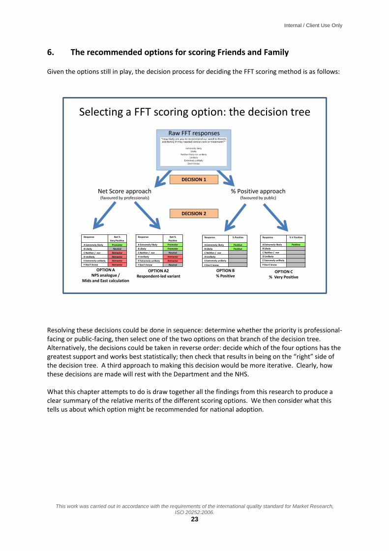
6. The recommended options for scoring Friends and Family
Given the options still in play, the decision process for deciding the FFT scoring method is as follows:
Raw FFT responses
Net Score approach(favoured by professionals)
% Positive approach(favoured by public)
Response Net %
Very Positive
A Extremely likely Promoter
B Likely Neutral
C Neither / nor Detractor
D Unlikely Detractor
E Extremely unlikely Detractor
F Don’t know Detractor
Response Net %
Positive
A Extremely likely Promoter
B Likely Promoter
C Neither / nor Neutral
D Unlikely Detractor
E Extremely unlikely Detractor
F Don’t know Neutral
Response % Positive
A Extremely likely Positive
B Likely Positive
C Neither / nor
D Unlikely
E Extremely unlikely
F Don’t know
Response % V Positive
A Extremely likely Positive
B Likely
C Neither / nor
D Unlikely
E Extremely unlikely
F Don’t know
Selecting a FFT scoring option: the decision tree
OPTION ANPS analogue /
Mids and East calculation
OPTION A2Respondent-led variant
OPTION B% Positive
OPTION C% Very Positive
DECISION 1
DECISION 2
Resolving these decisions could be done in sequence: determine whether the priority is professional-facing or public-facing, then select one of the two options on that branch of the decision tree. Alternatively, the decisions could be taken in reverse order: decide which of the four options has the greatest support and works best statistically; then check that results in being on the “right” side of the decision tree. A third approach to making this decision would be more iterative. Clearly, how these decisions are made will rest with the Department and the NHS. What this chapter attempts to do is draw together all the findings from this research to produce a clear summary of the relative merits of the different scoring options. We then consider what this tells us about which option might be recommended for national adoption.

Internal / Client Use Only
This work was carried out in accordance with the requirements of the international quality standard for Market Research, ISO 20252:2006.
24
Summary review of the four scoring options against key fieldwork and statistical criteria
TEST Option A: Net v positive (As used in Mids and East)
Option A2: Net positive Option B: % positive Option C: % v positive
Response Net %
Very Positive
A Extremely likely Promoter
B Likely Neutral
C Neither / nor Detractor
D Unlikely Detractor
E Extremely unlikely Detractor
F Don’t know Detractor
Response Net %
Positive
A Extremely likely Promoter
B Likely Promoter
C Neither / nor Neutral
D Unlikely Detractor
E Extremely unlikely Detractor
F Don’t know Neutral
Response % Positive
A Extremely likely Positive
B Likely Positive
C Neither / nor
D Unlikely
E Extremely unlikely
F Don’t know
Response % V Positive
A Extremely likely Positive
B Likely
C Neither / nor
D Unlikely
E Extremely unlikely
F Don’t know
AUDIENCES
Public reaction Strongly disliked – far too complicated. Where they did engage, objected to coding C+F as detractors
Option not presented by net scores disliked – far too complicated.
Preferred by a long way, but unsure whether B or C
Preferred by a long way, but unsure whether B or C
Public persuadable? Very difficult because of C+F options
Hints that some might be open to this as doesn’t appear to disregard critical patients
- -
Provider reaction Preferred net score option – but strongly disliked because of coding C+F
Preferred net score option – spontaneously advocated this version as better representation of questionnaire responses, so far better for engaging public and staff
A minority preferred this top two box option. But most staff rejected as too simplistic
Most staff rejected as too simplistic, and gives impression of disregarding too many patient responses
Providers persuadable?
- - Some argued easier to engage staff and patients so worth considering
Gives impression of disregarding too much information
Other professionals and stakeholders
Tended to support net scores. Some liked this option as continuity with Mids and East pilot; but some felt top box focus could make this unstable, and some questioned C+F
Tended to prefer net scores; both opinion formers and commissioners highlighted importance of targeting negative performance
Generally seen as too simplistic – and likely to generate very high scores (ie less discriminating)
Generally seen as too simplistic – and top box focus could make this unstable

Internal / Client Use Only
This work was carried out in accordance with the requirements of the international quality standard for Market Research, ISO 20252:2006.
25
TEST Option A: Net v positive (As used in Mids and East)
Option A2: Net positive Option B: % positive Option C: % v positive
Response Net %
Very Positive
A Extremely likely Promoter
B Likely Neutral
C Neither / nor Detractor
D Unlikely Detractor
E Extremely unlikely Detractor
F Don’t know Detractor
Response Net %
Positive
A Extremely likely Promoter
B Likely Promoter
C Neither / nor Neutral
D Unlikely Detractor
E Extremely unlikely Detractor
F Don’t know Neutral
Response % Positive
A Extremely likely Positive
B Likely Positive
C Neither / nor
D Unlikely
E Extremely unlikely
F Don’t know
Response % V Positive
A Extremely likely Positive
B Likely
C Neither / nor
D Unlikely
E Extremely unlikely
F Don’t know
CRITERIA
Simple calculation Definitely not from public perspective
Option not presented to public – but they felt net scores were not simple
Definitely yes Definitely yes
Simple explanation Very difficult to explain in a compelling elevator pitch
Slightly easier elevator pitch Easy elevator pitch Easy elevator pitch
Negative scores Yes Yes No No
Wide or narrow range
Wide Wide Wide Wide
Understandable scores from public pov
Risk of being misinterpreted as “% who recommended”
Risk of being misinterpreted as “% who recommended”
Yes – public very comfortable with percentages
Yes – public very comfortable with percentages
Covers whole scale Yes – and is only one to do this as well as Options D-F
Yes No No
Focus on poor scores, seen as impt for service imprvmt
Yes, but muddied by C and F
Yes No No
STATS TESTS
Skew, ceiling effects and std deviation
Second Best Worst Second Worst Best
Distribution (unique rankings)
Best Second Worst Worst Second Best
Correlation with other options
Best – only option that correlates with Options D-F
Middling Middling Worst – biggest outlier, though still a high correlation coefficient
Likely to fluctuate Top box option – likely to show more fluctuation
Likely to be more stable Likely to be more stable Top box option – likely to show more fluctuation

Internal / Client Use Only
26
This work was carried out in accordance with the requirements of the international quality standard for Market Research,
ISO 20252:2006.
© 2012 Ipsos MORI.
Based on this analysis we would conclude:
Option A should be dropped: it is strongly resisted by the public, and rejected by provider staff and some opinion formers as misrepresenting the survey responses it is trying to code. Providers felt this would undermine its credibility, and make it far harder to engage patients and staff in improving services
Options A2, B and C are more evenly balanced. Deciding between these will therefore depend on the relative weight placed on each of the criteria. This is likely to involve judgement as much as evidence
In terms of making a recommendation about which scoring mechanism should be rolled out nationally, it is clearly a very close call with no obvious front-runner. For this reason, it is essential to be clear what the purpose of the FFT score is: is it to engage the public as part of the transparency agenda; or is it about engaging staff to drive service improvement? Whichever of these is decided, it will have a clear impact on which options might be most suitable for rolling out: If prioritising the public perspective
If the priority is to produce a scoring mechanism that the public are likely to understand and engage with, then Option B or C looks a stronger contender, although there are limitations to these measures: they can give the impression of disregarding a lot of the responses; they don’t focus attention on areas of poor performance; and they are generally not viewed particularly positively by staff (although there are some exceptions)
Of these two options, there is no obvious front-runner. Option C is better in terms of producing a more even distribution of scores, which will therefore be more discriminating at the top of the range; however, it also can appear to disregard most data, and is more likely to fluctuate from month to month, especially with low patient volumes. It also is the least well correlated with the other measures – so some trusts may view this as an unfair calculation
In contrast, Option B uses more of the data, and is less likely to fluctuate from month to month, so from that perspective is likely to be more credible. It is also better correlated that Option C with other scoring methods. However, because of the degree of skew, it has substantial ceiling effects, which make it less discriminating at the top of the scale
Resolving Option B versus Option C may therefore require analysis of further data once FFT data collection goes live. It may therefore be useful to require dual reporting of Option B and Option C scores initially, to allow for this further analysis to be undertaken – with a view to deciding on one of these options once that analysis has been undertaken
If one of these options is undertaken, it will also be important to include a clear message in the guidance that trusts should be looking locally at the responses from their critical patients. This is to make clear that the feedback from these patients is not being disregarded.
Internal / Client Use Only
27
This work was carried out in accordance with the requirements of the international quality standard for Market Research,
ISO 20252:2006.
© 2012 Ipsos MORI.
If prioritising the professional perspective
If the priority is to introduce a mechanism that will be credible to staff, then Option A2 should be considered as a prime contender. This uses the whole range of responses, is seen as an accurate reflection of what patients reported, and includes feedback from the more discontent patients. It may also be slightly easier to explain to the public than Option A, although there is some risk that the public may misinterpret it (as a “% recommended” score). It is likely to be more stable over time, although the option does have substantial ceiling effects
This option does bring with it the risk of negative scores, although this is less of a risk than for the version of the score used in the work to date in NHS Midlands and East. And while many don’t like the impact of the negative score, some have argued this is a transparent way of highlighting poor performance, and provides a valuable incentive to drive service improvement
In other words, it is clear that looking to the decision tree presented at the start of this chapter, it is essential that Decision 1 is made first, before Decision 2 can determine the precise scoring mechanism to be rolled out nationally.

Internal / Client Use Only
28
This work was carried out in accordance with the requirements of the international quality standard for Market Research,
ISO 20252:2006.
© 2012 Ipsos MORI.
7. Presenting the FFT scores to the public As well as how the FFT scores are calculated, we also looked at how the results should be presented back to people. This was a substantial part of the discussion groups with the public, and a smaller part of the discussion with professional. Four questions were considered in particular:
How should the headline score be presented?
What should be presented at a more granular level (eg ward, specialty)?
How should time trends be presented?
How do the public want to be able to compare performance across different sites?
7.1 How should the headline FFT score be presented? By and large the professionals were relatively disengaged with the question of how the data should be presented to the public. Broadly, they agreed there should be a standard way of presenting the FFT scores across all trusts, and that the way the data is presented to the public should be friendly. Some also felt that the data should be presented to the public and professionals in the same format – although most professional seemed to think this was a relatively minor issue. Rather, the expectation was that the trusts would be drilling into the detail of their FFT database to understand the performance gaps – so from that perspective, how the headline scores were reported back to the public was seen as less important. Turning to the public perceptions of how they should be informed, we presented them with a number of options for how FFT scores could be presented to them – as shown here – and explored which they would find most useful.
Card: Prof5
Benjamin Franklin Hospital
Friends and Family Score:
76%
Benjamin Franklin Hospital
Friends and Family Rating:
0 10 20 30 40 50 60 70 80 90 100
0 10 20 30 40 50 60 70 80 90 100
Regional average
Your hospital’s Score
Regional average
Your hospital’s Score
Your hospital’s ScoreRegional average
Your hospital’s ScoreRegional average
Margin for error
Across all the public focus groups, there was a widespread view shared by a majority that simply presenting the numerical score was the most helpful particular when presented alongside a regional comparator, as in the following:

Internal / Client Use Only
29
This work was carried out in accordance with the requirements of the international quality standard for Market Research,
ISO 20252:2006.
© 2012 Ipsos MORI.
Set 3, Card1Option 1 (% positive)
The following is the Friends and Family score for your hospital
This means this hospital is doing better than average in this region.
Information:
Scores represent the percentage of people who say they would recommend the hospital
Scores can range from 0% to 100%
Benjamin Franklin Hospital
Friends and Family Score:
76%
Regional average
Friends and Family Score:
62%
This was seen as a clear, transparent way to present the data, which most people felt gave them the information they might need. Regarding the pictorial options for presenting the data, overall there was relatively little engagement with these: people just wanted the data presented to them clearly and simply. Where participants did pick options, there was relatively little consensus across the groups. The options that stood out most were as follows:
Some of the older London group liked the following scale reading, liking both the RAG colour coding and the simplicity of seeing a hospital score compared with a benchmark
Set 3, Card4Option 1 (% positive)
The following is the Friends and Family score for your hospital
Benjamin Franklin Hospital
Information:Scores represent the percentage of people who say they would recommend the hospitalScores can range from 0% to 100%
Your hospital’s Score
Regional average
Some of the older Peterborough group – particularly the women – liked star ratings. It is however notable that many of the public rejected star ratings, arguing “hospitals are not like restaurants or hotels”. Some also felt strongly there should be a zero star option if stars are to be used
Set 3, Card2Option 1 (% positive)
The following is the Friends and Family rating for your hospital
Information:
Scores represent the percentage of people who say they would recommend the hospital
Scores can range from 0% to 100%
Benjamin Franklin Hospital
Friends and Family Rating:

Internal / Client Use Only
30
This work was carried out in accordance with the requirements of the international quality standard for Market Research,
ISO 20252:2006.
© 2012 Ipsos MORI.
Interestingly, a minority of the younger London groups (low social class) preferred the
following, an icon used by NHS Choices. The green tick signifies performance above average, but this has no numerical information alongside it. When we explored this, it emerged that people liked the tick as it is clear what it means and is seen as a “friendly” way to show the data. Participants did go on to say that ideally they would like some numerical data presented alongside this. Participants also reflected that they would be less comfortable seeing a red cross for a poor performer
Set 3, Card9Option 1 (% positive)
The following is the Friends and Family rating for your hospital
Benjamin Franklin Hospital
Your hospitals FFT rating is green. This means it is above average for your region
Information:Scores represent the percentage of people who say they would recommend the hospitalScores can range from 0% to 100%
In contrast, the younger Peterborough group (higher social class) preferred the following. This suggests that there may well be an effect from education level: those likely to have higher educational attainment are likely to be more comfortable with more complex ways of presenting the data
Set 3, Card5Option 1 (% positive)
The following is the Friends and Family score for your hospital
Benjamin Franklin Hospital
Information:
Scores represent the percentage of people who say they would recommend the hospital
Scores can range from 0% to 100%
0 10 20 30 40 50 60 70 80 90 100
Your hospital’s
score
Regional average
Finally, it is also briefly worth noting what icons and pictures were rejected:
Interestingly, while some people liked the green tick, they did not like the green traffic light. It was seen as too authoritarian (“if the ward had a red traffic light *for below average+, I wouldn’t go in!”)
No one liked the speedometer dial – one woman in one of the younger groups asking, “Has this been designed by men!”
One or two of the staff we spoke to suggested the public would like the thermometer – but in fact only a very small minority picked this

Internal / Client Use Only
31
This work was carried out in accordance with the requirements of the international quality standard for Market Research,
ISO 20252:2006.
© 2012 Ipsos MORI.
While one group picked the horizontal scale, they did not want the margin of error to be included as it would be confusing4
7.2 What should be presented at a more granular level (eg ward, specialty)?
It was clear from the interview feedback that professionals understood there was an intention to be able to look at the data at a more granular level, and the public generally saw this as useful too. From the commissioners and providers’ points of view, the natural breakdown was to calculate scores at trust, site and ward level. Indeed some were already presenting their ward level scores back to the wards, eg via posters on the door as a way of engaging staff and communicating with patients. Commissioners also felt specialty level reporting would be helpful. However, providers tended to see this as more problematic, as a given specialty could be treated on a number of different wards. We explored whether it might be possible to produce a “proxy” FFT score for specialties. This might be done by identifying all the different wards treating, say, orthopaedic patients, and generate a combined FFT score for those wards. This was rejected, however, for two main reasons:
the nature of the different wards would be very different: eg one ward would be treating young patients with acute orthopaedic needs – eg sports injuries; while another would be treating much older patients with chronic orthopaedic problems. Hence, it was felt inappropriate – and potentially meaningless – to combine scores from such different wards
secondly, if the FFT score for a specialty dips, there is not an obvious management structure for dealing with this, as different teams will be involved in providing care. This contrasts with wards: if the score for a ward dips, it can readily be taken up with the ward sister, who “owns” the data and has responsibility for addressing the problem.
Interestingly, the public perspective tended to be the mirror image of providers: they were less interested in ward level scores, as they felt they had little control over what ward they were put on. But they did want FFT scores at specialty level: if they have been referred to a particular speciality, then if they decide to look at performance data, they want to be able to look at the data presented for that specialty. A small number of people also mentioned they would want to see performance data for their individual consultant, although this was by no means universally expressed.
Clearly, therefore, there is a gap between the detail of reporting the public would like, and the level or reporting that is possible – or indeed desirable – from a provider perspective. This many need further consideration going forward.
We were keen to explore how the more granular level of reporting should be presented, and both the public and professional audiences were shown the following to open up this discussion. This mocked up presentation includes:
on the left hand side is the overall FFT score for the given ward, or in this case the given specialty
the blue boxes on the right hand side represent the FFT responses from individual patients who had experienced that ward or specialty: the answer to the “recommend” question
4 That said, one opinion formers said this approach was useful for professional audiences: it could present a lot of data in a concisely – see for example the reports generated at http://www.lho.org.uk/LHO_Topics/national_lead_areas/marmot/marmotindicators.aspx

Internal / Client Use Only
32
This work was carried out in accordance with the requirements of the international quality standard for Market Research,
ISO 20252:2006.
© 2012 Ipsos MORI.
(presented in star format); and the open text response to the question “please tell us why you gave that score”.
Set 4, Card5Option 5 Overall score and individual star ratings
Below, we show the Friends and Family score for all the wards caring for Orthopaedic patients
Information:
Scores represent the percentage of people who say they would recommend the hospital
Scores can range from 0% to 100%
The wards in this hospital caring for orthopaedic patients include:
Rose WardMarigold WardPrimrose WardTulip Ward
The Friends and Family Score across these wards is:
68%
Ratings from individual patients:
4 Dec 2012 Rating:
Fabulous - staff couldn’t have been more helpful Big thanks to everyone
2 Dec 2012 Rating:
Generally good. The op on my knee was all very efficient, and so was the aftercare, but they could be a bit more friendly!!
1 Dec 2012 Rating:
Slow, dirty, uncommunicative - NEVER AGAIN!
29 Nov 2012 Rating:
Perhaps the most interesting finding to emerge was the lack of a common reaction to presenting individual patient comments. This division of opinion was apparent across all the audiences we presented it to: some found the granular presentation a real benefit, others saw it as a concern.
The arguments in favour of sharing individual patient views included:
For some, the text responses were far more meaningful and accessible. Following a lengthy discussion about different ways of presenting FFT performance numerically, one of the members of the older London group said “this is the first interesting piece of information I’ve seen”. They pointed out that this gave them a far clearer sense of what was going on on the ward that a numerical score
Some providers too felt this contained invaluable information for targeting their efforts to improve services: it was only when they could see these text responses that they knew what problems needed addressing. Building on this, they argued that if they have the data, then it should be available to the public. There was some caution, however, about whether this should simply be presented to people in total via the website – some arguing that the distribution of the data should be more controlled, and available to interested and more informed audiences such as patient groups or FT members and governors
Many of the professional audiences also argued that the data should be shared with the public on principle, pointing out is was important to be transparent
Finally some of the providers said it was an important part of engaging with patients and demonstrating to them that their views were being taken seriously. It was further suggested,

Internal / Client Use Only
33
This work was carried out in accordance with the requirements of the international quality standard for Market Research,
ISO 20252:2006.
© 2012 Ipsos MORI.
that trusts should have to respond to critical comments. Hence, the individual patient ratings could be used to start a dialogue with patients
The arguments were, however finely balanced:
A number of people in the discussion groups were concerned about how the information would be interpreted. It was felt that negative comments could leave potential patients feeling anxious. Even if there were positive comments, some felt that if the ratings fluctuated up and down, it would make them anxious about the quality of service they’d receive: it would be “like playing Russian Roulette”
The granularity could also lead to mismatches between the overall score and the individual patient ratings. For example if a ward was generally good, but had had a run of poor ratings, how should this be interpreted? Some felt it could be confusing or even misleading
Interestingly, while some patients felt the comments expanded on the simple score, others felt that the comments might actually over-simplify or misrepresent what was going on on the ward: were patients commenting on the same things, or might a poor comment reflect just one aspect of the service when in fact everything else had been good?
Another concern raised by professionals was that if patients knew their answers would be made public they would either not respond, or respond differently. This would undermine the value that many professional saw in these public comments, and therefore they were hesitant about putting these comments in the public domain
As well as these arguments for and against individual ratings, this part of the discussion also surfaced some further issues:
The graphic above presents the patient survey responses as star ratings. Some of the public liked this but others were concerned that this was not how the NHS should be presented (“it’s not a hotel or restaurant”). They felt that the raw survey responses should be presented
A view mentioned on several occasions was that if star ratings are retained, there should be a 0 star rating: the “Never Again” comment on the graphic above was not thought to merit one star
Amongst those who liked star ratings, some pointed out that if there were lots of ratings they would be difficult to read. They suggested that, as on websites like Amazon, the individual comments should be preceded by a a frequency count (57% rated 5-star; 31% rated 4-star, etc)
Views varied about how far back the ratings should be presented, with preferences ranging typically from 3 months to 1 year. It was felt unfair to go further back than that, as things might have changed in the hospital – eg the ward may have had a new management team, so it was unfair to associate them with historic reviews about another team’s performance
There was also surprisingly little concern about confidentiality for patients. One commissioner, however, did suggest removing the discharge dates, or presenting a band of dates so that no comment could be attributed to a particular patient
Despite the lack of concern about patient confidentiality, we would suggest there is an issue about informed consent to a patient’s survey comments being presented publicly. When completing a FFT survey at discharge, it would be reasonable for a patient to assume that their feedback was only going to the hospital, and some may feel aggrieved if those comments were made public (especially if they had chosen to include information which might identify them). Hence, we would recommend

Internal / Client Use Only
34
This work was carried out in accordance with the requirements of the international quality standard for Market Research,
ISO 20252:2006.
© 2012 Ipsos MORI.
that if individual responses are to be reported, then patients should be advised of this at the time of completing FFT survey.
7.3 How should time trends be presented?
We presented focus group participants with a range of options for presented trend data on hospital or ward performance. What was notable, again, was how little consensus there was across the public as a whole on how they would prefer the data to be shared. There was however something of an age effect, with older people preferring line graph presentations, and younger people preferring blocks of numbers. The following table summarises this:
Set 5, Card1Option 1 (% positive)
This shows how the Friends and Family Score for Orthopaedics has changed over the last year:
Information:
Scores represent the percentage of people who say they would recommend the hospital
Scores can range from 0% to 100%
0
10
20
30
40
50
60
70
80
90
100
Set 5, Card4Option 1 (% positive)
This shows how the Friends and Family Score for Orthopaedics has changed over the last year:
Key:
Information:
Scores represent the percentage of people who say they would recommend the hospital
Scores can range from 0% to 100%
Oct – Dec 2011
Jan – Mar 2012
Apr – Jun 2012
Jul – Sep 2012
56% 61% 62% 77%
Oct 2012
76%
Change since last quarter
-1
Last four quartersCurrent month
Change since last quarter
Very poor: less than 50%
Poor: 51% - 60%
Fair: 61% - 70%
Good: 71% - 80%
Very good: 71% - 80%
This format was universally preferred by the older public participants in both London and Peterborough.
They liked the simplicity and ability to see the trend for improvement.
Some suggested additional information could be overlaid – eg boundaries between each quarter, or RAG colour bands behind the chartline so it was clear when the score tipped from below average to average.
Data reporting should only go back a year, as it was seen as unfair to report back further: both the management team and the performance levels may have changed.
This format was universally preferred by the younger participants in both locations.
They liked being able to see the detail of the numbers, while the colour coding gave a useful sense of relative performance.
The lower social grade group in London preferred the version above (data grouped into three month blocks). The higher social grade Peterborough group preferred the more granular monthly version of this chart.
The final block (last month’s change) was welcomed, but it was suggested the colour was too alarmist (the dip in performance was not as bad as suggested).
Again, it was felt only report back the last year
Again, it is notable that there is a consistent view that the data should only be presented back over the last year. However other than that, the findings suggest that different people have very different preferences for how the data is presented. It may be that this should be addressed by giving people the ability to see the information either way when accessing it online, for instance leading the presentation with one version, but allowing people to click through to the other.

Internal / Client Use Only
35
This work was carried out in accordance with the requirements of the international quality standard for Market Research,
ISO 20252:2006.
© 2012 Ipsos MORI.
7.4 How do the public want to be able to compare performance across different sites?
Perhaps the most notable finding here was how little interest there was in the question of being able to compare trust performance. Even amongst the younger focus group participants, who might be expected to be more consumerist in attitude, there appeared to be relatively little appetite for comparing between trusts. For many, this was because they were unaware that they had a choice, and so the notion of comparing different providers simply didn’t arise. There was also a concern that making comparisons too explicit would undermine the confidence and morale of staff – and could even leave wards or services at risk of closure. Underlying this was a view, often expressed in groups on the NHS, that the NHS is a great institution, and we should avoid doing anything that might undermine staff. Because of this, the public did not really engage in a discussion of how they would like to be able to compare trusts. However, we would expect the appetite for this to grow over time, so it would be useful to build this functionality into the various FFT reporting tools. We would suggest that the functionality to run the following comparisons would be helpful – although this is not based on our own experience, rather than an obvious current public appetite for this:
Ability to select a group of hospitals/sites for comparison
Ability to compare a hospital/site against peer group hospitals/sites (however defined)
Ability to compare a hospital/site against others in the region and/or within a set distance

Internal / Client Use Only
36
This work was carried out in accordance with the requirements of the international quality standard for Market Research,
ISO 20252:2006.
© 2012 Ipsos MORI.
8. Other key findings and issues 8.1 Handling small numbers of data returns Our understanding of the research brief in relation to confidence intervals is broadly as follows:
Provide guidance on the appropriate formulae/methods to use to calculate confidence intervals for the scoring methods selected.
Make recommendations on minimum sample sizes at ward level. Regarding the second of these points, we understand that there are competing demands at play here:
the desire to publish results frequently, and
for sample sizes to be of a sufficient size that confidence intervals are narrow enough that they can be ignored (as, the confidence intervals will not be published).
We have done some preliminary modelling of responses at ward level to show the resulting CIs. This is written up more fully in Appendix 2, together with a number of estimates and assumptions on which the modelling is based. Subject to these, broadly speaking, the CIs would be in the region of:
For a three months sample (c.37 cases): +/- 16 percentage points
For a six months sample (c.75 cases): +/- 11 percentage points
For one year (c.150 cases): +/ - 8 percentage points That said, these CI’s could however be considerably wider, as explained in the appendix. Based on this, we would suggest reporting on periods of any less than a year leaves margins of error so large as to be unhelpful – particularly when trying to compare trusts or performance over time. We would therefore suggest a reporting model of rolling monthly averages, covering a 12 month period and updated every month could be a useful way forward. 8.2 Nationally mandated versus locally presented data On mandating returns, as might have been predicted, there were two contrasting views:
Broadly speaking, commissioners saw the opportunity to use FFT data as a mechanism for performance managing trusts and holding them to account (although one commissioner questioned whether the quality of the data was adequate for this). Accordingly, this group tended to feel that the centre should mandate as much as possible be returned (hospital-wide scores, scores for individual services, the raw patient responses and the open text comments were all suggested by various respondents)
In contrast, providers, and particularly FTs, argued just mandate the high level metrics. The view was expressed that this should be sufficient to identify whether there are any problems that need addressing in the trust. And if the scores suggest there are problems, these should be addressed by other mechanisms, not through studying the minutiae of the data
Regarding local data presentation, it was felt important the trusts demonstrate they are working with their data locally. This was suggested particularly if Options B or C are adopted, to avoid the
Internal / Client Use Only
37
This work was carried out in accordance with the requirements of the international quality standard for Market Research,
ISO 20252:2006.
© 2012 Ipsos MORI.
impression that the returns from the more critical patients are being disregarded. However, even if a net score method is adopted, it was still felt to be good practice for trusts to review and report on their data local – and this should be built into the guidance. As to how this local analysis should be presented, the view was that trusts should seek to ensure that the headline measures are presented in the same way as the national data – but beyond that, it was felt there needed to be some latitude in how trusts presented their local analysis of the data. As to the feedback channels, the most useful would appear to be posters on the wards reporting that ward’s score. Using the trusts website may also be helpful but bear in mind awareness is low. There was a feeling that channels such as Quality Accounts and Board Reports would not prove helpful for communicating with the general public – but that these might be useful for more specialist public audiences such as patient groups, FT members and governors. Regarding national channels such as NHS Choices, there is not currently a strong public demand for a central portal for FFT data. But, the public endorsed NHS Choice’s approach of providing simple, high level information, with the ability to drill down where people want. Also, many suggested FFT data should be presented alongside other trust data, which fits with NHS Choice’s approach. 8.3 Potential sources of bias on “fair comparisons” between trusts Three main potential sources of bias have been identified that may affect trust FFT scores and therefore the transparency with which trusts can be compared:
Bias arising from different data collection modes
Bias arising from different case mixes of patients
Bias arising from the location (typically, in more deprived areas, patients give more negative scores)
It is beyond the scope of this study to assess the scale of these and other potential sources of bias affecting FFT scores for individual trusts. We would recommend this requires further research. In the meantime, we would further recommend that FFT scores are presented with a caveat to the effect that because of the potential biases, care should be taken when comparing scores for each trust.

Internal / Client Use Only
38
This work was carried out in accordance with the requirements of the international quality standard for Market Research,
ISO 20252:2006.
© 2012 Ipsos MORI.
9. Conclusions Perhaps the strongest message to come from this research is the lack of consensus on the key issues at the heart of the study. Different stakeholders have different needs and expectations relating to the FFT score: should it be about accountability or transparency, engagement or service improvement? In reality, the answer is all of these. But the problem with this is that depending on where the emphasis is put, it will have very different implications for which scoring method is most fit for purpose. Added to this, the statistical analysis does not help resolve the question of which scoring method should be used. All methods have strengths and weaknesses – so in reality, there isn’t much in it. All of this points to the need for some greater clarity about what is the prime purpose for the FFT scores, the “Decision 1” referred to in Chapter 6. Being clear what this emphasis is should go a long way to resolving which scoring options should be considered further. A similar issue relates to how the data should be presented back to the public. Again, we found different views being expressed, with relatively few points of shared agreement across the public focus groups as a whole – except the preference for simple numerical scores and benchmarks. There is clearly pressure to resolve these issues quickly in time for implementation of FFT from April next year. While the mixed views discovered by this research do not provide easy answers, it is hoped they provided useful material to inform the debate over the coming few weeks.
Ipsos MORI Health Team 20 December 2012 Contacts: [email protected], [email protected], [email protected]

Internal / Client Use Only
39
This work was carried out in accordance with the requirements of the international quality standard for Market Research,
ISO 20252:2006.
© 2012 Ipsos MORI.
Appendix 1: Friends and family statistical tests Testing the scoring options using GPPS data
1. Method The section which follows describes descriptive analysis undertaken to illustrate how the calculation methods might perform in practice. The analysis is based on data from the advocacy question in the GP Patient Survey questionnaire:
GPPS Q29. Would you recommend your GP surgery to someone who has just moved to your local area?
Yes, would definitely recommend Yes, would probably recommend Not sure No, would probably not recommend No, would definitely not recommend Don’t know
The most recent published data (year 6) were used. Scores were generated for each GP practice using the calculation methods described in this report. All ‘don’t know’ responses were first recoded into the middle option (‘not sure’). The majority of practices were represented by at least 100 cases (7,000 out of 8,257) and a small number fewer than 30 (68 out of 8,257). Practices with fewer than 30 cases were excluded from the analysis, providing 8,189 practices.
2. Descriptive statistics
Descriptive statistics were run for each of the calculation methods. These are helpful in showing how the methods differ, in terms of their upper and lower limits, the range covered and how wide this is relatively, and whether practices are evenly distributed around the mean. These in turn give guidance in particular as to how discerning they are likely to be (the range they cover) and whether there are ‘ceiling effects’ (how skew they are) which will mean they are less discerning at one of the ends of their scales.
2.1 Net score options
Table 1 presents the descriptive statistics for options A and A2. The most important features highlighted are:
- Both tests produce positive and negative values but as might be expected A produces more negative ones (7% of practices for A, vs just 4, 0.05%, for A2). Option A produces no ‘perfect’ practices (i.e. with the highest possible score of 1), whereas A2 produces a handful (just six practices).
- Option A is substantially less ‘skew’ than option A2 (a skew of zero would indicate a perfect balance both sides of the mean). This is best seen looking at their histograms (see below): A2 has a substantial ‘ceiling effect’ (the worst of all the scores) whereby performance at the top is bunched.
- Option A has a very slightly wider range and standard deviation (the average distance from the mean). This might suggest slightly more ability to discern between performance scores.

Internal / Client Use Only
40
This work was carried out in accordance with the requirements of the international quality standard for Market Research,
ISO 20252:2006.
© 2012 Ipsos MORI.
Table 1. Descriptives for scores showing balance of opinion
Option A (Net score (NPS-style as used in Mids and East Cluster)
Option A2 (Simple net score)
Count (practices) 8,189 8,189
Minimum score -0.59 -0.11
Maximum score 0.94 1
Mean 0.37 0.76
Median 0.40 0.80
Range 1.53 1.11
Standardised standard deviation 0.16 0.14
Skewness -0.46 -1.22
Histogram for Option A (Net V Positive – NPS style as used in Mids and East)

Internal / Client Use Only
41
This work was carried out in accordance with the requirements of the international quality standard for Market Research,
ISO 20252:2006.
© 2012 Ipsos MORI.
Histogram for Option A2 (Simple Net Score)
2.2 “Percent positive options”
Table 2 presents the descriptive statistics for options B and C. Compared with one another, and options A and A2, we note the following:
- All scores are positive values. Option C, in common with A, produces no perfect scores, while B manages a handful (six).
- Option C is the least ‘skew’, meaning the scores are evenly distributed around the mean, and in fact it scores best on this measure of all the methods. Option B is less skew than A2 but still has a substantial ceiling effect.
- Option C also has the widest range in standard deviation terms of all the scoring methods.
Table 2. Descriptives for percent agree scores
Option B (% positive) Option C (% very positive)
Count (practices) 8,189 8,189
Minimum score 0.32 0.09
Maximum score 1 0.95
Mean 0.83 0.55
Median 0.85 0.55
Range 0.68 0.86
Standardised standard deviation 0.15 0.17
Skewness -1.02 -0.05

Internal / Client Use Only
42
This work was carried out in accordance with the requirements of the international quality standard for Market Research,
ISO 20252:2006.
© 2012 Ipsos MORI.
Histogram for Option B % positive
Histogram for Option C % very positive
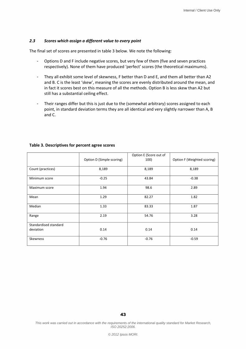
Internal / Client Use Only
43
This work was carried out in accordance with the requirements of the international quality standard for Market Research,
ISO 20252:2006.
© 2012 Ipsos MORI.
2.3 Scores which assign a different value to every point
The final set of scores are presented in table 3 below. We note the following:
- Options D and F include negative scores, but very few of them (five and seven practices respectively). None of them have produced ‘perfect’ scores (the theoretical maximums).
- They all exhibit some level of skewness, F better than D and E, and them all better than A2 and B. C is the least ‘skew’, meaning the scores are evenly distributed around the mean, and in fact it scores best on this measure of all the methods. Option B is less skew than A2 but still has a substantial ceiling effect.
- Their ranges differ but this is just due to the (somewhat arbitrary) scores assigned to each point, in standard deviation terms they are all identical and very slightly narrower than A, B and C.
Table 3. Descriptives for percent agree scores
Option D (Simple scoring)
Option E (Score out of 100) Option F (Weighted scoring)
Count (practices) 8,189 8,189 8,189
Minimum score -0.25 43.84 -0.38
Maximum score 1.94 98.6 2.89
Mean 1.29 82.27 1.82
Median 1.33 83.33 1.87
Range 2.19 54.76 3.28
Standardised standard deviation 0.14 0.14 0.14
Skewness -0.76 -0.76 -0.59

Internal / Client Use Only
44
This work was carried out in accordance with the requirements of the international quality standard for Market Research,
ISO 20252:2006.
© 2012 Ipsos MORI.
Histogram for Option D Simple scoring
Histogram for Option E Score out of 100

Internal / Client Use Only
45
This work was carried out in accordance with the requirements of the international quality standard for Market Research,
ISO 20252:2006.
© 2012 Ipsos MORI.
Histogram for Option F Weighted scoring
3. Further test: ranked correlations
We have also looked at the correlations between the rankings of the practices produced by each of the methods. They are all highly correlated as you would expect, but this gives some insight into whether they would discern differently between the relative performances of the practices (i.e. are those which perform well/poorly under one method also good/poor performers under another).
The table below shows the average correlation coefficient of each score when compared with the others. We have excluded D from this analysis as D and E are identical in terms of the rankings they produce (with a perfect correlation of 1), which would have given them a slightly higher average correlation, and means that there are now two methods for each of the three overall approaches to compare.
Of course they are all highly correlated (being close to 1), but of the options which are not based on a different score across the full scale (A, A2, B and C) A is the most correlated all the others by some distance, as it is the only one which is highly correlated to E and F. The others are not as well correlated with the measures which use the full scale, and C is somewhat the ‘outlier’ in terms of how it ranks the practices.
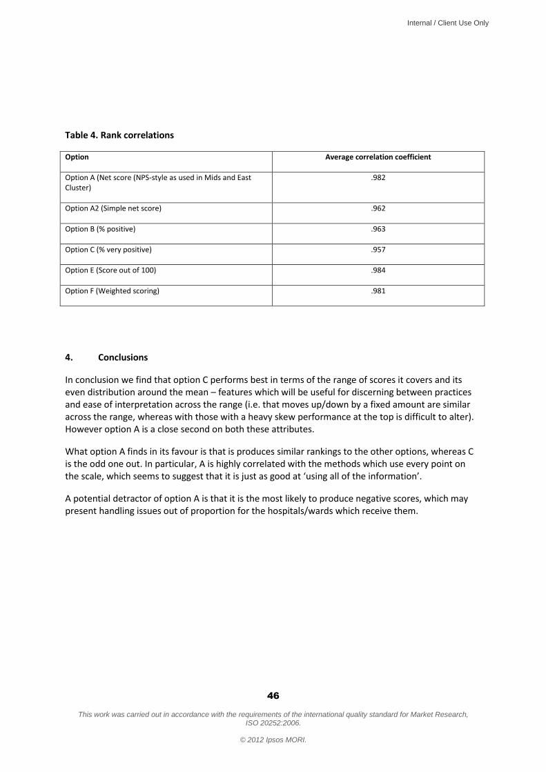
Internal / Client Use Only
46
This work was carried out in accordance with the requirements of the international quality standard for Market Research,
ISO 20252:2006.
© 2012 Ipsos MORI.
Table 4. Rank correlations
Option Average correlation coefficient
Option A (Net score (NPS-style as used in Mids and East Cluster)
.982
Option A2 (Simple net score) .962
Option B (% positive) .963
Option C (% very positive) .957
Option E (Score out of 100) .984
Option F (Weighted scoring) .981
4. Conclusions
In conclusion we find that option C performs best in terms of the range of scores it covers and its even distribution around the mean – features which will be useful for discerning between practices and ease of interpretation across the range (i.e. that moves up/down by a fixed amount are similar across the range, whereas with those with a heavy skew performance at the top is difficult to alter). However option A is a close second on both these attributes.
What option A finds in its favour is that is produces similar rankings to the other options, whereas C is the odd one out. In particular, A is highly correlated with the methods which use every point on the scale, which seems to suggest that it is just as good at ‘using all of the information’.
A potential detractor of option A is that it is the most likely to produce negative scores, which may present handling issues out of proportion for the hospitals/wards which receive them.
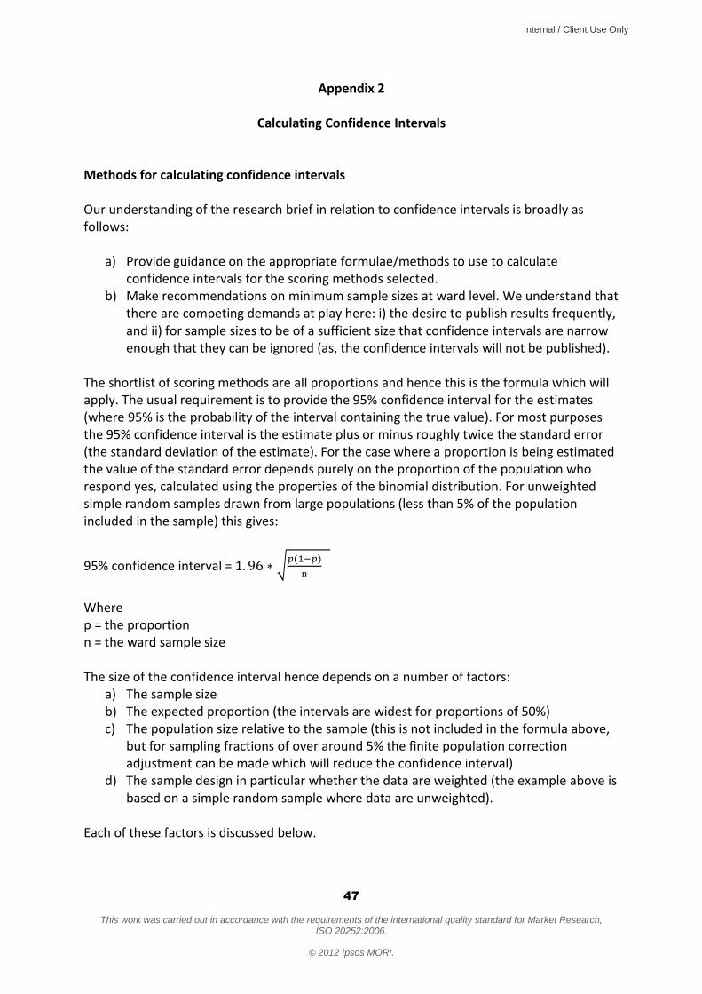
Internal / Client Use Only
47
This work was carried out in accordance with the requirements of the international quality standard for Market Research,
ISO 20252:2006.
© 2012 Ipsos MORI.
Appendix 2
Calculating Confidence Intervals
Methods for calculating confidence intervals Our understanding of the research brief in relation to confidence intervals is broadly as follows:
a) Provide guidance on the appropriate formulae/methods to use to calculate confidence intervals for the scoring methods selected.
b) Make recommendations on minimum sample sizes at ward level. We understand that there are competing demands at play here: i) the desire to publish results frequently, and ii) for sample sizes to be of a sufficient size that confidence intervals are narrow enough that they can be ignored (as, the confidence intervals will not be published).
The shortlist of scoring methods are all proportions and hence this is the formula which will apply. The usual requirement is to provide the 95% confidence interval for the estimates (where 95% is the probability of the interval containing the true value). For most purposes the 95% confidence interval is the estimate plus or minus roughly twice the standard error (the standard deviation of the estimate). For the case where a proportion is being estimated the value of the standard error depends purely on the proportion of the population who respond yes, calculated using the properties of the binomial distribution. For unweighted simple random samples drawn from large populations (less than 5% of the population included in the sample) this gives:
95% confidence interval = 1
Where p = the proportion n = the ward sample size The size of the confidence interval hence depends on a number of factors:
a) The sample size b) The expected proportion (the intervals are widest for proportions of 50%) c) The population size relative to the sample (this is not included in the formula above,
but for sampling fractions of over around 5% the finite population correction adjustment can be made which will reduce the confidence interval)
d) The sample design in particular whether the data are weighted (the example above is based on a simple random sample where data are unweighted).
Each of these factors is discussed below.

Internal / Client Use Only
48
This work was carried out in accordance with the requirements of the international quality standard for Market Research,
ISO 20252:2006.
© 2012 Ipsos MORI.
The Department estimates that the ward level sample size will be on average 150 patients per year (6 million patients, across 6,000 wards, with a 15% response rate). This translates to 12.5 per month, 37.5 per quarter, etc. When the point estimate proportion is unknown it is common to use the worst case scenario of 50%. However it can be expected that some of the scoring methods will produce more scores at the outer extremes: in the GPPS stats testing the mean for option A2 was 76% and B 83%, whereas A and C have means of 37% and 55% respectively. However the practices are spread across the range and it is perhaps safer to think in terms of the intervals at the 50% level. Whether the finite population correction should be factored into the calculation is another important consideration. With a 15% sample of the population it will reduce the confidence intervals slightly. However it is possible that some of the wards/hospitals will have a lower response rate, and therefore for the purposes of considering the likely confidence intervals it may be safer not to make the adjustment at this stage. Weighting will also increase the confidence intervals, potentially considerably (of the sample is not a good representation of the population on the weighting variables). If weighting is to be undertaken this should be taken into account. The recommended formula if weighting and population size are taken into account is as follows (we note that this is the formula used for calculating the confidence intervals for the GPPS):
95% CIs based on accounting for the design effect
Where p = proportion exhibiting outcome of interest (based on weighted results) n = unweighted sample size proportion p is based on N = population size for the population of interest DE = the design effect from weighting
The design effect =
Where the patient level weights adjusted to have a mean of 1 over the sample n. Expected confidence intervals for proportions (simple formula) Broadly speaking, the confidence intervals, assuming a proportion of 50%, no finite population correction and no weighting, will be:
- With three months sample (c.37.5 cases): +/- 16 percentage points. - Six months (c.75 cases): +/- 11 percentage points

Internal / Client Use Only
49
This work was carried out in accordance with the requirements of the international quality standard for Market Research,
ISO 20252:2006.
© 2012 Ipsos MORI.
- One year (c.150 cases): +/ - 8 percentage points With weighting the intervals could be considerably wider (although the finite population correction may counter-balance some or all of this effect. On balance we therefore recommend that at ward level a full year’s data are used when reporting scores. Issues for the Department to consider:
1. Are these calculations suitable, in particular, should adjustments be made for the population size and what is the likely design effect from weighting?
2. Is the recommendation of a year’s data appropriate; or would it be preferable to stipulate a minimum sample size (or both), noting that some wards are likely to have samples considerably smaller than the average.
3. Is a 95% confidence interval the appropriate level – e.g. we might be happy with 80% confidence intervals which would still allow us to say ‘we are 80% confident that this ward has increased its score’ etc.

Internal / Client Use Only
50
This work was carried out in accordance with the requirements of the international quality standard for Market Research,
ISO 20252:2006.
© 2012 Ipsos MORI.
Friends and Family Test – Scoring and Presentation
Topic Guide Professionals
Final v1 11-Dec-2012 NAME OF PARTICIPANT: ............................................................... AUDIENCE (professional participant type): ....................................................... 1. Introductions (maximum 5 mins)
Small sample from client – so while we won’t attribute to names, they may be able to work out who said what
Ask for consent to record the interview.
2. Introduce the Friends and Family test (warm up) As you know – the FFT is being launched next year
Present question wording (SHOWCARD PROF1)
As you know it’s about transparency for the public and encouraging providers to improve the services they offer Today, we’ll be looking particularly at how the FFT question should be scored. 3. How should FFT be scored? (maximum 20 mins) So the question is, how should the FFT score be calculated? This is important because
FFT is intended to be transparent – so it has to be clear and intuitive what the scores mean. So do some options work better than others? We are testing with public and professionals
Also, it’s intended to drive improvements – and different scoring methods will incentivise trusts to focus on different things
Finally, it aims to allow comparability with other organisations/sites to highlight opportunities for improvement.
Internal / Client Use Only
51
This work was carried out in accordance with the requirements of the international quality standard for Market Research,
ISO 20252:2006.
© 2012 Ipsos MORI.
There are six options under consideration. Turning to the first three...
(SHOWCARD PROF2 FOR OPTIONS A-C)
Interviewer to explain the three options by covering the points below before asking questions:
A: Exactly like Net Promoter: used by all Trusts within the Midlands and East SHA cluster.
Point out
Only top of scale “very likely” is counted as a “promoter”
Explain you work out what % are promoters and what are detractors, take one from the other to get the net promoter score
To increase your score you’d have to move patients red to grey and/or grey to green
Scores would range -100% to +100% - so some trusts would get negative scores
B: Similar to A – but just covers very positive responses
Point out
You work out the % at the top of the scale (very likely)
But you don’t subtract the detractors – you just report on the % v positive
To increase your score, you have to move patients grey to green – ie can only improve score by getting patients to say “very likely” to recommend
Scores would range 0-100% - so all scores would be positive
C: Similar to B – but sets the bar less high – ie % very positive or positive Point out
You work out the % at the top two boxes of the scale (very likely and likely)
Again, you don’t subtract the detractors – you just report on the % positive (v likely or likely)
To increase your score, you have to move patients grey to green – but lower threshold means this would be less challenging – getting patients to say “likely to recommend”, not “very likely”
Scores would range 0-100% - so all scores would be positive Questions to explore views on these options: So thinking about the aims of “transparency for the public”, and “encouraging trusts to improve service”:
Intuitively, which option do you like best/think will be most effective? Why do you think that?

Internal / Client Use Only
52
This work was carried out in accordance with the requirements of the international quality standard for Market Research,
ISO 20252:2006.
© 2012 Ipsos MORI.
Which option do you like least/think will be lease effective? Again, why do you think that?
Look out for spontaneous mentions of: Whether they think different options will incentivise different improvements Whether they think different options will be more/less acceptable to the public?
Prompt if not mentioned spontaneously: how effective would your preferred option be at encouraging trusts to improve services? How would it focus their improvement efforts?
Interviewer to record notes of views here on a copy of the showcards Turning to the next three options... (SHOWCARD PROF3 FOR OPTIONS D-F) There is another approach to scoring FFT which is to convert patient responses into scores – then add the scores up and work out the average score per patient. Interviewers to explain the three options before asking questions:
D: Scores range -2 to +2 Point out
Any shift of patient views will affect your score (it’s not like the earlier options where it depended on you reaching a threshold level)
It’s equal weight all up the scale – eg moving people E to D will have same impact on your score as moving people C to B
Reported scores would range from -2 to +2
E: Scores range 0 to 100 Point out
Again, any shift of patient views will affect your score
Again, its an equal weight across the whole scale
Reported scores would range from -2 to +2
F: Scores range -3 to +3 Point out
Again, any shift of patient views will affect your score
It’s NOT equal weight all up the scale – you’re score will improve more by moving F to E or B to A than moving in the middle of the scale
Reported scores would range from -3 to +3 Questions to explore views on these options:

Internal / Client Use Only
53
This work was carried out in accordance with the requirements of the international quality standard for Market Research,
ISO 20252:2006.
© 2012 Ipsos MORI.
So, again, thinking about the aims of the FFT to provide “transparency for the public” and to “encourage trusts to improve service”:
Overall – how do you think these compare to the first three options – do you feel they are better/worse? Why?
If participant says D-F are all worse, explore why, then move to section 4 If participant says they prefer at least one of the options D-F, then explore the following:
Intuitively, which option do you like best/think will be most effective? Why?
Which option do you like least/think will be lease effective? Why? Look out for spontaneous mentions of Whether they think different options will incentivise different improvements? Whether they think different options will be more/less acceptable to the public?
Prompt if not mentioned spontaneously: how effective would your preferred option be at encouraging trusts to improve services? How would it focus their improvement efforts?
Interviewer to record notes of views here on a copy of the showcards OVERALL, then, which of the six options do you think is best for:
Encouraging service improvement in trusts? - esp which most suitable for CQUIN schemes?
Being transparent with the public ? If participant gives two different answers on these two points, press them with the following prompts: Which would you recommend is adopted? Which would be most helpful to you in your role? Interviewer to make notes in section below: 4. Some specific scoring principles

Internal / Client Use Only
54
This work was carried out in accordance with the requirements of the international quality standard for Market Research,
ISO 20252:2006.
© 2012 Ipsos MORI.
Make clear that in this section we are talking about ratings for HOSPITALS, not individual wards or specialities Explore:
Under some of these methods, a hospital could have a NEGATIVE FFT score, is that a problem?
Which is better a scoring scheme, one that runs negative to positive, or runs 0 to 100? Why?

Internal / Client Use Only
55
This work was carried out in accordance with the requirements of the international quality standard for Market Research,
ISO 20252:2006.
© 2012 Ipsos MORI.
NEGATIVE SCORES: ..........................................................................................................
Some scoring regimes are NARROW (eg -2 to +2), others are WIDE (eg -0-100). Any preference? Why?
NARROW OR WIDE SCORES: ..........................................................................................................
If chose option A from showcard prof2: is it right that “don’t knows” should be seen as detractors. Or should they be excluded? Why?
If chose options D-F from showcard prof 3: how should “don’t knows” be handled. Should they be excluded, or treated same as “neither/nors”
DONT KNOWS: .......................................................................................................... 5. Other issues (5-20 mins depending on how much time participant has) 5.1 Level of reporting In your role, what level of reporting is useful and why?: Trust level: Y / N Why?............................................................................................... Hospital site: Y / N Why?............................................................................................... Ward level: Y / N Why?............................................................................................... Speciality: Y / N Why?...............................................................................................
Internal / Client Use Only
56
This work was carried out in accordance with the requirements of the international quality standard for Market Research,
ISO 20252:2006.
© 2012 Ipsos MORI.
5.2 When reporting ward or specialty How helpful is it to report back more granular data about wards and specialities to the public?
What is the right level – overall ratings for wards/specialties or individual patient responses?
SHOWCARD PROF4 What are your views on the advantage, disadvantages of this reporting method? On balance would you recommend this or not? Interviewer to make notes in section below: 5.3 How frequently should the data be refreshed / confidentiality
Should it be refreshed monthly, quarterly, or should it be ‘live’ updates?
If you have very frequent updates, then it could be possible to work out which patient was saying what. How much do you feel confidentiality is an issue?
***What’s the smallest number of response you should have before you update the reporting?
Interviewer to note preferred frequency of refresh below: Interviewer to note participant’s views on protecting confidentiality below:

Internal / Client Use Only
57
This work was carried out in accordance with the requirements of the international quality standard for Market Research,
ISO 20252:2006.
© 2012 Ipsos MORI.
Interviewer to note participant’s views on smallest response cell below: 5.4 How far back should the data be presented – three months, a year, five years, forever?
Why ? Interviewer to note participant’s views below: 5.5 How should the data be presented back to you? SHOWCARD PROF5 We are exploring with the public different ways to present the data. Would you want the data presented back to you/your management team/your frontline team the same way? Or differently? Would you just want the numbers? What national level results ( ie for all providers ) would be useful and for what purpose? Interviewer to note participant’s responses below: Do you want the calculated scores, the raw data or both made available?
Internal / Client Use Only
58
This work was carried out in accordance with the requirements of the international quality standard for Market Research,
ISO 20252:2006.
© 2012 Ipsos MORI.
Interviewer to note participant’s responses below: What channel would you find most useful? (eg Unify, DH website, Other) Interviewer to note participant’s responses below: How useful is it to include confidence intervals on the reports back? Interviewer to note participant’s responses below: 5.6 What should be mandated from the centre?
Sufficient to send returns to the centre for presenting on NHS Choices
Or should it also mandate local reporting – include score in Quality Accounts, Board Reports, local websites, posters in hospitals?
What does the centre need to mandate to make this as effective as possible Interviewer to note participant’s responses below: 6 Any final comments (A last chance to identify the principles that people are looking for to make FFT useful) Interviewer to note participant’s comments below:
Internal / Client Use Only
59
This work was carried out in accordance with the requirements of the international quality standard for Market Research,
ISO 20252:2006.
© 2012 Ipsos MORI.
Friends and Family Test – Scoring and Presentation
Topic Guide
Patients and Public Final December 2012
1. Introductions (10 minutes)
Standard Ipsos MORI content about introductions, permission to record, assurances about confidentiality etc.
2. Introduce the Friends and Family test (warm up) (15 minutes) Moderator to explain to participants:
The FFT will be live in England from April 2013
There are two aims of it: - transparency, so you can see which hospitals doing best - encourage hospitals to improve performance
Moderator to present question wording to the group (SHOWCARD 1)
Imagine you had to go in for some knee surgery. How would you react if someone asked you to complete this question as you were discharged? (Note to moderator: this is more of a warm up than a critical review – the intention is just to get people engaged in FFT) 3. How should the FFT scores be presented to help you choose your hospital? 3.1: salience (10 minutes) (Note to moderator: this is to understand whether people see FFT scores as “must have” info – or less important. Will indicate how much emphasis needs to be placed on public views) Let’s think about that example a bit more – say you needed some knee surgery. You talk to your GP and they say there are three possible hospitals you could go to BRAINSTORM WITH FLIP CHART (brief): what info would you look for to choose which hospital to choose?
If FFT score is mentioned: how big a factor would that be in your decision?
If FFT score not mentioned: I see you didn’t mention the FFT score – why’s that? The NHS think it should be really important for people picking their hospital – do you agree?

Internal / Client Use Only
60
This work was carried out in accordance with the requirements of the international quality standard for Market Research,
ISO 20252:2006.
© 2012 Ipsos MORI.
3.2: how the scores should be calculated to make most sense (30 minutes) (This scores the same FFT responses in different ways – to see which the public find most intuitive for understanding how well a trust is performing using FFT scores) (Raw scores for the following exercise are as follows in case moderator needs to explain them)
High performing
hospital
Good but not great (fewer top
boxes) Struggling poor
hospital Hospital A B C
v Likely 46 25 16
Likely 30 51 21
neither/nor 4 5 15
unlikely 10 9 23
v unlikely 5 5 20
dnk 5 5 5
(PREPARE SHOWCARD – IN CASE NEEDED – THOUGH NOT EXPECTED TO USE IN THE GROUP) Imagine you were comparing three hospitals. Those hospitals compare as follows – note that different ways to score it make the scorings and ranking different
(SHOWCARD – SET 2) Go through each option in turn Key things to test for each option:
do participants understand the rationale – does it make sense, does it seem intuitive
what do they think of the rationale o in particular, compare approaches that focus on top box, vs. focus on top-two
boxes
what do they think of the score range o what do they think of negative scores (where they apply)
After presenting all options, check: Which do they think is fairest / which do they like best? Why? Having reviewed the specific options, now test out three specific scoring principles: What do you think of negative scores? Why? a) should scoring system be weighted? Should scores be:
weighted to encourage hospitals to sort out the extremes
weighted to encourage more attention on the middling ones

Internal / Client Use Only
61
This work was carried out in accordance with the requirements of the international quality standard for Market Research,
ISO 20252:2006.
© 2012 Ipsos MORI.
equally weighted across the scale ***Important: make sure this is covered as it is how we assess the +3 +1 0 -1 -3 option (there is no showcard for this)*** b) which end of the performance spectrum should the FFT scores encourage trusts to focus on? Should the scoring focus more on:
Dealing with the poor performers (ie weighted scores at bottom of scale)
Aspiring to encouraging excellence (ie weighted scores at top of scale)
Positive and negative scores equally c) what should happen to don’t knows? Should they be
Excluded?
Or counted as neither/nors? 3.3: How graphically should scores be presented? (20 minutes) Present a range of options to participants (SHOWCARD – SET 3) Put all the showcards on the table – ask people to free-sort – pick ones that they like/dislike/standout for particular reasons The general discussion about why they picked what they picked – which should evolve into a discussion of which options they think should be used to present hospital F+F scores. In particular, find out
which formats they find most / least intuitive to understand – and why
which they find most/least informative in helping them understand trust
performance – and why
which do they think the NHS should use – and why
Do they want to be able to compare hospitals? – do they want to pick a list or presented with all the hospitals in the region? 4. More detailed FFT data – going below the headline hospital scores (10 minutes) (This tests appetite for more granular information) Right, let’s think about this in a bit more detail. If you were going to hospital for that knee operation, and you wanted to look at the FFT scores, what would you really want to know?
Would it be enough to have the FFT score for the whole hospital?
Or would you want it for “orthopaedics” (the dept that does the knee surgery)
Or would you want it for the individual ward?
Or would you want it for the individual consultant teams?

Internal / Client Use Only
62
This work was carried out in accordance with the requirements of the international quality standard for Market Research,
ISO 20252:2006.
© 2012 Ipsos MORI.
Explore why they pick the level they pick Push back/check – would they really investigate to that level? Point out – it would take more of their time time – would they really want to do that in practice? Would they go as far as comparing orthopaedics for each of the three hospitals? Would they eventually want that sort of functionality? 5. Presenting the more detailed (specialty level) information (20 minutes) (This tests reactions to one possible presentation of this data – NB it’s not possible to pull scores just for specialties. You have to identify the wards that care for those specialties and provide ratings for those wards. NB also, that the relevant wards will also provide care for people with other specialities – so it’s not possible to tell specifically whether ratings relate to a particular speciality – it will just be one of the specialties treated by that ward) Present several options (SHOWCARD - SET 4) 5.1 First, look at how the specialty report has been produced (i.e. reporting scores for the wards that serve that specialty, rather than the specialty itself).
What do you think of that?
Pros/cons, likes dislikes? 5.2 Secondly, which of these options would you find most useful if you genuinely needed knee surgery?
Why – what do you like about each option?
What do you dislike about each option?
What would you change?
Any other ideas? 6. How the scores change over time (15 minutes) (Participants are likely to default to more often = better. So test out would they really find this more useful – given extra NHS time it would take. Aim is to find what frequency of reporting would genuinely be most useful in eyes of public). 6.1 Thinking about that Ward level feedback: how up to date should it be?
Should it be refreshed monthly/quarterly?
If respondents push for more frequently, test out – do they really want NHS time and resources going into that? And if that means the data moves up and down, would that be confusing?

Internal / Client Use Only
63
This work was carried out in accordance with the requirements of the international quality standard for Market Research,
ISO 20252:2006.
© 2012 Ipsos MORI.
6.2 Confidentiality
If you have very frequent updates, then it could be possible to work out which patient was saying what. How much do you feel confidentiality is an issue?
***What’s the smallest no of response you should have before you update the reporting?
6.3 How far back should the data be presented – three months, a year, five years, forever?
Why – would you really use it?
Is it a good use of NHS time and resource? 6.4 How should it be presented? Present several options (SHOWCARD SET 5) Explore merits of both options to draw out principles of how they want the graphs presented... 7. Sum up and final comments (10 minutes) (A last chance to identify the principles that people are looking for to make FFT useful) Having heard the discussion today, what do you now think about the Friends and Family Score – what’s useful, less useful? How likely would you be to use it? What would make it better/make you more likely to use it?