frbclev_econtrends_201009.pdf
TRANSCRIPT

Banking and Financial Markets Where Does the Mortgage Market Go from
Here?
Monetary Policy Implications of Eurodollar Futures and Taylor
Rules for Alternative Monetary Policy
Labor Markets, Unemployment and Wages The Great Recession and its Impact on Diff erent
Industries
Growth and Production Households’ Balance Sheets and the Recovery
Infl ation and Prices Infl ation: Soft but Stable?
Regional Activity Small Business Lending
In This Issue:
September 2010 (August 13, 2010-September 9, 2010)

2Federal Reserve Bank of Cleveland, Economic Trends | September 2010
Banking and Financial InstitutionsWhere Does the Mortgage Market Go from Here?
08.27.10by Yuliya Demyanyk and Matthew Koepke
In the fi rst quarter of 2010, it appeared that the mortgage market was running out of steam. An increase in mortgage originations in the second quarter, however, demonstrates that there still is demand for mortgages. According to Inside Mort-gage Finance, VA-mortgage originations increased 6.3 percent from the fi rst to the second quarter, originations from the top 25 lenders were up 7.6 percent over the same period, and total originations were up 6.3 percent. In addition, new private mort-gage insurance was up 26.6 percent over last quar-ter. Private mortgage insurance is extra insurance lenders require when the amount of a loan exceeds 80 percent of the home’s value. Th e increased avail-ability of this type of insurance could make home ownership more accessible to homeowners who don’t have enough for a 20 percent down payment.
According to a recent survey published in Inside Mortgage Finance, the improved second-quarter performance was driven by consumers taking ad-vantage of the favorable interest rate environment and the extension of the homebuyer tax credit. Since October 2008, interest rates on 30-year fi xed mortgages have fallen 155 basis points, from 6.39 percent to 4.84 percent. In addition to the favorable rates, many homebuyers decided to take advantage of the homebuyer tax credit, which gave fi rst-time homebuyers a tax deduction of $8,000 and existing homeowners buying a new home a deduction of $6,500. Th e credit, which was set to expire in November 2009, was extended until April 2010.
While the second-quarter originations provide a glimmer of hope that the housing market is im-proving, signifi cant challenges still lay ahead. Th is is evident when examining the number of delinquent mortgages, new foreclosures, and the inventory of foreclosures. Between March 2003 and June 2010, the number of delinquent loans increased from 1.6 million to nearly 4.4 million. Rising even more dramatically is the inventory of foreclosed homes,
Source: Wall Street Journal.
3
4
5
6
7
1/08 5/08 9/08 1/09 5/09 9/09 1/10 5/10
Mortgage Interest Rates
15-year fixed mortgage rate
30-year fixed mortgage rate
Percentage rate
Source: Inside Mortgage Finance.
Mortgage Indicators
-25
-15
-5
5
15
25
35
VA
FHA
Fannie/FreddieNew MBS
New PMI
Originations(Top 25 Lenders)
Total
Percentage change: 2010:Q1–2010:Q2 Percentage change: 2009Q4–2010:Q1
Quarterly percentage change

3Federal Reserve Bank of Cleveland, Economic Trends | September 2010
which increased from 482 thousand to slightly over 2.0 million. As of June 2010, 6.9 million loans are classifi ed as in trouble.
Th e diffi culties involved in attempting to rectify the imbalances in the housing market can be demon-strated by examining the July Home Aff ordability Modifi cation Program (“HAMP”) Servicer Per-formance Report. According to the report, even though nearly 3.1 million delinquent loans were eligible for modifi cation and 1.3 million modifi ca-tion trials have been started since May 2009, the number of permanent modifi cations started since September of 2009 has been a mere 434 thousand. Given that there are currently 4.4 million delin-quent borrowers and only 434 thousand permanent modifi cations in the works, it is likely that the real estate market will remain fragile for some time.
To read the July Home Affordability Modifi cation Program (“HAMP”) Servicer Performance Report, visit http://www.fi nancialstability.gov/docs/JulyMHAPublic2010.pdf
01,0002,0003,0004,0005,0006,0007,0008,000
Source: Mortgage Bankers Association.
Number of mortgages (thousands)
Mortgage Delinquencies and Foreclosures
Delinquent mortgagesNew foreclosures
Permanent mortgage modifications under HAMP
Inventory of foreclosures
3/1/039/1/03
3/1/049/1/04
3/1/059/1/05
3/1/069/1/06
3/1/079/1/07
3/1/089/1/08
3/1/099/1/09
3/1/10

4Federal Reserve Bank of Cleveland, Economic Trends | September 2010
Monetary PolicyEurodollar Futures, Taylor Rules, and the Conduct of Future Monetary Policy
09.10.10by Charles T. Carlstrom and John Lindner
When interest rates are zero and policymakers would like to lower rates further, the usual mon-etary policy operations are no longer eff ective. Traditional open market operations, in which the Fed swaps collateral into or out of the fi nancial system for cash, can’t aff ect rates—or economic ac-tivity—because short-term bonds and excess bank reserves are perfect substitutes in a zero-interest-rate environment. Th e substitutability means that when the Fed buys short-term debt from banks, that does not insure that the money banks are receiving in payment will be lent out. Instead, banks simply substitute the T-bills that were on their balance sheet (which eff ectively earn zero percent interest) with excess reserves. When open market operations (with short-term bills) only increase the balances of excess reserves, the operations will be ineff ective in increasing prices and output. Th is substitutability is one reason that the level of excess reserves exploded during the recent recession.
Monetary authorities must instead fi nd alternative ways of stimulating the economy and increasing infl ation. One policy option is to signal the future path of interest rates. Monetary policy is not given by just today’s funds rate but the path of future funds rates as well. By promising low rates not just today, but also in the future, long-term rates can also be reduced. Th is reduction in long-term rates increases investment and thus output.
In order to achieve lower expected long-term inter-est rates, the Fed needs to convey a message to the markets that alters their expectations for the policy rate path going forward. Some elements of the Fed’s recent Federal Open Market Committee (FOMC) statements might suggest that it is sending such a message. In the last several statements, the FOMC said: “Th e Committee will maintain the target range for the federal funds rate at 0 to 1/4 percent and continues to anticipate …exceptionally low
0.00
0.25
0.50
0.75
1.00
1.25
1.50
1.75
2.00
2.25
12/07 05/08 10/08 03/09 08/09 01/10 06/10
Trillions of dollars, seasonally adjusted
Components of the Monetary Base
Source: Federal Reserve Board.
Excess reserves
Currency component
Required reserves

5Federal Reserve Bank of Cleveland, Economic Trends | September 2010
levels of the federal funds rate for an extended period.”
But the lines omitted in that excerpt are very important, as they seem to indicate that the reason the funds rate will be low is because of “economic conditions, including low rates of resource utiliza-tion, subdued infl ation trends, and stable infl ation expectations.” If low rates are solely due to the fact that the Fed will continue to respond to infl ation, output, and the output gap as it typically does, then the Fed’s statement will not stimulate the economy since it is not aff ecting the anticipated course of future policy.
To investigate whether the markets expect future funds rates to be lower than what would normally occur given the current state of economic condi-tions, we need a way of ascertaining how policy has typically responded to economic conditions as well as a measure of what markets expect. For the policy reaction function we can use a Taylor-type interest rate rule. While there are many possible economic conditions on which the Fed can base its rate deci-sions, we include infl ation, current output growth, and lagged federal funds rates. Th e following chart illustrates that such a simple “rule” tracks the funds rate quite closely.
Th e question is whether markets expect future fed funds rates to be higher or lower than would be predicted by this rule going forward. To extend this Taylor-type rule we use internal forecasts of infl a-tion and output growth. To get an idea of what markets expect for the future path of the funds rate we use Eurodollar futures, correcting for the risk in the Eurodollar market that is not present in the fed funds market. Th ese futures are thought to be a good estimate of market expectations of future funds rates.
If we start this analysis in April, we see that the market was expecting much higher funds rates in the future than would have been expected given the forecasts for future economic conditions. In April, future policy by this metric was not accommodative but was actually restrictive.
But by the June FOMC meeting the situation had changed dramatically. Now the market’s expecta-
Taylor-Type Rule and Federal Funds Rate
-10123456789
10
1987 1991 1995 1999 2003 2007
Sources: Federal Reserve Board; BEA.
Percent
Federal funds rate
Taylor-type rule
Taylor-Type Rule and Eurodollar Curve: April
-1.0
-0.5
0.0
0.5
1.0
1.5
2.0
2.5
08Q2 08Q4 09Q2 09Q4 10Q2 10Q4 11Q2 11Q4 12Q2 12Q4
Percent
Eurodollar forward rate curve (4/27/2010)
Taylor-type rule (red line is forecasted)
Note: Forward rate curve has been adjusted for term and maturity mismatch.Source: Federal Reserve Board; BEA; April internal forecast.
-1.0
-0.5
0.0
0.5
1.0
1.5
2.0
2.5
08Q2 08Q4 09Q2 09Q4 10Q2 10Q4 11Q2 11Q4 12Q2 12Q4
Percent
Note: Forward rate curve has been adjusted for term and maturity mismatch.Source: Federal Reserve Board; BEA; April internal forecast.
Taylor-Type Rule and Eurodollar Curve: June
Eurodollar forward rate curve (6/22/2010)
Taylor-type rule (red line is forecasted)

6Federal Reserve Bank of Cleveland, Economic Trends | September 2010
tion of future funds rates was almost always below what would be expected from a Taylor-type inter-est rate rule. Th is indicates that future policy was now accommodative. Th ese market expectations had fallen on the big news around this time of debt concerns in Greece and Portugal.
Repeating this analysis for early September, we see that market forecasts and a Taylor-type rule are very similar, suggesting that future policy is neither more restrictive nor accommodative than would typically be expected from economic conditions. Extending the market’s expectations out even fur-ther by promising low rates for a “hyperextended” period of time is likely to be stimulative. But the impact of such a language change will probably be minimal, given that markets are already expecting the next funds rate increase to occur in the middle of 2012.
For more on Eurodollar futures, visit http://www.clevelandfed.org/research/trends/2010/0410/01monpol.cfm
-1.0
-0.5
0.0
0.5
1.0
1.5
2.0
2.5
08Q2 08Q4 09Q2 09Q4 10Q2 10Q4 11Q2 11Q4 12Q2 12Q4
Percent
Eurodollar forward rate curve (9/1/2010)
Note: Forward rate curve has been adjusted for term and maturity mismatch.Source: Federal Reserve Board; BEA; April internal forecast.
Taylor-Type Rule and Eurodollar Curve: September
Taylor-type rule (red line is forecasted)

7Federal Reserve Bank of Cleveland, Economic Trends | September 2010
Labor Markets, Unemployment and WagesTh e Great Recession and its Impact on Diff erent Industries
09.10.10by Murat Tasci and John Lindner
Th e recent recession, now called the Great Reces-sion by many, had signifi cant adverse eff ects on the labor market overall. Even though the recovery has apparently begun and output has been growing since the second quarter of 2009, payroll employ-ment is still about 6 percent less than it was at its prerecession peak in December 2007. New jobs are being created, but at a relatively modest pace—about 100,000 jobs a month on average have been added to nonfarm payrolls since the beginning of 2010.
Th is anemic hiring indicates a low demand for labor. However, the job openings data don’t look so grim. In contrast to payroll employment, the current level of job openings is a lot higher than it was at its recession trough in July 2009, when it hit 52 percent. Total job openings in the economy currently stand at 65 percent of their prerecession level. But while this is evidence that fi rms are look-ing for workers to fi ll vacant positions, it has not translated into a sustained increase in actual hiring.
Th is is not uncommon at the early phases of a recovery, since it takes time for fi rms to fi nd the right match among the large pool of unemployed. But there is another reason employment growth could be sluggish, and it’s more of a concern. It could be that fi rms are willing to hire, but they are unable to fi nd the workers they need among those who are unemployed. Th at problem is sometimes dubbed a “mismatch” of (worker) skills and (com-pany) needs. If the mismatch is signifi cant, one obvious place it might show up is if some sectors were aff ected by the recession diff erently than oth-ers. Since the Great Recession was accompanied by problems in the housing and the fi nancial markets, some economists have argued that employment in these sectors might never go back to their prereces-sion levels. If this is true, we might see these sectors recovering more slowly than others, as workers who lost their jobs in these industries might lack the skills that are required for other sectors. Th ere
Total Private Sector Job Openings and Payrolls
40
50
60
70
80
90
100
110
120
2000 2001 2002 2003 2004 2005 2006 2007 2008 200960
70
80
90
100
110
120
130
140
Source: Bureau of Labor Statistics.
Index (seasonally adjusted)
Openings
Payrolls
Construction Sector Job Openings and Payrolls
0
40
80
120
160
200
240
2000 2001 2002 2003 2004 2005 2006 2007 2008 200960
70
80
90
100
110
Source: Bureau of Labor Statistics.
Openings
Payrolls
Index (seasonally adjusted)
Payrolls total
Openings total

8Federal Reserve Bank of Cleveland, Economic Trends | September 2010
is not a clear way to see whether this has in fact happened, but we can look at the responses of pay-roll employment and job openings across diff erent sectors as a start.
Construction was probably one of the sectors most aff ected by problems in the housing market. As a result, employment in this sector has shrunk by 25 percent since December 2007. Note that construc-tion employment started to decline before the re-cession offi cially hit, but the timing coincides with many of the housing problems that arose before the recession. Th e job loss in this sector stands in stark contrast to the total employment loss of 6 percent. Th e disproportionately stronger eff ects of the reces-sion on the construction sector are also evident in the job openings numbers. At one point toward the end of the recession, the number of job open-ings was barely 20 percent of the level in December 2007. If one takes into account the fact that con-struction employment was already in a declining trend by that time, the signifi cance of the decline in labor demand is more obvious.
Another sector that was hard hit by the recession is the fi nancial services sector (including insur-ance and real estate services). Contrary to what one might expect, the fi nancial services sector did not experience a much larger loss than the aggre-gate economy. Total employment in the sector was about 8 percent lower than it prerecession level by the end of August. However, the response of labor demand was a little more pronounced. Job open-ings slumped by about 55 percent by mid-2009 before starting to climb upward. Th e average fi gure in the second quarter was around 80 percent of the prerecession level in December 2007.
Th is limited evidence suggests that those industries thought to be disproportionately aff ected by the recession, did in fact respond diff erently.
Financial Sector Job Openings and Payrolls
20
40
60
80
100
120
140
160
180
2000 2001 2002 2003 2004 2005 2006 2007 2008 200980
90
100
110
Source: Bureau of Labor Statistics.
Openings total
Payrolls
Index (seasonally adjusted)
Payrolls total
Openings
Total Private Sector Job Openings and Payrolls
40
50
60
70
80
90
100
110
120
2000 2001 2002 2003 2004 2005 2006 2007 2008 200960
70
80
90
100
110
120
130
140
Source: Bureau of Labor Statistics
Index (seasonally adjusted)
Openings
Payrolls

9Federal Reserve Bank of Cleveland, Economic Trends | September 2010
Growth and ProductionHouseholds’ Balance Sheets and the Recovery
09.10.10by Pedro Amaral
Since the Second World War, real GDP in the United States has grown, on average, at a yearly rate of 3.2 percent. Th is is what economists call “trend growth.” Whenever the U.S. economy is faced with a recession and grows below trend for a while, a recovery period typically follows in which growth is above trend. In a previous Trends article I pointed out that the current recovery and the previous one are weak in the context of past recessions. As the fi gure below illustrates, in these two instances, un-like in previous recoveries, GDP grew either at or below trend for the year following the trough.
Th e latest numbers from the National Income and Product Accounts suggest that the state of the recovery is not as bad as one might think at fi rst glance. Looking at the behavior of the dif-ferent GDP components reveals some short-term eff ects that are likely to go away in the third quar-ter. While overall GDP grew at a rate of only 1.6 percent, gross domestic purchases, a series which subtracts exports from GDP and adds imports, grew at the healthy pace of 4.9 percent. Th is means net exports “robbed” GDP of 3.3 percent-age growth points. In fact, imports alone grew at a yearly equivalent rate of 32.4 percent, a clearly unsustainable rate that no doubt owes much to the broad appreciation in the U.S. dollar vis-à-vis the currencies of major U.S. trading partners.
Even if things do improve slightly in the near future, we would still be growing along with the trend and not above it as in most recoveries. Th e reasons for the sluggish pace of the two latest re-coveries are to be found in the diff erences between these two recessions and previous ones. While many factors may qualify, I will focus on the eff ect of the downturns on households’ balance sheets.
Th e chart below shows the behavior of households’ (and nonprofi t organizations’) net worth in the last six recessions. It is apparent that in the last two the damage to households’ balance sheets was
99
100
101
102
103
104
0 1 2 3 4
Index (trough=100)
Quarters from trough
Recovering from Troughs
2001:Q4
2009:Q2
Trend
Sources: Bureau of Economic Analysis and author’s calculations.

10Federal Reserve Bank of Cleveland, Economic Trends | September 2010
both deeper with and more protracted than in the previous episodes. What was behind the drop in the latest recession? During this period, liabilities were roughly constant, so the drop happened because of declines in asset values caused by the real-estate collapse and the subsequent depreciation in fi nan-cial assets. In the 2000 recession the drop was due to the stock market collapse. In contrast, in the twin recessions of the early 1980s, net worth never decreased, and in the early 1990s it dropped only about 2 percent.
Th e drops in household net worth help explain the protracted recoveries after the last two recessions. Personal consumption expenditures are the single biggest component of GDP at around 70 percent. If there is to be a solid recovery, consumption needs to increase at a substantially higher rate than the 1.7 percent it has averaged over the last year. But households are not going to start consuming at substantially higher rates until they have fi xed their balance sheet problems. Th is is why the savings rate has been so high lately: Households are working hard at improving their wealth to income ratios at the expense of consumption. In previous reces-sions, since net worth did not fall by a substantial amount, this was not a problem. As incomes started growing again, consumption followed suit. Right now, an important part of that income growth is being channeled to savings. As the chart above il-lustrates, net worth is still well below prerecession levels and, barring an increase in asset prices (real-estate prices or stock market prices), the only way to increase it is by saving more and consuming less, further delaying the recovery.
Finally, note that this fi gure hides a lot of heteroge-neity in terms of asset holdings across households. At the peak that preceded the most recent reces-sion, real estate represented roughly a third of total household assets, while most of the remainder was in the form of other fi nancial assets (stocks, bonds and related derivatives). Households at the very top of the income scale hold a disproportionate amount of wealth in the form of these fi nancial assets, which in turn means that the vast majority of households have most of their wealth in the form of housing. Since real-estate-related assets declined by 30 percent from peak to trough (compared to
70
80
90
100
110
120
130
0 1 2 3 4 5 6 7 8 9 10 11
Index (starting quarter=100)
Quarters
2000:Q32007:Q21990: Q21979: Q41973: Q31969: Q1
Households’ Net Worth During Recessions
Sources: Flow of Funds Accounts of the United States.

11Federal Reserve Bank of Cleveland, Economic Trends | September 2010
a 22 percent decline in other fi nancial assets), the decline shown in the graph, as large as it seems, actually underestimates the losses most households suff ered.
To read more about the current recovery, visit http://www.cleveland-fed.org/research/trends/2010/0510/01gropro.cfm

12Federal Reserve Bank of Cleveland, Economic Trends | September 2010
Infl ation and PricesInfl ation: Soft but Stable?
08.27.10by Brent Meyer
We have experienced a dramatic disinfl ation—a slowing in the growth rate of infl ation—over the past couple of years, with the 12-month growth rates of several measures of underlying infl ation trends falling from around 3.0 percent in mid-2008 to lows not seen in nearly fi ve decades. In fact, over the past year, measures of underlying infl ation pro-duced by the Federal Reserve Bank of Cleveland—the median CPI and 16 percent trimmed-mean CPI—are up just 0.6 percent and 0.9 percent, respectively. With measured infl ation rates that low, speculation abounds that disinfl ation will eventu-ally give way to defl ation. A quick glance at the most recent report on consumer prices might splash some cold water on that discussion. But then, a deeper dig through the report reveals details that might support continued low rates of infl ation.
Th e overall CPI jumped up 3.8 percent in July, though that rise was driven largely by a large spike in energy prices. Excluding food and energy prices (the core CPI), the index rose 1.6 percent dur-ing the month and is now up 1.7 percent over the past three months, a far cry from its growth rate of −0.2 percent over the fi rst three months of this year. Th ere have been some noisy price movements over the past few months bolstering those relatively higher core readings. For example, an increase in tobacco taxes pushed up tobacco prices, and prices in various apparel categories jumped around in a volatile fashion (likely symptomatic of seasonal adjustment or mismeasurement issues). Implic-itly, the core CPI takes all price changes in a given month except for food and energy prices as a signal of underlying infl ation.
Th e Federal Reserve Bank of Cleveland’s trimmed-mean measures, which were designed to lessen the impact of extreme component price swings on the reading of underlying infl ation, usually clear up the picture that can sometimes be muddled by the core CPI. Unfortunately, while the median and 16 per-cent trimmed-mean measures have been running
0
2
4
6
8
10
12
14
16
1960 1965 1970 1975 1980 1985 1990 1995 2000 2005 2010
12-month percent change
Core CPI
Median CPIa
16% trimmed-mean CPIa
Consumer Price Index
a. Calculated by the Federal Reserve Bank of Cleveland.Sources: Bureau of Labor Statistics, Federal Reserve Bank of Cleveland.
13Federal Reserve Bank of Cleveland, Economic Trends | September 2010
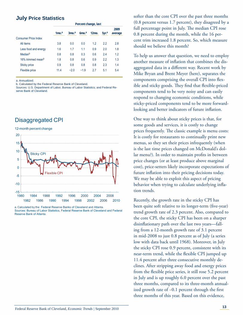
softer than the core CPI over the past three months (0.8 percent versus 1.7 percent), they disagreed by a full percentage point in July. Th e median CPI rose 0.8 percent during the month, while the 16 per-cent trim increased 1.8 percent. So, which measure should we believe this month?
To help us answer that question, we need to employ another measure of infl ation that combines the dis-aggregated data in a diff erent way. Recent work by Mike Bryan and Brent Meyer (here), separates the components comprising the overall CPI into fl ex-ible and sticky goods. Th ey fi nd that fl exible-priced components tend to be very noisy and can easily respond to changing economic conditions, while sticky-priced components tend to be more forward-looking and better indicators of future infl ation.
One way to think about sticky prices is that, for some goods and services, it is costly to change prices frequently. Th e classic example is menu costs: It is costly for restaurants to continually print new menus, so they set their prices infrequently (when is the last time prices changed on McDonald’s dol-lar menu?). In order to maintain profi ts in between price changes (or at least produce above marginal cost), price-setters likely incorporate expectations of future infl ation into their pricing decisions today. We may be able to exploit this aspect of pricing behavior when trying to calculate underlying infl a-tion trends.
Recently, the growth rate in the sticky CPI has been quite soft relative to its longer-term (fi ve-year) trend growth rate of 2.3 percent. Also, compared to the core CPI, the sticky CPI has been on a sharper disinfl ationary path over the last two years—fall-ing from a 12-month growth rate of 3.1 percent in mid-2008 to just 0.8 percent as of July (a series low with data back until 1968). Moreover, in July the sticky CPI rose 0.9 percent, consistent with its near-term trend, while the fl exible CPI jumped up 11.4 percent after three consecutive monthly de-clines. After stripping away food and energy prices from the fl exible price series, it still rose 5.2 percent in July and is up roughly 6.0 percent over the past three months, compared to its three-month annual-ized growth rate of −0.1 percent through the fi rst three months of this year. Based on this evidence,
-15
-10
-5
0
5
10
15
20
19801982
19841986
19881990
19921994
19961998
20002002
20042006
20082010
12-month percent change
Sticky CPI
Flexible CPI
Disaggregated CPI
a. Calculated by the Federal Reserve Banks of Cleveland and Atlanta.Sources: Bureau of Labor Statistics, Federal Reserve Bank of Cleveland and Federal Reserve Bank of Atlanta.
July Price Statistics Percent change, last 1mo.a 3mo.a 6mo.a 12mo. 5yr.a
2009 average
Consumer Price Index All items 3.8 0.0 0.0 1.2 2.2 2.8 Less food and energy 1.6 1.7 1.1 0.9 2.0 1.8 Medianb 0.8 0.8 0.3 0.6 2.4 1.2 16% trimmed meanb 1.8 0.8 0.6 0.9 2.2 1.3
Sticky price 0.9 0.8 0.8 0.8 2.3 1.4Flexible price 11.4 −2.0 −1.9 2.7 5.1 5.4
a. Annualized.b. Calculated by the Federal Reserve Bank of Cleveland.Sources: U.S. Department of Labor, Bureau of Labor Statistics; and Federal Re-serve Bank of Cleveland.

14Federal Reserve Bank of Cleveland, Economic Trends | September 2010
it seems that the price increases from the more vola-tile fl exible price series have been putting upward pressure on some underlying infl ation measures, while the sticky-price series has continued on its subdued (but positive) infl ation trend.
For more on Mike Bryan and Brent Meyer’s work, visit http://www.clevelandfed.org/research/commentary/2010/2010-2.cfm.
0
1
2
3
4
5
6
1990 1992 1994 1996 1998 2000 2002 2004 2006 2008 2010
12-month percent change
Sticky Versus Core CPI
Sticky CPI
Source: Bureau of Labor Statistics, Federal Reserve Bank of Cleveland and Federal Reserve Bank of Atlanta.
Core CPI

15Federal Reserve Bank of Cleveland, Economic Trends | September 2010
Regional ActivitySmall Business Lending
08.20.10by Robert J. Sadowski
Although the U.S. economy stabilized in the mid-dle of 2009 and is now expanding at a moderate pace, many small business owners who want to take advantage of growth opportunities report having diffi culty obtaining credit for equipment purchases, operating capital, or committing to strategic ac-quisitions. From the perspective of the fi rm owner, bankers appear to be reluctant to lend regardless of credit history or ability to repay. In turn, bankers say that while lending standards remain tight, they have the capital and are anxious to lend, but de-mand is low. Bankers often cite as evidence the use of credit lines, which is well below historic norms.
Call Reports—one of the periodic reports all regu-lated fi nancial institutions are required to fi le with their respective regulators (and offi cially named the Report of Condition and Income)—contain infor-mation that can be used to gauge the state of small business lending across the United States and in the Fourth District. One item institutions report is loans to small businesses and small farms. Examin-ing those data shows that nationwide, total out-standing loan volume to small businesses declined 5.8 percent, or $37 billion, between June 2008 and March 2010, with the number of loans dropping by almost 14 percent. Looking at individual loan categories shows that those with original amounts between $100,000 and $250,000 declined the most in terms of outstanding volume (9.6 percent).
Nationally, community banks and large banks hold the highest shares of small business loans in terms of volume. (Banks are usually categorized by total asset value. Community banks have less than $1 billion; regional banks have $1 billion to $10 billion; large banks more than $10 billion; and mega banks more than $400 billion.) Community bankers reported that their small business loan portfolios dropped by 6.2 percent between 2008 and 2010, with loans under $100,000 posting the largest outstanding volume decline at 13.4 percent. Th is suggests that it may be microbusiness owners
450
475
500
525
550
575
600
625
650
2001 2002 2003 2004 2005 2006 2007 2008 2009 2010
Billions of dollars
Small Business Lending: All Banks
Source: Bank Call Reports (Reports of Condition and Income).
180
185
190
195
200
205
210
215
220
225
2001 2002 2003 2004 2005 2006 2007 2008 2009 2010
Billions of dollars
Small Business Lending: All Community Banks
Source: Bank Call Reports (Reports of Condition and Income).

16Federal Reserve Bank of Cleveland, Economic Trends | September 2010
(under 10 employees) who are actually experiencing the most diffi culty obtaining credit. Loans aimed at microbusinesses are typically in the range of $5,000 to $35,000. Small business lending at large banks declined by 4.2 percent during this same time pe-riod; however, loan volume with original amounts of less than $100,000 rose by 1.7 percent.
Th e pattern is similar for lending to all fi rms. Be-tween June 2008 and March 2010, total outstand-ing commercial and industrial loan volume held by all banks nationally declined by 17.3 percent, or about $193 billion. While similar, these fi gures mean that, on a relative basis, small business lend-ing has not declined as much as overall commercial and industrial lending.
Th e Federal Reserve Board’s Senior Loan Offi cer Survey is a useful tool for monitoring business loan supply and demand. According to the July 2010 survey results, about 4 percent of bankers, on net, said that loan demand by small fi rms was moder-ately weaker on a quarter-over-quarter basis. While the trend has been growing less negative during the past year, many business owners remain un-certain about the strength and sustainability of the economic recovery and are less inclined to borrow. Uncertainty is one of the primary reasons given by the majority of business owners we spoke with in the Fourth District for why they are not increasing current or near-term capital spending relative to actual spending during the past 12 months.
On the supply side, 9 percent of bankers, on net, said that credit standards for approving applications for commercial and industrial loans or credit lines have eased somewhat on a quarter-over-quarter basis. However, the improvement has been con-centrated at large domestic banks. Th is means that tight credit standards remain fi rmly in place for the most part, and they are expected to be tighter than their long-run average level for the near term, especially for below-investment-grade fi rms.
Looking at call report data fi led by Fourth Dis-trict bankers, we found that it is more diffi cult to discern meaningful trends due to the many bank acquisitions and charter consolidations in recent years. Report data indicate that between June 2008 and March 2010, total outstanding loan volume
650
750
850
950
1,050
1,150
2001 2002 2003 2004 2005 2006 2007 2008 2009 2010
Outstanding Commercial and IndustrialLoan Volume: All Banks
Billions of dollars
Source: Bank Call Reports (Reports of Condition and Income).
Change in Demand for Commercial and Industrial Loans from Small Firms
Net percentage of respondents (stronger minus weaker)
20102009200820072006200520042003200220012000
Source: Federal Reserve Board /Haver Analytics.
40
20
0
-20
-40
-60
-80

17Federal Reserve Bank of Cleveland, Economic Trends | September 2010
to small businesses by all District banks rose 7.0 percent, or about $4 billion. However, a substantial amount of the increase can be attributed to one large District bank that consolidated two out-of-District bank charters under a single Ohio bank charter at the beginning of the fourth quarter 2009.
Fourth District community banks reported that lending to small fi rms has been on a downward trend since June 2006. In fact, between 2006 and 2010, outstanding volume declined by over $500 million, or about 6 percent. Th e under-$100,000 loan category showed the largest volume drop at 18.5 percent, with the number of loans in this category falling by more than 21 percent. One activity we have recently undertaken in the District is to discuss lending conditions with small business owners through meetings and Beige Book con-tacts. Th ese interactions provide us with anecdotal evidence regarding access to credit by small fi rms. Information obtained from these interactions again points to the microbusiness owner as experiencing the greatest eff ect of tight credit standards. Many manufacturers reported that while they are en-countering some diffi culties in credit markets, their “very small“ suppliers and customers are experienc-ing far more diffi culty obtaining a loan, or they are denied credit altogether.
Th ere is little doubt as to the substantial pullback in lending to small businesses nationally and in the Fourth District. Anecdotal information suggests that until business owners are more confi dent in the sustainability of a robust economic recovery, credit demand will remain subdued. Even if demand does begin to pick up, the supply of credit may be more limited than before the recession. Many bankers do not anticipate any loosening of credit standards for the foreseeable future, and they tell us that current standards for loan applicants are the new norm.
Tightening Commercial and Industrial Loan Standards for Small FirmsNet percentage of respondents (tightened minus eased)
20102009200820072006200520042003200220012000
Source: Federal Reserve Board /Haver Analytics.
75
50
25
0
-25
8.0
8.2
8.4
8.6
8.8
9.0
9.2
2001 2002 2003 2004 2005 2006 2007 2008 2009 2010
Billions of dollars
Small Business Lending: Fourth District Community Banks
Source: Bank Call Reports (Reports of Condition and Income).

18Federal Reserve Bank of Cleveland, Economic Trends | September 2010
Economic Trends is published by the Research Department of the Federal Reserve Bank of Cleveland.
Views stated in Economic Trends are those of individuals in the Research Department and not necessarily those of the Fed-eral Reserve Bank of Cleveland or of the Board of Governors of the Federal Reserve System. Materials may be reprinted provided that the source is credited.
If you’d like to subscribe to a free e-mail service that tells you when Trends is updated, please send an empty email mes-sage to [email protected]. No commands in either the subject header or message body are required.
ISSN 0748-2922