format research double page spread
TRANSCRIPT

This double page spread has been taken from the inside of an nme magazine. It is based on the main cover line from the cover, Florence is positioned in a confident pose with a direct mode of address looking directly into the camera, this portrays dominance and authority as she is also at a high level on the page. Furthermore, rule of thirds has been incorporated in the double page spread as Florence is towards the left hand side of the photo and not centre, this makes it more visually appealing. The ‘USA text in the background helps to highlight Florence's achievements and the bold, large font has been used for emphasis. Although the story is about how well she is doing in America the use of the British colours in the cloth that she is sitting on reinforces the fact that she is still patriotic and is proud to be British. Moreover, it is the only colour on the page making it stand out to readers.
The image merges in with the text section of the double page spread, this makes it well spread out and easy to read. Even though the image portrays a strong independent women the font used is elegant and feminine, this contrasts with the image and reflects on the idea of there being two sides to Florence. The article starts with a rhetorical question which engages the readers attention and makes them want to read on. The drop cap found on the page adds characteristic to the text, furthermore because it is the same size and boldness of the font as the cover line it encourages readers to start reading the article, they are drawn to it as it is the same font, also it is the start to a pull quote grabs the readers attention as well.
The by line underneath the title is in a large font and immediately makes the readers want to find out the answer to the rhetorical question. Language used is not sophisticated and formal, for example ‘The gap-toothed gagmeister virtually leaps out his chair in order to proffer his congratulations before the closing credits role...’ this use of lexis would not be expected in a more serious magazine and it reflects the alternative music that the magazine represents, with the unique use of words. Overall the magazine has been able to target the audience with features that will appeal to the younger generation. Furthermore, a brand has been created with continued use of colour with similar layout and font.
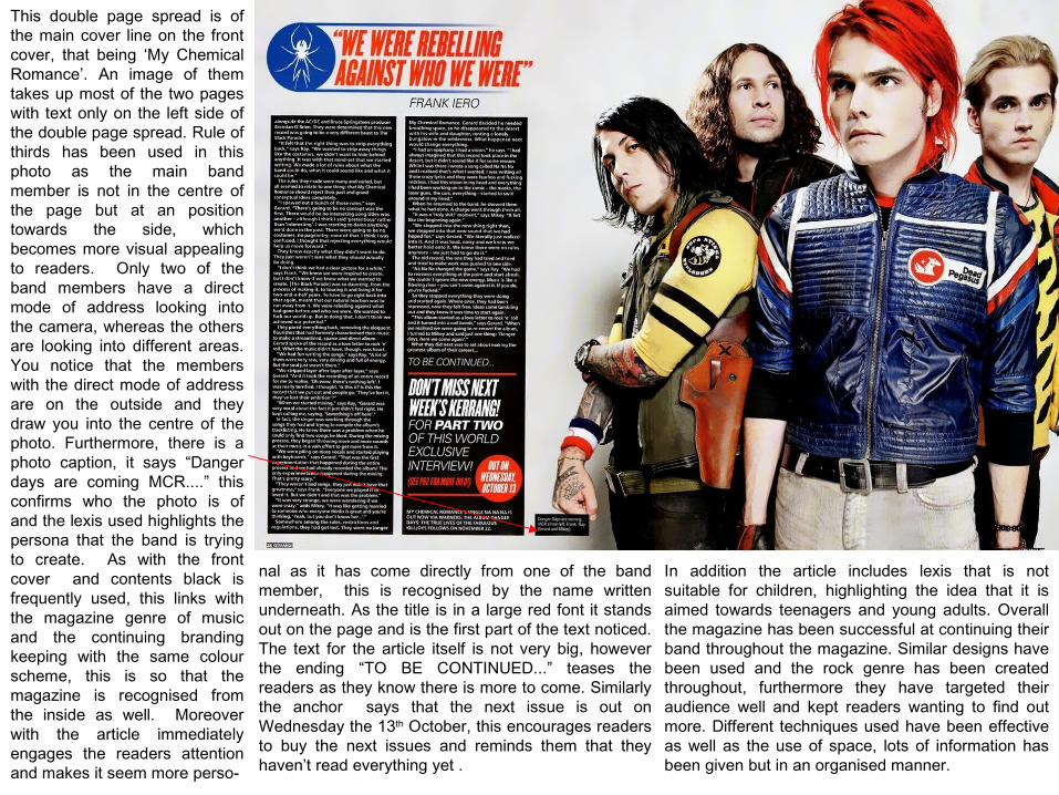
This double page spread is of the main cover line on the front cover, that being ‘My Chemical Romance’. An image of them takes up most of the two pages with text only on the left side of the double page spread. Rule of thirds has been used in this photo as the main band member is not in the centre of the page but at an position towards the side, which becomes more visual appealing to readers. Only two of the band members have a direct mode of address looking into the camera, whereas the others are looking into different areas. You notice that the members with the direct mode of address are on the outside and they draw you into the centre of the photo. Furthermore, there is a photo caption, it says “Danger days are coming MCR....” this confirms who the photo is of and the lexis used highlights the persona that the band is trying to create. As with the front cover and contents black is frequently used, this links with the magazine genre of music and the continuing branding keeping with the same colour scheme, this is so that the magazine is recognised from the inside as well. Moreover with the article immediately engages the readers attention and makes it seem more perso-
nal as it has come directly from one of the band member, this is recognised by the name written underneath. As the title is in a large red font it stands out on the page and is the first part of the text noticed. The text for the article itself is not very big, however the ending “TO BE CONTINUED...” teases the readers as they know there is more to come. Similarly the anchor says that the next issue is out on Wednesday the 13th October, this encourages readers to buy the next issues and reminds them that they haven’t read everything yet .
In addition the article includes lexis that is not suitable for children, highlighting the idea that it is aimed towards teenagers and young adults. Overall the magazine has been successful at continuing their band throughout the magazine. Similar designs have been used and the rock genre has been created throughout, furthermore they have targeted their audience well and kept readers wanting to find out more. Different techniques used have been effective as well as the use of space, lots of information has been given but in an organised manner.

is of a choir composer and is useful in improving the article structure. It is still very formal and organised but it reduces the continuous text that older readers may enjoy. Similarly, there is an enlarge part of the text against a blank box of colour, this makes it stand out to the readers and can be seen as a key sentence to the article. Moreover because it stands out on the page it can be read before the whole article and demonstrates the sophisticated lexis which is used throughout the magazine. The genre of the music is reflected well by the whole double page spread layout, it is simple meaning it is not overcrowded, like the music which is elegant and simple. The music is taken seriously so the text on the page is made sure that it is relevant and important, not going off topic, this ultimately keeps the readers engaged and suits the target audience as they do not want to read information that is not relevant to the music. The magazine has also made sure that a professional finish has been created with a colour scheme of brown, white and black, overall a branding has been developed with the repetitive use of font and simplistic layout.
This double page spread unfortunately is not from the original front cover magazine but represents the music genre well. The layout immediately has differences from the others with the image taking up the top halve of the two pages and the text on the bottom half. The article title stands out against the background part to the image, it is in a large font giving the magazine a sophisticated feel. Furthermore, the by line underneath the title is important in giving readers a brief overview of what the article is about. The photo caption is also
written in detail making it clear what the image is of and what the article is based on. Starting with a drop cap readers know where the article starts and are immediately drawn towards it as the letter is larger and bolder than the rest. Moreover, it begins with a quote which is a rhetorical question, this engages the readers as they can question their own opinions on classical music and what the article is about. A smaller image is used to split up the text on the left hand side of the page, the image