forecasting - it divisionpeople.wku.edu/bradley.fink680/class/cit492/mod4.pdf · forecasting 1...
TRANSCRIPT

2013
Brad Fink
CIT 492
3/20/2013
FORECASTING
Operations Management

FORECASTING
1
3/20/2013
Executive Summary
Woodlawn hospital needs to forecast type A blood so there is no shortage for the week of 12
October, to correctly forecast, a 3-week moving average, a 3-week weighted moving average and
an exponential smoothing forecast will be completed.
An undisclosed business which will be referred to as case 4.2 has provided data for a plotted
graph to determine any trends, cycles or random variations in sales. Again a moving average and
weighted moving average will be utilized to see the differences.
Telco Batteries, Inc., has provided monthly sales for the current year. The General Manager
wants a simple plot, a Naïve forecast, a moving and weighted moving forecast for the month of
January of the next year.
The Omaha Emergency Medical Clinic has given the past six weeks of patient demand and
would like to see what a forecast in week seven may be. A weighted moving forecast will be
performed to give the best possible data available.
Dell uses the CR5 computer chip in some of their laptops. With twelve months of data on the
price of this chip, Dell would like to see a 2-month and 3-month moving average plotted on a
graph to determine which is best, as well as a exponential smoothing average.
Coffee Palace’s manager, Joe Felan has determined that the price on a cup of Mocha Latte
influences the sales, based on his observations, Joe wants to know what the number of cups sold
might be if a cup costs $2.80.
Marty and Polly Starr runs a bed and breakfast with a bar. The number of guest for the past four
weeks have be provided and the Starr’s would like to know what to expect in bar sales if the
number of guest reaches twenty.

FORECASTING
2
3/20/2013
Contents
Woodlawn Hospital .........................................................................................................................3
Case 4.2 ............................................................................................................................................6
Telco Batteries, Inc. .........................................................................................................................9
Omaha Emergency Medical Clinic ................................................................................................13
Dell .................................................................................................................................................15
Coffee Palace .................................................................................................................................18
Marty & Polly Starr………………........……………………………...................…......................21
Summary……...…………………………………………..............................................................23
FORECASTING
3
3/20/2013
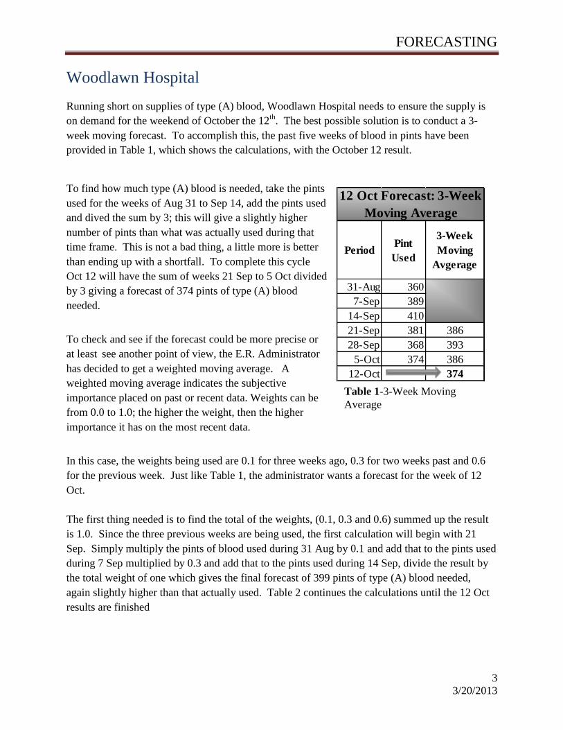
PeriodPint
Used
3-Week
Moving
Avgerage
31-Aug 360
7-Sep 389
14-Sep 410
21-Sep 381 386
28-Sep 368 393
5-Oct 374 386
12-Oct 374
12 Oct Forecast: 3-Week
Moving Average
Woodlawn Hospital
Running short on supplies of type (A) blood, Woodlawn Hospital needs to ensure the supply is
on demand for the weekend of October the 12th
. The best possible solution is to conduct a 3-
week moving forecast. To accomplish this, the past five weeks of blood in pints have been
provided in Table 1, which shows the calculations, with the October 12 result.
To find how much type (A) blood is needed, take the pints
used for the weeks of Aug 31 to Sep 14, add the pints used
and dived the sum by 3; this will give a slightly higher
number of pints than what was actually used during that
time frame. This is not a bad thing, a little more is better
than ending up with a shortfall. To complete this cycle
Oct 12 will have the sum of weeks 21 Sep to 5 Oct divided
by 3 giving a forecast of 374 pints of type (A) blood
needed.
To check and see if the forecast could be more precise or
at least see another point of view, the E.R. Administrator
has decided to get a weighted moving average. A
weighted moving average indicates the subjective
importance placed on past or recent data. Weights can be
from 0.0 to 1.0; the higher the weight, then the higher
importance it has on the most recent data.
In this case, the weights being used are 0.1 for three weeks ago, 0.3 for two weeks past and 0.6
for the previous week. Just like Table 1, the administrator wants a forecast for the week of 12
Oct.
The first thing needed is to find the total of the weights, (0.1, 0.3 and 0.6) summed up the result
is 1.0. Since the three previous weeks are being used, the first calculation will begin with 21
Sep. Simply multiply the pints of blood used during 31 Aug by 0.1 and add that to the pints used
during 7 Sep multiplied by 0.3 and add that to the pints used during 14 Sep, divide the result by
the total weight of one which gives the final forecast of 399 pints of type (A) blood needed,
again slightly higher than that actually used. Table 2 continues the calculations until the 12 Oct
results are finished
Table 1-3-Week Moving
Average

FORECASTING
4
3/20/2013
Period Pint Used Weights3-Week
WMA
31-Aug 360
7-Sep 389
14-Sep 410
21-Sep 381 0.1 399
28-Sep 368 0.3 391
5-Oct 374 0.6 376
12-Oct 373
12 Oct Forecast: 3-Week
Weighted Moving Average
Woodlawn Hospital .
As shown in the Table to the left, the 12 Oct forecast
has provided a result of 373 pints of type (A) blood
needed by using the 3-week weighted moving
average. To recap, the formula used was:
(381*0.1) + (368*0.3) + (374*0.6) 1 = 373
Table 2 -3-week Weighted Moving
Average/Forecast
To get a visual idea of how this looks the E.R. administrator wants a graph, but does not want to
show his superiors extreme spikes and drops. An exponential smoothing graph showing the
forecast will do exactly that.
Again a weight is needed, for this graph the weight of 0.2 is being used. The formula which will
capture the smoothing average is ( ) . In which, is the new
forecast, is the previous period’s forecast, is the smoothing (weighted) constant of (0.2),
and is the previous period’s actual demand. Easier yet, for those who despise math, the
new forecast = the last period forecast + 0.2 *(last period actual demand – last period forecast).
Figure 1 shows the smoothing graph for Woodlawn Hospital.

FORECASTING
5
3/20/2013
PeriodPint
Used
Smoothing
Forecast
31-Aug 360
7-Sep 389 360
14-Sep 410 366
21-Sep 381 375
28-Sep 368 376
5-Oct 374 374
12-Oct 374
Woodlawn Hospital
Figure 1 –Woodlawn Hospital’s Smoothing Graph
Figure 1 is represented using the data from Table 3. Notice the forecast could not be done on the
first week; the week of 7 Sep forecast will begin with the previous week’s actual demand. Using
the formula and working down the formula will look as
so: 14 Sep forecast equals 360 + 0.2 (31 Aug pints
actually used – 7 Sep forecast, or (14 Sep forecast =
360+0.2 (389-360).
Table 3 –Smoothing Average
330
340
350
360
370
380
390
400
410
420
31-A
ug
7-S
ep
14-S
ep
21-S
ep
28-S
ep
5-O
ct
12-O
ct
Pin
ts U
sed
Smoothing Forecast
Pints Used
Smoothing Forecast

FORECASTING
6
3/20/2013
0
2
4
6
8
10
12
14
1 2 3 4 5 6 7 8 9 10 11
Dem
an
d
Year
Trend, Cycle, Random Variation Chart
Trendline
Demand
Case 4.2
Having been asked to plot a graph on data which has been provided in Table 4, whether or not
any trends, cycles or random variations has also been requested. Taking the data that was
providing, an easy graph was completed and is displayed in Figure 2.
Table 4 –Data provided for graphing
The starting point
(year 1), has a
reoccurring cycle
at the end of year
11 and beginning
of year 12, this
pattern appears to
cycle every 12
years. All other
graphing data
shows no real
trends or cycles,
there are a few
random variations
but nothing out of
the ordinary.
Along with the graph in Figure2, a 3-Year moving forecast has also been requested. While
looking at the 3-Year moving forecast below Figure 3, take notice how it has smoothed the
appearance of the actual demand forecast. To achieve this 3-Year moving average had to be
completed, which can be seen in Table inside Figure 3.
Taking the sum of the demand in years 1, 2 and 3 then divide that by three, the result will be year
four’s moving average. To complete this simply move down the line, the important thing to pay
attention to is the moving average is equal to the previous 3 year demands divided by 3, Table 5
shows the completed calculations.
Year 1 2 3 4 5 6 7 8 9 10 11
Demand 7 9 5 9 13 8 12 13 9 11 7
Figure 2 –Trend Chart

FORECASTING
7
3/20/2013
Case 4.2
Figure 3 -3 Year Moving Average & Forecast
The last forecast needed to weigh all options is the weighted average. By placing a weight
standard on each year’s demand, a forecast may seem more realistic than that of the 3-Year
moving forecast. The weights associated with the demands normally are numbers ranging 0 to
1.0, with the biggest number being associated with the nearest month, since a 3-Year average is
still in effect, there will be three different weighted numbers. The predetermined numbers given
are (0.1, 0.3 and 0.6). Again using the formula (0.6*last month demand)+(0.3*demand 2 months
ago)+(0.1*demand 3 months ago) / 1, which is represented in Figure 4.
After doing all the equations, the weighted average can then be placed into the graph in Figure 3.
The weighted average that is placed into the graph will be referred to as the weighted forecast in
Figure 4.
Taking a good look at all three graphs, the Trend graph, 3-Year moving forecast and the
weighted forecast, the weighted forecast gives a better depiction of a good accurate forecast.
Following the green graphing line, it is not only a medium of the actual demand and the moving
1 2 3 4 5 6 7 8 9 10 11 12
Year 1 2 3 4 5 6 7 8 9 10 11 12
Demand 7 9 5 9 13 8 12 13 9 11 7
Moving Forecast 7 8 9 10 11 11 11 11 9
0
2
4
6
8
10
12
14
Demand
3 Year Moving Forecast

FORECASTING
8
3/20/2013
Case 4.2
forecast. Notice that it is not as smooth as the 3-Year forecast and yet it does not give a presence
of drastic declines as does the actual demand.
Taking a good look at all three graphs, the Trend graph, 3-Year moving forecast and the
weighted forecast, the weighted forecast gives a better depiction of a good accurate forecast.
Following the green graphing line, it is not only a medium of the actual demand and the moving
forecast. Notice that it is not as smooth as the 3-Year forecast and yet it does not give a presence
of drastic declines as does the actual demand.
Figure 4 –Weighted Forecast
1 2 3 4 5 6 7 8 9 10 11 12
Trend 1 2 3 4 5 6 7 8 9 10 11
Demand 7 9 5 9 13 8 12 13 9 11 7
Moving Forecast 7 8 9 10 11 11 11 11 9
Weighted 6 8 11 10 11 12 11 11 8
0
2
4
6
8
10
12
14
Dem
and
Time in Years
Weighted Forecast
FORECASTING
9
3/20/2013
0
5
10
15
20
25
Jan
Feb
Mar
Apr
May Jun
Jul
Aug
Sep
Oct
Nov
Dec
Sale
s
Sales Chart
Sales
Telco Batteries
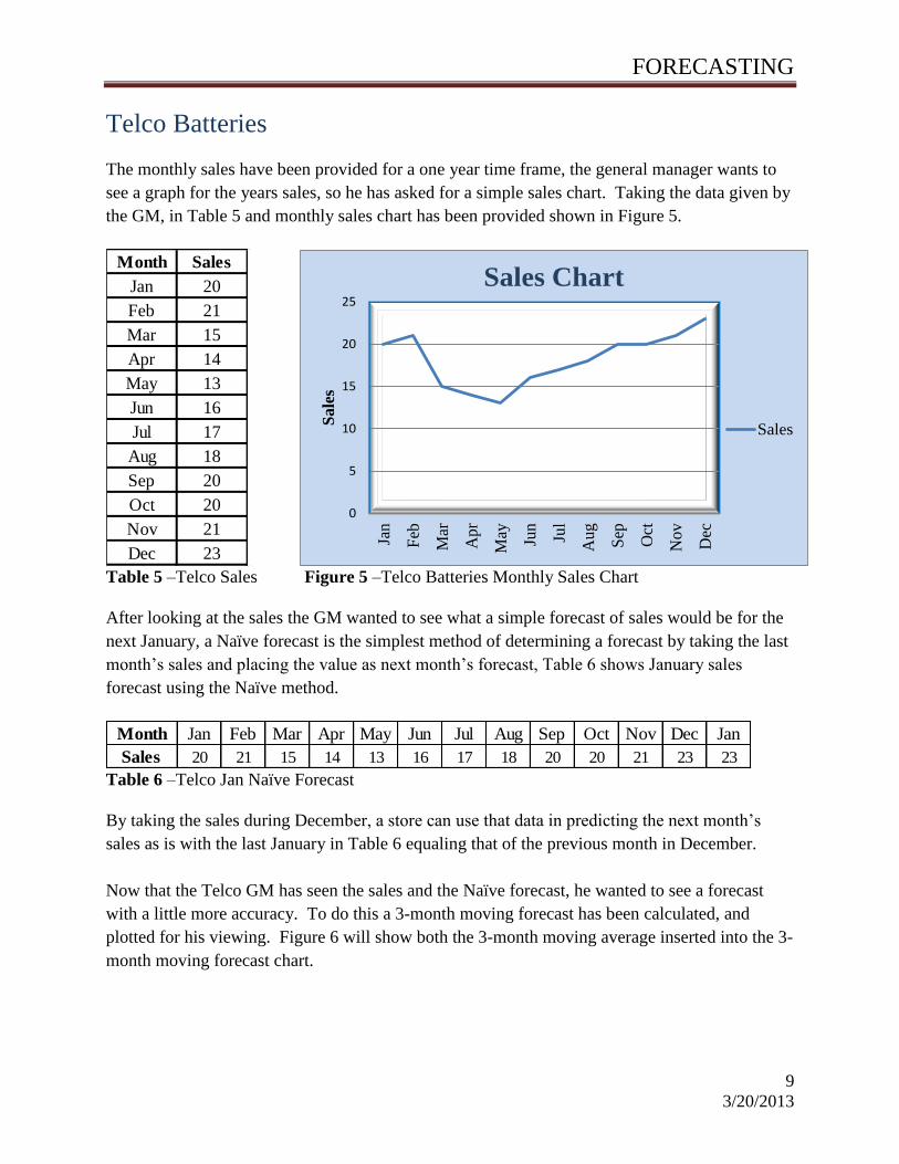
The monthly sales have been provided for a one year time frame, the general manager wants to
see a graph for the years sales, so he has asked for a simple sales chart. Taking the data given by
the GM, in Table 5 and monthly sales chart has been provided shown in Figure 5.
Table 5 –Telco Sales Figure 5 –Telco Batteries Monthly Sales Chart
After looking at the sales the GM wanted to see what a simple forecast of sales would be for the
next January, a Naïve forecast is the simplest method of determining a forecast by taking the last
month’s sales and placing the value as next month’s forecast, Table 6 shows January sales
forecast using the Naïve method.
Table 6 –Telco Jan Naïve Forecast
By taking the sales during December, a store can use that data in predicting the next month’s
sales as is with the last January in Table 6 equaling that of the previous month in December.
Now that the Telco GM has seen the sales and the Naïve forecast, he wanted to see a forecast
with a little more accuracy. To do this a 3-month moving forecast has been calculated, and
plotted for his viewing. Figure 6 will show both the 3-month moving average inserted into the 3-
month moving forecast chart.
Month Sales
Jan 20
Feb 21
Mar 15
Apr 14
May 13
Jun 16
Jul 17
Aug 18
Sep 20
Oct 20
Nov 21
Dec 23
Month Jan Feb Mar Apr May Jun Jul Aug Sep Oct Nov Dec Jan
Sales 20 21 15 14 13 16 17 18 20 20 21 23 23

FORECASTING
10
3/20/2013
Telco Batteries
Figure 6 –Telco Batteries 3-Month Moving Average/Forecast
By taking the sum of sales for Jan(20), Feb(21) and Mar(15) that value needs to be divided by
three, this will give the 3-month moving average for April, this will continue until the end, so the
Jan 3-month forecast will be (Oct + Nov + Dec) divided by 3, or (20+21+23)/3 which will give
Jan a 3-month moving forecast of 21.
Now that the GM has seen how the 3-month moving forecast correlates with the actual sales, he
has also asked to see what a 6-month forecast would look like, To help in accomplishing this
some weights have been assigned to each six previous months, these weighted numbers will be
within a normal weight range of zero to one.
In the case of Telco Batteries, the weights that correspond to each month is (.1, .1, .1, .2, .2
and .3); the first series of 0.3 being applied to the most recent month and working down to 0.1
that applies to the farthest month. All these weights summed up have a value of 1.0 which will
be used in the division of the formula.
Figure 7 will show the data table along with the forecast chart to show a more precise upward
trend compared to that of the 3-month moving forecast in Figure 6. To reach these results the
weights are multiplied to corresponding sales for that month. An example of how this is achieved
0
5
10
15
20
25
Mo
nth Jan
Feb
Mar
Ap
r
May Jun
Jul
Au
g
Sep
Oct
No
v
De
c
Jan
3-Month Moving Forecast
Actual Sales 3-Month Moving
Month Sales 3-Month
Jan 20 Moving
Feb 21 Average
Mar 15
Apr 14 19
May 13 17
Jun 16 14
Jul 17 14
Aug 18 15
Sep 20 17
Oct 20 18
Nov 21 19
Dec 23 20
Jan 21

FORECASTING
11
3/20/2013
Telco Batteries
the following formula is used; (the actual sales for
Jan*0.1)+(Feb*0.1)+(Mar*0.1)+(Apr*0.2)+(May*0.2)+(Jun*0.3)/1. Remember that the divisor
was the sum of all numbers of weights. This will be the results for the 6-month weighted
forecast for the month of July, the next forecast for August will be the same except the formula
will skip the sales of January and start with February.
Figure 7 -6-Month Weighted Average and Forecast
With the exception of the January forecast being off slightly between the 3-month moving
forecast and the weighted forecast there is really no difference, this is why the GM has requested
a smoothing forecast, this should give him what the forecast suggests, a smoothing effect to the
forecast from the two previous forecasts already done. Figure 8 will show both data table and
chart to show Telco Batteries smoothing forecast chart.
Mar Apr May Jun Jul Aug Sep Oct Nov Dec Jan
Sales 20 21 15 14 13 16 17 18 20 20 21 23
6-Month Weighted Average 15.8 15.9 16.2 17.3 18.2 19.4 20.6
0
5
10
15
20
25
6-Month
Weighted
Forecast

FORECASTING
12
3/20/2013
Telco Batteries
Figure 8 –Telco Batteries Smoothing Average and Forecast Chart
While just looking at Figure 8, the GM has noticed the forecast is much smoother while giving
almost the same exact forecast as in the prior two forecast, except the smoothing forecast has
both a gradual decline in sales forecasts as well as a gradual spike in sales. With the smoothing
forecast complete he needs to see a trend projection.
Figure 8 shows the same forecasting chart as Figure 7 with the addition of the trend line based
off the monthly sales, the trend line for Telco Batteries shows a slow but gradual positive trend
in sales for the year.
0
5
10
15
20
25
Jan
Feb
Mar
Ap
r
May Jun
Jul
Au
g
Sep
Oct
No
v
Dec Jan
Sa
les
Smoothing Forecast with Trend Line
Sales
Smoothing
Trend Line

FORECASTING
13
3/20/2013
Omaha Emergency Medical Clinic
Marc Schniederjans needs a forecast the patient demand for week seven using the data from
weeks 1 thru 6. After looking at all options, the weighted average/forecast will present more
emphasis on the data since the data given is so short. The data that Marc has given can be seen
in Table 5.
The values in the forecast Table 6 will be for week seven, also this will be determined from a 4-
Week weighted average. The weighted numbers for the Table 5 data are (0.333 on the present
period, 0.25 one period ago, 0.25 two periods ago, and 0.167 three periods ago).
Table 6 –Week 7 Weighted Forecast
After completing the 7-Week weighted forecast, a confirmation check is performed with
weighted number extremely out of the normal weighted range of 0 to 1.0, the number used were
(20 replacing 0.333, 15 replacing 0.25, 15 replacing 0.25 and 10 replacing 0.167) the results are
presented in Table 7.
WEEK
ACTUAL
NO. OF
PATIENTS
1 65
2 62
3 70
4 48
5 63
6 52
WEEK
ACTUAL
NO. OF
PATIENTS
Weighted
1 65
2 62
3 70
4 48
5 63 0.167 0.25 0.25 0.333 1
6 52 61
7 55
Present Total3 Periods
Ago
2 Periods
Ago
1 Period
Ago
Table 5 –
Data for a
Weighted
Forecast
Week 7 Forecast based of the
weighted numbers (0.33, 0.25, 0.25
and 0.167)

FORECASTING
14
3/20/2013
Omaha Emergency Medical Clinic
Using the numbers outside the normal weighted range the new 7 week forecast shows a 6,066%
increase which is substantially similar to the total weights periods of 60.
Now that the integrity check on weighted number beyond the normal range is complete a
different set of numbers are used, this time within the normal weighted range. The numbers
being used to replace the original respectively are, (0.40, 0.30, 0.20, and 0.10). Table 8 will
show the results of the changes.
Since all number are within the normal weighted range in Table 8, and with such minor
differences, the forecast is approximately 5% greater, which coincides with the data given, the
difference is only off by 2 forecasted patients.
WEEK
ACTUAL
NO. OF
PATIENTS
Weighted
1 65
2 62
3 70
4 48
5 63 20 15 15 10 60
6 52 3640
7 3425
Present Total3 Periods
Ago
2 Periods
Ago
1 Period
Ago
WEEK
ACTUAL
NO. OF
PATIENTS
Weighted
1 65
2 62
3 70
4 48
5 63 0.4 0.3 0.2 0.1 1
6 52 62
7 57
Present Total3 Periods
Ago
2 Periods
Ago
1 Period
Ago
Total
Weighted
Periods
Table 8 –Weighted Forecast confirmation
check

FORECASTING
15
3/20/2013
MonthPrice
per Chip
Jan $1.80
Feb $1.67
Mar $1.70 $1.74
Apr $1.85 $1.69
May $1.90 $1.78
Jun $1.87 $1.88
Jul $1.80 $1.89
Aug $1.83 $1.84
Sep $1.70 $1.82
Oct $1.65 $1.77
Nov $1.70 $1.68
Dec $1.75 $1.68
Jan $1.73
2-
Month
Moving
Average
Dell
Dell Computers has been tracking the cost of the CR5 chip used in some of their laptops for the
past year, the tracking list has been provided and a 2-month moving average is needed as well as
plotting the information in a 2-month moving forecast, the data is provided in Table 9 with the 2-
month moving average.
In order to help Dell get the 2-month moving average, the values in
January and February are summed and divided by 2, this will be the
2-month moving average or forecast for the month of March. This
process will continue progressively until the months of November
and December, these two months will be for the next January. Table
9 displays the finished 2-month moving average which is needed in
order to do a plotted chart shown in Figure 9.
Figure 9 -2-Month Moving Forecast
Along with the 2-month moving average and forecast, Dell also needed to see what a 3-month
moving average and forecast chart would look like compared to the 2-month mmoving average
and forecast. Figure 10 shows Dell exactly what they need to help predict future cost of the CR5
computer chip.
$1.50
$1.55
$1.60
$1.65
$1.70
$1.75
$1.80
$1.85
$1.90
$1.95
Jan
Feb
Mar
Ap
r
May
Jun
Jul
Au
g
Sep
Oct
No
v
Dec
Jan
2-Month Moving Forecast
Price per Chip
2-MonthMoving
Average
Table 10 –2-Month
Moving Average

FORECASTING
16
3/20/2013
Dell
Figure 10 -3-Month Moving Forecast
The 3-month moving average is done with the same process as the 2-month average with the
exception that three months of values are added and the divided by three. Taking a look at the
difference between the two averages, it would appear that the 3-month moving average is just
slightly higher than that of the 2-month moving average. Since it is easier to predict a near term
forecast than it is for a farther out forecast, the 2-month average better predicts the cost of the
CR5 chips.
Dell has additionally requested an exponential smoothing forecast for each month. The weighted
numbers are within a normal weighted range. To do this each month will be calculated using
each set of numbers which are: ( =0.1, =0.3 and =0.5). In addition to these factors, the
beginning forcast for January will be $1.80. Table 11 will show the final calculations of the
smoothing forecast and using the Mean Absolute Deviation (MAD) formula, we will be able to
tell which weighted factor involved is best.
Using the formula for the forecast (New Forecast= Last forecast + (Actual Demand-Last
Forecast), the error can now be calculated by subtracting the new forecast from the actual
demand, if the value is a negative simply treat it as an absolute number.
Once all columns are completed, add all the values under the error column which will then be
divided by the number of periods, in this case twelve. Since the MAD computation has the
lowest value of $0.068, this will be the best smoothing forecast scenario, which is using the 0.5
weighted score number.
$1.50
$1.55
$1.60
$1.65
$1.70
$1.75
$1.80
$1.85
$1.90
$1.95
3-Month Moving Forecast
Price per Chip
2-MonthMoving
Average
3-Month Moving
Average

FORECASTING
17
3/20/2013
Dell
MonthPrice
per ChipForecast Error Forecast Error Forecast Error
Jan $1.80 $1.80 $0.00 $1.80 $0.00 $1.80 $0.00
Feb $1.67 $1.80 $0.13 $1.08 $0.13 $1.80 $0.13
Mar $1.70 $1.79 $0.09 $1.76 $0.06 $1.74 $0.04
Apr $1.85 $1.78 $0.07 $1.74 $0.11 $1.72 $0.13
May $1.90 $1.79 $0.11 $1.77 $0.13 $1.78 $0.12
Jun $1.87 $1.80 $0.07 $1.81 $0.06 $1.84 $0.03
Jul $1.80 $1.80 $0.00 $1.83 $0.03 $1.86 $0.06
Aug $1.83 $1.80 $0.03 $1.82 $0.01 $1.83 $0.00
Sep $1.70 $1.81 $0.11 $1.82 $0.12 $1.83 $0.13
Oct $1.65 $1.80 $0.15 $1.79 $0.14 $1.76 $0.11
Nov $1.70 $1.78 $0.08 $1.75 $0.05 $1.71 $0.01
Dec $1.75 $1.77 $0.02 $1.73 $0.02 $1.70 $0.05
$0.86 $0.86 $0.81
0.072 0.072 0.068
0.1 0.3 0.5
MAD (Total/12)
Table 11 - Exponential
Smoothing Chart using
weighted Numbers (0.1,
0.3 and 0.5)
Using MAD, the
Error total divided
by 12 rates 0.068
the best choice.

FORECASTING
18
3/20/2013
Coffee Palace
Joe Felan suspects that demand for mocha latte coffees depends on the price being charged.
Based on historical observations, Joe has gathered the following data, which show the numbers
of these coffees sold over six different price values. Using this data, Joe would like to know the
forecast if the price for a cup of coffee were $2.80. The data Joe has provided is in Table 12
below.
Using Table 12, the forecast will be determined by using a simple linear regression method based
off the price of coffee at $2.80.
The forecast will be performed in a few steps, so taking one step or mathematical equation at a
time will be the easiest way about it. First taking the data from Joe’s observation, an updated
Table will need to be done. Table 13 will help with formulating the steps.
To find the values for x², simply start from top to bottom under the price column and square that
particular value, for example 2.70² will be the first value for the x² column which is 7.29.
Continue down all 6 rows until complete. The next step is to find the xy value, by multiplying
the value in price by the value in number sold the xy value will be completed.
Now that all six rows in Table 13 are complete, the next phase is ready for calculation. By
adding all the values in the price column, the result is 19.55. For all following equations the
PRICENUMBER
SOLD
$2.70 760
$3.50 510
$2.00 980
$4.20 250
$3.10 320
$4.05 480
PRICE
(x)
NUMBER
SOLD (y)x² xy
2.70 760 7.29 2,052
3.50 510 12.25 1,785
2.00 980 4 1,960
4.20 250 17.64 1,050
3.10 320 9.61 992
4.05 480 16.4025 1,944
Total: 19.55 3,300 67.1925 9,783
Table 12 –Coffee
Palace
Historical
Data
Table 13 –x, y
Factor Chart

FORECASTING
19
3/20/2013
Coffee Palace
value for n will be the total number of observations which is six. Now that the value x and value
n as been determined, by using the next formula the value for can be computed.
= Value of dependent variable, (Sales), or ( ) a = y-axis intercept
b = Slope of regression line
x = Independent variable (2.80)
The next step is to find the mean average ( ) of all the prices, to do this add all six prices and
dive that sum by (n), the next equation will give the final result.
=
, or
= 3.26;
The next equation to be completed is finding the mean average of the number of cups sold, the
process is the same as the previous equation.
=
= 550;
To continue the data in Table 13 will be used to find the value of the slope of regression (b).
Taking the sum of (xy) and subtracting the total observations multiplied by ( ), divide that
value by the sum in x² minus the number of observation multiplied by the result will be that in
the equation below.
=
To find the value of the dependent variable follow the equation below, remember that the value
of (b) is a negative number.
a = -b = 550-(-277.628)*3.26, a = 1454.604
Now that all data needed is complete, the last step is to find the value of . This will be
calculated using the value of (a), (b) and the price per cup that Joe wants forecasted, (2.80). The
equation below will finish the last step before making a plotted forecast.
Sales = a + bx = 1454.604+ (-277.628) * 2.80, = 677
With all information available, a scatter plot can now show Joe the forecast based on the data he
provided. Looking at the forecast in Figure 11, it clearly proves Joe’s theory that the cost of a
cup of Mocha latte does in fact impact the sales. With the economy being what it is, there are

FORECASTING
20
3/20/2013
Coffee Palace
fewer customers willing to spend over $3.00 per cup, and while charging only $2.00, the profits
do not justify selling a cup at such a low price.
Figure 11 –Regression Forecast for Mocha Latte
Selling a cup of Mocha Latte at $2.80 will bring in gross sales of $1,895.60. The difference
between selling at $2.00 is $64, but after expenses, the overall profits suggests this would be a
good move, not to mention that selling a cup at $2.70 is by far the biggest gross sales of $2,052.
Joe should make this move in order to collect data for another analysis.
y = -277.63x + 1454.6
0
200
400
600
800
1000
1200
$0.00 $1.00 $2.00 $3.00 $4.00 $5.00
Cups Sold
Price Per Cup
Coffee Palace Mocha Forecast
Number sold
Regression
Line
677 Cups
sold at $2.80

FORECASTING
21
3/20/2013
Marty and Polly Starr
Marty and Polly Starr have provided the data in Table 14 that pertains to the number of guest
registered in their bed and breakfast. The data was obtained from a four week period which they
consider an appropriate time frame to forecast the bar sales for twenty guests. To give the Starr’s
an accurate forecast; a linear regression will be used.
Table 14 gives the base of information needed in order to perform all further calculations; Table
15 shows the progression of the required data. Notice that the bottom row gives the total of the
number of weeks, guest and bar sales, while the furthest two columns have multiplied the
number of guest and bar sales giving a result of (xy). Again the far right column has taken the
number of guest and squared it giving the values for (x²).
In a five step mathematical equation, the first step is to find the value of ( ), this is the mean
average for the number of guest, the following equation below will show what the process looks
like.
=
, or
= 15;
WeekGuests
(x)
Bar
Sales
(y)
1 16 $330
2 12 $270
3 18 $380
4 14 $380
WeekGuests
(x)
Bar
Sales
(y)
xy x²
1 16 $330 $5,280 256
2 12 $270 $3,240 144
3 18 $380 $6,840 324
4 14 $380 $5,320 196
Totals: 4 60 $1,360 $20,680 920
Table 14 -4-Week Guest
to Bar Sales
(x) and (y) factors for the Linear
Regression Calculations
Table 15 –Linear
Regression Chart

FORECASTING
22
3/20/2013
Marty and Polly Starr
Step two is to find the value of ( ), this will be the mean average for the bar sales, the equation
for this is below and can easily be followed.
=
= 340;
Step number three is to find the value of (b), this is known as the slope of the regression line,
which is the next equation below.
=
In step four, the y-axis intercept value will be determined by using the end results for ( , b and
) from steps one through three in the next equation below. After step four is complete, all
results can be seen in Figure 14.
a = -b = 340-(14)*15, a = 130
Using the formula a + bx, the linear regression that relates the bar
sales to the number of guest can represented by:
Sales = a + bx, or Sales = 130+ 14x
The Starr’s want to know what the sales in the bar might be if the
forecasted number of guests reaches twenty. Again, using the
equation above and substituting (x) for (20), the equation now becomes; 130 + (14 * 20) which
will give the estimated bar sales of $410. This equates to about $20.5 in bar sales per guest.
�� 𝟏𝟓
�� 𝟑𝟒𝟎
𝐛 𝟏𝟒
a = 130
Figure 14 -Linear
Regression Results

FORECASTING
23
3/20/2013
Summary
Forecasting happens in smart businesses worldwide on a daily basis, for determining how much
blood to order as in the case of Woodlawn Hospital. A poor forecast in this situation could result
in lost lives. Of course a good forecast is only as good as the data that is required to make such a
prediction. While there are several different ways to make a forecast, choosing the right method
is vital to the accuracy needed. With Woodlawn Hospital the best choice was a moving forecast
only because the information needed was good and accurate.
With past raw data, not only can a forecast can be produced, but looking at any trends in sales,
what the cycle of sales might look like or even looking into the random variations can be studied
by plotting the information on a graph. A good manager can then adjust any ordering of
products based on this type of information to avoid having an overstock of certain items which
could take valuable space for another item which traditionally sells better at a particular time of
year.
In many cases a linear regression method of forecasting can help business owners decide what
might happen to sales if the price per items were either raised or lowered, which was the case of
Joe from Coffee Palace. With linear regression forecasting future sales based on other forecasts
are possible to help determine sales in specific departments just like the Starr’s bed and
breakfast, in which the bar was one of the specific departments they were focusing on.
No matter which method of forecasting is being done, the bottom line is there is no good forecast
without a good foundation of data that is used for support. A good manager or analyst knows,
good data in equals’ good data out, not to mention, having a strong accurate record of past
history makes compiling that data much easier for forecasting, not to mention faster and more
understandable. Without the fore mentioned, forecasting truly is like trying to pick information
out of someone’s brain, an impossible task for anyone.