fonts analysis
TRANSCRIPT
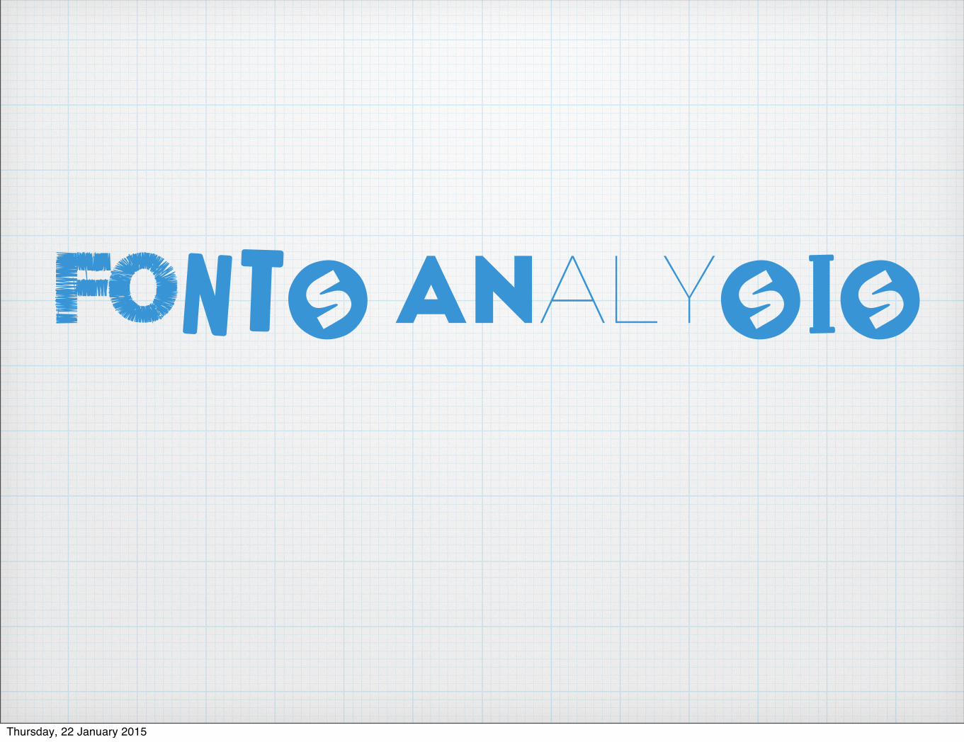
FontS AnalySIS
Thursday, 22 January 2015
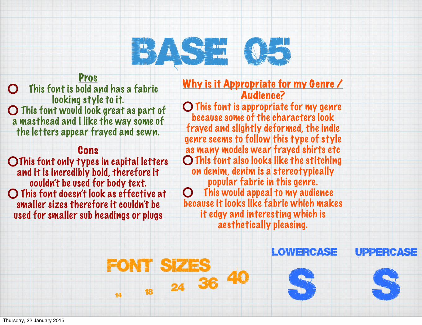
base 05Pros
This font is bold and has a fabric looking style to it.
This font would look great as part of a masthead and I like the way some of the letters appear frayed and sewn.
ConsThis font only types in capital letters and it is incredibly bold, therefore it
couldn’t be used for body text.This font doesn’t look as effective at
smaller sizes therefore it couldn’t be used for smaller sub headings or plugs
Why is it Appropriate for my Genre / Audience?
This font is appropriate for my genre because some of the characters look
frayed and slightly deformed, the indie genre seems to follow this type of style as many models wear frayed shirts etc
This font also looks like the stitching on denim, denim is a stereotypically
popular fabric in this genre. This would appeal to my audience
because it looks like fabric which makes it edgy and interesting which is
aesthetically pleasing.
4036241814
Font Sizes SsLowercase UPPERCASE
Thursday, 22 January 2015
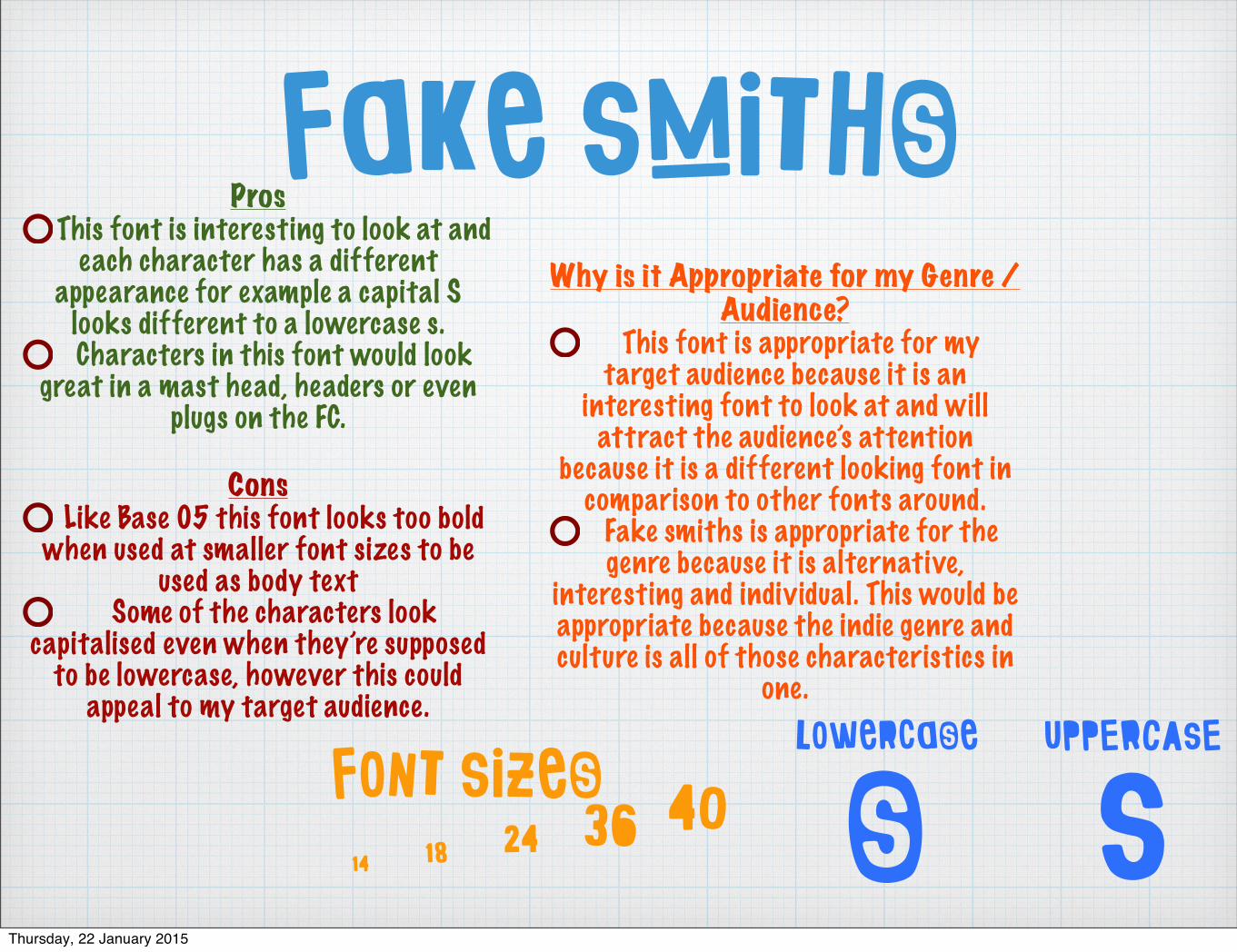
Fake SmithsPros
This font is interesting to look at and each character has a different
appearance for example a capital S looks different to a lowercase s. Characters in this font would look
great in a mast head, headers or even plugs on the FC.
ConsLike Base 05 this font looks too bold
when used at smaller font sizes to be used as body text
Some of the characters look capitalised even when they’re supposed
to be lowercase, however this could appeal to my target audience.
Why is it Appropriate for my Genre / Audience?
This font is appropriate for my target audience because it is an
interesting font to look at and will attract the audience’s attention
because it is a different looking font in comparison to other fonts around.
Fake smiths is appropriate for the genre because it is alternative,
interesting and individual. This would be appropriate because the indie genre and culture is all of those characteristics in
one.
SsLowercase UPPERCASE
4036241814
Font Sizes
Thursday, 22 January 2015
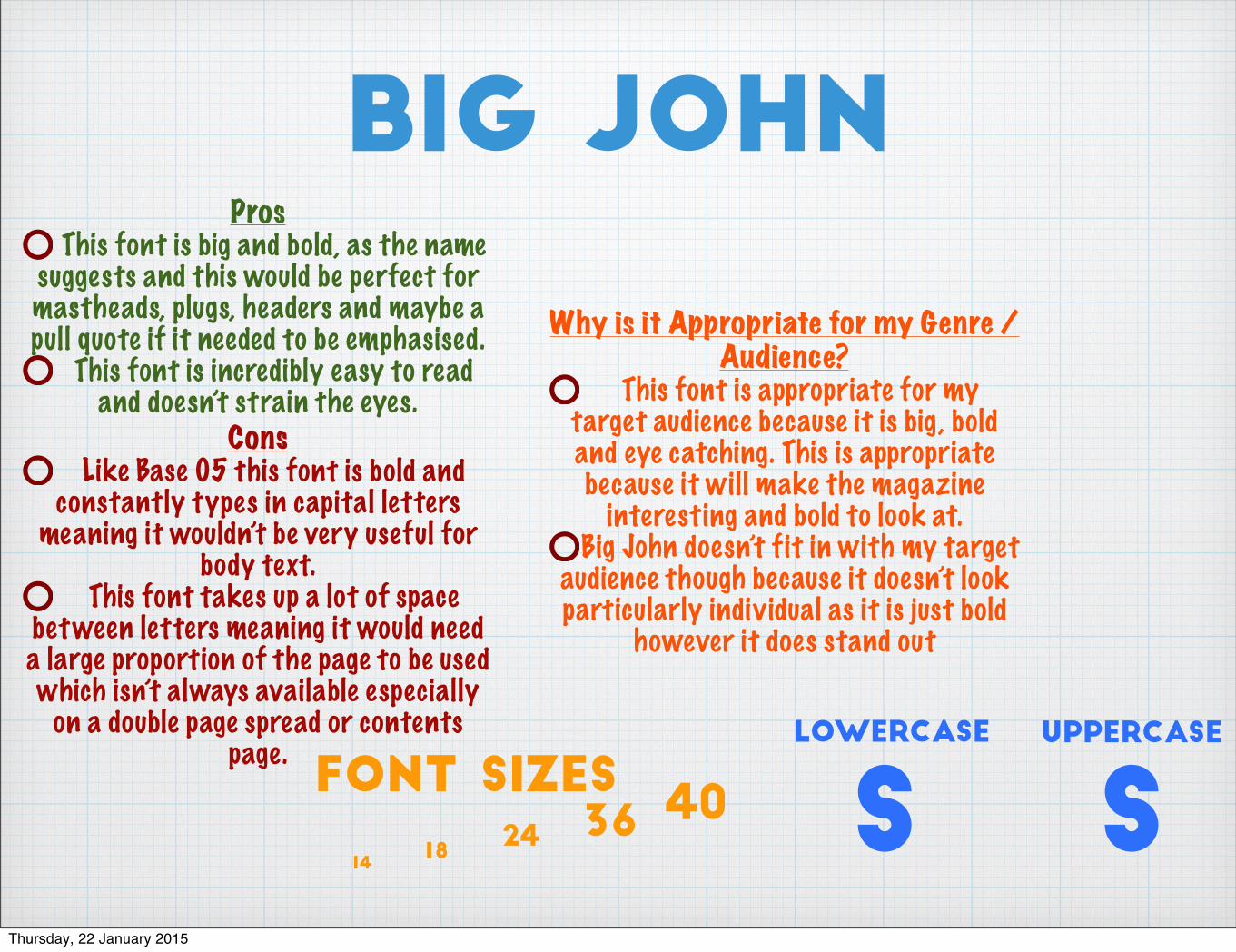
big johnPros
This font is big and bold, as the name suggests and this would be perfect for mastheads, plugs, headers and maybe a pull quote if it needed to be emphasised.
This font is incredibly easy to read and doesn’t strain the eyes.
ConsLike Base 05 this font is bold and
constantly types in capital letters meaning it wouldn’t be very useful for
body text.This font takes up a lot of space
between letters meaning it would need a large proportion of the page to be used which isn’t always available especially
on a double page spread or contents page.
Why is it Appropriate for my Genre / Audience?
This font is appropriate for my target audience because it is big , bold and eye catching. This is appropriate because it will make the magazine
interesting and bold to look at. Big John doesn’t fit in with my target
audience though because it doesn’t look particularly individual as it is just bold
however it does stand out
SsLowercase UPPERCASE
40362418
14
Font Sizes
Thursday, 22 January 2015
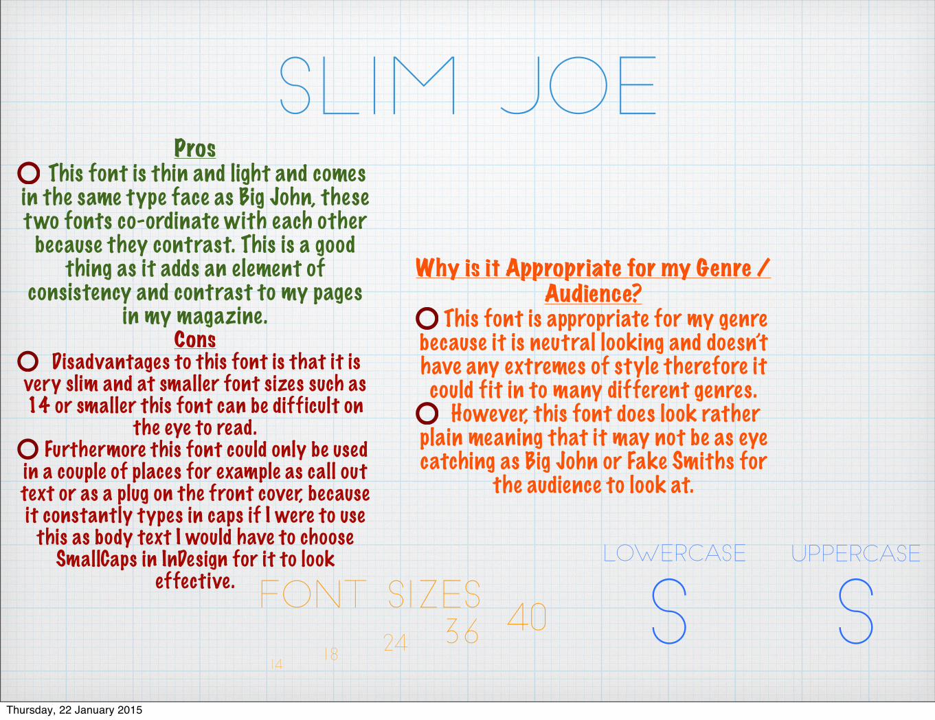
Slim JoePros
This font is thin and light and comes in the same type face as Big John, these two fonts co-ordinate with each other
because they contrast. This is a good thing as it adds an element of
consistency and contrast to my pages in my magazine.
ConsDisadvantages to this font is that it is
very slim and at smaller font sizes such as 14 or smaller this font can be difficult on
the eye to read.Furthermore this font could only be used
in a couple of places for example as call out text or as a plug on the front cover, because it constantly types in caps if I were to use
this as body text I would have to choose SmallCaps in InDesign for it to look
effective.
Why is it Appropriate for my Genre / Audience?
This font is appropriate for my genre because it is neutral looking and doesn’t have any extremes of style therefore it could fit in to many different genres.
However, this font does look rather plain meaning that it may not be as eye catching as Big John or Fake Smiths for
the audience to look at.
SsLowercase UPPERCASE
40362418
14
Font Sizes
Thursday, 22 January 2015
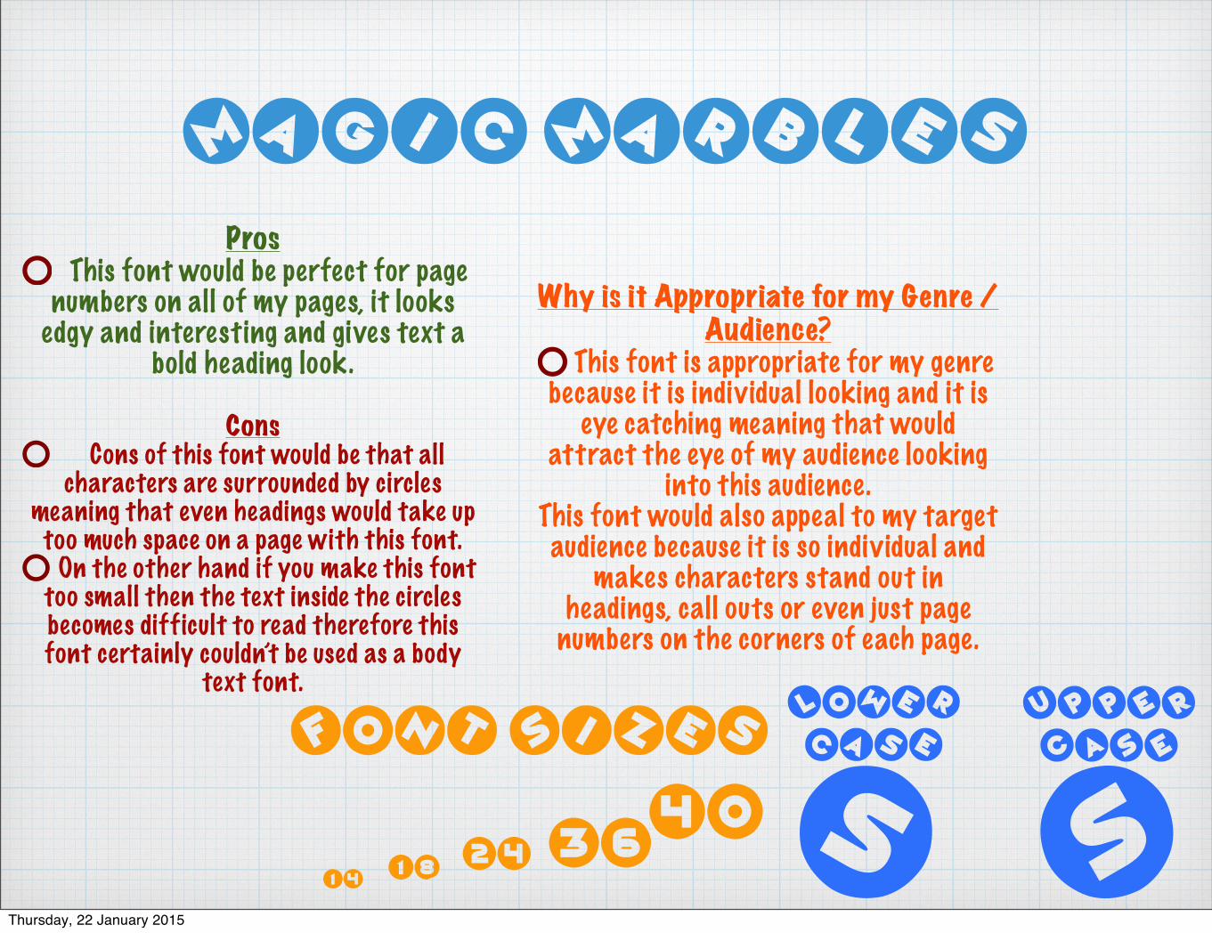
Magic Marbles
ProsThis font would be perfect for page
numbers on all of my pages, it looks edgy and interesting and gives text a
bold heading look.
ConsCons of this font would be that all
characters are surrounded by circles meaning that even headings would take up too much space on a page with this font.
On the other hand if you make this font too small then the text inside the circles becomes difficult to read therefore this font certainly couldn’t be used as a body
text font.
Why is it Appropriate for my Genre / Audience?
This font is appropriate for my genre because it is individual looking and it is
eye catching meaning that would attract the eye of my audience looking
into this audience.This font would also appeal to my target audience because it is so individual and
makes characters stand out in headings, call outs or even just page
numbers on the corners of each page.
SsLower
caseUPPER
CASE
4036241814
Font Sizes
Thursday, 22 January 2015
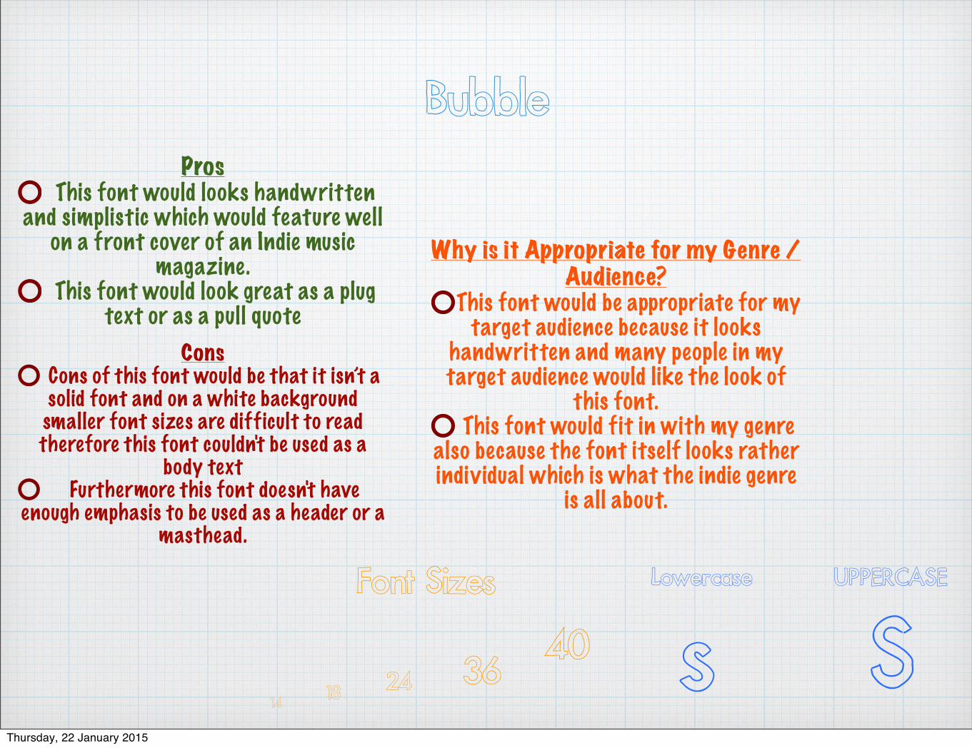
BubblePros
This font would looks handwritten and simplistic which would feature well
on a front cover of an Indie music magazine.
This font would look great as a plug text or as a pull quote
ConsCons of this font would be that it isn’t a solid font and on a white background smaller font sizes are difficult to read therefore this font couldn't be used as a
body textFurthermore this font doesn't have
enough emphasis to be used as a header or a masthead.
Why is it Appropriate for my Genre / Audience?
This font would be appropriate for my target audience because it looks
handwritten and many people in my target audience would like the look of
this font.This font would fit in with my genre
also because the font itself looks rather individual which is what the indie genre
is all about.
SsLowercase UPPERCASE
40362418
14
Font Sizes
Thursday, 22 January 2015
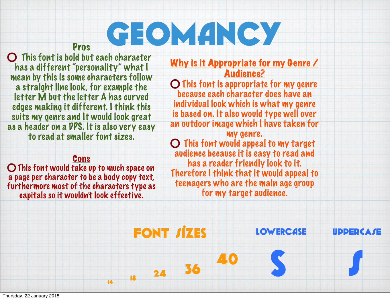
GeomancyProsThis font is bold but each character
has a different “personality” what I mean by this is some characters follow
a straight line look, for example the letter M but the letter A has curved edges making it different. I think this suits my genre and It would look great
as a header on a DPS. It is also very easy to read at smaller font sizes.
ConsThis font would take up to much space on
a page per character to be a body copy text, furthermore most of the characters type as
capitals so it wouldn’t look effective.
Why is it Appropriate for my Genre / Audience?
This font is appropriate for my genre because each character does have an
individual look which is what my genre is based on. It also would type well over an outdoor image which I have taken for
my genre.This font would appeal to my target
audience because it is easy to read and has a reader friendly look to it.
Therefore I think that it would appeal to teenagers who are the main age group
for my target audience.
SsLowercase UPPERCASE
4036241814
Font Sizes
Thursday, 22 January 2015
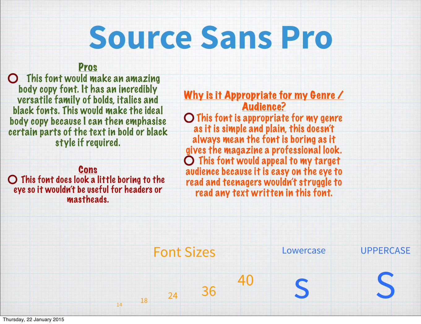
Source Sans ProPros
This font would make an amazing body copy font. It has an incredibly versatile family of bolds, italics and
black fonts. This would make the ideal body copy because I can then emphasise certain parts of the text in bold or black
style if required.
ConsThis font does look a little boring to the
eye so it wouldn’t be useful for headers or mastheads.
Why is it Appropriate for my Genre / Audience?
This font is appropriate for my genre as it is simple and plain, this doesn’t always mean the font is boring as it
gives the magazine a professional look. This font would appeal to my target
audience because it is easy on the eye to read and teenagers wouldn’t struggle to
read any text written in this font.
SsLowercase UPPERCASE
4036241814
Font Sizes
Thursday, 22 January 2015
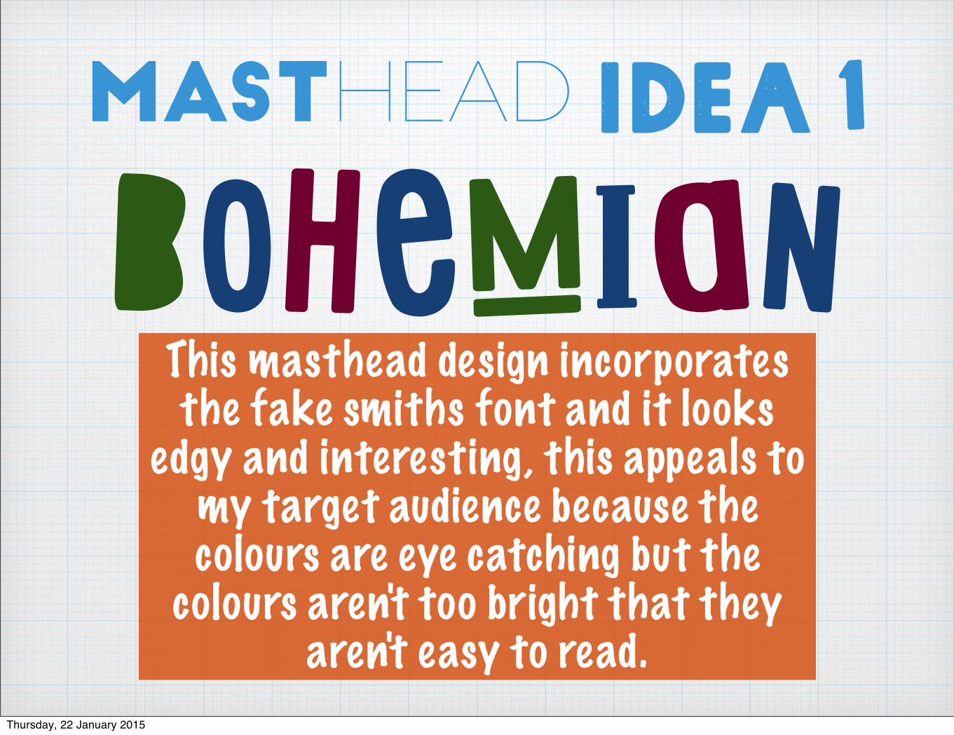
Masthead Idea 1
bohemIanThis masthead design incorporates the fake smiths font and it looks
edgy and interesting, this appeals to my target audience because the colours are eye catching but the
colours aren't too bright that they aren't easy to read.
Thursday, 22 January 2015
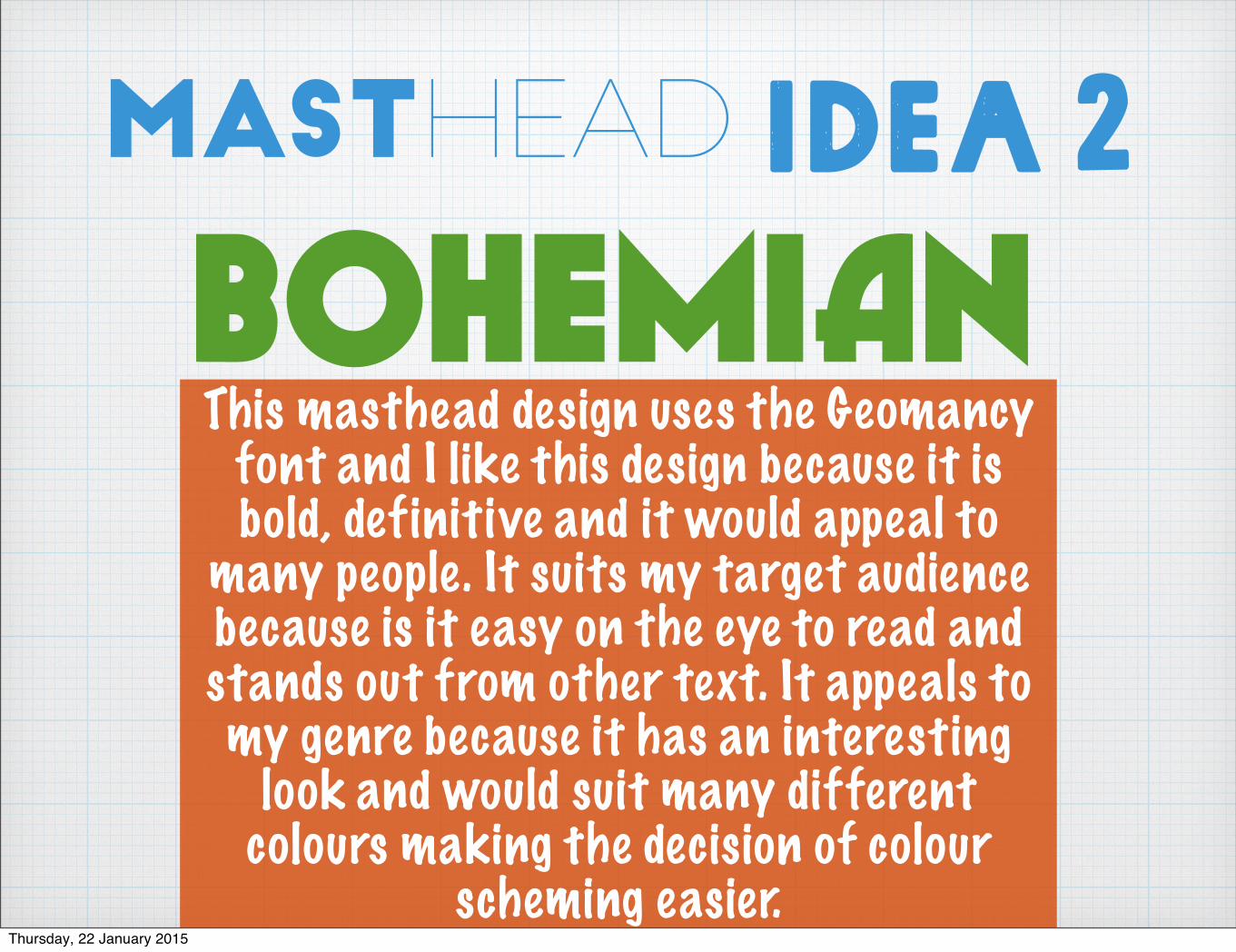
Masthead Idea 2
bohemIanThis masthead design uses the Geomancy
font and I like this design because it is bold, definitive and it would appeal to
many people. It suits my target audience because is it easy on the eye to read and stands out from other text. It appeals to my genre because it has an interesting
look and would suit many different colours making the decision of colour
scheming easier. Thursday, 22 January 2015
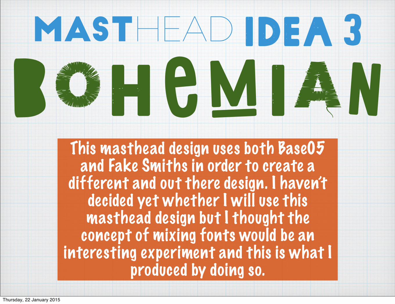
Masthead Idea 3
BohemIAnThis masthead design uses both Base05
and Fake Smiths in order to create a different and out there design. I haven’t
decided yet whether I will use this masthead design but I thought the
concept of mixing fonts would be an interesting experiment and this is what I
produced by doing so.Thursday, 22 January 2015
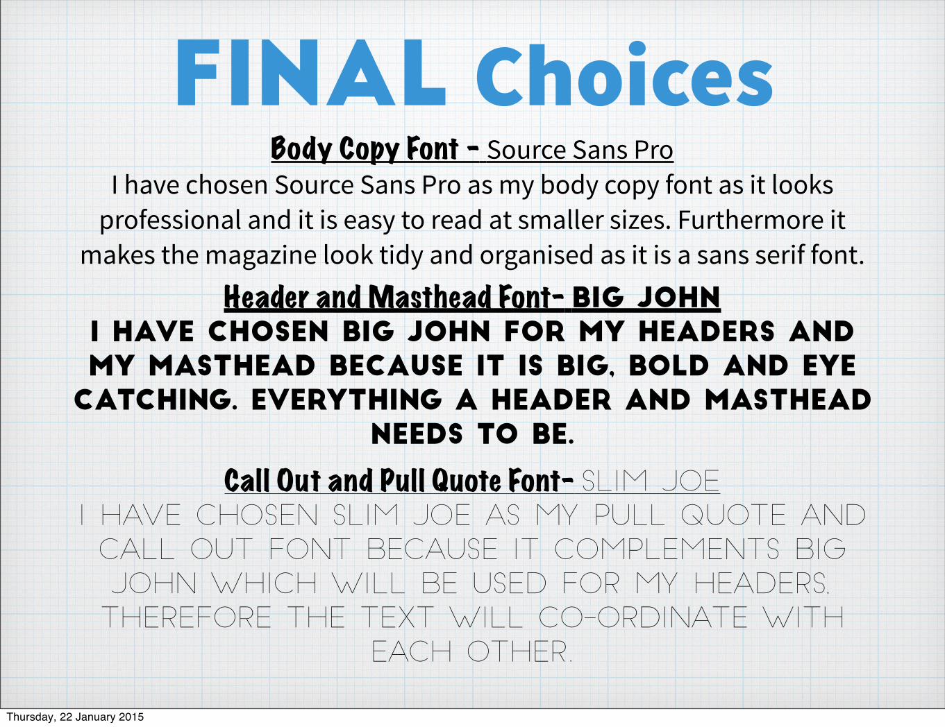
Final ChoicesBody Copy Font - Source Sans Pro
I have chosen Source Sans Pro as my body copy font as it looks professional and it is easy to read at smaller sizes. Furthermore it
makes the magazine look tidy and organised as it is a sans serif font.Header and Masthead Font- big john
I have chosen big john for my headers and my masthead because it is big, bold and eye
catching. everything a header and masthead needs to be.
Call Out and Pull Quote Font- Slim Joe
I have chosen slim joe as my pull quote and
call out font because it complements big
john which will be used for my headers,
Therefore the text will co-ordinate with
each other.
Thursday, 22 January 2015