fomc 20050630 text material
TRANSCRIPT

Presentation Materials (7.40 MB PDF)
Pages 172 to 234 of the Transcript
Appendix 1: Materials used by Messrs. Gallin, Lehnert, Peach, Rudebusch,and Williams
Material for Special Staff Presentations on Housing Valuations and Monetary PolicyJune 29, 2005
STRICTLY CONFIDENTIAL (FR) CLASS II-FOMC
Is Housing Overvalued?
Joshua GallinBoard of Governors of the Federal Reserve System
Exhibit 1Is Housing Overvalued?
Top panel
Title: Changes in Real House Prices: The United StatesSeries: Changes in real house pricesHorizon: 1976 to 2005Description: Data are plotted as one curve. Units are four-quarter percent change. Shaded barsappear on the figure for 1980, mid-1981 through 1982, mid-1990 to early 1991, and 2001.
The series begins 1976 at about negative 2, rises generally to about 8 in early 1978, falls to about 7 inlate 1978, and then rises to about 8 in early 1979. The series generally falls to about negative 4 inearly 1980, fluctuates between that point and negative 1 until late 1982, and then generally rises toabout 6 in late 1986. The series generally falls to about negative 5 in late 1990. The series generallyrises to end at about 9 in year-end 2004.
Note: Real house prices are the repeat-transactions price index relative to the personal consumption expenditures chain-priceindex.
Sources. BEA and OFHEO.
Middle-left panel
Title: Real Price Changes: Western CitiesSeries: San Francisco and Las Vegas

Horizon: 1975 to 2005:Q1Description: Data are plotted as two curves. Units are four-quarter percent change.
For San Francisco, the series begins in 1975 at about 10, rises generally to about 20 in mid-1977,falls to about 5 in 1978, and rises to about 12 in late 1979. The series then generally falls to aboutnegative 8 in late 1982, generally rises to about 19 in late 1989, and falls to about negative 8 in early1991. The series rises to about negative 3 later that year and fluctuates between that point andnegative 4 until early 1994. The series falls to negative 5 in late 1994 and then generally rises toabout 20 in late 2000. The series falls to about 5 in early 2002, rises to about 8 in mid-2002, falls toabout 4 in late 2003, and then generally rises to end at about 15 in 2005:Q1.
For Las Vegas, the series begins at about 10 in 1979, rises to about 12 in the middle of that year, andthen falls to about negative 3 in late 1979. The series rises to about negative 2 in early 1980 andfluctuates between that point and negative 1 until late 1980. The series then falls to negative 5 towardyear-end 1980, rises to about 11 in early 1981, falls to about 1 in late 1980. The series then rises toabout 18 in mid-1982, falls to about negative 3 in mid-1982, and then rises to about 16 towardyear-end 1982. The series then generally falls to about negative 20 in late 1983, generally rises toabout 5 in mid-1986, and then generally falls to about negative 5 in early 1987. The series remains atthis level until early 1988 and then rises to about 5 in mid-1990. The series then generally falls toabout negative 3 in early 1995, rises to about 5 in early 1996, falls to about negative 1 in mid-1997,rises to about 5 in mid-1998, and then falls to about negative 1 in late 1999. The series then generallyrises to about 7 in late 2001, remains at about that level until late 2003, rises to about 40 in late 2004,and then falls to end at a little more than 30 in 2005:Q1.
The curves overlap in 1979, 1981, 1982, 1983, 1990, 1997, and 2003.
Middle-right panel
Title: Real Price Changes: Eastern CitiesSeries: New York and MiamiHorizon: 1975 to 2005:Q1Description: Data are plotted as two curves. Units are four-quarter percent change.
For New York, the series begins at about negative 3 in 1975, generally rises to about 2 in early 1977,and falls to about negative 5 in late 1977. The series then generally rises to about 9 in early 1979.The series falls to a little less than zero in early 1981, rises to about 2 later that year, and then falls toabout negative 4 in mid-1982. The series rises to about 22 in late 1986, generally falls to aboutnegative 15 in late 1990, and generally rises to about 12 in late 2002. The series then falls to about 5in late 2003, generally rises to about 15 in late 2004, and then falls to end at about 12 in 2005:Q1.
For Miami, the series begins at about negative 9 in 1975, rises to about negative 1 in 1976, thenfluctuates between negative 5 and 9 between 1977 and 1982. The series generally remains a bit underor over zero from 1983 to 1998 when it generally begins to rise, ending at about 20 in 2005:Q1.
The curves overlap in every year from 1975 to 1983, in 1989, and all years between 1993 and 2005.
Bottom-left panelAnecdotes from the Housing Market
Increased speculation.Rosy assessments of future appreciation.Increased reliance on novel financing without full recognition of the associated risks.
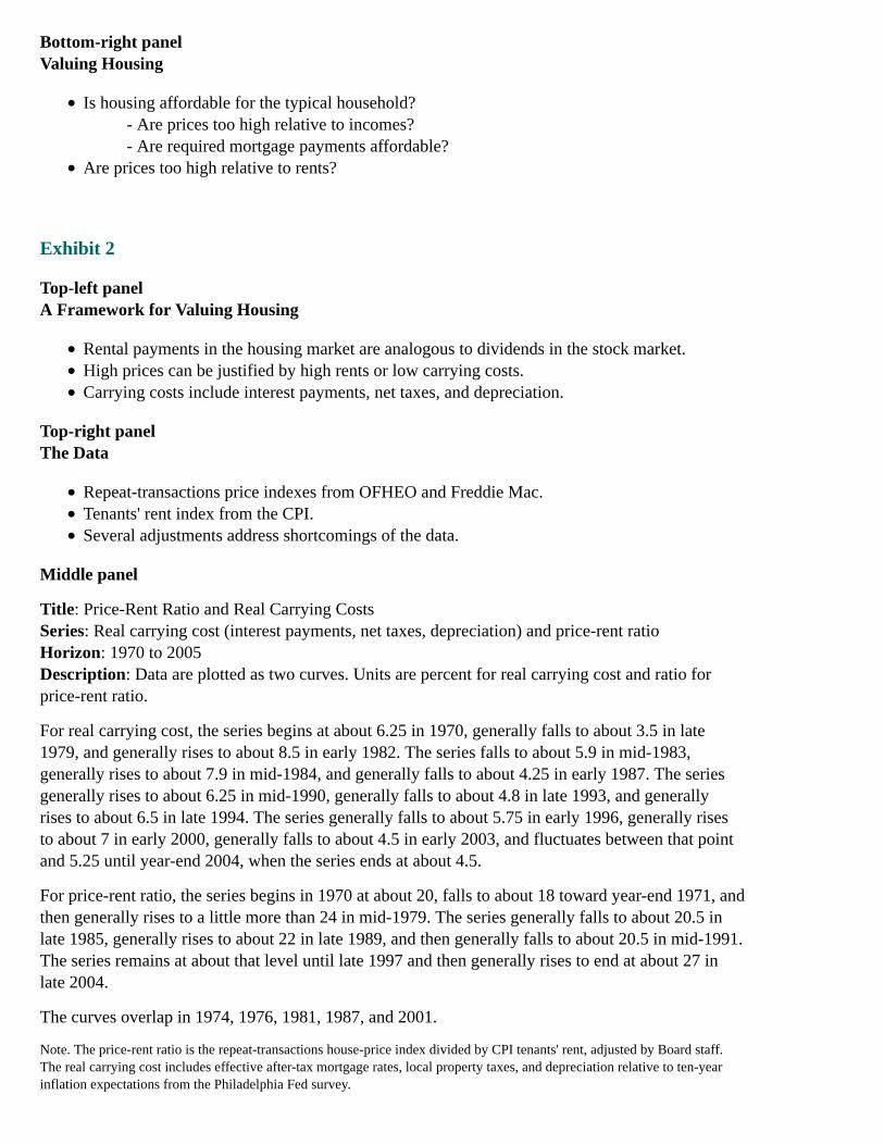
Bottom-right panelValuing Housing
Is housing affordable for the typical household?- Are prices too high relative to incomes?- Are required mortgage payments affordable?
Are prices too high relative to rents?
Exhibit 2
Top-left panelA Framework for Valuing Housing
Rental payments in the housing market are analogous to dividends in the stock market.High prices can be justified by high rents or low carrying costs.Carrying costs include interest payments, net taxes, and depreciation.
Top-right panelThe Data
Repeat-transactions price indexes from OFHEO and Freddie Mac.Tenants' rent index from the CPI.Several adjustments address shortcomings of the data.
Middle panel
Title: Price-Rent Ratio and Real Carrying CostsSeries: Real carrying cost (interest payments, net taxes, depreciation) and price-rent ratioHorizon: 1970 to 2005Description: Data are plotted as two curves. Units are percent for real carrying cost and ratio forprice-rent ratio.
For real carrying cost, the series begins at about 6.25 in 1970, generally falls to about 3.5 in late1979, and generally rises to about 8.5 in early 1982. The series falls to about 5.9 in mid-1983,generally rises to about 7.9 in mid-1984, and generally falls to about 4.25 in early 1987. The seriesgenerally rises to about 6.25 in mid-1990, generally falls to about 4.8 in late 1993, and generallyrises to about 6.5 in late 1994. The series generally falls to about 5.75 in early 1996, generally risesto about 7 in early 2000, generally falls to about 4.5 in early 2003, and fluctuates between that pointand 5.25 until year-end 2004, when the series ends at about 4.5.
For price-rent ratio, the series begins in 1970 at about 20, falls to about 18 toward year-end 1971, andthen generally rises to a little more than 24 in mid-1979. The series generally falls to about 20.5 inlate 1985, generally rises to about 22 in late 1989, and then generally falls to about 20.5 in mid-1991.The series remains at about that level until late 1997 and then generally rises to end at about 27 inlate 2004.
The curves overlap in 1974, 1976, 1981, 1987, and 2001.
Note. The price-rent ratio is the repeat-transactions house-price index divided by CPI tenants' rent, adjusted by Board staff.The real carrying cost includes effective after-tax mortgage rates, local property taxes, and depreciation relative to ten-yearinflation expectations from the Philadelphia Fed survey.
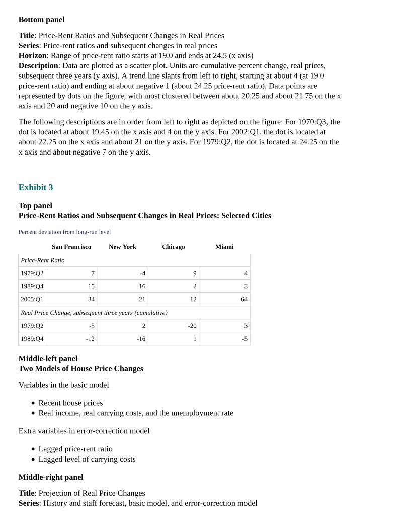
Bottom panel
Title: Price-Rent Ratios and Subsequent Changes in Real PricesSeries: Price-rent ratios and subsequent changes in real pricesHorizon: Range of price-rent ratio starts at 19.0 and ends at 24.5 (x axis)Description: Data are plotted as a scatter plot. Units are cumulative percent change, real prices,subsequent three years (y axis). A trend line slants from left to right, starting at about 4 (at 19.0price-rent ratio) and ending at about negative 1 (about 24.25 price-rent ratio). Data points arerepresented by dots on the figure, with most clustered between about 20.25 and about 21.75 on the xaxis and 20 and negative 10 on the y axis.
The following descriptions are in order from left to right as depicted on the figure: For 1970:Q3, thedot is located at about 19.45 on the x axis and 4 on the y axis. For 2002:Q1, the dot is located atabout 22.25 on the x axis and about 21 on the y axis. For 1979:Q2, the dot is located at 24.25 on thex axis and about negative 7 on the y axis.
Exhibit 3
Top panelPrice-Rent Ratios and Subsequent Changes in Real Prices: Selected Cities
Percent deviation from long-run level
San Francisco New York Chicago Miami
Price-Rent Ratio
1979:Q2 7 -4 9 4
1989:Q4 15 16 2 3
2005:Q1 34 21 12 64
Real Price Change, subsequent three years (cumulative)
1979:Q2 -5 2 -20 3
1989:Q4 -12 -16 1 -5
Middle-left panelTwo Models of House Price Changes
Variables in the basic model
Recent house pricesReal income, real carrying costs, and the unemployment rate
Extra variables in error-correction model
Lagged price-rent ratioLagged level of carrying costs
Middle-right panel
Title: Projection of Real Price ChangesSeries: History and staff forecast, basic model, and error-correction model

Horizon: 2002 to 2006 (forecast period begins after 2005:Q1)Description: Data are plotted as three curves. Units are four-quarter percent change. Vertical line islocated at 2005:Q1.
For history and staff forecast, the series begins at about 6 in 2002, rises generally to about 8 in late2004 and then falls to about 7.5 in 2005:Q1. After that point the series falls to end at about 1 inyear-end 2006.
For basic model, the series begins at about 7.5 in 2005:Q1, and then generally falls to end at about 4in year-end 2006.
For error-correction model, the series begins at about 7.5 in 2005:Q1, and then generally falls to endat about negative 1.75 in year-end 2006.
Bottom panelConclusions
The price-rent ratio is very high by historical standards, suggesting that housing might beovervalued by as much as 20 percent.Historical experience suggests that the change in real house prices going forward will beslower than in recent years.The evidence cannot rule out either further rapid gains in house prices for a time or a rapidcorrection back toward fundamentals.
House Prices and Mortgage Finance
Andreas LehnertBoard of Governors of the Federal Reserve System
Exhibit 1Household Sector Vulnerability to House Price Declines
Top panelEstimated Loan-to-Value Distribution of Outstanding Mortgages
Percent of borrowers
Less than 70 70-79 80-89 90+
September 2003 56 19 18 7
March 2005 64 18 14 4
Source. LoanPerformance Corp. (LPC) servicer data, flow of funds accounts (FFA), OFHEO
Middle-left panel
Title: Sensitivity of Household Sector to Price DeclinesSeries: September 2003 and March 2005Horizon: September 2003 and March 2005Description: Data are plotted as two curves. Horizontal axis units are price decline (percent).Vertical axis units are percent of borrowers with negative equity.
The September 2003 curve begins at about 0 percent price decline and about 2 percent of borrowers
with negative equity and trends up to end at 30 percent price decline and about 43 percent ofborrowers with negative equity.
The March 2005 curve begins at about 0 percent price decline and about 1 percent of borrowers withnegative equity and trends up to end at 30 percent price decline and about 35 percent of borrowerswith negative equity.
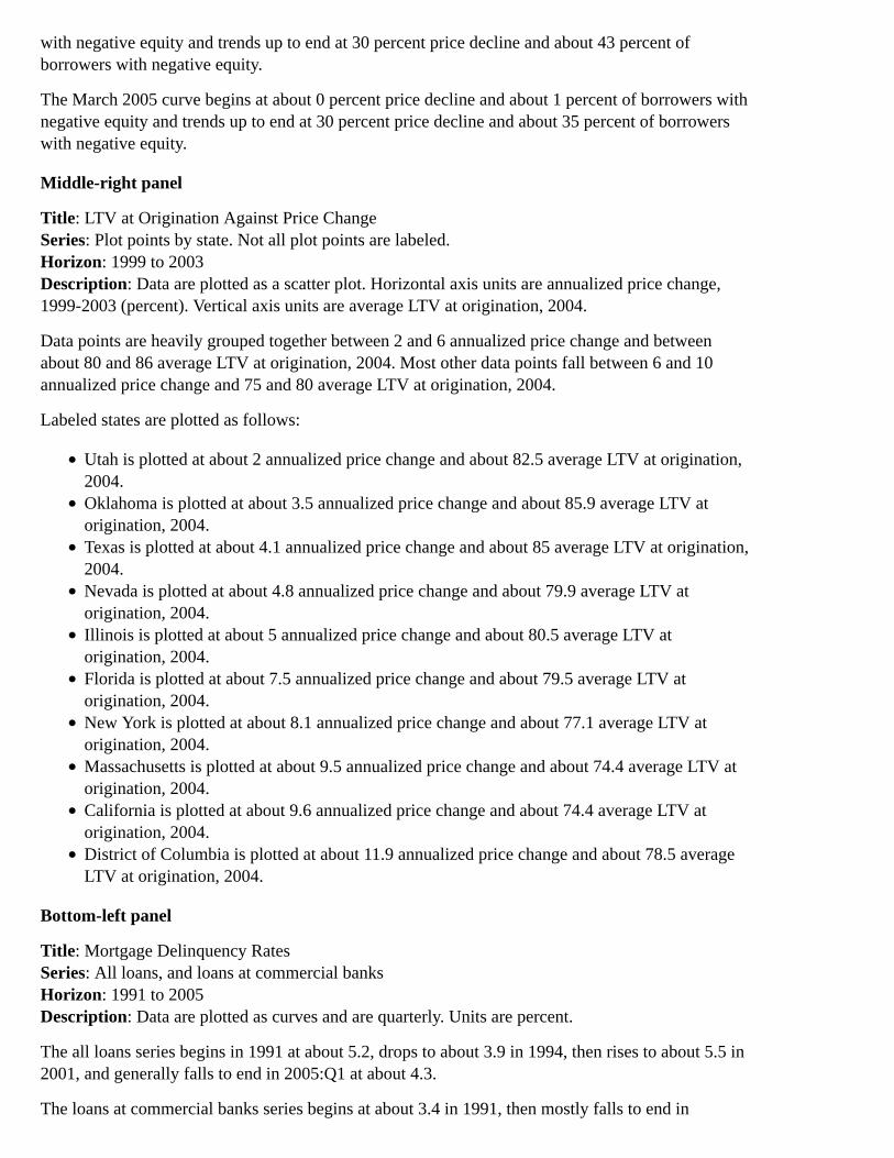
Middle-right panel
Title: LTV at Origination Against Price ChangeSeries: Plot points by state. Not all plot points are labeled.Horizon: 1999 to 2003Description: Data are plotted as a scatter plot. Horizontal axis units are annualized price change,1999-2003 (percent). Vertical axis units are average LTV at origination, 2004.
Data points are heavily grouped together between 2 and 6 annualized price change and betweenabout 80 and 86 average LTV at origination, 2004. Most other data points fall between 6 and 10annualized price change and 75 and 80 average LTV at origination, 2004.
Labeled states are plotted as follows:
Utah is plotted at about 2 annualized price change and about 82.5 average LTV at origination,2004.Oklahoma is plotted at about 3.5 annualized price change and about 85.9 average LTV atorigination, 2004.Texas is plotted at about 4.1 annualized price change and about 85 average LTV at origination,2004.Nevada is plotted at about 4.8 annualized price change and about 79.9 average LTV atorigination, 2004.Illinois is plotted at about 5 annualized price change and about 80.5 average LTV atorigination, 2004.Florida is plotted at about 7.5 annualized price change and about 79.5 average LTV atorigination, 2004.New York is plotted at about 8.1 annualized price change and about 77.1 average LTV atorigination, 2004.Massachusetts is plotted at about 9.5 annualized price change and about 74.4 average LTV atorigination, 2004.California is plotted at about 9.6 annualized price change and about 74.4 average LTV atorigination, 2004.District of Columbia is plotted at about 11.9 annualized price change and about 78.5 averageLTV at origination, 2004.
Bottom-left panel
Title: Mortgage Delinquency RatesSeries: All loans, and loans at commercial banksHorizon: 1991 to 2005Description: Data are plotted as curves and are quarterly. Units are percent.
The all loans series begins in 1991 at about 5.2, drops to about 3.9 in 1994, then rises to about 5.5 in2001, and generally falls to end in 2005:Q1 at about 4.3.
The loans at commercial banks series begins at about 3.4 in 1991, then mostly falls to end in

2005:Q1 at about 1.4.
Source. MBA, Call Reports
Bottom-right panelConclusions
Average LTV has decreased over the past 18 monthsMost borrowers have substantial equity in their homesRapidly rising house prices have kept mortgage delinquencies and losses lowSome households are very highly leveraged
Exhibit 2Characteristics of Interest-Only (IO) Mortgages in RMBS Pools
Top-left panelComponents of Home Mortgage Debt
2003:Q1 2005:Q1
billions of dollars
1. RMBS pools 591 1,191
2. IO RMBS pools 54 296
3. Total home mortgage debt 6,491 8,282
Memo:
4. IO RMBS share of home mortgages (percent) 0.8 3.6
Source. LPC RMBS data, FFA
Top-right panel
Title: IO Share of RMBS Against Price ChangeSeries: Plot points by state. Not all plot points are labeled.Horizon: 1999 to 2003Description: Data are plotted as a scatter plot. Horizontal axis is annualized price change, 1999-2003(percent). Vertical axis is IO share of RMBS (percent). r = 0.3
Data points are heavily grouped together between 2 and 4 annualized price change on the horizontalaxis and about 0 and 21 IO share of RMBS on the vertical axis. Most other plot points are scatteredbetween about 6 and 10 annualized price change and about 10 and 49 IO share of RMBS.
Labeled states are plotted as follows:
Utah is plotted at about 2 annualized price change and about 28 IO share of RMBS.Nevada is plotted at about 4.5 annualized price change and about 45 IO share of RMBS.Illinois is plotted at about 5 annualized price change and about 15 IO share of RMBS.Florida is plotted at about 7.5 annualized price change and about 30 IO share of RMBS.New York is plotted at about 8 annualized price change and about 15 IO share of RMBS.Massachusetts is plotted at about 9.5 annualized price change and about 20 IO share of RMBS.California is plotted at about 9.6 annualized price change and about 47 IO share of RMBS.
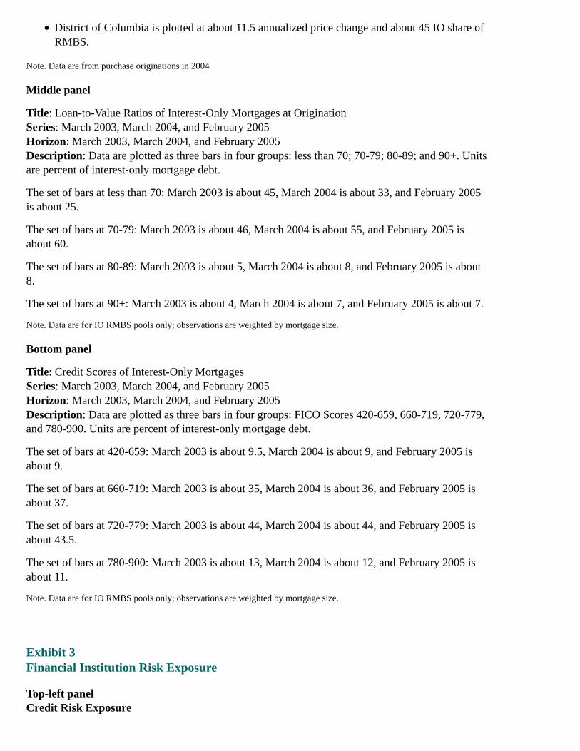
District of Columbia is plotted at about 11.5 annualized price change and about 45 IO share ofRMBS.
Note. Data are from purchase originations in 2004
Middle panel
Title: Loan-to-Value Ratios of Interest-Only Mortgages at OriginationSeries: March 2003, March 2004, and February 2005Horizon: March 2003, March 2004, and February 2005Description: Data are plotted as three bars in four groups: less than 70; 70-79; 80-89; and 90+. Unitsare percent of interest-only mortgage debt.
The set of bars at less than 70: March 2003 is about 45, March 2004 is about 33, and February 2005is about 25.
The set of bars at 70-79: March 2003 is about 46, March 2004 is about 55, and February 2005 isabout 60.
The set of bars at 80-89: March 2003 is about 5, March 2004 is about 8, and February 2005 is about8.
The set of bars at 90+: March 2003 is about 4, March 2004 is about 7, and February 2005 is about 7.
Note. Data are for IO RMBS pools only; observations are weighted by mortgage size.
Bottom panel
Title: Credit Scores of Interest-Only MortgagesSeries: March 2003, March 2004, and February 2005Horizon: March 2003, March 2004, and February 2005Description: Data are plotted as three bars in four groups: FICO Scores 420-659, 660-719, 720-779,and 780-900. Units are percent of interest-only mortgage debt.
The set of bars at 420-659: March 2003 is about 9.5, March 2004 is about 9, and February 2005 isabout 9.
The set of bars at 660-719: March 2003 is about 35, March 2004 is about 36, and February 2005 isabout 37.
The set of bars at 720-779: March 2003 is about 44, March 2004 is about 44, and February 2005 isabout 43.5.
The set of bars at 780-900: March 2003 is about 13, March 2004 is about 12, and February 2005 isabout 11.
Note. Data are for IO RMBS pools only; observations are weighted by mortgage size.
Exhibit 3Financial Institution Risk Exposure
Top-left panelCredit Risk Exposure

Institutions Mortgage Types
1. Housing GSEs Conforming, mostly fixed-rate
2. Private Mortgage Insurers High LTV
3. RMBS Pools Wide variety
4. Banks and Thrifts Wide variety
Top-right panelHousing GSEs
1. Average LTV at origination 70
2. Estimated average current LTV 57
3. Average credit score (FICO) 723
4. Percent of guaranteed mortgages with credit enhancement 19
Note. Data are from Freddie Mac only
Source. Freddie Mac 2004 Annual Report
Middle-left panel
Title: Private Mortgage InsurersSeries: Income/capital and risk/capitalHorizon: 1988 to 2003Description: Data are plotted as two curves and are annual. Units are ratios.
The income/capital curve begins at about negative 0.18 at the beginning of 1988, then generally risesto about 0.16 in late 1999, and falls a bit to end in early 2003 at about 0.09.
The risk/capital curve begins in early 1988 at about 18, rises a bit to about 24 in 1991, then generallyfalls to about 9 at the beginning of 2003.
The two curves overlap at about 1997.
Source. Mortgage Insurance Companies of America
Middle-right panelRisks in RMBS Pools
RMBS pools contain relatively risky mortgagesPools are structured to allow investors to choose risk exposurePools are exceptionally transparentPricing depends on loss modeling
Bottom-left panel
Title: Mortgage Share of Assets, Banks and ThriftsSeries: Mortgage share of assets, banks and thriftsHorizon: Not indicatedDescription: Data are plotted as bars and represent quartiles. Units are percent of total assets.
For the bottom quartile, about 5.
For the second quartile, about 12.
For the third quartile, about 21.
For the top quartile, about 41.
Note. Not weighted by assets
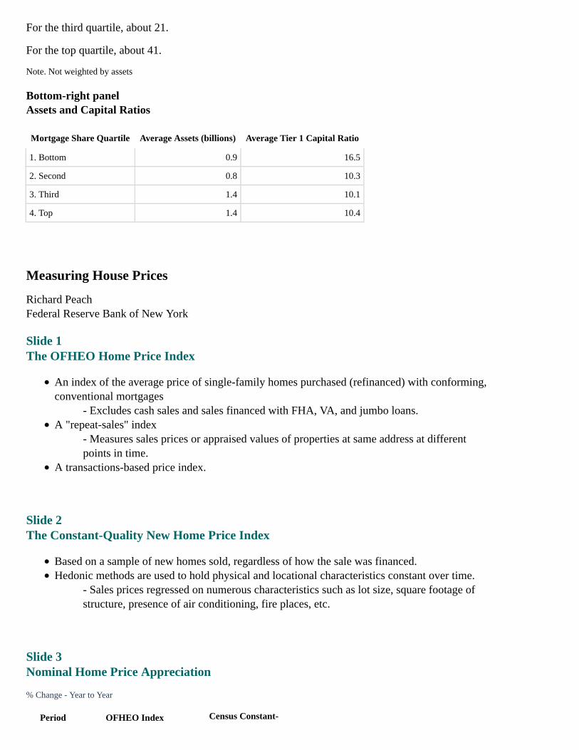
Bottom-right panelAssets and Capital Ratios
Mortgage Share Quartile Average Assets (billions) Average Tier 1 Capital Ratio
1. Bottom 0.9 16.5
2. Second 0.8 10.3
3. Third 1.4 10.1
4. Top 1.4 10.4
Measuring House Prices
Richard PeachFederal Reserve Bank of New York
Slide 1The OFHEO Home Price Index
An index of the average price of single-family homes purchased (refinanced) with conforming,conventional mortgages
- Excludes cash sales and sales financed with FHA, VA, and jumbo loans.A "repeat-sales" index
- Measures sales prices or appraised values of properties at same address at differentpoints in time.
A transactions-based price index.
Slide 2The Constant-Quality New Home Price Index
Based on a sample of new homes sold, regardless of how the sale was financed.Hedonic methods are used to hold physical and locational characteristics constant over time.
- Sales prices regressed on numerous characteristics such as lot size, square footage ofstructure, presence of air conditioning, fire places, etc.
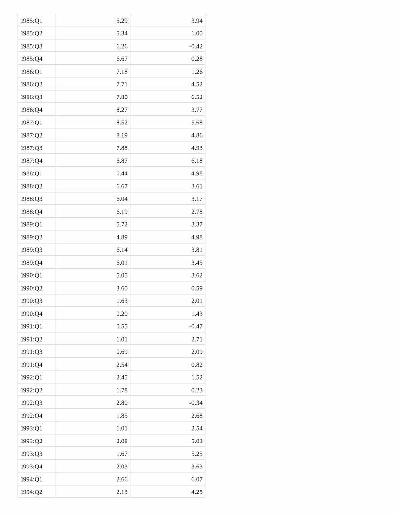
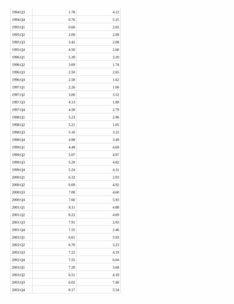
Slide 3Nominal Home Price Appreciation
% Change - Year to Year
Period OFHEO Index Census Constant-
QualityNew Home Price Index
1976:Q1 4.12 N/A
1976:Q2 5.58 N/A
1976:Q3 7.48 N/A
1976:Q4 7.54 N/A
1977:Q1 9.03 N/A
1977:Q2 9.92 N/A
1977:Q3 11.56 N/A
1977:Q4 13.19 N/A
1978:Q1 13.43 15.02
1978:Q2 13.02 13.68
1978:Q3 13.58 16.14
1978:Q4 13.32 13.07
1979:Q1 14.89 0.19
1979:Q2 14.09 1.88
1979:Q3 13.12 -0.54
1979:Q4 11.96 0.18
1980:Q1 9.17 13.42
1980:Q2 7.43 9.04
1980:Q3 8.52 9.98
1980:Q4 6.98 6.64
1981:Q1 5.89 9.43
1981:Q2 6.60 9.31
1981:Q3 4.66 6.60
1981:Q4 4.34 6.89
1982:Q1 4.83 4.55
1982:Q2 3.46 2.79
1982:Q3 1.62 1.86
1982:Q4 2.23 0.00
1983:Q1 2.74 0.15
1983:Q2 3.40 0.90
1983:Q3 4.61 3.34
1983:Q4 4.24 4.29
1984:Q1 3.90 2.69
1984:Q2 4.44 4.63
1984:Q3 4.75 4.12
1984:Q4 5.36 5.15
1985:Q1 5.29 3.94
1985:Q2 5.34 1.00
1985:Q3 6.26 -0.42
1985:Q4 6.67 0.28
1986:Q1 7.18 1.26
1986:Q2 7.71 4.52
1986:Q3 7.80 6.52
1986:Q4 8.27 3.77
1987:Q1 8.52 5.68
1987:Q2 8.19 4.86
1987:Q3 7.88 4.93
1987:Q4 6.87 6.18
1988:Q1 6.44 4.98
1988:Q2 6.67 3.61
1988:Q3 6.04 3.17
1988:Q4 6.19 2.78
1989:Q1 5.72 3.37
1989:Q2 4.89 4.98
1989:Q3 6.14 3.81
1989:Q4 6.01 3.45
1990:Q1 5.05 3.62
1990:Q2 3.60 0.59
1990:Q3 1.63 2.01
1990:Q4 0.20 1.43
1991:Q1 0.55 -0.47
1991:Q2 1.01 2.71
1991:Q3 0.69 2.09
1991:Q4 2.54 0.82
1992:Q1 2.45 1.52
1992:Q2 1.78 0.23
1992:Q3 2.80 -0.34
1992:Q4 1.85 2.68
1993:Q1 1.01 2.54
1993:Q2 2.08 5.03
1993:Q3 1.67 5.25
1993:Q4 2.03 3.63
1994:Q1 2.66 6.07
1994:Q2 2.13 4.25
1994:Q3 1.78 4.12
1994:Q4 0.76 5.25
1995:Q1 0.66 2.65
1995:Q2 2.09 2.09
1995:Q3 3.42 2.08
1995:Q4 4.50 2.60
1996:Q1 5.39 3.20
1996:Q2 3.69 1.74
1996:Q3 2.50 2.65
1996:Q4 2.58 1.62
1997:Q1 2.26 1.60
1997:Q2 3.00 3.52
1997:Q3 4.13 1.89
1997:Q4 4.58 2.79
1998:Q1 5.23 2.96
1998:Q2 5.21 1.65
1998:Q3 5.10 3.22
1998:Q4 4.98 3.49
1999:Q1 4.49 4.69
1999:Q2 5.07 4.97
1999:Q3 5.29 4.82
1999:Q4 5.24 4.31
2000:Q1 6.32 2.93
2000:Q2 6.69 4.92
2000:Q3 7.08 4.60
2000:Q4 7.60 5.93
2001:Q1 8.11 4.88
2001:Q2 8.22 4.69
2001:Q3 7.91 2.93
2001:Q4 7.55 2.46
2002:Q1 6.61 5.93
2002:Q2 6.70 3.23
2002:Q3 7.22 4.19
2002:Q4 7.55 6.04
2003:Q1 7.20 3.68
2003:Q2 6.51 4.18
2003:Q3 6.02 7.40
2003:Q4 8.17 5.54
2004:Q1 8.45 7.63
2004:Q2 9.98 9.18
2004:Q3 13.33 6.96
2004:Q4 11.17 8.43
2005:Q1 N/A 4.37
Note: Shading represents NBER recessions (as shown in the chart, approximately 1980, mid-1981 through 1982, mid-1990 toearly 1991, and 2001).
Source: Census Bureau and Office of Federal Housing Enterprise Oversight
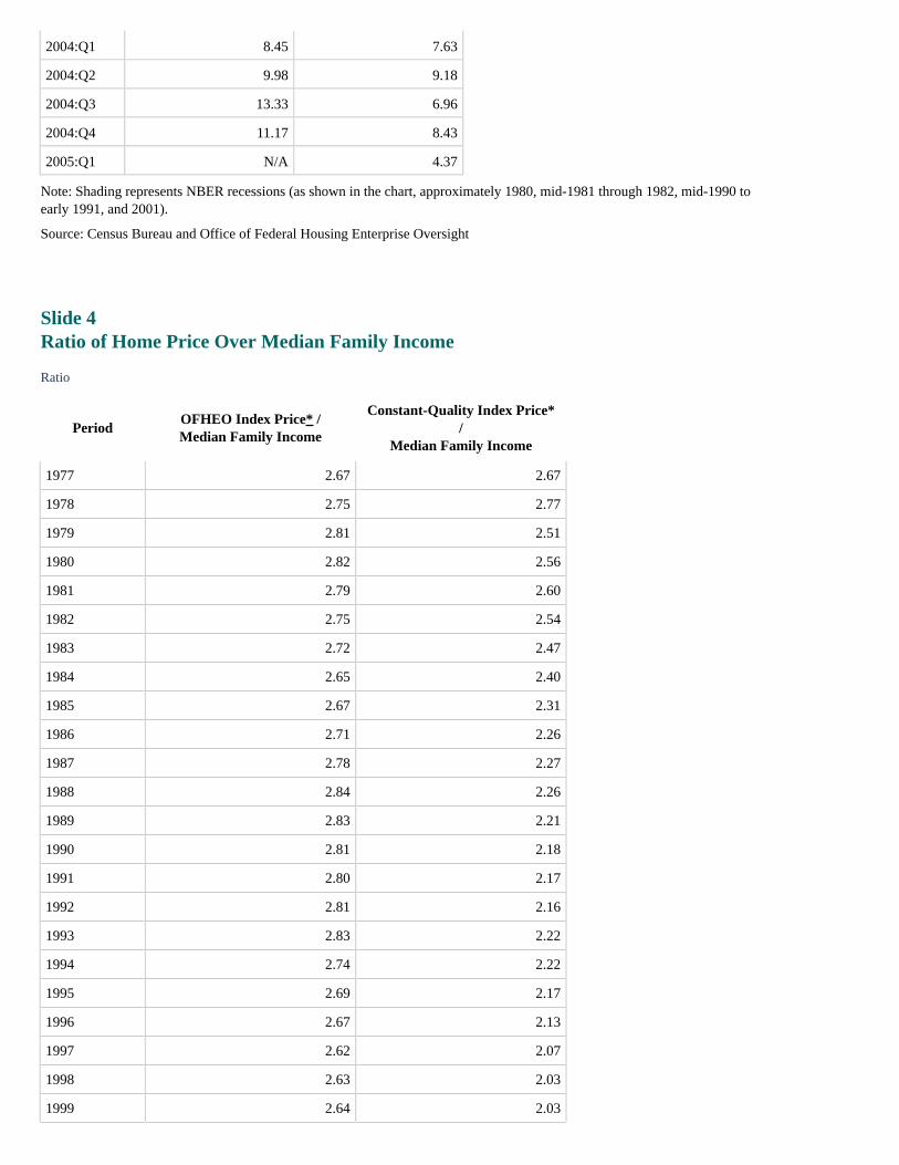
Slide 4Ratio of Home Price Over Median Family Income
Ratio
PeriodOFHEO Index Price* /Median Family Income
Constant-Quality Index Price*/
Median Family Income
1977 2.67 2.67
1978 2.75 2.77
1979 2.81 2.51
1980 2.82 2.56
1981 2.79 2.60
1982 2.75 2.54
1983 2.72 2.47
1984 2.65 2.40
1985 2.67 2.31
1986 2.71 2.26
1987 2.78 2.27
1988 2.84 2.26
1989 2.83 2.21
1990 2.81 2.18
1991 2.80 2.17
1992 2.81 2.16
1993 2.83 2.22
1994 2.74 2.22
1995 2.69 2.17
1996 2.67 2.13
1997 2.62 2.07
1998 2.63 2.03
1999 2.64 2.03
PeriodOFHEO Index Price* /Median Family Income
Constant-Quality Index Price* /Median Family Income
2000 2.72 2.05
2001 2.90 2.10
2002 3.09 2.19
2003 3.24 2.26
2004 3.47 2.36
* Both indices have been converted to dollars using the median price of existing homes in 1979Q1. Return to table
Note: Shading represents NBER recessions.
Source: Office of Federal Housing Enterprise Oversight and Bureau of Economic Analysis
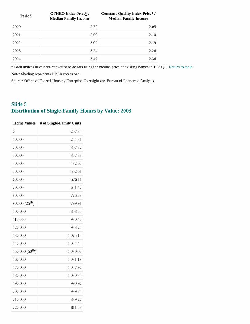
Slide 5Distribution of Single-Family Homes by Value: 2003
Home Values # of Single-Family Units
0 207.35
10,000 254.31
20,000 307.72
30,000 367.33
40,000 432.60
50,000 502.61
60,000 576.11
70,000 651.47
80,000 726.78
90,000 (25 ) 799.91
100,000 868.55
110,000 930.40
120,000 983.25
130,000 1,025.14
140,000 1,054.44
150,000 (50 ) 1,070.00
160,000 1,071.19
170,000 1,057.96
180,000 1,030.85
190,000 990.92
200,000 939.74
210,000 879.22
220,000 811.53
th
th
Home Values # of Single-Family Units
230,000 738.99
240,000 663.88
250,000 (75 ) 588.39
260,000 514.47
270,000 443.79
280,000 377.67
290,000 317.08
300,000 (80 ) 262.63
310,000 214.61
320,000 173.01
330,000 137.60
340,000 107.96
350,000 83.57
As shown in the chart, mean price of existing homes sold (215,000) corresponds with about 883 single-family units, and meanprice of homes purchased with conventional loans (243,000) corresponds with about 679 single-family units.
Source: American Housing Survey
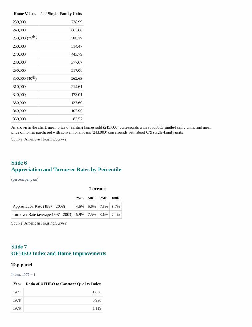
Slide 6Appreciation and Turnover Rates by Percentile
(percent per year)
Percentile
25th 50th 75th 80th
Appreciation Rate (1997 - 2003) 4.5% 5.6% 7.5% 8.7%
Turnover Rate (average 1997 - 2003) 5.9% 7.5% 8.6% 7.4%
Source: American Housing Survey
Slide 7OFHEO Index and Home Improvements
Top panel
Index, 1977 = 1
Year Ratio of OFHEO to Constant-Quality Index
1977 1.000
1978 0.990
1979 1.119
th
th
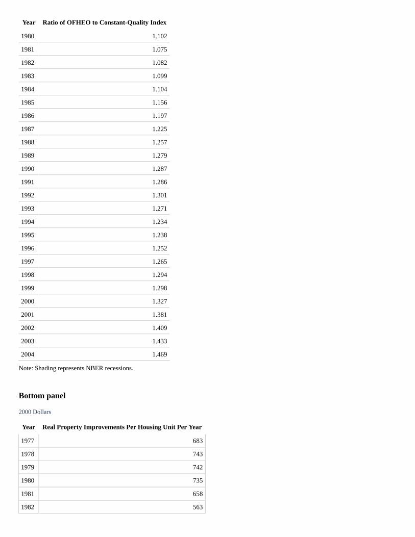
Year Ratio of OFHEO to Constant-Quality Index
1980 1.102
1981 1.075
1982 1.082
1983 1.099
1984 1.104
1985 1.156
1986 1.197
1987 1.225
1988 1.257
1989 1.279
1990 1.287
1991 1.286
1992 1.301
1993 1.271
1994 1.234
1995 1.238
1996 1.252
1997 1.265
1998 1.294
1999 1.298
2000 1.327
2001 1.381
2002 1.409
2003 1.433
2004 1.469
Note: Shading represents NBER recessions.
Bottom panel
2000 Dollars
Year Real Property Improvements Per Housing Unit Per Year
1977 683
1978 743
1979 742
1980 735
1981 658
1982 563

Year Real Property Improvements Per Housing Unit Per Year
1983 587
1984 647
1985 677
1986 795
1987 812
1988 808
1989 770
1990 704
1991 667
1992 731
1993 814
1994 850
1995 837
1996 861
1997 866
1998 858
1999 876
2000 896
2001 894
2002 962
2003 990
2004 1015
Note: Shading represents NBER recessions.
Source: Census Bureau, Office of Federal Housing Enterprise Oversight, and Bureau of Economic Analysis
Slide 8Ratios of Median Home Value to Median Family Income by Percentile of Home Value
Slide 9Implicit Land Price Increases Derived from Constant-Quality New Home PriceIndices*
(compound annual rate, 1998-2004)
U.S. Northeast Midwest South West
5.5% 7.3% 2.9% 2.8% 10.0%
* Based on the assumption that land represents 50 percent of the value of the property. Return to text
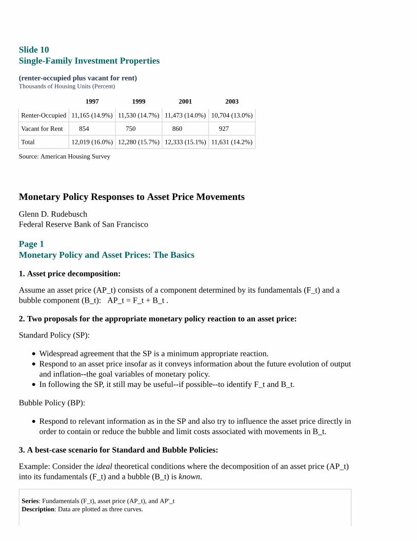
Slide 10Single-Family Investment Properties
(renter-occupied plus vacant for rent)Thousands of Housing Units (Percent)
1997 1999 2001 2003
Renter-Occupied 11,165 (14.9%) 11,530 (14.7%) 11,473 (14.0%) 10,704 (13.0%)
Vacant for Rent 854 750 860 927
Total 12,019 (16.0%) 12,280 (15.7%) 12,333 (15.1%) 11,631 (14.2%)
Source: American Housing Survey
Monetary Policy Responses to Asset Price Movements
Glenn D. RudebuschFederal Reserve Bank of San Francisco
Page 1Monetary Policy and Asset Prices: The Basics
1. Asset price decomposition:
Assume an asset price (AP_t) consists of a component determined by its fundamentals (F_t) and abubble component (B_t): AP_t = F_t + B_t .
2. Two proposals for the appropriate monetary policy reaction to an asset price:
Standard Policy (SP):
Widespread agreement that the SP is a minimum appropriate reaction.Respond to an asset price insofar as it conveys information about the future evolution of outputand inflation--the goal variables of monetary policy.In following the SP, it still may be useful--if possible--to identify F_t and B_t.
Bubble Policy (BP):
Respond to relevant information as in the SP and also try to influence the asset price directly inorder to contain or reduce the bubble and limit costs associated with movements in B_t.
3. A best-case scenario for Standard and Bubble Policies:
Example: Consider the ideal theoretical conditions where the decomposition of an asset price (AP_t)into its fundamentals (F_t) and a bubble (B_t) is known.
Series: Fundamentals (F_t), asset price (AP_t), and AP'_tDescription: Data are plotted as three curves.

The x-axis represents time (t) and has three tick marks dividing it into four sections. The first section of the x-axis is aboutone-half the size of the second and third sections. The fourth section is about one-half the size of the first section. They-axis units are unknown, and the axis has four tick marks dividing it into five equal sections.
The fundamentals (F_t) series starts at the beginning of the first section of the x-axis and about two-thirds up the firstsection of the y-axis and generally rises to end at about four-fifths into the third section of the y-axis at the end of the lastsection of the x-axis.
The asset price series (AP_t) starts at the beginning of the first section of the x-axis and about one-third into the firstsection of the y-axis; it generally rises to about three-fourths into the fifth section of the y-axis at two-thirds into the thirdsection of the x axis. The curve then generally drops to about the first tick mark of the y-axis at about three-fourths of thethird section of the x-axis. The curve generally rises again to end about two-thirds into the third section of the y-axis at theend of the last section of the x-axis.
The AP'_t curve starts near the end of the second section of the x-axis and about one-fourth into the third section of they-axis. The curve generally rises to end at about four-fifths into the third section of the y-axis at the end of the last sectionof the x-axis.
The fundamentals (F_t) and the asset price (AP_t) curves overlap throughout the first and second sections of the x-axis andagain about three-fourths into the third section of the x-axis. The curves overlap once more at about four-fifths into the lastsection of the x-axis.
The fundamentals (F_t) and AP'_t curves overlap about three-fourths into the third section of the x-axis.
The Standard Policy (SP) would:
Try to offset the effects of AP_t with higher rates than recommended by the fundamentalsbefore the crash and lower rates afterward.
The Bubble Policy (BP) would:
Respond to information as in the SP, but also try to reduce the bubble fluctuations and achieve,ideally, the AP'_t path. This would likely require higher rates than the SP before the crash andlower rates afterward.
Page 2Should Monetary Policy Try to Reduce an Asset Price Bubble?
Decision tree for Standard and Bubble Policies
Q1. Can a bubble--or asset price misalignment--be identified? (Yes or No)
Yes No
Asset price appears misaligned.
[Continue to Q2]
The asset price is arguably aligned with fundamentals.
Follow Standard Policy
[Stop]
Q2. Do bubble fluctuations result in large macroeconomic consequences that monetary policycannot readily offset? (Yes or No)
Yes No
Fallout may include a severe financial crisis, imbalances, or Macroeconomic consequences from asset price boom and

Yes No
misallocations that cannot be well offset by monetary policy.
[Continue to Q3]
bust are minor or they occur with a lag, so monetary policycan effectively offset them.
Follow Standard Policy
[Stop]
Q3. Is monetary policy a good way to deflate the bubble? (Yes or No)
Yes No
Relative to the cost of alternatives the dislocationsassociated with monetary policy actions are small.
Follow Bubble Policy
[Stop]
Interest rate effects on bubble are uncertain or costly,especially relative to alternative deflation strategies.
Follow Standard Policy
[Stop]
Page 3Two Episodes of Possible Asset Price Bubbles
Real-time answers to decision-tree questions
1. Equity prices in 1999-2000:
Q1: A bubble could be identified in certain sectors and perhaps in overall market.Q2: Serious capital misallocation appeared likely during boom and severe fallout fromfinancial instability was possible during bust. Both hard to rectify.Q3: It appeared unlikely that any bubble could be deflated by monetary policy.
Title: U.S. Stock Market IndexesSeries: NASDAQ and S&P 500Horizon: 1995 to 2005Description: Data are plotted on two curves. Units are index, January 3, 1995=100.
The NASDAQ series begins at about 100 in the beginning of 1995 and generally rises to about 275 in mid-1998. It risessharply to just under 700 in early 2000, then generally drops to just under 200 in early 2001. The curve stays mostly steadyending in mid-2005 at just under 300.
The S&P 500 series begins at about 100 in 1995, rising steadily and remaining between 200 and 300 between mid-1997and mid-2005.
The curves overlap in all years except between late 1998 and early 2001.
2. Bond prices in 1994:
Q1: A bubble or bond price misalignment appeared likely. Termed an "inflation scare" or"credibility gap."Q2: Possible fallout from propagation of high-inflation expectations.Q3: It appeared likely monetary policy could guide prices back to fundamentals.
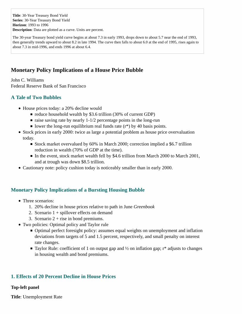
Title: 30-Year Treasury Bond YieldSeries: 30-Year Treasury Bond YieldHorizon: 1993 to 1996Description: Data are plotted as a curve. Units are percent.
The 30-year Treasury bond yield curve begins at about 7.3 in early 1993, drops down to about 5.7 near the end of 1993,then generally trends upward to about 8.2 in late 1994. The curve then falls to about 6.0 at the end of 1995, rises again toabout 7.3 in mid-1996, and ends 1996 at about 6.4.
Monetary Policy Implications of a House Price Bubble
John C. WilliamsFederal Reserve Bank of San Francisco
A Tale of Two Bubbles
House prices today: a 20% decline wouldreduce household wealth by $3.6 trillion (30% of current GDP)raise saving rate by nearly 1-1/2 percentage points in the long-runlower the long-run equilibrium real funds rate (r*) by 40 basis points.
Stock prices in early 2000: twice as large a potential problem as house price overvaluationtoday.
Stock market overvalued by 60% in March 2000; correction implied a $6.7 trillionreduction in wealth (70% of GDP at the time).In the event, stock market wealth fell by $4.6 trillion from March 2000 to March 2001,and at trough was down $8.5 trillion.
Cautionary note: policy cushion today is noticeably smaller than in early 2000.
Monetary Policy Implications of a Bursting Housing Bubble
Three scenarios:20% decline in house prices relative to path in June Greenbook1.Scenario 1 + spillover effects on demand2.Scenario 2 + rise in bond premiums.3.
Two policies: Optimal policy and Taylor ruleOptimal perfect foresight policy: assumes equal weights on unemployment and inflationdeviations from targets of 5 and 1.5 percent, respectively, and small penalty on interestrate changes.Taylor Rule: coefficient of 1 on output gap and ½ on inflation gap; r* adjusts to changesin housing wealth and bond premiums.
1. Effects of 20 Percent Decline in House Prices
Top-left panel
Title: Unemployment Rate
Series: Optimal policy, Taylor Rule, and June Greenbook (optimal policy)Horizon: 2004 to 2008Description: Data are plotted as three curves. Units are not defined.
The optimal policy series begins at about 5.6 in 2004, falls to about 5.1 in late 2005, and ends atabout 5.25 in late 2008.
The June Greenbook (optimal policy) series begins in 2005 at about 5.1 and ends in late 2008 atabout 5.25.
The Taylor Rule series begins at about 5.6 in 2004, falls to about 5.1 in late 2005, rises to about 5.4in late 2006, and ends at about 5.3 in late 2008.
The June Greenbook (optimal policy) curve and the optimal policy curve overlap from 2006 to late2008. The optimal policy curve and the Taylor Rule curve overlap from 2004 until mid-2005.
Top-right panel
Title: Core PCE Price Inflation (4-quarter change)Series: Optimal policy, Taylor Rule, and June Greenbook (optimal policy)Horizon: 2004 to 2008Description: Data are plotted as three curves. Units are not defined.
The optimal policy series and the Taylor Rule curve overlap and start at about 1.3 in early 2004 andtrend up to about 2.1 in mid-2005. In early 2006, the curves stop overlapping. The Taylor Rule seriesends in 2008 at about 1.80, and the optimal policy series ends 2008 at about 1.85.
The June Greenbook (optimal policy) curve begins in 2005 at slightly over 2 and ends in 2008 atabout 1.85.
The June Greenbook (optimal policy) curve overlaps the optimal policy curve and the Taylor Rulecurve between 2005 and 2006 and overlaps the Taylor Rule curve again in mid-2007.
Middle panel
Title: Federal Funds RateSeries: Optimal policy, Taylor Rule, and June Greenbook (optimal policy)Horizon: 2004 to 2008Description: Data are plotted as three curves. Units are not defined.
Both the optimal policy curve and the Taylor Rule curve start at about 1 in mid-2004. Both overlapand rise together to about 3.5 in late 2005. The Taylor Rule curve rises to about 4 in early 2006 andends in late 2008 at about 3. The optimal policy curve ends at about 3.2 toward the end of 2008.
The June Greenbook (optimal policy) curve begins in mid-2005 at about 3.1 and ends at about 3.7 inlate 2008.
The Taylor Rule curve and the optimal policy curve overlap from 2004 to late 2005 and again aroundearly 2007. All three curves overlap in 2005. The June Greenbook curve and the Taylor Rule curvecontinue to overlap through early 2006.
Bottom panel
House prices decline 20% relative to June Greenbook path by end of 2007.Demand shock: no significant tradeoff of goals.
Macroeconomic effects build gradually: Under Taylor Rule, policy can respond to them asthey develop.
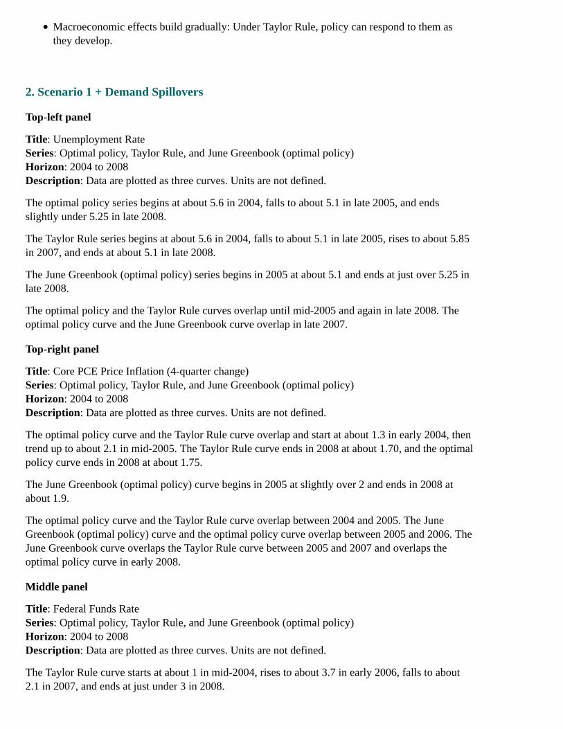
2. Scenario 1 + Demand Spillovers
Top-left panel
Title: Unemployment RateSeries: Optimal policy, Taylor Rule, and June Greenbook (optimal policy)Horizon: 2004 to 2008Description: Data are plotted as three curves. Units are not defined.
The optimal policy series begins at about 5.6 in 2004, falls to about 5.1 in late 2005, and endsslightly under 5.25 in late 2008.
The Taylor Rule series begins at about 5.6 in 2004, falls to about 5.1 in late 2005, rises to about 5.85in 2007, and ends at about 5.1 in late 2008.
The June Greenbook (optimal policy) series begins in 2005 at about 5.1 and ends at just over 5.25 inlate 2008.
The optimal policy and the Taylor Rule curves overlap until mid-2005 and again in late 2008. Theoptimal policy curve and the June Greenbook curve overlap in late 2007.
Top-right panel
Title: Core PCE Price Inflation (4-quarter change)Series: Optimal policy, Taylor Rule, and June Greenbook (optimal policy)Horizon: 2004 to 2008Description: Data are plotted as three curves. Units are not defined.
The optimal policy curve and the Taylor Rule curve overlap and start at about 1.3 in early 2004, thentrend up to about 2.1 in mid-2005. The Taylor Rule curve ends in 2008 at about 1.70, and the optimalpolicy curve ends in 2008 at about 1.75.
The June Greenbook (optimal policy) curve begins in 2005 at slightly over 2 and ends in 2008 atabout 1.9.
The optimal policy curve and the Taylor Rule curve overlap between 2004 and 2005. The JuneGreenbook (optimal policy) curve and the optimal policy curve overlap between 2005 and 2006. TheJune Greenbook curve overlaps the Taylor Rule curve between 2005 and 2007 and overlaps theoptimal policy curve in early 2008.
Middle panel
Title: Federal Funds RateSeries: Optimal policy, Taylor Rule, and June Greenbook (optimal policy)Horizon: 2004 to 2008Description: Data are plotted as three curves. Units are not defined.
The Taylor Rule curve starts at about 1 in mid-2004, rises to about 3.7 in early 2006, falls to about2.1 in 2007, and ends at just under 3 in 2008.

The optimal policy curve begins at about 1 in mid-2004, rises to about 2.8 in 2005, and drops toabout 2.5 in 2006. The series ends in 2008 at about 3.7.
The June Greenbook (optimal policy) curve begins in 2005 at about 2.8 and ends at about 3.7 in late2008.
The Taylor Rule curve and the optimal policy curve overlap from 2004 to 2005 and again in early2007. The June Greenbook (optimal policy) curve and the Taylor Rule curve overlap in 2005.
Bottom panel
House price declines rattle consumer confidence and dry up equity extraction from mortgagerefinancing, crimping household spending.Optimal policy: funds rate declines to 2-1/4% by middle of 2006.Taylor Rule fails to act in anticipation of spillover effects and responds too gradually once theyoccur.
3. Scenario 2 + Falling Bond Prices
Top-left panel
Title: Unemployment RateSeries: Optimal policy, Taylor Rule, and June Greenbook (optimal policy)Horizon: 2004 to 2008Description: Data are plotted as three curves. Units are not defined.
The optimal policy series begins at about 5.6 in 2004, falls to about 5.1 in late 2005, and endsslightly under 5.25 in late 2008.
The Taylor Rule series begins at about 5.6 in 2004, falls to about 5.1 in late 2005, rises to about 6.1in 2007, and ends slightly under 5.25 in late 2008.
The June Greenbook (optimal policy) series begins in 2005 at about 5.1 and ends at just over 5.25 inlate 2008.
The June Greenbook (optimal policy) and the Taylor Rule curves overlap until mid-2005 and againin late 2008. The optimal policy and the Taylor Rule curves overlap from early 2004 until early 2006.The optimal policy and the June Greenbook curves overlap in late 2007.
Top-right panel
Title: Core PCE Price Inflation (4-quarter change)Series: Optimal policy, Taylor Rule, and June Greenbook (optimal policy)Horizon: 2004 to 2008Description: Data are plotted as three curves. Units are not defined.
Both the optimal policy curve and the Taylor Rule curve start at about 1.3 in early 2004, then trendup to about 2.1 in mid-2005. The Taylor Rule curve ends in 2008 at about 1.70, and the optimalpolicy curve ends in 2008 at about 1.75.
The June Greenbook (optimal policy) curve begins in 2005 at slightly over 2 and ends in 2008 atabout 1.9.

The optimal policy curve and the Taylor Rule curve overlap between 2004 and 2005. The JuneGreenbook (optimal policy) curve and the optimal policy curve overlap between 2005 and 2006. TheJune Greenbook curve overlaps the Taylor Rule curve in 2005 and 2006 and overlaps the optimalpolicy curve in early 2008.
Middle panel
Title: Federal Funds RateSeries: Optimal policy, Taylor Rule, and June Greenbook (optimal policy)Horizon: 2004 to 2008Description: Data are plotted as three curves. Units are not defined.
The Taylor Rule curve starts at about 1 in mid-2004, rises to about 3.2 in early 2006, falls to about1.2 in 2007, and ends in late 2008 at about 2.
The optimal policy curve begins at about 1 in mid-2004, rises to about 2.8 in 2005, and drops toabout 0.8 in 2006. The series ends in 2008 at about 2.8.
The June Greenbook (optimal policy) curve begins in 2005 at about 2.8 and ends at about 3.7 in late2008.
The Taylor Rule curve and the optimal policy curve overlap from 2004 to 2005 and again in early2007.
Bottom panel
House prices decline 20% as before, with demand spillovers.Term premiums on long-term bonds increase 75 basis points by year-end.Optimal policy drives funds rate below 1 percent by middle of 2006.Optimal policy able to forestall significant rise in unemployment rate; under Taylor Rule,unemployment rate reaches 6 percent.
Using Monetary Policy to Preempt a Worsening House Price Misalignment
Pro: House price misalignment maycontribute to conditions that lead to a sharp contraction in economic activity that isdifficult for policy to counteractmisallocate resources toward housing-related activities.
Con: Effectiveness of such policies is open to questionuncertain empirical relationship between housing prices, interest rates, and other factorsdifficulties in assessing existence and magnitude of misalignment.
[Appendix 1, continued]
House Prices and Rents in Selected Metropolitan Areas
Top-left panel
Title: San Francisco
Series: Real price and real rentHorizon: 1975 to 2005Description: Data are plotted as two curves. Units are four-quarter percent change.
The real price series begins at about 10 in 1975, drops to about negative 9 in 1983, rises to about 19in 1990, then drops down again to about negative 9 in 1991. The series generally rises to about 20 in2001 and ends at about 15 in 2005.
The real rent series begins at about negative 5 in 1975, then rises to about 5 in 1984, and ends atabout negative 2 in 2005.
The two curves overlap in 1981, 1986, 1987, 1991, 1999, and 2003.
Top-right panel
Title: San FranciscoSeries: Price-rent ratioHorizon: 1975 to 2005Description: Data are plotted as a curve. Units are percent deviation from long-run level.
The price-rent ratio series begins at just under negative 10 in 1975, rises to about 10 in 1980, dropsto about negative 5 in 1986, rises to about 15 in 1990, then drops to about negative 5 in 1998, andends at about 33 in 2005.
Middle-left panel
Title: ChicagoSeries: Real price and real rentHorizon: 1975 to 2005Description: Data are plotted as two curves. Units are four-quarter percent change.
The real price series begins at about 10 in 1975, then drops to about negative 12 in 1981, rises toabout 1 in 1982, drops to about negative 11 in 1983, rises to about 2 in 1984, and ends at about 8 in2005.
The real rent series begins at about negative 5 in 1975, rises to about 1 in 1982, and ends at justabove 0 in 2005.
The two curves overlap in 1979, 1981, 1983, 1984, 1986, and 1991 through 1999.
Middle-right panel
Title: ChicagoSeries: Price-rent ratioHorizon: 1975 to 2005Description: Data are plotted as a curve. Units are percent deviation from long-run level.
The price-rent ratio series begins at about negative 5 in 1975, rises to about 10 in 1978, and ends atabout 11 in 2005.
Bottom-left panel
Title: ClevelandSeries: Real price and real rentHorizon: 1975 to 2005

Description: Data are plotted as two curves. Units are four-quarter percent change.
The real price series begins at about 9 in 1975, drops to about negative 16 in 1982, rises to about 8 in1983, and ends at about 1 in 2005.
The real rent series begins at about negative 5 in 1975 and ends at just below 0 in 2005.
The two curves overlap in 1980, 1983, 1984, 1986, 1991, 1992, 1995, 1997, 2001, and 2002.
Bottom-right panel
Title:ClevelandSeries: Price-rent ratioHorizon: 1975 to 2005Description: Data are plotted as a curve. Units are percent deviation from long-run level.
The price-rent ratio series begins at about negative 3 in 1975, drops to about negative 7 in 1982, andends in 2005 at about 6.
Sources: OFHEO, BEA, and BLS.
House Prices and Rents in Selected Metropolitan Areas
Top-left panel
Title: BostonSeries: Real price and real rentHorizon: 1975 to 2005Description: Data are plotted as two curves. Units are four-quarter percent change.
The real price series begins at about 0 in 1978, drops to about negative 1 in 1980, rises to about 25 in1986, drops to about negative 13 in 1990, and ends at about 9 in 2005.
The real rent series begins at about negative 5 in 1975 and ends at just below 0 in 2005.
The two curves overlap in 1981, 1983, 1988, 1992, 1993, 1994, 1995, and 1997.
Top-right panel
Title: BostonSeries: Price-rent ratioHorizon: 1975 to 2005Description: Data are plotted as a curve. Units are percent deviation from long-run level.
The price-rent ratio series begins at about negative 8 in 1975, rises to about 25 in 1987, drops toabout negative 8 in 1995, and ends at about 20 in 2005.
Middle-left panel
Title: New YorkSeries: Real price and real rentHorizon: 1975 to 2005Description: Data are plotted as two curves. Units are four-quarter percent change.
The real price series begins at about negative 3 in 1976, then rises to just over 20 in 1987, drops toabout negative 12 in 1990, and ends at about 12 in 2005.
The real rent series begins at about negative 4 in 1975 and ends at about 1 in 2005.
The two curves overlap in 1976, 1977, 1982, 1983, 1988, 1992, 1993, 1995, and 1998.
Middle-right panel
Title: New YorkSeries: Price-rent ratioHorizon: 1975 to 2005Description: Data are plotted as a curve. Units are percent deviation from long-run level.
The price-rent ratio series begins at about negative 5 in 1975, rises to just under 30 in 1988, drops toabout negative 9 in 1997, and ends at about 20 in 2005.
Bottom-left panel
Title: MiamiSeries: Real price and real rentHorizon: 1975 to 2005Description: Data are plotted as two curves. Units are four-quarter percent change.
The real price series begins at about negative 9 in 1976, rises to about 8 in 1979, drops to aboutnegative 7 in 1981, and ends at about 20 in 2005.
The real rent series begins at about negative 4 in 1978, rises to about 5 in 1981, and ends at about 3in 2005.
The two curves overlap in 1980, 1981, 1982, 1983, 1984, 1986, 1989, 1990, 1992, 1995, and 1996.
Bottom-right panel
Title: MiamiSeries: Price-rent ratioHorizon: 1975 to 2005Description: Data are plotted as a curve. Units are percent deviation from long-run level.
The price-rent ratio series begins at about negative 4 in 1978 and stays mostly steady until about2000, when it begins to climb sharply, ending at about 63 in 2005.
Sources: OFHEO, BEA, and BLS.
Measures of Prices, Rents, and Costs in the Housing Market
Top panel
Title: Changes in Real House Prices and RentsSeries: Repeat-transactions price index (adjusted), constant-quality price index for new homes, andrent index (adjusted)Horizon: 1979 to 2005:Q1Description: Data are plotted as three curves. Units are four-quarter percent change.
The repeat-transactions price index (adjusted) series begins at about 4.7 in 1979, drops to aboutnegative 3.9 in 1981, rises to about 4.2 in 1986, falls to about negative 4.1 in 1990, and climbs toabout 7.9 in 2005:Q1.
The constant-quality price index for new homes series begins in 1980 at about 2.1, falls to aboutnegative 5 in 1982, rises to about 3.9 in 1986, drops to about negative 5 in 1991, rises to about 4 in1994, and ends at about 2 at the end of 2004.
The rent index (adjusted) series begins at just under 0 in 1979, rises to about 4.2 in 1986, and ends atabout 1 at the end of 2004.
The repeat-transactions price index (adjusted) curve and constant-quality price index for new homescurve overlap from 1980 through 1987, and in 1990, 1991, 1992, 1995, 1996, and 1997.
The repeat-transactions price index (adjusted) curve and the rent index curve overlap in 1980, 1986,1990, 1993, 1994, 1996, and 1997.
The constant-quality price index for new homes curve and the rent index curve overlap in 1980,1981, 1986, 1988, 1989, 1992, 1995, 1996, 1997, 1998, 2000, 2001, and 2002.
Bottom panel
Title: Levels of Real House Prices and Construction CostsSeries: Repeat-transactions price index (adjusted), constant-quality price index for new homes, andconstruction costsHorizon: 1979 to 2004Description: Data are plotted as three curves. Units are index (1979=100).
The repeat-transactions price index (adjusted) series begins at about100 in 1979, drops to about 92 in1983, and ends at about 141 in 2004.
The constant-quality price index for new homes series begins at about 100 in 1979, drops to about 88in 1992, and ends at about 115 in 2004.
The construction costs series begins at about 100 in 1979, drops to about 91 in 1991, and ends atabout 103 at the end of 2004.
The repeat-transactions price index (adjusted) curve and the constant-quality price index for newhomes curve overlap in 1985.
The repeat-transactions price index (adjusted) curve and the construction costs curve overlap in 1980and 1986.
The constant-quality price index for new homes curve and the construction costs curve overlap in1981, 1989, 1990, 1995, and 1998.
Sources: OFHEO, Freddie Mac, BLS, Census, BEA, and Engineering News Record.
Appendix 2: Materials used by Mr. Kos
Page 1

Top panel
Title: Current U.S. 3-Month Deposit Rates and Rates Implied by Traded Forward Rate AgreementsSeries: LIBOR fixed, 3-month forward, 9-month forwardHorizon: March 1, 2005 - June 28, 2005Description: US forward contracts rates rose.
Middle panel
Title: Spread Between 2- and 10-Year Treasury YieldsSeries: 2-Year Treasury Yield and 10-Year Treasury Yield spread and Average since 1980Horizon: January 1980 - June 2005Description: The spread narrowed below the average.
Bottom panel
Title: TIPS Breakevens and Crude Oil FuturesSeries: 5-year TIPS breakeven rate, 10-year TIPS breakeven rate, and Front month crude oil futuresHorizon: January 13, 2005 - June 28, 2005Description: TIPS breakeven rates decreased, while the front month crude oil futures increased.
Page 2
Top panel
Title: High Yield and Auto Debt SpreadsSeries: GM, Ford, and High Yield IndexHorizon: January 3, 2005 - June 28, 2005Description: High yield and auto debt spreads widened.
Source: Merrill Lynch, Bloomberg
Middle panel
Title: Dow Jones CDX 5-Year Investment Grade Credit Default Swaps IndexSeries: Dow Jones CDX 5-Year Investment Grade Credit Default Swaps IndexHorizon: April 1, 2005 - June 28 2005Description: The Dow Jones CDX 5-year investment grade credit default swap index increasedslightly.
Bottom panel
Title: Select Hedge Fund Index ReturnsSeries: Aggregate Hedge Fund Index and Convertible Arbitrage IndexHorizon: December 31, 2004 - June 24, 2005Description: Select hedge fund indexes had negative returns.
Source: HFR
Page 3

Top panel
Title: Euro-Area 3-Month Deposit Rates and Rates Implied by Traded Forward Rate AgreementsSeries: Libor fixed, 3-month forward, and 9-month forwardHorizon: March 1, 2005 - June 28, 2005Description: Euro forward contracts rates rose.
Middle-left panel
Title: Euro-DollarSeries: Euro-dollarHorizon: January 3, 2004 - June 28, 2005Description: The dollar appreciated against the Euro.
Middle-right panel
Title: Interest Rate DifferentialsSeries: US 2-year Treasury note and 2-year German SchatzHorizon: June 28, 2004 - June 28, 2005Description: The US 2-year Treasury note rate increased, while the 2-year German Schatz ratedecreased.
Bottom-left panel
Title: Euro-Dollar Risk ReversalsSeries: 1-year 25 delta risk reversalHorizon: February 1, 2000 - June 28, 2005Description: There is a premium for Euro put options.
Bottom-right panel
Title: IMM Net Non-Commercial Euro PositionsSeries: IMM Net Non-Commercial Euro PositionsHorizon: January 2005 - June 2005Description: Non-commercial Euro positions decreased.
Page 4
Top panel
Title: Global 10-Year Sovereign Debt YieldsSeries: Australia, UK, US, Canada, and GermanyHorizon: March 15, 2005 - June 28, 2005Description: 10-year sovereign debt yields decreased.
Middle panel
Title: Japanese Government Bond Yield CurveSeries: 6/28/04 and 6/28/05Horizon: 3-month, 6-month, 1-year, 2-year, 3-year, 5-year, 7-year, 10-year, 15-year, 20-year, and30-yearDescription: The Japanese bond yield curve rate decreased for long term yields.
Bottom panel
Title: Year-To-Date Global Equity PerformanceSeries: USD Return and local currency return for: US S&P 500, Mexico Bolsa, Brazil Bovespa, U.K.FTSE, French CAC, German DAX, Italy MIB Index, and Japan NikkeiHorizon: Year-to-dateDescription: Local currency returns are mostly positive, with the U.S. and Brazil being outliers.USD returns are mostly negative, with Mexico, Brazil, and the U.K. being outliers.
Appendix 3: Materials used by Messrs. Oliner, Wilcox, and Leahy
Material for Staff Presentation on the Economic OutlookJune 30, 2005
STRICTLY CONFIDENTIAL (FR) CLASS I-FOMC**Downgraded to Class II upon release of the July 2005 Monetary Policy Report.
Exhibit 1Recent Indicators
Top-left panel
Title: Real Personal Consumption ExpendituresSeries: Real personal consumption expendituresHorizon: 2003 to May 2005Description: Data are plotted as a curve. Units are trillions of 2000 dollars at an annual rate.
The curve starts in 2003:Q1 just above 7.2, followed by an increase to just above 7.4 by 2003:Q3. Itdips to about 7.4 in 2003:Q4, then increases through 2004:Q2 to about 7.6. The curve decreases to abit less than 7.6 in 2004:Q3, then moves upward to end at nearly 7.9 in May 2005.
The chart shows 10 dots that denote quarterly averages and generally follow the contour of the curve.The dot for 2003:Q1 is just above 7.2, the dot for 2003:Q2 is at about 7.3, the dot for 2003:Q3 is justabove 7.4, and the dot for 2003:Q4 is about 7.5. The dot for 2004:Q1 is just above 7.5, the dot for2004:Q2 is slightly below 7.6, the dot for 2004:Q3 is at about 7.7, and the dot for 2004:Q4 is a bitbelow 7.8. The dot for 2005:Q1 is just below 7.8, and the 10th dot for 2005:Q2 represents a staffestimate and is at approximately 7.9.
[inset box]Percent change, a.r.
Q1 3.6
Q2 3.1
Top-right panel
Title: Sales of Single-Family HomesSeries: Existing homes and New homesHorizon: 2001 to May 2005Description: Data are plotted as two curves and are monthly. Units are millions at an annual rate.
e
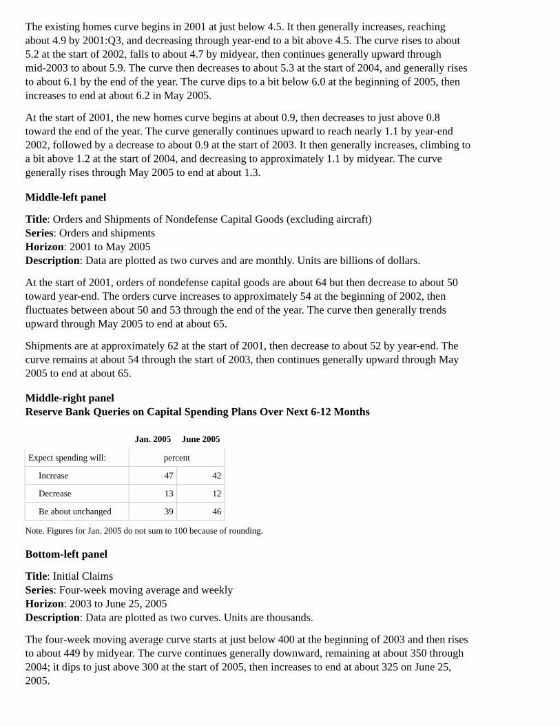
The existing homes curve begins in 2001 at just below 4.5. It then generally increases, reachingabout 4.9 by 2001:Q3, and decreasing through year-end to a bit above 4.5. The curve rises to about5.2 at the start of 2002, falls to about 4.7 by midyear, then continues generally upward throughmid-2003 to about 5.9. The curve then decreases to about 5.3 at the start of 2004, and generally risesto about 6.1 by the end of the year. The curve dips to a bit below 6.0 at the beginning of 2005, thenincreases to end at about 6.2 in May 2005.
At the start of 2001, the new homes curve begins at about 0.9, then decreases to just above 0.8toward the end of the year. The curve generally continues upward to reach nearly 1.1 by year-end2002, followed by a decrease to about 0.9 at the start of 2003. It then generally increases, climbing toa bit above 1.2 at the start of 2004, and decreasing to approximately 1.1 by midyear. The curvegenerally rises through May 2005 to end at about 1.3.
Middle-left panel
Title: Orders and Shipments of Nondefense Capital Goods (excluding aircraft)Series: Orders and shipmentsHorizon: 2001 to May 2005Description: Data are plotted as two curves and are monthly. Units are billions of dollars.
At the start of 2001, orders of nondefense capital goods are about 64 but then decrease to about 50toward year-end. The orders curve increases to approximately 54 at the beginning of 2002, thenfluctuates between about 50 and 53 through the end of the year. The curve then generally trendsupward through May 2005 to end at about 65.
Shipments are at approximately 62 at the start of 2001, then decrease to about 52 by year-end. Thecurve remains at about 54 through the start of 2003, then continues generally upward through May2005 to end at about 65.
Middle-right panelReserve Bank Queries on Capital Spending Plans Over Next 6-12 Months
Jan. 2005 June 2005
Expect spending will: percent
Increase 47 42
Decrease 13 12
Be about unchanged 39 46
Note. Figures for Jan. 2005 do not sum to 100 because of rounding.
Bottom-left panel
Title: Initial ClaimsSeries: Four-week moving average and weeklyHorizon: 2003 to June 25, 2005Description: Data are plotted as two curves. Units are thousands.
The four-week moving average curve starts at just below 400 at the beginning of 2003 and then risesto about 449 by midyear. The curve continues generally downward, remaining at about 350 through2004; it dips to just above 300 at the start of 2005, then increases to end at about 325 on June 25,2005.
The weekly curve starts at about 360 in 2003 and then fluctuates upward to about 450 by midyear. Itthen generally decreases, remaining at about 350 through 2004. The curve dips to about 299 at thestart of 2005, after which it generally increases to end a bit above 300 on June 25, 2005.
Bottom-right panel
Title: Core PCE PricesSeries: Core PCE pricesHorizon: 1997 to May 2005Description: Data are plotted as a curve and are presented monthly. Unit is 12-month percentchange.
The curve starts at about 1.7 in 1997 and then continues generally downward through mid-1998 untilit reaches about 1.0. It fluctuates upward to about 2.0 in 2000, followed by a decrease to about 1.5 byyear-end. In 2001, the curve increases to approximately 2.2, drops to about 1.5 by midyear, thenincreases to end the year at about 2.2. The curve drops to about 1.6 near mid- 2002, then increases tojust below 2.5 by year-end. The curve generally decreases through the start of 2004 to approximately1.0, then rises to end at about 1.6 in May 2005.
[inset box]Percent change
Mar. Apr. May
Greenbook .3 .1 .3
Published .2 .1 .2
Exhibit 2Key Background Factors
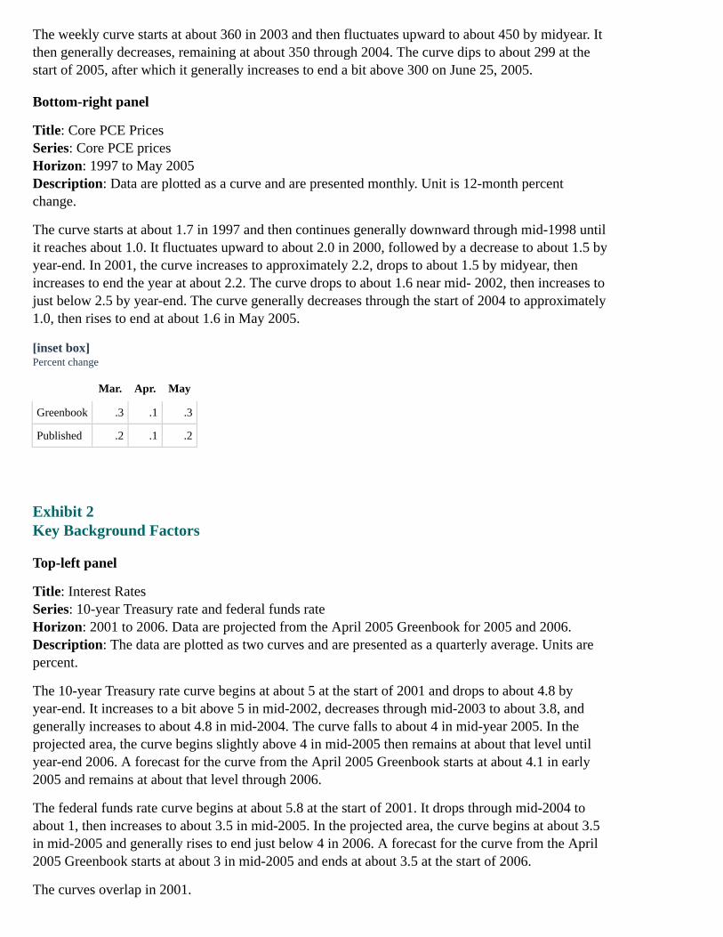
Top-left panel
Title: Interest RatesSeries: 10-year Treasury rate and federal funds rateHorizon: 2001 to 2006. Data are projected from the April 2005 Greenbook for 2005 and 2006.Description: The data are plotted as two curves and are presented as a quarterly average. Units arepercent.
The 10-year Treasury rate curve begins at about 5 at the start of 2001 and drops to about 4.8 byyear-end. It increases to a bit above 5 in mid-2002, decreases through mid-2003 to about 3.8, andgenerally increases to about 4.8 in mid-2004. The curve falls to about 4 in mid-year 2005. In theprojected area, the curve begins slightly above 4 in mid-2005 then remains at about that level untilyear-end 2006. A forecast for the curve from the April 2005 Greenbook starts at about 4.1 in early2005 and remains at about that level through 2006.
The federal funds rate curve begins at about 5.8 at the start of 2001. It drops through mid-2004 toabout 1, then increases to about 3.5 in mid-2005. In the projected area, the curve begins at about 3.5in mid-2005 and generally rises to end just below 4 in 2006. A forecast for the curve from the April2005 Greenbook starts at about 3 in mid-2005 and ends at about 3.5 at the start of 2006.
The curves overlap in 2001.
Top-right panel
Title: Fiscal ImpetusSeries: Fiscal impetusHorizon: 2001 to 2006. Data are projected from the April 2005 Greenbook for 2005 and 2006.Description: The data are plotted as bars. There are six bars. Units are percent of GDP. A horizontalline is drawn at zero.
The bars for each period indicate the following:
For 2001, about 0.5.For 2002, about 1.0.For 2003, just below 1.0.For 2004, about 0.8.For 2005, the bar shows a forecast at about 0.3.For 2006, the bar shows a forecast just above 0.3.
Middle-left panel
Title: Equity PricesSeries: Wilshire 5000Horizon: 2001 to 2006. Data are projected from the April 2005 Greenbook for 2005 and 2006.Description: Data are plotted as a curve and represent the quarter-end. Units are index, ratio scale.
The curve begins at about 10,400 at the start of 2001 and drops to about 9,500 by midyear. Itincreases to about 11,000 in early 2002, drops to about 7,800 by mid-2002, then generally increasesto about 12,500 in mid-2005. In the projected area, the curve begins at about 12,500 in mid-2005 andrises to end just above 13,000 in 2006. A forecast for the curve from the April 2005 Greenbook startsslightly below 12,000 in early 2005 and increases through 2006 to end just below 13,000.
Middle-right panel
Title: House PricesSeries: OFHEO repeat-transactions indexHorizon: 2001 to 2006. Data are projected from the April 2005 Greenbook for 2005 and 2006.Description: Data are plotted as a curve and are presented quarterly. Units are index, 1980:Q1=100,ratio scale.
The curve begins at about 255 at the start of 2001, then increases to about 358 in mid-2005. In theprojected area, the curve begins at about 359 and generally rises through 2006 to end at about 375. Aforecast for the curve from the April 2005 Greenbook starts in early 2005 at about 358 and increasesthrough 2006 to a bit below 375.
Bottom-left panel
Title: Crude Oil PricesSeries: West Texas IntermediateHorizon: 2001 to 2006. Data are projected from the April 2005 Greenbook for 2005 and 2006.Description: Data are plotted as a curve and are presented as a quarterly average. Units are dollarsper barrel.
The curve begins at about 30 at the start of 2001 and drops to about 20 by the end of the year. Itincreases through the start of 2003 to about 35 and dips to about 30 through the end of the year. Thecurve then generally increases to about 57 in mid-2005. In the projected area, the curve begins at

about 57 in mid-2005 and generally rises through 2006 to end at about 60. A forecast from the April2005 Greenbook starts at about 50 in early 2005, then increases a bit through 2006 to end at about54.
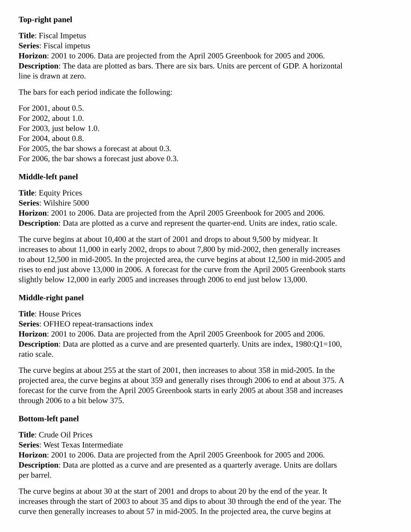
Bottom-right panel
Title: Broad Real DollarSeries: Broad real dollarHorizon: 2001 to 2006. Data are projected from the April 2005 Greenbook for 2005 and 2006.Description: Data are plotted as a curve and are presented as a quarterly average. Units are index,2000=100.
The curve starts at about 104 at the beginning of 2001 and increases to about 109 in early 2002. Itthen generally falls to about 90 in early 2005 and rises to about 95 in mid-2005. In the projected area,the curve begins at about 95 and falls through 2006 to end at about 94. A forecast from the April2005 Greenbook starts at about 93 at the beginning of 2005, then decreases to end at about 90 in2006.
Exhibit 3Forecast Summary
Top-left panel
Title: Real GDPSeries: Real GDPHorizon: 2000 to 2006; Data are projected for 2005 and 2006.Description: Data are plotted as a curve. Units are four-quarter percent change.
The series begins at about 4 in 2000:Q1, then increases to about 5 in the second quarter. It fallsthrough 2001:Q4 to about 0, increases to reach about 2.25 in 2002:Q3, then decreases to about 2 by2003:Q1. The series climbs to about 5 toward the second quarter of 2004, then decreases toapproximately 4 by year-end.
The figure also has two shaded areas that represent a projection period with a 70 percent confidenceinterval and a 90 percent confidence interval. The band for the 70 percent confidence interval startsin 2005:Q1 at about 3.75, gradually expanding to about 5.25 on the upper end and 1.75 on the lowerend by year-end 2006. The 90 percent confidence interval begins in 2005:Q1 at about 3.75, graduallyexpanding to a bit above 6 on the upper end and 0.5 on the lower end by year-end 2006.
In the projected period, the series begins at a little less than 4 in 2005:Q1, then decreases to about3.75 by the end of 2006.
Top-right panelReal GDP
(Percent change, Q4 to Q4)
Jan. GB June GB Revision
2004 3.8 3.9 .1
2005 3.9 3.6 -.3
2006 3.6 3.4 -.2
Middle-left panel
Title: Unemployment RateSeries: Unemployment rateHorizon: 2000 to 2006; Data are projected for 2005 and 2006.Description: Data are plotted as a curve. Units are percent.
The series begins at about 4 in 2000:Q1 and remains at about that level through year-end. It thencontinues generally upward, reaching about 6.25 by 2003:Q3, then decreasing through 2004:Q4 toalmost 5.25.
The figure also has two shaded areas that represent a projection period with a 70 percent confidenceinterval and a 90 percent confidence interval. The 70 percent confidence interval begins in 2005:Q1at about 5.25, gradually expanding to nearly 6 on the upper end and 4.25 on the lower end byyear-end 2006. The 90 percent confidence interval begins in 2005:Q1 at about 5.25, graduallyexpanding to about 6.5 on the upper and about 3.75 on the lower end by year-end 2006.
In the projected period, the series starts at about 5.25 in 2005:Q1, then decreases slightly through2006:Q4 to a bit above 5.
Middle-right panelUnemployment Rate
(Percent, Q4)
Jan. GB June GB Revision
2004 5.4 5.4 .0
2005 5.3 5.1 -.2
2006 5.1 5.1 .0
Bottom-left panel
Title: Core PCE PricesSeries: Core PCE pricesHorizon: 2000 to 2006; Data are projected for 2005 and 2006.Description: Data are plotted as a curve. Units are four-quarter percent change.
The series begins at about 2 in the first quarter of 2000, then dips to about 1.75 by year-end. Thecurve increases through 2001:Q4 to about 2.25, then generally moves downward to about 1 by2003:Q3. The series then increases through year-end 2004 to reach about 1.5.
The figure also has two shaded areas that represent a projection period with a 70 percent confidenceinterval and a 90 percent confidence interval. The 70 percent confidence interval starts in 2005:Q1 atabout 1.5, gradually expanding to about 2.75 on the upper end and slightly above 1 on the lower endby year-end 2006. The 90 percent confidence interval begins in 2005:Q1 at about 1.5, graduallyexpanding to about 3.25 on the upper end and about 0.5 on the lower end by the end of 2006.
In the projected period, the series starts at about 1.5 in 2005:Q1, followed by an increase to justabove 2 by the fourth quarter. It then decreases to just below 2 at the end of 2006.
Bottom-right panelCore PCE Prices
(Percent change, Q4 to Q4)
Jan. GB June GB Revision
2004 1.5 1.6 .1
2005 1.6 2.1 .5
2006 1.4 1.9 .5
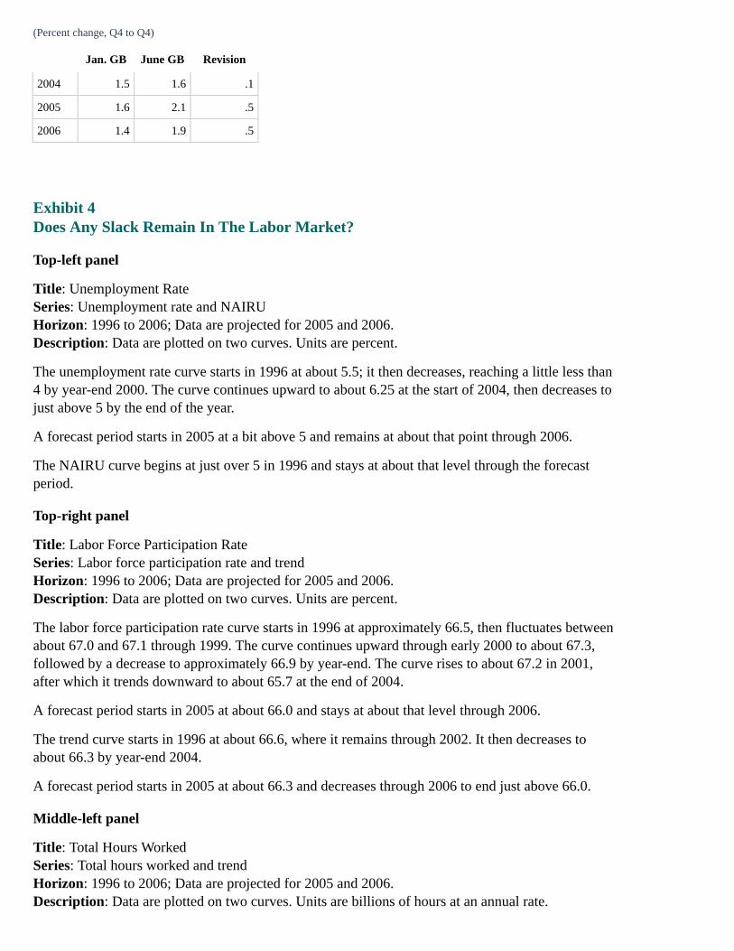
Exhibit 4Does Any Slack Remain In The Labor Market?
Top-left panel
Title: Unemployment RateSeries: Unemployment rate and NAIRUHorizon: 1996 to 2006; Data are projected for 2005 and 2006.Description: Data are plotted on two curves. Units are percent.
The unemployment rate curve starts in 1996 at about 5.5; it then decreases, reaching a little less than4 by year-end 2000. The curve continues upward to about 6.25 at the start of 2004, then decreases tojust above 5 by the end of the year.
A forecast period starts in 2005 at a bit above 5 and remains at about that point through 2006.
The NAIRU curve begins at just over 5 in 1996 and stays at about that level through the forecastperiod.
Top-right panel
Title: Labor Force Participation RateSeries: Labor force participation rate and trendHorizon: 1996 to 2006; Data are projected for 2005 and 2006.Description: Data are plotted on two curves. Units are percent.
The labor force participation rate curve starts in 1996 at approximately 66.5, then fluctuates betweenabout 67.0 and 67.1 through 1999. The curve continues upward through early 2000 to about 67.3,followed by a decrease to approximately 66.9 by year-end. The curve rises to about 67.2 in 2001,after which it trends downward to about 65.7 at the end of 2004.
A forecast period starts in 2005 at about 66.0 and stays at about that level through 2006.
The trend curve starts in 1996 at about 66.6, where it remains through 2002. It then decreases toabout 66.3 by year-end 2004.
A forecast period starts in 2005 at about 66.3 and decreases through 2006 to end just above 66.0.
Middle-left panel
Title: Total Hours WorkedSeries: Total hours worked and trendHorizon: 1996 to 2006; Data are projected for 2005 and 2006.Description: Data are plotted on two curves. Units are billions of hours at an annual rate.
The total hours worked curve starts at about 216 in 1996 and continues upward to about 236 by2001. The curve falls to about 230 in 2002, remains at about 234 in 2003, then generally risesthrough year-end 2004 to about 236.
A forecast period starts in 2005 at about 236 and increases through 2006, reaching approximately244.
The trend curve starts at about 222 in 1996, then increases through the end of 2004 to about 243.
A forecast period starts in 2005 at about 243 and climbs to nearly 245 by year-end 2006.
Middle-right panel
Title: Jobs Plentiful Versus Hard to GetSeries: Jobs plentiful versus hard to getHorizon: 1990 to 2005:Q2Description: Data are plotted as a curve. Units are diffusion index values. A horizontal line is drawnjust above 110 that shows the average for 1997:H1.
The curve begins in 1990 at a little less than 110 and then decreases, falling to about 51 by 1992. Thecurve increases through 2000 until it reaches about 145; it drops to about 71 by 2003 and then risesto end at about 100 in 2005:Q2.
Source: Conference Board.
Bottom-left panel
Title: Jobs Hard to FillSeries: Jobs hard to fillHorizon: 1990 to 2005:Q2Description: Data are plotted as a curve. Unit is percent. A horizontal line is drawn a bit above 25that shows the average for 1997:H1. Note that 2005:Q2 is the April-May average.
The curve begins at about 21 in 1990, followed by a decrease to about 11 by year-end 1991. It thengenerally moves upward to reach about 35 in 2000. The curve continues downward through 2003 toabout 16, then increases through 2005:Q2 to end at about 24.
Source: National Federation of Independent Business.
Bottom-right panel
Title: Persons Working Part-Time for Economic ReasonsSeries: Persons working part-time for economic reasonsHorizon: 1994 to 2005:Q2Description: Data are plotted as a curve. Unit is percent of household employment. A horizontal lineis drawn slightly above 3.0 that shows the average for 1997:H1. Note that 2005:Q2 is the April-Mayaverage.
The curve starts at about 3.7 in 1994, then generally falls to about 2.3 by 2000. It increases to about3.2 in 2001, dips to almost 3.0 in 2002, and rises through early 2004 to about 3.4. The curve thendecreases to end at about 3.0 in 2005:Q2.
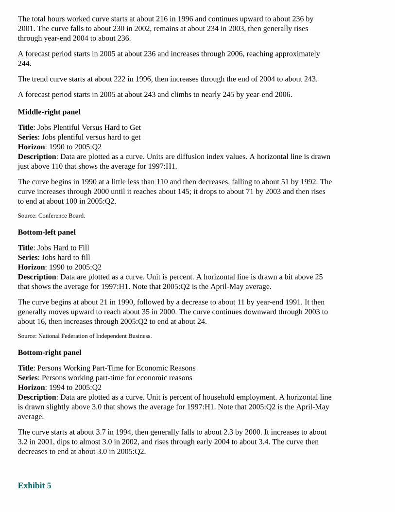
Exhibit 5
Is Compensation Growth Feeding Price Inflation?
Top-left panelP&C Compensation Per Hour
(Percent change, annual rate)
2004: Q1 2.1
Q2 6.0
Q3 5.5
Q4 10.2
2005: Q1 6.3
Top-right panel
Title: Hourly Compensation and Core PCE PricesSeries: P&C comp per hour, ECI, and Core PCE pricesHorizon: 1999 to 2005:Q1 for P&C comp per hour and Core PCE prices; 1999 to March 2005 forECIDescription: Data are plotted as three curves. Units are percent change from a year earlier.
The P&C comp per hour curve starts just above 5 in 1999:Q1, followed by a drop to about 3.1 in1999:Q3. The curve then rises to about 8 in 2000:Q3; it generally decreases through 2003:Q2 to justbelow 3, then rises to about 5.1 in 2003:Q4. The curve drops to about 4.1 through 2004:Q3, thenincreases to end at about 7 in 2005:Q1.
The ECI curve starts at about 3 in 1999:Q1 and increases to just above 4 through 2000. The curvethen generally decreases to end at about 3.1 in March 2005.
The Core PCE prices curve starts at about 1 in 1999:Q1 and stays at about that level through 2000; itbegins to increase to reach about 2.1 by year-end 2001, then generally decreases through 2005:Q1 toend just below 2.
The P&C comp per hour curve and the ECI curve overlap in 2001:Q3 and 2003:Q2.
Middle-left panelWhy The Bulge in CPH Likely Reflects Stock Option Exercises
Option exercises included in CPH but not in ECI.Industry composition of revision to CPH in 2004:Q4 looks suggestive.Exercises by senior executives stepped up in 2004.Stock prices rose and accounting rules changed in 2004:Q4.
Middle-right panelCompensation Per Hour
(Percent change over the year)
2004 2005 2006
1. P&C comp per hour 5.9 4.0 5.0
2. ECI total comp 3.8 4.0 4.8
3. Wage and salaries 2.4 3.5 4.4

2004 2005 2006
4. Benefit costs 6.9 5.4 5.5
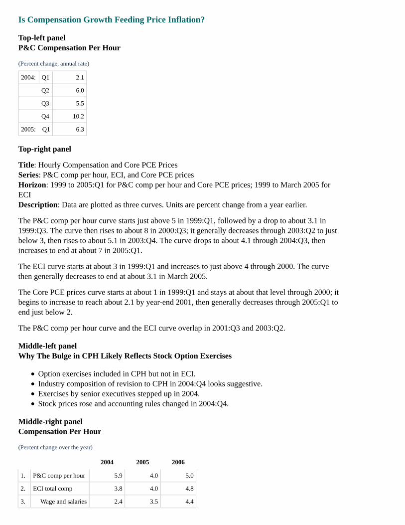
Bottom-left panelAlternative Scenario: Stronger Compensation Pressures
Hourly compensation increases 1 percentage point per year faster than in the baseline.Firms protect their profit margins. By the end of the scenario, markup is back at baseline.
Bottom-right panel
Title: Core PCE PricesSeries: Core PCE prices and stronger compensation pressuresHorizon: 2000 to 2006. Data are projected for 2005 to 2006.Description: Data plotted as two curves. Confidence intervals are represented as two bands. Unitsare four-quarter percent change.
The figure has two shaded areas that represent a projection period with a 70 percent confidenceinterval and a 90 percent confidence interval. The band for the 90 percent confidence interval beginsin 2005 at about 1.75, gradually expanding to about 3.25 at the upper end and about 0.5 at the lowerend in year-end 2006.
The band for the 70 percent confidence interval begins in 2005 at about 1.75, gradually expanding toabout 2.75 at the upper end and about 1 at the lower end in year-end 2006.
The series for core PCE prices begins in mid-2005 at about 1.8 and generally stays at that level untilnear the end of 2006. The series is in the 70 percent confidence interval from mid-2005 to late 2006.
The series for stronger compensation pressures begins in 2005 at about 1.5, rising generally until itreaches about 3 toward the end of 2006. The series is in the 70 percent confidence interval in 2005and early 2006. The series then rises into the 90 percent confidence interval from about mid-2006until near the end of 2006.
Exhibit 6Why Has Core Inflation Sped Up?
Top-left panel
Title: Evolution of the Greenbook Forecast For Core PCE PricesSeries: Forecast for 2004, forecast for 2005, and forecast for 2006Horizon: December 2003 to June 2005Description: Data are plotted as three curves. Units are percent change, Q4/Q4. The dates on thex-axis represent the Greenbook publication date.
The forecast for 2004 curve begins in December 2003 at about 1.1. It increases to about 1.8 inAugust 2004, then decreases to end at about 1.6 in June 2005.
The forecast for 2005 curve starts in December 2003 at about 1.0, then generally rises to end at about2.1 in June 2005.
The forecast for 2006 curve begins in September 2004 at about 1.3, then increases to end at about 1.8

in June 2005.
The forecast for 2004 curve and the forecast for 2005 curve overlap in January 2004 and October2004.
The forecast for 2004 curve and the forecast for 2006 curve overlap in March 2005.
Top-right panel
Title: Price of Imported OilSeries: Price of imported oilHorizon: 2003 to 2006. Data are projected from the June 2005 Greenbook, the December 2004Greenbook, and the December 2003 Greenbook.Description: Data are plotted as a curve. Units are dollars per barrel.
The curve begins in 2003:Q1 at about 28, followed by a drop to about 26 in the second quarter. Thecurve generally increases through 2004:Q4 to about 45, then decreases to end at about 43 in2005:Q1.
A forecast from the June 2005 Greenbook starts slightly above 43 in 2005:Q1, then increases to endat about 55 in 2006.
A forecast from the December 2004 Greenbook starts at about 42 in 2005:Q1 and stays at about thatlevel through 2006.
A forecast from the December 2003 Greenbook begins at about 29 in 2003:Q4, then decreasesthrough 2005:Q4 to end at about 26.
Note. Price is BOP unit value of crude oil and refined product imports.
Middle-left panel
Title: Core PPI Intermediate Materials PricesSeries: Core PPI intermediate materials pricesHorizon: 2003 to 2006. Data are projected from the June 2005 Greenbook, the December 2004Greenbook, and the December 2003 Greenbook.Description: Data are plotted as a curve. Units are index, 2000=100, ratio scale.
The curve begins at about 99 in 2003:Q1, then increases to end just below 106 in 2005:Q2.
A forecast from the June 2005 Greenbook starts at nearly 106 in 2005:Q2, then rises to end at about107 in 2006:Q4.
A forecast from the December 2004 Greenbook begins at about 103 at the end of 2004 and increasesto end at about 105 in 2006:Q4.
A forecast from the December 2003 Greenbook starts in 2003:Q4 at about 99, then increases through2005:Q4 to end at nearly 103.
Middle-right panel
Title: Core Nonfuel Import PricesSeries: Core nonfuel import prices.Horizon: 2003 to 2006. Data are projected from the December 2004 Greenbook, the June 2005Greenbook, and the December 2003 Greenbook.Description: Data are plotted as a curve. Units are index, 2000=100, ratio scale.

The curve begins at about 101 in 2003:Q1, then rises to end at about 112 in 2005:Q2.
A forecast from the December 2004 Greenbook starts in 2004:Q2 at nearly 108, then increases to endat about 118 in 2006:Q4.
A forecast from the June 2005 Greenbook starts a bit above 112 in 2005:Q2; then increases to endjust above 116 in 2006:Q4.
A forecast from the December 2003 Greenbook begins in 2003:Q1at about 101, then climbs to end atabout 108 in 2005:Q4.
Bottom-left panelRevisions to Staff Projections of Core PCE Inflation
(Percentage points)
2004 2005
1. Revision since Dec. 2003 Greenbook .5 1.0
Contribution of:
2. Energy prices .2 .5
3. Import and commodity prices .3 .4
4. Other factors .0 .1
Bottom-right panelPCE Prices
(Percent change, Q4/Q4)
2004 2005 2006
1. Total 2.6 2.5 1.7
2. Energy 18.5 9.9 -1.4
3. Food 2.9 2.2 2.2
4. Core 1.6 2.1 1.9
Exhibit 7Why Hasn't Real GDP Growth Been Marked Down More?
Top-left panel
Title: Evolution of the Greenbook Forecast for Real GDPSeries: Forecast for 2004, forecast for 2005, and forecast for 2006Horizon: December 2003 to June 2005Description: Data are plotted as three curves. Units are percent change, Q4/Q4. The dates on thex-axis represent the Greenbook publication date.
The forecast for 2004 curve starts just above 5 in December 2003. It generally decreases throughOctober 2004 to about 3.7, then increases to end just below 4 in June 2005.
The forecast for 2005 curve starts at about 3.9 in December 2003 and rises through March 2004 to
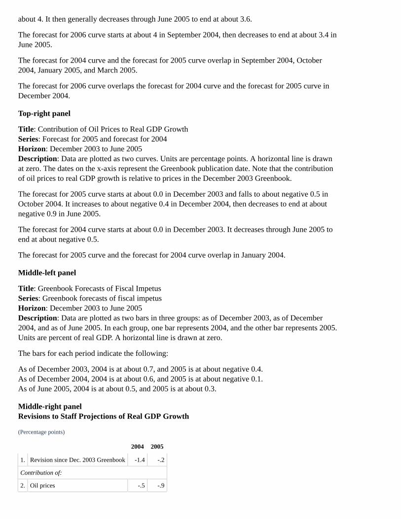
about 4. It then generally decreases through June 2005 to end at about 3.6.
The forecast for 2006 curve starts at about 4 in September 2004, then decreases to end at about 3.4 inJune 2005.
The forecast for 2004 curve and the forecast for 2005 curve overlap in September 2004, October2004, January 2005, and March 2005.
The forecast for 2006 curve overlaps the forecast for 2004 curve and the forecast for 2005 curve inDecember 2004.
Top-right panel
Title: Contribution of Oil Prices to Real GDP GrowthSeries: Forecast for 2005 and forecast for 2004Horizon: December 2003 to June 2005Description: Data are plotted as two curves. Units are percentage points. A horizontal line is drawnat zero. The dates on the x-axis represent the Greenbook publication date. Note that the contributionof oil prices to real GDP growth is relative to prices in the December 2003 Greenbook.
The forecast for 2005 curve starts at about 0.0 in December 2003 and falls to about negative 0.5 inOctober 2004. It increases to about negative 0.4 in December 2004, then decreases to end at aboutnegative 0.9 in June 2005.
The forecast for 2004 curve starts at about 0.0 in December 2003. It decreases through June 2005 toend at about negative 0.5.
The forecast for 2005 curve and the forecast for 2004 curve overlap in January 2004.
Middle-left panel
Title: Greenbook Forecasts of Fiscal ImpetusSeries: Greenbook forecasts of fiscal impetusHorizon: December 2003 to June 2005Description: Data are plotted as two bars in three groups: as of December 2003, as of December2004, and as of June 2005. In each group, one bar represents 2004, and the other bar represents 2005.Units are percent of real GDP. A horizontal line is drawn at zero.
The bars for each period indicate the following:
As of December 2003, 2004 is at about 0.7, and 2005 is at about negative 0.4.As of December 2004, 2004 is at about 0.6, and 2005 is at about negative 0.1.As of June 2005, 2004 is at about 0.5, and 2005 is at about 0.3.
Middle-right panelRevisions to Staff Projections of Real GDP Growth
(Percentage points)
2004 2005
1. Revision since Dec. 2003 Greenbook -1.4 -.2
Contribution of:
2. Oil prices -.5 -.9
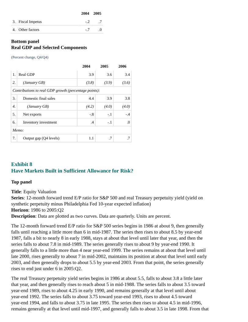
2004 2005
3. Fiscal Impetus -.2 .7
4. Other factors -.7 .0
Bottom panelReal GDP and Selected Components
(Percent change, Q4/Q4)
2004 2005 2006
1. Real GDP 3.9 3.6 3.4
2. (January GB) (3.8) (3.9) (3.6)
Contributions to real GDP growth (percentage points):
3. Domestic final sales 4.4 3.9 3.8
4. (January GB) (4.2) (4.0) (4.0)
5. Net exports -.8 -.1 -.4
6. Inventory investment .4 -.1 .0
Memo:
7. Output gap (Q4 levels) 1.1 .7 .7
Exhibit 8Have Markets Built in Sufficient Allowance for Risk?
Top panel
Title: Equity ValuationSeries: 12-month forward trend E/P ratio for S&P 500 and real Treasury perpetuity yield (yield onsynthetic perpetuity minus Philadelphia Fed 10-year expected inflation)Horizon: 1986 to 2005:Q2Description: Data are plotted as two curves. Data are quarterly. Units are percent.
The 12-month forward trend E/P ratio for S&P 500 series begins in 1986 at about 9, then generallyfalls until reaching a little more than 6 in mid-1987. The series then rises to about 8.5 by year-end1987, falls a bit to nearly 8 in early 1988, stays at about that level until later that year, and then theseries falls to about 7.8 in mid-1989. The series generally rises to about 9 by year-end 1990. Itgenerally falls to a little more than 4 near year-end 1999. The series remains at about that level untillate 2000, rises generally to about 7 in mid-2002, maintains its position at about that level until early2003, and then generally drops to about 5.5 by year-end 2003. From that point, the series generallyrises to end just under 6 in 2005:Q2.
The real Treasury perpetuity yield series begins in 1986 at about 5.5, falls to about 3.8 a little laterthat year, and then generally rises to reach about 5 in mid-1988. The series falls to about 3.5 towardyear-end 1989, rises to about 4.25 in early 1990, and remains generally at that level until aboutyear-end 1992. The series falls to about 3.75 toward year-end 1993, rises to about 4.5 towardyear-end 1994, and falls to about 3.75 in late 1995. The series then rises to about 4.5 in mid-1996,remains generally at that level until mid-1997, and generally falls to about 3.5 in late 1998. From that

period, the series generally rises to about 4.5 in late 1999, generally falls to about 3.5 in early 2001,and remains at about that level until about mid-2004. The series then falls to end at a little more than2 in 2005:Q2.
The curves overlap in late 1999.
Middle-left panel
Title: Decomposition of High-Yield SpreadSeries: High-yield spread and compensation for expected lossHorizon: 1990 to 2005 (June 2005 for high-yield spread and 2005:Q2 for compensation for expectedloss)Description: Data are plotted as two curves. Units are percentage points.
For high-yield spread, the series begins at about 7.5 in early 1990, rises to about 10 in early 1991,and then generally falls to about 4.5 in early 1992. The series generally falls again, reaching about3.75 in mid-1994. From that point, the series then generally rises to about 4.5 in late 1995, falls to3.5 in mid-1998, and rises to about 6 in late 1998. The series falls to 4.5 in late 1999 and rises toabout 9 in 2000. From this point, the series fluctuates between a little less than 8 and about 11 untillate 2002. The series generally falls to about 3.75 in early 2005, rises to about 4.25 in early 2005, andfalls slightly to end at a little more than 4 in June 2005.
For compensation for expected loss, the series begins at about 4 in early 1990, falls to about 3.75 inmid-1990, and then rises to about 4 in early 1991. The series gradually rises overall to about 4toward year-end 1995, falls to about 3.5 in early 1997, and then generally rises, reaching a little lessthan 4 in late 1998. The series falls a bit in early 1999 and generally rises to a little more than 4 inlate 2000. The series then falls to about 3 in 2002, remains at about that level until mid-2003, andfalls to a little less than 3 in late 2003. The series generally rises to end at about 3.5 in 2005:Q2.
The curves overlap from mid-1997 to mid-1998.
Middle-right panel
Title: Commercial Real Estate Prices and Net Operating IncomeSeries: Price and net operating income (NOI)Horizon: 1980 to 2005:Q1Description: Data are plotted as two curves. Data are quarterly. Units are index, 1978=100, ratioscale.
The price series begins at about 130 in 1980, generally rises to 235 in late 1990, falls to about 180,and then generally rises to end at about 300 in 2005:Q1.
The net operating income series starts at about 120, generally rises until reaching about 180 in 1985,remaining at about that level until early 1986, and then falls to about 160 toward the end of that year.The series generally remains at that level until mid-1990, rises to about 170 toward year-end, andthen generally rises again until reaching about 270 in early 2001. The series then generally falls toend at about 200 in 2005:Q1.
The curves overlap in 1995 and 2001.
Source: NCREIF.
Bottom-left panel
Title: Commercial Real Estate Valuation

Series: NOI/price ratio and real Treasury perpetuity yieldHorizon: 1990 to 2005:Q1Description: Data are plotted as two curves. Data are quarterly. Units are index, 1990:Q1=5 forNOI/price ratio and percent for real Treasury perpetuity yield.
The NOI/price ratio series begins at 5 in 1990, generally rises to about 6.5 toward year-end 1993,then rises slightly to about 7 in early 1995, and remains generally at that level until early 1998. Theseries gradually falls to about 6.25 in early 1999, remains at about that level until early 2000, andrises gradually to about 6.75 in mid-2001. The series then falls to end at about 4.25 in 2005:Q1.
The real Treasury perpetuity yield series begins at about 4.25, rises to about 4.75 by late 1990, andthen generally falls to about 3.5 in 1993. The series rises to about 4.75 in late 1994, falls to about3.75 in late 1995, rises to about 4.25, and remains at about that level until mid-1997. The series thengenerally falls to about 3 in late 1998, rises to a little more than 4 in late 1999, and then falls to about3.5 in early 2001. After rising slightly to about 3.75 a bit later in 2001, the series then fluctuatesbetween 3.75 and 2.9 until mid-2004. The series falls to end at about 2.5 in 2005:Q1.
The curves overlap in 1990.
Bottom-right panel
Title: Office Vacancy Rate and Rent per Square FootSeries: Vacancy rate and rent per square footHorizon: 1998 to 2005:Q2Description: Data are plotted as two curves. Data are quarterly. Units are percent for vacancy rateand dollars for rent per square foot.
The vacancy rate series begins at about 8.75 in 1998, drops a bit to about 8.5 in late 1998, rises toabout 8.8 in early 1999, and then generally falls to about 7 in mid-2000. The series generally rises toabout 14.5 in early 2003 and gradually falls to end at about 12.5 in 2005:Q2.
The rent per square foot series begins at about 22, generally rises to 24 in late 1999, and then falls toabout 23.75 in early 2000. The series rises to about 26.5 in early 2001, generally falls to about 22.25in mid-2003, remains at about that level until late 2004, and then rises to end at about 23.1 in2005:Q2.
The curves overlap in 1998 and 2001.
Source: CoStar. Data for 2005:Q2 are preliminary.
Exhibit 9Is Corporate Credit Quality Starting to Slip?
Top-left panel
Title: Bond Default and C&I Loan Delinquency RatesSeries: Bond default rate (six-month moving average) and C&I loan delinquency rateHorizon: 1990 to 2005 (May 2005 for bond default rate and 2005:Q1 for C&I loan delinquency rate)Description: Data are plotted as two curves. Units are percent of outstandings.
The bond default rate series begins at about 1.8 in 1990, remains generally at that level until later inthat year, and then rises to about 3.25 in early 1991. The series then generally falls to 0.6 in late

1991, rises to a little more than 1 in early 1992, falls to 0.5 later in that year, and remains generally atthat level until late 1998. The series then generally rises to a little more than 1 in mid-1999, falls alittle to 0.9 around year-end 1999, rises to a little more than 1 in 2000, and remains at about that leveluntil rising to about 2.9 in early 2001. The series falls to about 2.25 later that year and then rises toabout 3.75 in 2003. The series falls to a little more than zero in 2004 and rises to about 0.9 beforefalling a bit to end at about 0.5 in May 2005.
The C&I loan delinquency rate series begins at about 5 in 1990, rises to about 6 in 1991, and thenfalls to about 2 in 1994. The series falls to about 1.75 in 1997 and rises almost to 4 in 2002. Theseries then falls to end at about 1.5 in 2005:Q1.
The curves overlap in 2001 and 2003.
Top-right panel
Title: Financial Ratios (nonfinancial corporations)Series: Cash to assets, and interest expense to cash flowHorizon: 1990 to 2005:Q1Description: Data are plotted as two curves. Units are percent (right scale for cash to assets and leftscale for interest expense to cash flow).
The cash to assets series begins at about 5 in 1990, rises generally to about 7.5 in 1999, falls to about7 in 2000, and then rises to end at about 10.5 in 2004. The series is projected to end at about thesame level in 2005:Q1.
The interest expense to cash flow series begins at about 25 in 1990, rises slightly in 1991, and thengenerally falls to about 15 in 1997. The series rises to a little more than 20 in 2001 and then falls toend at about 12 in 2004. The series is projected to end at about 11 in 2005:Q1.
The curves overlap in 1994.
Source: Compustat.
Middle-left panel
Title: Payouts to Shareholders (nonfinancial corporations)Series: Cash mergers, share repurchases, and dividendsHorizon: 2001 to 2005:Q1Description: Data are plotted as stacked bars. As shown in the chart, approximate values are asfollows.
Billions of dollars, annual rate
Cash mergers Share repurchases Dividends
2001 55 145 105
2002 50 145 105
2003 20 170 110
2004 120 200 190
2005:Q1 105 220 180
Middle-right panel
Title: High-Yield Bond Issuance as a Share of Total Bond Issuance (nonfinancial corporations)
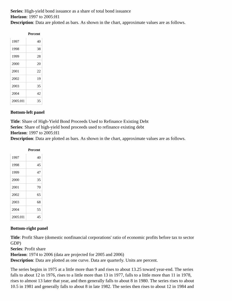
Series: High-yield bond issuance as a share of total bond issuanceHorizon: 1997 to 2005:H1Description: Data are plotted as bars. As shown in the chart, approximate values are as follows.
Percent
1997 40
1998 38
1999 28
2000 20
2001 22
2002 19
2003 35
2004 42
2005:H1 35
Bottom-left panel
Title: Share of High-Yield Bond Proceeds Used to Refinance Existing DebtSeries: Share of high-yield bond proceeds used to refinance existing debtHorizon: 1997 to 2005:H1Description: Data are plotted as bars. As shown in the chart, approximate values are as follows.
Percent
1997 40
1998 45
1999 47
2000 35
2001 70
2002 65
2003 68
2004 55
2005:H1 45
Bottom-right panel
Title: Profit Share (domestic nonfinancial corporations' ratio of economic profits before tax to sectorGDP)Series: Profit shareHorizon: 1974 to 2006 (data are projected for 2005 and 2006)Description: Data are plotted as one curve. Data are quarterly. Units are percent.
The series begins in 1975 at a little more than 9 and rises to about 13.25 toward year-end. The seriesfalls to about 12 in 1976, rises to a little more than 13 in 1977, falls to a little more than 11 in 1978,rises to almost 13 later that year, and then generally falls to about 8 in 1980. The series rises to about10.5 in 1981 and generally falls to about 8 in late 1982. The series then rises to about 12 in 1984 and

then generally falls (a brief increase occurred in 1985) to about 9 in 1986. The series rises generallyto about 11.5 in late 1988, generally falls to about 8.5 in 1991, and generally rises again to about13.25 in 1997. The series then falls generally to about 6 in late 2001 and then generally rises to endat about 11.25 in 2004.
In the projected area, the series begins at about 11 in 2005, rises to about 11.25 toward the end of thatyear, and then falls to end at about 10.75 in 2006.
Solid vertical bars are present in 1974, most of 1980, toward year-end of 1981 and extending through1982, most of 1990 and the early part of 1991, and 2001.
Exhibit 10Are Households Facing Significant Financial Stress?
Top-left panel
Title: Delinquency RatesSeries: Securitized credit card loans, auto loans at finance companies, and home mortgages at banksHorizon: 1996 to 2005 (April for securitized credit card loans and auto loans at finance companies,and Q1 for home mortgages at banks).Description: Data are plotted as three curves. Units are percent.
The securitized credit card loans series begins at about 4.25 in 1996, rises generally to about 5.5 in1997, and then falls generally to about 4.5 in 2000. The series rises generally to about 5.25 in 2001,remains at about that level until mid-2003, and then falls generally to end at a little more than 4 inApril 2005.
The auto loans at finance companies series begins at about 3 in 1996, rises generally to about 3.5 in1997, and then falls generally to about 2 in 2000. The series rises a bit to about 2.25 and remains atabout that level until late 2001. The series then falls to about 2 in early 2002, rises a bit to about 2.1in mid-2003, and falls to about 2 toward the end of that year. The series remains generally at aboutthat level until late 2004 when the series falls to a little less than 2 in early 2005 and then rises to endat a little more than 2 in April 2005.
The home mortgages at banks series begins at about 2.25 in 1996, remains at about that level untillate 1998, then rises to about 2.5 in early 1999; later in that year, the series falls to a little less than 2,rises again to about 2, and then falls to about 2. The series remains at about that level until midyear2000 then rises to about 2.5 in early 2001. Afterward, the series falls generally to about 1.5 inmid-2003, rises to about 1.75 in late 2003, and then falls to end at about 1.25 in 2005:Q1.
The auto loans at finance companies series and the home mortgage at banks curves overlapperiodically in 2000, 2001, and 2002.
Top-right panel
Title: Bank Lending Standards for Consumer Loans (average for credit cards and other consumerloans)Series: Bank lending standards for consumer loansHorizon: 1996 to 2005:Q2Description: Data are plotted as one curve. There is a horizontal zero line. Above the horizontal linerepresents tighter standards, below the horizontal line represents easier standards. Units are net

percent.
The series begins at about 20 in 1996, rises to 35 in midyear, then falls generally to 5 towardyear-end 1998. The series then rises to about 10 in early 1999, falls generally to about zero in 2000,and then rises to about 20 in early 2001. The series fluctuates between 20 and 12 from that point untillate 2002 and then falls generally to end at about negative 13 in 2005:Q2.
Source: Senior Loan Officer Survey.
Middle-left panel2004 Survey of Consumer Finances
Results are preliminary.Subject to revision as SCF staff continues to process the data.Results are confidential until public release of 2004 data next January.
Middle-right panel
Title: Households With Any Payments 60 Days Past DueSeries: Share of households and share of debtHorizon: 1989 to 2004Description: Data are plotted as two curves. Units are percent.
The share of households curve begins at about 5.4 in 1989 and drops to about 4.6 in 1992. Itincreases through mid-1998 to about 6, drops to about 5.2 in mid-2001, then increases to end atalmost 7 in late 2004.
The share of debt curve begins at about 4.2 in 1989 and drops to about 4 in 1992. It increases throughmid-1998 to a bit above 5, decreases to about 4.4 in mid-2001, then increases to end at about 4.8 inlate 2004.
Source: Survey of Consumer Finances.
Bottom-left panelAssets, Debt, and Net Worth, Change from 2001 to 2004
Substantial rise in assets. Driven by appreciation in house prices. Fairly widespread acrossincome groups.Rapid debt growth throughout the income distribution.For median-income households, little change in net worth. But net worth rose for high-incomehouseholds.
Source: Survey of Consumer Finances.
Bottom-right panel
Title: Household Net Worth to DPISeries: Household net worth to DPIHorizon: 1995 to 2006 (data is projected for part of 2005 and all of 2006)Description: Data are plotted as one curve. Data are quarterly. Unit is ratio.
The series begins at about 4.75 in 1995, rises until reaching about 5.75 in early 1998, falls to about5.5 later that year, and then rises generally to about 6.25 in early 2000. The series falls generally to alittle less than 5 in 2002. The series then rises generally from that point to about 5.5 in early 2005.
In the projected area, the series begins at about 5.5, rises slightly, and then falls to end at a little lessthan 5.5 in 2006.
Exhibit 11Foreign Outlook and Financial Market Indicators
Exhibit 11 is a two-by-two array of panels of U.S. and foreign GDP, stock prices, EMBI+ spreads,and ten-year government bond yields.
Top-left panelU.S. and Foreign GDP
U.S. and Foreign GDP plots U.S. GDP as a line chart and total foreign GDP as a bar chart for2004:H1 (actual), 2004:H2 (actual), 2005:Q1 (actual), 2005:Q2 (forecast), 2005:H2 (forecast),2006:H1 (forecast), and 2006:H2 (forecast). The range of the y-axis is [0,5]; unit is percent change,a.r. Data for total foreign GDP are weighted by shares of U.S. merchandise exports. Years areQ4/Q4; half years are Q2/Q4 or Q4/Q2. Approximate values for U.S. real GDP and total foreign realGDP for the seven periods are as follows.
2004:H1 2004:H2 2005:Q1 2005:Q2 2005:H2 2006:H1 2006:H2
U.S. GDP (black line) 3.8 3.9 3.7 2.9 3.6 3.4 3.3
Total Foreign GDP (red bars) 4.2 3.0 2.7 3.2 3.4 3.3 3.3
Top-right panelStock Prices*
Stock Prices on a weekly basis for emerging markets and for industrial countries for 2003 throughmid-2005. The range of the y-axis is [75, 200]; ratio scale, Jan. 3, 2003 = 100. Both series begin at100 and are somewhat volatile. The emerging markets series falls to about 93 by early 2003, rises toabout 155 by early 2004, declines to about 135 by mid-2004, and then rises to about 172 by the endof the period. The industrial countries series falls to about 87 by early 2003, rises to about 124 byearly 2004, declines to about 117 by mid-2004, and then rises to about 135 by the end of the period.
* Source: MSCI. Return to text
Bottom-left panelEMBI+ Spreads
EMBI+ Spreads on a weekly basis for 2003 through mid-2005 for Brazil, Mexico, and Overallexcluding Argentina. The range of the y-axis is [1, 15]; units are percentage points. The spreads forBrazil start at about 14 percentage points, and, with considerable volatility, fall to about 3¾percentage points by early 2005, and rise to about 4¼ percentage points by the end of the period. Thespreads for Mexico start at just over 3 percentage points, decline to about 1½ basis points by early2005, and rise to about 1¾ percentage points by the end of the period. The overall spreads excludingArgentina start at about 6½ percentage points and fall, with some volatility, to about 2½ percentagepoints by early 2005, and then rise to about 3 percentage points by the end of the period.
Bottom-right panelTen-Year Government Bond Yields

Ten-Year Government Bond Yields on a weekly basis for U.S. Treasury bonds and for weighted-average foreign bonds for 2003 through mid-2005. The range of the y-axis is [3.0, 5.0]; unit ispercent. The yields for weighted-average foreign bonds are the average of rates for Australia,Canada, the euro area, Japan, Sweden, Switzerland, and the United Kingdom, weighted by tradeshares. The yields for U.S. Treasury bonds start at about 4.1 percent, and, with considerablevolatility, fall to about 3.2 percent by mid-2003, rise to about 4.6 percent by early 2005, and then fallto just under 4 percent by the end of the period. The yields for weighted-average foreign bonds startat about 4.1 percent, and, with considerable volatility, fall to about 3.4 percent by mid-2003, rise tonearly 4.5 percent by mid-2004, fall to about 3.6 percent by early 2005, rise quickly to about 3.85percent and then fall to about 3.3 percent by the end of the period.
Exhibit 12Long-Term Interest Rates and Monetary Policy
Exhibit 12 is a three-by-four array of panels of weekly data. All graphs are shaded yellow fromNovember 2003 through the end of the period (mid-2005) to indicate the period of time during whichthe central banks of the countries discussed on this page tightened monetary policy. The four toppanels plot "Ten-Year Government Bond Yields" for the United States and Germany, Canada, theUnited Kingdom, and Japan. The four middle panels plot "Long-Term Nominal and Inflation-Indexed Yields" for the euro, the Canadian dollar, sterling, and the yen. The four bottom panels plot"Monetary Policy Indicators" for the United States and the euro area, Canada, the United Kingdom,and Japan.
Top panelsTen-Year Government Bond Yields
Ten-Year Government Bond Yields for the United States and Germany for 2003 through mid-2005.The range of the y-axis is [3, 6]; unit is percent. The yields for the United States start at just over 4percent, and, with considerable volatility, rise to about 4½ percent by October 2003, and then ease tojust above 4 percent by the end of the period. The yields for Germany start at about 4-1/3 percent,and, with considerable volatility, rise to about 4½ percent by October 2003, and then fall to justbelow 3¼ percent by the end of the period.
Ten-Year Government Bond Yields for Canada for 2003 through mid-2005. The range of the y-axisis [3, 6]; unit is percent. The yields for Canada start at about 5 percent, and, with considerablevolatility, decline to just below 5 percent by October 2003, and then fall to about 3¾ percent by theend of the period.
Ten-Year Government Bond Yields for the United Kingdom for 2003 through mid-2005. The rangeof the y-axis is [3, 6]; unit is percent. The yields for the United Kingdom start at about 4½ percent,and, with considerable volatility, rise to about 5 percent by October 2003, rise further to about 5¼percent by mid-2004, and then fall to about 4¼ percent by the end of the period.
Ten-Year Government Bond Yields for Japan for 2003 through mid-2005. The range of the y-axis is[0, 3]; unit is percent. The yields for Japan start at about 7/8 percent, and, with considerablevolatility, rise to about 1½ percent by October 2003, rise further to about 1-7/8 percent by mid-2004,and then fall to about 1¼ percent by the end of the period.
Middle panelsLong-Term Nominal and Inflation-Indexed Yields

Long-Term Nominal and Inflation-Indexed Yields for the euro for 2003 through mid-2005. Therange of the y-axis is [0, 6]; unit is percent. The nominal yields for the euro start at about 4¼ percent,and, with considerable volatility, ease to about 4 percent by October 2003, and then decline to about2¾ percent by the end of the period. The inflation-indexed yields for the euro start at about 2½percent, and, with considerable volatility, decline to about 2 percent by October 2003, and then fall tojust below 1 percent by the end of the period.
Long-Term Nominal and Inflation-Indexed Yields for the Canadian dollar for 2003 throughmid-2005. The range of the y-axis is [0, 6]; unit is percent. The nominal yields for the Canadiandollar start at about 5-1/3 percent, and, with considerable volatility, ease to about 5 percent byOctober 2003, and then decline to just above 4 percent by the end of the period. The inflation-indexed yields for the Canadian dollar start at about 3¼ percent, and, with some volatility, ease toabout 3 percent by October 2003, and then fall to about 1¾ percent by the end of the period.
Long-Term Nominal and Inflation-Indexed Yields for sterling for 2003 through mid-2005. The rangeof the y-axis is [0, 6]; unit is percent. The nominal yields for sterling start at about 4½ percent, and,with considerable volatility, rise to about 4¾ percent by October 2003, rise to about 5¼ percent bymid-2004, and then decline to about 4¼ percent by the end of the period. The inflation-indexedyields for sterling start at just above 2 percent, and, with considerable volatility, ease to about 2percent by October 2003, and then decline to about 1¾ percent by the end of the period.
Long-Term Nominal and Inflation-Indexed Yields for the yen. Although the dates on the chart are setfor 2003 through mid-2005, the data actually begin in early 2004. The range of the y-axis is [0, 6];unit is percent. The nominal yields for the yen start in early 2004 at about 1-1/3 percent, and, withsome volatility, rise to nearly 2 percent by mid-2004, and then decline to about 1 percent by the endof the period. The inflation-indexed yields for the yen start in early 2004 at just above 1 percent, and,with some volatility, decline to about ½ percent by the end of the period.
Bottom panelsMonetary Policy Indicators
Monetary Policy Indicators for the euro-area refinance rate and the U.S. target federal funds rate for2003 through mid-2005. The range of the y-axis is [0, 4]; unit is percent. The euro-area refinance ratestarts at 2¾ percent, falls to 2 percent by mid-2003, and remains there through the end of the period.The U.S. target federal funds rate starts at 1¼ percent, falls to 1 percent by mid-2003, stays therethrough mid-2004, and then rises to 3 percent by the end of the period.
Monetary Policy Indicators for the Canadian Bank rate for 2003 through mid-2005. The range of they-axis is [0, 5]; unit is percent. The Canadian Bank rate starts at 3 percent, rises to 3½ percent bymid-2003, falls back to 3 percent by late 2003, falls further to 2¼ percent by mid-2004, rises to 2¾percent by late 2004, and remains there through the end of the period.
Monetary Policy Indicators for the U.K. repo rate for 2003 through mid-2005. The range of they-axis is [0, 6]; unit is percent. The U.K. repo rate starts at 4 percent, falls to 3½ percent by late2003, rises to 4¾ percent by late 2004, and remains there through the end of the period.
Monetary Policy Indicators for balances at the Bank of Japan for 2003 through mid-2005. The rangeof the y-axis is [15, 40]; units are trillions of yen. The balances at the Bank of Japan start at about 20trillion yen, rise quickly at about 30 trillion yen, fall almost immediately to about 26 trillion yen, riseto about 30 trillion yen by October 2003, stay at about that level through early 2004, rise to about 33trillion yen in early 2004, and then fluctuate between about 30-34 trillion yen, ending at about 33trillion yen by the end of the period.
Exhibit 13Euro Area and Japan
Exhibit 13 is a three-by-two array of panels for earnings per share, BBB corporate bond spreads, realeffective exchange rates, euro-area confidence indicators, euro-area real GDP, and Japanese realGDP.
Top-left panelEarnings per Share
Earnings per Share on a yearly basis for the euro area and Japan for 1990-2004 (actual) and2005-2006 (forecast). The range of the y-axis is [-50, 350]; index, 1990=100. Earnings per share isdefined as operating earnings per share in local currency for MSCI indexes; forecasts are fromI/B/E/S surveys in mid-June 2005. Both series start at 100. Earnings per share for the euro area fall toabout 60 by 1993, rise to about 180 by 2000, fall to about 120 by 2002, rise to about 275 by 2004,and then rise to about 330 over the forecast horizon. Earnings per share for Japan, with somevolatility, fall to about -40 by 2001, rise to about 130 by 2004, and rise further to about 175 over theforecast horizon.
Top-right panelBBB Corporate Bond Spreads
BBB Corporate Bond Spreads on a weekly basis for the euro and the yen for 2002 through mid-2005.The range of the y-axis is [0, 250]; units are basis points. The spreads for the euro start at about 175basis points, and, with some volatility, rise to about 240 basis points by late 2002, fall to about 100basis points by mid-2003, and then decline more gradually to about 60 basis points by the end of theperiod. The spreads for the yen start at about 60 basis points and decline gradually to about 25 basispoints by the end of the period.
Middle-left panelReal Effective Exchange Rates
Real Effective Exchange Rates on a monthly basis for the euro and the yen for 2004 throughmid-2005 (actual) and for mid-2005 through 2006 (forecast). The range of the y-axis is [90, 105];index, Jan. 2004 = 100. Both series begin at 100. The index for the euro, with some volatility, falls toabout 97 by early 2004, rises to about 103 by late 2004, falls to about 96 by mid-2005, and stays atabout that level through the forecast period. The index for the yen, with some volatility, falls to about94 by mid-2005, and then eases to about 92½ by the end of the forecast period.
Middle-right panelEuro-Area Confidence Indicators
Euro-Area Confidence Indicators on a monthly basis for the industrial and consumer sectors for 2002through mid-2005. The range of the y-axis is [-25,5]; unit is diffusion index. A diffusion index isdefined as the percent of respondents reporting an increase minus the percent of respondentsreporting a decrease. The series for the industrial sector starts at about -15, rises to about -3 by late2004, and falls to about -11 by the end of the period. The series for the consumer sector starts atabout -11, falls to about -22 by early 2003, rises to about -15 by early 2004 and stays at about thatlevel through the end of the period.

Bottom-left panelEuro-Area Real GDP
Euro-Area Real GDP as a bar chart for 2004:H1 (actual), 2004:H2 (actual), 2005:Q1 (actual),2005:Q2 (forecast), 2005:H2 (forecast), 2006:H1 (forecast), and 2006:H2 (forecast). The range of they-axis is [-1, 6]; unit is percent change, a.r. Half years are Q2/Q4 or Q4/Q2. Approximate values forthe seven periods are as follows.
2004:H1 2004:H2 2005:Q1 2005:Q2 2005:H2 2006:H1 2006:H2
Euro-Area Real GDP 2.1 0.8 2.1 1.2 1.7 1.75 1.75
Bottom-right panelJapanese Real GDP
Japanese Real GDP as a bar chart for 2004:H1 (actual), 2004:H2 (actual), 2005:Q1 (actual), 2005:Q2(forecast), 2005:H2 (forecast), 2006:H1 (forecast), and 2006:H2 (forecast). The range of the y-axis is[-1, 6]; unit is percent change, a.r. Half years are Q2/Q4 or Q4/Q2. Approximate values for the sevenperiods are as follows.
2004:H1 2004:H2 2005:Q1 2005:Q2 2005:H2 2006:H1 2006:H2
Japanese Real GDP 2.3 -0.4 4.8 1.4 1.4 1.5 1.8
Exhibit 14China: Why is Import Growth Slowing?
Exhibit 14 is a three-by-two array of panels of the merchandise trade balance, merchandise trade,exports to China, real GDP, exports by category, and consumer prices.
Top-left panelMerchandise Trade Balance
Merchandise Trade Balance as a twelve-month moving sum for 1985 through mid-2005. The rangeof the y-axis is [-20, 80]; units are billions of dollars. The trade balance starts at a deficit of about $2billion, falls to a deficit of about $15 billion by early 1986, rises into surplus by mid-1990 andreaches a surplus of about $10 billion by early 1991, falls back into deficit in mid-1993 and reaches adeficit of about $12 billion by the beginning of 1994, rises back into surplus by the end of 1994 andreaches a surplus of about $46 billion by mid-1998, falls to a surplus of about $14 billion bymid-2004, and then rises sharply to a surplus of about $72 billion by the end of the period.
Top-right panelMerchandise Trade
Merchandise Trade in terms of exports and imports on a monthly basis for 2003 through mid-2005.The range of the y-axis is [20, 70]; units are billions of dollars. Exports start at about $33 billion andrise fairly steadily to about $62 billion by the end of the period. Imports start at about $34 billion andrise to about $52 billion by the end of the period.
Middle-left panelExports to China

Exports to China from Taiwan, Korea, and Japan for 2003 through mid-2005. The range of the y-axisis[-20, 180]; unit is twelve-month percent change. All the series are somewhat volatile. Thetwelve-month percent change of exports from Taiwan starts at about 120 percent, rises immediatelyto nearly 180 percent, drops quickly to about 70 percent by early 2003, rises to about 160 percent byearly 2004, and falls to about 10 percent by the end of the period. The twelve-month percent changeof exports from Korea starts at about 55 percent, rises immediately to about 80 percent, dropsquickly to about 30 percent by early 2003, rises to about 70 percent by mid-2004, and falls to justabove 20 percent by the end of the period. The twelve-month percent change of exports from Japanstarts at about 30 percent, rises immediately to about 65 percent, drops to about 25 percent bymid-2003, and then falls to about 0 percent by the end of the period.
Middle-right panelReal GDP
Real GDP as a bar chart for 2004:Q1 through 2005:Q1 (actual), and for 2005:Q2 through 2006:Q4(forecast). The range of the y-axis is [0, 15]; unit is percent change, a.r. As shown in the chart,approximate values for the twelve periods are as follows.
2004 2005 2006
Q1 Q2 Q3 Q4 Q1 Q2 Q3 Q4 Q1 Q2 Q3 Q4
Real GDP 14 2½ 10 11½ 13 8 8 7½ 7½ 7½ 7½ 7½
Bottom-left panelExports by Category
Exports by Category as a twelve-month moving sum for road vehicles and for iron and steel for 1995through mid-2005. The range of the y-axis is [0, 25]; units are billions of dollars. Both series start atabout $2 billion. Exports of road vehicles rise gradually to about $7 billion by mid-2002 and thenrise fairly sharply, reaching about $19 billion by the end of the period. Exports of iron and steelfluctuate between about $2 billion to $5 billion until mid-2004, when they rise sharply, reachingabout $20 billion by the end of the period.
Bottom-right panelConsumer Prices
Consumer prices for overall consumer prices and for consumer prices excluding food for 2003through mid-2005. The range of the y-axis is [-1, 6]; unit is twelve-month percent change. Overallconsumer prices start at about ½ percent, rise fairly sharply to about 5¼ percent by mid-2004, andthen fall to about 1¾ percent by the end of the period. Consumer prices excluding food start at about-¾ percent and rise to about 1 percent by the end of the period.
Exhibit 15Outlook for Commodity Prices and U.S. External Accounts
Exhibit 15 is comprised of five panels, including graphs on primary commodity prices, the broad realdollar, and WTI, a table on the balance of payments, and a graph on the current account balance.
Top-left panel
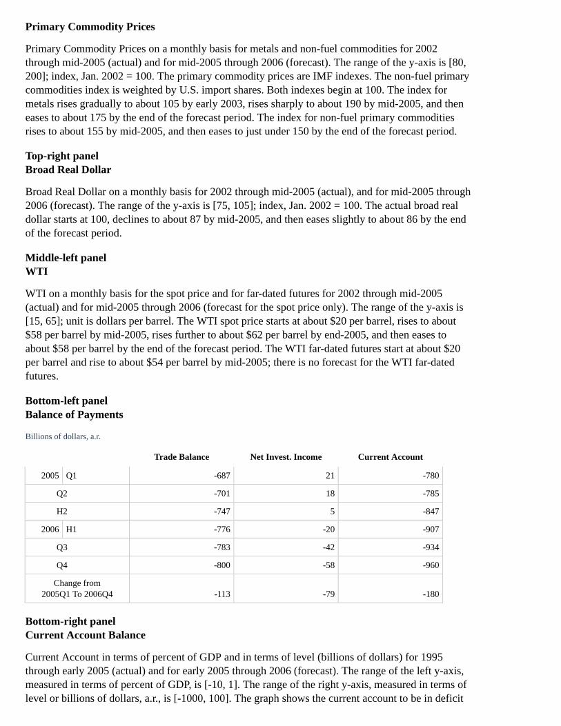
Primary Commodity Prices
Primary Commodity Prices on a monthly basis for metals and non-fuel commodities for 2002through mid-2005 (actual) and for mid-2005 through 2006 (forecast). The range of the y-axis is [80,200]; index, Jan. 2002 = 100. The primary commodity prices are IMF indexes. The non-fuel primarycommodities index is weighted by U.S. import shares. Both indexes begin at 100. The index formetals rises gradually to about 105 by early 2003, rises sharply to about 190 by mid-2005, and theneases to about 175 by the end of the forecast period. The index for non-fuel primary commoditiesrises to about 155 by mid-2005, and then eases to just under 150 by the end of the forecast period.
Top-right panelBroad Real Dollar
Broad Real Dollar on a monthly basis for 2002 through mid-2005 (actual), and for mid-2005 through2006 (forecast). The range of the y-axis is [75, 105]; index, Jan. 2002 = 100. The actual broad realdollar starts at 100, declines to about 87 by mid-2005, and then eases slightly to about 86 by the endof the forecast period.
Middle-left panelWTI
WTI on a monthly basis for the spot price and for far-dated futures for 2002 through mid-2005(actual) and for mid-2005 through 2006 (forecast for the spot price only). The range of the y-axis is[15, 65]; unit is dollars per barrel. The WTI spot price starts at about $20 per barrel, rises to about$58 per barrel by mid-2005, rises further to about $62 per barrel by end-2005, and then eases toabout $58 per barrel by the end of the forecast period. The WTI far-dated futures start at about $20per barrel and rise to about $54 per barrel by mid-2005; there is no forecast for the WTI far-datedfutures.
Bottom-left panelBalance of Payments
Billions of dollars, a.r.
Trade Balance Net Invest. Income Current Account
2005 Q1 -687 21 -780
Q2 -701 18 -785
H2 -747 5 -847
2006 H1 -776 -20 -907
Q3 -783 -42 -934
Q4 -800 -58 -960
Change from2005Q1 To 2006Q4 -113 -79 -180
Bottom-right panelCurrent Account Balance
Current Account in terms of percent of GDP and in terms of level (billions of dollars) for 1995through early 2005 (actual) and for early 2005 through 2006 (forecast). The range of the left y-axis,measured in terms of percent of GDP, is [-10, 1]. The range of the right y-axis, measured in terms oflevel or billions of dollars, a.r., is [-1000, 100]. The graph shows the current account to be in deficit

for the entire period; the two series track closely most of the period, but the gap between themwidens beginning in late 2004. The current account in terms of level starts at a deficit of about $125billion, which widens to about $780 billion by early 2005. The forecast shows the deficit wideningfurther, to about $960 billion by end-2006. The current account in terms of percent of GDP starts at adeficit of about 1¾ percent of GDP, which widens to a deficit of nearly 6½ percent of GDP by early2005. The forecast shows the deficit widening further to about 7¼ percent of GDP by end-2006.
Exhibit 16
Top panelECONOMIC PROJECTIONS FOR 2005
FOMCStaff
Range Central Tendency
Percentage change, Q4 to Q4
Nominal GDP 5 to 6¼ 5½ to 5¾ 5.9
February 2005 (5 to 6) (5½ to 5¾) (5.4)
Real GDP 3 to 3¾ 3½ 3.6
February 2005 (3½ to 4) (3¾ to 4) (3.9)
Core PCE Prices 1½ to 2¼ 1¾ to 2 2.1
February 2005 (1½ to 2) (1½ to 1¾) (1.6)
Average level, Q4, percent
Unemployment rate 5 to 5¼ 5 5.1
February 2005 (5 to 5½) (5¼) (5.3)
Central tendencies calculated by dropping high and low three from ranges.
Bottom panelECONOMIC PROJECTIONS FOR 2006
FOMCStaff
Range Central Tendency
Percentage change, Q4 to Q4
Nominal GDP 5 to 6 5¼ to 5½ 5.4
February 2005 (5 to 5¾) (5 to 5½) (5.3)
Real GDP 3¼ to 3¾ 3¼ to 3½ 3.4
February 2005 (3¼ to 3¾) (3½) (3.6)
Core PCE Prices 1½ to 2½ 1¾ to 2 1.9
February 2005 (1½ to 2) (1½ to 1¾) (1.4)
Average level, Q4, percent
Unemployment rate 5 5 5.1
February 2005 (5 to 5¼) (5 to 5¼) (5.1)

Appendix 4: Materials used by Mr. Reinhart
Exhibit 1
Exhibit 1 discusses recent financial market developments.
Top-left panelExpected Federal Funds Rates*
A line chart displays the current expected path of the funds rate derived from federal funds futuresalong with the expected path as of the time of the May meeting. The chart indicates that investorsexpect the funds rate to plateau at a level of about 3-3/4 percent beginning early in 2006. The currentfunds rate path is somewhat lower than the path anticipated at the time of the May meeting athorizons beyond the first quarter of 2006.
* Estimates from federal funds and eurodollar futures, with an allowance for term premia and other adjustments. Return totext
Top-right panelProbability of a Pause at Upcoming FOMC Meetings
A bar chart displays the current probability of a pause in tightening computed from market data andthe same probabilities computed as of the time of the May meeting. The chart indicates that investorsput high odds on pause in tightening by the end of 2005.
Middle panelNominal Treasury Yields*
A line chart displays two- and ten-year Treasury yields since the beginning of 2004. Ten-year yieldshave moved lower, on balance, over this period, while the two-year yield has risen appreciably. As aresult, the yield curve is quite flat at present.
* Par yields from an estimated off-the-run Treasury yield curve. Return to text
Bottom-left panelChange In Ten-Year Yields Since June 29, 2004
basis points
1. Nominal Treasury -79
2. TIPS -52
3. Inflation Compensation -26
4. One-Year Forward* -170
5. AA Corporate -78
6. Euro Swap Rate -120
*One-year nominal forward rate maturing ten years ahead. Return to table
Bottom-right panel

Actual and Expected Treasury One-year Forward Rates*
A line chart displays one-year Treasury forward rates currently and one year ago. In addition, thechart plots the schedule of current one-year forward rates that the market had anticipated one yearago. The chart indicates that the current term structure of Treasury forward rates is significantlylower and flatter than the market had expected would be the case a year ago.
* Forward rates are the one-year nominal rates maturing at the end of the year shown on the horizontal axis that are implied bythe smoothed Treasury yield curve. Return to text
Exhibit 2
Exhibit 2 presents information on the Treasury yield curve.
Top panelSlope of Yield Curve*
A line chart plots the slope of the Treasury yield curve computed as the spread of the ten-year yieldover the one-year yield. The spread has tended to widen substantially during recessions as theFederal Reserve eases the stance of monetary policy. Most recently, the spread has narrowed sharply.
* Ten-year over one-year constant maturity spread. Return to text
Note. Shaded areas represent NBER contractions.
Middle-left panelFactors Encouraging the Demand for Relative to the Supply of Long Duration Securities
Reduced macro volatilityIncreased demand for durationReduced supply of durationIncreased global saving
Middle-right panelFactors Damping Growth Prospects
Higher oil pricesPotential increase in domestic saving rateLarge and sustained trade deficits
Bottom-left panelTerm Premium of One-Year Forward Nominal Rate Maturing Ten Years Ahead*
A line chart reports a measure of the term premium for the forward rate maturing ten years ahead.This measure suggests that the term premium has declined substantially since the middle of June2004.
* Derived from three-factor arbitrage-free term structure model. Return to text
Bottom-right panelFour-Quarter-Ahead Real GDP Growth Forecast
A line chart displays the time series of the four quarter ahead real GDP growth forecasts from asimple regression model that includes the slope of the yield curve as an explanatory variable. The

chart indicates that the GDP growth forecast has been revised down over much of the last year.
Note. Shaded areas represent NBER contractions.
Exhibit 3
Top-left panelValues from Policy Rules and Futures Markets
A chart plots the level of the funds rate and the prescriptions from a range of interest rate rules overthe period from 1988 to present. The current level of the funds rate is at the upper end of the range ofinterest rate rule prescriptions. In addition, the prescriptions tend to flatten out over the next yearbased on the staff's outlook for output and inflation.
See explanatory note in Chart 8 of the Bluebook.
Top-right panelRange of Estimated Equilibrium Real Rates
A chart displays the current level of the real federal funds rate relative to a range of model estimatesof the equilibrium real rate. The current level of the real federal funds rate is below the range ofmodel-based estimates, suggesting that the stance of monetary policy is accommodative.
See explanatory note in Chart 7 of the Bluebook.
Middle-left panelWhat can go wrong?
Stop too soon-- Allowing inflation expectations to become unanchored
Stop too late-- Allowing slack to persist
Middle-right panelInflation Compensation
A line chart displays inflation compensation over the next five years and five to ten years aheadbased on Treasury Inflation Protected Securities (TIPS). Both series have moved down significantlysince the beginning of 2005.
Bottom-left panelIntended Federal Funds Rate*
A line chart displays the evolution of the intended federal funds rate since 1988. The chart indicatesthat the current period of sustained tightening is roughly comparable to the length of previoustightening episodes.
* Red shading indicates periods of sustained tightening. Blue shading indicates periods of sustained easing. Return to text
Bottom-right panelRisk Spreads*
A line chart displays investment- and speculative-grade corporate risk spreads since early 2002. Both

series spiked in 2002 but declined substantially through early 2005. Since May, both risks spreadshave widened noticeably.
* Measured relative to an estimated off-the-run Treasury yield curve. Return to text
Exhibit 4
Top panelMonetary Policy Alternatives
Policy RiskYield Curve Signal
Decline in Term Premium Economic Weakness
Stopping Too Soon C
Stopping Too Late A
Bottom panelStatement Challenges
"…the stance of monetary policy remains accommodative""…coupled with robust underlying growth in productivity""…with appropriate monetary policy action, the upside and downside risks to the attainment ofboth sustainable growth and price stability should be kept roughly equal.""…that policy accommodation can be removed at a pace that is likely to be measured."
Table 1: Alternative Language for the June FOMC Announcement
[Note: In Appendix 4, Table 1, emphasis (strike-through) has been added to indicate strike-through text in the original document. Strong emphasis(bold) indicates bold red text in the original document.]
May FOMC Alternative A Alternative B Alternative C
PolicyDecision
1. The Federal Open MarketCommittee decided today toraise its target for the federalfunds rate by 25 basis pointsto 3 percent.
The Federal Open MarketCommittee decided today toraise its target for the federalfunds rate by 25 basis pointsto 3-1/4 percent.
The Federal Open MarketCommittee decided today toraise its target for the federalfunds rate by 25 basis pointsto 3-1/4 percent.
The Federal Open MarketCommittee decided today toraise its target for the federalfunds rate by 50 basis pointsto 3-1/2 percent.
Rationale
2. The Committee believesthat, even after this action, thestance of monetary policyremains accommodative and,coupled with robustunderlying growth inproductivity, is providingongoing support to economicactivity.
The Committee believes that,even after this action, thestance of the degree ofmonetary policy remainsaccommodativeaccommodation has beensubstantially reduced. and,coupled with r Robustunderlying growth inproductivity, is providingongoing continues toprovide support to economicactivity.
[no change]
The Committee believes that,even after this action, thestance of monetary policyremains accommodative and,coupled with robustunderlying growth inproductivity, is providingongoing support to economicactivity.

May FOMC Alternative A Alternative B Alternative C
3. Recent data suggest thatthe solid pace of spendinggrowth has slowed somewhat,partly in response to theearlier increases in energyprices. Labor marketconditions, however,apparently continue toimprove gradually.
Recent data suggest that thesolid pace of spending growthhas Nonetheless, growth inspending slowed somewhatin the spring, partly inresponse to the earlierincreases in elevated energyprices. Labor marketconditions, however,apparently continue toimprove gradually.
Although energy priceshave risen further, Recentdata suggest that the solidpace of spending growth hasslowed somewhat, partly inresponse to the earlierincreases in energy prices theexpansion remains firm andL labor market conditions,however, apparently continueto improve gradually.
Recent data suggest that t Thesolid underlying pace ofspending growth has slowedsomewhat, partly in responseto remains solid despiteelevated the earlier increasesin energy prices. Labormarket conditions, however,apparently continue toimprove gradually.
4. Pressures on inflation havepicked up in recent monthsand pricing power is moreevident. Longer-term inflationexpectations remain wellcontained.
Pressures Readings oninflation have picked up beensubdued in recent months,and pricing power is moreevident. L longer-terminflation expectations remainwell contained havedeclined.
Pressures on inflation havepicked up in recent monthsand pricing power is moreevident. L stayed elevated,but longer-term inflationexpectations remain wellcontained.
Pressures on inflation havepicked up further in recentmonths and pricing power ismore evident. L, althoughmeasures of longer-terminflation expectations remainwell contained.
Assessmentof Risk
5. The Committee perceivesthat, with appropriatemonetary policy action, theupside and downside risks tothe attainment of bothsustainable growth and pricestability should be keptroughly equal.
The Committee perceivesthat, with appropriatemonetary policy action, theupside and downside risks tothe attainment of bothsustainable growth and pricestability should be keptroughly equal.
[no change]
The Committee perceivesthat, with appropriatemonetary policy action, theupside and downside risks tothe attainment of bothsustainable growth and pricestability should be keptroughly equal.
6. With underlying inflationexpected to be contained, theCommittee believes thatpolicy accommodation can beremoved at a pace that islikely to be measured.Nonetheless, the Committeewill respond to changes ineconomic prospects as neededto fulfill its obligation tomaintain price stability.
With underlying inflationexpected to be contained, theCommittee believes thatremaining policyaccommodation can beremoved at a pace that islikely to be measured.Nonetheless, the Committeewill respond to changes ineconomic prospects as neededto fulfill its obligation tomaintain price stability.
[no change]
With underlying inflationexpected to be contained, theCommittee believes thatpolicy accommodation can beremoved at a pace that islikely to be measured.Nonetheless, The Committeewill respond to changes ineconomic prospects as neededto fulfill its obligation tofoster the attainment ofboth sustainable economicgrowth and maintain pricestability.
Return to top
Home | Monetary policy | FOMC | FOMC transcriptsAccessibility | Contact UsLast update: March 16, 2011