flhealthcharts public health nursing leaders conference call
TRANSCRIPT
FLHealthCHARTSPublic Health Nursing Leaders Conference Call
DI V I S ION OF PUBL I C HEA LT H STAT I ST ICS A ND PER FOR M AN CE M A N AGEM EN T
BUR EAU OF COM M UN I T Y HEA LT H A SSESSM EN T
Florida Department of Health

Community Health Assessment Resource Tool Set
Notes from meeting
VISION:
Community-focused
Health statistics
Available to everyonewhich are
Relevant,
Timely and
Statistically sound.

Many data sources provide annual updates to CHARTS
From AHCA to WIC and lots in between!
• More than 30 different programs provide the data that is in CHARTS.
• There are over 3,700 health indicators!
Data is updated annually throughout the year as the data becomes available
• Most data is final
• Query systems show provisional data for the current year.
Easy access to data for community health assessments!
CHARTS saves you the trouble of going to many separate web sites to find data.
• AHCA – hospitalizations and ED visits• FDLE – crime data• HSMV – motor vehicle crashes• DCF – foster care• DOE – readiness, school lunch, graduation rates• DOH programs:
• Vital Statistics• HIV/AIDS• STD• Cancer, School Health• Surveys: BRFSS, YRBS• Immunizations • Medical Quality Assurance• Reportable and Communicable Diseases• WIC

Homepage Features
Toolbar• Search box – enter a search term• Get tutorials• Send a question with FEEDBACK
Navigation • Community map• Profile reports• BRFSS health behavior data• Health indicators by topic• Data queries• Atlases and maps
Health Observances• Monthly health observances• Community stories• What’s new
Featured Programs and Facts• Health initiatives• Most viewed indicators• Quick facts, Did You Know?
NavigationFeatured Programsand Facts
Toolbar
Health Observances and
Community Stories
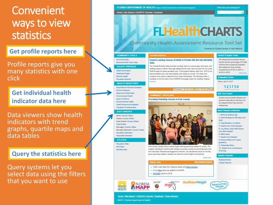
Convenient ways to view statistics
Profile reports give you many statistics with one click
Data viewers show health indicators with trend graphs, quartile maps and data tables
Query systems let you select data using the filters that you want to use
Get profile reports here
Query the statistics here
Get individual health indicator data here

Profile Reports: one click to county summary data!
Collections of data about a county
Focused on themes
Many reports to choose from
Get profile reports here!

Indicators = important health measures County Quartile = compare this county to other counties County Data = actual number or rate State Data = allows comparing the county to the state County Trend = compare the county’s trend for the last 5 data years
Profile Reports – County Health Status Summary Five components describe the county’s health status:
Indicators, County Quartile, County Data, State Data, County Trend
Florida Department of Health
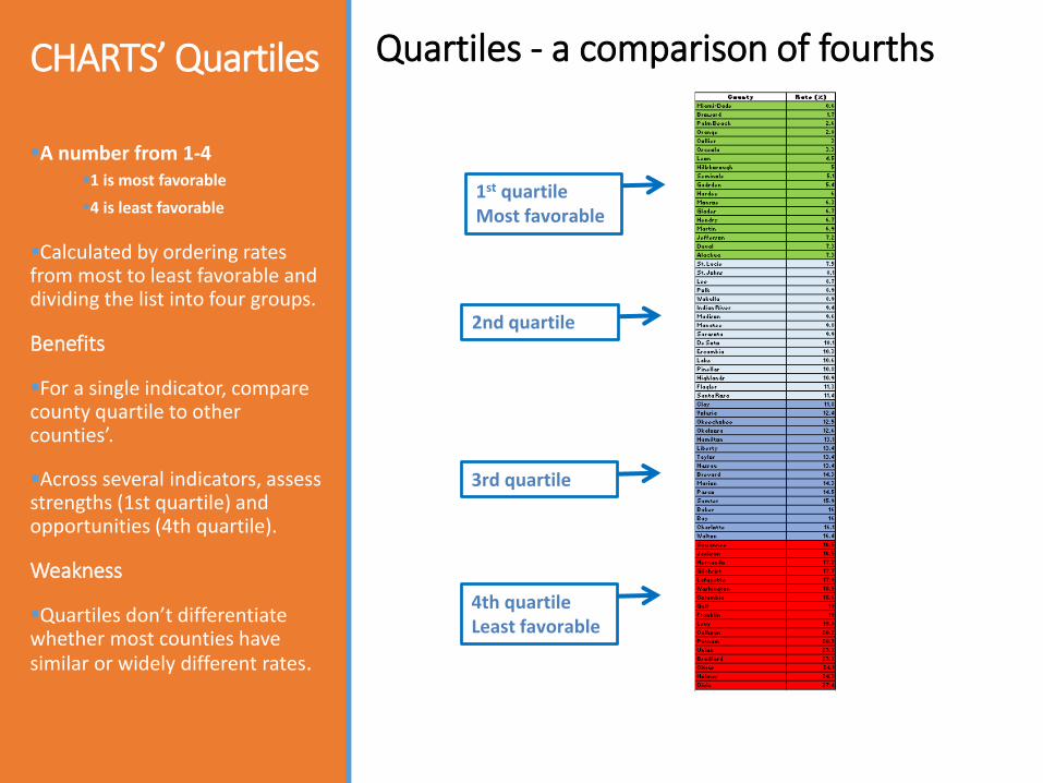
CHARTS’ Quartiles
1st quartileMost favorable
2nd quartile
3rd quartile
4th quartileLeast favorable
A number from 1-4 1 is most favorable
4 is least favorable
Calculated by ordering rates from most to least favorable and dividing the list into four groups.
Benefits
For a single indicator, compare county quartile to other counties’.
Across several indicators, assess strengths (1st quartile) and opportunities (4th quartile).
Weakness
Quartiles don’t differentiate whether most counties have similar or widely different rates.
Quartiles - a comparison of fourths
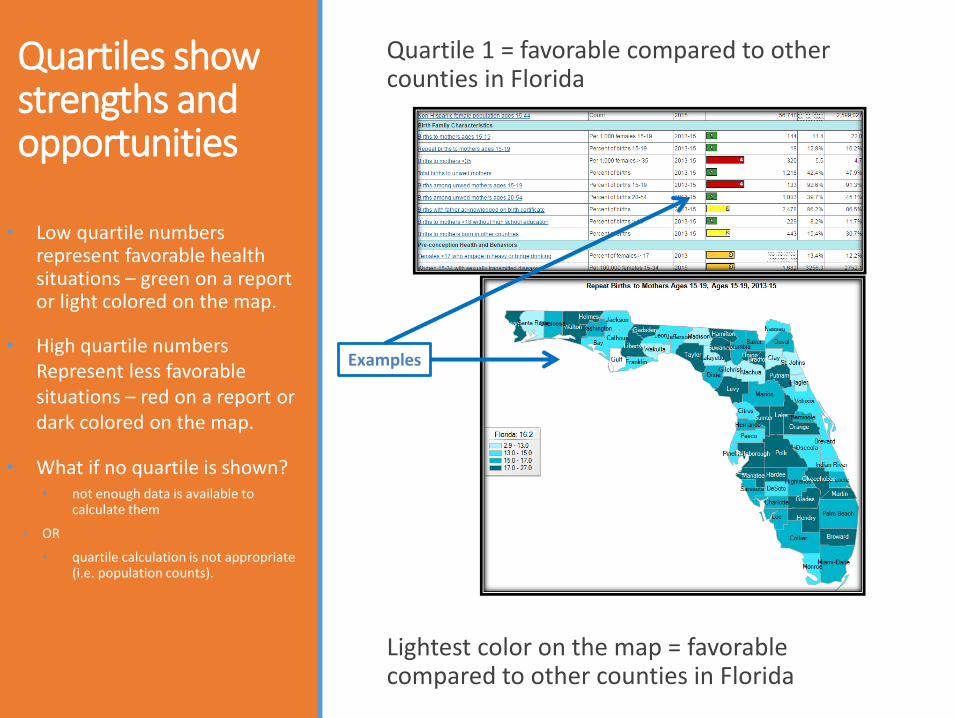
Quartiles show strengths and opportunities
• Low quartile numbers represent favorable health situations – green on a report or light colored on the map.
• High quartile numbers Represent less favorable situations – red on a report or dark colored on the map.
• What if no quartile is shown? • not enough data is available to
calculate them
◦ OR
• quartile calculation is not appropriate (i.e. population counts).
Quartile 1 = favorable compared to other counties in Florida
Lightest color on the map = favorable compared to other counties in Florida
Examples

The trend shows county status
Calculation of the trend is based on single-year rates or percents occurring in the last 5 data years
Better = Trend is getting better and the improvement is statistically significant
Worse = Trend is getting worse and the change is statistically significant
No Trend = Trend is not statistically significant Statistical testing has been applied making it possible to state
whether a change is statistically significant. For the data years shown in the graph and table, this county’s trend is significantly better at the 95% confidence level.

Click on a measure -- see its health indicator page
Click “Births to mothers who smoked during pregnancy” for a detailed view of this measure.
Click on a measure…
Get trends, a map and data tables
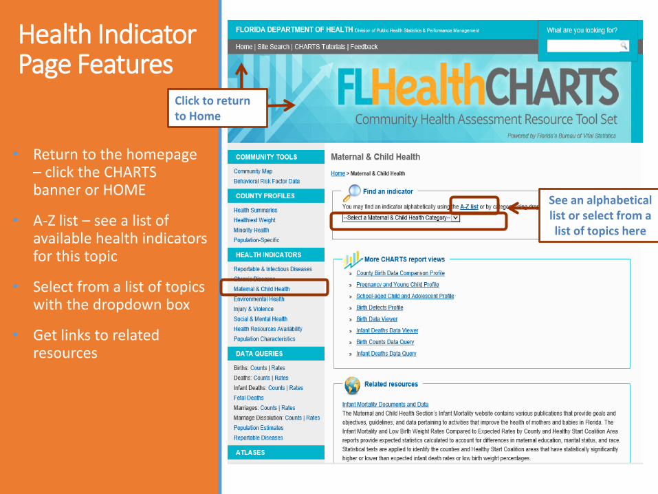
Health Indicator Page Features
• Return to the homepage – click the CHARTS banner or HOME
• A-Z list – see a list of available health indicators for this topic
• Select from a list of topics with the dropdown box
• Get links to related resources
See an alphabeticallist or select from a list of topics here
Click to return to Home

Customize your view of an indicatorOptions vary by of indicator. Here are some features:
1. Change indicators
2. Change the measure type (single, multi-year)
3. Select specific ages
4. Get a 10-year report
5. Select a county
6. Select a race/ethnicity group
7. Find out more about the indicator
8. Sort the columns
9. See the Measure of Variability Graph
7
7
6
5
4321
8 9
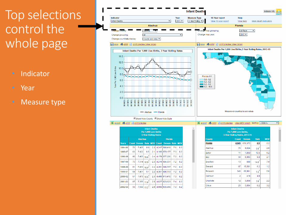
Top selections control the whole page
• Indicator
• Year
• Measure type

• 10-year report
• Help document
• More indicators
• Indicator info
• Return to CHARTS homepage
Helpful links give more info

These selections effect the entire left side
•County
•Grouping = race/ethnicity options
•Display counts and rates, counts only, or rates only
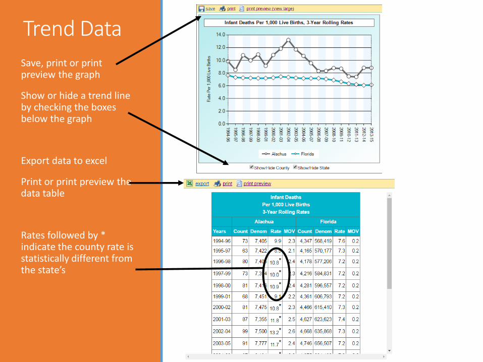
Trend Data
Save, print or print preview the graph
Show or hide a trend line by checking the boxes below the graph
Export data to excel
Print or print preview the data table
Rates followed by * indicate the county rate is statistically different from the state’s

Control the right side view with more display options
•Groupings show race/ethnicity options
•Year
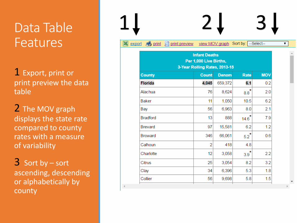
Data Table Features
1 Export, print or print preview the data table
2 The MOV graph displays the state rate compared to county rates with a measure of variability
3 Sort by – sort ascending, descending or alphabetically by county
2 31

Is a County’s Rate Different than the State’s?
If it is statistically different, it is marked with *
Click to see a graph of the variation
Measure of Variability is called MOV in CHARTS

Graphs illustrate variation from the state rate
State rates are represented by a flat, blue line.
County rates are represented by dots, and the MOV is represented by the end bars.
MOV = Measure of Variability

Importance of MOV
• Without the MOV it is harder to determine whether a difference from the state rate is valid.
• For example, in this example, Bradford County’s rate might seem much higher than the statewide rate.
• However, the MOV range indicates that random chance could have caused the rate to be higher than the state rate. Because the MOV range includes the state rate, we know it is not significantly higher.
Significance is tested at the 95% confidence level.
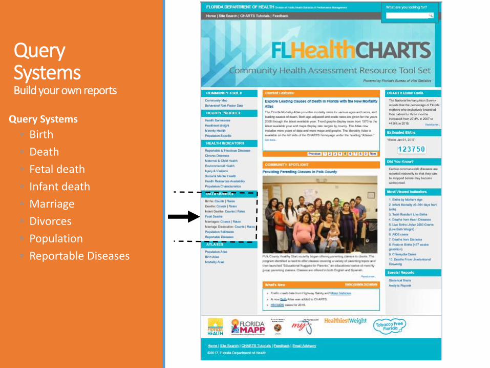
Query SystemsBuild your own reports
Query Systems
◦ Birth
◦ Death
◦ Fetal death
◦ Infant death
◦ Marriage
◦ Divorces
◦ Population
◦ Reportable Diseases

Query SystemsAll have similar functions
1. Feedback, Data Dictionary, Help
2. Quick standard reports
3. Selections you can use to change the reports
4. Your current report
1
2
3
4

How to Change the Year
This example uses the first standard report.
Click on the unchecked box at the top to unselect all.
If we select the year 2015, then we will only see the data for 2015.
Select different years or multiple years by checking the boxes.

How to Change the CountyIn this example, we will select Miami-Dade County.
Click on the unchecked box at the top to unselect all.
Select the county or counties you want by checking the boxes.
Now the report shows only Miami-Dade County
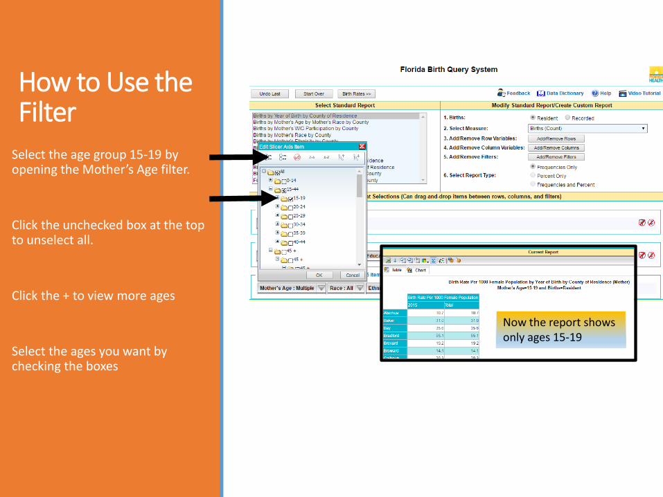
How to Use the Filter
Select the age group 15-19 by opening the Mother’s Age filter.
Click the unchecked box at the top to unselect all.
Click the + to view more ages
Select the ages you want by checking the boxes
Now the report shows only ages 15-19

Customize the Report
Make the selections you want by changing rows, columns or filters.
Limits to the number of fields in each area are stated on the screen.
In this example:
ROW: County=Broward, Miami-Dade
COLUMN: Year of Birth=2015, Mother’s Education Level (all)
FILTERS: Mother’s Age selections are made for age 20 - 44
ORDrag and drop between rows, columns or filters, observing the limits stated
Modify selections here using dropdown options

Community Map
Presents data for all causes of death, the 30 leading causes of death, and 16 birth indicators.
Data is presented at county, census tract, and zip code levels.
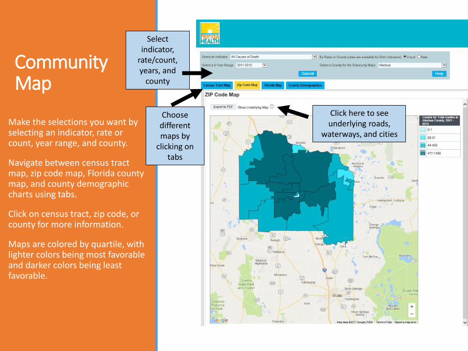
Community Map
Make the selections you want by selecting an indicator, rate or count, year range, and county.
Navigate between census tract map, zip code map, Florida county map, and county demographic charts using tabs.
Click on census tract, zip code, or county for more information.
Maps are colored by quartile, with lighter colors being most favorable and darker colors being least favorable.
Select indicator,
rate/count, years, and
county
Choose different maps by
clicking on tabs
Click here to see underlying roads,
waterways, and cities
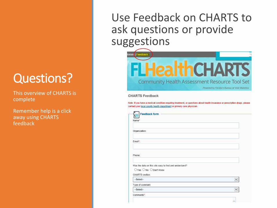
Questions?
Use Feedback on CHARTS to ask questions or provide suggestions
This overview of CHARTS is complete
Remember help is a click away using CHARTS feedback