flexbox and grid layout
TRANSCRIPT

CSS Grids & FlexboxRachel Andrew

Rachel Andrew
• Web developer since 1996ish
• ex Web Standards Project member
• edgeofmyseat.com since 2001
• grabaperch.com since 2009
• http://rachelandrew.co.uk
• http://twitter.com/rachelandrew

Flexbox

Flexible Box Module
• W3C Last Call Working Draft, http://www.w3.org/TR/css3-flexbox/
• Modern browsers support the up to date syntax
• Beware support for a previous version in older browsers
• Primarily a method for laying out items in a single horizontal or vertical line

Navigation marked up as a list. I want to space these items evenly.
<ul> <li><a href=""></a></li> <li><a href=""></a></li> <li><a href=""></a></li> <li><a href=""></a></li> </ul>

Flexbox gives us a new value for the display property.
display: flex;
nav ul{ display: flex; flex-direction: row; justify-content: space-around; align-items: stretch; }

Setting justify-content to space-between means that items justify against the left and right sides of the box.
nav ul{ display: flex; flex-direction: row; justify-content: space-between; align-items: stretch; }

The default value of flex-direction is row.
nav ul{ display: flex; flex-direction: row; justify-content: space-between; align-items: stretch; }

Set flex-direction to row-reverse and the order the items display in reverses.
nav ul{ display: flex; flex-direction: row-reverse; justify-content: space-between; align-items: stretch; }

Creating equal height boxes using flexbox. <div class="boxes">
<div class="box"> ... </div> <div class="box"> ... </div> <div class="box"> ... </div> </div>

With align-items given a value of stretch the items will take the height of the tallest.
.boxes { display: flex; flex-direction: row; flex-wrap: wrap; align-items: stretch; justify-content: space-between; }

With align-items given a value of center.
.boxes { display: flex; flex-direction: row; flex-wrap: wrap; align-items: center; justify-content: space-between; }
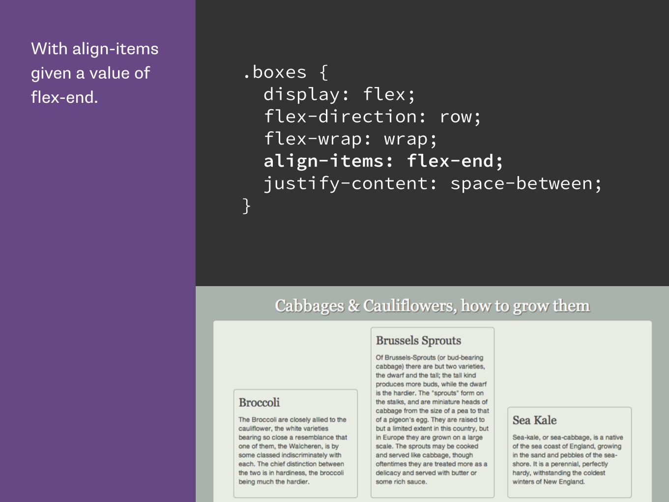
With align-items given a value of flex-end.
.boxes { display: flex; flex-direction: row; flex-wrap: wrap; align-items: flex-end; justify-content: space-between; }

The order property means we can order our flex items independently of source order.
.boxes .box:nth-child(1) { order:3; } .boxes .box:nth-child(2) { order:1; } .boxes .box:nth-child(3) { order:2; }
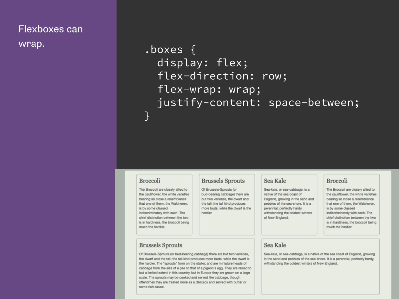
Flexboxes can wrap. .boxes {
display: flex; flex-direction: row; flex-wrap: wrap; justify-content: space-between; }


Flexbox Resources
CSS Tricks Guide to Flexbox: https://css-tricks.com/snippets/css/a-guide-to-flexbox/
Solved by Flexbox: http://philipwalton.github.io/solved-by-flexbox/
Flexplorer: http://bennettfeely.com/flexplorer/
Flexbox on Codrops CSS reference: http://tympanus.net/codrops/css_reference/flexbox/
Flexbox Cheat Sheet: http://www.sketchingwithcss.com/samplechapter/cheatsheet.html

CSS Grid Layouthttps://www.flickr.com/photos/blachswan/15174207821

CSS Grid Layout
• First Public Draft April 2011
• Proposal developed by Microsoft
• Early implementation in IE10
• Spec has moved on. Is now very different to the IE10 implementation.
• Latest Editors Draft 2 March 2015
• Implementation in Chrome (Experimental)

Line based positioning with CSS3 Grid Layout.
<h1 class="title">...</h1> <article class="wrapper"> <nav class="mainnav"> </nav> <h2 class="subhead"> </h2> <div class="content"> ... </div> <blockquote class="quote"> ... </blockquote> </article>

Grid Layout gives us new values for the display property.
To start using grid, define a grid on the container.
.wrapper { display: grid; }

Declare the columns with grid-template-columns.
The rows with grid-template-rows.
.wrapper { display: grid; grid-template-columns: 200px 40px auto 40px 200px; grid-template-rows: auto; }

Grid lines can be explict or implicit
• Explicit grid lines are those that you specify and give sizing information to
• Implicit lines are created when you place something into a row or column you have not specified with grid-template-rows or grid-template-columns


grid-column-start is the line before the content.
grid-column-end the line after.
grid-row-start is the line above the content.
grid-row-end the line below.
.content { grid-column-start: 3; grid-column-end: 4; grid-row-start: 2; grid-row-end: 3; }


Dropping the other items into place on the grid.
.mainnav { grid-column-start: 1; grid-column-end: 2; grid-row-start: 2; grid-row-end: 3; } .subhead { grid-row-start: 1; grid-row-end:2; grid-column-start: 3; grid-column-end: 4; } .quote { grid-column-start: 5; grid-column-end: 6; grid-row-start: 2; grid-row-end: 3; }


For columns start is the line before the column, end the line after.
For rows start is the line above, and end the row below.
.content { grid-column-start: 3; grid-column-end: 4; grid-row-start: 2; grid-row-end: 3; }

3 4
2
3

Grid Lines
Can be horizontal or vertical. Referred to by
number, or by name.
The highlighted line in this image is column line 2.

Grid Track
The space between two Grid Lines, either horizontal or
vertical.
The highlighted Grid Track in this image is between row
lines 2 and 3.

Grid Cell
The space between 4 Grid Lines.
The highlighted Grid Cell in this image is between row
lines 2 and 3 and column lines 2 and 3.

Grid Area
Any area on the Grid bound by four grid lines.
The highlighted Grid Area in this image is between row
lines 1 and 3 and column lines 2 and 4.


Adding a footer to the bottom of my design.
.mainfooter { grid-column-start: 1; grid-column-end: 6; grid-row-start: 3; grid-row-end: 4; }

Shorthand Syntax

The grid-row and grid-column properties allow you to declare the start and end values separated by a / character.
.content { grid-column: 3 / 4; grid-row: 2 / 3; }

The grid-area property lets us set all 4 values at once. The order of the values is:
- grid-row-start - grid-column-start - grid-row-end - grid-column-end
.content { grid-area: 2 / 3 / 3 / 4; }

Grid line placement properties.
.content { grid-column-start: 3; grid-column-end: 4; grid-row-start: 2; grid-row-end: 3; }
.mainnav { grid-column-start: 1; grid-column-end: 2; grid-row-start: 2; grid-row-end: 3; }
.subhead { grid-column-start: 3; grid-column-end: 4; grid-row-start: 1; grid-row-end:2; }
.quote { grid-column-start: 5; grid-column-end: 6; grid-row-start: 2; grid-row-end: 3; }

Grid line placement properties.
.content { grid-column: 3 / 4; grid-row: 2 / 3; }
.mainnav { grid-column: 1 / 2; grid-row: 2 / 3; }
.subhead { grid-column: 3 / 4; grid-row: 1 / 2; }
.quote { grid-column: 5 / 6; grid-row: 2 / 3; }

Grid line placement properties.
.content { grid-area: 2 / 3 / 3 / 4; }
.mainnav { grid-area: 2 / 1 / 3 / 2; }
.subhead { grid-area: 1 / 3 / 2 / 4; }
.quote { grid-area: 2 / 5 / 3 / 6; }

Redefining the grid

The source order of our html elements is:
- mainnav - subhead - content - quote
<article class="wrapper"> <nav class="mainnav"></nav> <h2 class="subhead"></h2> <div class="content"></div> <blockquote class="quote"> </blockquote>
</article>


Declare the grid at the 460 pixel breakpoint.
@media only screen and (min-width: 460px) { .wrapper { display: grid; grid-template-columns: auto ; grid-template-rows: auto ; } }

Within the media queries for that breakpoint, position the elements on the grid.
I am using the shorthand grid-row property here to define start and end.
.mainnav { grid-row: 1 / 2; }
.subhead { grid-row: 2 / 3; }
.quote { grid-row: 3 / 4; }
.content { grid-row: 4 / 5; }


Redefining the grid to two columns at the 700 pixel breakpoint.
@media only screen and (min-width: 700px) { .wrapper { grid-template-columns: 20% 5% auto ; grid-template-rows: auto ; }

In the two column version the nav goes into the left column. Between column lines 1 and 2.
.mainnav { grid-column: 1 / 2; grid-row: 2 / 3; }
.subhead { grid-column: 3 / 4; grid-row: 1 / 2; }
.content { grid-column: 3 / 4; grid-row: 3 / 4; }
.quote { grid-column: 3 / 4; grid-row: 2 / 3; }


Redefining the layout as three columns again.
@media only screen and (min-width: 980px) { .wrapper { grid-template-columns: 200px 40px auto 40px 200px; grid-template-rows: auto ; max-width: 960px; }

In this layout the quote is placed between column lines 5 and 6.
.mainnav { grid-column: 1 / 2; grid-row: 2 / 3; } .subhead { grid-column: 3 / 4; grid-row: 1 / 2; } .content { grid-column: 3 / 4; grid-row: 2 / 3; } .quote { grid-column: 5 / 6; grid-row: 2 / 3; }


Grid Template Areas

Use the grid-area property to set up areas for the main elements outside of the media queries.
.mainnav { grid-area: nav; } .subhead { grid-area: subhead; } .quote { grid-area: quote; } .content { grid-area: content; } .feature-image { grid-area: feature; }

Give names to the areas using the grid-template-areas property.
@media only screen and (min-width: 460px) and (max-width: 700px){ .wrapper { display: grid; width: 90%; grid-template-columns: auto ; grid-template-rows: auto ; grid-template-areas: "nav" "subhead" "quote" "content" "feature"; } }


Redefine the areas for two columns.
@media only screen and (min-width: 700px) and (max-width: 980px){ .wrapper { display:grid; grid-template-columns: 20% 5% auto ; grid-template-rows: auto ; grid-template-areas: ". . subhead" "nav . quote" "nav . feature" "nav . content" ; } }


Redefine the areas for three columns.
@media only screen and (min-width: 980px) { .wrapper { display: grid; grid-template-columns: 200px 40px auto 40px 200px; grid-template-rows: auto ; grid-template-areas: ". . subhead . ." "nav . feature . quote" "nav . content . quote"; } }


16 Column Grid

Naming Grid lines. Remember that the name is for the line and NOT the grid track.
grid-template-columns: (nav-start) 200px (nav-end) 40px (content-start) auto (content-end) 40px (side-start) 200px (side-end);
.content { grid-column: content-start / content-end; }

You can use the repeat keyword to repeat parts of the grid definition.
grid-template-columns: repeat(4, 200px 20px);

The fr unit is a flexible length that represents a fraction of the available space in the grid container.
grid-template-columns: 5fr 1fr 10fr 1fr 5fr;

Creating a 16 column grid using the repeat syntax.
I am also giving my grid lines names of col, row and gutter by adding a name for that line.
.wrapper { display:grid; grid-template-columns: (gutter) 1fr repeat(16, (col) 4.25fr (gutter) 1fr ); grid-template-rows: repeat(9, (row) auto (gutter) 20px ); }

We can create a bunch of boxes ...
<div class="wrapper"> <div class="box grid1">01</div> <div class="box grid2">02</div> <div class="box grid3">03</div> <div class="box grid4">04</div> <div class="box grid5">05</div> <div class="box grid6">06</div> ... </div>

... and position them on the grid.
.grid1 { grid-column: col / span 1; grid-row: row / span 1;}
.grid2 { grid-column: col 2 / span 1; grid-row: row / span 1;}
.grid27 { grid-column: col 7 / span gutter 3; grid-row: row 3 / span 1; }
.grid32 { grid-column: col 9 / span gutter 4; grid-row: row 4 / span 1; }


The markup for my layout.
<div class="wrapper"> <header class="header"> </header> <aside class="side1"> </aside> <article class="content"> </article> <aside class="side2"> </aside> <footer class="footer box"> </footer> </div>

Using the span keywords to span across gutter lines.
.header { grid-column: col / span gutter 16; grid-row: row / span 1; } .side1 { grid-column: col / span gutter 4; grid-row: row 2 / span 1; } .content { grid-column: col 5 / span gutter 8; grid-row: row 2 / span 1; } .side2 { grid-column: col 13 / span gutter 4; grid-row: row 2 / span 1; } .footer { grid-column: col / span gutter 16; grid-row: row 3 / span 1; }

span gutter 16 means span over 16 lines named gutter.
.header { grid-column: col / span gutter 16; grid-row: row / span 1; } .side1 { grid-column: col / span gutter 4; grid-row: row 2 / span 1; } .content { grid-column: col 5 / span gutter 8; grid-row: row 2 / span 1; } .side2 { grid-column: col 13 / span gutter 4; grid-row: row 2 / span 1; } .footer { grid-column: col / span gutter 16; grid-row: row 3 / span 1; }


Our content starts on col line 5, and spans 8 lines named gutter.
.header { grid-column: col / span gutter 16; grid-row: row / span 1; } .side1 { grid-column: col / span gutter 4; grid-row: row 2 / span 1; } .content { grid-column: col 5 / span gutter 8; grid-row: row 2 / span 1; } .side2 { grid-column: col 13 / span gutter 4; grid-row: row 2 / span 1; } .footer { grid-column: col / span gutter 16; grid-row: row 3 / span 1; }


The Gutter Problem - no way to define gutters without creating an explicit Grid Track for them. .wrapper {
display:grid; grid-template-columns: (gutter) 1fr repeat(16, (col) 4.25fr (gutter) 1fr ); grid-template-rows: repeat(9, (row) auto (gutter) 20px ); }


https://github.com/FremyCompany/css-grid-polyfill/

Grid or Flexbox?

Tab Atkins, to www-style
“Flexbox is for one-dimensional layouts - anything that needs to be laid out in a straight line (or in a broken line, which would be a single straight line if they were joined back together). Grid is for two-dimensional layouts. It can be used as a low-powered flexbox substitute (we’re trying to make sure that a single-column/row grid acts very similar to a flexbox), but that’s not using its full power.”

Grid Layout for the main page structure of rows and columns.

Flexbox for navigation, UI elements, anything you could linearize.


Using Grid Layout to lay out the main page components. First, define the grid areas.
.mainheader { grid-area: header; } .left { grid-area: sidebar; } .maincontent { grid-area: main; } .mainfooter { grid-area: footer; }

Then lay them out on the grid.
@media (min-width: 550px) { .container { display: grid; grid-template-columns: 22% 4% 74%; grid-template-rows: auto ; grid-template-areas: "header header header" "sidebar . main" "footer footer footer"; } }


Then use Flexbox for the panels.
.panels { display: flex; justify-content: space-between; }
.panels li { width: 27%; }


Grid Resources
Grid by Example: http://gridbyexample.com
Examples from Igalia: http://igalia.github.io/css-grid-layout/
Interesting post about the evolution of the spec: http://blogs.igalia.com/mrego/2014/12/30/css-grid-layout-2014-recap-specification-evolution/

Thank you@rachelandrew