firing on all cylinders€¦ · neil o brien obe mp. about onward ... tax system hits lagging...
TRANSCRIPT

Firing on all cylinders
Building a strong economy from the bottom up
Neil O’Brien OBE MP

About Onward
Onward is a campaigning thinktank whose mission is to develop new ideas for the next generation of centre right thinkers and leaders. We exist to make Britain fairer, more prosperous and more united, by generating a new wave of modernising ideas and a fresh kind of politics that reaches out to new groups of people.
We believe in a mainstream conservatism – one that recognises the value of markets and supports the good that government can do, is unapologetic about standing up to vested interests, and assiduous in supporting the hardworking, aspirational and those left behind. Our goal is to address the needs of the whole country: young as well as old; urban as well as rural; and for all parts of the UK – particularly places that feel neglected or ignored in Westminster. We will achieve this by developing practical policies that work. Our team has worked both at a high level in government and for successful thinktanks. We know how to produce big ideas that resonate with policymakers, the media and the public.
We will engage ordinary people across the country and work with them to make our ideas a reality.
Onward is an independent, not-for-profit thinktank, registered in England and Wales (Company Registration no. 11326052).
Thanks
The author would particularly like to thank the staff of the House of Commons library for their help in finding data and academic research for this publication, and in particular Matthew Keep who provided the distributional analysis and Lorna Booth who helped with data on low incomes. Thanks also to Richard Prothero from the Office for National Statistics for his advice about regional statistics and productivity.
Contents
Summary of the argument 2
A new fiscal rule: A new approach to the public finances 7
Investing in public services: Meeting people’s key priorities 12
Solving Britain’s productivity problem: A plan to tackle Britain’s chronic low productivity and attract new ideas and investment – with an emphasis on helping poorer areas grow 18
Helping working people on low incomes: Helping working families earn more and keep more of what they earn 47
Adding it all up: How to prioritise 73
Endnotes 77
2
Summary of the argument
Summary of the argument 3
The 2019 Spending Review must mark a turning point: from a time when reducing a dangerously high government deficit has been the unavoidable aim, to a new, more expansionist period in which we can realise our goals for Britain.
A big part of this new more expansionist agenda will of course be new investments in our public services: our schools, our police, prisons and social services.
While this paper will look at these issues, spending on public services is discussed every day in Westminster and in the media.
So this paper looks in more detail at the other big tasks for the Spending Review, which we don’t talk about enough; the actions we must take to make Britain more competitive – and to make sure we drive prosperity to all parts of the country, and all parts of society.
It proposes an approach to spurring growth which is pro-business, but in a way which aims to help the most needy places help themselves move forward.
It proposes a plan for trickle-up growth – a plan to make sure all areas and all groups in our society share in the benefits of a growing economy, with higher employment and incomes for families that are less well off today.
This paper argues for four things, and comes in four sections:
1. A new approach to the public finances and a new fiscal rule
• After nine years of difficult decisions, substantial headroom has opened up in the public finances. The current fiscal plan is set to drive down government debt as a share of GDP from 83% to 73% GDP over the next five years.
• We must not allow debt as a share of the economy to rise in normal times, especially because we face severe long term spending pressures from an ageing society in the coming decades.
• However, there is currently some scope to cut taxes and increase spending in a prudent way in the near term while keeping debt as a share of GDP falling.
• So the current set of fiscal rules and the plan to reduce debt sharply should be replaced with a more expansive single fiscal rule: to keep debt to GDP falling gently in normal years when there is no recession.
2. Investment in key public services
• Much of the headroom a new fiscal rule would open up should rightly be used to improve public services and there are a range of pressures for higher spending which Government will need to meet. After nine years of reducing the record deficit, there are a wide range of demands for more spending, including schools, the police, prisons, adult and children’s social care.
• The 2019 Spending Review should aim to meet some of these key pressures. In particular, it should return school spending to its 2015 record level of real spending per pupil and keep it at that record level. It should provide for sustained recruitment into the police budget and enable growth in officer numbers. Investment in prisons should be significantly increased with the number of prison places also growing substantially over time to enable the introduction of longer sentences, “earned release” and more honesty in sentencing.
Firing on all cylinders4
3. A plan to tackle Britain’s chronic low productivity and attract new ideas and investment – with an emphasis on helping poorer areas grow
• As well as meeting the pressures for more spending on services, we should use this moment to invest in Britain’s competitiveness – and do so in a way that boosts the performance of lagging areas.
• Britain has persistently lower productivity than the US, France and Germany. If we were able to match US rates of productivity – about a third higher per worker – it would transform our living standards and our ability to pay for public services.
• The root causes of lower productivity have been widely discussed: in particular, low fixed investment, and less automation; and (related to this) a larger proportion of people with low skill levels, partly because of lower investment in skills by firms. Fixed investment in Britain has been lower than the OECD average in every year but one since 1960, while rising countries like South Korea have nine times more robots per manufacturing worker than the UK.
• Recognising the role played by chronically low investment rates in Britain’s long term productivity problem, we should cut taxes on business investment and make the UK’s capital allowances among the most generous in the world. At present our capital allowances are the least friendly to investment of any G20 country.
• Business groups like the CBI, IoD and the manufacturers’ group Make UK have all called for more generous capital allowances, as did the independent LSE Growth Commission. As well as more generous allowances for plant and machinery, new allowances should be created to encourage investment in human capital and the diffusion of new technologies.
• Learning from countries that have sharply grown their productivity, we should recognise the crucial role of inward investors, not just in increasing investment rates (in machinery, research and people) but also their role in promoting competition and bringing new ideas and technology to the UK.
• In the UK, foreign firms account for more than half (52%) of all research and development investment, and spend around five times more on R&D than domestic companies. Foreign firms account for around 16% of total employment but contribute 30% of total productivity growth.1 There is also clear evidence that there are spillovers of new techniques and benefits from increased competition from foreign firms: more FDI within a particular industry increases productivity in competitor firms in the UK.
• With this in mind we should align our Corporation Tax rate with Ireland, learning from the way the Republic has used low tax rates to attract knowledge-intensive businesses. Inward investment has transformed Ireland’s productivity, and led to Ireland overtaking the UK in living standards and per capita income. Relative to the size of its economy, Ireland has attracted four times more inward investment than the UK. Between 1990 and 2017 its Gross National Income (GNI) per capita has gone from 25% below the UK level to 45% above it.
Summary of the argument 5
• There is clear evidence that more balanced economies do better overall. All large (G20) countries that are richer than the UK have a more geographically balanced economy. There are no large countries which have a more regionally imbalanced economy than the UK and are richer than the UK in terms of GDP per head.
• We should recognise that Britain has de-industrialised more than any other G20 country since 1990; that the UK’s tax system is currently uniquely hostile to manufacturing and other types of capital-intensive businesses; and that this has a particularly negative effect on lagging parts of the country which are more reliant on manufacturing. Despite its small share of overall GDP, manufacturing makes an outsize contribution to productivity growth.
• More generous capital allowances would help lagging regions. While manufacturing accounted for around a quarter of productivity growth nationally since 1997, it provided 40–50% of productivity growth in poorer regions like Wales, the West Midlands and North West. An investment-hostile tax system hits lagging regions harder.
• We should look to improve capital allowances across the country, but the Treasury should also go beyond this and enhance and extend allowances even further in lagging regions to attract inward investment there.
• We should also rebalance the Government’s own growth-enhancing spending. At present the items of government spending with the greatest potential to spur growth are too concentrated on the regions that are already the most successful. We should change the balance of spending in innovation, transport, housing and culture to lift the performance of poorer areas. Government should also fundamentally review the way funding is allocated. Government should consider whether the focus on current demand levels and current strengths is creating a vicious circle for less wealthy areas.
4. A plan to further boost employment, and raise the incomes of less well-off families
• Skill-biased technology change sweeping across industrialised countries in recent decades increased inequality around the world, by pushing up the earnings for higher skilled people and pushing them down for lower skilled people. Though things have improved somewhat in recent years, driven by increased employment among poorer households, almost all western countries, including Britain, are more unequal than in the period from the 1950s to the 1970s.
• Policy should aim to particularly help those in work. Specifically, we should aim to drive down absolute poverty rates for those who are in work. Claims that work is no longer a route out of poverty for those who can work are wrong. A workless couple are twenty times more likely to be in poverty than a couple working full-time, and rising, record employment means 350,000 fewer children in poverty than would be the case otherwise. In fact, record employment rates have made employment income a much more important part of the income of poorer households relative to benefits. For the bottom 10% of working age households, their own income has gone from being a third of their disposable income in the early 1990s to 70% today.

Firing on all cylinders6
• Policy should particularly aim to help in-work households with children, because they are worse off on average; because children reduce parents’ ability to pay tax; because helping children represents an investment in their future; and because children have no control over their family income.
• To help ensure that more families strongly feel the benefits of a growing economy, and to grow employment even more, the Government should further reduce tax in ways that are focused on lower income working families.
• For families in the low- to mid-income bracket, the Government should increase the Primary Threshold for National Insurance contributions, in preference to the Income Tax Personal Allowance, as this helps lower income households more. This is because the threshold at £8,600 is now substantially lower than the personal allowance for income tax at £12,500.
• Families with children are roughly twice as likely to have low incomes and so should be prioritised for tax cuts. As a first step Government should aim to increase the National Insurance Primary Threshold for people with children to align it with the rising Personal Allowance for income tax, at around £13,000.
• This would mean children were recognised in the tax system for the first time since the 1970s. This would cost just over £4 billion a year once fully rolled out, and raise post tax income by up to £1,100 for a two-earner couple. It would also improve work incentives and increase employment. It would allow working families with children to provide for themselves before paying tax.
• For poorer working families, Government should turn Universal Credit into “UC Plus” by substantially increasing work allowances and creating a separate work allowance for second earners. This would both directly raise the incomes of poorer working households and also increase work incentives and employment.
• As part of UC Plus, Government should set out a roadmap to increase work allowances by around £3,000. This would increase the incomes of low income working families by up to £1,900 a year. On top of this UC Plus would also introduce a new second earner work allowance in UC, equivalent to 16 hours of work on the National Living Wage. This would increase incomes for low income working households by up to a further £4,300.
• The Department of Work and Pensions (DWP) should also develop options to increase Work Allowances further for families with larger numbers of children.
This report argues that stronger growth has to be broadly based: that more geographically balanced economies are stronger overall; and that economies where all groups see the benefits of growth are more sustainable. This is a kind of “trickle-up” economics.
If we take decisive action in Spending Review 2019 we can build not just a strong economy, but a strong economy in all parts of the country. A country where all parts of society feel the benefits from growth – an economy that is really firing on all cylinders.

7
A new fiscal ruleA new approach to the public finances
Firing on all cylinders8
Why a new fiscal rule?
The 2019 Spending Review will be the first under the Conservatives not to be dominated by emergency deficit reduction.
The Chancellor is on course to meet the spending rules he has set out, with debt as a share of GDP falling over the forecast period.
The 2019 Spending Review would be a good time to set a new rule. The existing fiscal rules are being met, and will need to be changed anyway because they are defined in relation to next year (2020/21).
The current commitments are that:
1. The structural deficit (cyclically adjusted public sector net borrowing) must be below two per cent of GDP by 2020/21.
2. Public sector net debt should fall relative to GDP in 2020/21.
3. The current Charter for Budget Responsibility also says that the Government aims to “return the public finances to balance at the earliest possible date in the next Parliament.”
Rules 1 and 2 were set at the 2016 Autumn Statement, at a time when it was expected that the next election would be in 2020. The third “rule”, which is not being met at present, is essentially a delayed version of the “surplus rule” announced by George Osborne in Summer 2015, which pledged a surplus from the year 2019/20 onward.
This paper suggests that the Government should scrap the current rules and instead move to a single, simple fiscal rule; “that the ratio of debt to GDP over the forecast period should be falling not rising in normal times” – in other words, when no recession is forecast or being experienced.
This fiscal rule would make impossible the kind of borrowing programme advocated by the Labour Party under Jeremy Corbyn, which promised up to a trillion of extra borrowing at the 2017 election, with one single new policy alone (an infrastructure fund) increasing borrowing by £250 billion.
But compared to the current rules and forecast, such a new rule would (on the basis of current forecasts) leave the Chancellor with substantial headroom for tax cuts and spending increases.
It would be prudent to allow for a buffer or margin of error, so that the Treasury are not forced to make adjustments purely as a result of the inevitable swings in the fiscal forecast from one budget to another. Nonetheless, even with a margin for safety, the headroom is likely to be substantial.
Why we should not allow debt to rise while the economy is growing
At the 2019 Spring Statement, the OBR forecast that debt to GDP will fall from 83.3% GDP in 2018/19 to 73% GDP in 2023/24. There is a reasonable case for debt reduction, given the dramatic increase in the ratio of debt to GDP in the years following the 2008/9 recession:
A new fiscal rule 9
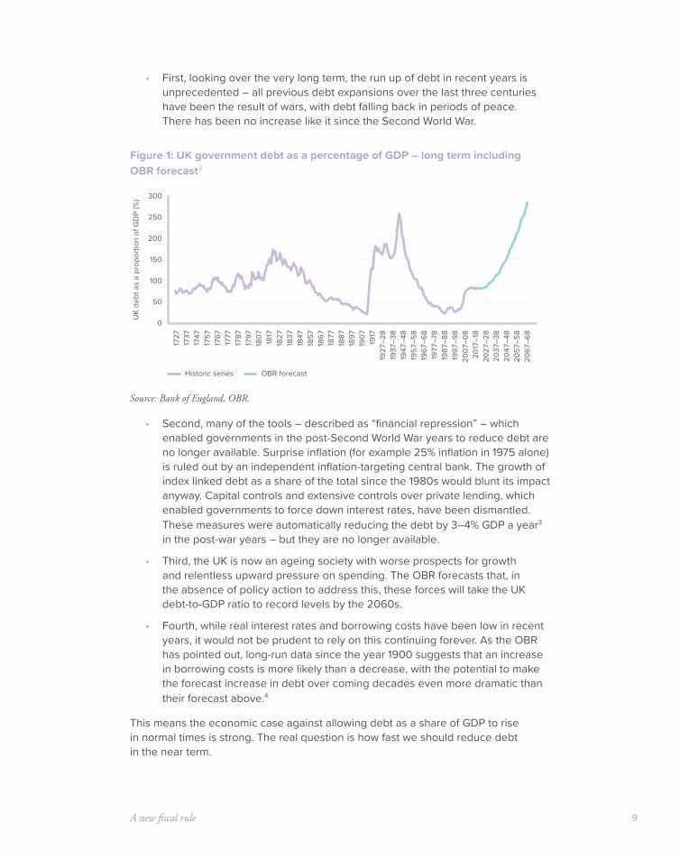
• First, looking over the very long term, the run up of debt in recent years is unprecedented – all previous debt expansions over the last three centuries have been the result of wars, with debt falling back in periods of peace. There has been no increase like it since the Second World War.
Figure 1: UK government debt as a percentage of GDP – long term including OBR forecast2
Source: Bank of England, OBR.
• Second, many of the tools – described as “financial repression” – which enabled governments in the post-Second World War years to reduce debt are no longer available. Surprise inflation (for example 25% inflation in 1975 alone) is ruled out by an independent inflation-targeting central bank. The growth of index linked debt as a share of the total since the 1980s would blunt its impact anyway. Capital controls and extensive controls over private lending, which enabled governments to force down interest rates, have been dismantled. These measures were automatically reducing the debt by 3–4% GDP a year3 in the post-war years – but they are no longer available.
• Third, the UK is now an ageing society with worse prospects for growth and relentless upward pressure on spending. The OBR forecasts that, in the absence of policy action to address this, these forces will take the UK debt-to-GDP ratio to record levels by the 2060s.
• Fourth, while real interest rates and borrowing costs have been low in recent years, it would not be prudent to rely on this continuing forever. As the OBR has pointed out, long-run data since the year 1900 suggests that an increase in borrowing costs is more likely than a decrease, with the potential to make the forecast increase in debt over coming decades even more dramatic than their forecast above.4
This means the economic case against allowing debt as a share of GDP to rise in normal times is strong. The real question is how fast we should reduce debt in the near term.
0
100
150
50
200
300
250
1727
1737
1747
1757
1767
1777
1787
1797
1827
1817
1807
1837
1847
1857
1867
1877
1887
1897
1927
–28
1917
1907
1937
–38
1947
–48
1957
–58
1967
–68
1977
–78
1987
–88
1997
–98
2007
–08
2017
–18
2027
–28
2047
–48
2037
–38
2057
–58
2067
–68
UK
debt
as
a pr
opor
tion
of G
DP
(%)
Historic series OBR forecast
Firing on all cylinders10
The case for using some of our headroom against debt falling
There are strong arguments for a lower reduction in debt than currently forecast, or for keeping debt flat in the near term. These are primarily political economy arguments:
• The need to support the economy through the dramatic changes involved in Brexit.
• The need to make post-Brexit Britain appealing to international investors.
• The need to tackle Britain’s long term productivity problem.
• The need to manage the spending pressures that have built up after nine years of the biggest deficit reduction programme since the war.
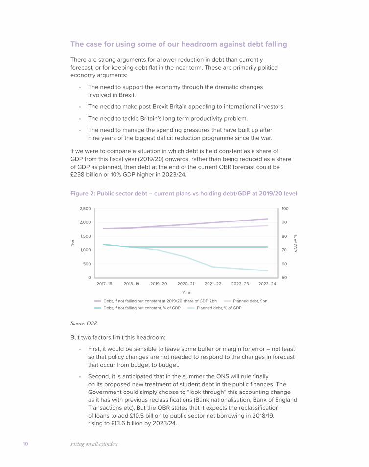
If we were to compare a situation in which debt is held constant as a share of GDP from this fiscal year (2019/20) onwards, rather than being reduced as a share of GDP as planned, then debt at the end of the current OBR forecast could be £238 billion or 10% GDP higher in 2023/24.
Figure 2: Public sector debt – current plans vs holding debt/GDP at 2019/20 level
Source: OBR.
But two factors limit this headroom:
• First, it would be sensible to leave some buffer or margin for error – not least so that policy changes are not needed to respond to the changes in forecast that occur from budget to budget.
• Second, it is anticipated that in the summer the ONS will rule finally on its proposed new treatment of student debt in the public finances. The Government could simply choose to “look through” this accounting change as it has with previous reclassifications (Bank nationalisation, Bank of England Transactions etc). But the OBR states that it expects the reclassification of loans to add £10.5 billion to public sector net borrowing in 2018/19, rising to £13.6 billion by 2023/24.
0
500
1,500
2,000
1,000
2,500
2017–18 2018–19 2019–20 2020–21 2021–22 2022–23 2023–24
£bn
50
60
70
80
90
100
% of G
DP
Year
Debt, if not falling but constant at 2019/20 share of GDP, £bnDebt, if not falling but constant, % of GDP
Planned debt, £bnPlanned debt, % of GDP

A new fiscal rule 11
• So with higher recorded borrowing each year, the amount of headroom freed up by holding debt as a share of GDP constant would shrink by over £50 billion. However, the Government could still choose to hold debt to GDP constant from 2019/20 onwards, freeing up nearly £190 billion of extra borrowing capacity in the four years running from 2020/21 through to 2023/24.
There are of course many areas in which the Government should improve value for money for the taxpayer and increase efficiency. There will be many areas in which Spending Review can and should find savings. And looking to the longer term, Government needs to lay the foundations for a response to the enormous challenges of an ageing society. But in the near term there is also some fiscal headroom to pursue our other goals.
Although there is fiscal headroom in the near term, over the coming decades we face a dramatic challenge to finance good public services in an ageing society. The Office for Budget Responsibility analysis of the problem has not been challenged, but no consensus has emerged on how to fix it.
To help crystallise clear options and build a consensus, the government should create an expert-led Commission on Sustainable Public Services. Running over the Spending Review period it would work up options, inform public debate and survey public opinion, with solutions implemented in the next spending review.
Recommendation 1
The current set of fiscal rules and the plan to reduce debt sharply should be replaced with a single more expansive fiscal rule – to keep debt to GDP falling gently in normal times. Government should create an expert-led Commission on Sustainable Public Services to build consensus on how to fix our longer term fiscal problems.

12
Investing in public services
Meeting people’s key priorities
Investing in public services 13
There are a number of spending pressures which there is a political demand for. This is not the main focus of this paper, but we anticipate that Spending Review 2019 should see increased spending on a number of public service priorities.
These spending pressures include, but are not limited to:
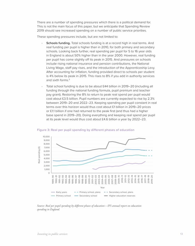
• Schools funding. Total schools funding is at a record high in real terms. And real funding per pupil is higher than in 2010, for both primary and secondary schools. Looking back further, real spending per pupil for 5 to 16 year olds in England is about 50% higher than in the year 2000. However, real funding per pupil has come slightly off its peak in 2015. And pressures on schools include rising national insurance and pension contributions, the National Living Wage, staff pay rises, and the introduction of the Apprenticeship Levy. After accounting for inflation, funding provided direct to schools per student is 4% below its peak in 2015. This rises to 8% if you add in authority services and sixth forms.5
• Total school funding is due to be about £44 billion in 2019–20 (including all funding through the national funding formula, pupil premium and teacher pay grant). Restoring the 8% to return to peak real spend per pupil would cost about £3.5 billion. Pupil numbers are currently expected to rise by 2.3% between 2019–20 and 2022–23. Keeping spending per pupil constant in real terms over this horizon would thus cost about £1 billion in 2019–20 prices or £1.1 billion if one had returned to the peak first (and thus had a higher base spend in 2019–20). Doing everything and keeping real spend per pupil at its peak level would thus cost about £4.6 billion a year by 2022–23.
Figure 3: Real per pupil spending by different phases of education
Source: Real per pupil spending by different phases of education – IFS annual report on education spending in England.
01,0002,0003,0004,0005,0006,0007,0008,0009,000
10,000
1989
–90
1990
–91
1991
–92
1992
–93
1993
–94
1994
–95
1995
–96
1996
–97
1997
–98
1998
–99
1999
–00
2000
–01
2001
–02
2002
–03
2003
–04
2004
–05
2005
–06
2006
–07
2007
–08
2008
–09
2009
–10
2011
–12
2010
–11
2012
–13
2013
–14
2014
–15
2015
–16
2016
–17
2017
–18
2018
–19
2019
–20
Real
spe
ndin
g (£
)
Year
Early years Secondary school, plansPrimary school, plansSecondary schoolPrimary school Higher education reserves
Firing on all cylinders14
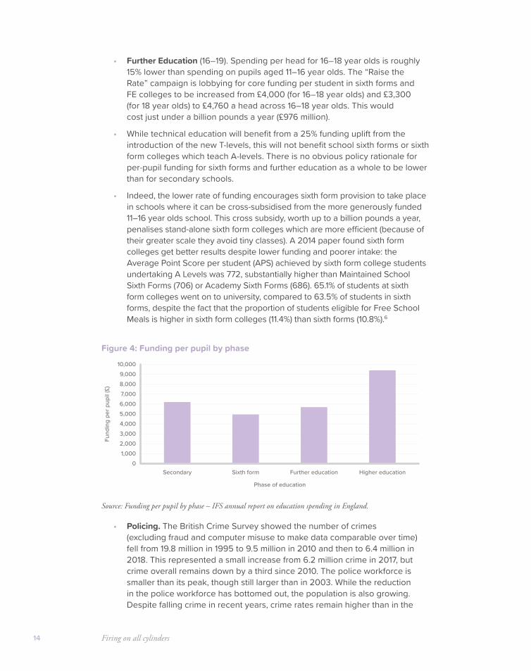
• Further Education (16–19). Spending per head for 16–18 year olds is roughly 15% lower than spending on pupils aged 11–16 year olds. The “Raise the Rate” campaign is lobbying for core funding per student in sixth forms and FE colleges to be increased from £4,000 (for 16–18 year olds) and £3,300 (for 18 year olds) to £4,760 a head across 16–18 year olds. This would cost just under a billion pounds a year (£976 million).
• While technical education will benefit from a 25% funding uplift from the introduction of the new T-levels, this will not benefit school sixth forms or sixth form colleges which teach A-levels. There is no obvious policy rationale for per-pupil funding for sixth forms and further education as a whole to be lower than for secondary schools.
• Indeed, the lower rate of funding encourages sixth form provision to take place in schools where it can be cross-subsidised from the more generously funded 11–16 year olds school. This cross subsidy, worth up to a billion pounds a year, penalises stand-alone sixth form colleges which are more efficient (because of their greater scale they avoid tiny classes). A 2014 paper found sixth form colleges get better results despite lower funding and poorer intake: the Average Point Score per student (APS) achieved by sixth form college students undertaking A Levels was 772, substantially higher than Maintained School Sixth Forms (706) or Academy Sixth Forms (686). 65.1% of students at sixth form colleges went on to university, compared to 63.5% of students in sixth forms, despite the fact that the proportion of students eligible for Free School Meals is higher in sixth form colleges (11.4%) than sixth forms (10.8%).6
Figure 4: Funding per pupil by phase
Source: Funding per pupil by phase – IFS annual report on education spending in England.
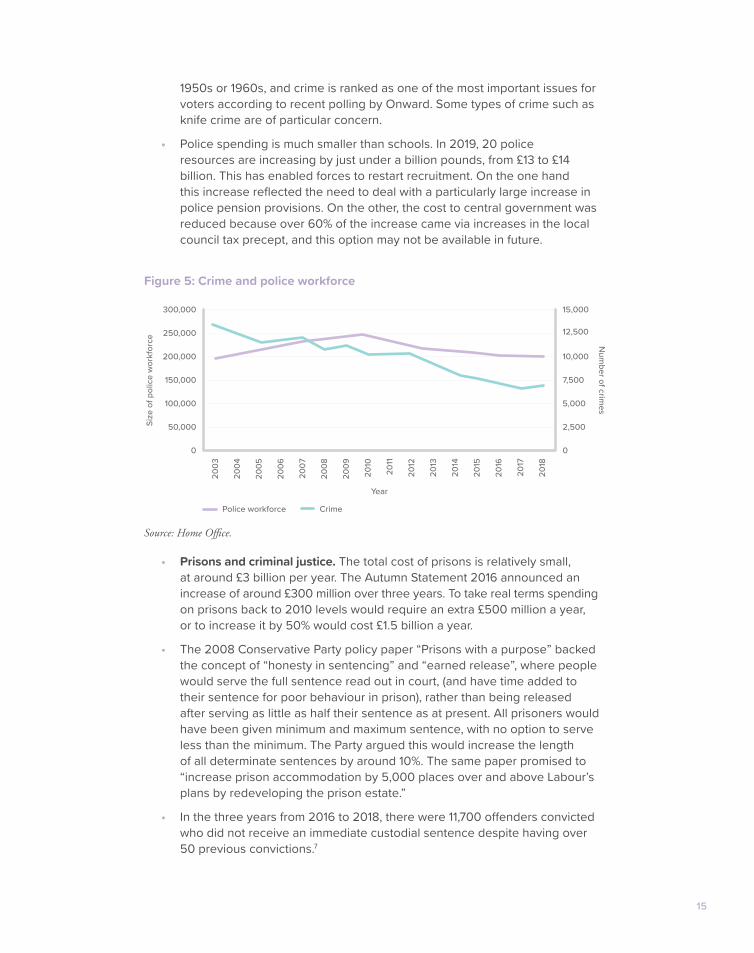
• Policing. The British Crime Survey showed the number of crimes (excluding fraud and computer misuse to make data comparable over time) fell from 19.8 million in 1995 to 9.5 million in 2010 and then to 6.4 million in 2018. This represented a small increase from 6.2 million crime in 2017, but crime overall remains down by a third since 2010. The police workforce is smaller than its peak, though still larger than in 2003. While the reduction in the police workforce has bottomed out, the population is also growing. Despite falling crime in recent years, crime rates remain higher than in the
01,0002,0003,0004,0005,0006,0007,0008,0009,000
10,000
Fund
ing
per p
upil
(£)
Secondary Sixth form Further education Higher education
Phase of education
15
1950s or 1960s, and crime is ranked as one of the most important issues for voters according to recent polling by Onward. Some types of crime such as knife crime are of particular concern.
• Police spending is much smaller than schools. In 2019, 20 police resources are increasing by just under a billion pounds, from £13 to £14 billion. This has enabled forces to restart recruitment. On the one hand this increase reflected the need to deal with a particularly large increase in police pension provisions. On the other, the cost to central government was reduced because over 60% of the increase came via increases in the local council tax precept, and this option may not be available in future.
Figure 5: Crime and police workforce
Source: Home Office.
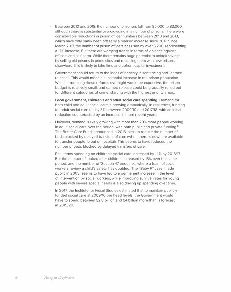
• Prisons and criminal justice. The total cost of prisons is relatively small, at around £3 billion per year. The Autumn Statement 2016 announced an increase of around £300 million over three years. To take real terms spending on prisons back to 2010 levels would require an extra £500 million a year, or to increase it by 50% would cost £1.5 billion a year.
• The 2008 Conservative Party policy paper “Prisons with a purpose” backed the concept of “honesty in sentencing” and “earned release”, where people would serve the full sentence read out in court, (and have time added to their sentence for poor behaviour in prison), rather than being released after serving as little as half their sentence as at present. All prisoners would have been given minimum and maximum sentence, with no option to serve less than the minimum. The Party argued this would increase the length of all determinate sentences by around 10%. The same paper promised to “increase prison accommodation by 5,000 places over and above Labour’s plans by redeveloping the prison estate.”
• In the three years from 2016 to 2018, there were 11,700 offenders convicted who did not receive an immediate custodial sentence despite having over 50 previous convictions.7
0
50,000
100,000
150,000
200,000
250,000
300,000
2003
2004
2005
2006
2007
2008
2009
2011
2010
2012
2013
2014
2015
2016
2017
2018
Size
of p
olic
e w
orkf
orce
0
2,500
5,000
7,500
10,000
12,500
15,000
Num
ber of crimes
Year
Police workforce Crime
Firing on all cylinders16
• Between 2010 and 2018, the number of prisoners fell from 85,000 to 83,000, although there is substantial overcrowding in a number of prisons. There were considerable reductions in prison officer numbers between 2010 and 2013, which have only partly been offset by a marked increase since 2017. Since March 2017, the number of prison officers has risen by over 3,200, representing a 17% increase. But there are worrying trends in terms of violence against officers and self-harm. While there remains huge potential to unlock savings by selling old prisons in prime sites and replacing them with new prisons elsewhere, this is likely to take time and upfront capital investment.
• Government should return to the ideas of honesty in sentencing and “earned release”. This would mean a substantial increase in the prison population. While introducing these reforms overnight would be expensive, the prison budget is relatively small, and earned release could be gradually rolled out for different categories of crime, starting with the highest priority areas.
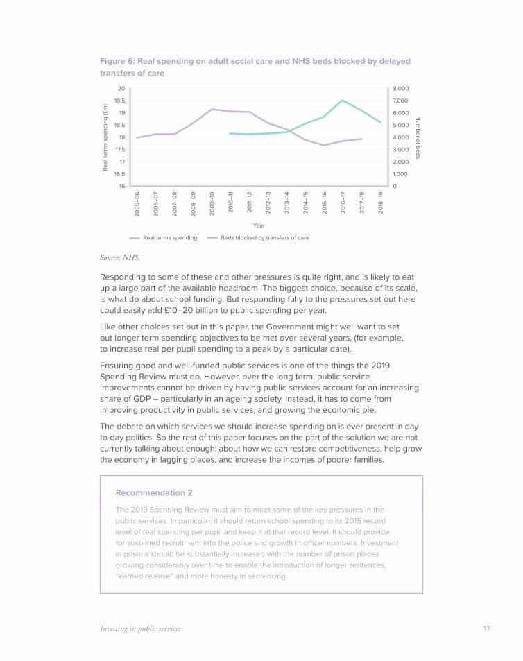
• Local government, children’s and adult social care spending. Demand for both child and adult social care is growing dramatically. In real terms, funding for adult social care fell by 3% between 2009/10 and 2017/18, with an initial reduction counteracted by an increase in more recent years.
• However, demand is likely growing with more than 20% more people working in adult social care over the period, with both public and private funding.8 The Better Care Fund, announced in 2013, aims to reduce the number of beds blocked by delayed transfers of care (when there is nowhere available to transfer people to out of hospital). This seems to have reduced the number of beds blocked by delayed transfers of care.
• Real terms spending on children’s social care increased by 14% by 2016/17. But the number of looked after children increased by 13% over the same period, and the number of ‘Section 47 enquiries’ where a team of social workers review a child’s safety, has doubled. The “Baby P” case, made public in 2008, seems to have led to a permanent increase in the level of intervention by social workers, while improving survival rates for young people with severe special needs is also driving up spending over time.
• In 2017, the Institute for Fiscal Studies estimated that to maintain publicly funded social care at 2009/10 per head levels, the Government would have to spend between £2.8 billion and £4 billion more than is forecast in 2019/20.
Investing in public services 17
Figure 6: Real spending on adult social care and NHS beds blocked by delayed transfers of care
Source: NHS.
Responding to some of these and other pressures is quite right, and is likely to eat up a large part of the available headroom. The biggest choice, because of its scale, is what do about school funding. But responding fully to the pressures set out here could easily add £10–20 billion to public spending per year.
Like other choices set out in this paper, the Government might well want to set out longer term spending objectives to be met over several years, (for example, to increase real per pupil spending to a peak by a particular date).
Ensuring good and well-funded public services is one of the things the 2019 Spending Review must do. However, over the long term, public service improvements cannot be driven by having public services account for an increasing share of GDP – particularly in an ageing society. Instead, it has to come from improving productivity in public services, and growing the economic pie.
The debate on which services we should increase spending on is ever present in day-to-day politics. So the rest of this paper focuses on the part of the solution we are not currently talking about enough: about how we can restore competitiveness, help grow the economy in lagging places, and increase the incomes of poorer families.
Recommendation 2
The 2019 Spending Review must aim to meet some of the key pressures in the public services. In particular, it should return school spending to its 2015 record level of real spending per pupil and keep it at that record level. It should provide for sustained recruitment into the police and growth in officer numbers. Investment in prisons should be substantially increased with the number of prison places growing considerably over time to enable the introduction of longer sentences, “earned release” and more honesty in sentencing.
16
16.5
17.5
18.5
19.5
17
18
19
20
2005
–06
2006
–07
2007
–08
2008
–09
2009
–10
2010
–11
2011
–12
2012
–13
2013
–14
2014
–15
2015
–16
2016
–17
2017
–18
2018
–19
Real
term
s sp
endi
ng (£
m)
0
1,000
2,000
3,000
4,000
5,000
6,000
7,000
8,000
Num
ber of beds
Year
Real terms spending Beds blocked by transfers of care
18
Solving Britain’s productivity
problemA plan to tackle Britain’s chronic low productivity and attract new ideas
and investment – with an emphasis on helping poorer areas grow
Solving Britain’s productivity problem 19
Problem 1: Britain is not productive enough overall
Why aren’t we richer? Many reports have analysed the reasons why Britain’s economy is not more productive. Economists have been agonising over the question for at least a century. Many of the headings for action in a 1961 report to the Chancellor on “Economic growth and national efficiency”9 are relevant today: low levels of fixed investment, a shortage of skilled labour, restrictive and anti-competitive business practices.
More recent contributions to the debate have included: the Treasury action plan “Fixing the Foundations” in 2016; Government’s Green and White Papers on Industrial Strategy in 2017; and the London School of Economics Growth Commission was published in 2013 and 2017, while the independent Industrial Strategy Commission was published in 2017. All the main business organisations have made significant contributions to the debate.
In recent years there have effectively been two different debates about Britain’s productivity. As well as the long running debate about Britain’s low productivity level compared to its peers, there is a more recent debate about the cause of the productivity slowdown which seems to have hit most western economies in the wake of the 2008 Financial Crisis and recession. This debate has included questions of whether the developed economies are in for a long period of “secular stagnation” and, if so, what might be causing this.
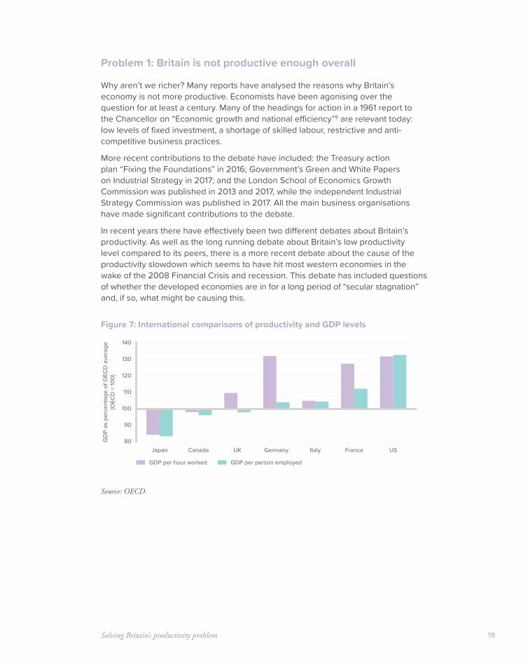
Figure 7: International comparisons of productivity and GDP levels
Source: OECD.
80
90
100
110
120
130
140
Japan UKCanada Germany Italy France US
GD
P as
per
cent
age
of O
ECD
ave
rage
(OEC
D =
100)
GDP per hour worked GDP per person employed
Firing on all cylinders20
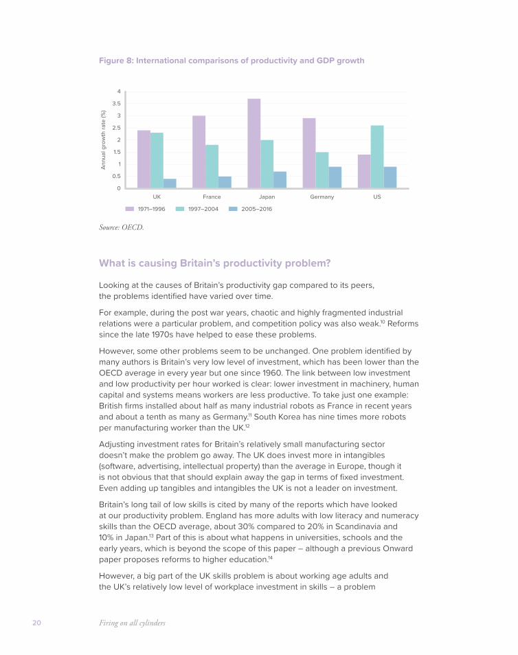
Figure 8: International comparisons of productivity and GDP growth
Source: OECD.
What is causing Britain’s productivity problem?
Looking at the causes of Britain’s productivity gap compared to its peers, the problems identified have varied over time.
For example, during the post war years, chaotic and highly fragmented industrial relations were a particular problem, and competition policy was also weak.10 Reforms since the late 1970s have helped to ease these problems.
However, some other problems seem to be unchanged. One problem identified by many authors is Britain’s very low level of investment, which has been lower than the OECD average in every year but one since 1960. The link between low investment and low productivity per hour worked is clear: lower investment in machinery, human capital and systems means workers are less productive. To take just one example: British firms installed about half as many industrial robots as France in recent years and about a tenth as many as Germany.11 South Korea has nine times more robots per manufacturing worker than the UK.12
Adjusting investment rates for Britain’s relatively small manufacturing sector doesn’t make the problem go away. The UK does invest more in intangibles (software, advertising, intellectual property) than the average in Europe, though it is not obvious that that should explain away the gap in terms of fixed investment. Even adding up tangibles and intangibles the UK is not a leader on investment.
Britain’s long tail of low skills is cited by many of the reports which have looked at our productivity problem. England has more adults with low literacy and numeracy skills than the OECD average, about 30% compared to 20% in Scandinavia and 10% in Japan.13 Part of this is about what happens in universities, schools and the early years, which is beyond the scope of this paper – although a previous Onward paper proposes reforms to higher education.14
However, a big part of the UK skills problem is about working age adults and the UK’s relatively low level of workplace investment in skills – a problem
0
0.5
1
1.5
2
2.5
3
3.5
4
UK JapanFrance Germany US
Annu
al g
row
th ra
te (%
)
1971–1996 1997–2004 2005–2016
21
which is getting worse. The number of employees undertaking training outside the workplace fell from 180,000 in 1999 to 20,000 in 2012.15
This is partly a facet of the general problem of underinvestment discussed above. The 2017 LSE Growth Commission report had as one of its central recommendations that “Tax breaks and allowances for capital should be extended to skills investment.” The low level of business investment in human capital is a problem discussed below, and will be developed in more detail in a forthcoming Onward report.
As well as explaining the UK’s low level of productivity, investment may also help explain the slowdown in recent years in the UK and elsewhere. Looking at more recent years, work by Silvana Tenreyro for the Bank of England in 2018 suggested that the slowdown in productivity growth since the 2008 recession was explained roughly half by a slowdown in capital investment and half by a decline in underlying total factor productivity (the efficiency with which both capital and labour are used).16
There are plenty of other reasons for the UK’s low productivity which this report will not delve into in detail.
There are certain sectors like housing and construction where regulatory barriers are frequently cited as an obstacle to growth in the UK – an area covered in a different Onward report.17 A series of reports in the Financial Times by Jonathan Ford have argued that competition, particularly in regulated utilities, remains too weak.
Another frequent subject in the literature is connectivity – both digital and in terms of transport. The agglomeration benefits from improving connections within growing cities are clear, but extensive research running from Ed Glaeser’s work to the reports of the Centre for Cities emphasise that improving transport is likely to do little where demand and productivity are lowest. Glaeser cites Detroit’s under-used monorail system as an example of how transport investment will do little for a city which is failing to attract new industries.
Productivity in the public sector is a much discussed aspect of the problem. With around 16% of people in Britain employed in the public sector, this is important. One encouraging trend in recent years has been a dramatic improvement in public sector productivity since 2010. While the productivity of public services fell slightly between 1997 and 2010, it increased just under 5% between 2010 and 2016.18
The role of finance is a recurring theme in the literature on productivity. JM Keynes raised concerns that the activities of the financial sector were too dominated by speculation and not enough by fundamentals and the efficient allocation of capital:19
“Speculators may do no harm as bubbles on a steady stream of enterprise. But the position is serious when enterprise becomes the bubble on a stream of speculation. When the capital development of a country becomes the by-product of the activities of a casino the job is likely to be ill done.”
Countless reports and actions have followed in his wake, from popularising books like Will Hutton’s “The State We Are In”, to a whole literature on the relationship between different forms of ownership and investment. Recent research reports include the Bank of England work on “Finance for Productive Investment” while recent interventions include the creation of tax reliefs like VCTs, EIS, and SIES,
Firing on all cylinders22
the establishment of the British Business Bank (2014) and HM Treasury’s Patient Capital Action Plan (2017). There has been a dramatic expansion of funds associated with leading universities.
Most of these different aspects of the productivity problem have some validity and there is more to be done on each of them.
Where this report will add particular emphasis to the well-developed arguments on productivity is on the subject of the UK’s many underperforming cities and regions – the gap in productivity between different parts of the country.
This is an issue raised in many of the reports on Britain’s productivity problem – and the subject to which this report now turns.
Problem 2: More balanced economies are stronger – but Britain’s economy is unbalanced, with too many low productivity areas
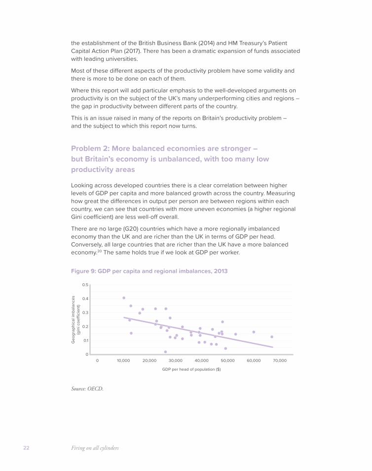
Looking across developed countries there is a clear correlation between higher levels of GDP per capita and more balanced growth across the country. Measuring how great the differences in output per person are between regions within each country, we can see that countries with more uneven economies (a higher regional Gini coefficient) are less well-off overall.
There are no large (G20) countries which have a more regionally imbalanced economy than the UK and are richer than the UK in terms of GDP per head. Conversely, all large countries that are richer than the UK have a more balanced economy.20 The same holds true if we look at GDP per worker.
Figure 9: GDP per capita and regional imbalances, 2013
Source: OECD.
0
0.1
0.3
0.4
0.2
0.5
0 10,000 20,000 30,000 40,000 50,000 60,000 70,000
Geo
grap
hica
l im
bala
nces
(gin
i coe
�ci
ent)
GDP per head of population ($)
Solving Britain’s productivity problem 23
The result that a more balanced economy should be linked with higher incomes overall, is intuitive:
• In a highly unbalanced economy economic resources like land and infrastructure can be overloaded in some parts of the country, while being underutilised in other parts. This imposes a direct cost on business and creates a fiscal pressure on government to spend to fight congestion.
• Given that workers (particularly lower skilled workers) do not simply move in the face of local economic problems, having greater distances between unemployed workers and job opportunities may well compound problems matching people to opportunities.
• There might even be compounding mechanisms: if some areas have very high unemployment that might lock in patterns of worklessness.
Fundamentally, an economy where all areas are doing reasonably well is simply likely to do better on average than one which is not firing on all cylinders.
However, around the world relatively few initiatives to improve the performance of lagging regions have been successful, while many have failed.
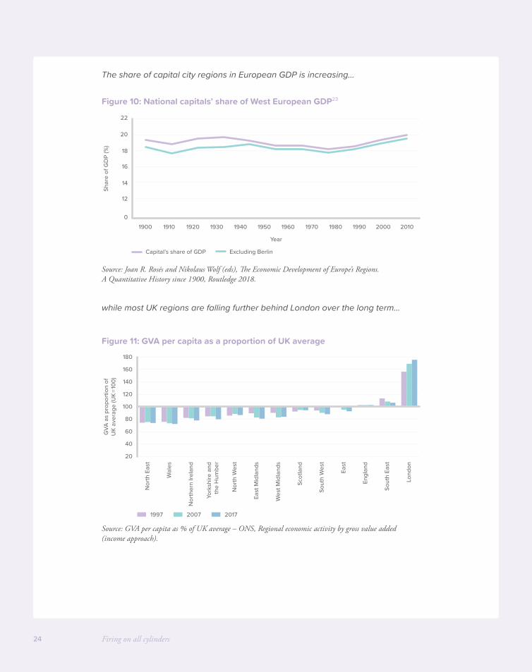
Furthermore, since around 1980 there have been new forces at work which are tending to unbalance the economy. The rise of the knowledge-based economy appears to have favoured the centres of large cities – and particularly capital cities. Capital cities have increased their share of the economy across the world. This might suggest other kinds of regions and less urban areas now face an even more difficult challenge in catching up.
Within the UK the same pattern is apparent, with London pulling further ahead of the UK average, and only Scotland and the (highly urbanised) North West improving their position relative to the average over the last 20 years. Looking within each region there is some evidence of what Alan Ehrenhalt has dubbed the “great inversion”, with city centres pulling ahead of their wider regions and some of the poorest growth performance coming from peripheral towns and the outer parts of large cities. This pattern is more visible in the data where the core of the city is its own administrative unit (Manchester in Greater Manchester) compared to where the city core is part of a much wider urban area (Birmingham).
An article by the ONS21 found that in England and Wales, the overall average GVA per worker of the business economy in 2014 for urban areas (excluding London) was 5 percentage points higher than for rural areas. For Scotland, the average productivity gap between rural and urban areas was greater still – 17 percentage points.
While the growth of knowledge intensive business services in city centres is part of the explanation for this, it is not just the mix of industries but different productivity levels within the same industries that make up these productivity gaps between different areas.22
Firing on all cylinders24
The share of capital city regions in European GDP is increasing…
Figure 10: National capitals’ share of West European GDP23
Source: Joan R. Rosés and Nikolaus Wolf (eds), The Economic Development of Europe’s Regions. A Quantitative History since 1900, Routledge 2018.
while most UK regions are falling further behind London over the long term…
Figure 11: GVA per capita as a proportion of UK average
Source: GVA per capita as % of UK average – ONS, Regional economic activity by gross value added (income approach).
0
12
14
16
18
20
22
20001900 1920 1940 19601910 1930 1950 1970 19901980 2010
Shar
e of
GD
P (%
)
Year
Capital’s share of GDP Excluding Berlin
20
40
60
80
100
120
140
160
180
Lond
on
Sout
h Ea
st
Sout
h W
est
East
Scot
land
Engl
and
Nor
ther
n Ire
land
York
shire
and
the
Hum
ber
Nor
th E
ast
East
Mid
land
s
Wes
t Mid
land
s
Nor
th W
est
Wal
es
GVA
as
prop
ortio
n of
UK
aver
age
(UK
=100
)
1997 2007 2017

Solving Britain’s productivity problem 25
Within the UK, city centres are pulling ahead of the rest of their regions…
Figure 12: GVA per head growth 1997–2017
Source: GVA per head growth 1997–2017 ONS, Regional economic activity by gross value added (income approach).
Policies to tackle our unbalanced economy have a patchy record
Since the early 20th century governments of all political persuasions have attempted to address the problems of slow growing or high unemployment regions, cities and neighbourhoods.
There was a heavy focus on aiding poorer regions in the immediate post-war years. Some post-war policies were highly destructive, like the limitation on industrial expansion in higher performing areas through the refusal of Industrial Development Certificates in the South East and Midlands.
With up to 30% of bids to expand refused in the later 1960s, many projects were abandoned or moved overseas. One estimate suggests that “moving” 18 jobs actually cost 82 jobs overall, and even firms which did move often failed later where they moved to areas without the pool of skilled Labour they wanted.24
Other policies, like employment subsidies for poor regions, helped fight unemployment in the short term, but only by locking in those regions to unsustainable, subsidy-dependent low wage employment in the long term.
The most effective policies in the post-war years were those which aimed to incentivise capital investment in poorer areas, through either tax breaks or even government grants for capital investment. One study for the DTI suggested that policies intended to aid poorer Development Areas between 1960 and 1981 had created up to 450,000 jobs directly and 630,000 in total. From the mid-1970s policies were scaled back due to the fiscal crisis.
After 1979 the focus of regional policy shifted to targeting smaller areas. Enterprise Zones offered more generous capital allowances and looser planning rules on certain small industrial estates. There is clear evidence they displaced jobs from nearby, and it is not clear what the overall impact has been.
020406080
100120140160180
200G
VA p
er h
ead
grow
th (%
)
Nor
th E
ast
Tyne
side
Mer
seys
ide
Live
rpoo
l
Gre
ater
Man
ches
ter
Man
ches
ter
Wes
t Yor
kshi
re
Leed
s
Wes
t Mid
land
s
Birm
ingh
am
Out
er L
ondo
n(E
ast a
nd N
orth
Eas
t)
Inne
r Lon
don
(Eas
t)
Out
er L
ondo
n(W
est a
nd N
orth
Wes
t)
Inne
r Lon
don
(Wes
t)
Firing on all cylinders26
Urban Development Corporations aimed to solve coordination problems in post-industrial areas where land ownership was fragmented and there was much brownfield land. London and Liverpool Docklands are generally considered a success.
Between 1997 and 2010 Regional Development Agencies aimed to work across larger areas with a higher level of overall funding. While a number of RDAs catalysed important new developments in their areas, and were active in physical regeneration, their activities did not prevent continuing divergence.
Of the ten UK regions with below average GDP per capita, three caught up with the national average but seven fell further behind.
The fiscal crisis period since 2010 has seen the abolition of the RDAs and their replacement by Local Enterprise Partnerships covering smaller geographies and with smaller budgets; the City Deals programme, which is still operational outside England, the creation of Combined Authorities and the Mayoral Devolution Deals for the major cities in England, further devolution of powers to Scotland and Wales, pan-regional initiatives including the Northern Powerhouse and Midlands Engine, and the creation of the Local Growth Fund, which provides around £2 billion a year in funding to LEPs in a form which they have some discretion over.
But again, divergence continues. Between 2010 and 2017, of the ten UK regions with below average GDP per capita, three caught up with the national average but seven fell further behind.
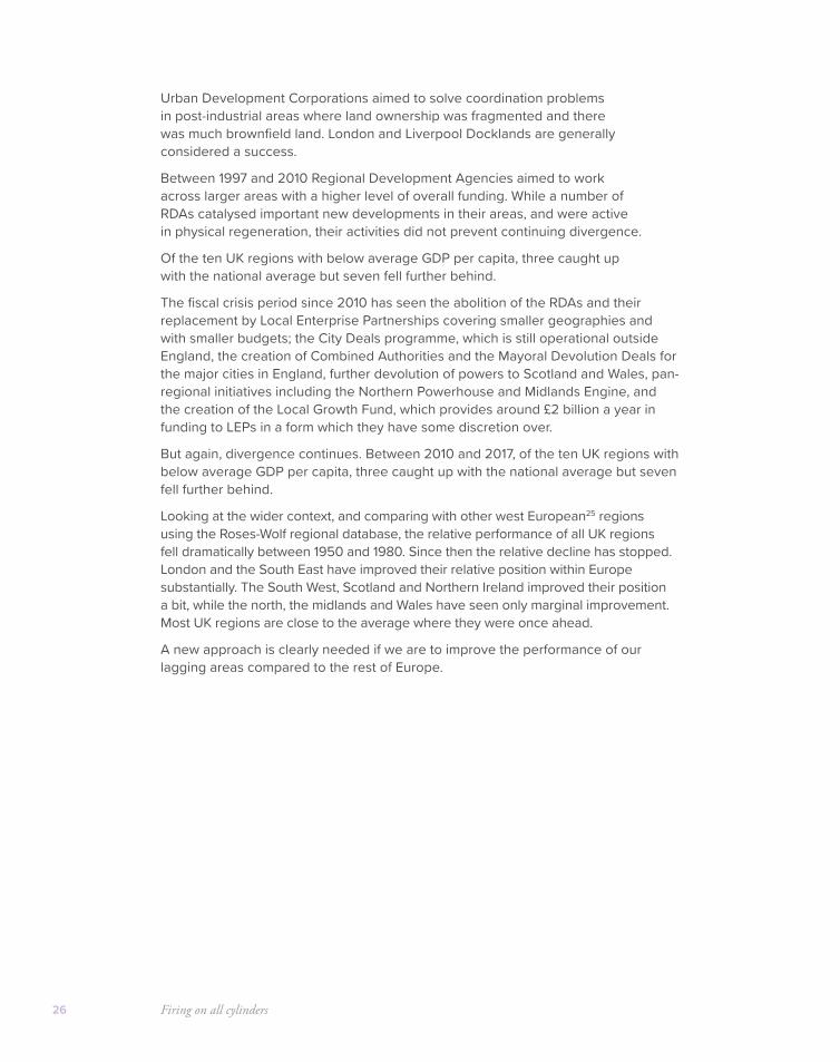
Looking at the wider context, and comparing with other west European25 regions using the Roses-Wolf regional database, the relative performance of all UK regions fell dramatically between 1950 and 1980. Since then the relative decline has stopped. London and the South East have improved their relative position within Europe substantially. The South West, Scotland and Northern Ireland improved their position a bit, while the north, the midlands and Wales have seen only marginal improvement. Most UK regions are close to the average where they were once ahead.
A new approach is clearly needed if we are to improve the performance of our lagging areas compared to the rest of Europe.
Solving Britain’s productivity problem 27
Figure 13: GDP per capita compared to European average
Source: Joan R. Rosés and Nikolaus Wolf (eds), The Economic Development of Europe’s Regions. A Quantitative History since 1900, Routledge 2018.
For the country as a whole inward investment has multiple benefits – via investment, knowledge diffusion and competition
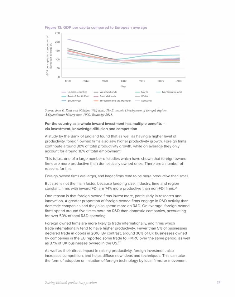
A study by the Bank of England found that as well as having a higher level of productivity, foreign owned firms also saw higher productivity growth. Foreign firms contribute around 30% of total productivity growth, while on average they only account for around 16% of total employment.
This is just one of a large number of studies which have shown that foreign-owned firms are more productive than domestically owned ones. There are a number of reasons for this.
Foreign owned firms are larger, and larger firms tend to be more productive than small.
But size is not the main factor, because keeping size, industry, time and region constant, firms with inward FDI are 74% more productive than non-FDI firms.26
One reason is that foreign owned firms invest more, particularly in research and innovation. A greater proportion of foreign-owned firms engage in R&D activity than domestic companies and they also spend more on R&D. On average, foreign-owned firms spend around five times more on R&D than domestic companies, accounting for over 50% of total R&D spending.
Foreign owned firms are more likely to trade internationally, and firms which trade internationally tend to have higher productivity. Fewer than 5% of businesses declared trade in goods in 2016. By contrast, around 30% of UK businesses owned by companies in the EU reported some trade to HMRC over the same period, as well as 37% of UK businesses owned in the US.27
As well as their direct impact in raising productivity, foreign investment also increases competition, and helps diffuse new ideas and techniques. This can take the form of adoption or imitation of foreign technology by local firms; or movement
0
50
100
150
200
250
1950 1960 1970 1980 1990 2000 2010
GD
P pe
r cap
ita a
s a
prop
ortio
n of
Eu
rope
an a
vera
ge (%
)
Year
London countiesRest of South EastSouth West
West MidlandsEast Midlands
North
Yorkshire and the Humber Scotland
Northern IrelandWales
Firing on all cylinders28
of workers with new knowledge from foreign to domestic employers; or increased competition from foreign firms incentivising local firms to improve their efficiency.
A 2007 paper by Haskel et al28 argues that the value of these spillover benefits are large enough to potentially justify substantial subsidies to inward investors:
Typical estimates suggest that a 10-percentage-point increase in foreign presence in a U.K. industry raises the TFP of that industry’s domestic plants by about 0.5%. We also use these estimates to calculate the per-job value of these spillovers at about £2,400 in 2000 prices ($4,300). These calculated values appear to be less than per-job incentives governments have granted in recent high-profile cases.
Knowledge and capital-intensive inward investment has a central role to play in turning round lagging regions, and needs to become a central focus of policy
As at the national level, inward investment is also crucial at the local and regional level. Since the early 1990s a huge body of economic research has developed on the causes of lasting economic disparities between different regions and cities.
The “New Economic Geography” developed by economists like Paul Krugman and Ed Glaeser in the US and Paul Cheshire and Henry Overman in the UK helps to explain agglomeration effects and why urban areas might have a higher level of productivity. It also helps explain why it often seems that “winner takes all”, with high productivity regions attracting more high productivity investments, to draw on the pools of skills, knowledge and capital already available there.
Research by Enrico Moretti also highlights the central role of inward investment from technology intensive, research intensive firms in powering the turnaround of poorer cities and regions in developed countries.
He highlights the case of Seattle, which in the 1970s was a city in steep decline. “Will the last person leaving Seattle turn out the lights?” asked one 1970s billboard. However, a series of fortunate inward investments transformed the fortunes of the city. Microsoft moved to Seattle from New Mexico because Bill Gates’ parents lived there. The growth of Microsoft and its highly skilled workforce triggered further investments from firms aiming to draw on that pool of skilled IT workers. Amazon moved from New York to Seattle exactly in order to tap into the pool of engineers in the area. Amazon staff then seeded the creation of many other firms in the area, while Amazon founder Jeff Bezos established spaceflight company Blue Origin in the Seattle area which itself attracts other space firms. Having a large number of venture capitalists in the area then attracted a series of biotechnology investments.
Seattle is an extreme example, but Moretti’s work on the multiplier effects of different investment has demonstrated that not all inward investments are equal. Certain types of jobs – particularly higher skilled jobs in the traded sector (i.e. firms which trade with other firms), have a much larger multiplier effect on the local economy. These firms – particularly exporters – are the ones which drive productivity growth, while productivity growth in many local services (bars, shops, hairdressers) is essentially static. This work is effectively putting numbers on the old adage that people in a particular place can’t make a living by taking in each other’s washing.

Solving Britain’s productivity problem 29
Assessing this multiplier effect for the UK, the Centre for Cities has estimated that every ten new jobs that are created in high skilled tradable firms in the private sector, 17 jobs are created in local services. Public sector jobs also had a positive multiplier effect, but this has been much smaller, with three new low-skilled local services jobs created for every 10 new public sector jobs.
The implication is that in recent years, cities that have been successful at attracting high-skilled exporting businesses have also been the cities best able to create growth in low-skilled local services jobs too. On the other hand, cities in which growth has been mostly led by the public sector or by lower-skilled export businesses have not experienced the same growth in local services.
In other countries a number of regeneration policies have aimed to play a catalytic role in attracting these crucial high skill private firms.
Within the US there is fierce tax competition between states to attract high skill investment, with Amazon’s HQ2 being a recent example. Common weapons in this tax competition include generous tax treatment of capital investments. The scale of inward investment incentives for high tech firms in US states is dramatic. In 2013, the state of Washington provided Boeing with an $8.7 billion package of tax breaks to retain aviation investment.
Other countries do the same or more. Korea offers inward investors not just tax breaks but cash grants for investment and rent supports. For decades China has run a series of Special Economic Zones with tax incentives for investors and in 2017 China announced that foreign firms will be exempt from withholding taxes on profits they reinvest in industries specified by Beijing. India has copied the Chinese SEZ model, citing the transformative effect of inward investment in China. The “Make in India” programme has added to these tax breaks and added capital subsidies for green industries. As in the US and China, India also has state-level policies and special zones to attract investment.
The existence of such a fiercely competitive international environment for inward investment should figure in UK thinking.
Nothing in the UK is on the same scale, but there have been a number of successful examples where government support has helped to seed knowledge-intensive private sector investment.
Mrs Thatcher’s government directly lobbied Nissan to invest in Sunderland, and in particular Thatcher intervened with the Treasury to ensure a favourable tax treatment of the firm’s capital investment29 to protect it from cuts to capital allowances which Nigel Lawson was introducing more generally (discussed more below). The land for the factory (a former airfield) was also sold to the firm at a heavy discount.30 The firm brought advanced Japanese manufacturing techniques to the UK, revolutionising the industry as well as the local area. In 2014 the plant was turning out more vehicles than all of Italy.

Firing on all cylinders30
In other cases government interventions have had a more circuitous effect. In the years after the second world war regional development grants and capital allowances were used to attract watchmaker Timex to invest in Dundee, to offset job losses in the declining jute industry. This factory was chosen to build the ZX Spectrum microcomputer in the early 1980s, leading to very high rates of computer ownership locally, leading in turn to the creation of a number of software firms in the area. One of these firms, DMA, was particularly successful, catalysing the creation of further firms in the area in video game design. The decision of the local university, Abertay University, to create the first degree in games design further encouraged the games local cluster – which is one reason the city has grown faster than the national average in recent decades.
There is no magic bullet to encourage the development of lagging regions – and a large number of policies have failed or even been actively unhelpful.
But a strategy focussed on encouraging private inward investment, particularly where it is knowledge or technology rich is most likely to succeed.
There are obviously many factors which have an impact on knowledge-rich inward investment, including tax incentives, access to other knowledge intensive firms and researchers, infrastructure, the local skills base and so on. But this report will now focus on what we could do through the tax system to increase inward investment into the UK as a whole and into our lagging regions.
Summary of conclusions
• The UK as a whole has low productivity. One set of causes relates to lower levels of fixed investment and workplace investment in human capital.
• Though more balanced economies are more successful overall, the UK is unbalanced and has too many lagging regions.
• Previous attempts to boost productivity in lagging regions have a very patchy record and overall divergence has continued.
• The world’s most successful turnaround regions and cities have been driven by knowledge-intensive and capital-investment intensive inward investment. Firms that operate internationally play a crucial role in this.
Solution 1: Cutting Corporation Tax to align with Ireland, to increase inward investment and productivity
How could we attract more inward investment to Britain? One way would be to cut Corporation Tax.
Corporation Tax rates have been consistently falling across the OECD for decades. There’s a reason for that. The least bad and distorting taxes are those which fall on factors which are not mobile or responsive to tax. For that reason taxes on land (which can’t move) have been held up as the “least bad” taxes by many economists.
31
Corporation Tax is very far away from this ideal tax. It attempts to tax a factor (corporate profits) which are extremely mobile internationally, with investment decisions highly responsive to business tax rates.
For this reason a study by the OECD31 finds that of all taxes, “Corporate income taxes appear to have the most negative effect on GDP per capita.”
That kind of academic evidence is one reason why in the UK the headline rate of Corporation Tax has not been increased since its introduction in its current form in 1973.
A further consideration is that higher rates of Corporation Tax also tend to encourage firms to use debt rate rather than equity, as debt financing can be offset against the tax while equity cannot. Excessive debt in turn makes the financial system more fragile.
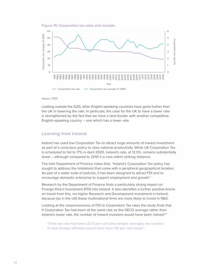
Comparing the UK to the OECD average, the UK maintained a lower rate between the mid-1980s and the late 2000s. Since 2010 the UK has operated a lower rate than the OECD. It is set to have the joint lowest rate in the G20.
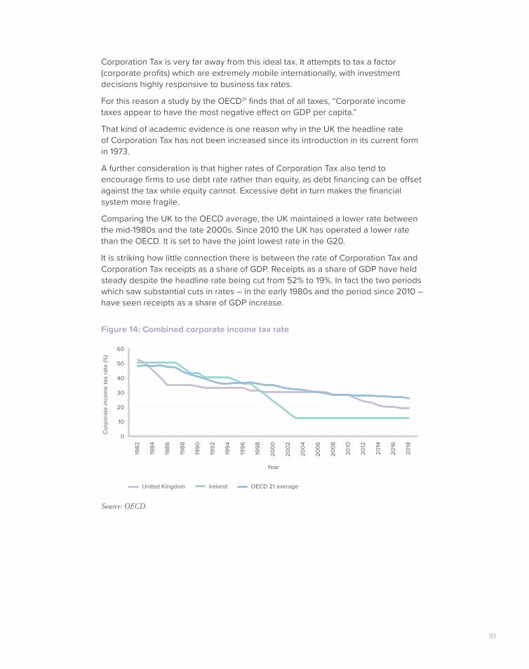
It is striking how little connection there is between the rate of Corporation Tax and Corporation Tax receipts as a share of GDP. Receipts as a share of GDP have held steady despite the headline rate being cut from 52% to 19%. In fact the two periods which saw substantial cuts in rates – in the early 1980s and the period since 2010 – have seen receipts as a share of GDP increase.
Figure 14: Combined corporate income tax rate
Source: OECD.
0
10
20
30
40
50
60
1982
1984
1986
1992
1994
1996
1998
1988
1990
2000
2002
2004
2006
2008
2010
2012
2014
2016
2018
Cor
pora
te in
com
e ta
x ra
te (%
)
Year
United Kingdom Ireland OECD 21 average
32
Figure 15: Corporation tax rates and receipts
Source: ONS.
Looking outside the G20, other English-speaking countries have gone further than the UK in lowering the rate. In particular, the case for the UK to have a lower rate is strengthened by the fact that we have a land border with another competitive, English-speaking country – one which has a lower rate.
Learning from Ireland
Ireland has used low Corporation Tax to attract huge amounts of inward investment as part of a conscious policy to raise national productivity. While UK Corporation Tax is scheduled to fall to 17% in April 2020, Ireland’s rate, at 12.5%, remains substantially lower – although compared to 2010 it is now within striking distance.
The Irish Department of Finance notes that, “Ireland’s Corporation Tax policy has sought to address the limitations that come with a peripheral geographical location. As part of a wider suite of policies, it has been designed to attract FDI and to encourage domestic enterprise to support employment and growth.”
Research by the Department of Finance finds a particularly strong impact on Foreign Direct Investment (FDI) into Ireland. It also identifies a further positive knock on boost from this, via higher Research and Development investment in Ireland, because (as in the UK) these multinational firms are more likely to invest in R&D.
Looking at the responsiveness of FDI to Corporation Tax rates the study finds that if Corporation Tax had been at the same rate as the OECD average rather than Ireland’s lower rate, the number of inward investors would have been halved:32
“If the tax rate had been 22.5 per cent (the sample average), the number of new foreign affiliates would have been 50 per cent lower”.
0
10
30
50
20
40
60
2005
2006
2007
2008
2009
2000
1999
1998
1996
1993
1997
1994
1995
1992
1991
1989
1988
1986
1983
1987
1984
1985
1982
1981
1990
2001
2002
2003
2004
2010
2011
2012
2013
2014
2015
2016
2017
2018
Cor
pora
tion
tax
rece
ipts
(% G
DP)
0
1
2
3
4
5
6
Corporation tax rate (%
)
Year
Corporation tax rate Corporation tax reciepts (% GDP)
Solving Britain’s productivity problem 33
The relatively higher productivity of the foreign owned firms Ireland has managed to attract can be seen in the difference between the proportion of people employed by such firms (22%) and the proportion of value added they account for (57%). When it comes to business R&D investment, foreign owned firms account for a whopping 70%.
This is a similar finding to the UK where foreign firms account for 1% of all businesses, 27% of value added33 but more than half (52%) of all R&D investment.34
Given their knowledge intensive nature, unsurprisingly the Irish study concludes that, “wage levels… are nearly twice as high in foreign-owned firms as compared with indigenous ones.”35
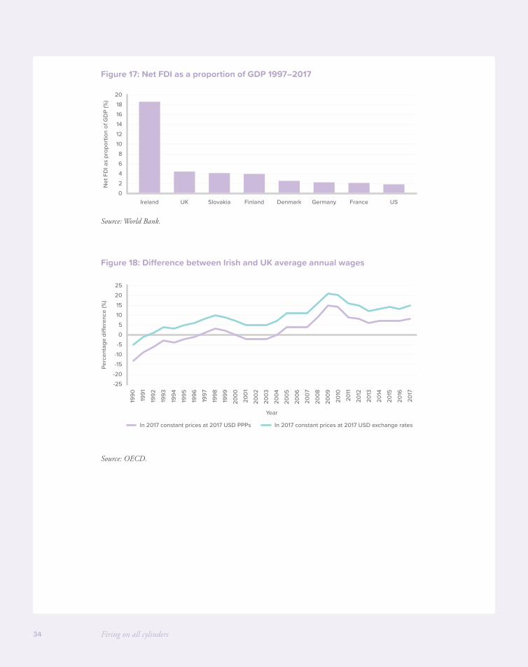
Ireland’s success in attracting foreign investment has been spectacular. In smaller countries FDI as a share of GDP is larger simply because of their relative size, but even accounting for this Ireland has dramatically more FDI than similarly sized countries like Finland, Denmark and Slovakia.
This huge boost from overseas investment of capital plus the introduction of new ideas and new techniques is one of the reasons why Irish productivity has accelerated so dramatically past UK levels.
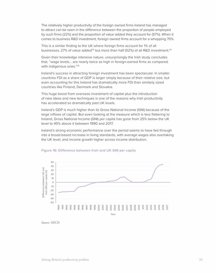
Ireland’s GDP is much higher than its Gross National Income (GNI) because of the large inflows of capital. But even looking at the measure which is less flattering to Ireland, Gross National Income (GNI) per capita has gone from 25% below the UK level to 45% above it between 1990 and 2017.
Ireland’s strong economic performance over the period seems to have fed through into a broad-based increase in living standards, with average wages also overtaking the UK level, and income growth higher across income distribution.
Figure 16: Difference between Irish and UK GNI per capita
Source: OECD.
-50-40
-10-20-30
01020304050
1990
1991
1992
1993
1994
1995
1996
1997
1998
1999
2000
2001
2002
2003
2004
2005
2006
2007
2008
2009
2011
2010
2012
2013
2014
2015
2017
2016
Di�
eren
ce b
etw
een
UK
and
Irish
GN
I per
cap
ita (%
)
Year
Firing on all cylinders34
Figure 17: Net FDI as a proportion of GDP 1997–2017
Source: World Bank.
Figure 18: Difference between Irish and UK average annual wages
Source: OECD.
02468
1012141618
20
Net
FD
I as
prop
ortio
n of
GD
P (%
)
Ireland UK Slovakia Finland Denmark Germany France US
-25-20-15-10-505
10152025
1990
1991
1992
1993
1994
1995
1996
1997
1998
1999
2000
2001
2002
2003
2004
2005
2006
2007
2008
2009
2011
2010
2012
2013
2014
2015
2017
2016
Perc
enta
ge d
ier
ence
(%)
Year
In 2017 constant prices at 2017 USD PPPs In 2017 constant prices at 2017 USD exchange rates
Solving Britain’s productivity problem 35
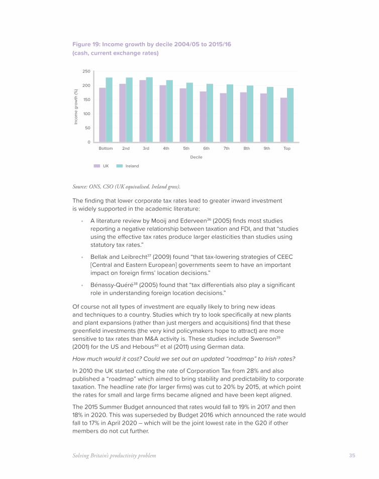
Figure 19: Income growth by decile 2004/05 to 2015/16 (cash, current exchange rates)
Source: ONS, CSO (UK equivalised, Ireland gross).
The finding that lower corporate tax rates lead to greater inward investment is widely supported in the academic literature:
• A literature review by Mooij and Ederveen36 (2005) finds most studies reporting a negative relationship between taxation and FDI, and that “studies using the effective tax rates produce larger elasticities than studies using statutory tax rates.”
• Bellak and Leibrecht37 (2009) found “that tax-lowering strategies of CEEC [Central and Eastern European] governments seem to have an important impact on foreign firms’ location decisions.”
• Bénassy-Quéré38 (2005) found that “tax differentials also play a significant role in understanding foreign location decisions.”
Of course not all types of investment are equally likely to bring new ideas and techniques to a country. Studies which try to look specifically at new plants and plant expansions (rather than just mergers and acquisitions) find that these greenfield investments (the very kind policymakers hope to attract) are more sensitive to tax rates than M&A activity is. These studies include Swenson39 (2001) for the US and Hebous40 et al (2011) using German data.
How much would it cost? Could we set out an updated “roadmap” to Irish rates?
In 2010 the UK started cutting the rate of Corporation Tax from 28% and also published a “roadmap” which aimed to bring stability and predictability to corporate taxation. The headline rate (for larger firms) was cut to 20% by 2015, at which point the rates for small and large firms became aligned and have been kept aligned.
The 2015 Summer Budget announced that rates would fall to 19% in 2017 and then 18% in 2020. This was superseded by Budget 2016 which announced the rate would fall to 17% in April 2020 – which will be the joint lowest rate in the G20 if other members do not cut further.
0
50
100
150
200
250
Decile
Bottom 2nd 3rd 4th 5th 6th 7th 8th 9th Top
Inco
me
grow
th (%
)
UK Ireland
Firing on all cylinders36
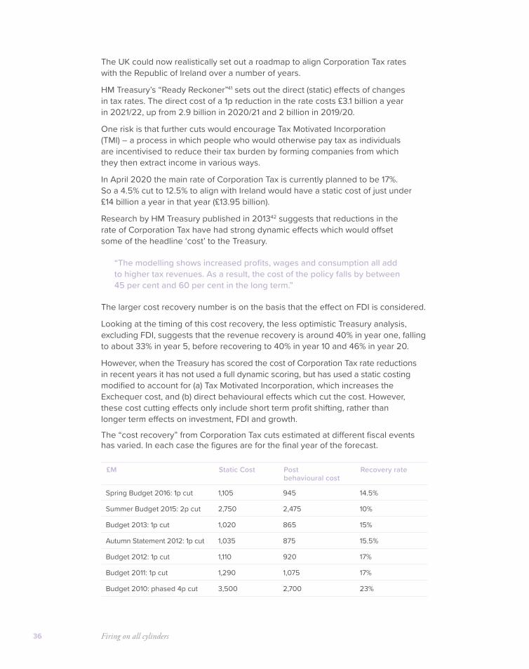
The UK could now realistically set out a roadmap to align Corporation Tax rates with the Republic of Ireland over a number of years.
HM Treasury’s “Ready Reckoner”41 sets out the direct (static) effects of changes in tax rates. The direct cost of a 1p reduction in the rate costs £3.1 billion a year in 2021/22, up from 2.9 billion in 2020/21 and 2 billion in 2019/20.
One risk is that further cuts would encourage Tax Motivated Incorporation (TMI) – a process in which people who would otherwise pay tax as individuals are incentivised to reduce their tax burden by forming companies from which they then extract income in various ways.
In April 2020 the main rate of Corporation Tax is currently planned to be 17%. So a 4.5% cut to 12.5% to align with Ireland would have a static cost of just under £14 billion a year in that year (£13.95 billion).
Research by HM Treasury published in 201342 suggests that reductions in the rate of Corporation Tax have had strong dynamic effects which would offset some of the headline ‘cost’ to the Treasury.
“The modelling shows increased profits, wages and consumption all add to higher tax revenues. As a result, the cost of the policy falls by between 45 per cent and 60 per cent in the long term.”
The larger cost recovery number is on the basis that the effect on FDI is considered.
Looking at the timing of this cost recovery, the less optimistic Treasury analysis, excluding FDI, suggests that the revenue recovery is around 40% in year one, falling to about 33% in year 5, before recovering to 40% in year 10 and 46% in year 20.
However, when the Treasury has scored the cost of Corporation Tax rate reductions in recent years it has not used a full dynamic scoring, but has used a static costing modified to account for (a) Tax Motivated Incorporation, which increases the Exchequer cost, and (b) direct behavioural effects which cut the cost. However, these cost cutting effects only include short term profit shifting, rather than longer term effects on investment, FDI and growth.
The “cost recovery” from Corporation Tax cuts estimated at different fiscal events has varied. In each case the figures are for the final year of the forecast.
£M Static Cost Post behavioural cost
Recovery rate
Spring Budget 2016: 1p cut 1,105 945 14.5%
Summer Budget 2015: 2p cut 2,750 2,475 10%
Budget 2013: 1p cut 1,020 865 15%
Autumn Statement 2012: 1p cut 1,035 875 15.5%
Budget 2012: 1p cut 1,110 920 17%
Budget 2011: 1p cut 1,290 1,075 17%
Budget 2010: phased 4p cut 3,500 2,700 23%

37
If we look only at the roughly £14 billion static cost of a Corporation Tax cut to Irish rates it is affordable over the coming years even once we account for the additional debt interest payments from a higher deficit. But it would eat up a large part of the available headroom.
This could be made more affordable in the coming years by:
• Adopting more dynamic scoring. A static cost of £14 billion could be reduced to either £12 billion using the same recovery ratio used by the Treasury in 2016 – or to somewhere between £7.7 billion or £5.9 billion a year over the long term using the Treasury’s full dynamic scoring.
• Phasing the reduction in rates over say four years – so the static Exchequer cost could be £3 billion in year one, £6 billion in year two, over £9 billion in year three, and so on. This is a less uncertain approach than going beyond the Treasury’s own limited cost recovery estimates.
Recommendation 3
The 2019 Spending Review should set a goal to align UK Corporation Tax with the Irish rate. To improve affordability rate reductions it should be phased in over a number of years. The Government should consider somewhat more dynamic scoring of the Exchequer costs of further rate reductions.
Solution 2: Cutting tax on business investment to get all parts of the economy moving
Tax policy in the UK is unfriendly to investment and to capital-intensive types of businesses.
This particularly affects manufacturing, but also other capital-intensive sectors. A 2018 study by the Tax Foundation found that the UK ranked second bottom across 35 OECD countries when it comes to how much of a capital investment can be recovered through the tax system.
A study by the Oxford University Centre for Business Taxation found that the UK’s capital allowances were the least generous in the G20 in 2015. Looking at the interaction of a low headline rate with unfavourable capital allowances, the study found that while the UK was ranked first in the G20 on its low headline rate, it ranked only 10th of 20 on the effective marginal rate (EMTR).
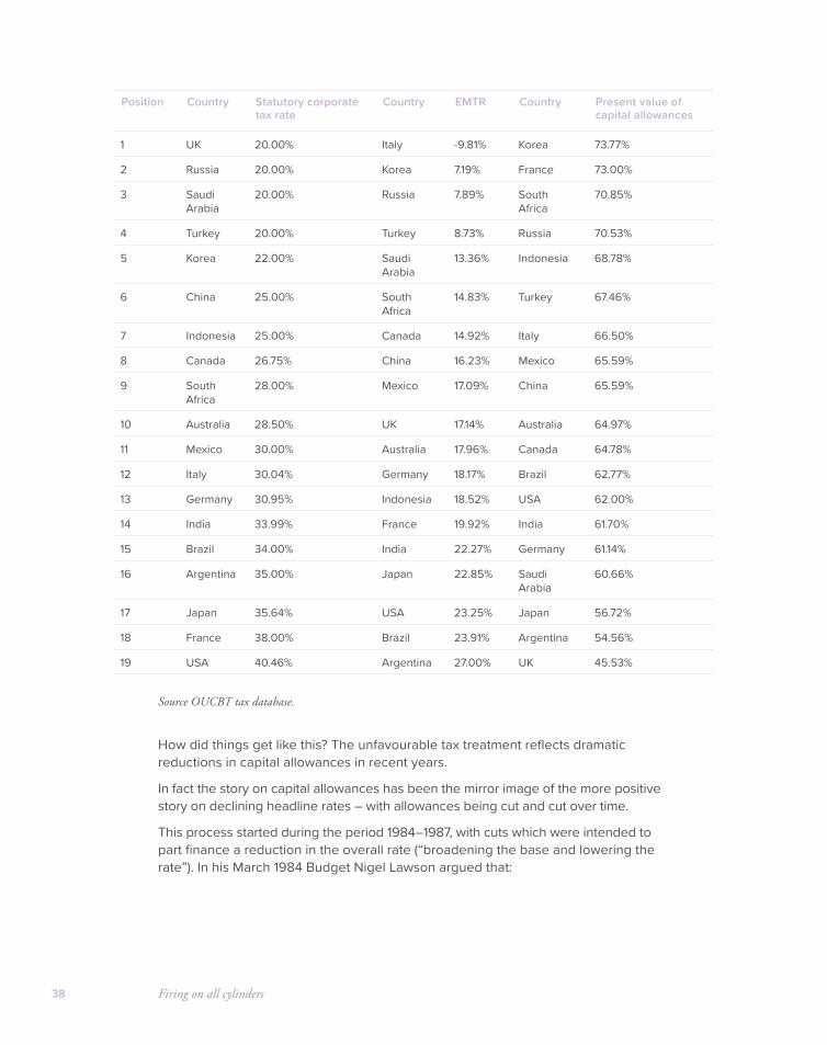
Firing on all cylinders38
Source OUCBT tax database.
How did things get like this? The unfavourable tax treatment reflects dramatic reductions in capital allowances in recent years.
In fact the story on capital allowances has been the mirror image of the more positive story on declining headline rates – with allowances being cut and cut over time.
This process started during the period 1984–1987, with cuts which were intended to part finance a reduction in the overall rate (“broadening the base and lowering the rate”). In his March 1984 Budget Nigel Lawson argued that:
Position Country Statutory corporate tax rate
Country EMTR Country Present value of capital allowances
1 UK 20.00% Italy -9.81% Korea 73.77%
2 Russia 20.00% Korea 7.19% France 73.00%
3 Saudi Arabia
20.00% Russia 7.89% South Africa
70.85%
4 Turkey 20.00% Turkey 8.73% Russia 70.53%
5 Korea 22.00% Saudi Arabia
13.36% Indonesia 68.78%
6 China 25.00% South Africa
14.83% Turkey 67.46%
7 Indonesia 25.00% Canada 14.92% Italy 66.50%
8 Canada 26.75% China 16.23% Mexico 65.59%
9 South Africa
28.00% Mexico 17.09% China 65.59%
10 Australia 28.50% UK 17.14% Australia 64.97%
11 Mexico 30.00% Australia 17.96% Canada 64.78%
12 Italy 30.04% Germany 18.17% Brazil 62.77%
13 Germany 30.95% Indonesia 18.52% USA 62.00%
14 India 33.99% France 19.92% India 61.70%
15 Brazil 34.00% India 22.27% Germany 61.14%
16 Argentina 35.00% Japan 22.85% Saudi Arabia
60.66%
17 Japan 35.64% USA 23.25% Japan 56.72%
18 France 38.00% Brazil 23.91% Argentina 54.56%
19 USA 40.46% Argentina 27.00% UK 45.53%
Solving Britain’s productivity problem 39
“The current rates of Corporation Tax are far too high… They are the product of too many special reliefs, indiscriminately applied and of diminishing relevance to the conditions of today… Too much of British investment has been made because the tax allowances make it look profitable rather than because it would be truly productive. We need investment decisions based on future market assessments, not future tax assessments.”
He abolished the 100% first year write-off for plant and machinery and the 40% first year allowance on industrial buildings over three years. The withdrawal of capital allowances during this period meant that the marginal effective tax rate on corporate investment increased from zero to between 35% and 40%.43
At the time the rationale for these changes was that the rate of unemployment was high and the capital allowances were so generous they were distorting incentives in favour of wasteful tax-driven over-investment. This is not the UK’s problem today.
Further changes have worsened the treatment of capital investment over time, including the abolition of the Industrial Buildings Allowance by Labour in 2007 as part of a bureaucratic tidying up exercise,44 which meant the UK became the only industrialised country without such an allowance.
Labour cut the main writing down rate for plant and machinery from 25% to 20% in 2008, and the coalition reduced it further in 2012, something criticised by the CBI:
“the performance of the UK has deteriorated since 2012. This is mainly due to the reduction in the Writing Down Allowance (WDA) rate of the main pool and special rate pool, from 20% to 18% and 10% to 8%, respectively. Over this period, all other G7 countries have seen their present value of capital allowances increase, further dampening the UK’s competitiveness.”
More positively, the Government recently reintroduced a 2% a year buildings allowance.
The 100% year one write off for smaller amounts of investment (the Annual Investment Allowance) has also been on the increase. After being cut as low as £25,000 in Budget 2012 it has been steadily been raised to £250,000, then £500,000, then temporarily to £1m at present – although with plans for it to fall back to £200,000.
A hostile tax system helps explain low fixed investment and a small manufacturing sector
The UK’s unfavourable tax treatment of capital investment may partly explain the UK’s low rate of fixed capital investment, which has been the lowest in the G7 for decades. Since 1991 the average private fixed capital investment in Germany, France and the US has been a third higher than the UK, and in Japan two thirds higher.45
This in turn tends to act as a brake on regions where manufacturing accounts for a larger part of the economy, because manufacturing requires far higher capital investment than services. The capital stock (of machinery, transport equipment,
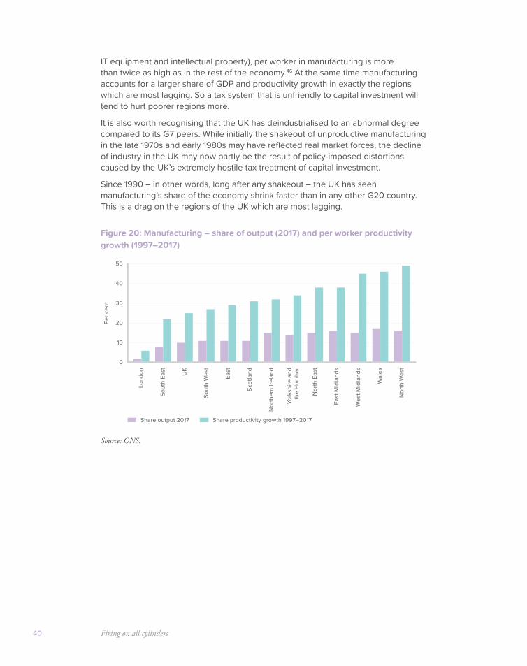
Firing on all cylinders40
IT equipment and intellectual property), per worker in manufacturing is more than twice as high as in the rest of the economy.46 At the same time manufacturing accounts for a larger share of GDP and productivity growth in exactly the regions which are most lagging. So a tax system that is unfriendly to capital investment will tend to hurt poorer regions more.
It is also worth recognising that the UK has deindustrialised to an abnormal degree compared to its G7 peers. While initially the shakeout of unproductive manufacturing in the late 1970s and early 1980s may have reflected real market forces, the decline of industry in the UK may now partly be the result of policy-imposed distortions caused by the UK’s extremely hostile tax treatment of capital investment.
Since 1990 – in other words, long after any shakeout – the UK has seen manufacturing’s share of the economy shrink faster than in any other G20 country. This is a drag on the regions of the UK which are most lagging.
Figure 20: Manufacturing – share of output (2017) and per worker productivity growth (1997–2017)
Source: ONS.
0
10
20
30
40
50
Lond
on
Sout
h Ea
st UK
Sout
h W
est
East
Scot
land
Nor
ther
n Ire
land
York
shire
and
the
Hum
ber
Nor
th E
ast
East
Mid
land
s
Wes
t Mid
land
s
Nor
th W
est
Wal
es
Per c
ent
Share output 2017 Share productivity growth 1997–2017
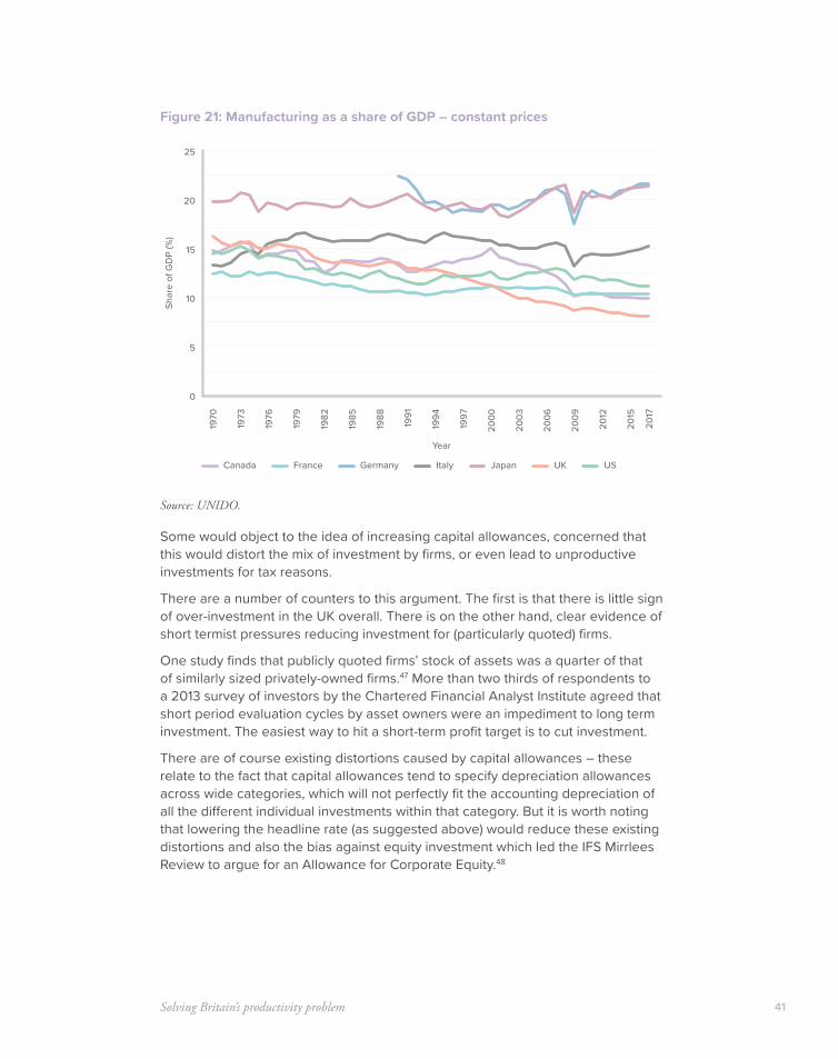
Solving Britain’s productivity problem 41
Figure 21: Manufacturing as a share of GDP – constant prices
Source: UNIDO.
Some would object to the idea of increasing capital allowances, concerned that this would distort the mix of investment by firms, or even lead to unproductive investments for tax reasons.
There are a number of counters to this argument. The first is that there is little sign of over-investment in the UK overall. There is on the other hand, clear evidence of short termist pressures reducing investment for (particularly quoted) firms.
One study finds that publicly quoted firms’ stock of assets was a quarter of that of similarly sized privately-owned firms.47 More than two thirds of respondents to a 2013 survey of investors by the Chartered Financial Analyst Institute agreed that short period evaluation cycles by asset owners were an impediment to long term investment. The easiest way to hit a short-term profit target is to cut investment.
There are of course existing distortions caused by capital allowances – these relate to the fact that capital allowances tend to specify depreciation allowances across wide categories, which will not perfectly fit the accounting depreciation of all the different individual investments within that category. But it is worth noting that lowering the headline rate (as suggested above) would reduce these existing distortions and also the bias against equity investment which led the IFS Mirrlees Review to argue for an Allowance for Corporate Equity.48
0
5
10
15
20
25
1970
1973
1976
1979
1982
1985
1988
1991
1994
1997
2000
2003
2006
2009
2012
2015
2017
Shar
e of
GD
P (%
)
Year
Canada France Germany Italy Japan USUK

Firing on all cylinders42
What business groups are saying on capital allowances
The CBI has called for more extensive capital allowances because “The evidence is clear that a problem of under-investment by businesses exists in the UK and this is likely constraining productivity and economic growth”.49
The CBI has called on the Government to look at new capital allowances for
• Human capital (training)
• Other investments in organisational capital
• Technology diffusion (to be added on top of maintaining R&D tax credits, which can’t be used to promote take-up of new technologies, but only research)
The CBI has also called for a more general look at the generosity of the regime, noting that:
“The present value of the UK’s capital allowance regime performs badly against international benchmarks. The Government should explore whether changes can be made to the regime to increase competitiveness.”
The Institute of Directors has called50 for a new Enhanced Capital Allowance (ECA) for defined productivity-enhancing technologies specifically for SMEs.
According to the IoD this could include relief on investments which help spread best practice in management to SMEs, to tackle what it identifies as a “long tail” of underperforming small firms.
Such a relief could include consultancy fees for operational management tasks, such as in human resources and finance, and the diagnostics and implementation of best practice productivity projects.
MAKE UK (Formerly the Engineering Employers Federation) have also supported51 a review of capital allowances and an increase in their generosity:
“Research… shows that the average life of machinery and equipment has fallen. This suggests that the rate of depreciation of equipment has increased in the last few decades, however, the UK’s main writing down allowance has moved in the opposite direction.”
Solving Britain’s productivity problem 43
Going further in lagging regions
While there is a case for enhancing and extending capital allowances across the whole country, there is a strong case for extending them even further in lagging regions – to attract the kind of inward investment which is crucial in turning around local economic performance.
The UK has done this to a limited extent with the Enterprise Zones programme, where on a small proportion (about a dozen) of the Enterprise Zones which are in EU Assisted Areas, 100% year one capital allowances are available.
However, as well as only covering a few sites, there are many other restrictions. Certain sectors are excluded altogether. Investments have to be for activities not previously carried out by the company, and not replacing older equipment. The policy is very small, with the Exchequer cost at around £95 million over the five year period 2012–13 to 2016–17.52
There is scope to go much further, introducing either higher rates of allowances or even whole new allowances for lagging regions. There are always questions about the boundaries of tax breaks for economic development, but policy should aim to introduce enhanced allowances for large regions (e.g. the north, the midlands, rural Scotland, or the South West) rather than small areas where there is more risk of simply moving activity around.
Enhanced allowances should go hand in hand with a review of DIT policy towards attracting high productivity investment to lagging regions.
How much would it cost to make capital allowances more competitive?
Spending Review 2019 should launch a thorough review of capital allowances with a view:
• To increasing capital allowances to match the most competitive rates in the world, and;
• To introduce new allowances where there are gaps (as suggested by business groups).
Doing this across the country would be likely to have a rebalancing effect by stimulating lagging regions the most, but the Treasury should go further and enhance allowances even more in lagging regions to attract knowledge-intensive inward investment there.
Working out a cost is much more difficult than a simple change in the headline rates because there are multiple allowances and HMRC warn that their estimates of the costs of reliefs are more uncertain.
By 2015/16 around 1.2 million businesses were claiming capital allowances, and it is estimated that in 2017/18 capital allowances will cost the Exchequer £21.5 billion. This gives some sense of the rough magnitudes:

Firing on all cylinders44
£ Current Exchequer costs53
Capital allowances 18,095m
Of which Annual Investment Allowance (currently £1m)
2,920m
Of which oil and gas ringfenced allowances 2,155m
R&D tax credits for small firms 1,840m
R&D credits for large firms 1,735m
The Treasury does not provide indicative costings for changing capital allowances in general but has provided policy costings for some recent changes:
Effects of recent changes
Reducing the Main and Special Writing Down Allowances by 2%
+£1,800m in year 4
Cutting Special Writing Down Allowance by a further 2%
+£305m in year 6
Cutting Annual Investment Allowance from £100,000 to £25,000
+£1,000m in year 4
Increasing Annual Investment Allowance from £25,000 to £200,000
-£895m in year 4
Creating the 2% structures and buildings allowance
-£585m in year 6
Recommendation 4
Spending Review 2019 should ensure that over time UK allowances become among the most competitive in the G20. As part of this we should aim to
• Increase the generosity of allowances for plant and machinery
• Introduce a human capital allowance
• Introduce an allowance to encourage technology diffusion
We should look to improve capital allowances across the country, and the Treasury should also enhance and extend allowances even further in lagging regions to attract inward investment.
Solving Britain’s productivity problem 45
Solution 3: Rebalance growth-enhancing spending to boost lagging regions
Unbalancing the economy?
There are of course many other things that Government could do beyond the tax system to encourage knowledge intensive inward investment to lagging regions.
At present a number of the ways Government allocates its most growth enhancing spending are not effective and tend towards making the economy less balanced.
Total spending on services per head in London is 15% higher than the rest of England. But this conceals much higher relative levels of spending on some of the most growth enhancing types of activity. Transport spending per person in London is twice the national average, while in the East Midlands it is nearly half the England average.
London also has much higher per capita spending on economic affairs (science, employment, pro-enterprise policies), and much higher than average on housing, culture, and education.
This is a result of historic patterns of spending, reinforced by long-standing government funding formulas which direct spending to high productivity regions. For example:
• London has its own ringfenced pot of transport spending, separate from the main spending decisions.
• Public transport spending is directed towards high demand (i.e. already congested regions).
• Housing spending is directed towards high house price areas (i.e. already fast growing regions) and London also receives its own separate pot for the GLA.
But there is a circular quality to these formulas – like putting petrol on a fire to put it out, or refusing to water your plants until they grow, as author Tom Forth has suggested. But directing growth enhancing spending to already overheating regions causes them to overheat further, while opportunities in lagging areas go untapped.
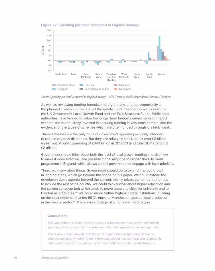
Firing on all cylinders46
Figure 22: Spending per head compared to England average
Source: Spending per head compared to England average – HM Treasury, Public Expenditure Statistical Analyses.
As well as reviewing funding formulas more generally, another opportunity is the planned creation of the Shared Prosperity Fund, intended as a successor to the UK Government Local Growth Fund and the EU’s Structural Funds. While local authorities have tended to value the longer term budget commitments of the EU scheme, the bureaucracy involved in securing funding is very considerable, and the evidence for the types of schemes which are often funded through it is fairly weak.
These schemes are the only parts of government spending explicitly intended to reduce regional disparities. But they are relatively small, at just over £2 billion a year out of public spending of £840 billion in 2019/20 (and total GDP at around £2 trillion).
Government should think about both the level of local growth funding and also how to make it more effective. One possible model might be to reopen the City Deals programme in England, which allows central government to engage with local priorities.
There are many other things Government should do to try and improve growth in lagging areas, which go beyond the scope of this paper. We could extend the devolution deals agenda beyond the current, mainly urban, combined authorities to include the rest of the country. We could think further about higher education and the current conveyor belt which tends to move people to cities for university and to London as graduates.54 We could move further high-skill state institutions, building on the clear evidence that the BBC’s move to Manchester spurred local production in the private sector.55 There’s no shortage of actions we need to take.
Conclusions
The Government should review the way it allocates the most growth enhancing spending, with a goal to further rebalance the most growth enhancing spending.
The review should look at both the current outcomes of spending allocation, and also consider whether funding formulae should include measures of potential and need for growth, as well as current demand levels and current strengths.
50
75
100
150
200
125
175
225
250
LondonSouth East SouthWest
East Yorkshireand theHumber
NorthEast
EastMidlands
WestMidlands
NorthWest
Per c
ent
Economic a�airsTransport
HousingRecreation and culture
EducationAll services
47
Helping working people on low incomes
Helping working families earn more and keep more of what they earn
Firing on all cylinders48
Measuring low income is complicated
Previous sections of this paper looked at how to get growth going, and how to ensure it is spread to all parts of the country. This section looks at how to spread the benefits of growth to all parts of society.
We need to start by understanding who has a low income and why.
Unfortunately this turns out to be less simple than it might sound, because the data on incomes and expenditure have very serious problems, as do some of the concepts which are widely used.
The first problem is the data.
Data on how much income people have and how much they earn come from two main ONS surveys,56 supplemented with some tax data.
The first problem is that two different types of survey data, on incomes and expenditure respectively, seem to tell quite different stories. Households in the bottom decile (the bottom ten percent of households) spent, on average, around £12,800 in the financial year ending 2017 while their average income, as measured with Living Costs and Food Survey (LCFS) data, was only about £5,000.57 More confusingly, the poorest households measured by income seem to consistently spend more than seemingly richer households.
How can this be? Part of this involves better off people with temporarily fluctuating incomes – particularly business owners and the self-employed. Self employment has been on the rise in recent years so this problem is getting worse. Losses self employed people make count as negative income, and so a family with relatively high wealth, and a good income in most years can appear in the bottom tenth of the income distribution if they have made a loss that year. This may be one reason why the poorest households in terms of income do not have the lowest expenditure.58
Another problem is that in surveys people systematically under-report the amount of benefits they receive. This is also a problem which has been growing over time. The value of benefits handed out by government – but not appearing in the survey data – increased from around £12 billion in 1999 to around £40 billion a year in 2015. A study by the Resolution Foundation attempting to correct for this problem suggested poverty rates were lower than they appear in the official statistics – the proportion of children in relative poverty was 5% lower once this problem is accounted for.59 The DWP are currently undertaking a project to try and fix this problem.
There are also problems with the data at the top end, where the very rich are less likely to be captured by surveys. The ONS are producing more data on top incomes, with the first experimental data produced in spring 2019.60
The second set of problems relates to the concepts that are widely used.
There are many ways to measure low income, but there are two dominant measures.
The two most common measures of poverty are described as absolute and relative. Relative poverty defines people as poor if their family income (equivalised for their family size) is below 60% of the median income in that year.

Helping working people on low incomes 49
There are a number of well-known problems with relative measures of poverty.
• Recessions can appear to reduce poverty, because they drag down the median income (dominated by people in work) relative to benefits which are not affected; and so recessions appear to close the gap between those on low incomes and the average.
• Relative measures can suggest strange conclusions across time – is there really more real “poverty” today than the 1950s or indeed the 1970s, when only half of homes had central heating? Miners leader Sam Watson told Labour Conference in 1950, “poverty has been abolished”, but by today’s standards we would regard many people in Britain in 1950 as extremely poor.
• Relative measures also make for odd international comparisons: on a relative measure, Germany has a higher “poverty” rate than the UK, while Slovakia and the Czech Republic have a lower rate.
• For sub-groups relative measures can behave more strangely. Every time a person without children gets a job the child poverty rate is pushed slightly upward because the median income rises.
Although relative poverty measures are widely used because they are easy to calculate, they might be better thought of as a particular measure of inequality.
An “absolute” measure of poverty in contrast defines a set income, which is updated each year in line with inflation so that it stays the same in real terms. The line which is used for the absolute measure in government statistics like Households Below Average Income was set at the equivalent of 60% of median household income in 2010/11.
Both the relative and absolute measures are produced in two ways – Before or After Housing Costs (BHC and AHC).
Both can have the disadvantage that they are a cliff-edge measure – knowing how many people are above or below a given line tells you nothing about how close others are to that line. Where incomes are clustered close to a threshold value huge percentage changes in poverty rates can be reported even if people are only moving a little or above a line. Both are also snapshots, and tell us nothing about whether people have a particular income level for a long time, or for a brief moment.
Household income is of course only part of the story about people’s living conditions, and does not measure the services available to a household but not paid for by them – from free childcare to the NHS. If Government were to end a service (e.g. free childcare) and turn it into an income transfer, this would appear to reduce poverty, although in reality nothing would have changed.
What has happened to inequality and why?
Like almost all other developed countries, incomes are relatively more unequal than they were in the 1970s. Looking at the Gini coefficient – a measure of inequality across the whole income distribution – shows that people’s original income (their earnings and savings income) became more unequally distributed
Firing on all cylinders50
between the 1970s and the early 1990s, driven by higher unemployment and more unequal earnings for those in work.
Trends in recent years have helped to reverse some of this increase in inequality. Looking at the Living Costs and Food Survey (used in the publication, “The Effect of Taxes and benefits on UK Household Income”) allows us to look at different stages of people’s income, from earnings to benefits to the amount people pay in tax.
It shows that measures of inequality are all down since the millennium, whether we look at original earnings or income after benefits (gross income), or after paying direct taxes (disposable income) or after all taxes, including indirect taxes (post-tax income).
Record employment rates under the current Conservative and coalition governments followed a large expansion of the benefits and tax credit system under the last Labour government and both seem to have helped reduce inequality.
As noted above, this data is plagued by problems in both directions: the under-reporting of top incomes makes inequality look lower than it is, while under-reporting of benefit income makes inequality look higher than it is.
The Family Resources Survey (used in the publication Households Below Average Income) is preferred by many researchers because it attempts to capture more of the income of the very rich from tax data. A study by the Resolution Foundation takes this data and also corrects for the under-reporting of benefits. It also finds inequality a little down since the millennium, on both the before and after housing costs measures.61
If we were to look at inequality using expenditure data rather than earnings, which is arguably more accurate, then the increase in inequality in the 1970s would look much less pronounced. Although the measure is rarely produced, one study found that inequality of expenditure in 2008 was at roughly the same level as in the early 1980s.62
However, with all those caveats in mind, income inequality seems to still be higher than in the post war boom years from the 1950s to the 1970s. What has driven up income inequality? A landmark study by the Institute of Fiscal Studies63 found that:
“The most important drivers of increased inequality appear to be occupation – with a widening earnings gap between unskilled workers and professional/managerial workers – and education, with increasing relative wages among better-educated members of the workforce throughout the 1980’s.
This finding is consistent with the idea that ‘skills-biased technological change’ was responsible for much of the increase in inequality – with new technologies complementing the work of skilled and educated workers, but substituting for the work of lower-skilled workers.”
Another factor which drove up inequality between households in the 1980s, but which is now unwinding, was the polarisation of employment and unemployment between households. The 1980s and early 1990s saw a sharp increase in the number of workless households, while employment gains were concentrated in rising number of dual earner households as female employment rose. However,
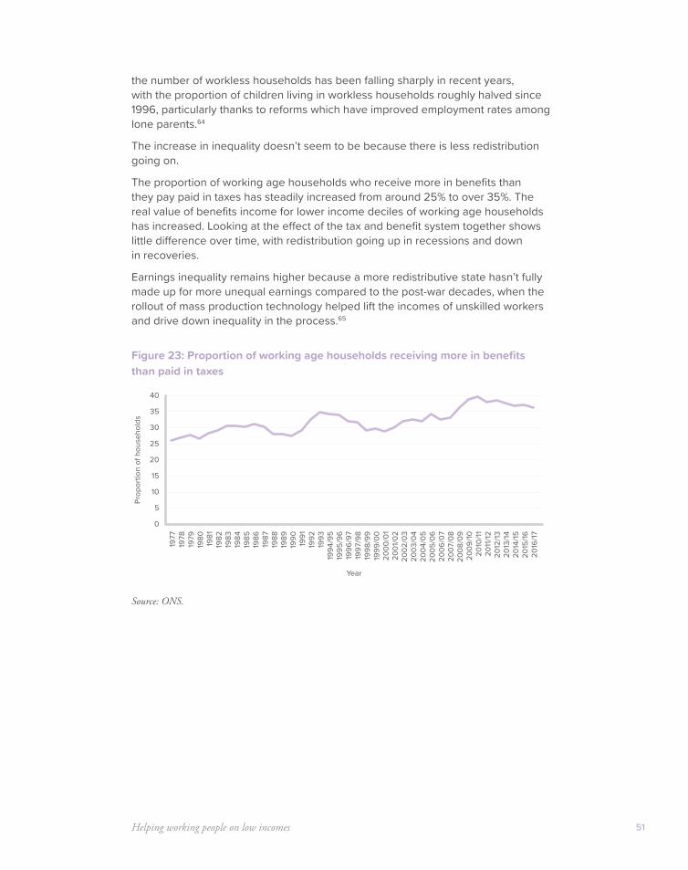
Helping working people on low incomes 51
the number of workless households has been falling sharply in recent years, with the proportion of children living in workless households roughly halved since 1996, particularly thanks to reforms which have improved employment rates among lone parents.64
The increase in inequality doesn’t seem to be because there is less redistribution going on.
The proportion of working age households who receive more in benefits than they pay paid in taxes has steadily increased from around 25% to over 35%. The real value of benefits income for lower income deciles of working age households has increased. Looking at the effect of the tax and benefit system together shows little difference over time, with redistribution going up in recessions and down in recoveries.
Earnings inequality remains higher because a more redistributive state hasn’t fully made up for more unequal earnings compared to the post-war decades, when the rollout of mass production technology helped lift the incomes of unskilled workers and drive down inequality in the process.65
Figure 23: Proportion of working age households receiving more in benefits than paid in taxes
Source: ONS.
0
5
10
15
20
25
30
35
40
1977
1978
1979
1990
1991
1992
1993
1980
1981
1982
1983
1984
1985
1986
1987
1988
1989
1994
/95
1995
/96
1996
/97
1997
/98
1998
/99
1999
/00
2000
/01
2001
/02
2002
/03
2003
/04
2004
/05
2005
/06
2006
/07
2007
/08
2008
/09
2009
/10
2011
/1220
10/11
2012
/1320
13/14
2014
/1520
15/16
2016
/17
Prop
ortio
n of
hou
seho
lds
Year

Firing on all cylinders52
Figure 24: Real value of benefits received by decile – bottom 40%
Source: ONS: The Effect of Taxes and Benefits on Incomes, 2018.
Figure 25: Inequality over time – gini coefficient
Source: ONS: The Effect of Taxes and Benefits on Incomes, 2018.
0
2,000
4,000
6,000
8,000
10,000
1977
1978
1979
1990
1991
1992
1993
1980
1981
1982
1983
1984
1985
1986
1987
1988
1989
1994
/95
1995
/96
1996
/97
1997
/98
1998
/99
1999
/00
2000
/01
2001
/02
2002
/03
2003
/04
2004
/05
2005
/06
2006
/07
2007
/08
2008
/09
2009
/10
2011
/1220
10/11
2012
/1320
13/14
2014
/1520
15/16
2016
/17
Real
val
ue o
f ben
efits
rece
ived
(£)
Year
Bottom 2nd 3rd 4th
0
20
10
30
40
50
60
1977
1978
1979
1990
1991
1992
1993
1980
1981
1982
1983
1984
1985
1986
1987
1988
1989
1994
/95
1995
/96
1996
/97
1997
/98
1998
/99
1999
/00
2000
/01
2001
/02
2002
/03
2003
/04
2004
/05
2005
/06
2006
/07
2007
/08
2008
/09
2009
/10
2011
/1220
10/11
2012
/1320
13/14
2014
/1520
15/16
2016
/17
Gin
i coe
ci
ent
Year
Original Gross Disposable Post-tax

Helping working people on low incomes 53
Figure 26: Redistribution – reduction in gini coefficient
Source: ONS: The Effect of Taxes and Benefits on Incomes, 2018.
The role of technology is central, as inequality is up across countries with many very different social models. Inequality is up in 16 out of the 19 OECD countries that have data going back to the 1990s. All of the Scandinavian economies, all of France, Germany and Italy, and all of the G7 economies have seen inequality rise.66 The only country which saw a significant fall was Turkey, a low income country still in the process of industrialising.
That’s the connection between earlier parts of this paper and this section – actions to grow productivity in poorer places are one way to keep tackling the underlying reasons why poorer groups’ earnings still haven’t caught up.
What matters for wellbeing anyway?
In terms of wellbeing and happiness, how much does relative income matter compared to unemployment?
In recent years the Office for National Statistics has started collecting new data on wellbeing. Questions include those on happiness, life satisfaction and how worthwhile people feel their life is. The results tend to be similar for all three questions,67 and we can average across all three to get an overall picture of wellbeing.
None of this data is perfect and we should not go overboard in the weight we put on it. But the striking result is that while unemployment clearly matters a lot, relative income seems to matter less. Controlling for other factors, ONS researchers68 found a small gap between the wellbeing of those in the bottom tenth of incomes, and everyone else’s, which is higher. But moving up to higher income groups beyond the bottom 10–20% didn’t seem to result in large increases in wellbeing.
In contrast, being unemployed had a large negative impact – in fact being unemployed had a similar impact on wellbeing to being divorced. Being long-term unemployed had a more negative impact even than being widowed.
0
5
10
15
20
25
1977
1978
1979
1990
1991
1992
1993
1980
1981
1982
1983
1984
1985
1986
1987
1988
1989
1994
/95
1995
/96
1996
/97
1997
/98
1998
/99
1999
/00
2000
/01
2001
/02
2002
/03
2003
/04
2004
/05
2005
/06
2006
/07
2007
/08
2008
/09
2009
/10
2011
/1220
10/11
2012
/1320
13/14
2014
/1520
15/16
2016
/17
Gin
i coe
ci
ent
Year
Gross Disposable Post-tax
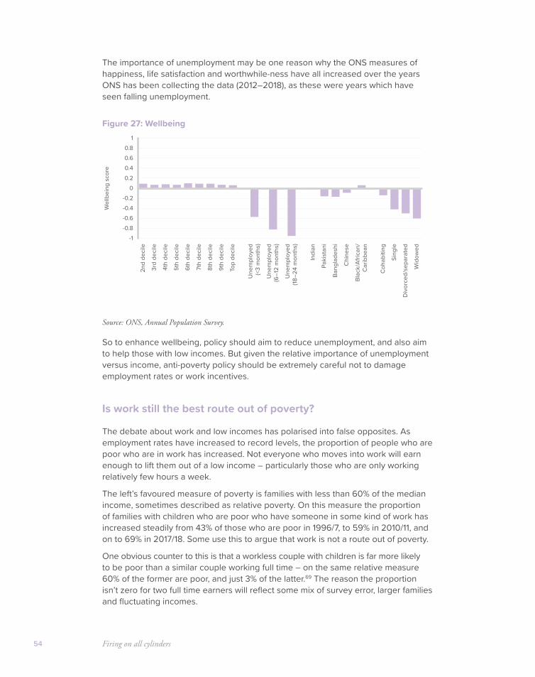
Firing on all cylinders54
The importance of unemployment may be one reason why the ONS measures of happiness, life satisfaction and worthwhile-ness have all increased over the years ONS has been collecting the data (2012–2018), as these were years which have seen falling unemployment.
Figure 27: Wellbeing
Source: ONS, Annual Population Survey.
So to enhance wellbeing, policy should aim to reduce unemployment, and also aim to help those with low incomes. But given the relative importance of unemployment versus income, anti-poverty policy should be extremely careful not to damage employment rates or work incentives.
Is work still the best route out of poverty?
The debate about work and low incomes has polarised into false opposites. As employment rates have increased to record levels, the proportion of people who are poor who are in work has increased. Not everyone who moves into work will earn enough to lift them out of a low income – particularly those who are only working relatively few hours a week.
The left’s favoured measure of poverty is families with less than 60% of the median income, sometimes described as relative poverty. On this measure the proportion of families with children who are poor who have someone in some kind of work has increased steadily from 43% of those who are poor in 1996/7, to 59% in 2010/11, and on to 69% in 2017/18. Some use this to argue that work is not a route out of poverty.
One obvious counter to this is that a workless couple with children is far more likely to be poor than a similar couple working full time – on the same relative measure 60% of the former are poor, and just 3% of the latter.69 The reason the proportion isn’t zero for two full time earners will reflect some mix of survey error, larger families and fluctuating incomes.
-1-0.8-0.6-0.4-0.2
00.20.40.60.8
12n
d de
cile
3rd
deci
le
4th
deci
le
5th
deci
le
6th
deci
le
7th
deci
le
8th
deci
le
9th
deci
le
Top
deci
le
Indi
an
Paki
stan
i
Bang
lade
shi
Chi
nese
Blac
k/Af
rican
/C
arib
bean
Une
mpl
oyed
(<3
mon
ths)
Une
mpl
oyed
(6–1
2 m
onth
s)
Une
mpl
oyed
(18–2
4 m
onth
s)
Coh
abiti
ng
Sing
le
Div
orce
d/se
para
ted
Wid
owed
Wel
lbei
ng s
core
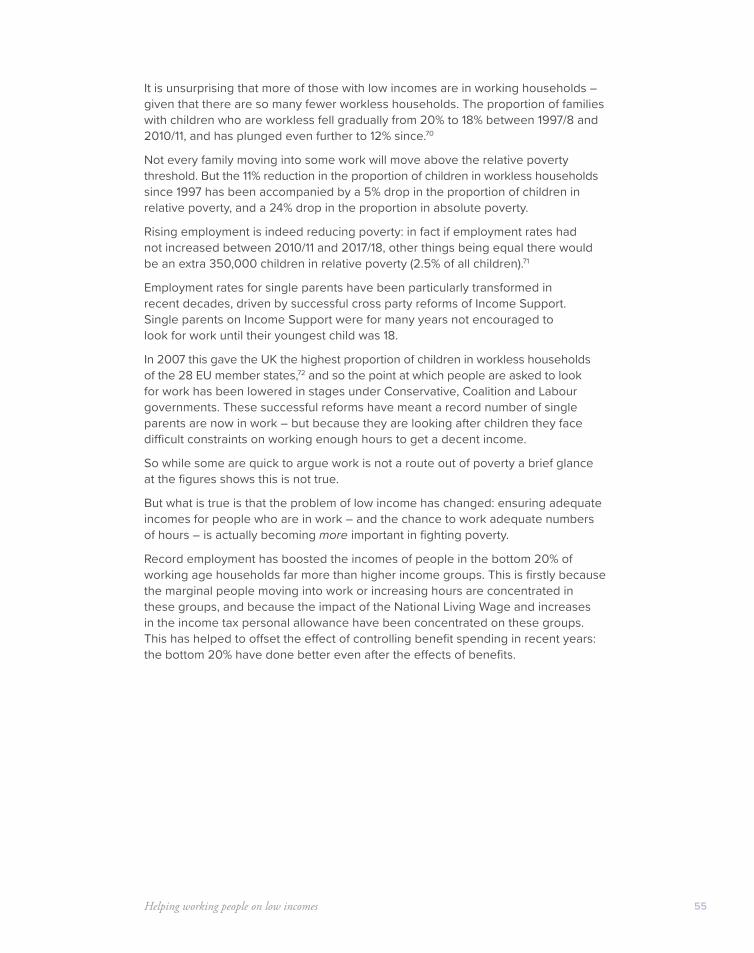
Helping working people on low incomes 55
It is unsurprising that more of those with low incomes are in working households – given that there are so many fewer workless households. The proportion of families with children who are workless fell gradually from 20% to 18% between 1997/8 and 2010/11, and has plunged even further to 12% since.70
Not every family moving into some work will move above the relative poverty threshold. But the 11% reduction in the proportion of children in workless households since 1997 has been accompanied by a 5% drop in the proportion of children in relative poverty, and a 24% drop in the proportion in absolute poverty.
Rising employment is indeed reducing poverty: in fact if employment rates had not increased between 2010/11 and 2017/18, other things being equal there would be an extra 350,000 children in relative poverty (2.5% of all children).71
Employment rates for single parents have been particularly transformed in recent decades, driven by successful cross party reforms of Income Support. Single parents on Income Support were for many years not encouraged to look for work until their youngest child was 18.
In 2007 this gave the UK the highest proportion of children in workless households of the 28 EU member states,72 and so the point at which people are asked to look for work has been lowered in stages under Conservative, Coalition and Labour governments. These successful reforms have meant a record number of single parents are now in work – but because they are looking after children they face difficult constraints on working enough hours to get a decent income.
So while some are quick to argue work is not a route out of poverty a brief glance at the figures shows this is not true.
But what is true is that the problem of low income has changed: ensuring adequate incomes for people who are in work – and the chance to work adequate numbers of hours – is actually becoming more important in fighting poverty.
Record employment has boosted the incomes of people in the bottom 20% of working age households far more than higher income groups. This is firstly because the marginal people moving into work or increasing hours are concentrated in these groups, and because the impact of the National Living Wage and increases in the income tax personal allowance have been concentrated on these groups. This has helped to offset the effect of controlling benefit spending in recent years: the bottom 20% have done better even after the effects of benefits.
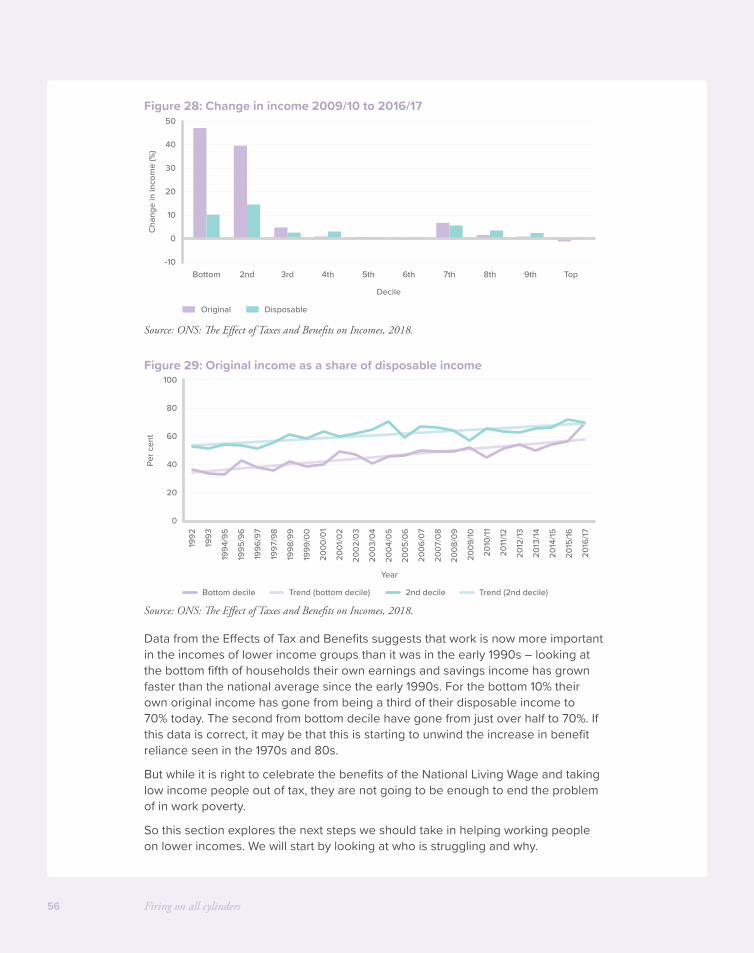
Firing on all cylinders56
Figure 28: Change in income 2009/10 to 2016/17
Source: ONS: The Effect of Taxes and Benefits on Incomes, 2018.
Figure 29: Original income as a share of disposable income
Source: ONS: The Effect of Taxes and Benefits on Incomes, 2018.
Data from the Effects of Tax and Benefits suggests that work is now more important in the incomes of lower income groups than it was in the early 1990s – looking at the bottom fifth of households their own earnings and savings income has grown faster than the national average since the early 1990s. For the bottom 10% their own original income has gone from being a third of their disposable income to 70% today. The second from bottom decile have gone from just over half to 70%. If this data is correct, it may be that this is starting to unwind the increase in benefit reliance seen in the 1970s and 80s.
But while it is right to celebrate the benefits of the National Living Wage and taking low income people out of tax, they are not going to be enough to end the problem of in work poverty.
So this section explores the next steps we should take in helping working people on lower incomes. We will start by looking at who is struggling and why.
-10
10
0
20
30
40
50
Bottom 2nd 3rd 4th 5th 6th
Decile
7th 8th 9th Top
Cha
nge
in in
com
e (%
)
Original Disposable
0
20
40
60
80
100
1992
1993
1994
/95
1995
/96
1996
/97
1997
/98
1998
/99
1999
/00
2000
/01
2001
/02
2002
/03
2003
/04
2004
/05
2005
/06
2006
/07
2007
/08
2008
/09
2009
/10
2011
/12
2010
/11
2012
/13
2013
/14
2014
/15
2015
/16
2016
/17
Per c
ent
Year
Bottom decile Trend (bottom decile) 2nd decile Trend (2nd decile)
Helping working people on low incomes 57
Which groups are struggling?
1. People out of work, or working limited numbers of hours, and people with higher housing costs
Working more hours hugely reduces the risk that a household will be in poverty. Looking at the left’s preferred measure of relative poverty (discussed below) shows that while around 60% of workless couples with children are in low income, poverty rates for couples where both work full time are very low. Work, for those who can work, remains the best route out of poverty.
Breaking the idea of “part time” down further, we can see that for households with children, poverty rates fall sharply at particular points as households work increasing numbers of hours.
For single-parent households relative poverty rates fall steadily with more hours worked, with the biggest fall coming with a move into relatively limited hours. For couple households there is a particularly dramatic reduction if the couple can work the equivalent of one full time job.
In either case, higher housing costs are (other things equal), likely to mean that a person has low income. Previous Onward publications have discussed how we could make housing cheaper overall, and reduce housing costs for working people on low incomes. This would help reduce the After Housing Costs measure of poverty.73
Figure 30: Relative poverty rate, single parent households
Source: Commons library analysis of HBAI, Average of 2014/15 to 2016/17.
0
20
40
60
80
100
Zero hours 1–16 17–24 25–36 Over 36
42%
23%18%
9%9%
70%
46%
34%
23%18%
Per c
ent
Before housing costs After housing costs
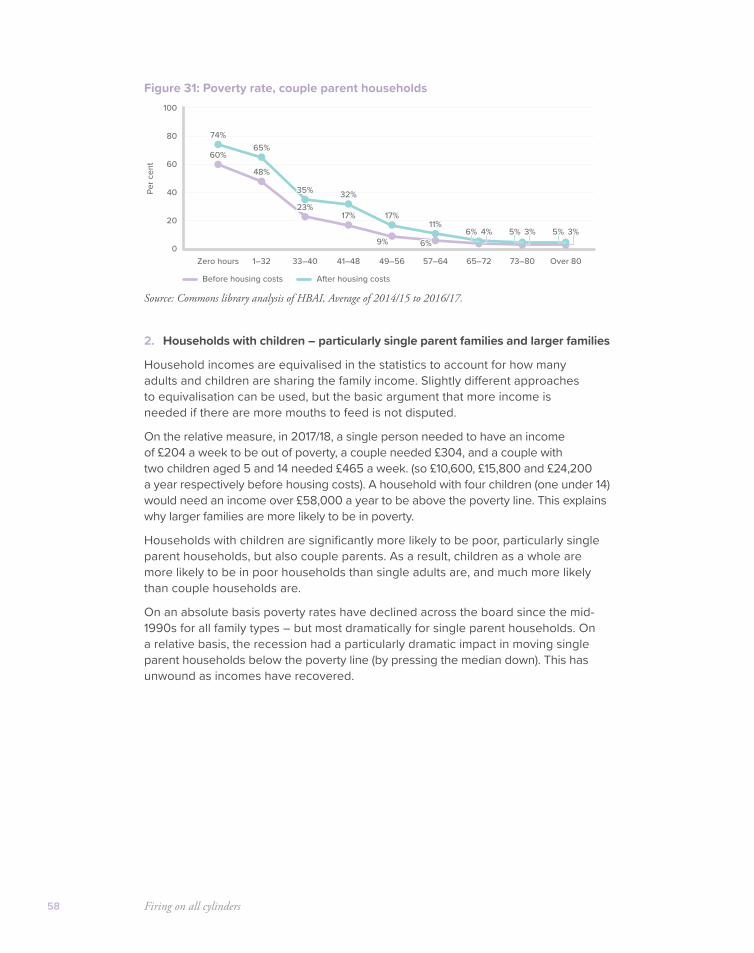
Firing on all cylinders58
Figure 31: Poverty rate, couple parent households
Source: Commons library analysis of HBAI, Average of 2014/15 to 2016/17.
2. Households with children – particularly single parent families and larger families
Household incomes are equivalised in the statistics to account for how many adults and children are sharing the family income. Slightly different approaches to equivalisation can be used, but the basic argument that more income is needed if there are more mouths to feed is not disputed.
On the relative measure, in 2017/18, a single person needed to have an income of £204 a week to be out of poverty, a couple needed £304, and a couple with two children aged 5 and 14 needed £465 a week. (so £10,600, £15,800 and £24,200 a year respectively before housing costs). A household with four children (one under 14) would need an income over £58,000 a year to be above the poverty line. This explains why larger families are more likely to be in poverty.
Households with children are significantly more likely to be poor, particularly single parent households, but also couple parents. As a result, children as a whole are more likely to be in poor households than single adults are, and much more likely than couple households are.
On an absolute basis poverty rates have declined across the board since the mid-1990s for all family types – but most dramatically for single parent households. On a relative basis, the recession had a particularly dramatic impact in moving single parent households below the poverty line (by pressing the median down). This has unwound as incomes have recovered.
0
20
40
60
80
100
Zero hours 1–32 33–40 41–48 49–56 57–64 65–72 73–80 Over 80
60%
48%
65%Pe
r cen
t
Before housing costs After housing costs
9% 6%6% 4% 5% 3%
11%
32%35%
74%
23%17% 17%
5% 3%

Helping working people on low incomes 59
Figure 32: Proportion in absolute poverty
Source: HBAI (BHC).
Figure 33: Proportion in relative poverty
Source: HBAI (BHC).
For the reasons discussed above, households with 3 or more children are much more likely to be poor. On an absolute basis there have been large declines in poverty rates in recent years for those households with three or more children. But these larger households remain at a much higher risk of poverty. On a relative basis, poverty rates have been flat over the decade, with rates for the largest families going down and then back up.
0102030405060708090
100
1994
/95
1995
/96
1996
/97
1997
/98
1998
/99
1999
/00
2000
/01
2001
/02
2002
/03
2003
/04
2004
/05
2005
/06
2006
/07
2007
/08
2008
/09
2009
/10
2011
/12
2010
/11
2012
/13
2013
/14
2014
/15
2015
/16
2016
/17
2017
/18
Per c
ent
Year
Children Couple with childrenSingle male without childrenCouple without children
Single female without childrenSingle with children
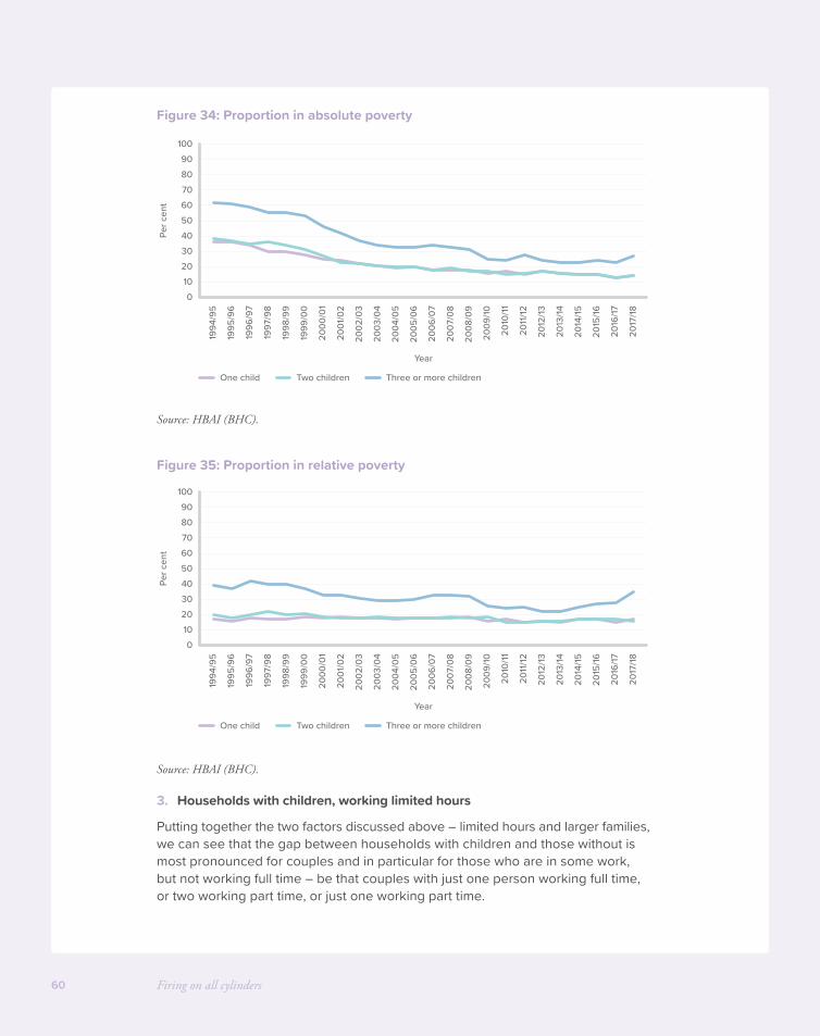
Firing on all cylinders60
Figure 34: Proportion in absolute poverty
Source: HBAI (BHC).
Figure 35: Proportion in relative poverty
Source: HBAI (BHC).
3. Households with children, working limited hours
Putting together the two factors discussed above – limited hours and larger families, we can see that the gap between households with children and those without is most pronounced for couples and in particular for those who are in some work, but not working full time – be that couples with just one person working full time, or two working part time, or just one working part time.
0102030405060708090
100
1994
/95
1995
/96
1996
/97
1997
/98
1998
/99
1999
/00
2000
/01
2001
/02
2002
/03
2003
/04
2004
/05
2005
/06
2006
/07
2007
/08
2008
/09
2009
/10
2011
/12
2010
/11
2012
/13
2013
/14
2014
/15
2015
/16
2016
/17
2017
/18
Per c
ent
Year
One child Two children Three or more children

Helping working people on low incomes 61
Figure 36: Absolute and relative poverty rate, by hours worked and children, before housing costs
Source: Commons library analysis of HBAI, Average of 2014/15 to 2016/17.
Looking over time, on a relative basis we can see that the recession dramatically reduced relative poverty rates among single parents – an effect that has unwound as median incomes have recovered. The most recent data seems to show a large uptick among full time working lone parents, taking the poverty rate above that for part time workers – although HBAI data warns this is the result of a miniscule number of survey responses: in fact just “two cases, with very large grossing weights”.
On an absolute or relative basis absolute poverty rates are high for those couples that have only one earner, either part or full time. They are also high for lone parents who only work part time.
Figure 37: Single parents – relative
Source: Commons Library analysis of HBAI, Average of 2014/15 to 2016/17.
0102030405060708090
100
Both
not
wor
king
No
full
time,
one
part
time
One
full
time,
one
not w
orki
ngO
ne fu
ll tim
e,on
e pa
rt tim
e
Both
full
time
Both
not
wor
king
No
full
time,
one
part
time
One
full
time,
one
not w
orki
ngO
ne fu
ll tim
e,on
e pa
rt tim
e
Both
full
time
Sing
le, n
ot w
orki
ng
Sing
le, p
art t
ime
Sing
le, f
ull t
ime
Sing
le, n
ot w
orki
ng
Sing
le, p
art t
ime
Sing
le, f
ull t
ime
Per c
ent
Absolute Relative RelativeAbsolute
No children One child Two children Three or more children
0102030405060708090
100
1996
/97
1997
/98
1998
/99
1999
/00
2000
/01
2001
/02
2002
/03
2003
/04
2004
/05
2005
/06
2006
/07
2007
/08
2008
/09
2009
/10
2011
/12
2010
/11
2012
/13
2013
/14
2014
/15
2015
/16
2016
/17
2017
/18
Per c
ent
Year
In full-time work In part-time work Not working
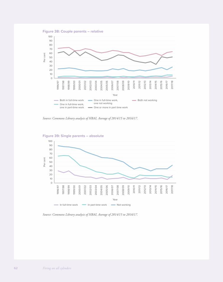
Firing on all cylinders62
Figure 38: Couple parents – relative
Source: Commons Library analysis of HBAI, Average of 2014/15 to 2016/17.
Figure 39: Single parents – absolute
Source: Commons Library analysis of HBAI, Average of 2014/15 to 2016/17.
0102030405060708090
100
1996
/97
1997
/98
1998
/99
1999
/00
2000
/01
2001
/02
2002
/03
2003
/04
2004
/05
2005
/06
2006
/07
2007
/08
2008
/09
2009
/10
2011
/12
2010
/11
2012
/13
2013
/14
2014
/15
2015
/16
2016
/17
2017
/18
Per c
ent
Year
Both in full-time work Both not working
One or more in part time workOne in full-time work,one in part-time work
One in full-time work,one not working
0102030405060708090
100
1996
/97
1997
/98
1998
/99
1999
/00
2000
/01
2001
/02
2002
/03
2003
/04
2004
/05
2005
/06
2006
/07
2007
/08
2008
/09
2009
/10
2011
/12
2010
/11
2012
/13
2013
/14
2014
/15
2015
/16
2016
/17
2017
/18
Per c
ent
Year
In full-time work In part-time work Not working
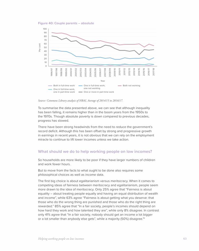
Helping working people on low incomes 63
Figure 40: Couple parents – absolute
Source: Commons Library analysis of HBAI, Average of 2014/15 to 2016/17.
To summarise the data presented above, we can see that although inequality has been falling, it remains higher than in the boom years from the 1950s to the 1970s. Though absolute poverty is down compared to previous decades, progress has slowed.
There have been strong headwinds from the need to reduce the government’s record deficit. Although this has been offset by strong and progressive growth in earnings in recent years, it is not obvious that we can rely on the employment miracle to continue to lift lower incomes unless we take action.
What should we do to help working people on low incomes?
So households are more likely to be poor if they have larger numbers of children and work fewer hours.
But to move from the facts to what ought to be done also requires some philosophical choices as well as income data.
The first big choice is about egalitarianism versus meritocracy. When it comes to competing ideas of fairness between meritocracy and egalitarianism, people seem more drawn to the idea of meritocracy. Only 25% agree that “Fairness is about equality – about treating people equally and having an equal distribution of wealth and income”, while 63% agree “Fairness is about getting what you deserve: that those who do the wrong thing are punished and those who do the right thing are rewarded.” 85% agree that “In a fair society, people’s incomes should depend on how hard they work and how talented they are”, while only 8% disagree. In contrast only 41% agree that “In a fair society, nobody should get an income a lot bigger or a lot smaller than anybody else gets”, while a majority (50%) disagree.74
0102030405060708090
100
1996
/97
1997
/98
1998
/99
1999
/00
2000
/01
2001
/02
2002
/03
2003
/04
2004
/05
2005
/06
2006
/07
2007
/08
2008
/09
2009
/10
2011
/12
2010
/11
2012
/13
2013
/14
2014
/15
2015
/16
2016
/17
2017
/18
Per c
ent
Year
Both in full-time work Both not working
One or more in part time workOne in full-time work,one in part-time work
One in full-time work,one not working
Firing on all cylinders64
Polling for Onward’s recent study, Generation Why? found strong support among all age groups for the proposition that “people should be allowed to keep more of their own money” (60%), versus the proposition that we should “increase taxation to increase equality” (40%).
This data suggests a focus on those who are working hard to improve their situation, but still find themselves with a low income.
The second big choice is about whether help should be particularly aimed at children.
Some would say that having more children is a choice – like buying a new car for instance – and that parents should be prepared for the impact on their living standards, rather than expecting other taxpayers to bear the full cost. They might add that increasing out of work benefits (both cash benefits and social housing) for people with children worsens work incentives, increasing unemployment with self-defeating results.
This can also have knock on consequences: there is clear academic evidence linking parental unemployment to higher rates of unemployment among their children. Sons of unemployed fathers are up to 25% more likely to be unemployed for a year than the sons of working fathers.75
Others would counter that children have no responsibility for the households that they are born into, and that reducing financial pressure on poorer households with children might improve family life and stability and represent an investment in a more productive life for them in the future. In particular, the expansion of in-work benefits over recent decades (family credit, then tax credits, then UC) has increased both employment and the incomes of poorer households.
You might also think that the basis of tax should be the ability to pay. For example, the rationale for the personal allowance is to let people keep enough money for their own basic needs before they pay tax. Having more children reduces a family’s ability to pay tax.
Helping working people on low incomes 65
Summary of problem analysis:
• Though we should be cautious because of data problems, skill biased technology change sweeping across industrialised countries seems to have increased income inequality by pushing up the earnings for higher skilled people, and pushing them down for lower skilled people.
• As in other countries, redistribution hasn’t been enough to offset this more unequal distribution of earned income.
• Policy should be highly cautious about doing anything which might reduce work incentives and so increase unemployment, given the impact of unemployment on wellbeing.
• Absolute measures of low income have fewer problems than relative measures. Policy should aim to particularly help those in work, and those with children.
• Specifically, we should aim to drive down absolute poverty rates for those who are in work. Claims that work is no longer a route out of poverty for those who can work are wrong. In fact increased earnings have done more for lower income families in recent decades than increased redistribution.
• Policy should particularly aim to help in-work households with children, because they are worse off on average; because children reduce parents’ ability to pay tax, because helping children represents an investment in their future, and because children have no control over their family income.
On this basis, the next section looks at how we could raise the incomes of the worst off.
We will look first at the tax system, and this paper suggests we should start to recognise children in the tax system, and prioritise low income working families with children.
We will then look at what we could do to build on UC, to make it a more powerful tool to help the working poor. It concludes that we should create “UC Plus” – delivering what is effectively a tax cut for the working poor by increasing work allowances; increasing them further for households with larger numbers of children; and introducing second earner work allowances. This would enable people to keep more of the money they earn.
Solution 1: Cutting tax for low income workers and recognising children in the tax system
First, we look at potential tax changes. Because labour market income is a much larger share of the income of higher income households, simple reductions in tax rates inevitably tend to benefit higher income groups. Many people would regard this as perfectly fair: if people are working hard and not depending on other taxpayers they should be enabled to keep some more of their own money.
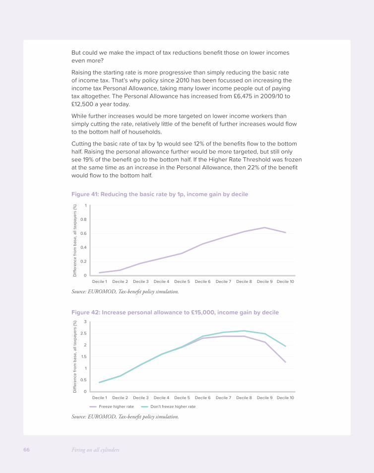
Firing on all cylinders66
But could we make the impact of tax reductions benefit those on lower incomes even more?
Raising the starting rate is more progressive than simply reducing the basic rate of income tax. That’s why policy since 2010 has been focussed on increasing the income tax Personal Allowance, taking many lower income people out of paying tax altogether. The Personal Allowance has increased from £6,475 in 2009/10 to £12,500 a year today.
While further increases would be more targeted on lower income workers than simply cutting the rate, relatively little of the benefit of further increases would flow to the bottom half of households.
Cutting the basic rate of tax by 1p would see 12% of the benefits flow to the bottom half. Raising the personal allowance further would be more targeted, but still only see 19% of the benefit go to the bottom half. If the Higher Rate Threshold was frozen at the same time as an increase in the Personal Allowance, then 22% of the benefit would flow to the bottom half.
Figure 41: Reducing the basic rate by 1p, income gain by decile
Source: EUROMOD, Tax-benefit policy simulation.
Figure 42: Increase personal allowance to £15,000, income gain by decile
Source: EUROMOD, Tax-benefit policy simulation.
0
0.2
0.4
0.6
0.8
1
Decile 1 Decile 2 Decile 3 Decile 4 Decile 5 Decile 6 Decile 7 Decile 8 Decile 9 Decile 10
Di�
eren
ce fr
om b
ase,
all
taxp
ayer
s (%
)
0
0.5
1.5
1
2
2.5
3
Decile 1 Decile 2 Decile 3 Decile 4 Decile 5 Decile 6 Decile 7 Decile 8 Decile 9 Decile 10
Di�
eren
ce fr
om b
ase,
all
taxp
ayer
s (%
)
Freeze higher rate Don’t freeze higher rate
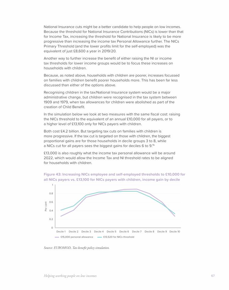
Helping working people on low incomes 67
National Insurance cuts might be a better candidate to help people on low incomes. Because the threshold for National Insurance Contributions (NICs) is lower than that for Income Tax, increasing the threshold for National Insurance is likely to be more progressive than increasing the income tax Personal Allowance further. The NICs Primary Threshold (and the lower profits limit for the self-employed) was the equivalent of just £8,600 a year in 2019/20.
Another way to further increase the benefit of either raising the NI or income tax thresholds for lower income groups would be to focus these increases on households with children.
Because, as noted above, households with children are poorer, increases focussed on families with children benefit poorer households more. This has been far less discussed than either of the options above.
Recognising children in the tax/National Insurance system would be a major administrative change, but children were recognised in the tax system between 1909 and 1979, when tax allowances for children were abolished as part of the creation of Child Benefit.
In the simulation below we look at two measures with the same fiscal cost: raising the NICs threshold to the equivalent of an annual £10,000 for all payers, or to a higher level of £13,100 only for NICs payers with children.
Both cost £4.2 billion. But targeting tax cuts on families with children is more progressive. If the tax cut is targeted on those with children, the biggest proportional gains are for those households in decile groups 3 to 8, while a NICs cut for all payers sees the biggest gains for deciles 6 to 9.76
£13,000 is also roughly what the income tax personal allowance will be around 2022, which would allow the Income Tax and NI threshold rates to be aligned for households with children.
Figure 43: Increasing NICs employee and self-employed thresholds to £10,000 for all NICs payers vs. £13,100 for NICs payers with children, income gain by decile
Source: EUROMOD, Tax-benefit policy simulation.
0
0.4
0.2
0.6
0.8
1
Decile 1 Decile 2 Decile 3 Decile 4 Decile 5 Decile 6 Decile 7 Decile 8 Decile 9 Decile 10
Per c
ent
£15,000 personal allowance £13,520 for NICs threshold
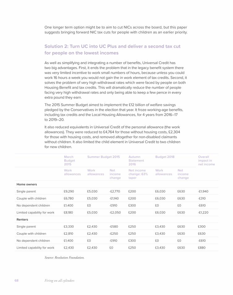
Firing on all cylinders68
One longer term option might be to aim to cut NICs across the board, but this paper suggests bringing forward NIC tax cuts for people with children as an earlier priority.
Solution 2: Turn UC into UC Plus and deliver a second tax cut for people on the lowest incomes
As well as simplifying and integrating a number of benefits, Universal Credit has two big advantages. First, it ends the problem that in the legacy benefit system there was very limited incentive to work small numbers of hours, because unless you could work 16 hours a week you would not gain the in work element of tax credits. Second, it solves the problem of very high withdrawal rates which were faced by people on both Housing Benefit and tax credits. This will dramatically reduce the number of people facing very high withdrawal rates and only being able to keep a few pence in every extra pound they earn.
The 2015 Summer Budget aimed to implement the £12 billion of welfare savings pledged by the Conservatives in the election that year. It froze working-age benefits, including tax credits and the Local Housing Allowances, for 4 years from 2016–17 to 2019–20.
It also reduced equivalents in Universal Credit of the personal allowance (the work allowances). They were reduced to £4,764 for those without housing costs, £2,304 for those with housing costs, and removed altogether for non-disabled claimants without children. It also limited the child element in Universal Credit to two children for new children.
Source: Resolution Foundation.
March Budget 2015
Summer Budget 2015 Autumn Statement 2016
Budget 2018 Overall impact in net income
Work allowances
Work allowances
Net income change
Net income change: 63% taper
Work allowances
Net income change
Home owners
Single parent £9,290 £5,030 -£2,770 £200 £6,030 £630 -£1,940
Couple with children £6,780 £5,030 -£1,140 £200 £6,030 £630 -£310
No dependent children £1,400 £0 -£910 £300 £0 £0 -£610
Limited capability for work £8,180 £5,030 -£2,050 £200 £6,030 £630 -£1,220
Renters
Single parent £3,330 £2,430 -£580 £250 £3,430 £630 £300
Couple with children £2,810 £2,430 -£250 £250 £3,430 £630 £630
No dependent children £1,400 £0 -£910 £300 £0 £0 -£610
Limited capability for work £2,430 £2,430 £0 £250 £3,430 £630 £880

Helping working people on low incomes 69
Subsequent changes have unwound some of these savings measures. In Autumn Statement 2016 the Government reduced the taper rate in UC from 65p to 63p, and in Budget 2018 increased work allowances by £1,000 for all remaining work allowances. For some renters this has undone the effect of the earlier changes, but for homeowners this is not the case.
If the full increases in take-up assumed by the Office for Budget Responsibility (OBR) are achieved, then UC is now set to be £1.6 billion more generous than the legacy system would have been by 2023–24, with gains for 700,000 families.77
How could we change UC to further boost the incomes of low income working people? Could we change UC into something stronger – “UC Plus” as it were?
We could simply increase the amount of benefit people receive when they are out of work, but this would worsen work incentives. Given the evidence above, we should be highly cautious about anything which risks increasing unemployment.
Alternatively, we could increase the amount of benefit people can keep in work, which improves work incentives and will tend to reduce unemployment.
We could do this either by increasing UC Work Allowances, the amount people can earn before their benefits are tapered away (the equivalent of the personal allowance) or by reducing the UC taper rate (the equivalent of reducing the tax rate).
Analysis ahead of the 2018 Budget by the JRF compared the distributional impact of an increase to work allowances for people with children, with reducing the taper rate, at the same fiscal cost (around £1 billion).
Increasing work allowances has a much bigger impact for people in the lowest income groups than changing the taper rate, which is slightly more beneficial for groups higher up the income scale.78
Figure 44: Increasing work allowances 20% for families with children vs reducing UC taper rate to 61%
Source: Joseph Rowntree Foundation, Comparing investment in Universal Credit work allowances and taper rate, 2018.
So one effective way to boost the income of low income working people is simply to increase work allowances. Budget 2018 provided the following costing of the £1,000 increase in the work allowance.
0
0.5
0.75
0.25
1
1.5
1.25
Decile 1 Decile 2 Decile 3 Decile 4 Decile 5 Decile 6 Decile 7 Decile 8 Decile 9 Decile 10
Per c
ent
Reduce taper Increase work allowances
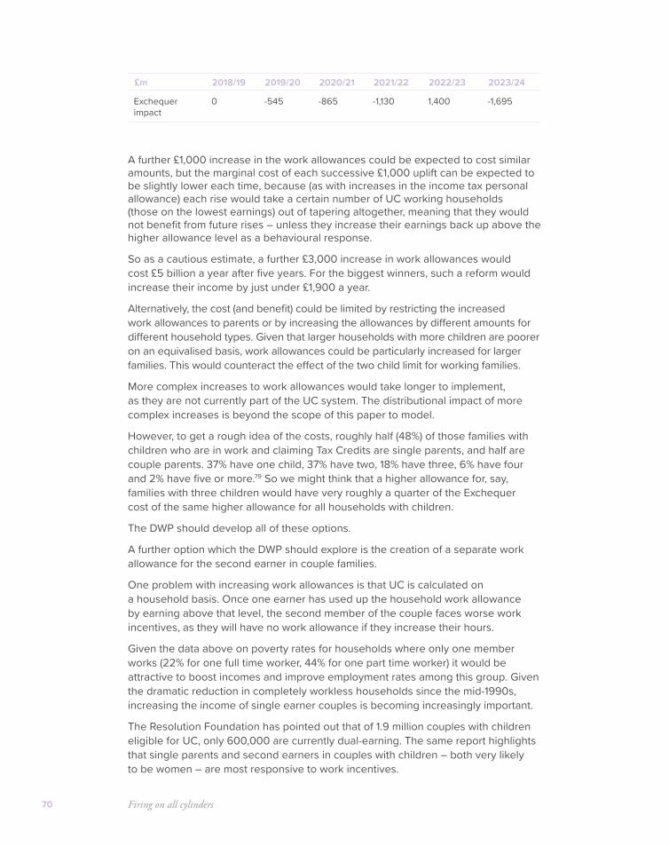
Firing on all cylinders70
£m 2018/19 2019/20 2020/21 2021/22 2022/23 2023/24
Exchequer impact
0 -545 -865 -1,130 1,400 -1,695
A further £1,000 increase in the work allowances could be expected to cost similar amounts, but the marginal cost of each successive £1,000 uplift can be expected to be slightly lower each time, because (as with increases in the income tax personal allowance) each rise would take a certain number of UC working households (those on the lowest earnings) out of tapering altogether, meaning that they would not benefit from future rises – unless they increase their earnings back up above the higher allowance level as a behavioural response.
So as a cautious estimate, a further £3,000 increase in work allowances would cost £5 billion a year after five years. For the biggest winners, such a reform would increase their income by just under £1,900 a year.
Alternatively, the cost (and benefit) could be limited by restricting the increased work allowances to parents or by increasing the allowances by different amounts for different household types. Given that larger households with more children are poorer on an equivalised basis, work allowances could be particularly increased for larger families. This would counteract the effect of the two child limit for working families.
More complex increases to work allowances would take longer to implement, as they are not currently part of the UC system. The distributional impact of more complex increases is beyond the scope of this paper to model.
However, to get a rough idea of the costs, roughly half (48%) of those families with children who are in work and claiming Tax Credits are single parents, and half are couple parents. 37% have one child, 37% have two, 18% have three, 6% have four and 2% have five or more.79 So we might think that a higher allowance for, say, families with three children would have very roughly a quarter of the Exchequer cost of the same higher allowance for all households with children.
The DWP should develop all of these options.
A further option which the DWP should explore is the creation of a separate work allowance for the second earner in couple families.
One problem with increasing work allowances is that UC is calculated on a household basis. Once one earner has used up the household work allowance by earning above that level, the second member of the couple faces worse work incentives, as they will have no work allowance if they increase their hours.
Given the data above on poverty rates for households where only one member works (22% for one full time worker, 44% for one part time worker) it would be attractive to boost incomes and improve employment rates among this group. Given the dramatic reduction in completely workless households since the mid-1990s, increasing the income of single earner couples is becoming increasingly important.
The Resolution Foundation has pointed out that of 1.9 million couples with children eligible for UC, only 600,000 are currently dual-earning. The same report highlights that single parents and second earners in couples with children – both very likely to be women – are most responsive to work incentives.
Helping working people on low incomes 71
The Resolution Foundation recommends:80
The introduction of a second earner work allowance, initially at a level equivalent to seven hours a week on the NLW (and funded by the abolition of the married couple’s allowance in the income tax system which acts as a disincentive for second earners), with a view to boosting it to the equivalent of 15 hours a week on the NLW in the longer term.
In their October 2017 report Universal Remedy, in which they first made this recommendation, the Resolution Foundation estimated that creating a second-earner allowance for couples with children of £3,200 a year (equivalent to seven hours a week at the then National Living Wage) would cost £1 billion a year.
Looking at data from tax credit claimants, this may be a cautious estimate and costs may be lower – in the order of £700m. This implies that a second earner work allowance set at the equivalent of 16 hours a week (a part time job) would cost somewhere around £2 billion a year.
Conclusion and costings
Tax
• For families in the low to mid-income bracket, Government should increase the Primary Threshold for National Insurance contributions, in preference to the Income Tax Personal Allowance, as this helps lower income households more. This is because the threshold at £8,600 is now substantially lower than the personal allowance for income tax at £12,500.
• Families with children are more likely to have low incomes. So as a first step Government should aim to increase the National Insurance Primary Threshold for people with children to align with the rising Personal Allowance for income tax at around £13,000. This would mean children were recognised in the tax system for the first time since the 1970s.
• This would cost just over £4 billion a year once fully rolled out, and raise post tax income by up to £1,100 for a two earner couple.
UC Plus
• To increase employment and raise the incomes of poorer working families, Government should turn UC into “UC Plus” by substantially increasing Work Allowances and creating a separate work allowance for second earners.
• UC Plus should be phased in over a number of years to improve affordability. But Government should set out a roadmap to increase work allowances by around £3,000. This would increase the incomes of low income working families by up to £1,900 a year. Government should go further, and introduce a new second earner work allowance in UC, equivalent to 16 hours of work on the National Living Wage. This would increase incomes for low income working households by up to a further £4,300.

Firing on all cylinders72
• DWP should also develop options to increase Work Allowances further for families with larger numbers of children.
Moving to “UC Plus” would cost around £7 billion once fully rolled out.
So the total cost of this tax and UC package would be between £11 and £12 billion a year once fully rolled out.
This is clearly an expensive, expansionist policy, but would help to ensure that more families would directly and strongly feel the benefits of a growing economy. As fiscal space opens up, we should ensure that people who work hard on low incomes are first among the beneficiaries.

73
Adding it all up
How to prioritise

Firing on all cylinders74
In the first section of this paper we saw how a more expansionary fiscal rule could create enough headroom to borrow nearly £240 billion more in the four years running from 2020/21 through to 2023/24. This would need to include the additional debt servicing cost incurred from tax cuts or spending increases during the period.
Once we take account of student debts coming onto the balance sheet, the headroom for extra debt falls to around £190 billion over four years.
Looking at the public services, this paper discussed pressures for more spending which could add between £10–20 billion to public spending each year. Focussing on returning school spending to its real terms peak per pupil and on investment in the police and prisons would add something in the order of £6 billion a year.
Fully aligning Corporation Tax headline rates with Ireland would cost £12 billion a year once aligned or somewhat less if more dynamic scoring was used.
This report has not advocated a single costing for increasing capital allowances and creating new allowances – there are many potential options, and changes would interact with the cost of reducing the headline rate. Current allowances cost the Exchequer £18 billion while being the least generous in the G20. If we budgeted for a 50% increase in allowances overall, that would cost around £9 billion a year once fully rolled out.
The dramatic increase in the threshold for National Insurance for working people with children advocated here would cost just over £4 billion a year once fully rolled out.
Moving to “UC Plus” would cost around £7 billion once fully rolled out.
Clearly, it would not be affordable to implement all of these different policies in a single year. There are many possible ways to prioritise between them.
For example, in Scenario 1 below we implement the increase in the national insurance threshold and the roll out of UC Plus immediately, but phase in the reduction in the Corporation Tax and improved capital allowances, and grow public service spending by an additional £20 billion by the final year. In total this would add £150 billion to debt directly, plus the cost of additional debt interest payments. Some of the rough policy costings above should also be increased to allow for the cost of uprating tax and UC thresholds from a higher baseline.
We could take a more cautious approach to rolling out these reforms.
In Scenario 2 additional spending on public services builds up more slowly to a lower level of £10 billion in the final year. The national insurance tax cuts and UC Plus are phased in, half in the first year and half in the third. Capital allowances build up more slowly to a cost of £6 billion a year in the final year. In this scenario the policy costs directly add £100 billion to the debt, plus debt interest costs as above.
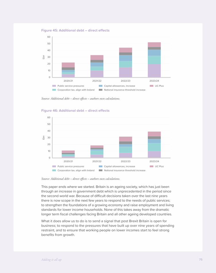
Adding it all up 75
Figure 45: Additional debt – direct effects
Source: Additional debt – direct effects – authors own calculations.
Figure 46: Additional debt – direct effects
Source: Additional debt – direct effects – authors own calculations.
This paper ends where we started. Britain is an ageing society, which has just been through an increase in government debt which is unprecedented in the period since the second world war. Because of difficult decisions taken over the last nine years there is now scope in the next few years to respond to the needs of public services; to strengthen the foundations of a growing economy and raise employment and living standards for lower income households. None of this takes away from the dramatic longer term fiscal challenges facing Britain and all other ageing developed countries.
What it does allow us to do is to send a signal that post Brexit Britain is open for business; to respond to the pressures that have built up over nine years of spending restraint, and to ensure that working people on lower incomes start to feel strong benefits from growth.
0
10
20
30
40
60
50
2020/21 2021/22 2022/23 2023/24
£bn
Public service pressuresCorporation tax, align with Ireland
Capital allowances, increase UC PlusNational insurance threshold increase
0
10
20
30
40
60
50
2020/21 2021/22 2022/23 2023/24
£bn
Public service pressuresCorporation tax, align with Ireland
Capital allowances, increase UC PlusNational insurance threshold increase

Firing on all cylinders76
The measures suggested here for Spending Review 2019 are a step towards creating a growing, united, outward looking country, so that we can face the difficult years ahead from a strong position.
These suggestions spring from clear evidence that strong economies are built on broad foundations: that more geographically balanced economies are stronger overall; that economies where all groups see the benefits of growth are more sustainable – in short, that a strong economy is one that is firing on all cylinders.

77
Endnotes
Firing on all cylinders78
1 Bank of England, Bank Underground blog, Batten and Jacobs.
2 Sources: BOE a millennium of macroeconomic data up to 1919, OBR historic series 1920 onward, OBR Fiscal Sustainability Report 2018 for 2023 onwards.
3 Reinhart & Branchia, The liquidation of government debt, NBER March 20113 .
4 OBR, “The outlook for debt interest spending”, 2017: “Over the longer term, the key risk to fiscal sustainability is that the growth-corrected interest rate reverts to a historically more normal average. The minus 1.6 percentage point average assumed in our latest medium-term forecast sits at around the 30th percentile of outturns since 1900 and around 2 percentage points below the median peacetime outturn. But even that may understate a ‘normal’ rate given the unusual drivers of negative outturns in the 1970s (due to the oil shocks) and the post-war decades (due to financial repression). For every percentage point increase, our latest long-term projections show debt would be higher at the 50-year horizon by around 25 per cent of GDP. The longer the time horizon one considers, the greater the likelihood that historical norms will reassert themselves.”
5 Institute for Fiscal Studies, School Funding Tables, part of 2018 annual report on education spending in England.
6 London Economics and Sixth Form Colleges Association, Assessing value for money in Sixth Form education, 2014.
7 Hansard, Written Question 217153, answered 08 February 2019.
8 Institute for Government, Performance Tracker 20188 .
9 Memorandum from Chancellor Selwyn Lloyd to Cabinet, 10 July 19619 .
10 Crafts, Forging Ahead, Falling Behind and Fighting Back, 201810 .
11 International Federation of Robotics, WR 2018 Industrial Robots Executive Summary11 .
12 International Federation of Robotics, Robot density rises globally, 201812 .
13 Kukzera et al, 201613 .
14 Onward, A question of degree, 201914 .
15 ONS, Labour Force Survey, quoted in HM treasury Summer Budget 201515 .
16 Silvana Tenreyro, Speech, The fall in productivity growth: causes and implications, 15 January 2018.
17 Onward, Green Pleasant and Affordable, 201817 .
18 ONS, Public service productivity: total, UK, 2016, released January 2019, figure 1118 .
19 Keynes, General Theory, Chapter 1219 .
20 The authors are grateful to Philip McCann for highlighting this in “The UK Regional-National Economic Problem” (2016).
21 ONS, Exploring labour productivity in rural and urban areas in Great Britain, 201721 .
22 ONS, Understanding spatial labour productivity in the UK, May 201922 .
23 Rosés and Wolf (2018).
24 Cities Limited, Leunig, Swaffield and Hartwich, Policy Exchange, November 200724 .

Endnotes 79
25 Comprising the EU15 plus Norway and Switzerland minus Greece25 .
26 ONS, ‘Foreign Direct Investment and labour productivity, a micro-data perspective: 2012 to 2015’, 2017.
27 ONS, UK trade in goods and productivity: new findings, July 201827 .
28 Haskel, Pereira and Slaughter, Does Inward Foreign Direct Investment Boost the Productivity of Domestic Firms?, The Review of Economics and Statistics, 2007, vol. 89, issue 3, 482–496.
29 The Journal, Revealed: How Margaret Thatcher saved Nissan’s North East move, 3 January 2014.
30 Guardian, How one factory explains the Brexit business dilemma, 4 October 2018.
31 OECD, Do Tax Structures Affect Aggregate Economic Growth?, 200831 .
32 Department of Finance, The Importance of Corporation Tax Policy in the Location Choices of Multinational Firms, October 2014.
33 ONS, Annual Business Survey foreign-owned businesses business count, turnover and a GVA breakdown, July 2018 – figure for 2016.
34 ONS, Business enterprise research and development, UK: 2017, October 201834 .
35 Department of Finance, Impact of Foreign-Owned Sector, part of Economic Impact Assessment of Ireland’s Corporation Tax Policy, October 2014.
36 Paper prepared for the Conference on Foreign Direct Investment and Taxation Monday 3rd October 2005.
37 Applied Economics, 2009, 41, 2691–270337 .
38 International Tax and Public Finance, September 2005, Volume 12, Issue 5, pp 583–60338 .
39 Swenson, Deborah L., 2001. “Transaction Type and the Effect of Taxes on the Distribution of Foreign Direct Investment in the United States.” In Hines, James R., Jr. (ed.), International Taxation and Multinational Activity, 89–112. University of Chicago Press, Chicago, IL.
40 The effects of taxation on the location decision of multinational firms: M&A versus greenfield investments, National Tax Journal, September 2011, 64 (3), 817–838.
41 HM Treasury, “Direct effects of illustrative tax changes”, January 201941 .
42 HM Treasury, Analysis of the dynamic effects of Corporation Tax reductions, December 2013.
43 Kay and King, The British Tax system, OUP, 1986, quoted in Wren, Industrial Subsidies: the UK experience, 1996.
44 Recent moves such as the creation of a structures and buildings allowance have been positive but the UK tax system is unfriendly to capital investment.
45 OECD Economic Outlook database, data for 1991–201745 .
46 ONS, Gross capital stock: by asset and industry, 2017, and ONS EMP13: Employment by industry. Here we focus on the capital types that could receive allowances. ONS also produces figures for the capital stock including dwellings, which would not receive capital allowances, and buildings (some industrial buildings have received capital allowances, at some times).
47 Davies, Haldane, Neilsen, Pezzini, Measuring the costs of short termism, 201447 .
48 IFS, Tax By Design, The Mirrlees Review, Chap 17, 201148 .
Firing on all cylinders80
49 Catching the Peloton, CBI, August 201849 .
50 Lifting the Long Tail, IoD, October 201850 .
51 EEF, A Budget to underpin growth, 201551 .
52 HMRC Budget 2012 Policy Costings, Enterprise Zones: First-Year Allowances for Designated Areas.
53 There are still some 100% first year allowances for environmentally friendly products, and some products like cars, ships and mines have their own rates. There are separate allowances for doing up business premises.
54 Centre for Cities, The Great British Brain Drain, November 201654 .
55 NESTA report cited in Tom Forth blog www.tomforth.co.uk/fiveyearsinmanchester/
56 56 The Family Resources Survey (used in the publication Households Below Average Income) and the Living Costs and Food Survey (used in the publication, the Effect of Taxes and benefits on UK Household Income).
57 ONS, An expenditure-based approach to poverty in the UK: financial year ending 2017, June 2018.
58 58 IFS, Brewer and O’Dea, Measuring living standards with income and consumption: evidence from the UK, 2012.
59 Resolution Foundation, The Living Standards Audit 201859 .
60 60 ONS, Using tax data to better capture top earners in household income inequality statistics, February 2019.
61 Resolution Foundation, The Living Standards Audit 2018, July 201861 .
62 IFS, Brewer and O’Dea, Measuring living standards with income and consumption: evidence from the UK, 2012.
63 IFS Observation, More unequal – but why?, 200963 .
64 64 Successive papers by Paul Gregg including Resolution Foundation, Employing New tactics, January 2016.
65 The data can be challenged and improved in different ways. The increasing underreporting of benefits is tending to inflate measures of inequality over time, while undermeasurement of the very top incomes may be deflating it – the two effects are pushing in opposite directions.
66 OECD Dataset, Income Distribution and Poverty, accessed via stat.oecd
67 67 Adults aged 16 and over were asked: Overall, how satisfied are you with your life nowadays?, Overall, to what extent do you feel the things you do in your life are worthwhile?, Overall, how happy did you feel yesterday?
68 Data from ONS, Measuring National Well-being – What matters most to Personal Well-being?, Oguz et al 2013.
69 69 Households Below Average Income (HBAI), Before Housing Costs – see data below69 .
70 HBAI70 .
71 Assuming the current poverty rates by family economic status but unchanged (lower) employment rates for each of the same economic status types.
Endnotes 81
72 72 16.9% were in workless households according to Eurostat, twice the euro area average of 7.7%. By 2018 the UK rate had fallen to 11.1%, while the euro area rate increased to 9.3%.
73 Onward, Green Pleasant and Affordable, 201873 .
74 Policy Exchange, 2011: Just Deserts? Attitudes to Fairness, Poverty and Welfare Reform74 .
75 Macmillan, Measuring the intergenerational correlation of worklessness, CMPO, December 2011, or Gregg et al, Children in Jobless Households Across Europe, , UCL, March 2017.
76 76 Because households in the low-to-middle bracket benefit more than the lowest deciles, on its own such a measure would worsen relative poverty, although it would reduce absolute poverty.
77 Resolution Foundation, Back in Credit? Universal Credit after Budget 2018, November 201877 .
78 JRF, Comparing investment in Universal Credit work allowances and taper rate, 2018.
79 HMRC, Personal tax credits: provisional statistics, December 201879 .
80 80 Resolution Foundation, Back in Credit? Universal Credit after Budget 2018, November 2018, page 21.

Support Onward
Onward is an independent, not-for-profit thinktank. We rely on the generous support of individuals and trusts, as well as partnerships with charities and businesses, to support our leading programme of research and events.
Individual and Trust donations
Onward’s core programme of research is funded by individual and trust donations. If you are an individual or represent a philanthropic trust and would like to support our ongoing research agenda, we would love to hear from you. We do not accept corporate funding for research reports.
Please contact us on [email protected] if you would like to donate by cheque or you can donate electronically using Onward’s account details below.
UK Onward Thinktank Ltd
Not-for-profit company no. 11326052
Bank: Natwest Account number: 21328412 Sort code: 50–10–05
Please note that Onward retains copyright and full editorial control over any written research it produces, irrespective of funding.
Partnerships with companies and charities
Alongside our research, we want to work closely with with charities, trusts and businesses, large and small, to further the political debate and bring the expertise and ideas from outside government to bear on the policymaking process.
If you would like to partner with Onward as a sponsor of one of our roundtable events or conferences, or to join our Business Leaders Network to engage further with our work, please get in touch at [email protected].
A commitment to transparency
Onward is committed to transparency and will publish the names of individuals and organisations who give us more than £5,000 of support each year. This will be published on our website twice a year. The first list will be published in November 2018 to cover the first six months of Onward’s existence.

About the authors
Neil O’Brien MPNeil O’Brien is a former economic advisor to Chancellor George Osborne (2012–2016) and Prime Minister Theresa May (2016–17). He is the MP for Harborough (2017–). He grew up in Huddersfield and is a member of Onward’s Advisory Board of MPs. He is the former Director of Policy Exchange and Open Europe.
Design by Soapbox | www.soapbox.co.uk