film review conventions- jack campbell a2 media
TRANSCRIPT
Codes and conventions of short film magazine review
pagesBy Jack Campbell
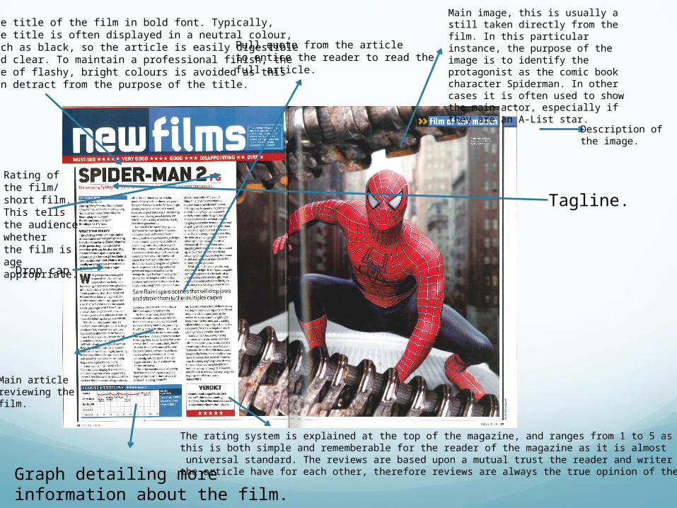
Main image, this is usually a still taken directly from the film. In this particular instance, the purpose of the image is to identify the protagonist as the comic book character Spiderman. In other cases it is often used to show the main actor, especially if they are an A-List star.
Description of the image.
Main article reviewing the film.
The title of the film in bold font. Typically,the title is often displayed in a neutral colour,such as black, so the article is easily digestibleand clear. To maintain a professional finish, theuse of flashy, bright colours is avoided as thiscan detract from the purpose of the title.
The rating system is explained at the top of the magazine, and ranges from 1 to 5 as this is both simple and rememberable for the reader of the magazine as it is almost universal standard. The reviews are based upon a mutual trust the reader and writer ofthe article have for each other, therefore reviews are always the true opinion of the author.
Drop cap
Rating of the film/ short film.This tells the audience whetherthe film is age appropriate.
Pull quote from the articleto entice the reader to read thefull article.
Graph detailing moreinformation about the film.
Tagline.
Summary of the conventions
The purpose is to advise the audience whether or not they want to watch the film
Film reviews do not contain spoilers as this could ruin the film for those who want to go and see it
Images from the film are used, often on a large scale. This is to draw attention to the magazine article as well as provide some relevant visual stimulation to the reader.
The magazines keep to their own 'house-style'. This means the same font, colour and design is consistent throughout.
continued...Usual magazine conventions such as tagline, drop
caps, columned articles, page numbers, release dates ect
Ratings systems- usually either out of 5 or 10
A3 spread with images ordered around the text in a linear format
I intend to follow these conventions when I produce my own ancillary text to make my product look as profes