figure 1.1: map of reservoirs identified as mercury ... · pdf filestatewide mercury control...
TRANSCRIPT

Statewide Mercury Control Program for Reservoirs
Staff Report for Scientific Peer Review (April 2017) Chapter 1 Figures - 1 -
Figure 1.1: Map of reservoirs identified as mercury-impaired on the 2010 303(d) List
Statewide Mercury Control Program for Reservoirs
Staff Report for Scientific Peer Review (April 2017) Chapter 1 Figures - 2 -
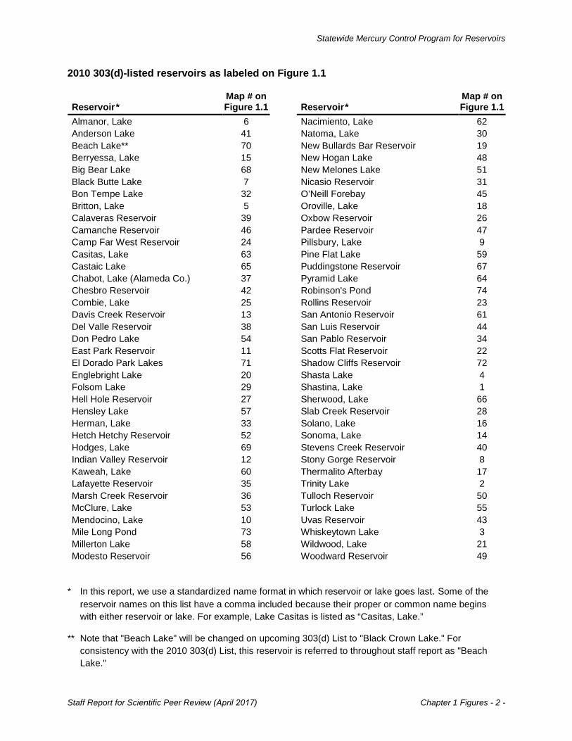
2010 303(d)-listed reservoirs as labeled on Figure 1.1
Reservoir * Map # on Figure 1.1 Reservoir *
Map # on Figure 1.1
Almanor, Lake 6 Nacimiento, Lake 62 Anderson Lake 41 Natoma, Lake 30 Beach Lake** 70 New Bullards Bar Reservoir 19 Berryessa, Lake 15 New Hogan Lake 48 Big Bear Lake 68 New Melones Lake 51 Black Butte Lake 7 Nicasio Reservoir 31 Bon Tempe Lake 32 O’Neill Forebay 45 Britton, Lake 5 Oroville, Lake 18 Calaveras Reservoir 39 Oxbow Reservoir 26 Camanche Reservoir 46 Pardee Reservoir 47 Camp Far West Reservoir 24 Pillsbury, Lake 9 Casitas, Lake 63 Pine Flat Lake 59 Castaic Lake 65 Puddingstone Reservoir 67 Chabot, Lake (Alameda Co.) 37 Pyramid Lake 64 Chesbro Reservoir 42 Robinson's Pond 74 Combie, Lake 25 Rollins Reservoir 23 Davis Creek Reservoir 13 San Antonio Reservoir 61 Del Valle Reservoir 38 San Luis Reservoir 44 Don Pedro Lake 54 San Pablo Reservoir 34 East Park Reservoir 11 Scotts Flat Reservoir 22 El Dorado Park Lakes 71 Shadow Cliffs Reservoir 72 Englebright Lake 20 Shasta Lake 4 Folsom Lake 29 Shastina, Lake 1 Hell Hole Reservoir 27 Sherwood, Lake 66 Hensley Lake 57 Slab Creek Reservoir 28 Herman, Lake 33 Solano, Lake 16 Hetch Hetchy Reservoir 52 Sonoma, Lake 14 Hodges, Lake 69 Stevens Creek Reservoir 40 Indian Valley Reservoir 12 Stony Gorge Reservoir 8 Kaweah, Lake 60 Thermalito Afterbay 17 Lafayette Reservoir 35 Trinity Lake 2 Marsh Creek Reservoir 36 Tulloch Reservoir 50 McClure, Lake 53 Turlock Lake 55 Mendocino, Lake 10 Uvas Reservoir 43 Mile Long Pond 73 Whiskeytown Lake 3 Millerton Lake 58 Wildwood, Lake 21 Modesto Reservoir 56 Woodward Reservoir 49
* In this report, we use a standardized name format in which reservoir or lake goes last. Some of thereservoir names on this list have a comma included because their proper or common name beginswith either reservoir or lake. For example, Lake Casitas is listed as “Casitas, Lake.”
** Note that "Beach Lake" will be changed on upcoming 303(d) List to "Black Crown Lake." For consistency with the 2010 303(d) List, this reservoir is referred to throughout staff report as "Beach Lake."

Statewide Mercury Control Program for Reservoirs
Staff Report for Scientific Peer Review (April 2017) Chapter 3 Figures - 1 -
Figure 3.1: Map of average methylmercury concentrations in top trophic level reservoir fish
This map summarizes average methylmercury concentrations in trophic level (TL) 4 fish (150 mm to 500 mm) in reservoirs and indicates which reservoirs are on the 2010 303(d) List. If TL4 species were not sampled at a particular reservoir, staff calculated the average methylmercury concentration in TL3 species. TL4 species include predator species such as largemouth, smallmouth, and spotted bass, Sacramento pikeminnow, and brown trout. TL3 species include rainbow trout, carp, and bluegill, among others.

Statewide Mercury Control Program for Reservoirs
Staff Report for Scientific Peer Review (April 2017) Chapter 3 Figures - 2 -
Figure 3.2: Plots of average fish methylmercury concentrations in top trophic level reservoir fish
Nearly half of the 348 reservoirs sampled have average fish methylmercury concentrations above the proposed sport fish target. [A] The grey symbols are reservoirs where only TL3 fish were sampled, largely because TL4 species are not resident in many high elevation Sierra Nevada reservoirs. [B] The black triangles are reservoirs in the Coast Range in the San Francisco Bay Region. The grey plus symbols indicate reservoirs that have only one fish sample.

Statewide Mercury Control Program for Reservoirs
Staff Report for Scientific Peer Review (April 2017) Chapter 3 Figures - 3 -
Figure 3.3: Map of watershed boundaries for 303(d)-listed reservoirs
Figure 3.4: Map of state and federal jurisdictional dams [Source: DWR 2010a and 2010b]

Statewide Mercury Control Program for Reservoirs
Staff Report for Scientific Peer Review (April 2017) Chapter 3 Figures - 4 -
Figure 3.5: Map of average annual precipitation [Source: DWR et al. 1994]
Figure 3.6: Map of average July temperature [Source: Hijmans et al. 2005]

Statewide Mercury Control Program for Reservoirs
Staff Report for Scientific Peer Review (April 2017) Chapter 3 Figures - 5 -
Figure 3.7: Map of vegetated areas [Sources: USCB 2012a and 2012b; MRLC 2011; Fry et al. 2011]
Figure 3.8: Map of urbanized and other developed areas The bright pink and blue areas are high population regions. The grey indicates other developed areas such as major and minor roads throughout cultivated areas and other rural areas of the state. [Sources: USCB 2012a and 2012b; MRLC 2011; Fry et al. 2011]

Statewide Mercury Control Program for Reservoirs
Staff Report for Scientific Peer Review (February 2017) Chapter 4 Figures - 1 -
Chapter 4 Conceptual Model: The Mercury Cycle and Bioaccumulation
Section 4. 1 The Mercury Cycle
Figure 4.1: Mercury cycling in reservoirs
The top of the graphic depicts sources of mercury (both natural and anthropogenic) to reservoirs, which are primarily inorganic mercury. Once the mercury is transported to the reservoir some of the mercury is lost back to the atmosphere through evasion and some is transported downstream; however, the majority of the mercury settles in the bottom sediment of the reservoir. The inorganic mercury that remains in the reservoir can be converted to methylmercury by anaerobic sulfate-reducing bacteria in anoxic sediment or in the anoxic hypolimnion (dark blue) during thermal stratification. Some methylmercury is converted back to inorganic mercury through both abiotic and biotic processes, and some of the methylmercury is bioaccumulated up the reservoir’s food web.

Statewide Mercury Control Program for Reservoirs
Staff Report for Scientific Peer Review (February 2017) Chapter 4 Figures - 2 -
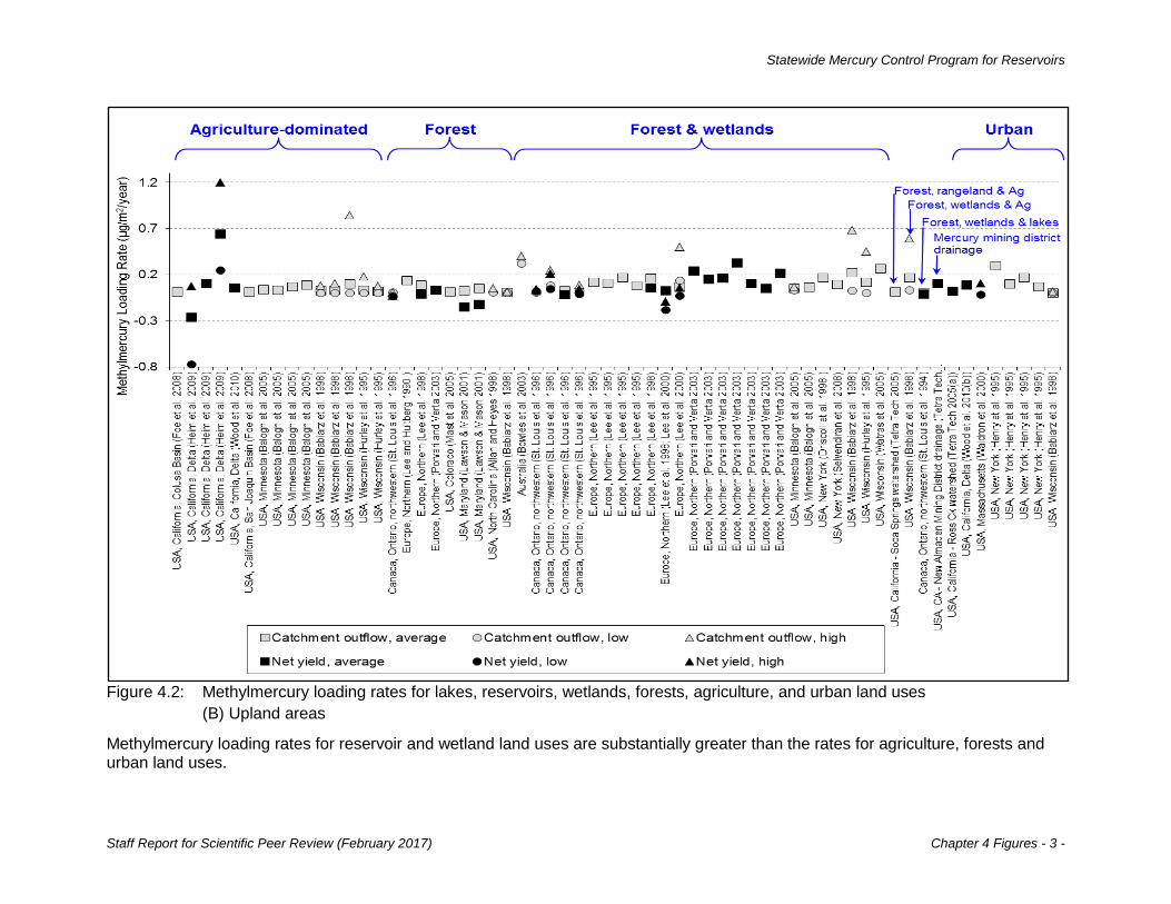
Figure 4.2: Methylmercury loading rates for lakes, reservoirs, wetlands, forests, agriculture, and urban land uses
(A) Lakes, reservoirs, and wetlands
Methylmercury loading rates from reservoir and wetland land uses are substantially greater than the rates from agriculture, forests and urban.
Statewide Mercury Control Program for Reservoirs
Staff Report for Scientific Peer Review (February 2017) Chapter 4 Figures - 3 -
Figure 4.2: Methylmercury loading rates for lakes, reservoirs, wetlands, forests, agriculture, and urban land uses
(B) Upland areas
Methylmercury loading rates for reservoir and wetland land uses are substantially greater than the rates for agriculture, forests and urban land uses.

Statewide Mercury Control Program for Reservoirs
Staff Report for Scientific Peer Review (February 2017) Chapter 4 Figures - 4 -
Section 4.2 Bioaccumulation
Figure 4.3: Food chain biomagnification of methylmercury
The single largest increase in methylmercury concentration in the aquatic environment is from water to algae at the base of the food web. The highest concentrations of methylmercury occur in the top trophic level fish, and these pose the greatest risk to human and wildlife fish consumers. One can deduce that adding additional levels to the food web could greatly magnify methylmercury concentrations in the upper trophic levels. Thus, food web dynamics greatly affects methylmercury accumulation in reservoirs.
[Source: Figure 5-7 in Tetra Tech 2005a]
Figure 4.4: Relationship between mercury concentrations in California roach and unfiltered
methylmercury concentrations in water samples in the Guadalupe River Watershed
A strong positive correlation was found between stream aqueous methylmercury concentrations and resident roach methylmercury concentrations in the Guadalupe River Watershed. [Source: Figure 3-28 in Tetra Tech 2005a]

Statewide Mercury Control Program for Reservoirs
Staff Report for Scientific Peer Review (February 2017) Chapter 4 Figures - 5 -
Figure 4.5: Plot of San Joaquin River small fish mercury concentrations and
aqueous methylmercury concentrations
This graph illustrates increases in small fish methylmercury (MeHg) concentrations following increases in aqueous MeHg concentrations. This compares average MeHg concentrations in juvenile, small (45 – 75 mm) Mississippi silverside fish to monthly aqueous MeHg concentrations collected from the San Joaquin River at Vernalis. An extreme increase in small fish MeHg concentrations was seen in July 2006 following a May 2006 spike in aqueous MeHg. MeHg concentrations in juvenile silverside averaged 0.24 mg/kg at Vernalis (Slotton et al. 2007, page 59). (MeHg concentrations in other species of small fish also spiked; spikes in aqueous and small fish methylmercury also occurred in the Cosumnes River.) Both fish and aqueous MeHg levels decreased to nearly pre-flood levels by September.
[Sources: Foe et al. 2008, Figure 13; water data from Foe et al. 2008; small fish data from Slotton et al. 2007]
Silv
ersi
de M
eHg
Wat
er M
eHg
(ng/
L)
0.30
0.25
0.20
0.15
0.10
0.05
0
0.8
0.7
0.6
0.5
0.4
0.3
0.2
0.1
0

Statewide Mercury Control Program for Reservoirs
Staff Report for Scientific Peer Review (February 2017) Chapter 4 Figures - 6 -
Figure 4.6: Fitted line plot for Lake Oroville length-normalized spotted bass
methylmercury concentrations versus sediment methylmercury concentrations
A strong positive correlation was found between natural logarithm transformed sediment methylmercury concentrations and length normalized (MeHg mg/kg/mm) spotted bass methylmercury concentrations collected from the same arms of Lake Oroville in a California Department of Water Resources fish and sediment contaminant study (DWR 2006). The correlation suggests that Lake Oroville food web methylmercury bioaccumulation is highly influenced by in-lake production of methylmercury.

Statewide Mercury Control Program for Reservoirs
Staff Report for Scientific Peer Review (February 2017) Chapter 4 Figures - 7 -
Section 4.3 The Mercury Cycle Particular to Reservoirs
Figure 4.7: A cartoon illustrating the effect of reservoir flooding on terrestrial ecosystems
The “Before” graphic depicts an environment with a high gradient, fast flowing river that is shaded, cold, turbulent, and well oxygenated. The “After” graphic displays how the reservoir environment has slowed, warmed, and changed water chemistry. The flooding of terrestrial soils creates conditions that enhance mercury methylation. The warmed water of the reservoir allows non-native warm water fisheries to exist. These warm water predatory fish tend to bioaccumulate higher levels of methylmercury than native cold water fish species.
After
Before

Statewide Mercury Control Program for Reservoirs
Staff Report for Scientific Peer Review (February 2017) Chapter 4 Figures - 8 -
Figure 4.8: Annual hydrologic cycle in reservoirs: temperature, dissolved oxygen, and
methylmercury
(A) From early fall through early spring, the reservoir water temperature is fairly uniform throughout the water column, and water mixes.
(B) Warm summer air temperatures create a temperature gradient within the reservoir. The difference between the temperature of the surface and bottom reservoir water creates density gradients that resist vertical mixing. Oxygen is depleted in the deep waters from respiration and organic carbon decomposition. These anoxic conditions stimulate mercury methylation, and methylmercury builds up in the unmixed deep waters.
(C) During late summer, cooling air temperatures cool reservoir surface waters. The decreasing temperature gradient between the surface and bottom waters allows the waters to mix. The accumulated methylmercury in the bottom water becomes distributed throughout the water column, where it is available to enter the food web.
[Source: Figure 5-13 in Tetra Tech 2005a]

Statewide Mercury Control Program for Reservoirs
Staff Report for Scientific Peer Review (February 2017) Chapter 4 Figures - 9 -
ORP (mV) Electron Acceptor Redox Condition
+700 to +400 Oxygen (O2) Oxidized
+400 to +300 Nitrate (NO3-) Moderately reduced
+200 to +100 Manganese (Mn4+) Moderately reduced
+100 to -100 Iron (Fe3+) Reduced
-100 to -200 Sulfate (SO42-) Reduced
-200 to -300 Methane production (CO2) Highly reduced Figure 4.9: Oxidation reduction potential (ORP) scale and ranges where reduction becomes
thermodynamically preferred for some common chemicals
This matrix illustrates the ecological oxidation-reduction (redox) sequence from oxygen to nitrate, manganese, iron, sulfate, and finally to methanogenesis. These electron receptors are listed in the second column and redox potential (ORP) is listed in the first column. Before stratification, reservoir conditions start at the first row in aerobic conditions, i.e., when oxygen is present and the redox potential is above 400 millivolts (mV). As oxygen, then nitrate, manganese, and iron are depleted, the redox potential drops, as indicated by reading from top to bottom. Significantly, methylmercury is primarily produced by anaerobic sulfate-reducing bacteria.
[Source: Delaune and Reddy 2005]

Statewide Mercury Control Program for Reservoirs
Staff Report for Scientific Peer Review (February 2017) Chapter 4 Figures - 10 -
Figure 4.10: Plot of methylmercury concentrations in anadromous and land-locked Chinook
This plot shows methylmercury concentrations in land-locked Chinook salmon in California reservoirs (red squares on the left) and in anadromous Chinook salmon in California rivers (blue circles on the right). Land-locked Chinook are smaller and have much higher mercury levels than anadromous Chinook. Anadromous fisheries are being restored for many reasons, and a positive outcome of that effort is lower fish methylmercury levels.
Sport Fish Water Quality Target
Anadromous and Land-Locked Chinook Salmon Length to MeHg Concentration
Statewide Mercury Control Program for Reservoirs
Staff Report for Scientific Peer Review (April 2017) Chapter 5 Figures - 1 -
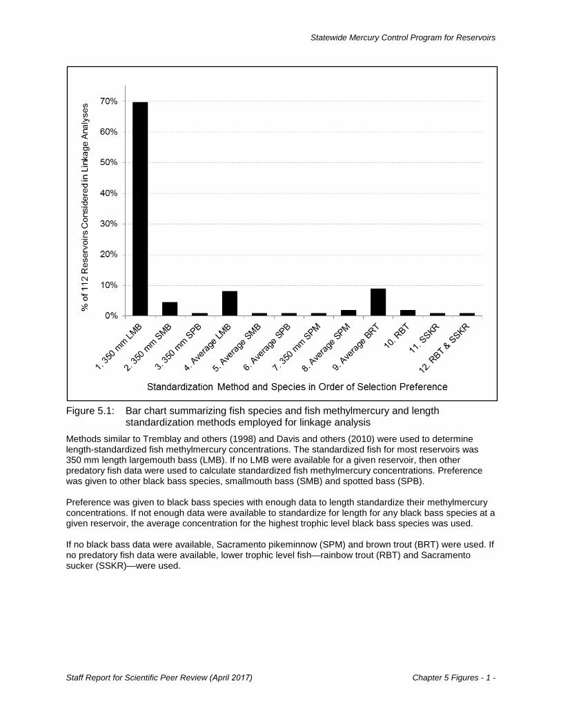
Figure 5.1: Bar chart summarizing fish species and fish methylmercury and length standardization methods employed for linkage analysis
Methods similar to Tremblay and others (1998) and Davis and others (2010) were used to determine length-standardized fish methylmercury concentrations. The standardized fish for most reservoirs was 350 mm length largemouth bass (LMB). If no LMB were available for a given reservoir, then other predatory fish data were used to calculate standardized fish methylmercury concentrations. Preference was given to other black bass species, smallmouth bass (SMB) and spotted bass (SPB).
Preference was given to black bass species with enough data to length standardize their methylmercury concentrations. If not enough data were available to standardize for length for any black bass species at a given reservoir, the average concentration for the highest trophic level black bass species was used.
If no black bass data were available, Sacramento pikeminnow (SPM) and brown trout (BRT) were used. If no predatory fish data were available, lower trophic level fish—rainbow trout (RBT) and Sacramento sucker (SSKR)—were used.

Statewide Mercury Control Program for Reservoirs
Staff Report for Scientific Peer Review (April 2017) Chapter 5 Figures - 2 -
Figure 5.2: Plot of correlation between standardized fish mercury concentrations and the average fish mercury concentrations in legal-sized top trophic level fish (length 200 – 500 mm TL4 or 150 – 500 mm TL3) for reservoirs in the Linkage Analysis
The correlation between standardized fish methylmercury (MeHg) concentrations and average MeHg concentrations in legal-sized TL4 fish is statistically significant (n = 107 reservoirs, R2 = 0.82). Note that the size of TL4 standardized fish (150 – 500 mm) differs slightly from size used for Statewide Water Quality Objective and sport fish target (200 – 500 mm).

Statewide Mercury Control Program for Reservoirs
Staff Report for Scientific Peer Review (April 2017) Chapter 5 Figures - 3 -
Figure 5.3: Plot of correlation between standardized fish methylmercury concentrations and geomean sediment mercury concentrations in California reservoirs
This graph plots geomean sediment total mercury (THg) concentrations against standardized fish methylmercury (MeHg) concentrations in California reservoirs, both with log scales. The black boxes are reservoirs where their sediment THg concentrations are comparable to natural background. The red circles are reservoirs with elevated mercury from mines and atmospheric deposition. Reservoirs in different parts of the state have different natural background levels of mercury. See Chapter 6 (section 6.2) for a review of natural (pre-industrial) and modern background mercury concentrations in soils and sediments throughout California.
There is a statistically significant correlation between standardized fish MeHg and sediment THg (n = 62 reservoirs, adjusted R2 = 0.227, p < 0.001). However, there is substantial fish MeHg variability not explained by sediment THg concentrations. There can be high fish MeHg in reservoirs where there is low sediment THg, low fish MeHg where there is high sediment THg, and reservoirs where there is extensive mercury contamination but the fish MeHg are not as high as we would expect from the high sediment THg concentrations. Further, there are many reservoirs with sediment THg concentrations comparable to natural background that have fish MeHg levels that exceed the sport fish water quality target (0.2 mg/kg). In summary, this plot illustrates how multiple factors are at play, more than just mercury pollution sources and associated sediment mercury concentrations.
0.01
0.1
1
10
0.001 0.01 0.1 1 10
Stan
dard
ized
Fis
h [M
eHg]
(mg/
kg)
Reservoir Sediment [THg] (mg/kg)
Reservoirs with elevated mercury from mines and atmospheric deposition
Reservoirs with sediment mercury levels comparable to natural background,i.e., no measurable anthropogenic mercury sourcesFish target of 0.2 mg/kg
LN[Fish MeHg] = - 0.3158 + 0.3134*LN[Sediment THg]
wide range of background sediment [THg] across CA
Clear Lake

Statewide Mercury Control Program for Reservoirs
Staff Report for Scientific Peer Review (April 2017) Chapter 6 Figures - 1 -
Figure 6.1: Statewide map of historic mercury mining districts, mercury mine sites, and geologic formations where naturally mercury-enriched soils may occur
The names of the numbered major and minor mercury mining districts are listed on the following page.
[Sources: CDOC-DMG 2000; USBM 1965, Figure 7; USGS 2008]

Statewide Mercury Control Program for Reservoirs
Staff Report for Scientific Peer Review (April 2017) Chapter 6 Figures - 2 -
Mercury Mining Districts in California as Labeled on Figure 6.1 Map Code Name Type
Map Code Name Type
1 Clear Lake Major 21 Skaggs Springs Minor 2 Wilbur Springs Major 22 Petaluma Minor 3 Knoxville Major 23 Del Puerto – Orestimba Minor 4 East Mayacmas Major 24 Bryson & San Capoforo Minor 5 West Mayacmas Major 25 Pine Mt Minor 6 Guerneville Major 26 Diamond Creek Minor 7 Oakville Major 27 Patrick Creek Minor 8 Sulphur Springs Mt Major 28 Klamath River Minor 9 Mount Diablo Major 29 Alturas Minor
10 Emerald Lake Major 30 Altoona Minor 11 New Almaden Major 31 New River Minor 12 Stayton Major 32 Mill Creek Minor 13 Central San Benito Major 33 Clover Creek Minor 14 New Idria Major 34 Occident Minor 15 Parkfield Major 35 Nashville Minor 16 Cambria – Oceanic Major 36 Mogul Minor 17 Adelaide Major 37 Bridgeport Minor 18 Rinconada Major 38 Coso Minor 19 Cachuma Major 39 Tehachapi Minor 20 Los Prietos Major 40 Tustin Minor
41 San Bernardino County Minor

Statewide Mercury Control Program for Reservoirs
Staff Report for Scientific Peer Review (April 2017) Chapter 6 Figures - 3 -
Figure 6.2: Statewide map of quicksilver (mercury) mineralized provinces in California identified in 1939 “Economic Mineral Map of California No. 1–Quicksilver”
The “districts known to be mineralized with quicksilver” (solid red) and “principal areas underlain by the Jurassic Franciscan Formation” (red hatching) mapped on the California Division of Mines’ “Economic Mineral Map of California No. 1 – Quicksilver” indicate the areas in California where naturally mercury-enriched soils may occur. [Source: Jenkins 1939]

Statewide Mercury Control Program for Reservoirs
Staff Report for Scientific Peer Review (April 2017) Chapter 6 Figures - 4 -
Figure 6.3: Statewide map showing the delineation of the naturally mercury-enriched region compared to 2010 303(d)-listed mercury-impaired reservoir watershed boundaries
Water Board staff based the delineation of the naturally mercury-enriched region primarily on the “Quicksilver Mineral Provinces” mapped on the California Division of Mines’ “Economic Mineral Map of California No. 1 – Quicksilver” (Jenkins 1939). The location of historic mercury mining districts (USBM 1965), historic mercury mine sites (USGS 2005), surface geology (CDOC-DMG), and background soil mercury concentrations (USGS 2008) also guided the delineation.

Statewide Mercury Control Program for Reservoirs
Staff Report for Scientific Peer Review (April 2017) Chapter 6 Figures - 5 -
Figure 6.4: Chart illustrating natural (pre-industrial) and background soil mercury levels based on dated sediment core and soil mercury concentrations
Natural background levels are based on average mercury concentrations observed in dated lake and estuary sediment cores. Modern background levels are based on average surface sediment mercury concentrations observed in lakes and reservoirs and the 95th percentile mercury concentrations observed in soils.

Statewide Mercury Control Program for Reservoirs
Staff Report for Scientific Peer Review (April 2017) Chapter 6 Figures - 6 -
Figure 6.5: Chart comparing 2010 303(d)-listed reservoir sediment average and individual sample mercury concentrations compared to background levels

Statewide Mercury Control Program for Reservoirs
Staff Report for Scientific Peer Review (April 2017) Chapter 6 Figures - 7 -
Figure 6.6: Statewide maps showing the locations of historic mercury, gold, and silver mines identified in the MRDS with the watershed boundaries of the 2010 303(d)-listed reservoirs
[Source: Mineral Resources Data System (MRDS), USGS 2005]
C. MRDS Silver
A. MRDS Mercury B. MRDS Gold

Statewide Mercury Control Program for Reservoirs
Staff Report for Scientific Peer Review (April 2017) Chapter 6 Figures - 8 -
Figure 6.7: Statewide maps showing the locations of historic mercury, gold, and silver mines identified in the Principal Areas of Mine Pollution (PAMP) database with the watershed boundaries of the 2010 303(d)-listed reservoirs
[Source: Principal Areas of Mine Pollution database, OMR 2000]
A. All Mercury, Gold and Silver Mines Identified in PAMPB. Mercury, Gold and Silver Mines with Potential Mercury Pollution
Described in PAMP

Statewide Mercury Control Program for Reservoirs
Staff Report for Scientific Peer Review (April 2017) Chapter 6 Figures - 9 -
Figure 6.8: Statewide map of dredge and placer tailings and diggings identified in the California Department of Conservation’s Topographically Occurring Mine Symbols (TOMS) Data Set
The boundaries of dredge and placer tailings are thickened to better show their locations. [Source: OMR 2001]

Statewide Mercury Control Program for Reservoirs
Staff Report for Scientific Peer Review (April 2017) Chapter 6 Figures - 10 -
Figure 6.9: Charts illustrating watershed mercury, gold, and silver mine site density, and estimates of historic gold and silver production and associated mercury loss in 2010 303(d)-listed reservoir watersheds
Charts A and B illustrate the number of historic mercury, gold, and silver mines and other mine features (prospects and occurrences) identified by the USGS’s Mineral Resources Data System (MRDS, USGS 2005) in each 303(d)-listed reservoir watershed. Chart C illustrates estimates of gold and silver production compiled by the USGS’s Database of Significant Deposits of Gold, Silver, Copper, Lead, and Zinc in the United States (Long et al. 1998; note, this database does not include mercury production information). The 303(d)-listed reservoir watersheds are charted from north to south within each geographic region noted with green brackets. The blue brackets indicate 303(d)-listed reservoirs that are in the same watershed; the reservoirs are charted from downstream to upstream within a given watershed.
Lake Berryessa and Lake Solano in the Putah Creek watershed had by far the most upstream historic mercury mining features of any of the 303(d)-listed reservoirs, with over 100 MRDS mercury mining features. In contrast, many 303(d)-listed reservoirs in the Sierra Nevada region have hundreds to thousands of MRDS gold and silver mining features. In some watersheds, the most production is associated with placer gold mining (e.g., Lake Natoma and Folsom Lake in the American River watershed). In other watersheds, the most production is associated with lode mining of gold (e.g., Camp Far West) and silver (e.g., Shasta Lake). A comparison of Charts B and C indicates the MRDS database sometimes identifies mine features in watersheds where the USGS’s Database of Significant Deposits does not identify any significant production, but the number of MRDS features is usually low in such watersheds. However, relatively high production occurred in watersheds where there were relatively few MRDS mine features. This indicates that the number of MRDS mine features may not be a good surrogate for the amount of production in a given watershed.

Statewide Mercury Control Program for Reservoirs
Staff Report for Scientific Peer Review (April 2017) Chapter 6 Figures - 11 -
Figure 6.9, continued
Chart D illustrates the watershed density of gold and silver production (production amount per unit watershed area, shown by vertical bars) compared to the watershed mine site density (number of MRDS productive mines, shown by dashes, and other MRDS features, shown by circles). Reservoirs with watersheds with high production density and mine site density are likely to be more contaminated. Camp Far West, Combie, Rollins, and Wildwood have high upstream production densities and watershed mine site densities. In contrast, Shasta, which had a high production amount in its watershed (Chart C), has a low production density and mine site density because of the immensity of its watershed area. This indicates the potential for more watershed supply of native soils and sediments that could mix with and dilute or bury contamination associated with historic mining. Also, the mine site density and production density generally track together. However there are some exceptions. For example, New Hogan Reservoir has comparatively low production given its high mine site density, and Lake Berryessa has comparatively high production given its low mine site density.

Statewide Mercury Control Program for Reservoirs
Staff Report for Scientific Peer Review (April 2017) Chapter 6 Figures - 12 -
Figure 6.9, continued
Chart E provides estimates of historic mercury loss from gold and silver mining (bars) along with watershed densities of mercury loss (dashes) for each 303(d)-listed reservoir. For some reservoir watersheds, mercury loss estimates are greater than expected from gold and silver production amounts in Chart C (e.g., Tulloch and Don Pedro), while for others the mercury loss estimates are less than expected (e.g., Lake Berryessa). This is because the loss estimates consider another key factor for evaluating the level of contamination in a watershed: the type and time period of mining activities. Mercury losses were greater with placer mining than lode mining, and loss rates for both decreased with time as new mining methods were developed (Churchill 2000). Water Board staff used estimated mercury loss amounts provided by Alpers and others (2014) and Churchill (2000) for placer and lode mining districts identified in the USGS Database of Significant Deposits (Long et al. 1998) to estimate mercury loss upstream of 303(d)-listed reservoirs. High watershed mercury loss densities indicate the potential for particularly elevated contamination in reservoir sediments. The chart shows how some watersheds had both high mercury loss and high watershed densities of mercury loss (e.g., Englebright, New Bullards Bar, Camp Far West, Tulloch, and New Melones), and others had low mercury loss but high watershed loss density (e.g., Wildwood, Combie, and Rollins). The chart also shows how some reservoirs may not have had a high watershed production density, but could have elevated watershed mercury loss densities because of extensive historic placer mining (e.g., Englebright, New Bullards Bar, Natoma, Folsom, Tulloch, New Melones, and Don Pedro).

Statewide Mercury Control Program for Reservoirs
Staff Report for Scientific Peer Review (April 2017) Chapter 6 Figures - 13 -
Figure 6.10: Pie chart illustrating estimates of mercury emissions for 2008 from natural processes
Emissions from natural processes include primary natural mercury emissions plus re-emissions of historic deposition originating from natural and anthropogenic sources. [Source: Pirrone et al. 2010]

Statewide Mercury Control Program for Reservoirs
Staff Report for Scientific Peer Review (April 2017) Chapter 6 Figures - 14 -
Figure 6.11: Time series of estimated historic anthropogenic mercury emissions from North America and modern anthropogenic mercury emissions from North America and other continents
This figure shows estimated historic and modern anthropogenic mercury emissions into the atmosphere from North America beginning in 1800, and for the rest of the world beginning in 1990. The grey line shows that North American mercury emissions into the atmosphere peaked before 1890 as a result of gold and silver production. The black line shows the steady increase in industrial emissions from North America. The open circles show that since 1990, North American regulations including the U.S. Clean Air Act have measurably reduced emissions. However, the black squares show that emissions from Asia have increased in recent years and are far greater than mercury emissions from North America. [Sources: Pirrone et al. 1998; USEPA 2008b; Pacyna et al. 2002, 2006, and 2010]

Statewide Mercury Control Program for Reservoirs
Staff Report for Scientific Peer Review (April 2017) Chapter 6 Figures - 15 -
Figure 6.12: Pie charts illustrating estimates of anthropogenic mercury emissions in 2005 from global, United States, and California sources
[Sources: AMAP/UNEP 2008; Pacyna et al. 2010; USEPA 2012a; USEPA 2012b, Table 7; USEPA 2008a, Table 4-3; ICF 2011]

Statewide Mercury Control Program for Reservoirs
Staff Report for Scientific Peer Review (April 2017) Chapter 6 Figures - 16 -
Figure 6.13: Bar chart showing trends in California and United States anthropogenic mercury emissions by sector
Green stars highlight emission sectors that have experienced substantial reductions. [Sources: USEPA 2012a; USEPA 2012b, Table 7; USEPA 2008a, Table 4-3; ICF 2011]

Statewide Mercury Control Program for Reservoirs
Staff Report for Scientific Peer Review (April 2017) Chapter 6 Figures - 17 -
Figure 6.14: Bar chart showing trends in California anthropogenic mercury emissions by major emission type
California mercury emissions decreased by more than 50% between 2001 and 2008. Some emissions types, such as Portland cement production, vary from year to year as a result of changes in economic demand. Others, such as municipal waste incineration, have had substantial reductions due to implementing emission controls. [Sources: USEPA 2012a; ICF 2011]

Statewide Mercury Control Program for Reservoirs
Staff Report for Scientific Peer Review (April 2017) Chapter 6 Figures - 18 -
Figure 6.15: Statewide map of top 50 mercury emitting facilities in the 2001 facility emissions inventory
The 50 facilities with the highest mercury emissions accounted for about 90% or more of all facility emissions in 2001, 2002, 2005, and 2008. Emissions from cement manufacturing, geothermal power production, and petroleum industry facilities within the top 50 reporting facilities account for about 60–80% of all annual statewide facility emissions. As this map of the top 50 emitting facilities in 2001 shows, many are clustered in the northern Coast Range northeast of Santa Rosa, San Francisco Bay area, Bakersfield area, and Los Angeles area. [Sources: USEPA 2008a; ICF 2011]

Statewide Mercury Control Program for Reservoirs
Staff Report for Scientific Peer Review (April 2017) Chapter 6 Figures - 19 -
Figure 6.16: Statewide map of atmospheric mercury deposition monitoring sites in California and western Nevada
Several short-term monitoring studies and one long-term monitoring program have evaluated atmospheric mercury in wet deposition at 13 sites in California and dry deposition at 7 sites in California. No monitoring data are available for northern inland California, northern and central Sierra Nevada, and southeastern California.

Statewide Mercury Control Program for Reservoirs
Staff Report for Scientific Peer Review (April 2017) Chapter 6 Figures - 20 -
Figure 6.17: Statewide maps of REMSAD 2001 model output for total, wet and dry atmospheric deposition of mercury in California
C. Dry Deposition
B. Wet DepositionA. Total Deposition
D. Ratio of Dry Deposition to Total Deposition

Statewide Mercury Control Program for Reservoirs
Staff Report for Scientific Peer Review (April 2017) Chapter 6 Figures - 21 -
Figure 6.18: Statewide maps of REMSAD 2001 model output for atmospheric deposition of mercury in California attributed to anthropogenic emissions from California, United States, Canada, and Mexico
Note changes in color scale for each of maps A–D. The magnitude of deposition is different for the different source regions. For example, deposition attributed to anthropogenic emissions from other states (map B) peaks (red) at less than 0.3 g/km2/year. In contrast, deposition attributed to anthropogenic emissions within California (map A) peaks (red) at 100 times greater, at 30 g/km2/year.
B. Other United States
D. Mexico
A. California
C. Canada

Statewide Mercury Control Program for Reservoirs
Staff Report for Scientific Peer Review (April 2017) Chapter 6 Figures - 22 -
Figure 6.19: Statewide maps of REMSAD 2001 model output for atmospheric deposition of mercury in California attributed to 2000 emissions from global background sources and re-emission of previously deposited mercury (from a combination of natural and anthropogenic sources)
Global background sources do not include anthropogenic emissions from the United States, Canada, and Mexico in 2001, but may include mercury emitted from anthropogenic sources in these countries in 2000. Re-emission of previously deposited mercury includes mercury from natural and anthropogenic sources.
A. Deposition attributed to globalbackground emissions
B. Deposition attributed to re-emission ofpreviously deposited mercury

Statewide Mercury Control Program for Reservoirs
Staff Report for Scientific Peer Review (April 2017) Chapter 6 Figures - 23 -
Figure 6.20: Map of REMSAD 2001 model output for total atmospheric deposition of mercury throughout the United States
[Source: USEPA 2008a, Figure 6-3c]

Statewide Mercury Control Program for Reservoirs
Staff Report for Scientific Peer Review (April 2017) Chapter 6 Figures - 24 -
Figure 6.21: Statewide map showing the ratio of atmospheric mercury deposition attributed by REMSAD to all sources except 2001 California anthropogenic sources to total deposition
The dark green areas illustrate where the REMSAD model attributes almost all the mercury deposition to California anthropogenic emissions, while the light green, yellow, orange, and red areas illustrate where the model attributes most of the deposition to natural and global sources. The model indicates that most of the mercury deposited in the state does not come from anthropogenic emissions in the state.
The black lines outline areas where REMSAD modeled atmospheric deposition exceeds 20 g/km2/year. The model attributes the elevated mercury deposition in the southeastern portion of the state primarily to global and natural sources. REMSAD attributes the elevated mercury deposition in other areas of the state to anthropogenic emissions from within the state.

Statewide Mercury Control Program for Reservoirs
Staff Report for Scientific Peer Review (April 2017) Chapter 6 Figures - 25 -
Figure 6.22: Statewide maps of REMSAD 2001 model output for atmospheric mercury deposition tagged to particular California emissions
These maps illustrate where the REMSAD model attributes mercury deposition to specific California anthropogenic emissions, and where such deposition coincides with the location of 2010 303(d)-listed reservoirs and their watershed boundaries, and other reservoirs with elevated fish methylmercury concentrations.
A. The Geysers Unites 13 & 16 B. Sierra Army Depot

Statewide Mercury Control Program for Reservoirs
Staff Report for Scientific Peer Review (April 2017) Chapter 6 Figures - 26 -
Figure 6.22: Statewide maps of REMSAD 2001 model output for atmospheric mercury deposition tagged to particular California emissions, continued
C. Long Beach SERRF D. Cement Plants

Statewide Mercury Control Program for Reservoirs
Staff Report for Scientific Peer Review (April 2017) Chapter 6 Figures - 27 -
Figure 6.22: Statewide maps REMSAD 2001 model output for atmospheric mercury deposition tagged to particular California emissions, continued
E. All Other California Anthropogenic Emissions

Statewide Mercury Control Program for Reservoirs
Staff Report for Scientific Peer Review (April 2017) Chapter 6 Figures - 28 -
Figure 6.23: Statewide map showing the ratio of atmospheric deposition attributed by REMSAD to 2001 California anthropogenic emissions to total deposition
The black lines outline “California emissions hotspots” where the REMSAD model attributes more than 20% of all deposition to California anthropogenic emissions. Reducing California emissions could make a substantial, measurable reduction in atmospheric deposition to these areas. Almost a third of the 2010 303(d)-listed reservoirs or their watersheds intersect a California emissions hotspot. There are five reservoirs where REMSAD attributes more than 50% of atmospheric deposition to California anthropogenic emissions: Davis Creek Reservoir, Indian Valley Reservoir (hotspot #3), Lake Herman (hotspot #4), El Dorado Park Lakes, and Puddingstone Reservoir (hotspot #11)

Statewide Mercury Control Program for Reservoirs
Staff Report for Scientific Peer Review (April 2017) Chapter 6 Figures - 29 -
Figure 6.24: Bar charts of the percent of 2010 303(d)-listed reservoir watersheds [A] within 2010 Census-designated Urbanized Areas and Urban Clusters and [B] classified as developed by the 2006 National Land Cover Database
[Sources: MRLC 2011; Fry et al. 2011; USCB 2012a and 2012b]

Statewide Mercury Control Program for Reservoirs
Staff Report for Scientific Peer Review (April 2017) Chapter 6 Figures - 30 -
Figure 6.25: Pie charts illustrating the number of NPDES-permitted facility dischargers and sum of design flows by facility type throughout California
Municipal WWTPs
Municipal WWTPs
Power Plants

Statewide Mercury Control Program for Reservoirs
Staff Report for Scientific Peer Review (April 2017) Chapter 6 Figures - 31 -
Figure 6.26: Pie charts illustrating the number of NPDES-permitted facilities and sum of permitted facility discharge volumes (design flows) by receiving water location, with and without power plant noncontact cooling water releases
Statewide Mercury Control Program for Reservoirs
Staff Report for Scientific Peer Review (April 2017) Chapter 6 Figures - 32 -
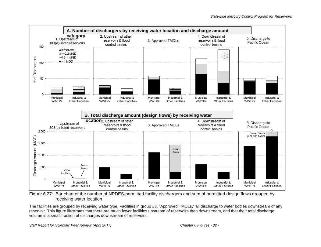
Figure 6.27: Bar chart of the number of NPDES-permitted facility dischargers and sum of permitted design flows grouped by receiving water location
The facilities are grouped by receiving water type. Facilities in group #3, “Approved TMDLs,” all discharge to water bodies downstream of any reservoir. This figure illustrates that there are much fewer facilities upstream of reservoirs than downstream, and that their total discharge volume is a small fraction of discharges downstream of reservoirs.
B. Total discharge amount (design flows) by receiving waterlocation
A. Number of dischargers by receiving water location and discharge amountcategory

Statewide Mercury Control Program for Reservoirs
Staff Report for Scientific Peer Review (April 2017) Chapter 6 Figures - 33 -
Figure 6.28: Box plot of effluent total mercury concentrations for four types of NPDES-permitted facility discharges
This figure summarizes effluent total mercury concentrations for four significantly different types of discharge (Kruskal-Wallis test, p<0.001): municipal wastewater treatment plants (Mun WWTPs), municipal combined stormwater sewer systems (Mun CSSS), petroleum refineries (Petro Refinery), and other types of facilities (Other). The boxes illustrate the interquartile ranges (25th and 75th percentiles). The middle horizontal lines indicate the medians. The asterisks illustrate outliers.
Efflu
ent T
Hg C
once
ntra
tion
(ng/
L)
4. Other3. Petro Refinery2. Mun CSSS1. Mun WWTP
400
300
200
100
0

Statewide Mercury Control Program for Reservoirs
Staff Report for Scientific Peer Review (April 2017) Chapter 6 Figures - 34 -
Figure 6.29: Statewide map of NPDES-permitted discharges from facilities with individual NPDES permits in 2010 303(d)-listed reservoir watersheds
This map shows only the facilities that discharge within the 303(d)-listed reservoirs’ watersheds.

Statewide Mercury Control Program for Reservoirs
Staff Report for Scientific Peer Review (April 2017) Chapter 6 Figures - 35 -
Figure 6.30: Pie charts illustrating the number of NPDES-permitted facility dischargers and sum of design flows by facility type in 2010 303(d)-listed reservoir watersheds

Statewide Mercury Control Program for Reservoirs
Staff Report for Scientific Peer Review (April 2017) Chapter 6 Figures - 36 -
Figure 6.31: Bar chart comparing sum of NPDES-permitted facility design flows and total mercury loads to 2010 303(d)-listed reservoir inflows and REMSAD modelled atmospheric deposition

Statewide Mercury Control Program for Reservoirs
Staff Report for Scientific Peer Review (April 2017) Chapter 6 Figures - 37 -
Figure 6.32: Pie chart illustrating the different combinations of sources that contribute to each of the 2010 303(d)-listed reservoirs
The pie chart represents 74 303(d)-listed reservoirs. Mining waste contributes to almost two thirds of the reservoirs. Atmospheric deposition is the primary anthropogenic mercury source to more than a third of the reservoirs, and global industrial emissions are the primary anthropogenic source to more than half of these.

Statewide Mercury Control Program for Reservoirs
Staff Report for Scientific Peer Review (April 2017) Chapter 7 Figures - 1 -
Figure 7.1: Chart illustrating mercury reductions in biota observed after mercury source controls at industrial sites
This chart illustrates 11 industrial sites from around the world that used source control to address mercury pollution. The left hand (grey) columns are before cleanup, the right hand (black) columns are after cleanup. “Multiple Controls” means source reduction and one or more other measures, such as dredging, excavation, or groundwater treatment, were used at these sites. On the right, “Only Source Control” was used at these sites. Fish methylmercury results are provided for two species or sizes at three of the sites, Pinchi Lake, Ball Lake and Lake Kirkkojarvi; Dungeness crab not fish results are provided for Howe Sound.
Substantial biota methylmercury reductions were achieved at all these sites. However, only one of these is a mine site. In addition, the proposed sport fish target of 0.2 mg/kg was achieved in fish tissue at only one of these sites, Pinchi Lake, in a lower trophic level species (lake whitefish) and not in lake trout; it also was achieved in Dungeness crab at Howe Sound.
[Sources: Armstrong and Scott 1979; Azimuth Consulting Group Inc. 2008; Lindestrom 2001; Lodenius 1991; Parks and Hamilton 1987; Southworth et al. 2000; Takizawa 2000; Turner and Southworth 1999]
Statewide Mercury Control Program for Reservoirs
Staff Report for Scientific Peer Review (April 2017) Chapter 7 Figures - 2 -
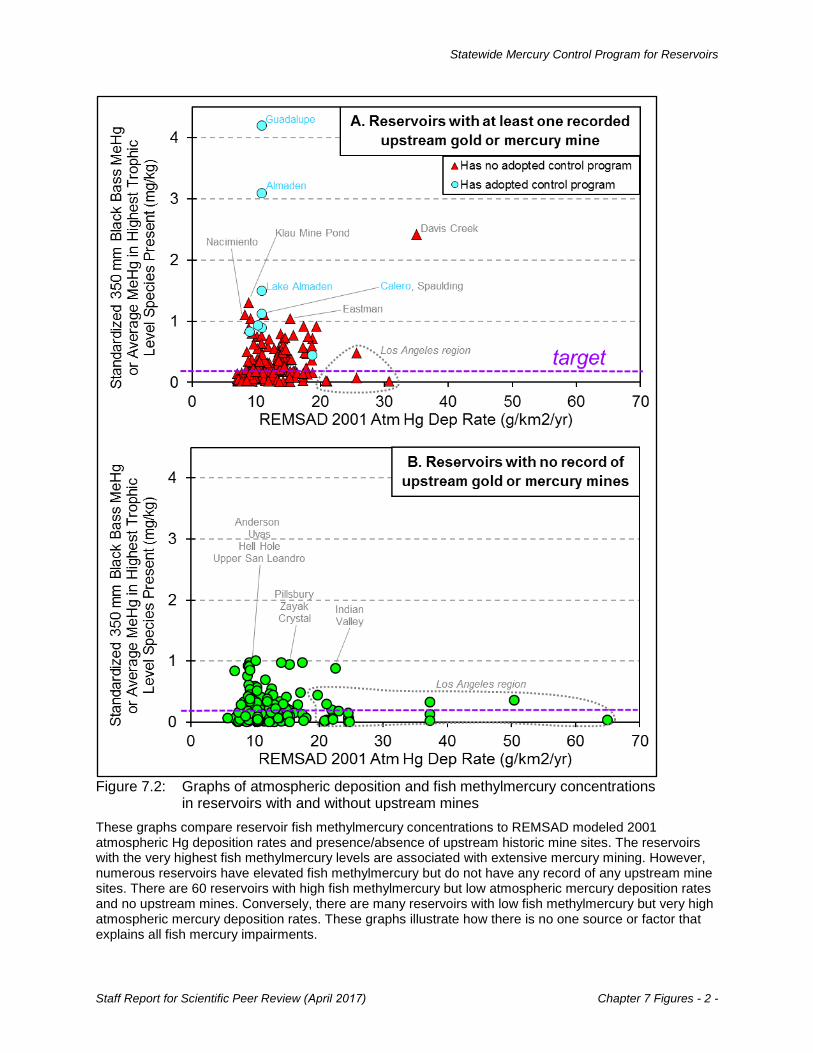
Figure 7.2: Graphs of atmospheric deposition and fish methylmercury concentrations in reservoirs with and without upstream mines
These graphs compare reservoir fish methylmercury concentrations to REMSAD modeled 2001 atmospheric Hg deposition rates and presence/absence of upstream historic mine sites. The reservoirs with the very highest fish methylmercury levels are associated with extensive mercury mining. However, numerous reservoirs have elevated fish methylmercury but do not have any record of any upstream mine sites. There are 60 reservoirs with high fish methylmercury but low atmospheric mercury deposition rates and no upstream mines. Conversely, there are many reservoirs with low fish methylmercury but very high atmospheric mercury deposition rates. These graphs illustrate how there is no one source or factor that explains all fish mercury impairments.

Statewide Mercury Control Program for Reservoirs
Staff Report for Scientific Peer Review (April 2017) Chapter 7 Figures - 3 -
Figure 7.3: Statewide maps showing predicted atmospheric mercury deposition rates and percent reductions if anticipated California and global emission reductions and proposed allocations are achieved
A. Total Deposition if Allocations Are AchievedB. Percent Reduction from REMSAD 2001
Deposition if Allocations Are Achieved

Statewide Mercury Control Program for Reservoirs
Staff Report for Scientific Peer Review (April 2017) Chapter 7 Figures - 4 -
Figure 7.4: Graph illustrating City of Stockton municipal wastewater treatment plant (WWTP) effluent ammonia, methylmercury, and total mercury concentration data collected before and after WWTP upgrades
Average effluent methylmercury concentrations decreased by 91% subsequent to upgrading the treatment process at the City of Stockton’s WWTP. (Note, it is not known if the treatment plant upgrades are responsible for the methylmercury and mercury reductions, or if the reductions are a result of other operational or physical changes.)
[Source: Wood et al. 2010b, Figure 6.6]
A. Effluent Methylmercury and Ammonia Concentrations Before and After Treatment Plant Upgrades
0.043 0.0750.155
0.068 0.11 0.049 0.0730
5
10
15
20
25
30
Sample Month
Efflu
ent N
H3
Con
cent
ratio
n (m
g/l)
0.0
0.5
1.0
1.5
2.0
2.5
Efflu
ent M
eHg
Con
cent
ratio
n (n
g/l)
NH3 - August 2004-July 2005NH3 - November 2008-July 2009MeHg - August 2004-July 2005, Before UpgradesMeHg - Jan-July 2009, After Upgrades
Jan Feb Mar Apr May Jun Jul Aug Sept Oct Nov Dec
NH4 and MeHg were not analyzedin June-Sept 2008.
B. Effluent Total Mercury Concentrations Before and After Treatment Plant Upgrades
0.9 1.1 1.10.7
1.00.6 0.8
0
2
4
6
8
10
12
Sample Month
Efflu
ent T
otal
Hg
Con
cent
ratio
n (n
g/l)
August 2004-July 2005, Before Upgrades
Jan-July 2009, After Upgrades
Jan Feb Mar Apr May Jun Jul Aug Sept Oct Nov Dec

Statewide Mercury Control Program for Reservoirs
Staff Report for Scientific Peer Review (April 2017) Chapter 7 Figures - 5 -
Figure 7.5: Statewide map highlighting the six 303(d)-listed reservoirs where relatively quick fish methylmercury reductions are predicted from source control
The three reservoirs predicted to have relatively quick benefits from mine remediation are, from north to south, Davis Creek, Marsh Creek, and Lake Nacimiento (Table 7.1). Similarly from north to south and west to east, the three reservoirs predicted to have relatively quick benefits from atmospheric deposition are Indian Valley, El Dorado Park, and Puddingstone. The rationale supporting these predictions is provided in section 7.2.7.
The red, orange, and yellow areas highlight where substantial reductions in atmospheric mercury deposition are expected if emission controls are achieved as anticipated (see Figure 7.3B). Atmospheric deposition from California industrial emissions is the primary anthropogenic source to Indian Valley, El Dorado Park, and Puddingstone Reservoirs, and they are located in regions expected to have substantial reductions in atmospheric deposition. Several other mercury-impaired reservoirs also are in such regions, but these reservoirs receive mercury from historic mine sites as well and therefore quick benefits from emission controls are not expected.

Statewide Mercury Control Program for Reservoirs
Staff Report for Scientific Peer Review (April 2017) Chapter 7 Figures - 6 -
Figure 7.6: Graph illustrating seasonal maximum methylmercury concentrations in Lake Almaden, California, before and after installation of solar-powered circulators
The Santa Clara Valley Water District reported the following: Annual maximum concentrations in the hypolimnion (green) varied over the study period, and were obviously affected by the circulator after it was set at the bottom in 2008 …. In 2005-2007 the maximum concentration in the hypolimnion was about 70 ng/L; in 2008 through 2011, the maximum concentration was 30, 18, 24 and 15 ng/L, respectively. Mid-depth seasonal maximum concentrations were immediately affected by the circulator following installation in 2006, and remained below 10 ng/L during the reporting period.
[Source: Drury 2011, Figure 31]

Statewide Mercury Control Program for Reservoirs
Staff Report for Scientific Peer Review (April 2017) Chapter 8 Figures - 1 -
Figure 8.1: Flow chart for determining waste load allocations for facilities with individual NPDES permits upstream of mercury-impaired reservoirs
[Table 8.1 Notes provided on next page]
If sum of facility design flows is > 1% and individual design flow > 1 MGD:
WLA equals: Municipal WWTPs: 10 ng/L All other facilities: 30 ng/L
Compliance: Compare WLA to calendar year average effluent total mercury concentration
Is facility design flow ≤ 0.2 MGD?
Determination of Waste Load Allocations (WLA) for NPDES facility discharges with individual permits
Compare individual and cumulative NPDES facility design flows to
watershed flows: Does the sum of individual NPDES facility design flows exceed 1% of
reservoir inflows(1) and
is the individual facility design flow >1 MGD?
If sum of facility design flows is ≤ 1% or individual design flow ≤ 1 MGD:
WLA equals: Municipal WWTPs: 20 ng/L All other facilities: 60 ng/L
Compliance: Compare WLA to calendar year average effluent total mercury concentration
Yes
No Yes
Facility design flow ≤ 0.2 MGD: No WLA
No

Statewide Mercury Control Program for Reservoirs
Staff Report for Scientific Peer Review (April 2017) Chapter 8 Figures - 2 -
Figure 8.1 Notes:
(1) The answer to the question, “Does the sum of individual NPDES facility design flows exceed1% of reservoir inflows?” is yes if either the sum of annual design flows for NPDES-permitted facility discharges exceeds 1% of annual reservoir inflows, or the sum of dryweather design flows for NPDES-permitted facility discharges exceeds 1% of dry weatherreservoir inflows.
Calculation methods:
Annual design flow for each facility is calculated by multiplying the facility daily design flow by 365, or by the potential maximum allowable number of days of discharge each year for facilities that do not discharge year round.
Dry weather design flow for each facility is calculated by multiplying the facility design flow by 61 (the number of days in October and November) or by the potential maximum allowable number of days of discharge during October and November for facilities that do not discharge year round.
Annual reservoir inflow for each reservoir is calculated by first summing the total inflow volume during each year of the entire period of gage record, and then dividing that sum by the number of years of the gage record.
Dry weather reservoir inflow for each reservoir is calculated by first summing the total inflow volume during October and November of each year of the entire period of gage record, and then dividing that sum by the number of years of the gage record.
If gaged inflow data are not available for a reservoir, gaged outflow data may be used instead. If no gaged reservoir inflow or outflow data are available, watershed precipitation runoff estimates may be used. Watershed precipitation runoff estimates should be based on at least five years of precipitation data.
For facilities such as hydro-power plants and fish hatcheries that make use of surface water intakes from the same water bodies as their discharge receiving waters, the annual and dry weather design flow calculations, WLAs, and effluent limitations apply to the discharges from internal waste streams, not to once-through cooling water discharges or other discharges of ambient surface water. The Water Boards will apply intake credits to once-through cooling water and other discharges as allowed by law.
If a facility has more than one outfall to a given reservoir’s watershed, the WLA and effluent limitation are determined by the sum of all its outfalls in that reservoir watershed. The WLA and effluent limitation apply to all of the facility’s outfalls in that watershed.
If future expansions or other new discharges from facilities with individual NPDES permits cause the watershed sum of annual or dry weather design flows to exceed 1% of reservoir inflows, then all the facilities in that reservoir watershed that discharge greater than 1 MGD shall be re-evaluated per the methodology described in Figure 1.