fashion & type
DESCRIPTION
Fashion Photography & Alexey BrodovitchTRANSCRIPT

ALEXEY BRODOVITCH FASHION PHOTOGRAPHY


Renée Chan
ALEXEY BRODOVITCH FASHION PHOTOGRAPHY

Sources:Alexey Brodovitch. Alexey Brodovitch. Assouline. 1998http://www.aiga.org/content.cfm/medalist-alexeybrodovitchhttp://wwar.com/masters/b/brodovitch-alexey.htmlhttp://www.aidan.co.uk/article_fashion1.htm
The textface is Bauer Bodoni Std 1 and Helvetica Neue LT STD.
Renée ChanInstructor: John KaneMay 2010Typography IIIGraphic Design


2
Mau
rise
Taba
rd

Alexey Brodovitch (1898 –April 15, 1971) was a Russian-born photographer, designer and instructor who is most famous for his art direction of fashion magazine Harper’s Bazaar from 1938 to 1958. Alexey was born in Ogolitch, Russia to a wealthy family in 1898. His father, Cheslav Brodovitch, was a respected physician, psychia-trist and huntsman. His mother was an amateur painter. During the Russo-Japanese War, his family moved to Moscow where his father worked in a hospital for Japa-nese prisoners. Alexey was sent to study at the Prince Tenisheff School, a prestigious institution in St. Peters-burg, with the intentions of eventually enrolling in the Imperial Art Academy. He had no formal training in art through his childhood, but often sketched noble profiles in the audience at concerts in the city.
Military career: At the start of World War I at the young age of 16, Brodovitch abandoned his dream of entering the Imperial Art Academy and ran away from home to join the Russian army. Not long after, his father had him brought home and hired a private tutor to help Alexey finish school. Upon graduating, Brodovitch ran away again on several occasions. He recalls:
“After a week or so I ran away to the front line to kill Germans. But my father, now a military general at the head of a Red Cross hospital train, had plenty of influ-ence, and I was soon brought back to him. On the train back I was employed as a nurses’ aid. In East Prussia I ran away again and joined a nearby regiment. Once
Often, the creative desires of the photogra-phers are at odds with the intentions of the editor, as Anna Wintour, fashion editor at Vogue, illustrates: “Our needs are simple. We want a photographer to take a dress, make the girl look pretty, give us lots of im-ages to choose from, and not give us any attitude. Photographers - if they are any good - want to create art.”
Through this tension have come about some of the most memorable images in the history of photography, transcending the time in which they were made, and representing that time for us today.
The precursors of fashion photography go back to the eighteenth century, when images of fashionable clothes were printed in maga-zines and often hand-coloured. Paris was at that time a centre for the production of such magazines, many of which were imported into England. The technique of photography was developed in the 1830s, but it wasn’t until much later that the métier of fashion photography came into existence. The earliest popular photographic technique, the daguerreotype, could not be used for mass printing. A later technique enabled the pro-
3
Coats by Molyneux and Hardy Amies, worn by Barbara, Goalen and Wenda Parkinson (nee Rogerson). 1948
Alexey Brodovitch in his office at Harper’s Bazaar, c. 1950
Nor
man
Par
kins
on

duction of the “Carte de Visite” which were made for individuals and which also depicted famous theatre and music hall personalities of the age. It wasn’t until advances in halftone printing techniques that fashion photographs came to be featured in magazines. This hap-pened in about the first decade of the 20th century.
Baron de Meyer (1868 - 1946) called “The Debussy of the Camera”, had wealthy, though not aristocratic origins. He was born Demeyer Watson, of a French father and a Scottish mother, and grew up in Saxony. He came to London and married into nobility. He was given the title Baron de Meyer and set out on a life of extravagant entertaining
His main characteristic was a wonderful use of backlighting and the soft-focus lens. What strikes us as being special to Baron de Meyer, however, are the glinting reflections from the background material and the jewels. The overall key is a light grey, the only dark areas being around the sitter’s face, arms and lap. It’s interesting to note that the chair is hardly a suitably aristocratic-looking piece of furniture, but perhaps he chose if for its colour, more than anything else.
Edward Jean Steichen (1879-1973) was born in Luxembourg, but his family moved to the USA in 1881. With Alfred Stieglitz, he founded the Photo-Secession Galleries in New York. He first photographed fashion models in 1911 for the magazine “Art and Decoration”, and worked with Conde Nast during the twenties.
Dolores, 1918
4
Baro
n D
e M
eyer
Dolores, 1918

again I was caught, and this time I was sent to an of-ficers’ school, the Corps de Pages. During the Russian Civil War, Brodovitch served with the White Army. While fighting against the Bolsheviks in Odessa, he was badly wounded and was hospitalized for a time in Kislovodsk, in the Caucasus. In 1918, the town was surrounded by the Bolsheviks, forcing Brodovitch into exile. It was during this retreat to the south through Caucasus and Turkey that he met his future wife, Nina.”
By good fortune, Alexey’s brother Nicolas turned out to be one of the soldiers guarding the refugees in Novo-rosysk. Not long after, their father, who had been impris-oned in St. Petersburg by the Bolsheviks, managed to flee to Novorosysk in hopes of finding his family. The three were once again together, and arranged for Brodovitch’s mother and other relations to join them in Constanti-nople. Finally reunited, the Brodovitchs made their way to France.
Influential years in Paris: Upon arriving in Paris, Brodovitch wanted to be a painter. A Russian émigré in Paris, Brodovitch found himself poor and having to work for the first time in his life. He took a job painting houses, while his wife Nina worked as a seamstress. They lived in a cheap, small apartment in the area of Mont-parnasse, among other Russian artists who had settled in Paris at the end of the 19th Century. This group of artists, including Archipenko, Chagall, and Nathan Alt-man, would meet at the inexpensive Académie Vassilieff, which offered painting and sculpting classes without an instructor. His connections with these young Russian art-ists led to more artistic work as a painter of backdrops for Diaghilev’s Ballets Russes.
5
Dolores, 1918
Baro
n D
e M
eyer
Baro
n D
e M
eyer

The arrangement of rectangular shapes shows the influence of con-structivist art, which was influential at the time. The vertically placed white rectan-gular card has been carefully positioned to show the shape of the falling drapery, which shows signs of considerable retouching. A piece of horizontally placed black card provides further contrast.
The head and shoulders stand out from the mid grey of the wall, and the toe of the shoe, pointing elegantly downwards, protrudes into the area of white on the floor. A white and black vertical band just to the left of the model, divides the upper part of the picture, and completes the background. The lighting is a combination of general light plus sidelighting, on both sides, giving the flesh tones a mid to high key, contrasting with the solid blacks.
This image skilfully uses very simple props to create an elegant arrangement of forms, modernist in flavour, but classi-cal in order and arrangement.
George Hoyningen-Huene (1900 - 1968) was another of the aristocratic practitioners of early fashion photogra-phy, and did most of his most memo-rable work between the mid-twenties and the end of the Second World War. He was born in St Petersburg, but moved to Paris in 1920, where he first did fashion illustration and then photog-raphy. He moved to New York in 1935, and worked mainly for Harper’s Bazaar. He spent the latter part of his life in California.
The famous swimwear ad by George Hoyningen-Huene is familiar to contem-porary eyes, having been used recently in advertising for perfume. It displays a combination of chic and classicism typical of the age. The image shows a meticulous attitude to detail and arrange-ment. The models are placed very care-
Lacoste, 1929
Geo
rge
Hoyn
inge
n-Hu
ene
6
Geo
rge
Hoyn
inge
n-Hu
ene
Lacoste, 1930

Paris was a cosmopolitan city through which many artists and art movements passed. Brodovitch was exposed to everything from Dadaism from Zurich and Berlin, Suprematism and Constructivism from Moscow, Bauhaus design from Germany, Futurism from Italy, De Stijl from Holland, and the native strains of Cubism, Fauvism, Purism and Surrealism. Among these various artistic influences, Brodovitch found his beginnings as a designer.
The move to graphic arts: On nights and weekends away from the Ballets Russes, Brodovitch began sketch-ing designs for textiles, china, and jewelry. By the time his work for the ballet had finished, he had already compiled an extensive portfolio of these side projects and was selling his designs to fashionable shops. He worked part-time doing layouts for Cahiers d’Art, an important art journal, and Arts et Métiers Graphiques, an influen-tial design magazine. While working on layouts, Brodo-vitch was responsible for fitting together type, photo-graphs, and illustrations on the pages of the magazines. He had the rare opportunity of having influence over the look of the magazine as there was no art director. He gained public recognition for his work in the commercial arts by winning first prize in a poster competition for an artists’ soiree called Le Bal Banal on March 24, 1924. The poster was exhibited on walls all over Montparnasse along with a drawing by Picasso, who took second place.
Brodovitch remained proud of this poster throughout his career, always keeping a copy of it pinned to his studio wall. The graphic, light-to-dark inversion of its mask shape, type, and background suggest not only the pro-cess of photography, but also represents the process of trading one’s identity for another when wearing a mask. It is the oldest surviving work by Brodovitch. He con-tinued to gain recognition as an applied artist due to his success at the Paris International Exhibit of the Deco-rative Arts in 1925. He received five medals: three gold medals for kiosk design and jewelry, two silver medals for fabrics, and the top award for the Beck Fils pavilion “Amour de l’Art.”
After these wins, Brodovitch’s career as an applied artist took off. In 1928 he was hired by Athélia, the design studio of the Parisian department store Aux Trois Quartiers, to design and illustrate catalogues and ad-vertisements for their luxury men’s boutique, Madelios. Brodovitch was aware that many of the customers were fairly traditional in their tastes, so he balanced out his modern designs with classical Greek references. Although employed full-time by Athélia, Brodovitch offered his service as a freelance designer on the side. He started his own studio, L’Atelier A.B. , where he produced posters for various clients, including Union Radio Paris and the Cunard shipping company. He was also commissioned by the Parisian publishing house La Pléiade to illustrate three books: Nouvelles by Alexander Pushkin, Contes Fantastiques by Fyodor Dostoyevsky, and Monsieur de
Bal Banal Poster, 1924
7
Alex
ey B
rodo
vitc
h

fully, with close attention to the effect of light and shadow. The combined outline forms a pleasing U shape, similar to a Greek vase. By illusion, the scene appears to be outdoors, but on closer inspection, we can see that, like most fashion shots of the day, it was taken in a studio, and the “sea” is an area of light grey, with the “sky” and faintly painted clouds above it. A very realistic effect of daylight is achieved by a strong, single light, placed to the above left of the subjects.
If you went to the sea and took a photo of it around midday, the sea would almost certainly appear much darker. The effect of this unnaturally light background is twofold: it makes the models stand out, but more inter-estingly, it actually simulates how we would see the background in harsh sunlight without sunglasses- very light and slightly fuzzy, due to the smarting of the eyes. The visually inac-curate, but psychologically correct portrayal of the background gives this image its myste-rious appeal. The enigmatic quality is height-ened by the fact that the models stare away from us, so that we can’t see their faces, and appear to be looking at something out on the “sea”, to the right, and beyond the frame of the picture. What are they looking at? What are their faces like? And where exactly is this seaside location?
Horst P Horst (born 1906, lives in New York) was a friend of Hoyningen-Huene, and also had a fascination for classical imagery, indeed he made a detailed study of classical poses, using Greek sculpture and classi-cal paintings, paying special attention to the positioning of hands. In his studio, he used
all manner of props, such as plaster statues, mirrors, crumpled paper, using them to both neoclassical and surrealist effect.
The photo of Helen Bennet is a good example of an image with a strongly classi-cal effect. A single spotlight shines down on the model from the top right. The edges of the spot place shadows on the edges of the pleated cloak, which is exhibited, peacock-fashion in a wonderful display of light and shadow. The model is standing in front of a column, and we can see the shadow of the spotlight forming an arc just to the right of the model’s face. The light falls on the face to form a perfect jaw line, with just the right amount of shadow on the cheekbone (although this might have been retouched).
The pose is statuesque and painterly, reminiscent of the paintings of Alfred Moore. The background is a graduated dark to lighter grey, made apparently by a diffused light placed behind the base. Around the base, there are three pieces of Greek-style plaster sculpture, though these are partly cropped out of the picture. One criticism might be that this arrangement looks botched and ama-teurish, and that the photographer couldn’t make up his mind whether or not to leave out the base altogether, but decided to crop it half way! In my opinion this doesn’t matter, as the main focus of the image is the model, and her outfit. In his use of props, he was
Vogue Cover, 1940
Round the Clock 1, 1987
8
Hors
t P H
orst
Hors
t P H
orst

Bougrelon by Jean Lorrain.Brodovitch embraced technical developments from the
spheres of industrial design, photography, and contem-porary painting. His broad curiosity began to assimilate the most interesting aspects of all these fields into his work, eventually making them his own. He later instilled this same curiosity in his students, encouraging them to use new techniques like the air brush, industrial lac-quers, flexible steel needles, and surgical knives.
By the age of 32, Brodovitch had dabbled in produc-ing posters, china, jewelry, textiles, advertisements, and paintings. Eventually specializing in advertising and graphic design, he had become one of the most respected designers of commercial art in Paris. By 1930, how-ever, Paris had lost its luster for Brodovitch. The once-flourishing spirit of adventure and experimentation was fading away. Although he was offered many design posi-tions, Brodovitch turned them down, presumably looking for new locales to advance his designs.
Brodovitch as instructor: While still living in Paris, Brodovitch was offered a job by John Story Jenks, the father of a young girl Brodovitch had shown around the arts scene in Paris. Jenks, a trustee of the Pennsylvania Museum School of Industrial Art (currently the Universi-ty of the Arts), was overwhelmed by Brodovitch’s talents and asked him to head the school’s Advertising Design Department. In September 1930, Brodovitch moved to Philadelphia with his wife and son to take the job. Brodovitch began teaching advertising design, creating a special department devoted to the subject.
Brodovitch’s task was to bring American advertising design up to the level of Europe’s, which was thought to have a far more modern spirit. Before his arrival, adver-tising students were simply copying the magazine styles of N. C. Wyeth and Howard Pyle. The illustrations were beautiful, but had evolved from the tradition of 19th-century romantic realism, a thing of the past. Brodo-vitch’s teaching technique, on the other hand, was unlike any other the students had been exposed to. He would always teach with a visual aid. Brodovitch would bring
Harper’s Bazaar
March 1936, pages 66-67
9
Man
Ray
Alex
ey B
rodo
vitc
h

only trying to create an effect of the antique, not, as perhaps in a painting, a detailed and accurate recreation of the real thing.
Cecil Beaton (1904 - 1980) was a con-temporary of Horst P Horst and Hoyningen-Huene, and was based in London. His exhibition in 1927 at the Cooling Galleries, London established him as a major pho-tographic figure. Like Horst, he also used elaborate studio props and experimented with surrealism. In the picture of Miss Mary Taylor, the image is dominated by two large and highly ornate oval-shaped hanging deco-rations, with flowers and patterns similar to peacock tails. The left hand one is closer to the camera, and is to the model’s right. The right hand one is hanging behind the model, and the edge intersects her face at eye level.
According to traditional rules of compo-sition, the model is too low in the frame, but, like others pictures by Beaton, it is not intended to be a portrait, but an arrangement of forms, patterns, textures and tones, in which the model is included. The decora-tions, which were probably made up specially for the shot, and don’t resemble anything I’ve
Charles James Gowns, Vogue, June 1948
Audrey Hepburn poses for photographer Cecil Beaton, 1963
10
Ceci
l Bea
ton
Ceci
l Bea
ton

into class French and German magazines to examine the pages with his students, explaining the artist’s work or technique. He would raise questions like, “Could this line be better? Could it be like, for example, Cocteau?” When not in the classroom, Brodovitch would take the class on outings around Philadelphia to see factories, laboratories, shopping centers, housing projects, dumps, and the zoo. The students were then told to make a “graphic impression” of what they had seen, whether a photographic interpretation, a drawing, or an abstrac-tion. Brodovitch did not teach in the conventional sense, but rather compelled his students to discover one’s inner, creative resources.
Design laboratory: In 1933, Brodovitch added the De-sign Laboratory to the classes he offered. It was meant to be a workshop for his advanced students who wanted to experiment with all aspects of design. Brodovitch shared the Bauhaus belief that you needed to educate the whole individual by directing his or her attention to a variety of modern solutions in their graphic projects. His course description for the Design Laboratory read:
‘The aim of the course is to help the student to dis-cover his individuality, crystallize his taste, and develop his feeling for the contemporary trend by stimulating his sense of invention and perfecting his technical ability. The course is conducted as an experimental laboratory, inspired by the ever-changing tempo of life, discovery of new techniques, new fields of operation...in close contact with current problems of leading magazines, department stores, advertising agencies and manufactures. Subjects include design, layout, type, poster, reportage, illustra-tion, magazine make-up, package and product design, display, styling, art directing.’
The lab was split into two sections per week, one for design and one for photography. The workshops were immensely popular, and it was not unusual for more than sixty people to show up to his class on the first night. Among the photographers who attended his classes were Diane Arbus, Eve Arnold, Richard Avedon, Lisette Model, and Gary Winogrand.
Harper’s Bazaar Mrs. Carmel Snow examining some layouts with Alexey Brodovitch in her office, 1952
11
Wal
ter
Sand
ers

Michel Brodovitch
12

Students on Brodovitch: “He taught me to be intol-erant of mediocrity. He taught me to worship the un-known.” - Art Kane, fashion and music photographer
“I learned from him that if, when you look in your camera, you see an image you have ever seen before, don’t click the shutter.” - Hiro, fashion photographer
Notable students: Graduates of these early courses went on to prominent careers in the field. Brodovitch’s department came to be known as a ‘prep school’ for agencies and magazines around the country.
Harper’s Bazaar: In spring of 1934, the Art Directors Club of New York asked Brodovitch to design their “13th Annual Art Directors Exhibition” at the Rockefeller Center, New York. It was there that Carmel Snow, the recently appointed editor-in-chief of Harper’s Bazaar, saw Brodovitch’s work for the first time. She knew right away that Brodovitch would be the one to transform the magazine into a real revival of Vogue, where she had started her career: “I saw a fresh, new conception of lay-out technique that struck me like a revelation: pages that “bled” beautifully cropped photographs, typography and design that were bold and arresting. Within ten minutes I had asked Brodovitch to have cocktails with me, and that evening I signed him to a provisional contract as art
Preparatory layout for “the Ultra Violet” series photographed by Richard Avedon
13

ever seen elsewhere, dominate the image, and almost have a life and character of their own, subjugating the model. There is a light source coming from the right, illuminating the rear wall, and the model’s face. A less intense, more diffuse light on the left fills in dark to mid grey shadows on the model’s face and lights the front of her garment. The placement of the fingers adds an extra ele-ment of theatricality to the image.
An interesting development during the 1930’s was a change in Beaton’s attitude to-wards the romanticism and indulgence in his earlier work. This quotation from “The Best of Beaton” written in 1968, gives us the pho-tographer’s insight into the changing mood:
The posed, static hands with the pointed index finger and arched wrist acquired an overnight vulgarity; the celestial expression in the eys suddenly became a joke shared by everyone except the sitter. The earlier pictures appeared over re-touched and altogether too artificial with ladies with forced rosebud simpers and impossibly goldern curls.
In the meantime, Beaton had developed a more realistic style:
‘The results of my experiments in this genre of photography were considered to prove that I had at last grown up, and had acquired a new sense of reality. “Reality” was taken up by editors as the “new thing”’.
A result of this change of direction was a contributory factor in the termination of his contract with Vogue in 1938. In the ensuing years he took many war photographs, and a famous example of the then, still prevalent idea of “reality” was this study of a model standing in a Paris courtyard. The look of the model and the clothes could almost be contemporary. She couldn’t be further re-moved from the high fashion models of earlier years. The photograph is almost of snapshot character, with very little attention wasted on artful arrangement of forms. The face
Jerry Hall, Jamaica, May, 1975
14
Balenciaga Dress, regine, Vogue 1950
Nor
man
Par
kins
onN
orm
an P
arki
nson

director.The offer was, of course, dependent on the approval of
the owner of Harper’s Bazaar, William Randolph Hearst. Brodovitch eagerly returned to Philadelphia and as-signed his students apprenticing at his Van Pelt Street studio to make two dummy issues of the magazine. He insisted that each page have a “shock value” of its own to set the magazine apart, “cutting paper dolls out of patterned paper, or illustration perfume bottles to look like high key photography - whatever was unlike other fashion magazines was tried.” Although preferring more conservative design, Hearst put his trust in Carmel Snow and allowed her to take on Brodovitch as art director where he remained for 24 years.
The new look of Harper’s Bazaar emphasized culture for its own sake. Taking advantage of Brodovitch’s con-tacts in Europe and his wide knowledge of photography, the magazine introduced the work of may artists and photographers to its American audience. Before starting at Harper’s Bazaar, Brodovitch organized a return trip to France, hoping to convince old friends to work with him at the magazine. Each summer he would return to offer commissions to artists and photographers until 1939 when the start of World War II made it impossible. By continually bringing in creative forces from overseas, he kept the magazine permanently fresh and cutting-edge. Among the artists that worked for Bazaar were Jean Cocteau, Raoul Dufy, Leonor Fini, Marc Chagall, Man Ray and A. M. Cassandre, the most eminent poster artist in France at the time, replacing the former cover favor-ite, Erté.
The style of Harper’s: to those who worked with him at Azar, the pinnacle of Brodovitch’s career as a designer was the unfailing elegance of his pages. This elegance, combined with an element of innovation was the ideal mix for a fashion magazine. The quality that guaranteed his success was his devotion to the new, unending sur-prise and vitality. Frances MacFadden, Bazaar’s manag-ing editor for much of Brodovitch’s tenure, explained his working method:
Portfolio Magazine Covers, 1950
15
Alex
ey B
rodo
vitc
h

appears exactly central in the frame, which doesn’t conform to traditional conventions. There are however, subtle evidences of the photographer’s eye - the natural light coming from above is at just the right angle to scupt the model’s face.
Personally, I feel that the photographer wasn’t being honest with himself. A deliber-ate urge to throw out former principles and techniques, and go to another extreme, is perhaps a way of trying to prove his versatility or an attempt not to be typecast. Maybe the picture is a product of its time - after six years of gruelling war, people were weary, more concerned with making the best of meagre rations, whether food or cloth, than indulging in opulent fantasies.
By 1948, however, the elegance was back, revived by Christian Dior’s “New Look” collection of 1947. The image epitomises the return to grand style, but in a plainer, more direct way than in earlier decades. Eight models are posed in a neo-classical salon, talking and drinking cups of tea from dainty teacups.
There are three sources, two shining in from the sides, and one very bright one placed behind the two models to the centre left. An additional, low key diffused light shines in from the left of the camera, illumi-nating very nicely the patterns of silken drap-ery. The lighting ensures a full range of tones from very bright to near black. Reproductions of this image in two different books turn out, on closer inspection to be slightly different.
It’s a CInch, Carmen, 1951
16
Lilli
an B
assm
an
“It was a pleasure to watch him work. He was so swift and sure. In emergencies, like the time the Clip-per bearing the report of the Paris Collections was held up in Bermuda, his speed was dazzling. A quick splash or two on the cutting board, a minute’s juggling of the photostats, a slather of art gum, and the sixteen pages were complete. His layouts, of course, were the despair of copywriters whose cherished tone poems on girdles or minks had to be sacrificed to his sacred white space. Just before we went to press, all the layouts were laid out in sequence on Carmel Snow’s floor, and there, under his eye, re-arranged until the rhythm of the magazine suited him.”
Typically, Brodovitch would begin his layouts by de-signing the layouts as illustrations by hand. His assistant would receive these sketches to look over, but the pho-tographers and freelance writers were often given little or no direction at all besides to come up with something new and unusual. When the photographs for the issue arrived, he would pick the most visually interesting and have a variety of sizes of reproductions made on a pho-tostat machine. From these, each spread would be made one at a time, then arranged among the others to create a well-paced magazine.
His style for the magazine was radically different than any of its contemporaries. Brodovitch wanted his spreads to be innovative and fresh. While other fashion maga-zines thought it important to show the whole garment,
17
Ballet, 1945
Alex
ey B
rodo
vitc
h

The poses are almost exactly the same, except for a couple of small differences.
This must indicate that considerable effort must have gone into placing the models in definite and highly stylised poses, artificial some would say. As we will see, there was a reaction against this which would leave be-hind the famous pre-war photographers, and usher in a new, post war era of spontaneity.
Norman Parkinson, (born in 1913) a con-temporary of Beaton, also photographed the beau monde during the twenties and thirties, but, as he explains, with certain differences:
‘I was hardly aware of other photographers’ work until I went to Harper’s, when I learnt about Steichen, Hoyningen-Huene, Durst and Beaton. But the women in their photo-graphs were a rarefied few, an elitist handful. My women behaved quite differently - they drove cars, went shopping, had children and kicked the dog. I wanted to capture that side of women. I wanted them out in the fields jumping over the haycocks - I did not think they needed their knees bolted together. There was always room in a magazine for the scent-laden marble-floored studios with lilies falling out ot great bowls of flowers. but there was also room for my sort of photography.’
(Norman Parkinson Lifework, page 35). A good example of this type of portrayal
are two pictures taken by Norman Parkinson in 1937. The first one has an irresistible qual-ity of exuberance, 30’s style and femininity about it, but why is the image so success-ful? It would have been difficult to pose the models carefully, though the photographer
California Desert, 1948
18
Loui
se D
ahl-
Wol
fe

Brodovitch would crop images unexpectedly or off-center to bring a new dynamism to the layout. He used forms in the photographs or illustrations as a cue for how to handle the shape of the text. In his earlier layouts, he would arrange photographs like playing cards, splayed out on the page or in the shape of a fan. Later in his career, however, he abandoned this technique in favor of using only one or two images to a page. Surrealism found its way onto the pages of the magazines in vari-ous experimental forms. For example, Brodovitch once used fashion photographs sent via radio from Paris to New York in blurry forms to communicate this new way of sharing information. Designs also included torn edges on photographs, or pages made to look as they had been torn through with a woman’s figure stepping out of them. The motif of isolated body parts, another common Sur-realist theme, could be seen on the covers and spreads of Harper’s in the form of lips, hands, and eyes.
Brodovitch was sensitive to the fact that color was relatively new in magazines, with laborious prepara-tion and high costs. By using process or second color inventively, Brodovitch was able to give the magazine an added sense of currency and luxury. He applied color to his layouts expressively, often choosing to use colors bolder than might be seen in the real world. Even after full-color reproduction became standard practice, he still used broad swaths of single colors for bold emphasis.
In terms of photography, Brodovitch had a distinct feel for what the magazine needed. He favored on-location fashion photography as opposed to the studio shots nor-mally used in other fashion publications. He urged his photographers to look for jarring juxtapositions in their images. One such spread features a woman in a full-length Dior gown posed between two circus elephants. The cinematic effect, a trademark characteristic of his
19
Ballet, 1945
Ballet, 1945
Alex
ey B
rodo
vitc
h
Alex
ey B
rodo
vitc
h

might have asked them to “act out” seeing someone on another boat, and waving.
In any case, the three poses are comple-mentary, the left hand model is holding her left arm vertically, the middle one holding her left arm horizontally, index finger pointing upwards, the right hand model has a relaxed, leaning pose. The outstretched leg of the left hand model reaches over to the far side, close to the leaning model. The effect of the wind, the sense of movement and shifting balance, gives the image great dynamism, added to by the swathe of foam stretching from the bottom right to near the top left. But by what means was the photographer able to attain this pleasing arrangement in such unpredictable circumstances? Perhaps the
gift of the photographer is to click the shutter exactly the right time:
‘I was using, on location, my by-now faith-ful Graflex quarter plate camera, and was trying to make moving pictures with a still camera. many photographers who attempt this technique have come to realize that if you see on the ground glass the image you are striving for, and it is a moving or air-borne im-age, you are too late. The secret is to direct the shot and to have the luck to anticipate it. It was discovering that I had the excep-tional good fortune to be able to do so that convinced me and I was hooked for all time on photography’.
(Norman Parkinson Life Work page 28) Interestingly, the eyes of the middle model
are exactly level with the horizon, and this is also a characteristic of the second picture by Norman Parkinson, showing a woman walking along a country track. The eyes are level with the horizon, adding an extra element of horizontality to the image. Again, the converging diagonals of the lane, going out of focus as they stretch into the distance give a sense of movement, added to by the
Veruschka in clothes designed by Kimberly, 1967
Veruschka in clothes designed by Kimberly, 1967
Stephanie Seymour, Dress and shoes by Chanel, Paris, September 1994
20
Rich
ard
Aved
on,
Rich
ard
Aved
on,

layouts, involved using photographs as if they were stills from a film. He would repeat a pose or a dress several times across a spread to give a narrative, temporal feel-ing. At times, Brodovitch would arbitrarily take a series of photographs and adopt a story line to go with them, as though recapping a movie. He was known to push this idea even further by adding film sprocket borders to photographs at times. Brodovitch also often emphasized spatial illusions, using type and photographs to create multiple perspectives within a space. The notion of mir-roring and doubling also interested him, as can be seen in how he paired similar pictures on a spread or dividing halves of one image across the gutter of the page.
With this goal of story-telling, Harper’s Bazaar can be seen as an example of a mediascape, in that Brodo-vitch was trying to construct a reality for the imagina-tions of the readers. He would create versions of small movie stills or spreads in which woman were supposed to see themselves rather than the model. For example, he would often use a model’s silhouette rather than her whole form, or keep her face in shadow, so that any reader could place themselves in those fashions, lead-ing a charmed life. The result would be a magazine of images “out of which scripts can be formed of imagined lives.”
Typeface” Brodovitch designed his own typeface in 1949. “Al-Bro”, an abbreviation of his name, has broad and narrow strokes inspired by the symbols of musical notation. A layout showcasing the typeface was included in Portfolio #1, winter 1950.
Portfolio: In 1949, Brodovitch collaborated in the production of the revolutionary publication Portfolio. It has been widely acknowledged as perhaps the definitive graphic design magazine of the twentieth century. The idea for the publication came from art director Frank Zachary. He wanted to put out a magazine that focused solely on art and design, but was at the same time an outstanding example of design itself. Brodovitch was intrigued by the concept. Although he enjoyed his work
21
Rich
ard
Aved
on,

Dovima with elephants, evening dress by Dior, Cirque
d’Hiver, Paris, August 1955
Rich
ard
Aved
on,

brisk walk of the model. The pose is full of confidence. She looks directly to her right, along the line of the horizon, striding forward towards the camera.
The movement of the body and the texture of the material act together to dynamically portray the clothes.
A familiar and recurring issue in fashion photography, and perhaps photography in general, is the dichotomy between “realism” and “artificiality”. At any one time, both have been in currency. The outdoor shots of Nor-man Parkinson were being made at about the same time as the posed and stylised studio works of Hoyningen-Huene. One photogra-pher whose work was more at the romantic and impressionistic end of the spectrum was Lillian Bassman, a protegee of the legendary
at Harper’s Bazaar, the limitations of space and subject matter often cramped his creative style. Portfolio freed him from the practical and aesthetic restraints to which he had grown accustomed. The pages of the publica-tion were space for his graphic imagination to run wild. George S. Rosenthal, whose family owned a printing company dedicated to mass-market pictorial paperbacks, signed on too.
With such great capital spent on publicity, Zachary and Rosenthal decided Portfolio would have to include advertising. Upon seeing the advertisements, however, they couldn’t bear to ruin the look and feel of the pub-lication by running them. It was decided that Portfolio would run without the aesthetic burden of advertising, freeing up more space for the overall design. Brodovitch was responsible for sorting through the articles and illus-trations to create the spreads. Zachary described watch-ing Brodovitch in action:
“He’d go through the stuff fast, really fast, and pick out always the right thing, you know, and then he would mark it up [for copying], an inch, inch and a half, two and a half inches... But anyhow, I’d go back to see him, he’d have these dam[n] ‘stats all over the floor, ankle deep in them, and he would look around, pick one up,
23
Alex
ey B
rodo
vitc
h

Alexey Brodovitch at Harpers, New York.The piece “New York” from 1949, is
timeless, almost contemporary in its look. With the depiction of a corset, we can see a return to more traditional, romantic vision of femininity. The image looks as if it was ex-posed sharp in the camera, but given a soft-focus effect at printing. There is slight double exposure, with probable use of a diffusing filter, or possibly an additional exposure was made out of focus. The pose has a sweep-ing sense of movement, the face and upper body are tipping forwards, the arms are pulling the strings backwards and upwards. The waist is tightly, painfully drawn in, to the extent that it looks unnaturally narrow. The tightness is contrasted with the looseness of the four hanging straps.
A moment is caught in time by the cam-era, a fleeting glimpse echoed by the reflec-tion in the mirror.
At first the image looks primarily decorative, but in addition to beauty of form, a powerful feeling of constriction is expressed. Perhaps the fact that the photographer is female made her better able to empathise with how it feels to wear a corset.
Like Lillian Bassman, Louise Dahl-Wolfe also worked for Harpers Bazaar, and not long after her arrval at the magazine in 1935, was one of the first to use one-shot Kodachrome, which had just been brought onto the mar-ket. Many of her pictures feature swimwear fashion, and have a relaxed and luxurious feel, with tall, slim models in elegant, out-
Under Parasols at the Beach, Vogue, January 1963
Natalie in Hammamet, 1950
24
Loui
se D
ahl-
Wol
fe
Loui
se D
ahl-
Wol
fe

until there were six or eight or ten and then he’d lay them out and it worked... that was the magic of it, you know?”
Inside Portfolio, Brodovitch promoted features devoted to respected artists and designers, contributed articles on vernacular design, and made wildly imaginative layouts. The magazine encompassed an array of subject matter and design styles. Works of great French poets were in-terspersed with off-beat articles about graffiti by hobos. It was a beautifully composed mix-up of all things art. Unfortunately, the publication lasted only three issues. The no-expense-spared ethos of the magazine, paired with the lack of advertising, caused the magazine to quickly fold.
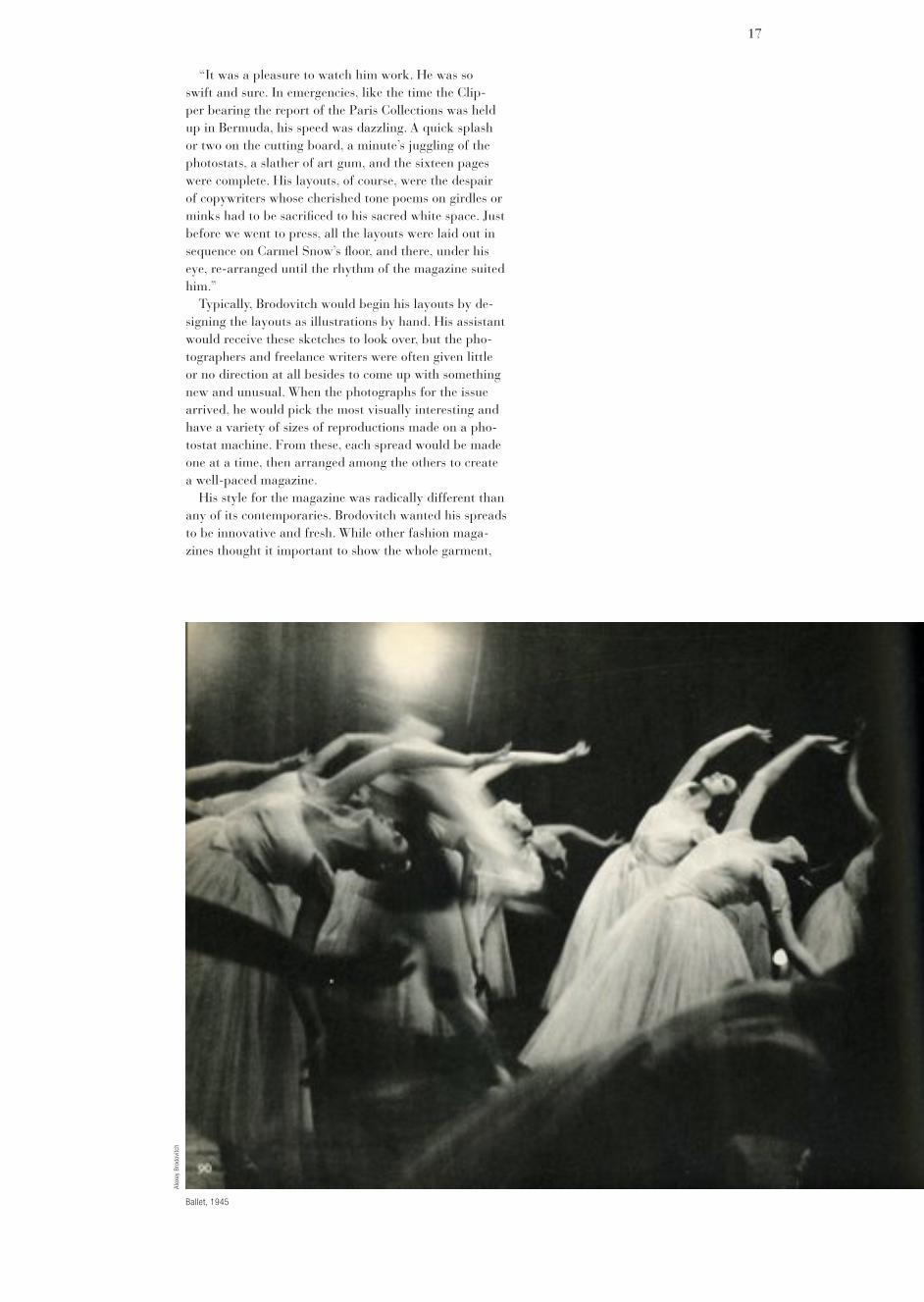
Ballet: Between 1935 and 1937, Brodovitch photo-graphed several ballet companies, including the Ballet Russe de Monte Carlo, during their visits to New York on world tours. Although at the time he claimed the pho-tos were only meant to be souvenirs, they evolved into something greater. The style in which Brodovitch photo-graphed deviated from the sharp, straight photography popular at the time. According to one colleague, his images “spat in the face of technique and pointed out a new way in which photographers could work.”
Brodovitch released a book of these photographs in 1945, titled simply Ballet, through a small New York publisher. The book contains 104 photographs of several ballets and is divided into eleven segments, one for each ballet performance. On the contents page, Brodovitch introduces each chapter in a typographic style that emulates the feel of the dance it is describing. He photo-graphed with a Contax 35mm camera, no flash, and with a slow film speed. The blurred figures of the dancers al-low the viewer to not only feel the music, but also to fol-low the line of the dancer’s limbs mid-step. The images beautifully capture the atmosphere on-stage, the frenzied behind-the-scenes action backstage, and the magical moments of the ballet. By bleeding the blurred, grainy pictures off the pages and into the gutters, he communi-cated the emotional impact of the dance without words.
Observations: Brodovitch’s work as a book designer can also be seen in Observations, a collection of photo-graphs by Richard Avedon and commentary by Truman
Ballet, 1945
25
Ballet, 1945
Alex
ey B
rodo
vitc
h
Alex
ey B
rodo
vitc
h

26
Harper’s Bazaar

Capote, both regular contributors to Harper’s Bazaar. In Observations, each spread shifts between pages of sil-houetted images and pages of rectangular blocks of im-ages and text, framed by ample stretches of white space. Although simple and elegant, the layout of the book has an enormous amount of visual variety.
Declining health: Already suffering ill health, Brodo-vitch was plunged into an acute state of depression over the death of his wife, Nina. Over the next two years, Brodovitch was sent to various hospitals on numerous occasions to cure his worsening depression and alcohol-ism. Throughout these hospital stays, however, Brodo-vitch had an incessant desire to start new projects. At one point, he began compiling an autobiography, but it was never put together. Brodovitch received a small Mi-nox camera from an old student, Ben Rose, visiting him at Manhattan State Hospital. He slipped the camera in an old box of Pall Mall cigarettes and discretely began to photograph his fellow patients. Brodovitch would often decide to discharge himself before the treatments had run course. He was so ill, however, that he would be back before the end of the day.
With no pension or regular salary from Harper’s Ba-zaar, Brodovitch was faced with mounting hospital bills. He often lost the little freelance work he was able to scrounge up due to his unwillingness to compromise with the clients. Poor health left him unable to show up to the Design Laboratory workshops on a regular basis. When Brodovitch stopped coming all together, a few students halfheartedly tried to keep the class going in his honor. Without its creator, though, the Lab came to an end.
In 1966, Brodovitch fell and broke his hip. Physically
27
Alex
ey B
rodo
vitc
h

stretched poses. A familiar hallmark of this photographer
is the reclining female model, the repeated curves of her body, and of the swimsuit ma-terial, set against the screen.
A rough division into vertical and horizontal thirds is visible. The bowl of fruit with tumbling exotic flowers recalls a still life. As if to con-trast with the image by Hoyningen-Huene of the chic couple in swimsuits in an imaginary and unspecified location, this one is taken in a real-life place, as indicated by the map of Tunisia. The point of the star appears to indi-cate the exact place, a nice, cryptic touch.
The one photographer who more than any other came to symbolise the new direction which fashion photography took after the Second World War is Richard Avedon, who was born in 1923. He has been a lead-ing figure in the world of photography since 1945, and is still active. He gained his first professional photographic experience in the Merchant Marine, taking ID photos. It was the innovative, ‘in-and-out-of-focus’ style of his shots of merchant seamen twins that caught the eye of Harper’s Bazaar art director Alexey Brodovitch, and persuaded him to try some fashion photos for the magazine. Soon, Avedon came to be regarded as the number one young photographer, creator of the “NewVision”.
Junior Bazaar, a separate edition, aimed at young people, ran for 3 years up till 1948, and featured a new brand of fresh and inno-vative photography, much of it contributed by Avedon. In its use of movement, the “in-and-
out-of-focus” effect, motion blur, cropping and the plain white background. He shot us-ing Kodachrome, a startling break with many of the basic principles of photographers like Hoynignen-Huene, who by the time this photo was published, had given up fashion photography altogether.
Despite the apparently casual nature of the arrangement of the figures, the effect is very pleasing, and has a strong sense of circular, dance-like motion, a theme alluded to in the text. The profile of the model forms a dark, chevron-like shape, pointing to the right - (the line of the back and rear of the dress forms a perfect arrow shape). The model is leaning back, looking up and laughing, whilst stand-ing still, meanwhile the model further away is leaning forward, looking down whilst moving. The background model is looking down at the same angle as the foreground model is looking up. To balance the composition on the page, two leaf-shaped areas of dark co-lour have been added, again fitting in with the text. All in all, it is an attractive, vibrant image, which, at least in the case of the foreground model, shows off the clothes very well.
His style is described succinctly by Cecil Beaton and Gail Buckland:
‘His pictures showed young ladies enjoying life to the full as they preened and jumped with joy in their Paris confections. Avedon’s photographs did not perhaps have technical perfection, and they were all the better for this, for they created the statement that he
Carmen ( Homage to Munkacsi), coat by Cardin, Place Francois-Premier Paris, 1957
28
Rich
ard
Aved
on

and financially in a poor state, he moved back to France with his son Nikita to be closer to his many relatives. Two years later, he relocated to Le Thor, a small village even closer to his family in Avignon. He died three years later at age 73.
Alexey Brodovitch is remembered today as the art director of Harper’s Bazaar for nearly a quarter of a century. Bu the volatile Russian emigré’s influence was much broader and more complex than his long tenure at a fashion magazine might suggest. He played a crucial role in introducing into the United States a radically sim-plified, “modern” graphic design style forged in Europe in the 1920s from an amalgam of vanguard movements in art and design. Through his teaching, he created a generation of designers sympathetic to his belief in the primacy of visual freshness and immediacy. Fascinated with photography, he made it the backbone of modern magazine design, and he fostered the development of an expressionistic, almost primal style of picture-taking that became the dominant style of photographic practice in the 1950s.
In addition, Brodovitch is virtually the model for the modern magazine art director. He did not simply arrange photographs, illustrations and type on the page; he took an active role in conceiving and commissioning all forms of graphic art, and he specialized in discovering and showcasing young and unknown talent. His first assistant in New York was a very young Irving Penn. Leslie Gill, Richard Avedon and Hiro are among the other photog-raphers whose work Brodovitch nurtured during his long career. So great was his impact on the editorial image of Harper’s Bazaar that he achieved celebrity status; the film Funny Face, for example, which starred Fred Astaire as a photographer much like Avedon, named its art-
Harper’s Bazaar, August 1958
29
Alex
ey B
rodo
vitc
h
Rich
ard
Aved
on
Harper’s Bazaar

director character “Dovitch.”Despite his professional achievements and public suc-
cess, however, Brodovitch was never a happy man. Born in Russia in 1898 of moderately well-to-do parents, he deferred his goal of attending the Imperial Art Academy to fight in the Czarist army, first against the Austro-Hungarian Empire and then against the Bolsheviks. In defeat, he fled Russia with his family and future wife and, in 1920, settled in Paris. There, despite the burden of exile, he prospered; in 1924 his poster design for an artists’ ball won first prize, and in 1925 he won medals for fabric, jewelry and display design at the International Exhibition of Decorative Arts (the landmark “Art Deco” exposition). Soon he was in great demand, designing restaurant décor, posters and department store advertise-ments.
He came to the United States in 1930 to start a depart-ment of advertising (later known as the Philadelphia College of Art). There he trained students in the funda-mentals of European design, while embarking on numer-ous freelance illustration assignments in Philadelphia and New York. In 1934 Carmel Snow, the new editor of Harper’s Bazaar, saw his design work and immediately hired him to be its art director. It was the beginning of a collaboration that was to revolutionize both fashion and magazine design, and that catapulted Bazaar past its arch-rival, Vogue.
At Harper’s Bazaar, where he was art director from 1934 to 1958, Brodovitch used the work of such European artists as Man Ray, Salvador Dali, and A.M. Cassandre, as well as photographers Bill Brandt, Brasai, and Henri Cartier-Bresson. He was the first to give assignments to
Harper’s Bazaar, April 1941
30
Herb
ert M
atte
r

Harper’s Bazaar, August 1940
Herb
ert B
eyer

wished to make-of movement caught forever by his lens.’
The Magic Image, page 252Dovima with Elephants is one of his
most celebrated pictures. The image is well-crafted, but its main appeal seems to be that it was the first time anyone had taken a high fashion model together with elephants. It had a certain shock value. Richard Avedon’s modernism, had sweeping effect on photography, and there was a consequent rejection of the earlier, more “classical” style:
‘By 1945, Hoynignen-Huene’s stiff, formal poses, perfectly attuned to the Neo-classicism of the 1930’s, suddenly seemed anachronistic...The most dev-astating critique of Hoyningen-Huene’s photography was delivered in 1944 by Dr Agha (formerly Hoyningen-Huene’s art director at Vogue) who described it as “a cross between stagecraft, interior deco-ration, ballet and society portrait painting done by camera.’
Perhaps there is a parallel with the Post War Modernism in other areas of creativity, such as architecture, where older styles were thrown out, to be re-placed by bold, but in hindsight unsuc-cessful creations. I personally have a very high regard for the ‘classical style’ of the 1930’s but I also like the exuberance of the post war period. Each style has its place. No successful artist or photogra-pher should be rejected because of the dictates of fashion. In a Post Modern
Lisette New York, 1999
New York, 1999
age, all styles of the past are available in the present to be drawn on.
Erwin Blumenfeld (1897-1969) was an experimenter in photography, who made creative use of colour and lighting. This picture (Fig. 15) shows a remark-able use of texture and colour. A finished print appears to have been repho-tographed with a series of coloured transparent bars placed on top of it. The effect is to play tricks on the eye, forcing us to look more closely in order to try and make sense of what we are seeing.
As if to confuse matters further, curled strips of cellophane have been added. The incorrect, but very attractive colour balance, typical of early Kodachrome, adds to the image’s appeal. Though the model’s face is cut into a series of dis-torted vertical strips, she still manages to look beautiful, at least, our eyes are able to reconstruct her beauty by applying our innate knowledge - maybe if this im-age was presented to a computer facial recognition system, it mightn’t be able to recognise a face there at all!
The combination of a familiar sub-ject viewed in a jarring and unfamiliar way is, for me, like being a child again, discovering new textures and lighting effects for the first time - I remember being especially fascinated with coloured transparent materials, as well are metallic reflective surfaces.
32
Alex
ey B
rodo
vitc
h
Erw
in B
lum
enfe
ld
Erw
in B
lum
enfe
ld

Layout shoing research on the theme of the shoe.
33
emigré photographers Lisette Model and Robert Frank. Starting with a splashy, sometimes overly self-conscious style largely borrowed from his early counterpart at Vogue, Dr. M.F. Agha (AIGA medalist, 1957), he gradu-ally refined his page layouts to the point of utter simplic-ity. By the 1950’s, white space was the hallmark of the Brodovitch style. Models in Parisian gowns and Ameri-can sports clothes “floated” on the page, surrounded by white backgrounds, while headlines and type took on an ethereal presence. At his best, Brodovitch was able to create an illusion of elegance from the merest hint of ma-teriality. Clothes were presented not as pieces of fabric cut in singular ways, but as signs of a fashionable life.