exploring aesthetic visualization for promoting consumer...
TRANSCRIPT
Exploring Aesthetic Visualization for Promoting
Consumer Energy Conservation
by
Mengting Sun
B.Sc., Simon Fraser University, 2011 B.Eng., Zhejiang University, 2011
Thesis Submitted In Partial Fulfillment of the
Requirements for the Degree of
Master of Science
in the
School of Interactive Arts and Technology
Faculty of Communication, Art and Technology
Mengting Sun 2014
SIMON FRASER UNIVERSITY
Summer 2014
ii
Approval
Name: Mengting Sun
Degree: Master of Science
Title of Thesis: Exploring Aesthetic Visualization for Promoting Consumer Energy Conservation
Examining Committee: Chair: Brian Fisher Associate Professor
Lyn Bartram Senior Supervisor Associate Professor
Alissa Antle Supervisor Associate Professor
Carman Neustaedter External Examiner Assistant Professor
Date Defended: March 21, 2014

iii
Partial Copyright Licence

iv
Ethics Statement
v
Abstract
Consumer awareness of energy use and their act in energy conservation are inextricably
linked because the former enables informed decision-making and motivates behaviour
change. Various feedback techniques have been developed to increase consumer
knowledge and problems with traditional methods such as pragmatic charts are the lack
of engagingness and integrity with the context. As an alternative, we explore the
effectiveness and utility of using aesthetic visualization as feedback for consumer energy
use, as we believe its more attractive display will increase aesthetic interest and better fit
with the environment. In our two-staged study, we first investigate its effectiveness in
comprehension and then further explore its ability in supporting decision-making and
understanding within a simulated gaming context. We conclude that aesthetic
visualization is a promising approach due to its advantage of engaging people with
visually interesting display while maintaining comprehensibility, supporting at-a-glance
awareness and enabling informed decision-making.
Keywords: feedback, aesthetic visualization, pragmatic visualization, energy conservation, sustainable HCI

vi
Dedication
To my dearest parents,
for raising me with courage to start this journey.
And to my lifelong friend,
for turning my sorrow into joy on this journey.
vii
Acknowledgements
First and foremost, I would like to express my special appreciation and thanks to
my senior supervisor Professor Lyn Bartram, for her continuous support, guidance,
insight and encouragement throughout the course of this thesis. She has made my
thesis research a joyful experience and helped me grow as a student.
I would like to thank Professor Alissa Antle, for her help and advice on this
research. And I am grateful towards Professor Carman Neustaedter for agreeing to be
my external and taking time to review my research design.
I would also like to give special thanks to Professor Diane Gromala and Jeremy
Mamisao, for their professional design support in the development of the visualization
prototypes. Thanks also to our research lab manager Gordon Pritchard, for all the
technical support and advice. And more thanks go out to my colleagues in the Humans,
Visualizations & Interfaces lab, for their support and friendship.
Thank you NSERC and GRAND NCE for funding this research.
Finally, I would like to show my gratitude to my family, especially to mom and dad
for their endless love and support. And I am thankful to all my close friends, for their
help and company.
viii
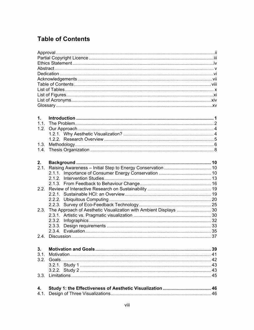
Table of Contents
Approval .............................................................................................................................ii Partial Copyright Licence .................................................................................................. iii Ethics Statement ...............................................................................................................iv Abstract ............................................................................................................................. v Dedication .........................................................................................................................vi Acknowledgements .......................................................................................................... vii Table of Contents ............................................................................................................ viii List of Tables ..................................................................................................................... x List of Figures....................................................................................................................xi List of Acronyms .............................................................................................................. xiv Glossary ...........................................................................................................................xv
1. Introduction ............................................................................................................ 1 1.1. The Problem ............................................................................................................. 2 1.2. Our Approach ........................................................................................................... 4
1.2.1. Why Aesthetic Visualization? ....................................................................... 4 1.2.2. Research Overview ...................................................................................... 5
1.3. Methodology ............................................................................................................. 6 1.4. Thesis Organization ................................................................................................. 8
2. Background .......................................................................................................... 10 2.1. Raising Awareness – Initial Step to Energy Conservation ..................................... 10
2.1.1. Importance of Consumer Energy Conservation ......................................... 10 2.1.2. Intervention Studies .................................................................................... 13 2.1.3. From Feedback to Behaviour Change ........................................................ 16
2.2. Review of Interactive Research on Sustainability .................................................. 19 2.2.1. Sustainable HCI: an Overview .................................................................... 19 2.2.2. Ubiquitous Computing ................................................................................ 20 2.2.3. Survey of Eco-Feedback Technology ......................................................... 25
2.3. The Approach of Aesthetic Visualization with Ambient Displays ........................... 30 2.3.1. Artistic vs. Pragmatic visualization ............................................................. 30 2.3.2. Infographics ................................................................................................ 32 2.3.3. Design requirements .................................................................................. 33 2.3.4. Evaluation ................................................................................................... 35
2.4. Discussion .............................................................................................................. 37
3. Motivation and Goals ........................................................................................... 39 3.1. Motivation ............................................................................................................... 41 3.2. Goals ...................................................................................................................... 42
3.2.1. Study 1 ....................................................................................................... 43 3.2.2. Study 2 ....................................................................................................... 43
3.3. Limitations .............................................................................................................. 45
4. Study 1: the Effectiveness of Aesthetic Visualization ...................................... 46 4.1. Design of Three Visualizations ............................................................................... 46
ix
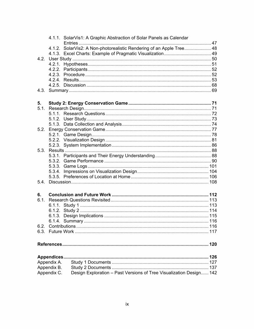
4.1.1. SolarVis1: A Graphic Abstraction of Solar Panels as Calendar Entries ........................................................................................................ 47
4.1.2. SolarVis2: A Non-photorealistic Rendering of an Apple Tree ..................... 48 4.1.3. Excel Charts: Example of Pragmatic Visualization ..................................... 49
4.2. User Study ............................................................................................................. 50 4.2.1. Hypotheses ................................................................................................. 51 4.2.2. Participants ................................................................................................. 52 4.2.3. Procedure ................................................................................................... 52 4.2.4. Results ........................................................................................................ 53 4.2.5. Discussion .................................................................................................. 68
4.3. Summary ................................................................................................................ 69
5. Study 2: Energy Conservation Game ................................................................. 71 5.1. Research Design .................................................................................................... 71
5.1.1. Research Questions ................................................................................... 72 5.1.2. User Study .................................................................................................. 73 5.1.3. Data Collection and Analysis ...................................................................... 74
5.2. Energy Conservation Game ................................................................................... 77 5.2.1. Game Design .............................................................................................. 78 5.2.2. Visualization Design ................................................................................... 81 5.2.3. System Implementation .............................................................................. 86
5.3. Results ................................................................................................................... 88 5.3.1. Participants and Their Energy Understanding ............................................ 88 5.3.2. Game Performance .................................................................................... 90 5.3.3. Game Logs ............................................................................................... 101 5.3.4. Impressions on Visualization Design ........................................................ 104 5.3.5. Preferences of Location at Home ............................................................. 106
5.4. Discussion ............................................................................................................ 108
6. Conclusion and Future Work ............................................................................ 112 6.1. Research Questions Revisited ............................................................................. 113
6.1.1. Study 1 ..................................................................................................... 113 6.1.2. Study 2 ..................................................................................................... 114 6.1.3. Design Implications .................................................................................. 115 6.1.4. Summary .................................................................................................. 116
6.2. Contributions ........................................................................................................ 116 6.3. Future Work ......................................................................................................... 117
References ................................................................................................................... 120
Appendices .................................................................................................................. 126 Appendix A. Study 1 Documents ............................................................................ 127 Appendix B. Study 2 Documents ............................................................................ 137 Appendix C. Design Exploration – Past Versions of Tree Visualization Design ...... 142
x
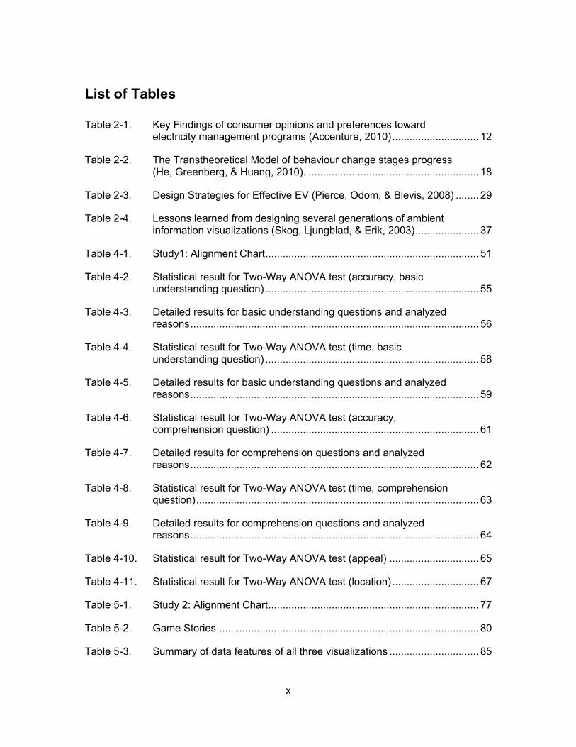
List of Tables
Table 2-1. Key Findings of consumer opinions and preferences toward electricity management programs (Accenture, 2010) .............................. 12
Table 2-2. The Transtheoretical Model of behaviour change stages progress (He, Greenberg, & Huang, 2010). ........................................................... 18
Table 2-3. Design Strategies for Effective EV (Pierce, Odom, & Blevis, 2008) ........ 29
Table 2-4. Lessons learned from designing several generations of ambient information visualizations (Skog, Ljungblad, & Erik, 2003) ...................... 37
Table 4-1. Study1: Alignment Chart .......................................................................... 51
Table 4-2. Statistical result for Two-Way ANOVA test (accuracy, basic understanding question) .......................................................................... 55
Table 4-3. Detailed results for basic understanding questions and analyzed reasons .................................................................................................... 56
Table 4-4. Statistical result for Two-Way ANOVA test (time, basic understanding question) .......................................................................... 58
Table 4-5. Detailed results for basic understanding questions and analyzed reasons .................................................................................................... 59
Table 4-6. Statistical result for Two-Way ANOVA test (accuracy, comprehension question) ........................................................................ 61
Table 4-7. Detailed results for comprehension questions and analyzed reasons .................................................................................................... 62
Table 4-8. Statistical result for Two-Way ANOVA test (time, comprehension question) .................................................................................................. 63
Table 4-9. Detailed results for comprehension questions and analyzed reasons .................................................................................................... 64
Table 4-10. Statistical result for Two-Way ANOVA test (appeal) ............................... 65
Table 4-11. Statistical result for Two-Way ANOVA test (location) .............................. 67
Table 5-1. Study 2: Alignment Chart ......................................................................... 77
Table 5-2. Game Stories ........................................................................................... 80
Table 5-3. Summary of data features of all three visualizations ............................... 85
xi
List of Figures
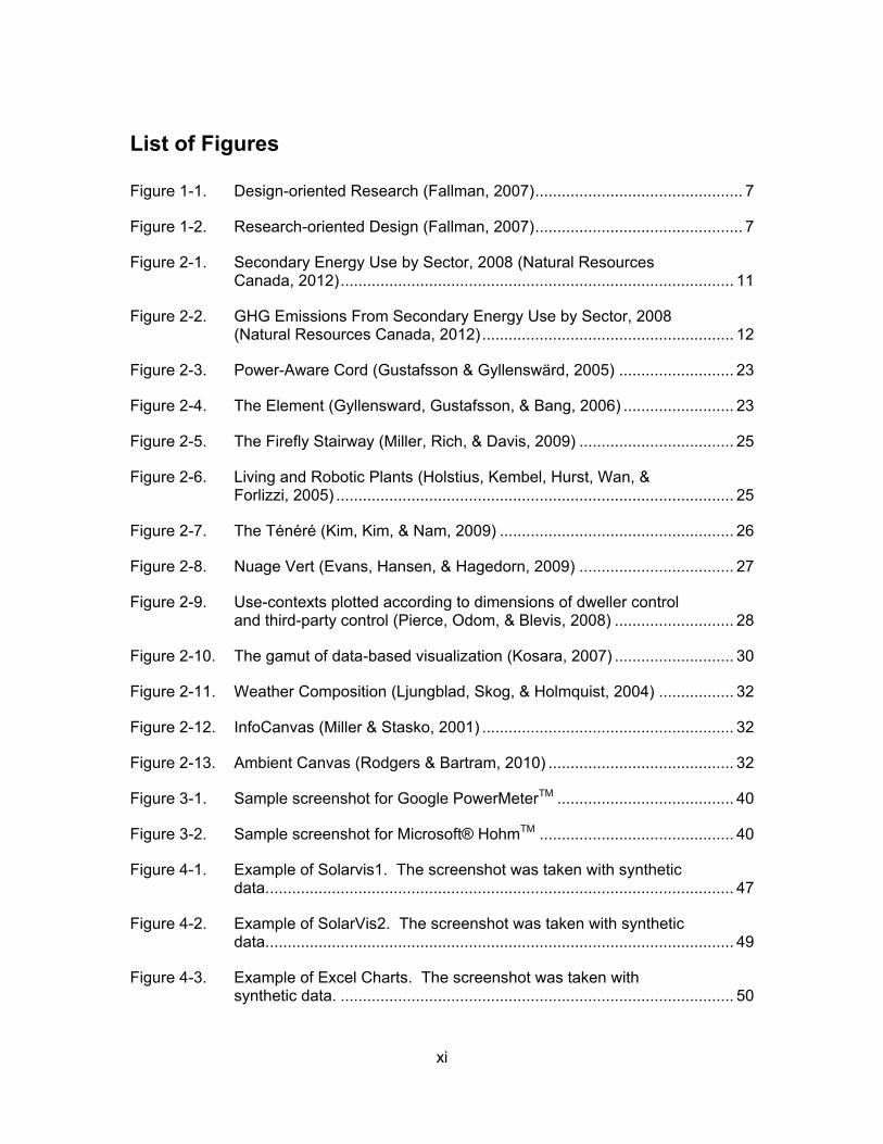
Figure 1-1. Design-oriented Research (Fallman, 2007) ............................................... 7
Figure 1-2. Research-oriented Design (Fallman, 2007) ............................................... 7
Figure 2-1. Secondary Energy Use by Sector, 2008 (Natural Resources Canada, 2012) ......................................................................................... 11
Figure 2-2. GHG Emissions From Secondary Energy Use by Sector, 2008 (Natural Resources Canada, 2012) ......................................................... 12
Figure 2-3. Power-Aware Cord (Gustafsson & Gyllenswärd, 2005) .......................... 23
Figure 2-4. The Element (Gyllensward, Gustafsson, & Bang, 2006) ......................... 23
Figure 2-5. The Firefly Stairway (Miller, Rich, & Davis, 2009) ................................... 25
Figure 2-6. Living and Robotic Plants (Holstius, Kembel, Hurst, Wan, & Forlizzi, 2005) .......................................................................................... 25
Figure 2-7. ..................................................... 26
Figure 2-8. Nuage Vert (Evans, Hansen, & Hagedorn, 2009) ................................... 27
Figure 2-9. Use-contexts plotted according to dimensions of dweller control and third-party control (Pierce, Odom, & Blevis, 2008) ........................... 28
Figure 2-10. The gamut of data-based visualization (Kosara, 2007) ........................... 30
Figure 2-11. Weather Composition (Ljungblad, Skog, & Holmquist, 2004) ................. 32
Figure 2-12. InfoCanvas (Miller & Stasko, 2001) ......................................................... 32
Figure 2-13. Ambient Canvas (Rodgers & Bartram, 2010) .......................................... 32
Figure 3-1. Sample screenshot for Google PowerMeterTM ........................................ 40
Figure 3-2. Sample screenshot for Microsoft® HohmTM ............................................ 40
Figure 4-1. Example of Solarvis1. The screenshot was taken with synthetic data. ......................................................................................................... 47
Figure 4-2. Example of SolarVis2. The screenshot was taken with synthetic data. ......................................................................................................... 49
Figure 4-3. Example of Excel Charts. The screenshot was taken with synthetic data. ......................................................................................... 50
xii
Figure 4-4. Participant Demographics – Gender ....................................................... 54
Figure 4-5. Participant Demographics – Age ............................................................. 54
Figure 4-6. Accuracy by basic understanding question for each visualization ........... 56
Figure 4-7. Time by basic understanding question for each visualization ................. 59
Figure 4-8. Accuracy by comprehension question for each visualization .................. 62
Figure 4-9. Time by comprehension question for each visualization ......................... 64
Figure 4-10. Rate by appeal for each visualization ...................................................... 66
Figure 4-11. Rate by location for each visualization .................................................... 67
Figure 5-1. Web Interface of Energy Conservation Game ......................................... 79
Figure 5-2. Game Story Example .............................................................................. 81
Figure 5-3. Self-evaluation Example .......................................................................... 81
Figure 5-4. Abstract Tree with Berries to represent positive actions ......................... 82
Figure 5-5. Abstract Tree without berries ................................................................... 84
Figure 5-6. Bar Chart with embellishment .................................................................. 85
Figure 5-7. Energy Conservation Game - System Architecture ................................. 87
Figure 5-8. System Installations ................................................................................. 88
Figure 5-9. Participants demographics ...................................................................... 89
Figure 5-10. Conservation activities mentioned by participants, number of mentions stacked by grade ...................................................................... 90
Figure 5-11. User Actual Game Score by Participants ................................................ 91
Figure 5-12. User Perceived Game Score by Participants .......................................... 92
Figure 5-13. Delta (actual score – perceived score) by Participants ........................... 93
Figure 5-14. User Actual Game Score by Tasks ......................................................... 94
Figure 5-15. User Perceived Game Score by Tasks ................................................... 94
Figure 5-16. Delta (actual score – perceived score) by Tasks ..................................... 95
Figure 5-17. User Actual Game score by story ............................................................ 96
xiii
Figure 5-18. User Perceived Game score by story ...................................................... 96
Figure 5-19. Delta (actual score – perceived score) by story ...................................... 96
Figure 5-20. Game Score by visualizations ................................................................. 97
Figure 5-21. Fridge Setting .......................................................................................... 99
Figure 5-22. Room Temperature Control ..................................................................... 99
Figure 5-23. Lighting .................................................................................................... 99
Figure 5-24. Turn Off Unused Appliances ................................................................. 100
Figure 5-25. Unplug Unused Appliances ................................................................... 100
Figure 5-26. Number of game logs by individual appliances ..................................... 102
Figure 5-27. Number of game logs by individual appliances separated by visualizations ......................................................................................... 103
Figure 5-28. Number of logs by game story ............................................................... 104
Figure 5-29. Number of logs by visualization ............................................................. 104
Figure 5-30. P t c p t’s d v du l p ss o o v su l z t o vs. t ctu l game scores .......................................................................................... 105
Figure 5-31. P t c p ts’ p ss o s o d ff t v su l z t o s ............................. 105
Figure 5-32. Individual preferences of location at home ............................................ 107
Figure 5-33. General preferences on location at home across three visualizations ......................................................................................... 107
Figure 5-34. Sample in-home placement of the display ............................................. 109
xiv
List of Acronyms
AmI Ambient Intelligence
EV Eco-visualization
GHG Green House Gas
HCI Human Computer Interaction
Infographic Information Graphic
NRCan Natural Resources Canada
UI User Interface

xv
Glossary
Ambient Display “Ambient displays are abstract and aesthetic peripheral displays portraying non-critical information on the periphery of a us ’s ttention.” (Mankoff, Dey, Hsieh, Kientz, Lederer, & Ames, 2003)
Calm Technology A type of information technology where the interaction between t t c ology d ts us s d s g d to occu t us ’s periphery rather than constantly at the center of attention. “Calm technology engages both the center and the periphery of our attention, and in fact moves back and forth between the two.” (Weiser & Brown, The coming age of calm technolgy, 1997)
Consumer Energy Use The use of electrical energy in support of daily activities. In this context, it particularly refers to: 1) charging of mobile devices at a solar charging station and 2) electricity use at home to power all sorts of home appliances.
Vampire Power Vampire power refers to the electric power consumed by electronic and electrical appliances while they are switched off or in a standby mode.
1
1. Introduction
All people, everywhere, use energy. People use it for cooking, heating, lighting
and powering all sorts of their electronics. They may use it economically or wastefully,
consciously or blissfully unaware of how and where it is being consumed. However,
energy use never occurs without side effects, it is at the cost of environmental
degradation: global warming, climate change and water and soil pollution. With the large
growth of energy demand, such impacts on deterioration of the environment have
become prominent and significant. The situation requires immediate attention and
action from policy makers, environmentalists, designers and citizens to improve energy
performance, including raising energy efficiency and promoting energy conservation.
In Canada, great efforts have been made to reduce green house gas (GHG)
emissions and to protect the environment with clean energy technologies. According to
the recent annual Report to Parliament:
Natural Resources Canada (NRCan) promotes energy efficiency and the use of alternative energy as a means to reduce GHG emissions and save money. NRCan uses a broad range of policy instruments, including leadership; information; voluntary initiatives; financial incentives; research, development and demonstration; and regulation. (Natural Resources Canada, 2012)
In British Columbia, the provincial government has laid several plans addressing
energy issues and strategies, which include the BC Energy Plan (B.C.'s Ministry of
Energy, Mines and Petroleum Resources, 2009), BC Climate Action Plan (B.C.'s Ministry
of Environment, 2009) and The Green Energy Advisory Task Force Report (B.C.'s
Ministry of Environment, 2009). The government plans primarily target energy
conservation and efficiency from a macroscopic view, such as making more investments
in clean and renewable energy. From the consumers’ end, the local utility company has
carried out the Smart Metering Program, aimed at helping residential customers reduce

2
energy use and save money by providing them with timely information about their energy
consumption with in-home feedback tools. As the company highlights,
Without specific and timely information about your consumption, it's difficult to make informed decisions to actively manage your electricity use. The introduction of smart meter enabled technology will give you the ability to track your power use and costs regularly, along with access to new tools to better understand and manage your electricity use. (BC Hydro, 2013)
Notably, information on energy use is an important instrument to be emphasized
as it increases consumer awareness of the environmental impact of energy use and
encourages them to become more energy efficient. It allows consumers to know their
energy consumption and make more informed decisions to actively manage their energy
use. More importantly, technology makes a difference in how we may effectively and
successfully deliver the information. And this presents opportunities for designers,
researchers and technologists to develop new information technology to bridge the gap
between consumer awareness of energy use and their everyday activities and to
contribute to a greener world.
1.1. The Problem
However, the problem here is: what, how and where should information on
energy use be delivered to consumers to initiate changes towards energy conservation?
What is the right information? Individual consumers think of energy in three ways:
as a commodity, a basic human need and an ecological resource (Darby, 2001). As a
commodity, it is important for consumers to know the cost, how much energy they have
consumed and where it has been consumed. As a basic human need, consumers need
to be informed that energy is a scarcity that should be used appropriately. Information
on energy shortage, availability and supply should be available to them. Finally, as an
ecological resource, consumers should be educated as to where energy comes from,
how its production affects the environment and how their actions with respect to
consumption may lower the environmental impact. Therefore, information on energy
consumption alone is inadequate for consumers to make informed decisions.
3
Supplementary information such as how energy consumption relates to GHG emissions
and everyday activities may also be helpful.
How should consumers see the information? There are various ways for
consumers to access the information discussed above. In British Columbia, the public
utility company actively promotes the Smart Metering Program, which allows customers
to track their power use and costs on a regular basis. The program intends to help
consumers save energy and money by providing specific and timely information about
their consumption (BC Hydro, 2013). The recent annual Report to Parliament mentions
that “information activities include publications, exhibits, advertising, toll-free telephone
lines, conferences, Web sites, workshops, training, building-design software and
promotional products” (Natural Resources Canada, 2012). These activities
communicate information that focuses on viewing energy as a basic human need and an
ecological resource.
Where would it be appropriate for consumers to see the information? Information
can be displayed either publicly or privately, depending on the content. For information
that is for educational purposes, it should be distributed publicly via exhibits, advertising
or Web sites so as to arouse wide public concern. Whereas for information related to
personal energy consumption, people would prefer to keep it in private, to have it shown
in their homes or through Web sites with user authentications. However, research also
shows that energy consumption is a social behaviour, proper sharing of consumption
information among communities, friends and/or families might lead to positive
competitions towards energy conservation (Darby, 2010).
Taken together, what, how and where information should be delivered to raise
consumer awareness of energy production and consumption and to bridge the gap
between consumer activity and energy conservation is a complex problem. To date,
much effort has been put into designing and developing feedback technologies to
effectively distribute information of consumer energy use (Darby, 2001). And this is also
the focus of our research discussed in this thesis.
4
1.2. Our Approach
To address the problem discussed above, we have explored the feedback tools
that are currently available from paper bills to more recent web-based applications
(Google PowerMeterTM and Microsoft® HohmTM). We point out that the problem with the
former is that the information provided is inadequate for decision-making, lacking details
of how energy is consumed relating to consumer activities. And the billing cycle is
usually too long for the consumers to receive timely feedback. Whereas the latter,
although detailed, precise and prompt, is not attractive and engaging; and does not
integrate gracefully into the environment. As an alternative, we propose that aesthetic
visualization may be a promising approach to the provision of feedback for consumer
energy use.
1.2.1. Why Aesthetic Visualization?
W dopt os ’s d f t o of st t c v su l z t o s oppos d to p g t c
visualization. It treats aesthetics as an important value and has the advantage of
applying various depictive and narrative-related forms of representation to communicate
a concern about the underlying information (Kosara, 2007). Besides aesthetics, another
primary property of aesthetic visualization is periphery. It can remain peripheral to
p opl ’s tt t o w l sust g t st ov t (Ljungblad, Skog, & Holmquist,
2004). Forms of aesthetic visualization include ambient and artistic visualization (or
informative art) and infographics.
We argue that the aesthetic visualization approach to consumer energy use
feedback offers promise over pragmatic visualization for the following reasons. First, we
can explore more engaging representations to make it more attractive, especially to
children. Enhanced engagement adds potential to make it an educational tool to inform
people of energy use and conservation. Second, it supports at-a-glance awareness.
This requires less effort for people to notice and interpret the data. Finally, considering
the aesthetics of both the visualization and the context as an explicit factor makes the
display part of daily life and activities, and integrate better into the environment.
Pragmatic visualizations are not p f d pl c s suc s p opl ’s o s s ply
because their serious looks do not fit with the environment. Taken together, we believe

5
that the aesthetic visualization approach has great potential because it engages people
more with its interesting display, s p p l to p opl ’s tt t o w l
sustaining interest over time; and has better integration into the environment with high
aesthetic value.
1.2.2. Research Overview
Our research is to explore whether the aesthetic visualization as an approach to
consumer energy use feedback is able to inform and ultimately lead consumers to use
energy in an ecological fashion. The research begins with a thorough literature review of
the problem to establish the theoretical background and situate the work into the broader
research field of Sustainable Human Computer Interaction (HCI).
To explore the effectiveness and utility of this approach, we make experimental
investigations in two stages. In the first stage, we intend to prove that aesthetic
visualization has the advantage of engaging people with a visually compelling display
while maintaining comprehensibility and supporting at-a-glance awareness. We quantify
comprehensibility into two statistical measures: accuracy of user interpretation and time
required for the interpretation. We present the results with a quantitative method and
confirm our hypotheses. Following this, we extend the research with a second user
study to evaluate various forms of aesthetic visualizations targeted at school-age
children through real usage via a game that simulates a real-life environment. This age
group is chosen because: 1) energy forms a major part of the school curriculum during
the middle school years (grade 5-8) (Ministry of Education, 2010); 2) the impact of
c ld ’s awareness on parental behaviour is known to have an influence on the adults
in their homes (Evans S. M., 1996; Mandel, 2013); 3) these represent our future
generations: we were interested in understanding how best to enhance and sustain their
learning about energy and conservation. As a result, we suggest that aesthetic
visualization should be considered a promising approach to energy feedback that
enables informed decision-making. Moreover, another finding that is not quite
anticipated in our hypotheses is that the game turns out to be a helpful tool to tease out
and elicit where people do not understand or remember about energy consumption in
their homes.

6
As a by-product of evaluating the approach, we draw some design implications in
this design space. First, it is important to choose the right data for display. Information
of high relevancy and consumer interest should be presented to better support
understanding and decision-making. Second, aesthetics is a key issue to be considered
provided that comprehensibility is well maintained. Our experience shows that graphical
representations that are conceptually related lead to better comprehension. Finally, the
design of aesthetic visualization is a process of trial and error. Sketches and software
prototypes are fast and useful ways to try out different design ideas. Also user
preferences and opinions should be highly valued.
This work makes three primary contributions to research in developing novel
ways of effective energy feedback. First, we demonstrate that aesthetic visualization is
able to maintain its comprehensibility while better engaging people with its richer and
more visually appealing representations. Second, we show that aesthetic and depictive
visualization has the potential to support decision-making and learning. Finally, we
examine the promise and viability of its utility in real-life settings through two user
studies.
As a limitation, this research considers only the design aspects of the approach
but does not address whether it has an impact on user behaviour change. Although it is
an important aspect to be considered in evaluating feedback technology, it is not part of
our intention due to limitations of sample size, study duration and physical contexts. As
will be discussed, to fully evaluate aesthetic visualization as feedback for energy use,
especially to find out whether it has an effect on behaviour change towards energy
conservation, further long-term in-situ studies are required and necessary (Skog, 2006).
1.3. Methodology
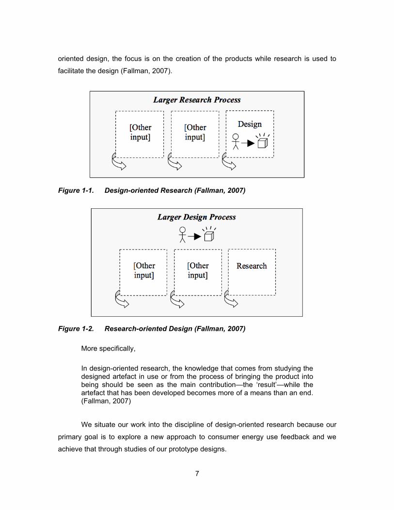
We take a design-oriented research perspective with mixed methods throughout
our research process. Design-oriented research (Figure 1-1), as opposed to research-
oriented design (Figure 1-2), seeks to reveal new knowledge through design, during
which research is the main objective and design is the means; whereas for research-
7
oriented design, the focus is on the creation of the products while research is used to
facilitate the design (Fallman, 2007).
Figure 1-1. Design-oriented Research (Fallman, 2007)
Figure 1-2. Research-oriented Design (Fallman, 2007)
More specifically,
In design-oriented research, the knowledge that comes from studying the designed artefact in use or from the process of bringing the product into being should be seen as the main contribution—t ‘ sult’—while the artefact that has been developed becomes more of a means than an end. (Fallman, 2007)
We situate our work into the discipline of design-oriented research because our
primary goal is to explore a new approach to consumer energy use feedback and we
achieve that through studies of our prototype designs.
8
To study the visualization prototypes as a means to this exploratory research, we
conducted two user studies. User studies are essential in design-oriented research, as
Fallman points out:
Studying an artefact to gain some new knowledge is hence as much a qu st o of u d st d g p opl co t xt d ‘ ow’—i.e. looking into and trying to grasp the complex interplay between people, technologies, d soc ty d ow t s ‘ ow’ c g s w w artefact is introduced—as it is to develop and study technology. (Fallman, 2007)
Additionally, user studies are important in evaluating visualization techniques
b c us “user studies offer a scientifically sound method to measur v su l z t o ’s
performance” (Kosara, Healey, Interrante, Laidlaw, & Ware, 2003). According to Kosara
et al. (2003), the importance of conducting user studies includes “to evaluate the
strengths and weaknesses of different visualization techniques” “to show that a new
visualization technique is useful in a practical sense” “to seek insight into why a
particular technique is effective” d “to show that an abstract theory applies under
certain practical conditions”.
This design-oriented research discipline has also influenced our selection of
methods. Our studies focus on user experience of several prototype designs, which
involves both statistics and interviews. Therefore, we choose mixed-methods because it
“involves collecting, analyzing, and mixing qualitative and quantitative approaches at
many phases in the research process” “focuses on collecting, analyzing, and mixing
quantitative and qualitative data in a s gl study o s s of stud s” d “provides a
better understanding of research probl s t t pp o c lo ” (Creswell &
Plano Clark, 2011). In this thesis research, both quantitative and qualitative data are
collected and analyzed as evidence to reflect on the research questions and as
implications to assist future work in the related field.
1.4. Thesis Organization
This thesis document consists of six chapters including this Introduction chapter.
The rest of the document is organized as follows:
9
Chapter 2: Background presents a literature review of the problem and
establishes the theoretical background to our research with focuses on three main
areas. First, consumer perception on energy conservation as related to decision-making
is discussed and strategies and theoretical studies on interventions to motivate
sustainable behaviours are explored. Second, a survey of interactive research in the
domain of Sustainable HCI is conducted to expand our knowledge to better situate the
research discussed in this thesis into this field. Finally, the approach of aesthetic
visualization with ambient displays is reviewed with highlights on design requirements
and evaluation methods followed by examples of existing work.
Chapter 3: Motivation and Goals begins with a review of current available energy
feedback technologies. Their drawbacks have motivated us to explore a novel way of
using aesthetic visualization as feedback on energy use. The chapter further describes
the research goals we aim to achieve with our two-staged studies addressed in this
thesis and outlines the scopes and limitations of our research.
In Chapter 4: Study 1: Effectiveness of Aesthetic Visualization, we present our
first experimental investigation of exploring the effectiveness of using aesthetic
visualization as feedback for power and energy use. The study addresses effectiveness
on user comprehension. The results of the study are analyzed using a quantitative
method and the implications of these preliminary results are discussed.
In Chapter 5: Study 2: Energy Conservation Game, we present the second study
extending the previous one to further explore the effectiveness of aesthetic visualization
s f db ck fo gy us t s of “d c s o - k g” w t o realistically
representative simulations – a game, and an ambient display. The study takes a design-
oriented research perspective with mixed evaluation methods. The chapter covers
descriptions of planning and details of the user study, introductions of design and
implementation of the study installations and analysis and discussions of the study
results.
Finally, Chapter 6: Conclusion and Future Work summarizes the findings of this
research by revisiting the research questions. Conclusions are made to detail the
contributions this research has made towards the broader area of Sustainable HCI. Also
opportunities and paths to future work are outlined.
10
2. Background
This chapter explores and discusses literature that provides context for
overviewing existing research and projects in energy conservation and establishes the
theoretical background to our research. The literature review addresses on three main
areas. First, current strategies of promoting consumer energy conservation are
explored, with special attention to intervention studies that focus on providing effective
feedback to motivate behaviour change. Second, a survey of recent interactive research
projects on sustainability is conducted to expand our knowledge in the related area. The
extensive past works also help us to situate our research into the field and to locate
areas for contribution and improvement. Finally, various research works on aesthetic
visualization techniques and ambient displays are reviewed. Especially, design
requirements and evaluation methods are discussed for this approach with examples of
existing applications.
2.1. Raising Awareness – Initial Step to Energy Conservation
One major challenge in promoting energy conservation is to inform consumers of
the link between their energy use and the environmental consequences and how their
inconspicuous efforts may contribute significantly to higher energy efficiency. In this
section, findings of consumer perceptions on energy consumption and conservation are
reviewed and theoretical studies on interventions are addressed. Additionally, previous
research on how feedback affects decision-making and further leads to behaviour
change is discussed.
2.1.1. Importance of Consumer Energy Conservation
The importance of consumer energy conservation is obvious as a recent report
reveals that in Canada, residential energy use accounts for 17 percent of the total
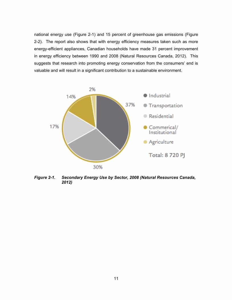
11
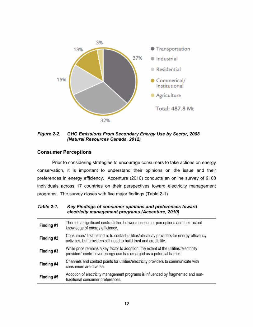
national energy use (Figure 2-1) and 15 percent of greenhouse gas emissions (Figure
2-2). The report also shows that with energy efficiency measures taken such as more
energy-efficient appliances, Canadian households have made 31 percent improvement
in energy efficiency between 1990 and 2008 (Natural Resources Canada, 2012). This
sugg sts t t s c to p o ot g gy co s v t o f o t co su s’ d s
valuable and will result in a significant contribution to a sustainable environment.
Figure 2-1. Secondary Energy Use by Sector, 2008 (Natural Resources Canada, 2012)
12
Figure 2-2. GHG Emissions From Secondary Energy Use by Sector, 2008 (Natural Resources Canada, 2012)
Consumer Perceptions
Prior to considering strategies to encourage consumers to take actions on energy
conservation, it is important to understand their opinions on the issue and their
preferences in energy efficiency. Accenture (2010) conducts an online survey of 9108
individuals across 17 countries on their perspectives toward electricity management
programs. The survey closes with five major findings (Table 2-1).
Table 2-1. Key Findings of consumer opinions and preferences toward electricity management programs (Accenture, 2010)
Finding #1 There is a significant contradiction between consumer perceptions and their actual knowledge of energy efficiency.
Finding #2 Consumers' first instinct is to contact utilities/electricity providers for energy-efficiency activities, but providers still need to build trust and credibility.
Finding #3 While price remains a key factor to adoption, the extent of the utilities’/electricity providers’ control over energy use has emerged as a potential barrier.
Finding #4 Channels and contact points for utilities/electricity providers to communicate with consumers are diverse.
Finding #5 Adoption of electricity management programs is influenced by fragmented and non-traditional consumer preferences.
13
These findings yield further insights for utilities/electricity providers to develop
more effective conservation strategies. One of such strategies is to educate consumers
and raise their awareness of the interconnection between their energy usage behaviour
and the impact on the environment (Accenture, 2010).
Consumer Energy Research
In fact, vast growth in conservation-related consumer research can be traced
back to 1970s. Gordon et al. (1981) review 645 studies in this domain between 1974
and 1980 and categorize them into two primary streams: first, research that centers on
understanding consumers; and second, research that focuses on the impact of
conservation initiatives.
The first stream has four subcategories: (1) opinion research, (2) self-reported
conservation, (3) adoption/diffusion research and (4) modelling energy consumption.
The authors find that the major problem existed in this stream of studies is the lack of
ssoc t o b tw gy co su pt o d co su s’ v ws d tt tud s tow ds
conservation. Co su s’ l f styl s “ ccount for 20-30 percent of the variance in
co su pt o ” (Lundstrom, 1980; Sonderegger, 1978; Gordon, John, J.R., & C., 1981).
The second stream concerns four types of primary conservation initiatives:
information, incentive, disincentive and restriction. In assessing these studies, the
authors recognize that the negligence of cost-effectiveness has been the major failure in
developing programs for encouraging consumer conservation actions (Gordon, John,
J.R., & C., 1981).
2.1.2. Intervention Studies
The next step is to develop interventions to help consumers reduce energy
consumption. The goal is to affect decision-making and ultimately motivate sustainable
behaviours. Over the past few decades, various social and environmental studies have
embarked on designing and implementing intervention plans and testing the
effectiveness of intervention strategies. The following section elaborates on different
types of interventions, their success and shortcomings. Also methods and criteria for
evaluating the effectiveness of an intervention are discussed.
14
Intervention Types
According to Darby (2010), intervention strategies can be categorized into five
main types: enhanced billing, financial incentives, written tips and advice on energy
saving, in-home displays and community programmes. Each has been employed with
varying degrees of success.
A utility bill is a form of feedback informing consumers of their energy use with
monetary consequences. The problem with a standard bill is its low billing frequency
(Gaskell, Ellis, & Pike, 1982) and lack of advice (Wilhite & Rich, 1995). However, even
with enhanced billing, i.e. bills with more frequent billing rate and more informative data,
the result in reduction of energy use is low as shown in a few studies (Garay & Lindholm,
1995; Henderson, Staniaszek, Anderson, & Phillipson, 2003).
Various financial incentive strategies have been made to motivate energy
savings, and they mainly fall into two categories: incentives to reduce consumption and
incentives to shift consumption (Darby, 2010). Successful incentive strategies of the
former include rebates, grants and loans (Shipworth, 2000). However, the positive effect
is short-lived and only lasts as long as the incentive lasts (Abrahamse, Linda, Charles, &
Talib, 2005). Incentives to shift consumption aim at encouraging consumers to use
electricity at low demand times by applying time-of-use rates. Studies have indicated
that this has resulted 20 percent in bill savings (Isaacson, Kotewa, Star, & Ozog, 2006)
and 4 percent conservation impact (King & Delurey, 2005).
Few studies have shown whether written tips or advice is effective in promoting
energy conservation (Darby, 2010). However, advice by home audits has proved to be
effective, especially when the information is tailored for a specific family (Abrahamse,
Linda, Charles, & Talib, 2005).
In-home display refers to a range of display monitors that provide real-time,
historical or predictive feedback of energy consumption. Examples include Smart Meter,
Power Cost Monitor (PCM) and various web-based displays. Darby (2010) concludes
from various in-home display studies that they only work for people who are already
motivated and know how to use these devices. She also states that the design of the
displays needs to be aesthetically pleasing and self-explanatory so as to engage more
15
people to use them. Besides, the cost-effectiveness should be well taken into
consideration, i.e., the price for the display should be carefully decided (Gordon, John,
J.R., & C., 1981).
Social influence constitutes an important impact on consumer energy
conservation and community programmes can be very effective in addressing this issue
(Darby, 2010). One main form of such programme is to set up competition between
households with similar settings. Studies have shown that people are more concerned
with information from their friends or families and comparative social feedback can lead
up to 10 percent energy reduction (Shipworth, 2000).
Effectiveness Evaluation
The effectiveness of the interventions needs to be carefully evaluated to improve
our understanding and knowledge for carrying out more valid future intervention plans.
Abrahamse et al. (2005) review 38 studies to access the effectiveness of interventions
based on four criteria: (1) measure of energy saving and/or change in behaviour the
intervention has caused; (2) to what degree these changes have been caused by the
intervention as compared to a control group; (3) how/why the intervention leads to these
changes; and (4) whether the intervention has carry on effect in energy conservation.
To examine the studies, the authors classify them into two groups based on when and
how interventions are employed to affect behaviour change: antecedent and
consequence.
Antecedent strategies include commitment, goal setting, information, and
modeling. Studies in this category have shown that all these strategies result in energy
reduction in varying degrees. Commitment has a long-term effect in energy saving.
Goal setting is effective when combined with feedback. Information is successful
especially when it is tailored and used with other interventions. Modelling has a positive
effect on spreading the knowledge but no statistical findings have been found to show
whether it has led to energy reduction (Abrahamse, Linda, Charles, & Talib, 2005).
Consequence strategies are mainly feedback and rewards. Feedback is
considered to be a crucial intervention in most conservation studies and the focuses
have been on both the feedback frequency and the feedback content. Abrahamse et al.
16
(2005) conclude that feedback is effective when it is provided on a frequent basis and
co b d w t ot t v t o s suc s w d. How v t ’s o d c t o
whether feedback in a particular type of content is more effective than the others
(Abrahamse, Linda, Charles, & Talib, 2005).
Multiple Interventions
Bot Ab s t l. 5 d D by’s 1 stud s s ow t t t v t o s
to promote energy conservation are successful especially when they are employed in
combinations. In particular, the feedback intervention contributes success to most other
interventions. Fo st c bot B ck 1 78 d McC ll y M dd ’s
experiments prove that combining goal setting with feedback receives a positive effect
on reducing electricity use. Another example is the EcoTeam Program that provides
ous olds w t t ow gy s v g fo t o s w ll s ot s’. The program
results in 20 percent of gas savings and 5 percent of electricity savings (Staats, Harland,
& Wilke, 2004). Also the Energy-Smart Pricing Plan, which applies a web-based display
to show real-time electricity pricing, results in a shift of consumption to off-peak hours
and savings in energy bills (Isaacson, Kotewa, Star, & Ozog, 2006).
2.1.3. From Feedback to Behaviour Change
The ultimate goal of promoting energy feedback is to motivate consumer
behaviour change. To achieve a lasting effect, such conservational behaviours ought to
be finally formed as habits. However, getting people to develop and maintain more
sustainable lifestyles requires proper motivation. As discussed above, one effective way
to motivate change is to provide real-t co t uous f db ck of o ’s gy use.
According to Darby (2010), feedback plays an important role in decision-making based
on four theories: sociological, economic, educational and psychological.
Sociological Theory
The sociological theory basically suggests that with the timely and accurate
feedback, people can get a better understanding of their energy consumption, which in
turn affects their behaviours.
17
Economic Theory
The most direct way to affect energy usage is pricing. Based on the economic
theory, feedback on real-time pricing can help consumers shift energy usage and make
savings in their energy bills (Isaacson, Kotewa, Star, & Ozog, 2006).
Educational Theory
The educational theory states that consumers learn to use energy more
efficiently and effectively through increased awareness and experience. And feedback
has the role of providing such knowledge and helping people realize that they can
control their energy consumption in a more sustainable way (Darby, 2010).
Psychological Theory
Psyc olog c lly bot “st ulus- spo s c s s d g g g tt t o ”
can have an impact on energy consumption (Darby, 2010). W t c g s o ’s
understanding, perception and motivation towards energy conservation, changes in their
behaviour will also follow (Linda, 2008). From this point of view, Fischer (2008)
concludes from five review studies and 21 papers on the effectiveness of energy
f db ck t t “t ost successful feedback combines the following features: it is given
frequently and over a long time, provides an appliance-specific breakdown, is presented
in a clear and appealing way, and uses comput z d d t ct v tools”.
Transtheoretical Model
Another important work within the perspective of motivational psychology is the
“ ot v t o l f wo k” b s d o t st o t c l od l (He, Greenberg, & Huang,
2010). R t t v “o -size-fits- ll” solut o t g t d t behaviour change, the
authors address that behaviour change occurs as a process in a series of stages, within
each stage, specific feedback should be given to motivate people to move to the next
stage. Details of progress for each stage are presented in Table 2-2 below.
18
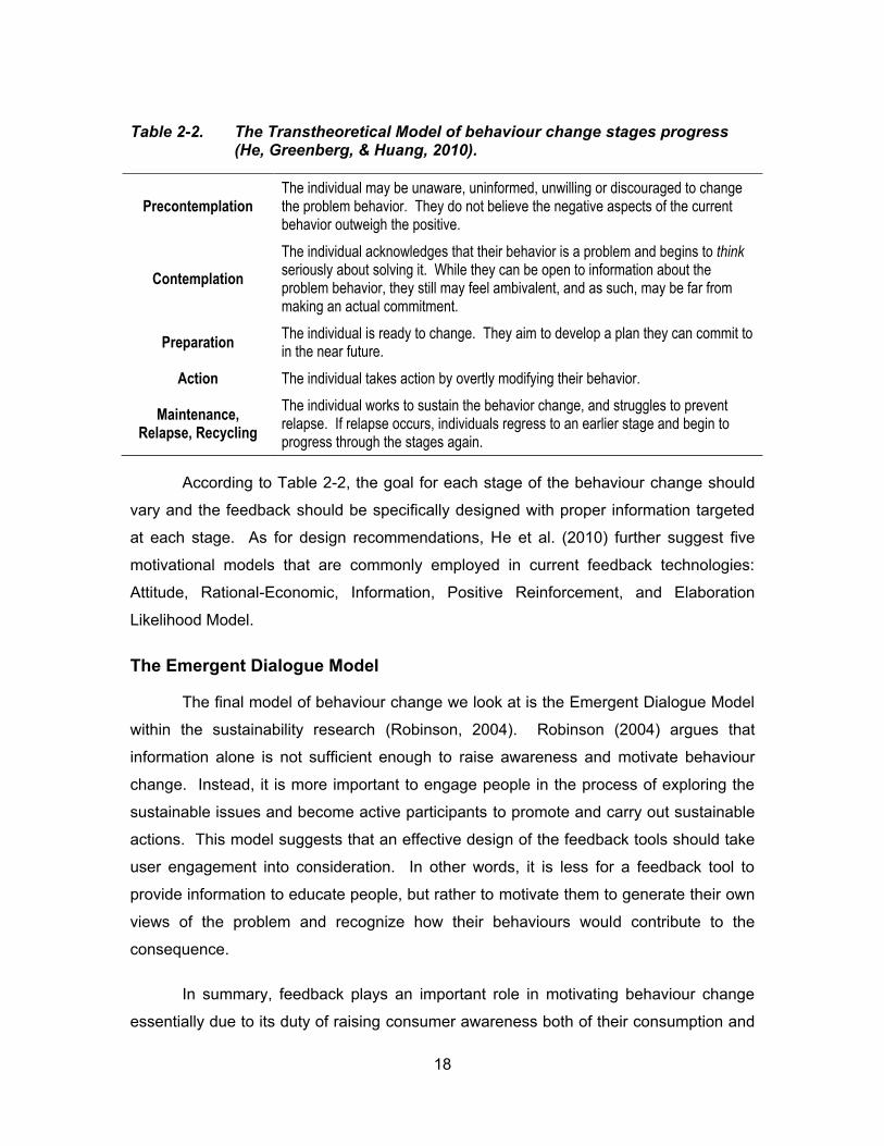
Table 2-2. The Transtheoretical Model of behaviour change stages progress (He, Greenberg, & Huang, 2010).
Precontemplation The individual may be unaware, uninformed, unwilling or discouraged to change the problem behavior. They do not believe the negative aspects of the current behavior outweigh the positive.
Contemplation
The individual acknowledges that their behavior is a problem and begins to think seriously about solving it. While they can be open to information about the problem behavior, they still may feel ambivalent, and as such, may be far from making an actual commitment.
Preparation The individual is ready to change. They aim to develop a plan they can commit to in the near future.
Action The individual takes action by overtly modifying their behavior.
Maintenance, Relapse, Recycling
The individual works to sustain the behavior change, and struggles to prevent relapse. If relapse occurs, individuals regress to an earlier stage and begin to progress through the stages again.
According to Table 2-2, the goal for each stage of the behaviour change should
vary and the feedback should be specifically designed with proper information targeted
at each stage. As for design recommendations, He et al. (2010) further suggest five
motivational models that are commonly employed in current feedback technologies:
Attitude, Rational-Economic, Information, Positive Reinforcement, and Elaboration
Likelihood Model.
The Emergent Dialogue Model
The final model of behaviour change we look at is the Emergent Dialogue Model
within the sustainability research (Robinson, 2004). Robinson (2004) argues that
information alone is not sufficient enough to raise awareness and motivate behaviour
change. Instead, it is more important to engage people in the process of exploring the
sustainable issues and become active participants to promote and carry out sustainable
actions. This model suggests that an effective design of the feedback tools should take
user engagement into consideration. In other words, it is less for a feedback tool to
provide information to educate people, but rather to motivate them to generate their own
views of the problem and recognize how their behaviours would contribute to the
consequence.
In summary, feedback plays an important role in motivating behaviour change
essentially due to its duty of raising consumer awareness both of their consumption and
19
of how to control their usage. Besides, it makes energy consumption more visible as a
commercial product in terms of pricing and helps consumers make more savings in their
energy bills.
2.2. Review of Interactive Research on Sustainability
In recent years, there have been increasing interests among researchers in the
ot o of “Sust bl HCI”. In this section, a review of recent interactive research
projects on sustainability is conducted to expand our knowledge in this area. Our main
focus is on ambient awareness and feedback technologies that are closely related to the
research discussed in this document.
2.2.1. Sustainable HCI: an Overview
With the explosive growth in sustainable HCI, many different approaches,
methods and orientations have emerged in the field, key topics covering ubiquitous
computing (discussed in section 2.2.2) and specifically energy feedback technologies
(discussed in section 2.2.3). To analyze and catalogue tons of research works in this
area, several researchers have made great effort to review and categorize the literature
and map out their intellectual similarities, differences and emerging issues.
In her review of 120 papers on the subject of HCI related to “nature”, “the
environment” or “sustainability”, Goodman (2009) identifies three environmental
discourses in human-computer interaction: sustainable interaction design, re-visioning
consumption and citizen sensing. Sustainable interaction design encourages
environmental decision-making in terms of manufacturing, use and disposal practices
through persuasive technological interventions (Goodman, 2009). An example of this is
to use aesthetic visualizations as feedback for resource consumption to engage
consumers and induce behaviour change (Holmes, 2007). Notably, our research also
fits into this discourse, as our primary focus is to motivate better decision-making
through more effective feedback. Re-visioning consumption focuses on how people
perceive their relationship towards the environment and treats consumption as a shared
experience instead of individual decisions. The resulting product is some belief system
20
t t ff cts p opl ’s f l gs towards the environment rather than force interventions
(Goodman, 2009). F lly c t z s s g tt pts to t t p opl s “c v c cto s” to
collect data for creating environmental information systems (Goodman, 2009).
Similarly, DiSalvo et al. review 157 papers related to sustainability and provide a
more precise and meticulous categorizations. In their analysis, research in sustainable
HCI is separated into five genres: persuasive technology, ambient awareness,
sustainable interaction design, formative user studies and persuasive and participatory
design (DiSalvo, Sengers, & Brynjarsdóttir, 2010). The major approach within
persuasive technology is to provide information to consumers of their unsustainable
behaviour and persuade them to behave in a more sustainable way. Ambient
awareness systems take advantage of calm technology and ambient displays to inform
consumers of the sustainable aspect of their behaviour. Often, it is applied in
combination with persuasive systems to improve decision-making (DiSalvo, Sengers, &
Brynjarsdóttir, 2010). Our work lies within these two genres and will be discussed in
detail in later sections. Sustainable interaction design defined by DiSalvo et al. aligns
with that of Goodman but more precisely describes sustainability as a “critical lens” for
design. Formative user studies draw attention to users as opposed to designers in
terms of their attitudes towards sustainability. Persuasive and participatory design is the
same as citizen sensing described by Goodman (DiSalvo, Sengers, & Brynjarsdóttir,
2010).
2.2.2. Ubiquitous Computing
Ubiquitous computing names the third wave in computing, just now beginning. First were mainframes, each shared by lots of people. Now we are in the personal computing era, person and machine staring uneasily at each other across the desktop. Next comes ubiquitous computing, or the age of calm technology, when technology recedes into the background of our lives. Alan Kay of Apple calls this "Third Paradigm" computing. (Weiser, 1996)
Ubiquitous computing is now widely applied in sustainable HCI research with two
main aspects: persuasive technology and ambient awareness. Examples are discussed
in the following sections.
21
Persuasive Technology
P su s o s “ tt pt to c g tt tud s o b v ou s o bot w t out
us g co c o o d c pt o ” (Fogg, 2002). Persuasive technology is a primary
research focus in sustainable HCI. As analyzed by DiSalvo et al., it accounts for 45% of
their entire corpus of research concerning sustainable HCI. The major approach is to
design systems that persuade people to behave more sustainably. Based on this design
strategy, there are two streams of such systems: system with strong persuasion and
system with passive persuasion (DiSalvo, Sengers, & Brynjarsdóttir, 2010).
The first stream informs people of the degree to which their behaviour is or is not
sustainable. One example of this is the PowerHouse, which is a persuasive computer
g d t s g pl y s’ w ss of do st c gy co su pt o d
influencing their behaviours associated with energy use (Bang, Torstensson, & Katzeff,
2006). Several persuasive methods are adopted in the game: first, the PowerHouse
itself is a simulated environment that models energy use in a home; second, operant
conditioning is applied in that players get direct feedback on their actions through praise
and getting bonus points; finally, intervening strategy is employed - during the play,
players are advised with hints before they make a decision (Bang, Torstensson, &
Katzeff, 2006). A ot x pl s Yu ’s w b-based application designed to use
persuasive technology to promote awareness and encourage energy conservation in the
workplace. The prototype applies three main intervention techniques: 1) Self-monitoring,
which tracks real-time and historical energy use for individual device; 2) Advice: both
long-term and short-term suggestions are provided to inform users to behave in a more
sustainable way; and 3) Control, which lets users control their items with the web-based
application (Yun, 2013).
The second stream implicitly provides users with information related to
sustainability such as how consumption might affect the environment. An example
reviewed by DiSalvo et al. (2010) is the iParrot, a social persuasive agent that provides
energy conservation advice in a user-friendly way and is rated as more trustworthy
compared to an unfriendly agent (Mahmud, Dadlani, Mubin, Shahid, Midden, & Moran,
2007).
22
Ambient Awareness
The concept of Ambient Intelligence (AmI) provides a vision of the Information Society where the emphasis is on greater user-friendliness, more efficient services support, user-empowerment, and support for human interactions. People are surrounded by intelligent intuitive interfaces that are embedded in all kinds of objects and an environment that is capable of recognising and responding to the presence of different individuals in a seamless, unobtrusive and often invisible way. (IST Advisory Group, 2001)
In the scope of sustainable HCI, systems providing ambient awareness often
k us of c l t c ology d b t d spl ys to g g t p p y of us s’
attention and make them aware of the issues related to their behaviour and sustainability
(DiSalvo, Sengers, & Brynjarsdóttir, 2010). A typical example of ambient awareness
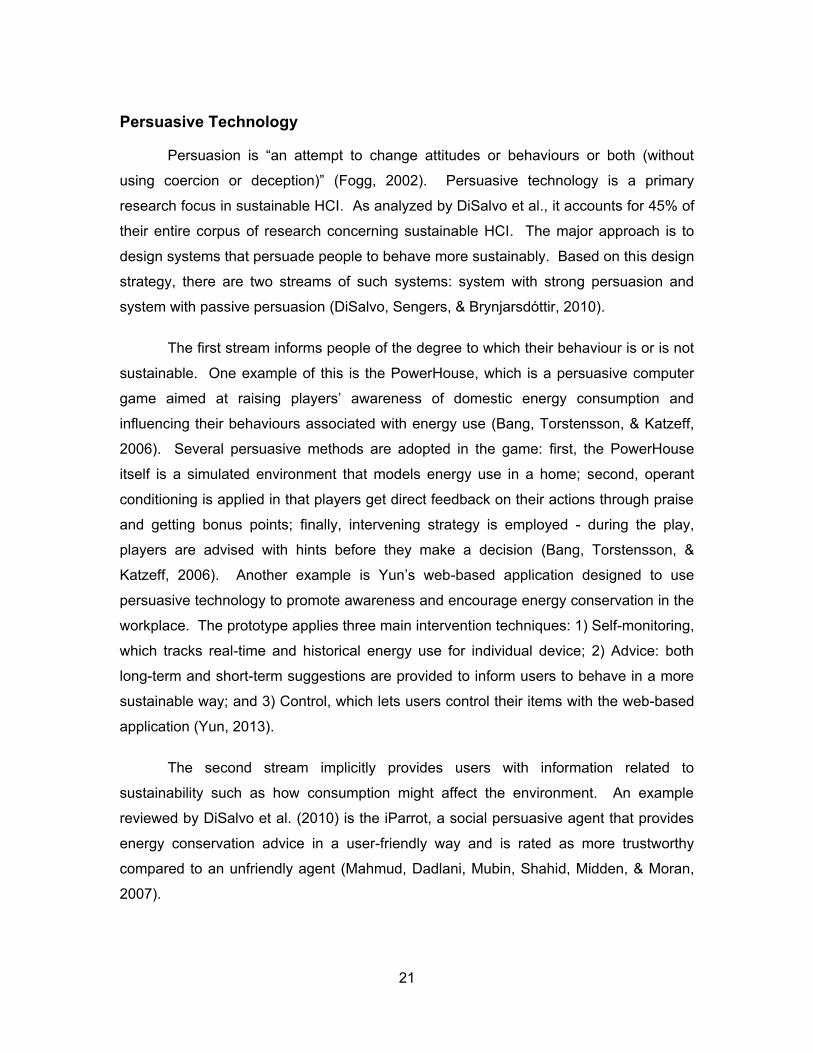
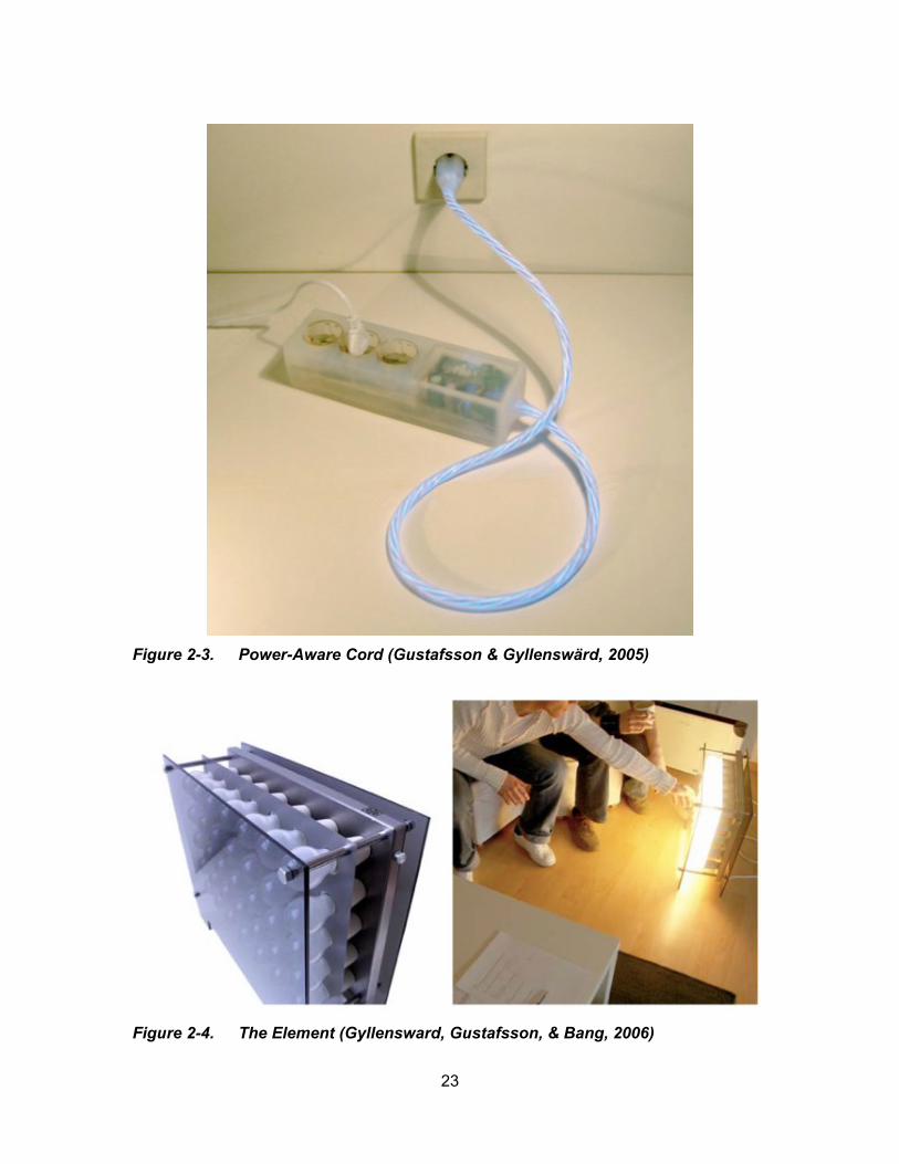
system is the Power-Aware Cord (Figure 2-3), which visualizes electricity use through
dynamically glowing patterns of the electrical power strip (Gustafsson & Gyllenswärd,
2005). Another example similar to this is the Element (Figure 2-4) – an electrical
radiator that emits heat from light bulbs and uses the light to indicate energy use
(Gyllensward, Gustafsson, & Bang, 2006). Both applications are a re-designing of
existing domestic device to incorporate means of visualizing energy consumption in an
engaging way to promote awareness.
23
Figure 2-3. Power-Aware Cord (Gustafsson & Gyllenswärd, 2005)
Figure 2-4. The Element (Gyllensward, Gustafsson, & Bang, 2006)

24
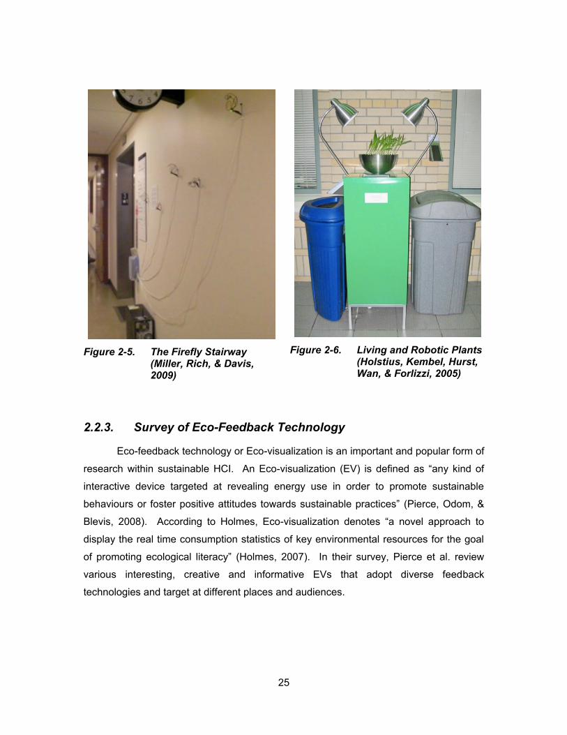
I D S lvo t l.’s 1 f d gs syst s suppo t g b t w ss c
also be persuasive. The idea behind this is that providing information in an ambient way
is more likely to convince people to behave sustainably. One application of this is the
Firefly Stairway (Figure 2-5), which uses wire firefly sculptures that are attached to LED
lights to decorate the stairway and makes the stairs more interesting to use than a
nearby elevator (Miller, Rich, & Davis, 2009). The Living and Robotic Plants, as shown
in Figure 2-6 is another example. Designed by Holstius et al. (2005), the plants are an
interactive ambient display that aim to encourage recycling behaviour in a cafeteria and
their experiment results show that apparent increase of recycling does occur with the
presence of the display. A further study led by Maan et al. (2011), which compares the
effectiveness of using ambient lighting as feedback for space heating energy
consumption to a numerical feedback, indicates that ambient feedback costs less
cognitive load and has stronger persuasive effects leading to lower energy consumption
(Maan, Merkus, Ham, & Midden, 2011).
25
Figure 2-5. The Firefly Stairway (Miller, Rich, & Davis, 2009)
Figure 2-6. Living and Robotic Plants (Holstius, Kembel, Hurst, Wan, & Forlizzi, 2005)
2.2.3. Survey of Eco-Feedback Technology
Eco-feedback technology or Eco-visualization is an important and popular form of
research within sustainable HCI. An Eco-v su l z t o EV s d f d s “ y k d of
interactive device targeted at revealing energy use in order to promote sustainable
b v ou s o fost pos t v tt tud s tow ds sust bl p ct c s” (Pierce, Odom, &
Blevis, 2008). According to Holmes, Eco-v su l z t o d ot s “ ov l pp o c to
display the real time consumption statistics of key environmental resources for the goal
of p o ot g colog c l l t cy” (Holmes, 2007). In their survey, Pierce et al. review
various interesting, creative and informative EVs that adopt diverse feedback
technologies and target at different places and audiences.
26
Feedback Types
Feedback plays an important role in bridging t “ v o t l l t cy g p”
which refers to the fact that people lack the awareness of how their everyday activities
might have impact on the environment, by providing related information (Froehlich,
Findlater, & Landay, 2010). In the context of eco-visualization, feedback is categorized
by the type of data being displayed and by the type of visualization presenting those
data (Pierce, Odom, & Blevis, 2008).
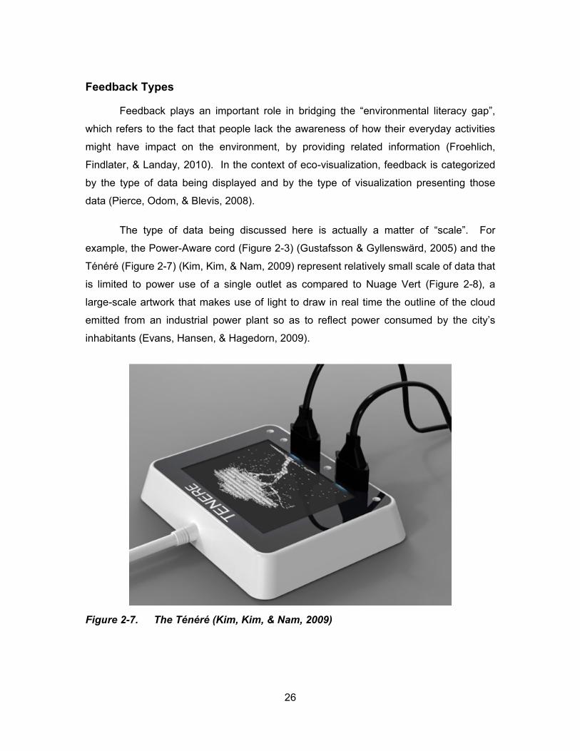
The type of data being discussed here is actually a matter of “scale”. For
example, the Power-Aware cord (Figure 2-3) (Gustafsson & Gyllenswärd, 2005) d t
(Figure 2-7) (Kim, Kim, & Nam, 2009) represent relatively small scale of data that
is limited to power use of a single outlet as compared to Nuage Vert (Figure 2-8), a
large-scale artwork that makes use of light to draw in real time the outline of the cloud
emitted from an industrial power plant so as to reflect pow co su d by t c ty’s
inhabitants (Evans, Hansen, & Hagedorn, 2009).
Figure 2-7. (Kim, Kim, & Nam, 2009)
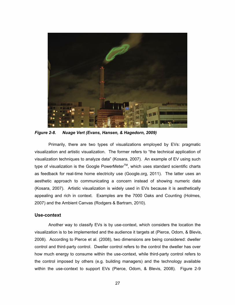
27
Figure 2-8. Nuage Vert (Evans, Hansen, & Hagedorn, 2009)
Primarily, there are two types of visualizations employed by EVs: pragmatic
v su l z t o d t st c v su l z t o . fo f s to “t t c c l ppl c t o of
v su l z t o t c qu s to lyz d t ” (Kosara, 2007). An example of EV using such
type of visualization is the Google PowerMeterTM, which uses standard scientific charts
as feedback for real-time home electricity use (Google.org, 2011). The latter uses an
aesthetic approach to communicating a concern instead of showing numeric data
(Kosara, 2007). Artistic visualization is widely used in EVs because it is aesthetically
appealing and rich in context. Examples are the 7000 Oaks and Counting (Holmes,
2007) and the Ambient Canvas (Rodgers & Bartram, 2010).
Use-context
Another way to classify EVs is by use-context, which considers the location the
visualization is to be implemented and the audience it targets at (Pierce, Odom, & Blevis,
2008). According to Pierce et al. (2008), two dimensions are being considered: dweller
control and third-party control. Dweller control refers to the control the dweller has over
how much energy to consume within the use-context, while third-party control refers to
the control imposed by others (e.g. building managers) and the technology available
within the use-context to support EVs (Pierce, Odom, & Blevis, 2008). Figure 2-9
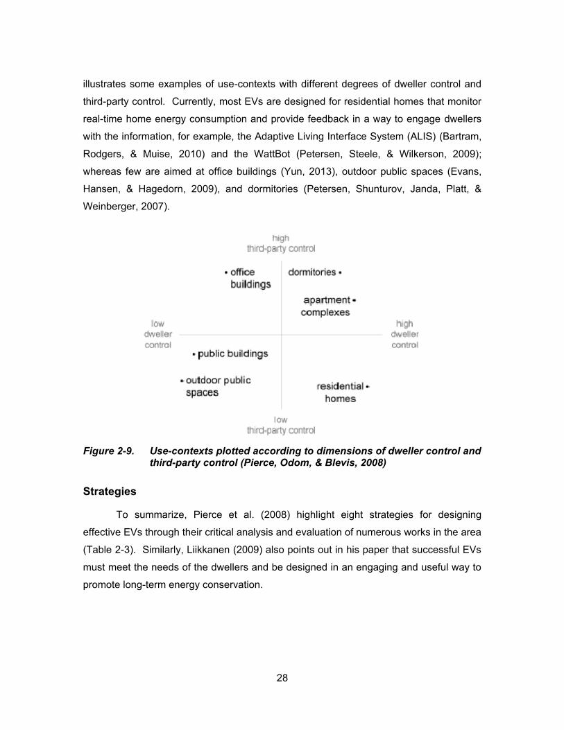
28
illustrates some examples of use-contexts with different degrees of dweller control and
third-party control. Currently, most EVs are designed for residential homes that monitor
real-time home energy consumption and provide feedback in a way to engage dwellers
with the information, for example, the Adaptive Living Interface System (ALIS) (Bartram,
Rodgers, & Muise, 2010) and the WattBot (Petersen, Steele, & Wilkerson, 2009);
whereas few are aimed at office buildings (Yun, 2013), outdoor public spaces (Evans,
Hansen, & Hagedorn, 2009), and dormitories (Petersen, Shunturov, Janda, Platt, &
Weinberger, 2007).
Figure 2-9. Use-contexts plotted according to dimensions of dweller control and third-party control (Pierce, Odom, & Blevis, 2008)
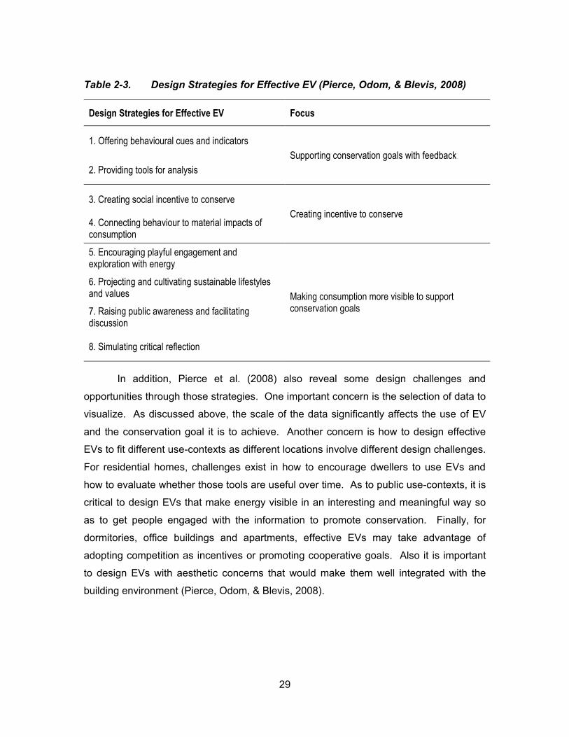
Strategies
To summarize, Pierce et al. (2008) highlight eight strategies for designing
effective EVs through their critical analysis and evaluation of numerous works in the area
(Table 2-3). Similarly, Liikkanen (2009) also points out in his paper that successful EVs
must meet the needs of the dwellers and be designed in an engaging and useful way to
promote long-term energy conservation.
29
Table 2-3. Design Strategies for Effective EV (Pierce, Odom, & Blevis, 2008)
Design Strategies for Effective EV Focus
1. Offering behavioural cues and indicators
Supporting conservation goals with feedback
2. Providing tools for analysis
3. Creating social incentive to conserve
Creating incentive to conserve 4. Connecting behaviour to material impacts of consumption
5. Encouraging playful engagement and exploration with energy
Making consumption more visible to support conservation goals
6. Projecting and cultivating sustainable lifestyles and values
7. Raising public awareness and facilitating discussion
8. Simulating critical reflection
In addition, Pierce et al. (2008) also reveal some design challenges and
opportunities through those strategies. One important concern is the selection of data to
visualize. As discussed above, the scale of the data significantly affects the use of EV
and the conservation goal it is to achieve. Another concern is how to design effective
EVs to fit different use-contexts as different locations involve different design challenges.
For residential homes, challenges exist in how to encourage dwellers to use EVs and
how to evaluate whether those tools are useful over time. As to public use-contexts, it is
critical to design EVs that make energy visible in an interesting and meaningful way so
as to get people engaged with the information to promote conservation. Finally, for
dormitories, office buildings and apartments, effective EVs may take advantage of
adopting competition as incentives or promoting cooperative goals. Also it is important
to design EVs with aesthetic concerns that would make them well integrated with the
building environment (Pierce, Odom, & Blevis, 2008).

30
2.3. The Approach of Aesthetic Visualization with Ambient Displays
Aesthetic visualization is defined as opposed to the traditional visualization that
mainly consists of pragmatic charts (Kosara, 2007). Aesthetic visualization treats
aesthetics as an important value and takes the advantage of applying various depictive
and narrative-related forms of representation to communicate a concern of the
information. Forms of aesthetic visualization include ambient and artistic visualization
(or informative art) and infographics. And it is considered as one of the promising
approaches to creating effective EVs. In this section, advantages of aesthetic
visualization as opposed to pragmatic visualization are discussed, design requirements
for such visualizations are highlighted and means to evaluate them are addressed.
2.3.1. Artistic vs. Pragmatic visualization
The distinction between artistic and pragmatic visualization is a measure of
“sublimity” (Kosara, 2007). As shown in Figure 2-10, pragmatic and artistic visualization
lie on the two extremes of the gamut with the former being entirely anti-sublime and
latter being primarily sublime. According to Kosara (2007), the sublimity also decides
the characteristics of the visualizations: the pragmatic visualization is recognizable and
readable and is often used to explore and analyze the data for which visual efficiency is
considered as an important criterion; whereas the artistic visualization might not be
readily recognizable and readable, but the sublime quality makes it visible and
interesting to communicate a concern of the underlying data.
Figure 2-10. The gamut of data-based visualization (Kosara, 2007)
os ’s just f c t o also indicates an approach that lies in the middle of the
gamut - the Informative Art. Informative art treats aesthetics as a key factor to make it
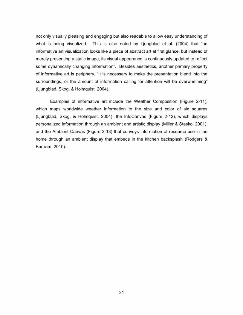
31
not only visually pleasing and engaging but also readable to allow easy understanding of
what is being visual z d. s s lso ot d by Lju gbl d t l. 4 t t “
informative art visualization looks like a piece of abstract art at first glance, but instead of
merely presenting a static image, its visual appearance is continuously updated to reflect
some dynamically changing information”. Besides aesthetics, another primary property
of informative art is periphery, “ t s c ss y to k t p s t t o bl d to t
surroundings, or the amount of information calling for attention will be overwhelming”
(Ljungblad, Skog, & Holmquist, 2004).
Examples of informative art include the Weather Composition (Figure 2-11),
which maps worldwide weather information to the size and color of six squares
(Ljungblad, Skog, & Holmquist, 2004), the InfoCanvas (Figure 2-12), which displays
personalized information through an ambient and artistic display (Miller & Stasko, 2001),
and the Ambient Canvas (Figure 2-13) that conveys information of resource use in the
home through an ambient display that embeds in the kitchen backsplash (Rodgers &
Bartram, 2010).
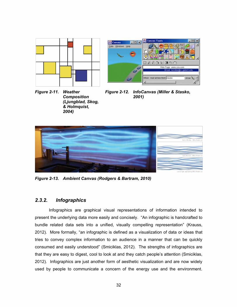
32
Figure 2-11. Weather Composition (Ljungblad, Skog, & Holmquist, 2004)
Figure 2-12. InfoCanvas (Miller & Stasko, 2001)
Figure 2-13. Ambient Canvas (Rodgers & Bartram, 2010)
2.3.2. Infographics
Infographics are graphical visual representations of information intended to
present the underlying data more easily and concisely. “A fog p c s dc ft d to
bundle related data sets into a unified, visually compelling representation” (Krauss,
2012). More formally, “an infographic is defined as a visualization of data or ideas that
tries to convey complex information to an audience in a manner that can be quickly
co su d d s ly u d stood” (Smiciklas, 2012). The strengths of infographics are
that they are easy to digest, cool to look at and they catch people’s attention (Smiciklas,
2012). Infographics are just another form of aesthetic visualization and are now widely
used by people to communicate a concern of the energy use and the environment.
33
Numerous examples can be found on the Internet, such as visual.ly (http://visual.ly/),
which contains a large collection of infographics under the topic of “environment”. The
problem with those works is that they are static and the data being represented can be
out of date quickly. However, their rich and appealing way of data representation does
inspire our research in designing engaging feedback for consumer energy use.
2.3.3. Design requirements
Information visualization is concerned with exploiting the cognitive capabilities of human visual perception in order to convey meaningful patterns and trends hidden in abstract datasets. (Moere, Tomitsch, Wimmer, Boesch, & Grechenig, 2012)
Summarized from various papers related to this topic, three features are
considered essential and special in designing aesthetic visualizations beyond normal
design criteria that are for pragmatic visualizations. They are aesthetics, real-time and
ambient. And our focus here is particularly on aesthetic visualization for energy use
feedback.
Aesthetics
Aesthetics is addressed by many researchers in this field (Skog, Ljungblad, &
Erik, 2003; Cawthon & Moere, 2007; Rodgers & Bartram, 2010). As mentioned earlier,
Kosara (2007) considers aesthetics as one of the critical criteria in classifying between
t st c d p g t c fo t o v su l z t o . As C wt o d Mo ot “R g g
from historical buildings to modern software applications, the integration of aesthetics
typically aims to stimulate the desire, positively influence the first impression, encourage
repeated usage o v ov w l ts ud c ” (Cawthon & Moere, 2007).
Skog et al. (2003) state that aesthetics is a major concern when visualization is
embedded into the environment because in such situation, not only utility is an important
issue to consider; it is also necessary that the work is visually appealing so as to
naturally become part of its surroundings. In their study of an ambient information
visualization of bus departure times, they conclude that aesthetics is more than an
added bonus to enhance visual appearance; it is a primary property in design and during
34
use to support the readability and comprehension of such installation (Skog, Ljungblad,
& Erik, 2003).
Similarly, Cawthon and Moere (2007) conduct a study to correlate aesthetics and
usability measures in the context of data visualization. The researchers investigate the
results of an online survey of 285 participants based on 11 different data visualization
techniques of an identical hierarchical dataset. Their findings show that usability
measures such as task abandonment and erroneous response are in correlation to
aesthetic preference as users tend to have more patience and spend more time with
more attractive visualizations. This also suggests that aesthetics should be considered
as one of the design issues of data visualization as it affects usability (Cawthon & Moere,
2007).
In their framework for designing residential resource use feedback tools, Rogers
d B t 1 dd ss t t “ st t cs s po t t f cto s t xp ds t
realm of visualization beyond analytical concerns toward a broader spectrum of
p s t t o d co u c t o ”. Add t o lly t y ot t t: “A st t c f cto s w ll
be closely enmeshed with design decisions regarding the binding of a feedback
instance, and will affect the expressive potential of an interface” (Rodgers & Bartram,
2010).
Real-time
Several papers on feedback technologies suggest that providing real-time
information is critical to effectively and successfully induce behaviour change (Liikkanen,
2009; Darby, 2010; Pacific Northwest National Laboratory, 2011). This is particularly
true for energy use feedback visualizations because it enables users to link their
behaviour to energy use by connecting causes and effects (Pierce, Odom, & Blevis,
2008). Similarly, Fischer (2008) st t s “f db ck s o ff ct v t o d ctly
ft ct o t s g v ”.
However, translated into design requirement of an aesthetic visualization, real-
time is achieved by properly defining the rate of change and the update rate. Skog et al.
(2003) discover that a suitable update rate of the display should allow users to perceive
the changes while not finding it to be too distractible. They suggest that “the rate of
35
change in the information should be frequent enough to promote relevance, but the
developer can affect the visual appearance by slowing down the changes or adding a
s ll ou t of t o ” (Skog, Ljungblad, & Erik, 2003).
Ambient
Ambient is another characteristic that is special to aesthetic visualization for
energy use feedback. This requires the visualization to be designed to present
information in the periphery of the us ’s tt t o (Skog, Ljungblad, & Erik, 2003). In
other words, aesthetic visualization is designed to blend into its surroundings, thus
factors like information source, context and audience should be carefully considered.
With their visualization of bus departure times, Skog et al. find that informative art
visualizations should be designed so that the scope of the information is relevant to the
location where it is placed and possible users of the display (Skog, Ljungblad, & Erik,
2003). Rodgers and Bartram also include context as an important dimension in their
framework for designing energy use feedback tools. The context dimension shows that
when the representation of the feedback is tightly bound to the context in which it is
delivered, it is easier to be perceived and comprehended by the users (Rodgers &
Bartram, 2010).
Taken together, aesthetic visualization is a means of presenting and providing
awareness of dynamic changes in a data set in a particular place. It is designed to blend
into its surroundings with high aesthetic concerns, display relevant scope of information
and update on a suitable rate.
2.3.4. Evaluation
A critical aspect of the design and development of an aesthetic visualization is
the evaluation. The exclusive features of it being aesthetically pleasing and ambient
make its evaluation more difficult than a pragmatic visualization because these
requirements are hard to define in measurable terms (Mankoff, Dey, Hsieh, Kientz,
Lederer, & Ames, 2003). However, whether it is aesthetic visualization or pragmatic
visualization, user studies offer a scientifically sound method to measure its performance
(Kosara, Healey, Interrante, Laidlaw, & Ware, 2003).
36
Approaches
The idea of evaluating an aesthetic visualization is not new, several approaches
have been proposed in the recent literature. Mankoff et al. (2003) have adapted a low-
cost heurist c v lu t o t od f o ls ’s u st c fo us b l ty to t st w t b t
displays. Through working with experts in designing ambient displays, the researchers
have defined a set of ambient heuristics that have proved to be useful in identifying
usability issues with ambient displays. Although results from their user studies imply that
heuristic evaluation is an effective and inexpensive technique, the problem remains in
that the method is only useful in the early stages of design with professionals but not
ppl c bl to “ v yd y” us s to t st t us l-life settings.
With more focus on user comprehension, Holmquist introduces an evaluation
framework for ambient displays. The framework addresses three levels of
comprehension over time: 1) that information is visualized; 2) what kind of information is
visualized and 3) how the information is visualized (Holmquist, 2004). As opposed to
u st c v lu t o Hol qu st’s f wo k s o ff ct v v lu t g ambient
displays in actual use.
Skog argues that the evaluation of an informative art is inseparable from the
co t xt t s pl c d b c us t s d s g d to s v s t g t d p t of t us s’
surroundings. He further insists that getting usage data from real-life installation is
crucial in evaluating such systems (Skog, 2006). Skog et al. evaluate their Bus
Departure Time visualization with an on-site interview with actual users in the area. The
interview is taken after the system has been installed in the university for 15 days. The
results of the interview facilitate the researchers to yield four lessons that are important
in designing ambient information visualization (Skog, Ljungblad, & Erik, 2003). The four
lessons are summarized in Table 2-4 below:
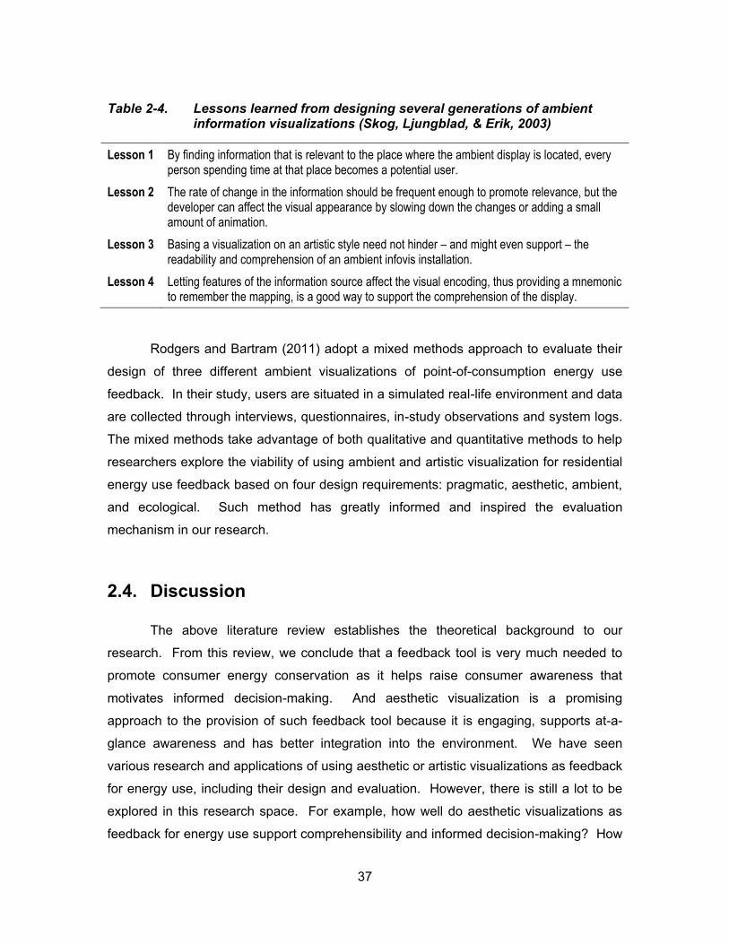
37
Table 2-4. Lessons learned from designing several generations of ambient information visualizations (Skog, Ljungblad, & Erik, 2003)
Lesson 1 By finding information that is relevant to the place where the ambient display is located, every person spending time at that place becomes a potential user.
Lesson 2 The rate of change in the information should be frequent enough to promote relevance, but the developer can affect the visual appearance by slowing down the changes or adding a small amount of animation.
Lesson 3 Basing a visualization on an artistic style need not hinder – and might even support – the readability and comprehension of an ambient infovis installation.
Lesson 4 Letting features of the information source affect the visual encoding, thus providing a mnemonic to remember the mapping, is a good way to support the comprehension of the display.
Rodgers and Bartram (2011) adopt a mixed methods approach to evaluate their
design of three different ambient visualizations of point-of-consumption energy use
feedback. In their study, users are situated in a simulated real-life environment and data
are collected through interviews, questionnaires, in-study observations and system logs.
The mixed methods take advantage of both qualitative and quantitative methods to help
researchers explore the viability of using ambient and artistic visualization for residential
energy use feedback based on four design requirements: pragmatic, aesthetic, ambient,
and ecological. Such method has greatly informed and inspired the evaluation
mechanism in our research.
2.4. Discussion
The above literature review establishes the theoretical background to our
research. From this review, we conclude that a feedback tool is very much needed to
promote consumer energy conservation as it helps raise consumer awareness that
motivates informed decision-making. And aesthetic visualization is a promising
approach to the provision of such feedback tool because it is engaging, supports at-a-
glance awareness and has better integration into the environment. We have seen
various research and applications of using aesthetic or artistic visualizations as feedback
for energy use, including their design and evaluation. However, there is still a lot to be
explored in this research space. For example, how well do aesthetic visualizations as
feedback for energy use support comprehensibility and informed decision-making? How

38
effective are they as compared to pragmatic visualizations? And how do people like this
kind of feedback tool and have it in real use? Additionally, more general and complete
design solutions need to be explored for this kind of feedback. For instance, what are
the key features to be included in this kind of feedback design? The above questions
present opportunities for us to carry out the research discussed in this thesis to further
contribute to the broader subject of sustainable HCI.
39
3. Motivation and Goals
As discussed in chapter 2, providing effective feedback on energy use helps
s co su s’ w ss of t l k b tw t d ly ct v t s d the results of
energy consumption, and ultimately allows them to better control their consumption to
improve energy conservation. Currently, consumers receive energy feedback mainly
through monthly energy bills sent out by their utility company. The major problem with it
is that the information provided is inadequate for decision-making, lacking details of how
energy is consumed in relationship to consumer activity. Also billing cycles are usually
too long for the consumers to receive timely feedback that would give them immediate
reflection upon their energy consumption.
Another feedback tool that is now available and deployed to household
consumers is the Smart Meter, which has the advantage of providing more direct and
prompt information about how much energy is used and when it is used. However, the
smart meter alone is not enough for informed feedback on energy use. As a result, a
few web-based applications (Google PowerMeterTM and Microsoft® HohmTM) based on
its data have been developed to provide more comprehensive information to enhance
consumer awareness of energy consumption. Both of these tools are able to track near
real-time and historical electricity usage, allow precise analysis of the tracking data and
present the data with nice charts through an interactive dashboard. Unfortunately, both
applications have discontinued their services due to lack of user adoption. Anecdotally,
p opl po t t t t y put t “out of t w y” ft s o t p od of us . As shown in
Figure 3-1 and Figure 3-2, both applications use pragmatic charts with precise numbers
to visualize consumption data. The advantage of these charts is that they are precise
and detailed, however, they are typically unattractive and unengaging, especially to
children. Besides, they do not integrate gracefully with the domestic environment nor do
they support at-a-glance awareness of the data. Much attention and great effort are
required for people to interpret those charts.
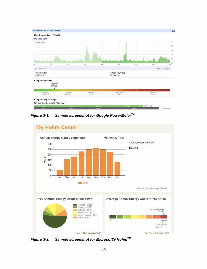
40
Figure 3-1. Sample screenshot for Google PowerMeterTM
Figure 3-2. Sample screenshot for Microsoft® HohmTM
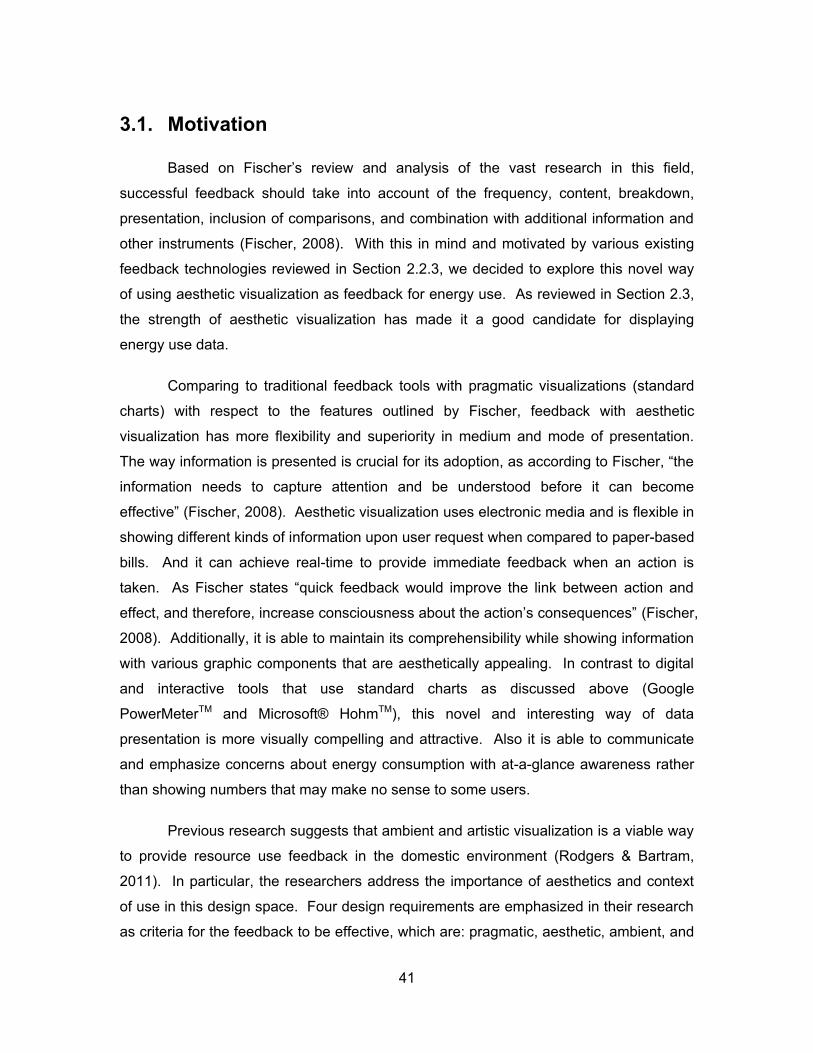
41
3.1. Motivation
B s d o F sc ’s v w and analysis of the vast research in this field,
successful feedback should take into account of the frequency, content, breakdown,
presentation, inclusion of comparisons, and combination with additional information and
other instruments (Fischer, 2008). With this in mind and motivated by various existing
feedback technologies reviewed in Section 2.2.3, we decided to explore this novel way
of using aesthetic visualization as feedback for energy use. As reviewed in Section 2.3,
the strength of aesthetic visualization has made it a good candidate for displaying
energy use data.
Comparing to traditional feedback tools with pragmatic visualizations (standard
charts) with respect to the features outlined by Fischer, feedback with aesthetic
visualization has more flexibility and superiority in medium and mode of presentation.
w y fo t o s p s t d s c uc l fo ts dopt o s cco d g to F sc “t
information needs to capture attention and be understood before it can become
ff ct v ” (Fischer, 2008). Aesthetic visualization uses electronic media and is flexible in
showing different kinds of information upon user request when compared to paper-based
bills. And it can achieve real-time to provide immediate feedback when an action is
t k . As F sc st t s “qu ck f db ck would p ov t l k b tw ct o d
ff ct d t fo c s co sc ous ss bout t ct o ’s co s qu c s” (Fischer,
2008). Additionally, it is able to maintain its comprehensibility while showing information
with various graphic components that are aesthetically appealing. In contrast to digital
and interactive tools that use standard charts as discussed above (Google
PowerMeterTM and Microsoft® HohmTM), this novel and interesting way of data
presentation is more visually compelling and attractive. Also it is able to communicate
and emphasize concerns about energy consumption with at-a-glance awareness rather
than showing numbers that may make no sense to some users.
Previous research suggests that ambient and artistic visualization is a viable way
to provide resource use feedback in the domestic environment (Rodgers & Bartram,
2011). In particular, the researchers address the importance of aesthetics and context
of use in this design space. Four design requirements are emphasized in their research
as criteria for the feedback to be effective, which are: pragmatic, aesthetic, ambient, and
42
ecological (Rodgers & Bartram, 2011). Their findings and evidence encouraged us to
study the feasibility of this approach to a greater extent. However, we needed to ensure
that the approach did not compromise the effectiveness and utility offered by traditionally
validated visualizations. More specifically, we wanted to draw out what made them
effective and in which way and whether they made a difference in real practice. In
addition, the previous research only looked at the design aspects of the visualization, but
did not explore whether it had support for informed decision-making and learning. And
this formed an interesting research question for us to explore and we aimed to
investigate its effectiveness and utility through real use.
In summary, we believed that feedback using the aesthetic visualization
approach would engage people more with its rich and interesting display and remain
p p l to o ’s tt t o w l sust g t st over time. With this motivation, we
aimed to empirically validate the potential application of this approach with our own
aesthetic visualization designs and experimental investigations in different energy use
contexts. During the process, we would also like to gain valuable design experience and
establish some basic design guidelines and tips for future reference within this field.
3.2. Goals
To explore the effectiveness and utility of using aesthetic visualization as an
approach to providing energy use feedback, two separate studies were carried out to
emphasize different aspects of the research goals. The first focused more on user
understanding of the feedback. With statistical measures of how correctly users were
able to interpret the feedback content and the time they spent interpreting the
information, the study intended to verify that the aesthetic visualization had the same or
better comprehensibility than the pragmatic visualization. While the second study
explored whether feedback designed with various aesthetic visualizations affected
decision-making. By putting the feedback into actual use in a simulated environment,
the study provided a more detailed analysis on the design components to find out what
wo k d d w t d d ’t.
43
3.2.1. Study 1
An initial step to explore the effectiveness of an aesthetic visualization is to test
its comprehensibility. The reason is that information must be understood before it can
be effective (Fischer, 2008). In our first study, we designed two different aesthetic
visualizations in the context of a solar charging station for mobile devices and compared
them to a pragmatic visualization (Excel charts). Comprehensibility was addressed as
the major evaluation criteria and was measured in terms of how accurately users were
able to interpret the information and how long it took them to do so. In short, could those
visualizations be understood and how much effort was needed? Our primary goal was
to find out whether the aesthetic visualization, with its more abstract form of data
presentation, was the same or easier to understand than the pragmatic visualization.
Further, we aimed to know whether this abstract form of representation appealed
to users. In other words, whether users rated the aesthetic visualization to be more
attractive than the pragmatic visualization. Also, we wanted to get a sense of whether
users preferred this novel way of representation and where they thought would be the
potential sites to place the visualizations. User opinions were crucial in this research
because if users showed no interest in this aesthetic visualization approach, then it
would be meaningless to continue the exploration.
The first study established the basis for us to further examine the potential of
putting the visualizations into actual use. Essentially, the feedback information needs to
be understood before it can activate other motives conducive to electricity conservation.
Besides, user preference and interest are also important. This includes not only the
content of the feedback: What kind of data they would like to see? Historical or real-time
or both? Personal or comparison with others? but also the way the information is
displayed: Is this abstract form of representation more engaging than the pragmatic
chart? Is it more useful to communicate a concern with at-a-glance awareness than to
show detailed analysis with precise numbers?
3.2.2. Study 2
With preliminary results gathered from the first study, the aesthetic visualization
proved to be a promising approach to energy use feedback. As an extension, our

44
second study sought to further explore its effectiveness and utility by integrating it with
an ambient display and a simulation game. The game was chosen as the testing
environment because it offered more realistically representative simulations and was
more attractive to our participants, especially children. Meanwhile, the game itself
served as an experiment through which we would like to understand where people were
weak in their knowledge and understanding of home energy use at both conceptual and
operational levels.
In this study, two aesthetic visualizations along with a standard bar chart were
designed for residential electricity use feedback. The visualizations were shown via an
ambient display that looked like a framed artwork and applied in the context of a
simulation game that mimicked real home environment. As opposed to the first study,
the effectiveness being studied here was more than comprehensibility. Our goal was to
see whether different forms of feedback would result in different decision-making. With
the simulation game, we were able to mimic different real life settings in which various
options were given and users were able to act in the way they normally did in everyday
life to achieve the game goal – saving energy. By comparing the game performances of
people seeing different feedback, we attempted to find out whether aesthetic
visualization displays had better support for positive decision-making towards energy
conservation than the pragmatic visualization. Specifically, we intended to see if the
explicit representation of positive actions applied in one of our visualizations affected
decision-making: would it encourage more positive actions and how did users like this
rewarding component in the feedback?
In addition, we wanted to elicit user impressions on these different feedback tools
in terms of their comprehensibility, visual interest, attractiveness and aesthetic appeal.
And more importantly, we purposed to know if people would like to use them in their
everyday life and where exactly they would like to place them in their homes. In contrast
to our first study, we believed that results gathered in this one would lead to more
profound insights because the simulated real-life use would add more validity to the
experiment.
A secondary goal of this study was to test the usefulness of the simulation game
itself. The game was more than a simulation environment. We wanted to know whether
45
it could provide us with more convincing fo t o bout p t c p ts’ k owl dg of
energy conservation and their actual actions than a pure interview.
3.3. Limitations
Both studies considered only the design aspects of the approach and were
merely a proof of concept due to limitations of sample size, study duration and physical
contexts. Acco d g to Skog us s’ b ts tt tud s d p ys c l co t xt ll ff ct t
perception of an informative art display (Skog, 2006). Thus, to fully evaluate an
aesthetic visualization as feedback for energy use, especially to find out whether it
affects behaviour change towards energy conservation, further long-term in-situ studies
are required and necessary.

46
4. Study 1: the Effectiveness of Aesthetic Visualization
This chapter describes the prototype study of our research towards exploring the
effectiveness of using aesthetic visualization as feedback for power and energy use. In
this study, we examined the utility and appeal of three different visualizations in the
context of a solar charging station, where the power comes from the solar generation
and the consumption gose out to mobile devices being charged at the station. The
results of the study were analyzed using a quantitative method and the implications of
these preliminary results were discussed as a reference for designing similar
visualizations for energy use feedback in our second study.
4.1. Design of Three Visualizations
We began our investigation of visualizing energy use feedback with the design of
three different visualizations: a graphic abstraction of solar panels as calendar entries
(SolarVis1), a non-photorealistic rendering of an apple tree (SolarVis2) and a set of
standard information visualization charts (Excel Charts). The first two were categorized
as aesthetic visualization and the third was considered as pragmatic visualization.
However, both SolarVis1 and SolarVis2 had pragmatic components on them so as to
allow them to show the historical data. All three designs were capable of displaying both
real-time power (W) and cumulative energy (Wh) values simultaneously. SolarVis1 and
SolarVis2 were developed using Processing and various open-source Java libraries.
The set of standard charts were generated with Excel. The following sections discuss
the three designs in detail.
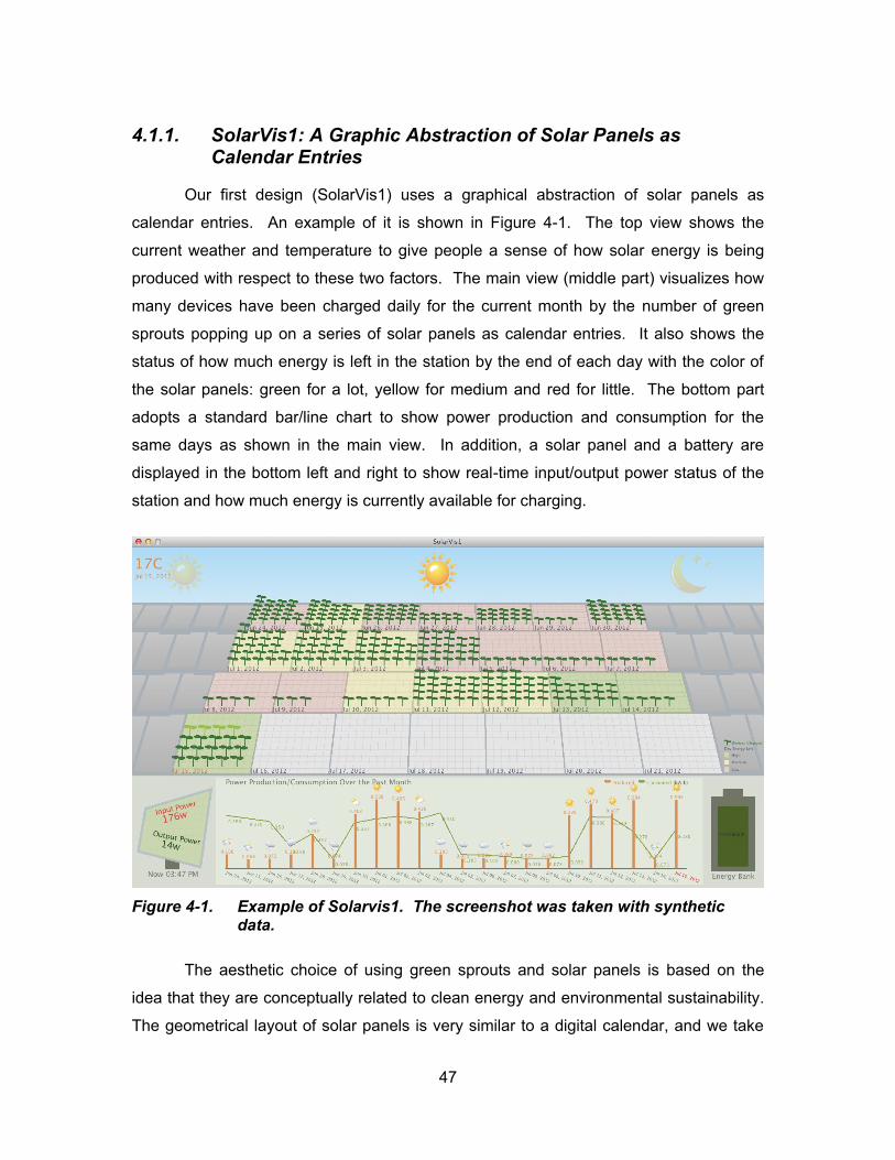
47
4.1.1. SolarVis1: A Graphic Abstraction of Solar Panels as Calendar Entries
Our first design (SolarVis1) uses a graphical abstraction of solar panels as
calendar entries. An example of it is shown in Figure 4-1. The top view shows the
current weather and temperature to give people a sense of how solar energy is being
produced with respect to these two factors. The main view (middle part) visualizes how
many devices have been charged daily for the current month by the number of green
sprouts popping up on a series of solar panels as calendar entries. It also shows the
status of how much energy is left in the station by the end of each day with the color of
the solar panels: green for a lot, yellow for medium and red for little. The bottom part
adopts a standard bar/line chart to show power production and consumption for the
same days as shown in the main view. In addition, a solar panel and a battery are
displayed in the bottom left and right to show real-time input/output power status of the
station and how much energy is currently available for charging.
Figure 4-1. Example of Solarvis1. The screenshot was taken with synthetic data.
The aesthetic choice of using green sprouts and solar panels is based on the
idea that they are conceptually related to clean energy and environmental sustainability.
The geometrical layout of solar panels is very similar to a digital calendar, and we take
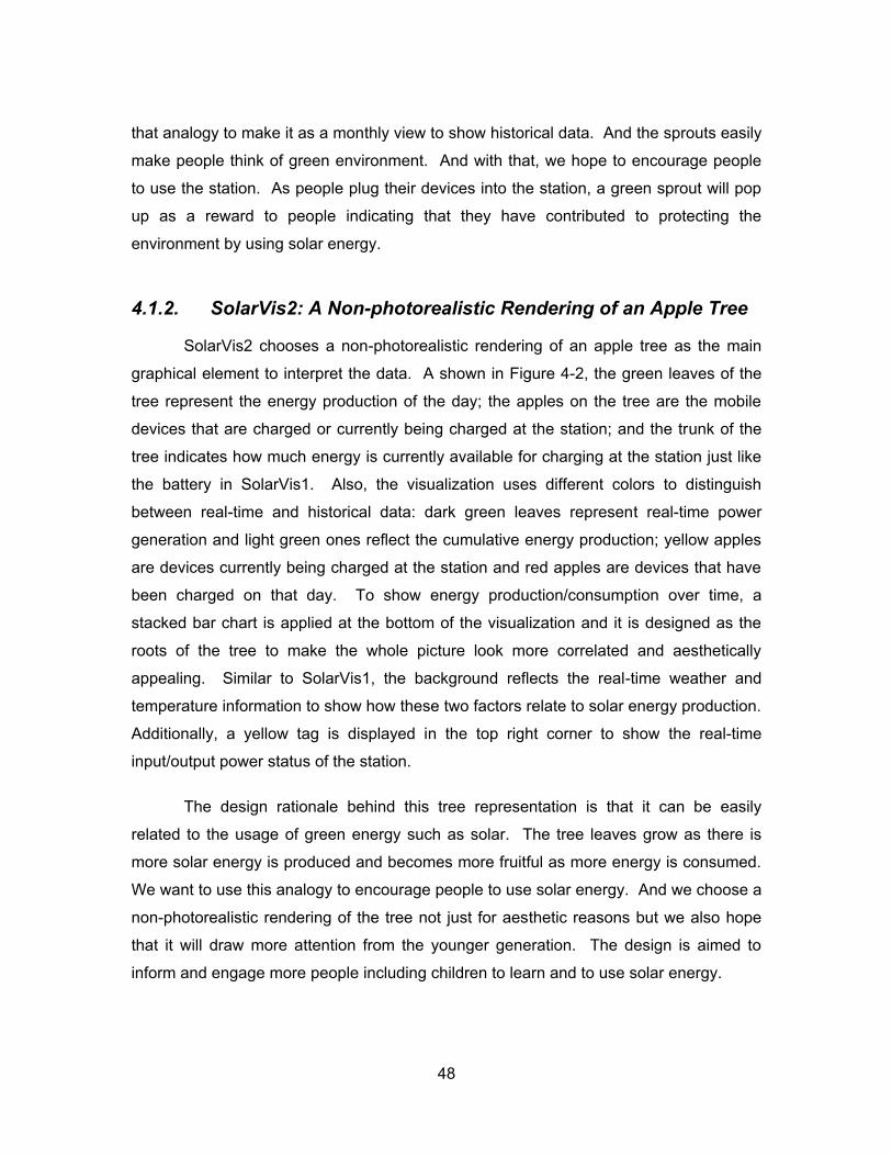
48
that analogy to make it as a monthly view to show historical data. And the sprouts easily
make people think of green environment. And with that, we hope to encourage people
to use the station. As people plug their devices into the station, a green sprout will pop
up as a reward to people indicating that they have contributed to protecting the
environment by using solar energy.
4.1.2. SolarVis2: A Non-photorealistic Rendering of an Apple Tree
SolarVis2 chooses a non-photorealistic rendering of an apple tree as the main
graphical element to interpret the data. A shown in Figure 4-2, the green leaves of the
tree represent the energy production of the day; the apples on the tree are the mobile
devices that are charged or currently being charged at the station; and the trunk of the
tree indicates how much energy is currently available for charging at the station just like
the battery in SolarVis1. Also, the visualization uses different colors to distinguish
between real-time and historical data: dark green leaves represent real-time power
generation and light green ones reflect the cumulative energy production; yellow apples
are devices currently being charged at the station and red apples are devices that have
been charged on that day. To show energy production/consumption over time, a
stacked bar chart is applied at the bottom of the visualization and it is designed as the
roots of the tree to make the whole picture look more correlated and aesthetically
appealing. Similar to SolarVis1, the background reflects the real-time weather and
temperature information to show how these two factors relate to solar energy production.
Additionally, a yellow tag is displayed in the top right corner to show the real-time
input/output power status of the station.
The design rationale behind this tree representation is that it can be easily
related to the usage of green energy such as solar. The tree leaves grow as there is
more solar energy is produced and becomes more fruitful as more energy is consumed.
We want to use this analogy to encourage people to use solar energy. And we choose a
non-photorealistic rendering of the tree not just for aesthetic reasons but we also hope
that it will draw more attention from the younger generation. The design is aimed to
inform and engage more people including children to learn and to use solar energy.

49
Figure 4-2. Example of SolarVis2. The screenshot was taken with synthetic data.
4.1.3. Excel Charts: Example of Pragmatic Visualization
The Excel charts include a set of five standard bar/line charts as shown in Figure
4-3. The bar/line chart is chosen over other types of standard charts because it is easy
to d d c b s ly u d stood du to ts w d sp d us p opl ’s everyday
life. In addition, the bar/line chart clarifies the historical energy use trends and it is easy
for people to make comparisons.
The purpose of having Excel charts as our third design is to allow us to make
comparisons to see if the aesthetic visualization is as effective as the pragmatic
visualization. And we want to explore if standard charts have a prominent advantage as
feedback for energy use.
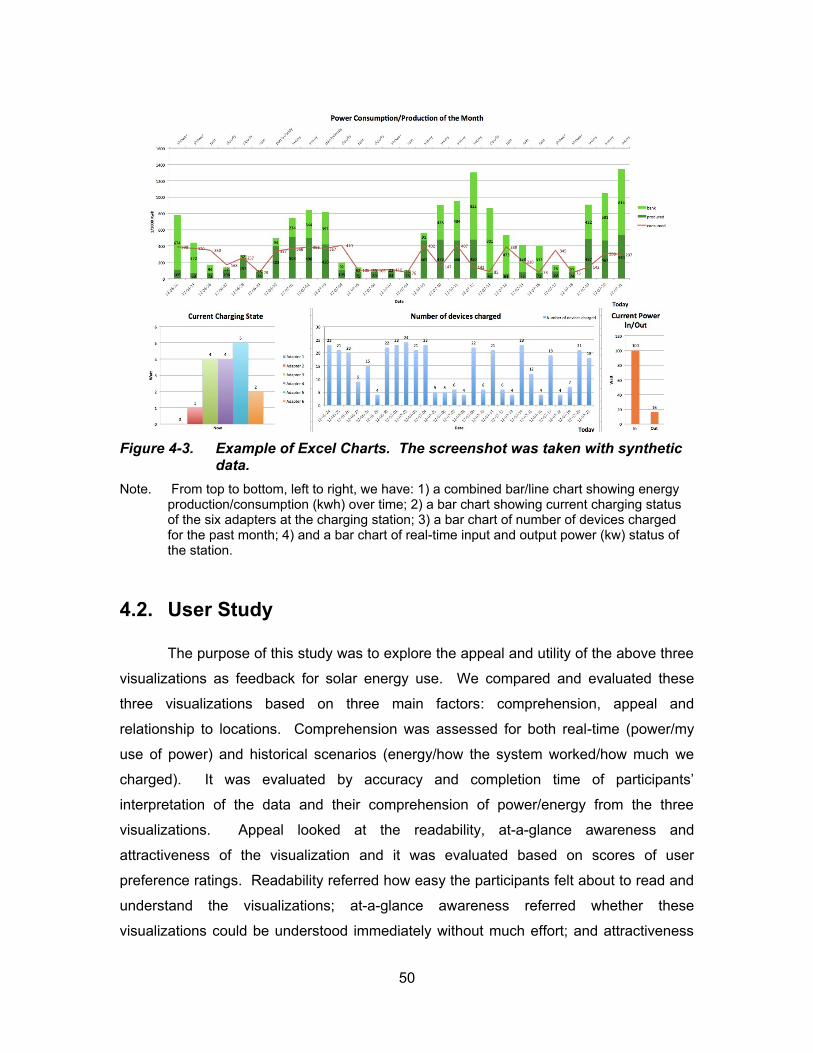
50
Figure 4-3. Example of Excel Charts. The screenshot was taken with synthetic data.
Note. From top to bottom, left to right, we have: 1) a combined bar/line chart showing energy production/consumption (kwh) over time; 2) a bar chart showing current charging status of the six adapters at the charging station; 3) a bar chart of number of devices charged for the past month; 4) and a bar chart of real-time input and output power (kw) status of the station.
4.2. User Study
The purpose of this study was to explore the appeal and utility of the above three
visualizations as feedback for solar energy use. We compared and evaluated these
three visualizations based on three main factors: comprehension, appeal and
relationship to locations. Comprehension was assessed for both real-time (power/my
use of power) and historical scenarios (energy/how the system worked/how much we
charged). It w s v lu t d by ccu cy d co pl t o t of p t c p ts’
interpretation of the data and their comprehension of power/energy from the three
visualizations. Appeal looked at the readability, at-a-glance awareness and
attractiveness of the visualization and it was evaluated based on scores of user
preference ratings. Readability referred how easy the participants felt about to read and
understand the visualizations; at-a-glance awareness referred whether these
visualizations could be understood immediately without much effort; and attractiveness
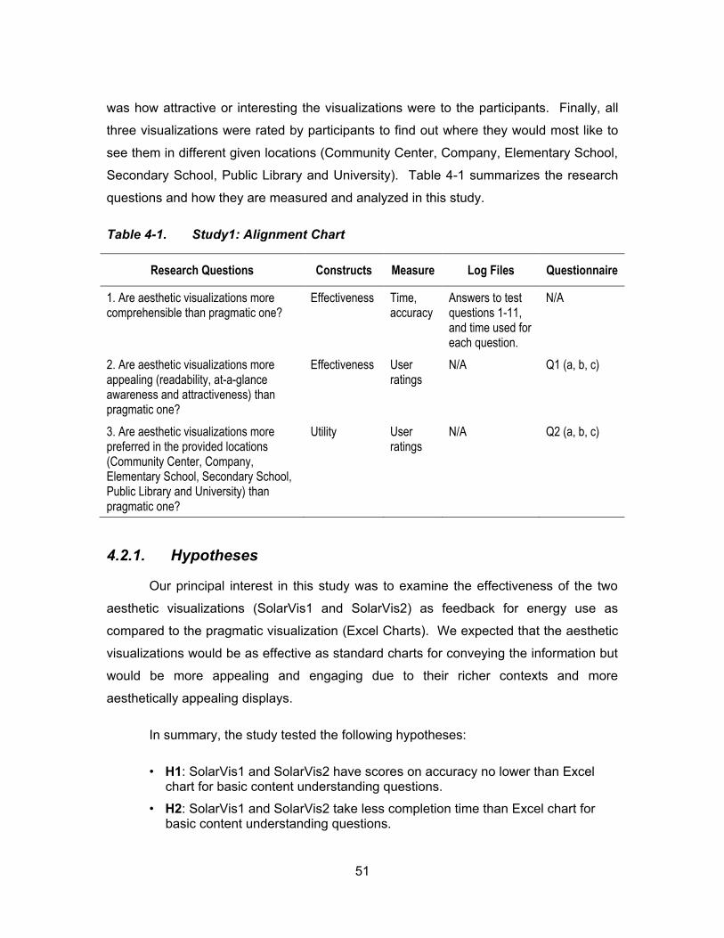
51
was how attractive or interesting the visualizations were to the participants. Finally, all
three visualizations were rated by participants to find out where they would most like to
see them in different given locations (Community Center, Company, Elementary School,
Secondary School, Public Library and University). Table 4-1 summarizes the research
questions and how they are measured and analyzed in this study.
Table 4-1. Study1: Alignment Chart
Research Questions Constructs Measure Log Files Questionnaire
1. Are aesthetic visualizations more comprehensible than pragmatic one?
Effectiveness Time, accuracy
Answers to test questions 1-11, and time used for each question.
N/A
2. Are aesthetic visualizations more appealing (readability, at-a-glance awareness and attractiveness) than pragmatic one?
Effectiveness User ratings
N/A Q1 (a, b, c)
3. Are aesthetic visualizations more preferred in the provided locations (Community Center, Company, Elementary School, Secondary School, Public Library and University) than pragmatic one?
Utility User ratings
N/A Q2 (a, b, c)
4.2.1. Hypotheses
Our principal interest in this study was to examine the effectiveness of the two
aesthetic visualizations (SolarVis1 and SolarVis2) as feedback for energy use as
compared to the pragmatic visualization (Excel Charts). We expected that the aesthetic
visualizations would be as effective as standard charts for conveying the information but
would be more appealing and engaging due to their richer contexts and more
aesthetically appealing displays.
In summary, the study tested the following hypotheses:
• H1: SolarVis1 and SolarVis2 have scores on accuracy no lower than Excel chart for basic content understanding questions.
• H2: SolarVis1 and SolarVis2 take less completion time than Excel chart for basic content understanding questions.
52
• H3: SolarVis1 and SolarVis2 have scores on accuracy no lower than Excel chart for power/energy comprehension questions.
• H4: SolarVis1 and SolarVis2 take less completion time than Excel chart for power/energy comprehension questions.
• H5: SolarVis1 and SolarVis2 are considered to be more appealing than Excel chart.
• H6: SolarVis1 and SolarVis2 are more preferred in given locations than Excel chart.
4.2.2. Participants
A pilot study with 4 participants (2 female) was followed by a full study of 13
participants (7 female) recruited through personal contacts from colleagues and friends
of the researchers and through SFU student participant databases maintained by the
School of Interactive Arts and Technology.
4.2.3. Procedure
Participants were tested individually in a study session of about 60 minutes with
three related activities. All three activities were performed using an online website which
automatically logged user entries and calculated completion time. An example of it is
available at: http://sr-hercules03.iat.sfu.ca/msun/SolarVis/test01/index.html.
First, a brief pre-session interview (Appendix A-1) was conducted to determine if
and how participants understood power and energy use by giving them a typical BC
Hydro bill (Appendix A-2) and asking them to explain it. Then the participants were
given a short tutorial on how solar energy production works.
Second, the participants were shown six different visualization screenshots (two
for each visualization type) on a standard computer monitor. In this study, only
screenshots of the visualizations were provided and participants did not directly interact
with the visualizations. The screenshots were generated with three sets of synthetic
data that were randomly assigned to each type of the visualization. The six screenshots
were separated into three test blocks with two different scenarios for each type of the
visualization, for which the participants were asked to answer 16 questions (Appendix A-
3). The first 11 questions were about the basic understanding of the visualization
53
content based on the first scenario and the questions were in the form of multiple
choices; The last 5 were short answer questions related to comprehension of
power/energy consumption and production with solar energy based on the second
scenario.
Finally, the study concluded with a questionnaire (Appendix A-4) and a semi-
structured interview around user preferences for the three visualizations, regarding their
appeal and the locations where they would most like to be seen. The appeal of the
visualizations was assessed by three criteria: readability, at-a-glance awareness and
attractiveness. And the locations provided for ratings were Community Center,
Company, Elementary School, Secondary School, Public Library and University. Before
they were asked to rate for their preferred locations, they were explicitly told by the
researcher that the visualizations would be run on a standard monitor placed on a desk
or hanging on a wall. In each of the questionnaire questions, participants were asked to
give a score from 1 to 5 for each visualization, with 1 being the most preferable and 5
being the least preferable.
4.2.4. Results
Participant Demographics
Of the 13 participants (7 female), nine were between 19 and 25, two between 26
and 35, one between 36 and 45 and one was over 50 (Figure 4-4 and Figure 4-5). All of
them had a basic understanding of electricity usage in their home but only 6 of them paid
for their electricity and read their monthly energy bills. Notably, only 7 of the participants
could tell the differences between power and energy well.
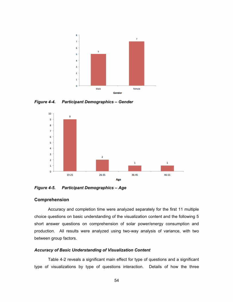
54
Figure 4-4. Participant Demographics – Gender
Figure 4-5. Participant Demographics – Age
Comprehension
Accuracy and completion time were analyzed separately for the first 11 multiple
choice questions on basic understanding of the visualization content and the following 5
short answer questions on comprehension of solar power/energy consumption and
production. All results were analyzed using two-way analysis of variance, with two
between group factors.
Accuracy of Basic Understanding of Visualization Content
Table 4-2 reveals a significant main effect for type of questions and a significant
type of visualizations by type of questions interaction. Details of how the three

55
visualizations scored for each individual question are presented in Figure 4-6 and
analyzed reasons leading to these results are described in Table 4-3.
Table 4-2. Statistical result for Two-Way ANOVA test (accuracy, basic understanding question)
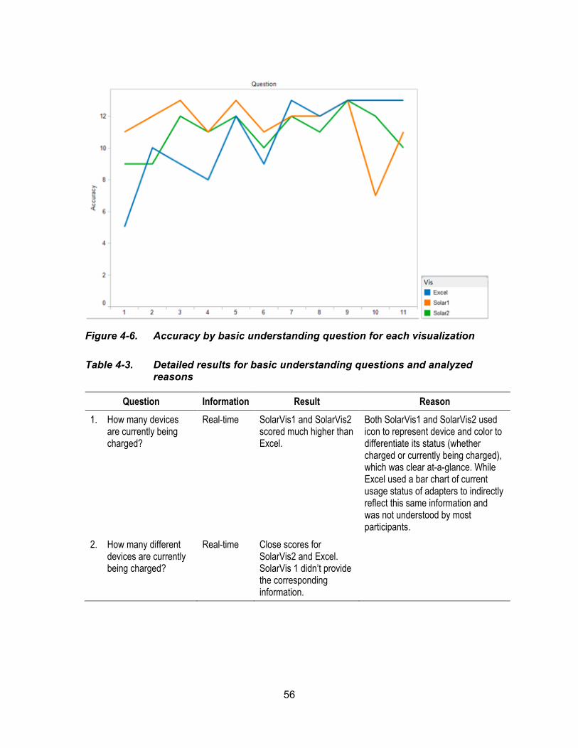
56
Figure 4-6. Accuracy by basic understanding question for each visualization
Table 4-3. Detailed results for basic understanding questions and analyzed reasons
Question Information Result Reason
1. How many devices are currently being charged?
Real-time SolarVis1 and SolarVis2 scored much higher than Excel.
Both SolarVis1 and SolarVis2 used icon to represent device and color to differentiate its status (whether charged or currently being charged), which was clear at-a-glance. While Excel used a bar chart of current usage status of adapters to indirectly reflect this same information and was not understood by most participants.
2. How many different devices are currently being charged?
Real-time Close scores for SolarVis2 and Excel. SolarVis 1 didn’t provide the corresponding information.
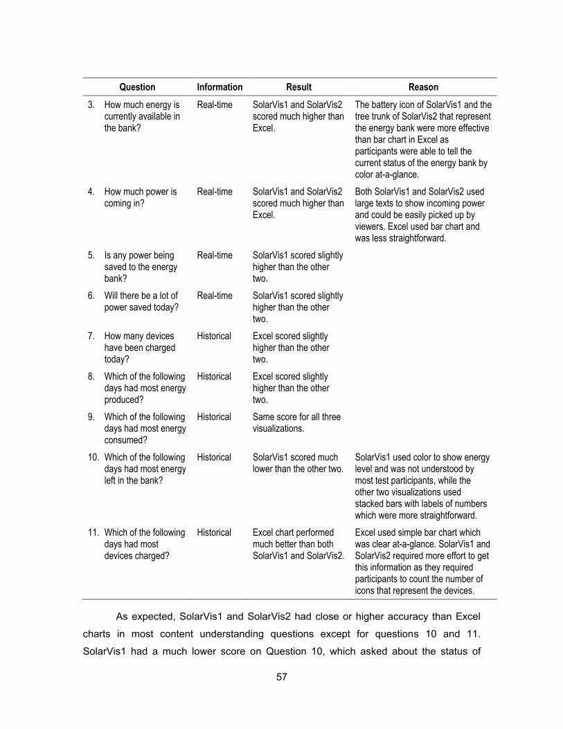
57
Question Information Result Reason
3. How much energy is currently available in the bank?
Real-time SolarVis1 and SolarVis2 scored much higher than Excel.
The battery icon of SolarVis1 and the tree trunk of SolarVis2 that represent the energy bank were more effective than bar chart in Excel as participants were able to tell the current status of the energy bank by color at-a-glance.
4. How much power is coming in?
Real-time SolarVis1 and SolarVis2 scored much higher than Excel.
Both SolarVis1 and SolarVis2 used large texts to show incoming power and could be easily picked up by viewers. Excel used bar chart and was less straightforward.
5. Is any power being saved to the energy bank?
Real-time SolarVis1 scored slightly higher than the other two.
6. Will there be a lot of power saved today?
Real-time SolarVis1 scored slightly higher than the other two.
7. How many devices have been charged today?
Historical Excel scored slightly higher than the other two.
8. Which of the following days had most energy produced?
Historical Excel scored slightly higher than the other two.
9. Which of the following days had most energy consumed?
Historical Same score for all three visualizations.
10. Which of the following days had most energy left in the bank?
Historical SolarVis1 scored much lower than the other two.
SolarVis1 used color to show energy level and was not understood by most test participants, while the other two visualizations used stacked bars with labels of numbers which were more straightforward.
11. Which of the following days had most devices charged?
Historical Excel chart performed much better than both SolarVis1 and SolarVis2.
Excel used simple bar chart which was clear at-a-glance. SolarVis1 and SolarVis2 required more effort to get this information as they required participants to count the number of icons that represent the devices.
As expected, SolarVis1 and SolarVis2 had close or higher accuracy than Excel
charts in most content understanding questions except for questions 10 and 11.
SolarVis1 had a much lower score on Question 10, which asked about the status of

58
energy left in the bank. The reason might be that it used color to show energy level that
was not recognized by most test participants and was not as straightforward as stacked
bars used in the other two visualizations. Excel performed much better in Question 11,
which asked about the number of devices charged for the day. This showed that the bar
chart used in Excel was clearer at-a-glance while the icons used in SolarVis1 and
SolarVis2 required more effort for the participants to interpret this information though
they looked more interesting.
In general, for all three visualizations, participants were able to answer the
questions with fair scores. This indicated that the aesthetic visualizations were as
comprehensible as the pragmatic one.
Completion Time of Basic Understanding of Visualization Content
Table 4-4 reveals a significant main effect for type of questions and a significant
type of visualizations by type of questions interaction. Details of how much time the
three visualizations took for each individual questions are presented in Figure 4-7 and
possible reasons of the results are described in Table 4-5.
Table 4-4. Statistical result for Two-Way ANOVA test (time, basic understanding question)
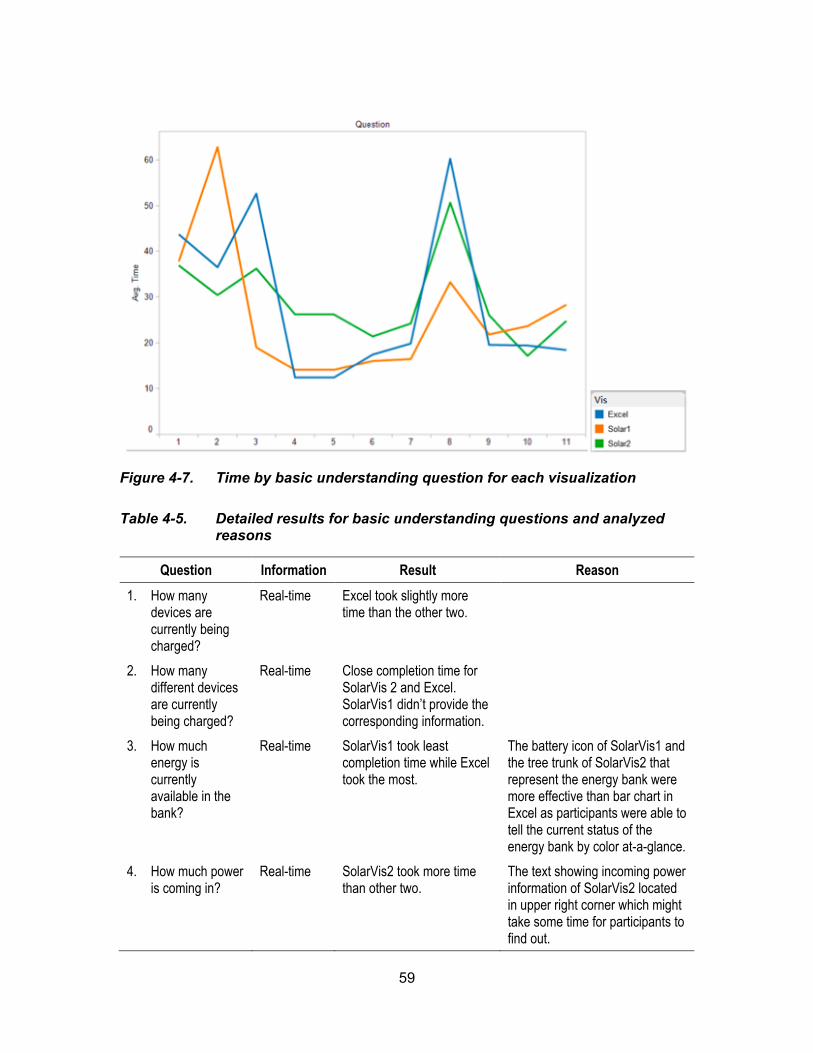
59
Figure 4-7. Time by basic understanding question for each visualization
Table 4-5. Detailed results for basic understanding questions and analyzed reasons
Question Information Result Reason
1. How many devices are currently being charged?
Real-time Excel took slightly more time than the other two.
2. How many different devices are currently being charged?
Real-time Close completion time for SolarVis 2 and Excel. SolarVis1 didn’t provide the corresponding information.
3. How much energy is currently available in the bank?
Real-time SolarVis1 took least completion time while Excel took the most.
The battery icon of SolarVis1 and the tree trunk of SolarVis2 that represent the energy bank were more effective than bar chart in Excel as participants were able to tell the current status of the energy bank by color at-a-glance.
4. How much power is coming in?
Real-time SolarVis2 took more time than other two.
The text showing incoming power information of SolarVis2 located in upper right corner which might take some time for participants to find out.
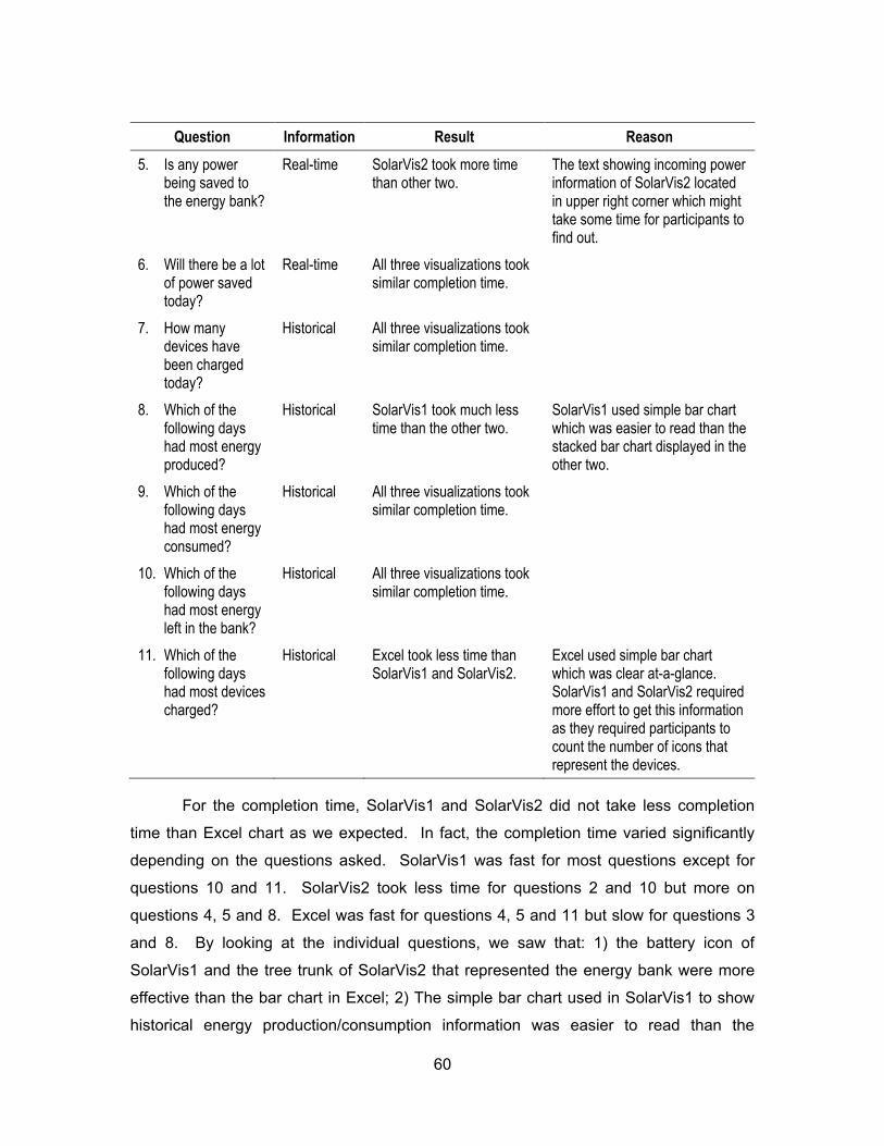
60
Question Information Result Reason
5. Is any power being saved to the energy bank?
Real-time SolarVis2 took more time than other two.
The text showing incoming power information of SolarVis2 located in upper right corner which might take some time for participants to find out.
6. Will there be a lot of power saved today?
Real-time All three visualizations took similar completion time.
7. How many devices have been charged today?
Historical All three visualizations took similar completion time.
8. Which of the following days had most energy produced?
Historical SolarVis1 took much less time than the other two.
SolarVis1 used simple bar chart which was easier to read than the stacked bar chart displayed in the other two.
9. Which of the following days had most energy consumed?
Historical All three visualizations took similar completion time.
10. Which of the following days had most energy left in the bank?
Historical All three visualizations took similar completion time.
11. Which of the following days had most devices charged?
Historical Excel took less time than SolarVis1 and SolarVis2.
Excel used simple bar chart which was clear at-a-glance. SolarVis1 and SolarVis2 required more effort to get this information as they required participants to count the number of icons that represent the devices.
For the completion time, SolarVis1 and SolarVis2 did not take less completion
time than Excel chart as we expected. In fact, the completion time varied significantly
depending on the questions asked. SolarVis1 was fast for most questions except for
questions 10 and 11. SolarVis2 took less time for questions 2 and 10 but more on
questions 4, 5 and 8. Excel was fast for questions 4, 5 and 11 but slow for questions 3
and 8. By looking at the individual questions, we saw that: 1) the battery icon of
SolarVis1 and the tree trunk of SolarVis2 that represented the energy bank were more
effective than the bar chart in Excel; 2) The simple bar chart used in SolarVis1 to show
historical energy production/consumption information was easier to read than the
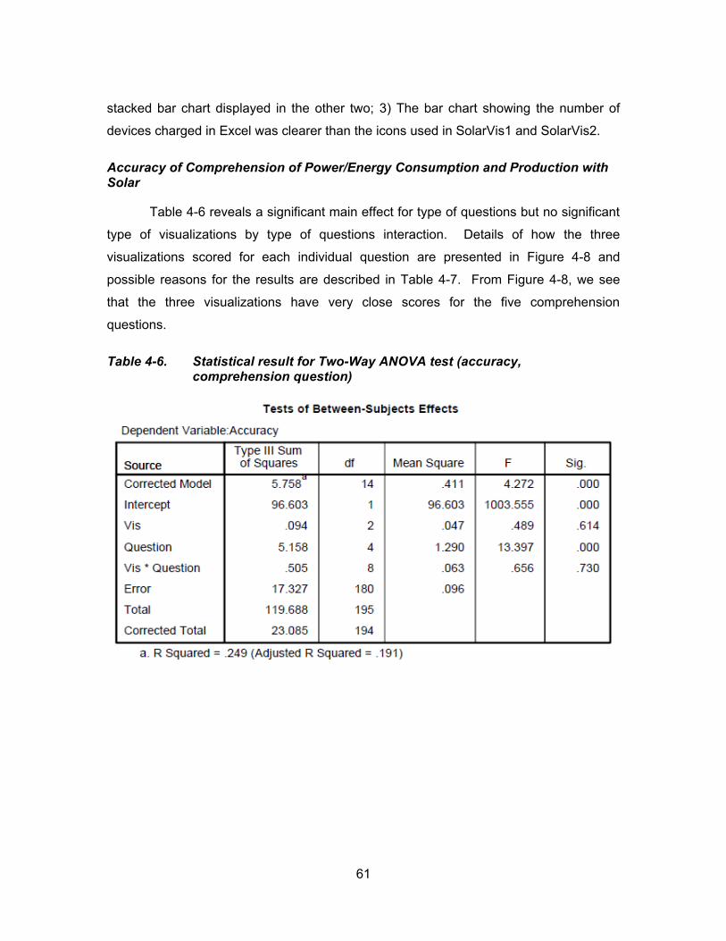
61
stacked bar chart displayed in the other two; 3) The bar chart showing the number of
devices charged in Excel was clearer than the icons used in SolarVis1 and SolarVis2.
Accuracy of Comprehension of Power/Energy Consumption and Production with Solar
Table 4-6 reveals a significant main effect for type of questions but no significant
type of visualizations by type of questions interaction. Details of how the three
visualizations scored for each individual question are presented in Figure 4-8 and
possible reasons for the results are described in Table 4-7. From Figure 4-8, we see
that the three visualizations have very close scores for the five comprehension
questions.
Table 4-6. Statistical result for Two-Way ANOVA test (accuracy, comprehension question)

62
Figure 4-8. Accuracy by comprehension question for each visualization
Table 4-7. Detailed results for comprehension questions and analyzed reasons
Question Result Reason
1. How much power is going out? Where do you think it is going?
Close scores for all three visualizations.
Lower scores of question 2 & 5 showed that participants did not fully understand the notion of “Energy Left”
2. What is the level of energy left today (low/medium/high)? Why?
3. Can I charge my laptop now? Why or why not? If not, when?
4. Is there a day that had more energy consumed than produced? If yes, choose one, and explain how could that happen? If not, why?
5. Could there be a lot energy left on a cloudy/rainy day? If yes, choose one, and explain how could that happen? If not, why?
In general, for all three visualizations, participants were able to answer the
questions with fair scores. This indicated that the aesthetic visualizations supported

63
p t c p ts’ u d st d g of sol p oduct o d co su pt o s w ll s t
pragmatic one.
Completion Time of Comprehension of Power/Energy Consumption and Production with Solar
Table 4-8 reveals a significant main effect for type of questions but no significant
type of visualizations by type of questions interaction. Details of how much time the
three visualizations took for each individual question are presented in Figure 4-9 and
possible reasons for the results are described in Table 4-9.
Table 4-8. Statistical result for Two-Way ANOVA test (time, comprehension question)
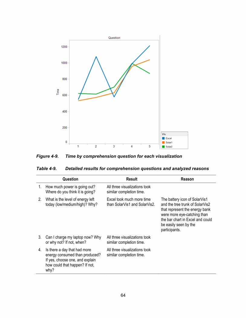
64
Figure 4-9. Time by comprehension question for each visualization
Table 4-9. Detailed results for comprehension questions and analyzed reasons
Question Result Reason
1. How much power is going out? Where do you think it is going?
All three visualizations took similar completion time.
2. What is the level of energy left today (low/medium/high)? Why?
Excel took much more time than SolarVis1 and SolarVis2.
The battery icon of SolarVis1 and the tree trunk of SolarVis2 that represent the energy bank were more eye-catching than the bar chart in Excel and could be easily seen by the participants.
3. Can I charge my laptop now? Why or why not? If not, when?
All three visualizations took similar completion time.
4. Is there a day that had more energy consumed than produced? If yes, choose one, and explain how could that happen? If not, why?
All three visualizations took similar completion time.

65
Question Result Reason
5. Could there be a lot energy left on a cloudy/rainy day? If yes, choose one, and explain how could that happen? If not, why?
SolarVis2 took least completion time while Excel took the most.
Both SolarVis1 and SolarVis2 had weather displayed as an icon, which was clearer than texts displayed in Excel.
As expected, though not for all five questions, SolarVis1 and SolarVis2 took
much less completion time than Excel for questions 2 and 5. This proved that the
graphical elements (the energy bank icon and the weather icon) we used in SolarVis1
and SolarVis2 did help making the displayed information more eye-catching and more
easily to be picked up by the audience.
Appeal
Results of the user ratings for appeal of the three visualizations were analyzed
using two-way analysis of variance, with two between group factors. Table 4-10
indicates that the type of visualization variable produced a significant difference and
significant type of visualizations by type of appeal criteria interaction was present.
Table 4-10. Statistical result for Two-Way ANOVA test (appeal)
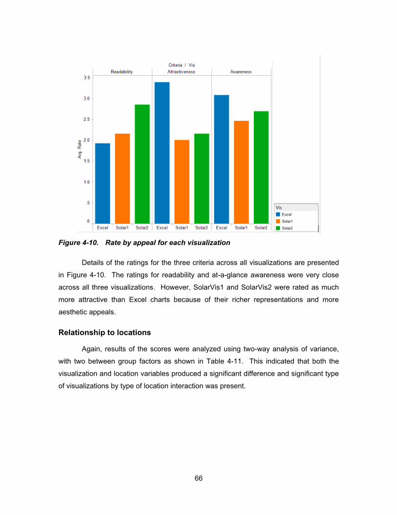
66
Figure 4-10. Rate by appeal for each visualization
Details of the ratings for the three criteria across all visualizations are presented
in Figure 4-10. The ratings for readability and at-a-glance awareness were very close
across all three visualizations. However, SolarVis1 and SolarVis2 were rated as much
more attractive than Excel charts because of their richer representations and more
aesthetic appeals.
Relationship to locations
Again, results of the scores were analyzed using two-way analysis of variance,
with two between group factors as shown in Table 4-11. This indicated that both the
visualization and location variables produced a significant difference and significant type
of visualizations by type of location interaction was present.

67
Table 4-11. Statistical result for Two-Way ANOVA test (location)
Figure 4-11. Rate by location for each visualization
As shown in Figure 4-11, people would more like to see SolarVis1 and SolarVis2
than the Excel chart in most public locations except for the company as some
participants said that it was a more serious place where the Excel chart might look more
68
professional. Ratings for SolarVis1 and SolarVis2 were pretty close in most locations
except for the company and the elementary school. People would not like to see
SolarVis2 in a company because the tree representation looked very childish but it was
most welcomed in an elementary school, as younger kids might be very interested in
seeing the growth of an apple tree.
Other Comments
8 of 13 participants stated that they preferred SolarVis1 because they liked the
graphical representation of solar panels and they thought it was easy to read and
understand. 3 participants liked SolarVis2 the most because it was interesting and clear.
Other notable comments were: 1) 3 participants stated that the visualizations had too
much information displayed at the same time and they suggested adding user
interactions so that they could filter the information they would like to see; 2) 4
participants expressed that the lower part of SolarVis2 was hard to read because the
stacked bars used similar colors for two different variables and they overlapped; 3) 1
participant pointed out that it would be nicer if the upper and lower part of SolarVis1
could have more connections in context as in SolarVis2.
4.2.5. Discussion
Our findings showed that the three visualizations had their own strengths and
weaknesses depending on the questions asked. In other words, this revealed that some
of the design elements in our visualizations were successful while others were not.
SolarVis1 had high accuracy for almost all basic data interpretation questions
(Question 1 to 11) except for question 10 and it required much less time for the
participants to understand those data. Such results indicated that SolarVis1 was
successful in displaying both real-time and historical information. However, its failure in
question 10 that asked about day energy left in the bank reflected that the color coding
of the solar panels representing the energy levels was not understood by most
participants and definitely needed to be redesigned and improved. SolarVis2 was
suppos d to b o “D y V w” o t d than SolarVis1, but unexpectedly, it had lower
scores for questions of real-time information than SolarVis1 and no obvious superiority in
completion time. As some participants pointed out that the tree abstraction was hard to
69
understand at first sight, but as they got more familiar with the idea they admitted that
the real-time information displayed with the tree was clearer at-a-glance. In general, the
results of the first 11 questions showed both SolarVis1 and SolarVis2 performed better
than Excel charts for the basic content understanding questions. Though the difference
was not significant, we could still conclude that our first two hypotheses were confirmed.
The results also showed that there was no significant difference in accuracy for
the five comprehension questions among SolarVis1, SolarVis2 and Excel Charts, which
indicated that the aesthetic visualizations were able to help people understand solar
through their displayed information just as well as standard charts did. Additionally, the
fact that SolarVis1 and SolarVis2 took much less time than Excel Charts for the
participants to answer questions 2 and 5 was not only a proof to our third hypothesis, it
also confirmed that the graphical elements we designed in those aesthetic visualizations,
especially the battery and the tree trunk that represented the energy bank, did help
participants understand the concepts more quickly and easily.
As proof to our last two hypothese, the user preference ratings showed that
SolarVis1 and SolarVis2 were rated as much more attractive than Excel charts due to
their richer representations and more aesthetic appeals. People would more like to see
them than Excel charts in most locations except for the company. However, they were
not rated as readable as Excel charts because they didn’t have clear headings, legends
and numbers for the information displayed.
In conclusion, SolarVis1 and SolarVis2, in the form of aesthetic visualization
were as effective as pragmatic visualization tools (Excel charts) in conveying energy
usage information to the consumers. In addition, they were more attractive than Excel
charts because of their richer representations and more visually compelling appeals and
they were more likely to engage people and lead them to think about using the solar
energy.
4.3. Summary
Our goal in this user study was to explore the effectiveness of using the aesthetic
visualization as feedback for power and energy use as compared to the pragmatic

70
visualization. Our preliminary results showed that the approach had good potential.
However, as we discovered in the user study, there were some design flaws that
affected how people perceived and understood the information that was embedded in
the aesthetic displays. And this led us to the question of how to balance the aesthetic
interest and the readability. Theoretically, aesthetic visualization and pragmatic
visualization are two different types of visualizations that sit on opposite ends of the
“sublimity” scale: the former is less readable and recognizable for the data as it is aimed
to transfer the basic concern from the data; while the latter is designed to aid in data
analysis but is less visible and interesting for people to see the underlying problem the
data implies (Kosara, 2007). In our case, we were not sacrificing the readability of our
aesthetic visualizations for aesthetic reasons. Although our main goal was to provide at-
a-glance awareness of energy use and to inform and engage people with richer and
more interesting displays, we still wanted to maintain the details of the data as some of
our audience might be interested to see exactly how much energy was produced or
consumed. One solution to this, as some of our participants pointed out, was to add
interaction so as to enable the users to customize what they wanted to see.
The study results indicated that the aesthetic visualizations did help people better
understand solar power and energy and were more engaging and welcomed than the
pragmatic one. Based on this, our next avenue is to explore how they work with ambient
displays and whether they will affect sustainable decision-making with more realistically
representative simulations.
71
5. Study 2: Energy Conservation Game
As an extension to our previous study, this research explores the effectiveness of
using different aesthetic visualizations as feedback for residential energy use by
integrating them with ambient displays and a simulation game. The game is chosen as
a testing context because it offers more realistically representative simulations and is
more attractive to our test participants. Particularly in this research, school-age children
are considered as our primary participants because we hope to find out if these
feedback tools help enhance their learning of energy and conservation. Two things
motivate this decision: 1) in BC, energy forms part of the science curriculum in grades 5-
7 (Ministry of Education, 2010) d c ld ’s w ness and behaviour often have a
great impact on the adults at home (Evans S. M., 1996; Mandel, 2013). Meanwhile, we
would also like to understand where people are weak in their knowledge and
understanding of home energy use at both conceptual and operational levels. In this
chapter, the planning and the details of the research study are described; the design and
the implementation of the study installations are introduced; the study results are
presented with mixed data analysis techniques; and implications of the results are
addressed.
5.1. Research Design
In this study, we took a design-oriented research perspective with mixed
evaluation methods. As Fallman (2007) states, the main objective of a design-oriented
research is to reveal the knowledge that comes from studying user behaviour and user
experience of a design artefact. In this context, we would like to explore the potential of
different depictive and narrative-related aesthetic visualizations as an approach to
energy use feedback. Also we aimed to both understand the potential benefits and
caveats of this approach, and to tease out w p opl ’s comprehension was weak
regarding energy conservation at home.
72
5.1.1. Research Questions
Three different visualizations were developed in this design research, among
which two were designed using an aesthetic visualization approach and one was a
standard bar chart with embellishment. Notably, one of the two aesthetic visualizations
employed an explicit representation of positive actions. These design artefacts were
studied as means rather than end products to explore the potential of using depictive
visualizations as effective feedback for residential energy use. The following research
questions were examined to qualify this approach.
Research Question 1: What are the implications of using these visualizations in an
applied learning context (the game)?
Following this question, we wish to know whether users are able to understand
these visualizations and whether that understanding affects their decision-making. In
other words, do these visualizations help users perform better or make better self-
evaluations in the simulation game? Additionally, we want to answer: are feedback tools
designed using the aesthetic visualization more effective than using standard charts?
How do participants describe their impressions of the visualizations: is there one easier
to understand or more interesting or attractive or aesthetically appealing than the others?
Research Question 2: What are the affordances, benefits and caveats of providing
explicit action representation as motivations?
Sub questions following this one are: Does explicit representation of positive
actions make a difference? Are users able to understand this representation? How do
users like the rewarding mechanism in the visualization? Does it help users to realize
what is good for energy conservation? Does it help to encourage positive actions?
Research Question 3: Where might people use this (if at all) in their homes?
This question is the key to this design research that aims to find out whether
users would like to have those visualizations in their homes, and more specifically, which
room they would like to put them in. Also we wish to know whether users think having
those visualizations in their homes would have a positive effect on their daily activities,
i.e. are they helpful?
73
Research Question 4: What does this simulation game suggest about people’s
understanding of how to use energy efficiently in their homes?
More specifically, the question is to elicit what children and families understand,
do ’t u d st d o “fo g t” bout operating their homes more efficiently. And we wish
to know whether this simulation game is useful in providing us with more information
regarding users understanding of home energy conservation than the early interview.
5.1.2. User Study
As Fallman addresses on design-oriented research:
Studying an artefact to gain some new knowledge is hence as much a qu st o of u d st d g p opl co t xt d ‘ ow’—i.e. looking into and trying to grasp the complex interplay between people, technologies, d soc ty d ow t s ‘ ow’ c g s w w t f ct s introduced—as it is to develop and study technology. (Fallman, 2007)
Thus, conducting user studies is important and necessary in this research to get
valuable insights into the visualization design and its potential use.
The user study started with a pilot study of 2 participants and followed by a study
of 24 participants recruited through personal contacts from colleagues and friends of the
researchers. All participants were school-age children. Some participated in the study
individually, some with their parents and some with their friends. This age group was
chosen because: 1) energy forms a major part of the school curriculum during the middle
school years (grade 5-8) (Ministry of Education, 2010); 2) t p ct of c ld ’s
awareness on parental behaviour is known to have an influence on the adults in their
homes (Evans S. M., 1996; Mandel, 2013); 3) these represent our future generations:
we were interested in understanding how best to enhance and sustain their learning
about energy and conservation. Most of the study sessions were done in partic p ts’
homes with two exceptions in coffee shops due to privacy concerns of the participants.
p t c p ts’ o s w c os s the primary study place because they were the
intended locations where the visualizations were to be placed. As mentioned in our
survey of evaluation approaches (2.3.4: Evaluation), the evaluation of an aesthetic
74
visualization was inseparable from its context and we attempted to take the advantage of
collecting data from real-life installation.
The study took around 30~45 minutes, which included three major related
activities plus a casual conversation at the end. First, a pre-session interview was
conducted to determine whether and how participants knew about energy usage in their
homes. Then the participants were asked to complete the energy conservation game,
during which they were randomly assigned to see one of the three visualizations (8 for
each visualization). Details of the game are described in the next Section (5.2: Energy
Conservation Game). After the game, the participants were required to fill in a
questionnaire on their impressions of the visualization they saw and their preferences of
whether they would like to have it in their homes. Finally at the end of the study session,
all three types of visualizations were shown to the participants, and the researcher took
a casual conversation with the participants to get an idea of how they thought about all
those visualizations and which they liked the most.
5.1.3. Data Collection and Analysis
The study data were collected and analyzed with several methods (
75
Table 5-1 summarizes the research questions and how they are measured and
analyzed in this study). First, a pre-session interview for around 5 minutes was taken to
l c t p t c p ts’ k owl dg of t o gy us . qu st o s w sk d
including total energy cost of the house, energy use of a particular household appliance
and conservation actions that might be taken at home to save energy (Appendix B-1).
The interviews were audio-recorded and then transcribed and analyzed with a qualitative
approach. As a limitation, only one coder was involved in transcribing the data. But the
interview was short and the questions were structured, therefore, the coding was very
straightforward.
Second, a game session varying in length from 20 to 30 minutes was performed.
Before starting with the game, a short tutorial of the control of the dollhouse interface
was given and free exploration of the game installation was allowed till participants felt
comfortable to start the game. The game included four stories and participants were
asked to complete all of them in the same order. Without counterbalancing, limitation
existed with such kind of experiment design as learning effect would affect participants’
performance. On the other hand, the learning effect itself was something we would like
to explore in this study. In each game story, participants needed to complete a few
tasks first and then evaluate their own actions. The game data were digitally logged by
the system itself, which contained basic information of the participant (user name and
school grade), game scores for each story task (actual score and self-evaluated score)
and a log of all interactions participants made during the game. The data were analyzed
using descriptive statistics and visualized using Tableau®. Interesting findings were
found and discussed in Section 5.3 and 5.4.
After the game, a post-s ss o qu st o coll ct d p t c p ts’ p ss o of
the visualization they saw and response of whether they would like to have the
visualization in their homes (Appendix B-2). Impression questions included whether the
visualization was: easy to understand, interesting, attractive and good-looking. And
participants were asked to rate them on a 5-point scale from strongly disagree, disagree,
neutral, agree to strongly agree. The location preference question provided a list of
seven rooms (e.g. living room, bedroom and etc.) for the participants to choose.
Participants were also allowed to specify rooms that were not on the list or choose
“would not like it in their house”. The questionnaire concluded with an open question

76
that allowed participants to leave any comment they had about the visualization. The
questionnaire data was collected electronically via a web interface and analyzed
quantitatively to make comparisons among all three visualizations. A link to it is
available at: http://energyvis.iat.sfu.ca/energy-game-v3/house/index.html?session=11111.
Finally, all three visualizations were presented to the participants and the
researcher led a short discussion with the participants around their general impression
and preference of them. The answers were recorded with researcher notes and
reviewed qualitatively.
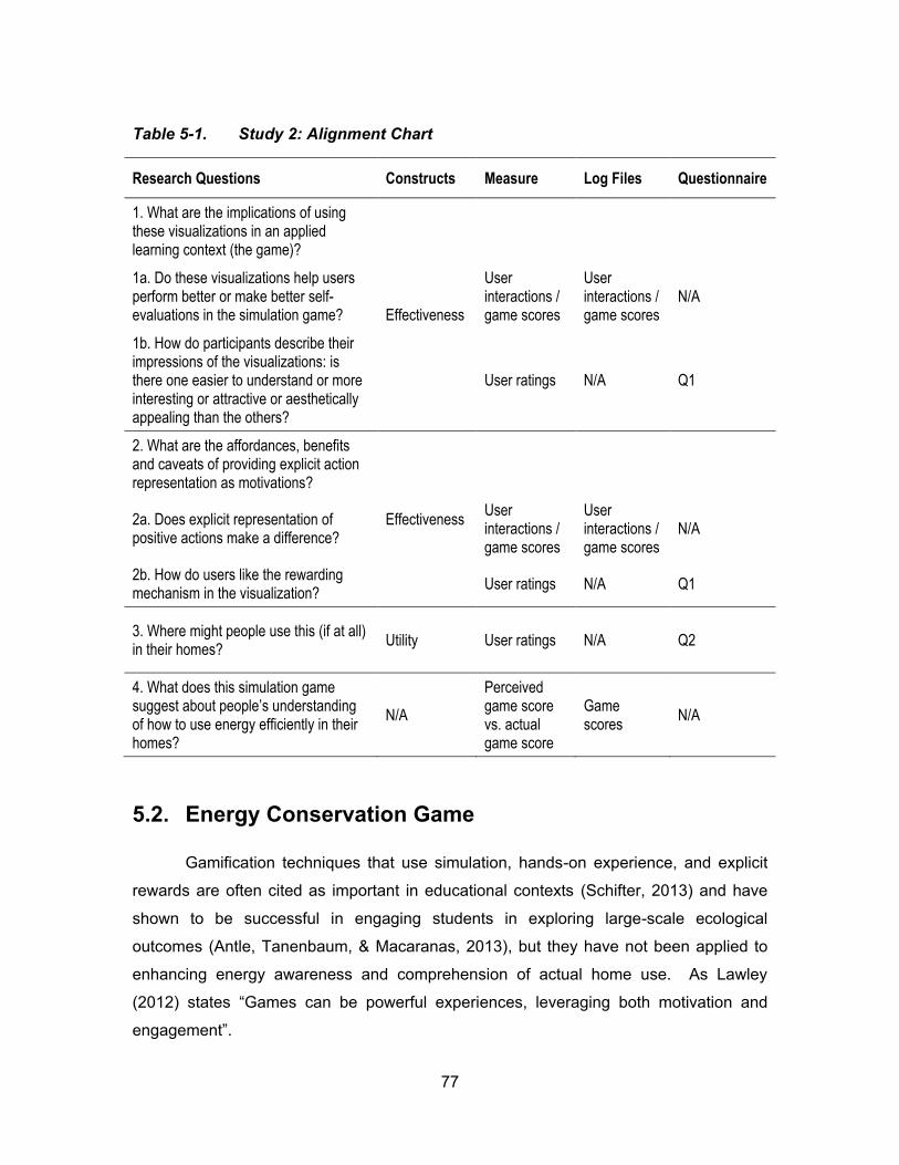
77
Table 5-1. Study 2: Alignment Chart
Research Questions Constructs Measure Log Files Questionnaire
1. What are the implications of using these visualizations in an applied learning context (the game)?
Effectiveness
1a. Do these visualizations help users perform better or make better self-evaluations in the simulation game?
User interactions / game scores
User interactions / game scores
N/A
1b. How do participants describe their impressions of the visualizations: is there one easier to understand or more interesting or attractive or aesthetically appealing than the others?
User ratings N/A Q1
2. What are the affordances, benefits and caveats of providing explicit action representation as motivations?
Effectiveness
2a. Does explicit representation of positive actions make a difference?
User interactions / game scores
User interactions / game scores
N/A
2b. How do users like the rewarding mechanism in the visualization?
User ratings N/A Q1
3. Where might people use this (if at all) in their homes?
Utility User ratings N/A Q2
4. What does this simulation game suggest about people’s understanding of how to use energy efficiently in their homes?
N/A
Perceived game score vs. actual game score
Game scores
N/A
5.2. Energy Conservation Game
Gamification techniques that use simulation, hands-on experience, and explicit
rewards are often cited as important in educational contexts (Schifter, 2013) and have
shown to be successful in engaging students in exploring large-scale ecological
outcomes (Antle, Tanenbaum, & Macaranas, 2013), but they have not been applied to
enhancing energy awareness and comprehension of actual home use. As Lawley
(2012) states “G s c b pow ful xp ences, leveraging both motivation and
g g t”.

78
To achieve more realistically representative simulations, we created this energy
conservation game as a testing environment for the visualizations. We defined it as a
game rather than a simple simulation because it employed basic game techniques. For
example, it had scores for the user performance and allowed users to compete against
each other (but this was not tested in the user study). The game also intended to make
the study session a more interesting process to engage children t ct v ty of “us g
gy” t s research. Additionally, the game was an experiment in the usefulness
itself, through which we would like to explore what people understood d d d ’t
understand about energy conservation in their homes.
5.2.1. Game Design
In the game, a dollhouse UI (Figure 5-1, left) is used to simulate the home
environment and drive the three visualizations (Figure 5-1, right). The dollhouse has six
rooms: mechanics, kitchen, living room, laundry, bedroom and washroom, each of which
contains household appliances that users may turn on/off/unplug to simulate their daily
activities.
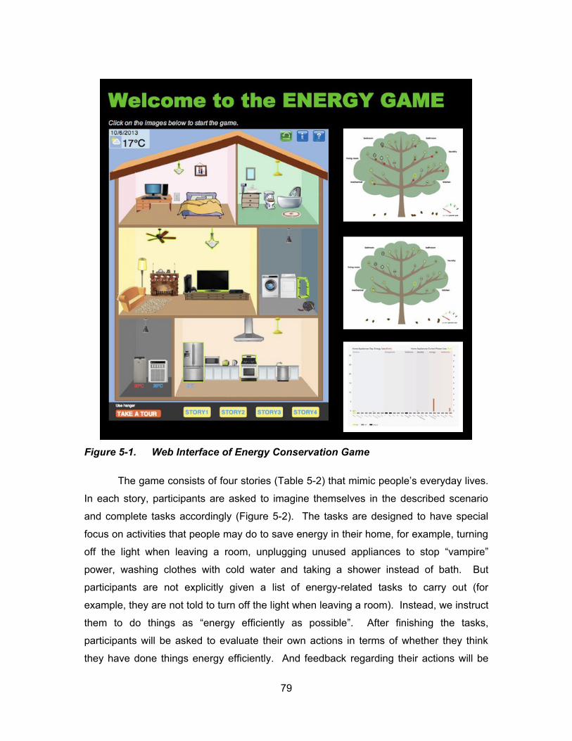
79
Figure 5-1. Web Interface of Energy Conservation Game
The game consists of four stories (Table 5-2 t t c p opl ’s v yd y l v s.
In each story, participants are asked to imagine themselves in the described scenario
and complete tasks accordingly (Figure 5-2). The tasks are designed to have special
focus on activities that people may do to save energy in their home, for example, turning
off the light when leaving a room, unplugging unused applia c s to stop “v p ”
power, washing clothes with cold water and taking a shower instead of bath. But
participants are not explicitly given a list of energy-related tasks to carry out (for
example, they are not told to turn off the light when leaving a room). Instead, we instruct
them to do things as “energy efficiently as possible”. After finishing the tasks,
participants will be asked to evaluate their own actions in terms of whether they think
they have done things energy efficiently. And feedback regarding their actions will be
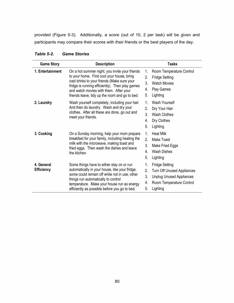
80
provided (Figure 5-3). Additionally, a score (out of 10, 2 per task) will be given and
participants may compare their scores with their friends or the best players of the day.
Table 5-2. Game Stories
Game Story Description Tasks
1. Entertainment On a hot summer night, you invite your friends to your home. First cool your house, bring iced drinks to your friends (Make sure your fridge is running efficiently). Then play games and watch movies with them. After your friends leave, tidy up the room and go to bed.
1. Room Temperature Control
2. Fridge Setting
3. Watch Movies
4. Play Games
5. Lighting
2. Laundry Wash yourself completely, including your hair. And then do laundry. Wash and dry your clothes. After all these are done, go out and meet your friends.
1. Wash Yourself
2. Dry Your Hair
3. Wash Clothes
4. Dry Clothes
5. Lighting
3. Cooking On a Sunday morning, help your mom prepare breakfast for your family, including heating the milk with the microwave, making toast and fried eggs. Then wash the dishes and leave the kitchen.
1. Heat Milk
2. Make Toast
3. Make Fried Eggs
4. Wash Dishes
5. Lighting
4. General Efficiency
Some things have to either stay on or run automatically in your house, like your fridge; some could remain off while not in use; other things run automatically to control temperature. Make your house run as energy efficiently as possible before you go to bed.
1. Fridge Setting
2. Turn Off Unused Appliances
3. Unplug Unused Appliances
4. Room Temperature Control
5. Lighting
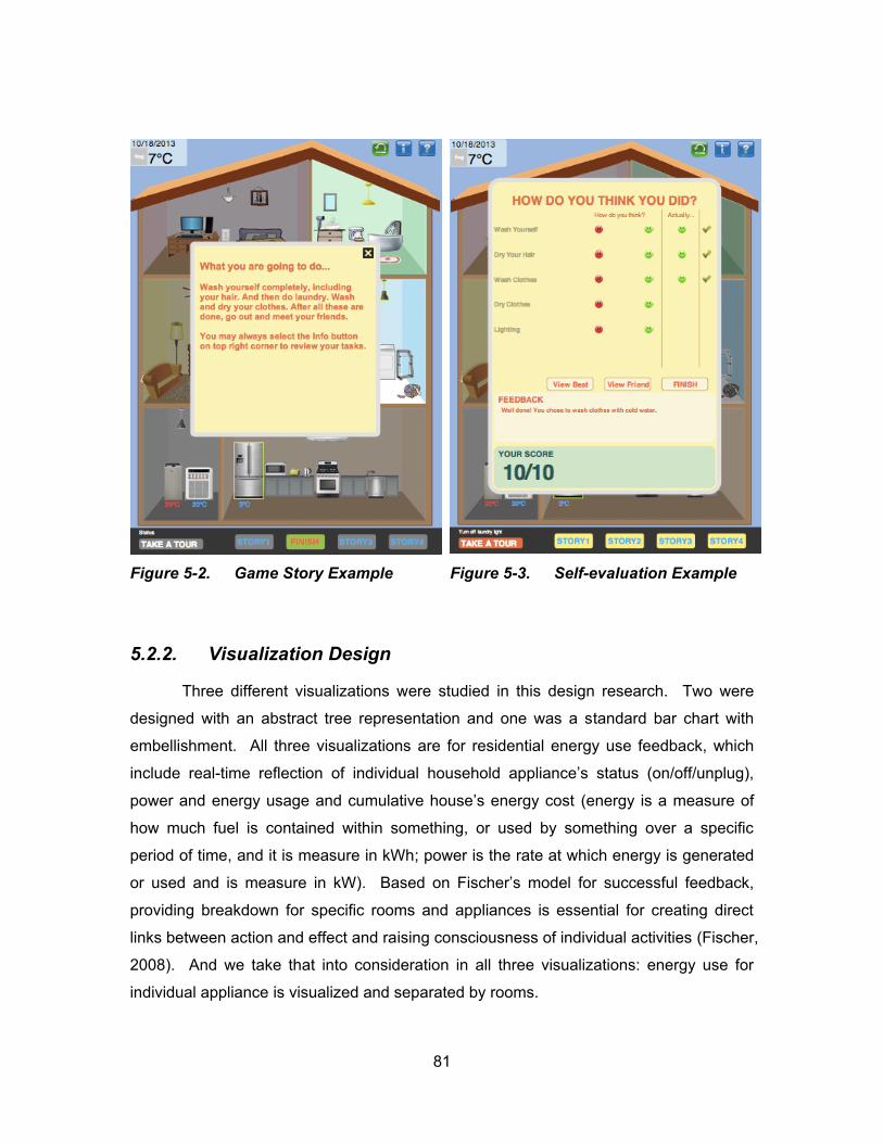
81
Figure 5-2. Game Story Example
Figure 5-3. Self-evaluation Example
5.2.2. Visualization Design
Three different visualizations were studied in this design research. Two were
designed with an abstract tree representation and one was a standard bar chart with
embellishment. All three visualizations are for residential energy use feedback, which
include real-time reflection of indiv du l ous old ppl c ’s st tus o /off/u plug
pow d gy us g d cu ul t v ous ’s gy cost (energy is a measure of
how much fuel is contained within something, or used by something over a specific
period of time, and it is measure in kWh; power is the rate at which energy is generated
or used and is measure in kW). B s d o F sc ’s od l fo succ ssful f db ck
providing breakdown for specific rooms and appliances is essential for creating direct
links between action and effect and raising consciousness of individual activities (Fischer,
2008). And we take that into consideration in all three visualizations: energy use for
individual appliance is visualized and separated by rooms.
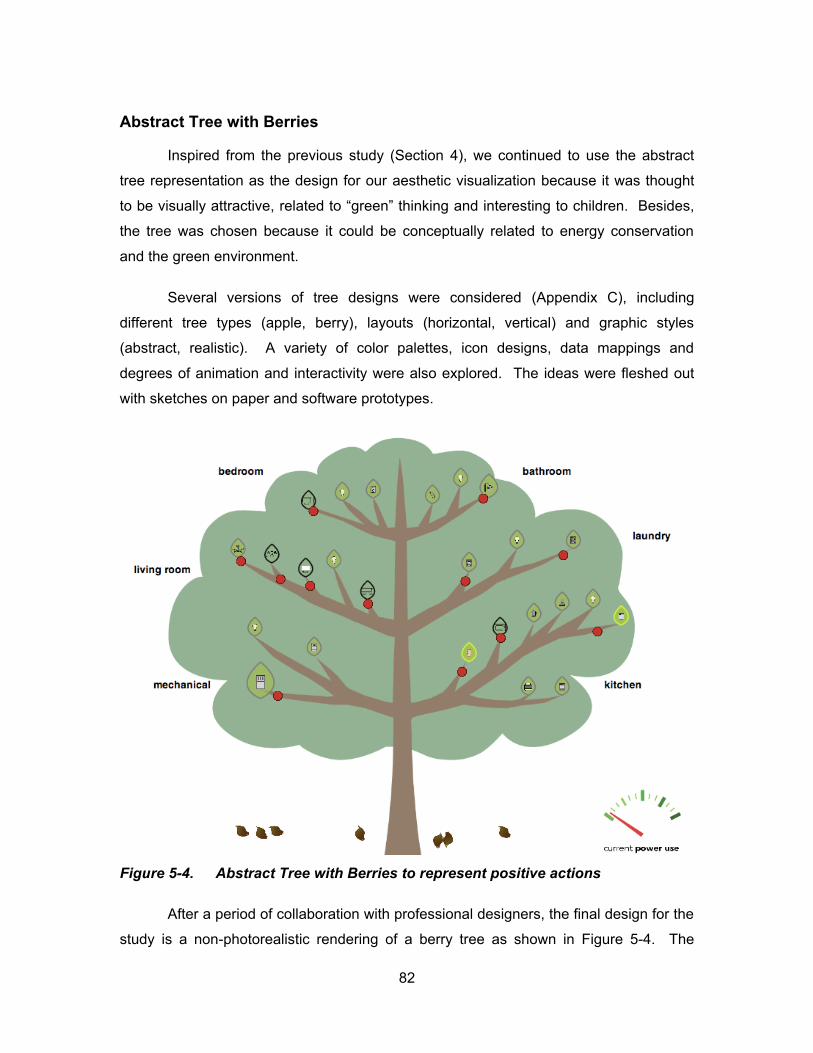
82
Abstract Tree with Berries
Inspired from the previous study (Section 4), we continued to use the abstract
tree representation as the design for our aesthetic visualization because it was thought
to be visually attractive l t d to “g ” t k g and interesting to children. Besides,
the tree was chosen because it could be conceptually related to energy conservation
and the green environment.
Several versions of tree designs were considered (Appendix C), including
different tree types (apple, berry), layouts (horizontal, vertical) and graphic styles
(abstract, realistic). A variety of color palettes, icon designs, data mappings and
degrees of animation and interactivity were also explored. The ideas were fleshed out
with sketches on paper and software prototypes.
Figure 5-4. Abstract Tree with Berries to represent positive actions
After a period of collaboration with professional designers, the final design for the
study is a non-photorealistic rendering of a berry tree as shown in Figure 5-4. The
83
branches in the tree represent different rooms in a house. For this study, it is mapped to
the dollhouse interface. On each tree branch, there are leaves representing household
appliances in the room that the branch is mapped to. Each individual appliance is
mapped to a single leaf with its icon displayed. The outline color of the leaf shows the
current status of the appliance: green for on, grey for off and black for unplugged. The
size of the leaf is mapped to the total energy the appliance costs (kwh): the larger the
leaf, the more energy it uses. The berries on the tree represent positive actions towards
energy conservation, for example, unplugging unused appliance, washing clothes in cold
water and turning up the fridge temperature. The yellow leaves piling up at the bottom of
the tree indicate the accumulative energy used in the house: the more leaves, the more
energy is consumed. The meter at the bottom right corner shows the current power use
(kw) in the house, which is self-explanatory.
Though the above tree visualization was decided and chosen for the study, there
were issues and conflict ideas around the design. First, several alternative ways of
displaying the appliances had been discussed in the design phase, including using icons
without the leaves and using icons with explanatory texts. For aesthetic reasons, the
current one was considered the best, though the icons for the appliances were thought
to be a bit too s ll to cog z . S co d t pow t d d ’t go w t t t
d s g d look d b upt t p ctu . U fo tu t ly w d ’t fou d a better way to
represent the current power use.
Abstract Tree without Berries
As a variation to the berry tree design, we also included a tree visualization
without the berries (Figure 5-5) in our study for the purpose of finding out whether the
explicit representation of positive actions would make a difference in engaging children
and encouraging more energy conservation behaviour. The data mapping to the tree is
identical to the one discussed above except positive actions are not displayed. In other
words, the berries are omitted.
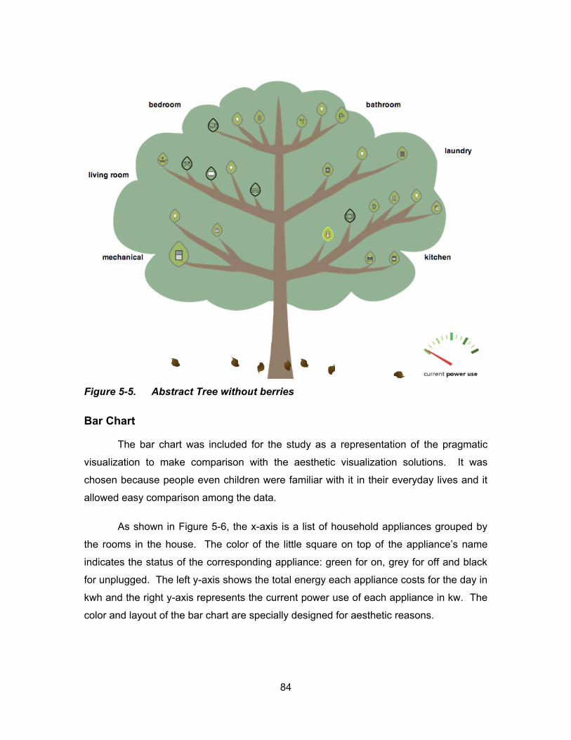
84
Figure 5-5. Abstract Tree without berries
Bar Chart
The bar chart was included for the study as a representation of the pragmatic
visualization to make comparison with the aesthetic visualization solutions. It was
chosen because people even children were familiar with it in their everyday lives and it
allowed easy comparison among the data.
As shown in Figure 5-6, the x-axis is a list of household appliances grouped by
the rooms in the house. The color of the little square on top of the ppl c ’s
indicates the status of the corresponding appliance: green for on, grey for off and black
for unplugged. The left y-axis shows the total energy each appliance costs for the day in
kwh and the right y-axis represents the current power use of each appliance in kw. The
color and layout of the bar chart are specially designed for aesthetic reasons.
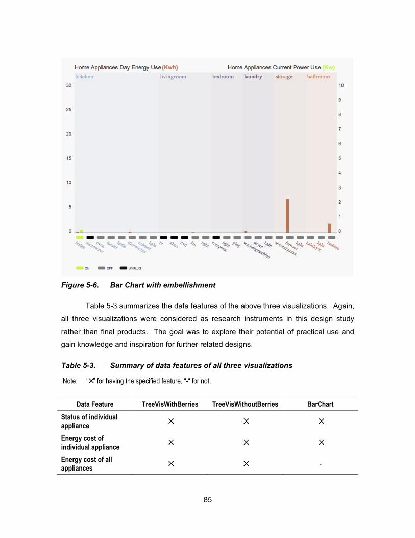
85
Figure 5-6. Bar Chart with embellishment
Table 5-3 summarizes the data features of the above three visualizations. Again,
all three visualizations were considered as research instruments in this design study
rather than final products. The goal was to explore their potential of practical use and
gain knowledge and inspiration for further related designs.
Table 5-3. Summary of data features of all three visualizations
Note: “✕” for having the specified feature, “-“ for not.
Data Feature TreeVisWithBerries TreeVisWithoutBerries BarChart
Status of individual appliance
✕ ✕ ✕
Energy cost of individual appliance
✕ ✕ ✕
Energy cost of all appliances
✕ ✕ -
86
Data Feature TreeVisWithBerries TreeVisWithoutBerries BarChart
Power use of individual appliance
- - ✕
Power use of all appliances
✕ ✕ -
Number of positive actions
✕ - -
5.2.3. System Implementation
The system (including the dollhouse and the visualizations) was developed a
web application using JavaScript (with D3 library) for the flexibility that it would be run on
different platforms and the data were kept in a MySQL database secured on the SIAT
lab server. The system was compatible with most web browsers (link:
http://energyvis.iat.sfu.ca/energy-game-v3/).
The system architecture is illustrated in Figure 5-7 below. The basic power (watt)
information for household appliances shown in the dollhouse is taken from the website
SavingElectricity (link: http://michaelbluejay.com/electricity/howmuch.html) and hard
coded into the MySQL database. The dollhouse interface loads the appliance power
data from the database on initiation and uses the information to calculate the appliance’s
actual energy cost (Energy Cost (kw·h) = Power (kw) * Time(h)). The time in the system
is simulated in a way that every 20 seconds is treated as an hour. The dollhouse then
sends the energy information back to the MySQL database along with the appliance
status (on/off/unplug) information. The dollhouse also has a real-time display of the
weather information, which is acquired from the World Weather API (Link:
http://www.worldweatheronline.com/) and updated on an hourly basis. On the
visualization side, all data required by the display including individual appliance status,
energy cost, etc., are pulled from the MySQL database and updated every 0.5-second to
achieve real-time effect.
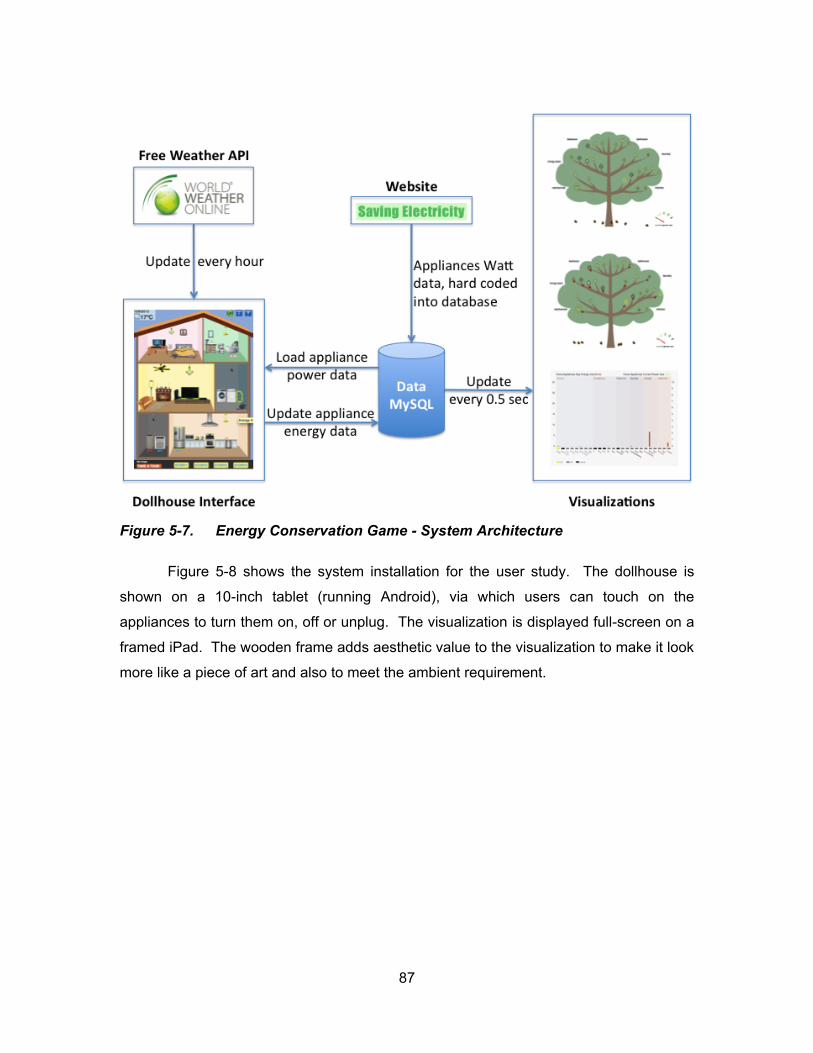
87
Figure 5-7. Energy Conservation Game - System Architecture
Figure 5-8 shows the system installation for the user study. The dollhouse is
shown on a 10-inch tablet (running Android), via which users can touch on the
appliances to turn them on, off or unplug. The visualization is displayed full-screen on a
framed iPad. The wooden frame adds aesthetic value to the visualization to make it look
more like a piece of art and also to meet the ambient requirement.
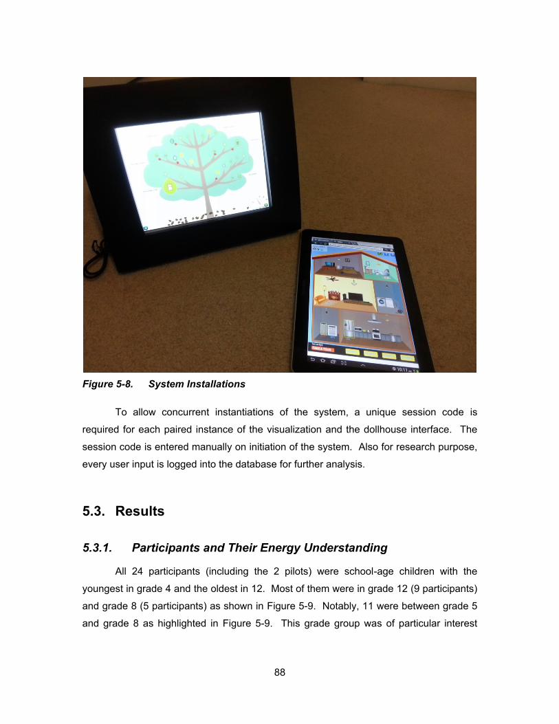
88
Figure 5-8. System Installations
To allow concurrent instantiations of the system, a unique session code is
required for each paired instance of the visualization and the dollhouse interface. The
session code is entered manually on initiation of the system. Also for research purpose,
every user input is logged into the database for further analysis.
5.3. Results
5.3.1. Participants and Their Energy Understanding
All 24 participants (including the 2 pilots) were school-age children with the
youngest in grade 4 and the oldest in 12. Most of them were in grade 12 (9 participants)
and grade 8 (5 participants) as shown in Figure 5-9. Notably, 11 were between grade 5
and grade 8 as highlighted in Figure 5-9. This grade group was of particular interest

89
because it was when children started to learn about power and energy in school.
(Ministry of Education, 2010)
Figure 5-9. Participants demographics
All participants admitted they had no idea about their family monthly energy cost.
y d d ’t c bout t f ly l ct c ty b lls d t y v t oug t bout
discussing the issue with their parents. All participants had a sense of which appliance
in their homes used the most energy, though a few of them were unsure about their
guesses. Of t 4 p t c p ts 8 sw d w t “f dg ” d 8 t o d oo
temperature control devices (heater/air-conditioner). Almost all participants thought that
appliances that they used most cost the most energy. All participants were able to name
2-3 actions that they might take at home to save energy (Figure 5-10). Among all the
pos t v ct o s t ost co o ly sw d w : “tu g off lights when leaving the
oo o w t d yl g t s b g t oug ” w c w s t o d by l ost ll
participants except one, d “u plugg g ppl c s ot us ”, which was brought up
by 9 participants. Other conservation actions mentioned includ d “w s ing with cold
w t ” “tu ing off u us d ppl c s” “w tc g l ss V” “us g l ss t ” tc.
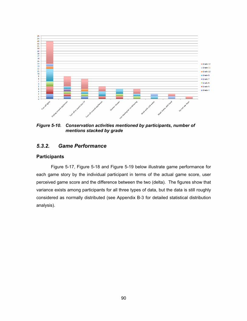
90
Figure 5-10. Conservation activities mentioned by participants, number of mentions stacked by grade
5.3.2. Game Performance
Participants
Figure 5-17, Figure 5-18 and Figure 5-19 below illustrate game performance for
each game story by the individual participant in terms of the actual game score, user
perceived game score and the difference between the two (delta). The figures show that
variance exists among participants for all three types of data, but the data is still roughly
considered as normally distributed (see Appendix B-3 for detailed statistical distribution
analysis).
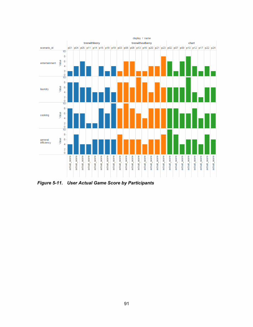
91
Figure 5-11. User Actual Game Score by Participants
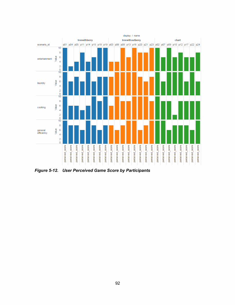
92
Figure 5-12. User Perceived Game Score by Participants
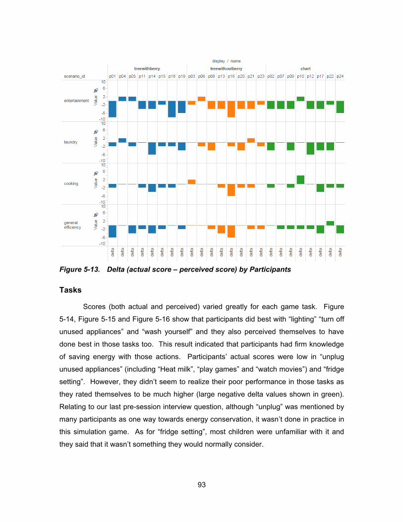
93
Figure 5-13. Delta (actual score – perceived score) by Participants
Tasks
Scores (both actual and perceived) varied greatly for each game task. Figure
5-14, Figure 5-15 and Figure 5-16 show t t p t c p ts d d b st w t “l g t g” “turn off
unused appliances” d “wash yourself” d t y lso p c v d t s lv s to v
done best in those tasks too. This result indicated that participants had firm knowledge
of saving energy with those actions. Participants’ actual scores were low in “unplug
unused appliances” (including “Heat milk”, “play games” d “watch movies”) and “fridge
setting”. However, they d d ’t seem to realize their poor performance in those tasks as
they rated themselves to be much higher (large negative delta values shown in green).
Relating to our last pre-session interview question, although “unplug” was mentioned by
many participants as one way towards energy conservation, it wasn’t done in practice in
this simulation game. As for “fridge setting”, most children were unfamiliar with it and
they said that it wasn’t something they would normally consider.
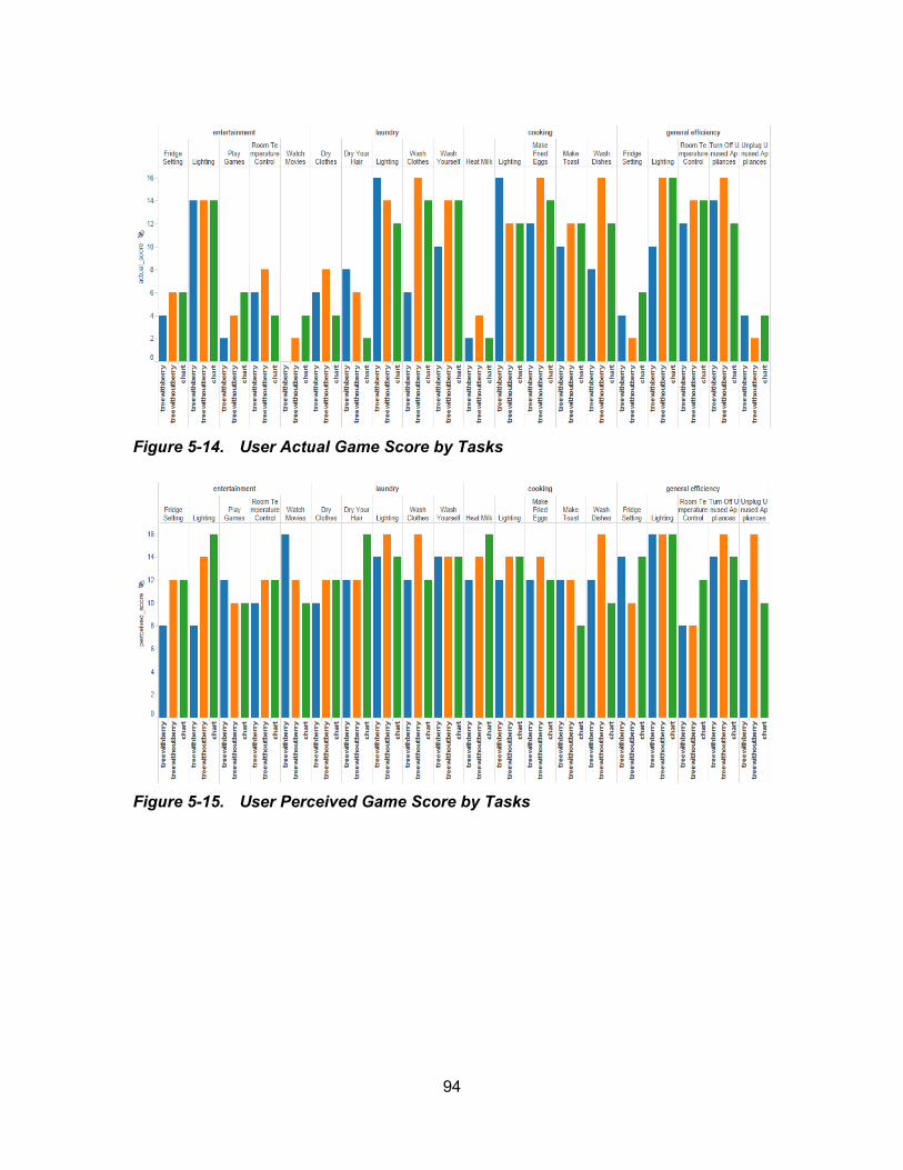
94
Figure 5-14. User Actual Game Score by Tasks
Figure 5-15. User Perceived Game Score by Tasks
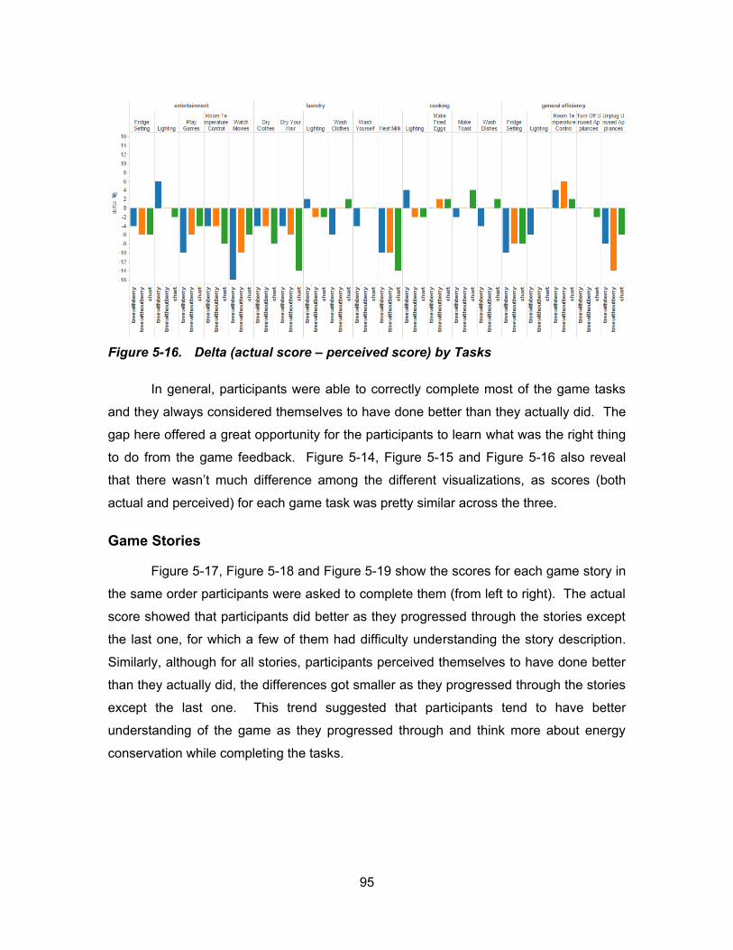
95
Figure 5-16. Delta (actual score – perceived score) by Tasks
In general, participants were able to correctly complete most of the game tasks
and they always considered themselves to have done better than they actually did. The
gap here offered a great opportunity for the participants to learn what was the right thing
to do from the game feedback. Figure 5-14, Figure 5-15 and Figure 5-16 also reveal
t t t w s ’t uc d ff c o g t d ff t v su l z t o s as scores (both
actual and perceived) for each game task was pretty similar across the three.
Game Stories
Figure 5-17, Figure 5-18 and Figure 5-19 show the scores for each game story in
the same order participants were asked to complete them (from left to right). The actual
score showed that participants did better as they progressed through the stories except
the last one, for which a few of them had difficulty understanding the story description.
Similarly, although for all stories, participants perceived themselves to have done better
than they actually did, the differences got smaller as they progressed through the stories
except the last one. This trend suggested that participants tend to have better
understanding of the game as they progressed through and think more about energy
conservation while completing the tasks.
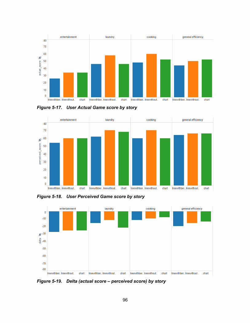
96
Figure 5-17. User Actual Game score by story
Figure 5-18. User Perceived Game score by story
Figure 5-19. Delta (actual score – perceived score) by story
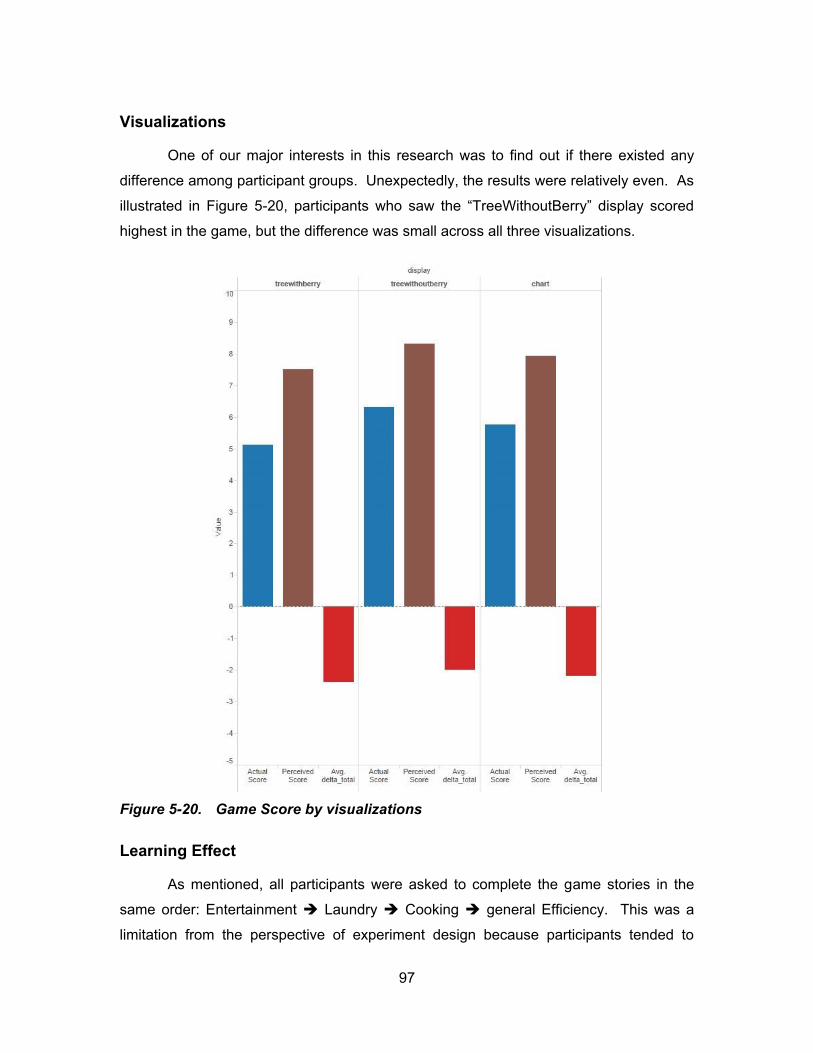
97
Visualizations
One of our major interests in this research was to find out if there existed any
difference among participant groups. Unexpectedly, the results were relatively even. As
illustrated in Figure 5-20 p t c p ts w o s w t “ W t outB y” d spl y sco d
highest in the game, but the difference was small across all three visualizations.
Figure 5-20. Game Score by visualizations
Learning Effect
As mentioned, all participants were asked to complete the game stories in the
same order: Entertainment Laundry Cooking general Efficiency. This was a
limitation from the perspective of experiment design because participants tended to
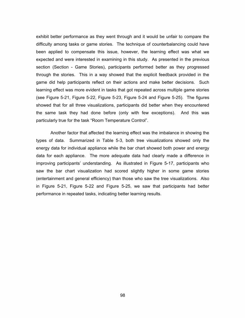
98
exhibit better performance as they went through and it would be unfair to compare the
difficulty among tasks or game stories. The technique of counterbalancing could have
been applied to compensate this issue, however, the learning effect was what we
expected and were interested in examining in this study. As presented in the previous
section (Section - Game Stories), participants performed better as they progressed
through the stories. This in a way showed that the explicit feedback provided in the
game did help participants reflect on their actions and make better decisions. Such
learning effect was more evident in tasks that got repeated across multiple game stories
(see Figure 5-21, Figure 5-22, Figure 5-23, Figure 5-24 and Figure 5-25). The figures
showed that for all three visualizations, participants did better when they encountered
the same task they had done before (only with few exceptions). And this was
particularly true for the task “Room Temperature Control”.
Another factor that affected the learning effect was the imbalance in showing the
types of data. Summarized in Table 5-3, both tree visualizations showed only the
energy data for individual appliance while the bar chart showed both power and energy
data for each appliance. The more adequate data had clearly made a difference in
p ov g p t c p ts’ u d st d g. As llust t d Figure 5-17, participants who
saw the bar chart visualization had scored slightly higher in some game stories
(entertainment and general efficiency) than those who saw the tree visualizations. Also
in Figure 5-21, Figure 5-22 and Figure 5-25, we saw that participants had better
performance in repeated tasks, indicating better learning results.
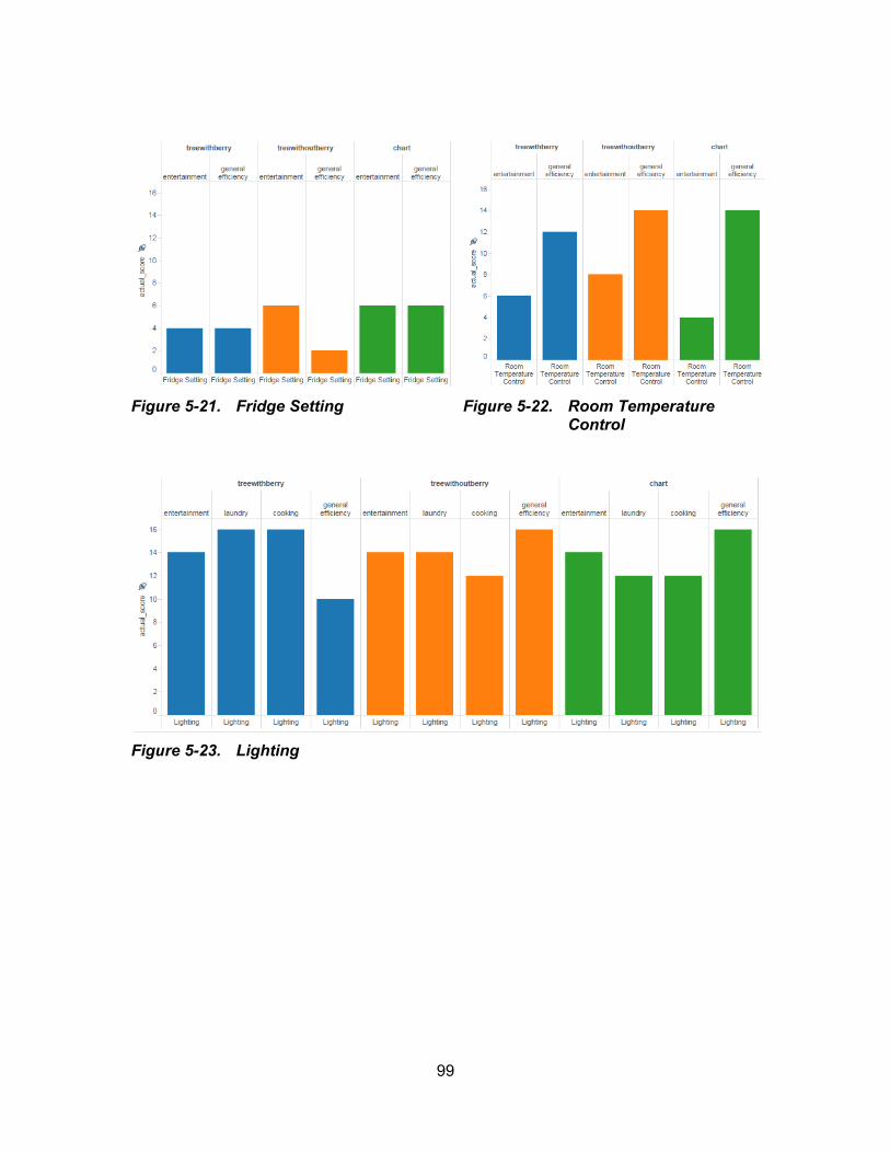
99
Figure 5-21. Fridge Setting
Figure 5-22. Room Temperature Control
Figure 5-23. Lighting

100
Figure 5-24. Turn Off Unused Appliances
Figure 5-25. Unplug Unused Appliances
101
5.3.3. Game Logs
A game log is a record of a p t c p t’s t ct o w t t g t f c . .
an action on a certain appliance to turn it on, off, or unplug. The number of the game
logs was an important aspect to be analyzed in this study as it indirectly indicated how
much effort participants spent on the game or how much interest participants had with
the game installations (the dollhouse and the corresponding visualization). The more
logs showed the more trials participants did during the game, which was either caused
by more effort participants needed to complete the game tasks or by more curiosity that
participants had to explore the game.
Appliances
The game logs showed significant difference among the number of times
participants interacted on different appliances (Figure 5-26). The lights were the most
clicked appliances. Unsurprisingly, they were required in all four game stories. Other
appliances with higher clicks were the dryer, fridge, oven, air-conditioner, TV and Xbox.
Two possible reasons were concluded from this finding: first, appliances such as the
light, dryer, oven and air-conditioner that had more obvious changing effects upon
interaction either in the dollhouse (light) or in the display (larger leaves or higher bars),
tended to cause the interest of the participants to explore them more; second,
participants were more interested in appliances that were familiar to them in real life
such as the TV and Xbox and were curious to know how they appeared in the dollhouse
and the visualizations. A more concrete example to this was the computer, which had a
lot of clicks even though it was not asked in any of the game stories.
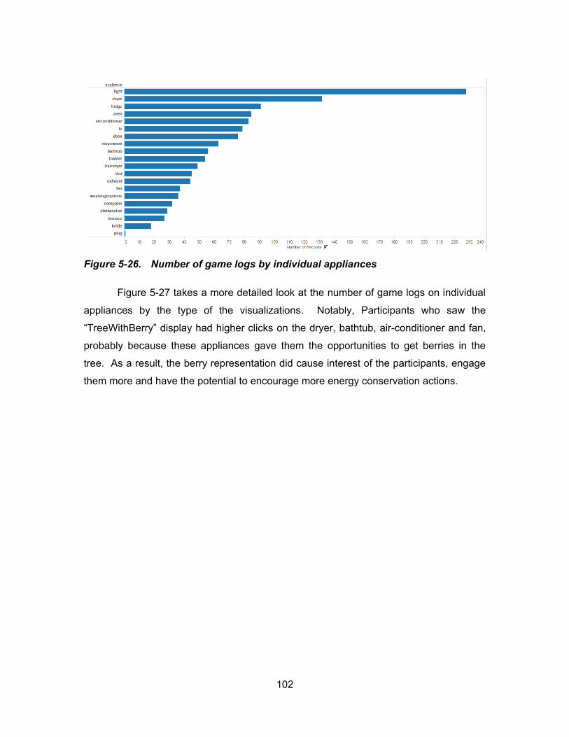
102
Figure 5-26. Number of game logs by individual appliances
Figure 5-27 takes a more detailed look at the number of game logs on individual
appliances by the type of the visualizations. Notably, Participants who saw the
“ W t B y” d spl y d g cl cks o the dryer, bathtub, air-conditioner and fan,
probably because these appliances gave them the opportunities to get berries in the
tree. As a result, the berry representation did cause interest of the participants, engage
them more and have the potential to encourage more energy conservation actions.

103
Figure 5-27. Number of game logs by individual appliances separated by visualizations
Logs in General
More logs were found in the first game story than the others (Figure 5-28). As
expected, when participants first started the game, they would spend more effort figuring
out how to complete the game tasks, which resulted in more trials. Also this was when
they were most curious about the game installations and would click on various
appliances to discover what might happen even if those appliances were not asked in
t g sto y. Add t o lly p t c p ts w o s w t “ W t B y” v su l z t o d
most clicks on the appliances (Figure 5-29), but the difference was not significant across
all three visualizations.
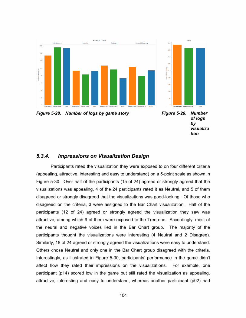
104
Figure 5-28. Number of logs by game story
Figure 5-29. Number of logs by visualization
5.3.4. Impressions on Visualization Design
Participants rated the visualization they were exposed to on four different criteria
(appealing, attractive, interesting and easy to understand) on a 5-point scale as shown in
Figure 5-30. Over half of the participants (15 of 24) agreed or strongly agreed that the
visualizations was appealing, 4 of the 24 participants rated it as Neutral, and 5 of them
disagreed or strongly disagreed that the visualizations was good-looking. Of those who
disagreed on the criteria, 3 were assigned to the Bar Chart visualization. Half of the
participants (12 of 24) agreed or strongly agreed the visualization they saw was
attractive, among which 9 of them were exposed to the Tree one. Accordingly, most of
the neural and negative voices lied in the Bar Chart group. The majority of the
participants thought the visualizations were interesting (4 Neutral and 2 Disagree).
Similarly, 18 of 24 agreed or strongly agreed the visualizations were easy to understand.
Others chose Neutral and only one in the Bar Chart group disagreed with the criteria.
Interestingly, as illustrated in Figure 5-30, p t c p ts’ p fo c t g d d ’t
affect how they rated their impressions on the visualizations. For example, one
participant (p14) scored low in the game but still rated the visualization as appealing,
attractive, interesting and easy to understand, whereas another participant (p02) had
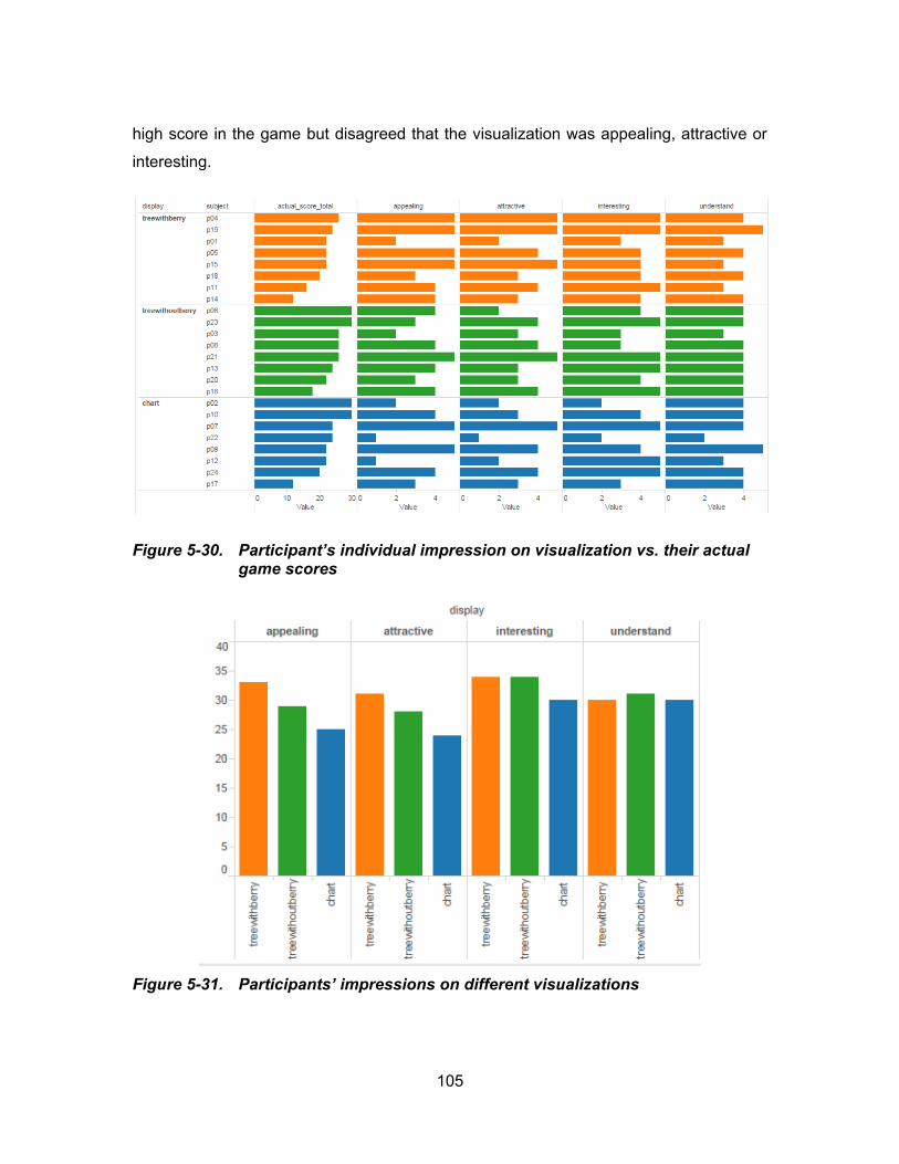
105
high score in the game but disagreed that the visualization was appealing, attractive or
interesting.
Figure 5-30. Pa ticipa t’s i dividual imp ssio o visualizatio vs. t i actual game scores
Figure 5-31. Participants’ impressions on different visualizations
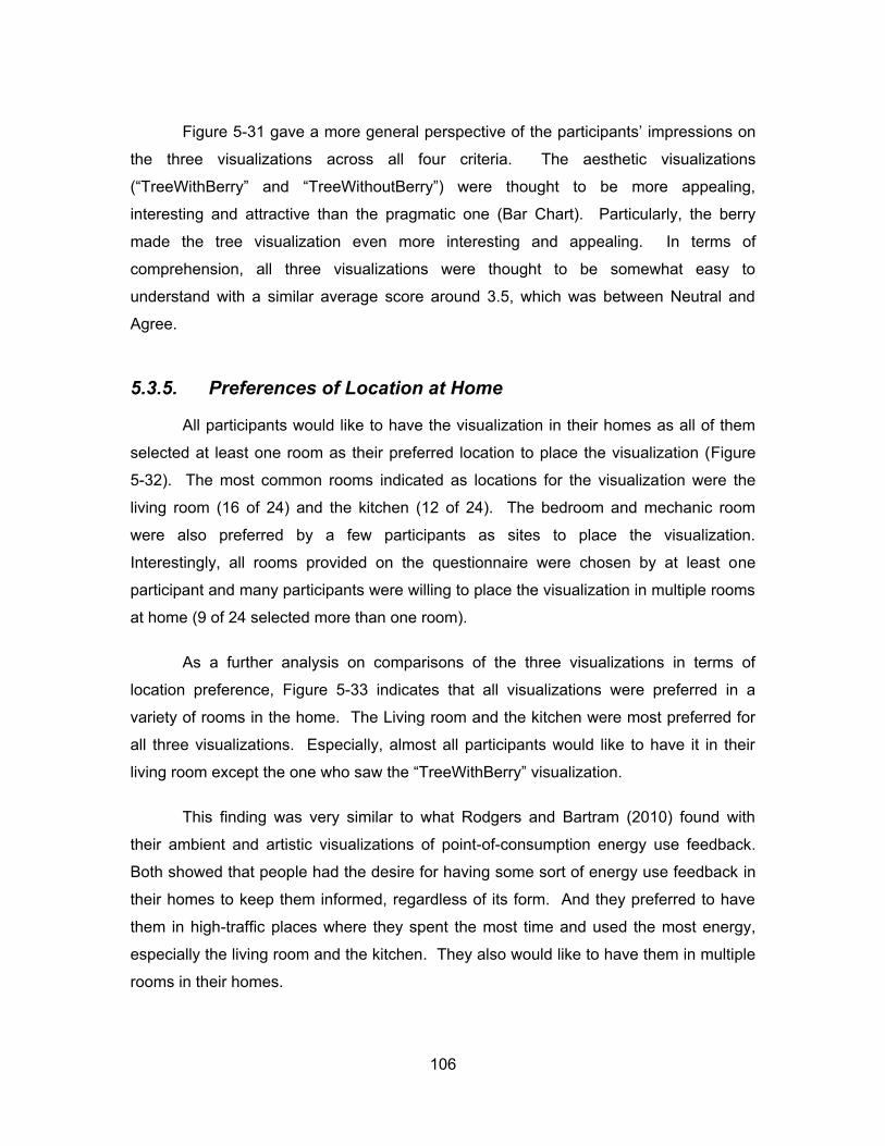
106
Figure 5-31 gave a more general perspective of the p t c p ts’ p ss o s o
the three visualizations across all four criteria. The aesthetic visualizations
“ W t B y” d “ W t outB y” w t oug t to b o pp l g
interesting and attractive than the pragmatic one (Bar Chart). Particularly, the berry
made the tree visualization even more interesting and appealing. In terms of
comprehension, all three visualizations were thought to be somewhat easy to
understand with a similar average score around 3.5, which was between Neutral and
Agree.
5.3.5. Preferences of Location at Home
All participants would like to have the visualization in their homes as all of them
selected at least one room as their preferred location to place the visualization (Figure
5-32). The most common rooms indicated as locations for the visualization were the
living room (16 of 24) and the kitchen (12 of 24). The bedroom and mechanic room
were also preferred by a few participants as sites to place the visualization.
Interestingly, all rooms provided on the questionnaire were chosen by at least one
participant and many participants were willing to place the visualization in multiple rooms
at home (9 of 24 selected more than one room).
As a further analysis on comparisons of the three visualizations in terms of
location preference, Figure 5-33 indicates that all visualizations were preferred in a
variety of rooms in the home. The Living room and the kitchen were most preferred for
all three visualizations. Especially, almost all participants would like to have it in their
living room except the o w o s w t “ W t B y” v su l z t o .
This finding was very similar to what Rodgers and Bartram (2010) found with
their ambient and artistic visualizations of point-of-consumption energy use feedback.
Both showed that people had the desire for having some sort of energy use feedback in
their homes to keep them informed, regardless of its form. And they preferred to have
them in high-traffic places where they spent the most time and used the most energy,
especially the living room and the kitchen. They also would like to have them in multiple
rooms in their homes.

107
Figure 5-32. Individual preferences of location at home
Figure 5-33. General preferences on location at home across three visualizations
108
5.4. Discussion
Our findings, to various extents, directly or indirectly referred to our research
questions. We have explored the utility of the visualizations in the context of a simulated
game environment and collected data of the p t c p ts’ g p fo c
impressions on visualization design and preferences of integrating the visualization tool
into their homes. The energy conservation game turned out to be quite fun and
engaging. Participants got very focused during the game session and tried hard to
explore everything that might cause changes in the game installations. Most of the
times, participants tended to over rate their performance in the game and the provided
feedback and conservation advice offered them a chance to reflect on their own actions.
In terms of our first research question, all three visualizations proved to be
effective as feedback for home energy use. This was indicated by the game
performance results that participants seeing different visualizations were all able to
complete the game tasks with moderate scores and there was no significant difference
among the three groups. The real-time feedback of the visualizations helped
participants immediately link the effects to their actions and let them give a thought on
what they should and should not do the next to score higher. As a matter of fact, this
was what we expected as effects on decision-making. Additionally in the follow-up
questionnaire, all three visualizations were rated as easy to understand.
Comprehensibility was the key to visualization design regardless of its form and was the
basis for it to serve its function. However, the aesthetic visualizations “ W t B y”
d “ W t outB y” were considered to be more appealing, interesting and
attractive than the pragmatic one (Bar Chart). When participants were shown all three
visualizations at the end of the study, almost all of them expressed preference on the
“ W t B y” o s t y t oug t “g tt g b s” w s t st g f db ck to
their positive actions and the berries made the tree more aesthetically appealing. Only
one participant preferred the Bar Chart the most, but no specific reason was given.
Much to our unexpectation, the explicit representation of positive actions (the
b s d d ’t ff ct p t c p ts’ performance in the game. Although, our results
s ow d t t t “b y” w s p f d by ost p t c p ts d d d d w o
attention during the game (with more g logs t ot s t d d ’t k d ff c

109
in leading to more energy conservation actions. However, our study design was very
l t d to fully sw t s qu st o b c us s c o p opl ’s b v ou c g
would require longitudinal studies in real-life settings (Skog, 2006).
Our results also indicated the viability of the visualizations, especially those
designed using the aesthetic visualization approach, to serve as feedback for residential
energy use. All participants were willing to have it somewhere in their homes, and many
of them would even like to have them in multiple rooms (Figure 5-34). Back to our first
pre-session interview question, all our participants had no idea about their family
electricity use and had no intention to read the energy bills. In other words, they were
not exposed to any form of energy feedback in their house, nor were they ever
interested in any existing feedback that was available to them. This made our approach
to energy feedback a promising method to bring home energy information to our children
and help them get a sense of how energy was consumed in their everyday life and what
they might do to contribute to energy conservation.
Figure 5-34. Sample in-home placement of the display
Referring to our last research question, the simulation game proved to be useful
both as a testing platform and an experiment itself to help us gain more insightful
110
findings of how people understood energy conservation in their homes. With this
realistically representative simulation, we were able to draw more information than a
pu t v w d d scov t g t g p b tw p t c p ts’ s lf-perceived
understandings of energy conservation at home and their actual performance. For
x pl qu t f w p t c p ts t o d “u plugging ppl c s ot us ” s one
way to save energy, but in the simulation game, few of them actually did that. The game
turned out to be a useful tool to help them realize and bridge this gap as we saw
apparent improvement as they progressed through the game stories. This also led to
another finding that was not quite anticipated in our hypotheses - the game could be a
helpful tool to tease out and elicit where people did not understand or remember about
energy consumption in their homes.
To summarize, all three visualizations proved to be effective as feedback for
residential energy use. Particularly, the two aesthetic visualizations appeared to be
more engaging and attractive to children. It is very promising that it will be an interesting
tool to help our future generation raise their awareness of home energy use and promote
more behaviours towards energy conservation. However, this requires future studies
that involve long-term evaluations within real-life settings. Besides, the game itself
proves to be a useful xp t to l c t p t c p ts’ p c v d u d st d gs of
energy conservation as compared to their actual performance. Such findings are
valuable in the future design practice as they serve as references for what the
visualization should address on.
Finally, in terms of design hints, although the above three visualizations are
merely conceived as research instruments rather than final products to be evaluated,
their design process shares us with valuable experience and inspirations. Showing the
right data is important in helping people better understand the situation. For example in
this research, both power and energy d t s ould b dd ss d to p ov p t c p ts’
knowledge of energy use for each household appliance. Aesthetics is a key issue to be
considered in such kind of visualization provided that comprehensibility is well
maintained. The design of aesthetic visualization is a process of trial and error, during
which sketches and software prototypes are useful to explore various design ideas and
lt t v s. Sk tc g s po t t b c us t “wo ks s tool o t c qu us ful fo
communicating with other designers and with customers as it provides a shared

111
language which has no equivalent in ordinary, spoken language, but which allows
d s g s to xp ss t s lv s” d t s “ w y of s p g w d s” (Fallman,
2003). Finally, the abstract art makes an important source of inspiration because they
v su lly f sc t g d c p p l to o ’s tt t o w l sust g
interest over time.
112
6. Conclusion and Future Work
In this research, we have discovered the preliminary evidence that the aesthetic
visualization approach is a promising alternative to the provision of feedback for
consumer energy use. With two experimental investigations, we explored the
effectiveness and utility of the approach focusing on different aspects. In the first study,
we laid the groundwork for proving that aesthetic visualization had the advantage of
engaging people with visually fascinating displays while maintaining comprehensibility
and supporting at-a-glance awareness. We quantified comprehensibility into two
statistical measures: accuracy of user interpretation and time required for the
interpretation. And we evaluated it using a quantitative method. We further reported
that aesthetic visualization was effective as an approach to energy feedback because it
had the potential to affect sustainable decision-making. This was evidenced by our
second study in which visualizations were tested through real usage via a simulated
real-life environment. We took a design-oriented research perspective (Fallman, 2007)
with mixed evaluation methods. In both studies, we compared aesthetic visualization to
pragmatic visualization (standard bar chart) and proved that aesthetic visualization had
slightly better performance than pragmatic visualization in terms of basic functionality.
However, the aesthetic visualization was much more favoured by the users (especially
children) and considered to be more interesting and engaging. We suggest that
aesthetic visualization should be considered a promising approach to consumer energy
feedback that enables informed decision-making. With regard to design issues in this
space, we address on balancing aesthetic interest with usefulness and transferring user
attention from highly attentive to peripheral (Skog, 2006).

113
6.1. Research Questions Revisited
As a review to our research discussed in this thesis, this section summarizes the
research questions in the two studies separately and concludes with implications and
recommendations these studies have established for future reference.
6.1.1. Study 1
A feedback tool needs to be understood before it can be effective to serve any
other purpose. Our major research question in this study is to explore - whether
aesthetic visualization, with its aesthetic appeal, still maintains comprehensibility and
whether this added aesthetic value assists users better understand the information. We
compared two aesthetic visualizations in different styles to a pragmatic visualization and
confirmed our hypothesis that they were as easy or slightly easier to comprehend than
pragmatic visualization with statistical measures. Specifically, we took a detailed
analysis at each individual graphical element in the visualization to find out which one
worked or did not work. Our findings showed that graphical representations, which were
conceptually related to the information represented, did add ease to the
co p s b l ty. Fo x pl t “b tt y” p s t g t gy l v l w ll
supported at-a-glance awareness as users were able to quickly and accurately tell how
much energy was currently left in the bank. Whereas the color coding of the solar panel,
also representing the energy level, failed to serve its purpose as most users did ’t g t ts
meaning. This suggests that for the graphical representation to be useful and provide
insights, not only aesthetics should be concerned, but also the way information is
represented.
In addition, we questioned in the study whether users would have higher ratings
for aesthetic visualizations with respect to readability, attractiveness and at-a-glance
awareness based on their general impression. Our assumption was partially approved
that the superiority in attractiveness and support for at-a-glance awareness somehow
made aesthetic visualizations lose readability as compared to pragmatic visualization
because details such as headings, legends and numbers were omitted for aesthetic
reasons. This leads to the dilemma: whether it is more important to communicate a
concern or focus more on detailed analysis. Finally, we collected user polls on where
114
they would like to place those visualizations. The results varied for different
visualizations and indicated that designs for such kind of feedback was context-
sensitive, but overall people liked the idea to have them in their everyday lives.
6.1.2. Study 2
We extended the research to further examine the effectiveness of aesthetic
visualization in practical use within a simulated real-life environment. Research
qu st o s ou d “ ff ct v ss” t sf d ts focus f o co p s b l ty to w t
it had the promise to lead to sustainable decision-making. Again, we compared that to a
pragmatic visualization. The results of our simulation game in which users were asked
to k d c s o s d d ’t s ow s g f c t d ff c b tw aesthetic visualization and
pragmatic visualization. While the game logs revealed that users who saw the aesthetic
visualizations showed more interest in trying out things with sustainable options,
especially those who saw the one with explicit representations for positive actions. In
addition to this, we reported the effectiveness of aesthetic visualizations based on higher
user preferences in the criteria of easy to understand, appealing, interesting and
tt ct v . How v t v d c w s ’t st o g oug to fully sw ou s c
question in terms of decision-making. According to Skog (2006), this requires
longitudinal in-situ studies for more comprehensive and valid evaluation.
Similar to our previous study, we also collected user preferences on where they
would like to have those feedback tools in their life, particularly in their homes. In
contrast, we believed user decisions in this study to be more mature and justifiable
because users had real use experience with them and the visualization designs were
specifically targeted at users in their age group. The positive results indicated the
viability of using aesthetic visualization as feedback for residential energy use.
Additionally, the simulated testing environment - the Energy Conservation Game
itself turned out to be a useful tool to lp us b tt u d st d p t c p ts’ k owl dg
of home energy conservation. It exposed t g p b tw p t c p ts’ s lf-perceived
understandings of energy conservation at home and their actual performance.
Participants always over rated themselves to have done better than they actually did,
indicating missing knowledge of their own behaviours. For example, quite a few
115
participants ment o d “u plugg g ppl c s ot us ” s o w y to s v gy
but in the simulation game, few of them actually did that. These findings may not directly
link to issues discussed in this research, but they are important hints to be considered in
future feedback designs in this space.
6.1.3. Design Implications
The two studies verified the effectiveness and utility of aesthetic visualization as
an approach to energy feedback in two stages. Our preliminary results showed that the
approach had good potential within two specific use contexts, inferring more general
design considerations for this type of feedback to be effective from these two instances.
First, showing the right data is important in helping people better understand the
situation. The right data refers to not only the preciseness of the data, but also the
relevance of the data – what should be presented and to which degree. For example in
our visualization design for residential energy use, both instant power and cumulative
energy data should be addressed for each household appliance to p ov p t c p ts’
knowledge of their energy use. More generally, the data should be relevant to consumer
understanding and perception of energy. As mentioned in introduction (The
Problem1.1), individual consumers think of energy in three ways: as a commodity, a
basic human need and an ecological resource (Darby, 2001). Therefore, when
representing energy data to consumers, it should fit in one of their expectations of what
energy is to them. For example, it is good idea to visualize the energy price, how it
powers household appliances and how it relates to GHG emissions, but it might be
pointless to present energy to them in physics illustrations.
Second, aesthetics is a key issue to be considered provided that
comprehensibility is well maintained. This includes how we balance aesthetic interest
and readability concern, as Kosara (2007) states they lie on the opposite ends of the
“sublimity” scale. Our main goal is to provide at-a-glance awareness of energy use and
to inform and engage people with rich and interesting display. To achieve that, special
thoughts should be put on what kind of graphical elements to choose and how to map
them to the underlying data. Our experience shows that graphical representations that
are conceptually related lead to better comprehension. More importantly, it should be
116
appropriate to the targeted audience and context. For example, children are interested
in more abstract and cartoon-looking representations like our tree design and standard
charts look too serious to be integrated into the home environment.
Finally, the design of the aesthetic visualization is a process of trial and error.
Software prototypes are fast and useful ways to try out different design ideas. Their
flexibility allows us to quickly generate various alternatives and compare them in parallel.
’s o bsolut sw to ssu s l k colo c o c s d s z pp gs, all have to
be tested out with comparisons. Besides, all user opinions and preferences are
valuable, however, they may be diverse and conflicting. Thus, the design should
consider and satisfy the taste of the majority of the audience.
6.1.4. Summary
Both study 1 and study 2 have provided positive answers to the research
questions explored. And we conclude that the aesthetic visualization is able to maintain
comprehensibility while better engaging people with its rich and interesting display and
has the potential to support decision-making and learning. More importantly, we have
received positive feedback from our test participants that they would like to have such
visualization tool in real use. This suggests that the aesthetic visualization may be a
promising and engaging tool to help raise consumer awareness of energy use and
promote more behaviour towards energy conservation.
6.2. Contributions
We situate this work within the broader subject of sustainable HCI discussed in
Section 2.2.1. Particularly, our research fits into the discourse described as sustainable
interaction design (Goodman, 2009) d l s w t t two g s of “p su s v
t c ology” d “ b t w ss” (DiSalvo, Sengers, & Brynjarsdóttir, 2010).
Inspired and motivated by various works within this field (Rodgers & Bartram, 2011;
Bartram, Rodgers, & Muise, 2010; Holmes, 2007), our primary focus of this research is
to motivate better decision-making through more effective feedback. As a result, this
work makes contribution to evolving the exploration on Eco-visualization (Pierce, Odom,
117
& Blevis, 2008) and diversifying the trials on developing new eco-feedback technologies
(Froehlich, Findlater, & Landay, 2010).
More specifically, this work leads to three critical outcomes in validating the
effectiveness and utility of aesthetic visualization as a novel approach to the provision of
consumer energy feedback. First, we have demonstrated that aesthetic visualization is
able to maintain its comprehensibility while better engaging people with its richer and
more appealing representations. Second, we have shown that aesthetic and depictive
visualization has the potential to support decision-making and learning. Although the
proof here is quite preliminary, it is evident enough to foster long-term field studies to
further evaluate its feasibility. Finally, we have unveiled the promise and viability of its
utility in real-life settings through two mixed methods user studies. We have received
high user preference ratings, positive attitudes and comments towards having the
aesthetic visualization feedback in everyday use.
Furthermore, the work contributes to design concerns of developing effective
energy feedback tools with detailed examinations of several of our prototypes. We have
arrived at a conclusion that aesthetics is an important issue to consider in this design
space because it draws user interest and assists at-a-glance awareness. Aesthetic
visualization is flexible in its content with inspirations from various art works, however, it
is context-sensitive and the selection of its visual representation should take serious
concern of its working environment and audiences. Besides, we have drawn several key
factors in this design space: first, the data being displayed should b l v t to p opl ’s
understanding of the underlying problem and sufficient information should be provided to
suppo t p opl ’s w ss; d s co d t d spl y d fo t o s ould v l l-
time change so as to allow people to immediately relate their behaviours to energy use
effects.
6.3. Future Work
We have emphasized several times in this thesis that our findings are preliminary
and our work has laid only the groundwork for the provision of aesthetic visualization as
feedback for consumer energy use. Thus, numerous opportunities are available for
118
future work to evolve exploration within this field, including long-term in-situ evaluation of
its feasibility, further exploration of more general and completed design concerns within
this space and development of variations or improvements to the approach.
Our work has revealed the promise of aesthetic visualization as an approach to
energy feedback. With limitations in time and context, the current work is insufficient in
reaching our ultimate goal of exploring whether this approach affects sustainable
decision-making that results in behavioural change. Therefore, our next avenue is to
conduct longitudinal field studies that will enable us to make more valid evaluations of
these factors over time.
With detailed examination of our prototypes, we have drawn a few basic design
implications within this space, but additional work is required to make that more
comprehensive and completed as general design guidelines for developing such kind of
feedback. Future work will expand current focus on balancing aesthetic and usability to
embracing aesthetic as a required quality to supplement effectiveness and visual
efficiency. We wish to arrive at some framework that will help identify the proper
representation to be used in designing this kind of feedback based on use-context, from
general graphical styles to more detailed features such as color choices.
With respect to design hints, we also want to explore what is the right data to
represent to better support informed decision-making. For example, in this research, we
saw that both power and energy information for individual appliance were important in
improving consumer knowledge whereas the explicit representation of positive actions
made little difference. Future work will continue to explore what information is important
and how to effectively show it. As reviewed in the background study (Section 2.1.2 and
Section 2.1.3), various interventions have proved to be useful in motivating behaviour
change such as social influence. This opens possibilities for future research to explore
whether integrating these different types of data into feedback design will add to its
effectiveness.
Finally, our prototype design of aesthetic visualizations mainly followed the
design requirements proposed by Rodgers & Bartram (2011). However, according to
our interviews with users, variations or improvements may be made to the current
design. For example, use of animations may be considered to add to the vividness of

119
the visualization and adding interactions may allow preference settings of the display to
b tt custo z d v du l us ds. s y co fl ct w t t “ b t”
qu t but t s f ct tt of ow w co t ol t “us of d g ” d t c
only be verified through trail and error.
120
References
Ab s W. L d S. C l s V. l b R. 5 йил 1 . A v w of intervention studies aimed at household energy conservation. Journal of Environmental Psychology , 25 (3), pp. 273-291.
Accenture. (2010). Understanding Consumer Preferences in Energy Efficiency - Accenture end-consumer observatoryon electricity management 2010.
Antle, A. N., Tanenbaum, J., & Macaranas, A. (2013). Games for change: Looking at models of persuasion through the lens of design. In A. Nijholt (Ed.), Playful User Interfaces: Interfaces that Invite Social and Physical Interaction. Springer.
B.C.'s Ministry of Energy, Mines and Petroleum Resources. (2009). The BC Energy Plan - A Vision for Clean Energy Leadership.
B.C.'s Ministry of Environment. (2009). BC Climate Action Plan.
B.C.'s Ministry of Environment. (2009). The Green Energy Advisory Task Force Report.
Bang, M., Torstensson, C., & Katzeff, C. (2006). The PowerHouse: a persuasive computer game designed to raise awareness of domestic energy consumption. PERSUASIVE'06 Proceedings of the First international conference on Persuasive technology for human well-being (pp. 123-132). Berlin, Heidelberg: Springer-Verlag.
Bartram, L., Rodgers, J., & Muise, K. (2010). Chasing the Negawatt: Visualization for Sustainable Living. IEEE Computer Graphics and Applications , 30 (3), 8-14.
BC Hyd o. 13 . S t M t s S t C o c . R t v d 13 йил 7-11 from BC Hydro: https://www.bchydro.com/energy-in-bc/projects/smart_metering_infrastructure_program/smart_meter_and_grid_technology/future_with_smart_meters.html
Becker, L. J. (1978, 8). Joint effect of feedback and goal setting on performance: A field study of residential energy conservation. Journal of Applied Psychology , 63 (4), p. 428.
Cawthon, N., & Moere, A. V. (2007). The Effect of Aesthetic on the Usability of Data Visualization. Information Visualization, IV '07. 11th International Conference, (pp. 637 - 648). Zurich.
121
Creswell, J. W., & Plano Clark, V. L. (2011). Understanding Mixed Methods Research. In J. W. Creswell, & V. L. Plano Clark, Designing and Conducting Mixed Methods Research (pp. 1-19). SAGE Publications, Inc.
Darby, S. (2001). Making it obvious: designing feedback into energy consumption. In Energy Efficiency in Household Appliances and Lighting (pp. 685-696). Springer Berlin Heidelberg.
D by S. 1 йил 8-12). Literature Review for Energy Demand Research Project.
DiSalvo, C., Sengers, P., & Brynjarsdóttir, H. (2010). Mapping the landscape of sustainable HCI. CHI '10 Proceedings of the SIGCHI Conference on Human Factors in Computing Systems , pp. 1975-1984.
Evans, H., Hansen, H., & Hagedorn, J. (2009). Artful Media: Nuage Vert. IEEE MultiMedia , 16 (3), 13-15.
Evans, S. M. (1996). Schoolchildren as educators: the indirect influence of environmental education in schools on parents' attitudes towards the environment. Journal of Biological Education , 30 (4), 243-248.
Fallman, D. (2003). Design-oriented Human—Computer Interaction. Proceedings of the SIGCHI Conference on Human Factors in Computing Systems (pp. 225-232). New York, NY: ACM.
Fallman, D. (2007). Why Research-o t d D s g Is ’t D s g -oriented Research. Knowledge, Technology & Policy , 20 (3), 193-200.
F sc C. 8 йил . F db ck o ous old l ct c ty co su pt o : tool fo saving energy? Energy Efficiency , 1 (1), pp. 79-104.
Fogg, B. J. (2002). Persuasive technology: using computers to change what we think and do. Morgan Kaufmann.
Froehlich, J., Findlater, L., & Landay, J. (2010). The design of eco-feedback technology. CHI '10 Proceedings of the SIGCHI Conference on Human Factors in Computing Systems (pp. 1999-2008). New York, NY: ACM.
G y J. L d ol P. 1 5 йил 8 . St t st cs o t gy b ll: b tt co t ol fo t customer.
Gaskell, G., Ellis, P., & Pike, R. (1982). The energy literate consumer: the effects of consumption feedback and information on beliefs, knowledge and behaviour.
Goodman, E. (2009). Three environmental discourses in human-computer interaction. CHI EA '09 CHI '09 Extended Abstracts on Human Factors in Computing Systems , pp. 2535-2544.
Google.org. (2011). Google PowerMeter: A Google.org Project. Retrieved 13 йил 8-8 from Google: http://www.google.com/powermeter/about/
122
Go do M. H. Jo C. D. J.R. R. B. C. A. D. 1 81 йил 1 . Co su E gy Research: A Review. Journal of Consumer Research , 8 (3), pp. 343-354.
Gustafsson, A., & Gyllenswärd, M. (2005). The Power-Aware Cord: Energy Awareness through Ambient Information Display. CHI '05 Extended Abstracts on Human Factors in Computing Systems (pp. 1423-1426). New York, NY: ACM.
Gyllensward, M., Gustafsson, A., & Bang, M. (2006). Visualizing energy consumption of radiators. PERSUASIVE'06 Proceedings of the First international conference on Persuasive technology for human well-being (pp. 167-170). Berlin, Heidelberg: Springer-Verlag.
He, H. A., Greenberg, S., & Huang, E. M. (2010). One size does not fit all: applying the transtheoretical model to energy feedback technology design. Proceedings of the SIGCHI Conference on Human Factors in Computing Systems , pp. 927-936.
Henderson, G., Staniaszek, D., Anderson, B., & Phillipson, M. (2003). Energy savings from insulation improvements in electrically heated dwellings in the UK. Proceedings, European Council for an Energy-Efficient Economy summer study , pp. 325-334.
Holmes, T. G. (2007). Eco-visualization: combining art and technology to reduce energy consumption. C&C '07 Proceedings of the 6th ACM SIGCHI conference on Creativity & cognition , pp. 153 - 162.
Holmquist, L. E. (2004). Evaluating the Comprehension of Ambient Displays. CHI '04 Extended Abstracts on Human Factors in Computing Systems (pp. 1545-1545). New York, NY: ACM.
Holstius, D., Kembel, J., Hurst, A., Wan, P.-H., & Forlizzi, J. (2005). Infotropism: living and robotic plants as interactive displays. DIS '04 Proceedings of the 5th conference on Designing interactive systems: processes, practices, methods, and techniques (pp. 215-221). New York, NY: ACM.
Isaacson, M., Kotewa, L., Star, A., & Ozog, M. (2006). Changing How People Think About Energy. Proceedings, American Council for an Energy-Efficient Economy summer study .
IST Advisory Group. (2001). Scenarios for Ambient Intelligence in 2010. IPTS (Institute for Prospective Technological Studies).
Kim, J.-W., Kim, Y.-K., & Nam, T.-J. (2009). The Ténéré: Design for Supporting Energy Conservation Behaviors. CHI '09 Extended Abstracts on Human Factors in Computing Systems (pp. 2643-2646). New York, NY: ACM.
g C. D lu y D. 5 йил 3 . w s s bl gs o cous s? A lyz g t conservation effects of demand response programs. Public Utilities Fortnightly .
123
Kosara, R. (2007). Visualization Criticism - The Missing Link Between Information Visualization and Art. IV '07 Proceedings of the 11th International Conference Information Visualization (pp. 631-636). Washington, DC, USA: IEEE Computer Society.
Kosara, R., Healey, C. G., Interrante, V., Laidlaw, D. H., & Ware, C. (2003). Thoughts on User Studies: Why, How, and When. Computer Graphics and Applications , 23 (4), 20-25.
Krauss, J. (2012). Infographics: More than Words Can Say. Learning & Leading with Technology , 39, 10-14.
Lawley, E. (2012). Games as an Alternate Lens for Design. Interactions , 19 (4), 16.
Liikkanen, L. A. (2009). Extreme-user approach and the design of energy feedback systems. Energy Efficiency in Domestic Appliances and Lighting EEDAL 2009. Berlin, Germany.
L d S. 8 йил 12). Promoting household energy conservation. Energy Policy , 36 (12), pp. 4449-4453.
Ljungblad, S., Skog, T., & Holmquist, L. E. (2004). From usable to enjoyable information displays. In Funology (pp. 213-221). Norwell, MA, USA: Kluwer Academic Publishers.
Lundstrom, E. (1980). Energy Consumption in Single-Family Houses-Influence of the Occupants.
Maan, S., Merkus, B., Ham, J., & Midden, C. (2011). Making it not too obvious: the effect of ambient light feedback on space heating energy consumption. Energy Efficiency , 4 (2), 175-183.
Mahmud, A. A., Dadlani, P., Mubin, O., Shahid, S., Midden, C., & Moran, O. (2007). iParrot: towards designing a persuasive agent for energy conservation. PERSUASIVE'07 Proceedings of the 2nd international conference on Persuasive technology (pp. 64-67). Berlin, Heidelberg: Springer-Verlag.
Mandel, P. (2013). Children as Change Agents: The Influence of Integrating Environmental Education into Home Learning Projects on Families and Community Members. South Florida Education Research Conference.
Mankoff, J., Dey, A. K., Hsieh, G., Kientz, J., Lederer, S., & Ames, M. (2003). Heuristic evaluation of ambient displays. CHI '03 Proceedings of the SIGCHI Conference on Human Factors in Computing Systems (pp. 169-176). New York, NY: ACM.
McC ll y L. . M dd C. H. йил 1 . E gy co s v t o t oug p oduct-integrated feedback: The roles of goal-setting and social orientation. Journal of Economic Psychology , 23 (5), pp. 589–603.
124
Miller, T. M., Rich, P., & Davis, J. (2009). ADAPT: audience design of ambient persuasive technology. CHI '09 Extended Abstracts on Human Factors in Computing Systems (pp. 4165-4170). New York, NY: ACM.
Miller, T., & Stasko, J. (2001). The InfoCanvas: information conveyance through personalized, expressive art. CHI '01 Extended Abstracts on Human Factors in Computing Systems (pp. 305-306). New York, NY: ACM.
Ministry of Education. (2010). British Columbia Curriculum Package Grade 5.
Moere, A. V., Tomitsch, M., Wimmer, C., Boesch, C., & Grechenig, T. (2012). Evaluating the Effect of Style in Information Visualization. IEEE Transactions on Visualization and Computer Graphics , 18 (12), 2739-2748.
Natural Resources Canada. (2012). Improving Energy Performance in Canada – Report to Parliament Under the Energy Efficiency Act For the Fiscal Year 2010-2011.
Pacific Northwest National Laboratory. (2011). Achieving Energy Efficiency Through Real-Time Feedback. U.S. Department of Energy, Richland, WA.
Petersen, D., Steele, J., & Wilkerson, J. (2009). WattBot: a residential electricity monitoring and feedback system. CHI '09 Extended Abstracts on Human Factors in Computing Systems (pp. 2847-2852). New York, NY: ACM.
Petersen, J. E., Shunturov, V., Janda, K., Platt, G., & Weinberger, K. (2007). Dormitory residents reduce electricity consumption when exposed to real-time visual feedback and incentives. International Journal of Sustainability in Higher Education , 8 (6), 16 - 33.
Pierce, J., Odom, W., & Blevis, E. (2008). Energy Aware Dwelling: A Critical Survey of Interaction Design for Eco-Visualizations. OZCHI '08 Proceedings of the 20th Australasian Conference on Computer-Human Interaction: Designing for Habitus and Habitat (pp. 1-8). New York, NY: ACM.
Rodgers, J., & Bartram, L. (2010). Ambient and Artistic Visualization of Residential Resource Use. Graphics Interface Poster Session (GI 2010). 588, pp. 17-19. Ottawa, On, Ca: CEUR-WS.org.
Rodgers, J., & Bartram, L. (2010). Residential Resource Use Feedback Technology: A Framework for Design. IEEE Information Visualization Conference. IEEE.
Rodgers, J., & Bartram, L. (2011). Exploring Ambient and Artistic Visualization for Residential Energy Use Feedback. Visualization and Computer Graphics , 17 (12), 2489 - 2497.
Schifter, C. c. (2013). Games in Learning, Design and Motivation. Handbook on innovations in learning , 149-164.
Shipworth, M. (2000). Motivating Home Energy Action - A handbook of what works.
125
Skog, T. (2006). Ambient Information Visualization. Göteborg, Sweden: Unpublished doctoral dissertation.
Skog, T., Ljungblad, D., & Erik, L. (2003). Between aesthetics and utility: designing ambient information visualizations. IEEE Symposium on Information Visualization, (pp. 233 - 240). Seattle, WA.
Smiciklas, M. (2012). ThePower of Infographics- Using Pictures to Communicate and Connect with Your Audience. Que Publishing.
Sonderegger, R. C. (1978). Movers and Stayers: The Resident's Contribution to Variation Across Houses in Energy Consumption in Space Heating. Energy and Buildings , 1, pp. 313-24.
Staats, H., Harland, P., W lk H. A. 4 йил M y . Eff ct g du bl c g . A team approach to improve environmental behavior in the household. Environment and Behaviour , 36 (3), pp. 341-367.
Weiser, M. (1996, 3 17). Ubiquitous Computing. Retrieved 2 12, 2014 from http://www.ubiq.com/hypertext/weiser/UbiHome.html
Weiser, M., & Brown, J. S. (1997). The coming age of calm technolgy. In Beyond calculation (pp. 75-85).
Wilhite, H., & Rich, L. (1995). Measured energy savings from a more informative energy bill. Energy and Buildings , 22 (2), pp. 145-155.
Yun, R. (2013). The Design of Persuasive System for Sustainability in the Workplace. Doctoral Consortium and BCSS Workshop at PERSUASIVE-2013. Sydney, Australia: Adjunct Proceedings of the 8th International Conference on Persuasive Technology.

126
Appendices

127
Appendix A. Study 1 Documents
1. Pre-session Interview Script
2. Sample BC Hydro Bill
3. Test Sets and Questions
4. Post-session Questionnaire
128
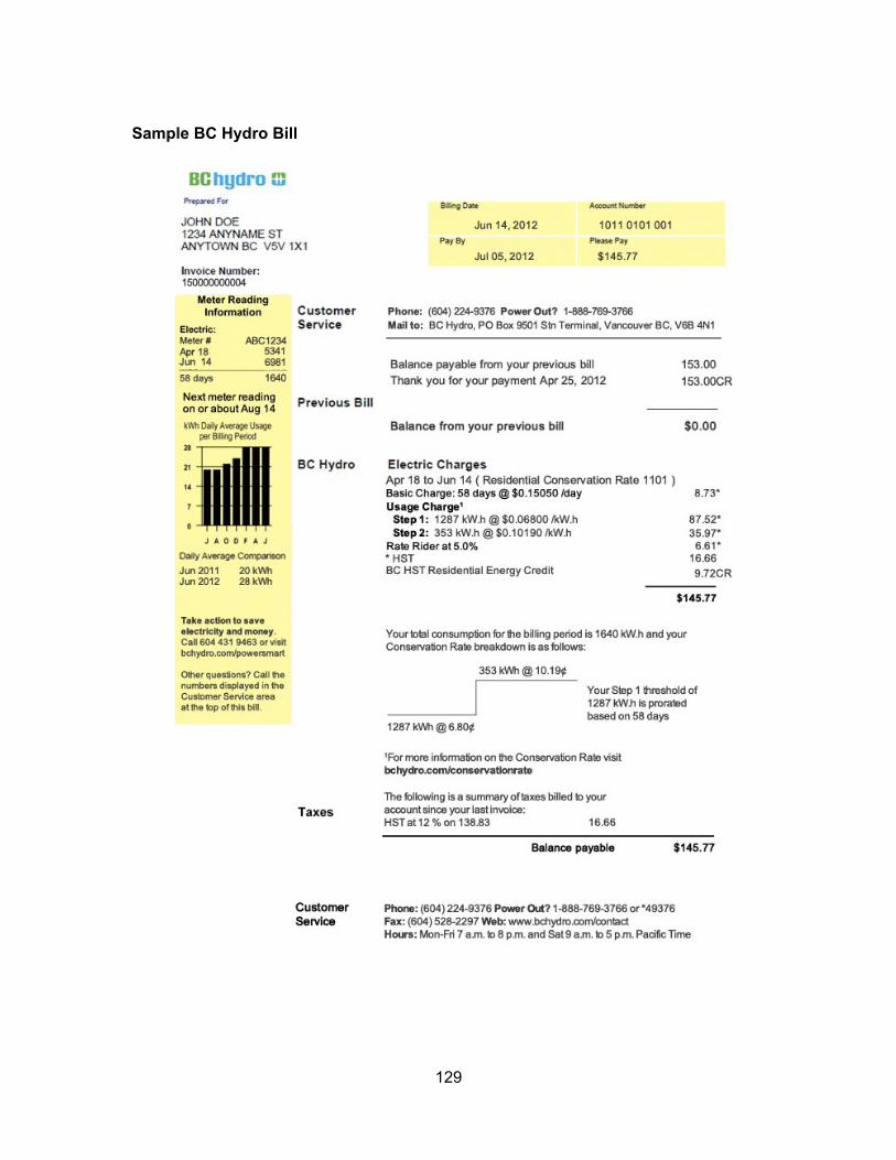
129
Sample BC Hydro Bill
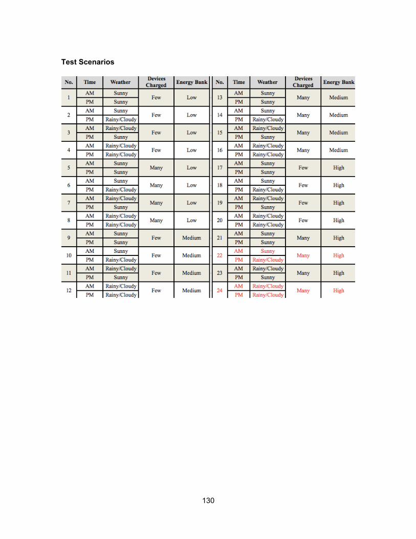
130
Test Scenarios
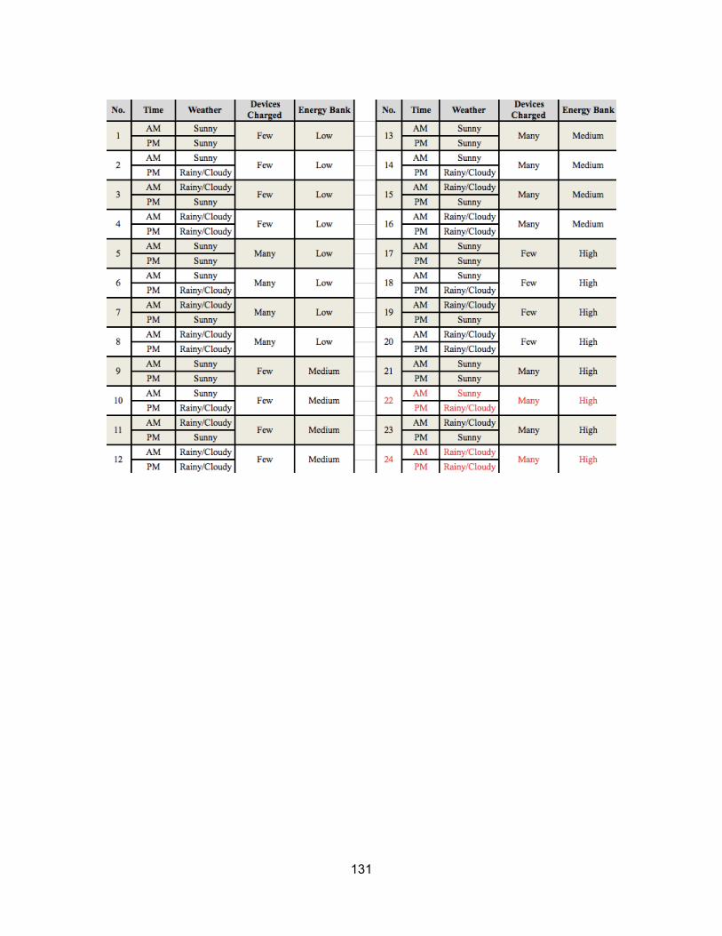
131
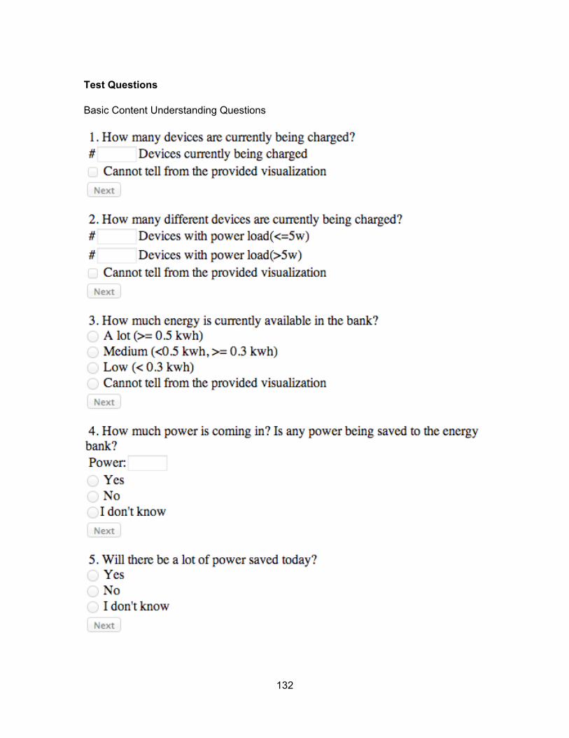
132
Test Questions
Basic Content Understanding Questions
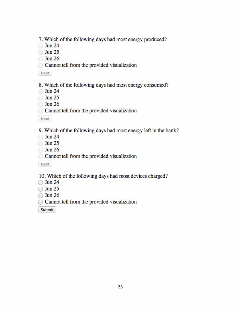
133

134
Solar Comprehension Questions
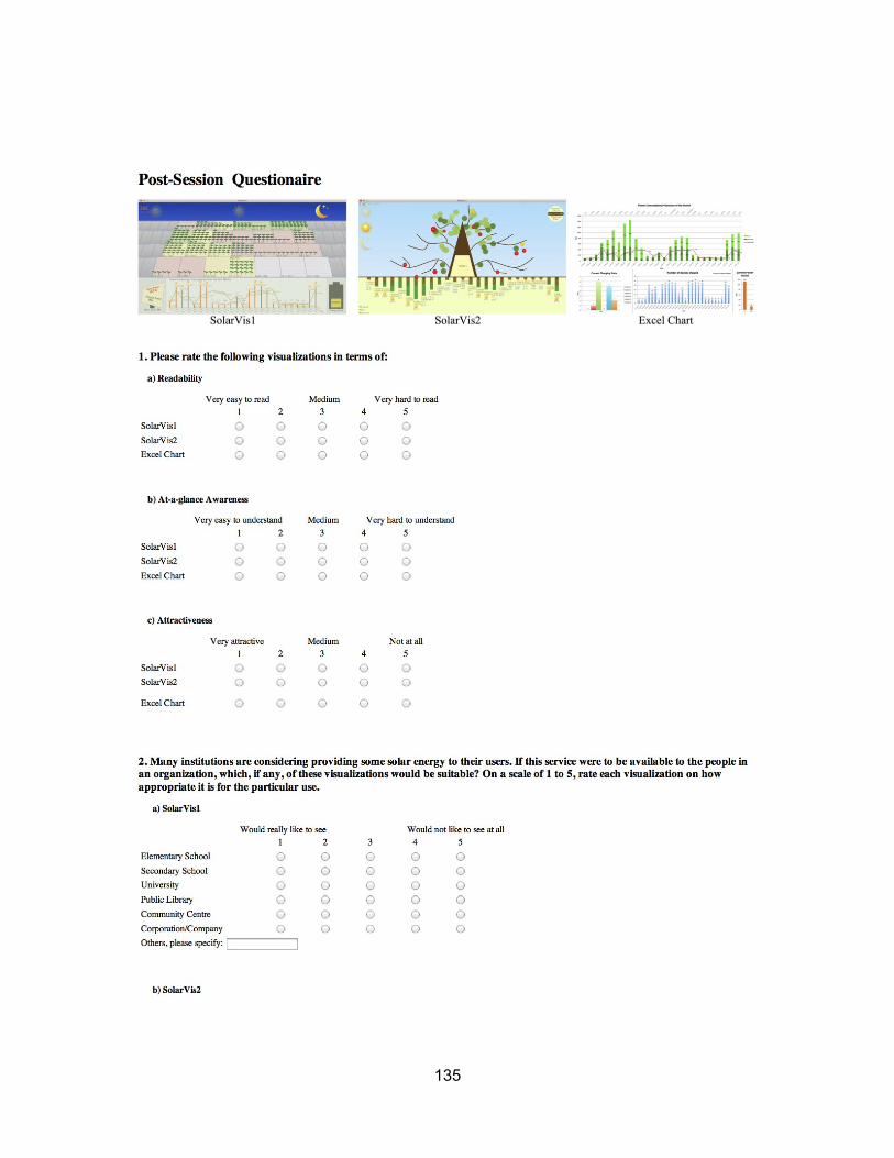
135
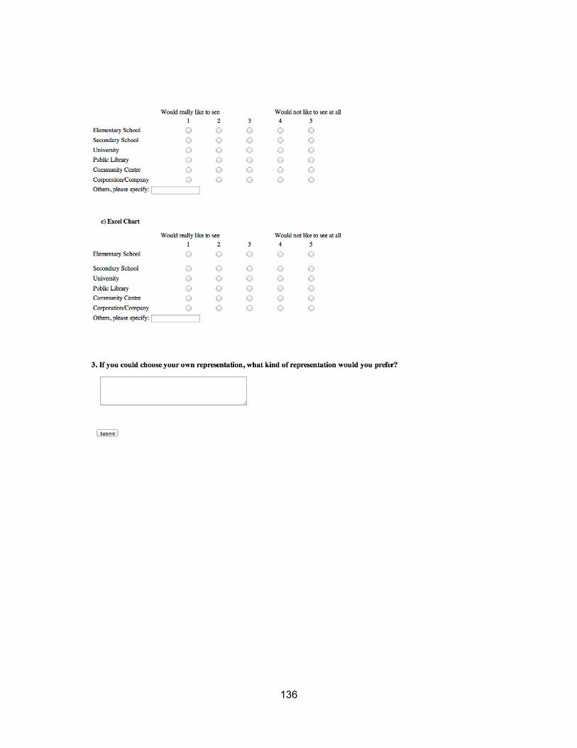
136

137
Appendix B. Study 2 Documents
1. Pre-session Interview Script
2. Post-session Questionnaire
3. Statistical Distribution of Participants Game Score
138
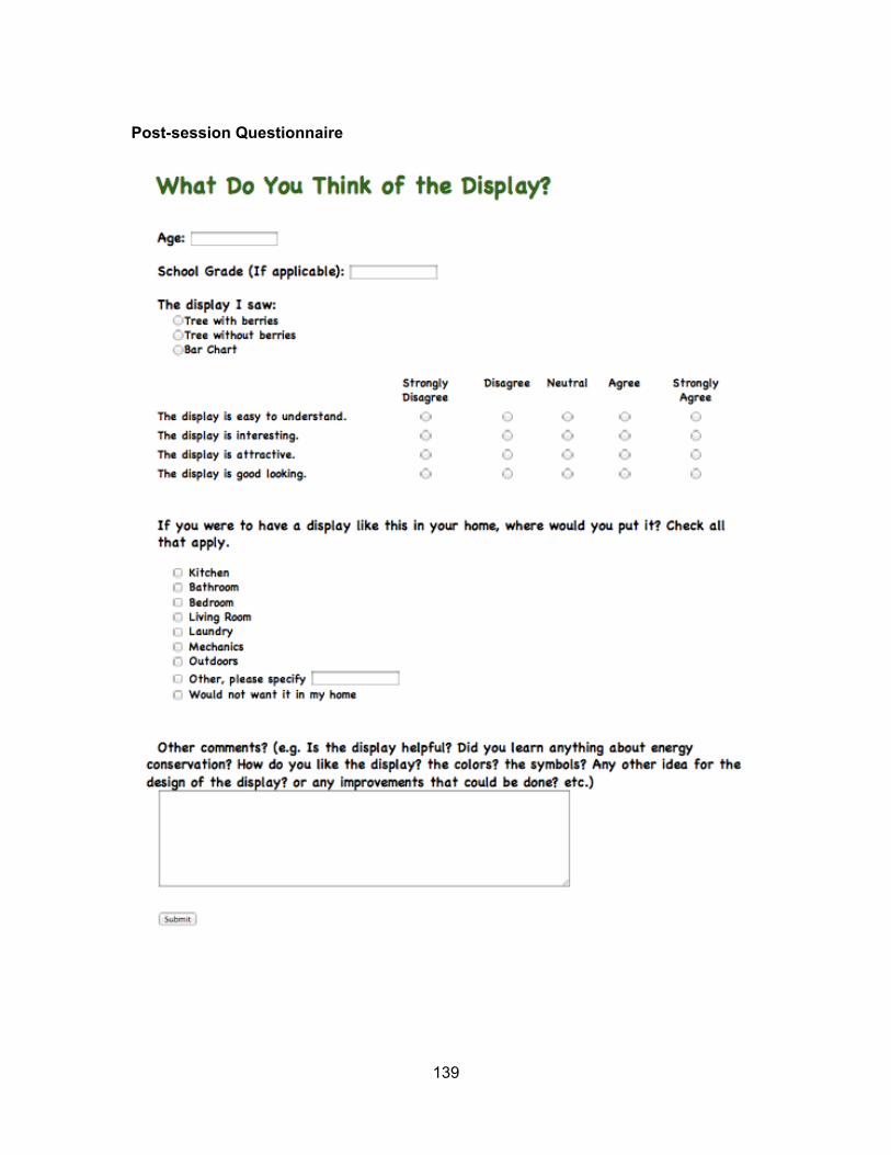
139
Post-session Questionnaire
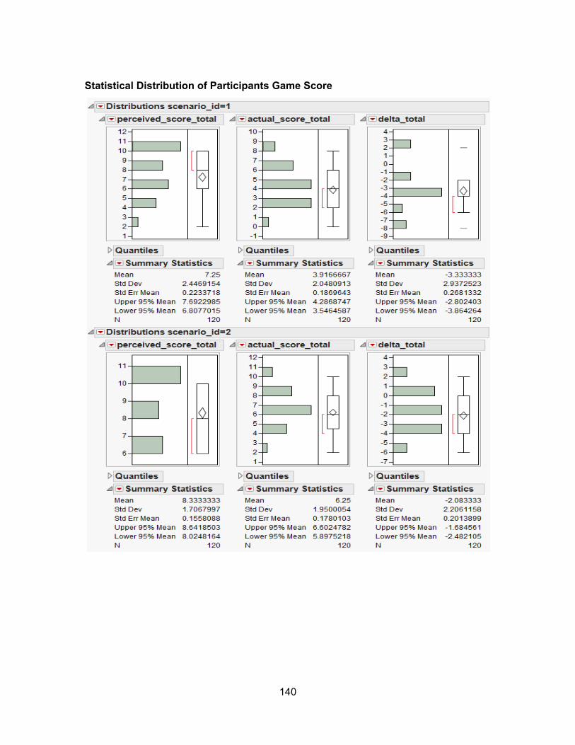
140
Statistical Distribution of Participants Game Score
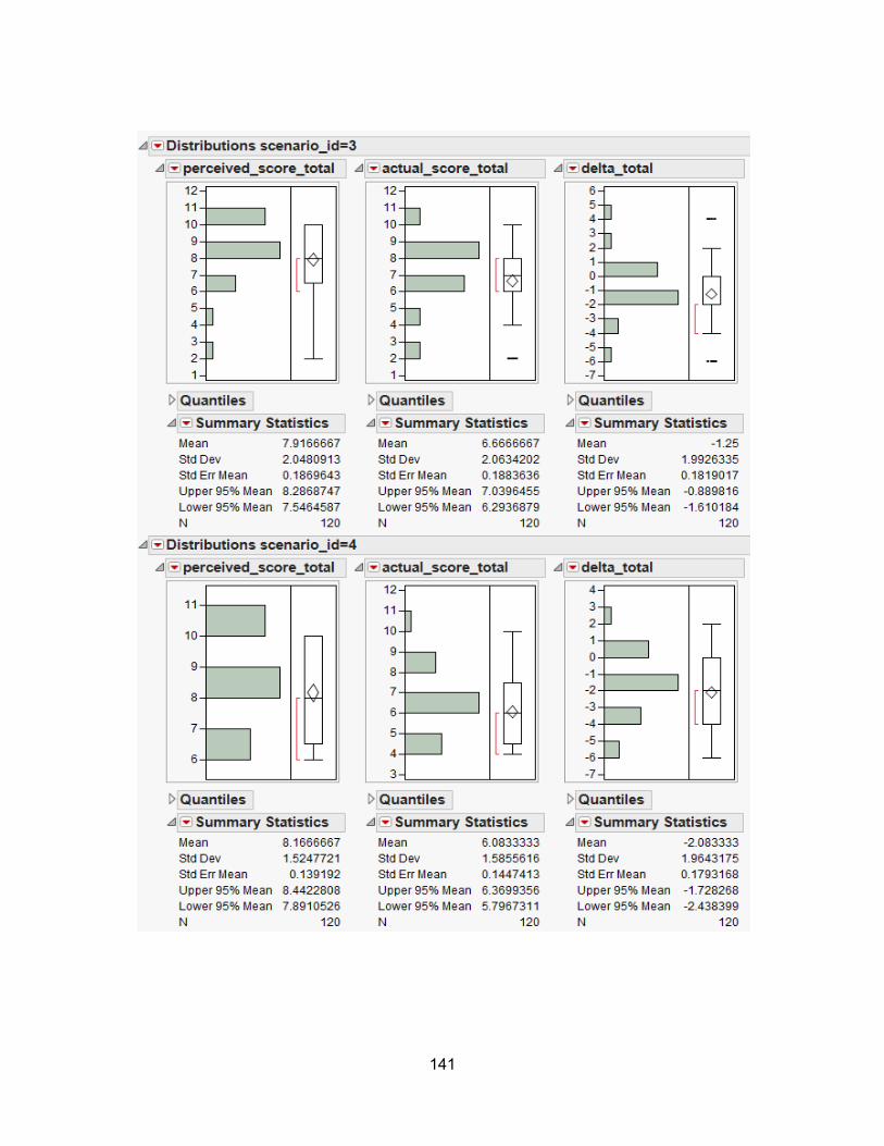
141
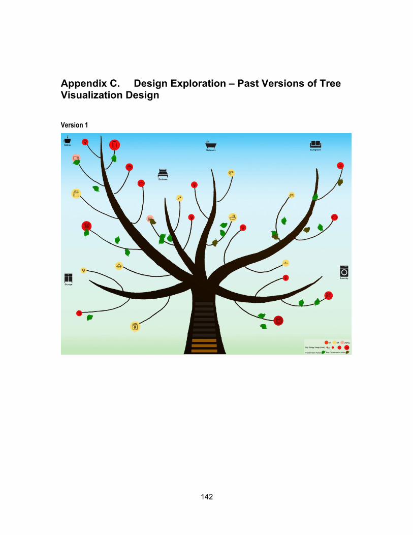
142
Appendix C. Design Exploration – Past Versions of Tree Visualization Design
Version 1
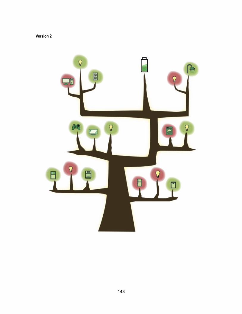
143
Version 2
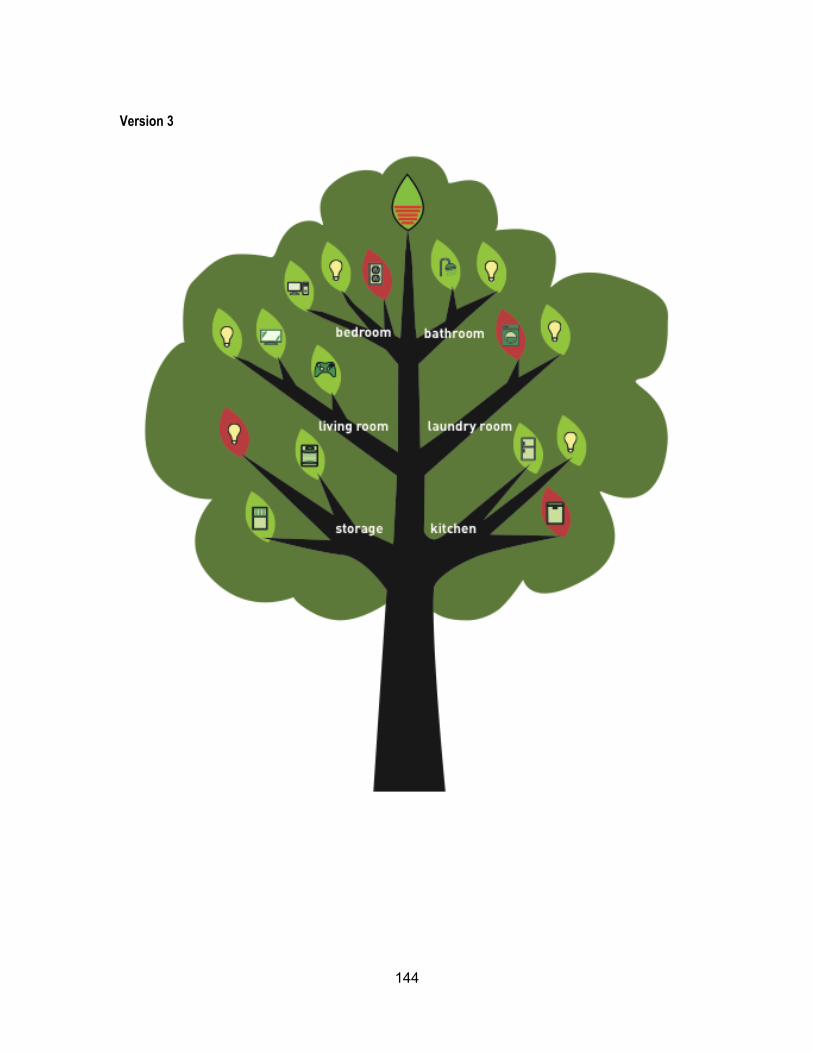
144
Version 3
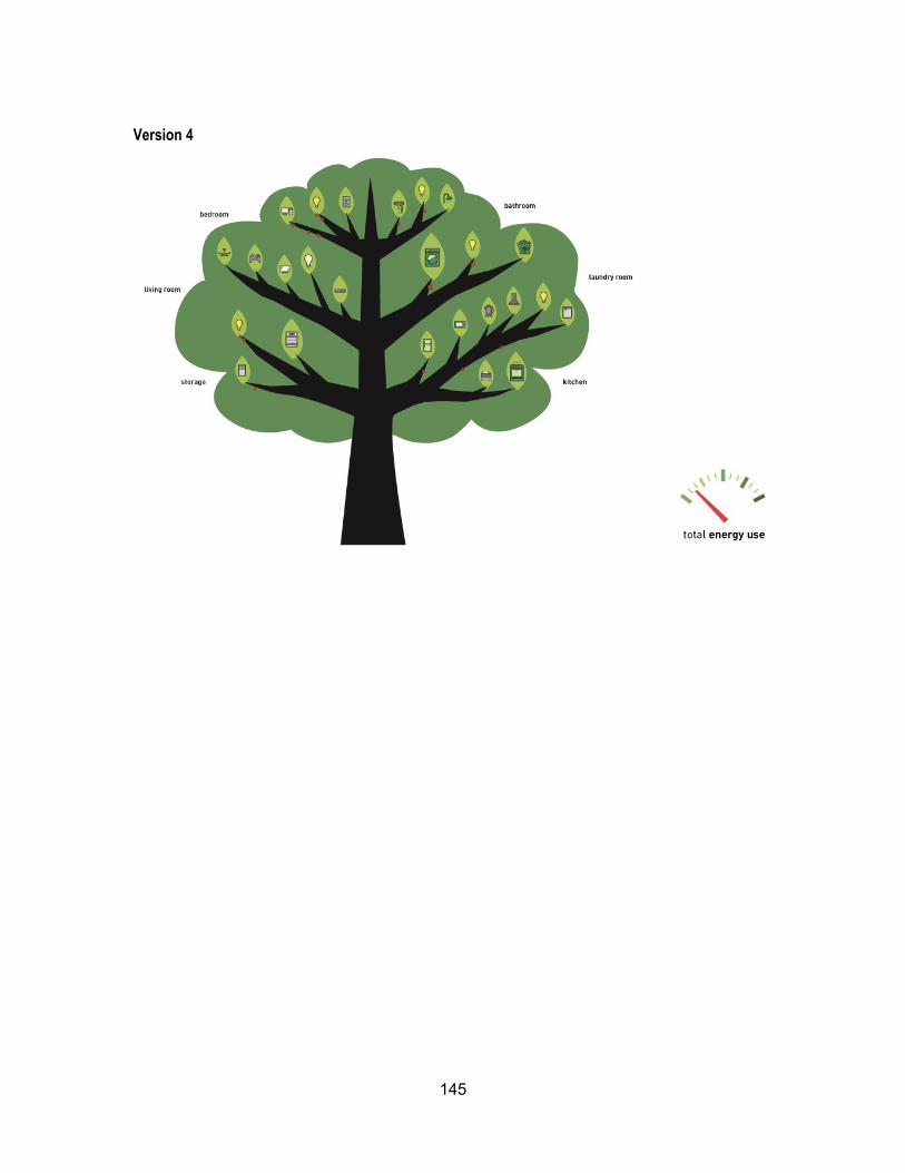
145
Version 4