exploratory sequential data analysis for multi-agent ... · exploratory sequential data analysis...
TRANSCRIPT

Exploratory Sequential Data Analysis for Multi-Agent Occupancy Simulation Results
Simon Breslav1, Rhys Goldstein
1, Azam Khan
1, and Kasper Hornbæk
2
1Autodesk Research, Toronto, ON, Canada
{firstname.lastname}@autodesk.com
2University of Copenhagen, Copenhagen, Denmark
ABSTRACT
In this paper we apply the principles of Exploratory
Sequential Data Analysis (ESDA) to simulation results
analysis. We replicate a resource consumption simulation of
occupants in a building and analyze the results using an
open-source ESDA tool called UberTagger previously only
used in the human-computer interaction (HCI) domain. We
demonstrate the usefulness of ESDA by applying it to a
hotel occupant simulation involving water and energy
consumption. We have found that using a system which
implements ESDA principles helps practitioners better
understand their simulation models, form hypotheses about
simulated behavior, more effectively debug simulation
code, and more easily communicate their findings to others.
Author Keywords
Exploratory sequential data analysis; agent-based
simulation; multi-agent simulation; occupancy simulation;
visual analysis; debugging; tagging; annotation.
ACM Classification Keywords
I.6.6. [Simulation and Modeling]: Simulation Output
Analysis; H.5.2. [Information Interfaces and Presentation]:
User Interfaces – Graphical User Interfaces.
INTRODUCTION
Simulation development is an iterative process typically
beginning with model design and programming, followed
by the execution of a number of simulations, generating
streams of results that may be analyzed. As simulation is
based on the advancement of time, simulation results are
typically sequences of time series data that are concurrent
in simulated time. These parallel time series may be
analyzed for scientific purposes, such as the generation and
testing of hypotheses about the phenomena under study;
design purposes, such as performance evaluation of various
design options; or development purposes, such as model
debugging. There is hence a need for analysis tools which
support these tasks, particularly general-purpose analysis
tools applicable to entire classes of simulation models such
as those involving numerous agents.
Multi-agent occupant simulations are becoming prevalent in
the domain of architecture and building science [1,3,12,16].
These simulations can produce large datasets that are
difficult to analyze and visualize. For example, in case of
crowd simulation [19], simulation output is generally
shown as an animation of agent movements. In cases where
expected behavior is somewhat clear, such as emergency
evacuation scenarios, this level of detail is sufficient.
However in context of other building occupancy models
[1,3,13,16] unexpected occupant behavior is likely to
emerge, and thus a greater number of exploratory options
are needed at the analysis and visualization stage.
To help practitioners find and debug important behavioral
patterns produced by multi-agent simulations, we present an
Exploratory Sequential Data Analysis (ESDA) tool called
UberTagger [6] that displays aggregate data in the context
of agents’ positions and other time-varying properties. We
demonstrate the system’s usefulness by applying it to a
hotel occupant simulation involving thermal comfort and
energy and water consumption. With an effective system
for finding behavioral patterns and tagging them, one can
gain insights about a simulation model that might be missed
when viewing animations, profiles, or statistics in isolation.
RELATED WORK
Exploratory Sequential Data Analysis (ESDA)
Data analytics has been called “detective work” by Tukey
[22] to support hypothesis generation. To capture the scope
of work done by analysts, a set of principles called
Exploratory Sequential Data Analysis (ESDA) was
proposed by Sanderson and Fisher [10], originally designed
for video analysis of human-computer interaction (HCI)
tasks. To better categorize the needed features of analysis
tools, the ESDA methodology proposes eight fundamental
data transformations critical to support scientific inference
and hypothesis generation workflows. The transformations
are referred to as Chunks, Comments, Codes, Connections,
Comparisons, Computations, Conversions, and Constraints.
Chunks (Groups)
Chunks are “segments of adjacent data elements that the
analyst perceives as forming a coherent group” [10].
Grouping and segmentation of data is one of the most
fundamental analytical operations that allows the analyst to
observe differences and similarities between or within
subsets of the data. It is also sometimes becomes necessary
to support hierarchical grouping, where groups can be
further grouped. SimAUD 2015, April 12 - 15, 2015, Alexandria, VA, USA
© 2015 Society for Modeling & Simulation International (SCS)

Comments
Comments are “unstructured informal or formal notes that
the analyst attaches to data elements, to groups, or even to
the results of intermediate analyses” [10]. Comments help
to document steps taken during the analysis, which leads to
richer data provenance information. Also, in the context of
group projects, the ability to add comments helps analysts
communicate observations to other members of their team.
This has been shown to help emergent patterns to be more
easily discovered [15].
Codes (Tags)
Codes, or tags, are user-defined names “attached to data
elements or chunks designed to capture the meaning of the
data while reducing the variability of its vocabulary” [10].
A tag may be just one word, or a phrase, where each word
is separated by either a dash or an underscore. The ability to
add tags aside from just comments adds rich metadata that
helps analysts more consistently and accurately classify
evidence and establish common ground [24], as well as
adding a useful organizational mechanism that has been
shown to improve overall data analysis results [24].
Connections (Links)
Connections are “a means of following threads through
their nonlinear paths and identifying the relationship among
their elements” [10]. Connections, or links can also express
linear, temporal, or implicit relationships in the data, or
relationships between different types of data. Support of
links in an analysis process have also been shown to help to
gather scattered evidence to support a hypothesis generation
process [24].
Comparisons
Comparisons “demonstrate the effects of different
treatments of the data with one another” [10]. For example,
one might compare different runs of the simulation to
identify effects of the different input parameters. Or on the
occupant level, one may compare behavior of different
occupants and try to discover anomalies or gain a greater
understanding of space utilization.
Computations (Aggregation Functions)
Computations “reduce the data to summary representations,
including simple counts, complex quantitative relationships,
or tests of statistical significance” [10]. While visual-
analytics offers a rich analytical foundation, coupling it
with quantitative statistical analysis lets the analyst be more
confident in the statistical significance of their observations.
Aggregating data in this manner promotes the use of
informal observation in rigorous scientific approaches.
Conversions
Conversions “transform data in order to reveal new
patterns” [10]. Often, conversions are visual, such as in
cases of using a new visualization, for example plotting a
time series data in a line chart. However, conversions can
be more numeric or procedural, such as changing units,
converting to a new coding scheme, or changing the scale
of analysis.
Constraints (Filters)
Constraints are filters applied to data to exclude items or to
select specific items. For example, an analyst may want to
focus on a certain subset of the data, such as only a
particular group of occupants or a specific period of time.
In the context of the overall modeling and simulation cycle
[2], ESDA falls within the Analysis phase, where the
analyst tries to gain insight from the simulation results (see
Figure 1). Traditionally this phase is associated with testing
the validity of the model, quantifying uncertainty in the
results, verifying the correctness of the simulation code, and
improving performance.
Model
Simulation
SimulationResults
Insight
Implement
ExecuteAnalyze
Modeling
ESDA Transformations
Figure 1: Modeling and Simulation Cycle [2]. Arrows
represent processes and boxes represent outcomes.
Occupant Simulation
To produce the input dataset for our exploration, we
replicate a resource consumption simulation of occupants in
a hotel building described in Goldstein et al. [13]. At any
given time the hotel may be occupied by a number of
employees and guests. The simulation tracks the position of
each simulated occupant, their activities such as eating,
sleeping, and rates of power and water usage for all
activities. It also predicts air temperatures, which varies
smoothly over the interior of the hotel and changes
gradually over time.
The output of this simulation has been previously visualized
in [4], as shown in Figure 2, where occupant paths are
animated using streamlines communicating overall space
utilization. Such visualizations encompass some of the
ESDA Transformations. For example, visualizing the
occupant path is an example of a Conversion, while using
different colors for hotel guests (yellow) and employees
(purple), is an example of Chunks. However, many of the
ESDA Transformations are missing, such as Comments and
Codes. Similarly, other work in occupant simulation output

analysis [11,17,20,21], may implement some of the ESDA
Transformations, but may leave out some important aspects
as they may not be as relevant in the particular evaluation.
In this paper, we try to present a system that incorporates all
of the ESDA Transformations to illustrate the potential use
of these techniques in future work on simulated occupant
behavior analysis.
Figure 2: 3D Floor plan of the Hotel Building from [4]. Yellow
paths are hotel guest, while purple are hotel employees, green
flash indicates a window opening event.
Visual Analysis in HCI
To apply ESDA to the domain of occupant simulation, we
draw on work done in the field of human-computer
interaction (HCI), as that was the original source of the
ESDA theory [10]. Developments in the visual analytics
field may be applied to many systems for the analysis of
complex datasets [5,6,8,14]. Specifically, we observe a
similarity between the building visualization in Figure 2
and visualizations that depict user interaction data (mouse
movements) as a Heat Map in Figure 3. The user interaction
visualization shows the aggregate behavior of many
participants of an online survey, providing information
about the amount of time spent in a given area of the web
page. This maps well to the building design domain, where
space utilization is of great concern.
To perform our data exploration, we use UberTagger [6], an
open source ESDA tool that was designed for analyzing
user interaction data. In the next section we outline
UberTagger’s user interface, and explain how it supports
analyses of not only user interaction data but also multi-
agent occupant simulation results.
APPLICATION OF UBERTAGGER
The user interface of UberTagger is shown in Figure 4 with
panels labeled A though I. Here we describe each panel
with a focus on its use of building occupant data and its
association with the eight fundamental data transforms of
ESDA.
Figure 3: Heatmap of Mouse Movements from [5] showing
large interaction patterns, such as the evidence of scrolling in
different window sizes (evident by several vertical striped
groups of movements in the right side of the image.)
Data Grid Panel
The Data Grid Panel (see Figure 4A) is a traditional data
table widget, similar to the table interface found in general
purpose tools such as Microsoft Excel [18]. To map the
data into the Data Grid, we take an occupant centric
approach, where each row of the table represents a single
occupant, and each column represents some variable
associated with that occupant. These column-specific
variables may be input parameters or aggregations of time
series data.
To make the population of the hotel more realistic, a
number of demographic parameters are used as input into
the hotel model simulation [13], specifically name, age,
gender, height, weight, Body Mass Index, and smoking
habit. There parameters are generated procedurally using
statistical averages from number of sources, such as the
CIA World Factbook [9], NationMaster.com [25], the and
World Health Organization BMI Database [26]. Two other
very important input parameters for each occupant are the
role and group membership. The role parameter determines
if a given occupant is a guest or an employee, and a group
parameter indicates (a) which room they are staying in the
case of a guest, or (b) what job they are performing in case
of an employee. Each parameter is displayed in a different
column of the Data Grid.
The time series data that we take advantage of in this view
include the following: the occupant’s position (floor, and x,
y coordinates), his/her water and energy consumption, and
his/her window opening actions. In order to map time series
data into the Data Grid, an aggregation function needs to be
defined for each time-series type. For example, for window
opening events, we use summation, while for water
consumption we perform an integration to find the total
number of liters consumed by an individual. When a given

cell is selected, the corresponding source time series can be
visualized in other panels (e.g. Line Chart, Figure 4C).
In terms of ESDA support, Chunks are implemented using a
flexible selection and tagging mechanism, where any set of
rows or columns can be selected as a group, and saved and
tagged. Sorting based on column value implements
Comparisons, which gives the ability to rank occupants
relative to each other. Sorting by similarity allows for
ranking based on multiple columns at the same time. See
[6] for details related to similarity sorting implemented in
UberTagger. The flexible row and column selection is also
an example of Constraints. As the analyst selects different
rows and columns, this selection can serve as the filtering
mechanism and may be tagged to be re-used. On top of that,
any selection can also become a filter, and selected rows or
columns can be hidden from the view to decrease visual
complexity of the grid. If a given cell has a corresponding
Comment or a Tag (Codes) it is styled with a blue border.
Heat Map Panel
The Heat Map Panel (Figure 4B) contains a floor plan of
the building design with a heat map of occupant movement
overlaid. The hotel design used for our exploration consists
of a two-story building, each floor shown side by side in
Figure 4B. The hotel features 11 guest rooms, private and
public bathrooms, a restaurant, a kitchen, an office,
hallways, two elevators, and storage spaces. Waypoints
(green dots) represent places where people perform actions,
for example, guests eat and sleep, and employees prepare
food and perform office work [13].
The visualization of occupant locations in a form of a Heat
Map is a good example of the Conversions and Connections
transforms. Since the occupant’s locations are visualized on
top of the building’s floor plan, implicit Connections are
revealed between occupant-specific behavior and the
special layout of the building. The Conversion is created
when an occupant’s location coordinates are converted into
a Heat Map plot, where gradient from purple to yellow
indicates increased amount of time spent in that space over
selected region of time. Note that “heat” in this case refers
to the utilization of space, not temperature. The Heat Map
Panel also supports Constraints by two mechanisms, first
only selected occupants’ paths are visualized, and second, if
a time interval is selected, movements that are within the
selected interval are colored with a purple to yellow
gradient, while movements outside of the time interval are
in gray. See Figure 6, for number of example Heat Maps
with different occupants and time intervals selected.
Line Chart Panel
The Line Chart Panel (Figure 4C) visualizes time series
data that has been selected. Whenever the analyst selects a
time series by clicking on a column in the Data Grid or
interacting with various menus associated with the Tags and
Figure 4: UberTagger Interface. Data Grid (A), Heatmap Floor Plan (B), Line Chart (C), Current Selection (D), New Comment
(E), Tag Suggestions (F), Comments (G), Tags (H), Relationships (I)
Comments panels (Figure 4F-I) a line graph corresponding
to all the selected time series is plotted. The colors of each
time series are defined as an input parameter for each type
of time series. For example, as can be seen in Figure 4C and
Figure 7, water consumption rate is in green, and power
consumption rate is in orange.
Plotting time series data is an example of Conversions, as
sequences of time-associated values are arranged on a 2D
viewing area. Comparisons are supported by plotting
multiple selected rows or columns. All selected time series
are overlaid in the line chart on the same x-y axis, with the
y axis normalized to a 0 to 1 interval. Additionally, all the
individual time series are displayed below, with each line
chart having its own properly scaled and labeled y-axis.
This allows analyst to compare both, different time series
for a particular occupant, and same-type time series for
different occupants.
To be able to explore some period of time in detail, an
analyst can select a time period in the top line chart, and all
the line charts below update to only the selected period.
This is an example of Constraints as well as an
implementation of a Context + Focus interface [7]. As the
selected time interval changes, the Heat Map view of the
occupants’ movement paths also updates to highlight the
space occupied during this time.
The line chart panel also provides a playback feature in the
top left corner, with an option of different playback speeds.
As the playback is activated, other views can update in
response to change of the current time. For example, the
Heat Map is updated to show current positions of all the
selected occupants.
Current Selection Panel
The Current Selection Panel (Figure 4D) displays currently
selected items, and lets the analyst clear out that selection.
There is also a button to update the similarity measure of
occupants to a given selection, which is an example of
Comparison feature. For example, if an analyst selects
water and power consumption columns of a particular
occupant in the Data Grid, and then clicks the “Similarity”
button, the Similarity column (first column of the Data
Grid) will update with a distance to the selected item. See
[6] for details on how similarity is calculated.
New Comment Panel
The New Comment Panel (Figure 4E) is the main
annotation input interface. Comments are the only
annotation content made by users, however, comments can
contain any number of tags (Codes) and any number of
selections (Connections).
Tags are simple single-word annotations preceded by a hash
sign: “#”. Tags may be appear separately or may be
embedded in a comment, for example:
This occupant seems to be #lost in the building.
An “@” symbol is used to specify an address or location in
the data set. For example, the comment above could specify
specific data rows for a specific duration:
The occupant @rows=[27]&time=[“07:23:07.986”, ”07:44:20.833”] seems to be #lost in the building.
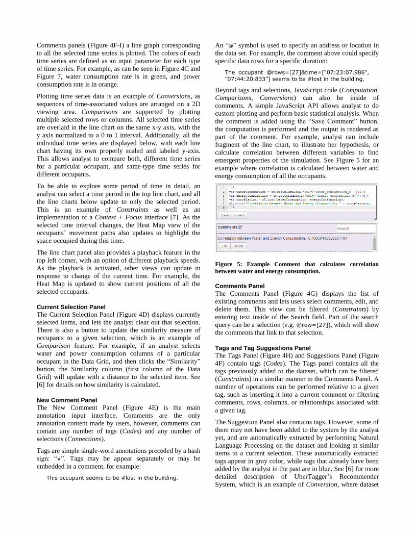
Beyond tags and selections, JavaScript code (Computation,
Comparisons, Conversions) can also be inside of
comments. A simple JavaScript API allows analyst to do
custom plotting and perform basic statistical analysis. When
the comment is added using the “Save Comment” button,
the computation is performed and the output is rendered as
part of the comment. For example, analyst can include
fragment of the line chart, to illustrate her hypothesis, or
calculate correlation between different variables to find
emergent properties of the simulation. See Figure 5 for an
example where correlation is calculated between water and
energy consumption of all the occupants.
Figure 5: Example Comment that calculates correlation
between water and energy consumption.
Comments Panel
The Comments Panel (Figure 4G) displays the list of
existing comments and lets users select comments, edit, and
delete them. This view can be filtered (Constraints) by
entering text inside of the Search field. Part of the search
query can be a selection (e.g. @row=[27]), which will show
the comments that link to that selection.
Tags and Tag Suggestions Panel
The Tags Panel (Figure 4H) and Suggestions Panel (Figure
4F) contain tags (Codes). The Tags panel contains all the
tags previously added to the dataset, which can be filtered
(Constraints) in a similar manner to the Comments Panel. A
number of operations can be performed relative to a given
tag, such as inserting it into a current comment or filtering
comments, rows, columns, or relationships associated with
a given tag.
The Suggestion Panel also contains tags. However, some of
them may not have been added to the system by the analyst
yet, and are automatically extracted by performing Natural
Language Processing on the dataset and looking at similar
items to a current selection. These automatically extracted
tags appear in gray color, while tags that already have been
added by the analyst in the past are in blue. See [6] for more
detailed description of UberTagger’s Recommender
System, which is an example of Conversion, where dataset

content is converted into tags, in combination with
Connections, since by re-using the same tags, implicit
connections are created.
Relationships Panel
The Relationship Panel (Figure 4I) displays relationships
(Connections) between tags, comments, and selections,
where these elements form a directed graph. In practice,
users can refer back to these connections to help re-use tags
and to informally identify tag frequency in a given dataset.
ANALYSIS OF RESULTS
To evaluate the usefulness of the ESDA transformations as
realized in UberTagger, we explore a dataset produced by a
run of the hotel simulation [13], representing 18 hours of
simulated time, as previously described in the Occupant
Simulation Section.
Occupant Behavior
Each activity and action of each simulated occupant is
determined randomly according to probabilities influenced
by their role, the time of day, and comfort level [4].
Grouping occupants based on their role (guest vs.
employees) and visualizing each group’s location paths in a
Heat Map view reveals a difference in space utilization
based on the role. While guests tend to only stick to their
rooms, hallways and the restaurant (see Figure 6A),
employees never go to the guest’s rooms (see Figure 6B). A
question concerning the lack of cleaning staff in the current
hotel model becomes immediately apparent, giving a clear
path for future model improvement.
During the exploration of the individual paths in the Heat
Map, an unexpected pattern in the model is revealed. Once
or twice during the 18 hour period guests would visit rooms
they were not staying in, suggesting that a group of friends
or colleagues had booked multiple rooms. Strangely, guests
would only visit a room directly above or below their own
room (See Figure 6C). This turns out to be a known defect
in the model where the floor value is not checked.
Animations such as the one illustrated in Figure 2 tend to
conceal this behavioral pattern, as a viewer cannot easily
track the various rooms visited by various occupants. By
contrast, the visualizations in UberTagger make the defect
obvious. Analysts may tag these suspected issues, and the
annotations can help communicate them to other members
of the development team. Issues can be marked as #fixed in
later versions of the model.
From a Heat Map over some period of time (see Figure
6D), one might hypothesize that occupants from the same
room are likely to dine together. However by looking at the
line chart of water consumption (orange blocks in Figure
6D), it can be observed that the consumption rates appear
uncorrelated, leading one to question the coordinated dining
hypothesis. Investigating further, the playback feature of
the Line Chart reveals that an occupant who was dining
alone switched seats for no apparent reason, leaving the
impression that he/she had company. This turns out to be an
oversimplification in the model: the agents essentially
forget where they had been sitting as soon as they move. As
the analyst discovers these behaviors, she adds comments to
document the hypotheses generated during her analysis.
These comments and tags can be used for future
confirmation of any hypothesis, for comparisons,
computations, and to build richer connections in the dataset.
Later on, she may come back to a dataset, and be able to
recount her previous exploration more easily, or
communicate her discoveries to her collaborators.
Figure 6: Floor plan Heat Maps revealing behavior patterns.

Resource Consumption
Sorting occupants based on water usage (Figure 7A) reveals
that guests are the top consumers of water. Looking at the
distribution of the consumption in the Line Chart also
suggests increased usage of the water in the morning.
Sorting based on energy consumption (Figure 7B),
employees consume more than the guests. Looking at the
distribution of the consumption, there is slight hint of the
dip in consumption during the night. Seeing these
interesting patterns, analysts tag the observations to be
more closely explored and confirmed later on.
Figure 7: (A) Water Consumption Rates and (B) Power
Consumption Rates.
CONCLUSION & FUTURE WORK
In this paper we have presented the use of Exploratory
Sequential Data Analysis principles to analyze multi-agent
simulation results. By combining analysis and annotation
tools outlined by ESDA, UberTagger gives simulation users
and developers a rich toolbox of analysis features.
All of the ESDA Transforms seem quite useful, especially
combining multiple Conversions together as in the case of
the Data Grid, Heat Map, and Line Chart panels, and
filtering them (Constraints) based on time regions. Each
widget’s Comparison capabilities (e.g. overlaying time
series in the line charts for multiple occupants, and
overlaying multiple occupant paths in the Heat Map) stood
out as the key to be able to draw conclusions about the data.
Computations appear to be useful in later stages of the
analysis when hypothesis confirmation is needed and when
one must calculate some aggregate values not performed by
the default visualizations. The effectiveness of Comments
and tags (Codes) is evident for bug tracking, analysis
documentation, and possible collaborative work.
Analyzing the results using ESDA Transforms revealed a
number of possible next steps a simulation modeler can
take, such as fixing peculiar occupant behaviors or adding
cleaning staff to the simulation. Another important avenue
to consider is the question of how ESDA exploration can
help one distinguish between efficient and wasteful use of
water and energy resources.
With respect to UberTagger’s user interface, we identified
missing features that would be helpful. For example, adding
spatial filtering of the Heat Map Panel would allow analysts
to draw connections between spatial and temporal behavior,
such as use of a particular room or a door. Also, since
UberTagger is a generic data exploration tool, it lacks
simulation-specific information, such as the internal details
of the simulation models, to help investigate deeper
relationships between the simulation model and simulation
results. Adding more simulation-specific features that
appear in the literature [23] may be beneficial.
While we have informally tried to see if the ESDA process
enhances collaborative work on a large display (Figure 8), a
formal study is needed to evaluate cooperative analysis for
simulation development. We note that annotation features
have been shown to be quite useful in such scenarios [24].
Figure 8: Two analysts reviewing simulation results on a large
4k screen display where all data values can be shown.
REFERENCES
1. Alfakara, A. and Croxford, B. Using agent-based
modelling to simulate occupants’ behaviours in response
to summer overheating. Proceedings of the Symposium
on Simulation for Architecture & Urban Design, (2014).
2. Banks, C.M. Modeling and Simulation Fundamentals.
John Wiley & Sons, Inc., Hoboken, NJ, USA, 2010.

3. Breslav, S., Goldstein, R., Doherty, B., Rumery, D., and
Khan, A. Simulating the Sensing of Building
Occupancy. Proceedings of the Symposium on
Simulation for Architecture & Urban Design, (2013).
4. Breslav, S., Goldstein, R., Tessier, A., and Khan, A.
Towards Visualization of Simulated Occupants and their
Interactions with Buildings at Multiple Time Scales.
Proceedings of the Symposium on Simulation for
Architecture & Urban Design, (2014).
5. Breslav, S., Khan, A., and Hornbæk, K. Mimic: visual
analytics of online micro-interactions. Proceedings of
the 2014 International Working Conference on
Advanced Visual Interfaces - AVI ’14, ACM Press
(2014), 245–252.
6. Breslav, S. UberTagger: Exploratory Analysis and
Annotation of Sequntial Data [Software]. 2014.
Available from https://github.com/sbreslav/UberTagger.
7. Card, S., Mackinlay, J., and Shneiderman, B. Readings
in information visualization: using vision to think.
Morgan Kaufmann Publishers Inc., 1999.
8. Childs, H. VisIt: An end-user tool for visualizing and
analyzing very large data. (2013).
9. CIA. The World Factbook: Denmark. 2014.
https://www.cia.gov/library/publications/the-world-
factbook/geos/da.html.
10. Fisher, C. and Sanderson, P. Exploratory sequential data
analysis: exploring continuous observational data.
Interactions 3, 2 (1996), 25–34.
11. Freire, V., Wang, S., and Wainer, G. Visualization in
3ds max for cell-DEVS models based on building
information modeling. Symposium on Simulation for
Architecture and Urban Design, (2013).
12. Gerber, D., Shiordia, R., Veetil, S., and Mahesh, A.
Design agency: prototyping multi-agent system
simulation for design search and exploration.
Proceedings of the Symposium on Simulation for
Architecture & Urban Design, (2014).
13. Goldstein, R., Breslav, S., and Khan, A. Towards
Voxel-Based Algorithms for Building Performance
Simulation. eSim, (2014).
14. Grossman, T., Matejka, J., and Fitzmaurice, G.
Chronicle: capture, exploration, and playback of
document workflow histories. Proceedings of the 23nd
annual ACM symposium on User interface software and
technology, (2010).
15. Heer, J., Viégas, F.B., and Wattenberg, M. Voyagers
and Voyeurs: Supporting Asynchronous Collaborative
Information Visualization. Proceedings of the SIGCHI
Conference on Human Factors in Computing Systems,
ACM, 1029–1038.
16. Hoes, P., Hensen, J.L.M., Loomans, M.G.L.C., de Vries,
B., and Bourgeois, D. User behavior in whole building
simulation. Energy and Buildings 41, 3 (2009), 295–
302.
17. Intille, S. and Bobick, A. A framework for recognizing
multi-agent action from visual evidence. AAAI/IAAI,
(1999).
18. Microsoft.Excel. http://products.office.com/en–us/excel.
19. Pelechano, N., O’Brien, K., Silverman, B., and Badler,
N. Crowd simulation incorporating agent psychological
models, roles and communication. V-CROWDS, (2005).
20. Rassia, S. The analysis of the role of office space
architectural design on occupant physical activity. PLEA
2008: 25th PLEA International Conference on …,
October (2008), 20–25.
21. Tecchia, F. Visualizing Crowds in Real-Time. Computer
Graphics Forum xx, (2002), 1–13.
22. Tukey, J.W. Exploratory Data Analysis. Addison-
Wesley Publishing Company, 1977.
23. Unger, A. and Schumann, H. Visual support for the
understanding of simulation processes. 2009 IEEE
Pacific Visualization Symposium, (2009), 57–64.
24. Willett, W., Heer, J., Hellerstein, J., and Agrawala, M.
CommentSpace: Structured Support for Collaborative
Visual Analysis. ACM Human Factors in Computing
Systems (CHI), (2011).
25. Denmark Health Stats: NationMaster.com. 2014.
http://www.nationmaster.com/country-
info/profiles/Denmark/Health.
26. World Health Organization: Global Database on Body
Mass Index. 2014.
http://apps.who.int/bmi/index.jsp?introPage=intro_3.ht
ml.