excel tutorial
DESCRIPTION
Excel tipsTRANSCRIPT
7/15/2019 Excel Tutorial
http://slidepdf.com/reader/full/excel-tutorial-5633837587fa6 1/52
Excel Tutorial – 1
Appendix 1: Basics of Excel for Chemistry 212
This document was developed based on Microsoft Excel 2000 for Microsoft Windows. Other
versions of Excel or for operating systems may have different procedures and functionality.
With all spreadsheet programs, there is more than one way to reach the same goal (formatting,formulas, etc.). This tutorial provides one way; you are free to use any procedure that obtains thesame goal.
Based on Excel: The Basics v6.1 (1/7/00)
Copyright 1999 – the Trustees of Indiana University
Documentation developed and the copyright of Indiana University-Bloomington, UITS Education Program Wrubel Computing
Center, 2711 East 10
th
Street, Bloomington, IN 47408-2671, phone (812) 855-7383.
Revised by David Stoll ([email protected]), 1999. http://www.cous.uvic.ca/esg/Revised for Chemistry 212 (University of Victoria) by Suzanne Manley, 2001. Updated by JaneBrowning and Nichole Taylor, as required.
1 Student Exercises
The hand-in exercises required for Chem 212 begin on page 22. Sections 11 to 15 are due at the
end of the class. Section 16 is the assignment due next week.

7/15/2019 Excel Tutorial
http://slidepdf.com/reader/full/excel-tutorial-5633837587fa6 2/52
Excel Tutorial – 2
Contents
1 Student Exercises 1
2 Welcome and Introduction 3
2.1 What You Should Already Know 3
2.2 What You Will Learn 3 2.3 What You Will Need to Use These
Materials 4
3 Toolbars in Office Applications(ver. 97 & later) 4
3.1 Reposition Toolbar 4 3.2 Toolbars can be Floating or Docking 4 3.3 Toolbar buttons have limited features 4 3.4 A Toolbar I need does not appear. 4
4 Starting up Excel 4
4.1 Start Excel 4
4.2 The Opening Screen 5 4.3 Resize Handles 6 4.4 Moving the Active Cell 7 4.5 Opening an Existing Worksheet 7 4.6 Understanding the Worksheet 7
5 Different Types of Data 8
5.1 Cell Contents and the Formula Bar 8 5.2 Data Entry 8 5.3 Numbers 8
6 Formulas 9
6.1 Understanding Formulas 9
6.2 Formulas, The Cell, and The FormulaBar 9 6.3 The Formula in Action 9 6.4 Copying Formulas 10 6.5 Clearing Formulas 10 6.6 Entering a Formula 10 6.7 Copying and Pasting a Formula 10 6.8 Complex Formulas 11
7 Functions 12
7.1 SUM 12 7.2 Average 12 7.3 The Power of Functions 12
7.4 Formula and Function Summary 13 7.5 Saving the Inform Worksheet 13
8 Excel Data Entry and Editing 13
8.1 Edit in the Formula Bar 13 8.2 Editing in a Cell 14
8.2.a To fix basic typos while typing 14 8.2.b To Editing Existing Data in a Worksheet 14 8.2.c To Cancel Edits 15
9 AutoFill, Column Width, Drag and Drop 15
9.1 AutoFill 16 9.2 Changing Column Widths 17 9.3 Drag and Drop 18 9.4 Enter Formulas and Functions 18
9.5 AutoFill vs. Copy and Paste 19 9.6 Editing a Formula or Function 20
10 Cell Addresses 20
10.1 Relative cell reference 20 10.2 Absolute cell reference 20
10.2.a Clearing Cells 21 10.2.b Fixing the PST Formula 21 10.2.c Use AutoFill to Copy the CorrectedFormula 21 10.2.d Enter the Total Formula and copy it 21
11 Why Use Excel for Statistics? 22
11.1 What the Data Represents 23 11.2 Excel Functions 23 11.3 Review of the Statistical Functions
in Excel 24 11.4 Using the Paste Function Dialog 24 11.5 Using Functions Without Paste
Function 25 11.5.a Standard Deviations 25
12 Using the Data AnalysisTool 27
12.1 Bivariate Statistics (Regression Analysis) 27
12.1.a A Regression Exercise 27 12.1.b Run the Regression 28 12.1.c Interpreting Regression Results 28
13 Excel Chart Wizard 30
13.1 Create a Calibration Curve 30 13.2 Format the New Graph; Add
Trendline 31 13.3 Renaming Charts and Worksheet
Tabs 32 13.4 Common Charting Errors 33
13.4.a Add a Chart Title 33 13.4.b Add Regression Equations to Graph 33
14 Printing 34
14.1 What will Excel Print 34 14.2 Use File menu – Page Setup to set
page options, margins, headersand footers, etc. 35
14.3 Preview the Worksheet 36 14.4 Printing the Worksheet 37
15 Ending Your Session 37
16 Exercise for Next Week 37
7/15/2019 Excel Tutorial
http://slidepdf.com/reader/full/excel-tutorial-5633837587fa6 3/52
Excel Tutorial – 3
17 Formatting the Worksheet (optional) 38
17.1 To apply formatting: 38 17.2 Undo Text Formatting 38 17.3 Changing Fonts 39 17.4 Formatting Numbers 39 17.5 Using Styles 39
17.5.a Predefined Styles (Format menu – Style…). 39 17.5.b Create Your Own Style 40 17.5.c Turn off Style Features 40
17.6 Add Rows and Columns 40 17.7 Removing Rows or Columns 41 17.8 Centering a Title Across a Range 41
18 Custom Headers and Footers(optional) 41
19 Excel Charts (optional) 43
19.1 Drawing Tools Enhance Charts 43 19.2 Excel Chart Types 44 19.3 Naming the Axis 44 19.4 How Charts are Plotted 44
19.5 Add text labels to the bubbles or legend 45
19.6 Area Charts 46 19.7 Bubble Charts 46 19.8 Bar Charts 47 19.9 Column Charts 47 19.10 Bar and Column Chart Variations 48
19.11 Doughnut Charts 48 19.12 Line Charts 48 19.13 Pie Charts 49 19.14 Radar Charts 49 19.15 Stock (High, Low, Close) Charts 49 19.16 Surface Charts 50 19.17 XY (Scatter Charts) 50 19.18 Combination charts 50
19.18.a Create a combination chart using thebuilt-in custom chart types: 51 19.18.b Create User-Defined Custom Chart 51 19.18.c Changing the Default Chart Type 52
2 Welcome and Introduction
2.1 What You Should Already Know
You should have taken the class Introduction to Computing Using Windows or have theequivalent skills. Specifically, you should already know how to do the following: Use a mouse Recognize icons Open and close windows Adjust the size of the window Access options from the menu bar Switch back and forth between applications Format diskettes
2.2 What You Will Learn
This class introduces the basic features of Microsoft Excel. We will cover many topics,including how to: Understand what a spreadsheet is Use Excel to create and modify worksheets Enter text, numbers, and equations
Use the statistical functions needed for Chem 212 Create and modify charts
For those of you who are already familiar with Excel, the most important material is in
sections 5, 6, 10, 11, 12 and 13. At the end of section 13 are the instructions for printingout your work. Section 15 contains the instructions for your assignment.
If you choose to skip the other sections, be aware that the ‘key’ sections assume youknow the concepts discussed in the others. Also, your work will be marked on that basis.
7/15/2019 Excel Tutorial
http://slidepdf.com/reader/full/excel-tutorial-5633837587fa6 4/52
Excel Tutorial – 4
2.3 What You Will Need to Use These Materials
You will be provided with: The use of Microsoft Excel 97 or 2000 The exercise files inform.xls and Zinc Analysis.xls
You will need to provide: A 3.5” floppy disk with at least 50 KB of free memory.
3 Toolbars in Office Applications (ver. 97 & later)
3.1 Reposition Toolbar
Move a toolbar by click and drag the left edge of a toolbar (the part with the vertical line) to anew location. Position is remembered next time the application is opened.
3.2 Toolbars can be Floating or Docking
A ‘docked’ toolbar can be positioned along the edge of the application area. A floating toolbar ismoved out into the document area.
3.3 Toolbar buttons have limited features
Toolbar buttons are convenient, but depending on the button it may:a) have limited options; while the drop-down menu equivalent has the full set of options,
e.g., the print button sends one copy to the last used printer, but using File – Print givesaccess to all printing options.
b) use the last used settings of menus with ellipses (…). For example, the number and bulletlist buttons change as Format – Bullets and Numbering… settings are changed.
3.4 A Toolbar I need does not appear.
All toolbars can be displayed from the View menu – Toolbars. Click to check and display atoolbar. Click again to uncheck and close the toolbar.
4 Starting up ExcelYour instructor will tell you where the exercise file is located and where to save your work.Excel is a basic spreadsheet program which allows you to keep track of information in tables, perform mathematical functions with data, and create graphs and charts from them. There are no
substantive differences between Excel on the PC and Excel on the Macintosh.
4.1 Start Excel
From the Start menu, select Programs.
• Start Excel from the menu list.
Excel loads and you see the opening screen.
7/15/2019 Excel Tutorial
http://slidepdf.com/reader/full/excel-tutorial-5633837587fa6 5/52
Excel Tutorial – 5
The Office Assistant is designed to help you in your Excel work. We will not be using the OfficeAssistant for today’s class. If the Office Assistant is displayed, hide it:
• In Excel 97 Click the “Office Assistant Close” button in the upper right corner.
• OR: To hide the Assistant, right-click the Assistant, and then click Hide Assistant on theshortcut menu. If the Assistant shows a tip, message, or Help topic, close it, and then hidethe Assistant.
• To set the Office Assistant so it does not provide Help with wizards, click the Assistant,and then click Options. On the Options tab, clear the Help with wizards check box.
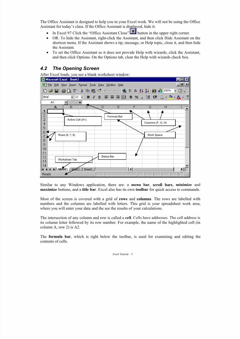
4.2 The Opening Screen
After Excel loads, you see a blank worksheet window:
Work Space
Active Cell (A1)
Worksheet Tab
Rows (6, 7, 8)
Formula Bar
Status Bar
Columns (F, G, H)
Similar to any Windows application, there are: a menu bar, scroll bars, minimize andmaximize buttons, and a title bar. Excel also has its own toolbar for quick access to commands.
Most of the screen is covered with a grid of rows and columns. The rows are labelled withnumbers and the columns are labelled with letters. This grid is your spreadsheet work area,
where you will enter your data and the see the results of your calculations.
The intersection of any column and row is called a cell. Cells have addresses. The cell address isits column letter followed by its row number. For example, the name of the highlighted cell (incolumn A, row 2) is A2.
The formula bar, which is right below the toolbar, is used for examining and editing thecontents of cells.
7/15/2019 Excel Tutorial
http://slidepdf.com/reader/full/excel-tutorial-5633837587fa6 6/52
Excel Tutorial – 6
The cursor is shaped like a thick “plus” sign. The shape of the cursor changes in Excel. It isimportant to notice the shape as different cursor shapes mean different things to Excel .
Excel creates documents as workbooks. Each workbook can contain many spreadsheets. Eachspreadsheet has a tab on the bottom marked Sheet1, Sheet2, etc. These sheets can be added,deleted, rearranged, and the tabs renamed. Earlier versions of Excel (before Version 6.0) did not
allow this. Each spreadsheet was saved as an individual file.
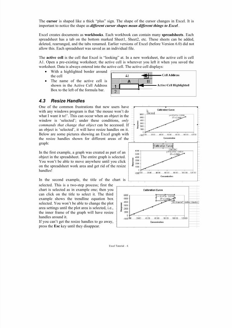
The active cell is the cell that Excel is “looking” at. In a new worksheet, the active cell is cellA1. Open a pre-existing worksheet; the active cell is wherever you left it when you saved theworksheet. Data is always entered into the active cell. The active cell displays:
• With a highlighted border aroundthe cell
• The name of the active cell isshown in the Active Cell AddressBox to the left of the formula bar.
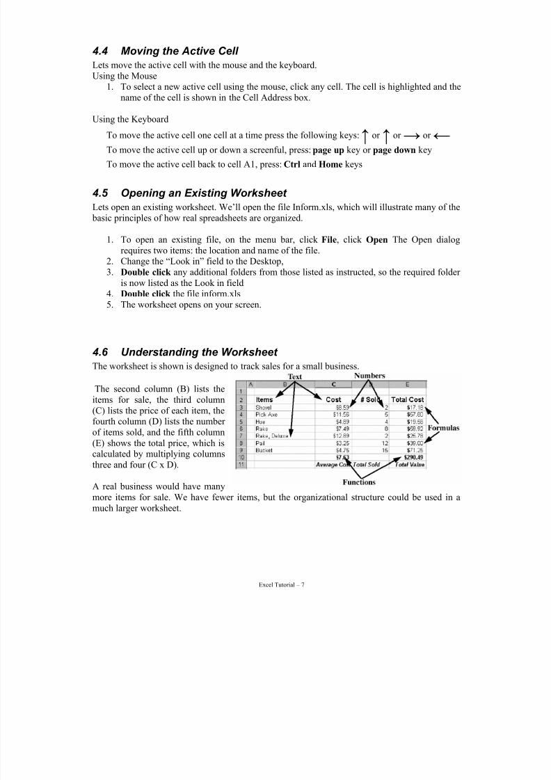
4.3 Resize HandlesOne of the common frustrations that new users havewith any windows program is that ‘the mouse won’t dowhat I want it to!’. This can occur when an object in thewindow is ‘selected’; under these conditions, only
commands that change that object can be accessed. If an object is ‘selected’, it will have resize handles on it.Below are some pictures showing an Excel graph withthe resize handles shown for different areas of thegraph:
In the first example, a graph was created as part of anobject in the spreadsheet. The entire graph is selected.You won’t be able to move anywhere until you click on the spreadsheet work area and get rid of the resizehandles!
In the second example, the title of the chart is
selected. This is a two-step process; first thechart is selected as in example one; then youcan click on the title to select it. The thirdexample shows the trendline equation box
selected. You won’t be able to change the plotarea settings until the plot area is selected, i.e.,the inner frame of the graph will have resizehandles around it.If you can’t get the resize handles to go away, press the Esc key until they disappear.
7/15/2019 Excel Tutorial
http://slidepdf.com/reader/full/excel-tutorial-5633837587fa6 7/52
Excel Tutorial – 7
4.4 Moving the Active Cell
Lets move the active cell with the mouse and the keyboard.Using the Mouse
1. To select a new active cell using the mouse, click any cell. The cell is highlighted and thename of the cell is shown in the Cell Address box.
Using the Keyboard
To move the active cell one cell at a time press the following keys:↑ or ↑ or → or ←
To move the active cell up or down a screenful, press: page up key or page down key
To move the active cell back to cell A1, press: Ctrl and Home keys§ ²
4.5 Opening an Existing Worksheet
Lets open an existing worksheet. We’ll open the file Inform.xls, which will illustrate many of the basic principles of how real spreadsheets are organized.
1. To open an existing file, on the menu bar, click File, click Open The Open dialogrequires two items: the location and name of the file.
2. Change the “Look in” field to the Desktop,3. Double click any additional folders from those listed as instructed, so the required folder
is now listed as the Look in field4. Double click the file inform.xls5. The worksheet opens on your screen.
4.6 Understanding the Worksheet
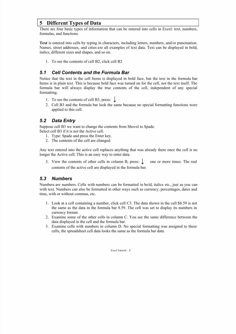
The worksheet is shown is designed to track sales for a small business.
The second column (B) lists theitems for sale, the third column(C) lists the price of each item, thefourth column (D) lists the number of items sold, and the fifth column(E) shows the total price, which iscalculated by multiplying columnsthree and four (C x D).
A real business would have manymore items for sale. We have fewer items, but the organizational structure could be used in amuch larger worksheet.
7/15/2019 Excel Tutorial
http://slidepdf.com/reader/full/excel-tutorial-5633837587fa6 8/52
Excel Tutorial – 8
5 Different Types of DataThere are four basic types of information that can be entered into cells in Excel: text, numbers,formulas, and functions.
Text is entered into cells by typing in characters, including letters, numbers, and/or punctuation. Names, street addresses, and cities are all examples of text data. Text can be displayed in bold,
italics, different sizes and shapes, and so on.
1. To see the contents of cell B2, click cell B2
5.1 Cell Contents and the Formula Bar
Notice that the text in the cell Items is displayed in bold face, but the text in the formula bar Items is in plain text. This is because bold face was turned on for the cell, not the text itself. Theformula bar will always display the true contents of the cell, independent of any specialformatting.
1. To see the contents of cell B3, press: ↓ 2. Cell B3 and the formula bar look the same because no special formatting functions were
applied to this cell.
5.2 Data Entry
Suppose cell B3 we want to change the contents from Shovel to Spade.Select cell B3 if it is not the Active cell.
1. Type: Spade and press the Enter key.2. The contents of the cell are changed.
Any text entered into the active cell replaces anything that was already there once the cell is no
longer the Active cell. This is an easy way to enter data.
3. View the contents of other cells in column B, press: ↓¢ one or more times. The real
contents of the active cell are displayed in the formula bar.
5.3 Numbers
Numbers are numbers. Cells with numbers can be formatted in bold, italics etc., just as you canwith text. Numbers can also be formatted in other ways such as currency, percentages, dates andtime, with or without commas, etc.
1. Look at a cell containing a number, click cell C3. The data shown in the cell $8.59 is notthe same as the data in the formula bar 8.59. The cell was set to display its numbers incurrency format.
2. Examine some of the other cells in column C. You see the same difference between thedata displayed in the cell and the formula bar.
3. Examine cells with numbers in column D. No special formatting was assigned to thesecells, the spreadsheet cell data looks the same as the formula bar data.
7/15/2019 Excel Tutorial
http://slidepdf.com/reader/full/excel-tutorial-5633837587fa6 9/52
Excel Tutorial – 9
6 FormulasThe real power of a spreadsheet is with formulas. A formula uses standard mathematical symbolsto operate on cell addresses and/or numbers. A formula always begins with the equal sign (=).
Mathematical symbols (in order of operations on an expression) include:
• Brackets () to group expressions
• Exponent uses a caret ^ to raise a number to a power, e.g. 2^3 = 2*2*2 = 8
• Division uses a forward slash /
• Multiplication uses an asterisk *
• Additions uses a plus +
• Subtraction uses a minus – 1. View the formula in cell E3, click cell E3. The cell shows the data $17.18, while
the formula is shown in the formula bar: =C3*D3. Cell data looks different thanthe real contents of the cell in the formula bar.
6.1 Understanding Formulas
The formula “=C3*D3” means Excel multiplies the value in cell C3 by the value in cell D3. Theanswer is displayed in the worksheet cell, but the real cell contents is the formula.
6.2 Formulas, The Cell, and The Formula Bar
• The cell displays the results or solution of the formula.
• The formula bar displays the real contents of a cell (a formula) in case you need tomodify it.
6.3 The Formula in Action
Lets change the number of Spades sold from 2 to 12.1. Click or ← to make D3 your active cell.
2. Type in cell D3: 12 and press the Enter key. The formula results in E3 have beenautomatically recalculated.
Manually recalculate a work sheet.Excel has been known to get stuck and not recalculate. This may be because Excel recalculates aworksheet in the order from upper left cell to lower right cell. If a formula contains a formulareference to a cell also containing a formula and the second formula is below or to the right of the first, the first formula depends on data that has not yet been calculated. (Newer versions of Excel are good at catching this but if you have doubts…..)
So, if Excel gets stuck and won’t recalculate, you can press the F9™ key or use Tools menu –
Options – Calculation tab to force a manual recalculation.
7/15/2019 Excel Tutorial
http://slidepdf.com/reader/full/excel-tutorial-5633837587fa6 10/52
Excel Tutorial – 10
Caution: Excel Has BugsExcel bugs may result in incorrect calculations. Excel 97 has a least three Service Releases (SR)to fix various problems in Excel and other Office 97 applications. Excel/Office 2000 as of June
2000 has had SR-1 and SR-1a. Check your Excel version from the Help menu select About. Thefirst line gives a reference to the version and Service Release (SR). For more information on problems with Excel and available patches and SR availability see the links given in Appendix 3.
Has Excel finished its calculation? In the Tools menu select Options (Preferences on a Mac). Select the Calculation tab and reviewthe calculation settings appropriate for your use.Force a manual recalculation of the open Workbook anytime by pressing the F9 key.
6.4 Copying Formulas
Look at the contents of other cells in column E and note the formula similarity.
• Cell E4 contains the formula “=C4*D4”.
• Cell E5 contains the formula “=C5*D5”.The only thing that changes is the row number. The formula can be entered once then copy and paste it to the other cells. Lets copy and paste this formula in column E, but first we will have toclear out all of the formula cells in column E.
6.5 Clearing Formulas
Lets clear the contents of cells E3 though E9, we want to keep the contents of row 10.1. Select cells E3 through E9 by Click and drag from cell E3 to cell E9 or click cell E3, hold
down either Shift¨ key then click cell E9 or select cell E3, hold down a Shift key then
press ↓ to cell E9
2. Clear the contents of the highlighted cells, press: Delete or Edit menu – Clear - All
Note the first cell of the range is highlighted differently than the other selected cells. This says itis the Active cell and the thick border says it is part of the selected range of cells.
6.6 Entering a Formula
1. Make E3 your active cell, click cell E3
2. Enter the formula, type: =C3*D33. Accept the formula, move off cell E3 (press enter, arrow key, click another cell)4. The results are displayed in cell E3.
6.7 Copying and Pasting a Formula
1. Make E3 your active cell, click cell E3 (or press ↑)
7/15/2019 Excel Tutorial
http://slidepdf.com/reader/full/excel-tutorial-5633837587fa6 11/52
Excel Tutorial – 11
2. Copy the formula. Choose a menu, keyboard shortcut, or toolbar method. Edit menu – Copy, Ctrl-C (Mac Cmd-C), or the toolbar Copy button. A flashing marquee appearsaround cell E3, indicating the contents are copied. Note the message in the status bar.
3. Highlight the cells to paste the formula into, Click and drag cell E4 through E94. Paste the copied formula into the highlighted cells, choose from:5. Edit menu – Paste, Ctrl V , or Shift Insert.
The formula is now in cells E4 through E9.
This is called a relative addressing. The formula cell addresses are adjusted relative to the rowin which they are pasted. Relative addressing also applies if we had pasted across columns. Thisgives us a correct formula in each cell.
6.8 Complex Formulas
All Excel formulas follow the same rules of Algebra, including the order of operations.Here is a sample complex formula. =((C2 + D2) * 12 + (A2 ^ B2))/E2 which is the ‘spreadsheet’
version of:( )
2
21222 2
E
A DC B+×+
Excel reads an equation from left to right following the BEDMAS rule.1. Excel performs all operations in Brackets (parentheses). If more than one set of brackets,
only the inner-most set of brackets2. Excel does Exponentiation.3. Excel does Division and Multiplication.4. Excel does Addition and Subtraction.5. If there are nested brackets repeat steps 2-4 with the next inner-most bracket.6. Repeat steps 2-5 until Excel reaches the outer-most brackets. If the formula has no
brackets then only steps 2-4 are used.
In the above example, Excel adds cells C2 and D2 first. Then calculations move to the next set of brackets and raise A2 to the B2 power. Next, the result of C2+D2 is multiplied times 12; thenthese two results (C2+D2)*12 and (A2^B2) are added together. Finally the numerator result isdivided by E2.Skill testing questions like (2+4) * 5 + 9 / 3 using these rules gives 6 * 5 + 9 /3 = 30 + 3 = 33.Brackets determine the correct order of calculations, so this formula could have been written as((2+4) * 5) + (9 / 3) and calculated from inner to outer brackets.
7/15/2019 Excel Tutorial
http://slidepdf.com/reader/full/excel-tutorial-5633837587fa6 12/52
Excel Tutorial – 12
7 FunctionsSome formulas are used so often that Excel includes them. These common formulas are calledfunctions. They begin with the equal sign, like formulas, and are followed by a keywordidentifier that tells Excel which function this is, and in brackets any required values the functions
needs.
7.1 SUM
Adding a column or row of numbers used to require a formula like: =A1 + A2 + A3 + A4 + A5can be replaced by the SUM function =SUM(A1:A5). Yes, you can type the function, but thereare even easier ways of working with functions.
1. Click cell E10 to see the SUM function.2. Move to cell D10 to add the SUM function here
3. On the toolbar, click . Excel puts a marquee around what it believes to be the range of cells to sum. If Excel guessed wrong, just reselect the correct cells.
4. Press Enter to see the sum.
7.2 Average
The AVERAGE function calculates the mathematical average of a range of cell values.1. Click cell C10 to see the AVERAGE function.2. Delete the contents of cell C10. We will replace the function.3. Open the Paste Function dialog by using Insert menu – Function or use the Toolbar and
click 4. Explore the list of available functions, left –category groups, right–click function.
5. Select AVERAGE from the All, Statistical, or Most Recently Use. Click the Function Name AVERAGE, then click OK.6. Excel puts a marquee around what it believes to be the range of cells to sum. If Excel
guessed wrong, just reselect the correct cells.7. Press Enter to see the average.
7.3 The Power of Functions
Functions, like formulas are automatically recalculated if the values it uses change.1. Click cell D4 The cell indicate 5 pick axes sold.2. Change the 5 to 50 and press Enter.3. The formulas in cells E4, D10 and E10 display updated result for total number sold and
the total cost.
7/15/2019 Excel Tutorial
http://slidepdf.com/reader/full/excel-tutorial-5633837587fa6 13/52
Excel Tutorial – 13
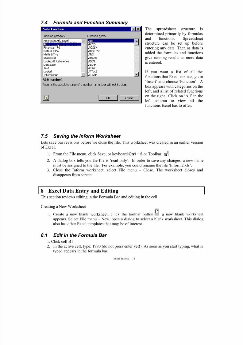
7.4 Formula and Function Summary
The spreadsheet structure isdetermined primarily by formulasand functions. Spreadsheetstructure can be set up beforeentering any data. Then as data is
added the formulas and functionsgive running results as more datais entered.
If you want a list of all thefunctions that Excel can use, go to‘Insert’ and choose ‘Function’. A box appears with categories on theleft, and a list of related functionson the right. Click on ‘All’ in theleft column to view all the
functions Excel has to offer.
7.5 Saving the Inform Worksheet
Lets save our revisions before we close the file. This worksheet was created in an earlier versionof Excel.
1. From the File menu, click Save, or keyboard Ctrl + S or Toolbar
2. A dialog box tells you the file is ‘read-only’. In order to save any changes, a new namemust be assigned to the file. For example, you could rename the file ‘Inform2.xls’.
3. Close the Inform worksheet, select File menu – Close. The worksheet closes anddisappears from screen.
8 Excel Data Entry and EditingThis section reviews editing in the Formula Bar and editing in the cell
Creating a New Worksheet
1. Create a new blank worksheet, Click the toolbar button a new blank worksheetappears. Select File menu – New, open a dialog to select a blank worksheet. This dialogalso has other Excel templates that may be of interest.
8.1 Edit in the Formula Bar
1. Click cell B12. In the active cell, type: 1990 (do not press enter yet!). As soon as you start typing, what is
typed appears in the formula bar.
7/15/2019 Excel Tutorial
http://slidepdf.com/reader/full/excel-tutorial-5633837587fa6 14/52
Excel Tutorial – 14
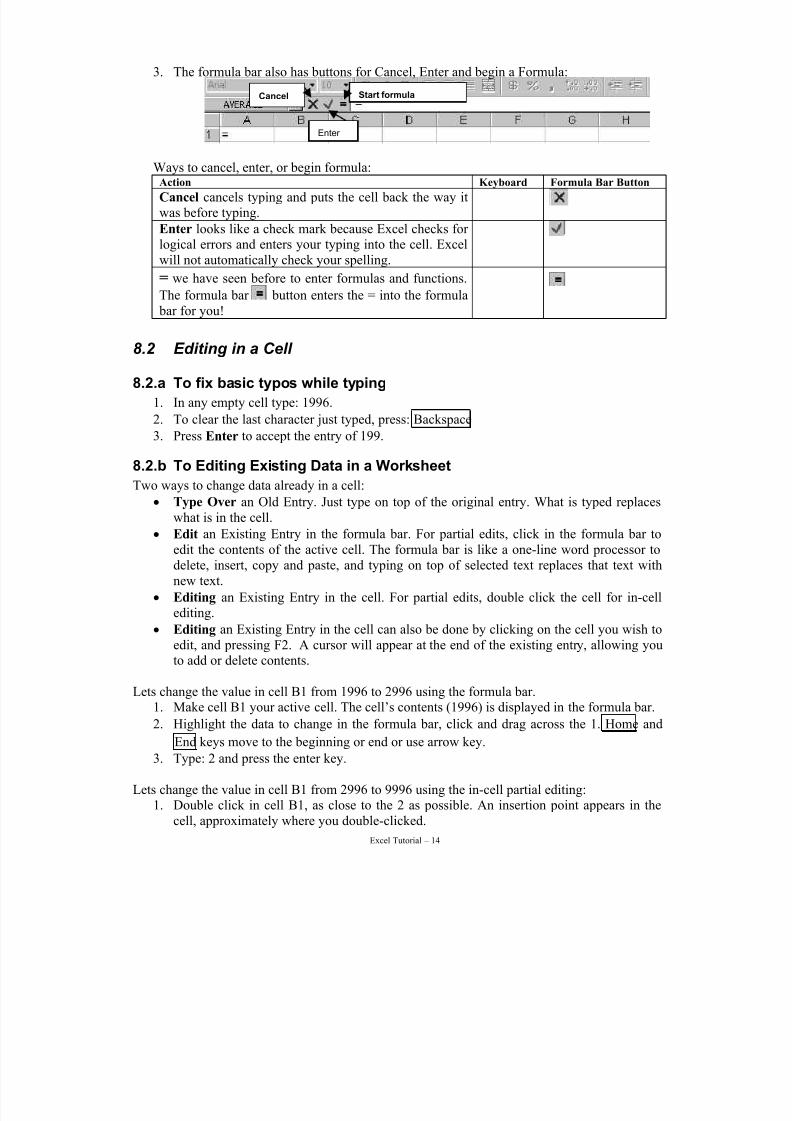
3. The formula bar also has buttons for Cancel, Enter and begin a Formula:
Cancel
Enter
Start formula
Ways to cancel, enter, or begin formula:Action Keyboard Formula Bar Button
Cancel cancels typing and puts the cell back the way itwas before typing. °
Enter looks like a check mark because Excel checks for logical errors and enters your typing into the cell. Excelwill not automatically check your spelling.
«
= we have seen before to enter formulas and functions.
The formula bar button enters the = into the formula bar for you!
=
8.2 Editing in a Cell
8.2.a To fix basic typos while typing
1. In any empty cell type: 1996.
2. To clear the last character just typed, press: Backspace
3. Press Enter to accept the entry of 199.
8.2.b To Editing Existing Data in a Worksheet
Two ways to change data already in a cell:
• Type Over an Old Entry. Just type on top of the original entry. What is typed replaces
what is in the cell.• Edit an Existing Entry in the formula bar. For partial edits, click in the formula bar to
edit the contents of the active cell. The formula bar is like a one-line word processor todelete, insert, copy and paste, and typing on top of selected text replaces that text withnew text.
• Editing an Existing Entry in the cell. For partial edits, double click the cell for in-cellediting.
• Editing an Existing Entry in the cell can also be done by clicking on the cell you wish toedit, and pressing F2. A cursor will appear at the end of the existing entry, allowing youto add or delete contents.
Lets change the value in cell B1 from 1996 to 2996 using the formula bar.1. Make cell B1 your active cell. The cell’s contents (1996) is displayed in the formula bar.
2. Highlight the data to change in the formula bar, click and drag across the 1. Home and
End keys move to the beginning or end or use arrow key.
3. Type: 2 and press the enter key.
Lets change the value in cell B1 from 2996 to 9996 using the in-cell partial editing:1. Double click in cell B1, as close to the 2 as possible. An insertion point appears in the
cell, approximately where you double-clicked.
7/15/2019 Excel Tutorial
http://slidepdf.com/reader/full/excel-tutorial-5633837587fa6 15/52
Excel Tutorial – 15
2. Select the 2 by: Click and drag across the 2 to select it or use the arrow keys to positionthe insertion cursor next to the 2, hold down the Shift key and use the left or right arrow
key to select it. Use Home and End keys to move to the beginning or end of the entry.
3. Type: 94. Move off the cell and number is changed.
8.2.c To Cancel EditsStart typing and change your mind? Cancel your typing by:
Cancel before pressing the enter key.
1. To move to cell C1, or any other cell that already has some content.2. Type: EXCEL IS FUN! (do not press enter!)3. Cancel the edit either:
a. Press the ESC key or b. Click the formula bar Cancel button.
4. The original value in the cell is restored.
Undo after pressing the enter key.1. To move to cell C1, or any other cell that already has some content.2. Type: EXCEL IS FUN! And press the Enter key!3. Return back to the former contents either:
a. Press the Ctrl-Z key combination, or From the Edit menu, select Undo, or
b. Click the Undo toolbar button .4. The original value in the cell is restored.
5. Excel keeps track of editing changes so you can “step back”. There is a redo in caseyou undo too far. Excel erases this history of editing changes when you close the open
Workbook so you can undo and redo changes made only since opening the file.
9 AutoFill, Column Width, Drag and DropWe will creating a New Worksheet that introduces a number of Excel features:
• AutoFill
• Change Column Width
• Drag and Drop editing
• Formulas and Function Copy and Paste
• Formatting cells and worksheets.
Note we will reuse the existing workbook even though we have entered some data already. Youcan just type over the existing data.
To illustrate these features we will make a new worksheet with the entries illustrated in thediagram below.
In order for these features to be demonstrated correctly, the following pages will introduce errorsthat will need to be corrected so put the data in the cells as instructed.
7/15/2019 Excel Tutorial
http://slidepdf.com/reader/full/excel-tutorial-5633837587fa6 16/52
Excel Tutorial – 16
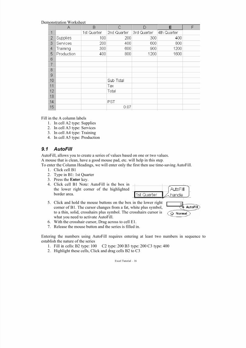
Demonstration Worksheet
Fill in the A column labels1. In cell A2 type: Supplies2. In cell A3 type: Services3. In cell A4 type: Training4. In cell A5 type: Production
9.1 AutoFill
AutoFill, allows you to create a series of values based on one or two values.
A mouse that is clean, have a good mouse pad, etc. will help in this step.To enter the Column Headings, we will enter only the first then use time-saving AutoFill.
1. Click cell B12. Type in B1: 1st Quarter 3. Press the Enter key.4. Click cell B1 Note: AutoFill is the box in
the lower right corner of the highlighted border area.
5. Click and hold the mouse buttons on the box in the lower rightcorner of B1. The cursor changes from a fat, white plus symbol,
to a thin, solid, crosshairs plus symbol. The crosshairs cursor iswhat you need to activate AutoFill.6. With the crosshair cursor, Drag across to cell E1.7. Release the mouse button and the series is filled in.
Entering the numbers using AutoFill requires entering at least two numbers in sequence toestablish the nature of the series
1. Fill in cells: B2 type: 100 C2 type: 200 B3 type: 200 C3 type: 4002. Highlight these cells, Click and drag cells B2 to C3
7/15/2019 Excel Tutorial
http://slidepdf.com/reader/full/excel-tutorial-5633837587fa6 17/52
Excel Tutorial – 17
3. Click and hold the mouse button on the AutoFill handle in the lower right corner. Thecursor must change to a thin, solid, crosshairs plus symbol.
4. With the crosshair cursor, Drag across to cell E3.5. Release the mouse button and the series is filled in.6. To AutoFill down the first two columns, make sure you still have the crosshairs cursor,
Click and drag down to cell E5
7. Release the mouse button and the series is filled in.
More about AutoFill
• AutoFill can fill by row or by column. AutoFill cannot fill diagonally.
• For a single cell of character and/or numbers, AutoFill will repeat that cell.
• For a single cell of characters and/or numbers, and the first character is a number,AutoFill will increment by one beginning with the number, providing there is a space between the number and the character.
• For two cells with numbers, AutoFill will increment by the difference of these twonumbers, e.g. 1 3 will give the series 1 3 5 7 9….
• AutoFill knows the days of the week given any two days in two cells including
capitalization, and common abbreviations like Mon, Tue.• AutoFill knows the months of the year given any two months in two cells including
capitalization, and common abbreviations like Feb, Mar.
• To add other AutoFill lists go to the Tools menu – Options – Custom Lists tab.
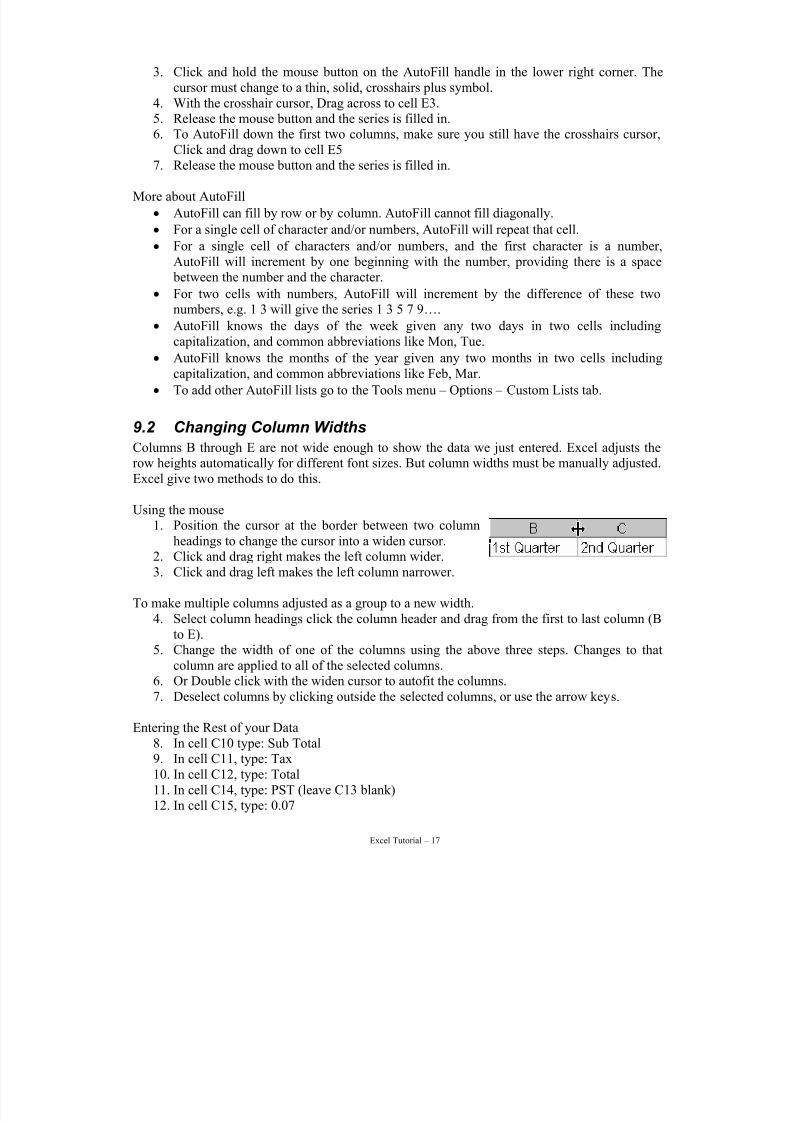
9.2 Changing Column Widths
Columns B through E are not wide enough to show the data we just entered. Excel adjusts therow heights automatically for different font sizes. But column widths must be manually adjusted.Excel give two methods to do this.
Using the mouse1. Position the cursor at the border between two column
headings to change the cursor into a widen cursor.2. Click and drag right makes the left column wider.3. Click and drag left makes the left column narrower.
To make multiple columns adjusted as a group to a new width.4. Select column headings click the column header and drag from the first to last column (B
to E).5. Change the width of one of the columns using the above three steps. Changes to that
column are applied to all of the selected columns.6. Or Double click with the widen cursor to autofit the columns.7. Deselect columns by clicking outside the selected columns, or use the arrow keys.
Entering the Rest of your Data8. In cell C10 type: Sub Total9. In cell C11, type: Tax10. In cell C12, type: Total11. In cell C14, type: PST (leave C13 blank)12. In cell C15, type: 0.07
7/15/2019 Excel Tutorial
http://slidepdf.com/reader/full/excel-tutorial-5633837587fa6 18/52
Excel Tutorial – 18
1. Select cells,position cursor on the border.
2. Click, dragto new positionand release.
Saving Your WorksheetSave your work regularly, especially if you are trying new things. This way you can revert
back to the saved file should things go wrong.
1. Save the worksheet using the Save As dialog since this is the first time we are saving thisfile. Use File menu – Save As.
2. Name the workbook: exercise.
3. Choose to save to your diskette, drive A.
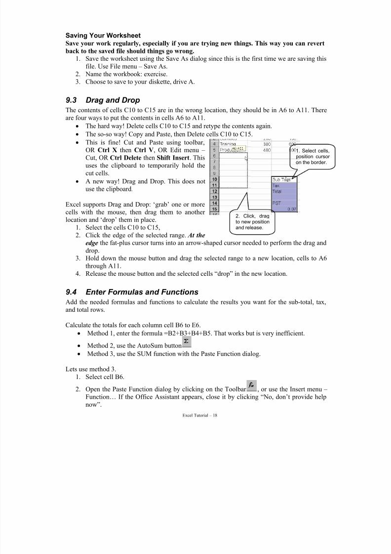
9.3 Drag and Drop
The contents of cells C10 to C15 are in the wrong location, they should be in A6 to A11. Thereare four ways to put the contents in cells A6 to A11.
• The hard way! Delete cells C10 to C15 and retype the contents again.
• The so-so way! Copy and Paste, then Delete cells C10 to C15.
• This is fine! Cut and Paste using toolbar,OR Ctrl X then Ctrl V, OR Edit menu – Cut, OR Ctrl Delete then Shift Insert. Thisuses the clipboard to temporarily hold thecut cells.
• A new way! Drag and Drop. This does notuse the clipboard.
Excel supports Drag and Drop: ‘grab’ one or morecells with the mouse, then drag them to another location and ‘drop’ them in place.
1. Select the cells C10 to C15,2. Click the edge of the selected range. At the
edge the fat-plus cursor turns into an arrow-shaped cursor needed to perform the drag anddrop.
3. Hold down the mouse button and drag the selected range to a new location, cells to A6through A11.
4. Release the mouse button and the selected cells “drop” in the new location.
9.4 Enter Formulas and Functions
Add the needed formulas and functions to calculate the results you want for the sub-total, tax,and total rows.
Calculate the totals for each column cell B6 to E6.
• Method 1, enter the formula =B2+B3+B4+B5. That works but is very inefficient.
• Method 2, use the AutoSum button
• Method 3, use the SUM function with the Paste Function dialog.
Lets use method 3.1. Select cell B6.
2. Open the Paste Function dialog by clicking on the Toolbar , or use the Insert menu – Function… If the Office Assistant appears, close it by clicking “No, don’t provide helpnow”.
7/15/2019 Excel Tutorial
http://slidepdf.com/reader/full/excel-tutorial-5633837587fa6 19/52
Excel Tutorial – 19
3. We could access the SUM function from the Most Recently Used category; or another way is from the All category. For this example, click All.
4. In the Function Name list, click anywhere.5. To jump to the “S” part of the Function Name list, type: s
6. Then press:↓ until the word “SUM” is highlighted. You could also have typed SUM
very quickly. The problem is if you took too long between the characters Excel would goto other functions beginning with U or M.
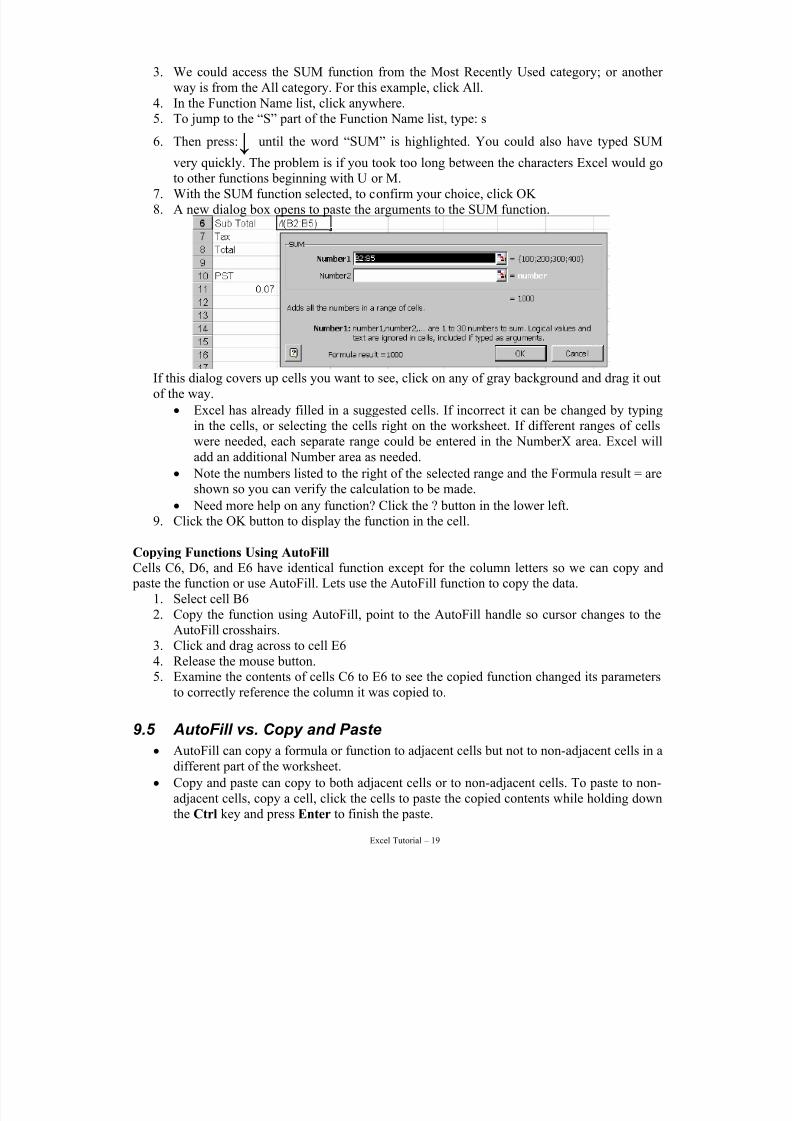
7. With the SUM function selected, to confirm your choice, click OK 8. A new dialog box opens to paste the arguments to the SUM function.
If this dialog covers up cells you want to see, click on any of gray background and drag it outof the way.
• Excel has already filled in a suggested cells. If incorrect it can be changed by typingin the cells, or selecting the cells right on the worksheet. If different ranges of cellswere needed, each separate range could be entered in the NumberX area. Excel willadd an additional Number area as needed.
• Note the numbers listed to the right of the selected range and the Formula result = areshown so you can verify the calculation to be made.
• Need more help on any function? Click the ? button in the lower left.
9. Click the OK button to display the function in the cell.
Copying Functions Using AutoFill
Cells C6, D6, and E6 have identical function except for the column letters so we can copy and paste the function or use AutoFill. Lets use the AutoFill function to copy the data.
1. Select cell B62. Copy the function using AutoFill, point to the AutoFill handle so cursor changes to the
AutoFill crosshairs.3. Click and drag across to cell E64. Release the mouse button.5. Examine the contents of cells C6 to E6 to see the copied function changed its parameters
to correctly reference the column it was copied to.
9.5 AutoFill vs. Copy and Paste
• AutoFill can copy a formula or function to adjacent cells but not to non-adjacent cells in adifferent part of the worksheet.
• Copy and paste can copy to both adjacent cells or to non-adjacent cells. To paste to non-adjacent cells, copy a cell, click the cells to paste the copied contents while holding downthe Ctrl key and press Enter to finish the paste.
7/15/2019 Excel Tutorial
http://slidepdf.com/reader/full/excel-tutorial-5633837587fa6 20/52
Excel Tutorial – 20
9.6 Editing a Formula or Function
Rules for editing a function or formula follow those for editing any other entry. Use the FormulaBar to make edits. The only difference is pressing Enter or the check mark button, Excel checksthe formula or function for logical errors. If none are found, it is entered. If an error is detected,Excel will highlight the equation at the point where the error was detected.
Add the PST FormulaThis is similar to the previous step, enter the formula then copy with AutoFill.
1. Select cell B72. Enter the formula to calculate the Sub-total * Tax, type: =B6*A113. AutoFill to Copy the Formula select cell B7,4. Get the crosshair cursor on the AutoFill handle in the lower right corner 5. Click and drag across to cell E76. Release the mouse button to paste the formula in the selected cells7. There is a problem. You see zeroes in cells C7 through E7.
Examine the contents of these cells; the formula did as instructed in adjusting the formula
relative to the column (or row) in which it has been pasted. It now no longer refers to cell A11,where the PST Rate is located.
Before we fix this problem, we need to understand relative and absolute cell addresses.
10 Cell AddressesExcel cell addresses are interpreted in terms of relative positions. A cell address is an instructionto take the value that is located so many cells up/down/left/right from the current position.Usually, this is just what we want.
When getting the Sub-totals and summed columns in earlier exercises, Excel adjusted our formulas and functions appropriately. Now we have a formula that needs to reference just thevalue stored in one cell (A11) for a series of formulas. Each time the copy moved to the right, theformula adjusted the location for where to find the Tax Rate value.
We could solve this by putting a row of Tax Rate values, but this is inefficient and not very niceto look at. The solution: enter Relative and Absolute cell referencing.
10.1 Relative cell reference
The normal condition just described is called relative cell addressing. That is, formulas and
functions refer to cells relative to the location of the equation. Copying the equation to the left,for example, adjusts all cell address to the left, and so on. This is usually what you want.
10.2 Absolute cell reference
Some time we need to tell Excel not to adjust a cell reference relatively during a copy operation,such as when there is a constant value like the PST.. In other words, we want it to refer to the celladdress absolutely. We indicate this to Excel by placing $ (dollar sign) in front the part of thecell address that do not change in the formula or function cell addresses.
7/15/2019 Excel Tutorial
http://slidepdf.com/reader/full/excel-tutorial-5633837587fa6 21/52
Excel Tutorial – 21
The PST is in cell A11 in the tax formula it is written as $A$11 to make it an absolute celladdress reference, so the formula would read =B6*$A$11. Then there is only one cell to updateshould the PST ever change. All cells which refer to it will be automatically updated if the cellvalue changes.
Thus there are four possible ways to reference a cell:• A1 – Relative cell reference, changes as it is copied to other rows or columns.
• $A$1 – Absolute cell reference, does not change as it is copied to another location.
• $A1 – Absolute column, relative row reference. The column does not change while therow does as it is copied to another location.
• A$1 – Relative column, absolute row reference. The column changes while the row doesnot as it is copied to another location.
To change relative references to absolute (and vice versa). Select the cell that contains theformula. In the formula bar, select the reference you want to change and then press F4. Each press of F4, Excel toggles through the above combinations. Once you have the combination that
you want, press Enter. The correct address type will be saved, and the active cell will move
down one row; to make sure the address is correct, click on the formula cell.
10.2.a Clearing Cells
Clear the cells containing the erroneous formulas before updating the formula to contain anabsolute address.
1. Select cells C7 to E7, do not include B7 as we will edit the formula.2. To clear the cells, press: Delete or use the Edit menu – Clear – Contents.
10.2.b Fixing the PST Formula
Change the PST formula from =B6*A11 so a11 reference to the PST are absolutely addressed=B6*$A$11.
3. Select cell B74. In the formula bar edit the formula to read: =B6*$A$115. When done, press: Enter or click the Check Mark button.
10.2.c Use AutoFill to Copy the Corrected Formula
Copy the corrected formula across row 7 using AutoFill.6. Select cell B77. Use AutoFill to copy the formula across the row to cell E7.8. Examine the contents of cells B7 through E7. The formula reference to cell $A$11 should
be the same in cell and the calculation done correctly.
10.2.d Enter the Total Formula and copy it
Finish entering the worksheet formulas to add the Sub Total and the Tax to give the Total. As wecreate the formula, we’ll see a different way we can enter it into the spreadsheet.
9. Select cell B8,10. Begin entering the formula, type: =. Instead of typing the whole formula, select cells in a
formula by clicking them.11. Place the first cell in the formula, click cell B6
7/15/2019 Excel Tutorial
http://slidepdf.com/reader/full/excel-tutorial-5633837587fa6 22/52
Excel Tutorial – 22
12. Place the plus sign into the formula, type: +13. Place the second cell in the formula, click cell B714. The formula bar reads =B6+B7. Accept it, press: Enter or click the Check Mark.15. Copy the formula, select cell B8,16. Use AutoFill to click and drag across to cell E817. Release the mouse button to paste formulas in the cells and display the totals.
18. Save your worksheet again, use any method you prefer: File menu – Save, or keyboardshortcut Ctrl + S or Toolbar
11 Why Use Excel for Statistics?
There may be times when you have a set of data and wish to compute some rather basic statistics but do not have the time to learn a statistical package or a statistical package may not be readilyavailable. Excel can accomplish many of the basic and some of the more advanced statistical procedures.
This material introduces some of the basic statistical procedures available in Excel as well as provides instruction on how to use them. If you are already very familiar with Excel, SPSS, SASor other statistical packages, this section may be a bit basic for you.
Start by opening the other spreadsheet file: Zinc Analysis.xls. This is a ‘read-only’ file, so saveit under a new name in order to start making changes at this point. Go to ‘File’ then ‘Save As…’
and enter a new name for the file.
7/15/2019 Excel Tutorial
http://slidepdf.com/reader/full/excel-tutorial-5633837587fa6 23/52
Excel Tutorial – 23
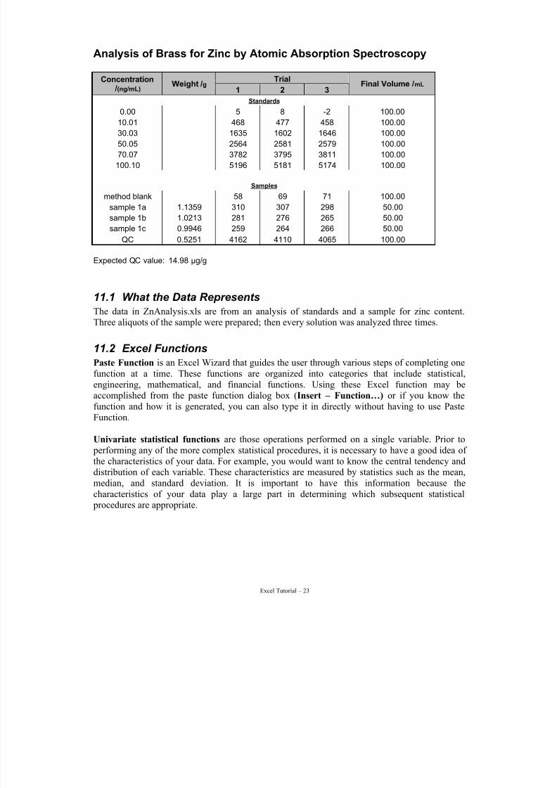
Analysis of Brass for Zinc by Atomic Absorption Spectroscopy
TrialConcentration /(ng/mL)
Weight /g 1 2 3
Final Volume /mL
Standards
0.00 5 8 -2 100.00
10.01 468 477 458 100.0030.03 1635 1602 1646 100.00
50.05 2564 2581 2579 100.00
70.07 3782 3795 3811 100.00
100.10 5196 5181 5174 100.00
Samples
method blank 58 69 71 100.00
sample 1a 1.1359 310 307 298 50.00
sample 1b 1.0213 281 276 265 50.00
sample 1c 0.9946 259 264 266 50.00
QC 0.5251 4162 4110 4065 100.00
Expected QC value: 14.98 µg/g
11.1 What the Data Represents
The data in ZnAnalysis.xls are from an analysis of standards and a sample for zinc content.Three aliquots of the sample were prepared; then every solution was analyzed three times.
11.2 Excel Functions
Paste Function is an Excel Wizard that guides the user through various steps of completing onefunction at a time. These functions are organized into categories that include statistical,engineering, mathematical, and financial functions. Using these Excel function may beaccomplished from the paste function dialog box (Insert – Function…) or if you know thefunction and how it is generated, you can also type it in directly without having to use PasteFunction.
Univariate statistical functions are those operations performed on a single variable. Prior to performing any of the more complex statistical procedures, it is necessary to have a good idea of the characteristics of your data. For example, you would want to know the central tendency anddistribution of each variable. These characteristics are measured by statistics such as the mean,
median, and standard deviation. It is important to have this information because thecharacteristics of your data play a large part in determining which subsequent statistical procedures are appropriate.
7/15/2019 Excel Tutorial
http://slidepdf.com/reader/full/excel-tutorial-5633837587fa6 24/52
Excel Tutorial – 24
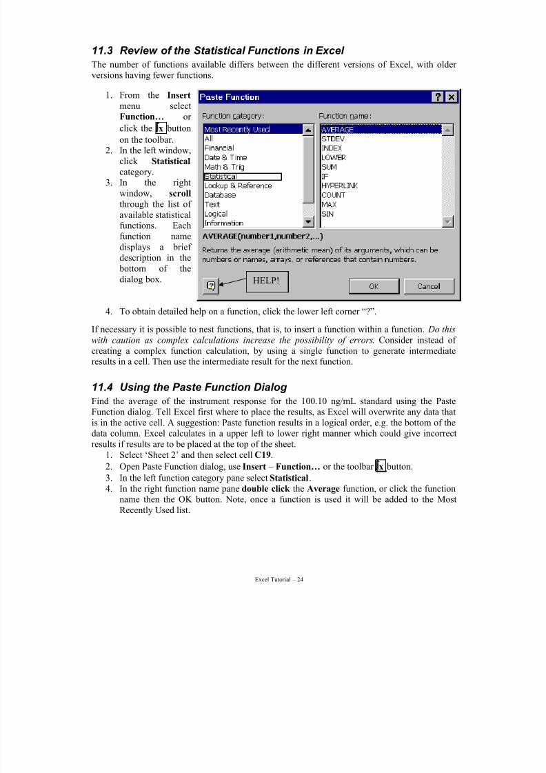
11.3 Review of the Statistical Functions in Excel
The number of functions available differs between the different versions of Excel, with older versions having fewer functions.
1. From the Insert menu select
Function… or click the ∫x button
on the toolbar.2. In the left window,
click Statistical category.
3. In the rightwindow, scroll through the list of available statisticalfunctions. Each
function namedisplays a brief description in the bottom of thedialog box.
4. To obtain detailed help on a function, click the lower left corner “?”.
If necessary it is possible to nest functions, that is, to insert a function within a function. Do this
with caution as complex calculations increase the possibility of errors. Consider instead of creating a complex function calculation, by using a single function to generate intermediateresults in a cell. Then use the intermediate result for the next function.
11.4 Using the Paste Function Dialog
Find the average of the instrument response for the 100.10 ng/mL standard using the PasteFunction dialog. Tell Excel first where to place the results, as Excel will overwrite any data thatis in the active cell. A suggestion: Paste function results in a logical order, e.g. the bottom of thedata column. Excel calculates in a upper left to lower right manner which could give incorrectresults if results are to be placed at the top of the sheet.
1. Select ‘Sheet 2’ and then select cell C19.
2. Open Paste Function dialog, use Insert – Function… or the toolbar ∫x button.
3. In the left function category pane select Statistical.4. In the right function name pane double click the Average function, or click the function
name then the OK button. Note, once a function is used it will be added to the MostRecently Used list.
HELP!
7/15/2019 Excel Tutorial
http://slidepdf.com/reader/full/excel-tutorial-5633837587fa6 25/52
Excel Tutorial – 25
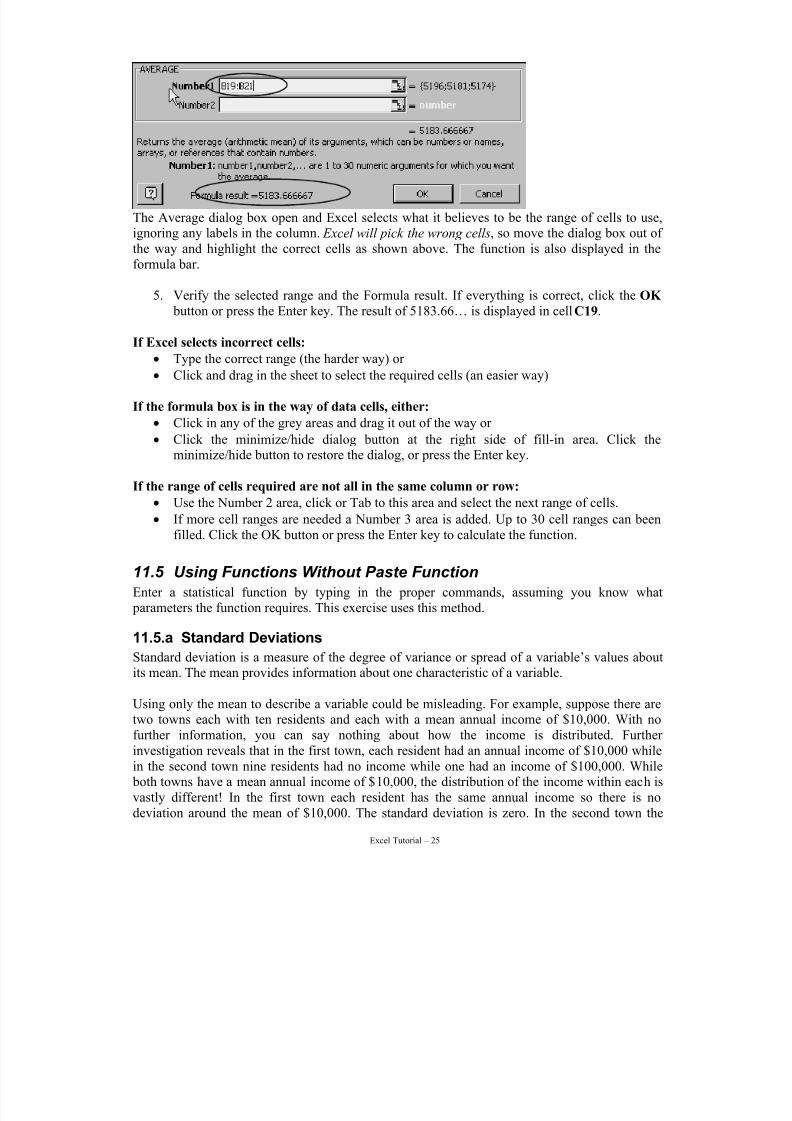
The Average dialog box open and Excel selects what it believes to be the range of cells to use,ignoring any labels in the column. Excel will pick the wrong cells, so move the dialog box out of the way and highlight the correct cells as shown above. The function is also displayed in theformula bar.
5. Verify the selected range and the Formula result. If everything is correct, click the OK button or press the Enter key. The result of 5183.66… is displayed in cell C19.
If Excel selects incorrect cells:• Type the correct range (the harder way) or
• Click and drag in the sheet to select the required cells (an easier way)
If the formula box is in the way of data cells, either:
• Click in any of the grey areas and drag it out of the way or
• Click the minimize/hide dialog button at the right side of fill-in area. Click theminimize/hide button to restore the dialog, or press the Enter key.
If the range of cells required are not all in the same column or row:
• Use the Number 2 area, click or Tab to this area and select the next range of cells.
• If more cell ranges are needed a Number 3 area is added. Up to 30 cell ranges can beenfilled. Click the OK button or press the Enter key to calculate the function.
11.5 Using Functions Without Paste Function
Enter a statistical function by typing in the proper commands, assuming you know what parameters the function requires. This exercise uses this method.
11.5.a Standard Deviations
Standard deviation is a measure of the degree of variance or spread of a variable’s values aboutits mean. The mean provides information about one characteristic of a variable.
Using only the mean to describe a variable could be misleading. For example, suppose there aretwo towns each with ten residents and each with a mean annual income of $10,000. With nofurther information, you can say nothing about how the income is distributed. Further investigation reveals that in the first town, each resident had an annual income of $10,000 whilein the second town nine residents had no income while one had an income of $100,000. While both towns have a mean annual income of $10,000, the distribution of the income within each isvastly different! In the first town each resident has the same annual income so there is nodeviation around the mean of $10,000. The standard deviation is zero. In the second town the
7/15/2019 Excel Tutorial
http://slidepdf.com/reader/full/excel-tutorial-5633837587fa6 26/52
Excel Tutorial – 26
incomes are not so evenly distributed. Nine residents have 0 income and one has an income of $100,000. For the second town the standard deviation is 31,622.78.
Using statistical measures like the standard deviation would uncover such uneven distributionand allow for a more descriptive and accurate analysis to be made. We will use the sameinformation from the 100.10 ng/mL standard, for this exercise and not use the Paste Function.
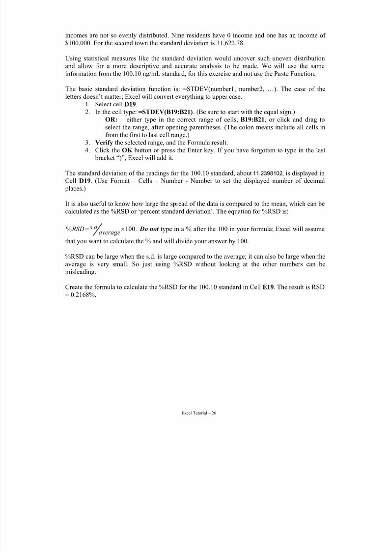
The basic standard deviation function is: =STDEV(number1, number2, …). The case of theletters doesn’t matter; Excel will convert everything to upper case.
1. Select cell D19.2. In the cell type: =STDEV(B19:B21). (Be sure to start with the equal sign.)
OR: either type in the correct range of cells, B19:B21, or click and drag toselect the range, after opening parentheses. (The colon means include all cells infrom the first to last cell range.)
3. Verify the selected range, and the Formula result.4. Click the OK button or press the Enter key. If you have forgotten to type in the last
bracket “)”, Excel will add it.
The standard deviation of the readings for the 100.10 standard, about 11.2398102, is displayed inCell D19. (Use Format – Cells – Number - Number to set the displayed number of decimal places.)
It is also useful to know how large the spread of the data is compared to the mean, which can becalculated as the %RSD or ‘percent standard deviation’. The equation for %RSD is:
100.% ×=average
d s RSD . Do not type in a % after the 100 in your formula; Excel will assume
that you want to calculate the % and will divide your answer by 100.
%RSD can be large when the s.d. is large compared to the average; it can also be large when theaverage is very small. So just using %RSD without looking at the other numbers can bemisleading.
Create the formula to calculate the %RSD for the 100.10 standard in Cell E19. The result is RSD= 0.2168%.
7/15/2019 Excel Tutorial
http://slidepdf.com/reader/full/excel-tutorial-5633837587fa6 27/52
Excel Tutorial – 27
12 Using the Data Analysis ToolYou can use the Paste Function to obtain one statistical measure at a time. Excel also has theData Analysis Tool-Pak, a pre-packaged set of statistical procedures. Use the Data Analysis Toolto apply multiple statistical measures simultaneously.
12.1 Bivariate Statistics (Regression Analysis)
So far we have examined variables in isolation from one another. The mean, median, andstandard deviation provide a good understanding of the data characteristics.
Multivariate statistics takes the process of data analysis one step further by examining howvariables interact with one another. Multivariate statistics helps to define the relationship between two or more variables and determine the strength of the relationship. In analyticalchemistry, we use use regression analysis to determine the relationship between concentrationand ‘instrument response’. Instrument response is just the raw output from the machine;remember, the machine doesn’t know what the concentration is – it can only provide a responsefor each sample. This is the reason for using the typical ‘standard curve’. By measuring theinstrument response of samples with known concentration (i.e., standards), we can determine amathematical relationship between response and concentration. Then, when a sample of unknown concentration is run, it is possible to use the response to calculate the concentration.
Regression is a more powerful statistical technique than a simple correlation to test if two or more variables are related. A regression calculation adds a level of precision on how changes inone variable may be reflected in changes in another variable.
12.1.a A Regression Exercise
The model to be tested is: Response = Slope × Concentration + Intercept. (This is the equation of a straight line.)Where:
• Response is the dependent variable (depends on the concentration), =y.
• Slope (=m) and intercept (=b) are constants determined by the calibration curve.
• Concentration is the independent variable (in the calibration curve, concentration isdetermined by the experimenter; then the response is measured; therefore the response is‘dependent’).
If Data Analysis does not appear in the Tools menu in step 2 below then:
a. From the Tools menu select Add-Ins… b. Click the check box by Analysis ToolPak . (The Analysis Tool-Pak VBA is similar
but also includes programming support for Visual Basic for Applications programmers.)
c. Click the OK button, it will now appear in the Tools menu.
The other items in the Add-Ins… dialog, including other valuable tools that generally have avery specific use. Because they are tools not used by a casual user, Microsoft has removedthem from the menus. Once an Add-In has been selected it will remain in the Excel menus.
7/15/2019 Excel Tutorial
http://slidepdf.com/reader/full/excel-tutorial-5633837587fa6 28/52
Excel Tutorial – 28
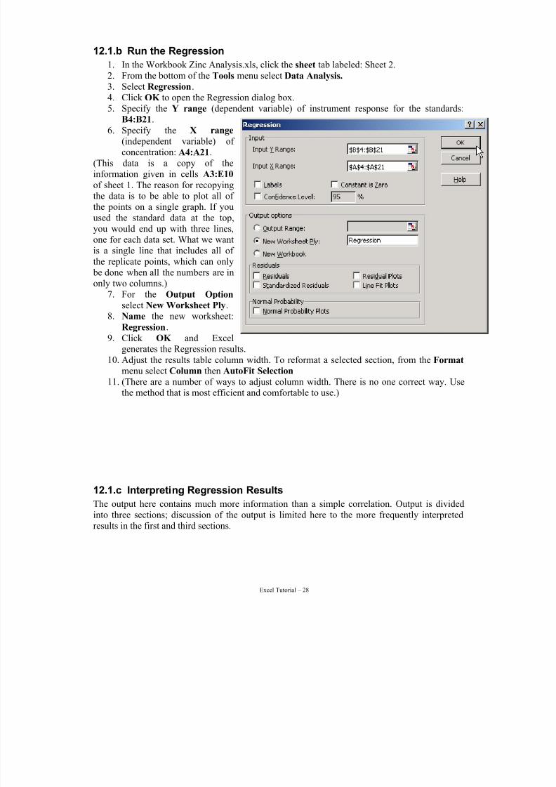
12.1.b Run the Regression
1. In the Workbook Zinc Analysis.xls, click the sheet tab labeled: Sheet 2.2. From the bottom of the Tools menu select Data Analysis. 3. Select Regression.4. Click OK to open the Regression dialog box.5. Specify the Y range (dependent variable) of instrument response for the standards:
B4:B21.6. Specify the X range
(independent variable) of concentration: A4:A21.
(This data is a copy of theinformation given in cells A3:E10 of sheet 1. The reason for recopyingthe data is to be able to plot all of the points on a single graph. If youused the standard data at the top,you would end up with three lines,
one for each data set. What we wantis a single line that includes all of the replicate points, which can only be done when all the numbers are inonly two columns.)
7. For the Output Option select New Worksheet Ply.
8. Name the new worksheet:Regression.
9. Click OK and Excelgenerates the Regression results.
10. Adjust the results table column width. To reformat a selected section, from the Format menu select Column then AutoFit Selection 11. (There are a number of ways to adjust column width. There is no one correct way. Use
the method that is most efficient and comfortable to use.)
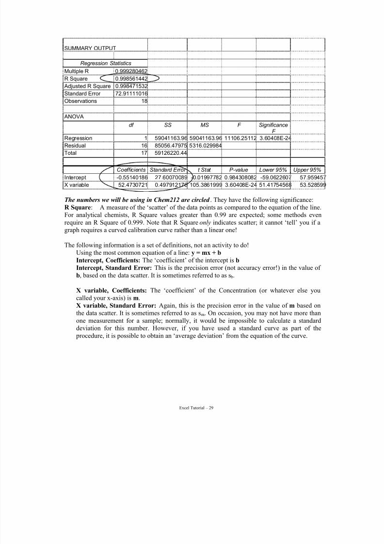
12.1.c Interpreting Regression Results
The output here contains much more information than a simple correlation. Output is dividedinto three sections; discussion of the output is limited here to the more frequently interpretedresults in the first and third sections.
7/15/2019 Excel Tutorial
http://slidepdf.com/reader/full/excel-tutorial-5633837587fa6 29/52
Excel Tutorial – 29
SUMMARY OUTPUT
Regression Statistics
Multiple R 0.999280462
R Square 0.998561442
Adjusted R Square 0.998471532
Standard Error 72.91111016
Observations 18
ANOVA
df SS MS F SignificanceF
Regression 1 59041163.96 59041163.96 11106.25112 3.60408E-24
Residual 16 85056.47975 5316.029984
Total 17 59126220.44
Coefficients Standard Error t Stat P-value Lower 95% Upper 95%
Intercept -0.55140186 27.60070089 -0.01997782 0.984308082 -59.0622607 57.959457
X variable 52.4730721 0.497912176 105.3861999 3.60408E-24 51.41754568 53.528599
The numbers we will be using in Chem212 are circled . They have the following significance:R Square: A measure of the ‘scatter’ of the data points as compared to the equation of the line.For analytical chemists, R Square values greater than 0.99 are expected; some methods evenrequire an R Square of 0.999. Note that R Square only indicates scatter; it cannot ‘tell’ you if agraph requires a curved calibration curve rather than a linear one!
The following information is a set of definitions, not an activity to do!
Using the most common equation of a line: y = mx + b Intercept, Coefficients: The ‘coefficient’ of the intercept is b Intercept, Standard Error: This is the precision error (not accuracy error!) in the value of b, based on the data scatter. It is sometimes referred to as s b.
X variable, Coefficients: The ‘coefficient’ of the Concentration (or whatever else youcalled your x-axis) is m.X variable, Standard Error: Again, this is the precision error in the value of m based onthe data scatter. It is sometimes referred to as sm. On occasion, you may not have more thanone measurement for a sample; normally, it would be impossible to calculate a standarddeviation for this number. However, if you have used a standard curve as part of the
procedure, it is possible to obtain an ‘average deviation’ from the equation of the curve.
7/15/2019 Excel Tutorial
http://slidepdf.com/reader/full/excel-tutorial-5633837587fa6 30/52
Excel Tutorial – 30
13 Excel Chart WizardCharts are Excel graphs that give a useful visual representation of your data. Creating a newchart is as easy as selecting the cells, and selecting the chart type, chart features, and where to place the chart in your Workbook. Excel Charts uses a wizard to step you through the process.
Excel charts can be embedded in your worksheet, or you can create them as a separate sheet in
your workbook. We will choose the second option, creating a separate chart sheet.
Our data includes titles for the data; the names in Row 3. Excel charts will use these if they areincluded in the selected cells to use in creating the chart. The Chart wizard will allow us tochange these titles, or add titles if the cells had not been selected. In analytical chemistry, themost common type of ‘chart’ or graph is the calibration curve. The following instructions willgive you step-by-step information as needed to make graphs for Chem 212.
13.1 Create a Calibration Curve
The steps required for your calibration curves in Chem 212 are listed below. More information
about each step, and additional options, are in Sections 17 to 19.
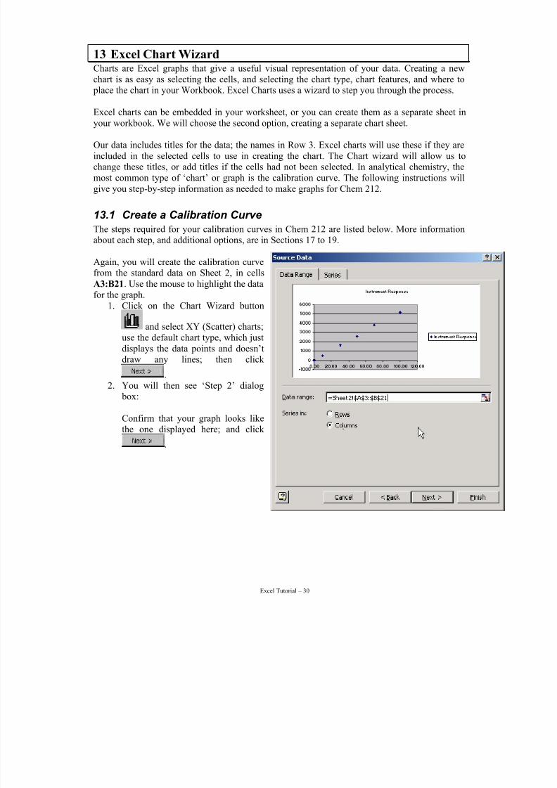
Again, you will create the calibration curvefrom the standard data on Sheet 2, in cellsA3:B21. Use the mouse to highlight the datafor the graph.
1. Click on the Chart Wizard button
and select XY (Scatter) charts;use the default chart type, which justdisplays the data points and doesn’t
draw any lines; then click .
2. You will then see ‘Step 2’ dialog box:
Confirm that your graph looks likethe one displayed here; and click
.
7/15/2019 Excel Tutorial
http://slidepdf.com/reader/full/excel-tutorial-5633837587fa6 31/52
Excel Tutorial – 31
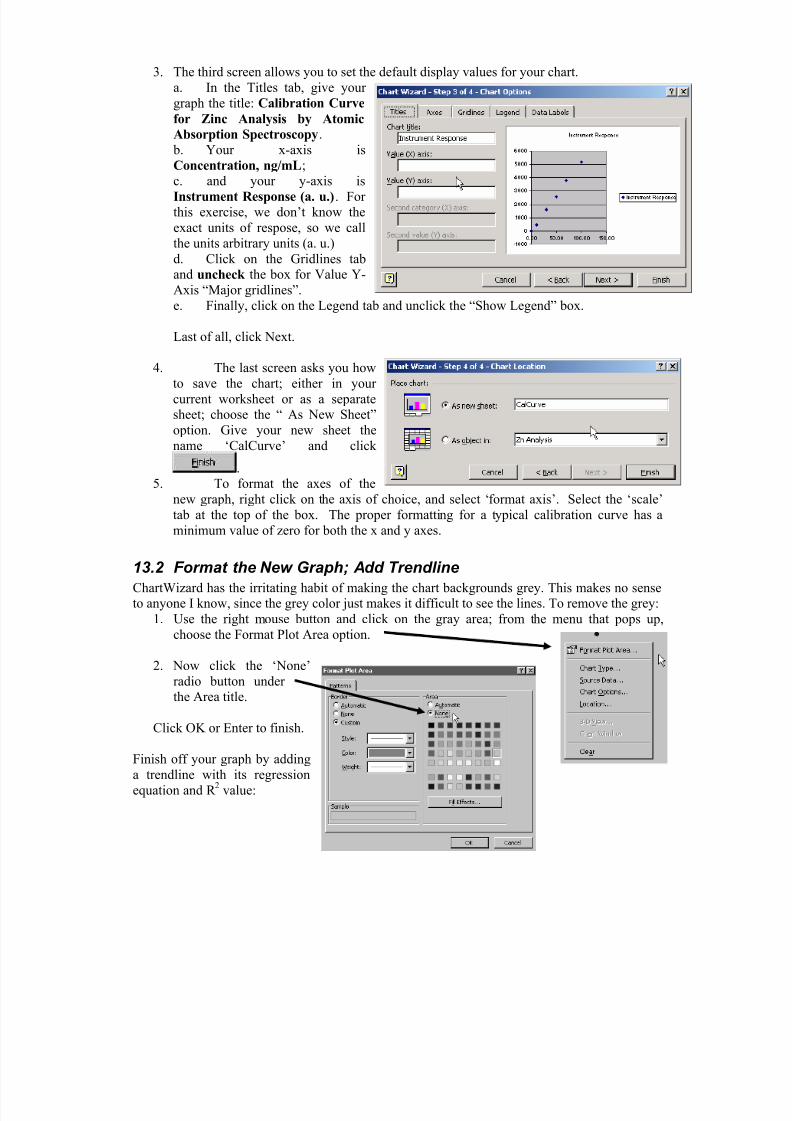
3. The third screen allows you to set the default display values for your chart.a. In the Titles tab, give your graph the title: Calibration Curve
for Zinc Analysis by Atomic
Absorption Spectroscopy. b. Your x-axis is
Concentration, ng/mL;c. and your y-axis isInstrument Response (a. u.). For this exercise, we don’t know theexact units of respose, so we callthe units arbitrary units (a. u.)d. Click on the Gridlines taband uncheck the box for Value Y-Axis “Major gridlines”.e. Finally, click on the Legend tab and unclick the “Show Legend” box.
Last of all, click Next.
4. The last screen asks you howto save the chart; either in your current worksheet or as a separatesheet; choose the “ As New Sheet”option. Give your new sheet thename ‘CalCurve’ and click
.5. To format the axes of the
new graph, right click on the axis of choice, and select ‘format axis’. Select the ‘scale’
tab at the top of the box. The proper formatting for a typical calibration curve has aminimum value of zero for both the x and y axes.
13.2 Format the New Graph; Add Trendline
ChartWizard has the irritating habit of making the chart backgrounds grey. This makes no senseto anyone I know, since the grey color just makes it difficult to see the lines. To remove the grey:
1. Use the right mouse button and click on the gray area; from the menu that pops up,choose the Format Plot Area option.
2. Now click the ‘None’radio button under the Area title.
Click OK or Enter to finish.
Finish off your graph by addinga trendline with its regressionequation and R
2value:
7/15/2019 Excel Tutorial
http://slidepdf.com/reader/full/excel-tutorial-5633837587fa6 32/52
Excel Tutorial – 32
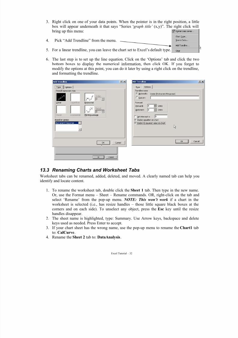
3. Right click on one of your data points. When the pointer is in the right position, a little box will appear underneath it that says “Series ‘ graph title’ (x,y)”. The right click will bring up this menu:
4. Pick “Add Trendline” from the menu.
5. For a linear trendline, you can leave the chart set to Excel’s default type.
6. The last step is to set up the line equation. Click on the ‘Options’ tab and click the two bottom boxes to display the numerical information, then click OK. If you forget tomodify the options at this point, you can do it later by using a right click on the trendline,and formatting the trendline.
13.3 Renaming Charts and Worksheet Tabs
Worksheet tabs can be renamed, added, deleted, and moved. A clearly named tab can help youidentify and locate content.
1. To rename the worksheet tab, double click the Sheet 1 tab. Then type in the new name.Or, use the Format menu – Sheet – Rename commands. OR, right-click on the tab andselect ‘Rename’ from the pop-up menu. NOTE: This won’t work if a chart in theworksheet is selected (i.e., has resize handles – those little square black boxes at the
corners and on each side). To unselect any object, press the Esc key until the resizehandles disappear.
2. The sheet name is highlighted, type: Summary. Use Arrow keys, backspace and deletekeys used as needed. Press Enter to accept.
3. If your chart sheet has the wrong name, use the pop-up menu to rename the Chart1 tabto: CalCurve.
4. Rename the Sheet 2 tab to: DataAnalysis.
7/15/2019 Excel Tutorial
http://slidepdf.com/reader/full/excel-tutorial-5633837587fa6 33/52
Excel Tutorial – 33
5. Move the three sheets so that Summary is the first worksheet, followed byDataAnalysis, CalCurve, and Regression. You can do this by using the pop-up menuoption Move or Copy… or click and drag the sheets to their correct positions:
13.4 Common Charting ErrorsIf you missed any of the steps in the above, you can still add the proper formatting to your graph.
13.4.a Add a Chart Title
1. Use the Chart menu to add the title. Click Chart – Chart Options... to open the ChartOptions dialog. If your menu items are all ‘greyed out’, then you have accidentallyselected an object in the chart. Press Esc key two or three times, then go back to Chart – Chart Options. You should be able to use the menu items now.
2. In the Titles tab, click in the Chart Title field3. Enter a chart title, type: Calibration Curve for Zinc Analysis by Atomic Absorption
Spectroscopy. Click OK. The title is added
Let’s try the pop-up menu to see how that works:1. To delete the title just added, select the title and press Delete .2. Now anywhere in the chart area (the white space where there the chart objects have been
placed, but do not click any of the objects, e.g. legend, plot area).3. With the cursor in the chart area, right mouse click for the pop-up menu.4. Select Chart Options... to open the Chart Options dialog.5. Re-do steps 4, 5, 6 above to add the title again.
The ‘adding a chart title’ exercise shows you have different ways to accomplish the same task. Inyour daily use, use the method you find most convenient to use.
The menus can be accessed by using the keyboard (no mouse required). Use Alt + the menuunderlined letter (hold down Alt and press the letter) For example Alt + C will drop down theChart menu.
• Use the ↓↑ to move through the options and Enter to select the option or just press the
underlined letter to select one of the listed submenu options.
• In dialogs use→←to select any tabs. The Tab key moves through the available
options and buttons.
• If you get stuck anywhere, use the Esc key to get out.
13.4.b Add Regression Equations to Graph
1. Right click on the Trendline – a box under the pointer will indicate when it is ‘on’ thetrendline.
2. Choose Format Trendline from the popup menu.
7/15/2019 Excel Tutorial
http://slidepdf.com/reader/full/excel-tutorial-5633837587fa6 34/52
Excel Tutorial – 34
3. The next menu has three tabs; the first tab is for changing the properties of the line. Thenext two tabs are the same as those described above in section 13.2. Follow steps five andsix.
Save your worksheet onto your diskette.
14 Printing
14.1 What will Excel Print
The following is a general discussion about how Excel prints stuff. Don’t print anything until
you get to section 15.4. When a worksheet is printed, Excel prints only the filled-in cells and any blank cells in between.If you do not want to print an entire worksheet, but only a portion, then:
• Select the cells to be printed (click and drag), then
• From the File menu – Print Area – select Set Print Area
• This print area will automatically expand and contract if rows or columns with cells inthis area are inserted or deleted.
• If you add any data outside this set area, it will not be included in the printout. To resizethe selected area you must clear, select the cells, and set the print area again.
• To clear a print area, select the sheet and select Clear Area
For this assignment:1. Set the Print Area of the Data Analysis sheet to include A1:I42. Note that you can set aseparate print area for each sheet.2. Set the Print Area of the Summary Sheet to include A1:F20.
It can be very useful to know the contents of the formulas, rather than just the final result. Thisoption is set for an individual spreadsheet, not for the entire workbook. In order to make thiseasy for you and your marker, start by making a copy of the Data Analysis sheet. Click on Editand choose Move or Copy Sheet, check the ‘make a copy’ box, Select: (move to end). This will put a copy of the Data Analysis sheet after the Regression sheet. Your workbook sheets willnow look like:
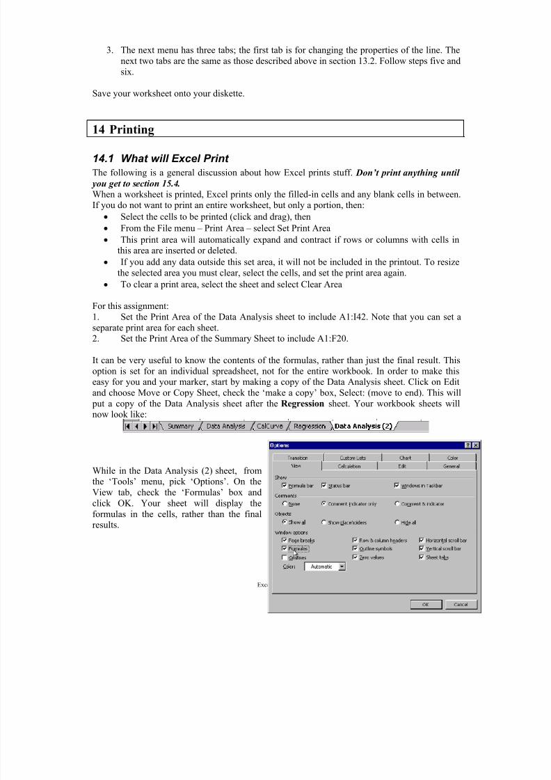
While in the Data Analysis (2) sheet, from
the ‘Tools’ menu, pick ‘Options’. On theView tab, check the ‘Formulas’ box andclick OK. Your sheet will display theformulas in the cells, rather than the finalresults.
7/15/2019 Excel Tutorial
http://slidepdf.com/reader/full/excel-tutorial-5633837587fa6 35/52
Excel Tutorial – 35
Select cells A1 to E21 and set the print area. Then change the column widths so that the area willfit on one sheet of paper.
Save your workbook again. You can now use this workbook as a reference for future lab data.
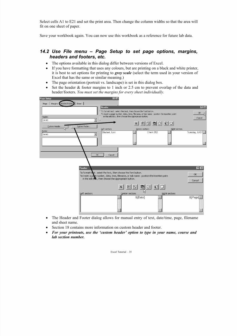
14.2 Use File menu – Page Setup to set page options, margins,headers and footers, etc.
• The options available in this dialog differ between versions of Excel.
• If you have formatting that uses any colours, but are printing on a black and white printer,it is best to set options for printing to grey scale (select the term used in your version of Excel that has the same or similar meaning.)
• The page orientation (portrait vs. landscape) is set in this dialog box.
• Set the header & footer margins to 1 inch or 2.5 cm to prevent overlap of the data andheader/footers. You must set the margins for every sheet individually.
• The Header and Footer dialog allows for manual entry of text, date/time, page, filenameand sheet name.
• Section 18 contains more information on custom header and footer.
• For your printouts, use the ‘custom header’ option to type in your name, course and
lab section number.
7/15/2019 Excel Tutorial
http://slidepdf.com/reader/full/excel-tutorial-5633837587fa6 36/52
Excel Tutorial – 36
Now set the footer to display the date in the center section by clicking on the little ‘calender’
button. This will insert a ‘field’ that will always display the current date. Move to the ‘rightsection’ box and insert the page number field (button with a # on it). Your footer should look
like the one above before you click OK.
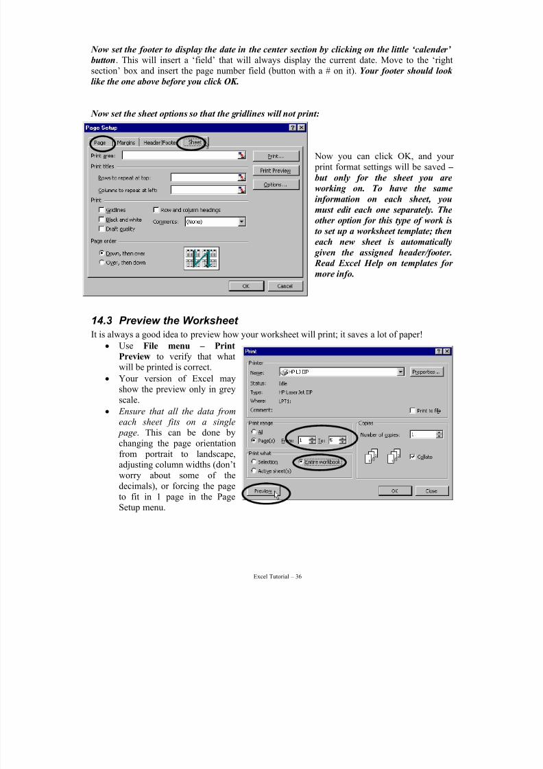
Now set the sheet options so that the gridlines will not print:
Now you can click OK, and your print format settings will be saved –
but only for the sheet you are
working on. To have the same
information on each sheet, you
must edit each one separately. The
other option for this type of work is
to set up a worksheet template; then
each new sheet is automatically
given the assigned header/footer.
Read Excel Help on templates for
more info.
14.3 Preview the Worksheet
It is always a good idea to preview how your worksheet will print; it saves a lot of paper!
• Use File menu – Print
Preview to verify that whatwill be printed is correct.
• Your version of Excel mayshow the preview only in greyscale.
• Ensure that all the data fromeach sheet fits on a single
page. This can be done bychanging the page orientationfrom portrait to landscape,adjusting column widths (don’t
worry about some of thedecimals), or forcing the pageto fit in 1 page in the PageSetup menu.
7/15/2019 Excel Tutorial
http://slidepdf.com/reader/full/excel-tutorial-5633837587fa6 37/52
Excel Tutorial – 37
14.4 Printing the Worksheet
• Do not use the printer button on the toolbar . This prints one copy to the last used printer with the last used settings. This is not always what is wanted, so…
Use File menu – Print to print. The options available in this dialog differ between versions of Excel. The available printer properties is dependent upon the make and model you will be usingto print. Different printers have different features and capabilities available.
By default Excel prints only the current sheet unless another option is selected; so, to print allyour sheets, you will need to set ‘Print What’ to ‘Entire Workbook”. You will be printing all 5
pages. Preview the workbook and make sure that all the pages you need will be printed!
15 Ending Your SessionShut down Excel and follow any additional shut down instructions.
1. From the File menu select Exit2. When Excel asks if you want to save your changes, select Yes.3. Any message about data on the clipboard can be ignored.
Staple and hand in your printed worksheets and charts to your instructor; if only one sheet hasthe header/footer information on it, put that sheet at the beginning of the pile.
16 Exercise for Next Week
Your assignment for next week is to fill in the empty columns from C4:E21, and D28:I42 of theData Analysis sheet. You will need information from other parts of the spreadsheet.
1. The solution concentration is determined from the linear regression equation you preparedin week 1. Rearrange this equation to solve for x and input this equation into the appropriate
column. Have Excel calculate the concentrations for you! (You do not have enough informationto calculate the sample concentration for the method blank.)
2. Adjust the columns to display the correct number of decimal places based on your uncertainty. Assume the uncertainty is the standard deviation. Standard deviations should never have more than 2 sig figs. Check the statistics appendix for more detail.
3. On a separate page, write out the formulas used in each column in conventional chemistrynotation (i.e., not with cell addresses etc.). Show cancellation of units.
7/15/2019 Excel Tutorial
http://slidepdf.com/reader/full/excel-tutorial-5633837587fa6 38/52
Excel Tutorial – 38
17 Formatting the Worksheet (optional)
Start this section by opening the Inform.xls worksheet again.
In all worksheets, entering labels, formulas and functions, and data to work with is the mostimportant task. After all if that is not accurate, what we will do in the rest of these instructions
will only make incorrect information look pretty.
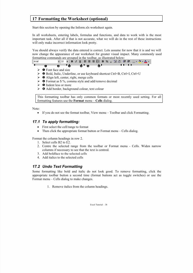
You should always verify the data entered is correct. Lets assume for now that it is and we willnow change the appearance of our worksheet for greater visual impact. Many commonly usedformatting commands are grouped in the toolbar, as illustrated below:
n o p q r s ¾ n Font face and size¾ o Bold, Italic, Underline, or use keyboard shortcut Ctrl+B, Ctrl+I, Ctrl+U¾ p Align left, center, right, merge cells¾ q Format as $ %, comma style and add/remove decimal
¾ r Indent less or more¾ s Add border, background colour, text colour
This formatting toolbar has only common formats or most recently used setting. For allformatting features use the Format menu – Cells dialog.
Note:
• If you do not see the format toolbar, View menu – Toolbar and click Formatting.
17.1 To apply formatting:
• First select the cell/range to format• Then click the appropriate format button or Format menu – Cells dialog.
Format the column headings in row 2.1. Select cells B2 to E2.2. Centre the selected range from the toolbar or Format menu - Cells. Widen narrow
columns if necessary to see that the text is centred.3. Add boldface to the selected cells4. Add italics to the selected cells
17.2 Undo Text Formatting Some formatting like bold and italic do not look good. To remove formatting, click theappropriate toolbar button a second time (format buttons act as toggle switches) or use theFormat menu – Cells dialog to make changes.
1. Remove italics from the column headings.
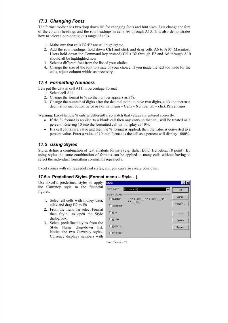
7/15/2019 Excel Tutorial
http://slidepdf.com/reader/full/excel-tutorial-5633837587fa6 39/52
Excel Tutorial – 39
17.3 Changing Fonts
The format toolbar has two drop down list for changing fonts and font sizes. Lets change the fontof the column headings and the row headings in cells A6 through A10. This also demonstrateshow to select a non-contiguous range of cells.
1. Make sure that cells B2:E2 are still highlighted.
2. Add the row headings, hold down Ctrl and click and drag cells A6 to A10 (MacintoshUsers hold down the Command key instead) Cells B2 through E2 and A6 through A10should all be highlighted now.
3. Select a different font from the list of your choice.4. Change the size of the font to a size of your choice. If you made the text too wide for the
cells, adjust column widths as necessary.
17.4 Formatting Numbers
Lets put the data in cell A11 in percentage Format1. Select cell A11
2. Change the format to % so the number appears as 7%.3. Change the number of digits after the decimal point to have two digits, click the increasedecimal format button twice or Format menu – Cells – Number tab – click Percentages.
Warning: Excel handle % entries differently, so watch that values are entered correctly.
• If the % format is applied to a blank cell then any entry to that cell will be treated as a percent. Entering 10 into the formatted cell will display as 10%.
• If a cell contains a value and then the % format is applied, then the value is converted to a percent value. Enter a value of 10 then format as the cell as a percent will display 1000%.
17.5 Using Styles
Styles define a combination of text attribute formats (e.g. Italic, Bold, Helvetica, 18 point). Byusing styles the same combination of formats can be applied to many cells without having toselect the individual formatting commands repeatedly.
Excel comes with some predefined styles, and you can also create your own.
17.5.a Predefined Styles (Format menu – Style…).
Use Excel’s predefined styles to applythe Currency style to the financialfigures.
1. Select all cells with money data,click and drag B2 to E8
2. From the menu bar select Formatthen Style.. to open the Styledialog box.
3. Select predefined styles from theStyle Name drop-down list. Notice the two Currency styles.Currency displays numbers with
7/15/2019 Excel Tutorial
http://slidepdf.com/reader/full/excel-tutorial-5633837587fa6 40/52
Excel Tutorial – 40
two digits after the decimal point. Currency [0] displays the numbers with no digits after the decimal point. The symbols that appear contain the code for special formatting suchas how negative numbers should display.
4. Select the Currency [0] style,5. Apply the style to the selected cells, click OK (or press Enter). The highlighted cells now
display currency without any zeros.
17.5.b Create Your Own Style
Lets create a style. This new style can then be applied to other cells.
1. Select a cell which has the combination of attributes we want, select cell B1.2. From the menu bar select Format then Style.. to open the Style dialog box. The style
name, Normal, is highlighted and cell formatting attributes are listed.3. Give a new name for the style, in the Style Name text box type: Heading.4. Click the Modify button and make any additional changes. Suggestions: add a border,
align the text to an angle, and change font color.5. Save your new style, click OK the style is added and the dialog disappears. (The Add
button allows multiple style changes without closing the Style dialog.)
Lets apply your new style to the row headings in column A.
1. Select cells to be formatted in the new style, click and drag cells A2 through A102. Open the Style dialog box, Format menu - Style...3. From the Style Name drop-down list select your Heading style, Heading4. Apply the Heading style and close the dialog box, click OK. The cells are now formatted
in this style. You can customize this style by making any additional formatting changesdesired.
17.5.c Turn off Style Features
The cells are now formatted in this style. You can customize this style by:
• Before applying the style, uncheck the text attribute that is not needed.
• After applying a style make any additional formatting changes desired as you wouldapply any format. Changes will add to or replace existing formatting.
17.6 Add Rows and Columns
Lets add a title for the entire worksheet above the column headings. There currently is no roomto do this.
To add rows or columns:
• Put the Active Cell in the row (or column) where you want to have a new row (or column) inserted.
• From the Insert menu and select Rows (or Columns).
• Excel inserts a rows (or column) shifting the current row and other rows below this onedown (the current column and columns to the right to the right).
• To insert multiple rows (or columns), select rows (or columns) immediately below (or right) of where you want the new rows (or columns). Select the same number of rows (or columns) as you want to insert
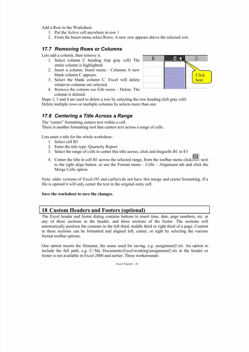
7/15/2019 Excel Tutorial
http://slidepdf.com/reader/full/excel-tutorial-5633837587fa6 41/52
Excel Tutorial – 41
Add a Row to the Worksheet.1. Put the Active cell anywhere in row 12. From the Insert menu select Rows. A new row appears above the selected row.
17.7 Removing Rows or Columns
Lets add a column, then remove it.1. Select column C heading (top gray cell) The
entire column is highlighted.2. Insert a column, Insert menu - Columns A new
blank column C appears.3. Select the blank column C. Excel will delete
whatever columns are selected.4. Remove the column use Edit menu – Delete. The
column is deleted.Steps 1, 3 and 4 are used to delete a row by selecting the row heading (left gray cell)Delete multiple rows or multiple columns by selects more than one.
17.8 Centering a Title Across a Range
The “center” formatting centers text within a cell.There is another formatting tool that centers text across a range of cells.
Lets enter a title for the whole worksheet :1. Select cell B12. Enter the title type: Quarterly Report3. Select the range of cells to center this title across, click and dragcells B1 to E1
4. Center the title in cell B1 across the selected range, from the toolbar menu click nextto the right align button. or use the Format menu – Cells – Alignment tab and click theMerge Cells option.
Note: older versions of Excel (95 and earlier) do not have this merge and center formatting. If afile is opened it will only center the text in the original entry cell.
Save the worksheet to save the changes.
18 Custom Headers and Footers (optional)
The Excel header and footer dialog contains buttons to insert time, date, page numbers, etc. inany of three sections in the header, and three sections of the footer. The sections willautomatically position the contents in the left third, middle third or right third of a page. Contentin these sections can be formatted and aligned left, center, or right by selecting the variousformat toolbar options.
One option inserts the filename, the name used for saving, e.g. assignment2.xls. An option toinclude the full path, e.g. C:\My Documents\Excel\working\assignment2.xls in the header or footer is not available in Excel 2000 and earlier. Three workarounds:
Click here
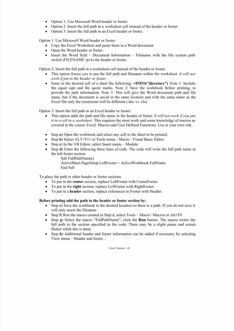
7/15/2019 Excel Tutorial
http://slidepdf.com/reader/full/excel-tutorial-5633837587fa6 42/52
Excel Tutorial – 42
• Option 1: Use Microsoft Word header or footer.
• Option 2: Insert the full path in a worksheet cell instead of the header or footer.
• Option 3: Insert the full path in an Excel header or footer.
Option 1: Use Microsoft Word header or footer.
• Copy the Excel Worksheet and paste them in a Word document.
• Open the Word header or footer.• Insert the Word field – Document Information – Filename with the file system path
switch (FILENAME \p) to the header or footer.
Option 2: Insert the full path in a worksheet cell instead of the header or footer.
• This option forces you to put the full path and filename within the worksheet. It will not work if put in the header or footer.
• Enter in the desired cell of a sheet the following: =INFO("directory") Note 1: Includethe equal sign and the quote marks. Note 2: Save the workbook before printing, to provide the path information. Note 3: This will give the Word document path and filename, but if the document is saved in the same location and with the same name as the
Excel file only the extensions will be different (.doc vs .xls).
Option 3: Insert the full path in an Excel header or footer.
• This option adds the path and file name in the header or footer. It will not work if you put
it in a cell in a worksheet. This requires the most work and some knowledge of macros ascovered in the course Excel: Macros and User Defined Functions. Use at your own risk.
• Step a) Open the workbook and select any cell in the sheet to be printed.
• Step b) Select ALT+F11 or Tools menu - Macro - Visual Basic Editor
• Step c) In the VB Editor, select Insert menu – Module
• Step d) Enter the following three lines of code. The code will write the full path name in
the left footer sectionSub FullPathName()ActiveSheet.PageSetup.LeftFooter = ActiveWorkbook.FullNameEnd Sub
To place the path in other header or footer sections
• To put in the center section, replace LeftFooter with CenterFooter
• To put in the right section, replace LeftFooter with RightFooter
• To put in a header section, replace references to Footer with Header.
Before printing add the path to the header or footer section by:
• Step e) Save the workbook to the desired location so there is a path. If you do not save itwill only insert the filename.
• Step f ) Run the macro created in Step d, select Tools – Macro –Macros or Alt+F8
• Step g) Select the macro “FullPathName”, click the Run button. The macro writes thefull path to the section specified in the code. There may be a slight pause and screenflicker while this is done.
• Step h) Additional header and footer information can be added if necessary by selectingView menu – Header and footer…
7/15/2019 Excel Tutorial
http://slidepdf.com/reader/full/excel-tutorial-5633837587fa6 43/52
Excel Tutorial – 43
A number of cautions exist when using Option 3.
• Do not place a “&” in file or folder names, e.g. Tom & Jerry.xls. The & symbol is usedfor the predefined header/footer entries. A & in a path or filename will only confuseExcel.
• If you move the file to a different location, run the macro again to update the path
information.• This option inserts the path into the currently open workbook because it was inserted in
the current VBA project with the filename of the workbook. To have the macro availablefor all workbooks, after step b and before step c click on VBAProject (PERSONAL.xls)so the macro will be available globally.
• Perhaps versions of Excel after 2000 will make this process easier. Until it is available choosefrom these three methods.
19 Excel Charts (optional)
19.1 Drawing Tools Enhance Charts
Add an arrow or circle a section of a chart to visually point out some particular piece of information. To do this we will use the arrow and oval tools on the Drawing toolbar.
Note: If the chart position is moved or the chart is rotated any drawing objects added must bemanually repositioned, as they are not part of the chart.
1. If the Drawing Toolbar is not displayed, select View menu – Toolbars – Drawing2. Add an arrow to the chart Click the arrow button (between the line and rectangle)3. Draw the arrow, click and drag the cursor on the chart itself.4. Release the mouse button to place the arrow.5. Resize and reposition as needed by click and drag a resize handle at either end (the cursor
is a double-headed cursor), or click an drag on the shaft of the arrow to move it to another position (the cursor is a four-headed cursor).
6. Additional formatting can be made to the arrow by selecting the format drawing buttonson the right end. Not all are available and cannot be selected.
7. Add a circle to the chart Click the oval button.8. Hold down either Shift key and click and drag the cursor on the chart itself to draw the
circle. (Without the shift key this tool draws ovals.9. Release the mouse button to place the circle.
10. The circle hides part of the chart because the inside of the circle is coloured. Click the FillColor list button (the small triangle on the right side of the paint bucket) and select “NoFill”
11. Resize, reposition and additional formatting are the same as steps 5 and 6.
To remove a Drawing object :
Click the object (resize handles show) then press Deleteµ
7/15/2019 Excel Tutorial
http://slidepdf.com/reader/full/excel-tutorial-5633837587fa6 44/52
Excel Tutorial – 44
19.2 Excel Chart Types
This section lists the 14 basic charts types found in Excel 2000. Each chart type has varioussubtypes to choose from. Note: The number of chart types and subtypes available may differ inolder versions of Excel e.g. Windows 2, 6/95, 97, or Macintosh 98 versions.
The type of chart used can help a person to understand what the data represents. The following
lists charts and when to use/avoid them for presenting different types of data.
Chart types can be mixed to create combination charts (such as a column and line plotted with 2value axes). Before making an elaborate chart, always ask, “Does the chart clearly communicatethe data?” If it does not then the purpose of using a chart is defeated.
Naming axes, plotting charts, and how to add bubble and legend labels are covered next
19.3 Naming the Axis
The Excel Chart Wizard and Help screens label the axes as category, value, and series, instead of
x-, y-, and z-axes. Most charts have a category axis and a value axis.
The category axis displays text labels, such as months or years, regions or cities, or item names.The category axis is usually the horizontal or X-axis. For some charts, such as in a bar chart, thecategory axis is the vertical axis.
The value axis always displays numerical data, such as currency amounts, quantity, percents,temperature, etc.
The series axis is added to some 3D chart types. The series axis placement often depends on theviewing angle of the chart.
19.4 How Charts are Plotted
Worksheet column data is not always plotted as the chart categories, and worksheet row data isnot always plotted as the chart series. It is the number of rows and columns of data selected thatdictates how data is plotted in an Excel chart:
• If the number of columns selected >= the number of rows then Excel plots the data inthe rows. The category axis uses column headings, and the row headings become thelegend labels designating the data series.
• If the number of rows selected >= the number of columns then Excel plots the data in
the columns. The category axis uses row headings, and the column headings become thelegend labels designating the data series. The Chart Wizard Step 2 allows changing Rowor Column series of data to plot. Use Chart menu -- Source Data to change the series of an already plotted chart.
• Watch which series is plotted as plotted by Rows produces a chart with a very differentfocus than one plotted by Columns.
7/15/2019 Excel Tutorial
http://slidepdf.com/reader/full/excel-tutorial-5633837587fa6 45/52
Excel Tutorial – 45
• To avoid plotting a column of data, hide the column in the worksheet and the chartautomatically adjusts to plot only the visible cells. Hide worksheet columns: select thecolumn heading letters and select from the Format menu, Columns, Hide. Unhide thehidden columns to update a plotted chart with this new data.
19.5 Add text labels to the bubbles or legend
The Chart Wizard does not have a direct method to add labels to some charts. Bubble charts areused for illustration, but these methods can be applied for others charts as well. Here are threeworkarounds:
Method 1
• Add label names in cells adjacent to the x-axis values (the first set of values).
• Select the chart.
• From the Chart menu select Source Data.
• On the Series tab, select the x-axis box.
• Fill it with cell address containing the labels and the x-axis values. Click OK.
Advantage: Labels appear in the legend along with the bubble colour.Disadvantage: Lose values along x-axis and bubbles do not show a concentration, they areevenly spaced along the axis.
Method 2
• Manually create text boxes for each label.
• Create one then copy and paste. Then edit the text for each addition label.
• Use the Draw toolbar group and alignment tools.Advantage: Retains values along x-axis and the concentration of the bubbles.
Can position the text boxes where you want them.Disadvantage: Have to manually create, position, and maintain the text boxes.
Method 3
• Right-click and select Format Data Series. Click the Data Labels tab.
• Apply any one of the data label options (it will be changed in the last two steps).
• Position as necessary and Click OK.
• Select one of the labels (selection handles appear around all data labels).
• Click one individual label (selection handles appear around only this label)
• Click in the Formula Bar.
• Type = and add the cell address containing the label to apply, e.g. =E1.Advantage: Change the cell contents changes the label.Disadvantage: The additional steps required and creating the cell reference formula.
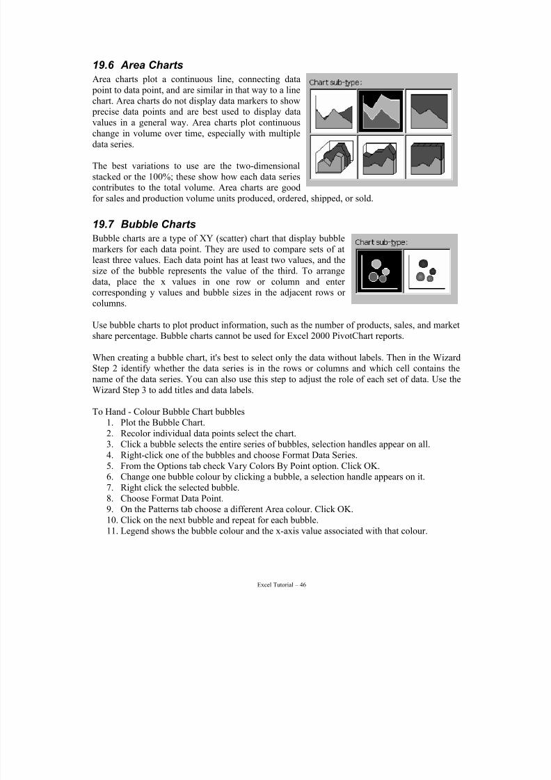
7/15/2019 Excel Tutorial
http://slidepdf.com/reader/full/excel-tutorial-5633837587fa6 46/52
Excel Tutorial – 46
19.6 Area Charts
Area charts plot a continuous line, connecting data point to data point, and are similar in that way to a linechart. Area charts do not display data markers to show precise data points and are best used to display data
values in a general way. Area charts plot continuouschange in volume over time, especially with multipledata series.
The best variations to use are the two-dimensionalstacked or the 100%; these show how each data seriescontributes to the total volume. Area charts are goodfor sales and production volume units produced, ordered, shipped, or sold.
19.7 Bubble Charts
Bubble charts are a type of XY (scatter) chart that display bubblemarkers for each data point. They are used to compare sets of atleast three values. Each data point has at least two values, and thesize of the bubble represents the value of the third. To arrangedata, place the x values in one row or column and enter corresponding y values and bubble sizes in the adjacent rows or columns.
Use bubble charts to plot product information, such as the number of products, sales, and marketshare percentage. Bubble charts cannot be used for Excel 2000 PivotChart reports.
When creating a bubble chart, it's best to select only the data without labels. Then in the WizardStep 2 identify whether the data series is in the rows or columns and which cell contains thename of the data series. You can also use this step to adjust the role of each set of data. Use theWizard Step 3 to add titles and data labels.
To Hand - Colour Bubble Chart bubbles1. Plot the Bubble Chart.2. Recolor individual data points select the chart.3. Click a bubble selects the entire series of bubbles, selection handles appear on all.4. Right-click one of the bubbles and choose Format Data Series.5. From the Options tab check Vary Colors By Point option. Click OK.
6. Change one bubble colour by clicking a bubble, a selection handle appears on it.7. Right click the selected bubble.8. Choose Format Data Point.9. On the Patterns tab choose a different Area colour. Click OK.10. Click on the next bubble and repeat for each bubble.11. Legend shows the bubble colour and the x-axis value associated with that colour.
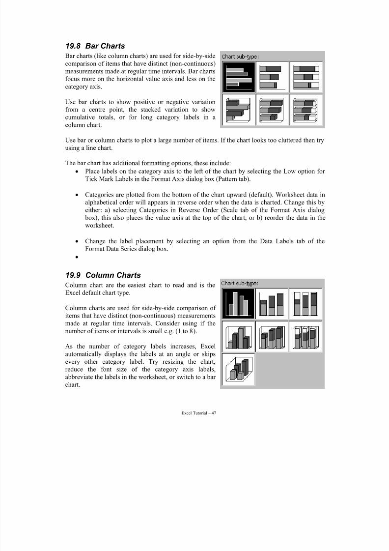
7/15/2019 Excel Tutorial
http://slidepdf.com/reader/full/excel-tutorial-5633837587fa6 47/52
Excel Tutorial – 47
19.8 Bar Charts
Bar charts (like column charts) are used for side-by-sidecomparison of items that have distinct (non-continuous)measurements made at regular time intervals. Bar chartsfocus more on the horizontal value axis and less on the
category axis.
Use bar charts to show positive or negative variationfrom a centre point, the stacked variation to showcumulative totals, or for long category labels in acolumn chart.
Use bar or column charts to plot a large number of items. If the chart looks too cluttered then tryusing a line chart.
The bar chart has additional formatting options, these include:
• Place labels on the category axis to the left of the chart by selecting the Low option for Tick Mark Labels in the Format Axis dialog box (Pattern tab).
• Categories are plotted from the bottom of the chart upward (default). Worksheet data inalphabetical order will appears in reverse order when the data is charted. Change this byeither: a) selecting Categories in Reverse Order (Scale tab of the Format Axis dialog box), this also places the value axis at the top of the chart, or b) reorder the data in theworksheet.
• Change the label placement by selecting an option from the Data Labels tab of theFormat Data Series dialog box.
•
19.9 Column Charts
Column chart are the easiest chart to read and is theExcel default chart type.
Column charts are used for side-by-side comparison of items that have distinct (non-continuous) measurementsmade at regular time intervals. Consider using if thenumber of items or intervals is small e.g. (1 to 8).
As the number of category labels increases, Excelautomatically displays the labels at an angle or skipsevery other category label. Try resizing the chart,reduce the font size of the category axis labels,abbreviate the labels in the worksheet, or switch to a bar chart.
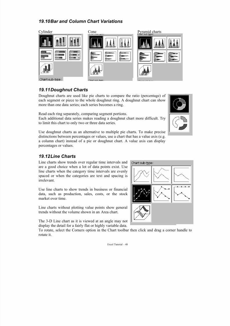
7/15/2019 Excel Tutorial
http://slidepdf.com/reader/full/excel-tutorial-5633837587fa6 48/52
Excel Tutorial – 48
19.10 Bar and Column Chart Variations
Cylinder Cone Pyramid charts
19.11 Doughnut Charts
Doughnut charts are used like pie charts to compare the ratio (percentage) of
each segment or piece to the whole doughnut ring. A doughnut chart can showmore than one data series; each series becomes a ring.
Read each ring separately, comparing segment portions.Each additional data series makes reading a doughnut chart more difficult. Tryto limit this chart to only two or three data series.
Use doughnut charts as an alternative to multiple pie charts. To make precisedistinctions between percentages or values, use a chart that has a value axis (e.g.a column chart) instead of a pie or doughnut chart. A value axis can display percentages or values.
19.12 Line Charts
Line charts show trends over regular time intervals andare a good choice when a lot of data points exist. Useline charts when the category time intervals are evenlyspaced or when the categories are text and spacing isirrelevant.
Use line charts to show trends in business or financialdata, such as production, sales, costs, or the stock market over time.
Line charts without plotting value points show generaltrends without the volume shown in an Area chart.
The 3-D Line chart as it is viewed at an angle may notdisplay the detail for a fairly flat or highly variable data.To rotate, select the Corners option in the Chart toolbar then click and drag a corner handle torotate it.
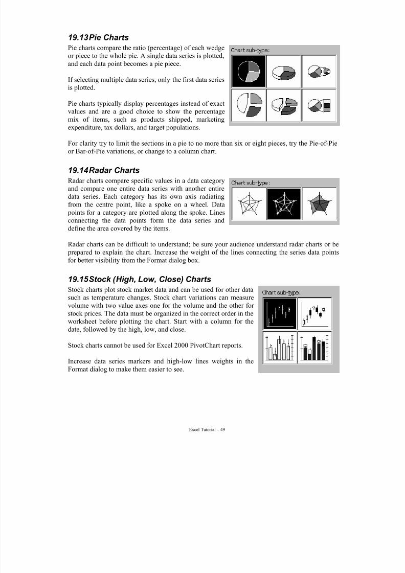
7/15/2019 Excel Tutorial
http://slidepdf.com/reader/full/excel-tutorial-5633837587fa6 49/52
Excel Tutorial – 49
19.13 Pie Charts
Pie charts compare the ratio (percentage) of each wedgeor piece to the whole pie. A single data series is plotted,and each data point becomes a pie piece.
If selecting multiple data series, only the first data series
is plotted.
Pie charts typically display percentages instead of exactvalues and are a good choice to show the percentagemix of items, such as products shipped, marketingexpenditure, tax dollars, and target populations.
For clarity try to limit the sections in a pie to no more than six or eight pieces, try the Pie-of-Pieor Bar-of-Pie variations, or change to a column chart.
19.14 Radar Charts
Radar charts compare specific values in a data categoryand compare one entire data series with another entiredata series. Each category has its own axis radiatingfrom the centre point, like a spoke on a wheel. Data points for a category are plotted along the spoke. Linesconnecting the data points form the data series anddefine the area covered by the items.
Radar charts can be difficult to understand; be sure your audience understand radar charts or be prepared to explain the chart. Increase the weight of the lines connecting the series data pointsfor better visibility from the Format dialog box.
19.15 Stock (High, Low, Close) Charts
Stock charts plot stock market data and can be used for other datasuch as temperature changes. Stock chart variations can measurevolume with two value axes one for the volume and the other for stock prices. The data must be organized in the correct order in theworksheet before plotting the chart. Start with a column for thedate, followed by the high, low, and close.
Stock charts cannot be used for Excel 2000 PivotChart reports.
Increase data series markers and high-low lines weights in theFormat dialog to make them easier to see.
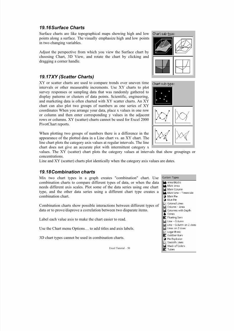
7/15/2019 Excel Tutorial
http://slidepdf.com/reader/full/excel-tutorial-5633837587fa6 50/52
Excel Tutorial – 50
19.16 Surface Charts
Surface charts are like topographical maps showing high and low points along a surface. The visually emphasize high and low pointsin two changing variables.
Adjust the perspective from which you view the Surface chart bychoosing Chart, 3D View, and rotate the chart by clicking anddragging a corner handle.
19.17 XY (Scatter Charts)
XY or scatter charts are used to compare trends over uneven timeintervals or other measurable increments. Use XY charts to plotsurvey responses or sampling data that was randomly gathered todisplay patterns or clusters of data points. Scientific, engineering,
and marketing data is often charted with XY scatter charts. An XYchart can also plot two groups of numbers as one series of XYcoordinates When you arrange your data, place x values in one rowor column and then enter corresponding y values in the adjacentrows or columns. XY (scatter) charts cannot be used for Excel 2000PivotChart reports.
When plotting two groups of numbers there is a difference in theappearance of the plotted data in a Line chart vs. an XY chart. Theline chart plots the category axis values at regular intervals. The linechart does not give an accurate plot with intermittent category x
values. The XY (scatter) chart plots the category values at intervals that show groupings or concentrations.Line and XY (scatter) charts plot identically when the category axis values are dates.
19.18 Combination charts
Mix two chart types in a graph creates "combination" chart. Usecombination charts to compare different types of data, or when the dataneeds different axis scales. Plot some of the data series using one charttype, and the other data series using a different chart type creates acombination chart.
Combination charts show possible interactions between different types of data or to prove/disprove a correlation between two disparate items.
Label each value axis to make the chart easier to read.
Use the Chart menu Options… to add titles and axis labels.
3D chart types cannot be used in combination charts.
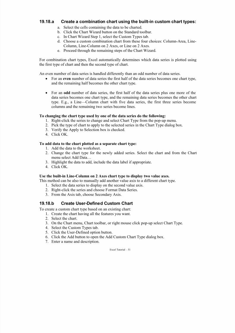
7/15/2019 Excel Tutorial
http://slidepdf.com/reader/full/excel-tutorial-5633837587fa6 51/52
Excel Tutorial – 51
19.18.a Create a combination chart using the built-in custom chart types:
a. Select the cells containing the data to be charted. b. Click the Chart Wizard button on the Standard toolbar.c. In Chart Wizard Step 1, select the Custom Types tab.d. Choose a custom combination chart from these four choices: Column-Area, Line-
Column, Line-Column on 2 Axes, or Line on 2 Axes.
e. Proceed through the remaining steps of the Chart Wizard.
For combination chart types, Excel automatically determines which data series is plotted usingthe first type of chart and then the second type of chart.
An even number of data series is handled differently than an odd number of data series.
• For an even number of data series the first half of the data series becomes one chart type,and the remaining half becomes the other chart type.
• For an odd number of data series, the first half of the data series plus one more of thedata series becomes one chart type, and the remaining data series becomes the other chart
type. E.g., a Line—Column chart with five data series, the first three series becomecolumns and the remaining two series become lines.
To changing the chart type used by one of the data series do the following:
1. Right-click the series to change and select Chart Type from the pop-up menu.2. Pick the type of chart to apply to the selected series in the Chart Type dialog box.3. Verify the Apply to Selection box is checked.4. Click OK.
To add data to the chart plotted as a separate chart type:
1. Add the data to the worksheet.
2. Change the chart type for the newly added series. Select the chart and from the Chartmenu select Add Data…
3. Highlight the data to add, include the data label if appropriate.4. Click OK.
Use the built-in Line-Column on 2 Axes chart type to display two value axes.
This method can be also to manually add another value axis to a different chart type.1. Select the data series to display on the second value axis.2. Right-click the series and choose Format Data Series.3. From the Axis tab, choose Secondary Axis.
19.18.b Create User-Defined Custom ChartTo create a custom chart type based on an existing chart:
1. Create the chart having all the features you want.2. Select the chart.3. On the Chart menu, Chart toolbar, or right mouse click pop-up select Chart Type.4. Select the Custom Types tab.5. Click the User-Defined option button.6. Click the Add button to open the Add Custom Chart Type dialog box.7. Enter a name and description.
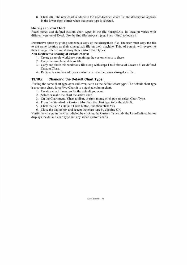
7/15/2019 Excel Tutorial
http://slidepdf.com/reader/full/excel-tutorial-5633837587fa6 52/52
8. Click OK. The new chart is added to the User-Defined chart list, the description appearsin the lower-right corner when that chart type is selected.
Sharing a Custom Chart
Excel stores user-defined custom chart types in the file xlusrgal.xls. Its location varies withdifferent version of Excel. Use the find files program (e.g. Start - Find) to locate it.
Destructive share by giving someone a copy of the xlusrgal.xls file. The user must copy the fileto the same location as their xlusrgal.xls file on their machine. This, of course, will overwritetheir xlusrgal.xls file and destroy their custom chart types.
Non-Destructive sharing of custom charts:
1. Create a sample workbook containing the custom charts to share.2. Copy the sample workbook file.3. Copy and share this workbook file along with steps 1 to 8 above of Create a User-defined
Custom Chart.4. Recipients can then add your custom charts to their own xlusrgal.xls file.
19.18.c Changing the Default Chart Type
If using the same chart type over and over, set it as the default chart type. The default chart typeis a column chart, for a PivotChart it is a stacked column chart.
1. Create a chart it may not be the default you want.2. Select or make the chart the active chart.3. On the Chart menu, Chart toolbar, or right mouse click pop-up select Chart Type.4. From the Standard or Custom tabs click the chart type to be the default.5. Click the Set As Default Chart button, and then click Yes.6. Close the dialog box and accept the chart type by clicking OK
Verify the change in the Chart dialog by clicking the Custom Types tab, the User-Defined buttondisplays the default chart type and any added custom charts.