event driven programming solutions chapter 1
TRANSCRIPT
Programming language
A programming language is an artificial language designed to communicate instructions to a machine, particularly a computer. Programming languages can be used to create programs that control the behavior of a machine and/or to express algorithms precisely.
EVENT DRIVEN PROGRAMMING
In computer programming, event-driven programming or event-based programming is a programming paradigm in which the flow of the program is determined by events—i.e., sensor outputs or user actions (mouse clicks, key presses) or messages from other programs or threads.
Event-driven programming can also be defined as an application architecture technique in which the application has a main loop which is clearly divided down to two sections: the first is event selection (or event detection), and the second is event handling. In embedded systems the same may be achieved using interrupts instead of a constantly running main loop; in that case the former portion of the architecture resides completely in hardware.
Event-driven programs can be written in any language, although the task is easier in languages that provide high-level abstractions, such as closures. Some integrated development environments provide code generation assistants that automate the most repetitive tasks required for event handling.
Features of event driven programming
1. Event
In computing an event is an action that is usually initiated outside the scope of a program and that is handled by a piece of code inside the program. Typically events are handled synchronous with the program flow, that is, the program has one or more dedicated places where events are handled. Typical sources of events include the user (who presses a key on the keyboard, in other words, through a keystroke). Another source is a hardware device such as a timer. A computer program that changes its behavior in response to events is said to be event-driven, often with the goal of being interactive.
Description
Event driven systems are typically used when there is some asynchronous external activity that needs to be handled by a program. For example, a user who presses a button on their mouse. The outside activity causes the event (it fires), some outside hardware and or software will collect data about the event, and when the program signals that it is ready to accept an event, the event will be dispatched to the event handler software that will deal with it.
A program can choose to ignore events, and there may be libraries to dispatch an event to multiple handlers that may be programmed to listen for a particular event. The data associated
with an event at a minimum specifies what type of event it is, but may include other information such as when it occurred, who or what caused it to occur, and extra data provided by the event source to the handler about how the event should be processed.
Events are typically used in user interfaces, where actions in the outside world (mouse clicks, window-resizing, keyboard presses, messages from other programs, etc.) are handled by the program as a series of events. Programs written for many windowing environments consist predominantly of event handlers.
Events can also be used at instruction set level, where they complement interrupts. Compared to interrupts, events are normally handled synchronously: the program explicitly waits for an event to be serviced (typically by calling an instruction that dispatches the next event), whereas an interrupt can demand service at any time.
Typical features of events in event-driven programming
Events are generally referenced, indexed, or named based on an object and the type of action that triggered the event. For example, "icon3_click" or "icon3 - onClick". Thus, they usually have at least two "keys" (in an informal sense).
Often there is an object, parameter set, or dictionary array structure that is passed in as parameter that can be used to find out more about the environment that triggered the event. For example, it may contain the keystroke or mouse coordinates at the time of event triggering.
Events often return a status indicator as to whether the event was successful or not. For example, an "onValidate" event may return True if a form passed validation or False if it did not. Another approach is to return a string or structure containing the error message(s) if there was a problem detected. An alternative is an AddError?() API operation. Not all events need to return results. One approach is to use the same input array/map (see above) as the output array. Thus, return codes, error messages, and log/trace messages (for debugging) could be returned without creating new variables. (Key names are reserved for them.) There is no risk of it "wrecking" existing items in the array because the input items are not reused. See example "Linda" below.
Events can often "talk" to a declarative state framework and/or database. For example, in a GUI an event may be able to change the colors or text of an input box not related to the event.
Events are generally treated as small procedural modules. Ideally multiple (local) functions are allowed in events, but some systems don't allow multiple routines per event unless calling shared libraries. Generally, a language like Pascal that allows nested functions simplifies scoping issues.
Some rules usually need to be set about which event has priority if multiple events are triggered at the same time. For example, both a form and a widget may have an "onKeystroke" event. Sometimes priorities can be set on individual events, other times the framework lays out the rules and cannot be directly changed.
Generally all pending events are processed before user input is sampled for the next set of events. Any user input happening during event processing is put in a queue. When all pending events are processed, the input queue is then again processed, resulting in
perhaps further events. (An API may perhaps allow one to clear the input buffer from an event.)
Events are often allowed to trigger other events through an API. One must be careful to avoid infinite looping however (see below). One approach is to simply call another event. Another is to put "dummy" user input actions into the input queue that will trigger events.
Similarly, events may be able to "cut off" any pending (queued) events. This may be done by setting a flag on the return structure/object, or returning a special error code.
A mechanism may be needed to prevent recursive or continuous looping of the same event or event set. A "max recur" setting may be needed per event or for the event engine. When all pending events are processed, the counter is reset to zero.
Typical Inputs and Outputs of Events, using a GUI system as an example:
Input o Keyboard key last pressed o Mouse coordinates o Line number and/or token value (for event-driven parsers) o Other prior event indicator/counter (to know if this the only event in the "stack")
Output o Event success or failure (such as validation results) o Error message(s) (may be used instead of status indicator) o Refresh indicator (do we need to refresh the display?) o Attributes specific to event kind or triggering object (noun). o Loggin or debug info (to be written to optional log)
Typical Event Attributes (usually set during design time)
Noun associated with event (such as widget ID) Value of the widget at time of event (if applicable) Action associated with event ("onClick", "onValidate", "onClose", etc.) Priority of event in case multiple events in event stack Maximum occurrences per user action to prevent infinite trigger loops. (May also be
system-wide instead of per event.)
2. EVENT HANDLERS.
An event handler is a subroutine in a computer program or operating system that allows handling of asynchronous hardware and software events using a generalized procedural interface (i.e., a computer software process is initiated). "Events" may be considered a form of input in a computer system (e.g., as a signal of some change of state). Events are typically generated by interrupts from hardware devices, software interrupt instructions, e.g., from the operating system, and computer user interfaces. For example, events may include network interface cards requesting service, the clicking of a mouse, a clock or timer reaching some predetermined time,
the dragging of a scrollbar within a windowing system, or the pressing of a button on a keyboard. Without event handlers, few computers could operate, as even bootstrap loaders are simple forms of event handlers.
Events may first be processed by an event dispatcher within an operating system. An event dispatcher typically manages the associations between events and event handlers, and may queue event handlers or events for later processing. Event dispatchers may call event handlers directly, or wait for events to be dequeued with information about the handler to be executed.
How any particular event handling system functions is highly dependent on the computer hardware, the operating system, the programming language, and the application program's environment. A programmer will need to consult the documentation provided in order to understand exactly how to use an event handling system. Users typically need only know how the interface to applications, windowing systems, and console terminals function.
3. Triggers
A trigger is usually defined as a procedure that is executed when a specific event in a table occurs (such as an insert, delete, or update). Triggers are useful for enforcing business rules throughout a database and applications based on the database. In a client/server database product such as MICROSOFT SQL SERVER and ORACLE, triggers are SQL statements saved at the table level. ACCESS, in contrast, does not support table-level triggers. Instead, business rules in ACCESS applications must be enforced by event-driven procedures attached to form objects.
Delegate event model
A very common and very "programmer-friendly" variant is the delegate event model, which is provided by the most popular graphic frameworks.
Delegate event model. clickme is the event source –a button in this example–, and it contains a list of listeners.
This model is based on three entities:
a control, which is the event source, consumers, also called listeners, that receive the events from the source, interfaces (in the broader meaning of the term) that describe the protocol by which every
event is to be communicated.
Furthermore, the model requires that
every listener must implement the interface for the event it wants to listen to every listener must register with the source to declare its desire to listen to some
particular event every time the source generates an event, it communicates it to the registered listeners,
following the protocol of the interface.
4. Event loop
In computer science, the event loop, message loop or message pump is a programming construct that waits for and dispatches events or messages in a program. It works by polling some internal or external "event provider", which generally blocks until an event has arrived, and then calls the relevant event handler ("dispatches the event"). The event-loop may be used in conjunction with a reactor, if the event provider follows the file interface (which can be select()ed or poll()ed). The event loop almost always operates asynchronously with the message originator.
Message pumps are said to 'pump' messages from the program's message queue (assigned and usually owned by the underlying operating system) into the program for processing. In the strictest sense, an event loop is a tool of inter-process communication. In fact, message processing exists in many systems, and is a kernel-level component of the Mach operating system. The event loop is a specific implementation technique of messaging systems.
5. Listeners
It comprises of the three states:
Normal state Running state Compiling state Executable state
It also takes the form of
Breaking the running state Restarting running state Step-over running state

A description advantages of event driven programming.
There are four main typical uses and advantages of event driven programs, these are as follows –
Flexibility Suitability for graphical interfaces Simplicity of Programming Ease of development portability
In the following article, I am going to describe these things.
Flexibility
Event driven programming is one of the most flexible programming language types. It allows the programmer to visually design the form to their needs and program the objects on the form with a huge range of sevents that can do different things when run. It gives the programmer more control over what they want the program to do when a user does something.
Suitability for graphical interfaces
Because of the graphical way a programmer creates their program in an event driven programming language it is much suited to graphical user interfaces. When programming with an event driven language, the programmer can select different controls such as a command button and place it on the form where necessary. Then with very little code, the button can perform a process when the chosen event is noticed by the program. Event driven programming allows the user to use the program without following any certain routine, they have complete control over what actions they want the program to carry out.
Simplicity of programming
The visual aspect of event driven programming simplifies even the most complex programming tasks. Because the programmer can visually create their program by placing different objects on the form, it saves a lot of time and effort. Event driven programming is great for beginner programmers as it is easy to use. Visual Basic works by letting the programmer place controls anywhere on the form, when the control is selected, the programmer can change properties of the control easily using the properties tab. This allows the programmer to change the look of the control and also the way it works.
Ease of development
Developing a program in an event driven language is easy because of the way the programmer only has to deal with event of one control at a time. This is because all of the controls on a form are programmed independently, even though they will sometimes work together.
Disadvantages
- For simple programs, event driven programming is often more complex and cumbersome than batch programming.- The flow of the program is usually less logical and obvious.
Typical Uses of EDP
Event driven programming is used extensively in the day to day world. There are many machines that run by an event driven system.
Firstly, a cash point would be a good example of event driven programming in everyday life. The machine is constantly searching for a debit or credit card to be inserted to the machine by using an event loop.
Many supermarkets now have self service checkouts where customers can purchase their goods quickly themselves. The machines work by using a touch screen that the customer can select options on and a barcode scanner that the customer uses to scan their products.
Billing machine: The machine asks for the customer’s memory card or CD. The photos are then loaded and the customer selects the images they want to print. When they have chosen all the images they want to print, and confirm it, the machine begins another piece of code to start the printer of the machine. When the printer starts, the machine also displays the cost of the photos and where to pay.
A vending machine is a simple machine that could be programmed using event driven programming. It works by waiting for money to be inserted to the machine, only when there is money present will the machine work. Once the money has been inserted, it allows the user to select a drink or item of food they want to purchase. When a button is pressed to dispense a drink, this starts an event handler witch dispenses the corresponding item.
Event driven programming languages
Visual basic 6 Visual studio.net C#.net J#.net
Visual Basic (VB)It is an ideal programming language for developing sophisticated professional applications for Microsoft Windows. It makes use of Graphical User Interface for creating robust and powerful applications. The Graphical User Interface as the name suggests, uses illustrations for text, which enable users to interact with an application. This feature makes it easier to comprehend things in a quicker and easier way.
Control 1
Control 3
Control 2
Form 2 (.FRM)
Control 1
Control 3
Control 2
Form 3 (.FRM) Module 1 (.BAS)
Coding in GUI environment is quite a transition to traditional, linear programming methods where the user is guided through a linear path of execution and is limited to small set of operations. In GUI environment, the number of options open to the user is much greater, allowing more freedom to the user and developer. Features such as easier comprehension, user-friendliness, faster application development and many other aspects such as introduction to ActiveX technology and Internet features make Visual Basic an interesting tool to work with.
Visual Basic (VB) was developed from the BASIC programming language. In the 1970s, Microsoft started developing ROM-based interpreted BASIC for the early microprocessor-based computers. In 1982, Microsoft QuickBasic revolutionized Basic and was legitimized as a serious development language for MS-DOS environment. Later on, Microsoft Corporation created the enhanced version of BASIC called Visual Basic for Windows.
Visual Basic (VB) is an event-driven programming language. This is called because programming is done in a graphical environment unlike the previous version BASIC where programming is done in a text only environment and executed sequentially in order to control the user interface. Visual Basic enables the user to design the user interface quickly by drawing and arranging the user elements. Due to this spent time is saved for the repetitive task.
Important Features of Visual Basic (VB)
Full set of objects - you 'draw' the application Lots of icons and pictures for your use Response to mouse and keyboard actions Clipboard and printer access Full array of mathematical, string handling, and graphics functions Can handle fixed and dynamic variable and control arrays Sequential and random access file support Useful debugger and error-handling facilities Powerful database access tools ActiveX support Package & Deployment Wizard makes distributing your applications simple
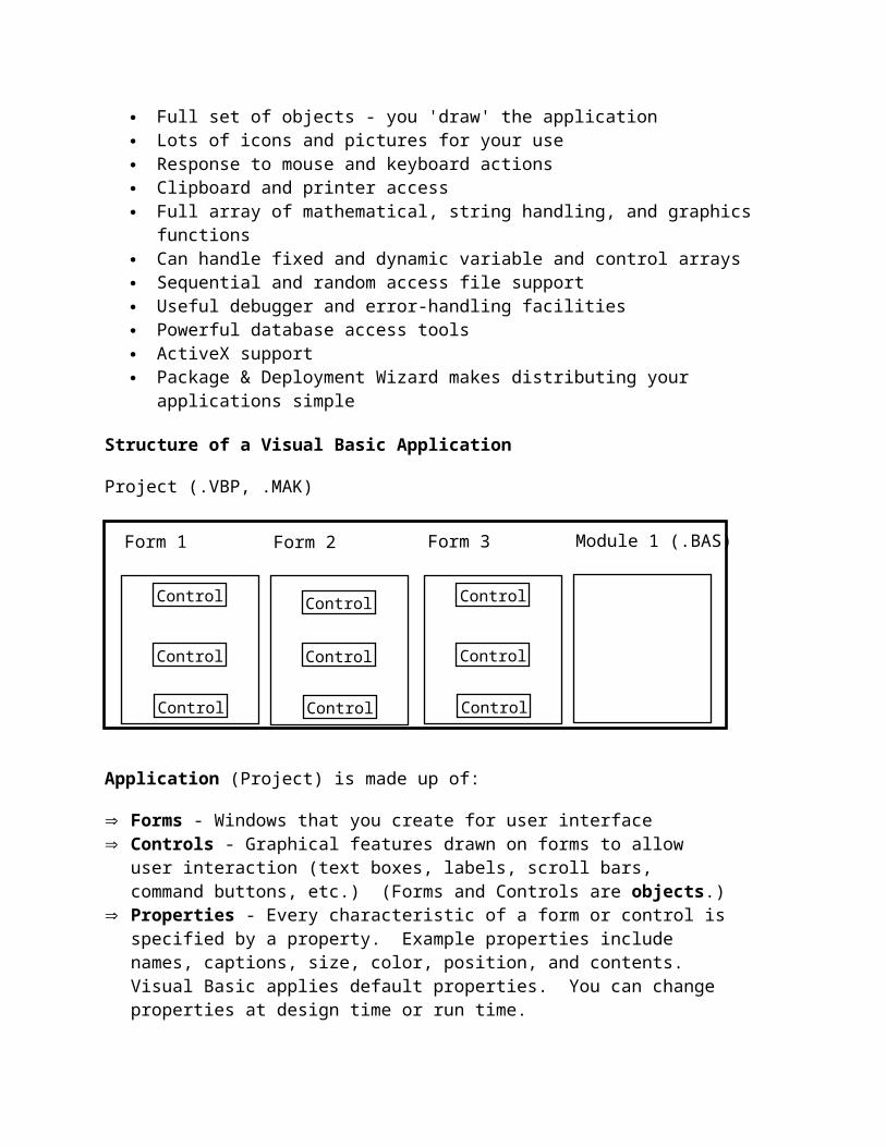
Structure of a Visual Basic Application
Project (.VBP, .MAK)
Control 1
Control 3
Control 2
Form 1 (.FRM)
Application (Project) is made up of:
Forms - Windows that you create for user interface Controls - Graphical features drawn on forms to allow user interaction (text boxes,
labels, scroll bars, command buttons, etc.) (Forms and Controls are objects.) Properties - Every characteristic of a form or control is specified by a property.
Example properties include names, captions, size, color, position, and contents. Visual Basic applies default properties. You can change properties at design time or run time.
Methods - Built-in procedure that can be invoked to impart some action to a particular object.
Event Procedures - Code related to some object. This is the code that is executed when a certain event occurs.
General Procedures - Code not related to objects. This code must be invoked by the application.
Modules - Collection of general procedures, variable declarations, and constant definitions used by application.
Steps in Developing Application
There are three primary steps involved in building a Visual Basic application:1. Draw the user interface2. Assign properties to controls3. Attach code to controls
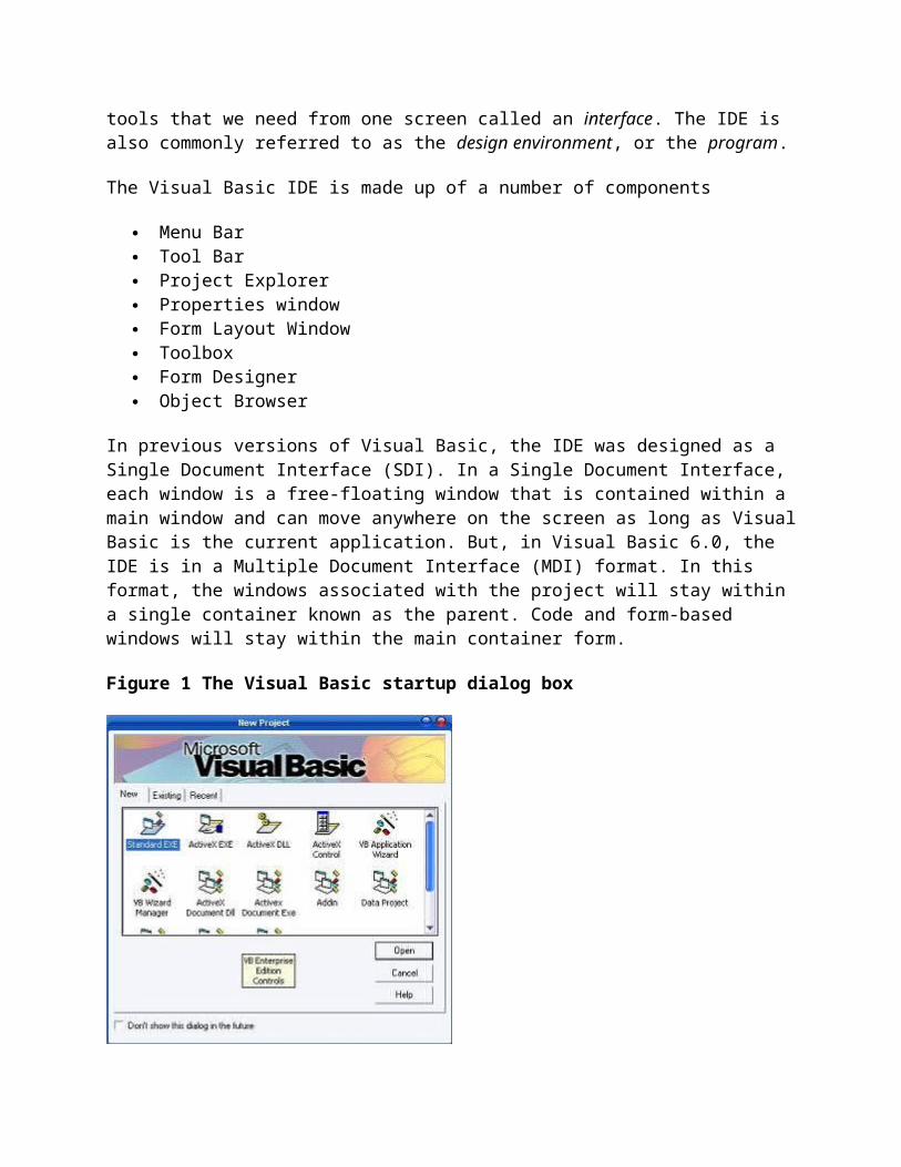
Getting Started with Visual Basic 6.0Visual Basic is initiated by using the Programs option > Microsoft Visual Basic 6.0 > Visual Basic 6.0. Clicking the Visual Basic icon, we can view a copyright screen enlisting the details of the license holder of the copy of Visual Basic 6.0. Then it opens in to a new screen as shown in figure 1 below, with the interface elements Such as MenuBar, ToolBar, The New Project dialog box. These elements permit the user to buid different types of Visual Basic applications.
The Integrated Development Environment
One of the most significant changes in Visual Basic 6.0 is the Integrated Development Environment (IDE). IDE is a term commonly used in the programming world to describe the interface and environment that we use to create our applications. It is called integrated because we can access virtually all of the development tools that we need from one screen called an interface. The IDE is also commonly referred to as the design environment, or the program.
The Visual Basic IDE is made up of a number of components
Menu Bar Tool Bar Project Explorer Properties window Form Layout Window Toolbox Form Designer Object Browser
In previous versions of Visual Basic, the IDE was designed as a Single Document Interface (SDI). In a Single Document Interface, each window is a free-floating window that is contained within a main window and can move anywhere on the screen as long as Visual Basic is the current application. But, in Visual Basic 6.0, the IDE is in a Multiple Document Interface (MDI) format. In this format, the windows associated with the project will stay within a single container known as the parent. Code and form-based windows will stay within the main container form.
Figure 1 The Visual Basic startup dialog box
Menu Bar
This Menu Bar displays the commands that are required to build an application. The main menu items have sub menu items that can be chosen when needed. The toolbars in the menu bar provide quick access to the commonly used commands and a button in the toolbar is clicked once to carry out the action represented by it.
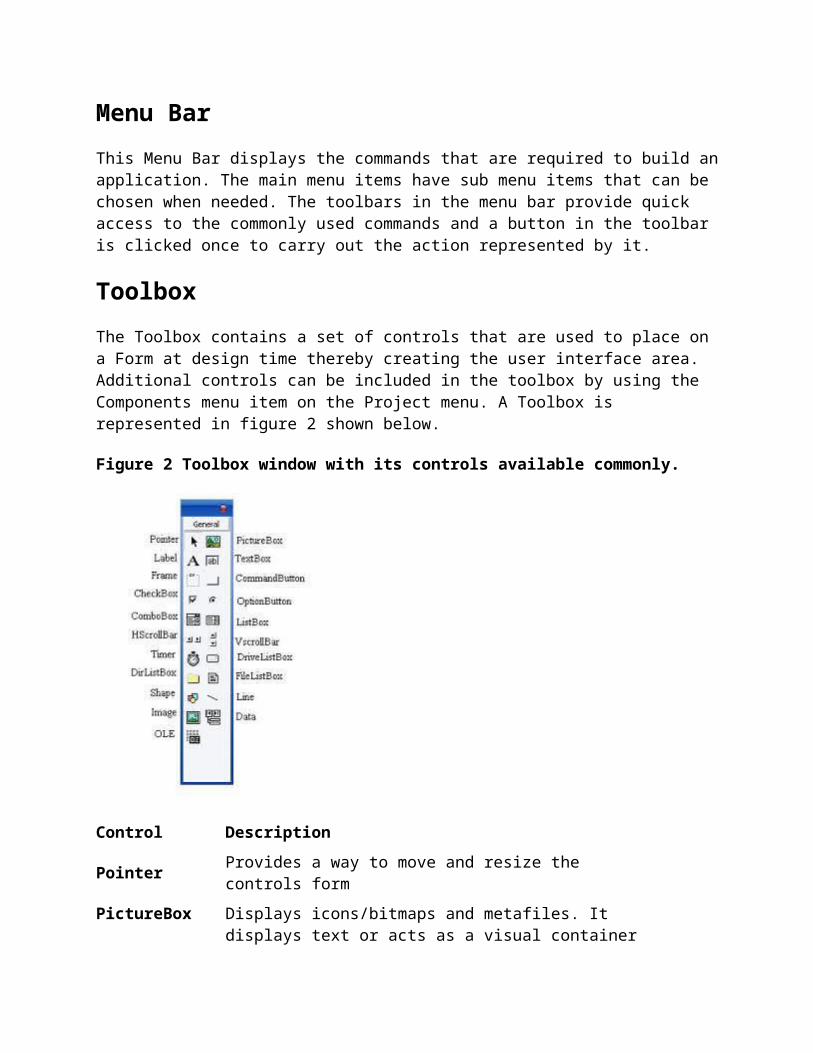
Toolbox

The Toolbox contains a set of controls that are used to place on a Form at design time thereby creating the user interface area. Additional controls can be included in the toolbox by using the Components menu item on the Project menu. A Toolbox is represented in figure 2 shown below.
Figure 2 Toolbox window with its controls available commonly.
Control Description
Pointer Provides a way to move and resize the controls form
PictureBoxDisplays icons/bitmaps and metafiles. It displays text or acts as a visual container for other controls.
TextBox Used to display message and enter text.
Frame Serves as a visual and functional container for controls
CommandButton Used to carry out the specified action when the user chooses it.
CheckBox Displays a True/False or Yes/No option.
OptionButtonOptionButton control which is a part of an option group allows the user to select only one option even it displays mulitiple choices.
ListBox Displays a list of items from which a user can select one.
ComboBoxContains a TextBox and a ListBox. This allows the user to select an ietm from the dropdown ListBox, or to type in a selection in the TextBox.
HScrollBar and VScrollBar
These controls allow the user to select a value within the specified range of values
Timer Executes the timer events at specified intervals of time
DriveListBoxDisplays the valid disk drives and allows the user to select one of them.
DirListBoxAllows the user to select the directories and paths, which are displayed.
FileListBox Displays a set of files from which a user can select the desired one.
Shape Used to add shape (rectangle, square or circle) to a Form
Line Used to draw straight line to the Form
Imageused to display images such as icons, bitmaps and metafiles. But less capability than the PictureBox
DataEnables the use to connect to an existing database and display information from it.
OLEUsed to link or embed an object, display and manipulate data from other windows based applications.
Label Displays a text that the user cannot modify or interact with.
TextBox Control
TextBox controls offer a natural way for users to enter a value in your program. For this reason, they tend to be the most frequently used controls in the majority of Windows applications. TextBox controls, which have a great many properties and events, are also among the most complex intrinsic controls. In this section, I guide you through the most useful properties of TextBox controls and show how to solve some of the problems that you're likely to encounter.
Setting properties to a TextBox
Text can be entered into the text box by assigning the necessary string to the text property of the control
If the user needs to display multiple lines of text in a TextBox, set the MultiLine property to True
To customize the scroll bar combination on a TextBox, set the ScrollBars property. Scroll bars will always appear on the TextBox when it's MultiLine property is set to True
and its ScrollBars property is set to anything except None(0) If you set the MultilIne property to True, you can set the alignment using the Alignment
property. The test is left-justified by default. If the MultiLine property is et to False, then setting the Alignment property has no effect.
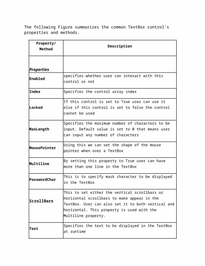
The following Figure summarizes the common TextBox control's properties and methods.
Property/ Method Description
PropertiesEnabled specifies whether user can interact with this control or not
Index Specifies the control array index
LockedIf this control is set to True user can use it else if this control is set to false the control cannot be used
MaxLengthSpecifies the maximum number of characters to be input. Default value is set to 0 that means user can input any number of characters
MousePointer Using this we can set the shape of the mouse pointer when over a TextBox
MultilineBy setting this property to True user can have more than one line in the TextBox
PasswordChar This is to specify mask character to be displayed in the TextBox
ScrollBarsThis to set either the vertical scrollbars or horizontal scrollbars to make appear in the TextBox. User can also set it to both vertical and horizontal. This property is used with the Multiline property.
Text Specifies the text to be displayed in the TextBox at runtime
ToolTipIndex This is used to display what text is displayed or in the control
VisibleBy setting this user can make the Textbox control visible or invisible at runtime
MethodSetFocus Transfers focus to the TextBox
Event proceduresChange Action happens when the TextBox changes
Click Action happens when the TextBox is clicked
GotFocus Action happens when the TextBox receives the active focus
LostFocus Action happens when the TextBox loses it focus
KeyDown Called when a key is pressed while the TextBox has the focus
KeyUp Called when a key is released while the TextBox has the focus
Timer Control
A Timer control is invisible at run time, and its purpose is to send a periodic pulse to the current application. You can trap this pulse by writing code in the Timer's Timer event procedure and take advantage of it to execute a task in the background or to monitor a user's actions. This control exposes only two meaningful properties: Interval and Enabled. Interval stands for the number of milliseconds between subsequent pulses (Timer events), while Enabled lets you activate or deactivate events. When you place the Timer control on a form, its Interval is 0, which means no events.
CommandButton Controls in VB6
Using CommandButton controls is trivial. In most cases, you just draw the control on the form's surface, set its Caption property to a suitable string (adding an & character to associate a hot key with the control if you so choose), and you're finished, at least with user-interface issues. To make the button functional, you write code in its Click event procedure, as in this fragment:
You can use two other properties at design time to modify the behavior of a CommandButton control. You can set the Default property to True if it's the default push button for the form (the button that receives a click when the user presses the Enter key—usually the OK or Save button). Similarly, you can set the Cancel property to True if you want to associate the button with the Escape key.
The CommandButton control supports the usual set of keyboard and mouse events (KeyDown, KeyPress, KeyUp, MouseDown, MouseMove, MouseUp, but not the DblClick event) and also the GotFocus and LostFocus events, but you'll rarely have to write code in the corresponding event procedures.
Properties of a CommandButton control
To display text on a CommandButton control, set its Caption property. An event can be activated by clicking on the CommandButton. To set the background colour of the CommandButton, select a colour in the BackColor
property. To set the text colour set the Forecolor property. Font for the CommandButton control can be selected using the Font property.
To enable or disable the buttons set the Enabled property to True or False To make visible or invisible the buttons at run time, set the Visible property to True or
False. Tooltips can be added to a button by setting a text to the Tooltip property of the
CommandButton. A button click event is handled whenever a command button is clicked. To add a click event
handler, double click the button at design time, which adds a subroutine like the one given below.
Private Sub Command1_Click( )..................End Sub
OptionButton Controls
OptionButton controls are also known as radio buttons because of their shape. You always use OptionButton controls in a group of two or more because their purpose is to offer a number of mutually exclusive choices. Anytime you click on a button in the group, it switches to a selected state and all the other controls in the group become unselected.
Preliminary operations for an OptionButton control are similar to those already described for CheckBox controls. You set an OptionButton control's Caption property to a meaningful string, and if you want you can change its Alignment property to make the control right aligned. If the control is the one in its group that's in the selected state, you also set its Valueproperty to True. (The OptionButton's Value property is a Boolean value because only two states are possible.) Value is the default property for this control.
Strictly speaking, you can avoid the test for the last OptionButton control in its group because all choices are supposed to be mutually exclusive. But the approach I just showed you increases the code's readability.
A group of OptionButton controls is often hosted in a Frame control. This is necessary when there are other groups of OptionButton controls on the form. As far as Visual Basic is concerned, all the OptionButton controls on a form's surface belong to the same group of mutually exclusive selections, even if the controls are placed at the opposite corners of the window. The only way to tell Visual Basic which controls belong to which group is by gathering them inside a Frame control. Actually, you can group your controls within any control that can work as a container—PictureBox, for example—but Frame controls are often the most reasonable choice.
Label Controls
Most people use Label controls to provide a descriptive caption and possibly an associated hot key for other controls, such as TextBox, ListBox, and ComboBox, that don't expose the Caption property. In most cases, you just place a Label control where you need it, set its Caption property to a suitable string (embedding an ampersand character in front of the hot key you want to
assign), and you're done. Caption is the default property for Label controls. Be careful to set the Label's TabIndex property so that it's 1 minus the TabIndex property of the companion control.
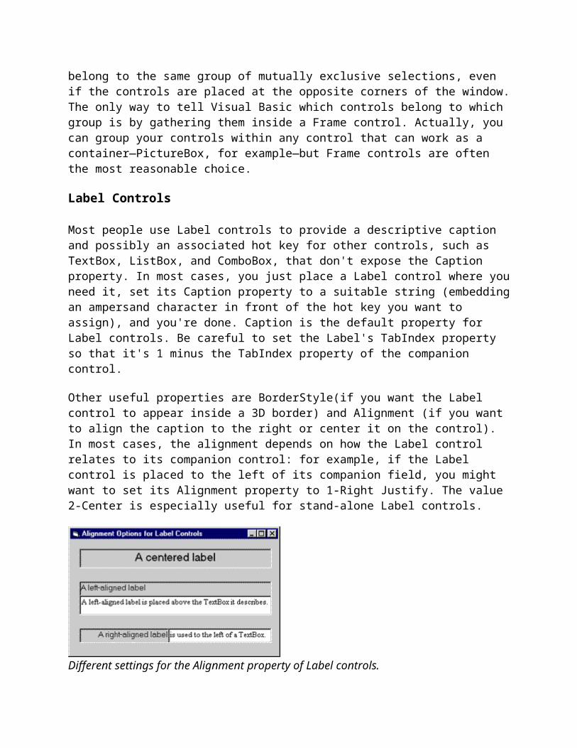
Other useful properties are BorderStyle(if you want the Label control to appear inside a 3D border) and Alignment (if you want to align the caption to the right or center it on the control). In most cases, the alignment depends on how the Label control relates to its companion control: for example, if the Label control is placed to the left of its companion field, you might want to set its Alignment property to 1-Right Justify. The value 2-Center is especially useful for stand-alone Label controls.
Different settings for the Alignment property of Label controls.
You can insert a literal & character in a Label control's Caption property by doubling it. For example, to see Research & Development you have to type &Research && Development. Note that if you have multiple but isolated &s, the one that selects the hot key is the last one and all others are ignored. This tip applies to all the controls that expose a Caption property. (The & has no special meaning in forms' Caption properties, however.)
If the caption string is a long one, you might want to set the Label's WordWrap property to True so that it will extend for multiple lines instead of being truncated by the right border of the control. Alternatively, you might decide to set the AutoSize property to True and let the control automatically resize itself to accommodate longer caption strings.
You sometimes need to modify the default value of a Label's BackStyle property. Label controls usually cover what's already on the form's surface (other lightweight controls, output from graphic methods, and so on) because their background is considered to be opaque. If you want to show a character string somewhere on the form but at the same time you don't want to obscure underlying objects, set the BackStyle property to 0-Transparent.
As I said before, you don't usually write code in Label control event procedures. This control exposes only a subset of the events supported by other controls. For example, because Label controls can never get the input focus, they don't support GotFocus, LostFocus, or any keyboard-related events. In practice, you can take advantage only of their mouse events: Click, DblClick, MouseDown, MouseMove, and MouseUp. If you're using a Label control to display data read from a database, you might sometimes find it useful to write code in its Change event. A Label control doesn't expose a specific event that tells programmers when users press its hot keys.
You can do some interesting tricks with Label controls. For example, you can use them to provide rectangular hot spots for images loaded onto the form. To create that context-sensitive ToolTip, I loaded the image on the form using the form's Picture property and then I placed a Label control over the Microsoft BackOffice logo, setting its Caption property to an empty string and the BackStyle property to 0-Transparent. These properties make the Label invisible, but it correctly shows its ToolTip when necessary. And because it still receives all mouse events, you can use its Click event to react to users' actions.
Frame Controls
Frame controls are similar to Label controls in that they can serve as captions for those controls that don't have their own. Moreover, Frame controls can also (and often do) behave as containers and host other controls. In most cases, you only need to drop a Frame control on a form and set its Caption property. If you want to create a borderless frame, you can set its BorderStyle property to 0-None.
Controls that are contained in the Frame control are said to be child controls. Moving a control at design time over a Frame control—or over any other container, for that matter—doesn't automatically make that control a child of the Frame control. After you create a Frame control, you can create a child control by selecting the child control's icon in the Toolbox and drawing a new instance inside the Frame's border. Alternatively, to make an existing control a child of a Frame control, you must select the control, press Ctrl+X to cut it to the Clipboard, select the Frame control, and press Ctrl+V to paste the control inside the Frame. If you don't follow this procedure and you simply move the control over the Frame, the two controls remain completely independent of each other, even if the other control appears in front of the Frame control.
Frame controls, like all container controls, have two interesting features. If you move a Frame control, all the child controls go with it. If you make a container control disabled or invisible, all its child controls also become disabled or invisible. You can exploit these features to quickly change the state of a group of related controls.
The OLE Control
When OLE first made its appearance, the concept of Object Linking and Embedding seemed to most developers nothing short of magic. The ability to embed a Microsoft Word Document or a Microsoft Excel worksheet within another Windows application seemed an exciting one, and Microsoft promptly released the OLE control—then called the OLE Container control—to help Visual Basic support this capability.
In the long run, however, the Embedding term in OLE has lost much of its appeal and importance, and nowadays programmers are more concerned and thrilled about Automation, a subset of OLE that lets them control other Windows applications from the outside, manipulating their object hierarchies through OLE. For this reason, I won't describe the OLE control: It's a
rather complex object, and a thorough description of its many properties, methods, and events (and quirks) would take too much space.
Line Tool
The line tool creates simple straight line segments of various width and color. Together with the shape tool discussed next, you can use this tool to 'dress up' your application.
Line Tool Properties:
BorderColor Determines the line color.
BorderStyle Determines the line 'shape'. Lines can be transparent, solid, dashed, dotted, and combinations.
BorderWidth Determines line width.
There are no events or methods associated with the line tool.
Since the line tool lies in the middle-layer of the form display, any lines drawn will be obscured by all controls except the shape tool or image box.
Shape Tool
The shape tool can create circles, ovals, squares, rectangles, and rounded squares and rectangles. Colors can be used and various fill patterns are available.
Shape Tool Properties:

BackColor Determines the background color of the shape (only used when FillStyle not Solid.
BackStyle Determines whether the background is transparent or opaque.
BorderColor Determines the color of the shape's outline.
BorderStyle Determines the style of the shape's outline. The border can be transparent, solid, dashed, dotted, and combinations.
BorderWidth Determines the width of the shape border line.
FillColor Defines the interior color of the shape.
FillStyle Determines the interior pattern of a shape. Some choices are: solid, transparent, cross, etc.
Shape Determines whether the shape is a square, rectangle, circle, or some other choice.
Like the line tool, events and methods are not used with the shape tool.
Shapes are covered by all objects except perhaps line tools and image boxes (depends on their Z-order) and printed or drawn information. This is a good feature in that you usually use shapes to contain a group of control objects and you'd want them to lie on top of the shape.
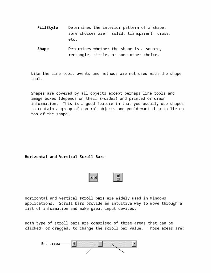
Horizontal and Vertical Scroll Bars
Horizontal and vertical scroll bars are widely used in Windows applications. Scroll bars provide an intuitive way to move through a list of information and make great input devices.
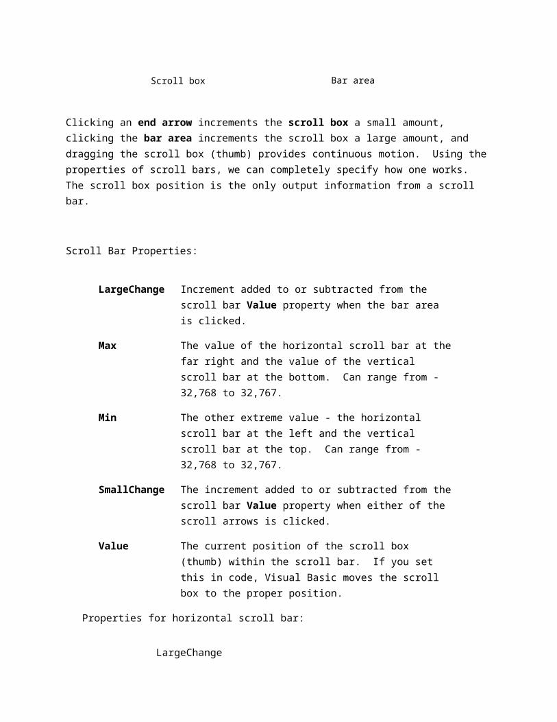
Both type of scroll bars are comprised of three areas that can be clicked, or dragged, to change the scroll bar value. Those areas are:
Clicking an end arrow increments the scroll box a small amount, clicking the bar area increments the scroll box a large amount, and dragging the scroll box (thumb) provides continuous motion. Using the properties of scroll bars, we can completely specify how one works. The scroll box position is the only output information from a scroll bar.
Scroll Bar Properties:
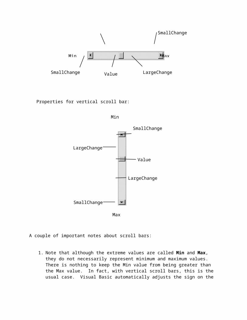
LargeChange Increment added to or subtracted from the scroll bar Value property when the bar area is clicked.
Max The value of the horizontal scroll bar at the far right and the value of the vertical scroll bar at the bottom. Can range from -32,768 to 32,767.
Min The other extreme value - the horizontal scroll bar at the left and the vertical scroll bar at the top. Can range from -32,768 to 32,767.
SmallChange The increment added to or subtracted from the scroll bar Value property when either of the scroll arrows is clicked.
Value The current position of the scroll box (thumb) within the scroll bar. If you set this in code, Visual Basic moves the scroll box to the proper position.
Properties for horizontal scroll bar:
End arrow
Scroll box (thumb) Bar area
SmallChangeLargeChange

Properties for vertical scroll bar:
A couple of important notes about scroll bars:
1. Note that although the extreme values are called Min and Max, they do not necessarily represent minimum and maximum values. There is nothing to keep the Min value from being greater than the Max value. In fact, with vertical scroll bars, this is the usual case. Visual Basic automatically adjusts the sign on the SmallChange and LargeChange properties to insure proper movement of the scroll box from one extreme to the other.
2. If you ever change the Value, Min, or Max properties in code, make sure Value is at all times between Min and Max or and the program will stop with an error message.
Scroll Bar Events:
SmallChange
SmallChange
LargeChange
LargeChange
Value
Max
Min
Min
SmallChange LargeChangeValue
Max
Change Event is triggered after the scroll box's position has been modified. Use this event to retrieve the Value property after any changes in the scroll bar.
Scroll Event triggered continuously whenever the scroll box is being moved.
Picture Boxes
The picture box allows you to place graphics information on a form. It is best suited for dynamic environments - for example, when doing animation.
Picture boxes lie in the top layer of the form display. They behave very much like small forms within a form, possessing most of the same properties as a form.
Picture Box Properties:
AutoSize If True, box adjusts its size to fit the displayed graphic.
Font Sets the font size, style, and size of any printing done in the picture box.
Picture Establishes the graphics file to display in the picture box.
Picture Box Events:
Click Triggered when a picture box is clicked.
DblClick Triggered when a picture box is double-clicked.
Picture Box Methods:
Cls Clears the picture box.
Print Prints information to the picture box.
Examples
picExample.Cls ' clears the box picExample
picExample.Print "a picture box" ' prints text string to picture box
Picture Box LoadPicture Procedure:
An important function when using picture boxes is the LoadPicture procedure. It is used to set the Picture property of a picture box at run-time.
Example
picExample.Picture = LoadPicture("c:\pix\sample.bmp")
This command loads the graphics file c:\pix\sample.bmp into the Picture property of the picExample picture box. The argument in the LoadPicture function must be a legal, complete path and file name, else your program will stop with an error message.
Five types of graphics files can be loaded into a picture box:
Bitmap An image represented by pixels and stored as a collection of bits in which each bit corresponds to one pixel. Usually has a .bmp extension. Appears in original size.
Icon A special type of bitmap file of maximum 32 x 32 size. Has a .ico extension. We’ll create icon files in Class 5. Appears in original size.
Metafile A file that stores an image as a collection of graphical objects (lines, circles, polygons) rather than pixels. Metafiles preserve an image
more accurately than bitmaps when resized. Has a .wmf extension. Resizes itself to fit the picture box area.
JPEG JPEG (Joint Photographic Experts Group) is a compressed bitmap format which supports 8 and 24 bit color. It is popular on the Internet. Has a .jpg extension and scales nicely.
GIF GIF (Graphic Interchange Format) is a compressed bitmap format originally developed by CompuServe. It supports up to 256 colors and is popular on the Internet. Has a .gif extension and scales nicely.
Image Boxes
An image box is very similar to a picture box in that it allows you to place graphics information on a form. Image boxes are more suited for static situations - that is, cases where no modifications will be done to the displayed graphics.
Image boxes appear in the middle-layer of form display, hence they could be obscured by picture boxes and other objects. Image box graphics can be resized by using the Stretch property.
Image Box Properties:
Picture Establishes the graphics file to display in the image box.
Stretch If False, the image box resizes itself to fit the graphic. If True, the graphic resizes to fit the control area.
Image Box Events:
Click Triggered when a image box is clicked.
DblClick Triggered when a image box is double-clicked.

The image box does not support any methods, however it does use the LoadPicture function. It is used in exactly the same manner as the picture box uses it. And image boxes can load the same file types: bitmap (.bmp), icon (.ico), metafiles (.wmf), GIF files (.gif), and JPEG files (.jpg). With Stretch = True, all three graphic types will expand to fit the image box area.
Drive List Box
The drive list box control allows a user to select a valid disk drive at run-time. It displays the available drives in a drop-down combo box. No code is needed to load a drive list box; Visual Basic does this for us. We use the box to get the current drive identification.
Drive List Box Properties:
Drive Contains the name of the currently selected drive.
Drive List Box Events:
Change Triggered whenever the user or program changes the drive selection.
Directory List Box
The directory list box displays an ordered, hierarchical list of the user's disk directories and subdirectories. The directory structure is displayed in a list box. Like, the drive list box, little coding is needed to use the directory list box - Visual Basic does most of the work for us.
Directory List Box Properties:
Path Contains the current directory path.
Directory List Box Events:
Change Triggered when the directory selection is changed.
File List Box
The file list box locates and lists files in the directory specified by its Path property at run-time. You may select the types of files you want to display in the file list box.
File List Box Properties:
FileName Contains the currently selected file name.
Path Contains the current path directory.
Pattern Contains a string that determines which files will be displayed. It supports the use of * and ? wildcard characters. For example, using *.dat only displays files with the .dat extension.
File List Box Events:
DblClick Triggered whenever a file name is double-clicked.
PathChange Triggered whenever the path changes in a file list box.
You can also use the MultiSelect property of the file list box to allow multiple file selection.
Synchronizing the Drive, Directory, and File List Boxes
The drive, directory, and file list boxes are almost always used together to obtain a file name. As such, it is important that their operation be synchronized to insure the displayed information is always consistent.
When the drive selection is changed (drive box Change event), you should update the directory path. For example, if the drive box is named drvExample and the directory box is dirExample, use the code:
dirExample.Path = drvExample.Drive
When the directory selection is changed (directory box Change event), you should update the displayed file names. With a file box named filExample, this code is:
filExample.Path = dirExample.Path
Once all of the selections have been made and you want the file name, you need to form a text string that correctly and completely specifies the file identifier. This string concatenates the drive, directory, and file name information. This should be an easy task, except for one problem. The problem involves the backslash (\) character. If you are at the root directory of your drive, the path name ends with a backslash. If you are not at the root directory, there is no backslash at the end of the path name and you have to add one before tacking on the file name.
Example code for concatenating the available information into a proper file name and then loading it into an image box is:
Dim YourFile as String
If Right(filExample.Path,1) = "\" Then
YourFile = filExample.Path + filExample.FileName
Else
YourFile = filExample.Path + "\" + filExample.FileName
End If
imgExample.Picture = LoadPicture(YourFile)
Note we only use properties of the file list box. The drive and directory box properties are only used to create changes in the file list box via code.
Advanced controls
1. Menus
Windows applications provide groups of related commands in Menus. These commands depends on the application, but some-such as Open and Save are frequently found in applications. Menus are intrinsic controls, and as such they deserve a place in this chapter. On the other hand, menus behave differently from other controls. For example, you don't drop menu items on a form from the Toolbox; rather, you design them in the Menu Editor window, as you can see in the figur below. You invoke this tool from the Menu Editor button on the standard toolbar or by pressing the Ctrl+E shortcut key. There's also a Menu Editor command in the Tools menu, but you probably won't use it often.
Visual Basic provides an easy way to create menus with the modal Menu Editor dialog. The below dialog is displayed when the Menu Editor is selected in the Tool Menu. The Menu Editor command is grayed unless the form is visible. And also you can display the Menu Editor window by right clicking on the Form and selecting Menu Editor.
Basically, each menu item has a Caption property (possibly with an embedded & character to create an access key) and a Name. Each item also exposes three Boolean properties, Enabled, Visible, and Checked, which you can set both at design time and at run time. At design time, you can assign the menu item a shortcut key so that your end users don't have to go through the menu system each time they want to execute a frequent command. (Do you really like pulling down the Edit menu any time you need to clear some text or copy it to the Clipboard?) The assigned shortcut key can't be queried at run time, much less modified.
Building a menu is a simple, albeit more tedious, job: You enter the item's Caption and Name, set other properties (or accept the default values for those properties), and press Enter to move to the next item. When you want to create a submenu, you press the Right Arrow button (or the Alt+R hot key). When you want to return to work on top-level menus—those items that appear in the menu bar when the application runs—you click the Left Arrow button (or press Alt+L). You can move items up and down in the hierarchy by clicking the corresponding buttons or the hot keys Alt+U and Alt+B, respectively.
You can create up to five levels of submenus (six including the menu bar), which are too many even for the most patient user. If you find yourself working with more than three
menu levels, think about trashing your specifications and redesigning your application from the ground up.
You can insert a separator bar using the hypen (-) character for the Caption property. But even these separator items must be assigned a unique value for the Name property, which is a real nuisance. If you forget to enter a menu item's Name, the Menu Editor complains when you decide to close it. The convention used in this book is that all menu names begin with the three letters mnu.
An expanded Menu Editor window.
An expanded menu
One of the most annoying defects of the Menu Editor tool is that it doesn't permit you to reuse the menus you have already written in other applications. It would be great if you could open another instance of the Visual Basic IDE, copy one or more menu items to the clipboard, and then paste those menu items in the application under development. You can do that with controls and with pieces of code, but not with menus! The best thing you can do in

Visual Basic is load the FRM file using an editor such as Notepad, find the portion in the file that corresponds to the menu you're interested in, load the FRM file you're developing (still in Notepad), and paste the code there. This isn't the easiest operation, and it's also moderately dangerous: If you paste the menu definition in the wrong place, you could make your FRM form completely unreadable. Therefore, always remember to make backup copies of your forms before trying this operation.
Checked : This is unchecked by default and allows the programmer the option of creating a checked menu item( a menu item that act as a toggle and displays a check mark when selected. The following is a Check Menu items.
Enabled : specifies whether a menu is disabled or not. If you see a disabled command in a menu that means that feature is not available. The Visible checkbox specifies whether the menu is visible or not.
To add commands to the Form's menu bar, enter a caption and a name for each command. As soon as you start typing the command's caption, it also appears in a new line in the list at the bottom of the Menu Editor window. To add more commands click Enter and type the Caption and the Name.
Creating Menus
Open a new Project and save the form as menu.frm and save the project as menu.vbp.
Choose Tools ››› Menu Editor and type the menu items as shown below.
Caption Name
File mnuFile
Open mnuOpen
Save mnuSave
Exit mnuExit
Edit mnuEdit
Copy mnuCopy
Cut mnuCut
Paste mnuPaste
2.Microsoft ADO controls
VB programmers would generally use DAO (Data Access Objects) to interact with local databases such as MS Access and use RDO (Remote Data Objects) to interact with client/server databases such as Oracle and SQL Server. The concept behind Visual Basic ADO was Universal Data Access (UDA), where one database access method could be used for any data source; it was designed to replace both DAO and RDO. DAO remains a viable technology for interacting with MS Access databases as it is faster than ADO for that purpose; however, ADO is more flexible – using ADO, one could develop a prototype database application using MS Access in the back-end, and with a "flick of the wrist" (i.e., with very little coding changes) "upsize" that same application to use Oracle or SQL Server. As far as RDO is concerned, no new versions of it have been developed beyond the version that shipped with Visual Basic, and there are no future plans for it.
In the VB4 and VB5 worlds, RDO was the main method used to interact with client/server databases. RDO works perfectly fine with VB6, so when folks migrated their VB5 applications over to VB6, little or no coding changes were required. However, ADO is the preferred method of database access for new VB6 applications .
3.Data grid controls
DataGrid control is the not the default item in the Visual Basic control toolbox, you have add it from the VB6 components. To add the DataGrid control, click on the project in the menu bar and select components where a dialog box that displays all the available VB6 components. Select Microsoft DataGrid Control 6.0 by clicking the checkbox beside this item. Before you exit the dialog box, you also need to select the Microsoft ADO data control so that you are able to access the database. Lastly, click on the OK button to exit the dialog box. Now you should be able to see that the DataGrid control and the ADO data control are added to the toolbox. The next step is to drag the DataGrid control and the ADO data control into the form.
The components dialog box is shown below:
3.
Project Explorer
Docked on the right side of the screen, just under the tollbar, is the Project Explorer window. The Project Explorer as shown in in figure servres as a quick reference to the various elements of a project namely form, classes and modules. All of the object that make up the application are packed in a project. A simple project will typically contain one form, which is a window that is designed as part of a program's interface. It is possible to develop any number of forms for use in a program, although a program may consist of a single form. In addition to forms, the Project Explorer window also lists code modules and classes.
Figure 3 Project Explorer
Properties Window
The Properties Window is docked under the Project Explorer window. The Properties Window exposes the various characteristics of selected objects. Each and every form in an application is considered an object. Now, each object in Visual Basic has characteristics such as color and size. Other characteristics affect not just the appearance of the object but the way it behaves too. All these characteristics of an object are called its properties. Thus, a form has properties and any controls placed on it will have propeties too. All of these properties are displayed in the Properties Window.
Object Browser
The Object Browser allows us to browse through the various properties, events and methods that are made available to us. It is accessed by selecting Object Browser from the View menu or pressing the key F2. The left column of the Object Browser lists the objects and classes that are available in the projects that are opened and the controls that have been referenced in them. It is possible for us to scroll through the list and select the object or class that we wish to inspect. After an object is picked up from the Classes list, we can see its members (properties, methods and events) in the right column.
A property is represented by a small icon that has a hand holding a piece of paper. Methods are denoted by little green blocks, while events are denoted by yellow lightning bolt icon.
Object naming conversions of controls (prefix)
Form -frmLabel-lblTextBox-txtCommandButton-cmdCheckBox -chkOptionButton -optComboBox -cboListBox-lstFrame-fmePictureBox -picImage-imgShape-shpLine -linHScrollBar -hsbVScrollBar –vsb