evaluation: question one
TRANSCRIPT

Question 1: In what ways does your media product use, develop or challenge forms and conventions of real media products?
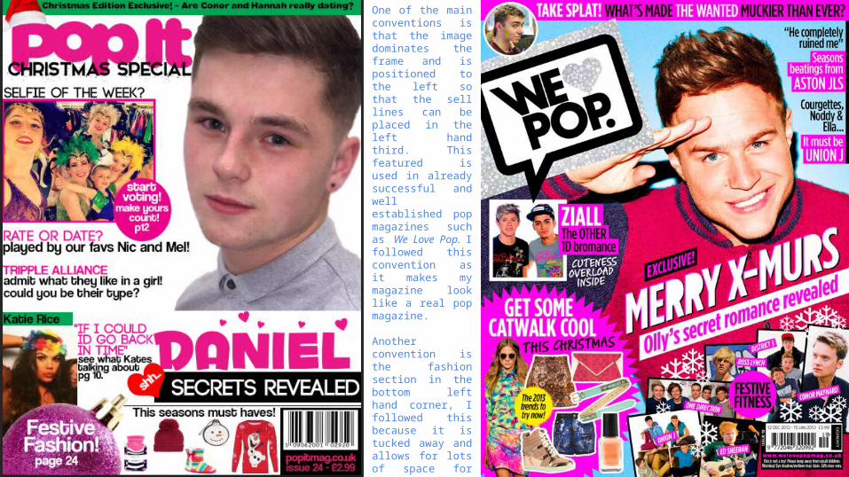
It is important that conventions are followed as they set out an idealistic way in which something should be done. Regarding my front cover I believe that several conventions can be seen, as set out and shown below.
My front cover uses bright and vibrant colours to a certain extent. The colours pink, green and red are used, with other colours cropping up in feature article photographs. As my magazine is a pop magazine, it is expected to have more bright and vibrant colours, as mine lacks this, I believe this is a downfall of my front cover. However, the content is still slightly followed, but could be adapted more to fit the concept of the ‘pop’ theme.
With the majority of pop magazine the background colour is usually white – my background colour for my front cover is also white. So my magazine does in fact follow this convention. I believe that this is a strong point within my front cover, and makes it look more professional. If I used a different colour background, such as purple, I think it would make my front cover look less professional and “tacky”.
The use of celebrity nicknames are also used often. A prime example is One Direction being referred to as 1D or Justin Bieber as ‘Biebs’. In relation to my artists, Katie is referred to as “Kates”, Nicole is referred to as “Nics” and Melanie as “Mel”. This allows my audience to feel as if they know the artists personally, in order to call them by a nickname.
The name of the magazine usually includes the word “pop” in it as an indication of the genre of the magazine. I decided to follow this convention and name my magazine “Pop It”. The name in itself is pretty basic, and I think, if I had more time I would have come up with something more creative. It is also bold and eye catchy - just like the We Love Pop masthead.
Commonly, the use of a puff is used to present to the audience information that they will find interesting or useful, for example it might mention an upcoming competition. I have followed the convention that there is a puff on my front cover; and that it has relevant text so I am therefore not breaking the convention. I believe that my puff fits in well with the sell line and the feature article photo well.
A skyline is used a lot, containing recent gossip, or artist names or what the magazine includes. In my magazine I have used it for the use of recent gossip. It contains the text “Christmas edition exclusive – are Conor and Hannah really dating?” I think this sell line suited the skyline well as listing artist names is more common in Rock Magazines.
A pug is always placed at the bottom of the page, whether it is in the bottom right hand corner or in the centre, as it is the last thing the audience see. It also includes the barcode. I have placed mine in the bottom right hand corner with the barcode, issue number, price and the website address. I placed it here as it is then not in the way and interfering the rest of the magazine and is away from everything else.
One of the main conventions is that the image dominates the frame and is positioned to the left so that the sell lines can be placed in the left hand third. This featured is used in already successful and well established pop magazines such as We Love Pop. I followed this convention as it makes my magazine look like a real pop magazine.
Another convention is the fashion section in the bottom left hand corner, I followed this because it is tucked away and allows for lots of space for fashion without disrupting the other content of the magazine which is also a convention shown and used of the We Love Pop front cover.
Sell lines always include the artists names, I have stuck to this as it is not always obvious who the sell line is speaking about especially if puns are used within it. I have wrote the artist names in differently in every headline, for example Triple Alliance is written in code font in pink in one headline with the rest of the sell line written in coolvetica in black, whereas in another sell line Rate or Date is written in code in pink and the artist names are written below in coolvetica in black which is “Nic an Mel”.
Seasonal features often appear. An example of this is the we love pop magazine with Olly Murs on the front with the main sell line saying “merry x-murs” includes seasonal features such as snowflakes throughout the background. My front cover includes a ball ball in the bottom left hand corner, instead of a circle shaped puff on top of this some of the fashion features promote the winter season such as the Christmas jumper!
Feature articles photographs appear a lot on magazine front covers, especially pop magazines, on mine I have two. I think I should have included a few more personally, as it is for a younger age group, I believe it should be more visual than have more text.
Question 1: In what ways does your media product use, develop or challenge forms and conventions of real media products?
The masthead is always written in the same style and the same font is a convention of a front cover. This is a convention and one I am to stick by to maintain brand consistency. Also to help the audience spot the magazine straight away.
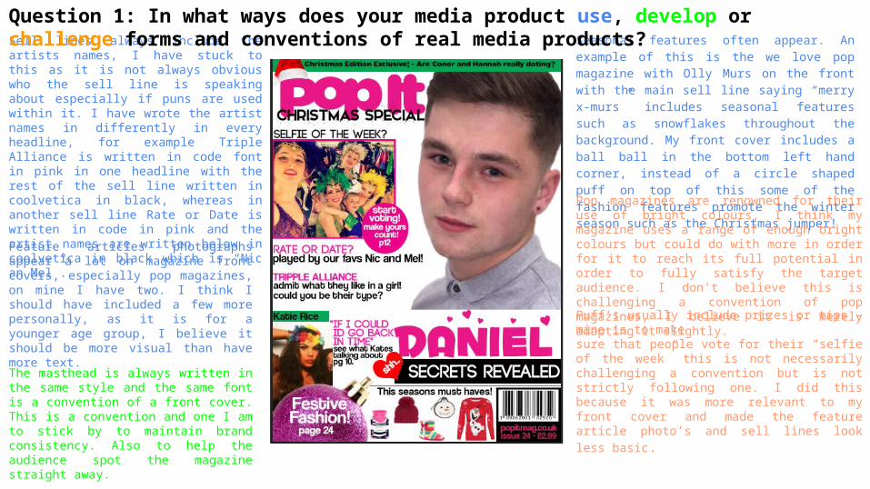
Pop magazines are renowned for their use of bright colours, I think my magazine uses a range of enough bright colours but could do with more in order for it to reach its full potential in order to fully satisfy the target audience. I don’t believe this is challenging a convention of pop magazines, I believe it is merely adapting it slightly.
Puff’s usually include prizes or tips - mine is to make sure that people vote for their “selfie of the week” this is not necessarily challenging a convention but is not strictly following one. I did this because it was more relevant to my front cover and made the feature
article photo’s and sell lines look less basic.
By looking at other pop magazine front covers, I believe that I could've used more buzz words throughout my front cover to appeal to the target audience more. Such as “OMG” and “PHWOAARR!” that are apparent on the likes of We Love Pop.
Question 1: In what ways does your media product use, develop or challenge forms and conventions of real media products?
Despite using a puff, more than one is often used. But rather than using two I adopted it to the Christmas theme and used a ball-ball to put text in instead.
There is usually an announcement of what photo’s are going to be inside the magazine. Due to a lack of space on the front cover I had to put this on the contents page instead. I thought this would be better as otherwise there would be to much going on on the front cover.
Front Covers usually have plenty of feature article photo’s in order to attract the intended target audience - based on the age. My front cover only has three feature article photo’s. Despite not having many and probably should've added more.
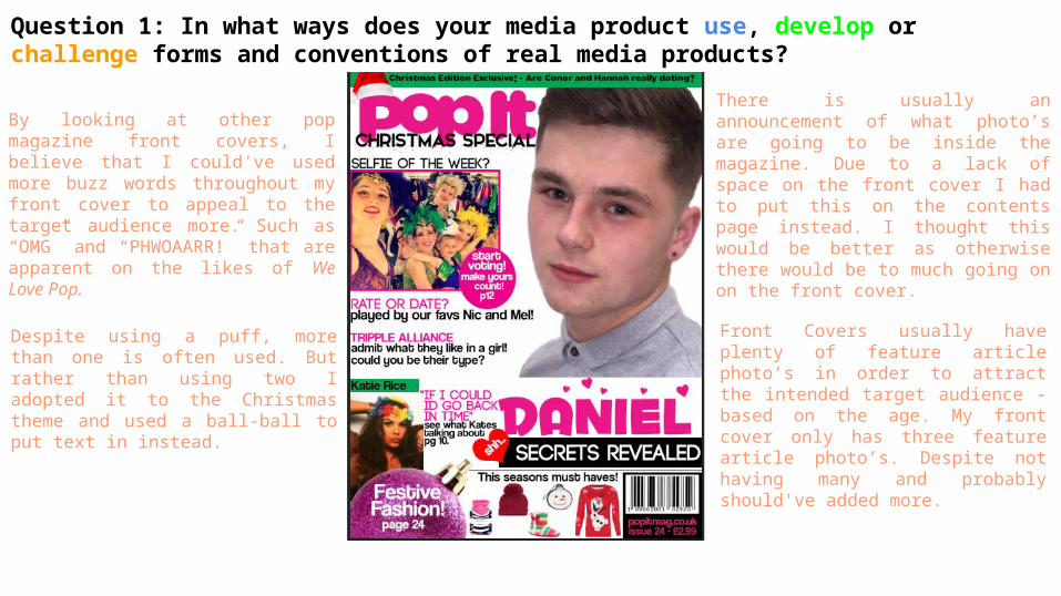
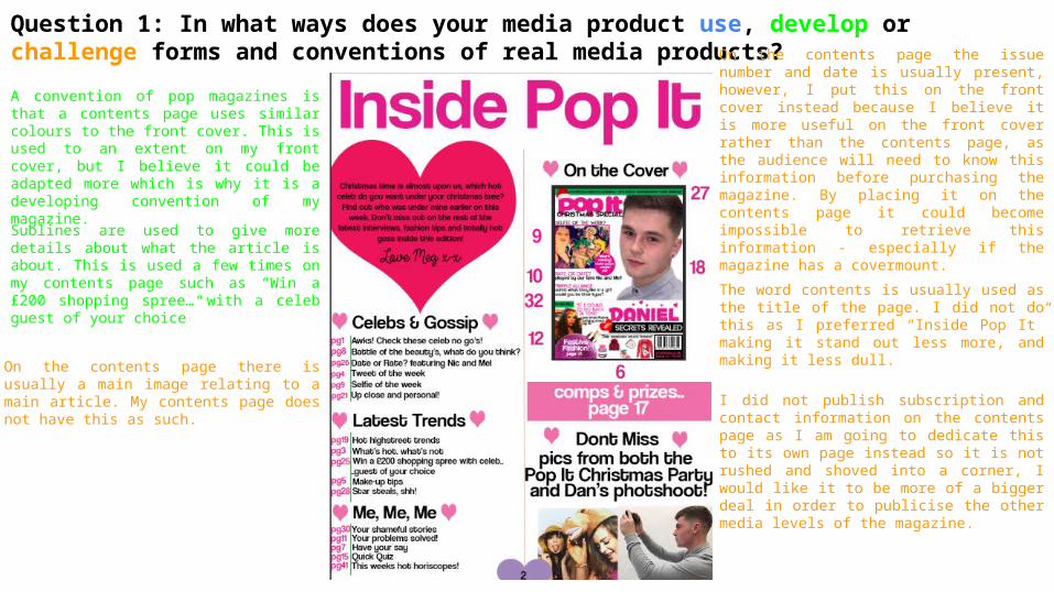
Question 1: In what ways does your media product use, develop or challenge forms and conventions of real media products?Contents pages are usually set out in columns, in which mine is set in two. I believe this makes the contents page look more organised so the audience can skim it to easily and quickly retrieve the information they require!
Other smaller images are usually placed on the contents page, this is because it splits it up from being text only. I have followed this convention as at the bottom of my contents page there is two images placed at the bottom. Even though I have followed it I do believe I could of added a few more!
Contents pages also have a structured layout, I have used this because it looks more professional and the audience can easily retrieve the information they require to navigate themselves around the magazine with ease!
Page numbers are written on the images or text which links to the written contents. I have done this as this is the sole purpose of a contents page, to list the content of the magazine and it is obviously more helpful if the audience are presented with the article and the page it is.
On the top of the page the name of the magazine is usually mentioned. I stuck to this by naming my contents page “Inside Pop It” instead of just “Contents Page” as I think it makes the contents page more related to the magazine in general. The same idea is used in Top of the Pops which is where I got the idea from because I believe it works in standing out more.
An editor’s letter is usually present in order for the magazine to be more personal to the reader and to summarise the edition. I have followed this because I think it is a nice touch to the magazine.
In some magazines like Top of the Pops the have a small image of the front cover with arrows coming out of it with the page numbers of the main article and feature articles. I did this to help fill the space on my contents page and I also think that it makes it look more modernised.
The contents page is usually divided into categories and headings to make it easier for the reader to find what they want. It also gives the reader a quick and brief idea of what the magazine includes by just looking at the headline - which is why I used this as my layout because that way the audience don't spend too much time reading it.
Question 1: In what ways does your media product use, develop or challenge forms and conventions of real media products?
A convention of pop magazines is that a contents page uses similar colours to the front cover. This is used to an extent on my front cover, but I believe it could be adapted more which is why it is a developing convention of my magazine.
Sublines are used to give more details about what the article is about. This is used a few times on my contents page such as “Win a £200 shopping spree… with a celeb guest of your choice”
On the contents page there is usually a main image relating to a main article. My contents page does not have this as such.
On the contents page the issue number and date is usually present, however, I put this on the front cover instead because I believe it is more useful on the front cover rather than the contents page, as the audience will need to know this information before purchasing the magazine. By placing it on the contents page it could become impossible to retrieve this information - especially if the magazine has a covermount.
The word contents is usually used as the title of the page. I did not do this as I preferred “Inside Pop It” making it stand out less more, and making it less dull.
I did not publish subscription and contact information on the contents page as I am going to dedicate this to its own page instead so it is not rushed and shoved into a corner, I would like it to be more of a bigger deal in order to publicise the other media levels of the magazine.
The general inspiration behind my contents page was by looking at a Top of the Pops front cover.
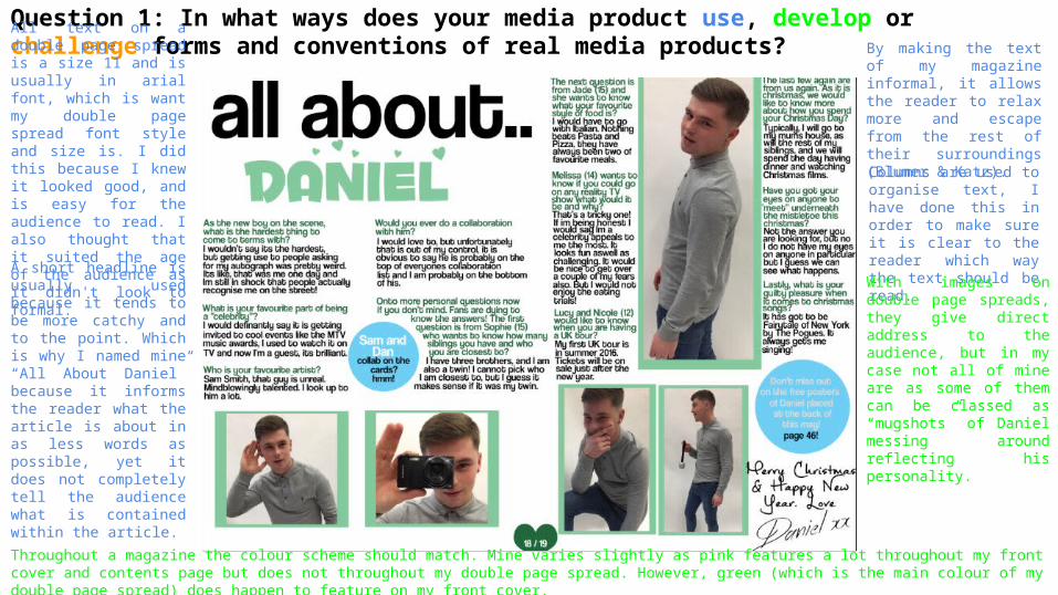
Question 1: In what ways does your media product use, develop or challenge forms and conventions of real media products?All text on a double page spread is a size 11 and is usually in arial font, which is want my double page spread font style and size is. I did this because I knew it looked good, and is easy for the audience to read. I also thought that it suited the age of the audience as it didn't look to formal.
By making the text of my magazine informal, it allows the reader to relax more and escape from the rest of their surroundings (Blumer & Katz).
A short headline is usually used because it tends to be more catchy and to the point. Which is why I named mine “All About Daniel” because it informs the reader what the article is about in as less words as possible, yet it does not completely tell the audience what is contained within the article.
Columns are used to organise text, I have done this in order to make sure it is clear to the reader which way the text should be read.
With images on double page spreads, they give direct address to the audience, but in my case not all of mine are as some of them can be classed as “mugshots” of Daniel messing around reflecting his personality.
Throughout a magazine the colour scheme should match. Mine varies slightly as pink features a lot throughout my front cover and contents page but does not throughout my double page spread. However, green (which is the main colour of my double page spread) does happen to feature on my front cover.
Question 1: In what ways does your media product use, develop or challenge forms and conventions of real media products?
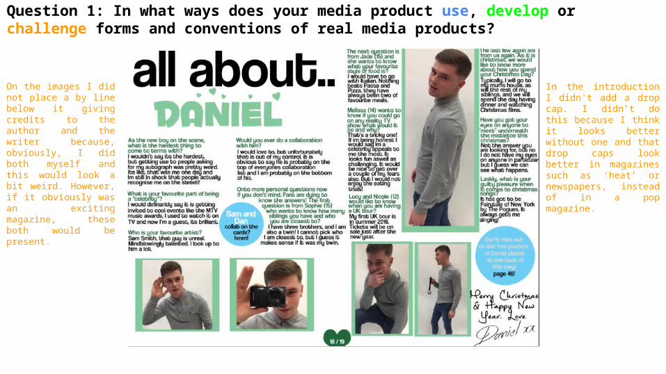
On the images I did not place a by line below it giving credits to the author and the writer because, obviously, I did both myself and this would look a bit weird. However, if it obviously was an exciting magazine, these both would be present.
In the introduction I didn't add a drop cap. I didn’t do this because I think it looks better without one and that drop caps look better in magazines such as ‘heat’ or newspapers, instead of in a pop magazine.
