evaluation for foundation portfolio
TRANSCRIPT

Evaluation For Foundation Portfolio
By Kirsty Mae Harragan

My Pop Music Magazine

In what ways does your media product use, develop or challenge forms and conventions
of real media products?I started my project by researching the conventions of pop magazines, so I could find out more about the genre and get a better idea of what my final pieces should include. I went on to create a PowerPoint of these conventions; I have attached the link below, along with an image of conventions of double page spreads.
conventions of pop magazines.pptx
In my magazine, I decided to follow most of the conventions of pop magazines in order to attract the target audience, and allow people to immediately know the genre of music that my magazine is celebrating.
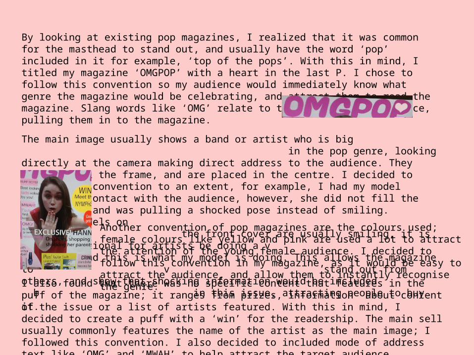
By looking at existing pop magazines, I realized that it was common for the masthead to stand out, and usually have the word ‘pop’ included in it for example, ‘top of the pops’. With this in mind, I titled my magazine ‘OMGPOP’ with a heart in the last P. I chose to follow this convention so my audience would immediately know what genre the magazine would be celebrating, and attract them to read the magazine. Slang words like ‘OMG’ relate to the young target audience, pulling them in to the magazine.
The main image usually shows a band or artist who is big in the pop genre, looking directly at the camera making direct address to the audience. They usually fill the frame, and are placed in the centre. I decided to follow this convention to an extent, for example, I had my model making eye contact with the audience, however, she did not fill the whole frame and was pulling a shocked pose instead of smiling. Although models on v the front cover are usually smiling, it is also conventional for artists be doing a v fun pose, and this is what my model is doing. This allows the magazine to v stand out from others, and show that shocking information would be included b in this issue,
attracting people to buy it. Another convention of pop magazines are the colours used; female colours like yellow and pink are used a lot to attract the attention of the young female audience. I decided to follow this convention in my magazine, as it would be easy to attract the audience, and allow them to instantly recognise the genre.
I also found that there was no specific content that features in the puff of the magazine; it ranges from prizes, information about content of the issue or a list of artists featured. With this in mind, I decided to create a puff with a ‘win’ for the readership. The main sell usually commonly features the name of the artist as the main image; I followed this convention. I also decided to included mode of address text like ‘OMG’ and ‘MWAH’ to help attract the target audience.

Some pop contents pages feature an editor’s letter with an image of the editor with the cover artists; I decided to include an editors letter on my contents page to make my magazine more personal.
Another ‘convention’ of pop magazines is to have a smaller version of the front cover on the contents page, with arrows directing the readers to each article. I also decided to put this on my magazine’s contents page, as it makes finding the article easier for the young readership, and also breaks the contents page up from being mainly written.
However, most pop magazines only feature one out of the above two things; I decided to feature both of these on my contents page. I included both of them on my magazine because makes it easier and more personal for readership.

Researching into conventions of double page spreads in pop magazines, I found that the artist on the front cover is usually featured in a double page spread, as shown by the example of Cher Lloyd on the cover and as the double page spread of ‘we love pop’. Following this convention, I decided to make my double page spread an interview with ‘Hannah Vickers’, as this is the artist who featured on the front.
I decided to follow the convention of having the artist make eye contact as this shows direct address to the audience and gives the magazine a more friendly feel, however, I did not have my artist taking up half a page which is another convention. I decided to invert this convention to allow a longer article for the readership to enjoy with their favourite artist.
In the case of interviews, pull quote is usually enlarged on the page somewhere as well as/or used as the title of the interview. This is shown by the image taken from a top of the pops article. I decided to follow this convention (as shown in the pictures) as it highlights the important parts of the interview, and draws the reader in by giving them a ‘sneak peek’.
I followed the convention of writing in columns and sticking to only a few colours; this shows a symbiotic link between the three pieces by keeping the same colour scheme, and makes it easier for the audience to read.
How does your media product represent particular social groups?
I have answered this question on a word document, and have placed the link below.
How does your media product represent particular social groups.doc
What kind of media institution might distribute your media product and
why?A media institution is a company that creates, markets or distributes media. ‘OMGPOP’ would be owned and distributed by BBC worldwide; this is the commercial subsidiary of the BBC. BBC worldwide was founded in 1995, but before this many BBC departments dealt with the sale of brands and programmes. This company exploits BBC brands, sells BBC products and other programming for broadcast abroad with the aim of supplementing the income received by the BBC. In addition to this, the BBC also produces other material, such as magazines, for example, Top Of The Pops, a magazine targeting young girls.
I would choose the BBC to publish ‘OMGPOP’ f because of the success it had with ‘Top of the The Pops’. ‘Top Of The Pops’ was originally a supplementary magazine for the TV show, but when the show got cancelled, the magazine continued independently. ‘Top of the Pops’ has now become more online based, with social media like twitter, and its own official website. BBC would be good to publish ‘OMGPOP’ because it is worldwide, and would be able to deliver it on many different platforms. This also means that the BBC has long-standing experience in successfully catering for an audience of pop fans.

The BBC is very successful worldwide; using multiple platforms, it reaches a weekly audience of 166 million globally. BBC world news is also available in over 200 countries and territories, around 300 million households, and 1.8 million hotel rooms. Because the BBC is familiar with working on a variety of platforms, it would be helpful with the promotion of ‘OMGPOP’.
The BBC’s mission is ‘to enrich people’s lives with programmes and services that inform, educate and entertain’, and their vision is ‘to be the most creative organisation in the world’. This explains why the BBC would be a suitable institution to distribute ‘OMGPOP’. The BBC has been around since the 1920’s, is known worldwide, and has a solid reputation. This is an advantage because it means that my media product would be successful worldwide, not just in England, and people would trust in the magazine if it was distributed by the BBC.
Along with ‘Top of the Pops’, the BBC also works with Radio Times. Radio Times is a British weekly television and radio programme listing magazine, founded and originally published by BBC magazines from 1923- 2011, when the BBC Magazines division was merged into Immediate Media Company. At one point, Radio Times was the magazine with the largest circulation in Europe; January 2013- 14, the circulation figure was 831,591. It is also the most comprehensive source of UK radio listings print, and has several regional editions, each containing different listings for regional programming. The BBC having experience with other magazines, such as the Radio Times means that they know what audiences like, and how to please their audience. It also shows that, because they’ve been successful with other magazines, they would be successful with ‘OMGPOP.’

Who would be the audience for your media product?
Please play the video below.

For my double page spread I decided to do an interview as when researching my target audience, I found out that this is what they would prefer to read. This double page spread would attract my target audience as its easy to read; the question is in a different colour to the answer, easily separating them for the readers. A big block of writing is avoided by placing an image centre of the interview; this would appeal to the young audience as they prefer visual based pieces rather than all text. This image is related to the article, and is captioned appropriately. An image of the artist takes up the right side of the page, with a quote from the article also. This shows the readers who the interview is with before having to read it, and gives a ‘sneak peek’ of something's from the interview by the pull quotes.
‘Dating dramas, shocking stories and colourful clothes… Hannah tells us all!’
This would attract the audience as alliteration is used, and the words ‘drama’ and ‘shocking’ would make the reader want to find out more.
My magazine is successful in attracting and addressing its target audience because of the direct address used; eye contact is made with the reader in most of the images throughout the magazine, and the language used is relatable to the readership’s age. The colours used also help to get the attention of the audience, as they’re bright and feminine. Exclamation marks are also used to express excitement in the issue.
How did you attract/address your audience?
Double page spread

‘Boyf’ is used as an abbreviation for ‘boyfriend’, linking the magazine to the youthfulness of the readers, and how they usually obsess over boys.
‘Buff Boys’, ‘Mwah’ and ‘OMG’ are used in the left hand third to draw the readers attention to the front cover, by convincing them to buy the issue to find out all about their favourite celebrities.
Alliteration is used to draw the audience in; ‘wow them with your winter wardrobe!’. This would attract young girls because they want the best clothes to look good. ‘Wow’ is in capital letters to attract them in, suggesting that this magazine has the best fashion tips.
‘Cringe’ is written in capital letters and in bold to attract the audience; the fact that celebrities are revealing embarrassing things creates a link between the celebrity and the audience, making the magazine seem more friendly.
When the audience see the word ‘plus’ they straight away know that the issue is full with content for them to enjoy, making them want to buy it.
The front cover also attracts the audience by being visually attractive; images are spread out on the page. This would appeal to the audience because they’re young, and a big group of words would be unattractive to them.
The word ‘exclusive’ lets the audience know that they can’t get this interview in any other magazine, appealing to them, making them want to buy it. Alliteration is also used in the main sell-line.
The heart in the title would also appeal to the young audience because it would link to them drawing in their schoolbooks, and also links to their femininity and youthfulness.
Front cover

Above the editors letter is a photo of the main artist and I; this shows that I actually met Hannah Vickers which means the interview is more personal and true to life. This would attract my audience because they’ll know that the information is real, and would be interested in finding out more about their favourite celebrities. This is placed in the left hand third, so the readers eye directly goes to it.
On my contents page is an editors letter in a script like font. This would appeal to my audience as it gives a friendly feel between the readership and I. ‘Love Kirsty x’ signs the letter off in an informal way, welcoming the readers to continue to read and enjoy the magazine.
Direct address is used on the contents page to tell the readers what will be included in this issue; text like ‘you’ and ‘we’ are used to specifically talk to the reader and draw them into buying the magazine.
A smaller image of the front cover is labelled on the contents page, directing the readers to the page in which they can find the articles on the cover. This would appeal to my target audience as they are young and so this is an easy way for them to navigate around the magazine.
Smaller images are placed around the contents page to make it more visually attractive as large amounts of text could put the reader off.
Ellipses are used with heart shapes instead of dots; this relates to the young target audience and adds femininity to the issue. This would attract the attention of my audience and make them want to buy it as they know its made specifically for them.
The language used would attract my audience; phrases like ‘wahey’ and ‘grabbing your perfect lad’ are used. The informal way its written is relatable to the young which pulls them into reading the magazine. Big words would make them uninterested, and help them decide not read it.
Contents page
Abraham Maslow
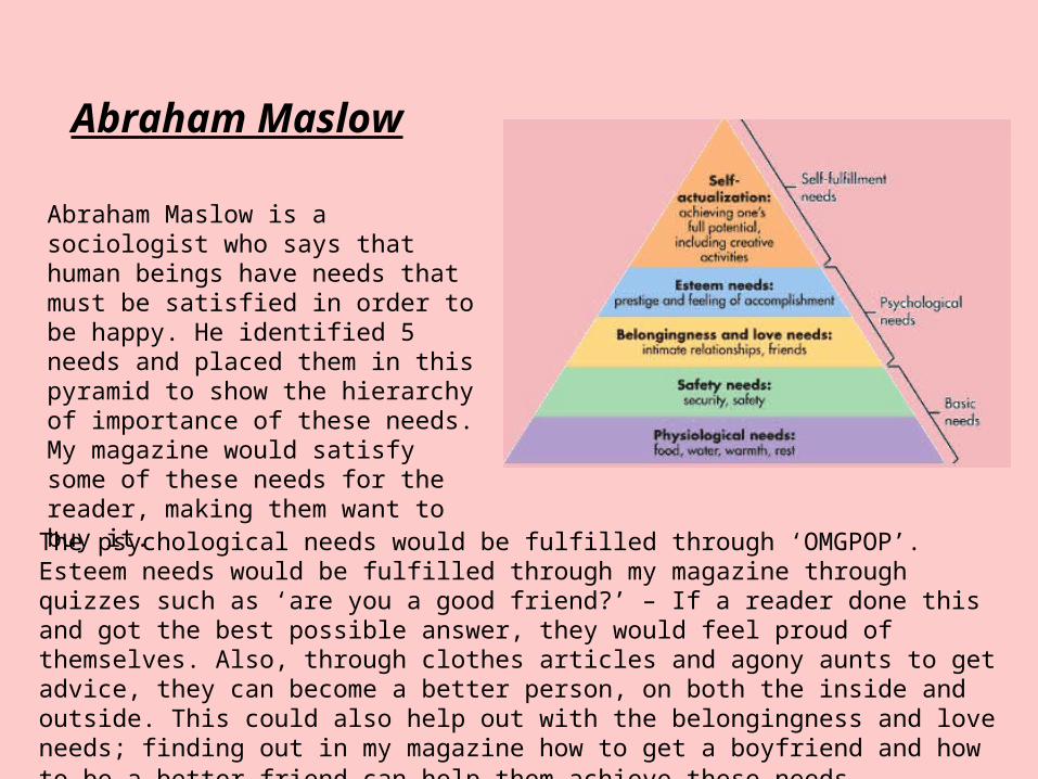
Abraham Maslow is a sociologist who says that human beings have needs that must be satisfied in order to be happy. He identified 5 needs and placed them in this pyramid to show the hierarchy of importance of these needs. My magazine would satisfy some of these needs for the reader, making them want to buy it.
The psychological needs would be fulfilled through ‘OMGPOP’. Esteem needs would be fulfilled through my magazine through quizzes such as ‘are you a good friend?’ – If a reader done this and got the best possible answer, they would feel proud of themselves. Also, through clothes articles and agony aunts to get advice, they can become a better person, on both the inside and outside. This could also help out with the belongingness and love needs; finding out in my magazine how to get a boyfriend and how to be a better friend can help them achieve these needs.

Uses and Gratifications Theory
The uses and gratifications theory is the idea that magazines offer a range of benefits and gratifications to the audience, and this is how a magazine succeeds. Blumler and Katz highlight five potential benefits, and magazines provide these benefits.
1) To educate My magazine educates the audience by teaching them the best fashion, relationship and general advice through the agony aunt section.
2) To entertain My magazine also fulfils this benefit by providing the audience with material to read and activities to complete.
3) The third benefit that is outlined in the uses and gratifications theory is social interaction This can be found in ‘OMGPOP’ as content can be talked about and shared with friends.
4) Escapism This is the idea that a magazine can be something for you to read and ‘escape’ from your life with. My magazine provides readers with this, so when they’re worried or stressed, they can open ‘OMGPOP’ and read about their favourite artists, or join in with the fun quizzes.
5) Identifying with others My magazine strongly provides audiences with this; they can share things with other readers, find out more about their favourite celebrities and role models, and help become a better person.
Post production research to prove how successful I was in satisfying target
audience.
I showed my magazine to some representatives of my target audience group and asked them what their opinions of it were. The comments I received back were positive:
•“I like the colours used, they stand out because they’re bright”
•“I think it looks good, if I was looking for a magazine to read, I would take interest in this”
•“I like the way you have set out the contents page… its easy to read and lets us know where we can find the articles on the front cover”
•“The pictures are nice, especially the one on the page with the article”
•“The double page spread looks interesting, and easy to read”.

What have you learnt about technologies from the process of constructing this product?
AndLooking back at your Preliminary Task, what
do you feel you have learnt in the progression from it to the full product?
These two questions are answered on Prezi, and the link is below.
http://prezi.com/8ce-pfgftctz/?utm_campaign=share&utm_medium=copy&rc=ex0share