evaluation
TRANSCRIPT

Front Cover

Contents Page

Double Page Spread

In what product ways does your media,
develop or challenge forms and conventions of real media products?
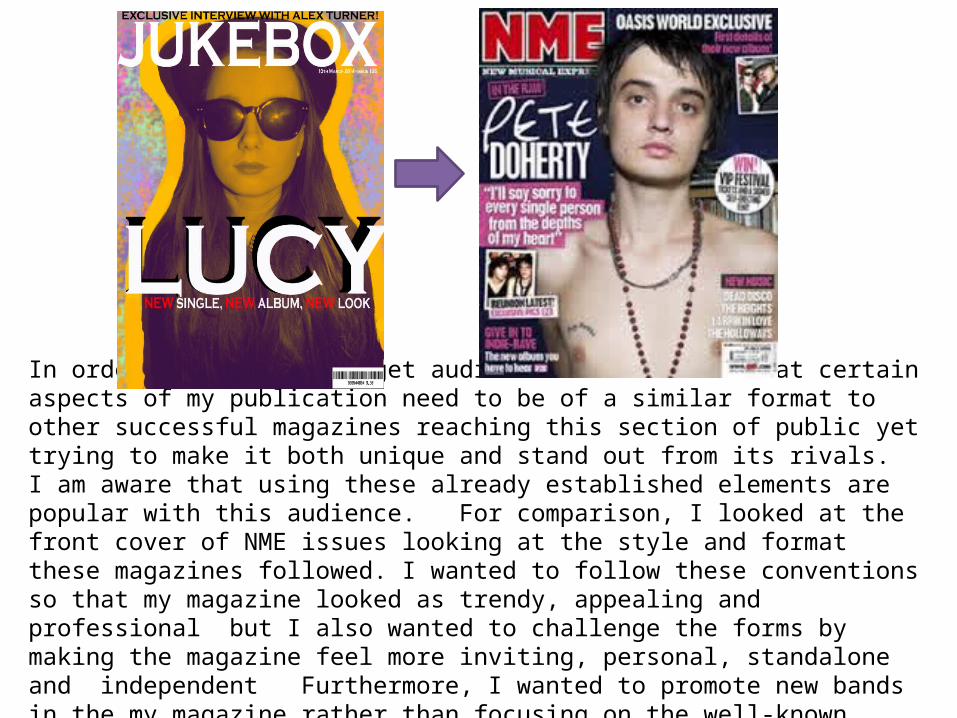
In order to reach my target audience I understand that certain aspects of my publication need to be of a similar format to other successful magazines reaching this section of public yet trying to make it both unique and stand out from its rivals. I am aware that using these already established elements are popular with this audience. For comparison, I looked at the front cover of NME issues looking at the style and format these magazines followed. I wanted to follow these conventions so that my magazine looked as trendy, appealing and professional but I also wanted to challenge the forms by making the magazine feel more inviting, personal, standalone and independent Furthermore, I wanted to promote new bands in the my magazine rather than focusing on the well-known artists.

What magazine conventions have I used?
• Masthead displayed across the width of the page• Banner ‘Exclusive Interview…’• Headline• Date Line• Barcode• Buzz Words• Consistent House Style• Main Image• Music Related Articles• Price• Website

Conventions I used from real media productsMasthead
Without doubt the masthead of the front cover needed to be both unique and prominent therefore, I employed a combination of the font ‘Copperplate Gothic Bold’ with a mixture of black and white I did this to catch the eye and this fitted the minimalist layout I was looking for. I felt this simplified text was straightforward without being predictable. In addition to this, I manipulated the writing so that the ‘magazine’ font is stretched out over the width of the page and the black writing outlines the white writing behind. I used this same style on the contents page as well as it makes the masthead stand out more as it outlines the text. The masthead conforms to the audience’s expectations as it is positioned at the top of the page and by doing this it is able to be seen clearly. This is a crucial effect especially for a new magazine. The masthead also dominates a large amount of the page which again allows for identification.
Front Cover
Contents Page
Double Page Spread
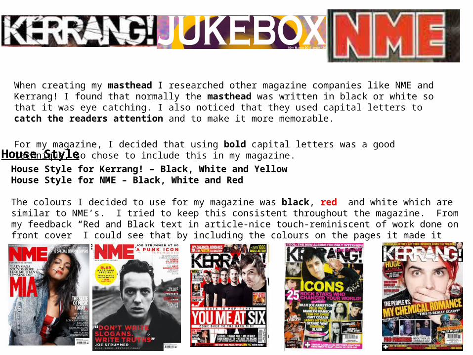
When creating my masthead I researched other magazine companies like NME and Kerrang! I found that normally the masthead was written in black or white so that it was eye catching. I also noticed that they used capital letters to catch the readers attention and to make it more memorable.
For my magazine, I decided that using bold capital letters was a good technique, so chose to include this in my magazine. House StyleHouse Style for Kerrang! – Black, White and YellowHouse Style for NME – Black, White and Red
The colours I decided to use for my magazine was black, red and white which are similar to NME’s. I tried to keep this consistent throughout the magazine. From my feedback “Red and Black text in article-nice touch-reminiscent of work done on front cover” I could see that by including the colours on the pages it made it look more professional.
Price
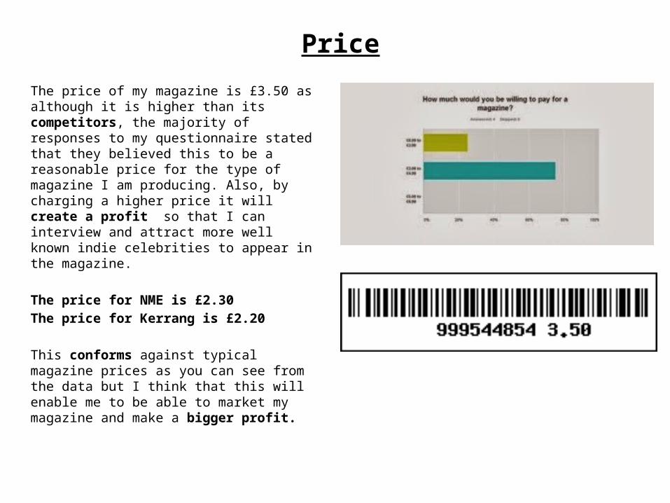
The price of my magazine is £3.50 as although it is higher than its competitors, the majority of responses to my questionnaire stated that they believed this to be a reasonable price for the type of magazine I am producing. Also, by charging a higher price it will create a profit so that I can interview and attract more well known indie celebrities to appear in the magazine.
The price for NME is £2.30The price for Kerrang is £2.20
This conforms against typical magazine prices as you can see from the data but I think that this will enable me to be able to market my magazine and make a bigger profit.

Font/Styles
Front Cover:I noticed that existing music magazines front covers were bold, distinct and always had bright eye catching colours used for their titles. This makes the magazine more memorable and seen as a brand therefore; I decided to use this convention in my own magazine.
When researching different poses, I came across using a different background colours for different images so that it made them stand out more and appear unique. The titles were written in white to highlight them and catch the reader’s attention. This conforms to what a lot of other magazines do and so makes the magazines authentic.
Double Page Spread:As a unique selling point I decided to use a photo booth style which I think challenges forms of a magazine as most of them only have one large photo on the page rather than 16 different little ones. I acquired my inspiration from looking at Andy Warhol’s ideas which I researched when looking at different poses.
The title font and style of my magazine is uncomplicated and clear cut. There is no predictable fashionable and curved text often associated with mainstream music magazines. Yet it still conforms to the conventions of a magazine due to the bold, capital letters used in the font ‘Copperplate Gothic Bold’. I think that it is important that the magazine does this because it creates a straightforward and comfortable aurora.
Contents Page: On my contents page, I have used an “ombre” style colour which I think worked really well. I think that this conforms against usual magazine contents pages and is unique in that I have never seen it done before. I outlined the white text at the top of the page with a shadow effect to catch the reader’s attention. The titles were written in white to highlight them and catch the reader’s attention and this conforms to what a lot of other magazines do and I feel will appeal to my target audience
Mise-en-sceneThroughout my magazine I have tried to use complete contrasts between the
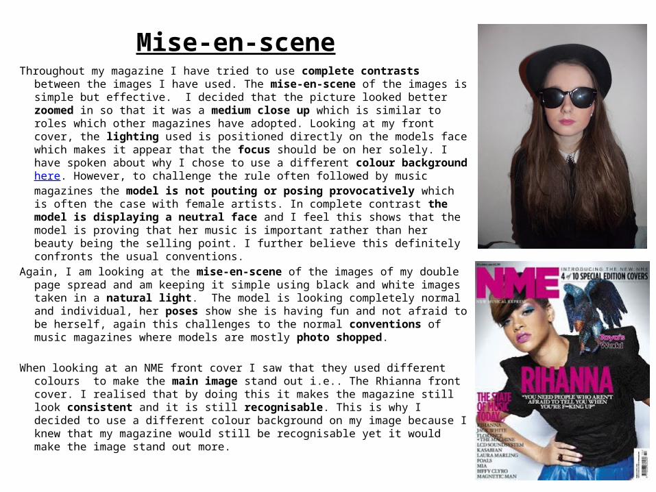
images I have used. The mise-en-scene of the images is simple but effective. I decided that the picture looked better zoomed in so that it was a medium close up which is similar to roles which other magazines have adopted. Looking at my front cover, the lighting used is positioned directly on the models face which makes it appear that the focus should be on her solely. I have spoken about why I chose to use a different colour background here. However, to challenge the rule often followed by music magazines the model is not pouting or posing provocatively which is often the case with female artists. In complete contrast the model is displaying a neutral face and I feel this shows that the model is proving that her music is important rather than her beauty being the selling point. I further believe this definitely confronts the usual conventions.
Again, I am looking at the mise-en-scene of the images of my double page spread and am keeping it simple using black and white images taken in a natural light. The model is looking completely normal and individual, her poses show she is having fun and not afraid to be herself, again this challenges to the normal conventions of music magazines where models are mostly photo shopped.
When looking at an NME front cover I saw that they used different colours to make the main image stand out i.e.. The Rhianna front cover. I realised that by doing this it makes the magazine still look consistent and it is still recognisable. This is why I decided to use a different colour background on my image because I knew that my magazine would still be recognisable yet it would make the image stand out more.

Costumes and PropsAll the costumes and props used throughout the magazine are conventional. Both are an important feature because they explain
the images more clearly. Looking at the contents page I have used simple photos that represent what people would wear and show images of people enjoying their music rather than studio shots. I have done this deliberately so that my audience can connect with the individuals. My audience will be able to relate to this because it is something they would enjoy doing. The main image I used was of a featured artist wearing plain black clothes so that she would stand out and appear more obscure. For her make up, I used a gothic purple lipstick and gave her props like a hat and dark sunglasses which gives off a cool message associated with this type of music. I thought that it was important to include this image because this followed the genre used in similar publications and indicate immediately who and what this publication is for. I wanted the feel to be “a do it yourself” approach often connected with this style of music and audience. Although not intended females seem to be the highly dominate my publication however, I believe this is a positive as it is normally male acts that are the main focus of these magazines and so this will not only attract a greater female audience but will encourage a wide range of people see this as something new and interesting.
At the top of the front page I mentions a male artist interview. This allows the target audience to feel this publication is relevant
to them. However, to conform against stereotype I have used a model of a young girl. This follows the standard used with most other magazines aimed at this genre.
I gave my model props like a hat and dark sunglasses which gives off a cool message associated with this genre of music. I also recognised that other well known indie celebrities wore these so I tried to look at their fashion and include it in my magazine.
Harry StylesLiam Gallagher Nina Nesbitt
Pixie Geldof
YouTuber Zoella wearing the same top as the model

LayoutI have used a conventional layout for this magazine; it is simple and easy to read. The layout is organised and relevant for this
type of publication. Similar to the music produced independently I wanted my publication to appear not to be owned by a large mainstream publisher. Obviously it is a necessity to make this magazine profitable yet at the same time I wanted to make it feel independent. Therefore, I needed to use different elements, so I have arranged the conventions by placing the masthead at the top of each page and using headlines and sub headlines. My subheadings tell the audience what to expect in the magazine without having to flick through the magazine. This will help increase the audience range because I included information that would appeal to more people. This conforms to the conventions of other similar magazines. Pages are numbered on the contents page so that the reader can quickly go to the section that interests them. The appropriate image of a feature in the article used corresponds well with the headlines and sub headlines. The barcode is placed conventionally at the bottom of the front page. The magazine is also dated so that the reader knows what edition they are reading. The layout of the magazine is an important feature because this is what first attracts the reader. The magazine needed to have a good eye-flow so that it is interesting and attracting for the audience to read.
I think I have made my magazine unique by including Polaroid photo’s on it to make it look more relevant thus letting the reader feel that this is not a high budget marketing tactic . Also, on the dps, a exclusive aspect is the use of the photo booth as I believe this is a distinctive idea.
I have conformed to the conventions on the contents page by splitting the page into three columns, making the centre column enlarged so it emphasises the picture. I think that by setting it out this way it makes the it more clear and organised and highlights the most important feature of the magazine. I believe this will draw the audience to want to read further. This is NME
contents page; I adapted the same technique they used with the different subheadings.
The masthead is positioned across the width of the page like Kerang! Following its conventions.
Contents page layout

I researched media conventions using my mood board which contained a mixture of images of artists and eye catching headlines which made use of different buzz words.
Written Content
The written content in my magazine is essentially conforming to an article in magazines as it uses standard writing techniques to create a piece of text to sound professional by using columns and an interview. I thought that by incorporating an interview into the article this would attract audiences who wanted to know more about the artist. By using columns which are a standard technique in magazines this would allow the audience to be able to read the article easily. I used a font size of 11 in the same font (copperplate gothic bold) to show contingency throughout the whole magazine.

Music Genre and How Your Magazine Suggests it?My music magazine conforms to the way in which the music genre is suggested, this is done by featuring well know indie artists as well as those who are not so well established. Featuring both appeal to this type of audience. It is about underground and non mainstream music. The suggestion of the genre of music is also offered by the mention of music festivals and the style of clothes worn in the photographs. As with the music this trend follows its own individual style. I have looked at other successful independent magazines such as The NME and Q Magazine.
NME talking about music festivals
I think through props and costumes I have tried to show the different music genres.
Liam Gallagher, part an indie band Oasis, seen wearing a hat like my models. The hats are well known for being indie.
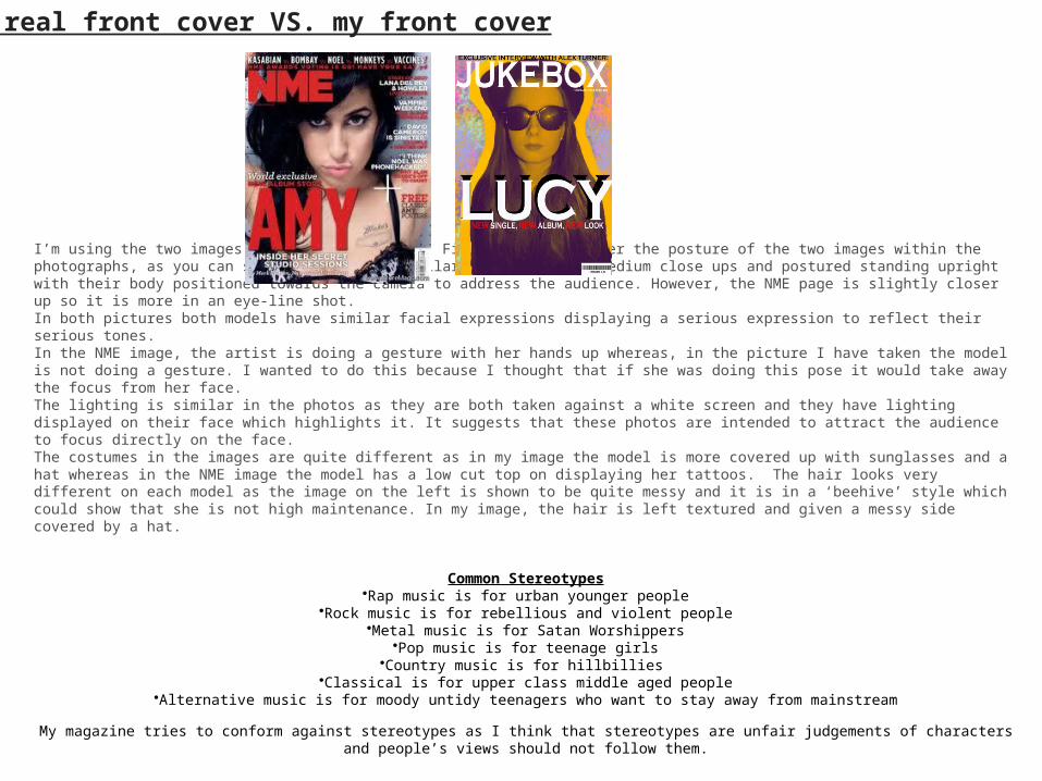
I’m using the two images above for comparison. First, let’s consider the posture of the two images within the photographs, as you can see they are both similar. They are both medium close ups and postured standing upright with their body positioned towards the camera to address the audience. However, the NME page is slightly closer up so it is more in an eye-line shot. In both pictures both models have similar facial expressions displaying a serious expression to reflect their serious tones.In the NME image, the artist is doing a gesture with her hands up whereas, in the picture I have taken the model is not doing a gesture. I wanted to do this because I thought that if she was doing this pose it would take away the focus from her face. The lighting is similar in the photos as they are both taken against a white screen and they have lighting displayed on their face which highlights it. It suggests that these photos are intended to attract the audience to focus directly on the face. The costumes in the images are quite different as in my image the model is more covered up with sunglasses and a hat whereas in the NME image the model has a low cut top on displaying her tattoos. The hair looks very different on each model as the image on the left is shown to be quite messy and it is in a ‘beehive’ style which could show that she is not high maintenance. In my image, the hair is left textured and given a messy side covered by a hat.
Common Stereotypes
•Rap music is for urban younger people•Rock music is for rebellious and violent people
•Metal music is for Satan Worshippers•Pop music is for teenage girls•Country music is for hillbillies
•Classical is for upper class middle aged people•Alternative music is for moody untidy teenagers who want to stay away from mainstream
My magazine tries to conform against stereotypes as I think that stereotypes are unfair judgements of characters and people’s views should not follow them.
A real front cover VS. my front cover

2. How does your media product represent particular social groups?
In order to represent a wide variety of my target audience I tried to make my magazine represent different social backgrounds, abilities, race and age groups. In order to maintain this target audience the publication needs to speak to everyone equally who like the genre of music as this way more people would be interested in reading the magazine.
EqualityAlthough it is not intentional, females dominate my magazine which could in turn attract a greater female readership. While I tried to balance up the ratio of male and female (by advertising a male interviewee on the front page), I don't foresee this gender gap being a problem as people associated with this subculture are known to tend to be fairly liberal in their views. I thought that this would be effective as it would help the reader form a better opinion and more people would be interested to hear the views from a variety of people.
PriceI incorporated the price on the barcode so that it is easy for people to see and it is a conventional feature of a magazine. I have decided to price my product at £3.50 as the majority of responses to my questionnaire stated that they believed that to be a reasonable price for the type of magazine I am producing. My magazine is reasonably priced which makes the magazine inclusive and will attract more people to read it. I think that my magazine represents similar social groups to magazines like NME as the content is fairly similar for example on the contents page it has different subheadings like ‘News’, ‘Reviews’, ‘Live!’ and ‘New Acts’.

Models ClothingThe model is dressed all in black to make it appear like she is not in a costume. I feel by doing this it relates to the target audience because she looks down to earth and casual.
Ray ban Sunglasses – worn by younger celebrities reflecting a young social group.
Younger celebrities at Festivals
Using pictures from festivals shows that I am targeting a younger audience because this normally attracts a younger group.

The social groups that are represented in my media product are people aged between 16-21 year old. This target audience is normally well known for being ‘heavy spenders’ e.g. Buying the latest technology on the market and high branded clothes. This generation is also well known for being online (1 in 4 people have facebook) so this is why I thought it would effective to display a website on the contents page.
Music is a massive part of most young peoples lives, as often the songs recount situations they have been in and so it would appeal to them to read more about the artists because it something they can relate too. The people who are interested in the type of music that the magazine deals in tend to be very passionate about it, and willing to spend a lot of money on it.
I tried to use a variety of images that this target audience would be able to communicate with. My magazine tries to appeal to all ethnicities and genders as I didn’t want to limit my target market.

3. What kind of media institution might distribute your media product and why?
The major publishing company that I would be interested in my magazine would be IPC media because they print magazines like NME.
IPC Media “With more than 60 iconic media brands, IPC creates content for multiple platforms, across print, online, mobile, tablets and events. We engage with 26 million UK adults - almost two thirds of UK women and over 40% of UK men. Our award winning portfolio of websites reaches over 25 million global users every month.”
IPC media has partnerships with leading supermarkets which could widen my target audience and make the magazine more accessible for my target audience. I feel that this would be a great platform for my magazine as the company is already well known for its popularity amongst iconic media brands. It engages with 26 million people and its website reached over 25 million global users every month which would be a great starting place. My magazine can bring originality and uniqueness to the publishing company because there is not a magazine like mine already on the market. My magazine is similar to NME whom IPC Media already publish but as unlike NME, my magazine will look at new artists as well as the well-known artists which I believe is the unique selling point.

4) Who would be the audience for your media product?
My target audience is 16-21 year old males and females who are passionate about indie and alternative music. My research showed me that many people of this age, who enjoy this music also follow indie fashion, enjoy watching the bands live, attend festivals and usually can play an instrument. Although it is not intentional, females dominate my magazine which could attract more females as they pay a bigger role in the magazine.
The type of people who would buy my magazine would be in E NRS Social Grade because the majority of people aged 16-21 are unemployed students or casual workers. This suggests that the magazine may be bought for them. The majority of people aged 16-21 are students or do not have other commitments (families to support, mortgages,etc) and so have more disposable income to spend on (on products such as my magazine)
My target audience would probably fall into both the explorer and the aspirer category in the psychographics labels. This is because the target readership tend to research music beyond that which they're immediately presented with by mainstream radio stations, and often aspire to present this music to others as a superior alternative. It is also highly likely that the people reading my magazine enjoy exploring music that they may not otherwise have heard of.
5. How did you attract/address your audience?
To attract my audience, I first tried to understand what they would like in the magazine. I did this by taking a survey which enabled me to get a clearer idea on their views. When I analysed these results, it allowed me to cater to my audiences needs more. For example, when asking my audience 'How much would you be willing to pay for a magazine?' The majority were willing to pay £3.00-£4.99 this allowed me to decide an appropriate price for my magazine. The survey also helped me to decide what content to put inside the magazine. I asked 'What were people's favourite things to see in magazines?'. The result from this question was interviews, then new bands followed by event information (gigs), and freebies and exclusives which again gave me a clear insight and helped me understand the audiences needs. The link to this page is here.
Another way to try to attract my audience was by getting feedback from family and friends at every stage of the creation process. I asked for positive and negative feedback so that I could make improvements to suit the audience. I thought this would be effective because at every stage of the process it is consistently trying to suit the target audience.
Positive
Looks professional-tag line of the magazine draws people in (especially the red ‘New’)Right to make the actual picture darker-greater contrast makes it more eye-catchingWhite and red writing easy to read. The black less so. Negative
Could perhaps have more on it? More of what else is in the magazine to draw people in “Exclusive interview with Alex Turner” bit seems just randomly placed-need more there Maybe some effect on the singers name to make it stand out?

Front Cover
When making my front cover, I tried to keep the writing to a minimum because I wanted it to appear catchy and I thought by doing this it would grab the readers attention as it would make it easier to read. I kept the text simple by making it outlined and bold to contrast it against the brightly coloured background. I then used buzz words to try to address the audience and to draw them in.
Contents Page
On my contents page, I have tried to include articles that would appeal to my audience like including exclusive interviews with well liked artists like Jake Bugg and Arctic Monkeys. Another way I tried to attract my audience was by using different subheadings similar to NME as I thought this was a good technique to use.
DPS
The double page spread tries to attract the audience by using a variety of pictures to make it more eye-catching. I have included an image of the writer with the artist to make the article seem more personal and keep up that DIY vibe that I'm striving for
6. What have you learnt about technologies from the process of constructing this product?
• Throughout the process of constructing the product I learnt a great deal about the technology and how vastly they have helped the media institutions. I have learnt many different things like
·Using a Nikon l810 I learnt how to take photos correctly by looking at different camera angles and considering how the setting and lighting would affect the picture.
Computer Programmers' I used
• Adobe Photoshop: I have acquired new skills throughout the process of Photoshop and I now feel much more confident with using the programme. Before doing this task I didn’t understand how to use Photoshop but by watching online tutorials I knew how to move different pictures around the screen, overlapping different pictures, making backgrounds, retouching pictures, getting rid of red-eye and how to organise the different layers efficiently. I also learnt about how to use different lighting and colour saturation to make the picture look different.
• Scanner to scan in paper drafts• Microsoft PowerPoint and Word to record down or present my ideas• Internet Explorer - allowed me to access online sites (Blogger and Slide share)• Creating a blogger account to record the different steps that was involved in creating my magazine e.g. first
draft, mood board• I used slide share to display my presentation on my blog

Looking back at your preliminary task, what do you feel you have learnt in the progression from it to full product?
Preliminary Task
Final Task
When comparing my preliminary task and final task I feel the full product now looks more professional both visually and within the content; you can clearly see a vast improvement between the two. This learning process has helped me develop a deeper understanding of what is required to achieve a better and more popular publication. These new skills include what is required to attract my specific target audience. This new knowledge has shown me that different social groups have different interests and so magazines aimed at one target audience will not necessarily appeal to another. It has shown me how important it is to reach the market you are trying to attract. I further understand why and how to attract the audience for my music magazine in order to reach its maximum potential. In the case of my Music Magazine I needed to show the reader that this magazine was speaking to them and understood there desire to stay away from mainstream music. The importance of my Market Research was paramount to the success of this publication. By listening to feedback taken from my questionnaire I learnt what was important to my audience e.g. many wanted to see pictures of their favourite artists playing live and read live reviews. I have forged ahead with my completed media product with a better understanding of programs such as photoshop. I have a clear understanding of how to update my blog on a regular basis and how to upload versions to slide share.