evaluation
TRANSCRIPT


Q1: In what ways does your media product use, develop or challenge forms and conventions of real
media products?
• In my media product (music magazine), many conventions are used and developed; however, another number of them have either been challenged or omitted. For example, conventionally, the front cover of a magazine would include a main image which would work with juxtaposition with things around it, working in tandem to get information across to the audience. This can be seen in the Kerrang! magazine front cover:

• as the medium shot of Oli Sykes shows him holding a camera which creates juxtaposition when placed next to the buzz words “Hot Shots” to indicate to the audience that there are exclusive photos inside. Similarly to this - taking inspiration from this rock magazine and other magazines that follow this convention – I decided to do this with my magazine
by showing the lead singer of the band “Long Shot” making a gun gesture; however, I developed my juxtaposition further by adding a subheading saying “firing on all cylinders with their new album” therefore showing how I have information on the band’s latest album.

Another often used convention is a plug; usually used in bulk with many on one page- the plug is a sticker like picture which is used to depict to the reader what lies within the magazine. This convention can be found in every genre of music magazine as it appeals to the audience and makes them feel like they are getting something nobody else is getting; something exclusive.
Albeit, a plug doesn't have to be an image but it is most commonly an image as it adds more information to that section of the page. just writing is less likely to entice the potential reader and so an image is used to get the reader's attention and get them interested. But simple writing is also used as can be seen on the Q front cover:

The plugs I have chosen to used are following the status quo of plugs but others are building on the idea of the image and a bit of subtext. The original ones are used to show to the audience that there are 5 free posters inside that you can cut out and stick on your wall; however, the other two- near the top- each have a paragraph alongside them to add context that just a few words couldn't do, the image would draw the reader's attention and the writing would entice them to buy the magazine as they would find it interesting:

The date and price are often bundled with the barcode wherever the barcode is placed. This is because although they are necessities, the barcode, price and date and not what attracts the reader to a certain magazine, therefore they are kept small, bunched together and are placed out of the way but in view. This usually means that they are all squashed into a corner on the front cover so that people can see it and tell how much it is going to cost but it doesn't distract away from the main attractions or the main image on the front cover.
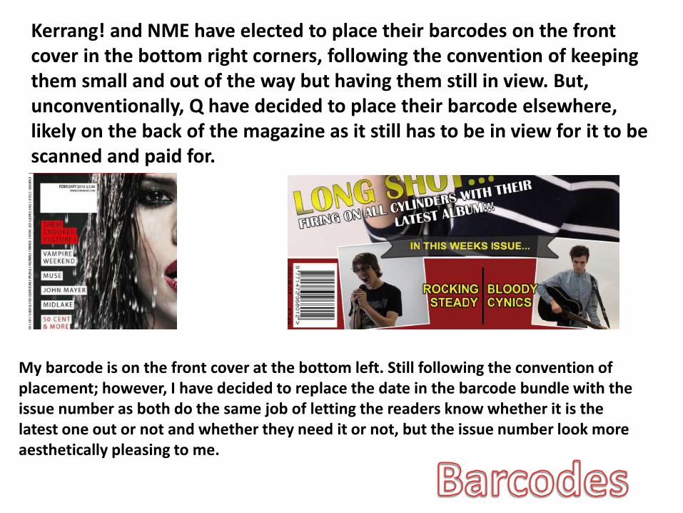
Kerrang! and NME have elected to place their barcodes on the front cover in the bottom right corners, following the convention of keeping them small and out of the way but having them still in view. But, unconventionally, Q have decided to place their barcode elsewhere, likely on the back of the magazine as it still has to be in view for it to be scanned and paid for.
My barcode is on the front cover at the bottom left. Still following the convention of placement; however, I have decided to replace the date in the barcode bundle with the issue number as both do the same job of letting the readers know whether it is the latest one out or not and whether they need it or not, but the issue number look more aesthetically pleasing to me.

When it comes to the masthead in a magazine, you are likely to find it at the top of the front cover as convention dictates that is where it should be. This is because when you start reading, you start from the top left of the page and so when you are looking for the title of the magazine, you look straight to the top and to the left to find the name of the magazine. This is the same for all magazines:
Following this convention due to its appeal through it being aesthetically pleasing, my magazine starts at the top left and goes across the page in big blocky letters. So the audience know right away what it is called.

Also, quite often in a music magazine, the centrefold of the double page spread in connected by a heading/subheading to help make the audience feel more comfortable knowing that the two pages are connected as it is often an image on one side and text on the other. This heading/subheading is conventionally, potentially a pull quote from the text. This can be seen in the magazine by NME:
The main image of the double page spread is usually a very large image that takes up the whole page and makes any writing look tiny. However, challenging this convention, I decided to have a still quite large image- but with a fair amount of writing to go along side it, this would then free me up some more space to have a larger article for the audience, thus enticing them more.
Also, layout includes colour and through research into other magazines of the rock genre and the survey I had sent out- I found that red, yellow, black and white were the most characteristic of a rock magazine and so I incorporated such colours throughout my magazine.
Also, the convention of page numbers is almost obligatory as they indicate to the audience the numbers of the pages which allow them to turn straight to what they want to read which link in to the purpose of the contents page.
Using these conventions in my magazine is useful because it allows the reader to look at one side of the double page spread and smoothly move to the other side of it, making the transition smooth makes the two pages look less blocky and more merged together which is what you would expect from a double page spread.

Moreover, conventions are very hard to oppose when it comes to appealing to a large market as they have grown to expect certain things. Such things would include a website URL placed on one of the pages; either the front cover, double page spread or the contents page where the readers can visit to get more information on certain subjects such as those shown below in Kerrang!, NME and Q:
Each of these use the URL puffs to express to the reader how each magazine doesn't just end at the end of the issue, it allows the reader to dig further into a story and depicts how much bigger the magazine is. Expanding on this for my own magazine- and developing it unconventionally- I decided to introduce social networking icons where the reader will be able to follow the magazine and get day to day updates, as the stereotypical young readers are now expecting to be able to use all kind of media to read about the latest things. Facebook and Twitter were the two icons and social medias I chose to place on my magazine- shown below- but are among many potentially usable ones:
Using icons instead of URLs is unconventional because- unlike other magazines- it doesn't give the reader a particular site to visit with a certain story, it gives them a page which is much easier and more accessible than typing a full URL out in the search bar. This then appeals to my target audience because it is aimed at teens that are stereo-typically lazy as it is much easier to like a Facebook page than continuously typing out the website URL.

Q2: How does your media product represent particular social groups?
Colour scheme:The use of the colours blackand red across my double-page spread imply that thesocial group I aim to targetlike to wear dark clothes thatexpress the genre of musicthey listen to – in this caserock. The use of red is bright,and so implies that myaudience like to stand outfrom the crowd, and alsoconnotes danger – suggestingmy audience like to live life onthe edge. These traits arecommon in teenagers as theylike to try new and excitingthings, whilst also expressingtheir interests boldly (such asthrough dress).
Photography:The colour scheme links in with the image used on this page, as the actor in this image is dressed in black. This was planned for my image, as again it expresses how teenagers like to stress their music taste through their clothing. Also, the posture of the subject is slumped forward –suggesting that teenagers tend to slouch and appear laid back, as if they are void of stress and are instead careless.
Writing style:The use of the questions: ‘What is your greatest ambition? What do you most hope to achieve in your life time?’ I imply that my audience are young, as many adolescents tend to be questioning what to do with their lives. Therefore, it represents this particular social group as searching for some inspiration from their favourite celebrities in what to do with their own lives.
Social group:From the fact the subject is wearing black and the colour scheme is red and black, the whole double-page spread gives off a rather gothic feel. However, with the effect of the guitar and the lit up background – I have also represented a social group of ‘Indie’ as it isn’t quite as dark and msyterious as the stereotypical ‘goth’ would be represented.

Class:I decided to give my magazine a price of £2.50 – which presents my target audience to be working/middle class. This suggests that they are earning less than the average adult and so would not be willing to spend a lot of money on a magazine as they cannot afford to waste it; therefore implying my audience are young adults or adolescents.
Content:The fact that I have included social icons on the front cover represents my audience as media savvy. It suggests that they are always on some form of media/technology, and always want to keep up to date on the internet (something in which the typical adult doesn’t feel they depend on). This applies to all social classes and genders when it comes to the younger audience.
Having the masthead in a Roman/Greek font challenges the stereotypical representation of youth because in this day and age, young people want to be seen as wild and out of control; however, with my choice of font, I have presented the audience as still taking an interest and pride in how academic and intellectual they are, not just how fun they are. Therefore, I have represented them as mature but still socially concerned.
In this front cover, there is the gesture of a gun taking form in the subjects hand; this represents the readers as finding allure in guns and violence- and by extension- danger.
The representation of young people being attracted to danger can also be seen to be represented through the continuous use of the colour red which can be seen over and over in the music magazine as it can be throughout all rock music magazines.
Writing Style:
Social Groups:
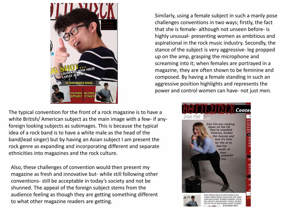
The typical convention for the front of a rock magazine is to have a white British/ American subject as the main image with a few- if any-foreign looking subjects as subimages. This is because the typical idea of a rock band is to have a white male as the head of the band(lead singer) but by having an Asian subject I am present the rock genre as expanding and incorporating different and separate ethnicities into magazines and the rock culture.
Also, these challenges of convention would then present my magazine as fresh and innovative but- while still following other conventions- still be acceptable in today’s society and not be shunned. The appeal of the foreign subject stems from the audience feeling as though they are getting something different to what other magazine readers are getting.
Similarly, using a female subject in such a manly pose challenges conventions in two ways; firstly, the fact that she is female- although not unseen before- is highly unusual- presenting women as ambitious and aspirational in the rock music industry. Secondly, the stance of the subject is very aggressive- leg propped up on the amp, grasping the microphone and screaming into it; when females are portrayed in a magazine, they are often shown to be feminine and composed. By having a female standing in such an aggressive position highlights and represents the power and control women can have- not just men.

Q3: What kind of media institution might distribute your media product and why?
Due to my chosen genre, audience and layout, I believe Bauer Media would be the type ofinstitution to distribute my media product.
Firstly, as Bauer Media are the publishers of Kerrang!, Q and Mojo, this means they have a largercirculation than ICP Inspire - who only publish one magazine (NME- that has a circulation of just33,875) and so therefore would not appeal to as many people and would not make my magazineas successful. This is because Kerrang!, Q and Mojo have completely different target audiences interms of age and genre - and so not only are they more diverse, but my magazine wouldintroduce a new age group in which they do not yet target. This would then be beneficial to themas it furthers their reach into society.
Moreover, in terms of genre and target audience, my magazine is very similar to that of Kerrang!,as Kerrang! aim to target an audience with an average age of 22, and I aim to target an audiencewithin the ages of 16 plus, as well as them both having a rock music genre. A common targetaudience and genre would also be tempting to them as they already have one successful rockmagazine aimed at adults, so then having one aimed at teens could be seen as a swift musicmagazine rite for them to ease them into Kerrang!.
Additionally, the fact that Bauer Media have a diverse set of magazines that target completelydifferent audiences – which could be seen as a downfall – is actually a benefit as, especially whenit comes to Q magazine, they are very open minded and are always introducing fresh new artistsinto the music scene. This would benefit my magazine as it means there is and could be somecrossover between the audiences, which would therefore increase the circulation of my ownmagazine itself.

Q4: Who would be the audience for your media product?
My audience would be music fanatics around 18 years old- listening to music 24/7. Their favourite genre of music would be rock and this music would play a large part in their lives, impacting their social circles and fashion. They would read magazines to obtain information on celebrities, freebies and to read articles, and also get information on upcoming venues that they can attend. They would enjoy music by the likes of You Me At Six etc. but would still be willing to openly try out new, diverse bands. Being 18, they would probably still be in education and so would potentially study a lot and therefore listen to music more often than the average person. The favourite colours of the ideal audience would based around black and red colours as they are the main ones characteristic of rock. With the audience being young and still in education, they are unlikely to have a lot of money compared to the average adult and therefore would look to be buying cheapish magazines – such as Bottleneck! – as it is applicable to those who are only able to spend a few pounds on a magazine but still want all the content and exclusives as those who can throw their money away.

Q5: How did you attract/address your audience?
The use of the buzz word “Outstanding” and the capitalisation of this word helps to attract the reader because it makes this section of the page look significant and exciting.
Following the buzzword, in the text section, I then addressed the audience directly by the use of personal pronouns such as “you” which makes the audience feel special and part of a conversation with magazine creators.
The bold, dark red colour-which is applicable the enticement of the audience is used here. This is because important notices are- more often than not- in red; stop sign, traffic lights, etc. and so the audience is instinctively drawn to this section.
The medium shot- with the subject looking directly into the camera allows the audience to feel roped into the magazine which both attracts and addresses the audience. It does this by connecting with them as he points his finger down the lens.
A studio/spotlight is used in the corner of the pages to make the audience feel as though they are in the spotlight; this is because the spotlight- instead of being positioned facing the main image- is facing outwards, lighting up the audience. Also, with the subject of the main image looking down the camera lens, it looks as though the audience is engaging in a conversation with the artist backstage- which would help with the idea of the Q&A article.
Using custom shapes on Photoshop, I was able to find and make an explosive shape to make it look like something big is happening and then attract the reader. After the shape was placed, I had to fiddle around with it and transform it so that it looked perfect and in place.

Using the “editors notice” convention of a magazine addresses the audience because it is telling them that there is a direct bit of text that the editor wants them to read; it lets them feel as though they have been picked out to read this magazine and therefore makes them feel very special and unique.
Using a red, jagged star- by drawing in in Photoshop with straight lines and merging the layer and then colouring it with the fill tool and making it brighter than its background so that it stands out- alerts the audience to it’s presence and attracts them- in turn allowing me to address them.
By using the pull quote and making it look like I have cut it out and stuck it onto the page-by copy and pasting a black rectangle over and over and merging the layers- makes it look appealing to the audience and then entices them to read the text.As pronouns are commonly used in conversation between two or more people,
the reader is therefore addressed by making them join in the conversation- as the artist’s response was directed right at them.

Q6: What have you learnt about technologies from the process of constructing this product?
From constructing this product, I have found that almost every piece of technology necessary for creating such a product can work in tandem with one another and be interlinked to create even more things. Some of the technologies include hardware such as cameras, voice recorders, USB sticks and computers; and others include software such as Photoshop, Word, Adobe Bridge, Power-point, Blogger.com, Internet, etc.

Another example, when I started my preliminary task, I had no idea that I could have any font I wanted, I thought I was completely limited to what there was on Photoshop. However, by the time I had finished my final product, I knew that I could find a font online – on dafont.com-and save it to my computer and put it into Photoshop and use it from there. This meant that if I wanted a specific type of font, I could have it. It also shows how well the internet links with computers, which links to computing programmes like Photoshop.
For example, at the start of the coursework, I had to make a mock up of what I wanted my final product to look like. This meant that I had to go onto word and put in titles, subheadings, plugs, etc. And after that, I had to save it as a picture so I could easily look at it from time to time; this then meant print-screening the finished mock up and pasting it into Powerpoint where I could then save it as an image. This image would later be uploaded to the internet via blogger as part of my coursework.

To keep things organised, I savedeverything I had done to a USB stick and tothe Thaw space so that I couldn’t/wouldn’tlose anything. This meant saving picturesthat I had taken for my magazine byinserting the SD card into an SD card readerand placing it into the computer, this wouldthen make the picture files available to bemoved onto Thaw space and my USB whichin turn could be placed into Photoshop tobe edited and played with so that theylooked the way they were supposed to.
As my preliminary task was my first ever use of Photoshop, I had very little knowledgeof what I could do with it, I didn’t know what could be placed in there (e.g. Pictures,fonts, shapes, writing, etc.) and therefore my ability was very closed off and limited.But, by the end, I could take a picture and either place it onto a page as it is withoutany further modifications to the image and just transform it if needs be, or put it on aseparate page to be edited further so it looks more fitting.
Also, keeping things safe applied to thevoice recording that I had to do as aninterview. This was transferred into theThaw space and my USB so that it couldthen be placed into [insert]. Placing it into[insert] is useful because it can then beturned into a video format- which is exactlywhat happened. Then pictures, text andanimation can be added to help the viewerto engage and not become uninterested. Ijust added some writing because then theviewer still has something to look at butthey aren’t too distracted that they aren’tlistening to what the video is about. Thevideo would then be uploaded toBlogger.com where it can be viewed by thepublic.

When researching what my audience would like to find is amagazine, specifically rock, I had to devise a way of finding outthis information. The best way of doing this was to create a surveyon Survey Monkey- with questions that would help with thedesign of my magazine- which I then put on Facebook for peopleto fill out.
After this, I downloaded the SurveyMonkey app on my smartphone to keepnotified on when someone had filled itin; this meant that I could reflect on thenew response and add it to the rest assoon as possible.
Then I had to put my findings into aPowerPoint for analysis. By putting itinto this software, I was able toinsert and crop the images so that Ihad only the relevant information,thus allowing me to analyse quicklyand efficiently giving me more towork with on my magazine.
After this stage of my magazine creation, I had to startincorporating my finding into the magazine as I went along inPhotoshop. This meant taking the favoured colours and addingthem to the magazine. This was done by the fill tool and also byclicking on the colour of an object or text and moving italong/across the colour grid.
Other ways of adding elements of my research to the magazine wasby the content, the audience was expecting a lot of article likewriting and so that’s what I did. I placed guides down the page,cutting the right hand side of the double page spread into threesections which is where I would place the text for it to look like anarticle.
A separate piece of text for the left hand side of the page,introducing the whole notion of the Q&A article on the other sideof the page was rasterized, ready for drawing a box around andlayer via cutting, so that I could mould it’s shape to that of themain image making it look more aesthetically pleasing than justsome text in block form making it’s way over the main image anddistorting the audiences view of it.
This process was also done on the contentspage where I wanted the text to mould themain image again so that it did not overlapwith it, I then decided to make the text adifferent colour by double clicking on it’slayer in Photoshop and going to coveroverlay where I chose a colour and selectedokay to apply it. Although I never stuckwith the colour I chose, it is useful inexplaining how you can still change thecolour of text after it have been rasterized.

Q7: Looking back at your preliminary task, what do you feel you have learnt in the progression from it
to the full product?
In my preliminary task, I knew very little- if anything- about Photoshop. But, by the time it came to the end and finishing my media product, I was quite capable of doing a lot of things that I never knew were even possible of the Photoshop software. Things such as the cloning tool, importing text of your own from the internet and so on.
The first example of this would be the main image of the front cover, this is the first thing I started with- in both the preliminary and the final product. In the preliminary, I used a single image on the front cover with little writing surrounding it, which meant I had to transform and stretch the image out of it’s original shape to get it to fit on the page. With the final product, I knew that the front cover wasn’t just comprised of a single picture and some writing, so I knew that if the picture was too long or too wide, I could simply crop it down and fit the gaps in with plugs or subimages- which are quite often the same thing.
PRELIMINARY: FINAL PRODUCT:

Importing text from the internet to my magazinewas very important aspect of making mymagazine; without the right text, it wouldn’t beexactly how I wanted it to be. In my preliminarytask, I felt that any bold font would be perfect formy magazine; however, when it came to makingmy media product, I knew that a simple bold fontwould not suffice, I knew it would have to lookbetter and more intriguing if it was going toattract the audience. I learnt through this processhow to download a font from the internet, save itinto a folder and add that folder to the Photoshopso that I could use it from there.
PRELIMINARY:
FINAL PRODUCT:
Also, as my preliminary front cover was quite primitive in comparison to my final product and even more primitive in comparison to a real magazine, it did not contain some of the vital elements such as plugs. I learnt from looking at my preliminary and other magazines that I had to have more content on my front cover, otherwise it looks dull and bland; so by adding plugs, I was able to let the readers know more about what was going on in the magazine and also make it look more aesthetically pleasing.

Beside techniques and how to do things withinPhotoshop, I have learnt that when designingand creating a magazine, you have to follow,challenge and develop conventions- but mainlyfollow them- in order to make a successfulmagazine because they are what makes a goodmagazine good. One of these conventions is thelayout of the contents page; layout is key tokeeping an audience interested as it is all abouthow it looks. In my preliminary task, my mockup of the contents page followed theexpectations of an article more than a list ofcontents as you would expect. Building on thisand fixing it for my final product, I condensedthe writing into a much shorter list and placed itdown the right hand side of the page, freeingup space for another convention of the contentspage, the large main image surrounded by smallsub-images.
From looking at other magazines, my preliminary and theresponses I got back from Survey Monkey, I found that a colourscheme is quite vital in making a magazine look appealing, youneed constant colours running through with the odd differentone. In my preliminary, I had a clash of loads of colours whichmade it kind of hard to look at for too long, making the audiencefeel like they don’t want to read it and therefore they would notbuy it. However, with my final product, there were consistent red,black and white, with a little yellow every now and again; thismakes the audience interested because they can easily look at thepage without wanting to look away, they have to colours theywould expect and want on the page.