evaluation
DESCRIPTION
TRANSCRIPT
Harry Pickford
Evaluation
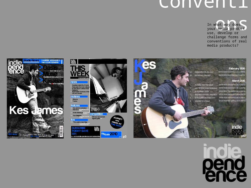
ConventionsIn what way does your
media product use, develop or challenge forms and conventions of real media products?
Throughout the process of the production of my final products I used forms and conventions from other similar genres of music magazines to the one which I was trying to create. I created three products which were a front cover, contents page and a double page spread. So these where the parts from the similar magazines which I used to get inspiration and make my magazine have a similar conventional appearance. I will show how and where I found the inspiration from these magazines to create the layout to the actual content on the products to fit my magazines genre.
As you can see I followed the conventions for layout with the tile of the magazine as it is positioned in the top left hand corner of the page. I did not try and re –arrange this due to it not being perceived as a professional or real magazine as a title positioned in a different place to this would be going against conventions and for this element it would not be right.
I also followed conventions with the splash on the page. I positioned the name of the cover band or artists name in the centre, layered over the top of the image which is also shown in the NME cover on the right. I also used a slogan underneath the splash to give the viewer a brief insight of what will be shown about the performer. I have realised that this layout is present in many music magazines and not just of this genre. Therefore I continued this theme as it has proven to be successful and I would not want to go against this as it could lose its professional and real like appearance.
From my research I found that a vertical barcode was mainly present on the front cover and as this is the one thing on the front cover which will make my magazine look like a real product having this would show that a transaction can take place and this can be purchased in nationwide stores.
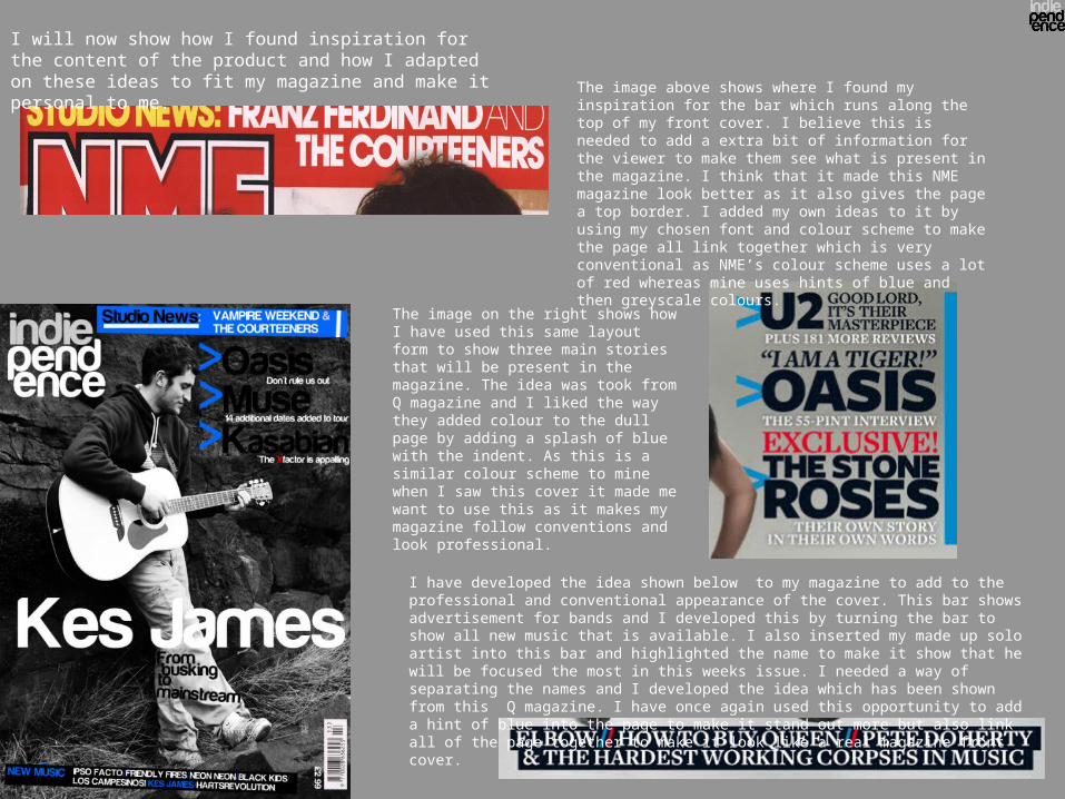
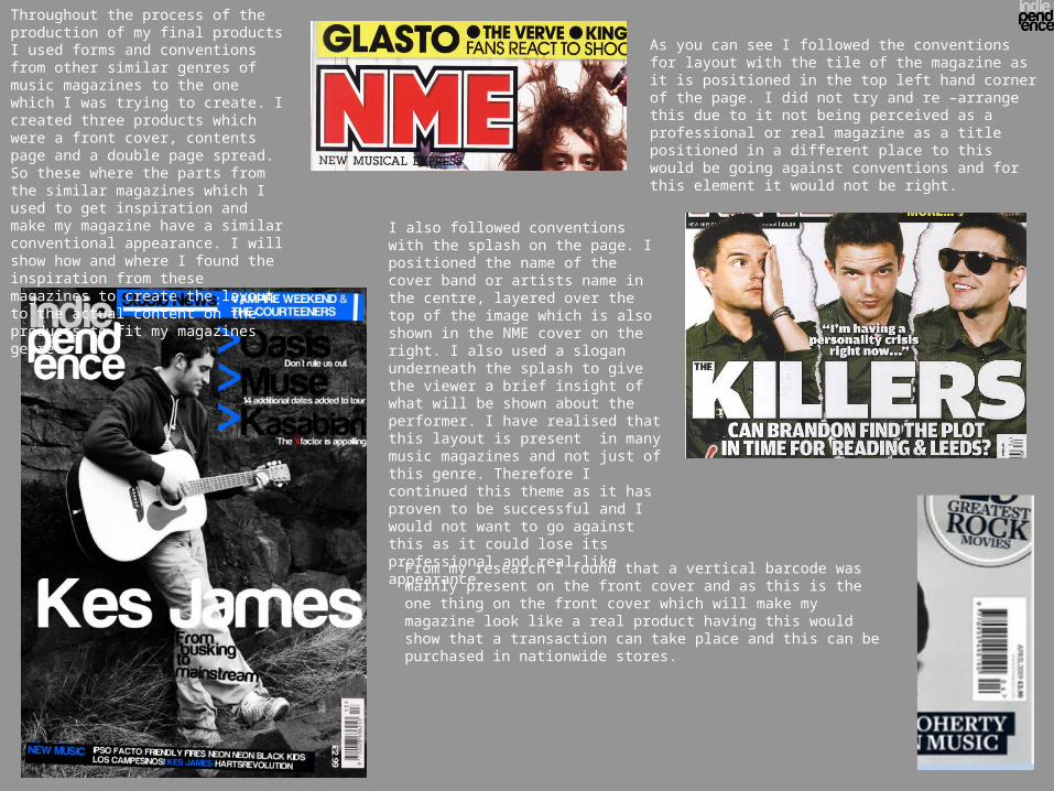
The image above shows where I found my inspiration for the bar which runs along the top of my front cover. I believe this is needed to add a extra bit of information for the viewer to make them see what is present in the magazine. I think that it made this NME magazine look better as it also gives the page a top border. I added my own ideas to it by using my chosen font and colour scheme to make the page all link together which is very conventional as NME’s colour scheme uses a lot of red whereas mine uses hints of blue and then greyscale colours.
I will now show how I found inspiration for the content of the product and how I adapted on these ideas to fit my magazine and make it personal to me.
The image on the right shows how I have used this same layout form to show three main stories that will be present in the magazine. The idea was took from Q magazine and I liked the way they added colour to the dull page by adding a splash of blue with the indent. As this is a similar colour scheme to mine when I saw this cover it made me want to use this as it makes my magazine follow conventions and look professional.
I have developed the idea shown below to my magazine to add to the professional and conventional appearance of the cover. This bar shows advertisement for bands and I developed this by turning the bar to show all new music that is available. I also inserted my made up solo artist into this bar and highlighted the name to make it show that he will be focused the most in this weeks issue. I needed a way of separating the names and I developed the idea which has been shown from this Q magazine. I have once again used this opportunity to add a hint of blue into the page to make it stand out more but also link all of the page together to make it look like a real magazine front cover.
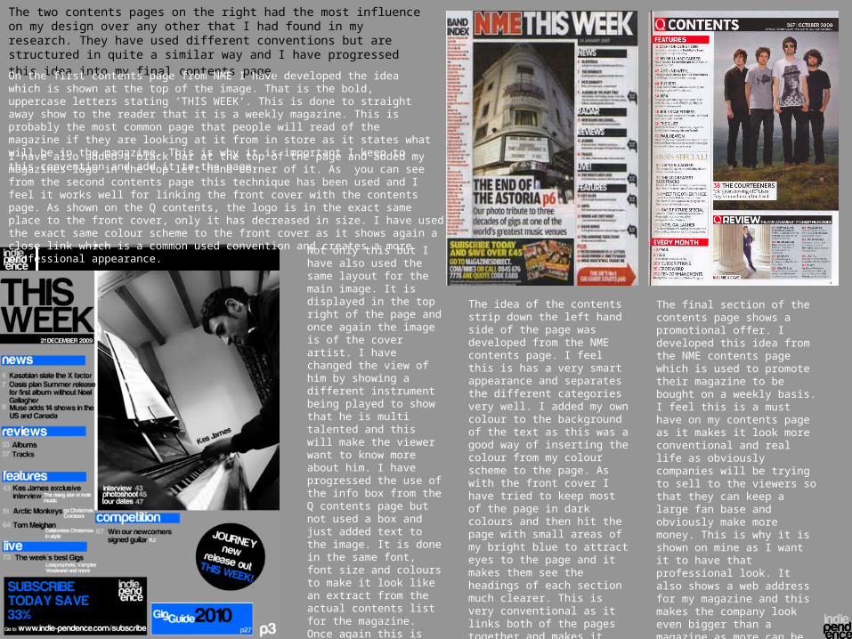
The two contents pages on the right had the most influence on my design over any other that I had found in my research. They have used different conventions but are structured in quite a similar way and I have progressed this idea into my final contents page. On the first contents page from NME I have developed the idea which is shown at the top of the image. That is the bold, uppercase letters stating ‘THIS WEEK’. This is done to straight away show to the reader that it is a weekly magazine. This is probably the most common page that people will read of the magazine if they are looking at it from in store as it states what will be in the magazine. This is why it is important I keep to this convention and add it to the page. I have also added a black bar at the top of the page and added my magazines logo in the top left hand corner of it. As you can see from the second contents page this technique has been used and I feel it works well for linking the front cover with the contents page. As shown on the Q contents, the logo is in the exact same place to the front cover, only it has decreased in size. I have used the exact same colour scheme to the front cover as it shows again a close link which is a common used convention and creates a more professional appearance.
The idea of the contents strip down the left hand side of the page was developed from the NME contents page. I feel this is has a very smart appearance and separates the different categories very well. I added my own colour to the background of the text as this was a good way of inserting the colour from my colour scheme to the page. As with the front cover I have tried to keep most of the page in dark colours and then hit the page with small areas of my bright blue to attract eyes to the page and it makes them see the headings of each section much clearer. This is very conventional as it links both of the pages together and makes it look like a real media product that you could go out and buy today.
Not only this but I have also used the same layout for the main image. It is displayed in the top right of the page and once again the image is of the cover artist. I have changed the view of him by showing a different instrument being played to show that he is multi talented and this will make the viewer want to know more about him. I have progressed the use of the info box from the Q contents page but not used a box and just added text to the image. It is done in the same font, font size and colours to make it look like an extract from the actual contents list for the magazine. Once again this is very conventional as this technique is used to link the image with the text and give it a more professional aesthetic appearance.
The final section of the contents page shows a promotional offer. I developed this idea from the NME contents page which is used to promote their magazine to be bought on a weekly basis. I feel this is a must have on my contents page as it makes it look more conventional and real life as obviously companies will be trying to sell to the viewers so that they can keep a large fan base and obviously make more money. This is why it is shown on mine as I want it to have that professional look. It also shows a web address for my magazine and this makes the company look even bigger than a magazine as more can be seen from a free internet site.
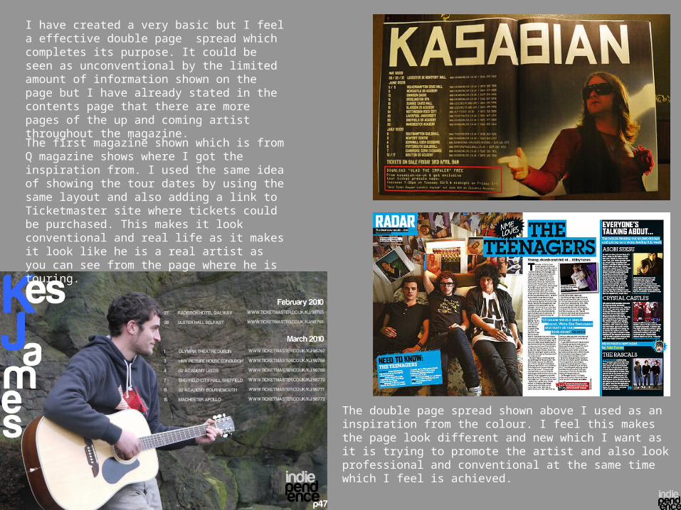
I have created a very basic but I feel a effective double page spread which completes its purpose. It could be seen as unconventional by the limited amount of information shown on the page but I have already stated in the contents page that there are more pages of the up and coming artist throughout the magazine.
The first magazine shown which is from Q magazine shows where I got the inspiration from. I used the same idea of showing the tour dates by using the same layout and also adding a link to Ticketmaster site where tickets could be purchased. This makes it look conventional and real life as it makes it look like he is a real artist as you can see from the page where he is touring.
The double page spread shown above I used as an inspiration from the colour. I feel this makes the page look different and new which I want as it is trying to promote the artist and also look professional and conventional at the same time which I feel is achieved.
Representation How does your media product represent particular social groups?
As I have tried to make my magazine a competitor to two magazines in particular I have based my target audience and genre very similar to these. These two magazines are NME and Q magazine. I would say that this target audience is indie and new music with an age audience for the teenage to mid thirties.
The reason that I have chosen indie is because I feel it is a very popular type of music and scene at the moment in the music industry. The reason I have added new music to this is people are becoming more and more interested in local and up and coming music bands. As this is popular this would have a huge benefit on the sales of the magazine and fan base.
The age group was targeted due to them probably having the most free time and interest and with them having such a broad interest in types of music I feel it would be the easiest market to attract. If I tried to aim the magazine at a older age I feel this would not create any more fans and actually would have less fans of the magazine. I did not intend to create an audience of an individual sex as I feel this would lose a lot of buyers and fans. By attracting both genders it gives them a chance to interact with each other more and give them a new topic to talk about. I intend to add images which would interest the opposite sex and by doing this it would make more people want to buy the magazine so that they can see more of what they see on the front cover.
The way of attracting the audience was through the images, colours, fonts and articles that I used. The images that I displayed were of a young male aged around the mid twenties. The reason this was displayed on the front cover was to attract the target audience. This was done from attracting the females and maybe gay community but also the fans interested in new music would be attracted as the majority of new music is from the younger generation.
I stuck to a colour scheme throughout which was black, white, grey and blue. The reason I stuck to this and used these colours was to give it a more professional look and as these are the colours that are in with fashion of my target audience it would attract them to see the bright colour of blue as they would see themselves wearing clothing of this colour. Not only this but also from my research I found that these colours were the most like not only in my class but also when I asked family members and friends.The information which I provided about the performer was very good as I believe writing a lot would find it boring for my target audience and as he is only a new band I believe people would lose interest easily as they have probably never heard him sing. This is the reason why I added his tour dates to let his performance do the talking and this would interest the new and upcoming music fans.
Institutions What kind of media institution might distribute your media product and why?
The media institution that could distribute the media products that I have created could be a music magazine publisher. This would benefit them as it is easy for them to do as this is what they specialise on but also it could maybe produce a new genre for them in new up and coming indie music which I feel is a growing market. As it also supplies news on large mainstream bands this would also attract a dominant amount of music magazines audience and would be a benefit for them. As this is quite a large market maybe there are more magazines of this sort out there which I am not aware of which could mean there would be no room or need in there eyes for another of this type.
There are many different ways which a magazine may be distributed This could be through digital publishing as around 20 % of all magazines are published this way. Also free magazines which could be given away in music and clothing stores. The money made from this though would only come from adverts that are shown inside.
http://www.musicmags.net/
The magazine the publisher that I feel would best suit my product would ne MusicMags. It is said that they generate around four times the average revenue on a average distributer. This company publishes specific magazines for specific target audience and this is why I feel my magazine would fit in. As I have a set target audience for my magazine I want a publisher who has experience in this market with the hope it makes my magazine more popular. It states on their website that “2,100,000 musicians turn to us for product knowledge”. They produce 48 different magazine titles and as this will bring knowledge and experience e this is why I believe my magazine would need to have experience put into it to make it sell better and be more successful.
AudienceWho would be the audience for your media product?
I based my products on material that I had researched and found from other magazines and picked out elements within them that I liked the look of. From this I was then able to mould it into my own front cover, contents page and double page spread to suit my audience in the best was as possible. The research into other magazines helped me create the perfect target audience as this was vital I got this right so I could then create the products in the best way as possible to suit them.
As I have already said on an earlier slide the audience for the magazine is indie and new music with an age audience for the teenage to mid thirties. The best way of getting the attention of this audience was the name of the magazine. I called the magazine Indiependence. This straight away hits the indie music fans in the face as they will straight away realise what the magazine is like and will have a much greater chance in wanting to pick up and have a look at the magazine.
I think that the products I have created have been aimed at more of a niche audience. As i have said this is the younger generation of around the twenties and I will be showing on the next slide the techniques that I did in attracting them which involve the images, colours, layouts and articles that I used.
Attracting the audience
How did you attract/address your audience?
In order for my magazine to sell I had to target an audience and then use different techniques which would enable me to catch their eye and want them to read it. The way I developed different techniques was from researching on other magazines which were similar to the one I was trying to create so that I could then find items which appealed to me and then try to reproduce them into a final design which I feel would attract the audience in the best way.
Firstly, the title of the magazine was important as my magazine is obviously new it would not get priority at the front of shelves. The reason the title had to stand out is it would be behind others and this is the main feature that would be seen. This is why I named the magazine involving the actual genre of the magazine. This would hopefully catch my targeted audience and make them pick it up which then other techniques could be used once they have it in a close up view.
I then had to make sure the image used on the front cover would stand out. I made the image totally dominate the background and I changed the effect of the image so that it would fit in more with my colour scheme. The image used was of the main story of a new up and coming artist which my audience are very interested in. This would make them want to pick up the magazine and find out about him. I also added a large bold contrasting splash across the image so it would give a snippet of what the story is about. I did this by also adding a caption which basically explained how the artist went from ‘Busking, to mainstream’ music.
If these techniques worked this would mean that they might pick up the magazine and venture onto the contents page. This is the reason why I added a small advertisement on this page showing how people could purchase the magazine at a discounted price. As well as this it provides people with a easy readable list of all things which is present in the magazine and also extra items which I have included for e.g. a guide to all the gigs of 2010. With all of these different factors took into place I would hope it would make people purchase the magazine which was my overall aim from the start.
Throughout the products I stuck to set colour scheme which I had found out in my research not only that they work well together but they also would attract my target audience. This is vital that I had a set colour scheme as due to it being a new magazine I wanted it to look professional so that I could compete with the larger magazines that I would be competing with in the same style of magazine.

Use of technology
What have you learnt about technologies from the process of constructing this product?
For the construction of my final products and also in the production of completing tasks for coursework, I have had to use different types of software and internet sites on the computer in order to do this. With some of these, I have had past experience with at both school and home but I feel I have definitely developed my knowledge on some of these. The programmes that I have used are, ‘Microsoft Office Word’, ‘Microsoft Office PowerPoint’, ‘Macromedia Fireworks’ and ‘Microsoft Photo Editing Suite’. The internet sites that I have learnt how to use due to no past experience are ‘Blogger’, which has enabled me to post all of my work in to one classified area which is visible for other candidates to see along with the teacher. ‘Slideshare’ which has enabled my ‘PowerPoint’ presentations been put on to the internet where i can then post these on to ‘Blogger’. Finally ‘DaFont’, this has provided me with different fonts which I can download for free and then use on my products.
The programme that I have used the most is ‘Fireworks.’ From using this to create both my final products and also preliminary tasks I have learnt many different things that I can do both from researching my self and also help from others. I have previously used this programme in past years at school on a graphics course but still I have found this year my knowledge has certainly developed.
Finally my camera skills have also developed throughout the course. I have been able to produce photos in different angles to give them a more professional appeal and also arrange the light source in order that the face of main part of the image is easily seen. Also the background is an important part of the photo as for two of my products I have used the background of the photo as the total background of the products.
Progress from pre-limLooking back at your preliminary task, what do you feel you have learnt in the progression from it to the full product?
I feel that I have made a lot of progress from when I first created my preliminary task. A major part in this process was from the research which I had made into other magazines. From doing this I picked up on the ways a conventional magazine is usually laid out and that I should stick to this in order for my magazine to look professional and appealing at the same time. A lot of the elements in my products that I used came from the research which I made at the beginning of the project. It enabled me to find suitable layouts, locations of images, colours and information to be shown with in the magazine.
Also for the planning of the creation of the preliminary task did not take me long and I created products on a basis from a basic knowledge of what I had seen from material that I had read and seen in the past. I used the first font that I found on a website and quickly chose the colour which best suited the task and the genre of that magazine. The difference with this to my full product was I took a lot more time in the planning. I changed the colours and fonts several times and that was only to create my first draft. With the image that I used on my pre lim I chose from a selection of around 5 pictures which where took on a decent camera phone. The progression I have made of this is for my final products was a much more professional camera used and up to 50 of my own pictures where took so that I could select the perfect images that I needed to suit my target audience the best. Not only this but also how I adapted the photos once they had been took. As I begun to use different programs I was then able to easily change the images to how I liked and I could then change the colours of my images to fit in better with the colour scheme used.
As I have begun to create more of an understanding in the process of making products this has enabled me to shorten the time it takes me. This is a real positive factor as I spent a lot of time on my front cover for the prelim and this meant I had little time on the contents page and because of this it came out looking very basic and rushed.
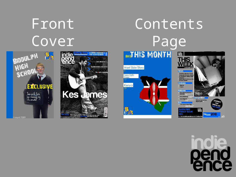
Contents Page
Front Cover