evaluation 1
TRANSCRIPT

Evaluation 1: In what ways does your media product use, develop or challenge forms and
conventions of real media products?

For this evaluation question, I will be comparing my own final piece with a published piece from a similar magazine, Mixmag.
I will be analysing in detail and showing the similarities and differences between my piece and a real media product to show how my piece depicts, develops and challenges the conventions we see in real media products.
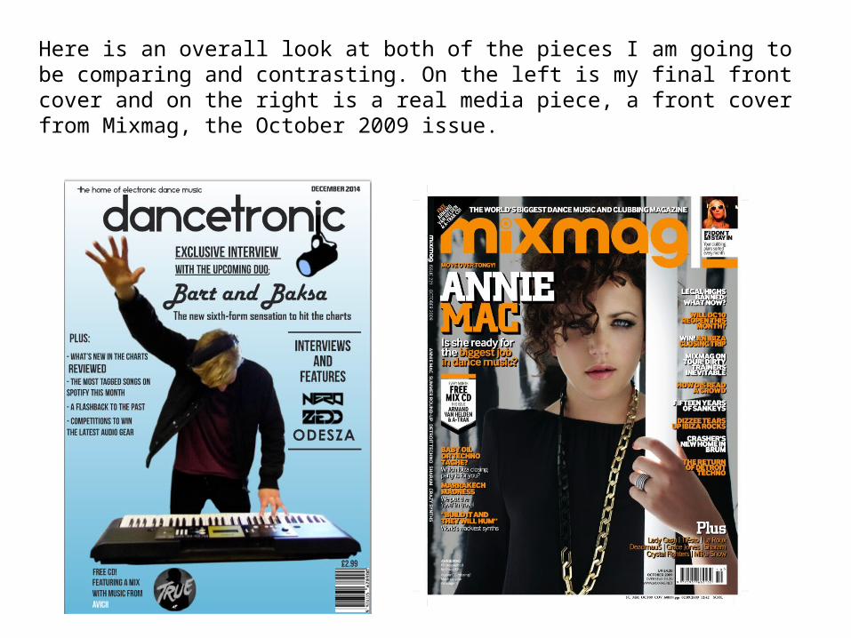
Here is an overall look at both of the pieces I am going to be comparing and contrasting. On the left is my final front cover and on the right is a real media piece, a front cover from Mixmag, the October 2009 issue.
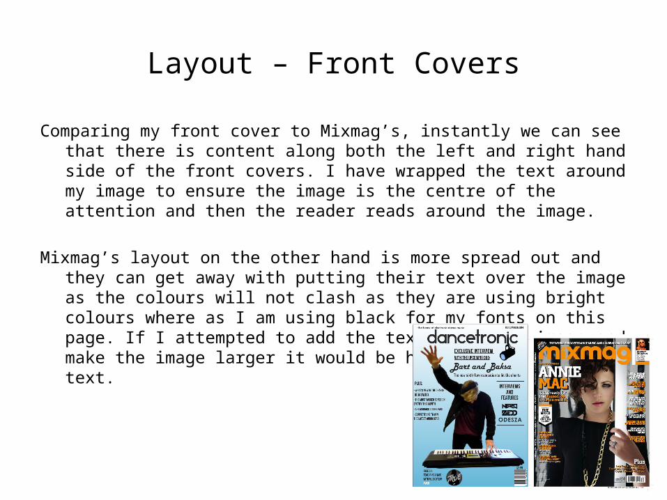
Layout – Front Covers
Comparing my front cover to Mixmag’s, instantly we can see that there is content along both the left and right hand side of the front covers. I have wrapped the text around my image to ensure the image is the centre of the attention and then the reader reads around the image.
Mixmag’s layout on the other hand is more spread out and they can get away with putting their text over the image as the colours will not clash as they are using bright colours where as I am using black for my fonts on this page. If I attempted to add the text above the image and make the image larger it would be harder to read the text.
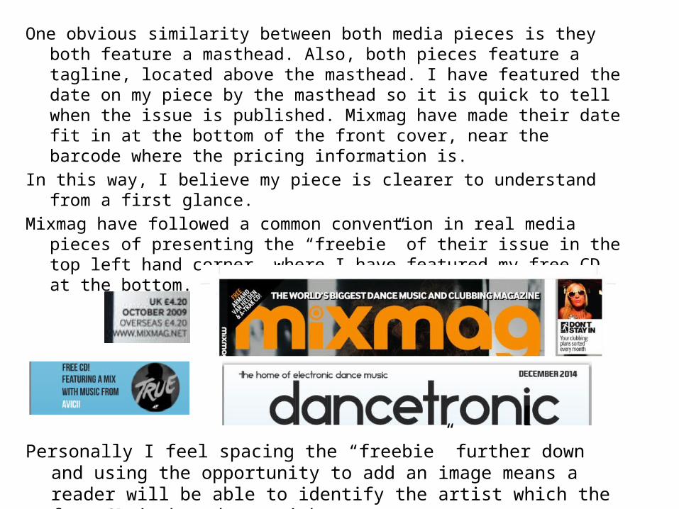
One obvious similarity between both media pieces is they both feature a masthead. Also, both pieces feature a tagline, located above the masthead. I have featured the date on my piece by the masthead so it is quick to tell when the issue is published. Mixmag have made their date fit in at the bottom of the front cover, near the barcode where the pricing information is.
In this way, I believe my piece is clearer to understand from a first glance.Mixmag have followed a common convention in real media pieces of presenting
the “freebie” of their issue in the top left hand corner, where I have featured my free CD at the bottom.
Personally I feel spacing the “freebie” further down and using the opportunity to add an image means a reader will be able to identify the artist which the free CD is based on quicker.

Layout – Contents Pages
Comparing these two contents pages, they do look similar. I used Mixmag’s contents page as inspiration when making my own contents page. I like the idea of splitting the features using white lines. An improvement I would make is adjusting the thickness of the lines so they look more consistent.
Mixmag add information about the “freebie” of the magazine at the bottom of every contents page, but I have used this section for an editor’s section as I feel it would not be necessary to have information about a well known artist as they are widely heard of already.
I have featured a common convention of a special offer / subscription offer in my contents page, one example of where I have seen one of these previously is in an NME magazine.

Layout – DPS
The layouts of both double page spreads are similar, they both have a main image covering one page and the article on the other page.Both double page spreads also feature a standfirst.
My double page spread features more pictures about the artists and also has more columns. The Mixmag article has a much more catching heading, with an underlined font and white text.
I have used a feature that I saw in a Vibe magazine article in the corner of the right page of my double page spread. I have a little “d” in the top right corner and underneath it says dancetronic, reminding the reader what magazine they are reading. Vibe uses a very similar feature but they use a “V”, for Vibe.
I have promoted the artists soundcloud and website, whereas Mixmag have provided a small paragraph about Duke Dumont’s new album.

Mastheads
Looking closer at the two mastheads I feel mine may present the genre a bit easier, but the idea of “mixing” suggests the presence of electronic music. The similarities between the mastheads are that they do stand out due to their size on the front covers compared to the smaller features below and to the sides.
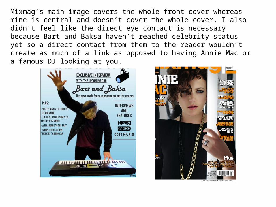
Mixmag’s main image covers the whole front cover whereas mine is central and doesn’t cover the whole cover. I also didn’t feel like the direct eye contact is necessary because Bart and Baksa haven’t reached celebrity status yet so a direct contact from them to the reader wouldn’t create as much of a link as opposed to having Annie Mac or a famous DJ looking at you.

Barcodes and Prices
Another similarity, being a legal requirement is the barcode featured on the front cover.
The prices are different, comparing between the two magazines. My magazine has a lower price than the established magazine Mixmag. I have used this price from my market research and it also appears competitive if it were to be produced as a real media product.
Mixmag have done something which I think is a really good idea, listing the overseas prices in Euros as it shows they are aware the international coverage they have.
This could be an improvement I may make after my evaluation.

Props
In my media piece, I have used props that I feel connote the genre of music, such as a midi keyboard, audio mixer, microphones and a digital receiver.
This conforms to the conventions of real media products as in a lot of media products you will see artists with instruments, from guitars, to brass instruments, to virtual instruments.