evaluating magazine
TRANSCRIPT

Mu s i c
Magaz i n e
Eval u at i
o n
Fr o n t c o ve r Eval u at i o n
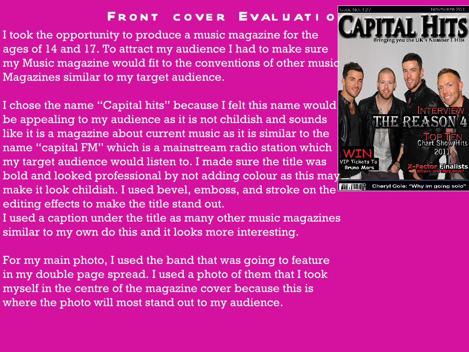
I took the opportunity to produce a music magazine for the ages of 14 and 17. To attract my audience I had to make sure my Music magazine would fit to the conventions of other music Magazines similar to my target audience.
I chose the name “Capital hits” because I felt this name would be appealing to my audience as it is not childish and sounds like it is a magazine about current music as it is similar to the name “capital FM” which is a mainstream radio station which my target audience would listen to. I made sure the title was bold and looked professional by not adding colour as this may make it look childish. I used bevel, emboss, and stroke on the editing effects to make the title stand out. I used a caption under the title as many other music magazines similar to my own do this and it looks more interesting.
For my main photo, I used the band that was going to feature in my double page spread. I used a photo of them that I took myself in the centre of the magazine cover because this is where the photo will most stand out to my audience.
Fr o n t c o ve r Eval u at i o n
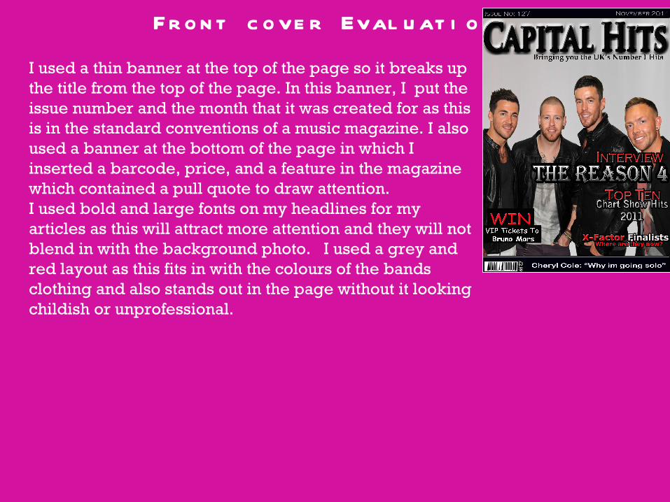
I used a thin banner at the top of the page so it breaks up the title from the top of the page. In this banner, I put the issue number and the month that it was created for as this is in the standard conventions of a music magazine. I also used a banner at the bottom of the page in which I inserted a barcode, price, and a feature in the magazine which contained a pull quote to draw attention. I used bold and large fonts on my headlines for my articles as this will attract more attention and they will not blend in with the background photo. I used a grey and red layout as this fits in with the colours of the bands clothing and also stands out in the page without it looking childish or unprofessional.
Co n t e n t s Page Eval u at i o n
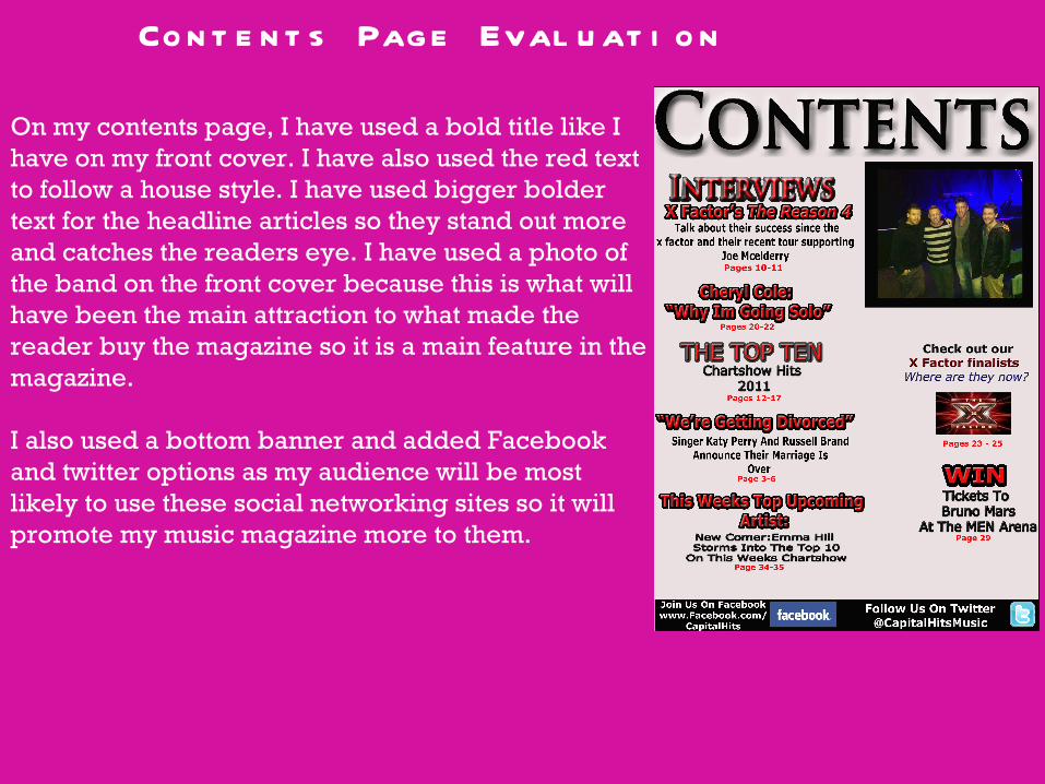
On my contents page, I have used a bold title like I have on my front cover. I have also used the red text to follow a house style. I have used bigger bolder text for the headline articles so they stand out more and catches the readers eye. I have used a photo of the band on the front cover because this is what will have been the main attraction to what made the reader buy the magazine so it is a main feature in the magazine.
I also used a bottom banner and added Facebook and twitter options as my audience will be most likely to use these social networking sites so it will promote my music magazine more to them.
Do u b l e p age s p r e ad Eval u at i o n
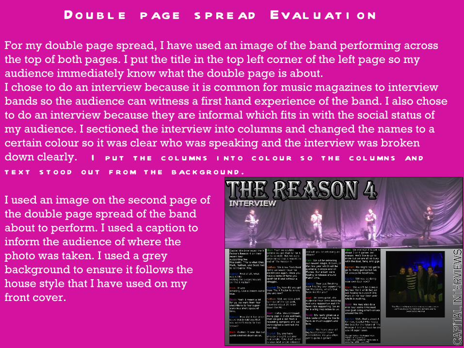
For my double page spread, I have used an image of the band performing across the top of both pages. I put the title in the top left corner of the left page so my audience immediately know what the double page is about. I chose to do an interview because it is common for music magazines to interview bands so the audience can witness a first hand experience of the band. I also chose to do an interview because they are informal which fits in with the social status of my audience. I sectioned the interview into columns and changed the names to a certain colour so it was clear who was speaking and the interview was broken down clearly. I p u t t h e c o l u mn s i n t o c o l o u r s o t h e c o l u mn s an d
t e x t s t o o d o u t f r o m t h e b ac k gr o u n d .
I used an image on the second page of the double page spread of the band about to perform. I used a caption to inform the audience of where the photo was taken. I used a grey background to ensure it follows the house style that I have used on my front cover.
Ove r al l Eval u at i o n
Overall, I feel my magazine was successful as it appeals to my target audience and is to a professional standard. I also feel it was successful because I followed the
success criteria and conventions of a music magazine. If I was to create this magazine again, I would take better photos to use in my double page spread. I
would also take up more space on the front cover so it looks fuller. I would also add more text to my contents page so it does not look as plain.