environment analysis
TRANSCRIPT
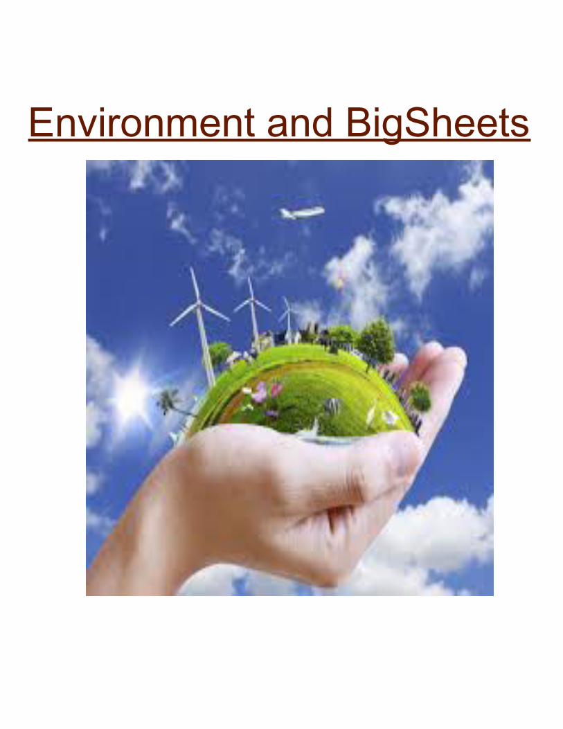
Environment and BigSheets
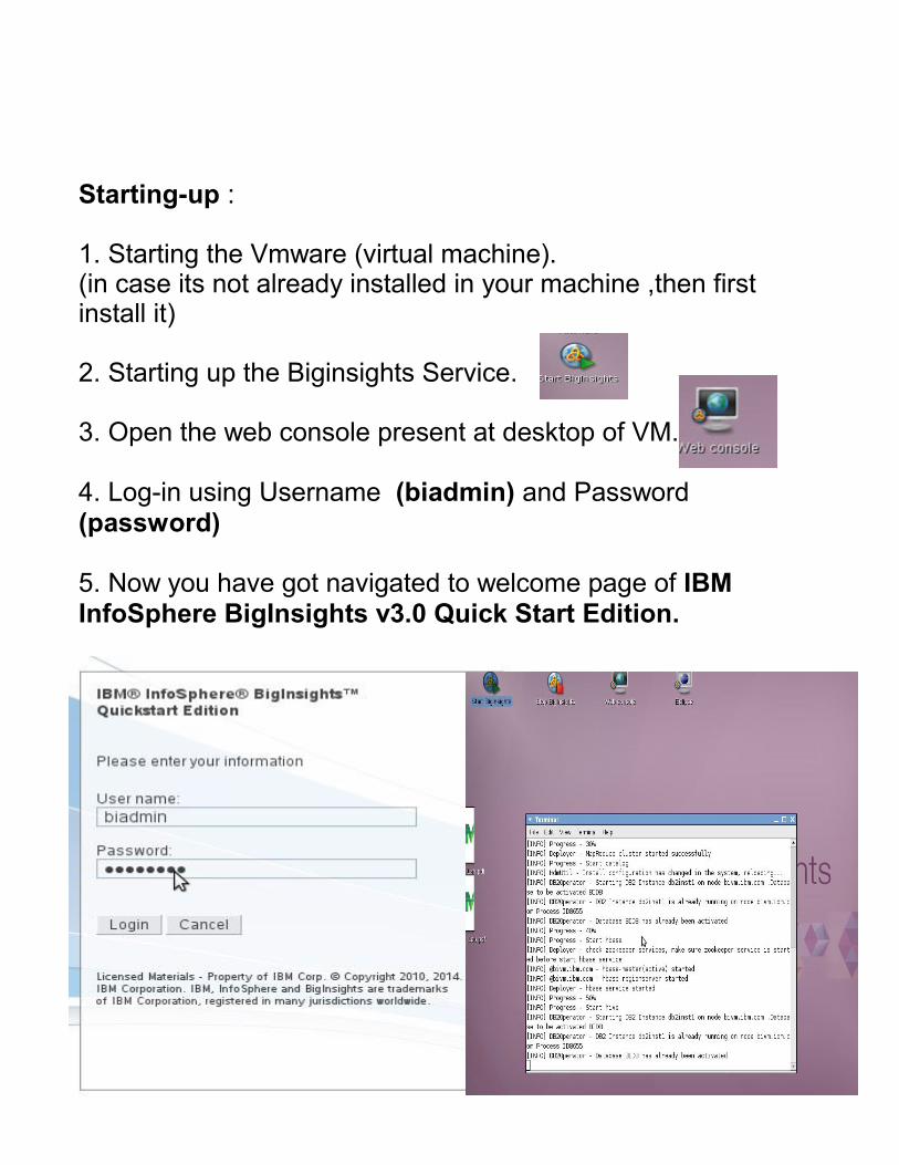
Starting-up :
1. Starting the Vmware (virtual machine).(in case its not already installed in your machine ,then first install it)
2. Starting up the Biginsights Service.
3. Open the web console present at desktop of VM.
4. Log-in using Username (biadmin) and Password (password)
5. Now you have got navigated to welcome page of IBM InfoSphere BigInsights v3.0 Quick Start Edition.
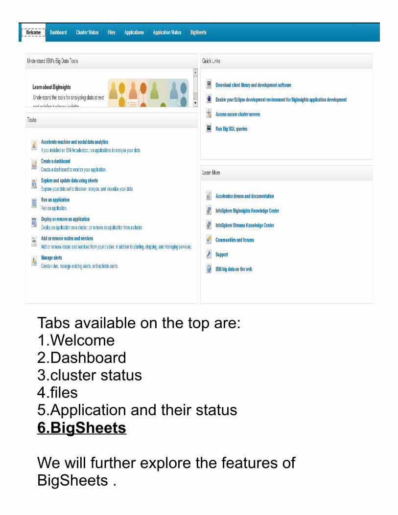
Tabs available on the top are:1.Welcome2.Dashboard3.cluster status4.files5.Application and their status6.BigSheets
We will further explore the features of BigSheets .

● Checked the Cluster status.All nodes are running except of monitoring (which is not an issue for right now)● Go to files tab and upload the file from your VM
system.

Click open.

1. Increase the Viewing size (100kb) 2. Select the Sheet radio button.3.Edit Line reader to CSV format (include Headers)4. Save as Master WorkBook. (Name and description).
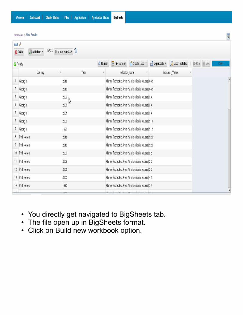
● You directly get navigated to BigSheets tab.● The file open up in BigSheets format.● Click on Build new workbook option.
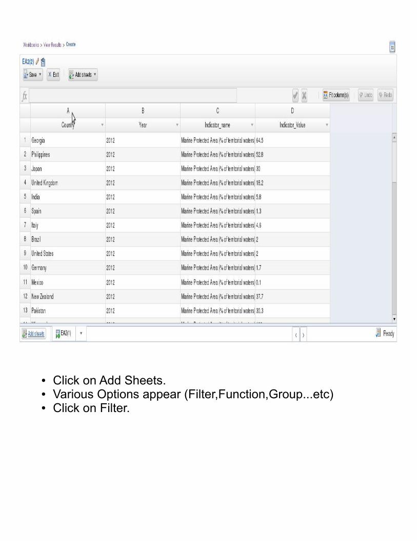
● Click on Add Sheets.● Various Options appear (Filter,Function,Group...etc)● Click on Filter.
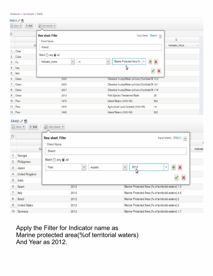
Apply the Filter for Indicator name as Marine protected area(%of territorial waters)And Year as 2012.

Click Save and Exit.Run the Sheet.

● Add the Chart.● Select the Horizontal Bar.● Adjust chart settings and Run.● As we can see already in bar, Micronesia country has highest
amount of marine protected area
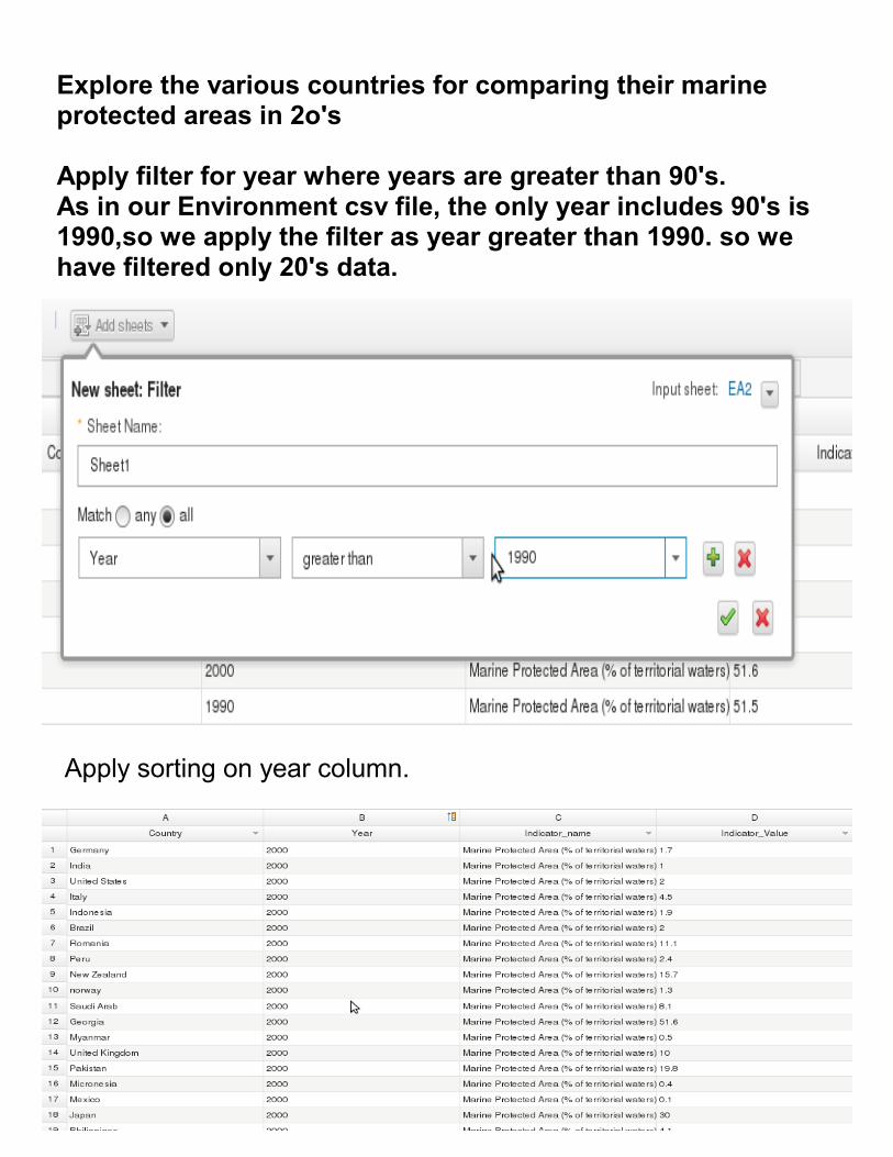
Explore the various countries for comparing their marine protected areas in 2o's
Apply filter for year where years are greater than 90's.As in our Environment csv file, the only year includes 90's is 1990,so we apply the filter as year greater than 1990. so we have filtered only 20's data.
Apply sorting on year column.

Adding chart as Parallel coordinates.Adjust chart setting and Run.
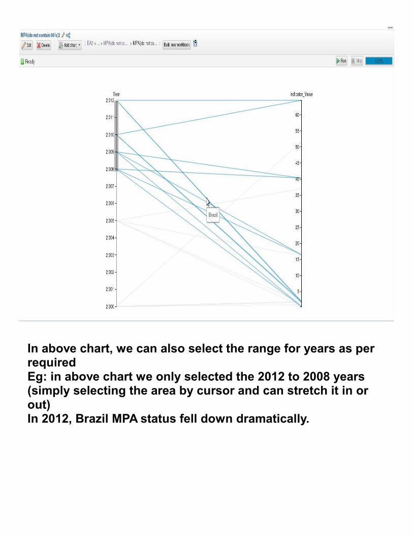
In above chart, we can also select the range for years as per requiredEg: in above chart we only selected the 2012 to 2008 years (simply selecting the area by cursor and can stretch it in or out)In 2012, Brazil MPA status fell down dramatically.
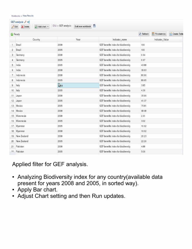
Applied filter for GEF analysis.
● Analyzing Biodiversity index for any country(available data present for years 2008 and 2005, in sorted way).
● Apply Bar chart.● Adjust Chart setting and then Run updates.
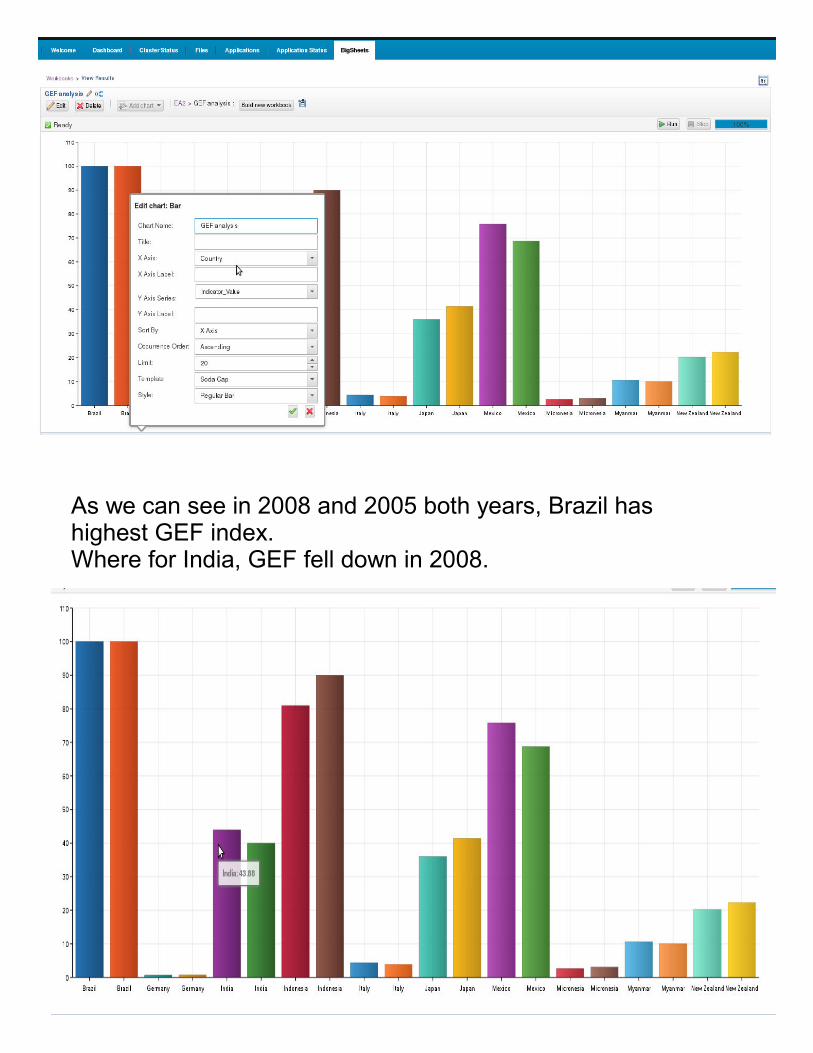
As we can see in 2008 and 2005 both years, Brazil has highest GEF index.Where for India, GEF fell down in 2008.

Which country is leading in the Least Chemical Industry Pollution?

Apply Chart as Heat Map.Adjust map setting and then RUN.

Fish Threat Analysis for 2013
Apply the chart.Select cloud (Text cloud)Adjust the chart setting and then Run.
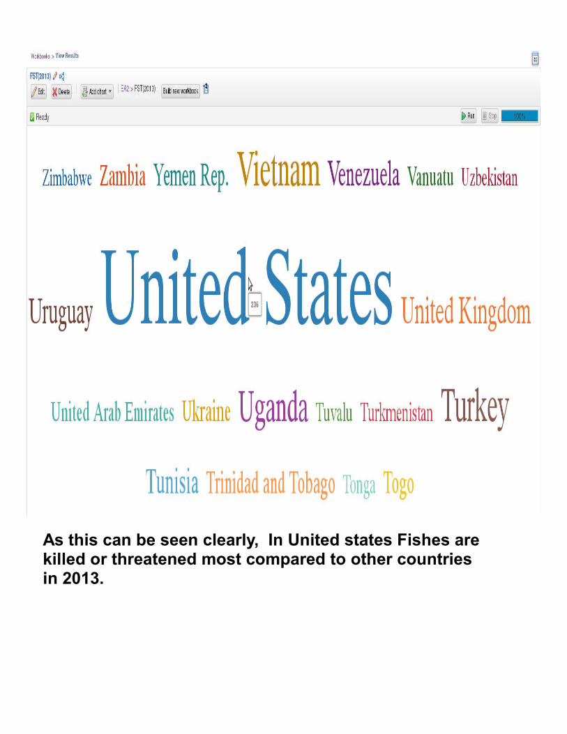
As this can be seen clearly, In United states Fishes are killed or threatened most compared to other countries in 2013.

The overall Flow can be seen easily as:
Create a dashboard.
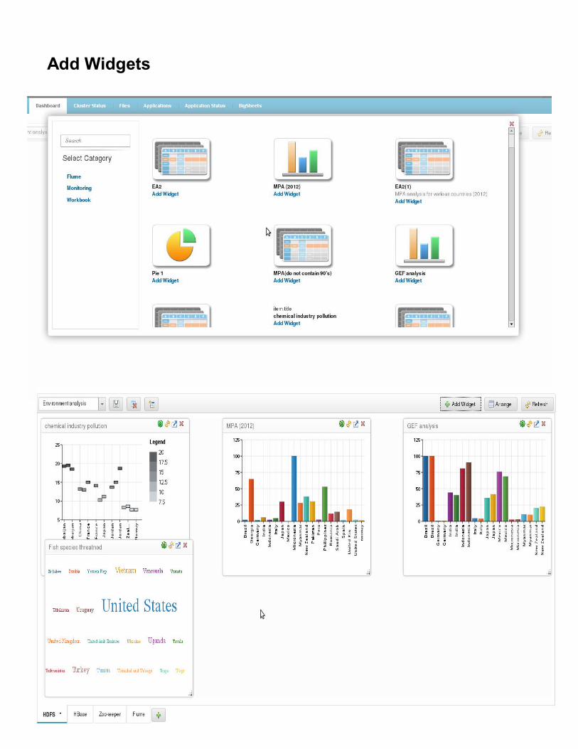
Add Widgets
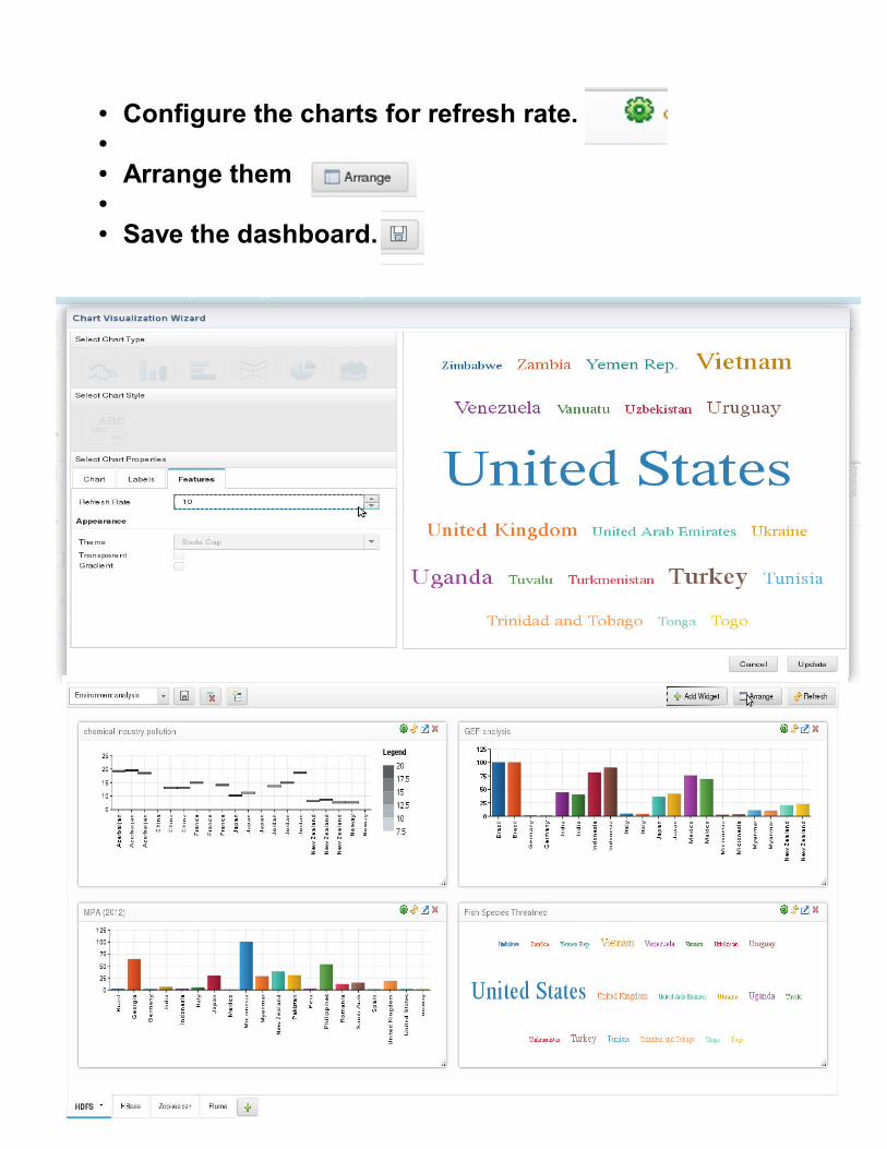
● Configure the charts for refresh rate.●
● Arrange them●
● Save the dashboard.

You can also copy the link of chart and open it in new tab .