enterprise computing: responsive design computing: responsive design ... this video clip represents...
TRANSCRIPT

Outline Introduction Responsive Web Design Non-functional requirements Closing
Enterprise Computing:Responsive Design
Professor Stephen GilmoreSchool of Informatics
The University of Edinburgh
January 26, 2015
Outline Introduction Responsive Web Design Non-functional requirements Closing
1 Introduction
2 Responsive Web DesignContent: Josh Hughes, University of Missouri
3 Non-functional requirements
4 Closing

Outline Introduction Responsive Web Design Non-functional requirements Closing
Non-functional requirement (#5 of 10)
This image represents non-functional requirement #5. If you were at the lecture then you heard me explainin words what it means.
Outline Introduction Responsive Web Design Non-functional requirements Closing
Enterprise systems are data-sharing systems
Enterprise computing systems exist to maintain and sharedata, making the information which is important to theenterprise available to as many people as possible.
The people who consume the enterprise data are distributed indifferent geographical locations, and/or different time zones,software and hardware updates are completely uncoordinated.
The challenge is to make the enterprise data available to asmany users as possible, across as wide a range of devices aspossible.
The most practical delivery mechanism for data would seemto be the browser.
Outline Introduction Responsive Web Design Non-functional requirements Closing
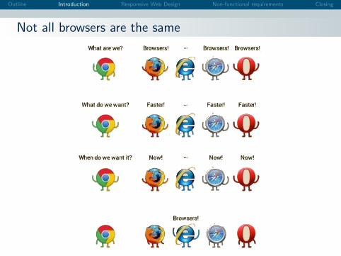
Not all browsers are the same
Outline Introduction Responsive Web Design Non-functional requirements Closing
Standards
Standards
The nice thing about standards is that you have so many to choosefrom. — Andrew S. Tanenbaum
Standards
The awful thing about standards is how much people overuse thatAndrew S. Tanenbaum quote. — Stephen Gilmore
The HTML5 language, standardised in October 2014, is theleading choice for cross-platform mobile applications.
Many language features are designed with low-powereddevices such as tablets or smartphones in mind.
In theory, standards should fix everything, making anycross-platform testing unnecessary. In practice, they don’t.
Outline Introduction Responsive Web Design Non-functional requirements Closing
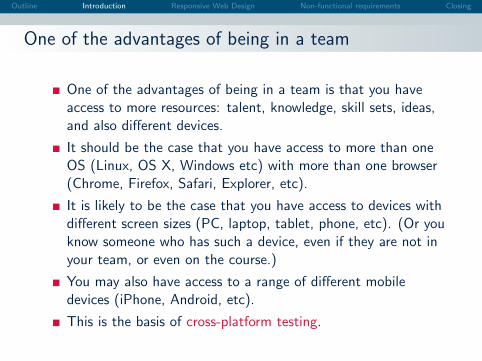
One of the advantages of being in a team
One of the advantages of being in a team is that you haveaccess to more resources: talent, knowledge, skill sets, ideas,and also different devices.
It should be the case that you have access to more than oneOS (Linux, OS X, Windows etc) with more than one browser(Chrome, Firefox, Safari, Explorer, etc).
It is likely to be the case that you have access to devices withdifferent screen sizes (PC, laptop, tablet, phone, etc). (Or youknow someone who has such a device, even if they are not inyour team, or even on the course.)
You may also have access to a range of different mobiledevices (iPhone, Android, etc).
This is the basis of cross-platform testing.
Outline Introduction Responsive Web Design Non-functional requirements Closing
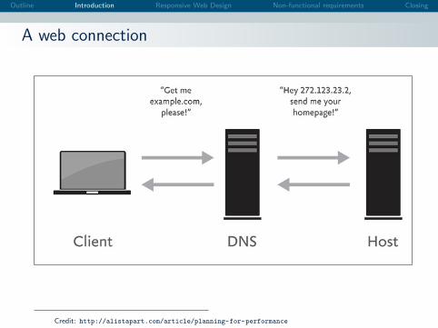
A web connection
Credit: http://alistapart.com/article/planning-for-performance
Outline Introduction Responsive Web Design Non-functional requirements Closing
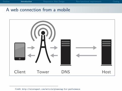
A web connection from a mobile
Credit: http://alistapart.com/article/planning-for-performance
Outline Introduction Responsive Web Design Non-functional requirements Closing
Content: Josh Hughes, University of Missouri
Responsive Web Design
Content: Josh Hughes, University of Missouri
http:
//uablogs.missouri.edu/wp-content/presentations/
responsive-web-design/presentation.pdf

Responsive Web DesignJosh [email protected]
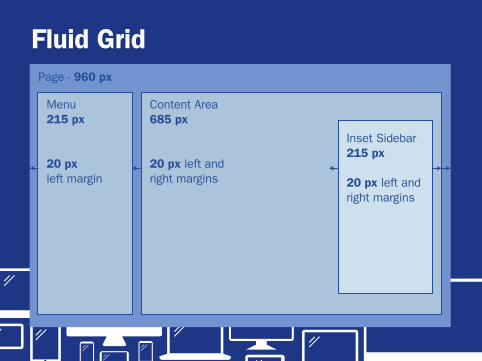
Fluid Grid
Menu215 px
20 px left margin
Content Area685 px
20 px left and right margins
Inset Sidebar215 px
20 px left and right margins
Page - 960 px

Fluid Gridtarget ÷ context × 100 = percentage
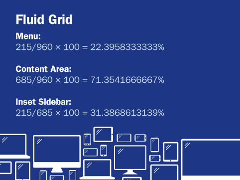
Fluid GridMenu: 215/960 × 100 = 22.3958333333%
Content Area: 685/960 × 100 = 71.3541666667%
Inset Sidebar: 215/685 × 100 = 31.3868613139%
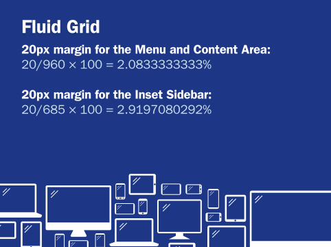
Fluid Grid20px margin for the Menu and Content Area: 20/960 × 100 = 2.0833333333%
20px margin for the Inset Sidebar:20/685 × 100 = 2.9197080292%
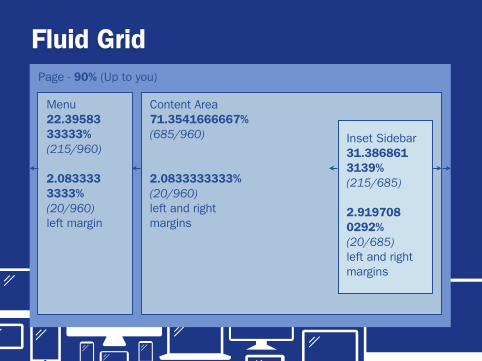
Fluid Grid
Menu22.3958333333%(215/960)
2.0833333333% (20/960)left margin
Content Area71.3541666667%(685/960)
2.0833333333% (20/960)left and right margins
Inset Sidebar31.3868613139% (215/685)
2.9197080292%(20/685)left and right margins
Page - 90% (Up to you)
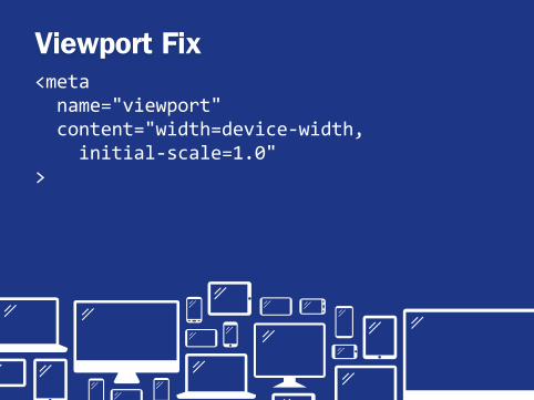
Viewport Fix<meta&&name="viewport"&&content="width=device3width,&&&&&initial3scale=1.0">&
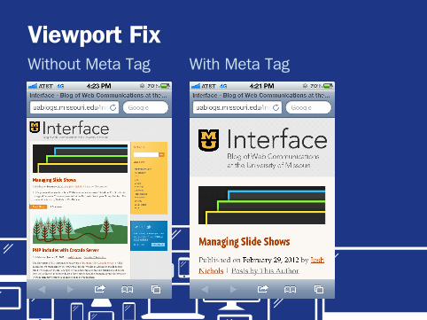
Viewport FixWithout Meta Tag With Meta Tag
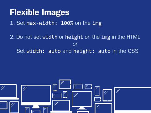
Flexible Images1. Set max3width:&100% on the img
2. Do not set width or height on the img in the HTMLor
Set width:&auto and height:&auto in the CSS
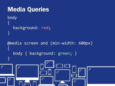
Media Queriesbody&{& background:&red;}
@media&screen&and&(min3width:&600px){& body&{&background:&green;&}}
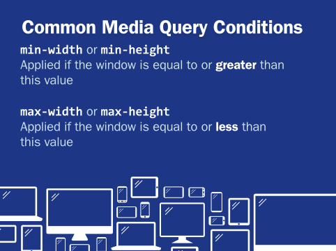
Common Media Query Conditionsmin$width or min$heightApplied if the window is equal to or greater than this value
max$width or max$heightApplied if the window is equal to or less than this value
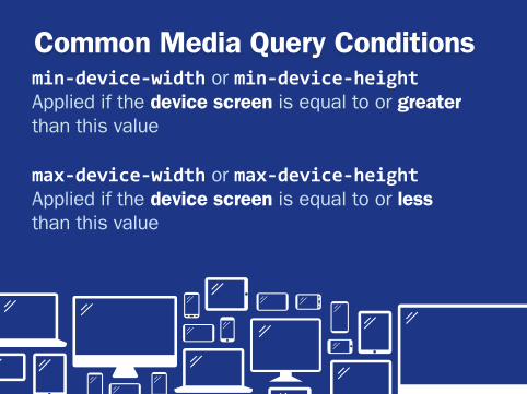
Common Media Query Conditionsmin$device$width or min$device$heightApplied if the device screen is equal to or greater than this value
max$device$width or max$device$heightApplied if the device screen is equal to or less than this value
Responsive Web Design versus Other Options
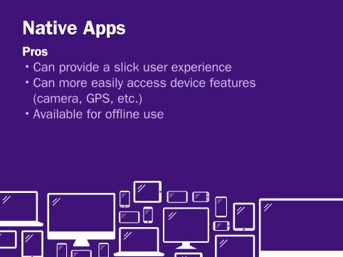
Native AppsPros•Can provide a slick user experience•Can more easily access device features
(camera, GPS, etc.)•Available for offline use
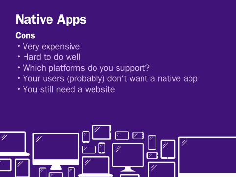
Native AppsCons•Very expensive•Hard to do well•Which platforms do you support?•Your users (probably) don't want a native app•You still need a website
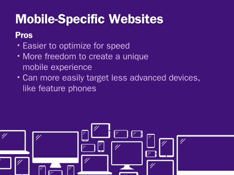
Mobile-Specific WebsitesPros•Easier to optimize for speed•More freedom to create a unique
mobile experience•Can more easily target less advanced devices,
like feature phones

Mobile-Specific WebsitesCons•Have to deal intelligently with redirects• Ignores tablets for the most part•Tends to offer an incomplete experience
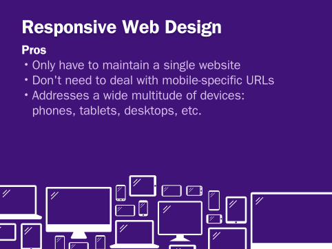
Responsive Web DesignPros•Only have to maintain a single website•Don't need to deal with mobile-specific URLs•Addresses a wide multitude of devices:
phones, tablets, desktops, etc.
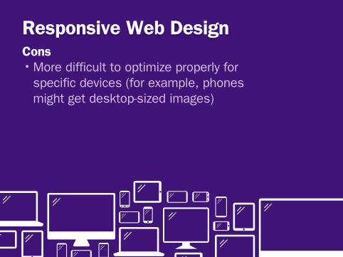
Responsive Web DesignCons•More difficult to optimize properly for
specific devices (for example, phones might get desktop-sized images)

Dealing with Images
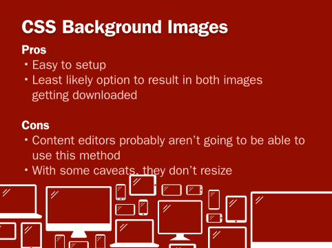
CSS Background ImagesPros•Easy to setup•Least likely option to result in both images
getting downloaded
Cons•Content editors probably aren’t going to be able to
use this method•With some caveats, they don’t resize

Navigation Design Patterns
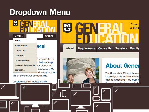
Dropdown Menu

Select Menu
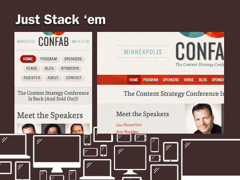
Just Stack ‘em
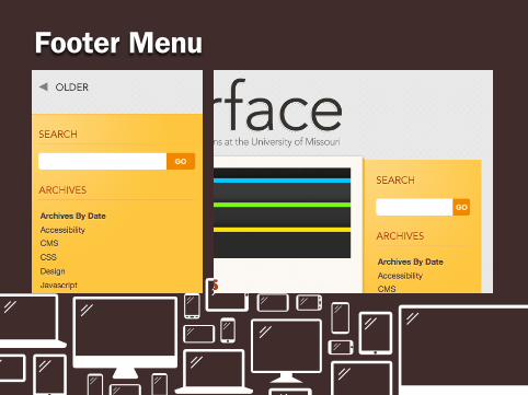
Footer Menu
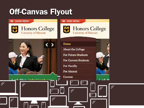
Off-Canvas Flyout
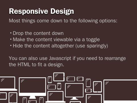
Responsive DesignMost things come down to the following options:
•Drop the content down•Make the content viewable via a toggle•Hide the content altogether (use sparingly)
You can also use Javascript if you need to rearrange the HTML to fit a design.
Outline Introduction Responsive Web Design Non-functional requirements Closing
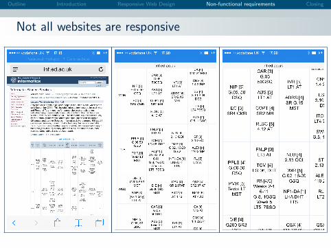
Not all websites are responsive
Outline Introduction Responsive Web Design Non-functional requirements Closing
Non-functional requirement (#6 of 10)
https://www.youtube.com/watch?v=Sqz5dbs5zmo
This video clip represents non-functional requirement #6. If you were at the lecture then you heard meexplain in words what it means.
Outline Introduction Responsive Web Design Non-functional requirements Closing
Three terms you should know
When discussing web content and responsive design, there arethree terms which you should know.
Three terms you should know
Page bloat.
FOUC.
Polyfill, or polyfiller.
If you were at the lecture then you heard the discussion of what these terms mean.
Outline Introduction Responsive Web Design Non-functional requirements Closing
Things to do now
Some things to do now
Visit “A List Apart”, the website about websites.
http://alistapart.com
Find out about responsive images.
http://alistapart.com/article/
responsive-images-in-practice
Learn about polyfills such as Picturefill.
http://scottjehl.github.io/picturefill/
Learn about sustainable Web design.
http:
//alistapart.com/article/sustainable-web-design
Outline Introduction Responsive Web Design Non-functional requirements Closing
Live long and prosper