enhancement of the tour guide …umpir.ump.edu.my/id/eprint/4468/1/cd6578_new_lay_kee.pdfprojek ini...
TRANSCRIPT

ii
ENHANCEMENT OF THE TOUR GUIDE WEBPAGE FOR KINTA TOUR
GUIDE WEBPAGE BASED ON HUMAN COMPUTER INTERACTION (HCI)
ELEMENTS BY JACOB NIELSEN
NEW LAY KEE
Faculty of System Science Computer & Software Engineering
UNIVERITI MALAYSIA PAHANG
JUNE 2012

vii
ABSTRACT
Webpages are the pages which are available online and this is the site where
Internet users can get a wide range of information from. Webpages can be divided
into various types such as advertisements, articles, guidelines and so on. Webpage
for tour guide is one of the significant and useful pages available online. Different
types of webpages have different goals and information. However, there are many
existing webpages that require enhancement to be more convenience, informative
and attractive to the Internet users. This project is done in order to enhance the
tourism webpage of Kinta Tour Guide Webpage. The Heuristic Usability rules of
Human Computer Interaction (HCI) are utilized for the Kinta Tour Guide webpage
enhancement. The effectiveness of the project is verified by bringing out random
survey with questionnaire. It is the Research Methodology process. Then, it has been
identified that the Kinta Tour Guide webpage is lack of information, creativity and so
on. The existing system of the webpage has been surveyed by 30 respondents and
their comments from the questionnaire are considered seriously to be applied in order
to enhance the webpage based on the Heuristic Rules. Most of the respondents are
unsatisfied with the unattractive design and boring contents of the existing system.
There are three main Heuristic Usability Rules available which include 8 Golden
Rules, Norman’s Principle and the Jacob Nielsen’s Rules. In the project of
Enhancement of the Tour Guide Webpage for Kinta Tour Guide Webpage Based on
Human Computer Interaction (HCI) Elements by Jacob Nielsen, the most suitable
rule to be applied is the Jacob Nielsen’s Heuristic Rules. Hence with the suitable
Heuristic rules and useful comments from the survey, the enhanced webpage can
fulfil all of the requirements from the viewers.

viii
ABSTRAK
Laman web adalah halaman yang boleh didapati dalam Internet dan ia adalah
tempat di mana pengguna Internet boleh mendapatkan pelbagai maklumat. Laman
web boleh dibahagikan kepada pelbagai jenis seperti halaman untuk iklan, artikel,
garis panduan dan sebagainya. Laman web untuk panduan pelancong adalah salah
satu laman web yang penting dan berguna pengguna Internet. Setiap jenis laman web
mempunyai matlamat yang berbeza dan maklumat. Walau bagaimanapun, terdapat
banyak laman web yang sedia ada yang masih memerlukan pengubahsuaian dan
peningkatan untuk menjadi lebih mesra pengguna, bermaklumat dan menarik kepada
pengguna Internet. Projek ini dilaksanakan dalam usaha untuk meningkatkan laman
web pelancongan Panduan Pelancongan Kinta. Kaedah-kaedah kebolehgunaan
Interaksi Heuristik Manusia dan Komputer (HCI) digunakan untuk pembangunan
laman web Tour Panduan Kinta. Keberkesanan projek ini dibuktikan dengan
pelaksanaan kajian rawak serta soal selidik. Ia adalah satu proses Kaedah
Penyelidikan. Selepas itu dengan keputusan dari kajian yang telah dilaksanakan, ia
telah dikenal pasti bahawa laman web Panduan Kinta Tour kekurangan maklumat,
kreativiti dan sebagainya. Sistem laman web yang sedia ada telah ditinjau oleh 30
orang responden dan komen mereka daripada soal selidik adalah penting kerana akan
digunakan sebagai idea untuk meningkatkan laman web berdasarkan Kaedah-Kaedah
Heuristik. Kebanyakan responden tidak berpuas hati dengan reka bentuk yang tidak
menarik dan isi kandungan sistemsedia ada yang membosankan. Terdapat tiga
peraturan utama dalam Kebolehgunaan Heuristik iaitu 8 Peraturan Emas, Prinsip
Norman dan Peraturan Jakob Nielsen. Dalam projek Peningkatan Laman Web
Panduan Pelancongan Kinta. Berdasarkan Elemen HCI, peraturan yang paling sesuai
digunakan ialah Peraturan Heuristik Jakob Nielsen. Oleh itu dengan kaedah-kaedah
Heuristik dan komen yang berguna daripada kajian, laman web yang dipertingkatkan
dapat memenuhi semua keperluan pengguna laman web.

ix
TABLE OF CONTENTS
CHAPTER TITLE PAGE
ABSTRACT vii
TABLE OF CONTENTS ix
LIST OF TABLES xiii
LIST OF FIGURES xiv
LIST OF APPENDICES xix
1 INTRODUCTION 1
1.1 Introduction 1 - 5
1.2 Problem Statement 5
1.3 Objectives 5
1.4 Scopes 5 - 6
1.5 Deliverables 6
1.6 Thesis Organization 6
2 LITERATURE REVIEW 7
2.1 Survey on the existing system of Ipoh Tourism webpage 7 - 12
2.2 Systems that similar with the existing Kinta Tour Guide 13
Webpage
2.2.1 Survey on the existing system that similar with the 13 - 18
existing Kinta Tour Guide Webpage
2.2.2 Survey on the existing system that similar with 18 - 19
the existing Kinta Tour Guide Webpage
2.2.3 Survey on the existing system that similar with the 20 - 23
existing Kinta Tour Guide Webpage
2.2.4 Survey on the existing system that similar 23 - 25
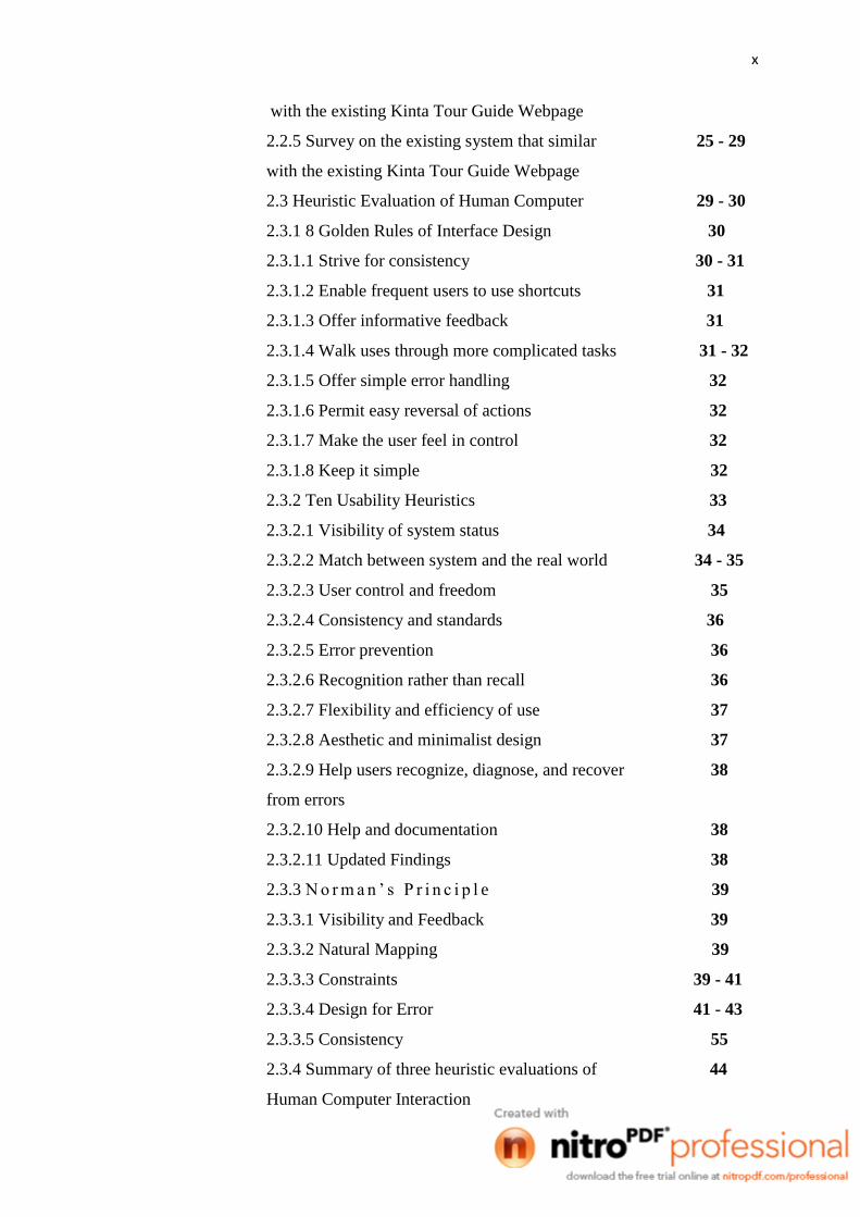
x
with the existing Kinta Tour Guide Webpage
2.2.5 Survey on the existing system that similar 25 - 29
with the existing Kinta Tour Guide Webpage
2.3 Heuristic Evaluation of Human Computer 29 - 30
2.3.1 8 Golden Rules of Interface Design 30
2.3.1.1 Strive for consistency 30 - 31
2.3.1.2 Enable frequent users to use shortcuts 31
2.3.1.3 Offer informative feedback 31
2.3.1.4 Walk uses through more complicated tasks 31 - 32
2.3.1.5 Offer simple error handling 32
2.3.1.6 Permit easy reversal of actions 32
2.3.1.7 Make the user feel in control 32
2.3.1.8 Keep it simple 32
2.3.2 Ten Usability Heuristics 33
2.3.2.1 Visibility of system status 34
2.3.2.2 Match between system and the real world 34 - 35
2.3.2.3 User control and freedom 35
2.3.2.4 Consistency and standards 36
2.3.2.5 Error prevention 36
2.3.2.6 Recognition rather than recall 36
2.3.2.7 Flexibility and efficiency of use 37
2.3.2.8 Aesthetic and minimalist design 37
2.3.2.9 Help users recognize, diagnose, and recover 38
from errors
2.3.2.10 Help and documentation 38
2.3.2.11 Updated Findings 38
2.3.3 N o r m a n ’ s P r i n c i p l e 39
2.3.3.1 Visibility and Feedback 39
2.3.3.2 Natural Mapping 39
2.3.3.3 Constraints 39 - 41
2.3.3.4 Design for Error 41 - 43
2.3.3.5 Consistency 55
2.3.4 Summary of three heuristic evaluations of 44
Human Computer Interaction

xi
2.4 Proposed System 44 - 46
2.5 Conclusion 46
3 METHODOLOGY 47
3.1 The Justification of Research Methodology Process 47 - 48
3.1.1 Planning Phase 48
3.1.2. Analysis Phase 48
3.1.3. Implementation Phase 48
3.1.4. User Design 48
3.1.5. Testing 49
3.2 Implementation of Research Methodology Process 50
in the Kinta Tour Guide Webpage
3.2.1 Planning Phase 50 - 59
3.2.2 Analysis Phase 60
3.2.3 Analyze of the Design Rules for Implementation Phase 60
3.2.3.1 Software and Hardware Tools 61
3.2.3.2 Hardware 61
3.2.3.3 Software 62
3.2.4User Design Phase 63 - 65
3.2.5 Testing Phase 66
3.3 Research on Current Situation 66
4 IMPLEMENTATION 67
4.1 Implementation 67
4.1.1 Visibility of System Status 67 - 73
4.1.2 Match between System and The Real World 73 - 75
4.1.3 User Control and Freedom 75 - 80
4.1.4 Error Prevention & Help Users Recognize, 80 - 83
Diagnose, and Recover From Error (Combined)
4.1.5 Recognition Rather Than Recall 83 - 84
4.1.6 Aesthetic and Minimalist Design 85 - 88
4.1.7 Consistency and Standards 88 - 92
4.2 Testing 93

xii
5 RESULT 94
5.1 Analysis of Data Collection based on Survey Questions 94 - 96
5.2 Analysis of Survey Questions Result 97 - 117
6 CONTRIBUTIONS, LIMITATION, FUTURE 118
RESEARCH & CONCLUSION
6.1 Contributions 118 - 119
6.2 Limitation 119 - 120
6.3 Future Research 120 - 122
6.4 Conclusion 109
7 REFERENCES 123 - 126
8 APPENDICES 127
A Gantt Chart 128
B Survey Questions 1 129 - 131
C Survey Questions 2 132 - 34

xiii
LIST OF TABLES
TABLE NO. TITLE PAGE
1.1.1 Ten Heuristics of usability 3 - 4
3.2.3.2.1 Hardware Tools 61
3.2.3.3.1 Software Tools 62
5.1.1 Data Collection Based On the Survey Questions 95
of Existing Website
5.1.2 Data Collection Based On the Survey Questions 96
of Enhanced Kinta Tour Guide Webpage
xiv
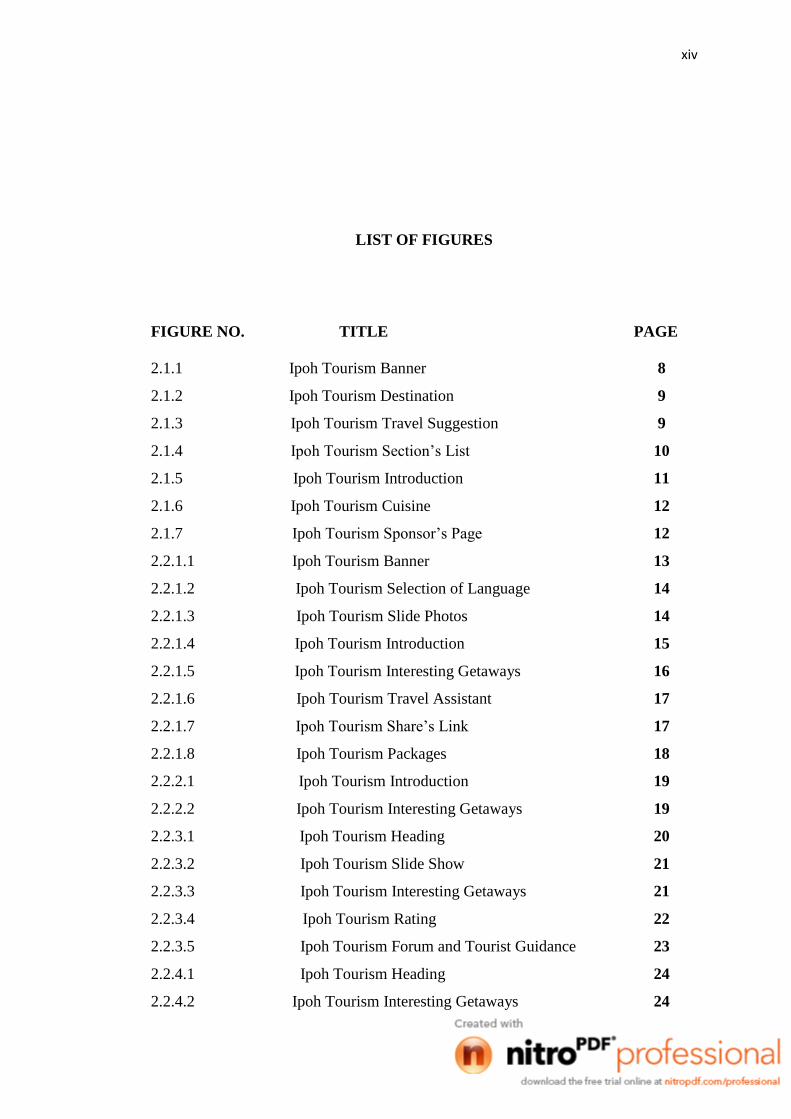
LIST OF FIGURES
FIGURE NO. TITLE PAGE
2.1.1 Ipoh Tourism Banner 8
2.1.2 Ipoh Tourism Destination 9
2.1.3 Ipoh Tourism Travel Suggestion 9
2.1.4 Ipoh Tourism Section’s List 10
2.1.5 Ipoh Tourism Introduction 11
2.1.6 Ipoh Tourism Cuisine 12
2.1.7 Ipoh Tourism Sponsor’s Page 12
2.2.1.1 Ipoh Tourism Banner 13
2.2.1.2 Ipoh Tourism Selection of Language 14
2.2.1.3 Ipoh Tourism Slide Photos 14
2.2.1.4 Ipoh Tourism Introduction 15
2.2.1.5 Ipoh Tourism Interesting Getaways 16
2.2.1.6 Ipoh Tourism Travel Assistant 17
2.2.1.7 Ipoh Tourism Share’s Link 17
2.2.1.8 Ipoh Tourism Packages 18
2.2.2.1 Ipoh Tourism Introduction 19
2.2.2.2 Ipoh Tourism Interesting Getaways 19
2.2.3.1 Ipoh Tourism Heading 20
2.2.3.2 Ipoh Tourism Slide Show 21
2.2.3.3 Ipoh Tourism Interesting Getaways 21
2.2.3.4 Ipoh Tourism Rating 22
2.2.3.5 Ipoh Tourism Forum and Tourist Guidance 23
2.2.4.1 Ipoh Tourism Heading 24
2.2.4.2 Ipoh Tourism Interesting Getaways 24

xv
2.2.4.3 Ipoh Tourism Special Links 25
2.2.5.1 Ipoh Tourism Heading 26
2.2.5.2 Ipoh Tourism Photos 26
2.2.5.3 Ipoh Tourism Forum 27
2.2.5.4 Ipoh Tourism Travel Services 28
2.2.5.5 Ipoh Tourism Country Information 28
2.2.5.6 Ipoh Tourism Viewers’ Information 29
2.2.5.7 Ipoh Tourism Map 29
2.3.2.1 Ipoh Tourism Header 34
2.3.2.2 Ipoh Tourism Content 35
2.3.2.3 Ipoh Tourism Content 35
2.3.2.6 Introduction of Ipoh Tourism 36
2.3.2.8 Ipoh Tourism Contents 37
3.1.1 Research Methodology Process Flowchart Diagram 49
3.2.1.1 Header of Tourism Penang Website 51
3.2.1.2 Malaysia Tourism Contents 52
3.2.1.3 Blog Design Webpage Contents 53
3.2.1.4 Options of the Microsoft Word header 53
3.2.1.5 Options of Microsoft Power Point header 54
3.2.1.6 Error Message of the ‘Leave Comment’ section 55
3.2.1.7 Highlighted Option of Action 56
3.2.1.8 Options of selected action 57
3.2.1.9 Information text layout 57
3.2.1.10 Language changed of the webpage 58
3.2.1.11 Help Function 59
3.2.4.1 User Interface Flow Diagram of Enhancement of 65
the Tour Guide Webpage based on HCI Elements
for Kinta Tour Guide Webpage
4.1.1.1 Banner of Kinta Tour Guide Website 67
4.1.1.2 Perak Flag 68
4.1.1.3 Coding Implementation for Kinta Tour Guide 68
Webpage Banner
4.1.1.4 Logo and Banner of Kinta Tour Guide website 69
4.1.1.5 Footer of Kinta Tour Guide Website 70

xvi
4.1.1.6 Coding Implementation for Logo, Banner and 70
Main menu of Kinta Tour Guide Webpage
4.1.1.7 Coding Implementation for Footer of Kinta Tour 71
Guide Webpage
4.1.1.8 Header of Webpage 72
4.1.1.9 Header of Webpage 72
4.1.1.10 Coding Implementation of a Header’s Topic 73
Main Menu’s Topic
4.1.2.1 Contents of ‘About Ipoh’ Webpage 74
4.1.2.2 Menu’s of Website Information 74
4.1.2.3 Coding Implementation of Main Menu 74
4.1.2.4 Coding Implementation of Webpage’s Contents 75
4.1.3.1 Original Position of Main Menu 76
4.1.3.2 Bottom Position of Main Menu 76
4.1.3.3 Coding Implementation of Main Menu of the 77
Webpage
4.1.3.4 Thumbnail Photos Viewer 77
4.1.3.5 Photo Viewer with ‘Next’ Button Function 78
4.1.3.6 Photo Viewer with ‘Previous” Button Function 78
4.1.3.7 Original Font Size of Contents 79
4.1.3.8 Increased Font Size of Contents 79
4.1.3.9 Decrease Font Size of Contents 79
4.1.3.10 Font Size Adjustment Codes Function 80
4.1.4.1 Users’ Input Information 81
4.1.4.2 Reset Button Function 81
4.1.4.3 Coding Implementation of ‘Reset’ Button Function 82
4.1.4.4 Pop Out Error Message 82
4.1.4.5 Coding Implementation of Pop Out Message Box 83
4.1.5.1 Hotel’s Photo Image 84
4.1.5.2 Coding Implementation of Photos Displayed 84
4.1.6.1 Photo of Images As Contents’ Representative 85
4.1.6.2 Admin Login Hyperlink 86
4.1.6.3 Coding Implementation of ‘Admin Login’ Hyperlink 86
Navigation

xvii
4.1.6.4 Admin Login Page 86
4.1.6.5 Coding Implementation for ‘Admin Login’ Webpage 87
4.1.6.6 Information Database System (Admin Page) 87
4.1.6.7 Registration Form 88
4.1.7.1 Food To Eat Webpage’s Contents 89
4.1.7.2 Place To Stay Webpage’s Contents 89
4.1.7.3 Place To Go Webpage’s Font-Size Contents 90
4.1.7.4 Contact Us Topic’s Header 90
4.1.7.5 Original Selected Light Yellow Colour 91
4.1.7.6 Bright Blue Colour 92
4.1.7.7 Walnut Colour 92
5.1.1 Graph Bar of Existing Website before Enhancement 95
5.1.2 Graph Bar Kinta Tour Guide Webpage after 96
Enhancement
5.2.1 Percentage shown based on question number 1 98
5.2.2 Banner of the Existing Tour Guide Webpage 98
5.2.3 Banner of the Enhanced Kinta Tour Guide Webpage 98
5.2.4 Percentage shown based on question number 2 100
5.2.5 Language Contents of the Existing Tour Guide Website 100
5.2.6 Simple Language Used of Contents of the Kinta 101
Tour Guide Webpage
5.2.7 Percentage shown based on question number 3 102
5.2.8 Arrow Icon as Hyperlink ‘Back’ Function of the 102
Existing Tour Guide Website
5.3.9 ‘Next’ Button of the Enhanced Kinta Tour Guide 103
Webpage
5.2.10 Percentage shown based on question number 4 104
5.2.11 Hyperlink Navigations Menu of the Existing Tour 104
Guide Website
5.1.12 Hyperlink Navigation Main Menu of the Enhanced 105
Kinta Tour Guide Webpage
5.2.13 Percentage shown based on question number 5 106
5.2.14 Pop Out Error Message Box of the Enhanced Kinta 107
Tour Guide Webpage

xviii
5.2.15 Percentage shown based on question number 6 108
5.2.16 Accommodation Contents of the Existing Tour 108
Guide Website
5.2.17 Few Sentences of Contents of the Enhanced Kinta 109
Tour Guide Webpage
5.2.18 Percentage shown based on question number 7 110
5.2.19 Font Size Adjustment for Contents of the Enhanced 110
Kinta Tour Guide Webpage
5.2.20 Percentage shown based on question number 8 111
5.2.21 Background Colour of the Existing Tour Guide Website 112
5.2.22 Background Colour of the Enhanced Kinta Guide 112
Webpage
5.2.23 Percentage shown based on question number 9 104
5.2.24 Only a Piece of Photo Displayed to Represent 114
Contents of the Existing Tour Guide Webpage
5.2.25 Photo Displayed of ‘Perak Tong Temple’ of the 114
Enhanced Kinta Tour Guide Webpage
5.2.26 Percentage shown based on question number 10 115
5.2.27 Layout Design of the Existing Tour Guide Website 116
5.2.28 Webpage’s Layout Design of the Enhanced Kinta 116
Tour Guide Webpage

xix
LIST OF APPENDICES
APPENDIX TITLE PAGE
A Gantt Chart 128
B Survey Questions 1 129 - 131
C Survey Questions 2 132 – 134
D Result of Survey Question 1 135
(Before Enhancement)
E Result of Survey Question 2 136
(After Enhancement)

1
CHAPTER I
INTRODUCTION
This chapter briefly discuss on the overview of this research. It contains six
sections. The first section is introduction; follow by the problem statement. Next are
the objectives where the project’s goal is determined. After that are the scopes of the
system, deliverables of the system and lastly is the thesis organization which briefly
describes the structure of this thesis.
1.1 Background
Kinta strict is one of the ten administrative districts of Perak, Malaysia, and it
is divided into two major councils which are Ipoh City Council (Majlis Bandaraya
Ipoh), based in Ipoh, the state capital of Perak and West Kinta District Council
(Majlis Daerah Kinta Barat), based in the town of Batu Gajah [1]. Kinta is one of the
most congested areas in Perak. The majority of the Kinta lived in the north, the
region about the capital of Perak, Ipoh [2]. Kinta Nature Park is a legacy of Perak’s
tin mining heritage. The tin-mining boom times in Perak came to an end in the 1980s
with the crash of the tin market and the depletion of tin deposits. By the 1990s, the
tin industry had collapsed, affecting some 70,000 hectares in Kinta Valley alone and
leaving extensive tracts of idle land consisting of barren tailings sand and hundreds
of mining pools [3].
Ipoh is the state capital of Perak, on the west coast of peninsular Malaysia [4].
Although it was a rich town, it was not the original administrative centre of Perak. It

2
was not also the British, but the Japanese that provided the turning point for Ipoh.
During their occupation of Malaya in 1941, the Japanese Imperial Army transferred
all administrative concerns from Batu Gajah and Taiping to Ipoh. The British
actually endorsed this arrangement when they returned to power, and continued to
retain Ipoh as Perak's administrative centre [5]. The name Ipoh is derived from a
local tree, ‘Pohon Epu’ or now more commonly known as ‘Pokok Ipoh’. The sap of
this plant is poisonous and was used by ‘Orang Asli’ (Indigenous Peoples in Malay)
to coat the tips of the darts of their blowpipes for hunting purpose. The Cantonese
name for Ipoh derives the word ‘Yee Bow’ and in Mandarin ‘Yi Bao’ (Chinese: 怡保)
which mean Found Treasure, the name was after the Cantonese ‘Hoi San Clan’ - the
first batch of Chinese Labour that move to the area for tin mining where then build a
small town for F&B, medical, grocery & hardware trading, bringing Ipoh a huge
boost in economy and population. Among the local Chinese, Ipoh as known as
‘Paloh’ (Chinese: 霸箩) (mining pump in Malay), name after the gigantic mining
pump used for early tin ore extraction. Nowadays, ‘Paloh’ refers to the Old Town
area previously known as ‘Kampung Paloh’ (Paloh Village in Malay) [6]. The Perak
government wants to turn the "Old Town" part of Ipoh into a heritage attraction to
draw domestic and foreign tourists. Today, Ipoh has developed significantly [7]. The
Greentown area near the City Council is fast becoming an entertainment hotspot with
the construction of the Greentown Business Centre [8]. The city of Ipoh houses some
of the best limestone cave systems in Malaysia. The formation of these glistening
stalactites and stalagmites took place over millions of years [9]. Ipoh is famous for its
restaurants, which serve delicious local foods influenced by the high proportion
(roughly 70 percent) of ethnic Chinese in its population of over 700,000 people [10].
In the era of science and technology, the usage of Internet is undeniable for its
unlimited supply of information. The creation of website is a huge achievement for
human kind. It provides us the ability to get and collect any information almost
instantly from every part of the world by just a mere click. The websites is being
updated time to time and many new sites are being created everyday. Therefore, a
website being created should be as attractive as possible to get the attention of
Internet users. Anyway, there are a lot of web pages which are unattractive and
boring. For example, some of the pages in the Internet are full with words, dull
3
designed and lack of pictures presented. This will absolutely make the viewers feel
boring and they will not hesitate to change for another webpage in no time. Hence,
those are the web pages which have to be upgraded especially about tourisms. A
website that introduces a tourism destination should be as creative as possible to curb
the viewers’ enthusiasms. An Internet user will be keen to surf the website page by
page, word by word without getting bored. A good and attractive webpage also will
not bring about frustrations to the viewers. On the other words, it should be attractive,
simple as well as packed with useful information.
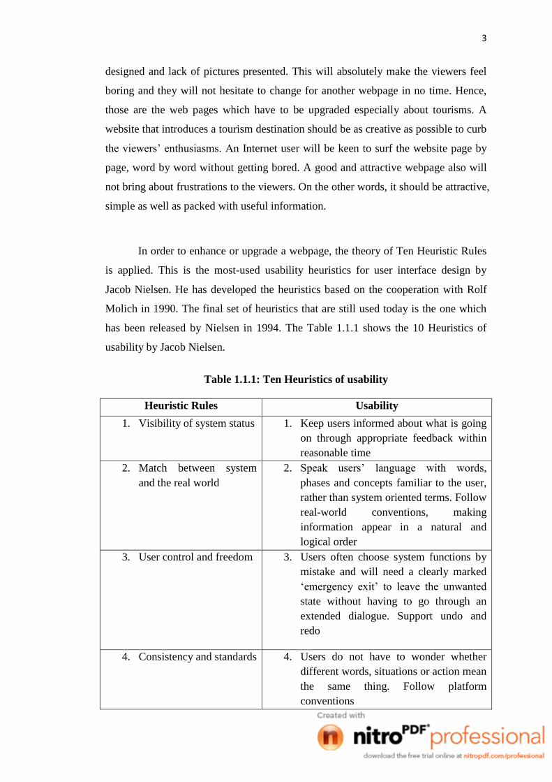
In order to enhance or upgrade a webpage, the theory of Ten Heuristic Rules
is applied. This is the most-used usability heuristics for user interface design by
Jacob Nielsen. He has developed the heuristics based on the cooperation with Rolf
Molich in 1990. The final set of heuristics that are still used today is the one which
has been released by Nielsen in 1994. The Table 1.1.1 shows the 10 Heuristics of
usability by Jacob Nielsen.
Table 1.1.1: Ten Heuristics of usability
Heuristic Rules Usability
1. Visibility of system status 1. Keep users informed about what is going
on through appropriate feedback within
reasonable time
2. Match between system
and the real world
2. Speak users’ language with words,
phases and concepts familiar to the user,
rather than system oriented terms. Follow
real-world conventions, making
information appear in a natural and
logical order
3. User control and freedom 3. Users often choose system functions by
mistake and will need a clearly marked
‘emergency exit’ to leave the unwanted
state without having to go through an
extended dialogue. Support undo and
redo
4. Consistency and standards 4. Users do not have to wonder whether
different words, situations or action mean
the same thing. Follow platform
conventions

4
Heuristic Rules Usability
5. Error Prevention 5. Even better than good error message is a
careful design which prevent a problem
from occurring in the first place. Either
eliminate error-prone conditions or check
for them and present users with a
confirmation option before they commit
the action
6. Recognition rather than
recall
6. Minimize the user’s memory load by
making objects, actions and options
visible. Instructions for use of the system
should be visible or easily retrievable
whenever appropriate
7. Flexibility and efficiency
of use
7. Accelerators which unseen by novice
user who may often speed up the
interaction for the expert user such that
the system can cater to both inexperience
and experienced users. Allow users to
tailor frequent actions
8. Aesthetic and minimalist
design
8. Dialogues shouldn’t contain information
which is irrelevant or rarely needed.
Every extra unit of information in a
dialogue competes with the relevant units
of information and diminishes their
relative visibility. Visual layout should
respect the principles of contrast,
repetition, alignment and proximity
9. Help users recognize,
diagnose and recover
from errors
9. Error message should be expressed in
plain language (no codes) precisely
indicate the problem and constructively
suggest a solution
10. Help and documentation 10. Any such information will be easy to
search, focused on user’s task, list
concrete steps to be carried out and not
be too large
For the sake of developing a more interesting internet contents for the users,
the dull websites should be improved and enhanced. Therefore, this project is
brought out in order to provide a better understanding and net-surfing atmosphere for
the viewers.

5
1.2 Problem Statement
Most of the webpage found online are inconvenience and not well-planned.
The webpage are usually very boring and not attractive to users. These make users
lost interest to continue their search for travelling information in a short time.
Besides, it is true that any information is available to be searched online. However,
sometimes it’s hard to find a webpage that contains full and packed information of
what is wanted. Usually, users have to search more than one page in order to collect
all of the needed information. This is because users are not able to find a single page
that is packed with the needed information. Thus, users have to use up a lot of time
searching for few webpage at the same time only for a single topic. In order to make
it be more convenience for Internet users, a webpage that comprises of ample data
and information under a specific topic must be developed.
1.3 Objectives
This project embarks the following objectives:
a. To enhance the Tour Guide Webpage for Kinta Tour Guide Webpage.
b. To utilize the Heuristic rules of Human Computer Interaction (HCI) by Jacob
Nielsen.
c. To verify the effectiveness of the project by bringing out random survey using
survey form.
1.4 Scopes
a. Enhancement of Kinta Tour Guide Webpage for Ipoh Tourism by using Jacob
Nielsen’s Heuristic Rules of HCI.
b. The software used for the Enhancement of Kinta Tour Guide Webpage for Ipoh
Tourism is Microsoft Visual Web Developer 2010 Express. There will be various
languages applied using Microsoft Visual Web Developer 2010 Express which

6
consists of HyperText Markup Language (HTML), Cascading Style Sheet (CSS),
JavaScript language, Jquery, and ASP.Net.
c. Most of the users of the Kinta website are UMP students.
1.5 Deliverables
a. Enhancement of the tour guide webpage for Kinta Tour Guide Webpage.
b. The Heuristic rules of Human Computer Interaction (HCI) by Jacob Nielsen
applied in the Kinta Tour Guide Webpage.
c. Result of the survey form.
1.6 Thesis Organization
This thesis consists of four (4) chapters. Chapter 1: Introduction briefly describes
and introduces the system. This system preliminary shows the basic concept of the system,
problem statements of the system, objectives, scopes, and how the report is organized.
Chapter 2: Literature Review depicts the manual systems and the existing systems as the
case studies of the project. This chapter also reviews the technique, method, equipment,
and technology that had been used in the case studies. Chapter 3: Methodology discusses
about the overall workflow in the development of the project. This chapter also discusses
the method, technique or approach that has been used while designing and implementing
the project. Chapter 4: Conclusion briefly summarizes the project.

7
CHAPTER 2
LITERATURE REVIEW
Over the years, computers and programs have become easier to use.
Computer programs have become more user friendly, taking advantage of user
friendly design. Minimal mouse clicks are only part of the picture to increase the
computing experience. Cleaner, less cluttered “work spaces” for software is the heart
of HCI. HCI is an acronym for Human Computer Interaction. It is a very wide
discipline which studies all the elements linked to the human use of computers and
software. It also concerns devices which can be linked to computers such as video
terminals, mobile devices and computerised consoles. The main aim of HCI is to
make the use of software and computerised devices as simple and easy to understand
as possible, with the aim of improving the efficiency and effectiveness of the actions
taken at the same time. This project covers the application of Heuristic Rules for
usability evaluation.
2.1 Survey on the existing system of Ipoh Tourism webpage
The website of Ipoh Destination Guide [11] is the selected Ipoh Tourism
webpage for evaluation and will be innovated in the project. The project contains a
few weaknesses which need some improvement using Heuristic Rules. The parts
which are needed to be upgraded are being shown in the images within the following
paragraphs, along with the descriptions.

8
Figure 2.1.1 shows the header of the website which may confuse the visitors’
thought that came from foreign countries. The main title above is stated as
‘Destination Guide Ipoh’ but the picture above is showing the city of Kuala Lumpur.
Hence once the foreigners view the page, foreigners will imagine that the city shown
in the picture is the Ipoh City. Kuala Lumpur City’s picture is at the top of the page
and the picture shown will definitely misleading the first thought of the viewers. A
photo represents a thousand words, so the photos placed in the webpage should be
chosen carefully. At least, the image shown in the banner should be changed to the
pictures of the view of Ipoh City.
Figure 2.1.1: Ipoh Tourism Banner
The Figure 2.1.2 shows one of the parts within the webpage. The content is
full with text and words and it is boring for the viewers. Actually the content shown
above is the most important part of the page as it introduces the tour sites within the
area of Ipoh. The problem is that the elaboration and explanation written is
inadequate and unattractive. It is too simple and only one photo about Kellie’s Castle
is presented. In additional to that, the photo is not interesting and dull. The photo
shown should be the overview of the whole building structure for a clearer image of
Kellie’s Castle. Besides that, the picture of others tourism places introduced in the
content also should be presented too. In other words, words and photos should be at a
balance within a page.

9
Figure 2.1.2: Ipoh Tourism Destination
The Figure 2.1.3 shows one of the parts within the webpage. The content is
about the interesting getaways near the Ipoh area. The content of this part is
obviously too plain and dull. The content contains too many words and makes
viewers feel boring. Hence, every viewer will definitely will lose enthusiasms on the
contents. The places introduced should be attached with photos too or at least some
interesting images related to the pages.
Figure 2.1.3: Ipoh Tourism Travel Suggestion

10
The Figure 2.1.4 shows a part of the webpage which is a system created for
the ease of viewers. There are a series of contents in the menu of ‘Jump to Section’.
The viewers just have to click what viewers want according to the menu and the
navigator will lead viewers straight jump to the attached content. However, the
navigation used contains a weakness. All of the contents are packed within the same
page, making the page too long. For example, when the viewer wants to know the
routes of Ipoh, the viewer can click the ‘Direction of Ipoh’ button in the menu and
the navigation used will lead to the attached content but the content is still within the
same webpage. The content is better to have a specific page for a specific section.
For instant, when a viewer clicks a selected title in the menu, the navigation used will
lead the viewer to another page that is only packed with the related information and
images. When every section has its own page, then more information related to the
specific title can be presented in the page and would not make it like a mixture of
different components. Whenever a viewer wants to get out from the page, the viewer
just has to close the page and straight back to the main menu for other subtitles. This
will make the webpage looked more systematic and packed with relevant information.
Figure 2.1.4: Ipoh Tourism Section’s List
The most important thing in a passage is the introduction of the whole story.
The Figure 2.1.5 is the part of introduction within the webpage. The first impression
given to the viewers is ‘dull’. The background colour and the font colour unmatched,
unattractive borders and word is too much for a tourism introduction page. Even the
photo shown is not enough to be an attention getter. Background colour, font colour
and borders should be designed creatively to make viewers feel that the page is worth