earnings inequality and mobility in the united states: evidence from social security...
TRANSCRIPT

EARNINGS INEQUALITY AND MOBILITY IN THE UNITED
STATES: EVIDENCE FROM SOCIAL SECURITY DATA SINCE 1937∗
Wojciech Kopczuk
Emmanuel Saez
Jae Song
March 18, 2009
Abstract
This paper uses Social Security Administration longitudinal earnings micro data since
1937 to analyze the evolution of inequality and mobility in the United States. Annual earn-
ings inequality is U-shaped, decreasing sharply up to 1953 and increasing steadily afterwards.
Short-term earnings mobility measures are stable over the full period except for a temporary
surge during World War II. Virtually all of the increase in the variance in annual (log) earn-
ings since 1970 is due to the increase in the variance of permanent earnings (as opposed to
transitory earnings). Mobility at the top of the earnings distribution is stable and has not
mitigated the dramatic increase in annual earnings concentration since the 1970s. Long-term
mobility among all workers has increased since the 1950s but has slightly declined among
men. The decrease in the gender earnings gap and the resulting substantial increase in up-
ward mobility over a lifetime for women is the driving force behind the increase in long-term
mobility among all workers.
∗We thank Tony Atkinson, Clair Brown, David Card, Jessica Guillory, Russ Hudson, Jennifer Hunt, Markus
Jantti, Alan Krueger, David Lee Thomas Lemieux, Michael Leonesio, Joyce Manchester, Robert Margo, David
Pattison, Michael Reich, Jonathan Schwabish, numerous seminar participants, and especially editor Lawrence
Katz and four anonymous referees for very helpful comments and discussions. We also thank Ed DeMarco, Linda
Maxfield, and especially Joyce Manchester for their support, Bill Kearns, Joel Packman, Russ Hudson, Shirley
Piazza, Greg Diez, Fred Galeas, Bert Kestenbaum, William Piet, Jay Rossi, Thomas Mattson for help with
the data, and Thomas Solomon and Barbara Tyler for computing support. Financial support from the Sloan
Foundation and NSF Grant SES-0617737 is gratefully acknowledged. All our series are available in electronic
format in the Web Appendix.

I. Introduction
Market economies are praised for creating macro-economic growth but blamed for the economic
disparities among individuals they generate. Economic inequality is often measured using high-
frequency economic outcomes such as annual income. However, market economies also generate
substantial mobility in earnings over a working lifetime. As a result, annual earnings inequality
might substantially exaggerate the extent of true economic disparity among individuals. To
the extent that individuals can smooth changes in earnings using savings and credit markets,
inequality based on longer periods than a year is a better measure of economic disparity. Thus,
a comprehensive analysis of disparity requires studying both inequality and mobility.
A large body of academic work has indeed analyzed earnings inequality and mobility in the
United States. A number of key facts from the pre-World War II years to the present have
been established using four main data sources:1 (1) Decennial Census data show that earnings
inequality decreased substantially during the “Great Compression” from 1939 to 1949 [Goldin
and Margo, 1992] and remained low over the next two decades, (2) the annual Current Population
Surveys (CPS) show that earnings inequality has increased substantially since the 1970s and
especially during the 1980s [Katz and Murphy, 1992; Katz and Autor, 1999], (3) income tax
statistics show that the top of the annual earnings distribution experienced enormous gains over
the last 25 years [Piketty and Saez, 2003], (4) panel survey data, primarily the Panel Study of
Income Dynamics (PSID), show that short-term rank-based mobility has remained fairly stable
since the 1970s [Gottschalk, 1997], (5) the gender gap has narrowed substantially since the
1970s [Goldin, 1990; Blau, 1998; Goldin, 2006]. There are, however, important questions that
remain open due primarily to lack of homogeneous and longitudinal earnings data covering a
long period of time.
First, no annual earnings survey data covering most of the US workforce are available before
the 1960s so that it is difficult to measure overall earnings inequality on a consistent basis before
the 1960s, and in particular analyze the exact timing of the Great Compression. Second, studies
of mobility have focused primarily on short term mobility measures due to lack of longitudinal
data with large sample size and covering a long time period. Therefore, little is known about1A number of studies have also analyzed inequality and mobility in America in earlier periods (see Lindert
[2000] for a survey on inequality and Ferrie [2008] for an analysis of occupational mobility).
1

earnings mobility across an entire working life, let alone how such long-term mobility has evolved
over time. Third and related, there is a controversial debate on whether the increase in inequality
since the 1970s has been offset by increases in earnings mobility, and whether consumption
inequality has increased to the same extent as income inequality.2 In particular, the development
of performance pay such as bonuses and stock-options for highly compensated employees might
have increased substantially year to year earnings variability among top earners so that the
trends documented in Piketty and Saez [2003] could be misleading.
The goal of this paper is to use the Social Security Administration (SSA) earnings micro
data available since 1937 to make progress on those questions. The SSA data we use combine
four key advantages relative to the data that have been used in previous studies on inequality
and mobility in the United States. First, the SSA data we use for our research purposes have
large sample size: a 1 percent sample of the full US covered workforce is available since 1957,
and a 0.1 percent sample since 1937. Second, the SSA data are annual and cover a very long
time period of almost 70 years. Third, the SSA data are longitudinal balanced panels as samples
are selected based on the same Social Security Number pattern every year. Finally, the earnings
data have very little measurement error and are fully uncapped (with no top code) since 1978.3
Although Social Security earnings data have been used in a number of previous studies (often
matched to survey data such as the Current Population Survey), the data we have assembled
for this study overcome three important previous limitations. First, from 1946 to 1977, we
use quarterly earnings information to extrapolate earnings up to 4 times the Social Security
annual cap.4 Second, we can match the data to employers and industry information starting
in 1957 allowing us to control for expansions in Social Security coverage which started in the
1950s. Finally, to our knowledge, the Social Security annual earnings data before 1951 have not
been used outside SSA for research purposes since Robert Solow’s unpublished Harvard Ph.D.
thesis [Solow, 1951].2See e.g., Cutler and Katz [1991], Krueger and Perri [2006], Slesnick [2001], Attanasio et al. [2007].3A number of studies have compared survey data matched to administrative data to assess measurement error
in survey data (see e.g., Abowd and Stinson [2005]).4Previous work using SSA data before the 1980s has almost always used data capped at the Social Security
annual maximum (which was around the median of the earnings distribution in the 1960s) making it impossible
to study the top half of the distribution. Before 1946, the top code was above the top quintile allowing us to
study earnings up to the top quintile over the full period.
2

Few socio-demographic variables are available in the SSA data relative to standard survey
data. Date of birth, gender, place of birth (including a foreign country birth place), and race
are available since 1937. Employer information (including geographic location, industry, and
size) is available since 1957. Because we do not have information on important variables such as
family structure, education, and hours of work, our analysis will focus only on earnings rather
than wage rates and will not attempt to explain the links between family structure, education,
labor supply and earnings, as many previous studies have done. In contrast to studies relying
on income tax returns, the whole analysis is also based on individual rather than family-level
data. Furthermore, we focus only on employment earnings and hence exclude self-employment
earnings as well as all other forms of income such as capital income, business income, and
transfers. We further restrict our analysis to employment earnings from commerce and industry
workers which represents about 70 percent of all US employees as this is the core group always
covered by Social Security since 1937. This is an important limitation when analyzing mobility
as (a) mobility within the commerce and industry sector may be different than overall mobility
and (b) mobility between the commerce and industry sector and all other sectors is eliminated.5
We obtain three main findings. First, our annual series confirm the U-shape evolution of
earnings inequality since the 1930s. Inequality decreases sharply up to 1953 and increases
steadily and continuously afterwards. The U-shape evolution over time of inequality is also
present within each gender group and is more pronounced for men. Percentile ratio series show
that (1) the compression in the upper part of the distribution took place from 1942 to 1950 and
was followed by a steady and continuous widening ever since the early 1950s, (2) the compression
in the lower part of the distribution took place primarily in the post war period from 1946 to
the late 1960s and unravelled quickly from 1970 to 1985, especially for men, and has been fairly
stable over the last two decades.
Second, we find that short-term relative mobility measures such as rank correlation measures,
Shorrocks indices comparing annual vs. multi-year earnings inequality have been quite stable
over the full period except for a temporary surge during World War II.6 In particular, short-term5Since in recent decades Social Security covers over 95 percent of employees, we show in the Web Appendix
that our findings for recent decades are robust to including all covered workers. However, we cannot perform such
a robustness check for earlier periods when coverage was much less complete.6Such a surge is not surprising in light of the large turnover in the labor market generated by the war.
3

mobility has been remarkably stable since the 1950s, for a variety of mobility measures and also
when restricting the sample to men only. Therefore, the evolution over time of annual earnings
inequality is very close to the evolution of inequality of longer term earnings. Furthermore, we
show that most of the increase in the variance of (log) annual earnings is due to increases in the
variance of (log) permanent earnings with modest increases in the variance of transitory (log)
earnings. Finally, mobility at the top of the earnings distribution, measured by the probability
of staying in the top percentile after 1, 3, or 5 years has also been very stable since 1978 (the
first year in our data with no top code). Therefore, in contrast to the stock-option scenario
mentioned above, the SSA data show very clearly that mobility has not mitigated the dramatic
increase in annual earnings concentration.
Third, we find that long-term mobility measures among all workers, such as the earnings
rank correlations from the early part of a working life to the late part of a working life display
significant increases since 1951 either when measured unconditionally or when measured within
cohorts. However, those increases mask substantial heterogeneity across gender groups. Long-
term mobility among males has been stable over most of the period with a slight decrease in
recent decades. The decrease in the gender earnings gap and the resulting substantial increase in
upward mobility over a lifetime for women is the driving force behind the increase in long-term
mobility among all workers.
The paper is organized as follows. Section 2 presents the conceptual framework linking
inequality and mobility measures, the data, and our estimation methods. Section 3 presents
inequality results based on annual earnings. Section 4 focuses on short-term mobility and its
effect on inequality, while Section 5 focuses on long-term mobility and inequality. Section 6
concludes. Additional details on the data and our methodology, as well as extensive sensitivity
analysis and the complete series are presented in the Web Appendix.
II. Framework, Data, and Methodology
A. Conceptual Framework
Our main goal is to document the evolution of earnings inequality. Inequality can be measured
over short-term earnings (such as annual earnings) or over long-term earnings (such as earnings
4
averaged over several years or even a lifetime). When there is mobility in individual earnings over
time, long-term inequality will be lower than short-term inequality as moving up and down the
distribution of short-term earnings will make the distribution of long-term earnings more equal.
Therefore, conceptually, a way to measure mobility [Shorrocks, 1978] is to compare inequality
of short-term earnings to inequality of long-term earnings and define mobility as a coefficient
between zero and one (inclusive) as follows:
Long-term earnings inequality = Short-term earning inequality * (1 - Mobility) (1)
Alternatively, one can define mobility directly as changes or “shocks” in earnings.7 In our
framework, such shocks are defined broadly as any deviation from long-term earnings. Those
shocks could be indeed real shocks such as unemployment, disability, or an unexpected promo-
tion. Changes could also be the consequence of voluntary choices such as reducing (or increasing)
hours of work, voluntarily changing jobs, or obtaining an expected pay raise. Such shocks can
be transitory (such as working overtime in response to a temporarily increased demand for
employer’s product or a short unemployment spell in the construction industry) or permanent
(being laid off from a job in a declining industry). In that framework, both long-term inequality
and the extent of shocks contribute to shaping short-term inequality:
Short-term earnings inequality = Long-term earnings inequality + Variability in earnings (2)
Equations (1) and (2) are related by the formula:
Variability in earnings = Short-term earnings inequality * Mobility
= Long-term earnings inequality * Mobility / (1-Mobility)(3)
Thus, equation (3) shows that a change in mobility with no change in long-term inequality
is due to an increase in variability in earnings. Conversely, an increase in inequality (either
short-term or long-term) with no change in mobility implies an increased variability in earnings.
Importantly, our concept of mobility is relative rather than absolute.8
7See Fields [2007] for an overview of different approaches to measuring income mobility.8Our paper focuses exclusively on relative mobility measures although absolute mobility measures (such as the
likelihood of experiencing an earnings increase of at least X percent after 1 year) are also of great interest. Such
measures might produce different time series if economic growth or annual inequality changes over time.
5

Formally, we consider a situation where a fixed group of individuals i = 1, .., I have short-term
earnings zit > 0 in each period t = 1, ..,K. For example t can represent a year. We can define
long-term earnings for individual i as average earnings across all K periods: zi =∑
t zit/K. We
normalize earnings so that average earnings (across individuals) are the same in each period.9
From a vector of individual earnings z = (z1, .., zI), an inequality index can be defined as
G(z), where G(.) is convex in z and homogeneous of degree zero (multiplying all earnings by
a given factor does not change inequality). For example, G(.) can be the Gini index or the
variance of log earnings. Shorrocks [1978, Theorem 1, p. 381] shows that:
G(z) ≤K∑
t=1
G(zt)/K,
where zt is the vector of earnings in period t and z the vector of long-term earnings (the average
across the K periods) earnings. This inequality result captures the idea that movements in
individual earnings up and down the distribution reduce long-term inequality (relative to short-
term inequality). Hence we can define a related Shorrocks mobility index 0 ≤M ≤ 1 as:
1−M =G(z)∑K
t=1G(zt)/K,
which is a formalization of equation (1) above. M = 0 if and only if individuals incomes
(relative to the mean) do not change overtime. The central advantage of the Shorrocks mobility
index is that it formally links short-term and long-term inequality which is perhaps the primary
motivation for analyzing mobility. The disadvantage of the Shorrocks index is that it is an
indirect measure of mobility.
Therefore, it is also useful to define direct mobility indices such as the rank correlation in
earnings from year t to year t + p (or quintile mobility matrices from year t to year t + p).
Such mobility indices are likely to be closely related to the Shorrocks indices as re-ranking from
one period to another is precisely what creates a wedge between long-term inequality and (the
average of) short-term inequality. The advantage of direct mobility indices is that they are more
concrete and transparent than Shorrocks indices. In our paper, we will therefore use both and
show that they evolve very similarly overtime.
One specific measure of inequality—the variance of log earnings—has received substantial9In our empirical analysis, earnings will be indexed to the nominal average earnings index.
6

attention in the literature on inequality and mobility. Introducing yit = log zit and yi =∑t log zit/K, we can define deviations in (log) earnings as:
εit = yit − yi.
It is important to note that εit may reflect both transitory earnings shocks (such as an iid
process) and permanent earnings shocks (such as a Brownian motion). The deviation εit could
either be uncertain ex-ante from the individual perspective, or predictable.10
The Shorrocks theorem applied to the inequality index variance of log-earnings implies that
vari(yi) ≤ varit(yit),
where the variance varit(yit) is taken over both i = 1, .., I and K = 1, .., t. If, for illustration,
we make the statistical assumption that εit ⊥ yi and we denote var(εit) = σ2ε , then we have:
varit(yit) = vari(yi) + σ2ε ,
which is a formalization of equation (2) above. The Shorrocks inequality index in that case is
M = σ2ε/varit(yit) = σ2
ε/(vari(yi) + σ2ε).
This shows that short-term earnings variance can increase because of an increase in long-term
earnings variance or an increase in the variance of earnings deviations. Alternatively and equiv-
alently, short-term inequality can increase while long-term inequality is stable if mobility in-
creases. This simple framework can help us understand the findings from the previous literature
on earnings mobility in the United States. Rank based mobility measures (such as year-to-year
rank correlation or quintile mobility matrices) are stable over time [Gottschalk, 1997] while there
has been an increase in the variance of transitory earnings [Gottschalk and Moffitt, 1994]. Such
findings can be reconciled if the disparity in permanent earnings has simultaneously widened to
keep rank-based mobility of earnings stable.
In the theoretical framework we just described, the same set of individuals are followed across
the K short-term periods. In practice, because individuals leave or enter the labor force (or the10Uncertainty is important conceptually as individuals facing no credit constraints can fully smooth predictable
shocks while uncertain shocks can only be smoothed with insurance. We do not pursue this distinction in our
analysis as we cannot observe the degree of uncertainty in the empirical earnings shocks.
7

“commerce and industry” sector we will be focusing on), the set of individuals with positive
earnings varies across periods. As the number of periods K becomes large, the sample will
become smaller. Therefore, we will mostly consider relatively small values of K such as K = 3
or K = 5. When a period is a year, that allows us to analyze short term mobility. When a
period is a longer period of time such as 12 consecutive years, with K = 3, we cover 36 years
which is almost a full lifetime of work, allowing us to analyze long-term mobility, i.e., mobility
over a full working life.
Our analysis will focus on the time series of various inequality and mobility statistics. The
framework we have considered can be seen as an analysis at a given point in time s. We can
recompute those statistics for various points in time to create time series.
B. Data and Methodology
• Social Security Administration Data
We use primarily datasets constructed in SSA for research and statistical analysis known
as the Continuous Work History Sample (CWHS) system.11. The annual samples are selected
based on a fixed subset of digits of (a transformation of) the Social Security Number (SSN).
The same digits are used every year so that the sample is a balanced panel and can be treated
as a random sample of the full population data. We use three main SSA datasets.
(1) The 1 percent CWHS file contains information about taxable Social Security earnings
from 1951 to date (2004), basic demographic characteristics such as year of birth, sex and race,
type of work (farm or non-farm, employment or self-employment), self-employment taxable
income, insurance status for the Social Security Programs, and several other variables. Because
Social Security taxes apply up to a maximum level of annual earnings, however, earnings in this
dataset are effectively top-coded at the annual cap before 1978. Starting in 1978, the dataset also
contains information about full compensation derived from the W2 forms, and hence earnings
are no longer top coded. Employment earnings (either FICA employment earnings before 1978
or W2 earnings from 1978 on) are defined as the sum of all wages and salaries, bonuses, and
exercised stock-options exactly as wage income reported on individual income tax returns.12
11Detailed documentation of these datasets can be found in Panis et al. [2000]12FICA earnings include elective employee contributions for pensions (primarily 401(k) contributions) while
8

(2) The second file is known as the Employee-Employer file (EE-ER) and we will rely on its
longitudinal version (LEED) that covers 1957 to date. While the sampling approach based on
the SSN is the same as the 1 percent CWHS, individual earnings are reported at the employer
level so that there is a record for each employer a worker is employed by in a year. This dataset
contains demographic characteristics, compensation information subject to top-coding at the
employer-employee record level (and with no top code after 1978), and information about the
employer including geographic information and industry at the three digit (major group and
industry group) level. The industry information allows us to control for expansion in coverage
overtime (see below). Importantly, the LEED (and EE-ER) dataset also includes imputations
based on quarterly earnings structure from 1957 to 1977 which allows us to handle earnings
above the top code (see below).13
(3) Third, we use the so-called .1 percent CWHS file (one tenth of one percent) that is con-
structed as a subset of the 1 percent file but covers 1937-1977. This file is unique in its covering
the “Great Compression” of the 1940s. The .1 percent file contains the same demographic vari-
ables as well as quarterly earnings information starting with 1951 (and quarter at which the top
code was reached for 1946-1950), thereby extending our ability to deal with top-coding problems
(see below).
• Top Coding Issues
From 1937 to 1945, no information above the taxable ceiling is available. From 1946 to 1950,
the quarter at which the ceiling is reached is available. From 1951 to 1977, we rely on imputations
based on quarterly earnings (up to the quarter at which the annual ceiling is reached). Finally,
since 1978, the data are fully uncapped.
To our knowledge, the exact quarterly earnings information seems to have been retained only
in the 0.1 percent CWHS sample since 1951. The LEED 1 percent sample since 1957 contains
imputations that are based on quarterly earnings but the quarterly earnings themselves were
not retained in the data available to us. The imputation method is discussed in more detail
in Kestenbaum [1976, his method II] and in the Web Appendix. It relies on earnings for quarters
W2 earnings exclude such contributions. However, before 1978, such contributions were almost non existent.13To our knowledge, the LEED has hardly ever been used in academic publications. Two notable exceptions
are Schiller [1977], and Topel and Ward [1992].
9

when they are observed to impute earnings in quarters that are not observed (when the taxable
ceiling is reached after the first quarter). Importantly, this imputation method might not be
accurate if individual earnings are not uniform across quarters. We extend the same procedure to
1951-1956 using the .1 percent file and because of the overlap of the .1 percent file and 1 percent
LEED between 1957 and 1977 were able to verify that this is indeed the exact procedure that
was applied in the LEED data. For 1946-1950, the imputation procedure [see the Web Appendix
and Kestenbaum, 1976, his method I] uses Pareto distributions and preserves the rank order
based on the quarter when the taxable maximum was reached.
For individuals with earnings above the taxable ceiling (from 1937 to 1945) or who reach the
taxable ceiling in the first quarter (from 1946 to 1977), we impute earnings assuming a Pareto
distribution above the top code (1937-1945) or four times the top code (1946-1977). The Pareto
distribution is calibrated from wage income tax statistics published by the Internal Revenue
Service to match the top wage income shares series estimated in Piketty and Saez [2003].
The number of individuals who were top-coded in the first quarter and whose earnings are
imputed based on the Pareto imputation is less than 1 percent of the sample for virtually all
years after 1951. Consequently, high-quality earnings information is available for the bottom 99
percent of the sample allowing us to study both inequality and mobility up to the top percentile.
From 1937 to 1945, the fraction of workers top coded (in our sample of interest defined below)
increases from 3.6 percent in 1937 to 19.5 percent in 1944 and 17.4 percent in 1945. The number
of top-coded observations increases to 32.9 percent by 1950, but the quarter when a person
reached taxable maximum helps in classifying people into broad income categories. This implies
that we cannot study groups smaller than the top percentile from 1951 to 1977 and we cannot
study groups smaller than the top quintile from 1937 to 1950.
To assess the sensitivity of our mobility and multi-year inequality estimates with respect to
top code imputation, we use two Pareto imputation methods (see Web Appendix). In the first
or main method, the Pareto imputation is based on draws from a uniform distribution that are
independent across individuals but also time periods. As there is persistence in ranking even at
the top of the distribution, this method generates an upward bias in mobility within top coded
individuals. In the alternative method, the uniform distribution draws are independent across
individuals but fixed over time for a given individual. As there is some mobility in rankings at
10
the top of the distribution, this method generates a downward bias in mobility. We always test
that the two methods generate virtually the same series (see Web Appendix Figures A.5 to A.9
for examples).14
• Changing Coverage Issues
Initially, Social Security covered only “commerce and industry” employees defined as most
private for-profit sector employees and excluding farm and domestic employees as well as self-
employed workers. Since 1951, there has been an expansion in the workers covered by Social
Security and hence included in the data. An important expansion took place in 1951 when
self-employed workers, farm and domestic employees were included. This reform also expanded
coverage to some government and non-profit employees (including large parts of education and
health care industries), with coverage further significantly increasing in 1954 and then slowly
expanding since then. We include in our sample only commerce and industry employment
earnings so as to focus on a consistent definition of workers. Using SIC classification in the
LEED, we define commerce and industry as all SIC codes excluding agriculture, forestry and
fishing (01-09), hospitals (8060-8069), educational services (82), social services (83), religious
organizations and non-classified membership organizations (8660-8699), private households (88),
and public administration (91-97).
Between 1951 and 1956, we do not have industry information as the LEED starts in 1957.
Therefore, we impute “commerce and industry” classification using 1957-1958 industrial clas-
sification as well as discontinuities in covered earnings from 1950 to 1951 (see Web Appendix
for complete details). In 2004, commerce and industry employees are about 70 percent of all
employees and this proportion has declined only very modestly since 1937. Using only commerce
and industry earnings is a limitation for our study for two reasons. First, inequality and mobility
within the commerce and industry sector may be different than in the full population. Second
and most important, mobility between the commerce and industry sector and all other sectors
is eliminated. Since in recent decades Social Security covers over 95 percent of earnings, we
show in the Web Appendix that our mobility findings for recent decades are robust to including
all covered workers. However, we cannot perform such a robustness check for earlier periods14This is not surprising because, starting with 1951, imputations matter for just the top 1 percent of the sample
and mobility measures for the full population are not very sensitive to what happens within the very top group.
11

when coverage was much less complete. Note also that, throughout the period, the data include
immigrant workers only if they have a valid SSN.
• Sample Selection
For our primary analysis, we are restricting the sample to adult individuals aged 25 to 60
(by January 1st of the corresponding year). This top age restriction allows us to concentrate
on the working-age population.15 Second, we consider for our main sample only workers with
annual (commerce and industry) employment earnings above a minimum threshold defined as
one-fourth of a full year-full time minimum wage in 2004 ($2575 in 2004), and then indexed
by nominal average wage growth for earlier years. For many measures of inequality, such as
log-earnings variance, it is necessary to trim the bottom of the earnings distribution. We show
in Web Appendix Figures A.2 to A.9 that our results are not sensitive to choosing a higher
minimum threshold such as a full year-full time minimum wage. We cannot analyze satisfactorily
the transition in and out of the labor force using our sample because the SSA data covers only
about 70 percent of employees in the early decades. From now on, we refer to our main sample
of interest, namely “commerce and industry” workers aged 25 to 60 with earnings above the
indexed minimum threshold (of $2575 in 2004), as the “core sample”.
III. Annual Earnings Inequality
Figure I plots the annual Gini coefficient from 1937 to 2004 for the core sample of all workers, and
for men and women separately in lighter grey. The Gini series for all workers follows a U-shape
over the period which is consistent with previous work based on decennial Census data [Goldin
and Margo, 1992], wage income from tax return data for the top of the distribution [Piketty and
Saez, 2003], and CPS data available since the early 1960s [Katz and Autor, 1999]. The series
displays a sharp decrease of the Gini coefficient from 0.44 in 1938 down to 0.36 in 1953 (the
Great Compression) followed by a steady increase since 1953 which accelerates in the 1970s and
especially the 1980s. The Gini coefficient surpassed the pre-war level in the late 1980s and is
highest in 2004 at 0.47.
Our series shows that the Great Compression is indeed the period of most dramatic change in15Kopczuk et al. [2007] used a wider age group from 18 and 70 and obtain the same qualitative findings.
12
inequality since the late 1930s and that it took place in two steps. The Gini coefficient decreased
sharply during the war from 1942 to 1944, rebounded very slightly from 1944 to 1946 and then
declined again from 1946 to 1953. Among all workers, the increase in the Gini coefficient over
the five decades from 1953 to 2004 is close to linear which suggests that changes in overall
inequality were not just limited to an episodic event in the 1980s.
Figure I shows that the series for males and females separately displays the same U-shape
evolution over time. Interestingly, the Great Compression as well as the upward trend in in-
equality are much more pronounced for men than for all workers. This shows that the rise in the
Gini coefficient since 1970 cannot be attributed to changes in gender composition of the labor
force. The Gini for men shows a dramatic increase in a short time period from 0.35 in 1979 to
0.43 in 1988 which is consistent with the CPS evidence extensively discussed in Katz and Autor
[1999].16 On the other hand, stability of the Gini coefficients for men and for women from the
early 1950s through the late 1960s highlights that the overall increase in the Gini coefficient in
that period has been driven by a widening of the gender gap in earnings (i.e., the between rather
than within group component). Strikingly, there is more earnings inequality among women than
among men in the 1950s and 1960s while the reverse is true before the Great Compression and
since the late 1970s.
Finally, the increase in the Gini coefficient has slowed since the late 1980s in the overall
sample. It is interesting to note that a large part of the 3.5 points increase in the Gini from
1990 to 2004 is due to a surge in earnings within the top percentile of the distribution. The
series of Gini coefficients estimated excluding the top percentile increases by less than 2 points
since 1990 (see Web Appendix Figure A.3).17 It should also be noted that, since the 1980s, the
Gini coefficient has increased faster for men and women separately than for all workers. This
has been driven by an increase in the earnings of women relative to men, especially at the top16There is a controversial debate in labor economics about the timing of changes in male wage inequality due
in part to discrepancies across different datasets. For example, Lemieux [2006], using May CPS data, argues that
most of the increase in inequality occurs in the 1980s while Autor et al. [2008], using March CPS data, estimate
that inequality starts to increase in the late 1960s. The Social Security data also point to an earlier increase in
earnings inequality among males.17Hence, results based on survey data such as official Census Bureau inequality statistics, which do not measure
well the top percentile, can give an incomplete view of inequality changes even when using global indices such as
the Gini coefficient.
13

of the distribution as we shall see.
Most previous work in the labor economics literature has focused on gender specific measures
of inequality. As men and women share a single labor market, it is also valuable to analyze the
overall inequality generated in the labor market (in the “commerce and industry” sector in our
analysis). Our analysis for all workers and by gender provides clear evidence of the importance
of changes in women’s labor market behavior and outcomes for understanding overall changes
in inequality, a topic we will return to.
To understand where in the distribution the changes in inequality displayed on Figure I are
occurring, Figure II displays the (log) percentile annual earnings ratios P80/P50 — measuring
inequality in the upper half of the distribution — and P50/P20 — measuring inequality in the
lower half of the distribution. We also depict the series for men and women only separately in
lighter grey.18
The P80/P50 series (depicted in the bottom half of the figure) are also U-shaped over the
period with a brief but substantial “Great Compression” from 1942 to 1947 and a steady increase
starting in 1951 which accelerates in the 1970s. Interestingly, P80/P50 is virtually constant from
1985 to 2000 showing that the gains at the top of the distribution occurred above P80. The
series for men is similar except that P80/P50 increases sharply in the 1980s and continues to
increase in the 1990s.
The P50/P20 series (depicted in the upper half of the figure) display a fairly different time
pattern from the P80/P50 series. First, the compression happens primarily in the post war
period from 1946 to 1953. There are large swings in P50/P20 during the war, especially for
men, as many young low income earners leave and enter the labor force because of the war,
but P50/P20 is virtually the same in 1941 and 1946 or 1947.19 After the end of the Great
Compression in 1953, the P50/P20 series for all workers remains fairly stable to the present,
alternating periods of increase and decrease. In particular, it decreases smoothly from the mid-
1980s to 2000 implying that inequality in the bottom half shrunk in the last two decades although18We choose P80 (instead of the more usual P90) to avoid top coding issues before 1951 and P20 (instead of
the more usual P10) so that our low percentile estimate is not too closely driven by the average wage-indexed
minimum threshold we have chosen ($2575 in 2004).19In the working paper version [Kopczuk et al., 2007] we show that compositional changes during the war are
strongly influencing the bottom of the distribution during the early 1940s.
14
it started increasing after 2000. The series for men only is quite different and displays an overall
U-shape overtime with a sharper great compression which extends well into the post-war period
with an absolute minimum in 1969 followed by a sharp increase up to 1983 and relative stability
since then [consistent with recent evidence by Autor et al., 2008]. For women, the P50/P20
series display a secular and steady fall since World War II.
Table I summarizes the annual earnings inequality trends for all (Panel A), men (Panel B),
women (Panel C) with various inequality measures for selective years (1939, 1960, 1980, and
2004). In addition to the series depicted on the Figures, Table I contains the variance of log-
earnings which also displays a U-shape pattern over the period, as well as the shares of total
earnings going to the bottom quintile group (P0-20), the top quintile group (P80-100), and the
top percentile group (P99-100). Those last two series also display a U-shape over the period. In
particular, the top percentile share has almost doubled from 1980 to 2004 in the sample of men
only and the sample of women only and accounts for over half of the increase in the top quintile
share from 1980 to 2004.
IV. The Effects of Short Term Mobility on Earnings
Inequality
In this section, we apply our theoretical framework from Section 2.1 to analyze multi-year
inequality and relate it to annual earnings inequality series analyzed in Section 3. We will
consider each period to be a year and the longer period will be 5 years (K = 5).20 We will
compare inequality based on annual earnings and earnings averaged over 5 years. We will then
derive the implied Shorrocks mobility indices, and decompose annual inequality into permanent
and transitory inequality components. We will also examine some direct measures of mobility
such as rank correlations.
Figure III plots the Gini coefficient series for earnings averaged over 5 years21 (numerator
of the Shorrocks index) and the 5-year average of the Gini coefficients of annual earnings (the20Series based on 3 year averages instead of 5 year generates display a very similar time pattern. Increasing K
beyond 5 would reduce substantially sample size as we require earnings to be above the minimum threshold in
each of the 5 years as described below.21The average is taken after indexing annual earnings by the average wage index.
15

denominator of the Shorrocks index). For a given year t, the sample for both the five year Gini
and the annual Ginis is defined as all individuals with “Commerce and Industry” earnings above
the minimum threshold in all 5 years, t− 2, t− 1, t, t+ 1, t+ 2 (and aged 25 to 60 in the middle
year t). We show the average of the five annual Gini coefficients between t− 2 and t+ 2 as our
measure of annual Gini coefficient, because it matches the Shorrocks’ approach. Because the
sample is the same for both series, Shorrocks’ theorem implies that the five year Gini is always
smaller than the average of the annual Gini (over the corresponding 5 years) as indeed displayed
on the Figure.22 We also display the same series for men only (in lighter grey). The annual
Gini displays the same overall evolution over time as in Figure I. The level is lower as there
is naturally less inequality in the group of individuals with positive earnings for 5 consecutive
years than in the core sample. The Gini coefficient estimated for 5 year earnings average follows
a very similar evolution over time and is actually extremely close to the annual Gini, especially
in recent decades.
Interestingly, in this sample, the Great Compression takes place primarily during the war
from 1940 to 1944. The war compression is followed by a much more modest decline till 1952.
This suggests that the post war compression observed in annual earnings in Figure I was likely
due to entry (of young men in the middle of the distribution) and exit (likely of war working
women in the lower part of the distribution). Since the early 1950s, the two Gini series are
remarkably parallel, and the 5 year earnings average Gini displays an accelerated increase during
the 1970s and especially the 1980s as did our annual Gini series. The 5 year average earnings
Gini series for men show that the Great Compression is concentrated during the war, with little
change in the Gini from 1946 to 1970, and a very sharp increase over the next three decades,
especially the 1980s.
Figure IV displays two measures of mobility (in black for all workers and in lighter grey for
men only). The first measure is the Shorrocks measure defined as the ratio of five year Gini
to the (average of) annual Gini. Mobility decreases with the index and an index equal to one
implies no mobility at all. The Shorrocks index series is above 0.9, except for a temporary dip22Alternatively, we could have defined the sample as all individuals with earnings above the minimum threshold
in any of the 5 years, t− 2, t− 1, t, t + 1, t + 2. The time pattern of those series is very similar. We prefer to use
the positive earnings in all 5 years criterion because this is a necessity when analyzing variability in log-earnings
as we do below.
16

during the war. The increased earnings mobility during the war is likely explained by the large
movements in and out of the labor force of men serving in the army and women temporarily
replacing men in the civilian labor force. The Shorrocks series have very slightly increased since
the early 1970s from 0.945 to 0.967 in 2004.23 This small change in the direction of reduced
mobility further confirms that, as we expected from Figure III, short-term mobility has played
a minor role in the surge in annual earnings inequality documented on Figure I.
The second mobility measure displayed on Figure IV is the straight rank correlation in
earnings between year t and year t + 1 (computed in the sample of individuals present in our
core sample in both years t and t + 1).24 As the Shorrocks index, mobility decreases with the
rank correlation and a correlation of one implies no year to year mobility. The rank mobility
series follows the same overall evolution over time as the Shorrocks mobility index: a temporary
but sharp dip during the war followed by a slight increase. Over the last two decades, the rank
correlation in year-to-year earnings has been very stable and very high around 0.9. As with the
Shorrocks index, the increase in rank correlation is slightly more pronounced for men (than for
the full sample) since the late 1960s.
Figure V displays (a) the average of variance of annual log earnings from t − 2 to t + 2
(defined on the stable sample as in the Shorrocks index analysis before), (b) the variance of five
year average log-earnings, var(Pt+2
s=t−2 log zis
5
), and (c) the variance of log earnings deviations
estimated as
Dt = var
(log(zit)−
∑t+2s=t−2 log zis
5
),
where the variance is taken across all individuals i with earnings above the minimum threshold
in all 5 years t − 2, .., t + 2. As the previous two mobility measures, those series, displayed in
black for all workers and in lighter grey for men only, show a temporary surge in the variance of
transitory earnings during the war, and is stable after 1960. In particular, it is striking that we
do not observe an increased earnings variability over the last 20 years so that all the increase
in the log-earnings variance can be attributed to the increase in the variance of permanent (five
year average) log-earnings.23The increase is slightly more pronounced for the sample of men.24More precisely, within the sample of individuals present in the core sample in both years t and t + 1, we
measure the rank rt and rt+1 of each individual in each of the two years, and then compute the correlation
between rt and rt+1 across individuals.
17

Our results differ somewhat from Gottschalk and Moffitt [1994] results using PSID data
who found that over one third of increase in the variance of log-earnings from the 1970s to
the 1980s was due to an increase in transitory earnings (Table 1, row 1, p. 223). We find
a smaller increase in transitory earnings in the 1970s and we find that this increase reverts
in the late 1980s and 1990s so that transitory earnings variance is virtually identical in 1970
and 2000. To be sure, our results could differ from Gottschalk and Moffitt [1994] for many
reasons such as measurement error and earnings definition consistency issues in the PSID or the
sample definition. Gottschalk and Moffitt focus exclusively on white males, use a different age
cut-off, take out age-profile effects, and include earnings from all industrial sectors. Gottschalk
and Moffitt also use 9 year earnings periods (instead of 5 as we do) and include all years with
positive annual earnings years (instead of requiring positive earnings in all 9 years as we do).25
The absence of top code since 1978 allows us to zoom on top earnings which, as we showed
in Table 1, have surged in recent decades. Figure VI.A uses the uncapped data since 1978 to
plot the share of total annual earnings accruing to the top 1 percent (those with earnings above
$236,000 in 2004). The top 1 percent annual earnings share doubles from 6.5 percent in 1978
to 13 percent in 2004.26 Figure VI.A then compares the share of earnings of the top 1 percent
based on annual data with shares of the top 1 percent defined based on earnings averaged at the
individual level over 5 years. The 5 year average earnings share series naturally smoothes short-
term fluctuations but shows the same time pattern of robust increase as the annual measure.27
This shows that the surge in top earnings is not due to increased mobility at the top. This finding
is confirmed in Figure VI.B which shows the probability of staying in the top 1 percent earnings
group after 1, 3 and 5 years (conditional on staying in our core sample) starting in 1978. The one-25The recent studies of Dynan et al. [2008]; Shin and Solon [2008], revisit mobility using PSID data. Shin and
Solon [2008] find an increase in mobility in the 1970s followed by stability, which is consistent with our results.
Dynan et al. [2008] find an increase in mobility in recent decades but they focus on household total income instead
of individual earnings.26The closeness of our SSA based (individual-level) results and the tax return based (family-level) results
of Piketty and Saez [2003] show that changes in assortative mating played at best a minor role in the surge of
family employment earnings at the top of the earnings distribution.27Following the framework from Section 2.1 (applied in this case to the top 1 percent earnings share measure
of inequality), we have computed such shares (in year t) on the sample of all individuals with minimum earnings
in all 5 years, t− 2, .., t + 2. Note also that, in contrast to Shorrocks’ theorem, the series cross because we do not
average the annual income share in year t across the five years t− 2, .., t + 2.
18

year probability is between 60 percent and 70 percent and it shows no overall trend. Therefore,
our analysis shows that the dramatic surge in top earnings has not been accompanied by a
similar surge in mobility in and out top earnings groups. Hence, annual earnings concentration
measures provide a very good approximation to longer-term earnings concentration measures.
In particular, the development of performance based pay such as bonuses and profits from
exercised stock-options (both included in our earnings measure) does not seem to have increased
dramatically mobility.28
Table II summarizes the key short-term mobility trends for all (Panel A) and men (Panel
B) with various mobility measures for selective years (1939, 1960, 1980, and 2002). In sum, the
movements in short-term mobility series appear to be much smaller than changes in inequal-
ity over time. As a result, changes in short-term mobility have had no significant impact on
inequality trends in the United States. Those findings are consistent with previous studies for
recent decades based on PSID data [see e.g., Gottschalk, 1997, for a summary] as well as the
most recent SSA data based analysis of Congressional Budget Office [2007]29 and the tax return
based analysis of Carroll et al. [2007]. They are more difficult to reconcile, however, with the
findings of Hungerford [1993] and especially Hacker [2006] who find great increases in family
income variability in recent decades using PSID data. Our finding of stable transitory earn-
ings variance is also at odds with the findings of Gottschalk and Moffitt [1994] who decompose
transitory and permanent variance in log-earnings using PSID data and show an increase in
both components. Our decomposition using SSA data shows that only variance of the relatively
permanent component of earnings has increased in recent decades.
V. Long-term mobility and Life-Time Inequality
The very long span of our data allows us to estimate long-term mobility. Such mobility measures
go beyond the issue of transitory earnings analyzed above and describe instead mobility across
a full working life. Such estimates have not yet been produced for the United States in any
systematic way because of the lack of panel data with large sample size and covering a long time28Conversely, the widening of the gap in annual earnings between the top 1 percent and the rest of the workforce
has not affected the likelihood of top 1 percent earners to fall back into the bottom 99 percent.29The CBO study focuses on probabilities of large earnings increases (or drops).
19
period.
A. Unconditional Long-Term Inequality and Mobility
We begin with the simplest extension of our previous analysis to a longer-term horizon. In
the context of the theoretical framework from Section 2.1, we now assume that a period is 11
consecutive years. We define the “core long-term sample” in year t as all individuals aged 25-60
in year t with average earnings (using the standard wage indexation) from year t − 5 to year
t+ 5 above the minimum threshold. Hence, our sample includes individuals with zeros in some
years as long as average earnings are above the threshold.30
Figure VII displays the Gini coefficients for all workers, and men and women separately
based on those 11 year average earnings from 1942 to 1999. The overall picture is actually
strikingly similar to our annual Figure I. The Gini coefficient series for all workers displays on
overall U-shape with a Great compression from 1942 to 1953, an absolute minimum in 1953,
followed by a steady increase which accelerates in the 1970s and 1980s and slows down in the
1990s. The U-shape evolution over time is also much more pronounced for men than for women
and shows that, for men, the inequality increase was concentrated in the 1970s and 1980s.31
After exploring base inequality over those 11 year spells, we turn to long-term mobility.
Figure VIII displays the rank correlation between the 11 year earnings spell centered in year t
and the 11 year earnings spell after T years (i.e., centered in year t+ T ) in the same sample of
individuals present in the “long-term core sample” in both year t and year t + T . The figure
presents such correlations for three choices of T : 10 years, 15 years, and 20 years. Given our
25-60 age restriction (which applies in both year t and year t+T ), for T = 20, in sample in year
t is aged 25 to 40 (and the sample in year t+ 20 is aged 45 to 60). Thus, this measure captures
mobility from early career to late career. The figure also displays the same series for men only
in lighter grey, in which case rank is defined within the sample of men. Three points are worth
noting.30This allows us to analyze large and representative samples as the number of individuals with positive “com-
merce and industry” earnings in 11 consecutive years is only between 35 and 50 percent of the core annual
samples.31We show in Web Appendix Figures A.8 and A.9 that these results are robust to using a higher minimum
threshold.
20

First, the correlation is unsurprisingly lower as T increases but it is striking to note that
even after 20 years, the correlation is still substantial (in the vicinity of 0.5). Second, the
series for all workers show that rank correlation has actually significantly decreased over time:
from example the rank correlation between 1950s and 1970s earnings was around 0.57 but it is
only 0.49 between 1970s and 1990s earnings. This shows that long-term mobility has increased
significantly over the last five decades. This result stands in contrast to our short-term mobility
results displaying substantial stability. Third however, Figure VIII shows that this increase in
long-term mobility disappears in the sample of men. The series for men display a slight decrease
in rank correlation in the first part of the period followed by an increase in the last part of the
period. On net, the series for men display almost no change in rank correlation and hence no
change in long-term mobility over the full period.
B. Cohort based Long-Term Inequality and Mobility
The analysis so far ignored changes in the age structure of the population as well as changes
in the wage profiles over a career. We turn to cohort-level analysis to control for those effects.
In principle, we could control for age (as well as other demographic changes) using a regression
framework. In this paper, we focus exclusively on series without controls because they are
more transparent, easier to interpret and less affected by imputation issues. We defer a more
comprehensive structural analysis of earnings processes to future work.32
We divide working lifetimes from age 25 to 60 into three stages: Early career is defined as
the calendar year the person reaches 25 to the calendar year the person reaches 36. Middle
and later careers are defined similarly from age 37 to 48 and age 49 to 60 respectively. For
example, for a person born in 1944, the early career is calendar years 1969-1980, middle career
is 1981-1992, and late career is 1993-2004. For a given year of birth cohort, we define the “core
early career sample” as all individuals with average “commerce and industry” earnings over
the 12 years of the early career stage above the minimum threshold (including zeros and using32An important strand of the literature on income mobility has developed covariance structure models to
estimate such earnings processes. The estimates of such models are often difficult to interpret and sensitive to the
specification [see e.g., Baker and Solon, 2003]. As a result, many recent contributions in the mobility literature
have also focused on simple measures without using a complex framework (see e.g., Congressional Budget Office
[2007], and in particular the discussion in Shin and Solon [2008]).
21

again the standard wage indexation). The “core mid career” and “core late career” samples are
defined similarly for each birth cohort. The earnings in early, mid, or late career are defined
as average “commerce and industry” earnings during the corresponding stage (always using the
average wage index).
Figure IX reports the Gini coefficient series by year of birth for early, mid, and late career.
The Gini coefficients for men only are also displayed in lighter grey. The cohort based Gini
coefficients are consistent with our previous findings and display a U-shape over the full period.
Three results are notable. First, there is much more inequality in late career than in middle
career, and in middle career than in early career showing that long-term inequality fans out
over the course of a working life. Second, the Gini series show that long-term inequality has
been stable for the baby-boom cohorts born after 1945 in the sample of all workers (we can
observe only early- and mid-career inequality for those cohorts as their late career earnings are
not completed by 2004). Those results are striking in light of our previous results showing
a worsening of inequality in annual and five-year average earnings. Third, however, the Gini
series for men only show that inequality has increased substantially across baby-boom cohorts
born after 1945. This sharp contrast between series for all workers versus men only reinforces
our previous findings that gender effects play an important role in shaping the trends in overall
inequality. We also find that cohort based rank mobility measures display stability or even slight
decreases over the last five decades in the full sample but that rank mobility has decreased
substantially in the sample of men (figure omitted to save space). This confirms that the
evolution of long-term mobility is heavily influenced by gender effects to which we now turn.
C. The Role of Gender Gaps in Long-Term Inequality and Mobility
As we saw, there are striking differences in the long-term inequality and mobility series for
all workers vs. for men only: Long-term inequality has increased much less in the sample of
all workers than in the sample of men only. Long-term mobility has increased over the last 4
decades in the sample of all workers but not in the sample of men only. Such differences can be
explained by the reduction in the gender gap that has taken place over the period.
Figure X plots the fraction of women in our core sample and in various upper earnings
groups: the fourth quintile group (P60-80), the ninth decile group (P80-90), the top decile
22

group (P90-100), and the top percentile group (P99-100). As adult women aged 25 to 60 are
about half of the adult population aged 25 to 60, with no gender differences in earnings, those
fractions should be approximately 0.5. Those representation indices with no adjustment capture
the total realized earnings gap including labor supply decisions.33 We use those representation
indices instead of the traditional ratio of mean (or median) female earnings to male earnings
because such representation indices remain meaningful in the presence of differential changes in
labor force participation or in the wage structure across genders, and we do not have covariates
to control for such changes as is done in survey data [see e.g. Blau et al., 2006]. Two elements
on Figure X are worth noting.
First, the fraction of women in the core sample of commerce and industry workers has in-
creased from around 23 percent in 1937 to about 44 percent in 2004. World War II generated
a temporary surge in women labor force participation, two thirds of which was reversed imme-
diately after the war.34 Women labor force participation has been steadily and continuously
increasing since the mid 1950s and has been stable at around 43-44 percent since 1990.
Second, Figure X shows that the representation of women in upper earnings groups has
increased significantly over the last four decades and in a staggered time pattern across upper
earnings groups.35 For example, the fraction of women in P60-80 starts to increase in 1966
from around 8 percent and reaches about 34 percent in the early 1990s and has remained about
stable since then. The fraction of women in the top percentile (P99-100) does not really start to
increase significantly before 1980. It grows from around 2 percent in 1980 to almost 14 percent
in 2004 and is still quickly increasing. Those results show that the representation of women in
top earnings groups has increased substantially over the last three to four decades. They also
suggest that economic progress of women is likely to impact significantly measures of upward
mobility as many women are likely to move up the earnings distribution over their lifetime.
Indeed, we have found that such gender effects are strongest when analyzing upward mobility33As a result, they combine not only the traditional wage gap between males and females but also the labor
force participation gap (including the decision to work in the commerce and industry sector rather than other
sectors or self-employment).34This is consistent with the analysis of Goldin [1991] who uses a unique micro survey data covering women
workforce history from 1940 to 1951.35There was a surge in women in P60-80 during World War II but this was entirely reversed by 1948. Strikingly,
women were better represented in upper groups in the late 1930s than in the 1950s.
23

series such as the probability of moving from the bottom two quintile groups (those earning
less than $25,500 in 2004) to the top quintile group (those earning over $59,000 in 2004) over a
life-time.
Figure XI displays such upward mobility series defined as the probability of moving from the
bottom two quintile groups to the top quintile group after 20 years (conditional on being in the
“long-term core sample” in both year t and year t+ 20) for all workers, men, and women.36
The figure shows a striking heterogeneity across groups. First, men have much higher levels
of upward mobility women. Thus, in addition to the annual earnings gap we documented, there
is an upward mobility gap as well across groups. Second, the upward mobility gap has also been
closing overtime: the probability of upward mobility among men has been stable overall since
World War II with a slight increase up to the 1960s and declines after the 1970s. In contrast,
the probability of upward mobility of women has continuously increased from a very low level
of less than 1 percent in the 1950s to about 7 percent in the 1980s. The increase in upward
mobility for women compensate for the stagnation or slight decline in mobility for men so that
upward mobility among all workers is slightly increasing.37 Figure XI also suggests that the
gains in female annual earnings we documented above were in part due to earnings gains of
women already in the labor force rather than gains entirely due to the entry of new cohorts of
women with higher earnings. Such gender differential results are robust to conditioning on birth
cohort as series of early to late career upward mobility display a very similar evolution over time
(see Web Appendix Figure A.10). Hence, our upward mobility results show that the economic
progress of women since the 1960s have had a large impact on long-term mobility series among
all U.S. workers.
Table III summarizes the long-term inequality and mobility results for all (Panel A), men
(Panel B), women (Panel C) by reporting measures for selective 11 year spans (1950-1960,
1973-1983, and 1994-2004).36Note that quintile groups are always defined based on the sample of all workers, including both male and
female workers.37It is conceivable that upward mobility is lower for women because even within P0-40, they are more likely to
be in the bottom half of P0-40 than men. Kopczuk et al. [2007] show that controlling for those differences leaves
the series virtually unchanged. Therefore, controlling for base earnings does not affect our results.
24
VI. Conclusions
Our paper has used U.S. Social Security earnings administrative data to construct series of in-
equality and mobility in the United States since 1937. The analysis of these data has allowed
us to start exploring the evolution of mobility and inequality over a life-time as well as comple-
ment the more standard analysis of annual inequality and short term mobility in several ways.
We found that changes in short-term mobility have not substantially affected the evolution of
inequality, so that annual snapshots of the distribution provide a good approximation of the
evolution of the longer term measures of inequality. In particular, we find that increases in an-
nual earnings inequality are driven almost entirely by increases in permanent earnings inequality
with much more modest changes in the variability of transitory earnings.
However, our key finding is that while the overall measures of mobility are fairly stable,
they hide heterogeneity by gender groups. Inequality and mobility among male workers has
worsened along almost any dimension since the 1950s: our series display sharp increases in
annual earnings inequality, slight reductions in short-term mobility, large increases in long-term
inequality with slight reduction or stability of long-term mobility. Against those developments
stand the very large earning gains achieved by women since the 1950s, due to increases in labor
force attachment as well as increases in earnings conditional on working. Those gains have been
so great that they have substantially reduced long-term inequality in recent decades among all
workers, and actually almost exactly compensate for the increase in inequality for males.
Columbia University and NBER
University of California Berkeley and NBER
Social Security Administration
25
References
Abowd, John M. and Martha Stinson, “Estimating Measurement Error in SIPP Annual
Job Earnings: A Comparison of Census Survey and SSA Administrative Data,” January 2005.
Cornell University, mimeo.
Attanasio, Orazio, Erich Battistin, and Hidehiko Ichimura, “What Really Happened to
Consumption Inequality in the US?,” in Ernst Berndt and Charles Hulten, eds., Measurement
Issues in Economics - The Paths Ahead. Essays in Honor of Zvi Griliches, Chicago: University
of Chicago Press, 2007.
Autor, David, Lawrence F. Katz, and Melissa Schettini Kearney, “Trends in U.S.
Wage Inequality: Revising the Revisionists,” Review of Economics and Statistics, May 2008,
90 (2), 300–323.
Baker, Michael and Gary Solon, “Earnings Dynamics and Inequality among Canadian Men,
1976-1992: Evidence from Longitudinal Income Tax Records,” Journal of Labor Economics,
April 2003, 21 (2), 289–321.
Blau, Francine D., “Trends in the Well-being of American Women, 1970-1995,” Journal of
Economic Literature, March 1998, 36 (1), 112–165.
, Marianne Ferber, and Anne Winkler, The Economics of Women, Men and Work, 4th
ed., Prentice-Hall, 2006.
Carroll, Robert, David Joulfaian, and Mark Rider, “Income Mobility: The Recent Ameri-
can Experience,” Working Paper 07-18, Andrew Young School of Policy Studies, Georgia State
University March 2007.
Congressional Budget Office, “Trends in Earnings Variability Over the Past 20 Years,”
Letter to the Honorable Charles E. Schumer and the Honorable Jim Webb April 2007. Online
at http://www.cbo.gov/ftpdocs/80xx/doc8007/04-17-EarningsVariability.pdf.
Cutler, David and Lawrence Katz, “Macroeconomic Performance and the Disadvantaged,”
Brookings Papers on Economic Activity, 1991, 2, 1–74.
26
Dynan, Karen E., Douglas W. Elmendorf, and Daniel E. Sichel, “The Evolution of
Household Income Volatility,” Working Paper, Brookings Institution February 2008.
Ferrie, Joseph, “Moving Through Time: Mobility in America Since 1850,” Manuscript under
contract, Cambridge University Press 2008.
Fields, Gary S., “Income Mobility,” Working Paper 19, Cornell University ILR School 2007.
http://digitalcommons.ilr.cornell.edu/workingpapers/19.
Goldin, Claudia, Understanding the gender gap: An economic history of American women
NBER Series on Long-Term Factors in Economic Development, New York; Oxford and Mel-
bourne: Oxford University Press, 1990.
, “The Role of World War II in the Rise of Women’s Employment,” American Economic
Review, September 1991, 81 (4), 741–56.
, “The Quiet Revolution That Transformed Women’s Employment, Education, and Family,”
American Economic Review Papers and Proceedings, May 2006, 96 (2), 1–21.
and Robert A. Margo, “The Great Compression: The Wage Structure in the United
States at Mid-Century,” Quarterly Journal of Economics, February 1992, 107 (1), 1–34.
Gottschalk, Peter, “Inequality, Income Growth, and Mobility: The Basic Facts,” Journal of
Economic Perspectives, Spring 1997, 11 (2), 21–40.
and Robert Moffitt, “The growth of earnings instability in the U.S. labor market,” Brook-
ings Papers on Economic Activity, 1994, (2), 217–54.
Hacker, Jacob S, The Great Risk Shift: The Assault on American Jobs, Families Health Care,
and Retirement - And How You Can Fight Back, Oxford University Press, 2006.
Hungerford, Thomas L, “U.S. Income Mobility in the Seventies and Eighties,” Review of
Income and Wealth, December 1993, 39 (4), 403–417.
Katz, Lawrence F. and Alan B. Krueger, “Changes in the Structure of Wages in the Public
and Private Sectors,” in Ronald G. Ehrenberg, ed., Research in Labor Economics, Vol. 12,
Greenwich, Conn. and London: JAI Press, 1991, 137–172.
27
and David Autor, “Changes in the Wage Structure and Earnings Inequality,” in Orley
Ashenfelter and David Card, eds., Handbook of Labor Economics, Amsterdam; New York:
Elsevier/North Holland, 1999.
and Kevin M. Murphy, “Changes in Relative Wages, 1963-87: Supply and Demand
Factors,” Quarterly Journal of Economics, February 1992, 107 (1), 35–78.
Kestenbaum, Bert, “Evaluating SSA’s Current Procedure for Estimating Untaxed Wages,”
American Statistical Association Proceedings of the Social Statistics Section, 1976, Part 2,
461–465.
Kopczuk, Wojciech, Emmanuel Saez, and Jae Song, “Uncovering the American Dream:
Inequality and Mobility in Social Security Earnings Data since 1937,” Working Paper 13345,
National Bureau of Economic Research August 2007.
Krueger, Dirk and Fabrizio Perri, “Does Income Inequality Lead to Consumption Inequal-
ity? Evidence and Theory,” Review of Economic Studies, January 2006, 73 (1), 163–93.
Lemieux, Thomas, “Increasing Residual Wage Inequality: Composition Effects, Noisy Data,
or Rising Demand for Skill?,” American Economic Review, June 2006, 96 (3), 461–498.
Lindert, Peter, “Three Centuries of Inequality in Britain and America,” in Anthony B. Atkin-
son and Francois Bourguignon, eds., Handbook of Income Distribution, Amsterdam; New York:
Elsevier/North Holland, 2000, 167–216.
Margo, Robert A. and T. Aldrich Finegan, “The Great Compression of the 1940s: The
Public versus the Private Sector,” Explorations in Economic History, April 2002, 39 (2),
183–203.
Panis, Constantijn, Roald Euller, Cynthia Grant, Melissa Bradley, Christine E.
Peterson, Randall Hirscher, and Paul Steinberg, SSA Program Data User’s Manual
RAND June 2000. Prepared for the Social Security Administration.
Perlman, Jacob and Benjamin Mandel, “The Continuous Work History Sample Under
Old-Age and Survivors Insurance,” Social Security Bulletin, February 1944, 7 (2), 12–22.
28

Piketty, Thomas and Emmanuel Saez, “Income Inequality in the United States, 1913-1998,”
Quarterly Journal of Economics, February 2003, 118, 1–39.
Schiller, Bradley R., “Relative Earnings Mobility in the United States,” American Economic
Review, December 1977, 67 (5), 926–941.
Shin, Donggyun and Gary Solon, “Trends in Men’s Earnings Volatility: What Does the
Panel Study of Income Dynamics Show?,” Working Paper 14075, National Bureau of Economic
Research June 2008.
Shorrocks, Anthony F., “Income Inequality and Income Mobility,” Journal of Economic
Theory, December 1978, 19 (2), 376–93.
Slesnick, Daniel T., Consumption and Social Welfare: Living Standards and Their Distribu-
tion in the United States, Cambridge, New York and Melbourne: Cambridge University Press,
2001.
Social Security Administration, Handbook of Old-Age and Survivors Insurance Statistics
(annual), Washington, D.C.: US Government Printing Office, 1937-1952.
, Social Security Bulletin: Annual Statistical Supplement, Washington, DC: Government
Printing Press Office, 1967.
Solow, Robert M., “On the Dynamics of the Income Distribution.” PhD dissertation, Harvard
University 1951.
Topel, Robert H. and Michael P. Ward, “Job Mobility and the Careers of Young Men,”
Quarterly Journal of Economics, May 1992, 107 (2), 439–79.
U.S. Treasury Department: Internal Revenue Service, “Statistics of Income,” 1916-2004.
Washington, D.C.
Utendorf, Kevin R., “The Upper Part of the Earnings Distribution in the United States:
How Has It Changed?,” Social Security Bulletin, 2001/2002, 64 (3), 1–11.
29

1940 1950 1960 1970 1980 1990 20000.30
0.35
0.40
0.45
0.50
Year
Gin
i coe
ffici
ent
● All WorkersMenWomen
●
●
● ● ●●
●
●● ●
●
● ●●
●
●●
●● ●
●●
● ●● ● ● ● ●
● ● ●● ● ●
● ●●
● ●● ●
●● ●
●●
● ●●
●
● ● ● ●
● ●●
●●
● ●●
●●
●●
●
Figure IAnnual Gini Coefficients
The figure displays the Gini coefficients from 1937 to 2004 for earnings of (1) individuals in the core sample, (2) men in the core sample, (3)women in the core sample. The core sample in year t is defined as all employees with Commerce and Industry earnings above a minimumthreshold ($2,575 in 2004 and indexed using average wage for earlier years) and aged 25 to 60 (by January 1st of year t). Commerceand Industry is defined as all industrial sectors excluding government employees, agriculture, hospitals, educational services, social services,religious and membership organizations, and private households. Self-employment earnings are fully excluded. Estimations are based on the0.1% CWHS dataset for 1937 to 1956, the 1% LEED sample from 1957 to 1977, and the 1% CWHS (matched to W2 data) from 1978 on. SeeWeb Appendix for complete details.
30

1940 1950 1960 1970 1980 1990 20000.3
0.4
0.5
0.6
0.7
0.8
0.9
1.0
Year
log
perc
entil
e ra
tios
● All WorkersMenWomen
●
●
● ● ●
●
●
●
●
●
●●
●●
●● ● ●
● ●●
● ● ● ●● ● ● ● ● ● ● ● ● ●
● ● ● ● ●● ● ●
● ●● ● ● ● ● ● ● ● ● ● ● ● ● ● ● ● ● ● ● ● ●
●●
p80
p50
●
●●
●
●
● ●
●
●
●●
●●
●
●●
●
●
●
● ●●
● ●●
● ●● ●
●●
●● ●
●● ● ●
● ● ●
●● ● ●
●● ● ● ● ● ● ●
● ● ● ●● ● ● ●
● ● ● ●● ●
●
p50
p20
Figure IIPercentile ratios Log(P80/P50) and Log(P50/P20)
Sample is the core sample (commerce and industry employees aged 25 to 60, see Figure I footnote). The figure displays the log of the 50thto 20th percentile earnings ratio (upper part of the figure) and the log of the 80th to 50th percentile earnings ratio (lower part of the figure)among all workers, men only (in lighter grey), and women only (in lighter grey).
31

1940 1950 1960 1970 1980 1990 20000.25
0.30
0.35
0.40
0.45
Year
Gin
i coe
ffici
ent
●
●
Annual earnings, All workers5 year earnings, All workersAnnual earnings, Men5 year earnings, Men
●
●
●
●
●●
● ●
●
●●
●●
● ●● ●
● ● ● ● ● ● ● ● ● ● ● ● ● ● ● ●●
●●
●●
●●
●
●
●
●
●
●
●
●
●
●●
●● ●
●●
●●
●
●● ● ● ●
●●
●
●
●●
● ●●
●● ●
● ●● ● ●
● ● ● ● ● ● ● ● ● ● ● ● ● ●● ● ●
●●
●● ●
●●
●●
●●
●●
●●
●●
● ● ● ●●
●●
●●
● ● ● ●
Figure IIIGini coefficients: Annual Earnings vs. Five-Year Earnings
The figure displays the Gini coefficients for annual earnings and for earnings averaged over 5 years from 1939 to 2002. In year t, the samplefor both series is defined as all individuals aged 25 to 60 in year t, with commerce and industry earnings above the minimum threshold in all5 years t− 2, t− 1, t, t+ 1, t+ 2. Earnings are averaged over the 5 year span using the average earnings index. The Gini coefficient for annualearnings displayed for year t is the average of the Gini coefficient for annual earnings in years t− 2, .., t+ 2. The same series are reported inlighter grey for the sample restricted to men only.
32

1940 1950 1960 1970 1980 1990 20000.5
0.6
0.7
0.8
0.9
1.0
Year
Sho
rroc
ks G
ini m
obili
ty in
dex
and
Ran
k C
orre
latio
n
●
●
Shorrocks Index (5 year Gini/Annual Gini), All workersShorrocks Index (5 year Gini/Annual Gini), MenRank correlation (after 1 year), All workersRank correlation (after 1 year), Men
●
●
●
●●
●●
●●
●● ● ● ●
● ● ● ● ● ● ● ● ● ● ● ● ● ● ● ● ● ● ● ● ● ● ● ● ● ● ● ● ● ● ● ● ● ● ● ● ● ● ● ● ● ● ● ● ● ● ● ● ● ●
●
●
●●
● ●●
● ●
●● ● ● ●
● ● ● ● ● ● ● ● ● ● ● ● ● ● ● ● ● ● ● ● ● ● ● ● ● ● ● ● ● ● ● ● ● ● ● ● ● ● ● ● ● ● ● ● ● ● ● ● ● ●
Figure IVShort-Term Mobility: Shorrocks’ Index and Rank Correlation
The figure displays the Shorrocks mobility coefficient based on annual earnings Gini vs. five year average earnings Gini and the rank correlationbetween earnings in year t and year t+ 1. The Shorrocks mobility coefficient in year t is defined as the ratio of the 5 year earnings (from t− 2to t+ 2) Gini coefficient to the average of the annual earnings Gini for years t− 2, .., t+ 2 (those two series are displayed on Figure 3). Therank correlation in year t is estimated on the sample of individuals present in the core sample (commerce and industry employees aged 25 to60, see Figure I footnote) in both year t and year t+ 1. The same series are reported in lighter grey for the sample restricted to men only.
33

1940 1950 1960 1970 1980 1990 20000.0
0.1
0.2
0.3
0.4
0.5
0.6
0.7
Year
Var
ianc
e of
log(
earn
ings
)
● ●
AllAnnual VariancePermanent (5 year) VarianceTransitory Variance
MenAnnual VariancePermanent (5 year) VarianceTransitory Variance
● ●
●●
● ●● ●
●
●● ●
● ● ● ● ●● ● ● ● ● ● ● ● ● ● ● ● ● ● ● ● ●
●● ● ●
● ● ●●
●●
●●
●●
● ● ●● ● ● ● ● ● ● ● ● ● ● ● ●
● ●●
●● ● ●
●
●
●● ● ● ●
● ● ● ● ● ● ● ● ● ● ● ● ● ● ● ● ● ● ● ● ●● ● ● ● ● ● ●
●● ●
● ● ● ● ● ● ● ● ● ● ● ● ● ● ● ● ● ● ●
Figure VVariance of Annual, Permanent, and Transitory (log) Earnings
The figure displays the variance of (log) annual earning, the variance of (log) five year average earnings (permanent variance), and thetransitory variance defined as the variance of the difference between (log) annual earnings and (log) five year average earnings. In year t,the sample for all three series is defined as all individuals aged 25 to 60 in year t, with commerce and industry earnings above the minimumthreshold in all 5 years t− 2, t− 1, t, t+ 1, t+ 2. The (log) annual earnings variance is estimated as the average (across years t− 2, .., t+ 2) ofthe variance of (log) annual earnings. The same series are reported in lighter grey for the sample restricted to men only.
34
6
7
8
9
10
11
12
13
Year
Ear
ning
s S
hare
(%
)A. Top 1% Earnings Share: Annual vs. Five−Year
● Annual earnings5 year average earnings● ●
● ●
●●
● ●
●
●
●●
●
●
●
●
●●
●
●●
●
●
●
●●
●
● ●● ●
●●
● ●
●
●
●●
●
●
●
●
●●
●
●●
●
●
●
●●
●
1980 1985 1990 1995 2000 200550
60
70
80
90
100
Pro
babi
lity
(%)
B. Probability of Staying in the Top 1%
● After 1 yearAfter 3 yearsAfter 5 years
●
● ●● ●
● ●
●●
● ● ●● ● ● ● ● ● ● ●
● ●●
●● ●
Figure VI
Top Percentile Earnings Share and Mobility
In panel A, the sample in year t is all individuals aged 25 to 60 in year t and commerce and industryearnings above the minimum threshold in all 5 years t− 2, t− 1, t, t+ 1, t+ 2. In year t, Panel A displays(1) the share of total year t annual earnings accruing to the top 1 percent earners in that year t, (2) theshare of total five year average earnings (from year t − 2, ..t + 2) accruing to the top 1 percent earners(defined as top 1 percent in terms of average 5 year earnings).Panel B displays the probability of staying in the top 1 percent annual earnings group after X years(where X = 1, 3, 5). The sample in year t is all individuals present in the core sample (commerce andindustry employees aged 25 to 60, see Figure I footnote) in both year t and year t+X.Series in both panels are restricted to 1978 and on because sample has no top code only since 1978.
35

1940 1950 1960 1970 1980 1990 2000
0.40
0.45
0.50
Year (middle of the 11 year span)
Gin
i coe
ffici
ent
● All WorkersMenWomen
●
●●
●●
●●
●●
● ● ● ● ● ● ● ●● ● ●
● ● ● ● ● ● ● ●●
●●
●●
● ●● ● ● ●
●●
●●
● ●● ● ● ● ● ● ● ● ● ● ● ● ●
●
●●
●●
●●
●●
● ● ● ● ● ● ● ●● ● ●
● ● ● ● ● ● ● ●●
●●
●●
● ●● ● ● ●
●●
●●
● ●● ● ● ● ● ● ● ● ● ● ● ● ●
Figure VIILong-Term Earnings Gini Coefficients
The figure displays the Gini coefficients from 1942 to 1999 for 11 year average earnings for all workers, men only, and women only. Thesample in year t is defined as all employees aged 25 to 60 in year t, alive in all years t− 5 to t+ 5, and with average Commerce and Industryearnings (averaged using the average wage index) from year t − 5 to t + 5 above the minimum threshold. Gini coefficient in year t is basedon average (indexed) earnings across the 11 year span from year t− 5 to t+ 5.
36

1950 1960 1970 1980 19900.4
0.5
0.6
0.7
0.8
Year (middle of the initial 11 year span)
Ran
k co
rrel
atio
n
●● ● ●
● ● ● ● ● ● ●● ●
● ● ● ● ● ● ● ● ● ● ● ● ● ●● ● ● ● ● ● ● ● ● ● ● ●
●●
● ● ● ● ● ● ● ● ●● ●
● ● ● ● ● ● ● ●●
●● ● ● ● ● ● ● ● ● ● ● ● ● ● ● ●
●
●
After 10 years, AllAfter 10 years, Men
After 15 years, AllAfter 15 years, Men
After 20 years, AllAfter 20 years, Men
Figure VIIILong-Term Mobility: Rank Correlation in 11 Year Earnings Spans
The figure displays in year t the rank correlation between 11 year average earnings centered around year t and 11 year average earningscentered around year t+X where X = 10, 15, 20. The sample is defined as all individuals aged 25 to 60 in year t and t+X, with average 11year earnings around years t and t+X above the minimum threshold. Because of small sample size, series including earnings before 1957 aresmoothed using a weighted 3-year moving average with weight of .5 for cohort t and weights of .25 for t − 1 and t + 1. The same series arereported in lighter grey for the sample restricted to men only (in which case, rank is estimated within the sample of men only).
37

1900 1920 1940 19600.30
0.35
0.40
0.45
0.50
0.55
Year of birth
Gin
i Coe
ffici
ent
● Early career: age 25 to 36Mid career: age 37 to 48Late career: age 49 to 60Men only in lighter gray
●
●
●●
●●●●
●
●●
●●
●●
●●
●
●●
●
●●●●
●●
●●●●
●●●
●●●
●●●
●●●●
●
●●●●
●
●●●●●●●
●
●●
●
●●●
●●●
●
●●●●
●●
●●●●
●
●
●●●●
●●●●●●
●●●●●
●●●●●●●●●
●●●●●
●●●●
●●●●
●
Figure IXLong-Term Earnings Gini Coefficients by Birth Cohort
Sample is career sample defined as follows for each career stage and birth cohort: all employees with average Commerce and Industry earnings(using average wage index) over the 12-year career stage above the minimum threshold ($2,575 in 2004 and indexed on average wage forearlier years). Note that earnings can be zero for some years. Early career is from age 25 to 36, middle career is from age 37 to 48, latecareer is from age 49 to 60. Because of small sample size, series including earnings before 1957 are smoothed using a weighted 3-year movingaverage with weight of .5 for cohort t and weights of .25 for t− 1 and t+ 1.
38

1940 1950 1960 1970 1980 1990 20000.0
0.1
0.2
0.3
0.4
0.5
Year
Fra
ctio
n of
Wom
en in
Eac
h G
roup
● All WorkersP60−80P80−90P90−100P99−100
● ● ● ● ●
●
●
●●
● ● ● ● ●● ● ● ● ● ● ● ● ● ● ● ● ● ● ●
● ● ● ● ● ● ● ● ● ●● ●
●● ● ● ● ● ● ● ● ● ● ● ● ● ● ● ● ● ● ● ● ● ● ● ● ● ●
Figure XGender Gap in Upper Earnings Groups
Sample is core sample (commerce and industry employees aged 25 to 60, see Figure I footnote). The figure displays the fraction of womenin various groups. P60-80 denotes the fourth quintile group from percentile 60 to percentile 80, P90-100 denotes the top 10 percent, etc.Because of top coding in the micro-data, estimates from 1943 to 1950 for P80-90 and P90-100 are estimated using published tabulations inSocial Security Administration [1937-1952] and Social Security Administration [1967] and reported in lighter grey.
39

1950 1955 1960 1965 1970 1975 19800
2
4
6
8
10
Year (middle of the initial 11 year span)
Pro
babi
lity
of M
ovin
g fr
om P
0−40
to P
80−
100
(%)
Afte
r 20
Yea
rs
● AllMenWomen
● ● ● ● ● ● ●● ● ●
●● ● ● ● ● ● ● ● ●
●●
●● ● ● ●
● ●
Figure XILong-Term Upward Mobility: Gender Effects
The figure displays in year t the probability of moving to the top quintile group (P80-100) for 11 year average earnings centered around yeart+20 conditional on having 11 year average earnings centered around year t in the bottom two quintile groups (P0-40). The sample is definedas all individuals aged 25 to 60 in year t and t+ 20, with average 11 year “commerce and industry” earnings around years t and t+ 20 abovethe minimum threshold. Because of small sample size, series including earnings before 1957 are smoothed using a weighted 3-year movingaverage with weight of .5 for cohort t and weights of .25 for t − 1 and t + 1. The series are reported for all workers, men only, and womenonly. In all three cases, quintile groups are defined based on the sample of all workers.
40
TABLE IAnnual Earnings Inequality
Year Gini Variance Log percentile ratios Earnings shares Average #Workerslog
earningsP80/P20 P50/P20 P80/P50 P0-20 P80-100 P99-100 earnings
(2004 $)(’000s)
(1) (2) (3) (4) (5) (6) (7) (8) (9) (10) (11)A. All
1939 0.433 0.826 1.43 0.88 0.55 3.64 46.82 9.55 15,806 20,4041960 0.375 0.681 1.24 0.79 0.46 4.54 41.66 5.92 27,428 35,3151980 0.408 0.730 1.33 0.76 0.57 4.34 44.98 7.21 35,039 50,1292004 0.471 0.791 1.39 0.76 0.63 3.91 51.41 12.28 44,052 75,971
B. Men1939 0.417 0.800 1.32 0.85 0.47 3.82 45.52 9.58 17,918 15,4931960 0.326 0.533 0.94 0.58 0.35 5.89 38.80 5.55 32,989 24,3091980 0.366 0.618 1.06 0.64 0.43 5.25 42.02 6.85 44,386 30,5642004 0.475 0.797 1.34 0.73 0.61 3.92 51.83 13.44 52,955 42,908
C. Women1939 0.380 0.635 1.36 0.87 0.49 4.49 42.25 6.11 9,145 4,9111960 0.349 0.570 1.31 0.82 0.50 4.98 39.18 4.05 15,148 11,0061980 0.354 0.564 1.22 0.74 0.49 5.15 40.38 4.37 20,439 19,5662004 0.426 0.693 1.34 0.74 0.59 4.45 47.36 8.00 32,499 33,063
The table displays various annual earnings inequality statistics for selected years, 1939, 1960, 1980, and 2004 for All workers in the core sample (PanelA), Men in the core sample (Panel B), Women in the core sample (Panel C). The core sample in year t is defined as all employees with Commerce andIndustry earnings above a minimum threshold ($2,575 in 2004 and indexed using average wage for earlier years) and aged 25 to 60 (by January 1st ofyear t). Commerce and Industry is defined as all industrial sectors excluding government employees, agriculture, hospitals, educational services, socialservices, religious and membership organizations, and private households. Self-employment earnings are fully excluded. Estimations are based on the0.1% CWHS dataset for 1937 to 1956, the 1% LEED sample from 1957 to 1977, and the 1% CWHS from 1978 on. See Web Appendix for complete details.Columns (2) and (3) report the Gini coefficient and Variance of log earnings. Columns (4), (5), and (6) report the percentile log ratios P80/P20, P50/P20,P80/P50. P80 denotes the 80th percentile, etc. Columns (7), (8), (9) report the share of total earnings accruing to P0-20 (the bottom quintile), P80-100(the top quintile), and P99-100 (the top percentile). Column (10) reports average earnings in 2004 dollars using the CPI index (the new CPI-U-RS indexis used after 1978). Column (11) reports the number of workers in thousands.
41

TABLE IIFive-Year Average Earnings Inequality and Short-Term Mobility
Year 5-yearearningsaverage
Gini
Annualearnings
Gini(average
t−2, ., t+ 2)
Rankcorrelationafter 1 year
Permanent(5-year
average)log-earnings
variance
Annuallog-earnings
variance(average
t−2, ., t+ 2)
Transitorylog-earnings
variance
#Workers(’000s)
(1) (2) (3) (4) (5) (6) (7) (8)A. All
1939 0.357 0.380 0.859 0.416 0.531 0.085 14,7851960 0.307 0.324 0.883 0.371 0.447 0.054 26,4791980 0.347 0.364 0.885 0.426 0.513 0.061 35,5002002 0.421 0.435 0.897 0.514 0.594 0.058 55,108
B. Men1939 0.340 0.365 0.853 0.373 0.494 0.091 11,7001960 0.272 0.291 0.855 0.288 0.362 0.052 19,5771980 0.310 0.329 0.869 0.337 0.425 0.062 23,1902002 0.426 0.440 0.898 0.509 0.591 0.061 32,259
The table displays various measures of 5-year average earnings inequality and short-term mobility measures centered around selected years, 1939, 1960,1980, and 2002 for All workers (Panel A), and Men (Panel B). In all columns (except col. (4)), the sample in year t is defined as all employeeswith Commerce and Industry earnings above a minimum threshold ($2,575 in 2004 and indexed using average wage for earlier years) in all 5 yearst− 2, t− 1, t, t + 1, t + 2, and aged 25 to 60 (by January 1st of year t). Column (2) reports the Gini coefficients based on average earnings from year t− 2to year t + 2 (averages are computed using indexed wages). Column (3) reports the average across years t− 2, .., t + 2 of the Gini coefficients of annualearnings. Column (4) reports the rank correlation between annual earnings in year t and annual earnings in year t + 1 in the sample of workers in thecore sample (see Table I footnote for the definition) in both years t and t + 1. Column (5) reports the variance of average log-earnings from year t − 2to year t + 2. Column (6) reports the average across years t − 2, .., t + 2 of the variance of annual log-earnings. Column (7) reports the variance of thedifference between log earnings in year t and the average of log earnings from year t−2 to t+ 2. Column (8) reports the number of workers in thousands.
42

TABLE IIILong-Term Inequality and Mobility
Year 11-year earningsaverage Gini
Rank correlationafter 20 years
Upward mobilityafter 20 years
#Workers (’000s)
(1) (2) (3) (4) (5)A. All
1956 0.437 0.572 0.037 42,7531978 0.477 0.494 0.053 61,8281999 0.508 94,930
B. Men1956 0.376 0.465 0.084 27,9521978 0.429 0.458 0.071 37,1871999 0.506 52,761
C. Women1956 0.410 0.361 0.008 14,8011978 0.423 0.358 0.041 24,6411999 0.459 42,169
The Table displays various measures of 11-year average earnings inequality and long-term mobility centered around selected years, 1956, 1978, and 1999for All workers (Panel A), Men (Panel B), and Women (Panel B). The sample in year t is defined as all employees with Commerce and Industry earningsaveraged across the 11 year span from t− 5 to t + 5 above a minimum threshold ($2,575 in 2004 and indexed using average wage for earlier years), andaged 25 to 60 (by January 1st of year t). Column (2) reports the Gini coefficients for those 11-year earnings averages. Column (3) reports the rankcorrelation between 11-year average earnings centered around year t and 11-year average earnings centered around year t + 20 in the sample of workers(1) aged between 25 and 60 in both years t and t + 20, (2) with 11-year average earnings above the minimum threshold in both earnings spans t− 5 tot + 5 and t + 15 to t + 25. Column (4) reports the probability of moving to the top quintile group (P80-100) for 11 year average earnings centered aroundyear t + 20 conditional on having 11 year average earnings centered around year t in the bottom two quintile groups (P0-40). The sample is the same asin column (3). Column (5) reports the number of workers in thousands.
43
Appendix 1:
Web Appendix of “EARNINGS INEQUALITY AND
MOBILITY IN THE UNITED STATES: EVIDENCE FROM
SOCIAL SECURITY DATA SINCE 1937” by Wojciech
Kopczuk, Emmanuel Saez, and Jae Song
A. Data Sample and Organization
• Covered Workers
Table 2.A1 of the Annual Statistical Supplement of SSA (2005) presents the evolution of
covered employment and self-employment provisions from 1937 to date. At the start in 1937,
only employees in commerce and industry were covered. There have been a number of expansions
in coverage since 1937.
In 1951 most self-employed workers and all regularly employed farm and domestic employees
became covered. The coverage has also been (in some cases electively or for new hires) extended
to non-profit organizations and some state and local government employees. A further expansion
to state and local employees covered under a state or local retirement system took place in 1954,
followed by many smaller change expanding coverage to additional categories of state, local and
federal government employees. For this reason, we eliminate from our main sample (referred
to as “commerce and industry”) workers that fall into categories that have not always been
covered. Quantitatively, other than directly obvious categories of public administration, self-
employed, farm workers and household employees, these expansions brought into the system a
large number of workers in education and health care.
Self-employment and farm earnings are not reported on W-2 forms, instead SSA obtains this
information from the IRS as reported on tax returns. As a result, self-employment earnings were
effectively top-coded at the taxable maximum until 1993 (when the cap for Medicare tax was
eliminated) and are never present in the data on a quarterly basis. All of it makes it impossible to
pursue any reasonable imputation strategy above the top code in that group. Additionally, the
44

presence of self-employment earnings may potentially interact with withholding and reporting of
other types of income. Hence, we exclude individuals with other than occasional self-employment
income, i.e. those who have self-employment income in two subsequent years (the number of
observations affected is very small). Imputations above maximum taxable earnings from 1951
to 1977 (either our own imputations from 1951 to 1956 or the LEED imputations from 1957 to
1977) are also based solely on employment earnings excluding farm wages. Therefore, excluding
self-employment earnings and farm employment earnings has no repercussions for imputations
above the top code.
To exclude non-always covered industry categories, we rely on industry codes present in the
LEED (starting with 1957). We exclude workers with main source of earnings in the following
categories (using SIC classification): agriculture, forestry and fishing (01-09), hospitals (8060-
8069), educational services (82), social service (83), religious organizations and non-classified
membership organizations (8660-8699), private households (88), public administration (91-97).
These categories were selected by looking at the fraction of individuals in each industry in 1957
who were present in the data in 1950, i.e. prior to expansions (when industry codes are not
available). We selected categories with over 60 percent of newly covered workers (the average
for the whole sample was 29 percent, with no large remaining categories exceeding 40 percent).
Between 1951 and 1956 no industry codes are present. Hence, we apply a heuristic to correct
for the expansion of coverage during that period. We eliminate earnings in 1951-1956 for workers
who worked in one of the excluded industries in 1957 or 1958 (we choose 1958 if there are no
earnings in 1957) and who did not have any covered earnings in 1949-1950. We also eliminate
1951-1956 earnings for workers with no earnings in 1947-1950 and 1957-1960. For the remaining
workers working in the excluded industries as of 1957 (who were by construction working in
a covered occupation in 1949 or 1950), we randomly assign the date of joining that industry
drawn from the uniform distribution on (1950,1957) and erase earnings in 1951-1956 preceding
this imputed date. We verified that this procedure brings us close to matching the time pattern
of employment dynamics in the 1950s.
• Top Coding and Imputations Before 1978
The general idea is to use earnings for quarters when they are observed to impute earnings
45

in quarters that are not observed (because the annual taxable maximum has been reached)
and to rely on a Pareto interpolations when the taxable maximum is reached in the first quar-
ter. Pareto parameters are obtained from income tax statistics tabulations (published in U.S.
Treasury Department: Internal Revenue Service [1916-2004] by size of wage income combined
with the Piketty and Saez [2003] homogeneous series estimated based on the same tax statistics
source. The important point to note is that we do a Pareto interpolation by brackets because the
location of the top code (or 4 times the top code) changes overtime and the Pareto parameter
is somewhat sensitive to the threshold of earnings defining the top tail. Each individual*year
observation who reaches the annual taxable maximum is assigned a random iid uniformly dis-
tributed variable uit. We describe our imputations from 1937 to 1977 by reverse chronological
order as the complexity of the imputations is greater in the earlier years.
From 1957 to 1977, the 1% LEED file provides imputed earnings above the top code. This
imputation was originally done using quarterly earnings information and Method II described
below. The imputation was based on employment earnings (and excluding farm wages and self-
employment earnings). Unfortunately, the quarterly earnings information has not been retained
in the LEED file and hence we cannot replicate directly ourselves the imputation. The original
Method II imputation for those above 4 times the top code was set equal to a given constant
(which only varied by year and gender). From 1957 to 1977, we replace this LEED imputation
for observations above 4 times the top code with a single Pareto interpolation:
zit = (4 · taxmax) · u−1/at
it ,
where at is the Pareto parameter estimated from the Piketty and Saez [2003] wage income series.
at is estimated as b/(b− 1) where b is average earnings above the threshold (4 · taxmax) divided
by the threshold. We pick as the threshold for the Pareto interpolation the percentile (P95,
P99, P99.5 or P99.9) threshold from the Piketty and Saez [2003] series closest to the 4 · taxmax
threshold.
From 1951 to 1956, the 0.1% CWHS also reports the earnings by quarter (up to the point
where the taxable maximum is reached). This information allows us to apply Method II [de-
scribed further in Kestenbaum, 1976]. If the taxable maximum is reached in quarter 1, we
do a Pareto interpolation as described above. If the taxable maximum is reached in quarter
T (T = 2, 3, 4), then earnings in quarters T, .., 4 are estimated as earnings in the most recent
46

quarter with earnings exceeding earnings in quarter T or as earnings in quarter T if there is no
earlier quarter with higher earnings.
From 1946 to 1950, the 0.1% CWHS reports the quarter in which the taxable maximum
is reached (but does not report the amount of earnings in each quarter before the tax code
is reached). This allows us to apply Method I to impute earnings. Method I is described in
Kestenbaum [1976]. Method I assumes that earnings are evenly distributed over the year. Hence,
if the taxable maximum X is reached in quarter 1, we assume that annual earnings are above
4 · X. If the taxable maximum is reached in quarter 2, we assume that annual earnings are
between 2 ·X (when the taxable max is reached at the very end of quarter 2) and 4 ·X (when
the taxable max is reach at the very beginning of quarter 2). Similarly, if the taxable maximum
is reached in quarter 3, we assume that annual earnings are between 43 ·X and 2 ·X and if the
taxable maximum is reached in quarter 3, we assume that annual earnings are between X and43 · X. We assume that the distribution of earnings in each of those brackets follows a Pareto
distribution estimated bracket by bracket from the wage income tax statistics. The formula for
imputed earnings zit in the bracket [z1, z2) is:
zit = z1 ·(uit + (1− uit) ·
z1z2
)− 1a
,
where a is the Pareto parameter which is specific to each year and bracket.38 For the top bracket,
the Pareto parameter is estimated as b/(b− 1) where b is average earnings above the threshold
(4 · taxmax) divided by the threshold.
For each year b is obtained from the Piketty and Saez [2003] series. For brackets below the
top, the Pareto parameter a is obtained from the tax statistics using the formula:
a =log(p2/p1)log(z1/z2)
, (4)
where pi is the fraction of earners above zi and zi are the cap thresholds X, 43 ×X, 2×X, and
4×X.
From 1937 to 1945, the 0.1% CWHS reports only earnings up to the top code with no
additional information on quarterly earnings for those who reach the annual top code. Hence,
the data are effectively top coded up to the social security taxable maximum of $3,000 for38The same formula applies for the top bracket where z2 =∞.
47

those years. The number of top coded individuals in our main sample grows from about 3
percent in 1937-1939 to almost 20 percent in 1944 and 1945 [see Table A2 in Kopczuk et al.,
2007]. Because the relative location of the top code changes so much during these years, a single
standard Pareto interpolation would not reproduce accurately the wage income distribution from
the tax statistics.
Therefore, for that period, we have imputed earnings above the top code using a Pareto
interpolation by brackets calibrated on the top wage income shares from Piketty and Saez
[2003]. More precisely, we replicate the Piketty and Saez [2003] wage income shares for P90-95,
P95-99, and P99-100 up to a multiplicative factor (constant across years) to paste our series in
1951.
From 1937 to 1956, the 0.1% CWHS contains relatively few observations at the top, hence the
Pareto imputation for the top bracket can sometimes generate extreme values which can have a
large impact on top income shares. To remedy this noise issue in the imputation, we randomly
order top-coded observations and space them equally in the corresponding c.d.f. underlying
the Pareto imputation. This method guarantees that we match the top income share exactly
without sampling noise.
Note that imputations in various years are independent and that imputations are independent
of any earnings information in other years that we may know. In other words, we do not try
to impute the mobility patterns for top-coded observations. This procedure is innocuous for
the annual income shares of groups bigger than the top-coded group because by construction it
matches those share exactly. It is important to note that it also provides an unbiased estimate
of top income share based on averages over a number of years if all individuals with imputed
income remain in the top income group. Because in 1951-1977 imputations apply to at most 1
percent of the sample and, empirically, the likelihood of an observation falling out from the top
quintile for reason other than death or retirement is extremely low, this procedure is expected
to provide a good approximation of the income share of the top quintile of distribution averaged
over a number of years.
• Data cleaning
As pointed out by [Utendorf, 2001/2002], there are a number of errors in the uncapped
48

earnings for year 1978 to 1980 that are due to errors in the coding of the data and which bias
severely top income shares and mobility measures if not corrected for. There are also some
erroneous observations in some years after 1978 (although much less common).
We first explain the nature of these problems, and then describe our procedure. We also
describe the procedure that to use in our ongoing work that deals with the problems more
precisely and explain why it is not applied in this paper. The problems are already present in
the administrative database (Master Earnings File, MEF) from which CWHS and LEED are
derived. Among other things, the MEF contains information on total compensation (starting in
1978) and Social Security covered earnings derived from W-2. Each W-2 corresponds to one or
more records in the database. A single W-2 may correspond to multiple records, either to accom-
modate multiple boxes on W-2 or to split large numbers. A single employment relationship may
correspond to multiple W-2s, for example when the W-2 was later amended. Subsequent correc-
tions of errors are also recorded as additional records in the MEF. The research databases are
obtained from the MEF by aggregating information to the employer level (LEED) or individual
level (CWHS). Any problems in the underlying MEF records are then potentially confounded
and hence hard to detect due to aggregating them with other information. The problems in the
administrative data take a variety of forms: some records are duplicated, adjustments may be
made to FICA earnings but not to total compensation, typos are present and so on. Problems
in the MEF are common in 1978-1980, the dominant (but not the sole) one being omission of
the decimal point in total compensation figure.39 The documentation for the MEF indicates
that the total compensation in 1978 and soon after may reflect the decimal point as being in the
wrong position but does not provide a way to identify affected observations. These problems
affect total compensation. The (top-coded) FICA earnings are of very high quality, presumably
because they are the critical input in computing benefits.
Using the MEF, these problems are hard but not impossible to identify and address by
comparing FICA and total compensation, searching for duplicates, checking for the lack of39Another important type of problem arises when corrections to W-2 were made: they are implemented by
adding two new records — one showing the amended income and another with negative income equal to the old
value so that it gets offset when aggregating. In practice, these negative numbers are correctly included in the
FICA field but sometimes missing from the total compensation field making aggregation of total compensation
less reliable.
49

adjustments to total compensation when adjustments to FICA are present and so on. An ideal
correction routine would work directly on the MEF. In our ongoing work, we follow this path
and work directly with extracts from the MEF. However, estimates presented in this paper rely
on our earlier and more heuristic data cleaning procedure that incorporates information on total
compensation and FICA earnings present in 1% CWHS and LEED. The main reason for this
approach is our desire to retain consistency of pre- and post-1978 data. CWHS and LEED are
derived from the MEF after about a year and are not subsequently updated to reflect any future
adjustments and undergo some additional processing. Starting with 1978, CWHS and LEED
can be thought of as (processed) extracts from the MEF, however prior to 1978 these datasets
contain some information that is not present in the modern MEF.40 Since MEF does not contain
detail information for years prior to 1978, data cleaning procedure relying on the MEF would
require replicating the process of creating LEED and CWHS to retain consistency with pre-1978
data, we did not attempt to do so. However, we rely on the 1% MEF in 1978-2004 to address
another deficiency of the data. In some years a substantial number of observations is missing
from CWHS but present in the MEF.41 We investigated carefully the patterns of entry/exit
from the sample and did not find evidence that such problems were present prior to 1978. Not
addressing this issue would result in discrete changes in the number of observations used driven
by factors other than Social Security coverage.
We proceed as follows to construct earnings variables in 1978-2004. We construct corrected
total compensation for everyone as described below. However, we use FICA-covered earnings
for individuals with earnings below taxable maximum and use the corrected total compensation
only for those with earnings above the taxable maximum.
Our objective is to obtain a dataset that preserves information for high-income individuals
and does not distort mobility patterns. In designing the data cleaning procedure, we compared
income distributions, mobility patterns and joint distributions of incomes from all available40Obviously, how earnings histories are recorded and stored by the SSA evolved over time and the CWHS has
not always been a simple extract from the administrative database. In fact, the CWHS predates the computer
technology: it started in 1940, with information originally recorded on punch cards [Perlman and Mandel, 1944].41The worst case in that respect is 1981, when 50,000 out of 900,000 observations are missing. The extent of
this last problem generally falls over time, by 1987 it applies to less than 2 percent of observations and by the
end of our sample it falls below 1 percent.
50

sources with those for years that are not affected by these issues and with earnings distribution
based on income tax records. The procedure was designed to be as conservative as possible so
that we do not correct observations that need not be adjusted.
Unless otherwise indicated, the procedure is applied to all years starting with 1978 (but in
practice affects few observations after 1980). We first supplement CWHS earnings by earnings
from the MEF (using the same definition as one used for earnings in the CWHS to maintain
consistency) if CWHS is missing. Next, we verified that virtually all 1978-1979 observations
that are missing in LEED but present in the CWHS and that have total earnings greater than
$100,000 have FICA earnings (when below taxable max) and earnings in adjacent years smaller
by the factor of the order 100. In many cases, FICA earnings are exactly 1/100th of total
earnings. Consequently, we divide CWHS earnings in such cases by 100. There are 2400 cases
of this nature in 1978 and about 1400 in 1979. We are confident that over-correction here, if
any, is limited to a handful of cases.
In other cases, we use CWHS total earnings if (1) LEED earnings are missing (2) CWHS
earnings are greater than 50 and smaller than 5 times LEED earnings or (3) (in 1978-1979) when
CWHS earnings exceed LEED earnings by a multiple of 100,000 with CWHS above taxable max
and earnings in at least one of the three following years equal to at least a half of CWHS
earnings.42 If none of these is the case, we start with LEED earnings.
We compare Social Security earnings with total compensation and if the latter is 100 times
greater than the former (plus or minus $100), we use Social Security earnings. For other obser-
vations we proceed with a more heuristic algorithm. Candidates to be corrected are defined as
follows: an observations must have FICA earnings higher than taxable max minus 10 or total
earnings must exceed FICA earnings by a factor of at least 5, with FICA earnings positive. We
make adjustments only to those observations among the ones identified above that have earnings
in adjacent years that are very much out of line. We use income in the three following years
(fewer years in 2002-2004) and income in two preceding years with the exception of 1978-1980
when we use instead income in 1977. Starting with the last year, we correct by dividing by 100
or reverting to LEED in cases where LEED and CWHS were different by a multiple of 100,00042We verified that W2-level earnings data in 1978-1979 in LEED never exceed 100,000 and in fact include only
the last five digits (and decimal part).
51

if and only if the following three conditions hold: (1) income in any of the adjacent years as
specified above is not zero, (2) income in all the adjacent years is less than 20 of income in the
year considered and (3) if 1977 income is used, it is not at the taxable max. We repeat this
step one more time for 1979 and 1980 so that some additional corrections take place based on
already corrected observations.
In our final dataset, in 1978, 50,000 out of approximately 870,000 observations have their
origin in LEED and in 1979 this is the case for 100,000 of approximately 900,000. In other
years, earnings have their source only in CWHS or MEF.43 Due to the multitude of tests that
we apply before an observation gets corrected, the number of observations that are affected
by our correction procedure is small (and the numbers below are overestimates because we
construct the corrected earnings measure for all observations, including those with earnings
below the taxable maximum for which we end up using FICA earnings anyway). Other than the
accurate adjustment of observations missing from LEED mentioned above, we end up correcting
about 6900 observations in 1978, 5600 in 1979 and 800 in 1980. Afterwards, this procedure
usually affects 500 or fewer observations, with the exception of 1982, 1987, 2002, 2003 and 2004
when it affects approximately 1000 cases. Although the number of affected observations is very
small relative to the sample size, their pre-corrected values were heavily concentrated at the
top and both mobility and inequality patterns at the top were obviously and very significantly
incorrect. These adjustments bring earnings shares in line with tax statistics and generate
mobility patterns that do not exhibit significant discontinuities.
B. Sensitivity Analysis
Figure A.1 reports average and median earnings (in 2004 dollars) and the total number of covered
workers (in the full population) from 1937 to 2004 in the core sample. As is well known, both the
median and average earnings increased quickly from 1937 to 1973. After 1973, median earnings
stagnated.44
43In 1978-1980, few observations from MEF need to be used.44They are almost identical in 2004 and 1973, even using the revised CPI-U-RS price deflator which incorporates
7-8 percent less cumulative price inflation (and hence 7-8 percent more real growth) than the official CPI from
1978 to 1992. After 1992, the official CPI includes the new methods of the CPI-U-RS. Before 1978, there are no
CPI-U-RS series available.
52

We perform sensitivity analysis along three key dimensions: (1) commerce and industry
restriction, (2) choice of the minimum earnings threshold, (3) imputations above the top code.
We therefore construct three alternative samples to the core sample.
(1) In the “all industries” sample, we expand the core sample to include all workers with
covered earnings from any industry (instead of restricting earnings to “commerce and indus-
try” sectors) above the minimum threshold. In that case, earnings are defined as all covered
earnings (instead of “commerce and industry” earnings). Note that we continue to exclude self-
employment income and farm income. As described above, before 1951, the “all industries” and
core samples coincides because only “commerce and industry” earnings are covered. In recent
decades, the “all industries” sample includes about 95 percent of US employees as very few
sectors remain uncovered. The primary goal of the “all industries” sample is to check (for recent
decades) whether mobility in and out the commerce and industry sample affects substantially
measures of mobility and long-term inequality.
(2) In the “4*minimum threshold” sample, we restrict the core sample to all workers with
“commerce and industry” earnings above a minimum threshold of $10,300 in 2004 (and indexed
using average wage for earlier years). This alternative threshold is four times as high as the
core sample threshold of $2,575. The higher threshold corresponds to a full time and full year
minimum wage annual earnings (= 40 ∗ 50 ∗ $5.15). The goal of this alternative sample is to
assess whether our results are sensitive to the arbitrary choice of the minimum threshold.
(3) In the “Pareto imputation fixed effect” sample, the sample remains the core sample but
we estimate earnings above the top code using individual fixed effects random draws ui instead
of iid random draws uit as in the core sample. This alternative method assesses the sensitivity
of our mobility and multi-year inequality estimates with respect to top code imputation. The
core sample method Pareto imputation is based on draws from a uniform distribution that are
independent across individuals but also time periods. As there is persistence in ranking even at
the top of the distribution, this method generates an upper bound on mobility within top coded
individuals. In the alternative method, the uniform distribution draw is independent across
individuals but fixed over time for a given individual. As there is some mobility in rankings at
the top of the distribution, this method generates a lower bound on mobility.
Figure A.2 depicts average earnings and number of workers in the core sample, the all
53

industries sample, and the 4*minimum threshold sample. Unsurprisingly, average earnings are
higher in the 4*minimum sample and the number of workers is higher in the all industries sample
and lower in the 4*minimum threshold sample.
Figure A.3 compares estimates of the Gini coefficient for our commerce-industry core sample
and three alternative samples. Figure A.3 displays the Gini coefficient for the “all industries”
sample. The overall evolution over time is the same. The Gini including all industries is lower
today than the commerce and industry sample while the Gini for the two samples was almost
identical in 1970. This is consistent with Katz and Krueger [1991] who show that inequality
within the public sector has increased much less than in the private sector in the 1980s. We
cannot document changes in inequality outside the commerce and industry sector during the
Great Compression. However, Margo and Finegan [2002], using census data, showed that a
similar compression took place within the public sector as well. This suggests that the overall
U-shape evolution over time for the Gini should be robust to including all sectors.
Figure A.3 also displays the Gini coefficient when increasing the minimum threshold by a
factor 4 (so that it is equal to a full-time full-year minimum wage $10,300 in 2004). Unsurpris-
ingly, the Gini is lower for that sample. However, the overall U-shape over time and the key
inflection points remain identical. Figure A.3 also displays the Gini coefficient when excluding
the top percentile earners. The figure shows that the increase in the Gini in the 1980s and espe-
cially the 1990s is noticeably smaller when excluding the top 1 percent. This is not surprising
that the top 1 percent share has increased dramatically and the share going to the top affects
significantly the Gini (this can be easily seen by drawing the Lorenz curve). This shows that
Gini estimates based on top coded data such as the CPS are likely to be severely biased relative
to administrative data with no top code and good coverage at the top.
Figure A.4 compares the log-percentile ratios P80/P50 and P50/P20 in the core sample and
in two alternative samples: the “all industries” sample and the “4*minimum threshold” sample.
The time patterns are very similar. Note that the 4*minimum threshold displays more inequality
at the bottom but less at the top (although the time patterns of the series are very close to
those in the core sample). The “all industries” series display slightly less inequality increase over
recent decades, especially in the upper part of the distribution, consistent the Gini sensitivity
analysis above.
54
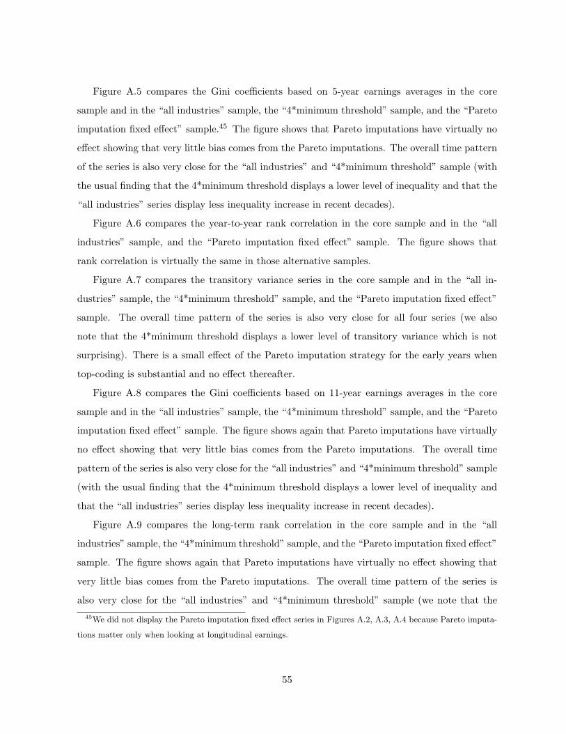
Figure A.5 compares the Gini coefficients based on 5-year earnings averages in the core
sample and in the “all industries” sample, the “4*minimum threshold” sample, and the “Pareto
imputation fixed effect” sample.45 The figure shows that Pareto imputations have virtually no
effect showing that very little bias comes from the Pareto imputations. The overall time pattern
of the series is also very close for the “all industries” and “4*minimum threshold” sample (with
the usual finding that the 4*minimum threshold displays a lower level of inequality and that the
“all industries” series display less inequality increase in recent decades).
Figure A.6 compares the year-to-year rank correlation in the core sample and in the “all
industries” sample, and the “Pareto imputation fixed effect” sample. The figure shows that
rank correlation is virtually the same in those alternative samples.
Figure A.7 compares the transitory variance series in the core sample and in the “all in-
dustries” sample, the “4*minimum threshold” sample, and the “Pareto imputation fixed effect”
sample. The overall time pattern of the series is also very close for all four series (we also
note that the 4*minimum threshold displays a lower level of transitory variance which is not
surprising). There is a small effect of the Pareto imputation strategy for the early years when
top-coding is substantial and no effect thereafter.
Figure A.8 compares the Gini coefficients based on 11-year earnings averages in the core
sample and in the “all industries” sample, the “4*minimum threshold” sample, and the “Pareto
imputation fixed effect” sample. The figure shows again that Pareto imputations have virtually
no effect showing that very little bias comes from the Pareto imputations. The overall time
pattern of the series is also very close for the “all industries” and “4*minimum threshold” sample
(with the usual finding that the 4*minimum threshold displays a lower level of inequality and
that the “all industries” series display less inequality increase in recent decades).
Figure A.9 compares the long-term rank correlation in the core sample and in the “all
industries” sample, the “4*minimum threshold” sample, and the “Pareto imputation fixed effect”
sample. The figure shows again that Pareto imputations have virtually no effect showing that
very little bias comes from the Pareto imputations. The overall time pattern of the series is
also very close for the “all industries” and “4*minimum threshold” sample (we note that the45We did not display the Pareto imputation fixed effect series in Figures A.2, A.3, A.4 because Pareto imputa-
tions matter only when looking at longitudinal earnings.
55

4*minimum threshold displays less correlation in levels than the other series).
Finally, Figure A.10 shows that our upward mobility findings by gender (Figure XI) are
robust to conditioning on birth cohort. The figure displays the probability of moving from P0-
40 in early career to P80-100 in late career by year of birth. Such upward mobility measures
increase in the full sample but decomposition by gender shows that this is entirely driven by
women which experience a large increase in upward mobility while upward mobility for men
stays stable over the period.
56

1940 1950 1960 1970 1980 1990 200010
15
20
25
30
35
40
45
Year
Ear
ning
s (in
'000
of 2
004
$)
●●
●●
● ●
●
●
●● ● ●
●●
●●
● ●
●
● ●●
●● ●
●●
●●
● ●●
● ● ●
●●
●●
●●
●●
● ● ● ●● ●
●●
● ● ●●
● ● ●●
●
●
●
●
● ●● ● ●
0
20
40
60
80T
otal number of covered w
orkers (in millions)
● Mean (left scale)Median (left scale)Covered workers (right scale)
Figure A.1Aggregate SSA Earnings and Workers in Commerce and Industry Core Sample
Sample is the core sample defined as all employees in Commerce and Industry with earnings above minimum threshold ($2,575 in 2004 andindexed using average wage for earlier years) and aged 25 to 60 (by January 1st of a given year t). Commerce and Industry is defined asall industrial sectors excluding government employees, agriculture, hospitals, educational services, social services, religious and membershiporganizations, and private households. Only commerce and industry earnings are included. Self-employment earnings are fully excluded.Average Earnings are reported in 2004 dollars (using the CPI and the CPI-U-RS after 1978).
57

1940 1950 1960 1970 1980 1990 200010
20
30
40
50
Year
Ear
ning
s (in
'000
of 2
004
$)
● ● ●●
●● ● ● ●
● ● ● ●●
● ● ● ● ● ● ● ● ● ● ● ● ● ● ● ● ● ● ● ● ● ● ● ● ● ●●
●● ● ● ● ●
●●
● ●●
● ● ● ● ●●
●●
●●
● ● ● ● ●●
0
20
40
60
80
Total num
ber of covered workers (in m
illions)
●●
●●
● ●
●●
●● ● ● ●
●●
●
● ●
●
● ● ●
●● ●
●●
●●
● ●●
● ● ●
● ●
●●
●●
●●
● ● ● ●● ●
●●
● ● ●●
● ● ● ●●
●
●
●
● ●● ● ●
● ●
Mean (left scale)Core sampleAll industries4*minimum threshold
Covered workers (right scale)Core sampleAll industries4*minimum threshold
Figure A.2Average Earnings and Number of Workers in Alternative Samples
The figure displays average earnings and number of workers in three different samples. The first sample (core sample) is the core sample:employees aged 25 to 60 with Commerce and Industry earnings above a minimum threshold of $2,575 in 2004 (and indexed using average wagefor earlier years). The second sample (4*minimum threshold) restricts to core sample to employees with Commerce and Industry earningsabove a higher minimum threshold equal to $10,300 (=4*$2,575) in 2004 (and indexed using average wage for earlier years). The third sample(all industries) extends the core sample to include all employees with covered earnings (in any industry, not only “Commerce and Industry”)above $2,575 in 2004 (and indexed using average wage for earlier years). In this all industry sample, earnings include earnings from allindustries. In all three samples, average earnings are reported in 2004 dollars (using the CPI and the CPI-U-RS after 1978).
58

1940 1950 1960 1970 1980 1990 20000.30
0.35
0.40
0.45
0.50
Year
Gin
i coe
ffici
ent
● Core sampleAll industries4*minimum thresholdCore sample excluding top 1%
●
●
● ● ●●
●
●● ●
●
● ●●
●
●●
●● ●
●●
● ●● ● ● ● ●
● ● ●● ● ●
● ●●
● ●● ●
●● ●
●●
● ●●
●
● ● ● ●
● ●●
●●
● ●●
●●
●●
●
●
●
● ● ●●
●
●● ●
●
● ●●
●
●●
●● ●
●●
● ●● ● ● ● ●
● ● ●● ● ●
● ●●
● ●● ●
●● ●
●●
● ●●
●
● ● ● ●
● ●●
●●
● ●●
●●
●●
●
Figure A.3Annual Earnings Gini Coefficients Sensitivity
The figure reports the annual earnings Gini coefficients in various samples: (a) in the core sample (as in Figure II in the text, series allworkers), (b) in the sample including workers in all covered industries (instead of only commerce and industry), (c) in the sample with ahigher minimum threshold equal to $10,300 in 2004 dollars (instead of $2,575 as in the text).
59

1940 1950 1960 1970 1980 1990 20000.2
0.4
0.6
0.8
1.0
1.2
Year
log
perc
entil
e ra
tios
● Core sampleAll industries4*minimum threshold
●
●● ● ●
●
●
●●
●
●● ●
●●
● ● ●● ● ● ● ● ● ● ● ● ● ● ● ● ● ● ● ●
● ● ● ● ●● ● ● ● ● ● ● ● ● ● ● ● ● ● ● ● ● ● ● ● ● ● ● ● ● ● ● ●p80
p50
●● ●
●●
● ●
●
●
●●
● ●●
●●
●●
●
● ●●
● ●●
● ●● ●
●● ●
● ● ●● ● ●
● ● ●
●● ● ●
● ● ● ● ● ● ● ● ● ● ● ● ● ● ● ●● ● ● ● ● ●
●
p50
p20
Figure A.4Percentile Ratios Sensitivity
The figure reports the percentile Ratios Log(P80/P50) and Log(P50/P20) (a) in the core sample (as in Figure 2 in text, series all workers), (b)in the sample including workers in all covered industries (instead of only commerce and industry), (c) in the sample with a higher minimumthreshold equal to $10,300 in 2004 dollars (instead of $2,575 as in the text).
60

1940 1950 1960 1970 1980 1990 20000.25
0.30
0.35
0.40
0.45
Year
Gin
i coe
ffici
ent
● Core sampleAll industries4*minimum thresholdPareto imputation fixed effect
●
●
●
●
●● ● ●
●● ● ●
● ●● ● ● ● ● ● ● ● ● ● ● ● ● ● ● ● ● ● ● ● ●
●●
● ●●
●●
●●
●●
●
●●
●●
● ● ● ●●
●●
●●
● ● ● ●
Figure A.55-Year Earnings Average Gini Coefficients Sensitivity
The figure reports the Gini coefficients for 5-year earnings averages in various samples: (a) in the Figure 3 sample in the text (series 5 yearearnings, all workers), (b) in the sample including workers in all covered industries (instead of only commerce and industry), (c) in the samplewith a higher minimum threshold equal to $10,300 in 2004 dollars (instead of $2,575 as in the text), (d) in the sample where imputationsabove the top code are based on random draws that are constant over time for each individual (instead of being iid as in the text).
61

1940 1950 1960 1970 1980 1990 20000.6
0.7
0.8
0.9
1.0
Year
Ran
k C
orre
latio
n
● Core sampleAll industriesPareto imputation fixed effect
●
● ●
●
●
●
●●
●
●
●●
●
●
●●
● ●
●
●
●
●
●● ●
● ● ● ● ● ● ●●
● ● ● ●●
●● ● ● ●
●
●● ●
● ● ● ● ● ● ● ● ● ● ● ● ● ● ● ● ● ● ● ●
Figure A.6Year to Year Rank Correlation Sensitivity
The figure reports the year to year rank correlation in various samples: (a) in the Figure 4 sample in the text (series rank correlation, allworkers), (b) in the sample including workers in all covered industries (instead of only commerce and industry), (c) in the sample with ahigher minimum threshold equal to $10,300 in 2004 dollars (instead of $2,575 as in the text), (d) in the sample where imputations above thetop code are based on random draws that are constant over time for each individual (instead of being iid as in the text).
62
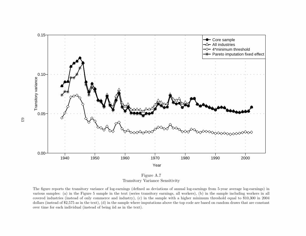
1940 1950 1960 1970 1980 1990 2000
Year
Tra
nsito
ry v
aria
nce
0.00
0.05
0.10
0.15● Core sample
All industries4*minimum thresholdPareto imputation fixed effect
●
● ●
●●
●●
●
●
●
●
●
● ●
●
●
●
●
●
●
●
●
●
● ● ● ●●
● ● ●
●
●●
● ●
●
● ● ●
●● ●
● ●
●● ●
● ● ● ●● ● ●
● ● ● ● ● ● ● ●
●
Figure A.7Transitory Variance Sensitivity
The figure reports the transitory variance of log-earnings (defined as deviations of annual log-earnings from 5-year average log-earnings) invarious samples: (a) in the Figure 5 sample in the text (series transitory earnings, all workers), (b) in the sample including workers in allcovered industries (instead of only commerce and industry), (c) in the sample with a higher minimum threshold equal to $10,300 in 2004dollars (instead of $2,575 as in the text), (d) in the sample where imputations above the top code are based on random draws that are constantover time for each individual (instead of being iid as in the text).
63

1940 1950 1960 1970 1980 1990 20000.30
0.35
0.40
0.45
0.50
0.55
Year
Gin
i coe
ffici
ent
● Core sampleAll industries4*minimum thresholdPareto imputation fixed effect
●●
●● ●
●●
● ●● ● ● ● ● ● ● ● ● ● ●
● ● ● ● ● ● ● ● ● ●●
●● ● ● ● ● ● ● ● ●
●● ● ● ● ● ● ● ● ● ● ● ● ● ● ● ●
Figure A.811-Year Earnings Average Gini Coefficients Sensitivity
The figure reports the Gini coefficients for 11-year earnings averages in various samples: (a) in the Figure 7 sample in the text (series transitoryall workers), (b) in the sample including workers in all covered industries (instead of only commerce and industry), (c) in the sample with ahigher minimum threshold equal to $10,300 in 2004 dollars (instead of $2,575 as in the text), (d) in the sample where imputations above thetop code are based on random draws that are constant over time for each individual (instead of being iid as in the text).
64

1950 1955 1960 1965 1970 1975 19800.40
0.45
0.50
0.55
0.60
Year (middle of the initial 11−year earnings span)
Ran
k co
rrel
atio
n
● Core sampleAll industries4*minimum thresholdPareto imputation fixed effect
●●
●
●
● ●●
●●
●
●●
●
●
●●
● ● ●●
●●
●● ● ● ●
● ●
Figure A.9Long-Term Rank Correlation Sensitivity
The figure reports the rank correlations of 11-earnings averages after 20 years in various samples: (a) in the Figure VIII sample in the text(series all workers and men), (b) in the sample with a higher minimum threshold equal to $10,300 in 2004 dollars (instead of $2,575 as in thetext), (c) in the sample where imputations above the top code are based on random draws that are constant over time for each individual(instead of being iid as in the text).
65

1930 1935 1940 1945 19500
5
10
15
20
Year of birth
Pro
babi
lity
of M
ovin
g fr
om P
0−40
to P
80−
100
(%)
● AllMenWomen
The graps shows mobility between early and late careerEarly career: age 25 to 36Late career: age 49 to 60
●
● ●●
●●
● ●
●
●
● ●● ●
●●
●●
●
● ●
●
●
●
●●
●
Figure A.10Long-Term Upward Mobility and Gender: Cohort-Based Estimates
The figure displays, by birth cohort, the probability of moving to the top quintile group (P80-100) for late career earnings (age 48 to 59)conditional on having early career earnings (age 26 to 37) in the bottom two quintile groups (P0-40). The series are reported for all workers,men only, and women only. In all three cases, quintile groups are defined based on the sample of all workers. Estimates in lighter grey areimputed based on less than 12 year of earnings (as the career stage is right-censored in 2004), see Kopczuk et al. [2007] for details.
66