Download - Web design principles
Web Design PrinciplesBy: Joe Robinette Haylee Gregory Caleb Renfro

Unity

Unity This website shows unity by having all
elements organized, equally spaced yet still close together. It’s attractive to the eye and easy to locate things.

Variety

Variety This site shows many different colors
and a large array of products they offer. It has an interesting layout that adds to the site.

Balance

Balance There is an even distribution of text to
pictures. Everything is weighted evenly in the middle drawing the eye in. It is asymmetrically balanced with equal weight concerning the pictures, text, and blank space.

Scale & Proportion

Scale & Proportion The T-rex is larger than everything
providing excitement. The roller coaster is much smaller in picture than it would be in a real life setting.
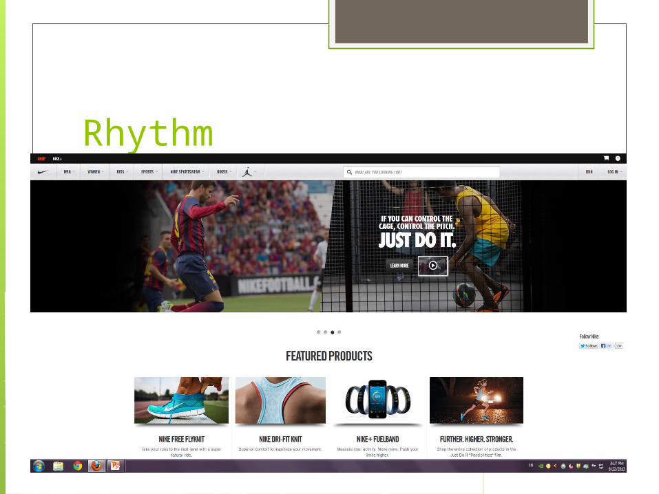
Rhythm

Rhythm You can see the motion of the athletes
by their positions and angles as well as the crowd being blurred out.
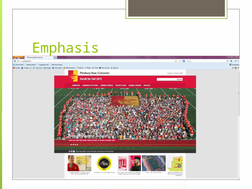
Emphasis
Emphasis The freshman are easily emphasized
contrasting the grass. The eye is drawn to them because of their placement in the photo. The outline of people in red shirts helps to draw your eyes as well.

Simplicity

Simplicity It is very basic and to the point with a
lot of blank space to draw your eye right to the main function of the site.


