University of Glasgow
Typeface effects in written, language
Functions of typeface change for signalling meaning within text
Erica HcAteer
Thenin auhnitted for the degree of Doctor of Philozophy Department of Psychology Nay, 1989
0 Eric& Mkteer

ActnovledoeiRents
Especially to: Andrev Toluie, Tony Sanford, Paddy O'Donnell, Linda Noxey, Anne Anderson and the majority of the Department of Psychology at the University of Glasgov; to friends vho gave me good ideas; a very great part of it to Ellen, Jim. and Susan lIcAteer.
A13o my thanks to the Economic and Social Research Council, who funded the research which led to this thesis through an Open Studentship Competition Award.
Erica lIcAteer, Glasgov, 1988

'Typography, in its nature and origin, and still more in its stupendous results, is a legitimate subject of curlousity and attention. 0
From (2nd)edifionThe Rey. HerwyCotton, Sublikarien of the Bodleian Library, O)Iord Vrtmity Pre33,183 1.

ABMMACT
Typeface change is one of the resources of written language which,
in combination with other paralinguistic signs available to that
3y3tex (use of space, punctuation, syntax manipuation are
8xamples), can facilitate the author's intended interpretation.
The thirteen studies undertaken for this research project explored
the effects of typeface manipulations upon subjects'
interpretations of brief texts, testing the efficiency of two
conventional forms of emphasis, capital letters and italic print.
Studies one to four specifically addressed issues of distinction
betveen the tvo typefaces. It vas found that both forms of
typeface could function to intensity certain adjectives on a simple
measurement scale, vith capital letters providing quantifiably
*more' to a referent than Italics, as Italics did over plain case.

Both typefaces were tested for their ability to provide modulatory
or contrastive emphasis for a word, where it was found that effects
differed between the typefaces, suggesting divergent functions.
Subjects' responses to a direct request to describe differences
between capital and italic print, supported these findings.
Studies five to nine examined the effects of typeface change and
sentence sequence upon texts, by asking subjects to rank versions
where these variables were manipulated. Strong concordances were
found to be linked to information structure within the texts.
Study ten took the same set of texts and presented versions
individually to subjects in a story continuation task. The
effects of emphasis and information sequence Vhich vere found
suggest again the importance of content, Vhich cooperated or
conflicted vith other paralingui3tiC signals in a text. Me
'foregrounding' effect of typeface emphasis on secondary
information increased its availabilty for the production of
continuation content.

Studies eleven to thirteen looked at typeface charxje as a facility
for signalling theme maintenance or enhancement, operating to
disambiguate texts by reinforcing their 'default' or natural
readings, as vell &3 its efficiency in signalling theme shift by
contrastive emphasis. Different strategies Of typeface emphasis
vere found to function for each of these requirements.
Throughout all the studies, both forms of typeface emphasis vere
tested, either in contrast or in combination. Evidence
accumulated to suggest that capital letters functioned best for
providing modulatory emphasis, italic print for contrastive.
Outside this issue of individual differences, typeface change
itself va3 found to be an efficient strategy for indicating the
author's intended interpretation to the reader.

ME M.
Section i: Preliminary aspects i
Chapter i: Background 3
Chapter 2: Introduction 26
Chapter 3: Basic Effects 41
Study 1: flessuring Emphasis 42
Study 2: Connotative Interpretations 53
Study 3: Modulation and Contrast 56
Study 4: Subjective Views on Emphasis Types 60
Section 2: Rhetorical Aspects 68
Chapter 4: Proper Emphasis for Written Texts 70
Study 5: Public Warning U
Study 6: Thriller Fiction 07
Study 7: Detective Fiction 100
Chapter 5: Information Sequence and Emphasis ill
Study 8: Proper Order 112
Study 9: Emphasis and Order 121
Chapter 6: Emphasis. Sequence and Information 137 Salience
Study 10: Emphasis and Order Effects on Story 141 Continuations

rwE m.
Section 3: Typeface Eaphasis and Semantic 180 Structure
Chapter 7: Stress and Pronominal Resolution 184
Study 11: Testing Strategies for Disambiguation 192
Study 12: Consensus on Typeface Empbasis Strategies 208
Chapter 8: Testing Strategies for reinforcing 227 or shifting pronominal reference.
Studies 13a
13b ...........................................
13c ...........................................
13d ........................................... Overall Corkolusion
......................................
Section 4: Conclusion
Chapter 9: Capitals or Italics?
Chapter 10: Assessment and Summary
References:
Appendices: Appendix I is appended to this volume.
Appendices 2 and 3 are available separately.
Apperdix 1: Responses to Questionnaire on Capitals ard Italics
Apperdix 2: Transcripts of Subjects* Explanations for Rankirag: Studies 5-9
Apperdix 3: Transcripts of Subjects' Explanations of Sentence Cboice: Study 10
229
238
242
249
253
265
266
278
285

SECTION ONE: Preliminary asvects
7be study domain for this research is vritten text. The
definition of 'text' provided by Gillian Brovn (1983, p. 20) is
wa record of a co=unicative act", and the concern is vith
intentional communicative acts, vhere any resources of the
language system used can be exploited by the communicator to
facilitate an intended interpretation of the text. The
phenomenon under analysis is typeface emphasis: changing
font, case or size of print for a vord or vords vithin a text,
the-concern of the studies being to identify any effects of
such changes upon the interpretation of the text.
From a psychological perspective, vithin the general research
domain of communication, the functions of typeface emphasis
vithin vritten text have not been specifically addressed to
any great degree, and a full-scale literature reviev is
therefore not feasible. To treat the various bodies of
research that touch on or relate to the topic at too great a
length vould suggest too many, possibly inappropriate,
perspectives from vhich to vork. Rather the folloving tvo
chapters, providing a fairly broad background to the studies
undertaken and reported, acknovledge dependency upon
literature from various areas and reference any papers from
vhich specific points have been taken.

Chapter One takes a backgrounding perspective on the
phenomenon of typeface change, its occurrence and the
assumptions made of its function vithin vritten text.
Chapter 2 leads up to an introduction to the studies
I themselves by considering the requirements of text, and
strategies for meeting these from the resources of the written
laxiguage system. Chapter 3 reports four preliminary studies,
which sought functional information about typeface change in
written texts.
2

CHAPTER 1: Background
We cannot produce a word without its having some sort of
physical embodiment. The spoken word is a sequence of sounds,
the written word a sequence Of shapes. We do not need
specific and constant sound or sbape-sequence3 to be able to
recognise a written or spoken expression as a particular word.
Studies in both language systems have found that difficulties
in deciphering a word on minimal information are greatly
overcome, or negated altogether, by interpretation of
co-text: the surrounding words, plus a partial expression of
the target word, are often enough to enable accurate
recognition of the word Itself (for recent discussion of this,
see Ellis and Beattie, 1986). We know that in speech the
immediate co-text has an interfering as well as a facilitatory
function for interpretation - at one level the sounds of the
preceding and subsequent words affect how much of the target
word is actually pronounced at all, while at another the sense
of the surrounding words works tovards the interpretation of
the target word.
In spoken language, constancy is the exception rather than the
rule. Regional differences in pronounciation. the
circumstances in which the speech is produced (conversing from
one room to another, over the telephone, on an Intercity
express, at a disco) have their effect. Written text is
3

similarly varied: hastily scribbled notes; long painstaking
letters carefully penned with such uniformity of lettering
style that it is very hard to distinguish between the words at
all; celebratory messages in firework displays; the pages
before you now. Even the printed word can vary dramatically
between communicatory contexts: Scottish schoolchildren
taking O-grade German, up until about fifteen years ago, found
all their exam questions presented in Gothic script.
However, after any intitial decoding, there are constancies
within a text, spoken or written, which render any sudden
difference in overall rhythm, or pattern remarkable,
interrupting the interpretative flow and focussing the
attention of the reader. The unit concerned becomes figure,
against the ground of the text - it is esphasised.
Emphasis is one of a bundle of paralinguistic signs that
accompany the actual vords of a text, vorking cooperatively
vith them to facilitate the interpretation intended - In other
vord3, vorking to fulfil the communicatory function of the
text. The interpretative process is synergic, a cooperation
of processes, each of Vhich is contingent upon the others,
vorking as a unit. The aim, of this synergic processing is
harnony: the combination or adaptation of parts so as to
form a consistent and orderly Vhole. In discussing verbal and
non-verbal signs, Eco (1976, p. 174) states " ... Vithout doubt
4
verbal language is the most poverful sexiotic device that man
has invented; but nevertheless other devices exist, covering
portions of a general semantic space that verbal language does
not. In order to be so poverful, it (verbal language) must
often be helped along by other 3exiotic systems vhich add to
its pover. 0 Jakob3on (078, p. 99) describes phonatory act3 as
being akin to musical chords.
In spoken language. paralinguistic properties function on the
axis of succession. They are always relations which are
based on the temporal axis. on the sequence of the successive
units. For example, stress is a property which presupposes,
in an actual sequence. an opposition between units endowed
With stress and those devoid of stress (Jakob3on, 1976,
PA04). In written language. this applies also within the
space parameter (up-dovn. right-left, larger-3maller, etc)
decisions on where to place a crucial word within a text,
and/or the size and shape chosen for its presentation, will
have a direct relation to the whole text, in its setting. it
is this property of emphasis, OPP031tion of figure against
ground, that must determine its functions within the language
system. A point to bear in mind is that, although generally
'ground' is taken to be the surrounding text, a whole text
presented in, say, capital letters, as NBEVARE OF THE DOG" is
still empha3i3ed, against an implicit background of 'normal
print'.
5
Paralinguistic elements of communication are signs in their
ovn right. By looking at their operation in concert vith
other Inputs, it may be possible to establish something of
their individual meaning.
Certain signs in language could be described as iconic, their
forms imitating that they signify, or as providing analogs of
their meaning (the larger the print, or the louder the voice,
the more important the vord), Vhereas the vords themselves are
symbols, having an arbitrary relationship to what they
represent. This relates to Plato's differentiation of
language signs as 'natural' &hvsei) or I conventional'
(tbesei), and this division may be inappropriate. For both
language systems, it seems more sensible to adopt, In
general terms, the position of Bolinger (1981), Eco (1976) and
others on paralingui3tic signs in spoken language: gestural
signs such as beckoning or pointing should classify as
$natural' - they 'mean that they are'. Others - ritualistic
gestures, particular stances, are no longer natural but nov
mean 'by agreement'. Gestures of insult, in many cases
apparently natural (even disturbingly so), are often
conventional to a time and culture - and uninterpretable
outside it:
6

To you bite your thumb at me, Sir? w
"No Sir, I do not bit my thumb at you, Sir. But I do bite my thumb. n
(Abraham and Samson, in Shake3peare' 3 Rozee and Juliet).
Clearly, the distinctions blur -a phenomenon familiar to any
study of language - and dividing classificatory lines are
often misplaced. Eco, in his "critique of iconosm" (1976,
p. 191) points out that 'conventional' should not be equated
vith 'arbitrary', nor oppose 'naturall in the classification
Of signs. '.. the core of the problem is obviously the notion
of convention, vhich is not co-extensive vith that of an
arbitrary link but vhich is co-extensive vith that of cultural
link". The notion of 'arbitrary' itself, although in an
external sense accurately applied to the relation betveen most
vords and their referents, is not necessarily appropriate in
psychological terms. Bolinger (1983, p. 129) points out that
"though the (language) system in all its smaller parts may be
more symbolic than iconic, ve sense it as iconic, and treat it
so in daily small acts of creation and readjustment. Vhen a
child says gooder instead of JWter, it is only because good
has been learned as the proper symbol for good and any
deviation from it adds to the arbitrariness - makes it less
iconic. u Here too, culture or speech community is at issue:
07be question of the arbitrary relation or the necessary
connection betveen the 3ignif ied and the 3ignif ier cannot be
ansvered except by reference to a given state of a given
languagem states Shapiro (083), his example being that "a
7

m
peasant woman from rrancophone Switzerland has a right to be
astonished - how can cheese be called Anase, since trowge is
its natural naze? " Bowing is a conventional gesture of
greeting or acknowledgement in one country, an unusual gesture
of self-aba3ement in another.
The points taken above are given to illustrate hov any text,
Vhether spoken or vritten, contains a mixture of signs vhich
can operate at different levels for its proper interpretation.
Distinctions vhich may be arguable from a philosophical, or a
linguistic, point of viev, shift too easily vithin a
psychological perspective to enable any individual text
element to be ascribed to any specific, or constant,
interpretative level. One simply has to admit vith Bolinger
(1986, p. 30) "Communication in general is a voracious user of
just about anything that can conveniently serve to convey
meaning. n An example of a strategy only available to
vritten discourse shovs this in a delightful vay:
"We might go in your umbrellan said Pooh.
"We might go in your unbrellan said Pooh.
"We might go in your umbrellau said Pooh. nIIIII1 11
8
For suddenly Christopher Robin 3av that they might. (from Winnie the Pooh, by A. A. Hilre, a conversation between Pooh and Christopber Robin. )
But of course, in order to convey meaning, the signs must be
interpreted. Vhatever their referent relationship - iconic,
analogical, arbitrary - paralinguistic signs must be read and
integrated vithin the ongoing interpretation of the text.
To abuse or extend the conventional use of a sign, it must
have a natural, or 'default' meaning, vhich must agree betveen
communicator and recipient.
Accepting a functional equation of meaning vith use, and
making no pretence of tracing the vhole history of physical
emphasis vithin the development of vritten language, ve can
look briefly and selectively at evidence from the past before
turning to present day usage of this resource.
Vithin-text emphasis as ve use it today vas unknovn to ancient
vriting systems (Lakoff 1982). In fact, similarly to this
country in the early days of privileged literacy, no
di3tinction va3 made betveen one vord and another - it vas up
to the vriter vhere he left his gaps. Even so, as long ago
as 3,000 BC text conventions applied vhich served the
function of setting certain elements as figure against ground.
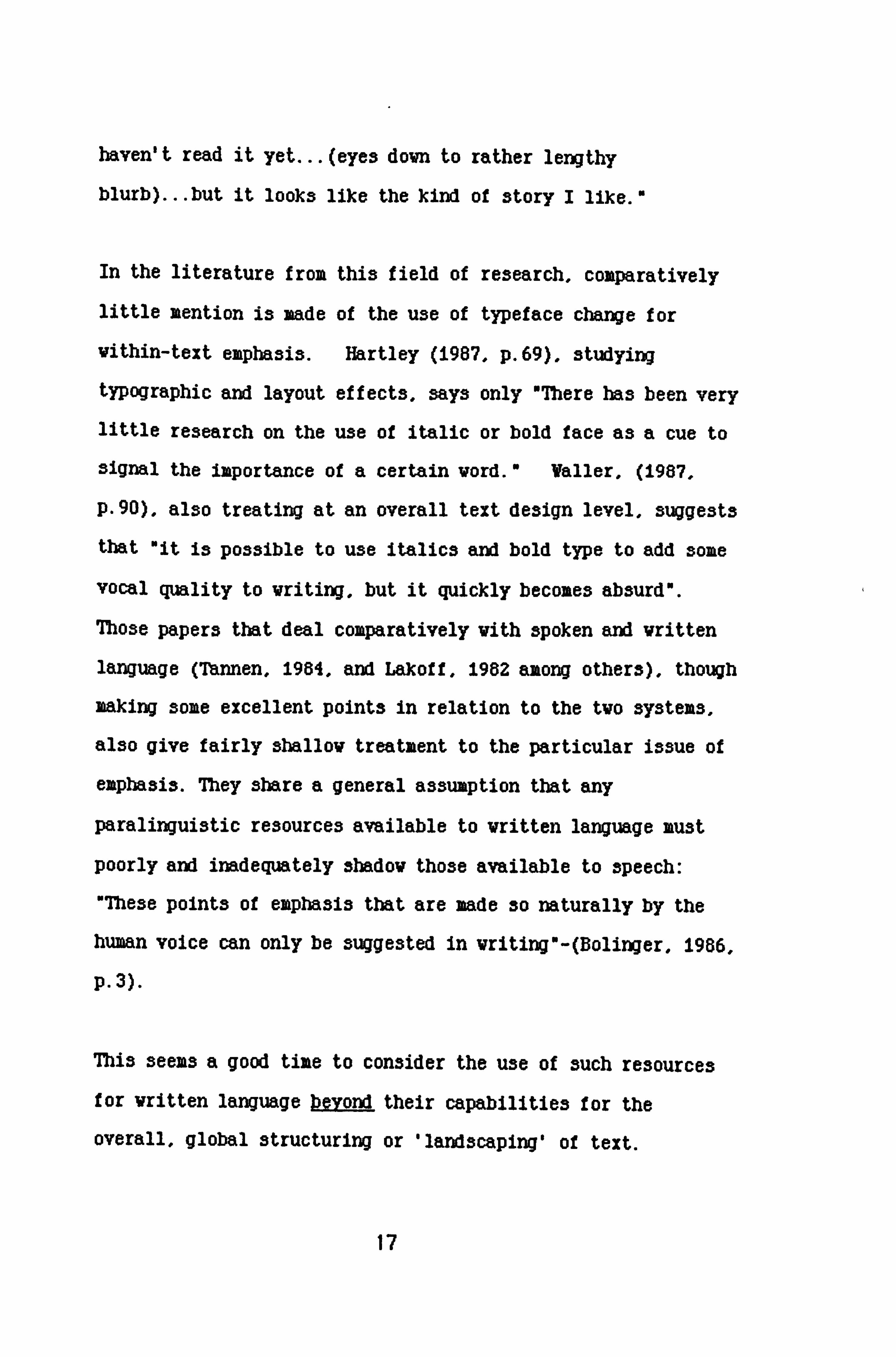
Egyptian texts from the early dynastic period present the name
of the king - or any past sovereign - enclosed in a
9

Figure 0.1: The name of lkhanaton. King of Egypt, (1367-i3SO BCE)
C
c) 0
Translation:
Sedge and Bee Lord of the (King of Upper two lands & Lower Egypt)
(Beautiful are the Ra is one. ) (becomirgs of Ra.
Son of Ra. (iq Son of the sun)
(Akhenaten) (trans: Glory's splendour of the
sun-disc)
Drawings and translations by Dr. Nicolas Wyatt, Department of Old Testament Studies, University of Edinburgh.
cartouebe, giving a 'box' effect, as Fig. 0.1 shows. Certain
constant signs - the '3edge' and 'bee' for example, indicating
kingship - always accompany the name, but outside the 'box'.
It is the particular name for a king, and certain unique
titles, which are empha3i3ed by enclosure within the
cartouche. Sumerian writing placed a 3tar-sign before a word
if that word was to be read as naming a god. Hebrew texts
10

made use of a single capital letter, or capitalised acronym,
for this purpose and continue to do so. The Rev. Cotton
(1831, P. 269) said of this:
"still however, we must not pronounce it a fault if we happen to meet in some Bibles with words that begin with a letter of much larger body than the text, nor need we be astonished to see words with letters in them of much less body; or wonder to see final letters used in the middle of words. For such notes shew that they contain some particular and mystical meaning. '
Believers or not, today ve still use print change to
distinguish God from god!
Hand vritten documents from the middle ages to the present day
make use of various strategies to indicate information
salience. Middle English texts shov the progenitors of our
choice of fonts in the large variety of scripts used for
different kinds of text, depending on their purpose. Very
often, vithin one document, tvo scripts vould be used, one for
the text itself and one for the commentary accompanying it.
Quoted material, and vords not filling their usual role vithin
a manuscript (vhich ve vould place betveen quotation marks, or
in italics) vere sometimes enclosed in a sort of open-topped
box (Hector, 1966). Underlining, use of upper case, even
thickening the lettering by change of quill or nib or by
applying different pressure over certain strokes, va3 common.
A study of one's own personal correspondence, or notes penned to self as reminders, vill shov the same individuality of

emphasis strategies, Vhich nonethelVs follov certain overall
conventions and are generally interpretable. Charles Dickens
used underscoring of one, tvo or three lines, and 'boxing'.
for his chapter frameworking notes.
The invention of print techniques brought standardisation,
vith options and the conventions for their use developing as a
function of requirement and technology. J. Johnson, printer,
vrote in 1824 (p. 29) that "A fount of this day is rarely
ordered vithout small capitals and italic letters" and gives
useful and interesting information about both. The invention
of an italic font is attributed to a Roman, Aldus Hanutious,
in 1496 and Sampson (1985, p. i13) dates the practice of mixing
italic and roman lettering vithin a text, to the aid-sixteenth
century, vith italic *reserved for such purposes as emphasis
and differentiation. n According to Johnson, "that beautiful
lettero vas originally designed Oto distinguish such parts of
a book as might be considered not to belong to the body of the
vork - as Drefaces, introductions, annotations, etc. As
regards its use vithin a text, his feelings are clear -
NTo plead the necessity of Italic to distinguish proper names of persons and places would be altogether needless and to argue that the present age is less capable of apprehension than our forefathers, who knew the sense and meaning of words before Italic existed, at a period when one kind of type served for the title, body and all the other parts of a work.... It would be a desirable object if the use of Italic could be governed by some rules....
12

that the frequent use of Italic is useless, and generally absurd, cannot be doubted. (1824, p. 7)
In Johnson's time, there seems to have been a similar
confusion of function between capital and italic typefaces
that we find today as his comments on capital letters
indicate:
The use of capitals has been considerably abridged of late years and the antiquated method of using them vith every 3usbtantive, and sometimes even vith verbs and adverbs, is nov discontinued. They are considered, in the present day, as necessary only to distinguish proper names of places etc. There are, hovever, particular vork3 in Uhich authors deez it essential to mark emphatical vords vith a capital.... Small capitals are used for the purpose of giving a stronger emphasis to a vord than can be conveyed to it by its being in Italic. (1624, p. 33)
These few examples show a continuing assumption that a change
in form for a word or words implies its importance, relative
to the surrounding text. Given the facility typeface change
provides for giving a word figure against the background of
the text, this makes sense. Clearly, conventions of use
developed and changed, but no hard and fast rules
distinguishing functions, particularly in terms of kinds of
typeface, can be established.
Vithin the service industries today - advertising, market
research, management services, media and communications,
presentation of a message has long stood parallel vith
content - "It i3n' t Uhat he sajvs, it's the vay that he says
it". Training in vhat could be termed the physical
13

techniques of communication in these fields is based on
experience of what works best (though with scant attention to
how, or why). The technological advances within the
communications industry have made the techniques of
information presentation available to the world at large. In
what might be considered the relatively quiet backwaters of
academia, the facilities of most departments now extend beyond
electric typewriters with secretary attached, and terminals
accessing the institutional mainframe, guarded by manuals of
daunting weight. The standard fonts available for the
unsophisticated requirements of the Hacvrite word processing
system that comes in the package accompanying the Apple
Macintosh series of mini-computer3 include ChICago, Geneva,
Helykica, Monaco, Now York, Tms and Venice, as well as the
Courier font chosen for this paper. The range of public domain
fonts available free to 1%cinto3h users exceeds two hundred.
All can be enlarged or decreased through at least six places,
italici3ed, expressed In bold print or capital letters,
underlined, outlined or shadowed. It would be possible to
produce a medium-length scientific paper without any word being in the same typefacel The 3ystex is very easy to use
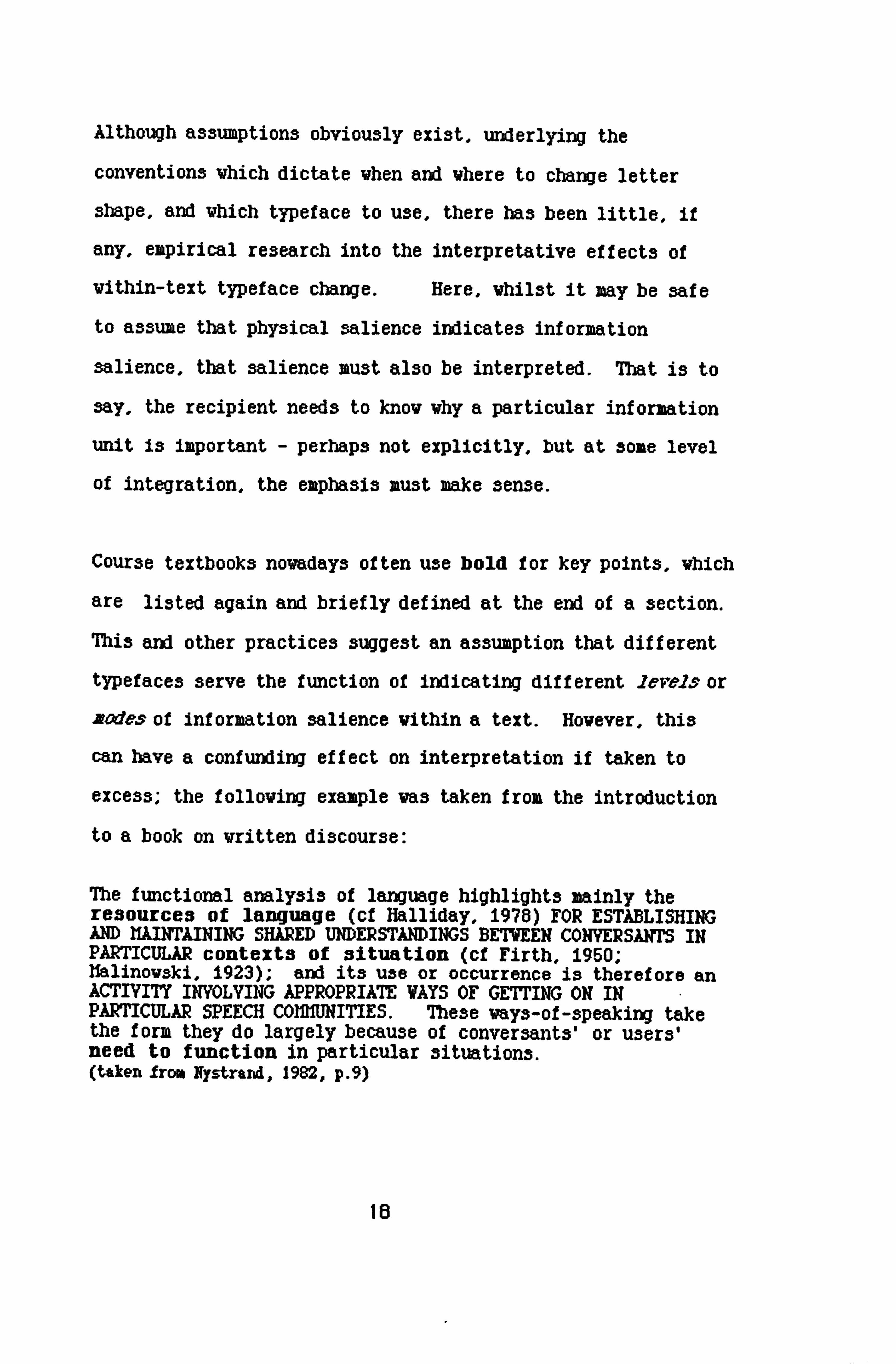
and simple to apply: Figure 0.2 shows a slide from a departmental presentation:
14

Figure 0.2
Nursing delivers product care. process
This presents the underlying theme of the whole presentation,
making its point via simple analogy, underlining that analogy
by repetition of message structure at tvo levels -
vithin-text, and global presentation.
There is a growing field within writing research which
concentrates on typeface change in terms of the global
structuring of text, of which Ny3trand (1982), Hartley (1987),
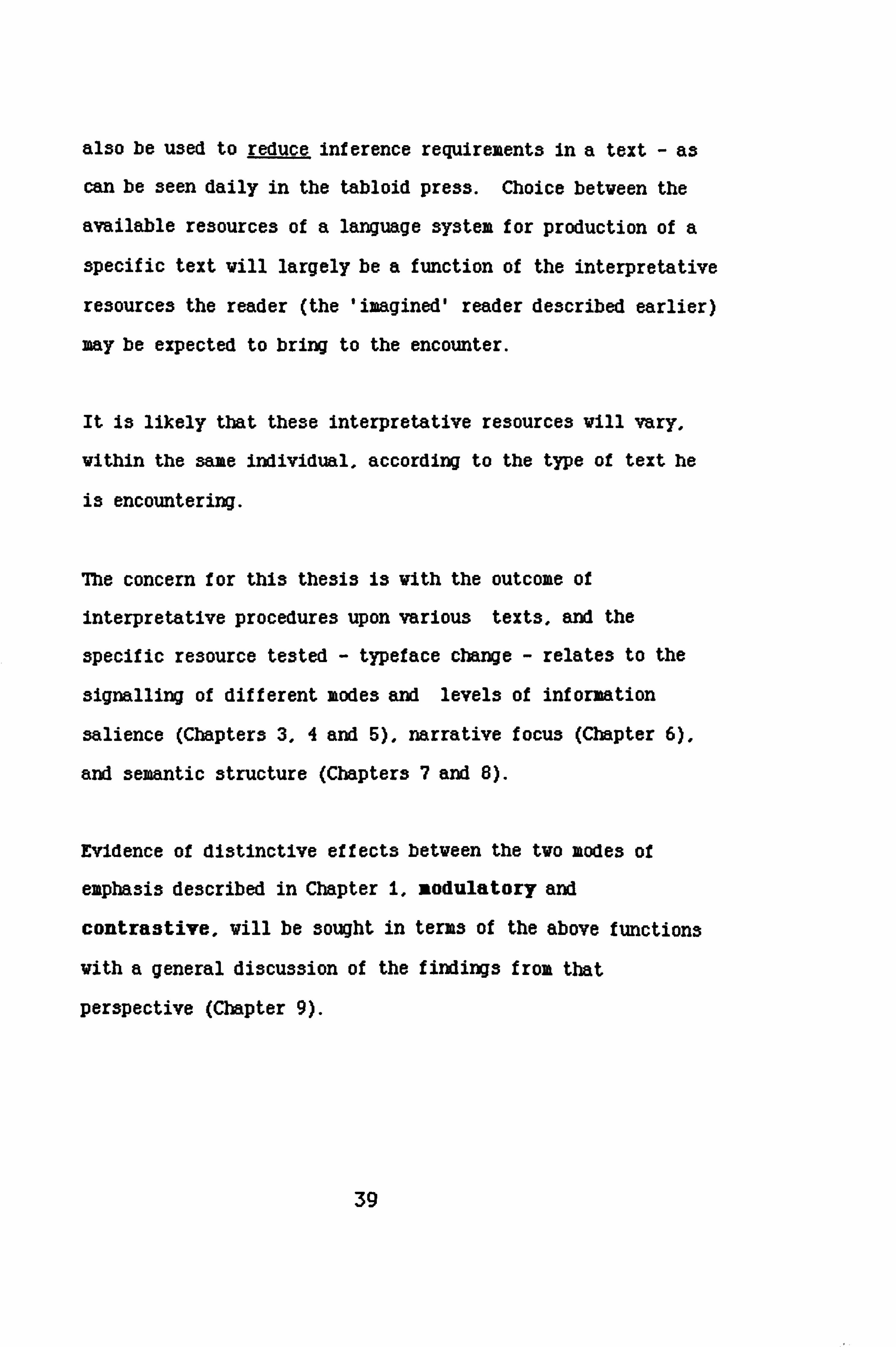
and (Valler 1987) are examples. Figure 0.3 shows Valler'3
example of print emphasis for the salient information on two
book covers. Note that the content salience shifts between
15

Figure 0.3
40 950 CLASSIC$ SZRIIS CL 135
HENRY FIELDING
TOM 0-'ý'JONES
D, B. ryl R-1-A
C. 1lXE1E
0 Fu"sher
MARY STEWART
ACA
b-Ir A-7 /wi-A-V ar, d'dWVW tO. W AWNW
(Taken f rom Britton 6c Glyn, (ed) 1987 with the permission of the author and the publishers, Lawrence Erlbaum Associates, New Jersey)
the two, and the physical emphasis shifts with it. Waller's
point was that, if one cover's reading was predictable from
the other, then one may either have a book called Henrv
Fie1ding by Tom Jones, or a book called lfazýv Stehrart by The
Gabriel Hounds. An underlying assumption, of course, is that
while people know that Tox Jones is a story, perhaps from
seeing the film (hence the salience of COM=2 AAT
LWMRIIVEIý, it is a fair guess that the name of the author is
not familiar, so there is little point in making this the
focus of attention. The reverse is the case with the second
book cover: "Another one ot hers.... (eyes up to title)
16
haven't read it yet... (eyes down to rather lengthy
blurb) ... but it looks like the kind of story I like. "
In the literature from this field of research, comparatively
little mention is made of the use of typeface change for
Vithin-text emphasis. Hartley (1987, p. 69), studying
typographic and layout effects, says only OThere has been very little research on the use of italic or bold face as a cue to
signal the importance of a certain vord. * Valler, (1987,
P. 90), also treating at an overall text design level, suggests
that "it is possible to use italics and bold type to add some
vocal quality to vriting, but it quickly becomes absurd".
Those papers that deal comparatively vith spoken and vritten
language (7hnnen, 1984, and Lakoff, 1982 among others). though
making some excellent points in relation to the Wo systems,
also give fairly shallow treatment to the particular issue of
emphasis. They share a general assumption that any
paralinguistic resources available to vritten language must
poorly and inadequately shadov those available to speech:
"These points of emphasis that are made so naturally by the
human voice can only be suggested in vriting"-(Bolinger, 1986,
p. 3).
7bis seems a good time to consider the use of such resources
for vritten language beyond their capabilities for the
overall, global structuring or 'lamdscaping' of text.
17
Although assumptions obviously exist, underlying the
conventions vhich dictate when and vhere to change letter
shape, and Uhich typeface to use, there has been little. if
any, empirical research into the interpretative effects of
vithin-text typeface change. Here, Vhilst it may be safe
to assume that physical salience indicates information
salience, that salience must also be interpreted. That is to
say, the recipient needs to knov vhy a particular information
unit is important - perhaps not explicitly, but at some level
of integration, the emphasis must make sense.
Course textbooks nowadays often use bold for key points, which
are listed again and briefly defined at the end of a section.
This and other practices suggest an assumption that different
typefaces serve the function of indicating different 2eve2s or
zodes of information salience within a text. However, this
can have a confunding effect on interpretation if taken to
excess; the following example was taken from the introduction
to a book on written discourse:
The functional analysis of language highlights mainly the resources of language (cf Halliday, 1978) FOR ESTABLISHING AND 11AINTAINING SHARED UNDERSTANDINGS BETWEEN CONVERSANTS IN PARTICULAR contexts of situation (cf Firth, 1950; Nalinovski, 1923); arA its use or occurrence is therefore an ACTIVITY INVOLVING APPROPRIATE WAYS OF GETTING ON IN PARTICULAR SPEECH COMMITIES. These vays-of-speaking take the form they do largely because of conversant3' or users' need to function in particular situations. (taken from Nystrarml, 1982, p. 9)
18

This seems to require several readings, and it remains
difficult to properly integrate the section of text vhich
follovs the semi-colon vith that vhich precedes it.
Hovever, training may make things easier. Another book, this
time an introductory vork on text linguistics, has an even
busier landscape but provides decoding information on a
separate page at the front of the book:
Orthographic conventions: Linguistic samples are enclosed in single quotes, vith all punctuation excluded if not part of the sample; other quotations are in double quotes. Hain terms are introduced in SMALL CAPITALS. Ve use bold type for terms there ve vish to stress their usage according to our approach. The Paragraphs are numbered throughout for greatest ease in indexing and cross-referencing. (Taken from de Beaugrande & Dressler, 1981)
This use of available resources to signal informational
salience in its ovn right differs from another established
function of typeface emphasis, to focus attention at a
grazwtical level of interpretation. Typeface change is
conventionally used to indicate or maintain thene,
disambiguate ref erence, or distinguish given f rox nev
information. This example, from Jane Austen's Pride and
Prejudice is given in Brovn & Yule (1986, p. 7) to shov hov
publishers reproduce an author's expression of contrast:
19

'Nay", sam Elizaibem, otnis is not rair. rou vish to think all the vorld respectable, and are hurt if I speak ill of anybody. I only vant to think you pertect".
An operational difference betveen the functions attributed to
the typeface changes used for the Nystrand and the Jane Austin
examples given above, is that the first requires one
interpretative step, focussing attention directly upon the
referent of the emphasi3ed vord(s), vhile the second implies a
further stage therein the contrasting set is also referenced.
In the text above, ' You I also means 'not V, and vice rerm.
'Pert--ct' is contrasted vith 'respectable'. For both
functions, emphasis is assumed to act vith the vord itself to
mediate the interpretation of the text.
A rough distinction betveen the tvo functions exemplified
above can be suggested by classifying them as intending either
modulatory emphasis or contrastive emphasis. Modulatory
emphasis indicates the relative importance of a particular
information unit vithin a text, or in some vay modifies that
unit. Contrastive emphasis contrasts the information content
of one unit vith that provided by another, either in the text
or presupposed.
The theories of the functional grawar school (Dik, 1980)
relate intonational stress to communicatory focus, suggesting
three broad function categories, vith finer sub-categorical
20

distinctiow: completive, contrastive, and modulatory.
The first tvo categories can be illustrated by the folloving
question-answer pairs:
1) *What did John buy? w "John bought a book. '
2) ODid John buy a hat? " *John bought a book. "
In (10 the focus is completive - according to Dik (1981) this
category of focus "does not involve any specific contrast; it
relates to a presupposition, but not to a spýecitic
presupposition concerning the identity of the unknovn entity. 0
The focus in (2) is contrastive - Nusually restricted to the
more specific case, in Ohich one piece of information, say X,
is explicitly or implicitly opposed to some other piece of
information, say Y. vhich stands in some specific relation of
oposition to X in the given setting. 0 Thirdly, presupo3ing
the addressee's knovledge of "John" as a person vho is
renovned for his collection of videos, comics and compact
discs, the stress in (3) vould be modulatory, reflecting
directly upon the content of the vord itself:
3) "Guess vhat John bought? w "John bought a booklm
As argued earlier In this chapter, the various elements of a language 3ystex are, individually, 3ign-sy3teim In their ovn
21

right. The paralinguistic system vithin vritten language
breaks dovn into subsystems, one of Vhich is typeface
change, arguably corresponding to certain prosodic effects
in the spoken language system. Apart from Vhatever basic
effects can be established vith regard to the "figure and
ground* facility of typeface change, are there more subtle
distinctions to be dravn betveen Yinds of typeface in terms of
interpretative effect?
This notion presents a deeper challenge to the assumptions
inherent in the position generally adopted in various
communication study doiaain3, summarized by quoting Bolinger
(1986, p. vii), saying in his preface to Intomtionand its
parts. NIt concerns writers who, for lack of tone marks sore
subtle than period, quotation marks and comma, iust translate
the nuances of intonation into descriptive words. "
Given the extension to general public use of facilities and
techniques that were previously restricted to the
communications industry itself, across the board oral-literate
distinctions as strict as the above cannot be made.
With the use of font options, is it possible to make the form
of the sign match its meaning - not just to emphasi3e, but to
provide the proper emphasis? We emphasise a vord because it
has a peculiar meaning. It may be possible to establish
different regularities of effect betveen different typefaces
22

used for emphasis, indicating semantic differences betveen
the kinds of emphasis provided. Beyond the obvious
3ound-3hape correspondences made, for example, in comics -
knovn to the trade as 'sound effects' - there there is a clear
intention to reference sound by shape, such as
I 099 01 ý
gs'ghhhhh
one could speculate that translation correspondences eX13t
betveen different levels or modes of phonological prominence
in speech and size or shape of visual prominence in vriting:
size increase=volume increase; angle of letter3=pitch
direction could be tvo examples. If a friend comes into the
room, shortly after an almighty crash in the kitchen, and says
wIt's okay, nothing to vorry about" one can Usually tell by
23

his voice whether the words can be taken at their f ace value
or not. Bolinger (1986, p. 19) suggests a prosodic category
of *breathine330, giving emotional connotation or
uper3onality" to a word. Haintaining a level of speculation,
we might suggest such written strategies as capitals for
importance, enhancing the word, ('SH073TING' it); italics
providing intensity, insinuation (bissing" it? ); one could
even suggest Gothic for macabre, jagged letters for dangerous,
fat ones for jolly, etc. Business logos are designed on just
that rationale, and we are all familiar with the idea that
messages are conveyed by the form, as well as the content, of
advertising copy. Size, shape and also colour can be mood
markers in written communication, just as voice modulation can
be for speech. A simple example is suggested by Ybe
Mteb-biArer"s 6Wde to the 6&2axr, Vhich its author Douglas
Adams described as having Ton't panico in large, comforting
letters on the cover. Compare these tvo typefaces for this
message:
don't panic MY /W. C
I a3ked tvo graphic de3igners to give me their opinion on the
message above. Both said that (1) comotes assurance, that
24

there is no need to panic, providing a calming effect. They
also said that (2) connotes paLnicl It implies that there isý
something to panic about, vhil3t ordering you not to. Both
believed that using an inappropriate font for a message sets
up a conflict vithin the text betveen the vord3 and their
shape, in this case signalling calm vith alarm.
A second example shows this notion in practice, from a
television programme on US tactics in South American
countries, (Cold Par Cese, 28.4.68 Channel 4) where a summary
of various conflicting strategies described by film footage
was provided at different points In the programme, with a
split-screen presentation of listed points, headed separately:
support attack
Beyond the level of speculation. it would be dangerous to
predict a sound for a word from a 3bape. or vice rer5s. The
complexity of the enterprise is shown just by asking how much
of any prosodic differences between readings of the above two
words. printed as they are. should be attributed to the
phonemic differences between them.
25

The main purpose of the research described in this thesis Is
to establish whether any regularities can be found among
observed interpretative effects for typeface chiange. Such
regularities might provide information of its efficiency as a
paralingui3tic resource of written language, and its
particular functions within that system, with relation to
communicatory focus. Vithin this goal, the resources of
different typefaces for indicating qualitative focus can be
tested, thereby going at least a few steps in the direction of
establishing a semantics of typeface emphasis.
26

CHAPTER 2: Introduction
A broad comparison may be made between the two language
systems, spoken and written, in terms of the communicatory
resources available. At word level, the relation between
written and spoken language is one of translation between
sound and shape (Haas, 1970). Simply, both the sound <k&t>
and the written word 'eat' refer directly to the same entity.
This relation can extend to some of the paralinguistic
elements of text. Figure 0.4 gives a rough outline of levels
of correspondence between the resources of the two systems for
conveying the Intended communicatory focus from the
communicator to the recipient, within the constraints of the
comunicatory situation.
To understand speech in the presence of the speaker, we attend
to contextual information such as his status, the relation of
this to ourselves, the situation and circumstances within
which the speech occurs, what the message is about and why it
is being given; we attend to paralinguistic information: the
gestural acompaniment to the words being spoken (changes in
body orientation and stance, variations of facial expression,
movements of hands, arms, etc. ) and the prosodic accompaniment
- rate (speed/rhythm of speech), accent (stress, emphasis),
Intonation (which incorporate3, range for signalling emotion
27

Figure 0.4: Resource correspondences between Written and Spoken language systens.
COMM M CATORY INTENTION
Situational Constraints
Word Cboice Word Cboice I
Syntax Manipulation I
Syntax Manipulation Typeface Cbarmje Accent
Colour Intonation Punctuation Rate/Pauses Use of space Gesture
I I
LingpAstio Expression Linguistic Expression (Written) (Spoken)
INTEPPRETATION
content of the message, direction of pitch and relative
height): we attend to the order in which words are presented
and to pauses in presentation; we attend to the words
themselves.
Witten communication also requires 3imiultaneous, and
interactive, production or interpretation of the various signs
that make up the text. Ve have to provide or interpret:
lexical signs (the vords themselves), syntactic signs (the
order in Vhich those vord3 are presented). context markers
28

classifying the various levels of context within and beyond
the text itself (Bate3on, 1972). These last include co-text
(the material within which a piece of text currently being
processed is embedded) - signalling the topic of the message;
the communicatory context - handwritten note to colleague,
newspaper article, advertisement hoarding; the situational
context - the circumstances under which the text is likely to
be read (not usually controllable) and the communicatory
function - to inform, horrify, persuade. Paralingui3tic
resources for written communication - signs within the text,
aside from the words themselves, include full stops,
paragraphs, and use of space generally. This may translate
to pauses, body-po3ition or gaze-direction shifts and
intonational cues indicating boundaries and theme-shifts in
the communicative flow. It also makes sense to describe the
relation between written and spoken emphasis similarly;
intonational stress, functioning to indicate information
salience or to signal contrast can be equated with the common
use of capitals, italics, bold, or underlining to focus
attention of the interpreter.
Mere has been some Interesting vork in the field of speech
communication on intonational functions for emphasis (Brovn et
al, 1980, Vells, 1986, Thomson, 1980, are examples). A set
of comparative studies, with a reasonably restricted set of
parameters, would be interesting to run and may provide some
29

very useful information. At present, hovever, although it may
seen appropriate to suggest a translation correspondence
betveen these Wo systems, ve actually knov nothing of the
signalling effects of typeface change in its ovn right.
Saiap3on, (1985, p. Ii8) finds "the current lack of interest in
the psychology of typography surprising, considering hov
all-important the printed vord is in any kind of academic
vork".
This thesis examines typeface change as a resource of written
language within the paralinguistic sub-system, which could
serve toward fulfilling certain generally acknowledged
requirements of text, defined as 'communicatory event'. At
this point, a broad description of what written text should,
minimally, do is provided, before further discussion of
Possible functions of typeface change as a strategy for doing
it.
De Beaugrande (081, p. 3ff) list seven ustandard3 of
textuality": cohesion, coherence. intentionality,
acceptability, informativity, situationality and
intertextuality. These standards vill serve as a background
in the folloving discussion.
It is generally agreed that a major constraint differentiating
required functions of vritten. text from those of spoken is
30

that the audience addressed by a written language is likely to
be dispersed, and lack the advantage afforded by the presence
of the communicator. In fact, the same situation obtains in
such spoken communicative settings as radio or television,
public address systems, video or sound-only instruction and
entertainment systems provide. However, most texts are
produced with a particular audience in mind, though this can
be as broad as "the British housewife" or as comparatively
defined as "sixth form physics students". As the targetted
audience for that text, they would have an interpretative
advantage over accidental Oinappropriate" recipients.
Ny3trand (1982): "Even it the writer's audience is necessarily
more diffuse and remote than the speaker's always present
listener, the writer nonetheless has a sense of whom he or she
hopes to influence - the piece is for certain individuals more
than others. "
Another vay of looking at the co=unicator-recipient
relation3hip betveen vriter and reader 13 provided by Valler
(087, p. 94) discussing 'conversational' theories:
"Crudely summarized, the conversational viev is one in vhich vriters address themselves to an imagined reader (sometimes referred to as a Omock", Ovirtualo or aimpliedw reader), who3e characteristics and attitudes the real reader is able to perceive and assume. It is argued that just like a participant in a conversation, the imagined reader has particular questions or objects that must be met at the right time".
31

Such questions voula quickly narrow down from "mat kind of
text is this? " "Vhat is it aboutV to Vhat are the salient
points? " and further, to the interpretation of the content
units and their relationship with each other within the
overall interpretation of the text.
Collins & Gentner (1980) separate two components of the
writing process: (a) producing ideas, (b) producing texts for
those ideas. As many would agree (see, particularly, Peter
Vason, 1980) the two processes are more interdependent than
sequential but, concerning ourselves particularly with (b),
the text should express the communicator's ideas in such a way
that the recipient's attention is captured and held, that he
can comprehend the information conveyed by the text and
integrate it appropriately within memory. In other words,
the text should facilitate its own intended interpretation.
Leaving aside the point that the ideas expressed by the text
content should be worth conveying, and that the right words
are available, the major issue for the writer becomes one of
structuring the information appropriately within the stylistic
conventions of the communicatory context: 31tuationality
and Intertextuallty. An illustration Is provided by an
anti-litter campaign which was conducted this summer in
Glaswegian primary schools, involving the distribution to
32

m
schoolchildren of coloured plastic bags for collecting litter.
The focus vas on food vrappers, coke cans etc. and posters
could be seen in playgrounds, on corridor valls and in dinner
halls saying "FEED TBE BINS... ". This meets the standard of
situationality, as vithin the communicatory context the
message makes perfect sense. Outside of this specific
sub-context, local park signs say "LEAYE NO LITTER" -
demonstrating intertextuality, the tvDe of text conventional
to that requirement, a "public notice" - both texts are
similar in form and style.
Cohesion concerns the surface text (ie, the linguistic
expression itself) and its internal relations, so is mostly a
function of the syntax system: *the cat sat on the mat' rather
than *on cat the sat mat". Beyond that, the standard relates
to the ordering of expressions to shov the relative importance
of their content. OR vas the mat that the cat sat onn as
opposed to *It vas the cat that sat on the matu, looked at
functionally, lets the recipient knov that in the first case,
the current theme of the text is the mat and one might expect
to learn more about this in subsequent text, eg 01 left it to
air on the lavender bush, and the vind took it... " The second
case might lead on to something like *She vashed herself then
called the kittens. 0
33

Coherence demands the appropriate structuring of information,
not only so that a text makes sense internally, but also so
that it makes DroDer sense, in terms of real world or
'discourse world' (Seuren 197), to the recipient. 7bi3
standard would reject, for example, "the mat sat on the cat"
as an acceptable sentence unless there were clues in the
co-text confirming that the sentence did in fact express the
communicatory intention. a... it floated onto the lawn, where
Tibble3 lay basking in the sun. 0 could acceptably be followed
by: OThis time it vas the mat which sat on the catin or,
"The sat sat on the cat I"
A list of structuring priorities for text should include the
provision of theme cues. Brovn & Yule (1983, p. 33) define
'theme' as a category vith tvo main functions: connecting
back and linking in to discourse, thereby maintaining a
coherent point of viev; serving as a point of departure for
the further development of the discourse.
As well as the introduction and iaintenence or updating of a
running theme within a text, other levels of information
salience between text units must be signalled for the intended
sense to be made of the message.
Another kind of distinction between information units in terms
of importance opposes theme to rheme - vhat is being
34

discussed, versus the content of the discussion - Halliday's
(1985) given and nev information. Generally speaking, after
any initial indication of its status, the theme would not
require reiteration - it should maintain by default, as it
were, until such time as a shift in theme needs to be
signalled. The rheme, or new information, on the other hand,
is generally accorded some form of stress (Halliday, 1985,
Brown & Yule, 1983 and others).
Brown & Yule (1983, p. 182) say: Me only evidence we have of
the information status the writer attributes to different
entities is the form of the expression which he produces. *
In written language, word choice, syntax manipulation (eg
clefting: nIt was wrong to lie... "), use of prolepsis (eg 00n
the other hand.... ) and intensifiers (eg mthis giant was
very, very, bigg) as well as use of connectives and
punctuation, are common 3tragegie3 for signalling focus in
linguistic expressions. 7Weface change, also, can function
as a resource of written language to convey the underlying
communicative intention, or rhetorical meaning, of a text, as
the following two simple examples show:
The sentence Mary vas afraid of Jazesw could (vithout
context) be thematically ambiguous, interpreting to equate
either vith nIt vas James that Hary va3 afraid ofn and Mary
vas afraid of jazes 0, or OJajke3 vas someone Nary va3 afraid
35

of", and "Hary Va3 AFRAID of James". The first pair relate
to hary's state of fear, the second to her attitude to James.
As another example, the folloving questions signal the
required focus of the response by giving prominence to a key
vord. A vay of achieving the same end could be to use more
vords, as suggested vithin the square brackets folloving each
text:
Hov did ve arrive at that 3tate? [by what way/what happened I
Hov did ve arrive at that 3tate? lwbat did we do I
Hov did ve arrive at that 3tate? [of all people I
The emphasis can be rolled right through the sentence, loading
the vords to provide a different focus for each version,
fulfilling the fundamental requirement of any text: that the
attention of the recipient should be so focussed as to direct
the ongoing interpretation along the lines intended by the
communicator - de Beaugrande's standards of intentionality
and acceptability.
'Information focus' is variously defined as Othat
subconstituent bearing the principle communicative content of
the textu (Thompson, 1980), or as presenting Ovhat is
relatively the most important or salient information'in the
given setting" (Dik, 1980). It is a determinant of the
36

surface structure of a text, of the linguistic expression of
an underlying communicatory intention.
As already stated , the fundamental requirement constraining
the use of available language system resources for the
production of any text is that the attention of the recipient
must be so focussed as to direct the ongoing interpretation
along the lines intended by the communicator. This should be
done vithout overloading the interpretative system.
Discussing the memory management processes involved in the
interpretation of text, Britton, Glyn & Smith (1985, p. 227)
make the same point:
The text features can be configured in many different vay3 - that is, there are many different vays of vriting the same content. Each particular configuration of text leads to a particular set of demands by lover-level component processes and by memory management processes. Some configurations of the text have relatively high costs in terms of the amount of cognitive resources they use, vhile others have relatively lov costs. Other things being equal, the less costly configuration is best, because resources saved on the lover level component cognitive processes and on the memory management processes can be reallocated to the text integration processes.
On the other hand, account should be taken of de Beaugrande's
(1981) standard of inf ozmativity. A text Uhich possesses
"first-order informativity* vould be predictable to the point
of triviality, making very slight demands upon attention:
37

"The standard procedures applied to first order occurrences in communication vould be DEFAULTS (operations or selections assumed to be stipulated in the absence of contrary indicators), and PREFERENCES (operations or selections routinely favoured. over conflicting alternatives). (Mi, p. 143)
"Second order informativity" is obtained vhen text elements -
content, syntax, emphasis, are belov the upper range of
probability, focus3ing the reader'3 attention:
"The presence of at least some second-order occurrences would be the normal standard for textual communication, since texts purely on the first order would be difficult to construct mid extremely uninteresting. " (081, pA43)
There is a balance to be dravn, a trade-off betveen
overloading the interpretative process and overloading the
text vith interpretative cues so that little or no effort is
required to read it. Studying intonation, Bolinger (1986,
p. 337) asked OVhat is the least that can be said from vhich
the most can be inferred? "
Emphasis for a vord is provided by a vriter to denote
importance - to signal that special attention should be paid
by the reader to its interpretation. The direction of that
interpretation vill be a function of inference - vork for the
processor - to a greater extent than if the underlying
communicatory focus had been 3pelt out. Typeface change can
38
also be used to reduce inference requirements in a text - as
can be seen daily in the tabloid press. Choice betveen the
available resources of a language system for production of a
specific text vill largely be a function of the interpretative
resources the reader (the 'imagined' reader described earlier)
may be expected to bring to the encounter.
It is likely that these interpretative resources will vary,
vithin the same individual, according to the type of text he
is encountering.
The concern for this thesis is vith the outcome of
interpretative procedures upon various texts, and the
specific resource tested - typeface change - relates to the
signalling of different mode3 and levels of information
salience (Chapters 3,4 and 5), narrative focus (Chapter 6),
and semantic structure (Chapters 7 and 8).
Evidence of distinctive effects between the two modes of
emphasis described in Chapter 1, modulatory and
contrastive, will be sought in terms of the above functions
with a general discussion of the findings from that
perspective (Chapter 9).
39

Another aspect or the enquIry, aaares3es the possibilty or
qualitative differences betveen types of vritten emphasis.
Capital and italic typeface are both familiar and common means
of indicating salience in vritten text and have a long
tradition of use, as the historical discussion in Chapter i
shovs. It is betveen these tvo emphasis types that
comparisons vill be made and Chapter 9 reports on the
information gathered.
Chapter N dravs overall conclusions from all the findings, in
terms of general assumptions regarding the use of typeface
changes outlined in this and the preceding chapter. it
presents a brief summary of the general findings before
outlining possible areas of further research.
The communicatory requirement of any text is that it should be
produced in such a vay as to facilitate the interpretative
procedures carried out by the reader. The purpose of the
research project described by this thesis is to test the
efficacy of typeface change as an economical means to that
end.
40
A nethodological note is appropriate here, as it is common to
all the studies reported. All material was presented to
subjects with instructions and accompanying information in
Courier i2pt. The tasks themselves (ie, the texts) were also
printed in Courier 12 pt with emphasis manipulations of
capital or italic typeface. An Apple Nacinto3h Plus computer
using the standard ffacVrite word processing system and an
Inagewriter printer were used to produce all material.
41

CHAPTER 3: Basic Effects
This chapter reports four brief experiments designed to
establish preliminary information about typeface crginge as a
resource of the paralinguistic system vithin vritten language,
as vell as locate any points of distinction betveen the tvo
conventional typeface manipulations used throughout the
research project itself - capital and italic print.
Study One treats a notion that one modulatory effect of
typeface emphasis might be to intensify a 'natural'
interpretation of a word, rather than changing or modifying it
in any particular direction. Study Two looks for any
connotative distinctions between the typefaces tested, on a
simple binary measure of 'positive or negative' interpretative
effects. Study Three compares interpretations of typeface
emphasis as modulatory or contrastive when both functions are
explicitly cued and subjects are forced to differentiate
between them in terms of the kind of typeface used.
A condition shared by all three of the small experiments
described Is that all material is presented without any
surrounding text or situational markers, in an attempt to
zinizise contextual constraints upon the interpretative tasks
required of the subjects.
42

Study 1: Ifeasurina ejohasis
Introduction:
One simple and common3ense assumption about emphasis in a
language system is that it madds to" the meaning of the word
it accompanies at a very basic level. Eiapha3i3ing a word, on
this assumption, "makes it more son. The most obvious way
of illustrating this notion within a written language is to
suggest that "John is big, Tom is very big" can translate to
"John is big, Tom is BIGO - at a 'children's story' level of
exposition. This is saying that typeface emphasis can serve a
grammatical function, of intensifying the word it accompanies.
A corollary of this should be that an isolated statement that
"Toll is BIGN would suggest that the person referred to, if
seen, would be unusually large - or possibly generous, If the
largeness referred to was of spirit rather than flesh. This,
of course, raises an important point. Generally, any such
statements would be made within a situational context. For
example, within a children's story, the co-text would provide
interpretative cues for the prominence given to a particular
word. Without context, what happens? Is there a simple
effect of typeface emphasis which literally makes a referent
of a word Nincrea3e'? In other words, can typeface change
43

alone function as an intensifier, witli no otner interpretative
cues to that effect, or might its meaning in such a case be
more ambiguous, potentially serving other modulatory
functions? The following study addresses the basic question
of whether typeface emphasis can relate to physical scale.
The research reported in this thesis, as stated in the
introductory chapters, concentrates upon the effects of two
familiar and conventional typeface change options for printed
text: capital letters and italic print. Using these options
for adjectives which are associated with ratio scales of
measurement - heat, weight and speed, a task was devised to
test whether typeface emphasis effectively intensities the
degree of quantification.
Ilethod:
Three groups of tventy undergraduate students vere subjects
for this experiment, undertaken vhile vaiting for a practical
laboratory ClaS3.
Three one-sentence texts, vith a betveen groups manipulation
of three typeface options for the adjective in all sentences -
capitals, italics or plain case - vere presented to each
group. Figure 1.1 show the texts.
44

FIgure I. I: Text veralons grouped by typeface. (compressed)
Group I Group 2 'Drolmp
It was a hot day. R ms a hot dar. IT WAS A HDT DAY.
It was a last train. It ms a J'vst fruln. IT wks A rAST TRAIN.
It was a beavy box. I't mir a Aav rjr hoz. IT WAS A BEATY BOX.
A separate page vas used for each text, vhich va3 printed
above a scale measuring from i to 12. Figure 1.2 shows an
example.
Figure 1.2: Example of text and scale as presented to subjects.
It vas a HOT day.
1 12
The pages vere stapled as four page booklets, the front page
giving the folloving instructions:
On each of the three attached pages is a short sentence above a twelve-point scale. All the sentences have exactly the same structure, referring to different qualities: temperature, weight and speed. Please read through each sentence in turn, circling whichever number you think best represents the degree of hotness, heaviness, etc. In other words, taking one of the sentences as an example: on a scale of one to twelve, how hot was the day?
45

Pre3entation order of the text va3 3y3tematically varied
acrO33 3ubject3.
Results and discussion:
Table Li shows the scale means for each word under each
typeface condition, with a distinct pattern of increase
between plain print and emphasis typeface for the words
Table I. I: Nean score for words within typeface.
Hot Heavy Fast OYERALL
Plain 7.00 7.87 7.53 7.47
Italios 8.47 9.13 9.73 8.78
Capitals 9.93 9.87 9.47 9.75
An analysis of variance was carried out with typeface as
between subjects factor and word as within subjects factor.
The typeface effect was significant, (F=8.060, df=2, p<. 002).
There was no significant effect of word, nor of word x
typeface interaction.
A pairvise comparison of means between typeface levels shoved
that both italic and capital print conditions scored
46

significantly higher on the scale than plain typeface,
italic>plain at p. <. 05, capital>plain at p<. Oi, although the
difference betveen capital and italic print means, overall,
vas not significant.
To see if there was any difference in the way the typeface
emphasis acted with the different words, pairwi3e comparisons
were also made between each typeface within each word, using
7bkey'3 113D test (Kirk, 1968). It was found that Text I
'hot', followed a pattern of significant increase on the scale
between plain and italic print conditions, (cp3.636, df=42,
p<. 05) and again between italic and capital letters
(q=3.625, df=42, p<. 05). Heasurement responses for text 2,
'heavy'. did not differ significantly between plain and italic
typeface conditions but did differ between italic and capital
(T--4.285, df=42, p<. 05). Text 3, 'fast'. differed between
plain and capitals (q=4.779, df=42, p<. Oi) and plain and
italics (q--5.438, df=42, p<. 01). For this word, there was no
significant difference between responses to either capital or
italic print.
The re3ult3 provide evidence to 3upport a conventional u3e of
typeface empha3i3 to bring about an inten3ification of the
qualifying effect of gradeable adjective3. On the phy3ical
3cale provided, for the qualitie3 named, a reliable effect of
increa3e vas found Vhen typeface empha3i3 vas used on the
47

adjective. Effectively, typeface emphasis in this particular
application acted as an intensifier; taking Text I as the
clearest example, 'hot' 1bat ' and 'HOT' could translate to
'hot', 'very hot' and very, very hot' on the basis of the
mean poins on the measuring scale found under each condition.
However, the evidence for a clear, step-like effect between
the emphasis typefaces on this one word cannot be used for
predicting general effects. Indeed, though all three text
findings support the notion of an intensifier function for
typeface emphasis as such, note that the word itself - the
quality measured - is also at issue. It is only capital
print that increases the interpreted degree of 'heaviness',
while for Text 3 the effect of capitals is less powerful,
being equal or less than that of italics on the word 'fast'.
From the overall rav scores It vas clear that subject
variability va3 greater for responses to the plain typeface
condition than to either of the tvo emphasis conditions.
7hble 1.2 3hov3 mean deviation scores for each of the three
typefaces.
Table 3.2: Hean deviation scores for all words, between typeface.
plain Italics capitals
2.72 1.45 1.42
48

A further analysis of variance vas carried out using each
subject's deviation from the group mean as the value for
comparison. 'A highly significant typeface effect (F=8.70,
df=2, p<. 001) vas found, vith a subsequent comparison of means
shoving that both capital and Italic print score variability
differed frox plain on this measure at p<. Oi. This suggests
that providing emphasis vith each adjective not only predicts
a higher value on the measurement scale, but also firmer
agreement betveen subjects as to vhich value va3 given.
The study va3 run vith each subject seeing only one typeface
on the adjectives in the texts in order to avoid contrast
effects. What if typeface va3 manipulated vithin subjects?
The presence of all three typefaces may provide a context
marker indicating comparison as part of the task. This may
involve higher-level processing of the emphasis signal, vith a
need to differentiate betveen the typefaces. and the scales
vould provide subjects vith an obvious measure for this. Any
contrast effect might separate out capitals and italics and
might reduce the variability in responses to the plain case
condition. To test this possibility, the texts under the
same emphasis manipulations vere presented to a further set of
subjects, this time vith typeface options as a vithin subjects
factor.
49

3tudy 1. a
Itlethod:
Subjects were first year undergraduates, in three groups of
twenty, who undertook the task before participating in a
practical laboratory class. The three texts were presented
on a single sheet of paper, each above a measurement scale.
Each text had a different typeface for the adjective - plain,
italic or capital letters. Yigure Li shows the whole text
versions, and ]Figure 1.3 shows the emphasis conditions for
each of the groups.
Figure 1.3: Vithin group vord/typeface conditions
Grow i Group 2 Group 3
HOT bot hot bm ý1.. heavy HEAVY f ast FAST fast
50

Results and discusslon:
The interest here lies In examining the within subject effects
of the three different typefaces. Table 1.3 shows the scale
means for each vord under each typeface, shoving a similar,
but not identical, pattern to those from the original study.
Table 1.3: Ifean scores for words within typeface
Plain Italics Capitals
Typeface/hot 6.96 8.40 8.92
Typef ace/heavy 6.56 8.92 9.12
Typeface/fast 6.48 9.48 9.18
OVERALL 6.33 8.93 9.06
An analysis of variance with typeface as a within subjects
variable and typeface on word as a between subjects variable
found a significant effect of typeface (r=49.732, df=2,
P<. 001). There vas no significant effect of typeface on
vord, arxi no interaction effect. A pairvise comparison of
means for the typeface effect shoved no significant
difference overall betveen the tvo emphasis typefaces, but
that each of these differed from plain at above the . 01 level
of significance.
51

separate analyses of variance vere then run to examine
emphasis effects within the three words, with typeface as
between subjects factor. These found an overall effect of
typeface for each vord:
Hot, F=7.06i, df=2, p<. 002; Heavy, F=ii. 597, df=2, p<. 00i;
Fast, F=26.640, df=2, P<. 00i.
Subsequent comparisons of means on typeface effect vithin each
vord found that all cases reflected the overall finding, ie
there vere no significant differences of scale measurement
betveen capital and italic print, but each differed from plain
at above the . 01 level of significance.
In order to check subject variability vith this version of the
task, an analysis of variance vas run vith typeface as a
vithin subject factor and typeface on vord as betveen subject
factor using deviations from the mean as the values for
comparison. 7hble 1.4 3hovs the mean deviation scores for
each typeface.
Table 1.4: Nean deviation score for all vords, betveen typeface.
Plain Italic$ CaDitals
1.80 1.58 1.30
52

A small but significant effect of typeface was found,
(F=3.569, df-2, p<. 05) with subsequent pairvise comparisons
and study of main effects shoving that capital and plain print
responses differed on variability at the 01 level of
significance, in the case of the word 'fast'. with no effect
for italic print on this measure. As was the case with Study
i. the variability between scores is low when typeface
emphasis is present in a text. This time, however, the plain
print response variability is also low, indicatirxj an effect
of contrast (see the discussions in Chapter 4 of a 'playdovn'
effect on normal typeface when emphasis is present in
co-text).
Othervise, rather surprisingly, the effect of typeface change
on the measures used vas more distinct vhen this manipulation
vas betveen subjects than vhen each subject had all three
typefaces available for comparison. There is a greater
distinction betveen responses to capital and to italic print
emphasis in the results from the first study - except for the
vord 'fast' vhich both sets of subjects seen to find equally
effective in italics, if not more so.
53

However, these distinctions aside, the second presentation of
the texts supported the evidence from the first, demonstrating
that typeface chazige can serve the 3aze interpretative
function as intensifier words in written language, on a
physical scale of measurement.
Study 2: Connotative interpretations
Introduction:
One of the more speculative points raised In Chapter I
concerned the possibility of different connotative effects
betveen typefaces.
The general difference in findings between the adjective
'fast' and the other two tested in the previous studies may be
relevant. The next study addresses the issue directly by
presenting a one-3entence text, ambivalently marked for
situational context, to three groups of twenty subjects, whose
task was to complete a continuation sentence. The intention
was to test the effects of presenting part of the target
sentence in either capital or Italic print, on a measure of
positive or negative outcome scored from the content of
subjects' continuations.
54

Ilethod:
Sixty first year undergraduate students, in three groups of 20
subjects, were given one of the text versions shown below
(Figure 2.1) and asked to complete the second sentence.
figure 2.1: Text versions presented for connotation task.
He gave me the pen vith an encouragirxj 3mile and I 3igned. Next day
.............................................
He gave jae the pen vith an encouraging 3mile aW I signed. Next day ..............................................
He gave me the pen with an encouraging smile AND I SIGNED. Next day ..............................................
At the top of the page va3 a reque3t to read the 3entence,
then complete the continuation.
Scoring: All responses dealt vith an outcome of the 'signing'
act, as va3 predicted by the prompt of "Next day... ".
Continuations vere scored by tvo judges on the simple criteria
of Vhether the outcome vas positive or negative. Agreement
betveen judges vas complete.
55

Result3 and D13cu33lon:
Table 2.1 gives the response 3core frequencies, which imply
that the target sentence vas not truly ambivalent, as the
negative outcome3 exceed the positive under the plain print
condition.
Thble 2.1:
Negative Positive Neutral
Plain 56
Italio 16 3
Capital 983
Disregarding the neutral responses, a chi square test on the
negative and positive outcome frequencies gave X2=7.386, df=2,
p<. 025. Given a negative bias for a natural reading of the
uneiaphasised text, this finding suggests that italic print on
the last three vords has an enhancement effect tovard that
natural reading. It is hard to say vhether this is an effect
of connotation directly folloving from the presence of italic
print, or vhether it is another mode of an intensifying
function of emphasis upon the meaning of the vords, though the
negative scores for capital print match those for plain case.
56

It could be suggested from the response frequencies that
emphasis reduced the neutrality of the text, reflecting from
another perspective one of the findings in the previous study,
vhere agreement betveen subjects va3 closer under emphasis
conditions of text.
These points vill come up again in subsequent reports of
studies undertaken, and vill feature as discussion points in
the final 3ection of thi3 the3i3.
Study 3: flodulation and Contrast
Introduction:
In Chapter one, a functional distinction Detveen modulatory
and contrastive emphasis vas suggested. Vithin a full text,
vhich function was intended by a change of typeface for a
particular vord should be interpretable smoothly enough from
co-textual cues. In an isolated sentence, vord content or
the specific typeface used may play a stronger role.
57

The following stuay tests the interpretation of capital or
italic typeface in terms of modulatory or contrastive effects
upon a word. Vhat was sought by this study was an
interpretation of typeface emphasis which focussed from a
requirement to distinguish these two functions, with no
surrounding text to provide interpretative cues, to see
whether under such relatively stark constraints, any
consistency would be found in the allocation of continuation
sentence alternatives to target sentence.
Nethod:
Wenty third-year psychology undergraduate students vere
subjects for this experiment.
Four sentences vere presented to subjects, each one in Wo
versions of emphasis - capital letters or italic print.
Alternative continuations vere provided for the sentences, one
indicating that the emphasis should interpret as modulating
the meaning of the vord empha3ised in some vay, the other as
contrasting its referent vith another, provided by the
continuation. Figure 3.2 3how the material as presented,
vith instructions at the top of the page.
58
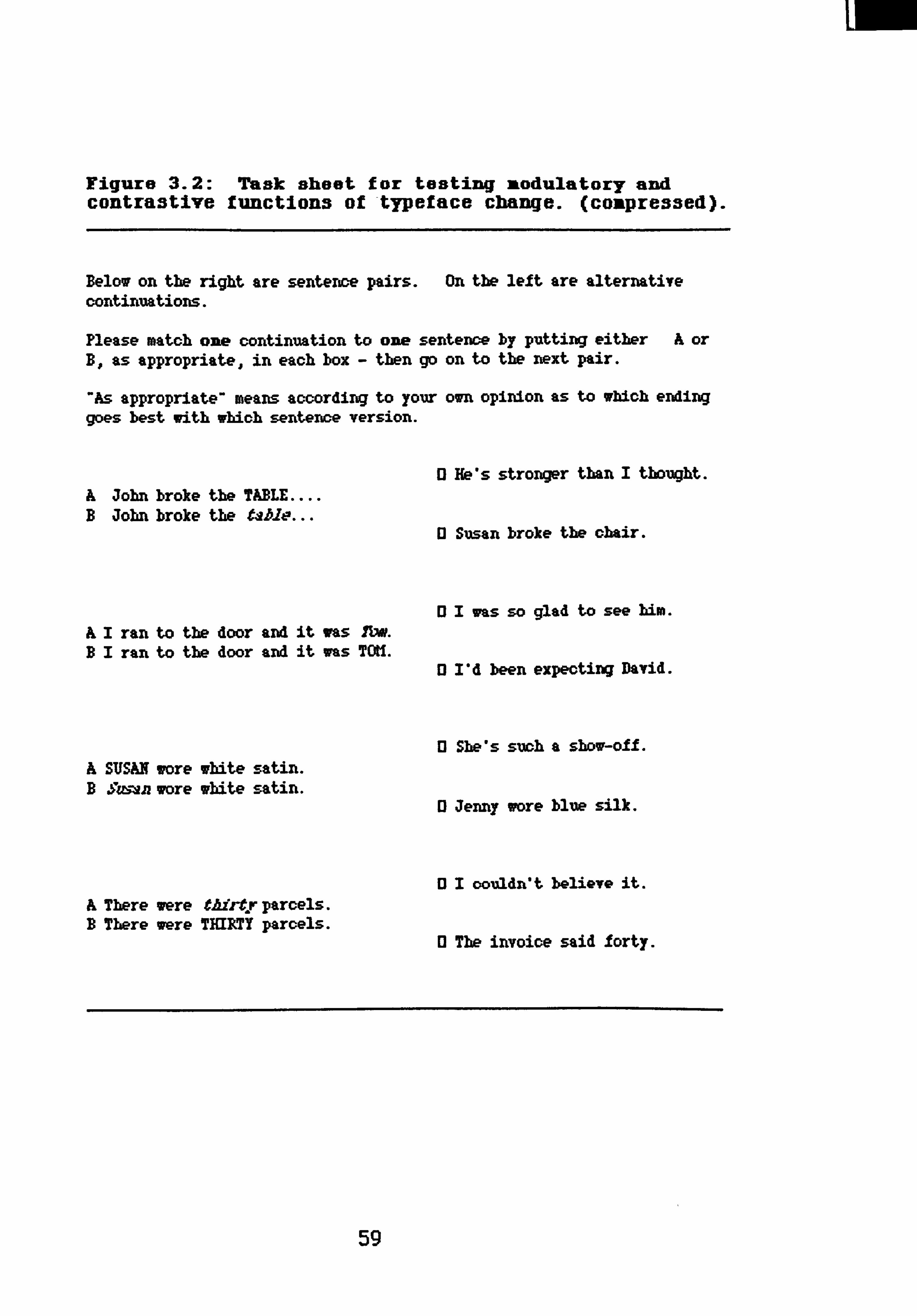
Figure 3.2: Task sheet for testing modulatory and contrastive functions of typeface change. (coupressed).
Below on the right are sentence pairs. On the left are alternative continuations.
Please match one continuation to one sentence by putting either A or B.. as appropriate, in each box - then go on to the next pair.
"As appropriate' means according to your own opinion as to which ending goes best with which sentence version.
A John broke the TABLE B Jobn broke the table
AI ran to the door and it was Ylv. BI ran to the door and it ims TOU.
A STJSAN wore white satin. B Smun wore white satin.
.r parcels. A There were tAirt B There were TEIRTY parcels.
0 He's strorger tbart I tbougbt.
U Susan broke the obair.
13 1 was so glad to see him.
0 I'd been expecting David.
13 Sbe*s such a show-off.
0 Jermy wore blue silk.
11 The invoice said forty.
01 couldn't believe it.
59
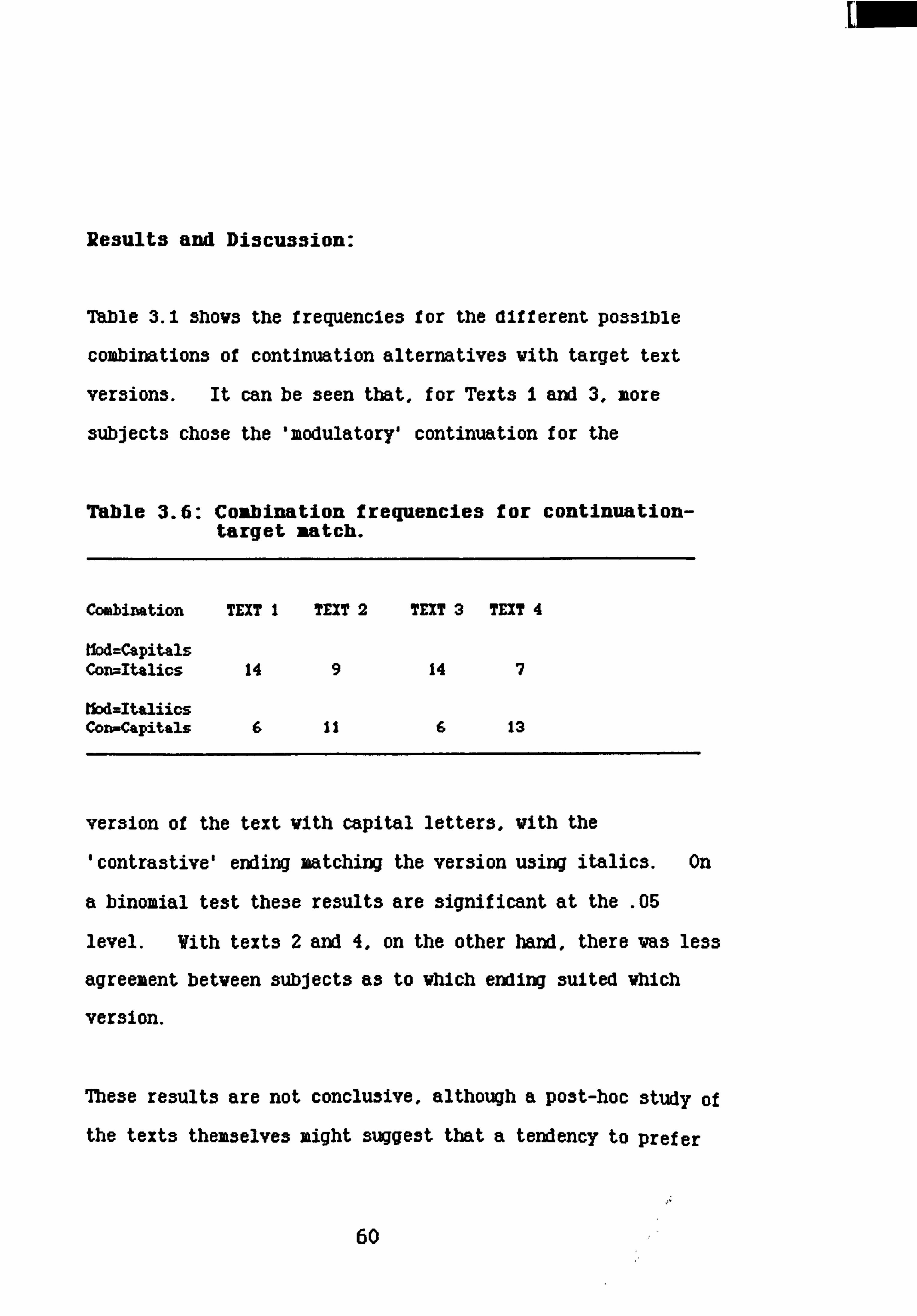
Re3ult3 and Discu33ion:
Table 3.1 shovs the frequencies for the different possible
combinations of continuation alternatives vith target text
versions. It can be seen that, for Texts I and 3, more
subjects chose the 'modulatory' continuation for the
Table 3.6: Combination frequencies for continuation- target match.
Combination TEXT I TEXT 2 TEXT 3 TEXT 4
Ilod=CoLpitals Cort--Italics 14 9 14 7
tkA=ItaliicS Coro-Capitals 6 11 6 13
version of the text vith capital letters, vith the
'contrastive' ending matching the version using italics. On
a binomial test these results are significant at the . 05
level. Vith texts 2 and 4, on the other hand, there vas less
agreement betveen subjects as to Vhich ending suited vhIch
version.
The3e result3 are not conclu3ive, although a po3t-hoc 3tudy of
the text3 themselve3 might 3ugge3t that a tendency to prefer
60

capital letters for modulatory emphasis and italic print for
contrast vas countered, in Texts 2 and 4, by a content effect
vhich interpreted the emphasis as indicating motion -
surprise, for exaxple.
Me effect for Texts I and 3, though 3tatistlcally
significant, is not very strong. For the other two texts,
subjects were not in any state of agreement as to which
typeface implied which interpretation of the emphasis. Me
question of content conflict cannot be answered on any grounds
from this study, but the information gained and the points
raised will be referred to as larger studies are reported.
The final study in this chapter addresses the issue of
particular typeface differences zore directly.
Study 4: Subjective vieva of e"Msis twe3
Introduction:
Do people interpret capital letters differently from italics?
The previous study attempted this question, and Vhil3t there
vas no clear ansver from the findings, they did indicate that
it vas vorth pursuing. As stated in Chapter 1. throughout
this project tests are made of the separate and combined
61
lv-- 1,

errect3 or tne3e tvo typeraces. Tnis seems a good point to
consider subjective opinions of their functional differences
when that issue is directly addressed. The final study in
this chapter took a completely different approach to the first
three on the question of different kinds of typeface emphasis.
Subjects vere, quite simply, asked to say what they thought
the difference va3.
Ilethod:
Forty subjects, all third year undergraduates in the
Department of English Language at Glasgov University,
participated In this experiment. Irigure 4.1 gives the full
questionnaire in compressed form.
Figure 4.1: Questionnaire on emphasis types.
There are many different ways of emphasising a word in a written text by changing the typeface or, with handwritten text, just writing differently or underlirdng important points. When texts are typeset, two common ways are to use Ytalio or CAPITAL letters for key words. Sometimes one of these seems more appropriate than another, depending perhaps upon the word itself, or on a particular meaning for the whole message.
Thinking back over our own experience of typeface change when reading textbooks, magazines, fiction or whatever, please give me a brief statement saying why capital letters may be better for some cases where typeface emphasis is required, and italic print for others. Do you think they may actually mean something different?
Tbank you for belpirg with this stvAy.
62

Results and discussion:
The full set of response transcripts is available as Appendix
i, vith a representative sample reproduced in the discussion
belov.
Using a simple measure of predicate frequency, a content
analysis of responses showed that subjects made clear
distinctions when allocating certain qualities between the
typefaces. Table 4.1 displays the results of this analysis.
The criterion for inclusion was an appearance frequency of
five or over and, with the exception of Oconnotationo, the
categories listed in the table are the actual words used by
subjects, or close synonyms. "Connotation" includes such
comments as umore emotional", mmeaningfulm, etc.
Table 4.1: Frequency of quality attribution to typeface.
ITALICS CAPITALS
Prominence 0 Attention 0 Importance 0 6 Increase 0 7 Contrast 7 2 Surprise 2 4 'Connotation' 5 0
63

Although a study of the transcripts in Appendix i should show that the above crude measure misses much that is valuable, if
unquantifiable, in the data, the two typefaces clearly do have
particular, and distinct, qualities. Of course, establishing distinctions rather than 3ixilarities is a task demand of this
experiment; as was implied by the historical discussion of written emphasis in Chapter 1, the conventions of use for these two options overlap, and both work from the same basic
qualification - providing figure against ground. SubJect3 do
not ignore this fact in their responses, as can be seen from the sample of transcripts below.
Tran3cript of 3ubject re3pon3e3:
Capital letters tend for me to denote size, or emphasis on volume, whereas italics tend to emphasise mood, feeling or emotions.
Italic print seems better for cases where amusement, disbelief or some other such emotion is being registered. Capital letters are better for cases where a fact is being related and the important factors need to be made to stand out. I know there aren't really any formal rules about when to use what typeface, but they do mean different things to me personally.
For me, capital letters draw attention to the word in isolation, whereas italics emphasi3e the word within its context of the surrounding words.
Italics often sees to show incredulity: capitals are followed by a comparison. Capitals also draw more attention to the word than do italics.
Italics imply a comparison of some kind; capitals just add emphasis
Italic print is better for expressing spoken stress in writing. Capital letters attract immediate attention, and are therefore useful for headings, technical terms etc. Putting a technical term in capitals when it is first used allows easy reference back to it. In general a word written in capitals is stressed more than a word in italics.
64

Capital letters vould be better for shoving surprise, disgust or other strong emotions. Italics sees to be better for implying a contrast vith something else. Capital letters sees to carry more emphasis than italics.
Capitals make the vord important in a different vay to italics. Capitals are good for making something clearer, more prominent. Italics make you think about it more.
I think that italics are more effective for disambiguating reference, or for referring to something not normally expected. Capitals are better for less critical emphasis or maybe for cases vhere the emphasis indicates surprise, rather than the surprise requiring emphasis.
Discussion:
Although statements betven subjects are sometimes
contradictory, as the fourth and fifth responses above shov,
there does sees to be a general feeling among the subjects
questioned that there is a distinction of function for
typeface emphasis vhich it may be appropriate to roughly
categori3e under modulatory and contrastive headings.
Judging from the content of the responses, subjects agree that
this is a distinction vhich could be expressed by different
typefaces. On balance, the transcripts suggest that italics
are for subtlety, contrast and implication, and capitals for
stressing importance, draving attention, modulatory emphasis
of the vord itself. The results of the small experiments
undertaken by the other subject groups described in this
chapter, thile comparatively tentative and begging further
questions, do not deny this.
65

overall conclu3ion:
The findings f rox the studies described above go some vay
tovard confirming functional assumptions for typeface change
vithin texts, and also suggest certain interpretative
regularities thich, though sometimes overlapping, distinguish
betveen the tvo types of emphasis.
Study i demonstrated that typeface emphasis could take a role
of intensifier, adding to the quality of the referent -a
modulatory rather than contrastive effect. Here both
emphasis types serve the same function, and were it not for
the fact that one of the words chosen for study, 'fast',
provided conflicting information, the findings might predict a
difference of degree between the two typefaces on that
function, with capitals implying 'more' of the quality than
Italics. This possibility 13 certainly not denied, but the
overall results with the three words used serve as a necessary
reminder that typeface emphasis works with the word it
accompanies, plus any other signs within the text. To put
this very simplistically, italic print may be more suitable
for intensifying 'fast' because of its shape, associating with
conventional (though quite natural) Images of movement.
There is a font on my own word processing application called
66

To continue this line of enquiry, as indicated in Section One,
is not an intention of this particular research project. The
point is to hold the issue open, and to be avare that content
is alvay3 likely to be an interactive factor in the
functioning of typeface change.
The connotative possibilities of typeface change vere brought
out, though not strongly, by the second study. For the first
and third texts, subjects related the modulatory continuation
to the text version using capital letters, and the contrastive
continuation to the italici3ed version. Evidence and
information on this issue vas sought through further studies,
and this is a point that vill be returned to.
Likewise, the differences in effect depending on text content
in the continuation matching study. Any conflict betveen
responses vhich related to subjects' contradictory notions of
vhich typeface best suits vhich function should have been
evenly reflected in the results across all four texts, so that
a possible conflict betveen the contrastiveness and the
connotative implications vithin one target sentence may
explain the overall pattern of results to some extent.
67

Tne 3uDjective opinions on possme airrerence3 or runction
betveen capital and italic typeface, provided by Study 4,
transcribed in full as Appendix i, give reference points and
background perspective to many of the findings yet to be
reported.
All subjects taking part in the studies reported In this
chapter were students at the University of Glasgow, coming
from either the English Language or the Psychology
departments. All must be assumed to be used to readingi
They will have encountered written texts from zany
perspectives - text books, literary works, newspapers, novels
and, more importantly, they will have learned to think of
written language as an interface system between communicator
and interpreter.
The experiments to be described in the folloving sections take
up the notion of reflective interpretation, in their design
and in the analysi3 of their finding3.
68

4
SECTION 2: Rhetorical Asvects
It is reasonable to Suppose that the best Vay Of conveying a vritten message vill depend upon its comunicatory context: fairly tale, government announcement, letter to shareholders,
Postcard to family, etc. The best vay of vriting exactly the
same basic message - for example, "don't call on Sunday, ve'll be outo vill vary according to the rhetoric of the occasion. Exactly those vords, on a postcard, vould 3Uffice for family
or friends, vhere the relationship betveen communicator and
recipient may be described as casually close, and where
contact is frequent. Where relations, though cordial, are
more remote, something more formal is required:
Aw /Amtf
,. gf*y, v ea, U-4 e4yiv H-0 Al
vA"1eAxm+%v mak arzfavl
NIX
69

Vithin the constraints imposed by the text context, a vriter
can select from various strategies available vithin the
resources of vritten language to indicate his comunicatory
intention to the reader, those interpretation should match
that intention.
The sets of studies described in Chapters 4 and 5 seek to
establish whether there is a consensus of opinion on the
proper use of typeface eikphaL3i3 in written communication,
within different comunicatory settings. They also look at
another strategy for conveying particular zeaning for words,
the sequence of information presented by the text, with
particular relation to its effect upon typeface emphasis.
Chapter 6 studies the effect of typeface manipulation on
subjects' perception of the author'5 communicatory intention,
by requesting brief continuations for different versions of
texts. The manipulations vere aimed at modifying the ongoing
interpretation of narrative fOCU3.
70

CMLPTER 4: Proper Emphasis for Vritten Text
Introduction:
The question addressed by Study 5 vas vhether subjects vould
agree on the best use of typeface emphasis fromi available
options, indicating their knovledge of the conventional
functions of this resource in general, and vhether particular
functions apply differently betveen the tvo kinds of empha3is
under study.
Three-sentence texts vere presented to subjects, vhose task
va3 to select, from six versions of typeface emphasis, the
most appropriate vay of expressing the message, ranking this
option 'first' and the remainder in descending order of
preference.
Different constraints may apply for texts presented from
different communicatory contexts, Vhere the content of such
texts indicates - at a general level - the context from Vhich
it vas dravn. Despite each text being presented to subjects
in six typeface versions, vith instructions and questions
Vhich define it as a psychological experiment, it va3 hoped
71

that the words within the text would mark its context and that
any constraints and requirements that should apply for a real
text in that real context may apply here.
Two comunicatory contexts vere provided, 'public notice' and
'fiction', on an assumption that both vould be familiar to
3ubject3.
Tvo points vere at issue for this series of studies.
Firstly, vhether regularities of typeface use vould apply for
the majority of subjects, Indicating general conventions
constraining their preferences. Secondly, what such
regularities might imply for the facility each type of print
has for presenting particular meaning for the vords it
carries. To this end, subjects vere asked to explain their
choice of 'best' or 'vorst' version.
. StudV 5: Public Warnina
Various notices on public transport systems, vhere the
communicatory intention is to attract attention, inform and/or
instruct passengers, suggested the material for this study:
-------------------------------------------------------------- It you 3ee a su3picious package: do not touch it, call the
guard.
72
Plain, italic and capital letters were alternated for the
three 3entences making up the text, providing 3ix typeface
ver3ion3. Subject3 vere a3ked to rank the ver3ion3 in order
of be3t u3e of typeface for conveying the mes3age.
Public notices commonly sake use of different sizes and shapes
of lettering. Generally they are custom made for a
particular message or message type, and a realistic
reproduction of such a text would not allow a suitably direct
comparison with texts drawn from other contexts. In these
studies, all texts were presented to subject groups in the
same format, on an assumption that subjects would 'read' the
intended background context from the content of each text. A
contingent assumption is that any constraints and requirements
that should apply for a real text in its real context may
apply here.
Ifethod
Twenty fir3t-year psychology students vere subjects for this
experizent, vhich vas run at the beginning of a practical
laboratory class.
The six versions of the text were presented, with order
randoxised across subjects, on a single A4 sheet of paper.
73

rig. 5.1: Alternate verslons of WARNING text as presented to subjects.
This study is part of a research project looking at the effects of emphasis in Vritten communication. Here are six versions of a piece of text. Please vill you rank these in order of "best" (1) to Nwor3t* (6) according to vhich you think is the most effective vay of expressing the message.
It you 3ee a 3u3picious package: DO NOT MUCH IT, C822 the guard.
If you see a suspicious mckage: do not touch it, CALL THE GUARD.
IF YOU SEE A SUSPICIOUS PACKAGE: do not toueb it, call the guard.
It you 3ee a 3uspiclous package: do n4at toueb It, CALL MM GUARD.
If you see a suspicious package: DO NOT TOUCH IT, call the guard.
ir You SEE A SUSPICIOUS PACKAGE: do not touch It. call We guard.
71aking the version you have ranked "i" and the one to vhich you gave a 060, can you say Vhy you think the one good and the other bad?
Mank you for helping vith this study.
74

Instructions for the ranking task were given at the head of
the sheet, and a request for reasons for first and sixth
rankings at the toot. Typeface was 12pt Courier throughout,
with plain case for instruction, question and unesphasi3ed
sentences in the text versions. Plaincase is therefore
identified as 'normal' typeface throughout this report.
Figure 5.1 shows the material as presented to subjects, all of
whom completed the task within ten minutes.
Results and discussion:
Me results of the ranking task itself vill be dealt vith
first. The reasons given by subjects for their first and
sixth rank allocations vill then be treated, before a
discussion of the overall findings.
1. Rankina:
7hble 5.1 3hov3 mean rankings of the six versions, in order of
preference. A Kendalls T coefficient of concordance
indicated a significant degree of agreement betveen subjects
on the overall rank order of the versions (V=0.201, X2--20A,
df =5, p<. 00i).
75
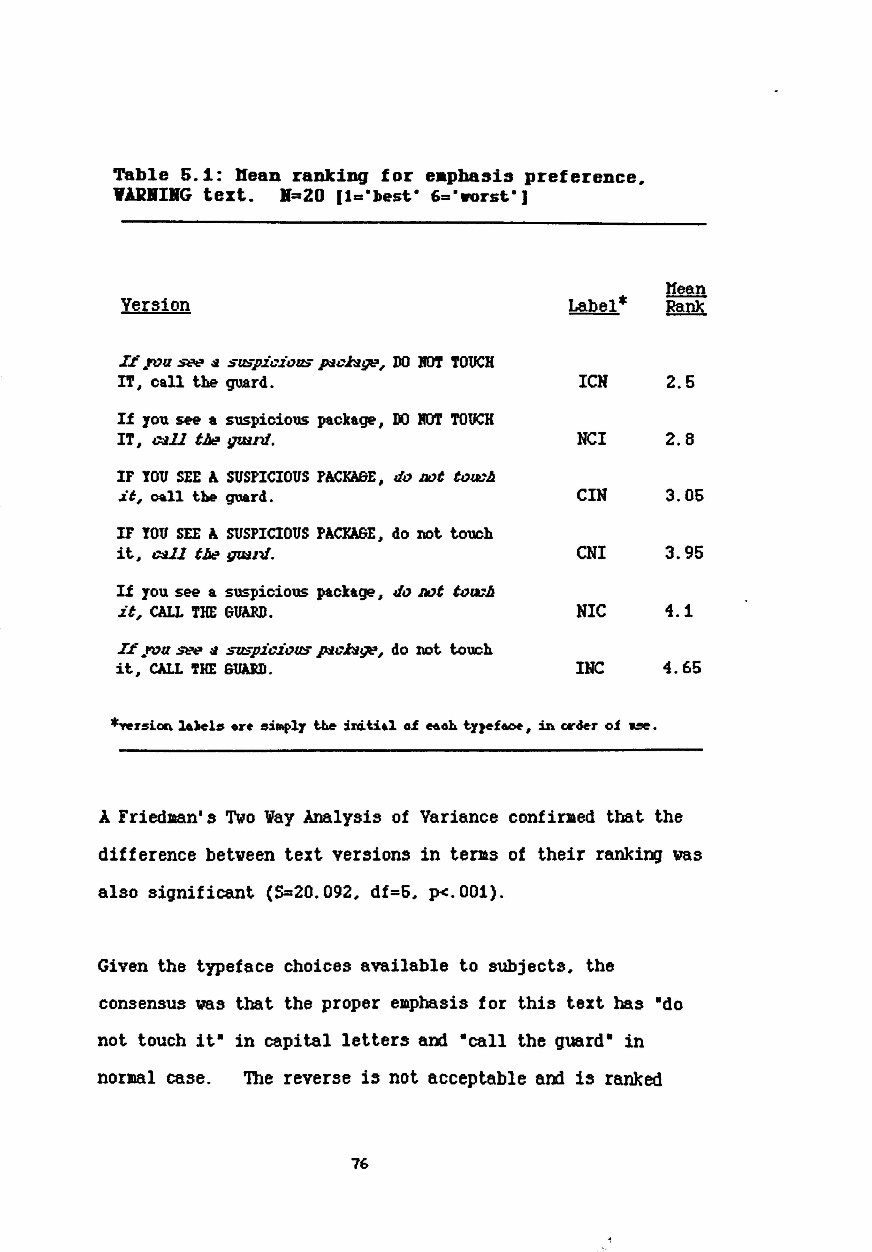
Table SA: Hean ranking for eiRphasis preference, VARNING text. N=20 [Wbest' 6=*worst*]
Ilean Version I&bel* Rank
If pom :wa szupioiozu pacJs9p, DO NOT TOUCH IT, call the guard. ICN 2.5
If you see a suspicious package, DO NOT TOVCH IT, call the qwrd. NCI 2.8
IF YOU SEE A SUSPICIOUS PACyjkGE' do mt towh
. it, oall the guard. CIN 3.05
IF YOU SEE A SUSPICIOUS PACYAGE, do not touch it, 4m. 11 tA-- qwvd. CNI 3.95
It you see a suspicious package, do not towh
. it, CM THE GUMM. NIC 4.1
Xf. rozr sw a sWYvYozu paclvqtp, do not touch it, CAU THE Glum. INC 4.65
*Yerzicn 3ALbelz ore zimply the ircLti4l al eaah ty? efaoe, in order ol we.
A Friedman's Two Vay Analysis of Variance confirmed that the
difference betveen text versions in terms of their ranking vas
also significant (S--20.092, df=5, p<. 001).
Given the typeface choices available to subjects, the
consensus vas that the proper emphasis for this text has "do
not touch it" in capital letters and "call the guard" in
normal case. The reverse is not acceptable and is ranked
76

sixth. ItalIcs fall, necessarily, to the first sentence of
each version. A Vilcoxon's matched pairs signed ranks text
betveen subjects' rankings for these Wo versions gives V+=10,
N=20, Z---3.547 p<. 00i.
Applying Vilcoxon's tests between descending means found that
the lowest point of significant difference distinguished the
third from the fourth rank; for CIN-CNI, V+=39.6, n=20,
p<. Oi. This distinguishes those versions with "do not toucho
In normal print and "call the guard* in capitals or italics,
as well as that with "do not touch" in italics and "call the
guard" in capitals, and allocates them to the lover ranks.
Looking at the mean of each subject's ranking for typeface
position upon sentence, as 3hovn in Table 4.2, suggests
requirements that may have operated to determine the mean rank
order of the individual versions of the text. A Vilcoxon'3
signed ranks test betveen capital letters on "do not touch ito
and "call the guard" gave V-9, N--19, Z---3.460, p<. 001 in
favour of the former The reverse va3 the case vhen this test
va3 applied for normal typeface: V+=3.5, N=18, Z=3.524,
P<. 001.
Very clearly, the proper empha313 for the varning Information
is capital letters. Vhere the italic lettering falls within
77

the text is less of an Issue and seems largely to depend on
Vhere the capital and normal typefaces are sited. The means
of mean position rank in terms of italic typeface are tightly
round the grand mean of 3.5. as are those for any one of the
available typefaces being on the first sentence, "If you
see ..... 0
Table 5.2: Itlean ranking for typeface position on WARNING text N=20
Ilean TyDeface Sentence Labels Rank
Capitals 'If you see.... ' CIN4CNI 3.5 Capitals 'do not touch it' ICN4NCI 2.65 Capitals 'call the guard' NIC4INC 4.376
Italics 'If you see.... I INC+ICN 3.576 Italics 'do not touch it' NIC+CIN 3.575 Italics 'call the guard' CNI+NCI 3.375
Normal 'If you see.... ' NCI+NIC 3.45 Normal 'do not touch it' CNI+INC 4.3 Normal 'call the guard' ICN+CIN 2.775
From this analysis, it is clear that a critical concern for
ranking the versions of this text vas the relative salience of
the sentences. As the concordance results indicate, subjects
strongly agreed that the middle sentence, "do not touch"
should be emphasised, with capital letters providing the
'best' emphasis. Italic lettering vas preferred to normal
case provided that the final sentence vaL3 not in upper case.
78

Reasons for rankim:
The next step taken vas to examine the subjects' reasons for
giving "be3tu or uvor3tu rank to versions of the text. This
analysis sought some explanation of the descriptive results
given above; a transcript of subjects* responses to this
question is given in Appendix 2.
Host of the subjects provided very similar reasons for their
ranking preferences. This confirms the evidence of the
concordance test: they were applying similar standards to the
ranking task. Because subjects made their explanations in such
the same terms, it was possible to score these responses
according to the frequency with which specific qualities were
predicated for specific typefaces. Analysis of comments on
typeface itself, or on the sentence to which a specific
typeface was allocated, provided the quality categories, whose
definition is most easily given by examples from the
transcripts.
limedlacy: focusing on urgency: "you see at once U,
wimmediately lets you know n
79

Attentlon capture: Relating to the need to arrest and
retain interest: "your attention is
dravn... ", "commanding attention... 0
Prominence: figure and ground explanations,
qualifications of a typeface in terms
of its function for indicating
emphasis, stress, salience - "really
stands outft. "is most prominentu.
Reflecting the content of subjects'
responses, tvo categories of
prominence are scored f or: major and
minor.
Playdown ettect: Like proikinence this again vas stated
in terms of figure and ground.
Predictably applied mostly to normal
print, it suggests that Vhere typeface
emphasis is present in a text, then
normal print itself is a sign,
indicating lov salience. OAb3olutely no
stressing the danger involved... *
80

Connotation: This predicate vas scored vhere a
subject's comment implied a particular
meaning suggested by the typeface, an
example being: *the italics suggest
the danger involved". Though a small
issue in this study, it increases for
other contexts.
Wo judges then scored the transcripts using the criteria
outlined above; agreement over scores was 97X with full
agreement after discussion. 7hble 6.3 gives the frequencies
for each typeface used in the text.
Thble 5.3: Frequency of quality attribution to typeface for VARNING text
(hml-ifty
Immediacy
Attention capture
Prominence major minor
Connotation
Playdown
capital italic normal
5 0 0
9 1 0
20 1 0 0 7 0
3 3 1
0 3 12
A principal issue in subjects responses vas that of the
relative status of the pieces of information in the text in
81

terms of 'importance'. It is clear that subjects found the
most important sentence to be "Do not touch it". Generally
the degree of importance of the other tvo sentences was seen
in relation to the first; there vas no strong consensus of
opinion about their information status relative to each other.
The majority of subjects responses dealt vith content
salience and the proper typeface qualities for providing
physical saliency to the appropriate degree - proper emphasis.
For this text the proper emphasis has capital letters for what
subjects considered to be the most important information, and
italic face on the information of secondary importance.
Comments by those subjects who explicitly attributed levels of
importance to the information provided by the different
sentences vere scored in terms of frequency of sentence vith
status level as 3hovn in 7hble 4.4. A brief definition of
the tvo levels of salience follow:
116jor salience: This applies to the information unit
possessing highest salience over other
units in the sequence, vith respect to
the text focus - therefore needing that
salience to be physically expressed in
the text so that the proper
interpretation can be read. "The
crucial part of the sentence".
82

11inor salience: Relative salience may be attributed to
any other information unit(s) in terms of
the text as a Vhole. Merefore the
physical salience given to that
information unit should provide an
appropriate relation to the main point
and the unempha3ised units in the
text. 0... is also importanto, is
3econdary. *
Table 5.4 Frequency of salience allocation to information unit for WARNING text.
"If you see.. w "Do not... Tall then
Hajor 10
Hinor 48
A binomial test of equal probability for each sentence falling
vithin either category, shoving no significant effect for the
introductory sentence, revealed that *do not touch it" vas
attributed major salience beyond the . 00i level of
significance, while Ocall the guard" was considered to have
minor salience vithin the text units, p<. 005.
83

General discussion:
Me principal issue here for subjects va3 that of
'importance'. their general opinion being that the most
important message in the text is wdo not touch It". Vhat
must not be touched, and Uhat to do instead of touching, is
necessary information but this major point must be
highlighted. Subjects agreed strongly that this highlighting
is best Provided by capital letters for that part of
the message. Overall, the results clearly suggest that they
focussed on a need to capture attention, varn and instruct.
Mat text requirement constrained the choice of typeface
change over the three sentences in the text.
Very fev of the explanations for ranks vere uncodable.
(Typical examples are "The emphasis is just right". or "For
me, this shows the vrong emphasis" vhich provides no further
information to that provided by their ranking certain versions
Obest" and "worst").
Vhile of course it must be the combination of typefaces that
functioned for preference ranking (as indicated by Tables 4.1
and 4.2), studies of subject's explanatiow 3hov that their
main concern va3 vith Vhere the capital letters should be and
vhy. Comments on the other typefaces vere mostly made Vith
relation to this. The major information unit should have
84
r

major salience in the text ana the consensus on vhich unit
contained major information matched the consensus on capital
letters being the best vay to vrite it. This facility of
capital letters to highlight information vithin a text va3
explicitly commented on by subjects: "the capitals express
the importance of not touching it", Including
individuals vho did not concord vell on ranking: Othe vord3 DO
NOT MUCH stand out and you have to look back to see vhat the
message is about. 0 Such comments as *vrong vord3 stand outo
or sattention vrongly dravnO 3hov that vhere emphasis does not
go vith content, it is deemed inappropriate, breaking rules of
language use.
According to Individual comment, Italic typeface was favoured
for "the next most ixportanto or Orelatively unimportant"
sentence. The conformity between subjects on ranking the
text versions does not extend strongly beyond their
attribution of major information salience and best typeface
for one sentence in the text. 11inor information salience is,
less distinctly, accorded to 'call the guard' (see Table 4.4)
yet italic typeface is no more favoured for this sentence than
for the first. Had it been so, then normal-capital-italic
print, as 'very proper' emphasis for this text, should have
held a distinct first rank. Instead, subject opinion is
divided between leading into the text with italic print, and
using it for the less vital instruction.
85

It seems that when a text passage contains typeface emphasis,
then rules of proper use are also applied to normal print and
any misuse is judged as error (or perhaps as an intentional
deviation from the norm - one subject suggested an
interpretation of normal case for Odo not touch' as suggesting
a calming effect). on the few occasions where normal print
was specifically dealt with, it was In terms of where it
should not be, rather than where it should, sugge3ting'that it
is only noticed when improperly used - "most important
sentence seems to be least important* and "did not command
attention" are examples which suggest a playdown ef f ect of
normal typeface when emphasis is present elsewhere in the
text.
Suamary:
The implied text context here was 'warning to the general
public, with an (assumed) background knowledge (bombs,
terrorism) on the part of the targetted audience (commuters,
tourists). The notice itself should have intrinsic salience,
it should be clearly visible against, say, a background of
platform paraphanalia, advertisement hoardings and general
passenger Information. Subjects' responses to both tasks
showed that the text of the notice should conform to those
86

external requirements, it should be eyecatching, succinct and
instructive. Vhen ranking the available options for
presenting the text as a physical entity, subjects agreed vith
a reliable degree of concordance on the extent to vhich the
different text versions met the criteria for best presentation
of the content, and vhy they did so. The task vas
constrained by the options available. Each of the three
sentences in the text had to take one of the three typefaces
available, once selected for a sentence vithin a version, that
typeface vas not available to either of the others.
Within these constraints, it was a general finding that choice
of typeface for particular information units within a text is
a function of the perceived content saliency of that unit.
Capital letters should go with the most important information,
italic with that information deemed to have secondary
importance and normal print with that deemed to have least.
The implication of this, supported by subjects explanations,
is that typeface -salience should correspond to content
salience, indicating that focus which facilitates an
appropriate interpretation of this particular text, within its
background context.
87

3tudy 6: Thriller fIction
Introduction:
, riction' 13 a very different kind of text to that of 'public
notice'. Emphasis is more often indicated by syntax
manipulation (Tannen, 1984), vith key information foregrounded
by one or more of the strategies discussed in Chapter 2.
Hovever, italic and upper-ca3e print are acceptable and
familiar, particularly In the 'popular fiction' domain. rroia
a friend vho is compiling a book of short 3tories at the
request of her publishers, I took the draft of a
"detective-thrillerm story and selected a three sentence
sequence for ranking according to proper emphasis. The
requirements for selection vere that the three sentences
should vary in content salience, so that predictions of major,
minor and neutral importance being attributed to content, and
typeface for emphasis for different sentences being ranked in
those terms, may be made on the grounds of the findings from
I varning'. The folloving text meets these requirements:
-------------------------------------------------------
I valked up to the body on the hearthrug and turned it over. There vas a birthmark on his forehead. We had killed the vrong man.
-------------------------------------------------------
88

In a novel or a short story a text sequence of three sentences
vould be interpreted vithin the immediate co-text of the story
itself. Yet presenting the above segment in isolation
should not prevent all constraints from the implicit
background communicatory context from applying to subjects'
judgements (Bateson, 1972). The 'best' version of this text
should relate to the type of text it is, ie fiction.
Vithout their surrounding sentences. the information units in
this text can be judged against each other in terms of content
3alience.
The sequence structure is describable as: first sentence
background information, second sentence - implicatory
information, third sentence, realisation. The atmosphere of
the text is dramatic, suggesting the 'thriller* rather than
the 'detective' end of the genre; the narrative takes the
first person, vhich may add emotive connotations to the
reali3ation of murder and mistake.
All six versions for ranking held the first 'background'
sentence constant in normal typeface. The constraint this
imposed on subjects ranking options (ie we don't know from
these results whether or not subjects would have placed
emphasis on this sentence) were bargained against more direct
89

Fig. 6.1: Ilternate versions of THRILLIR text as presented to subjects.
This study is part of a research project looking at the effects of emphasis in written communication. Here are six versions of a piece of text. Please will you rank these in order of 'best' (1) to 'worst' (6), according to which you think is the best way of expressing the message.
I valked up to the body on the hearthrug and turned it over. Mere aras a JVrtAwrt on bis forebead. Ve had killed the vrong man.
I valked up to the body on the hearthrug and turned it over. THERE WAS A BI MN ARK ON HIS FOREHEAD. We had killed the vrong man.
I valked up to the body on the hearthrug and turned it over. There vas a birthmark on his forehead. Fe Md Wled the l1rong Zen.
I valked up to the body on the hearthrug and turned it over. There va3 a birthmark on his forehead. VE HAD KILLED TRE VRONG NAN.
I valked up to the body on the hearthrug and turned it over. 7MRE VAS A BIRTHHM ON HIS FOREHEAD. Fe tad &Med the mrang &an.
I valked up to the body on the hearthrug and turned it over. Mere iras a birtAwr* on bis forebead. VE HAD KILLED THE VRONG W.
Taking the version you have ranked "I" and the one to Vhich you gave a "68, can you say vhy you think the one good and the other bad?
Thank you for helping vith this study.
90

comparisons of typeface preference between the implicatory and
the impact sentence. The options allowed for choices between
either of the two sentences carrying emphasis, vith either
italics or capitals available, or alternate combinations of
emphasis on both sentences.
The general expectation for this first study vas that choice
of appropriate typeface for particular sentences vithin the
text vould be a function of the relative salience of the
information units, as perceived by subjects, and the
communicatory function of the text itself, vithin its
interpretative context.
Ifethod:
As before, Wenty first-year psychology students (none of vhom
had helped vith the previous study) undertook the task as
subjects before the start of a laboratory class. The
procedure folloved in running this study vas exactly as that
for Varning. Again, all subjects completed the task vithin
ten minutes. The six versions presented to subjects are shovn
in Figure 6A.
91
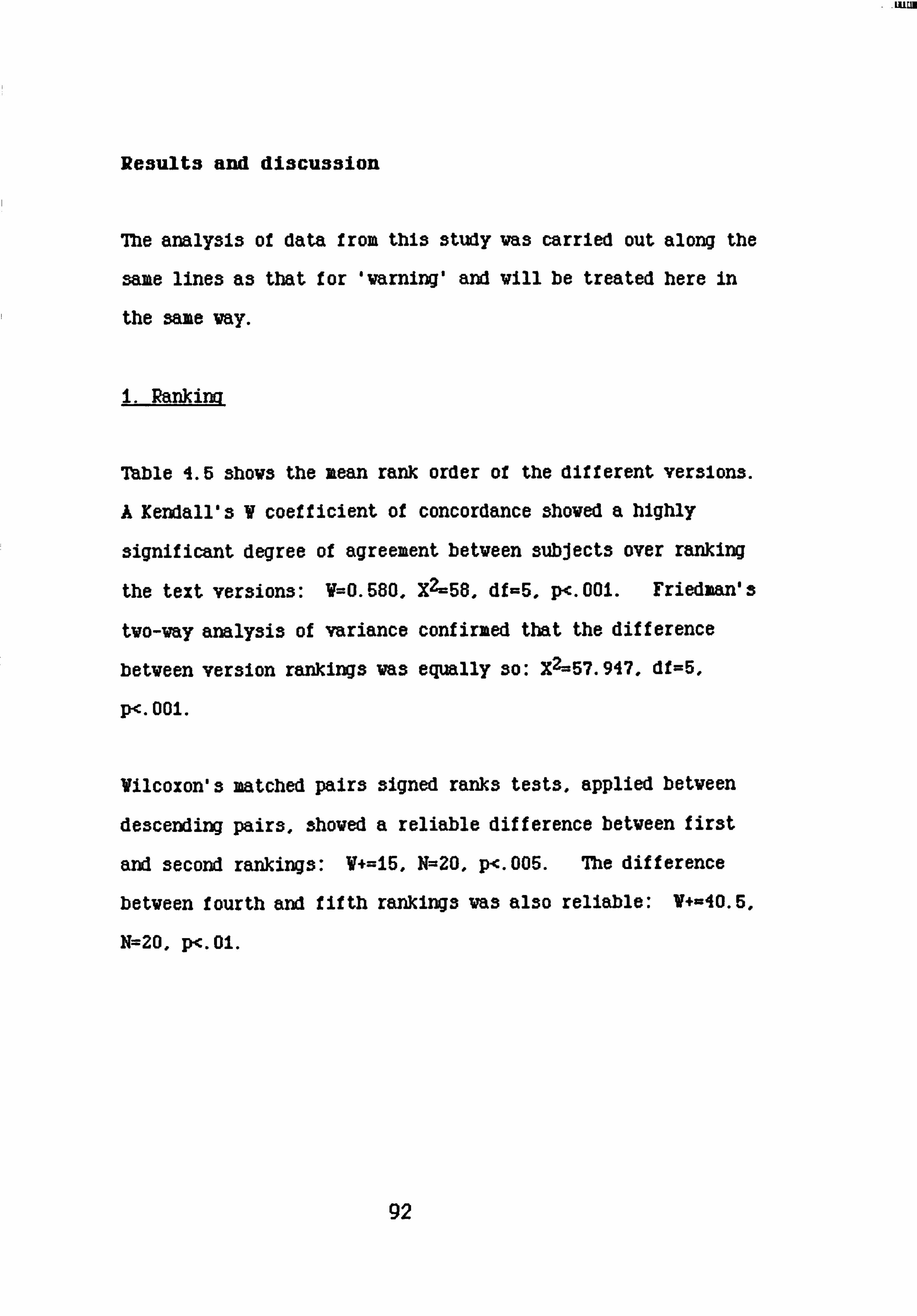
- LUEM
Results and discussion
The analysis of data from this study was carried out along the
same lines as that for 'warning' and will be treated here in
the same way.
i. Rankina
Table 4.5 shows the mean rank order of the different versions.
A Kendall's V coefficient of concordance showed a highly
significant degree of agreement betveen subjects over ranking
the text versions: V=0.580, XZ=58, df=5, p<. 001. Friedman's
tvo-vay analysis of variance confirmed that the difference
betveen version rankings vas equally so: X2--57.947, df=5,
P<. 001.
Vilcoxon's matched pairs signed ranks tests, applied between
descending pairs, showed a reliable difference between first
and second rankings: V+=15, N=20, p<. 005. The difference
between fourth and fifth rankings was also reliable: V+=40.5,
N=20, p<. 01.
92

Table 6A: ffean rankings for emphasis preference on THRILLER text. N=20
Version Mean
Label Rank
I walked up to the body on the bearthrug and turned it over. F&-. re ms a hirthwrt on Ais foreAtud. WE HAD EILLED THE WRONG HAN. Ic 1.25
I walked up to the body on the heartbrug and turned it over. There was a birthmark on his forehead. WE HAD XILLED THE MEG tJAN- KC 2.8
I walked up to the body on the hearthrug and turned it over. THERE WAS A BIRTNVM ON HIS FOREHEAD. & Agd ulled t&- FZVJV agn. ci 3.4
I walked up to the body on the beartbrug and turned it over. There was a birthmark on his forehead. & A2d kil2ed the irz-viV mun. NI 3.55
I walked up to the body on the heartbrug and turned it over. ms -a hii-tAwnt on Ais YbjvAevd. We bad killed the wrong man. IN 4.1
I walked up to the body on the bearthrug and turned it over. THERE WAS A BIRTZIARK ON HIS ]FOREHEAD. We bad killed the wrong man. CN 5.2
There was no significant difference between means for second,
third and fourth ranks. showing that there was no strong
consensus among subjects on which of these should be taken by
versions using normal-capital, capital-italic or normal-italic
print over the last two sentences.
93

- Isto
The major finding from the analysis of rankings given to
versions was that, between alternatives offered, subjects
agreed strongly on the proper emphasis for this text. If the
assumptions generated by the findings of the previous study, -
that capital letters should go with major content salience are
correct, then the preferred version should have the impact
sentence, "we had killed the wrong manw, in capital letters.
The rankings overall affirm that the final, impact sentence
should be emphasised - if not with capitals then with italics.
The information about the birthmark should not have salience
it there is no emphasis for the mistaken murder.
Looking at rankings combined in terms of emphasis type
position in Table 6.2 confirms the evidence presented in Table
6.1 of the preferred placing of italics being to an extent
dependent upon the placing of capital letters and normal
print. This clearly influences the mean ranks of individual
versions.
Wilcoxon's sign test showed that the mean rank difference
between uthere was a birthmark* and "we had killed* carrying
capital letters was significant: V-1, n=19, Z=3.863, p<. 001.
The mean rank difference between these two sentences taking
normal print was also significant: V+=Ii, N=20,
Z=-3.509, p<. 00i.
94

-11M
Týable 6.2: mean ranking for typeface position on THRILLER text. N=20
Ilean 7)rpef ace Sentence Labels Rank
Capital3 'There vas a birthmark ... CI+CN 4.3 Capitals 'Ve had killed ........... IC+NC 2.026
Italics 'There va3 a birthmark ... IC+IN 3.025 Italics 'We had killed ........... CI+NI 3.475
Normal 'There va3 a birthmark... ' NI+NC 3.175 Normal 'We had killed ........... I IN+CN 5.0
Ilthough the preference is clearly for a particular sentence
being emphasised over the other, indicating major information
status for NVe had killed the vrong man", the significance of
the difference betveen the versions ranked first and second in
7'able 4.5 suggests that, as predicted, secondary salience
attaches to the implication sentence, "There was a
birthmark.. ". Hovever, providing emphasis vith this
information is not appropriate if the impact sentence appears
in normal print. The evidence of the meaw from the position
pairs shovn in Table 6.2 also suggests the critical concern
vas to put uve had killed... " in capital print. The ranks
for versions using italics on either sentence are close to the
null mean, but clearly the physical salience of the
iaplicatory information is a dependent function of the degree
95
of salience proviaed by the typeface for the impact sentence.
Vith respect to ranking, the finding here is very like that
for the text from a 'public information' background: it seems
that content salience should be matched by typeface
prominence. The results of the concordance tests suggest an
even closer subject agreement on information status and proper
emphasis than there va3 for the Varning study, this agreement
extending to the best use for italic face. Again, fuller
information is available if ve consider the ranks allocated to
versions in conjunction vith subjects response to the question
of VhY they ranked them so.
2. Rea3on3 for rankina
An examination of subjects' explanations for ranking
particular versions Nbe3tu and "worst" revealed that their
content va3 similar to those for the Varning study. Reasons
for first and sixth rankings vere treated as before and scored
for frequency on the same qualities. There was no
disagreement betveen the tvo judges on scoring. The results
are set out in Table 6.3, vith points of similarity or
difference to the content of transcripts from the Varning task
discussed belov. irull transcripts of these responses can be
found in Appendix 2.
96

Table 6.3: Frequency of quality attribution to typeface for THRILLER text.
Qualitv calDital Italic Normal
Immediacy 0 0 0
Attention capture 0 0 0
Prominence Hajor 19 1 0 Minor 0 8
Playdown 0 0 16
Connotation 7 8 2
As the ranking concordance suggests, subjects were very clear
as to which sentence had major content salience and which had
minor. These frequencies are shown in Table 6.3 and discussed
below.
Table 6.3: ]Frequency of salience allocation to inforimation
unit for THRILLER text.
OBirthmark" "Killed"
Hajor 3alience 0 15
11inor 3alience io 0
97

A binomial test assuming equal proportions for both categories
shoved p<. 001 for both cases, leaving no doubt as to the
relative salience status of the Wo sentences.
General discussion
The prediction va3 upheld that the Information unit found to
be most important vas that Vhich stated the mistaken killing,
and that this sentence should be in capital letters. Italic
letters for the birthmark information vas clearly preferred
above normal print, provided that the imipact sentence vas in
capital letters. Analyi3i3 of subjects comments found that
they explicitly accorded secondary content salience to the
implicatory sentence.
Although results here, in terms of which typeface is best for
which level of information, conform quite closely to that of
warning, subjects distinctly prefer italic letters for the
'minor' sentence in this Thriller text, where the function of
the sentence is i3aplicatory rather than informative. The
content analysis of subjects responses to the request for
explanations of choice supported this interpretation of the
results. Ijmedincy and attention capture, crucial for the
Varning text, are not an issue for Thriller, while the
98

frequency score for connotation more than doubled: one
subject said *the italics sees to empha3i3e the sinister
implications of the birthmark, while the upper case gives the
impact of the mistake". and many of the explanations were
along the same lines.
The Vilcoxon betveen first and second-rank versions show us
that " Mere iras a MrttmarA, on his forebmd. VE HAD KILLED
71JE VRONG MiNa is very proper emphasis Indeed. A comment on
the mi3interpretive effects of 'improper' emphasis came from a
subject vho gave sixth rank to the normal-italic version,
Odoe3n't create the feeling of such a catastrophe, treats the
situation very flippantly. " The capital-italic version,
reversing 'proper' emphasis, athrow meaning a bit* according
to one terse comment from a subject.
The quality of proiRinence is as important an issue for this
text as it vas for varning, and typeface choice is the same -
capital letters for major content salience, italics for minor.
"... the most shocking statement carries the heavies emphasis,
but the explanation of this statement is also prominent",
"... 3hov3 the build up to a vital statementO. Unlike the
Varning responses, subjects deal less in straightforvard terms
of degrees of importance but attempt to incorporate some
information of the kind of importance at issue.
99

Playdown Is entirely attributed to normal print In this
study, and is most often stated vith respect to the 'major'
information: the capital-normal version is just not right.
"The point of the paragraph is to convey the avful statement
've had killed', the emphasis put on 'there vas a birthmark'
may point out information clearly, but the information seems
to be made more important than the conclusion it is supposed
to lead to".
Although a value of prominence for a typeface implies that it
vould function to capture attention, there is no explicit
reference to this in subjects explanations for Thriller, as
there va3 in the Warning study. The text context imposed a
requirement on the text itself to convey mood - the drama of
the situation. While this va3 an issue vith the Warning
text, subjects comments acknovledging the need to convey the
potential danger of the situation, here for the Thriller text
it is the major issue.
Suzzary:
The findings here are very like those for the Varning study.
For proper emphasis, the relative importance of the
information units in the text should be reflected physically
by the typeface. However, content analysis of subjects
100

explanations for-ranking suggests that the focus of the
communicatory intent shifts between the two texts. From
their comments, it was clear that subjects saw the text
requirement for the first study as being to warn and instruct
the public, having first captured their attention. For
Thriller, It was thought more necessary to indicate the drama
of the related events; it should read like a story.
Study 7: Detective Fiction
Introduction:
Looking at the findings from the tvo reported studies and
comparing the analyses of ranking and explanations, it seems
clear that it is content salience vhich controls typeface
emphasis. It is the underlying semantic structure of the
text, the status of its different pieces of information in
terms of each other and vithin the background context, Uhich
defines Uhich information should be given physical salience.
This can be tested by setting the same task vith a text those
information units are neutral in terms of comparative
importance, holding the available typefaces, number of
sentences and background context constant with the preceding
study, Thriller, vhil3t reducing the distinctions of content
salience.
101

The following three sentence text was drawn from the same set
of drafts as the 7briller text of the last study:
He said he had caught the morning train from Plovbright as usual, changing at Crewe for Leicester. Yesterday the Plovbright train was two hours late. He could not have made the connection.
Here, although folloving the same text sequence, vith
background information, then implicatory information folloved
by realisation, the final sentence has less impact than that
in Thriller. Also, the text is less dramatic, nearer the
'Detective' end of the genre.
Vhilst predicting that it vill be the assumed content salience
of the different sentences that determines the typeface
selected for each, there is likely to be less agreement on
vhich sentences are content-salient, to vhat degree.
Therefore a proper emphasis for the text as a vhole is not
predictable.
Ilethod:
The procedures followed in this study were the same as those
for Varning and Thriller, vith a nev set of subjects.
Figure 7A shovs the text version as presented.
102

Figure 7.1: Alternate versions ot DETECTIVE text as presented to subjects.
This study is part of a research project looking at the effects of emphasis in written communication. Here are six versions of a piece of text. Please will you rank these in order of 'best' (i) to 'worst' (6), according to which you think is the best way of expressing the message.
He said he had caught the morning train from Plovbright as usual, changing at Creve for Leicester. Besterday the Pzoltrigbt train Irds t1ro bours late. He could not have made the connection.
He said he had caught the morning train from Plovbright as usual, changing at Creve for Leice3ter. YESTERDAY THE PLOVBRIGHT TRAIN VAS TWO HOURS LATE. He could not have made the connection.
He said he had caught the morning train from Plovbright as usual, changing at Creve for Leicester. Yesterday the Plovbright train vas Wo hour3 late. Ne cau. Zd not Mye irade the coiWeetion.
He said he had caught the morning train from Plowbright as usual, chexiging at Creve for Leicester. Yesterday the Plovbright train vas Wo hours late. HE COULD NOT HAVE WE THE CONNECTION.
He said he had caught the morning train from Plotbright as usual, changing at Creve for Leicester. YESTERDAY THE PLOVBRIGHT TRAIN VAS TWO HOURS LATE. He cozzZd not bave irade tb-- eviWection.
He said he had caught the morning train from Plovbright as usual, changing at Creve for Leicester. resterday the p2oarbrigbt train Aws taro bours late. HE COULD NOT HAVE WE THE CONNECTION.
Taking the version you have ranked mi" and the one to vhich you gave a 06". can you say vhy you think the one good and the other bad?
Mank you for helping vlth this study.
103
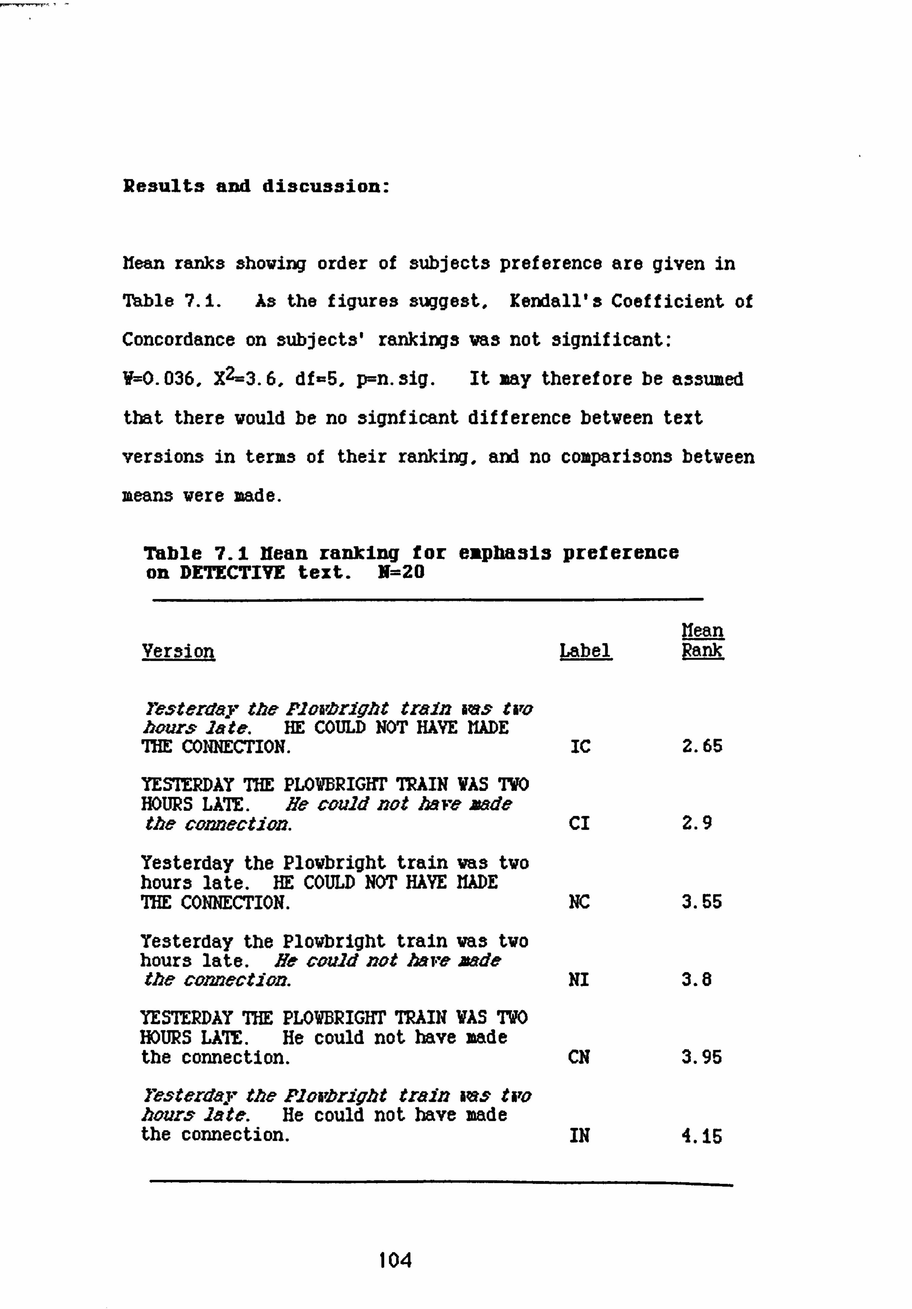
Re3ults and discu33ion:
Kean ranks shoving order of subjects preference are given in
Table 7.1. As the figures suggest, Kendall's Coefficient of
Concordance on subjects' rankings vas not significant:
V=0.036, X2=3.6, df-5, p=n. sig. It may therefore be assumed
that there vould be no signficant difference betveen text
versions in terms of their ranking, and no comparisons betveen
means vere made.
Table 7.1 Ifean ranking for eaphasis preference on DETECTIVE text. N=20
Hean Version Label Rank
Testerday the FlvaOriobt train iras tiro bvursý late. HE COULD NOT HAVE WE ME CONNECTION. Ic 2.65
YESTERDAY THE PLOVBRIGHT TRAIN WAS TWO HOURS LATE. He could not 1mve zade the connection. CI 2.9
Yesterday the Plowbright train vas tvo hours late. HE COULD NOT HAYE MD E THE CONNECTION. NIC 3.55
Testerday the Plowbright train was two hours late. He cauld not Mve Bad& the comection. NI 3.8
YESTERDAY THE PLOWBRIGHT TRAIN VAS TWO HOURS LATE. He could not have made the connection. CN 3.95
resterd'a. T., the plvaorigbt tmiJ7 Iras tiro bour. sý Zate. He could not have made the connection. IN 4. iS
104

-''r' -
Though the tendency is to prefer combined emphasis, vith no
clear distinction betveen emphasis-type for either sentence,
there is no significant difference separating these versions
from the rest. This ambivalence continues throughout the
ranking judgements. Although the rank order itself suggests
a tendency to prefer the resolution sentence to be emphasised
over the implication sentence, the differences betveen
descending pairs are very small, vith no marked consensus on
any distinction. Table 7.2. giving mean rankings for
typeface position on content, confirms this.
Table 7.2: Hean ranking for typeface position on DETECTIVE text. N=20
Ifean ZrDeface Sentence Labels Rank
Capitals 'Yesterday the ....... CI+CN 4.875 Capitals 'He could not have... ' IC*NC 3.1
Italics 'Yesterday the ...... IC+IN 3.4 Italics 'He could not have ... CI+NI 3.35
Normal 'Yesterday the ...... NC+NI 3.675 Normal 'He could not have... ' CN+IN 4.05
Reasons for rankina
Subjects' reasons for 'best' and 'vor3t' ranking vere analysed
as before, vith full agreement betveen judges on scoring.
7hble 7.3 gives the frequencies of qualities predicated upon
typeface, shoving that prominence and playdown are still
105

Important qualities for the judgement of proper emphasis.
Again, major prominence is considered to be a function of
Table 7.3: Frequency of quality attribution to typeface for DETECTIVE text.
0-mi-i-ty
Immediacy
Attention capture
Prominence llajor Ilinor
Playdovn
CalDital Italic Normal
o 0 0
I 1 0
15 2 0 0 6 0
0 2 II
Comotation 15a
capital letters, with italic for minor. Scores for
connotation reduce considerably f rom the Thriller study; in
fact they drop almost to the figure for Varning. These
points of difference and similarity will be taken up in the
discussion section, together with any that arise from the
information on content saliency attributed to the sentences,
shovn in Table 7.4 below.
This table shovs quite clearly that subjects vere divided in
106

their opinion of vnich sentence carrie(I the most important
information, and explains the lack of concordance among
3ubject3 vhen ranking the text version3 for proper empha3i3.
Table 7.4: Frequency of 3alience allocation to information unit for DETECTIVE text.
NThe P. train... 0 "He could not.. m
Hajor salience 66
Hinor salience 3
As the values predict, a binomial test assuming equal
frequencies for both salience categories did not 3hov any
significance betveen the allocations of content salience to
sentence.
General discussion:
The general prediction that content salience was a major
criterion for ranking the versions was met. Analysis of the
content of explanations shoved the main requirement for
subjects to be that any information unit with major content
salience should be given major prominence by typeface
emphasis. Two examples from the transcripts (Appendix 2)
illustrate this: *Good because it only emphasi3es the
relevant point... ", and "draws attention to the most important
107

sentence". But the emphasis sequence for the versions
commented on here by these two subjects was reversed,
reflecting a general disagreement between subjects over
which sentence provides the most important information, as is
indicated by the lack of ranking concordance and the
frequencies in Table 7.4.
From subject responses to the ranking task and the request for
explanation, it seems appropriate to distinguish betveen the
tvo fiction texts in the terms predicted: Vbile the Thriller
text contains one information unit vhich is generally agreed
to have high salience, the sentences in the Dectective text
are neutral in that respect.
Uncertainty as to which sentence was the most important may
have contributed to the fact that it was the two versions
using combined emphases that took the first two mean ranks,
with no distinction of preference as to which sentence took
which typeface. This contrasts with the Thriller rankings,
and supports the prediction that the similarities between
these two texts were shallow. It could be said that the
punchline lacks punch. For Thriller, the final sentence took
the first priority for emphasis. For Detective, comments
often contained an explicit requirement that both deserved
salience.
108

Style became more of an issue for this text than it was for
the other two. Possibly reflecting the relative equality of
salience between the sentences, criticisms were made of
capital letters in terms of their appropriateness. Some
examples show this well: "In this type of text I felt that
bold block capitals took away from the effect. * "Capitals
are not suitable, they give the wrong feel to the passage,
like a command rather than a discovery. * *The upper case
shouts the delay at you but doesn't pinpoint any implication.
A tendency for capital print to overesphasi3e information (to
'shout') is mentioned by some subjects in their responses to
the other two studies, Varning and Thriller, but only
concerning the use of this typeface for the secondary
information unit. In neither study was there such doubt as
to where the capitals should be. Here, though, the comments
are critical of the typeface In terms of the text as a whole,
the implication of which is that there is nothing, in this
text, to shout about.
One theme is fairly consistent throughout responses for
Detective, though not strongly articulated: the passage
should 'make sense'.
"The statement emphasi3ed is the key to understanding the
me33age. 0
ft.... confusing the point of the statement". 0.... the point
of the
109

statement is lo3tn. As this is a requirement for any piece
of text, it could be described as a default position when there does not seem to be any clear issue to raise. A strong
point of comparison between the two Fiction texts is that. for
Thriller, the 'punchline' is in the text - the reali3ation
sentence has impact. With the Detective text, it seems to be
outside the text, with all the information in the text
building toward it. This issue is raised in a later set of
studies, using the two fiction texts.
Summarv for all texts:
The transcripts of subjects' explanations of their choices
(Appendix 2) show clear distinctions between the texts for
interpretations of what Brown and Yule (1983) call "the
writer's overall rhetorical strategy of presentation" and the
intention which motivates it - in other words, the
communicatory focus of the text. For Varning, subjects saw
this as being to 'attract attention, warn and instruct', with
the warning itself being most important, so that it is this
sentence which should be most prominent. 05atety". or
Odanger" was explicitly mentioned by some subjects and implied
by others.
110

The underlying rationale of Thriller was to convey the drama
of the related events, tell the story vith the emphasis as
vell as the words. This va3 indicated by subjects in their
explanations for first and last choices, and reflected in the
comparatively high score on the Connotation value.
Again, for Detective the constraints from a communicatory
context of 'fiction' are applied by subjects, although the
actual ranking results reflect the neutrality of the two
sentences concerned. There 13, again, considerable
similarity in content between subjects' explanations; it
could be said in the case of this text that the requirement is
to tell the story sensibly, rather than dramatically.
It seems from the findings that subjects assume an information
focus for each text, an underlying semantic structure, vhich
needs to be communicated via the text as a Vhole, not just by
its vords but by its shape. The communicatory focus of a
text renders some vords more important than others and perhaps
differently important. These levels of content salience
require a matching physical prominence for those vord3 in the
text to facilitate an appropriate interpretation.

CEUkP7TR B: Information Sequence and Zaphasis
Two common strategies for indicating information focus, listed
by Dik (Mi) and discussed in Chapter 2, are at issue here:
typeface change and information sequence. Typeface change
is, it was suggested in Chapter i, almost gestural in effect.
Information sequence makes a different use of communicatory
space, but to the same end, to make the most important
inforzation prominent (Halliday, 1985). The studies reported
in this chapter deal first with order as a separate issue,
from the same perspective as the ranking studies reported in
Chapter 4 (ie, is there a preferred way of expressing a
particular message? ), then look at any effects of the two
strategies in conbination by replicating the ranking task
itself, with a different sequencing of the text information,
and comparing results. Essentially, this is an endeavour to
ascertain vhether the results from the studies described in
Chapter 4 were confounded by order effects.
112

Study 8: Prover order
Introduction:
Working on the three simple texts provided, subjects had no
difficulty in locating the most salient information and
deciding vhich typeface presented it best. For tvo of the
texts, vhere there vas a clear distinction of information
salience betveen units, subjects shoved clear agreement on
both issues. Would they be equally able to judge the
seauence of sentences vhich best conveyed the appropriate
salience? The texts still 'make sense' in their different
orders, so any effects obtained could be considered
rhetorical. Would their explanations for choice 3hov an
avarene3s of the strategic facilities of reordering text for
interpretation of communication focus? The next study sets
subjects a judgement task betveen orders for each text.
Ilethod:
Twenty first-year undergraduate students, none of whom had
helped with the ranking studies described earlier, were
subjects for this study. Material was presented on an A4
sheet of paper with instructions at the head, followed by the
three texts in both orders. Their task was to judge between
113

each version pair, giving an explanation of their preference.
The texts themselves in their comparative orders can be seen
in Table 8.1. The instructions vere as follovs:
This study is part of a research project looking at the effects of sentence order in written comunication. Here are two versions of three pieces of text. Can you place a tick by the version that you think best for each text. If you can think of one, please make a brief statement about the reason for your choice in the space provided.
(The question OYby do you prefer the one you cho3e? o vas repeated after each version pair, vith space for reply. )
The study was carried out prior to a lecture; all subjects
completed their task vithin ten minutes.
Results and discussion:
Table 8.1 presents the alternate versions for each text,
folloved by proportional choice for each ver3ion.
A binomial test against an expectation of equal proportions
for both versions of each text gave:
Fa miw: p <. 01 7bril2er: p <. 001 Pete'ctive: p <. 025
114

Table 8.1: Proportional choice for best order on all texts
F8MiW:
If you see a suspicious package, do not touch it, call the guard.:: 16/20
If you see a suspiciou3 package, call the guard, do not touch it.:: 4/20
mriller.
I valked up to the body on the hearthrug and turned it over. There vas a birtlaaark on hi3 forehead. Ve had killed the vrong man.:: 18/20
I valked, up to the body on the hearthrug and turned it over. Ve had killed the vrong man. There vas a birthmark on hi3 forehead.:: 2/20 PftypCtiMr
He said he had caught the morning train from Plovbright as usual, changing at Crewe for Leicester. Yesterday the Plowbright train was two hours late. He could not have made the comection.:: 15/20
He said he had caught the morning train from Plovbright as usual, changing at Creve for Leicester. He could not have made the connection. Yesterday the Plovbright train vas Wo hours late.:: 5/20
This 311OWS that there Is a 'best' sentence sequence for each
text. Due to the phrasing of the question, subjects reasons
f or choice dealt vith that va3 good about the preTerre-d order,
that Va3 bad about the vrong order va3 not discussed.
Subjects' explanations vere simpler and briefer than those
made by the subjects in the previous studies. The full
115

transcripts can be seen in Appendix 2. they are sualmari3ed
vith the discussions on the results for each text.
Wamina:
Similarly to the ranking task for typeface emphasis, most
subjects discussed the information sequence for this text vith
regard to the relative 'Importance' of the information units.
Betveen the Wo instructions, Othe important part (do not
touch it) should come first" vas one subject's explanation,
Vhich va3 typical of the set.
Reasons why this should be were given in terms of prominence
and immediacy: "it gives the warning more quicklym, *stresses
the fact that you should not touch Itu, arxl even *more
emphasis on vhat not to do is good. " Explanations here were
quite similar to that for the typeface-ranking study for the
text, in this respect. Again, subjects read the two versions
was if" judging between real notices, where the requirements
for that type of text to stand out against Its physical
background apply also for the presentation of its content.
Thriller:
Intere3tingly, here there va3 no mention of prominence, nor
vere the sentences themselves described in terms of their
116

importance. Continuity, sense and structure were important
issues for judgement. "A more plausible sequence of events".
"better structured", "makes more sense" are examples.
However, fitting the background context of Thriller fiction,
the majority of the subjects also described the proper
sequence of the text as conveying suspense and drama. 011ore
descriptive and dramatic - adds to the atmosphere - stimulates
imagination", "more mysterious", Obetter dramatic effect*
were three of the comments. This supports evidence from the
earlier Thriller study on proper
emphasis, and indicates that information sequence is also
acknowledged by subjects to reflect the communicative
intention of the writer (to "tell a good 3toryn) and
facilitate the appropriate interpretation of text.
Detective:
Subjects here seemed to apply the same criteria they used Vhen
considering the best vay of presenting the Thriller text - to
the point Vhere four of them found the same comment adequate
for both. Sense, structure, and continuity vere the main
issues; the requirement for sentence sequence to convey
drama is very such less apparent than it is Vhen subjects deal
vith the other fiction text.
117

Here we are clealing less with an oraer of events in terms of
importance or dramatic effect, than a sequence of
understanding that should be mirrored by the sentence sequence
in the text. Hence the overriding concern with sense: Onov
the 'yesterday' applies to the 'connection'", "the sentences
seem to connect", nsaves conclusion to the end". In the
Ranking experiments, subjects were divided upon which was the
most important sentence in this particular text, and this
prevented a significant concordance over ranking the versions.
Here, 'importance' as such is not raised at all, what should
be conveyed with the text is 'sense' and the binomial test
suggests that subjects agreed better on judging sentence order
than content emphasis on this criteria.
Suwwry:
Just as the studies described in Chapter 4 found there to be a
preferred pattern of emphasis for each of the texts, this
experiment confirmed that there is a preferred order, which
corresponded to that used for the ranking tasks. Though
terser, reflecting the comparative simplicity of the task.
order requirements sees to relate to the same issues as
emphasis requirements - that information salience should be
reflected in, or expressed through, physical salience - either
in terms of where important information should be placed with
Ila

reference to other information In the text, or of hov that
information should actually look vithin the text. Taking the
results of the typeface emphasis study vith those of the order
study, ve find that the proper order, and the proper emphasis,
for tvo of the texts has been established by the subject
groups: Varning and Thriller. In order that the (assumed)
communicatory intention of the vriter be interpreted by the
reader, these texts should read as follov3:
if Yozl see a suspicious package: DO NOT MUCH IT, call the guard.
I valked up to the body on the hearthrug and turned it over. Mere aras a MrMwrk w bisý forebead. VE HAD KILLED ME VRONG HM.
The right order of sentence sequences for the Detective text
was established, as shown in Table B. I. The ranking study,
however, produced no agreement between subjects as to whether
the second, or the third sentence should have major prominence
and the content analysis of ranking explanations for that text
shoved that opinion was divided as to which sentence was the
most important. The requirement for ordering these sentences
was described by subjects as being that which reflected the
locrical sequence of their information. OHe could not have
made the connection' is properly at the end of the text
119

because It 13 the conclusion. najor content salience is not
attributed to this sentence by subjects in the
constituent-ordering task.
The ordering of information is critical for an appropriate
interpretation of any text (Keiras, 1985). Sanford (1985,
p. 253) suggests two primary features of felicitous ordering3
of statements:
a) A natural unfolding of events b) The narrator makes reasonable assumptions about
that the receiver may already knov as a result of that has been said.
Both features are relevant in this study. ror Varning,
subjects placed Uhat they 3av to be the most important
instruction in the middle of the text, immediately folloving
the backgrounding information. Its information status gave
it prior position over the other instructional sentence. As
one subject said, in this case that to do is not so important
as Vhat not to do. Subjects Vho did the typeface ranking
task allocated major content salience to the same sentence and
gave it capital letters, so that it stood out, physically, in
the middle of the text.
The Thriller and Detective texts shared a similar information
structure - background, implicatory and reali3ation. Both
fiction texts had the same preferred order, vith the
realisation sentence at the end. The realisation sentence in
120

Thriller is dramatic, it nas impact, and this was a explicit
concern for subjects when placing this sentence, ftwe had
killed... ft at the end of the text. It is a punchline, not
just a conclusion. The transcripts froz the
ranking task for this text show that those subjects, also,
were concerned with the same issues when they gave this
sentence capital typeface. For Detective, the reall3ation sentence should also be at the end of the text - but subjects'
explanations gave that as the sensible sequence of information
rather than implying that whe could not have made the
connection" was intrinsically important in its own right.
The texts studied in Chapter 4 and here were 'found' texts.
Mat is, they were not created by the experimenter to test or
demonstrate the phenomenon at issue, but were already
'existing in the world' (Brown & Yule, 1983). The fact that
the subjects preferred the sentences to be in their original
sequence shows that the authors had presented the information
in its natural order.
It is possible that subjects' ranking of text versions whose
units were presented in the proper order for conveying their
information salience may possibly have been biased by that
order. The next study addresses this issue.
121

Studv 9: MalDhasis and Order
Introduction
It has been established by the studies so far that the
material provided to subjects is structured in such a way
that, where an information unit is highly salient, the
typeface emphasis selected "goes with" the proper order of the
texts. How such does the placing of the different sentences
affect assumptions of their informational salience? Yould
changing the order of the sentences affect subject opinion
about the typeface in which an information unit should be
presented? Vould there be any differences due to presence or
absence of a highly salient information unit in a text? In
other words. is there a 'place' for emphasis, which might
cooperate or conflict with content salience?
Me content of the 7briller text is clas3if ied as wHigh
salience" and that of the Detective text "Neutral salience".
Othervi3e, the information sequence is the same (background -
implicatory - reali3ation) and the background context is the
same (fiction) betveen the tasks. Using these tvo texts as
material allows direct comparisons betveen ranking for best
emphasis vithin each text of versions in the 'right' and in
the 'vrong' order. The next study presents both texts, Vith
their second and third sentences reversed. The same task va3
set as for the texts in their proper sequence.
122

Fig. 9.1: Alternate versions of THRILLER text as presented to subjects.
This study Is part of a research project looking at the effects of emphasis in vritten communication. Here are six versions of a piece of text. Please vill you rank these in order of 'best' (I) to Ivorst' (6). according to vhich you think is the best vay of expressing the message.
I valked up to the body on the hearthrug and turned it over. We had killed the vrong man. Mere ies a Mrt, &=rAr an bis forebead.
I valked up to the body on the hearthrug and turned it over. We had killed the vrong man. THERE WAS A BIRTHMK ON HIS FOREHEAD.
I valked up to the body on the hearthrug and turned it over. Fe 1grdkilled the Arrow wj7. There vas a birthmark on his forehead.
I valked up to the body on the hearthrug and turned it over. WE HAD KILLED THE WRONG HAN. There vas a birthmark on his forehead.
I valked up to the body on the hearthrug and turned it over. Fe twd Anfl. Zed the vraAq X&J7. THERE WAS A BIRTHMARK ON HIS FOREHEAD.
I valked up to the body on the hearthrug and turned it over. WE HAD KILLED THE WRONG M. Yhere aws a MrtAwrk on Ms forebead.
Taking the version you have ranked 01" and the one to vhich you gave a 060, can you say Vhy you think the one good and the other bad?
7hank you for helping vith this 3tudy.
123

rigure 9.2: Alternate versions 01 DETECTIVE text as presented to subjects.
This study is part of a research project looking at the effects of emphasis in written communication. Here are six versions of a piece of text. Please will you rank these in order of 'best' (1) to 'worst' (6), according to which you think is the best way of expressing the message.
He said he had caught the morning train from Plovbright as usual, changing at Crewe for Leicester. He could not have made the connection. Testerday the Ploitrigbt train mys taro hours late.
He said he had caught the morning train from Plovbright as usual, changing at Crewe for Leicester. He could not have made the connection. YESTERDAY 7M PLOVBRIGHT TRAIN VAS TWO HOURS LATE.
He said he had caught the morning train from Plovbright as usual, changing at Crewe for Leicester. He could not Mye made the connection. Yesterday the Plowbright train was two hours late.
He said he had caught the morning train from Plovbright as usual, changing at Crewe for Leicester. HE COULD NOT HAVE WE THE CONNECTION. Yesterday the Plovbright train was two hours late.
He said he had caught the morning train from Plovbright as usual, changing at Crewe for Leicester. He could not bare sade the connection. YESTERDAY ME PLOVBRIGHT TRAIN VAS TWO HOURS LATE.
He said he had caught the morning train from Plovbright as usual, changing at Crewe for Leicester. HE COULD NOT HAVE 11ADE THE CONNECTION. Yesterday the Ploalftigbt train ars. 5ý tro hours late.
Ming the verslon you have ranked 010 and the one to which you gave a 060, can you say why you think the one good and the other bad?
..............................................................
Thank you for helping with this study.
124

Illethod:
Exactly the same procedure was followed as for the earlier
ranking studies: forty fir3t-year psychology students, naive
to the experiment, were given a sheet of paper containing six
versions of one of the texts, (with the same instructions as
before). The texts in their 'wrong order' versions are shown
as Figures 9.1 and 9.2. Twenty subjects were used to rank
each of the two texts. All subjects completed their task
within ten minutes.
Results and discussion:
The texts are dealt with separately first, for a descriptive
comparison with their 'right order' results. 7hble 9A shows
the version rankings for Thriller in both order sequences.
Table 9.1: Ifean ranks of typeface ver3lon3: both orders, Thriller text. N=40
Thriller Rigbt Xrom
IC 1.25 CI 2.00 NC 2.80 CN 2.20 CI 3.40 IC 3.65 NI 3.55 IN 3.70 IN 4.80 HI 4.70 CN 5.20 NC 4.75
125

Here the versions were ranked In order of exactly the same
typeface upon content as those in the Right Order task.
Kendall's Coefficient on this, Vrong order, text gave V=0.4,
X2--40, df=5, P<. 001. Friedmans X2=68.6 df=5 P<. 001. This
time, the difference between first and second place was not
significantly distinct. Perhaps italics leading away from a
capitall3ed main point are not as appropriate as Italics .
leading toward it. But taking the capital letters off the key
sentence did distinguish clearly between second and third
rank: CN-IC gave Vilcoxon'3 V+=37.5, N--20, p <. 01. As before,
the difference between fourth and fifth rankings was
significant: IN-NI gave V+=56.5, rr-=20 p <. 05, suggesting that
Vherever it is, this sentence must be emphasi3ed. The
significance levels for comparisons betveen ranks vere not as
high as those for the text versions In their proper order.
Table 9A shov3 that the spread of the means vas closer, and
the di3tinction3 between rank3 generally were not 3o marked.
Table 9.2: Comparative Quality Frequences for Typeface by Order for THRILLER:
Q-U-al i tv CalDital italic normal right vrong right vrong right vrong
Immediacy 000000
Attention Capture 010000
Prominence Major D 18 1100 Ilinor 00a900
Playdovn 0000 16 8
Comotation 708020
126

Generally speaking, subjects' explanations for ranking dealt
in similar terms as those for the Right order ranking task.
Table 9.2 compares frequencies of quality allocation to
typeface betveen the tvo information sequences of the text.
From the analysis of these explanations it is clear that the
same qualities were at issue, with the exception that the type
of comment which achieved connotation scoring in the earlier
task was not made by subjects here. This may be a sequence
effect: the 'build-up' to a dramatic impact in the last
sentence was an issue for this text when its proper order was
being established and of course that effect is lost for the
material as presented to subjects for this task. It cannot
therefore be an issue for deciding upon the proper emphasis
for the text.
One other point of difference stands out from what are
othervise very similar sets of frequencies: the scores for
playdovn drop by half. Looking at the full set of versions
for this text in Right order (Figure 6.1) and in Vrong Order
(Fig. 9.1) suggests that for normal print to follov capital
letters has a stronger effect of playing dovn the information
at issue than then it precedes them. haking this (purely
intuitive) comparison betveen the text-versions In their
different orders 13 vhat led to the point above about italic
127

letters 'leading up to' or 'away from' the main point. There
is support here, as the playdovn effect in this text is
commented on by subjects vhere a version is ranked lovest for
having normal print on the 'killing' sentence. In the Right
Order study, this sentence appears at the end of the text and
playdovn frequencies are double those for the version vith it
in the middle.
Thble 9.3: Coaparative frequency of 3alience allocation to information unit3 for THRILLER text3 in Right and Trong Order
"Birthmark "Killed" Right Wrong Right Wrong
116jor Salience 00 15 17
11inor Salience 10 700
A binomial test on the wrong order frequencies, assuming equal
proportions, gave p<. Oi for "Birthmark" and p<. 001 for
"Killed".
The transcripts of subjects explanations for first and sixth
rankings of the vrong order versions of the text shov that,
again, the main point is the mistaken killing, this must have
the most emphasis, capital letters, for an appropriately
dramatic effect. Table 9.3 gives the comparative frequency of
salience-level allocated to the information units for both
text orders, shoving little difference from the findings for
the first study.
128

"-"RW
--
I IN
Table 9.4 gives the comparative rankings for the right and
vrong order versions of Detective. Vith neutral salience
for both 3entence3, the top tvo and the la3t rank3 vere
Table 9.4: Hean ranks of typeface versions: both orders, Detective text. N=40
Detective pigbi Froav
IC 2.60 IC 3.10 CI 2.90 CI 3.20 NC 3.66 CH 3.25 NI 3.80 NC 3.70 CN 3.95 NI 3.85 IN 4.15 IN 3.90
identical vith the versions for Right order in terms of vhere
the typeface emphasis is in the text, rather than vhich
sentence it goes vith. Hovever, a Kendall's Concordance test
shoved even less consensus betveen subjects on ranking than
vhen the versions vere in the right order, V=0.036, X2=3.6.
This show in the very small spread betveen the means, vhich
is tighter than that for the ranking of these text versions in
their Right order. Generally, results here are similar to
those for the earlier task on this text. Analysis, of
subjects explanatiow found an almost equal division on Vhich
sentence vas most important. Tables 9.5 and 9.6 provide
comparisons of frequencies for typeface qualities and for
129

Table 9.5: Conparative quality frequencies for Typeface by Order: Detective
Qualitv capital Italic Normal Right Wrong Right Wrong Right Wrong
Immediacy 0 0 0 0 0 0
Attention capture I 1 0 0 0 0
Prominence Major 15 19 2 0 0 0 Minor 0 0 6 8 0 0
Playdown 0 0 2 4 11 12
Connotation 1 1 5 0 0 0
Table 9.6: Comparative frequencies of salience allocation to information unit for DETECTIVE text in Right and Yrong Order
"late traino "comection" Right Wrong Right Wrong
Hajor salience 6968
11inor salience 3324
information salience for this text in its two orders. As was
the case for Study 7, with the versions in their preferred
sequence, for this text version there was no significant
difference in frequencies for oalience allocation betveen the
sentences, using a binomial test assuming equal proportions.
7ý, peface choices were, as before, made with regard to sense,
interest and style rather than dramatic impact, and the
130

qualltle3 at issue were almost IdentIcal v1th those tor the
earlier task on this text in Right order.
Connotation, again, was not an issue. Unlike the Thriller
text, playdown scored slightly higher for Wrong order version
ranking than for Right order. This may support the notion
that this was an effect of sequence for that text: for
Thriller it was the resolution sentence that should not be
played down, for it was that sentence in particular that
subjects' explanation3 established as being the most
important. With this text, both sentences were of equal
importance for the subject group as a whole. An examination
of subjects explanations for ranking versions of the Detective
text found that ten of the twelve comments scored for
'playdown' related to normal print on the last sentence of the
text in its Wrong order presentation, and in the Right order
the proportion was nine from eleven. The content of the final
sentence, of course, differed between the two studies.
General discussion:
The main purpose of this particular study vas to seek effects
of sentence order upon choice of typeface emphasis for the
texts. Generally, aside from points raised above, the
results from the ranking task for Vrong order versions vere
similar to those for Right order. But the terms of this
similarity seem to differ betveen the tvo texts. For
131

Thriller it is clear that major prominence, via capital
letters, should be given to the information unit with the
greatest salience. The sentence *Ve had killed the wrong
manu should be emphasised, wherever it comes in the text.
Therefore, when the text is presented in its Trong order, the
strongest emphasis is required for the middle sentence, not
the last. ror Detective, things are not so clear. On the
face of It, as the first two and the last-ranked versions were
the same in terms of the place of the typeface emphasis in the
text, it may be that there was an effect of sequence.
However, the analysis on this text for both ranking tasks
found no concordance, and no significant difference between
text version ranks. On the other hand, the ordering task
did establish a clearly preferred sequence which was the same
as that for Thriller: the 'realisation' sentence should go at
the end of the text.
In order to establish whether emphasis was preferred on the
Orealisation' sentence, wherever it was placed, or the last
sentence, whatever its content salience, the relevant version
rank data was taken for each set and those that corresponded
were eliminated. (These were IC and KC in Right order, as
these versions have the emphasis on the target sentence, with
that sentence at the end of the text. ) The comparison, then
13 between CI+CN and IC+NC In the Wrong order versions, for
each text separately. Vilcoxon's matched pairs signed ranks test gave Thriller: V-0, N=19, P<-001 and Detective: V+=66.5,
132

N=V, p=n. sig. This supports all the evidence gathered so far
that for 7briller, the reali3ation sentence must be
emphasised. In other words, it va3 the content salience
structure in this text that determined the emphasis. For
Detective, no such finding can be reported.
Another question this study addresses is whether there is a
conflict between emphasis and order where only one 'goes with,
a target sentence, and whether the content salience level of
the target sentence is an issue for this. Defining target
sentence as the 'realisation' sentence in each text, having
high salience in Thriller and neutral salience in Detective,
7b. ble 9.7 shows the combined mean rank for text versions
according to whether the target sentence has major emphasis
(capital letters), takes the proper order position, and has
high salience.
The version ranked highest for each text has the 'reali3ation'
sentence at the end, in capital letters, as va3 predicted from
the findings of the earlier ranking study and the ordering
study. The next rank goes. in each case, to the version vith
the right emphasis, but the vrong order, for this sentence.
After that, having the unempha3i3ed target sentence in the
middle of the text is preferred to its being at the end.
The rank order of ver3ion3 in terxs of capital letter3 and
position of target sentence is the same tor both texts, with
133

Thriller shoving a strong distinction between versions with
emphasis on the high content unit and those vithout. ror
Detective, the spread is narrow.
Table 9.7: ffean ranks for versions according to content salience, emphasis and order for 'realisatioul sentence, both texts.
Salience Type Text label Content Emphasis Order Ilean Rank
mriller NC+IC High ++ 2.025 Cx+CI High t 2.1 MIN High + 5.0 NC+NI High 4.726
petectire NC+IC Neutral tt3.075 CN+CI Neutral t 3.225 MIN Neutral -t4.05 NC+NI Neutral - 3.775
A repeated measures analysis of variance. vith content and
order as betveen subjects factors, and emphasis as vithin
subjects factor, using the SPSSx routine WOVA. found a
significant main effect for emphasis, F=69.92954, df=1,76,
p<. 00i. implying that vhich one of the Wo sentences carried
134

capital letters vas critical for subjects' ranking of the text
versions, vith a significant content x emphasis interaction,
F=22.8742i, df=1,76, p<. 001, shoving that high content
salience vas a critical issue. There vas no order x emphasis
interaction, nor an interaction effect of content x order x
emphasis.
Comparisons for the content x emphasis interaction sought an
effect of Emphasis separately for the high content-3alience
text (Thriller) and the text whose sentences were neutral In
terms of their relative information salience (Detective). A
very highly significant effect of emphasis was found for
Thriller, F=86.39667, df=i, 76, p<. 001. Within this text
subjects paid great attention to which sentence carried
capital letters when ranking the six versions.
Surprisingly, a significant emphasis effect va3 also found for
the content-neutral text, Detective, though at a such lover
level: lr=6.40709, df=1,76 P <. 013. This suggests that there
vas a tendency to prefer the resolution sentence to carry the
emphasis for these subjects also, though this tendency vas
not strong, as the mean ranks of the Detective versions
suggest in Table 5.1. There vas no significant interaction
effect of order by emphasis vithin either text. Vhat vas
emphasi3ed, rather than vhere, vas the main issue for both
sets of subjects.
135
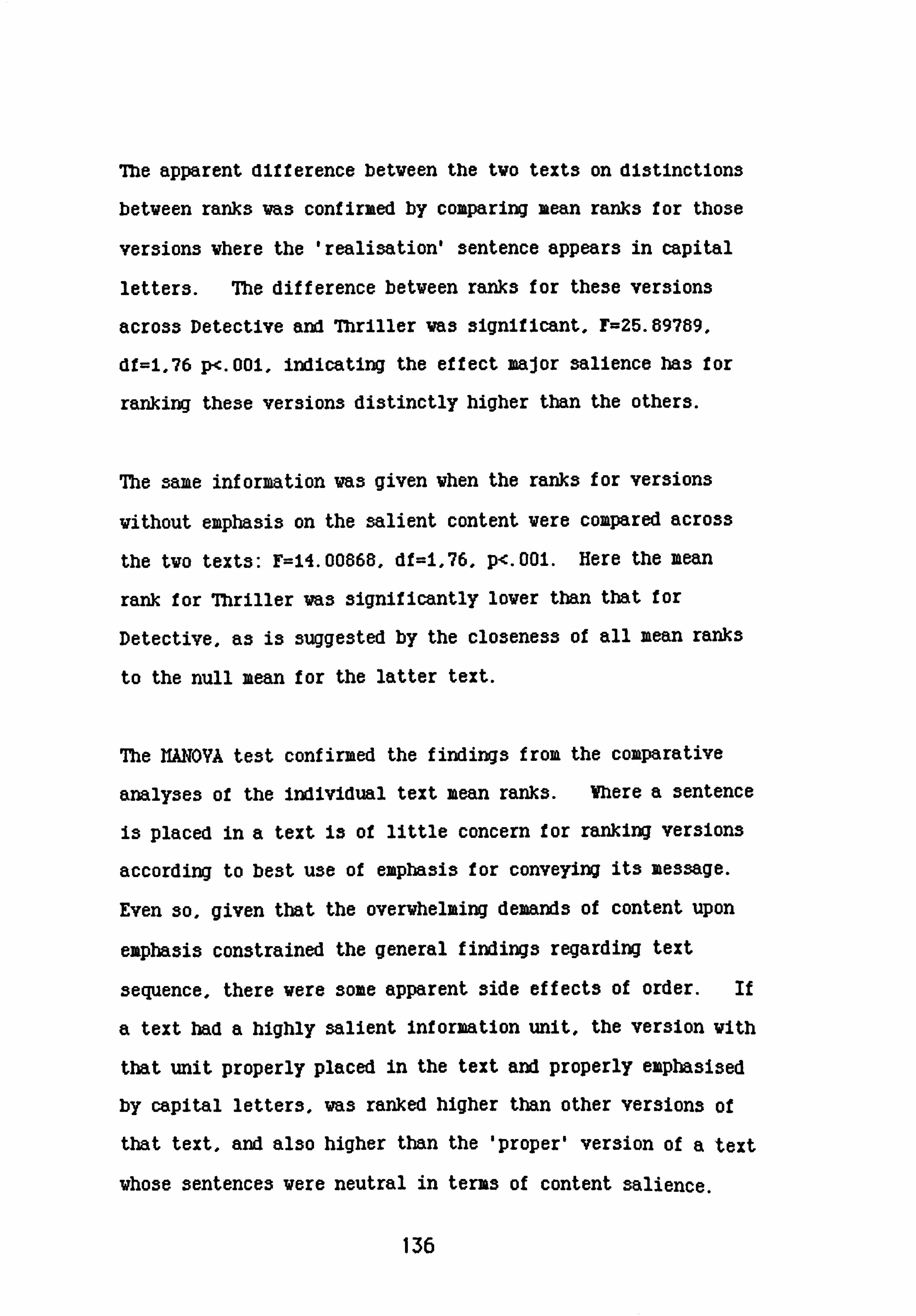
The apparent difference betveen the Wo texts on distinctions
betveen ranks va3 confirmed by comparing mean ranks for those
versions vhere the 'realisation' sentence appears in capital
letters. The difference betveen ranks for these versions
across Detective and Thriller va3 significant, r=25.69789,
df=1,76 p<. 001, indicating the effect major salience has for
ranking these versions distinctly higher than the others.
The same information vas given then the ranks for versions
vithout emphasis on the salient content vere compared across
the tvo texts: F=14.00868, df=i, 76, p<. 001. Here the mean
rank for Thriller va3 significantly lover than that for
Detective, as is suggested by the closeness of all mean ranks
to the null mean for the latter text.
The NANOVA test confirmed the findings from the comparative
analyses of the Individual text mean ranks. Where a sentence
is placed in a text is of little concern for ranking versions
according to best use of emphasis for conveying its message.
Even so, given that the overthelaing demands of content upon
emphasis constrained the general findings regarding text
sequence, there vere some apparent side effects of order. if
a text had a highly salient Information unit, the version vith
that unit properly placed in the text and properly eiaphaSi3ed
by capital letters, was ranked higher than other versions of
that text, and also higher than the 'Proper' version of a 'text
those sentences vere neutral in terms of content salience.
136

The physical structure of the whole text is of issue when
subjects provide reasons for ranking. Given that the content
of a sentence may demand emphasis, whatever its position in
the text, it seems that Vhen normal print is used the
resulting underempha3i3 is more noticed if it follows a
capitali3ed sentence than if it precedes it. Impact should
be led up to, not away from. This relates to another
difference in results between the two sets of ranking tasks:
the fir3t-ranked version of Thriller, with italics on the
'birthmark' information and capitals on 'killing'. is only
ranked significantly higher than the next ranked version when
the text is in its proper order.
The experiment on proper order found that there definitely was
a preferred information sequence for the texts. The lack of
this proper sequence for subjects ranking the Vrong order
versions may show in the reduction of ranking distinctions for
both texts - see Tables 5.1 and 5.2, indicating less general
certainty. There may have been other peripheral effects, as
discussed above. However, it must be accepted that the
questions addressed by this study are very clearly answered by
its results: it is the content of the individual sentences
and their relation to each other in terms of their semantic
structure, not their physical sequence, that dictates the
proper emphasis for a text.
137

CEULPTER 6: Emphasis, Sequence, and Inf ormation Salience.
Interix Sunaary and Introduction:
The ranking tasks described in Chapters 4 and 5 required an
interpretation of each version, comparison of each
interpretation with the (assumed) communicatory intention of
the writer, and ranking all six text versions according to
degree of match. In order to explain their 'best' and
'worst' rankings, subjects had to access knowledge of
paralingui3tic systems operating within the text, as word
content was identical across versions. The foregoing applies
also to the text ordering task.
Although Vhen order preferences vere studied for each text in
the absence of typeface emphasis, there va3 a marked
preference for a particular order in each case, there vas no
reliable difference found betveen ranks given to versions of
texts in their Right or their Wrong order. Some side effects
reported in the conclusion to the preceding section suggested
certain possible effects for the physical place of emphasis in
terms of its communicative function, but there va3 no
discernible effect of order on the choice of vhich typeface
should go vith vhich sentence. The most important
information must have the greatest emphasis, vnerever it 3tooa
with relation to the other text units. This constraint was
138

clearly evident from the findings of the Thriller text and
3tudies.
Mere is a weak tendency, shown from the analyses of rankings
in terms of which unit should take capital letters, for the
summary sentence in Detective to require most prominence. The
function of this sentence in this particular text is to
reall3e the implication of the content so far and to restate
the situation in summary form, as a conclusion which leads on
to, or implies, a secondary realisation which presumably is
critical for the development of the story - the man lied, his
alibi is broken, or perhaps he is a forgetful academic with no
sense of direction or time.
With Thriller, the situation is different. Though the
reall3ation sentence "ve had killed the vrong man" does serve
the function of summoarising and concluding the 'story so far',
in terms of the information explicitly available in the text
given to subjects, it supplies nev information - vhich is
dramatic in its ovn right.
That the narrator had been partner to a mistaken killing is
only one potential reali3ation from the implications of the
previous sentences in the text. This should make the
sentence all the more crucial in the eyes of subjects ranking
the text versions for proper emphasis, and ve know that their
decision that this sentence should be in capital letters vas
more or less unanimous.
139

Effectively, both realisation sentences suislaarise previous
Information. They are therefore appropriate conclusions to
each text, as the ordering task results showed. A point
about such summaries, found at intervals throughout passages
of fiction, is that they have a rhetorical function to convey
the 3tory-line, to restate preceding information in terms of
the particular tale that is being told (Brown & Yule, 1983).
Summaries should serve this function in most communicatory
contexts.
The communicatory context is an external operator upon the
text as a vhole, vhich must conform to predictable
regularities if it is to be interpreted appropriately. With
fiction this is telling the story vell, holding interest,
suggesting drama, mystery and maintaining the threads that
hold the information sensibly together. Holding the
information together from a particular perspective (simply,
vhat the story is about) gives the vriter the task of
maintaining the internal content structure of the text
throughout the discourse, selecting strategies Uhich vill
provide interpretants for the narrative focus of the text.
Generally speaking, for Thriller this focus is explicit Vithin
the given text, provided by the reali3ation sentence. There
has been a mistaken killing, committed by the narrator. For
Detective, that the man has lied, that his alibi is broken, is
not stated in the text - the narrative focus is implicit.
140

The ranking results could be explained by subjects ranking
their versions to the necessities of the narrative focus,
within the coziunicatory context, and allocating importance,
and consequent typeface emphasis, to particular sentences in
terms of their function for this focus. What it the writer
of the Thriller story intended the birthmark information to
feature strongly in subsequent events in the narrative? Which
strategy, from the available options, would stand the best
chance of achieving this? Subjects in the Ranking study gave
the version which provided most prominence to *There was a
birthmark on his forehead* bottom rank, on the stated grounds
that it gave this information too such emphasis, and played
down the killing. These subjects had all versions of the text
available, for a task which in effect required the production
of the best text. What would the interpretative effects of
the different texts be, in isolation? Would empha3ising one
sentence increase its perceived content salience at the
expense of another, and what would be the effects of
competition from highly salient information elsewhere in the
text?
The next 3tudy addre33es the Interactive function3 of
typeface, emphasis and information sequence for vritten.
communication, from the perspective of the reader.
141
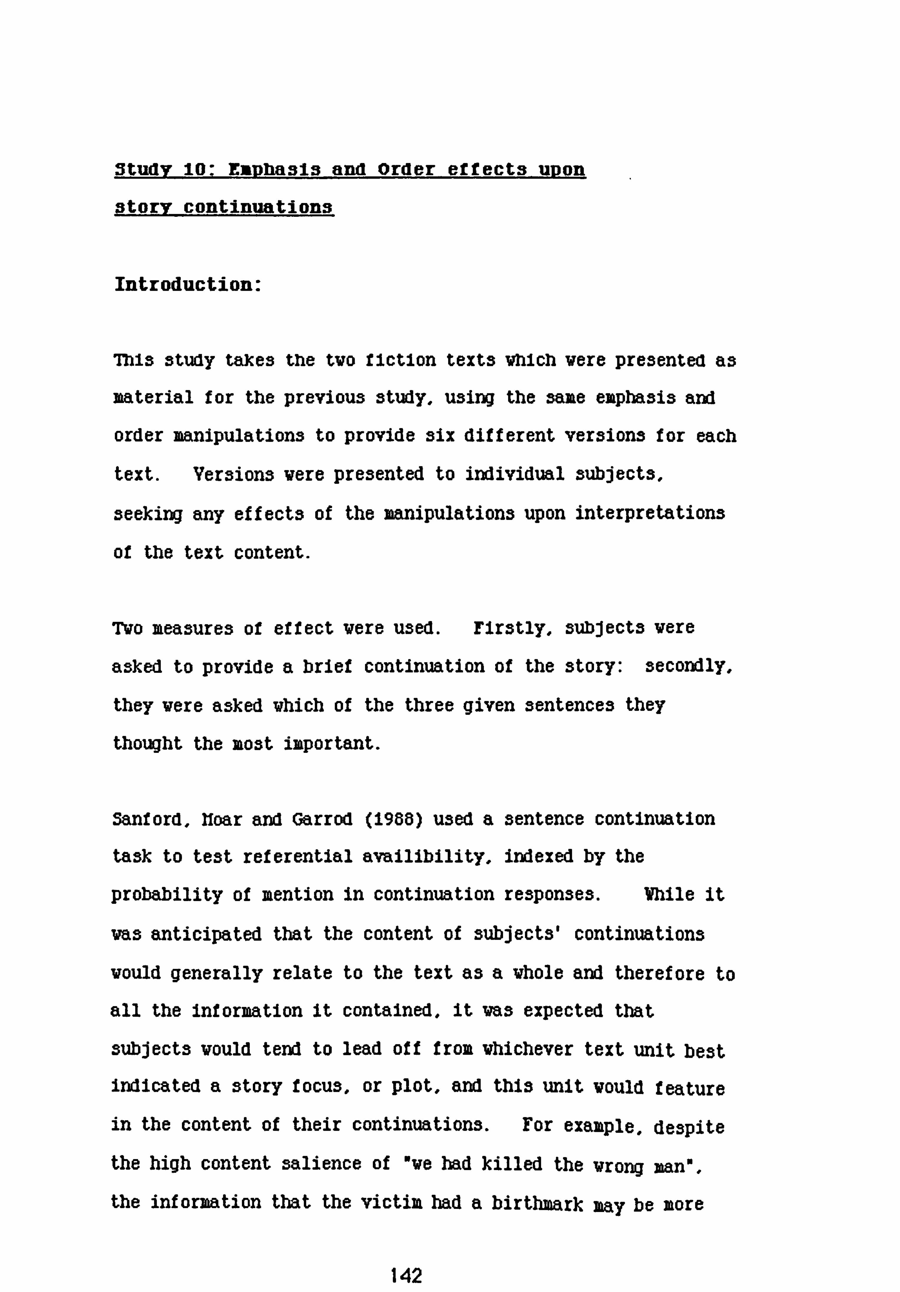
Studv 10: Eiavhasis and Order effects uvon
story continuations
Introduction:
This study takes the two fiction texts which were pre3ented as
material for the previous study, using the same emphasis and
order manipulations to provide six different versions for each
text. Versions were presented to individual subjects,
seeking any effects of the manipulations upon interpretations
of the text content.
Wo measures of effect were used. Mrstly, subjects were
asked to provide a brief continuation of the story: secondly,
they were asked which of the three given sentences they
thought the most important.
Sanford, Ifoar and Garrod (1988) used a sentence continuation
task to test referential availibility, indexed by the
probability of mention in continuation responses. Vhile it
was anticipated that the content of subjects' continuations
would generally relate to the text as a whole and therefore to
all the information it contained, it was expected that
subjects would tend to lead off from whichever text unit best
indicated a story focus, or plot, and this unit would feature
in the content of their continuations. For example, despite
the high content salience of "we had killed the wrong man",
the information that the victim had a birthmark may be more
142

available to subjects it it is focussed by typeface emphasis
within the text. Or, more overtly, they may asume it does
have importance for the ongoing story, indicated by the
writer's use of capital letters.
ror continuations of the Thriller text It was expected that
the realisation sentence, which explicitly contains the plot
focus of the surrounding text, would feature as a departure
point for subjects, unless order or emphasis pulls hard -
maybe in combination, to focus attention elsewhere. For the
question response, however, the sentence "Ve had killed .......
should score highest, whatever else 13 signalling.
On the other hand, It the Detective text did focus subjects
attention to an implicit plot, this plot should feature in
their continuations, with possible order or emphasis effects
on which, if any, text units featured as lead in. If both
sentences are neutral in terms of information salience, then
it might be expected that emphasis and/or order manipulations
may act to render one sentence more salient than the other,
which should affect the selection of 'most important
sentence'.
Over the two texts, the interest was in evidence of conflict
or cooperation betveen emphasis and order vith content
salience.
143

Ilethod:
560 subjects took part in this experiment, giving Wenty-eight
groups of tventy. All vere first or second-year undergraduate
3tudent3 at the Univer3ity of Glasgov.
The two fiction texts from the Ranking experiment provided
material for the study. The combined and single emphasis
manipulations previously presented for ranking, plus
unempha3ised versions of each text within each sentence order,
gave fourteen different versions for each of the two texts,
tventy-eight versions in all. The emphasis sequence for each
version, within order set, was identical for both the Thriller
and the Detective texts, as shown in Figure 10.1.
]Figure 10.1: Order L Emphasis sequence descriptions of alternative versions, both texts.
Sentence Order Emphasis Order Version Label
Implication-Realisation Italic-Capital IR-IC Capital-Italic IR-CI Normal-Capital IR-NC Capital-Normal IR-CN Normal-Italic IR-NI Italic-Normal IR-IN Normal-Normal IR-NN
Realisation-Implication Italic-Capital RI-IC Capital-Italic RI-CI Normal-Capital RI-NC Capital-Normal RI-CN Normal-Italic RI-NI Italic-Norual RI-IN Normal-Normal RI-NN
144

Figures 5A and 5.2 from Chapter 4 shov the different typeface
versions for each text in their proper order, the versions in
their vrong order can be seen in Chapter 5, Figures 7.1 and
7.2.
Each subject was presented with an A4 sheet of paper
containing a text and instructions to 'continue the story'.
On a second sheet they were asked to state which of the three
given sentences was 'most important', and why. Yigure 7.2
gives an example of the material presented, using a version of
the Thriller text, with instructions and questions.
The study vas run prior to different course lectures, vith
the cooperation of the lecturers concerned. Subjects vere
given the material and asked to complete their tasks vithin
the first ten minutes of lecture time. All did so.
5corina iDrocedures
Transcripts of subjects' continuations, and of their
explanations of vhy a particular sentence vas rated most
important, are available in Appendix 3.
145

Figure 10.2: Example of material presented to subjects for the continuation and question task.
[page I)
Please read the following passage, then continue the story in the space ]Ibelow. Just one or two sentences will do, showing what you think might come next.
[Version: RI-NIJ
I walked up to the body on the hearthrug and turned it over. We bad killed the wrong mart. rhei-e ms a hij-tAwj-. t on Ais An-ehead.
[page
There are three sentences in the passage you were given. Which do you think is the most important?
Can you say why?
Thank you for belpirwg with this stvAy.
On the first measure, story continuations for the Thriller
text versions were scored in terms of which sentence in the
given text functioned most clearly as the departure point for
subjects' continuations. Scoring categories, therefore, were
146

"Backgrouna', "Implicatory', "Reall3ation" and "Other* -a
score on the latter implying either that none of the sentences
from the given text vere specifically linked by content, or
that all the sentences seemed, by the same criteria, to be
necessary for the continuation.
Scoring vas carried out by tvo judges, vith agreement overall
for the Thriller text being 86X at the first run, f olloved by
full agreement after discu3sion.
Scoring of the Detective text was carried out in the same way.
The majority (619) of the scores here fell within the "Other"
category, implying that there was no distinguishable departure
point from the given text. An examination of these responses
found that 829 related to a 'broken alibi' plot, the remainder
dealing variously with timetables, British Rail waiting rooms
and alternative means of transport. In f act, 65X of all
continuations dealt with the fact that the subject of the
story had lied, taking this from the information provided as a
whole or relating back to one specific unit of the text, and
being scored accordingly.
Between judges the agreement rate for first scoring the
continuation responses for this text had been 88X. It was
decided that the responses scored 'Other' would stand, on the
criteria as originally applied, ie no evidence of any specific
147

sentence in the given text serving as departure point for the
continuation. Disagreed items from the whole data set were
agreed at a second scoring session after discussion.
A separate scoresheet was then drawn up for the continuations
of each text. This time they were scored in terms of whether
or not the story focus as intended by the author (which in
fact was mistaken killing for the Thriller text, broken alibi
for Detective) featured in their content, regardless of links
to specific text units. Scores were then tabled according to
emphasis-order condition.
Throughout all scoring procedures, judges saw the
continuations only, rather than scoring each continued text as
a unit. This was because, during a practice run, it was
generally felt that the print emphasis was influencing judges
decisions, that is, affecting their interpretation of the
continuation itself.
Responses to the question about importance were simply scored
by the experimenter, matching subjects' selections with the
text sentence. Coding categories were therefore the same as
those for the continuation responses.
148

Scoring categories for subjects explanations of vhy a
particular sentence was accounted most important emerged from
careful study of these responses, Vho3e high degree of
systematic consistency enabled a manageable number of
categories to accommodate most of the data. It vas found
that explanations related mainly to the sequencing of
information in the text, to physical emphasis or prominence,
to the content of the chosen sentence in its own right, or to
that content in relation to the perceived plot or story-focus
of the text. Scoring categories vere therefore 'Content',
'Emphasis'. 'Sequence' and 'Plot' plus 'Other' for any
explanations Vhich could not be accommodated vithin the
categories provided. Again, tvo judges scored the data, vith
an agreement rate of SEX, full agreement after discussion.
These scores vere then related to the order-emphasis condition
undergone by the subject.
Results and discussion:
Continuation Task
Table3 10.1 and 10.4a 3hov the frequency of continuation topic
relation to text unit content, I)y expliasis-order Condition,
for each text. 7hble3 6.3 and 6.4 shov vhich sentence vas
149

considered by subjects to be most important, under which
condition. For clarity, the final columns of each table
indicate whether typeface emphasis 13 on the reali3ation
sentence (+ Emphasis), and whether that sentence takes its
preferred order, as last sentence in the text (+ Order).
Table 10.1: Response frequencies for continuation task THRILLER text, all versions N=280
Status of Version* Background Imply Realise Other Realisation
Esp. Ord.
IR-NN 0 5 15 0 0+
IR-CN 0 6 16 0 -+ IR-NC 0 1 P 2 ++
IR-IN 0 2 18 0 -+
IR-NI 0 0 20 0 ++
33k-Cl 1 4 15 0
31?, -IC 1 4 14 1 +
RI-NN 3 7 8 2 0
RI-CN 0 12 8 0 +
RI-NC 0 8 11 1
RI-IN 0 12 7 1 +
RI-NI 0 7 13 0
la-Cr 1 11 7 1 +t
la-le
..........
0
............
13
.......
7
..........
0
........
++
...........
TOTAL 6 91 175 8
*Tersion labels show the initials of each factor, in sequence for that version, eg IR-CN = Implicatory sentence in capital letters, followed by realisation sentence, in normal print.
ISO

Necessarily, the minus signs indicate the status of the
implicatory sentence - that is, it the realisation sentence is
not expha3i3ed, then the implicatory sentence is +EmphasI3,
the same applying for sentence position.
The nature of the data restricts its analysis to some form of
frequency quantification. Chi square, is the most commonly
used form of analysis in this context. However, where there
are more than two factors, each with several levels - as is
the case here - interaction effects can only be tested by
carrying out an exhaustive series of partitions on the
contingency table. A form of log-linear analysis,
multinomial logit modelling (see, eg. Upton (078), was felt
to be more efficacious. This allows direct testing of
interaction effects and has the additional advantage of
explicitly treating the response variable as dependent.
7hking the continuation task first, each text is dealt with
3eparately before a comparative dinunion.
Thriller:
All the Thriller continuations dealt in some vay vith a
mistaken killing, and the majority of subjects took the
reali3ation sentence alone as a departure point for their
continuations. Almost exclusively, the content of these-
151

aealt with the resulting state or action ot the narrator, In
the light of the mistake. There does appear to be a shift to
the implicatory sentence'among those subjects who received the
'wrong order' versions of the text, with a slight increase in
this tendency under certain conditions of typeface emphasis.
Unexpectedly, when sentence order is reversed, emphasis on one
sentence slightly increases response frequencies for the
other.
Ilultinomial logit modelling was carried out on the frequencies
tabulated in Table i0A, with response as dependent variable.
The various models tested, as defined by the effect removed
from the saturated model (ie that model which includes all
two- and three-way interactions between Response, Emphasis and
Order), are shown in Table 10.2 with values for
goodne3s-of-fit chi-square (the likelihood-ratio statistic,
y2), and significance for these values. *
It is plain that sentence order is the only influence against
a strong tendency to lead off from the reali3ation sentence
when continuing this story. hodel B, with the effects of
order on response removed, clearly does not fit the data.
*11 y2 is signilioant, then that model does not lit the date well, implying that the effect removed is in fact required to explain the pattern of frequencies. (See, eg, lUpton 1978)
152

Table 10.2: IfultInomIal logIt models for testing Ejkphasis, Order and Emphasis x Order effects upon Response, Thriller continuation task.
Ilodel Parameter removed Y2 df P
A Response x Emphasis x 16.14890 12 . 185
Order
B Response x Order 46.62434 15 . 000
c Response x Emphasis 23.66716 24 Aft
D Right Order only: R. xE il. M70 12 . 502
E Wrong Order only: RxE 12.35545 12 . 42
Contrasts from Ilodel A shov that the realisation sentence
features as departure point more often vith right order
versions, vhere it ends the text, than vith vrong order
versions (Z=3.6153). Correspondingly, the birthmark
information became more salient, featuring more often in
continuations vhen this sentence vas last (Z-2. iO54i). This
influence was not so strong as to reverse the frequencies,
rather it pulled more of the responses over, under the vrong
order conditions. When contrasted vith the effects of other
emphasis conditions, the 'realisation' responses for those
versions having italic typeface for that sentence (RI-NI and
IR-NI) vere highest (Z=2.03668). Hovever, it vas generally
found that the effects of emphasis for this task on this text,
though suggestive, are marginal in comparison to the overall
response effect (ie, to deal exclusively vith the mistaken
killing), and to the overall order x response effect.
153

Detective:
659 of all continuations dealt vith the fact that the subject
of the story had lied, taking this from the information
provided though not often relating back to any specific unit
of text. This proportion varied considerably betveen the
different subject groups; Table 10.3 gives the percentage of
subjects for each text version vho continued the story in
terms of a lie or broken alibi, vhether or not there va3 a
content relationship to a specific sentence in the text,
scored accordingly.
Table 10.3: Percentage of continuations with alibi as topic. Detective text.
Right Order Vrong Order Ver3ion3 (I-R) X Ver3ions (R-I) X
NN 70 NN 40
NC 65 NC 90
CN 65 CN 90
NI 50 NI 70
IN 75 IN 60
ci 55 ci 75
Ic 50 Ic 60
It would seem that the 'proper order' sequence of sentences
works best to direct continuations to the 'alibi' story focus,
if no typeface emphasis is available. Vrong order versions
154

vith typeface emphasis generally produced higher frequencies
of this response type than emphasised right order versions,
though this difference does not quite achieve statistical
significance. Using a binomial test vith probability defined
as overall proportion of this response across all conditions,
Z--l. 55, p=. 072.
On the basis of these findings, the best vay to present the
text it requiring to focus story continuations on an alibi
plot has the implicatory sentence last, and either sentence in
capital letters (RI-KC, RI-CN): Z=2.914, p--. 002. The version
vhich produced the highest number of lie responses vith no
specific content association to the text was RI-CN (75X of
that subject group).
The frequencies for all responses for this text are shown in
Tables 10.4a and 10.4b, with the latter providing information
of frequencies when 'Lie' scores are separated out.
Generally, the majority of responses for this task took the
whole text as a lead in to an implicit plot, which provided
the topic of continuation content, whether or not subjects
interpreted this as concerning a broken alibi or the
inefficiency of British Rail. However, there does seem to be
an effect of emphasis and order in that certain version
conditions show an increase In frequency for a specific
155

Table 10.4a: ]Response frequencies for continuation task DETECTIVE text, all versions N=280
Status of Version* Background Imply Realise Other Realisation
Esp. Ord.
IR-IRN 2 0 2 16 0 +
IR-Cli 3 3 4 10
IR-NC 3 0 7 10 +
IR-IN 1 2 4 13
IR-NI 0 3 6 11 +
3M-Cl 2 2 3 13
33k-IC 3 3 5 9
RI-14N 2 5 5 8 0
RI-CN 1 0 2 V +
RI-NC 1 2 a 17
RI-IN 3 4 4 9 +
RI-NI 2 4 0 14
M-cl 2 2 13 ++
......... .......... ......... ........ .......... ........ ...
rIDTAL 28 36 45 17l
156

Table 10.4b: Response frequencies for continuation task DETECTIVE text with 'Lie' scores, all versions N=280
Status of Version Back Imply Realize Lie Other
Realization Ezp. Ord.
IR-NN 2 0 2 12 4 0+
IR-CN 3 3 4 7 3 -+ IR-NC 3 0 7 9 1 ++
IR-IN 1 2 4 A 3 -+
IR-NI 0 3 6 8 3 ++
IR-Cl 2 2 13 0 ++ +
IR-IC 3 3 7 2 ++ +
RI-NN 2 5 6 2 0
RI-CN 1 0 2 15 2 +
RI-NC 1 2 0 D 4
RI-IN 3 4 4 7 2 +
RI-NI 2 4 0 10 4
IM-Cl 2 3 2 13 0 ++
la-ic ............
3 ........
5 .........
1 .............
10 .........
1 ...........
++ ............
70TIAL 28 36 45 140 31
sentence featuring as a departure point, pulling more
responses away from the 'Other' category vhere no such effect
vas found. As va3 the case for Thriller, reversing the order
of the tvo sentences spread the responses vithout any
influence from typeface change - compare IR-14N vith RI-NN in
Tables iO. 4a and 10.4b. The data from Table X. 2A vas subjected
157

to log-linear modelling, to provide a more direct comparison
with the findings from the Thriller text, and goodness of fit
statistics for the models are given in Table 10.5.
Thble 10.5: Ifultinomial logit models for testing Emphasis, Order and Emphasis x Order effects upon Response. Detective continuation task.
Model Parameters Removed y2 df P
A Response x Emphasis x 23.22339 12 . 026 Order effect
Respouse x Order
Response x Emphasis
28.04296 15 . 021
38.66773 24 . 030
Right Order only: R. xE
E Wrong Order only, RxE
13.76936 12 X6
21.43857 12 . 044
The models confirm the impression given by the frequencies
shown in Table 10.4a. None fit the data well, suggesting
that both typeface emphasis end the order of sentences affect
response frequencies, and that their interaction effect is
also significant. Nodel A contrasts shov that the
'reali3ation' response, Te could not have made the
connection" was higher in Right order versions, with the
emphasis effect noticeable within the Vrong order versions
only (Z-2. iiOO7).
158

General d1scussion:
For the Thriller story, with all the responses relating to the
mistaken killing, putting the highly content-3alient
information last was the best strategy for ensuring the
continuations dealt with this alone and ignored the
implicatory information. Reversing the order facilitated an
interpretation of the given text which, while not shifting the
main focus from the killing, treated the victix'3 birthmark as
an ongoing element in the plot. "Gorbachev was deadl' is the
simplest example from the data.
An unexpected finding which, although a very minor effect
compared to the overriding influences of content salience and
sentence order, is the tendency for OVE HAD KILLED THE VRONG
M. There was a birthmark on his forehead" (RI-CN) to pull
more responses to the implicatory sentence category than "Ve
had killed the wrong man. THERE VAS A BIRTMWK ON HIS
FOREHEADn (RI-NC), though this version also conforms to the
general order effect operating on the data.
This effect was not found in the data from the Detective
continuation task, where typeface emphasis had a more
straightforward influence when Interacting with sentence
order. It should be noted that the Detective fiction context
could not have been strongly marked. ]Firstly, only
3ixty-five per cent of all continuation responses related to a
159

broken alibi. nost otner continuations involvea time-tanes
and travel arrangements - one subject deserves quoting for
combining the tvo: nElementary, you may think, but it vas
singular observations such as these that turned the young
train3potter into Sherlock Holmes, the vorld's most feared
detective. " (RI-CN). Secondly, those plots thich did deal
vith a theme of lie and broken alibi vere fairly evenly
divided betveen Holmesian deductions and accusations of
infidelity.
Presenting three sentences from a body of text is, naturally,
more likely to mark an immediate story context if the plot
focus is explicit within the given text. The main issue for
this report, however, is the influence of typeface emphasis
and sentence order, and here Table 10.3 shows that for the
Detective text any disadvantage from not explicitly stating
the plot can be considerably overcome by the use of typeface
emphasis, in combination with order. It was found that a
substantial majority of continuations dealt with the intended
story focus when the text was presented in the 'wrong' order,
with the implicatory information about the delayed train last,
and either that sentence or the reali3ation sentence
capitalised. This was confirmed by the log-linear analysis
carried out on the frequencies shown in Table A. 4a, which
tested for emphasis or order influences away from the main
trend of taking the whole text as a lead-in to the story
continuation, rather than one specific sentence. Table 10.3
160

3how clearly that prediction3 vere met, and that typeface
emphasis and sentence order do work cooperatively to influence
subjects' continuations of their given text versions.
A prediction that the best way to sequence and emphasise the
information units in the two texts given to subjects in this
study so as to best communicate the narrative focus intended
by the author would be that preferred by subjects In the
Ranking study would not have been met by the findings here.
If we take "best version* in "best order" from the Ranking
tasks on both texts and compare them with the versions
producing the highest frequency for intended interpretation of
each text, we find that they do not match.
The preferred version for Thriller vas:
I walked up to the body on the hearthrug and turned it over. FA--. P-e ms a hIrfAmm. -k on Ais Jbi-eAcmd. WE HAD EILLED THE WRONG HAN.
For Detective:
He said he had caught the morning train from Plowbright as usual, changing at Crewe for Leicester. restojlfar tAo Plorbi'Ight bvin ms tm Aozu.! r late. HE COULD NOT HAVE MADE THE CONNECTION.
Ranking of versions in Chapters 4 and 5 vas to be done in
terms of "best vay of expressing the messageo, vhich
instruction does seem, from subjects' explanations, to have
been taken to mean communicating an intended interpretation in
terms of narrative focus vithin the overall text context.
Az3uming the 'proper' continuation response to Thriller is
that vhich concentrates upon the mistaken killing Vhile
161

discarding the birthmark information (vhich the ranking study
subjects, from a study of their explanations, clearly assumed
the narrative focus to be), the version producing most
responses of this type va3:
I walked up to the body on the bearthrug and turned it over. There was a birthmark on his forehead. & had lilled tA-- rzvjv sun.
Significantly more responses vere scored 'R' for this version,
in comparison vith the plain text version. It vas ranked
fourth by subjects ranking 'right order' versions, for Vhom a
major imperative vas placing capital letters on the highly
salient information given in the last sentence.
Oddly enough, the scores from Table 10.1 suggest that if the
author had intended the fact that the victim of the killers'
error was a man with a birthmark on his forehead to feature as
an element in the unfolding plot, then her best was of
achieving this interpretation from the three sentences taken
for study would be to switch the two sentences, and use
italics for the impact sentence and capitals for the
implicatory information:
Fe Md, &Med the irrong wn. TBERE VAS A BIRMURK
This version gives full prominence, from emphasis and sentence
positon, to the implicatory sentence.
162

With the Detective text, Table 10.3 shm that either of the
folloving version3 vork be3t for the intended interpretation:
H& said he bad oaught the morning train from Plowbright as usual, changing at Crewe for Leicester. HE COULD NOT KAYE HADE THE CONNECTION. Yesterday the Plowbright train was two bours late.
He said he had caught the morning train from Plowbright as usual, changing at Crewe for Leicester. He could not have made the connection. YESTERDAY THE PLOMIGHT TRAIN WAS TWO HOWS LATE.
The mismatch is less serious in this case, as subjects in the
Ranking task indicated no significant preference for any one
version. Hovever this text, like Thriller, vas preferred
vith combined emphasis. The suggestion from Tables 10.1,
iO. 4a and iO. 4b is that any effects from the combined emphasis
versions tend to cancel each other out, in terms of sentence
order comparisons and typeface sequence.
Me above conflict suggests that any Interpretative faculties
brought to bear Vhen ranking text versions in order of
preference differ from those used to interpret a given version
and respond by continuing the story -a more 'reactive' task.
163

Question taSks
As a first step, within subject responses to the two tasks,
continuation and question, were analysed to see if there were
any associations between departure points for continuations
and selection of mmost important sentence*. None were found:
for the Thriller text
X2=9.351, df=9, p=n. 3ig. For Detective, X2=11.2225, df=9,
p=n. sig. This confirm3 that the tasks measured different
effects of the emphasis/order manipulations on text
interpretation.
The responses to the question of which sentence In the given
text was most important were scored against exactly the same
categories as those used for scoring the continuation task.
Tables 10.6 and 10.7 show the response frequencies for each
text. One point is clear, that predictions of perceived
information salience made from the results of the ranking
study hold true. Across all versions, 71g of the responses
were for the 'killing' sentence, with the implicatory sentence
achieving 26X. Vith Detective, the responses were much more
evenly spread between the last two sentences, and increased
for the Background information.
164

Another point Is that the differences ]between the
non-empha3i3ed versions (with only sentence order changed) are
far less marked than was the case for the continuation task
for both texts. The analysis of results for each text is
reported separately, followed by a general discussion.
Table 10.6: Response frequencies for question task THRILLER text, all versions N=280
Status of Version Background Imply Realise Other Realisation
Esp. Ord.
IR-NN 0 4 16 0 0+
IR-CN 0 9 11 0 -+
IR-NC 0 3 17 0 ++
IR-IN 1 8 11 0 -+
IR-NI 0 2 18 0 ++
IR-Cr 1 3 16 0
XPI-IC 1 2 16 1 ++ +
RI-NN 1 4 15 0 0
RI-CN 0 3 17 0 +
RI-NC 0 9 11 0
RI-IN 0 3 16 1 +
RI-NI 0 13 7 0
M-Cr 2 12 1
ra-ic ...........
0 ...............
5 .........
is ............
0 .............
++ ..............
=AL 6 72 199 3
165

Thriller:
Table 10.6 shows the frequency of the Implicatory response to
be higher than the Realisation response only once (RI-NI).
The Background sentence scores show this to be completely out
of the running. This suggests that content is a better
predictor of judgements of importance between the sentences in
this text, although the proportion of Implicatory to
Realisation does increase whenever the former is emphasi3ed.
It va3 found from the log-linear models of the data described
in table 10.7 that, although Hodel C indicates a trend avay
from
Table 10.7: Iftultinoxial logit models for testing Emphasis, Order and Emphasis x Order effects upon Response. Thriller question task.
Ilodel Parameters removed y2 df P
Response x Emphasis x 3.79774 12 . 987 Order
B Response x Order 3.87759 15 . 998
c Respouse x Emphasis 29.04851 24 . 22
D Right Order only: R. xE M 85162 U . 542
E 'Frong Order oray: RxEA. 19689 12 - iio
166

goodness of fit Vhen the Emphasis effects on the response are
disregarded, and hodel E 3hov3 us that this is more the case
Vhen only the vrong order version responses are studied, the
high content salience of the reali3ation sentence "ve had
killed.... " overrides any effects of emphasis, and certainly
of order, for its selection as most important sentence. IIodel3
A and B fit the data very vell. The contrasts from Hodel A
indicate an increase in response frequencies for the
implicatory sentence Vhen empha3ised by Italics or by
capitals, (Z--2.63618,2.59932 respectively). Capital letters
for the reali3ation sentence increases its already frequent
selection (Z=2. i697).
These emphasis effects clearly do not influence the general
direction of responses, which is toward the highly salient
reali3ation sentence, an explicit statement of the plot.
Detective
Again, although the 3core for Background is higher than it vas for the Thriller text, the real conflict is betveen the
Implicatory and the Realisation sentence.
167

Table 10.8 Response frequencies for question task - DETECTIVE text, all versions N=280
Status of Version Background Imply Realise Other Realisation
Emp. Ord.
IR-NN 1 8 8 3 0+
IR-CN 0 10 10 0 -+ IR-NC 3 2 14 1 ++
IR-IN 3 12 4 1 -+ IR-NI 4 5 11 0 ++ IR-Cr 1 7 11 1
IR-IC 1 7 12 0
RI-NN 3 6 9 2 0
RI-CN 3 3 14 0 +
RI-NC 0 13 7 0
RI-IN 2 6 12 0 +
RI-NI 2 16 2 0
IM-Cr 2 9 10 0 ++
1M-: EC
...........
1
...............
5
..........
12
............
2
............. +t
.............
TOTAL 26 108 136 io
The response frequencies for the question task in Table 10.8
suggest a stronger effect of emphasis than va3 the case for
Thriller. Log-linear analysis confirmed this, as Table 0.9
shov3. Removing Response by Emphasis effects (Hodel C)
168

Thble 10.9: Hultinomial logit models for testing Emphasis, Order and Emphasis x Order effects upon Response, Detective question task.
Model Parameters removed Y2 df P
Response x Emphasis x 3.79774 12 . 987 Order
B Response x Order 5.41057 15 . 998
c Response x Emphasis 53.09787 24 001
D Right Order only: RxE 23.52949 12 024
E Frong Order only: RxE 29.66839 U. 003
did significantly reduce goodness of fit for that model.
Examination of the contrasts from Nodel A found that choice of
the implicatory sentence increased vhen printed in italic
letters (Z=2.63618) or in capitals (Z=2.59932), and that the
realisation sentence response is more frequent vhen carrying
capital letters (Z-2.1697). It can be seen that typeface
emphasis had slightly more influence upon responses in the
vrong order than the right, but 11odel3 A and E confirm
indications from Table 10.6 that information sequence, in
combination vith emphasis or alone, vas not an issue vhen
subjects selected the most important sentence from this text.
169

Reasons for cholce:
The explanations subjects made for their choice of most
important sentence from their given text versions were treated
according to the coding procedures described. Content was
scored when the choice related to some quality of the
information expressed by the sentence chosen; emphasis when
subjects simply explained choice by the typeface in which the
sentence was presented; plot if the sentence is judged
important because it is crucial to what a subject sees as the
underlying theme or plot of the text; sequence when comments
specifically concerned the order relationship of the
information units. A full transcript of responses is
available in Appendix 3. Some subjects gave more than one
reason, all were scored and the frequencies for each text,
broken down to text version groups, are shown in Tables 10.10
and 10.11.
It Is clear from the frequency tables that the effects of
typeface and order manipulation upon subjects given reasons
for choice of the most important sentence from either text
were minimal. Rather, the total response frequencies for the
different categories provide confirmatory information about
the nature of the texts themselves and the sentences within
them, which throws more light on the different findings for
the two texts as far as the 'Question' task itself goes.
170

Table 10.10: Proportional response category frequencies of reasons for sentence selection, Thriller text. (I=Imlicatory. R--Realisation)
VERSION CONTEXT EVHASIS FLOT SEQUENCE OTBER I R I R I R I R IR
IR-NN . 25 . 29 - - . 50 . 53 . 25 .
18
IR-CN . 25 .
45 . 37 - .
31 . 55 . 06 -
IR-NC - . 30 - .
26 1.00 . 22 - .
22
IR-IN - . 59 . 50 - . 50 . 08 - . 33 --
IR-II - . 46 - . 37 1.00 . 17 -
IR-Cl - . 33 - . 06 1.00 . 50 -
IR-IC - . 18 - . 32 1.00 . 27 - . 33
RI-IM - . 53 - - 1.00 . 23 - . 24
Pi-cx - . 33 - . 43 1.00 . 24 - -
RI-Rc . 10 . 64 . 40 - . 50 . 36 - -
RI-IN . 33 . 43 - . 30 . 66 . 13 - . 09 . 04
Ri-li . 07 . 72 . 40 - . 53 . 28 - - -
RI-CI - . 28 - . 22 . 80 . 39 - . 11 . 20
RI-Ic
.......... -
..... . 27
....... . 50
....... -
....... . 33
....... . 40
....... . 17
....... . 33
....... -
..........
TOTAL . 09 . 37 . 28 . 20 . 58 . 29 . 04 . 13 . 01 . 004
71X of subjects receiving versions of the Thriller text
selected the realisation sentence as being the most important
of the three. Of a total of 335 reasons, 85 related to the 171

Implicatory sentence, 248 to the Realisation. Proportional
figures shoving the frequency for reasons falling vithin each
of the categories are given for those Wo sentences only.
For either sentence, if typeface emphasis is present, it tends
to be given as a reason for selection. Otherwise, the
Realisaton sentence is more often chosen because of its
content salience, though its function for plot is recognised.
OR shows that something serious had been done by mistake.
Killing somebody is a pretty grave thing to do and to do
something like that by accident is quite important. * If the
Implicatory sentence is chosen, it is because of its
importance to the plot and very seldom min its own right", ie,
in terms of Its content. "It explains how they know they
killed the wrong man. n
The results of the Thriller tasks, Tables 10.6 and 10.7,
clearly demonstrate the overriding influence of content
salience on subjects' choice, and the response frequencies in
7hble 10.10 reflect this, as well as the subservient role of
the implicatory sentence even when selected.
Predictably, for Detective the frequencies are much more
evenly spread. Of 308 reasons, 136 referred to selection of
the Implicatory sentence, 158 for Reali3ation. Again, if
172

Table 10.11: Proportional response category frequencies of reasons for sentence selection, Detective text. (I=Implicatory. Rx-Realisation)
VERSION CONTEXT EMPHASIS PLOT SEQUENCE OTHER I R I R I R I R I R
IR-IN . 43 . 50 . 43 . 30 . 14 . 10 - . 10
IR-CN . 08 . 30 . 46 - . 15 . 40 . 31 . 30 - -
IR-NC . 25 . 21 - . 47 - . 26 . 75 . 05 - -
IR-IN . 25 . 17 . 25 - . 10 . 50 . 35 . 33 . 05 -
IR-li . 40 . 25 - . 17 . 20 - . 20 . 33 . 20 . 25
IR-a . 43 . 25 . 14 . 08 . 29 . 50 . 14 . 08 - . 09
IR-ic . 71 . 25 - . 41 . 29 . 17 - . 17 - -
RI-IN . 50 . 40 - - . 25 . 20 . 12 . 40 . 13 -
RI-CH - . 11 - . 50 . 50 . 06 . 50 . 33 - -
RI-NC . 18 . 28 . 29 - . 29 . 43 . 24 . 29 - 0
RI-IN . 33 . 36 - . 21 - . 14 . 67 . 21 - . 07
RI-Wi . 32 . 50 . 27 - . 23 . 50 . 14 - . 04 -
RI-cl . 33 . 09 - . 18 . 33 . 45 . 22 . 09 . 11 . 18
RI-IC
.......... . 28
..... . 27
....... . 14
....... . 27
........ . 29
...... . 20
....... -
....... . 13
....... . 29
...... . 13
.... TOTAL . 30 . 26 . 18 . 22 . 23 . 25 . 24 . 20 . 05
. 06
173

emphasis va3 present it tended to be mentioned in
explanations; generally the reason categories applied
relatively equally for both sentences.
The same reason for choice could apply whichever sentence was
chosen: one subject chose Implicatory because "it indicates
the guy was lying". another chose Realisation "because it
tells us the man was lying*. There is more concern with
information sequence in subjects' explanations. nIt states
the implication of the preceding sentences*. This is a very
minor issue for the Thriller text.
General discussion:
Choice of the most important sentence in the Thriller text vas
not affected by vhere the sentences vere placed, nor to any
significant extent by the presence or absence of typeface
emphasis. From Table 10.6 ve can see that, basically,
subjects found the sentence "ve had killed the vrong man" too
important to ignore, vhen veighing the sentences against each
other. If the sentence containing the birthmark information
was chosen, then it vas because it enabled the dramatic
realisation stated in the 'killer' sentence - as the
frequencies in Table Mil confirm. Content salience
174

relationships vithin this text vere clearly poverful enough to
override any influence of the paralinguistic signs vithin the
text, for this particular task.
Subjects In the Ranking study agreed that the reali3ation
sentence must have major emphasis because it was so important,
that underempha3i3 would detract from this. 7bis was not
found to be the case for responses to an overt task demand of
I choosing the most important sentence' from any single version
of the text, wherever the emphasis was placed. It could be
said that if one sentence is more important than any other in
a text, it has a natural emphasis. Indeed, for the ranking
task how else would subjects know it should not be played
down, by emphasis for other units?
With Detective, the case is different and the results tabled
from multinomial logit modelling of the data (Table 10.9) show
this to be so. The great majority of subjects did make a
choice between the two neutrally salient sentences. Their
given reasons for doing so varied between the general
categories which applied for all the 'explanation' data, with
emphasis no stronger an issue than any other for the various
conditions (see Table 10.11) and with Information sequence
featuring as well. Yet their actual choice was found to
relate strongly to the emphasis manipulations across the text
175

ver3lon3; removing the respon3e x expria3is parameter from the
log-linear analysis of this data produced a bad model of the
f ind ing 3.
Here, typeface emphasis was not an issue if a sentence was
seen to have high content salience within a text. Mat
salience is recogni3ed and acknowledged whether it was
physically present in the print or not. If. on the other
hand, two sentences had almost equal content salience, then
the writer's indication of salience by emphasis was be taken
UP-
For this, more reflective task, sentence order was not an
issue for either text; content salience has most influence if
present, with typeface emphasis operating in default. The
findings from the two tasks, continuing a story from a given
text and selecting the most important information from that
text, will now be summari3ed in terms of their contrasts.
sumwry:
The main interest here was in the relative powers of typeface
emphasis and information sequence as strategies for
influencing the interpretation of theme In written text. A
major finding was that their effects differed, within
176

subjects, between the two Interpretative tasks Impose(l.
Another was that, between subjects, any influence from
typeface and/or order manipulations was subject to whatever
content salience relations held between the information units
of the given text.
The model descriptions indicate one difference between the
tasks very clearly. Sentence order was a major contributory
influence for the task of continuing a story, but played no
role for subjects' decisions as to which sentence in the text
version they received had major importance. This seems an
understandable difference - for continuing a story, the
preceding sentence seems a fairly natural takeoff point.
For the Thriller text. a tendency to lead off from the last
sentence vas strengthened vhen that sentence va3 highly
salient and explicitly stated the plot, and va3 strong enough
to pull a significant number of responses avay from the main
trend of taking only the highly salient sentence as departure
point then that sentence vas not at the end of the text. For
the less reactive task of selecting the 'most important'
sentence from the text, content salience va3 the major factor
and sentence order had no apparent effect upon responses.
177
The interpretive role of emphasis vas not signficant for the
results of either task using this text but It should be noted
that the removal of the Response x Emphasis paramater from the
data for Thriller continuations considerably reduces goodness
of fit for the model; the emphasis effect, though not strong
enough to overcome the influence of content salience, va3
clearly active. Emphasis vas also influential for subjects
decisions in the Question task, particularly for those
receiving 'vrong order' versions.
Vith the Detective text, the task differences expressed
themselves in the same way as far as the role of sentence
sequence was concerned. Information order was important for
the results of the continuation task, but had no effect on
subjects decisions about which sentence in a given text was
most important. However, for this text, where no information
unit had prime content salience, it was typeface emphasis that
played the significant role, in cooperation with sentence
order for the story continuations, and took the reins entirely
for the question of importance.
The relative povers of emphasis and order to cooperate or
conflict vithin interpretation depend, therefore, on the
178

nature of the interpretative task and the levels of content
salience of the different units to be interpreted. Sentence
order seems to play a more subtle role than typeface emphasis
- this is indicated by the fact that it ceases to be a
measurable influence on results when the task demands a more
reflective study of the text. For the level of
interpretation required by the story continuation task, if
emphasis goes with content salience - as was the case for
those versions of the Thriller text which had the reali3ation
sentence - then that sentence increases Its already high
response frequency. If order goes with the implication
sentence, ie where that sentence is last in the text, its
content features in subjects' continuations of the story.
Noreover, under that condition, the role of emphasis
increases its influence on the perceived content salience of
the implicatory sentence.
The situation for both sentences in Detective is similar to
that for the imiplicatory sentence in Thriller. Vhichever is
at the end of the text tends to feature in the story
continuation, unless emphasis is on the other sentence,
pulling salience avay. So far as the question task is
concerned, vithout high content salience to neutrali3e the
pover of other influences signalling in the text. typeface
emphasis overrides any Possible effects of information
sequence.
179

SECTION THREE: Typeface Eitiphasis and
SeiRantic Structure
All the major points at issue for this thesis depend on the
view that presenting a word in a different typeface to that
used for the main body of a text provides physical salience -
modulating emphasis for that word, so that it stands out from
the rest of the text, capturing and focussing attention..
The salience of the words empha3i3ed implies the salience of
the information they convey. The emphasis signals that a
word requires a level of attention which it would not normally
receive under the 'default' interpretation of the text when
unemphasised.
Consider the following text treatments:
A. John, Jim and Joe were locked out of John's house. John tried the door. John went to the window. John even tried to get through the skylight. In the end, they vent to the pub.
B. John, Jim and Joe were locked out of John's house. John tried the door. Jim went to the window. Joe even tried to get through the skylight. In the end, they vent to the pub.
C. John, Jim and Joe were locked out of John's house. He tried the door. He vent to the window. He even tried to get through the skylight. In the end, they vent to the pub.
D. John, Jim and Joe were locked Out Of John's house. He tried the door. Be vent to the window. Se even tried to get through the skylight. In the end, they went to the pub.
180

Texts A and B present five acceptable sentences vhich, read in
sequence, make up a simple story. In the first, the subject
John retain3 his thematic role as agent throughout the text.
In the second, the role passes to each of the persons named.
Text C should convey exactly the information conveyed by A,
but in a style less likely to be enountered in a children's
story. Text C is surely not ambiguous at a natural level of
interpretation.
'Johnn is the most likely antecedent for all occurrences of
the pronoun 'he' In the text, on several grounds: he Is the
first and last named agent in sentence one; the owner of the
house mentioned; given the status of antecedent for the first
occurrence of the pronoun, the natural reading of subsequent
occurences. without intervention of another proper noun,
should follow the same resolution of reference (Frederiksen,
1981a, and see also Sanford, Hoar and Garrod, 1988).
Does text D relay the same information as A, or as B? Vhile
acknovledging that this text has a greater degree of ambiguity
than C, -it is argued that it interprets in the same vay as
text B, on the grounds that the italic print for each of the
pronouns signals a change In vhat light be termed the
* running' or default interpretation. In speech, Bolinger
181

(1986) says "An accentea pronoun ls typIcal of the aletlc or
pointing use of that Part of speech - It It comes out of the
blue, it requires a gesture indicating the person concerned.
Text3 B and D. then, are alternative expre33ions of the 3ame
underlying information structures. The same is the case for
texts A and C.
The typeface emphasis in text D vork3 for the disambiguation
of pronominal reference, by focu33ina the ambiguity. The
physical signal, the shape-change in the text, indicates that
the default interpretation, the more favoured reading of the
unemphasised text, requires attention. This is the
scontra3tive focus' function commonly attributed to typeface
emphasis or intonational stress (Dik, 1980, Brovn, 1983,
Bolinger, 1986 and others). Typeface emphasis in the type of
role illustrated above has a further function of 'theme
shifting' vithin the text, not just rendering one reading more
appropriate than another, but altering the perspective the
reader takes on to further sections of the text. Vhether
the right direction of shift in theme is taken by the reader
depends on the adequacy of the signalling strategy the vriter
uses, vithin vhichever constraints are specific to the text.
Chapters 7 and a report a series of studies designed to test
the efficacy of different typeface emphasis strategies for
reinforcing, or shifting, default readings of text.
182

Study 11, in Chapter 7. tests strategies of typeface emphasis
based on predictions of their effect which were, to a large
extent, dependent upon how the sentences sound when read aloud
(cf Bolinger, 1986). These intuited strategies were compared
with others Produced from Study 12, which asked subjects to
produce alternate versions of texts, manipulating typeface
emphasis to produce enhancement, or shift, of their natural
reading. There was a considerable degree of match between
the versions devised by subjects and the original versions
tested, but there were interesting differences. These were
consistent across subjects, and Chapter 8 describes a series
of tests run as Study 13, testing those strategies which did
differ and also testing versions of texts which combined the
strategies of both the earlier studies.
183

CHAPTER 7: Stress and pronoxinal resolution
To examine the efficiency of typeface emphasis as a strategy
for providing contrastive focus vhich can indicate theme
shifts in vritten language, four brief texts, each capable of
more than one interpretation, vere devised by the
experimenter:
1. Simon said Fred did it. He did.
2. Frank asked Bill to drive. He said he couldn't.
3. Rose called Jenny a feminist and then she insulted her. 4. John met Susan, Tom and Josie in the pub. He vas glad
he vas there.
Different versions of each text vere then produced, designed
to test the efficacy of typeface emphasis upon their perceived
ambiguity.
Me intuitive grounds on which the different versions were
devised are set out below. It is acknowledged that the
commomeme predictions made for different readings of each
text relate to expected regularities of interpretation, rather
than exhausting all possible interpretations for each text.
Rationale for version design
Text i provides a statement, folloved by a comment on that
statement. The narrator of "Simon said rred did it. He
184

did. * could be confirming that Simon told the truth, or
stating that in fact it was Simon himself who did it. Vithout
typeface emphasis, the former interpretation would seem on a
commonsense reading to be more likely, with the pronoun
referring to the last named person. It In fact the writer
had intended the second intepretation, then highlighting the
pronoun by typeface change could indicate a salience
unnecessary for simply confirming that uFred did it".
ia: Simon said Fred did it. He did.
Given that no other person is referred to in any preceding
text, NSimon" and Ten should be taken to have the same
referent, and the comment should be taken as denying the
statement. Hovever, emphasi3ing 'did' could reduce vhatever
salience "Hen may possess by virtue of its primary position
in the second sentence. This should enhance the first
interpretation by increasing the confirmatory nature of the
comment:
ib: Simon said Fred did it. He did.
Finally, the vriter can use emphasis as a strategy for comment
within the statement itself.
ic: Sixon said Fred did it. He did.
185

A reader could take the highlighting of 'said' as an
imputation of falsehood on Simon's behalf, or as support for
the veracity of his statement. Vith no further information on
Simon's character, either meaning could be taken, affecting
the Interpretation of the second sentence. Here the Interest
was more specifically in qualitative differences betveen
emphasis types.
Text 2, similarly, consists of tvo sentences. Here it is
suggested that, rather than being a direct comment on the
first statement, "He said he couldn'tm interprets as Bill's
response to Frank's request, vith both pronouns sharing the
same referent -a constraint imposed by the sense of the Vhole
text. The information given by the second sentence has a
sequential, rather than a recursive, relation to the first.
Providing physical salience for the first pronoun seems to
maintain or perhaps strengthen its reference relation to Bill,
returning the same interpretation as the unempha3i3ed text:
2a: Frank asked Bill to drive. He said he couldn't.
Emphasising the second pronoun, on the other hand, seems to
have an effect of shifting the reference of both pronouns to
'Frank' :
2b: Frank asked Bill to drive. He said he couldn't.
186

This shift changes the semantic structure of the second
sentence. Rather than relating Bill's answer to Frank's
request, the writer is providing Frank's reason for asking.
This brings the function
of the second sentence rather closer to that of the comment to
Text 1.
Again, a third eiapha3i3-ver3ion va3 devised, on similar
grounds to that for Text i:
2c: Frank asked Bill to drive. He said he couldn't.
Here highlighting 'asked' may have an effect of concentrating
attention on that unit of information and its agent - that
Frank asked, in other words, and strengthen any likelihood
that Frank be seen as the antecedent to subsequent pronouns,
by virtue of text position and strengthened agent role. This
interpretation would render Frank as a response to both
questions. Nore likely in this case, though, the emphasis
could strengthen the action itself, "asked Bill to drive".
The emphasis on 'asked' reduces rather than enhances the
information status of the subject - the attention is directed
to what was asked, not who did the asking.
Text 3 is not broken into tvo sentences because using the
conjunction reduces any reciprocal connotations OThen" could
187

prime as first word of a second sentence. Me more common
response, with the conjunction, should be that Rose insulted
Jenny; the first action and the second interpreted as having
the same agent, the subject of the sentence. The two
pronouns are constrained in opposition by the semantic
structure of the first part of the text: each must attach to
a different referent. The relative effects of emphasising
one or other pronoun are of interest in terms of the best
strategy for indicating that Jenny insulted Rose:
3a: Rose called Jenny a feminist and then she in3UIted her.
3b: Rose called Jenny a feminist and then she Insulted her.
Again, emphasising a word whose interpretation without
emphasis is coherent with the natural interpretation of the
text focu3se3 any ambiguity that may have passed unnoticed
from a reading of the plain text, and signals a shift from
that interpretation. She could indicate that the pronoun has
a salience that is not appropriately referenced to Rose, who
is already the agent; her might indicate that Jenny, the
recipient of the first action, was not an appropriate referent
for the recipient of the second. The question of ambiguity
Itself then relates more to vnether or not the term *femlnl3t"
is an insult (or whether Rose can be assumed to think it so)
and whether typeface emphasis has any clarifying effect on
108

this:
3c: Rose called Jenny a feminist and then she Insulted her.
Empha3i3ing winsultedu could be a vay of reinforcing the
default interpretation of the first pronoun, that it relates
to Rose. The emphasis on the second action allovs an
interpretation that the agent is the same as for the first.
Ambiguity in Text 4 seems to locate on the second pronoun, for
the unempha3i3ed version of the text. Having met the three
people named, John is either glad to be in the pub himself, or
he is glad that Tom (the pronoun requires a sale referent) is
among the group. The first interpretation seems more likely
as, without any opposition marked by the sense of the text (as
there was in the case of Text 3), the default interpretation
should give the second pronoun the same referential relation
as the first, ie with the subject, 'John'. How efficient is
typeface emphasis as a strategy for priming a redirection in
text interpretation? 'Tom' is, physically, surrounded by
'Susan' and 'Jo3ie' in the text. Is this obscurity
penetrated by the highlighting of the second pronoun, which
should not be empha3i3ed if it follows the first pronoun by
relating to 'John'? Is 'Tom' even less salient when not only
is the second sentence unemphasi3ed, but another word in the
text, connectIng back to John, does have prominence? See
169

version3 'a' and 'c' below.
It could be that a third interpretation, of Tom being glad,
can be prized by emphasis on the first pronoun, indicating by
prominence that the more natural interpretative process should
redirect. The second pronoun retains its ambiguity:
4a: John met Susan, Tom and Josie in the pub. He vas glad he vas there.
The second interpretation, John being glad that Tom was there,
seems more likely to be primed if the second pronoun is
emphasised, indicating its infornational salience:
4b: John met Susan, Tox and Josie in the pub. He was glad he was there.
Finally, a third emphasis strategy:
4c: John met Susan, Tom and Josie in the pub. He va3 glad he vas there.
This Could have an effect of enhancing the first
interpretation as, vith both pronouns in plain typeface, it
provides further information about John, reducing any content
salience Tom (obscured betveen Susan and J031e) may Possess.
190

Me efficiency of the various strategies suggested for
promoting theme reinforcement and theme shift in
interpretatiom of the four text3 vas te3ted by Study 11.
Studv 11: Testina alternate stratecties for disambictuation
Introduction
7bis study tests the strategies outlined above by presenting
individual versions of the texts to groups of subjects. Each
text vas provided vith a question, designed to elicit an
interpretation of the second sentence, or clause, of the text.
The texts, vith their questions are listed below
Simon said Fred did it. He did. (Vho did it? )
2. Frank asked Bill to drive. He said he couldn't. (Who said? Vho couldn't? )
3. Rose called Jenny a feminist and then she insulted her. (Who insulted vhom? )
4. John met Susan, Tom and Josie In the pub. He vas glad he was there. (Vho va3 glad? About vhom? )
In each case, the task requires di3ambiguation of the text by
establishing reference for the pronouns in the second part of the text, betveen the proper nouns in the first. The
191

decision as to vhich antecedent applies should be a function
of vbat readers perceive as the natural interpretation of the
text, under various conditions of emphasis.
ror all the texts, the first object of the exercise was to see
the extent to which texts were ambiguous - ie whether one
interpretation was much miore frequent than another, when no
typeface emphasis was used. This was to provide a baseline
from which to establish whether emphasi3ing particular words
either enhanced this interpretative trend or shifted it, and
whether the type of emphasis - capital or italic print -
seemed critical for any interpretation.
The questions put to the subject after reading the text are
not likely to trigger an immediate response, but rather to
redirect attention to the text, the next interpretation being
from the perspective of the question asked. Text ambiguity
is more likely to be apparent and the response deci3ison is
likely to include conscious consideration of whatever
disambiguating signs are present in the text. This implies
that information gathered from this study will be a function
of reflective rather than reactive processes of interpretation
(see also Chapter 4) and that any systematic regularities
found should be viewed in this light.
192

Ficture li-1: Plain and emphasised versions of all texts (reduced to lOpt)
I: plain: a: italics: a: capitals: b: italics: b: capitals: o: italics: O: Capitals:
Question:
Simon said Fred did it. Simon said Fred did it. Simon said Fred did it. Simon said Fred did it. Simon said Fred did it. Simon suid Fred did it. Simon SAID Fred did it. Who did it?
He did. Ma did. ZZ did. He did. He DID. He did. He did.
2: plain Frank asked Bill to drive. He said he couldn't. a: italics: Frank asked Bill to drive. A3said he couldn't. a: capitals: Frank asked Bill to drive. HE said he couldn't. b: italics: Frank asked Bill to drive. He said As couldn't. b: capitals: Frank asked Bill to drive. He said HE couldn't. 0: italics: Frank Sgled Bill to drive. He said he couldn't. 0: 0apitals: Frank ASKED Bill to drive. He said be couldn't.
Question: Who said? Who couldn't?
3: plain: Rose called Jenny a feminist and then she insulted her. a: italics: Rose called Jenny a feminist and then sb-- insulted her. a: capitals: Rose called Jenny a feminist and then SHE insulted her. bAtalics: Rose called Jenny a feminist and then she insulted A--. r. b: capitals: Rose called Jenny a feminist and then she insulted HER. c: italics: Rose called Jenny a feminist and then she ijzT&W ber. C: capitals: Rose called Jenny a feminist and then she INSVLTED her.
Question: Wbo insulted wbom?
4: plain: John met Susan, Tom and Josio in the pub. He was glad he
was there. a: italics: John met Susan, Tom and Josie in the pub. A& was glad be
was there. &: capitals: John met Susan, Tom and Josie in the pub. HE was glas he
was there. b: italics: John met Susan, Tom and Josie in the pub. He was glad hem
was there. b: capitals: John met Susan, Tom and Josie in the pub. He was glad HE
was there. O: italics: John met Susan, Tom and Josie in the pub. He was g1ad be
was there. O: Oapitals: John met Susan, Tom and Josie in the pub. He was GLAD be
was there. Question: Who was glad? About whom?
193

Ilethod:
140 first year undergraduate students vere subjects in this
study. There vere seven versions of each text: plain
typeface, and capital or italic type for each emphasis
version. Printing throughout vas i2pt Courier. Figure 11.1
shovs the material presented (reduced in size), vith
underlining to indicate emphasis. Each subject received one
version of each of the four texts, presented vith questions on
an A4 sheet of paper headed vith the folloving instructions:
Please read each text below, answer the question(s) about it, then gcý on to the next.
Presentation order of the texts was randomised, with twenty
3ubject3 receiving one ver3ion of each of the four text3.
Results and discussion:
Response frequencies for the plain typeface versions of each
text indicated that tvo potential interpretations vere
generally made, one stronger than the other in each case. For
all texts, the stronger interpretation vas that predicted to
be the 'default' in the text descriptions given in the
introduction. These vere taken to indicate the major and
194

minor interpretative trends for each text, confirming their
predicted ambiguity, and also its approximate degree. Tables
11.1 to 11.4 3hov subjects' response frequencies for the texts
under each emphasis condition. The texts vill be dealt vith
separately In this section before a discussion of the general
findings for this study.
Text 1:
Table IIA: Simon said Fred did it. He did. N=20
Q: Yho did it?
Version Simon Fred Other
Plain 5 14 1
a: italic 8 12 0 a: capital 7 12 1
b: italic 0 19 1. b: capital 2 18 0
c: italic 6 14 0 c: capital 3 17 0
TOTAL 31 106 3
The response frequencies for the plain, unesphasised version
in Table iIA show that, as expected, the majority of subjects
decided that Fred did it. The proportion of default to
alternative was 74: 26. This suggests that the natural
interpretation for this text, unemphasised and with no
195

surrounding text to provide further information, relates the
pronoun with the last named person and takes the second
sentence to be a comment or enlargement on the first. Both
capital and italic typeface for the 'a' versions, with
emphasis on the pronoun, may have shifted the responses
slightly toward the secondary interpretation, that Simon did
it, but the decrease in frequencies for 'Fred' is very small.
Emphasising 'did' (the W versions), clearly reinforced the
natural interpretation for the unemphasised text. The second
sentence is itself a kind of emphasis upon Simon's statement,
by repetition, and the two strategies seem to cooperate well.
Whereas the different typeface effects within versions 'a' and
'b' seem to have worked in the same direction, with version
'c' the effect of italic print seems to differ from that of
upper case. Responses to the former scarcely differ from
those for plain type, while the latter, *Simon SAID Fred did
it.... 0 increases the frequencies for the major
interpretation, enhancing the bias. Capital letters seem to
have increased the truth status of what Simon say3l
Chi square tests vere applied to the frequencies In Table
11.1. The 'other' scores vere discarded (the three responses
simply acknovledged the ambiguity of the text by ansvering
"eithern). 7he information lost is not of interest here,
vhere the concern is to measure any effects of emphasis upon
196

the relative frequencies for the major and minor
interpretations, and therefore not vorth the
degrees-of-freedom cost. X2---14.686, df=6, p<. 05, shoving
that emphasis did have an effect upon responses. A2x2
partition on plain typeface vith version b: italic gave
X2: 5.758, df=i, p<. 02; therefore the version "Simon said Fred
did it. He did. n significantly enhanced the dominant
interpretation for this text.
There was no indication from the overall chi-square test that
any other comparisons vith the plain version vould be
significant, although the trends of the frequencies for the
'a' version responses are in the predicted direction. For
this text, the attempt to pull interpretations avay from the
natural, or default response that Fred did it va3 not
successful, in terms of statistical significance.
Text 2:
As anticipated, the responses to this text (7hble 11.2), when
no emphasis is present, favour the interpretation that the
second sentence continues the Information given by the first,
rather than amplifying it. The most frequent response is
that Bill said he (Bill) couldn't drive, with the alternate
response indicating the referent Frank for both pronouns. The
proportion of default to alternative responses was 69: 31.
The 'other' scores include the responses 'Frank said Bill
197

couldn't* or 'Bill said ]Frank couldn't' as well as 'either',
though the proportions were small. The task demands
discussed in the introduction would possibly have prevented
these interpretations from underlying most an3vers, even if
they had fleetingly occurred to more of the subjects, on
grounds of inconsistency. It vould seem unlikely that either
event should follov on from the first
Table 11.2: Frank asked Bill to drive. He said he couldn't- N=20
Q: Yho said? Vho couldn't?
Version Frank: Frank Bill: Bill Other
Plain 5 11 4
a: italic 7 11 2 a: capital 3 14 3
b: italic io 5 5 b: capital 8 8 4
C: italic 1 17 2 c: capital 4 11 5
TvrAL 38 77 25
Version c: italic pulled responses most firmly to the major
interpretation: "Frank &sAred Bill to drive. He said he
couldn't. " Generally for this version the antecedent for both
pronouns vas given as 'Bill'. Capital typeface had no
particular effect.
Version 'a' did not have the expected effect: neither
198

typeface triggered a marxea response shift from the 'plain'
condition.
To shift the theme of the second sentence to Frank, version
b: italic works best: 'Frank asked Bill to drive. He said be
couldn't. " Capital letters produced a weaker effect, In the
same direction.
Excluding 'other' responses, an overall chi-square test on the
data gave X2=18.545, df+6, p<. 01, indicating a fairly strong
effect of the emphasis conditions upon responses. W
partition tests were made for plain typeface and b: italic
(giving X2--3.884, df=I, p<. 05) and c: italic (X2=3.649, df=i,
P<. 05). Therefore the emphasis strategy for reinforcing the
theme of the f ir3t sentence, and that f or 3hif ting it f rom
agent to recipient f or interpreting the second sentence, both
worked in the directions predicted.
Text 3:
From responses to the plain text version given in Table 11.3.
it is evident that to be called a feminist is not considered
an insult by the population sampledl Had it been, the
predicted disposition to favour Rose insulting Jenny as the
event described by the second clause in the text should not
have been found. The ambiguity of the text va3 acknovledged
by the five subjects vhose responses vere scored 'Other,, vith
199

the secondary Interpretation of Jenny Insulting Rose ]being
relatively infrequent. Here the proportion of default to
alternative interpretations was 80: 20, suggesting that the
alternative bia3 here was very weak. However, the version
empha3i3ing the first pronoun with italic print, "... and then
. 5be insulted her" (a: italic) had the predicted effect of
shifting the allocation of pronouns to antecedents,
proportions changing to 41: 59.
Table 11.3: Rose called Jenny a fexinist and then she insulted her. N=20
Vho insulted whom?
Version Rose: Jemy Jennv: Rose Other
Plain 12 3 5
a: italic 7 io 3 a: capital 11 6 3
b: italic 11 7 2 b: capital 12 7 1
c: italic 16 2 2 c: capital 18 2 0
TOTAL 87 37 16
Presenting this version in capital letters, or empha3i3ing the
final pronoun ('b' versions) did not affect the response
frequency for "Rose: Jenny" but did reduce the expressed
ambiguity of the sentence, decreasing the frequency of 'other'
responses and increasing the strength of the minor
200

interpretative bia3.
A reason can be suggested for the success of 'a' strategy over
W: The second pronoun, 'her', takes some emphasis by being
the last lexical item in the text but this may vell have been
over3hadoved by the fact that the first pronoun, 'she' vas
emphasised by its mere presence, the use of ellipsis having
othervise been perfectly acceptable here (a ... and then
insulted hern) for the default interpretation of the text.
In that case the italic print vould have reinforced this.
This explanation directs attention to the diverging effect of
capital letters in this version. At one level of analysis,
capital letters may be assumed to imply an increase in
information salience over that indicated by italics (see
earlier chapters of this thesis). At another level,
different emphasis functions may be ascribed to the tvo types
of print. This vould seem to be an instance of the latter.
There is a discussion tovard the end of this chapter on the
accumulating evidence for divergent, as vell as complimentary,
functions of capital and italic print, so this issue vill not
be taken further at this point.
Clarifying the issue of vhether Rose had insulted Jenny by the
appellation "feministw, through emphasi3ing the verb itself in
the second clause, did reinforce the default interpretation as
expected. Here it vas capital print that vorked best: "Rose
called Jenny a feminist and then she INSULTED hero. Italics
201

produced a veaker effect in the same direction. An overall
chi-square test (discounting 'other') gave X2--15.684, df=6,
p<. 02, confirming the influence typeface emphasis has upon
interpretation. W partition tests of each emphasis
condition vith 'plain' found a: italic to be the best strategy
for shifting the interpretative bias (X2=4.98, df=i, p-c. 05).
The enhancing effects of emphasi3ing 'insulted' on the
frequencies for the major interpretation vere not greater than
chance; the response bias vas already very strongly In that
direction, imposing a ceiling effect upon the scores.
Text 4:
Here it vas thought that responses to the 'a' versions might
include a number stating that Tom vas glad John vas there, but
only one subject made this response. All other responses to
the first'que3tion, "Who vas glad? ", gave "John". The
thematic agent remained, therefore, constant regardless of
emphasis condition. In other vord3 there va3 no ambiguity of
reference resolution for the first pronoun in this text and no
effect of emphasis upon its interpreted antecedent. On the
other hand, 259 of subjects responded, under various
conditions of emphasis, by stating that John va3 glad that
Susan, or that everyone, va3 there. It has to be admitted
that the question itself vas ambiguous, a point to bear in
mind vhen studying the analysis of responses to this text
202
throughout this chapter.
Hovever, it can be seen from Table 11.4 that subjects did, in
the main, attend to the second pronoun and took the question
"about Vhom? " to have been asking for its referent. From
Table 11.4 it is clear that, vhile the major interpretative
bias for this text is that predicted (John himself being glad
Table IIA: John set Susan, Tox and Josie in the pub. He vas glad he vas there. N=20
Ver3ion John: John John: Tom Other
Plain 947
a: italic 7 7 6 a: capital io 3 7
b: italic 4 14 2 b: capital 6 9 5
c: italic 6 9 5 c: capital 11 4 6
TOTAL 53 50 37
to be there himself), the sum effect of the emphasis
conditions vas to shift the interpretation quite strongly.
The proportions move from 69: 31 in favour of the major
interpretation for the plain version of the text, to 49: 51 in
favour of the minor when the emphasis condition responses are
3ummed for each category.
203

Although vith this text the theme itself remained stable under
all conditions of emphasis, it va3 modified to highlight 'Tom'
as a secondary character Vhen the second pronoun vas
emphasised by italic print (b: italic): " ..... He va3 glad be,
vas there" gave, via reference assignment, salience to the
sale member of the group met in the pub, increasing responses
of "John vas glad Tom vas therem. Capital letters for this
version had a veaker influence in the same direction.
The tvo 'c' versions seem to have a slightly contradictory
effect. mHe vas GLAD he vas there" seems to promote an
interpretation in favour of John being glad about being there
himself (the major interpretative bias for the text), Vhile
"He vas glad he va3 there" shifts responses in the other
direction.
Vithout 'other' responses, a chi-square test on Table 11.4
gave X2--i5.654, df=6, p<. 02, confirming again that typeface
emphasis can function to modify readers' interpretation of
theme. A Zx2 partition test of 'plain' with b; italic gave
X2=9.526, df=I, P<. Ol, strong support for the prediction that
this version would shift the default interpretation, by
shifting reference resolution for the second pronoun to 'Tom'.
204

The lack of evidence that any version could enhance the
interpretative bias to a level of statistical significance
could be due to the fact that, here, the default response
bias was not as stable as the plain case responses Indicate.
The relatively high number of 'other' responses does not
diminish under emphasis, as va3 the case for Text 3. The
extent of the shift to 'Tom', also, demonstrates the
comparative veakne33 of the bias tovard 'John' having a
reference relationship to the second pronoun. Text 3'3
problem for 3trenthening the natural Interpretation va3 that
the trend va3 already very strong in that direction. Vith
Text 4, the bias va3 not strong enough.
Suimary and interim conclusion:
This study has established the role that can be played by
typeface emphasis for the di3ambiguation of text, and for
reinforcement or shift of text theme. Although some effects
vere less pronounced than others, response trends generally,
under various conditions of emphasis, vere in line vith
predictions across all texts.
Simple disambiguation, that is strengthening an interpretative
bias tovard one particular reading, was achieved by
empha3i3ing a vord that, 3o highlighted, indirectly reinforce3
205

the theme of the text under the natural interpretation. ror
the texts studied here, giving typeface emphasis to the verbs
'did' (Text 1). 'asked' (Text 2), 'insulted' (Text 3) and the
predicative use of 'glad' (Text 4) had an effect of
strengthening the interpretative bias for the tematicv agent
being selected as referent, given most frequently from
readings of the unesphasised versions of each text, by
stressing the action itself.
Pronominal emphasis does not seem to be a good strategy for
strengthening an interpretative bias. In the example of
John's house, it is plain that for text C to be an alternative
vay of expressing the information from text A, none of the
pronouns need emphasis. In fact it threatens the required
interpretation to provide it, as demonstrated by text D in the
introduction to this study and supported by the responses to
the tasks set.
For reversing or shifting the natural interpretation of the
text presented to subjects, whether the agent role switches
midway through the text (Texts I and 2) or remains with the
first person named (Texts 3 and 4). pronominal emphasis is
plainly a good strategy. This may be explained by the fact
that pronouns require two stages of reference resolution. At
stage one there 13 no actual referent, no object In the real
world or, in this case, character in the discourse world. To
establish the character that is indexed by a pronoun, the
206

correct antecedent must be located in the text. As the
content immediately attaching to a pronoun is minimal (gender
and number), stressing it should indicate information salience
at the stage of allocating reference, focussing the ambiguity
and therefore priming the altermtive antecedent. For a
sentence which, though capable of zore than one
interpretation, favour3 one in particular, the pronoun should
remain unempha3ised if the default reading is what the writer
indended.
Despite its general success, this signal vas not alvays strong
enough to significantly affect the frequencies, nor is its
effect clearly predictable. Can the strategies be improved?
Are there other vays of using typeface change to prime the
required interpretation, primary or secondary, of an ambiguous
text? The point made at the end of the introduction to this
study is taken up here. On the assumption that the task
demands called upon reflective, rather than reactive,
processes of interpretation, it va3 decided that a further
study should overtly promote that mode, in an attempt to
improve on strategies of typeface emphasis for vritten
communication.
Evidence dravn from this study's findings about differences of
effect produced by capital and italic typeface suggests, very
generally, that Italic print was more effective than capital in those versions Vhich had the strongest effect for shifting
207

the interpretative bias; capital letters tended to work
better for enhancing it. As Tables 11.1 to 11.4 show, the
less successful typeface can either shadow the other's effect
for some versions (Texts la, 1b, 3a and 3c are examples) or
provide a contradictory effect (Texts 2a, 4c). Vhere the
effects of the two typefaces do seem to work in different
interpretative directions for the same version of a text,
again it would seem that italic print promotes shift, and
capital letters enhance the interpretative bias. It is
possible to speculate on the different facilities of these two
typefaces in terms of contrastive and non-contra3tive or
13imple' emphasis but the evidence is not sufficient to
address such a question even at that level. The issue is
addressed more directly by the following study.
208

3tudv 12: Consensus on tinDeface eiRlDhasis strateales
Introduction:
A questionnaire was devised to address the issue of consensus
in peoples intuitions concerning typeface emphasis strategies
for text disambiguation and the shifting of theme within a
text. Using the same four texts as were presented in the
previous study, subjects were asked to provide emphasis to
prime both the major and the minor interpretations of each
text, as established by that study. The real task required
of them, therefore, was to devise ways of allocating typeface
emphasis to strengthen, or to shift, the natural
interpretation of each text.
A practice task was given first, requiring allocation of
emphasis for a basic contrastive function. It was
anticipated that for this simpler task there would be strong
regularities among the responses: the main interest lay in
the degree to which subjects' allocations of typeface change
for the more complex interpretative functions required by the
main task corresponded with the strategies tested and found
successful in Study 1, and whether any regularities of
response suggested potential Improvement to those strategies.
A compre33ed reproduction of the que3tionnaire it3elf i3 given
as Figure 12A. The results of this study and subsequent tests
209

of Its findings will be reported and discussed In full, before
this chapter's concluding discussion takes the new information
to readdres3 the point3 at inue.
Ifethod:
Twenty volunteer subjects, all Junior Honour3 students in the
Psychology Department, were given the questionnaire and asked
to complete it at one sitting at some convenient point during
that working day, returning it to the Experimenter via
internal mail. They were asked not to discuss the study with
colleagues, as independent responses were needed. Order of
text pairs was randomised within each task, across subjects.
Figure 12.1: Questionnaire on Typeface Emphasis
[page I) A written text can be ambiguous. How we interpret it depends on how we read it: "Did Joe eat the soup? " could be asking any one of several things, such as "was it Joe? ", "was it eaten? " or even "was it soup? ". Wban writing, we can present our intended meaning by using emphasis on key words. The example below shows this:
EXAMPLE: Did Joe eat the soup? (no, he drank it) Did Joe eat the soup? (no, I did)
? (no, just the bread) Did Joe eat the IoU. Did Joe eat the soup? (no)
Often, to get the necessary meaning across without using emphasis, we would have to use a lot more words. In the task below., four sentences are each given two possible meanings by continuing the sentence in different ways. The continuations are given in brackets. lFollowing the example above, please would you underline the right word to give the right meaning, so that the continuation is not necessary for the sentence to be properly interpreted.
Task 1: The lights were red. (not green) The lights were red. (not the curtains) I thought she said yes. (but she said no) I thought she said yes. (but it was you)
210

MAD wore a purple mantille. (not a rod orio) She wore a purple mantilla. (I wore a blue scarf) Five freaky frogs flew. (not four) Five freaky frogs flew. (not Swam)
[page two] Below are four text pairs. In each, the exact meardng of the secord sentence is hard to establish without more information, and this information could be given by typeface emphasis. Read each text with its intended meaning (given in brackets) then decide which word (or words) needs to be emphasised, to convey that particular meaning. Underline the key word(z).
Task 2: 1a) Frank asked Bill to drive. He said he couldn't.
(Frank said Frank couldn't) 1b) Frank asked Bill to drive. He said he couldn't.
(Bill said Bill couldn't) 2a) Simon said Fred did it. He did.
(Simon did it) 2b) Simon said Fred did it. He did.
(Fred did it) 3a) John met Susan, Tom and Josie in the pub. He was glad he was
there. (John was glad John was there)
3b) John met Susan, Tom and Josie in the pub. He was glad be was there.
(John was glad Tom was there) 4a) Rose called Jenny a feminist. Then she insulted her.
(Jenny insulted Rose) 4b) Rose called Jenny a feminist. Then she insulted her.
(Rose insulted Jenny)
[page 31
There are many different ways of emphasizing a word in a written text by chariging the typeface or, with handwritten text, just writing differently or underlining important points. When texts are typeset, two common ways are to use ita. Uc or CAPITAL letters for key words. Sometimes one of these seems more appropriate than another, depending maybe upon the word itself, or on a particular meaning for the message.
Task 3: Please go back to each sentence pair (for all interpretations), read them again and see if you can decide whether the word you haye underlined should be in italic or capital letters. If you find that you can, then write either "I" (for Ualies) or 'C' (for CAPITALS) by the word. If either would do, just write 'IC'.
Thank you very muoh for helping with this study.
211

Results and discussion:
Each task vill be dealt vith separately.
Ta sk 1:
For the practice task, there was very close agreement between
subjects as to which word should be empha3ised for each
interpretation, for all four texts. The three subjects whose
versions did not conform provided alternatives whose emphasis
strategies seemed so suitable for providing the required
interpretation that it was surprising they were so few. Table
12.1 shows the strategy frequencies; a binomial test of equal
probability of alternative responses gave p<001.
Table 12.1: Emphasis strategies for Task i:
Emphasis response: Frecruencv:
The lights were red. (not green) 20 The liqhts were red. (not the curtains) 20
I thought she said yes. (but she said no) 2 I thought she said yes. ' (but she said no) 18 I thought she said yes. (but it was you) 20
She wore a purple mantilla. (not a red one) 20 She wore a purple mantilla. (I wore a blue scarf) 19 She wore a purple mantilla. (I wore a blue scarf) I
Five freaky frogs flev. (not four) 20 rive Ireaky frogs flow. (wt swum) 20
212

In each case the word at issue is is made more prominent. A
very easy rule to apply, which works simply and well. In
this case, the communicative requirement is to imply that
there are alternatives, and to deny them. One strategy fills
both functions. T4e responses to the task here conform to
assumptions of informational salience and physical stress made
in the context of intonational functions in spoken language
(see Chapter 2 for references).
Täak 2:
Here the issues were, basically, the same; the results were
far less consistent. The texts vill be dealt vith
separately, as they vere for Study 1.
Text 1:
Table 12.2 shovs the typeface versions of the text vhich
subjects produced in response to the tasks of strengthening
and of shifting the default Interpretation of the text and the
response frequency for each version. For either required
reading, there vas a tendency to distribute emphasis across
particular vord3, rather than just emphasi3ing one vord.
Hovever, in both cases the highest frequency va3 for a version
identical vith that vhich vorked best for its predicted
213

interpretation in the original study. A binomial test on
equal probability that any of the versions produced vould
occur gave p<. 005 for the most frequent version designed to
reinforce an interpretation that Fred did it, and p<. 002 for
the most frequent version produced for the secondary
interpretation that Sixon did it.
Table 12.2: Version frequencies for Text 1: N=20
Enhance Effect (Fred did it): Frequency
Simon said Fred did it. He did. 7 Simon said Fred did it. Re did. 3 Simon said Fred did It. He did. 3 Simon said Fred did it. He did. 3 Simon said Fred did it. He did. I Simon said Fred did it. He did. I Simon said Fred did it. He did. I Simon said Fred did it. He did. I
Shift effect (Simon did it): Frequency
Simon said Fred did it. He did. 8 Simon said Fred did it. He did. 6 Simon said Fred did it. He did. 3 Simon said Fred did it. He did. I Simon said Fred did it. He did. I Simon said Fred did it. He did. 1
A striking thing about the Table 12.2 is the high frequency
vith Vhich the name of the person required to be interpreted
as agent by each reading vas emphasised by subjects. It the
intention vas to communicate that Fred did it, then 'Fred'
received emphasis. Similarly, for a required interpretation
that Simon did it, subjects highlighted this name as part of
their emphasis strategy.
214

Text 2:
Table 12.3 shows that here also, subjects favoured spreading
the emphasis around the text, highlighting more than one word.
The most popular way of communicating an Interpretation that
Bill responded to Frank's request by saying he couldn't drive
was to empha3ise the proper noun 'Bill', and both pronouns in
the second sentence. The frequency for this version was
greater than chance, on a binomial test: p<. 025. The
strategy differs from that which reinforced the natural
Interpretation in the first study, which only emphasised the
word 'asked'. This version is not to be found among those
devised by subjects here. What we do find is a disposition
to emphasi3e the name 'Bill', a strategy used by D subjects.
This disposition is also apparent then subjects attempted to
proviae the 3ecorxiary interpretation of the text, that Frank
said Frank couldn't, except in the case of the most frequently
offered solution. This used the same strategy that succeeded
in achieving this reading in Study 1: 0 ..... He said be
couldn'tu. The probability for the obtained frequency of
this version exceeded that of chance, p<. 025. Othervi3e,
hovever, all but tvo versions gave emphasis to 'Frank'.
215
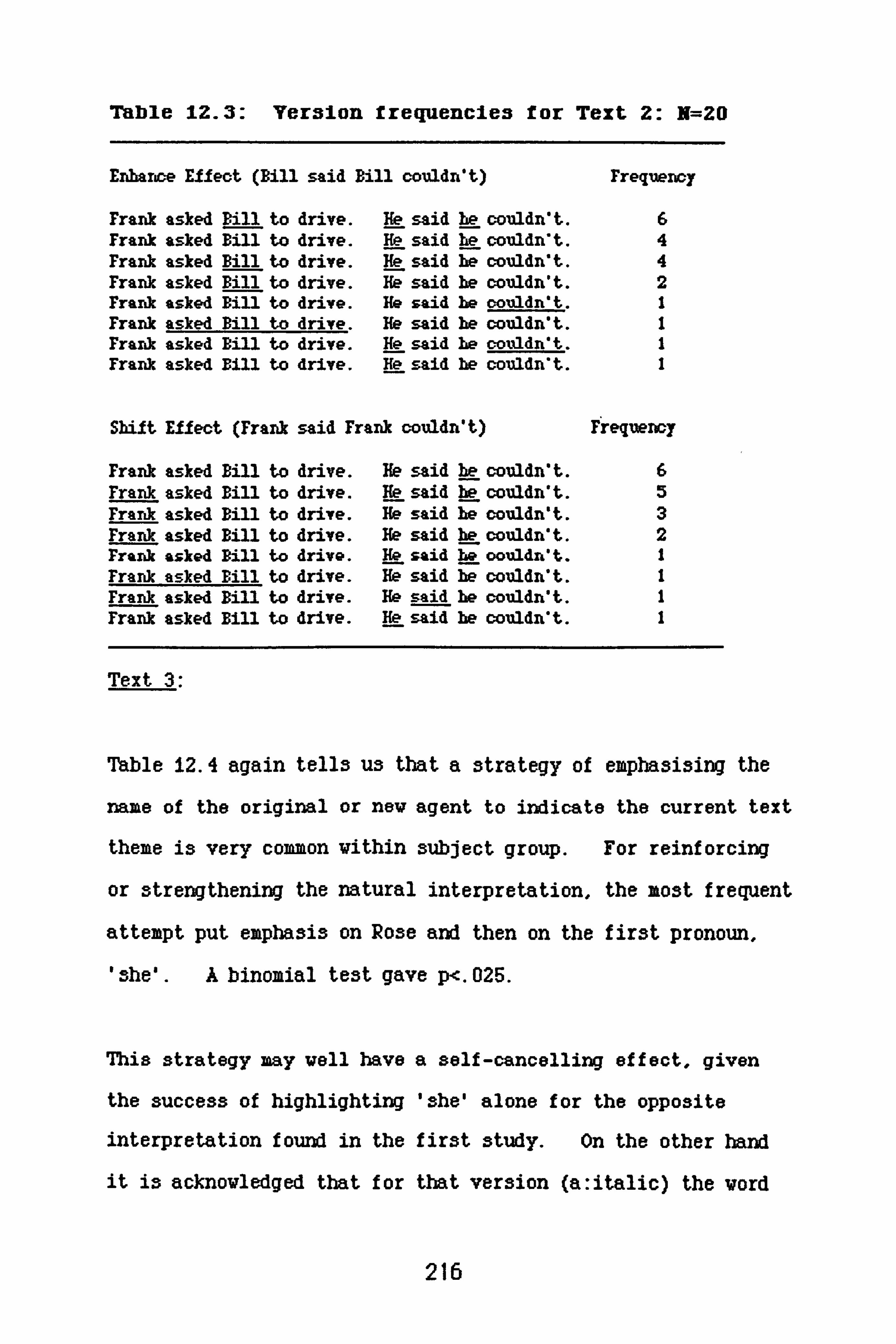
Table IZ. 3: Version frequencies for Text Z: N=20
Enhance Effect (Bill said Bill couldn't) rrequency
Frank asked Bill to drive. He said be couldn*t. 6 Frank asked Bill to drive. He said he couldn't. 4 Frank asked Bill to drive. He said he couldn't. 4 Frank asked Bill to drive. iý7said he couldn't. 2 Frank asked Bill to drive. He said he oouldn't. I Frank asked Bill to drive. He said he couldn't. I Frank asked Bill to drive. He said he couldn't. I Frank asked Bill to drive. He said he couldn*t. 1
Shift Effect (Frank said Frank couldn't) Frequency
Frank asked Bill to drive. He said be couldn't. 6 Frank asked Bill to drive. He said he couldn't. 5 Frank asked Bill to drive. He said i; couldn't. 3 Frank asked Bill to drive. He said be couldn't. 2 Frank asked pill to drive. He said i; oouldn't. I Frank asked Bill to drive. He said he couldn't. I Frank asked Bill to drive. He said he couldn't. I Frank asked Bill to drive. He said he couldn*t. 1
Text 3:
Table 12.4 again tells us that a strategy of emphasising the
name of the original or nev agent to indicate the current text
theme is very common vithin subject group. For reinforcing
or strengthening the natural interpretation, the most frequent
attempt put emphasis on Rose and then on the first pronoun,
'she'. A binomial test gave p<. 025.
This strategy may well have a self-cancelling effect, given
the success of highlighting 'she' alone for the opposite
interpretation found in the first study. On the other hand
it is acknowledged that for that version (a: italic) the vord
216
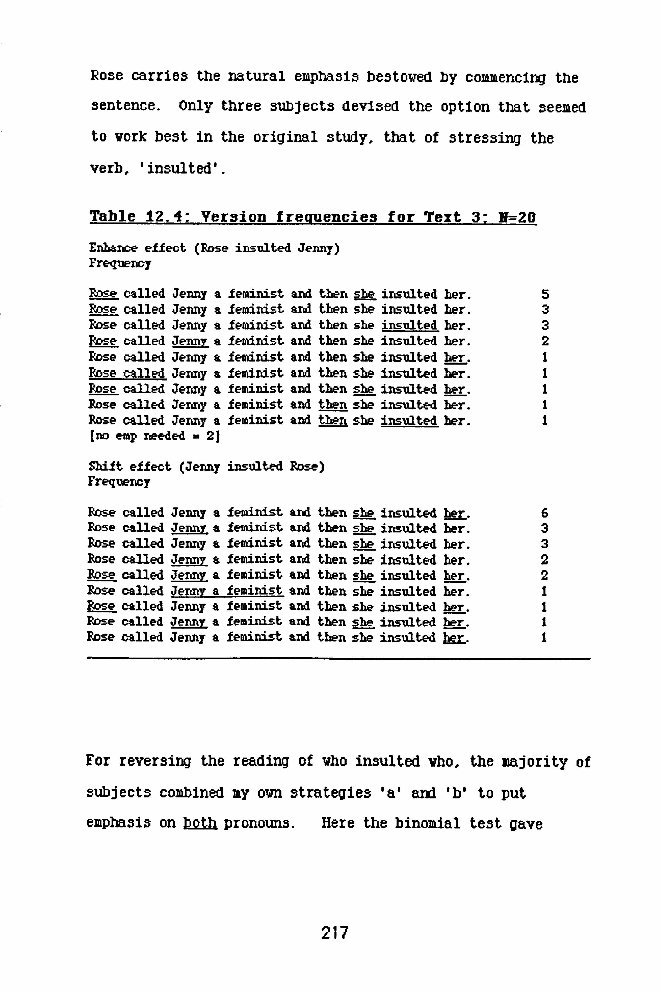
Rose carries the natural emphasis bestowed by commencing the
sentence. Only three subjects devised the option that seemed
to work best in the original study, that of stressing the
verb, 'insulted'.
Table 12.4: Version freauencies for Text 3: N=20
Enhance effect (Rose insulted Jenny) Frequency
Rose called Jenny a feminist and then she insulted her. 5 Rose called Jenny a feminist and then she insulted her. 3 Rose called Jenny a feminist and then she insulted her. 3 Rose called Jenny a feminist and then she insulted her. 2 Pzse called Jenny a feminist and then she insulted her. I Rose called Jenny a feminist and then she insulted her. I Rose called Jenny a feminist and then she insulted her. I Rose called Jenny a feminist and then she insulted her. I Rose called Jenny a feminist and then she insulted her. I [no emp needed - 21
Shift effect (Jenny insulted Rose) Frequency
Rose called Jenny a feminist and then she insulted her. 6 Rose called Jenny a feminist and then she insulted her. 3 Pbse, called Jenny a feminist and then she insulted her. 3 Rose called Jenny a feminist and then she insulted her. 2 Rose called Jenny a feminist and then she insulted her. 2 Rose called Jenny a feminist and then she insulted her. I Rose called Jenny a feminist and then she insulted her. I Rose called Jenny a feminist and then she insulted kr I Rose called Jenny a feminist and then she insulted her. I
For reversing the reading of who insulted vho, the majority of
subjects combined my ovn strategies 'a' and 'b' to put
emphasis on both pronouns. Here the binomial test gave
217

P<. 01. The 3trategy seem3 likely to vork, on a combination
of the grounds given for either emphasis in the introduction
to this chapter.
Subjects kept up their general strategy of emphasising more
than one vord in the text for both emphasis requirements;
also the same tendency to emphasis the noun vas apparent.
Rose vas eiapha3i3ed for the reinforcing version, and Jenny for
the version intended to shift the agent role from Rose to
Jenny halfvay through the text.
Text 4:
Table 12.5 confirms that. for these subjects, spreading
emphasis over the text, often to include the agent noun, is
favoured as a strategy for communicating a particular
interpretation over that of highlighting one key word.
'John' is often stressed for the reinforcing version, 'Tom'
for the versions designed to shift the interpretive trend.
Subjects adopted a similar line for strengthening the
interpretative bias as they did for Text 2. The first noun
and both pronouns are stressed. The frequency with which
this version occurred was greater than chance, using a
binomial test: p<. 05.
218

Table 12-5: Version frequencies for Text 4: N=20
Enbarice effect (John was glad John was tbere) Freq.
John met Susan, Tom and Josie in the pub. l; -- was glad he was there. 6 John met Susan, Tom and Josie in the pub. He was glad he was there. 3 John met Susan, Tom and Josie in the pub. He was glad he was there. 3 John met Susan, Tom and Josie in the pub. He was glad be was there. I John met Susan, Tom and Josie in the pub. He was glad E; was there. I John met Susan, Tom and Josie in the pub. He was glad he was there. I [no emphasis rieo. - 5]
Shift effect (John was glad Tom was there) Freq.
John met Susan, Tom and Josie in the pub. He was glad be was there. 6 John met Susan, Tom and Josie in the pub. He was glad he was there. 5 John met Susan, Tom ard Josie in the pub. He was glad he was there. 2 John met Swan, Tom and Josie in the pub He was glad he was there. 2 John met Susan, Tom and Josie in the pub. He was glad he was there. I John met Susan, Tom and Josie in the Pub. He was glad i; was there. I John met Susan, Tom and Josie in the pub. He was glad be was there. I John met Susan, Tom and Josie in the pub. ht was glad he was there. I John met Susan, Tom and Josie in the pub. He was glad be was there. I
Only one subject came up with the version that seemed most
successful for strengthening the interpretative bias in the
original study, stressing 'glad'. Note that despite an
apparent lack of strength for the bias as far as the results
for the interpretative task (Study i) were concerned, five
subjects here found that no emphasis was necessary to prime
the required interpretation.
The version which most successfully achieved a shift of theme
in the original study was the most frequently used here to
relate the second pronoun to 'Tom'. A binomial test gave
P<. 01. Otherwise, there was the usual tendency to empha3ise
219

more than one vord, and to include either 'John' or 'Tom' for
emphasis, according to the interpretation required.
Summry and further conclusions:
There was some correspondence between the versions created by
the subjects in this study to promote a desired interpretation
and those versions which achieved that same interpretation
from the subjects in Study 1. The most frequent 03hift"
versions of Texts 1,2 and 4 were identical with the versions
of those texts which worked best for that effect in Study i.
The one that differed, Text 3, in fact combined both of the
strategies tried for that effect, eaphasising both pronouns to
indicate that they should not receive their default
allocation:
4ab: Rose called Jenny a feminist and then she insulted her.
Only one of the menhanceu versions produced by 3ubjects
matched that presented most successfully in study 1:
ib: Simon said Fred did it. He did.
220

This is the only one of the high frequency versions created by
subjects in Study 2 that emphasise3 any vord but a noun or
pronoun. The dominant strategy was to eaphasise both.
Subjects emphasised the name of the person required to feature
as agent in the second sentence or clause of the text.
Generally the most popular strategy remained constant for all
the texts: keep pronominal emphasis constant, and vary the
nominal emphasis according to required interpretation.
It vas suggested at the conclusion of Study I that, given more
than one possible antecedent, pronominal emphasis signals a
shift in reference resolution from that given by the natural
reading of the unempha3i3ed text. Presenting the pronoun in
a different typeface, therefore, focus3es the ambiguity.
Emphasis on the antecedent, the noun itself, should operate at
a different level of contrast, reiterating an interpretation
that the character directly referred to by this noun
currently fills the 'agent' role, and therefore reinforcing
the perceived theme of the text, supporting the function of
that noun as antecedent for subsequent pronomal reference. *
*Frederikson found, in the context of syntax manipulation strategies for foregrounding text (1981, p. 383) that text variables which emphasise the importance of a particular noun phrase simultaneously serve to make that noun phrase more readily available as the referent for a pronoun.
221

The statistical significance reached by the number of
identical responses for the two required strategies on each
text suggests that those which do not correspond to those
tried by the original study must be tested. This applies for
the 'enhance' versions produced by subjects for texts 2.3 and
4, all of which depend on a combination of pronominal emphasis
with emphasis on the name of the character required to be
returned as agent. The one 'shift' version that did not match
Study i, that for Text 3, will also be tested.
Because of the predominance of nominal emphasis across both
'shift' and 'enhance' versions for all the texts, it was
decided that a further series of tests would be run, some
presenting two versions of each text between subjects with
emphasis on either the default or alternate name, others using
text versions which combined the most successful emphasis
strategies from Study I with emphasis on the required noun for
each interpetation.
Before reporting on the studies run to test the effects of
these different emphasis strategies. hovever, it is necessary
to look at subjects' responses to Task 3 of the que3tionnaire.
Decisions on vhich typeface should to be used for vhich vord3
in the 'compound emphasis' versions tested next (Study 3) vere
222

taken on the ]basis of Task 3 responses, as vell as the more
general findings of typeface distinctions discussed in the
swamary to Study i.
Th sk 3:
This task (see Figure 12.1) required subjects to go back over
their responses to the earlier sections of the questionnaire
and decide whether the word they had selected for emphasis
should be printed in capital or Italic print.
The general finding for the practice task (Task 1) was that
italic print was more often selected regardless of the
required interpretation or the type of word stressed. Of the
cases where an emphasis type was indicated by subjects for the
stressed word in a sentence, 28X gave capital letters as
appropriate and 72X gave italics. Note that the main
function of highlighting a word in these four texts is always
to contrast that word with an implied alternative, rather
than to give some particular, or more qualitative, meaning to
the word in its own right.
For Task 2, the real 133ue of the que3tionnaire, more
3y3tematic distinction3 of typeface 3election vere found, in
terw of the kind of vord 3tre33ed and, by implication, the
function of the empha3is for that particular vord. Italic
print vas more popular than capital letter3 throughout, 699 of
223
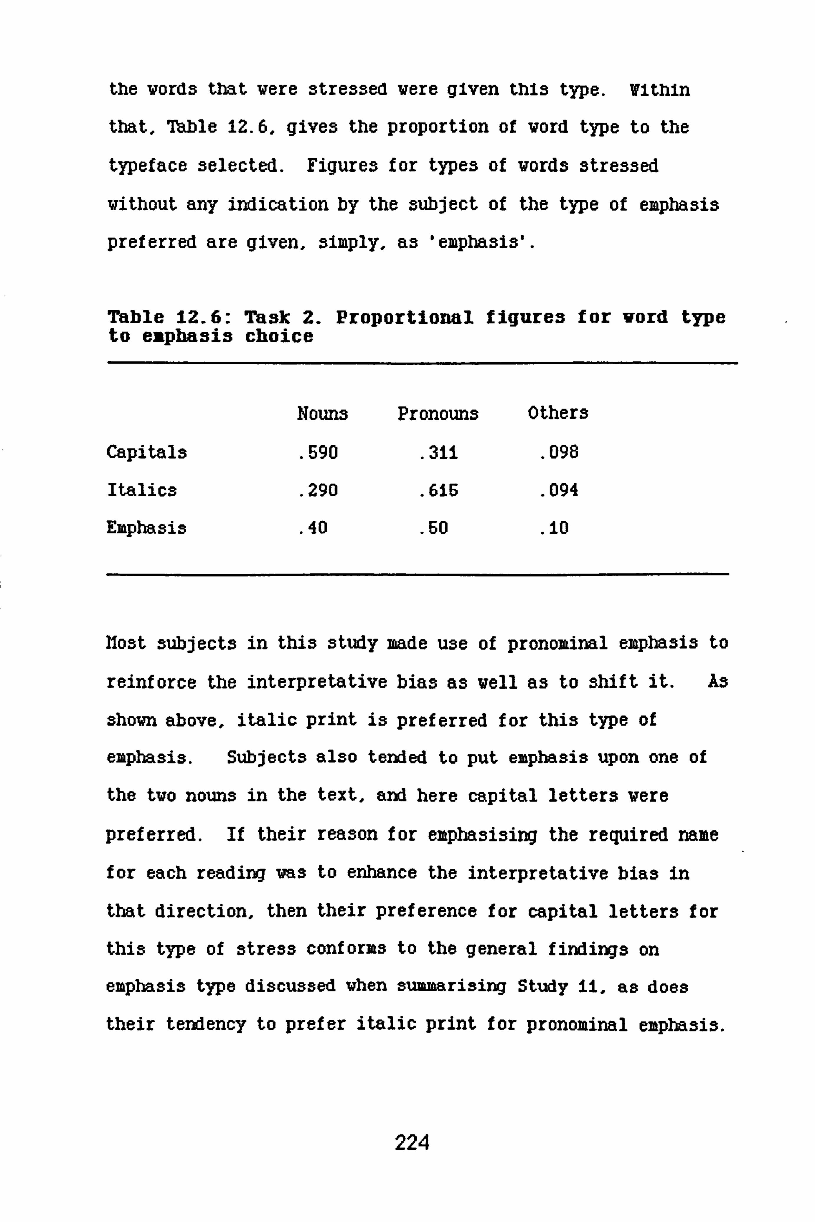
the words that were stressed were given this type. Within
that, 7hble 12.6, gives the proportion of word type to the
typeface selected. Figures for types of words stressed
without any indication by the subject of the type of emphasis
preferred are given, simply, as 'emphasis'.
Table 12.6: Task 2. Proportional figures for vord type to emphasis choice
Nouns Pronouns Others
Capitals . 590
. 311 . 098
Italics . 290 . 616 . 094
Emphasis . 40 . 60 io
host subjects in this study made use of pronominal emphasis to
reinforce the interpretative bias as vell as to shift it. As
shovn above, italic print is preferred for this type of
emphasis. Subjects also tended to put emphasis upon one of
the tvo nouns in the text, and here capital letters vere
preferred. If their reason for emphasising the required name
for each reading was to enhance the interpretative bias in
that direction, then their preference for capital letters for
this type of stress conforms to the general findings on
emphasis type discussed vhen summarising Study 11, as does
their tendency to prefer italic print for pronominal emphasis.
224

Subjects shared a general opinion of the different functions
of the two typeface changes available to them for expha3ising
the texts. Their tendency to prefer capital letters for
nouns, and italic print for pronouns (which have no intrinsic
content to emphasi3e), makes sense in terms of the general
descriptions many subjects gave of the difference between
these two emphasis types in the Questionnaire given to
subjects as one of the set of first studies described in
Chapter 3.
As indicated earlier, the intention is to acquire any possible
information about individual differences of meaning or
connotation between the two emphasis types studied throughout
this project as a side effect of studying more general effects
of emphasis in written communication. This is why the two
typefaces were used in parallel throughout the studies,
selected particularly because of their contrast in form and
their familiarity to readers in a variety of contexts.
Chapter 9 is devoted to a discussion of the different threads
of information gathered from the findings of the various
studies undertaken by this project, so far as these relate to
a general semantics for individual typeface emphasis. For
the purposes of this particular series of studies, the
implication of the responses to Task 3 is that pronominal
emphasis should take italic print, and nominal emphasis should
take capital letters. The design of the different text
225

versions vhich require to be tested on the basis of the
results of Study 12 itself take this into account.
Overall sunxary:
Study ii found single prominal emphasis to be a good strategy
for promoting interpretive shift from the thematic subject as
pronominal referent within the texts presented to subjects,
increasing their ambiguity. Fmpha3i3 on a verb or verbal
predicate, which reinforced an agent role for the default
reading in each text reduced ambiguity, increasing the
frequency of those readings for the texts. There was some
indication that italic print worked best for pronominal
emphasis (shift strategy), and capital letters for the verbal
emphasis (enhance strategy).
For shifting the reading of text theme, the strategies most
frequently suggested by Study 12's subjects concurred almost
exactly vith those successfully used in Study 11. For
enhancing the default interpretation, hovever, the strategies
differed.
The findings regarding the alternative typefaces, capital and
italic print, seem to relate across the tvo studies in terxs
of Uhich vorked best for the required function in Study 11,
and vhich was chosen for vhich vord-type in Study 12.
21-6

The next chapter describes the studies undertaken to test out
the most frequently suggested strategies from Study 12, where
these differed from those tested and found successful in Study
11, and reports on further information gathered on emphasis
type distinctions.
227

CHAPTER 8: Testincr strategies for reinforcina or
shiftina prongioninal reference
This chapter will describe the results or testing different
versions of the original four texts from Study 11. The
versions were produced on the basis of findings from that
study and from Study 12. The first set, Study 13. a, simply
tested those versions most frequently produced by subjects
which did not correspond to the most successful version for
the predicted interpretation in the earlier study. Mie second
set, Study 13. b, looked for any effects of empha3i3ing the
name of the required agent for each of the two readings of the
text. Study 13. c combined two strategies: emphasis on the
recruired agent name with the best strategies used in Study Ii
for enhancing or for shifting the default interpretation of
each text. Study 13. d looks only at the shift effect and
compares the results of a strategy of combining the default
name with pronominal emphasis against the alternate name plus
pronominal emphasis tried for that effect in Study 11.
228

study Im a:
Introduction and method:
The most frequently produced versions for promoting the major
and the minor interpretations of each text by subjects in
Study 12, Vhich vere not identical to those Vhich achieved
this in Study ii, vere tested to establish their
effectiveness.
Using exactly the same procedures as vere folloved for Study
11,20 subjects (first-year undergraduate students) received
the three folloving texts. The versions given most
successfully in the original study are given belov each text,
in smaller print, as a reminder.
Text 2: Frank asked BILL to drive. He said he couldn't. Frank aslutd Bill to drive. He said he couldn't.
Text 3: ROSE called Jenny a feminist and then sbe Insulted her. Rose called Jenny a feminist and then sbe INSULTED ber.
Text 4: JOHN met Swan, Tom and Josie in the pub. He vas glad be vas there. John met Susan, Tom and Josie in the pub. He was GLAD be was there.
Mixed typeface, using capital letters for nominal emphasis and
italic print for pronominal emphasis, vas provided for the
229

different text versions, fitting the general preferences
indicated by the subjects from the third task of Study 12.
All the above versions vere intended to promote the default
interpretation of the text. A second set of 20 subjects from
the same population received a fourth text, the shift version
of Text 3 most frequently produced by subjects in Study 12.
This was to prevent the possibility that finding Wo versions
of one text may prime the subject to produce opposing
interpretations.
Text 3a: Rose called Jenny a feminist and then sbe insulted b-pr. Rose called Jenny a feminist and then sA-- insulted her.
This text was the only one of the 'shift' versions which did
not coincide with the best strategy for that effect in Study
11, but in fact was a combination of the two attempted there.
Subjects received this text with its question as one of the
tasks in a pilot for another study.
Results and discussion:
Tables IM-13.3 show response frequencies for the versions
tested here, in comparison with the plain text responses.
The tables are commented on separately before suminarising the
results.
230

Text 2:
Me version most subjects thought should suggest the default
interpretation va3 not so successful as the version given to
subjects in Study ii. There va3 no significant change in
response direction from that shown for the 'plain' version in
Study il (X2=2.7ii, df=i). Although the responses for the
Table 13.1: Text 2. Frank asked BILL to drive. He said he couldn't. N=20
Version Frank: Frank Bill: Bill Other
Plain 5 11 4
Enhance 1 13 6
alternate, minor interpretation decreased, the movement vas to
the 'other' category ('Frank said Bill couldn't'. or 'Bill
said Frank couldn't) rather than the default interpretation,
as for Study Ii. This particular version increased the
expressed ambiguity of the text, rather than reducing it;
possibly the emphasis on both pronouns provided conflicting
signals.
Text 3:
Dealing vith the 'enhance' versions first, again the intended
interpretation vas less frequently given by subjects here.
231
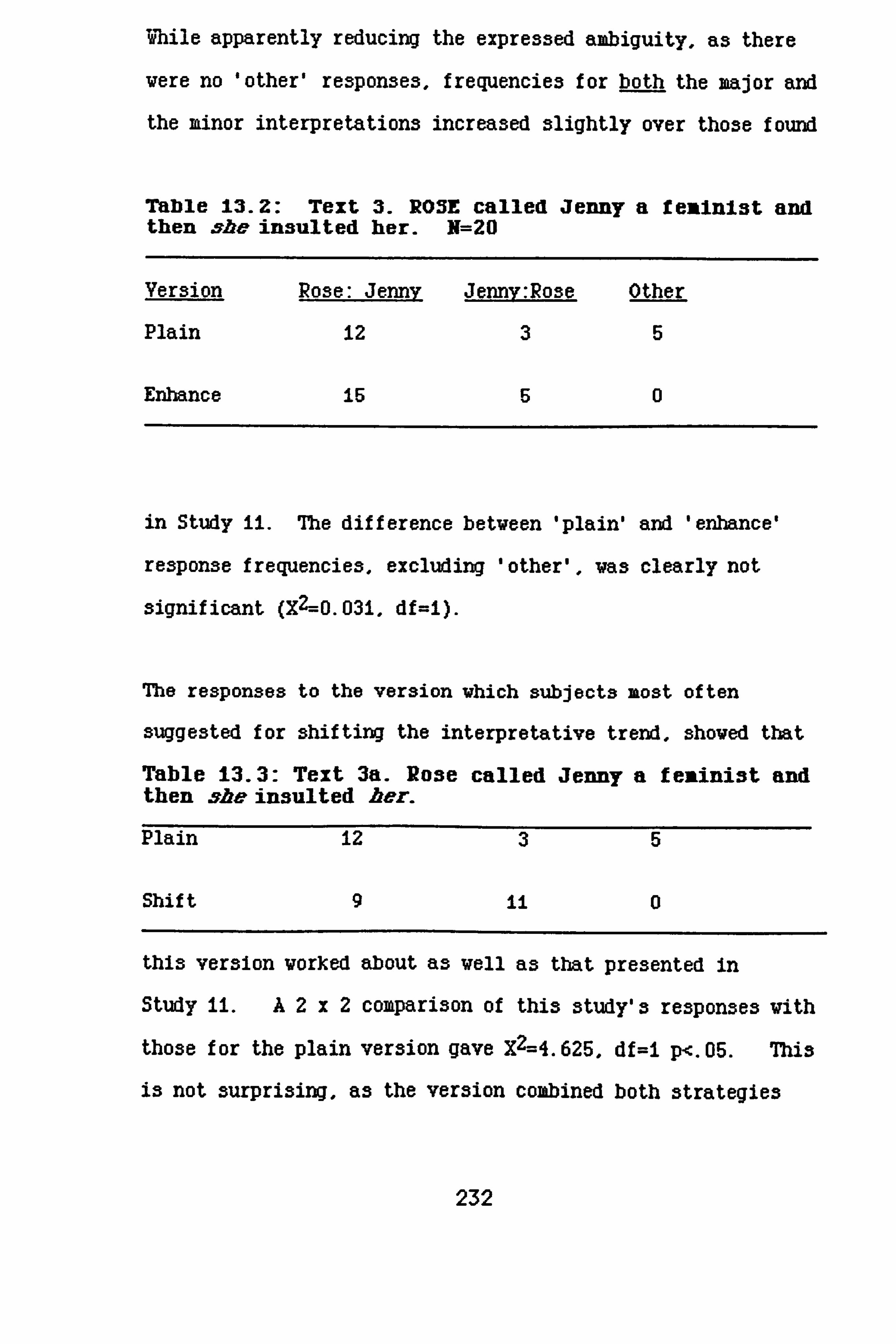
Mile apparently reducing the expressed ambiguity, as there
were no 'other' respon3es, frequencie3 for both the major and
the minor interpretations increased slightly over those found
Table 13.2: Text 3. ROSE called Jenny a femInIst and then sb-- insulted her. N=20
Version Rose: Jenny Jemv: Rose Other
Plain 12 35
Enhance 15 50
in Study ii. The difference betveen 'plain' and 'enhance'
response frequencies, excluding 'other', vas clearly not
significant (X2--0.031, df=I).
The responses to the version vhich subjects most often
suggested for shifting the interpretative trend, shoved that
Table 13.3: Text 3a. Rose called Jenny a feninist and then she insulted ber.
Plain 12 35
Shif t90
this version worked about as well as that presented in
Study ii. A2x2 comparison of this study's responses vith
those for the plain version gave X2=4.625, df=I p<. 05. This
is not surprising, as the version combined both strategies
232

from Study il which sought the shift effect, and Table 11.3
shows that although it was the emphasis on the first pronoun,
... and then . 5ýbe insulted her" that drew a significant
increa3e in reponse3 to the alternative interpretation, the
'b' ver3ion3 of that text did move re3pon3e3 in the required
direction.
Text 4:
Table 13.4 shows that there was no marked change in the
response differences from that obtained from subjects
receiving the 'plain' text version in Study 11 (X2=0.198,
df=i). There is a similar situation here to that for Text 2.
in that both pronouns take the same antecedent, and that the
Table 13.4: Text 4. John met Susan, Ton and Josie in the pub. He vas glad he vas there- N=20
Version John: John John: Toia Other
Plain 947
Enhance 13 43
version tested here emphasises the default noun and both
pronouns, providing signals which may conflict rather than
cooperate. The overall effect, however, was in the required
direction, which was not the case for this version of Text 2.
233

7hi3 exerci3e found that, although there va3 a 3light
enhancement in the right direction from the plain ver3ion
re3ponses, the combined 3trategy of nominal and pronominal
empha3i3 did not work very well for reinforcing the default
reading of the text.
It is possible that the nominal emphasis acts vith the
pronominal emphasis in a vay that can change the interpretive
function that either emphasis may have singly.
The enhance version produced most frequently by subjects for
Text 3 used precisely the pronominal emphasis vhich
successfully shifted the interpretative bias of subjects in
Study 11. In combination vith emphasis on 'Rose', the agent
for the second event under the default reading of the text,
stressing 'she' does not have a shift effect. Nor does it
enhance the default interpretation.
For Texts 2 and 4, subjects emphasised both pronouns and the
default agent noun, vhen intending an enhance effect. The
most successful strategy for shifting the reading of each text
in Stuay I had emphasised only the second pronoun. In
neither case, for Study 11 subjects, did the strategy of
234

empha3i3ing the fir3t pronoun in the text (the 'a' ver3ion3,
see Tables 11.2 and 11.4) work very well for shifting the
natural reading.
Assuming subjects to have been familiar with the syntactic
regularities of the English language we might expect a
tendency to map the first pronoun of a sentence or clause to
the first person named in the preceeding text section.
However, this can obviously be overridden when the semantic
structure of the text conflicts. The default readings of
these texts differed with respect to the allocation of
pronominal reference, because of their difference in semantic
structure. For text 2, "Frank asked Bill to drive. He said
he couldn'tm, both pronouns went to Bill, the second person
named in the text. 'Couldn't' refers to 'drive'. not 'asked'.
For text i they vent to the first, John. "John met Susan, Tom
and Jo3ie in the pub. He was glad he was there. * For all
subjects but one in this study, the agent of the second
action, denoted by 'He' at the start of the sentence
describing that action, was the subject and agent in the first
sentence, 'John'. The default reading of the text allocates
the second pronoun to the same referent.
Allocation of an unempha3i3ed pronoun in terms of the default
reading of a text, it coherent within that ongoing reading,
should reinforce it. Emphasis on a second pronoun, then, may
235

be a more powerful signal for shifting the interpretation as,
effectively, it should contrast more sharply the stronger the
ongoing interpretation, or the longer it has been current.
On the other hand, obviously an accumulation of evidence
toward one reading might override a contradictory sign
encountered in the text, or ignore it altogether. Vith the
short, fairly simple texts used here, however, I would expect
the former possibility to be more likely.
At a simple level, it could be predicted that emphasis upon
one pronoun should signal a shift from the default
interpretation running to that point of the text, and that
emphasis on a second pronoun (given that the same antecedent
is shared by both) may signal a shift in the other direction,
back to the default.
On this basis, emphasis on both pronouns in the texts
discussed should provide contradictory signals, except in the
case of the shift version of text 3, Vhere each pronoun must
relate to a different actor and where. for the alternative
reading, both actors must change places.
Hovever, experience vith the effects of typeface emphasis
gained as this research progressed suggests that things are
unlikely to be as 3traightforvard as this - particularly in
the case of the text versions just tested, vhere the default
236

noun is also emphasised. For example, the veaker enhance
effect for Text 2, where the default name and both pronouns
are emphasi3ed, might carry 'BILL' to the first italici3ed
'He ', then shift to 'Frank' - to shift back to 'BILL' again
on the second 'be '. This could be described as a cooperative
effect, but common3en3e suggests it to be rather clumsy as a
communication strategy. Readers do not expect writers to be
clum3yl Or. the emphasis on both pronouns may imply that a
different antecedent should attach to each. Given the default
reading required from the version, this vould be a contllctlng
effect.
On the other hand, the emphasis on the first pronoun could
have a different function than that attributed in the
discussions so far. It will be remembered that Text 4
maIntalned the character 'John' as subject for the second
sentence and antecedent for the first pronoun, even though the
second pronoun shifts with emphasis manipulation. Italic
print is often used for providing secondary salience to words
in a text (see discussions of subject explanations for the
various ranking tasks in Chapters 4 and 5). This function is
nearer to modulatory emphasis than to contrast, so that 'Me
could echo the emphasis on 'JOHN'.
In Study ii, 3ubjects' 3trategy for noun empha3is va3 to
emphasise the default name for the default interpretation, and
237
the alternate name when the reading vas required to 3hift.
Combimtory empha3is el3evhere in the text va3, mo3t
popularly, standard for both versions.
On the basis of Study 13a'3 findings, it seems possible that
nominal emphasis might have a cooperative or conflicting
effect upon a required interpretation, when combined with
other typeface emphasis within a text. If, as subjects in
Study 12 seemed to believe, empha3ising one or other name
makes that character the likely agent, then the enhance
strategy from Study 11 should act with the name, cooperating
for an additive effect. But the shift strategy, acting
through the pronoun by focussing the ambiguity (which the
findings from Study 11 suggest that it does) should conflict
with the signal from the capitalisation of the alternate noun.
Effectively, It emphasis on the alternate noun biases the
reading of the text tovard the alternate interpretation, and
pronominal emphasis varn3 against folloving that bias, then
combining the strategies, Uhich vas the tactic most often
proposed by Study i2's subjects, ought to have had a
contradictory, or at least a conflicting, effect.
Basically it is difficult, without further enquiry, to
I speculate vhat interactive effects, cooperative or
conflicting, the combined empha3i3 strategie3 may have. The
238

next set of studies in this series, therefore, tests various
versions of the texts, using emphasis strategies vhich are
based on the information gained so far, from the tvo studies
in Chapter 7 and the one just reported.
The results of the tolloving tests, w1th the most successful
from Study It, vill then be compared against plain text
versions in an attempt to establish the best strategies for
enhancing or shifting default text readings, and to see
vhether these generalise across the texts.
Study 13. b
Introduction and xethod:
Tests vere made of the effects of nominal emphasis alone upon
the ambiguity level of the texts, to see vhether this altered
according to vhich name in the text received emphasis.
Conforming to findings from Study 12 - and for the sake of
consistency throughout the series - the emphasis type for this
study vas capital print.
239

40 first year undergraduate students took part in the study as
subjects, under exactly the same procedure as was followed for
the earlier studies. Each subject received one version of
each of the four text, two with emphasis on the default noun,
and two with emphasis on the alternative. The order of text
presentation was randomised across subjects.
Re3ults and di3cw3ion:
For simplicity, all results are tabled together as Table D. 5,
vith the emphasis conditions themselves given as rov labels.
The figures 3hov quite clearly and rather surprisingly that
emphasis on either noun has the same, or a very similar,
effect on responses to the text questions.
For Text 1, there is an enhancement ef f ect f rox both versions.
Ambiguity decreases strongly in favour of the default reading
in each case, bringing all responses to that interpretation
then 'Fred' is emphasi3ed.
ror Text 2, the frequencies for the default response remain
almost constant, with the alternate frequencies moving to the
'other' column. The function of emphasis on the noun here
(regardless of which noun is stressed) seems less to decrease
or increase ambiguity than to actually confuse the readings of
the text.
Vith Text 3, the default responses do not change, but those
240

Table 13-5: All texts. Response frequencies to nozinal emphasis coapared vith plain versions.
Text 1: Simon said Fred did it.
Simon Fred
Plain 5 14
'FRED' 0 20
'SIIION' 2 18
Text 3: Frank asked Bill to drive
Frank: Frank Bill: Bill
Plain 5 11
'BILL' 0 12
IFPMR 2 12
He did.
Other
i
0
0
He said he couldn't.
Other
4
8
6
Text 3: Ro3e called Jenny a feialnl3t and then 3he in3ulted her.
Rose: Jemv Jemv: Rose Other
Plain 12 35
'ROSE' 12 80
8 JEMTY 11 81
Text 4: John met Susan, Tom andýJosie in the pub. He vas glad he was there.
John: John John: Tom Other
Plain 947
JOH14 479
rMII 1479
241

for the alternate reading increase slightly, reducing 'other'
frequencie3 and thereby increa3ing the ambiguity level of the
text.
The responses to either noun being prominent in Text I are
identical. The result in each case reduced the default bias,
increasing frequencies for alternative and 'other' responses.
Of course, the above findings do not ju3tif y an. assumption
that this duplication of effect obtains vhen nominal emphasis
Is combined vith other typeface changes In the text. Also,
the point made in the context of Study 11 still holds true:
subjects here are unlikely to have been responding immediately
to the texts. The question posed is very likely to have
redirected their attention to the text again, to seek the
an3ver.
Given this likelihood, I found it surprising that the only
regularity found was within texts, implying that it makes no
difference which noun is emphasised, prominence of either name
works in the same way upon the reading of each text. For
Texts 2 and 3 the frequencies for the default reading are very
close, under both conditions of nominal emphasis,
and differ very little from responses to the plain versions of
the text. There is an effect with both Texts I and 4: again
default reading frequencies are very close within each text
242
regardless of vhich name is prominent, but the effect vorks in
opposite directions betveen the tvo texts.
Whil3t it seemed necessary to address the question of the
possible effects of nominal emphasis upon the reading of a
text, particularly in viev of the frequent use of this
strategy by subjects in Study 2, it is hard to establish any
clear and general finding from the study under discussion.
Studv 13- c
Introduction and method:
The versions tested here combine the dominant strategy put
forward by subjects in Study 12, that of emphasising the name
of the character intended to be interpreted as agent, with the
emphasis used in the most successful version for the required
reading of the text In Study 11. Pronominal emphasis was
made by italic print, nominal emphasis by capital letters;
the words emphasised for the 'enhance' versions retained the
typeface used originally in Study 11.
243
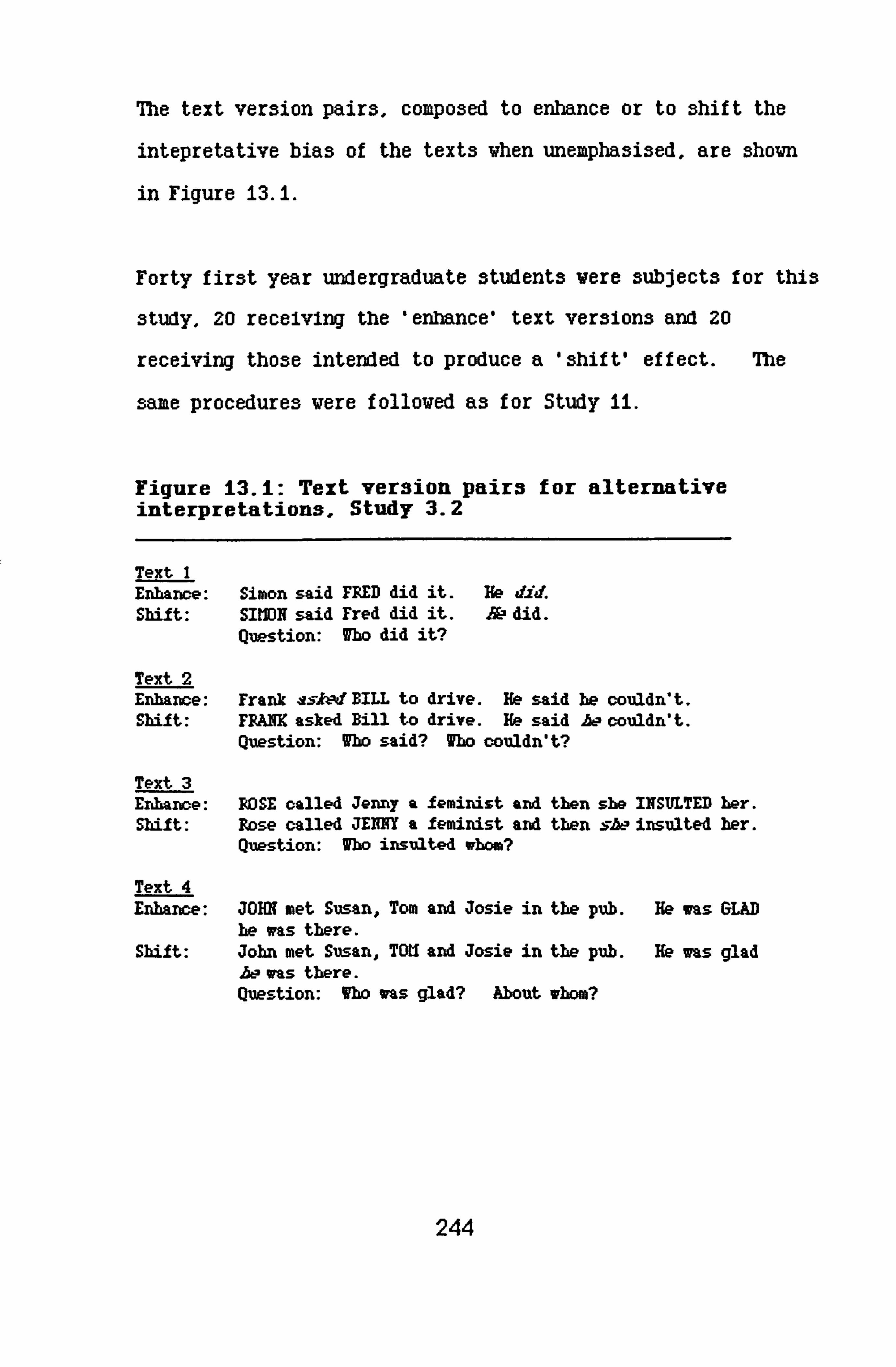
The text version pairs, composed to enhance or to shift the
intepretative bias of the texts when unemphasised, are shown
in Figure 13.1.
Forty first year undergraduate students were subjects for this
study, 20 recelving the 'enhance' text versions and 20
receiving those intended to produce a 'shift' effect. The
same procedures were followed as for Study 11.
Figure 13.1: Text version pairs for alternative interpretations, Study 3.2
Text 1 Enhame: Simon said FRED did it. He did. Shift: SIMN said Fred did it. &0 did.
Question: Who did it?
Text 2 Enhance: Frank ssl: MBILL to drive. He said he couldn't. Shift: FFAM asked Bill to drive. He said AL2 couldn't.
Question: Who said? Who couldn't?
Text 3 Enhance: ROSE called Jenny a feminist and then she INSULTED her. Shift: Rose called JENNY a feminist and then s&- insulted her.
Question: Who insulted whom?
Text 4 Enhance: JOHN met Susan, Tom and Josie in the pub. He was GLAD
be ims there. Shift: John met Susan, TOU and Josie in the pub. He was glad
A-- was there. Question: Who was glad? About whom?
244

Re3ult3 and discu33ion:
Tables 13.6 to 13.9 show frequencies for the two versions
tested by this study, in comparison with the response
frequencies for the plain unempha3ised versions of the texts.
Table 13.6: Text 1. Simon said Fred did It. He did-
Version Simon Fred Other
Plain 5 14
Enhance 2V (FREDidia)
shir t
With Text i, highlighting 'Fred' by capital letters and
italicising 'did' did not increase the default interpretative
bias beyond that obtained by the verbal emphasis alone in
Study ii. The overall effect va3 in the right direction,
hovever.
On the other hand, the effect of pronominal emphasis in
combination with capital letters on the alternate noun,
'Simon'. destroyed the shift effect obtained by simply
stressing the pronoun. This supports the notion discussed
245

following Study 13. a, as the effect of nominal emphasis alone
on either name was to increase the frequency of default
readings. A chi square test of the values in Table 13.6
against plain and excluding 'other', gave X2--2.219, (df=2),
suggesting that neither of the combinatory emphasis strategies
worked well in this text.
Table 13.7: Text 2. Frank asked Bill to drive. He said
he couldn't.
Version Frank: Frank
Plain 5
Enhance 0 (ss, &dIBILL)
Shif t 12 (rpm/he)
Bill: Bill Other
11
17
53
As Table 13.7 shows, with Text 2 both combined strategies were
successful, working similarly to the versions without nominal
emphasis used for Study ii. On this study's findings,
against the plain text version (excluding other), X2--18.977
df=2 p<. 0005, with a 2x2 on Plain/Enhance giving X2=6.262 df=I
p<. 025 and, on Plain/Shift, X2--5.105, df=I p<. 025. With this
particular text, this is perhaps not surprising because of the
semantic structure of the text, discussed in the summary to
2`4 6

Study 13. a. The two stresses in the text work separately,
within their sentences. Pronominal emphasis in the second
sentence should indicate 'not Bill', whichever name is given
prominence in the first sentence, it the findings from Study
13. b can be related to predicting the effects of combined
3trategies.
Table 13.8: Text 3. Rose called Jenny a fexinist and then she insulted her.
Version Rose: Jenny Jennv: Rose Other
Plain 12 35
Enhance 20 00 (RDSE /INSULTED)
Shif t 12 (TDtIIA--)
Vith Text 3, both the enhance and the shift strategies vorked
better than those used in Study Ii. The default reading vas
significantly enhanced by printing both the name of the
default agent and the second action in capital letters
(X? --13.636, df=I, p<. 0005). This va3 not the case Vhen only
the verb va3 stressed.
Hovever, it should be noted that this text, under the natural
reading vithout emphasis, already has a strong bias tovard
the default interpretation. There is not much room for
enhancement, and the frequencies here are not strikingly
247
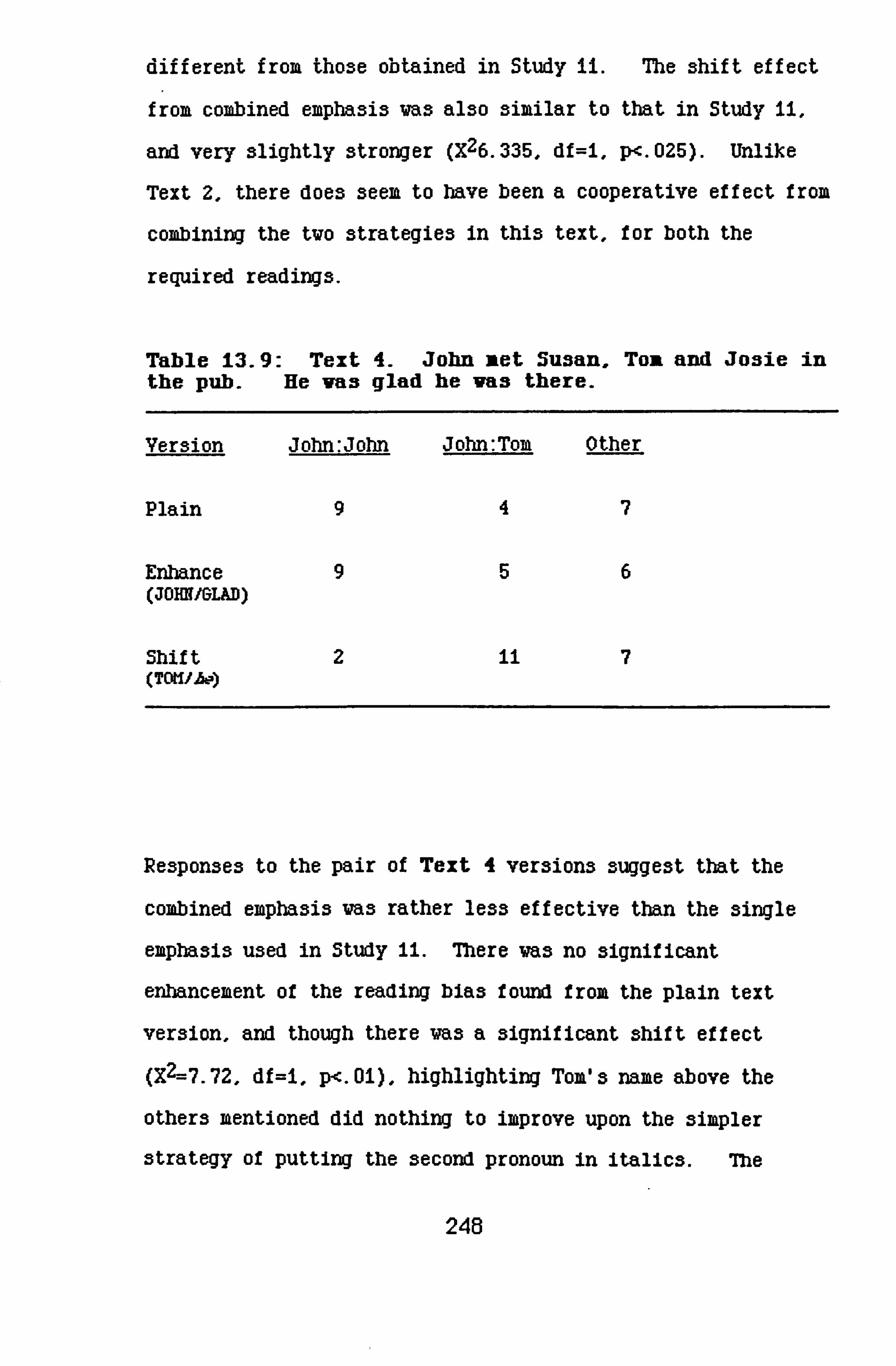
different from tho3e obtained in Study li. The 3hift effect
from, combined emphasis was also similar to that in Study 11,
and very slightly stronger (X26.335, df=I, p-c. 025). Unlike
Text 2, there does seem to have been a cooperative effect from
combining the two strategies in this text, for both the
required readings.
Table 13.9: Text 4- John met Susan, TojL and Josie in the pub. He vas glad he vas there.
Version John: John John: Tom Other
Plain 94
Erlmnce (JOHN/GLAD)
Shif t (TOUIA-)
Re3ponse3 to the pair of Text 4 ver3ion3 3ugge3t that the
combined empha3i3 va3 rather les3 effective than the 3ingle
emphasis used in Study ii. There va3 no significant
enhancement of the reading bias found from the plain text
version, and though there was a significant shift effect
(X2--7.72, df=i, p<. 01), highlighting Tom's name above the
others mentioned did nothing to improve upon the simpler
strategy of putting the second pronoun in italics. The
248

effect of capitalization for either noun in combination vith
Study ii strategies remains negligible, as it was vhen used
3ingly in Study 13. b.
Summary:
The enhance versions took the strategy that vorked best for
that effect from Study Ii, plus emphasis on the default noun,
as suggested from the findings from Study 12. This combined
strategy generally vorked as vell as the single emphasis
strategy used in Study 11, and sometimes better.
7be shift versions, following the response trend in Study 12,
gave nominal emphasis to the alternate name, and combined
this with the pronominal emphasis strategy that had proved
successful in Study 11.
Aside from individual points made above for each text, the
general effect of the combined strategy for enhancing the
default interpretation of the text worked to much the same
degree as the single emphasis strategies used in Study It.
The shift strategy using combined emphasis with the alternate
noun capitalised also worked well enough - except In the case
of Text 1. Given the findings from Study 13. b, that emphasis
on either name produces the same interpretative effect with a
text, the suggestion made at the close of Study 13. a'3 report
249

regarding the possible interactive effects of highlighting the
default noun and stressing the pronoun may well not hold good.
Nevertheless, for the sake of completeness, and because Study
13. b'3 findings could not provide any evidence of potential
combinatory effects, the test was made. The results of this
will be reported here, before drawing any conclusions on
single or combined emphasis effects within the texts in
question.
Studv 13. d
Introductlon and method:
The following report briefly de3cribe3 the interpretative
effect3 of a 3hift 3trategy which maintain3 ezpha3i3 on the
default noun, while emphasi3ing the pronoun for which it i3
antecedent under the natural reading of the plain text. The
nominal empha3is, therefore, was that pre3ented a3 part of the
combined enhance 3trategy in the previou3 3tudy, with
pronominal esphasi3 a3 u3ed in that 3tudy and Study ii, for
the 3hif t ef f ect.
Again, the procedure follovs that u3ed for the other te3t3 in
thi3 3eries, u3ing a further 20 fir3t year undergraduate
students as subjects.
250

Results and Discussion:
The results for each text are tabled belov (Tables 13.10 to
13.13). The shift strategy used in this study vorked rather
differently vithin each text. It vas the best for promoting
the alternate interpretation In Text JL, though not to a level
of statistical significance: X2-1.509, (df=l). It was the
worst for that ef f ect among the Text 2 versions tested,
gaining twice the number of 'other' responses without
increasing the frequency of alternate readings.
For the Text 3 and 4 the frequencies differed very little
from those for the versions emphasising the alternate name In
combination with the pronoun that were tested by Study Mc.
For Text 3 the difference was positive, for Text 4, negative.
It should be noted that the version for Text 3 had already
been tested on a different group of subjects in Study 13. a as
an enhance version produced by subjects in Study 12 and tested
again by the current study as a double check. Me results
for the duplicated test were very similar.
251

Table 13.10: Shift effects in Text 1. Simon said Fred did it. He did.
Version Simon Fred Other (alt. ) (def. )
Plain 5 14 1
FRED+He 90
Table 13-11: Shift effects in Text 2. Frank asked Bill to drive. He said he couldn't.
Version Frank: Fran Bill: Bill Other (alt. ) (def. )
Plain 5A4
BILL+JYe 5
Table 13.12: Shift effects in Text 3. Rose called Jenny a feminist and then she insulted her.
Version Jemv: Rose Rose: Jemy (alt. )
Plain 3 12
ROSE+sbe 14 6
Other (def.
5
0
252

Table 8.13: Shift effects in Text 4. John net Susan, Ton and Josie in the pub. He vas glad he was there.
Version John: Tom John: John Other (alt. ) (def. )
Plain 497
JOHN+b, e io 3
Suimary:
Even in the case of Texts i and 2, the change in alternate
reading frequencies betveen shift versions tried in Studies
Mc and 13. d does not differ much from that betveen plain and
Study ii versions; there is little evidence in favour of
stressing either noun to strengthen the shift effected by
pronominal emphas3.
It seems that highlighting one or other character in any text
does not strongly affect theme maintenance or shift. The
function may have been more one of mood than of contrast - that is, the emphasis may have been interpreted in terms of
the characters, but not their role3.
The discu33ion which conclude3 thi3 chapter will take the
above point further. In conclusion of this study's report,
253
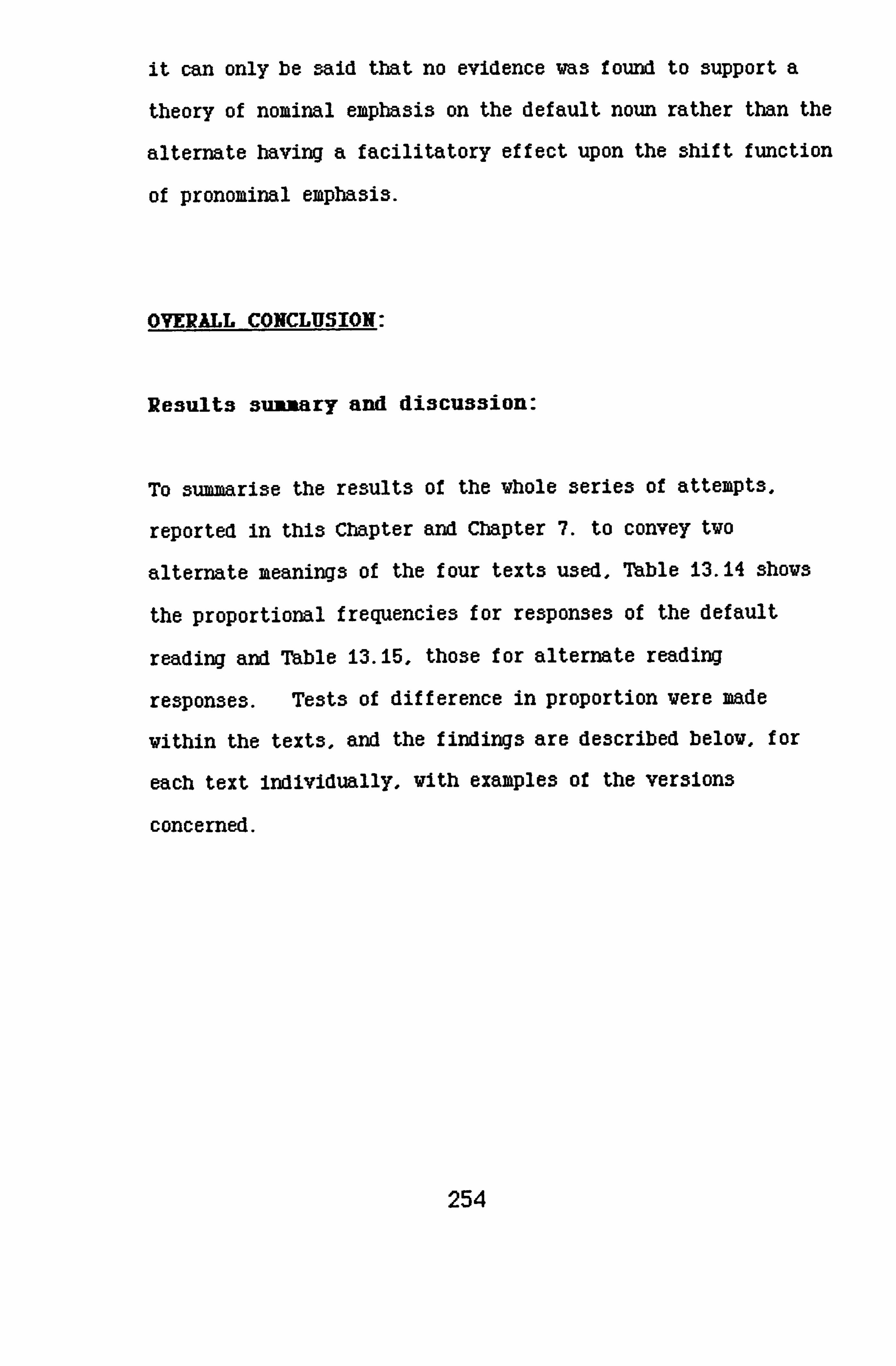
it can only be said that no evidence was found to support a
theory of nominal emphasis on the default noun rather than the
alternate having a facilitatory effect upon the shift function
of pronominal emphasis.
OVERALL CONCLUSION:
Results sumary and discussion:
To summari3e the results of the whole series of attempts,
reported in this Chapter and Chapter 7. to convey two
alternate meanings of the four texts used, Table 13.14 shows
the proportional frequencies for responses of the default
reading and Table 13.15, those for alternate reading
responses. Tests of difference in proportion were made
within the texts, and the findings are described below, for
each text individually. with examples of the versions
concerned.
254

Table 13.14: DEFAULT reading frequencies as a proportion of responses. from all tests of all texts for enhance and shift effects.
Version Text I Text 2 Text 3 Text 4 (Fred) (Bill: Bill) (Pose: Jenny) (John: John)
Plain . 70 . 65 . 60 . 45
Enhance: 11 . 96 . 85 . 90 . 55
Enhance: 13. b 1.00 . 60 . 60 . 20
Enhance: 13. c . 85 . 85 LOO . 45
Shift: il . 60 . 25 . 35 . 20
Shift: 13. b . 90 . 60 . 55 . 20
Shift: 13. c . 60 . 25 . 35 . 10
Shift: 13. d . 55 . 35 . 30 A5
HB: For Study 3.2, which dealt with nominal emphasis only, the 'enhance' version is that with emphasis on the default noun, the 'shift' version is that with emphasis on the alternate noun following the subject response trend from Study 2.
The best version for enhancing the default bias in Text I is
that given in Study 13. b.
Simon said FRED did it. He did.
The proportional increase here was . 30, Z=2.658, p<. 005. This
single emphasis of capital letters on the noun was sufficient
to bring all the re3pon3es to the default reading, "Fred did
ito. However, emphasis on the other name in the text, 'SIIION'
produced a noticeable effect in the same direction, enhancing
255

the default reading of the text, though the increase in the
proportion of these responses over those from the normal print
version va3 not quite significant: Z--1.581, p=. 0571.
Table 13.15: ALTERNATE reading frequencies as a proportion of responses, frox all tests of all texts for enhance and shift effects.
Version Text i Text 2 Text 3 Text 4 (Simon) (Frank: Frank) (Jermy: Rose) (John: Tom)
Plain . 25 . 25 15 . 20
Shift: 11 . 40 . 50 . 50 . 70
Shift: 13. b AO AO . 40 . 35
Shift: 13. c . 25 . 60 . 60 . 56
Shift: 13. d . 46 . 25 . 70 . 60
Enhance: 11 . 00 . 05 AO . 20
Enhance: 13. b . 00 . 00 . 40 . 35
Enhanc e: 13. c. 10 . 00 . 00 . 25
The single emphasis on 'did' used in Study ii also brought a
significant increase, from plain: . 25, Z--2.08i, p<. 02:
Simon said Fred did it. He did.
The emphasis vas italic, possibly reinforcing the contrast
function of the vord itself (see discussion of Task 3, Study
U). Combining the tvo above strategies, in version D. b,
256

produced a response increase in the right direction, but its
extent va3 not significant.
None of the strategies which were tried for shifting responses
from the default to the alternate reading significantly
influenced the frequencies. The best was 13. d, with the
default noun emphasi3ed and this version achieved a shift of
only . 20, Z=1.326:
Simon said FRED did it. He did.
The default reading for this text in plain case was stronger
than that for any other text, 7CX. Vhereas either single
emphasis enhance strategy sufficed to increase the likelihood
of the default reading, It took a cooperative strategy of
combined emphasis to shift it, even slightly. A point arises
here on the issue of combined emphasis: both single nominal
emphasis strategies enhanced the default reading, as Table
13A4 shows. In fact, the extent of the increase over plain,
20%, almost reached statistical significance: Z=1.58i,
p=. 0571. But, for this text, specific nominal emphasis 13
critical for a successful combination strategy to shift the
interpretation. 'SIMON' with 'He ' does not work.
In Text 2, both the single emphasis on 'asked' from Study 1i
and the combined strategy Mc vorked, identically to
257

strengthen the default reading:
Frank a. 5ked Bill to drive. He said he couldn't.
Frank asked BILL to drive. He said he couldn't.
Strategy 13.3 possibly vorked in the same vay as strategy 11,
vith a reinforcement in the emphasis that directs attention to
the action, increasing the likelihood of the object of the
first sentence being read as agent for the second. Hovever,
even though that addition increased the physical salience of
the name of that agent, it did not increase proportional
frequencies for the appropriate reading above the level
obtained by the simpler strategy of only stressing the verb,
vith italic print. The effect upon the proportion of
responses to the default reading vas identical and
significant, Z--2.070, p<. 025.
Me relatively low informational salience of the subject in
the first sentence: 'Frank', under the natural reading of the
text as mostly concerning 'Bill', may be the reason for
strategy 13.3's success in shifting the interpretation.
FRANK asked Bill to drive. He said be couldn't.
This version produced a proportional increase in alternate
readings of . 35 (Z=2.286m p<. 02). Combining nominal and
258

pronominal emphasis has the edge over single emphasis here;
the proportional increase in alternate responses was . 25 for
strategy 11, not quite achieving statistical significance
(Z--1.633, p--. 0516). As said earlier, the sense of this text
demands that the pronouns share the same antecedent rather
than relate separately to the characters named in the text, as
they do with Rose and Jenny in Text 3 and can do, under the
right conditions of emphasis, with John and Tom in Text 4.
So, although the emphasis on the second pronoun may signal a
shift in reference from the first, a careful reading (which
should be a task effect within these studies, as discussed in
the introduction to Study ii) would reject this interpretation
of the salience of 'be ' and find an alternative antecedent
for both. There is only one within the given text, and in
this version it is highlighted. Note that highlighting the
default noun, 'BILL', then signalling shift with 'be ', does
not work at all.
For both interpretations required of Text 3. combined emphasis
stratetgies gave the best results.
ROSE called Jenny a feminist and then she INSULTED her.
Version 1I. c above drew all responses to the default
interpretation, an increa3e of . 40 over the plain text
response: Z--3.162, p-c. 001. Single nominal emphasis (enhance
259

version 13a) made no difference at all to the default
frequencies, but simply empha3i3ing the verb in the second
clause, 'INSULTED', (enhance version 1) drew a proportional
increase of . 30 to that reading: Z=2.081, p<. 02. The
function of the combined emphasis here may be different from
that for the previous texts. Both combined strategies (13. c
and i3. d) worked better than the single emphasis on the second
pronoun given in Study ii.
Capital letters on the default agent name, 'Rose", with the
first pronoun italicised, brought more responses to the
alternate reading, giving 'Jenny' as the agent f or the second
clause, than capitalising that name itself did. Note that
single emphasis on either noun did nothing for or against the
enhance effect but did increase the alternate response. The
proportion moved from A5 to . 40. The shift signal ('sbe
seems not to have conflicted with this effect, but to have
confirmed and strengthened the alternate bias of the text.
This text does not hold very hard to the natural reading found
vith normal print; every shift strategy attempted, including
13. b and the trial of the most popular version from Study 12
bad a significant effect upon the frequencies, the greatest
being 13. d, Z=3.518, p<. 0005 and the least 13. b, 7, -1.770,
p<. 05 - matched exactly by the alternate 13. b version, vith
'JEMW prominent.
260

For Text 4, the gender of the pronoun, together with the
italic print signalling attention to that stage in the
reading, was enough to locate the name 'Tom' as the proper
antecedent despite the fact that this vas the middle name of
the three, unmarked by either first or last placing. The
proportional increase In alternate responses vas . 50, Z=3.178,
P<. 001.
Both combined emphasis shift versions worked also, 13. c with
emphasis on 'Tom' plus the second pronoun (Z=2.286, p<. 02) did
slightly better than 13A, where 'John' was given salience
(Z=i. 989 p<. 02). None of the enhance strategies were very
successful, although it may be noted from that this was the
most ambiguous text in its unemphasi3ed state, only 459 of
subjects responding with the default interpretation, giving
this text more potential room for enhancement with an
appropriate strategy. Of the attempts made, the best version
for enhancing this text (though the proportional drift was
only . 10) highlighted 'glad' with capital letters, reiterating
the role of the default agent, to whom the first pronoun
located for all but one of the 140 subjects receiving the
text, in their seven version groups. So for this text, the
tactics adopted in Study It were the most appropriate for
rendering the two meanings of the text.
261

Suimary:
The results from the different tests applied to each text shov
that individual content is critical for the best choice of
emphasis strategy for enhancing or shifting subjects'
interpretation of theme. This echoes findings made
throughout this project, and mentioned particularly in
Chapters 3 and 6. Generalisation from found rules is not
likely to be possible, but then this is a common observation
from any study of language.
Nevertheless, there are regularities which apply, at least
through the texts studied in Chapters 7 and 8. Typeface
change can provide contrastive emphasis, which works for theme
shift within a text, and modulatory emphasis, for theme
enhancement.
Using typeface emphasis as a strategy for eanhancing a default
interpretation of a text does not imply a contradiction in
terms of its contrastive function, as It 13 clearly a question
of the crucial vord or words to be empha3i3ed vithin a text,
for a specific interpretation. The interpretative focus
implied by the emphasis is modulation of the vord itself,
vithout the second stage requirted by contrastive, ie "find
the alternate referent or referent set.
262

In the studies described, emphasi3ing the default agent role
by changing the typeface on the relevant verb or verbal
predicate worked well to enhance the default interpretation of
the text. For all but Text 3, there was no improvement to be
gained by combining this strategy with nominal emphasis. As
for Text 3, with hindsight one could say that, because of its
content, it suits the emphasis on the noun - it has 'gossipy'
connotations! This is actually a serious point, which will
be returned to shortly.
On this occasion the contrastive emphasis strategies
concentrated on pronouns, taking up Brown & Yule's (1983)
point that they are "the paradign examples of expressions used
by speakers to refer to given entities ... because of their lack
of content, they have become the crucial test case items for
any theory of language".
Emphasis in language is a common strategy for distinguishing
new from given information (Halliday, 1985). Pronominal
eaphasis was found to indicate for theme shift. In the case
of three of the four texts, It vorked to a level of
statistical significance among the subject groups concerned.
The fourth (Text 1), proved resistant to all strategies for
proinoting this reading.
263

Me improvement in frequencies for alternate readings of Texts
2 and 3 when nominal emphasis is combined with pronominal
presents some problems for generalisable explanation,
particularly as the successful versions put emphasis on the
alternate noun and pronoun in Text 2, and on the default noun
and pronoun in Text 3. On the other hand, the difference in
each case is only 10 between that version and single
pronominal emphasis, which promoted a significant shift effect
for Text 2. and between the default and the alternative
nominal emphasis, combined with pronominal, for Text 3.
Having established that typeface emphasis options can be
utilised by writers to indicate narrative focus, it has to be
said that sorting out the contradictory findings between
default versus alternative nominal emphasis across the texts
is difficult. Certainly semantic structure and indivual text
content will feature for interpretations of emphasis, which
returns us to the point of 'gossipy' connotations for Text 3.
It matters very little whether wRo3en or nJemyn is empha3i3ed
in combination with the pronoun as a shift strategy - and this
may well have been the case for the enhance strategy
combination.
264

The main point is that vhat might be faulted on grounds of
style for other texts, as 'overemphasis', is appropriate here
for this particular text.
Such points are important; even without a supplied
communicatory context, in a situational context which is
openly that of 'psychological experiment'. subjects will
supply background for the briefest text, and interpret that
text accordingly. It is interesting that, under such
circumstances - for the various texts examined within the
current research project - this subjective background context
is cued for such a large proportion of the subjects concerned.
This point has been made before, in Chapters 3,4,5 and 6.
Other regularities of the findings from this series of studies
concem the effects of the tvo typefaces used. These relate
to the studies reported in Chapter 7, as Chapter 8'3 studies
imposed the emphasis differentially betveen function on the
grounds of findings from Studies Ii and 12. The concluding
section of Chapter 7 discusses the information gathered on the
effects of italic print and capital letters as emphasis
options and, as stated there, an assessment of the relevant
findings throughout the vhole project vill be presented in the
next chapter.
265

Individual discussions over each text, both in this concluding
section and elsewhere in the chapters, have by no means
exhausted all the possible interpretations of the effects of
various versions of the texts made with or without the
hindsight given by the results of the various texts. To go
any further, however, without the sort of information that the
various further research approaches suggested in the
concluding section of this thesis might provide would be to
tip the scales too far toward speculation.
266
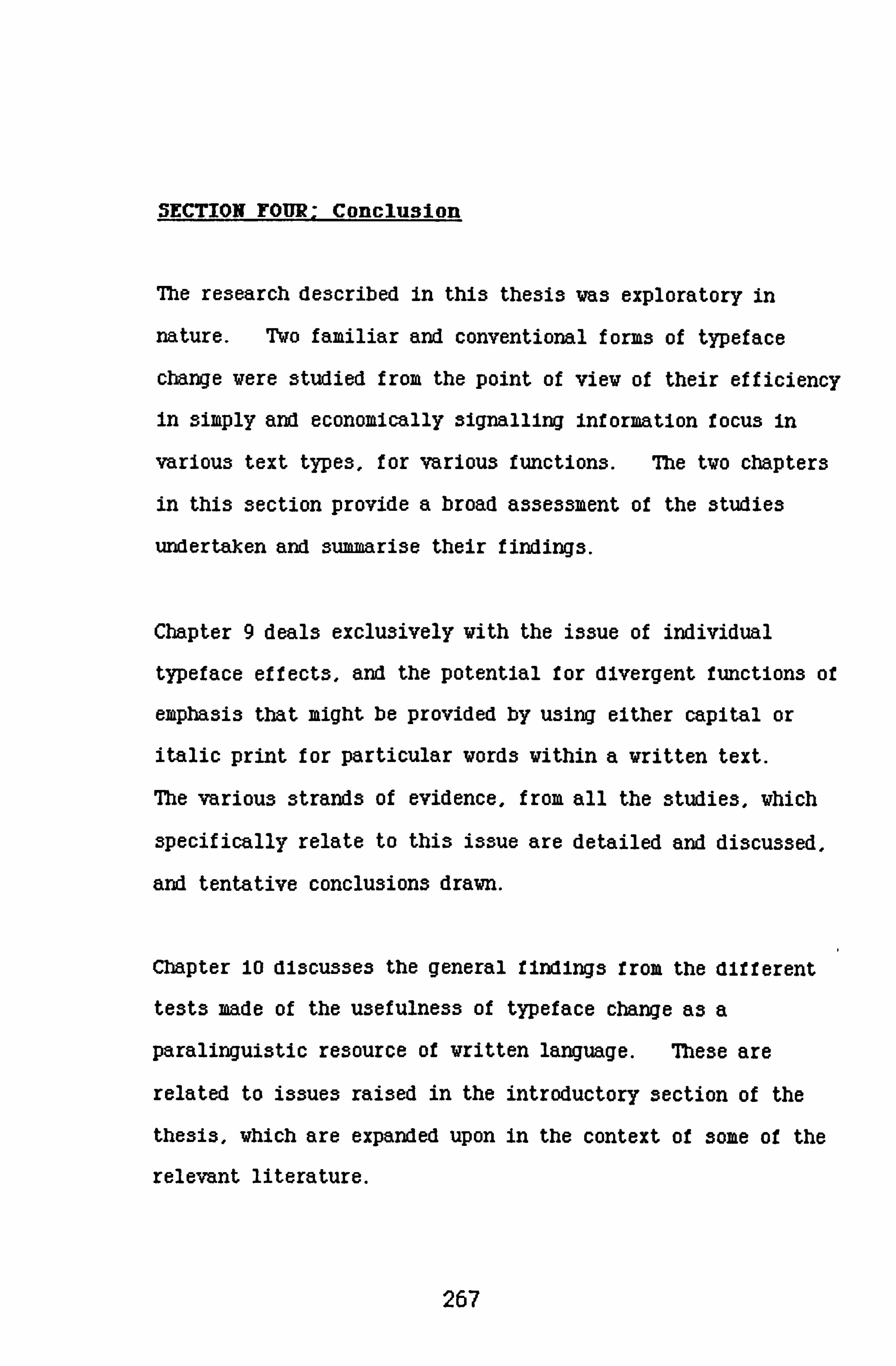
SECTION FOUR: Conclusion
The research described in this thesis was exploratory in
nature. Two familiar and conventional forms of typeface
change were studied from the point of view of their efficiency
in simply and economically signalling information focus in
various text types, for various functions. The two chapters
in this section provide a broad assessment of the studies
undertaken and 3ummari3e their findings.
Chapter 9 deals exclusively with the issue of individual
typeface effects, and the potential for divergent functions of
emphasis that might be provided by using either capital or
italic print for particular words within a written text.
The various strands of evidence, from all the studies, which
specifically relate to this issue are detailed and discussed,
and tentative conclusions drawn.
Chapter 10 discusses the general findings from the different
tests made of the usefulness of typeface change as a
paralingui3tic resource of written language. These are
related to issues raised in the introductory section of the
thesis, which are expanded upon in the context of some of the
relevant literature.
267

CHAPTER 9: Capitals or Italics?
Until recently, the choice of different print form, for
different communicatory function, available to a writer was
constrained by practicalities of availability and cost. If a
work 'was to be published, the printer dictated the options.
A font, once selected, was set as standard with italic face
serving most stress functions within the text. Today, it is
often conventions of style which define the boundaries within
which authors make use of typeface change to signal
communicatory focus. The author Douglas Adams wrote and
typ eset hi srec ent bo ok lnirt c7entlv's Ho. Zistic Oetecti ve
Agenc. v on an Apple 11acintosh Plus mini-computer and
LazerTrite Plus printer. The book was then printed using
Linotron 100. All the variations of font, style, or size
within a text available with standard Macintosh
vord-processing systems were available for the published
document, presenting no difficulty to the author other than
the necessity for selecting between them and the grounds for
doing so.
Although the majority of present-day novelists (including
Douglas Adams! ) make little use of font or style change to
prime interpretative modification of the words they write, the
options are there and, gradually, the conventions are
changing.
268

Presently, italic print remains by far the commonest single
typeface used for emphasis requirements in narrative text.
This is less the case with expository texts - texts that
convey new information and explain new topics to people.
Authors of textbooks and instruction manuals, particularly,
are beginning to avail themselves of the increasing options.
Although use of various typefaces to Indicate specific meaning
for certain content units of text 13 not limited to this
genre - the tabloid press is the best example that springs to
mind. Distinctions between kind of typeface emphasis, and
purpose for that emphasis, may gradually be achieving status
from convention, but their actual efficiency in use has not
yet been tested.
The studies undertaken here, addressing the general issues of
within text emphasis also, sought evidence of qualitative
differences of function between two conventional forms of
written emphasis, capital letters and italic print. This
chapter will summarise and discuss this evidence.
In Chapter 3, four 'baseline' studies were described which
specifically addressed the issue of distinction betveen
capital and italic print. Study i, vhich looked at the
269

effects of typeface change on adjectives which could be
associated with physical scales of measurement, found that
emphasising the words hot, heavy, and f a3t produced a similar
effect to using intensifier words - 'very', for example, or
'excessively'.
With the proviso that the word itself will always be at issue,
the general findings with relation to difference between the
emphasis types suggested that one simple distinction between
italic and capital letters may be that of degree of emphasis,
with capitals providing quantifiably 'more' to the referent
than italics.
This finding was echoed in the results from Studies 5-9,
described in Chapters 4 and 5, where subjects ranked six
versions of different texts according to "the best way of
expressing the message". Capital letters were considered to
be appropriate for the most important information in the set
of texts presented, with italics preferred for "the next most
important" - that is, the sentence expressing secondary
content salience.
A study of these explanations, the transcripts for which are
available in Appendix 2. shows clear distinctions betveen the
tvo faces. Apart from the degree of emphasis attributed to
270

each, capital letters were considered to command, state
authoratively, even "shout". The physical attributes of this
typeface, when set against the background of the plain text,
selected it for information whose content salience was
similarly marked. The above findings suggest that a simple
difference between italic and capital print may relate to
where these typefaces stand in some continuum of emphasis.
The accumulated findings from the various studies also suggest
a more interesting divergence. Italic print vas held to be
more connotative than capitals, giving 'mood' to a vord.
Again, content is critical in this: as the sentences for
Uhich italic print was preferred vere implicatory in their
meaning, so the implicatory connotations of the typeface va3
focussed by subjects.
Capital letters, similarly, were given attributes which
coincided with the content on which they were preferred -
impact was a common term in the transcripts. As a reminder,
see the preferred version for one of the fiction texts,
"Mriller", in the ranking study (Study 6, Chapter 4):
I walked up to the body on the hearthrug azil turned it over. Mere aras a birtAmazA, on Ais fombead. VE HAD KILLED THE WRONG W.
I-. -, Li

Subjects' explanations for their almost unanimous selection of
this version as best shoved great content agreement. Italic
print vas appropriate for the implicatory second sentence,
"suggesting" or *leading up to" the most important
information, itself properly empha3ised by capital letters.
The responses to Study 4, (Chapter 3) which directly addressed
the question of difference without text examples found the
same issues raised and similar points made on behalf of the
two types of print.
Ap endix I presents a full transcription of all subjects Pp
responses, and the results from a content analysis of these
provide an informative background from which to consider the
findings from all the studies, in the context of options
between typefaces. Connotation, mood or feeling were
generally associated with italic print; authority,
importance and impact with capital letters.
Study 2, a task designed to establish any possibility of
connotative effects, found the only significant difference of
response on a measure of "positive/negative outcome" between
plain, capital and italic typeface for continuations to:
He gave me the pen with an encouraging smile, and I sianed. Next day ...............
272

was provl(lea by italic print, vnere more outcomes were
negative. A second separation of responses by classifying
their content as "humourous/non-humourouso found that, on this
measure, capital letters had an effect over the other
typefaces.
A divergence of effect betveen italics and capital letters vas
also suggested by the findings from Study 10 (Chapter 6).
Here the two fiction texts vere presented for a betveen
subjects test of the effects of each version upon a story
continuation task. The issue of vhich of the three sentences
featured in an ongoing theme of subject's continuations va3
found to be a function of sentence sequence as vell as
emphasis, vith the semantic structure of the texts (the
content 3alience relations betveen the units) playing a
crucial part. Hovever, betveen the tvo options of
(a) dealing exclusively vith mistaken murder, or
(b) incorporating information about the victim's birthmark
for continuing the story, type of emphasis did play a role.
The following versions achieved the highest frequency for the
two categories above:
a) I valked up to the body on the hearthrug and turned it over. There was a birthmark on his forehead. Fe lad Arilled the firzong zw.
I valked up to the body on the hearthrug and turned it over. Fe had kl2led the irrow wn. THERE WAS A BIRTHIIARK ON HIS FOREHEAD.
273

Vith version (a), significantly more subjects carried the
mistaken killing forvard, ignoring the information that the
victim had a birthmark. The sentence vith the highest
content salience, preferred by subjects in the ranking studies
to be given capital letters, here becomes implicatory -
Imding oj7 to the continuation.
What works to carry the more crucial sentence through,
however, is not sufficient for the implicatory sentence, the
one with 'secondary importance', according to the subjects in
Studies 5-9. Here, keeping the 'implicatory' print for the
high-salience information and giving full impact, by place and
by typeface, to the birthmark information, increased the
likelihood of its mention in subjects' continuations.
A point made frequently by subjects in response to Study 4's
questionnaire indicated that the two typefaces may also be
distinguished in terms of their ef f ects for nodulatory and
contrastive focus, with capital letters best serving the
former function, and italics the latter. To quote from the
transcripts, italic print upon a word signals 'comparison%
*distinguishing the word from something else* - "something
different was expected*. Capital letters reflect upon the
word itself, mdrav attention to the word in isolation" and
ushov surprise, disgust or other strong emotionw. Some of the
studies provided more direct evidence on this.
74
In Study 3. reported in Chapter 3, subjects were presented
with two versions of sentences, using either italic or capital
typeface to empba3i3e one word of text. Alternate
continuations were provided for each sentence. One implied
that the communicatory intention of the emphasis was
modulatory, concerned directly with the referent of the
stressed word. The other implied that the emphasis was
contrastive, indicating the potential existence of another
referent for the word.
John broke the table.
Alternative continuations provided to subjects were:
i) He's stronger than I thought.
2) Susan broke the chair.
Subjects presented with the initial emphasis as capital
letters tended to select the first continuation; those given
italics chose the second. However, content effects, as
suggested before, are critical. "Surprise' conflicts with
"comparisonn, perhaps, for the sentence
I ran to the door, and it vas Tom.
275

For this text, no clear match of emphasis type with emphasis
function was indicated by the findings. Here, the point must
be made that, on an overall question of stress in written
language, it is not possible to show a clear and concise
distinction between the functions of modulatory, contrastive,
or completive emphasis (Dik, 1981, see Chapter 2, page 20 -
the discussion in Chapter 10 on *intonational nucleusn is also
relevant). There is a sense in which an emphasised content
word, by descriptively modifying its referent, contrasts that
referent to any potential referents. Likewise, a deliberate
intention to signal contrast may also provide a modulatory
interpretation. Take the following example:
1) It wasn't Betty's fault. She wasn't there.
Previous text with appropriate content would need to be
accessible to allow a reading which resolved reference of
'she' to an available entity outvith the immediately current
text. Tithout this, the emphasised pronoun contrasts Betty
with those who were there, amongst whom the person at fault
must be found. This sets the stress function somewhere
between Dik's contrastive focus, requiring a distinct entity,
and completive focus - because the opposing set is limited to
those in the room. It could also signal information about
Betty's personality, that she was not the sort of person to be
at that sort of event, perhaps. This would be modulatory
276

emphasis, yet arguably contrastive it that term Invokes the
whole world of people (who may be 'that sort of person') into
the contrast set.
Bolinger (1961 p. 87) states that every semantic peak is
contrastive, with the quality of contra3tiVity increasing as
alternatives narrow down. This is countered by Chafe (1976,
p. 34) who views contrastive sentences as Nqualitatively
different from those which simply supply new information from
an unlimited set of possibilities. This issue is discussed
again in the context of intonational nucleus in Chapter 10.
Evidence from other language communities supporting the idea
that there s, &ould be a dif f erence is given by Chaf e (1976).
One example which does not depend on paralingui3tic
distinctions is found in Japan: Chafe (p. 38) describes the
use of the particle wa for signalling contrast within a narrow
set of alternatives:
Axe va hutte imasu Rain is falling (but snow is not)
and ga then the contrasting set is an exhaustive listing:
John ga baka desu (of people) John and only John is stupid
The series of studies testing the effects of typeface change
on pronominal resolution - Studies II to 13 in Chapters 7 and
8- provided more evidence of the distinction suggested, which
277

supports Chafe's point of view. In particular, study 12
required subjects to allocate emphasis within a text to
provide two readings for it - the natural or default, and an
alternative reading, less strongly marked by the text.
Subsequently they were asked to say which of the two emphasis
types they preferred for the individual words they had
empha3i3ed (with an option allowing "no preferencen). The
majority chose italic print for pronominal emphasis, which was
consistently the strategy chosen for the alternative reading,
where the emphasis was required to be contrastive.
This choice was supported by the findings from Study 11, which
presented groups of subjects with different emphasi3-versions
of the texts, intended to shift or to reinforce their default
readings. The effect of the different versions was tested by
a question designed to elicit the interpretation subjects made
under the different emphasis conditions.
Simon 3aid Fred did It. He did.
Que3tion: Who did it?
All the versions tested were run in duplicate, using either
capital letters or italics as emphasis type for comparison
with responses to plain, unemphasised text. The best
response frequencies for the 'shift' effect were obtained when
italic print was used. Correspondingly, there was evidence
278

(thougli weaker) of a greater number of response frequencies
for the 'enhance' version3 of the text3, when the relevant
vords vere emphasised vith capital letters.
It is acknowledged that there is likely to be a semantic
overlap between the two prints. Modulatory emphasis, in the
sense of directly reflecting upon the word stressed (Dik
1981), may well be a better function of capital rather than
italic print. But where the emphasis is connotative,
indicating a particular meaning for a vord, thereby implying
'intensional constra3t', then italic print may be more
appropriate - as it is shown to be for more overt contrast.
Me subjects questioned on this Issue seem to thl&% so.
Overall, it does seem possible that these two conventional
forms of within text emphasis might be distinguishable in
terms of function, from the evidence accumulated by the
different studies described. Moreover, from subject's
responses to the questionnaire given as Study 4, as well as
from comments made and points tested casually by friends and
colleagues, it seems that people tend to agree that there is a
difference, which more or less corresponds to the modulatory -
contrastive distinction. The findings suggest that further
studies should be designed which would address the issue of
'typeface semantics' more directly.
279

CEULPTER 10: A33e33itent and Suumary
E. 11. Forster, in Aspects of the Yove. Z wrote: OFor me, the
whole intricate questionof method resolves itself not into
formulae but into the power of the writer to bounce the reader
into accepting what he 3ays. 0
Reading involves simultaneous processing on a large number of
levels (McClelland 1986). The studies reported here have
mainly concerned input constraints upon this processing that
are a function of the pbvsi4cal text, that is to say, the
effects of typographical variables upon interpretation.
As discussed in Chapter One, there is currently a lot of
interest in typography as a text resource which can be
manipulated in the interests of global information structure:
headings, paragraphing, layout of main and peripheral
information are examples. An author's requirement to ensure
as close a match as possible between his intended
communication and the reader's interpretation, necessitates
the best possible use of all resources available to the
written language system, within the particular communicatory
setting. Generally, controllable cognitive processes in
reading are induced in the reader by the te. rt feature. 5ý
(Britton, Glyn & Smith, 1985 - see discussion in Chapter Two
280

of this thesis). Here typographical variables have a role
to play as a paralinguistic subsystem vithin language,
indicating content structure at all levels and lightening the
interpretative load.
Discounting any simplistic model of nwrIter-->text-->reader",
Eco (1976, p. 141) dif f erentiates between text as e. rpre&51an of
the writer's communicatory intention, and text as content of
the readers interpretation. Among the 'labour3 performed by
both the sender and the addressee to articulate and to
interpret sentences whose content must be correctly
established and detected" (p. i55) he states:
OThere is a labour performed in order to articulate expression units. This kind of labour concerns the choice and the disposition of sign-vehicles ........ There is a labour that the sender performs in order to focus the attention of the addressee on his attitudes and intentions. u
Again:
nThere is a labour performed in order to interpret a text by means of a complex inferential process ....... There is a labour performed in order to interpret expressions on the basis of certain coded or uncoded circumstances... the 'labour of inference'.
For Eco, the interpretation of a text involves the advancement
and modification of a series of hypotheses (1976, p. 129) -
this is what he means by the reader's 'labour of inference'.
(Rumelhart, Hinton & McClelland, 1986, describe more general
information processing in the saxe terms, as wa battle betveen
hypotheses". )
281

7he text itself, described by Waller (1987b p. 170) as "a
complex network of 3ubcodes that may be strong or weak, and
that are subject to constant change as each juxtaposition of
elements creates a new, if temporary connotationn constrains
this inferential labour (or battle), as well as constraining
the author's expression of communicatory content. A basic
expression of this model could be:
WRXTER -> exTresylon c*-> TEXT (-- READER
The corresponding model for the spoken language system vould
be:
SPEAKER -> expivsuion <-> TEXT (- LISTENER
Given that the integrative processes in text comprehension
operate within the same base - cognition - it seems
intuitively the case that the processing constraints upon
interpretation should correspond within the two language
systems. The effects of the text constraints within that
process, however, on grounds of the differences described
earlier, cannot be assumed to correspond analogically.
Lakoff (1982, p. 239) states of spoken and written text: "The
devices utilised in the two media for maximum effect can be
282

expected to be different, and we may further suppose that the
direct transposition of the devices of one medium to the other
will not work, or even result in intelligible communication. m
Until recently, studies comparing oral and written
communication systems have often confounded the distinction
with differing degrees of formality and complexity of
discourse (Beaman 1984). 11-any commentators are not so much
interested in the different advantages of each medium, as in
perceiving the two as locked in deadly combat; this point is
well made by Lakoff (1982). Against this stand, several
authors - Nystrand, (1982). Tannen (1984), Lakoff (1982) and
Gentner (1980) are examples - have addressed issues of
coherence, context and rhetoric from a comparative
perspective, finding that differences between resource
strategies of the written and spoken language systems reduce
with similarity of communicatory context. However, on Issues
of translation between spoken and written paralinguistic
subsystems, as discussed in Chapter 2, the assumption is that
writing, given its comparative paucity of resources, cannot
match the communicative subtlety of speech. The use of
italic or capital letters to indicate stress is specifically
mentioned by all the above authors, but only in terms of their
providing an inadequate translation of Intonational signals.
Haas (1970) suggested, however, that any notion of a one to
one translation correspondence between the systems should
n07 /- u 1)

generally De acknovleaged as 1nappropriate, aesplte Me
obvious relationship between two systems which share the
primary function of coimunication.
Josef Vachek (1973) defines language from the functionalist
perspective, suggesting a sensible difference between spoken
and written text which emphasi3e3 the zirgencv of spoken text
and the surT;, e. FvbflitjF of written text, rather than
distinctions of form and style. We should not expect parallel
correspondences between the language systems in terms of
resource function, we do not need them. We can 'read in'
shades of emphasis from context or from other cues and change
the current text resolution at any point - as Vachek'3
distinction implies. Written language is a system that
stands on its own. It uses a different medium of
communication to speech - visual, rather than auditory, space.
Issues of rbvtAu - pause, implication, impact apply
differently between the systems. It was a stated intention in
Chapter Two that the signalling effect of typeface change
should be tested "in its own right" (p. 29). At this point,
however, the issue of translation correspondences between the
written and spoken language systems, raised in the
introductory section to this thesis before setting in
parentheses, as it were, during the data-gathering stage, may
be returned to and expanded in the light of the findings.
284

Bolinger (1960, p. 9) rates tntomtzaa as the most highly
symbolic of all the systems within language, wherein Nform and
meaning correspond in some natural way. n This was discussed
in Chapter I in the context of 'natural' signs - it is agreed
that the potential of the intonational system for conveying,
by 3ound-forms, complex nuances of meaning is not matched by
the potential of graphical systems to convey meaning by
shape-form3. Mat said, however, by adding what is,
basically, an iconic quality to a verbal expression in print,
we can approximate the phenomenon of intonational nucleus,
providing a better target for translation correspondence
assumptions between the two language systems (see the
discussion In Chapter 1, p. 21). "Nucleus" Is the term used
to describe the pitch accent which stands out as most
prominent in an intonation group - also known as tonic,
prizar. T. - stress or focus in linguistic analysis (Cruttenden,
1986, p. 49). Halliday (1979, p. 68) defines the meaning of
intonational prominence as the f ocus of inf oritation.
Research on intonational effects In discourse shows that
locating the nucleus in an intonational unit and,
particularly, empirically establishing its function in
focussing the Orelatively most important or salient
information in the given setting" (Dik, 1981) is no
straightforward task. This point is made by Brown, Currie
and Kenvorthy (1980). particularly in the context of dialects.
285

Fox (1984) raises the issue of context and the need to take
larger segments of discourse into the analysis and ruchs
(1984), the controversy between syntactic and semantic
determination of accent placement. Cutler (1984) found that
Olisteners appear to exploit whatever cues are available -
discourse cues where they exist and prosodic cues where these
are there to be used", concluding that information focus can
bebave analogously to accent. Allan (1986, p. 21) argues
that "stress and intonation cannot be defined using acoustic
measurements, but that the hearer's auditory perception of
them is based on the analy3i3-by-3ynthe3i3 of the speaker's
prosody, using acoustic cues and a knowledge of the
conventional production features for prosody.
Tells (1986) found that characteri3ation of focus in terms of
pitch prominence alone is not always appropriate. Pitch
meter records will often show this to be given to the first
element of a unit; human judges, "earballing" for pitch
magnitude, seldom select this element but rather choose one
which has not only prosodic salience, but content salience as
well. Tells therefore took the approach of first
hypothesi3ing that a "system of focus" exists, then finding
out what categories of focus have meaning for native speakers,
before correlating these with prosodic f eature3. Subjects
listened to a taped series of decontexted sentences, a sheet
of paper with the same sentences printed In sequence before
286

them. Their task was to listen, then underscore the vord(3)
in the vritten text vhich they felt the speaker to be
"focussing on as particularly important' on a scale of one to
three. Focus constituents vere then analysed in terms of
prosodic features. Wells found it appropriate to set up four
focus categories, vith a corresponding phonological system of
'prominence', shown here in Figure 10.1 7be prominence values
are a function of number and combination of the following
phonological elements: pitch peak, maximum pitch range,
Figure 14.1: Focus categories and corresponding phonological levels of proxinence.
Informational Focus
Contrastive
Phonoloaical Prominence
Maximal
Ilain
Subsidiary
Zero
Major
Ilinor
Ilinimal
kinetic tone, loudness peak, decrescendo, tempo marking,
pause/dravl. Yells' claim is that the presence of a
287

specified configuration of phonetic features renders an
information element susceptible to interpretation as belonging
to the corresponding focus category. In other words "the
semantic system of focus 13 reali3ed by a phonological system
of prominence. " (p. 74). In this context, Chafe (1976, p. 35)
states the linguistic expression of "contra3tivene3s" to be
Othe placement of higher pitch and stronger stress upon the
focus of contrast", and that it is possible to demonstrate
that contrastivity is phonetically different from other stress
expressions. As stated earlier, however, empirically
establishing phonetic differences which correspond to meaning
differences remains a vexed issue for intonational research.
The effects of graphical prominence upon the interpretation of
focus are demonstrated in this thesis by the responses by
subjects to the various tasks set up under the different
typeface conditions. The findings certainly confirm that the
notion of perceived nucleus, of itself, can translate from the
spoken medium of sound in sequence to the vritten medium of
shape in space. Whether or not a broader translation can be
made to include categories of focus remains an issue, vhich
the findings summari3ed in Chapter 9 Indicate to be vorth
addressing.
Me last study reported in Chapter 3 deals with a
que3tionnaire vhich directly addre3sed the ime of
288

differences of function between the two emphasis types.
Conclusions from the findings from this study are made in the
preceding chapter, where the general issue of interpretative
distinctions between capital and italic typeface is discussed
in terms of the results of all the studies undertaken. The
responses to the questionnaire provides explanatory background
for the studies reported in Chapter 4, and supported the
notion that further studies, which specifically address the
issue of establishing a "semantics of typefacem might be
possible, and should certainly be attempted.
People's Intuitions about the best way to use different
typeface options within a text tend to agree with the
interpretations of typeface stress given in the questionnaire
responses. Vithin three different communicatory contexts and
using the two typeface options available to contrast with the
plain type background of the texts, subjects judgements
corresponded over the issues of which emphasis suited which
information content, and also why their decisions were made.
Generally speaking, a point made from the findings in the
pronominal emphasis series of studies (Chapters 7 and 8) can
be raised here, in that vhere both capital and italic
conditions produced effects In the same direction, the effect
from italic face was stronger when the function of the
emphasis was contrastive. To a lesser, but still perceptible
289

extent, where the function was modulatory, capital letters haa
a greater effect.
In the ranking tasks described in Chapters 4 and 5, strong
physical salience was generally selected for units judged to
have high informational salience. This was consistently felt
to be the role of capital letters. Italic print went to
units of secondary importance. (11ore subtle differentiations
attributed between the two typefaces were discussed in the
preceding chapter. )
The task did not directly access subjects' skill in
communicating intended focus with the texts. Rather, by
stating the research interest to be typeface emphasis and
providing a fixed choice of options involving its use, it
addressed subjects' opinion of the functions of the two types
of print available, providing content units on which to place
them. In this respect the findings satisfactorily
distinguished the two typefaces. At the same tize, subjects
reasons for first and last rankings showed that communicatory
focus was at issue, in that it figured in the explanations
given.
Me step of equating Yells' phonological realisations of
content focus categories with graphic constituents of written text should not, however, be taken without research that
290

addresses me issue more directly. Nevertneless, a more
general equation of within text emphasis with intonational
nucleus, both serving the same function of expressing content
focus, may be made with more confidence.
From the findings reported in this thesis, a major role of
typeface emphasis in written text concerns the foregrounding
of certain text objects. Chafe (1976) defines a foregrounded
entity in discourse as "given" or win con3ciousnessm - with a
speaker signifying reference to such an entity by "low pitch,
low amplitude" intonational cues. Emphasis or stress is used
for bringing items into foreground, as are such other
strategies as clefting, pseudoclefting and build-up,
illustrated by (1), (2) and (3) below:
1) It was Sally who ate the cake3.
2) The one who at the cake3 vas Sally.
3) Plujap and greedy Sally ate the cakes.
Sanford and Garrod found that wanything which is foregrounded
is more available for referencen, citing Anderson's (1981)
studies into staging effects upon continuation tasks. She
manipulated the use of adjectives adding *qualifying
information" to secondary characters in brief texts which
291
required subjects to continue the passage. This had an
effect on the content of subjects' continuations, making them
more likely to contain reference to that character.
Continuations to texts without this manipulation dealt with
the topic character only.
Continuation studies are a useful way of establishing which
elements of a text are accessed by readers during the task,
and testing the effects of focus manipulations upon this
(Sanford, Hoar and Garrod, 1988). The story continuation
task reported in Chapter Six tested the rhetorical effects of
typeface change for signalling narrative focus. Sentence
sequence and content salience - the information structure of
the text - are also critical. Emphasis acts in cooperation
or conflict with these sub-3y3teM3, with a necessary
dependency upon the actual words Used. It was clear from the
continuation content produced by subjects that the texts
themselves had activated background knowledge structures
relating to their content. The operation of such structures
within cognitive processing is described by schematic models
Schank and Abelson's (1977) w3cript3", 11in3ky'3 (1975)
"frame3w and John3on-Laird'3 (1983) "mental models" are
examples - see Alba and Ha3her (1983) for a discussion and
a3se3ment of these in the context of language understanding.
Here, within schematic models in general, 11uscovici13 (1983)
notion of 'social representations' - *cognitive matrixes,
292

coordinating ideas, vords, images and perceptions that are all
interlinkedo - is appropriate. Equally so is the Sanford and
Garrod (1981) notion of 'scenarios' - situational
representations Vhich are activated, and constrained, by text
content. The Thriller text clearly brought in situational
knovledge (based on experience of stories, films etc vithin
the genre) to subjects' predictions of subsequent behaviour on
the part of the lead character. This behaviour vas more
likely to acknovledge the (mistaken) victim It his identity
was emphasised in the text by stress or position. In other
vord3, manipulations of stress and of order (understandably, a
strong influence for the task) generated input effects vhich
cooperated vith these structures, increasing the availability
of 03econdary* information to produce the continuation
content.
The explanations given by subjects for their choice of Omost
important sentence" of the three that made up the text shoved
that content battled vith emphasis for this avard, vhere the
hierarchy of content salience vas distinct in the text.
Typeface emphasis va3 acknovledged as implying importance for
a text element even vhen this vas contradicted by content
salience relationships betveen elements. Generally, in this
case, content von - these findings correspond to those
provided by intonational nucleus judgements on spoken texts,
discu3sed earlier.
293

Vhile the typeface change may be def inable as a 'natural' sign
(see discussion in Chapter I and earlier in this Chapter) its
interpretation vill also be very largely a function of
convention. Vachek (1973, p. 9) says "Rules governing the use
of ... grapheme3 (including graphotactic rules) in the given
language community have clearly a normative character vithin
that community and any use contrary to these rules is felt as
contrary to the norm and evaluated either as a mistake or, in
some specific circumstances, as a case of intentional
deviation, prompted by some functional motive.... 0 This
recalls the comment quoted from a subject in the 'Ranking'
experiment reported in Chapter 4 who gave a possible
explanation for the impact sentence wDo not touch it" in the
Varning text being in normal print as intentional, to provide
a 'Calming effecte.
Generally, throughout the project, typeface change signal3
vere found to focus attention upon the ongoing interpretation
at that point, and modify it in 3oze vay.
Me studies described in Chapters 7 and 8 found that typeface
change, alone, can signal theme-shift by providing contrastive
emphasis to critical vord3 in a text. 7he shift sought va3
that of pronominal reference resolution. away from the
'default' referent under an interpretation of plain case text.
294

Brovn and Yule (1983, p. 214) describe pronouns as "paradigm
examples of expressions used by speakers to refer to 'given'
entities% saying that as such they are "typically uttered at
lov pitch In spoken discourse". stressing the pronoun In
speech 3vitches its resolution, indicating the need to
foreground another entity - or rather, that the foreground
status of the current entity is inappropriate, yet a referent
is required. Bosch (1983) calls this a deitic function:
OAmphorically used forms refer to what the listener's attention is oriented to, or assumed to be oriented to, vhen the utterance in question is made .....
wDeitic forms are means to re-orient the listener's attention to something his attention is not yet directed to, and accordingly occupy the facus pasitioj2 of the utterance" (p. 58)
Bosch'3 statemnts are made on the basis of linguistic theory,
and not on the grounds of empirical evidence. Also, they are
made on behalf of the spoken language system. No empirical
study - to the vriter'3 present knovledge - has been made of
stress effects on pronominal resolution vithin vritten texts,
using typeface manipulations.
Brovn & Tule (1983, p. 214) rank pronouns as "the crucial test
case items for any theory of reference", and there is a vast
'295 2-

literature on vork done to test other text constraints upon
their resolution in vritten language, some of which is
de3cribed by Frederik3on (1981a).
To resolve an anaphor, it is necessary to knov vhat kind of
thlng it can refer to. Me semantic content of a pronoun,
though limited to number and gender, can reduce the possible
set of referents to one. Erlich (MO) found that vhere
subjects have to choose betveen antecedents, sentences in
Vhich gender cues facilitate di3ambiguation are responded to
faster than if there are no such cues. As an example,
Consider the folloving:
Ro3e gave Tom an apple becau3e [he/she/it] va3 nice.
where the gender of the pronoun determines between Rose, Tom
and the apple as antecedent. Garvey & Caramazza (1974) found
that the semantics of the verb in a main clause influences the
assignment of a pronoun in a subordinate clause, eg
5) Rose slapped Sally because she vas playing too loudly.
6) Rose annoyed Sally because she vas playing too loudly.
Assignment of a pronoun depends on semantic. pragmatic and
Syntactic constraints.
296

Me "precede-command" constraint (Ross. 1967, and Langacker,
1969), that a pronoun must be preceded, and commanded, by its
antecedent noun, vas tested by Purki33 (1978), vho found
distancing effects by manipulating the number of intervening
sentences betveen pronoun and natural antecedent. Greater
distance increased the difficulty of assignment. Anderson
(1981) found that tine changes indicated by discourse content
altered the availability of both principal and secondary
characters for subsequent anaphoric reference.
Sanford and Garrod (1981). citing the above research findings
together vith those from their own investigations, stress the
relationship betveen pronominal resolution and f oregrounding.
"It the antecedent is not foregrounded, using a pronoun vill
seem odd, even if an unambiguous mapping can be made. m (p. 135)
Strategies for foregrounding a character or object in
discourse include sequencing. topicalization and 'build-up' as
discussed earlier In this Chapter. Given the form of text
wed for the studies described in Chapters 7 and 8, the most
pertinent of the heuristic rules Sanford and Garrod suggest
for assigning pronominal reference is that "the current topic
is more likely to be an appropriate antecedent than other3m.
297
I *-ý-

Talzy Givon (1976) discusses anaPhoric pronouns and topic
shift in discourse, contrasting texts where a topic is
mentioned directly before an amphoric expression (with no
axblguity of reference) and where distance between the related
units requires the use of "topic shiftu strategies to
foreground the correct referent once more:
Once there was a vizard. He vas very vise and rich, and was marrled to a beautiful witch. They had two 3on3. The first was tall and brooding, he spent his days JLn the forest hunting snails, and his mother vas afraid of him. The second was short and vivacious, a bit crazy, but always gaze.
? U_e lived in Africa. Nov the vizard, he lived in Africa. (p. i53)
Yekovitch and Valker (1987) state the ease of accessing an
antecedent to be a direct function of that antecedent's level
of activation in zexory. Shillcock (1982) found evidence
that the processing of an anaphoric pronoun entails the
selective sezantic activation of its referent, reinforcing its
foreground statu3.
The studies described in Chapters 7 and 8 of this thesis shov
the efficiency of typeface emphasis as a 'topic shift' or
areforegrounding' resource, in cases vhere tvo antecedents
vere available in the immediately preceding text. This
resource of the vritten language system can be classified vith
others as a constraint upon pronominal reference resolution.
298

In studies 11-13, the 'default' reading of the texts concerned
va3 taken as the majority choice of antecedent by subjects
encountering plain, unempha3ised versions of the texts; the
general finding vas that resolution vent to the character
taking the 'thematic agent' role. Unemphasised, a pronoun
reinforces the thematic status of its default antecedent.
Karxiloff-Saith (1980) found that speakers typically follov a
pronoxinali3ation 3trategy in vhich the use of pronouns is
reserved for a single central actor. Here, the pronoun
function3 more like a zero:
7) John picked up the cake and [he] ate it.
rather than a3 an amphoric referential device. OThere is no
need for an a3se33zent procedure because there Is no choice to
be zade. * Indeed, Sanford and Garrod (1981) suggest that
pronouns thewelves have a foregrounding function: wIn
Witten text, foregrounding is best revealed by
pronoitimli3ation: using a pronoun rather than a noun to
refer back to an antecedent individual can be thought of as
the vrItten equivalent of Olow stress, lov amplitude'.
7be 3trategy of stressing the pronoun, by focussing that
elezent In the text, vorked vell to shift its natural reading.
Mie salience of the vord triggers an alternative resolution,
3upporting the idea of a 'deitic' function of pronominal
299
3tre33 di3CU33ed by Bosch (1988) In the context of speech:
OMrkednes3 of the focus change type may svitch off a default
interpretation of a referential expression. *
The sinimal descriptive content of the pronoun, though only
indicating gender, further constrains resolution of the text:
Tests using the version
'John 3ket, Susan, Tox and Josie in the pub. He was glad be vas there*
shoved that the emphasised pronoun effectively signals
0 not-John and malea, accessing Tom from the available options.
The same series of studies found that sentence disamabiguation
by cueing reference resolution via typeface change vas also
effective, vhen the default agent role was reinforced by
stressing an appropriate verb or verbal predicate in the text.
7be effect of this strategy va3 that the natural reading of
the text vas more likely to be made than a potential alternate
reading, vhen compared vith the responses from those subjects
receiving uneapha3i3ed text versions. Here the salience of
the verb reflects back to the default agent, strengthening
that role.
300

7te design of this study, involving the presentation of only
four texts. may raise the question of generali3ability for the
findings. Clark's (1973) varning of the 'language-a3-fixed-
effect' fallacy, though a very appropriate background
constituent to language study design in general, is not at
Issue here, vhere there vas no intention of generali3ing any
findings to 'potential, texts. In such an exploratory study
context, it vas felt that the findings should relate to a
sufficient number of subjects to allov generali3ation3 to be
made to a vider population of readers, vith some degree of
confidence regarding the effects of empha3i3 manipulations
FlUtYn the textsý c4mcerned. At the same time, the data to be
Collected by this study va3 essentially qualitative in nature.
Given the lack Of statistical techniques for the analysis of
such data vithin subjects, this placed practical constraints
upon the number of items tested. Each subject could only be
alloved to make a response to one version of a text, thus
yielding a betveen subjects analysis. It vas felt that it a
large number of texts vere presented, even vith the typeface
Conditions systematically varied. the results could be biased
by task set effects. As already discussed, the question
itself vould be likely to redirect subjects' attention to the
text given and to its ambiguity. The obvious (intentionally
301) dlacaxbiguatory cues from the typeface emphasis may, It
several texts using each of the strategies vere presented,
bave too much overt control over the interpretative response.
301

Me four texts used vere not equated In terms of semantic
structure - for exaxple. the thematic agent under a natural
reading wa3 the first character named in texts 4 and 5, and
the last in texts I and 2. In fact, the study designs
approxinated a 'itethod of single cases' model. both here and
throughout the project as a vhole, vith the data for each text
recorded separately (the alternative approach recommended by
Clark 1973). Vhere a final analysis of grouped data has been
presented folloving a series of studies, text vas dealt vith
a3 a variable in its ovn right.
Me problem Indicated above, in the context of the obvious
Cues from typeface emphasis, of potential artificiality for
the findin93 if a large number of texts vere presented, could
be Said to apply to a lesser extent for the texts used in
Studies 11 to 13. Me post-presentation question directed
subjects' attention to the ajibiguity of the texts, and
typeface eapbasis is likely to have been seen as providing an
intentional interpretative signal - as indeed it vas. Care
va3 taken to ensure that no subject received the same emphasis
strategy tvice across the four texts and, as stated
previously, it was felt in this exploratory stage of research
that nore deliberate responses to the po3t-text question could
appropriately be discussed vith relation to evidence provided
by the other experiments, vhere subjects' conscious
302

interpretation or empnasis was required. Indeed, Me
approach used for the majority of the studies described in the
preceding chapters was to set tasks for subjects that required
their reflectf Fe interpretation of the texts. This was felt
to be appropriate at this level of enquiry, and it may be
argued that this mode is more natural to the language system
concerned - cf. Vachek'3 (1973) "surveyability" of written
text. In the absence of feedback, but also of interruption,
the writer anticipates the interpretative processes of the
reader (the Ovirtual reader" of the conversational model of
written communication described by Waller, 1987b), and the
reader uses his knowledge of the general strategies writers
use to facilitate understanding - that Is, knowledge of the
conventions of written communication. Testing different
organisational structures, Heyer (1984) found that skilled
readers appear to approach text with knowledge about how texts
are conventionally organised. Typeface emphasis was found to
be an efficient strategy for making a minor character
accessible to amphoric reference procedures, for signalling
information status, and for maintaining the availability of
secondary information. *
However, the question of naturalness adds to that of
generali3ability, and this is acknowledged. What could help
to support assumptions made of typeface emphasis functions
within the interpretation of written language based on the
303

findings from the studies described by this thesis, is
evidence from 'on-line' studies, where the text to which
question tasks relate is not visible for secondary,
ta3k-prized, interpretation. This gets over the 'task
effect' constraints on text quantity discussed earlier,
permitting a design which allows measures to be taken of
typeface effects over different texts within subjects as well
as between different typeface versions of individual texts.
Frederik3on (1981a, b) 11-ar3len-Wil3on et al (1982), Garrod and
Sanford (1985) and Shillcock (1982) describe studies whose
sequential presentation of individual units of complete texts
test a model of a system capable of immediate interpretation
and integration of verbal input, word by word as received:
*the system operates on-line by continuously generating multiple partial lexical and structural readings of the input and simulataneously assessing these in terms of their compatibility with, and implications for, a discourse level interpretation. " (Ilarlsen-Vilson, p. 340)
One route for further research, therefore, will be to look at
text reading time and typeface manipulation effects upon this.
An application which has been designed to present a fuller set
of texts across which to test typeface manipulation effects
upon subject groups via VDU, as a follow up to experiments
reported in Chapters 7 and 8, has the facility for recording
reading times, either for units of text or for a vhole text,
plus response time and category following presentation of the
304

post-text questions. Pronominal emphasis strategies of the
type tested by studies II to D will be used for a series of
texts. Effects of emphasis on anaphoric noun phrases, with
only one text-available antecedent, will also be sought.
Bosch (1988) suggests that this should function deitically, in
the same way as pronominal stress, inducing search for an
antecedent within the discourse domain, implied but not
expressed by the text. Sufficient numbers of both text types
will be presented to enable findings to be stated In more
general terms of function than simply within the texts
concerned. The application is very flexible and permits
presentation of text blocks of any size, with as many
manipulations of font, size and style as may be required.
Presentation time for text units and questions is also
controllable.
Another built-in option of the application is the use of the
moving window method, wherein a text is presented to the
reader via a 'window' onscreen which moves sequentially
through the text landscape (left-top toward right-bottom, line
by line) revealing one word at a time. The architecture of
the text itself remains on screen, represented as dashes where
the letters fall, with spaces between each group of dashes
marking a vord. Thi3 technique i3 de3cribed more fully by
305

Graesser, Haberland and Kolzuml (1967) In a paper addressing
the issue of influences upon reading time. An adaptation of
their technique is planned, where typeface manipulations can
be tested against interpretation in the same way as following
full presentation of text, with further questions addressing
issues of attention and comprehension. Graesser, Haberland
and Koizumi make the point that reading times can be related
to eye-tracking behaviour: "the moving window procedure
provides data that are similar to eye movement data. In
fact, there is a substantial correlation between the word
reading times in the moving window procedure and the gaze
durations for words when eye movements are recorded. "
Carpenter and Just (1987) present a process model of reading
comprehension, together with a theoretical framework, which
provides useful background to the intended research.
The application is being developed at the University of
Glasgow by Keith Edwards, programming technician within the
Department of Psychology and patient and skilful realiser of
the author's technological requirements. Presently it runs
on a Mcintosh Plus mini-computer.
The applicability of the sort of information that can be
gathered from exploratory studies into accumulatory effects of
typeface change in text on processing at input level, combined
with findings from tasks accessing higher level processes. is
306

perhaps best reall3ed vltliln a theoret1cal backgrouna ot
'interactive' or 'multiple entry' memory systems (sensorv,
perceptizI and reflective f or example, as described, in Hasson,
1987). In this context, a further project presently in
preparation will present sets of subjects with short text
sequences on VDU, to seek interpretative-effect3, of typeface
change, using the conventional stress indicators of bold and
italic face. The influence of a 'read aloud' strategy will
be tested with two questions in mind. Firstly, would the
vriten emphasis be detectable in readers' speech, and would
this be systematic across subjects for the different typefaces
tested? Secondly, would there be any effects on subjects'
Interpretational response from both reading and speaking the
texts? Lastly, given an identical set of questions to answer
following tape-recorded presentation of texts, would the
listener receive and use the interpretative signals provided
by the irriter ?
,f
Aside from the type of intended research described above
which, though extending the domain and hopefully providing
generalisable findings, remains at an exploratory level,
practical applications of-the findings in more natural
settings will also be tested. Neither the pen and paper
tasks In the studies run here, nor the one line/vord at a time
designs projected for on-line studies, provide a normal
situational setting for the interpretation of written texts.
307

Eletronic text*ls a medium which seems to me to bridge the
poles of 'oral' and 'literate' media discussed in the
introductory section to this thesis, and again earlier in this
concluding chapter. In an academic setting, for example, the
rhetorical focus may fall 3o&evhere betveen conference paper
and published report, or lecture and text-book tutorial.
This is particularly the case for systems Vhich permit
authoring of non-linear documents, "hypertextso, for a variety
of communicatory functions.
A research project that Is presently In the planning stages
takes up problems raised by both general and 3peciali3ed
experience of such systems (for an overview, see Conklin
1988). The principle issues addressed relate to the
documented phenomenon of cognitive processing overload,
induced by the need to interpret the current, or onscreen,
text whil3t filtering information about offscreen text,
deciding on its immediate relevance and whether or not to
access it. One aspect of this problem is the need to
distinguish between content inf ormation -f ocu3 marking., for
example, and structure information about the existence and
nature of linked information (Hardman, 1987). An objective
of the projected research 13 to show that utilising general
paralingui3tic resources of the written language system, as
well as those specific to non-linear texts presented through
308
the medium of a computer screen, can reduce the processing
load so that the advantages of the hypertext environment may
be more fully realised. Vithin onscreen text units,
typographical resources will be utili3ed to allow easy
distinction between paralinguistic signs indicating content
and structure information, reserving the use of conventional
typeface changes such as Italic or bold face for signalling
content focus information, while developing a system of
link-points ("button" indicators) which are unmrked, while
semantically appropriate to the type of information they
access. Subjects recall protocols and answers to multiple
choice questions designed to test comprehension of all text
levels, will be used to measure the effects of the variable
manipulations.
Host of the texts used as material for the studies reported in
this thesis fell within the "narrativew text genre.
Grae3sner (1980) points out that narrative texts generate many
more inferences than expository texts, yet an average
narrative passage takes approximately halt the time to read as
an expository passage of the same length. Narrative texts
generally activate memory structures related to content to
help readers to understand the passage - for expository texts,
whose purpose is to inform and instruct, readers should not be
expected to have the necessary knowledge base structures to
allow this. Rather, it is suggested, we use memory
309

structures related to the 'typical' presentation of
information (Gerrig 1988) - that is, we use abstract knowledge
relating to the conventional organisation of texts to guide
our interpretation. This loads the writer's task with
particular constraints, within which, however, more use may be
made of typographical strategies than may be acceptable in,
for example, fiction. And also, of course, readers goals
will differ - and so must the experimental desIgn1 Not much
can be expected in the way of information about text variables
when subjects are asked to say what they think comes next from
Tancreatic RNa3e is a highly specific endonuclea3e which splits the bond between the phosphate residue at C-3 ...............
0
[this example was taken from Keiras, 1985, p. 901
Colleagues from the departments of Chemistry and English
Language here at the University of Glasgow will participate In
the proposed research by providing text material and advising
on its organisation, also taking responsibility for post-ta3k
questions aimed at assessing subjects' comprehension of the
texts relating to their subjects . Vhil3t seeking to
eliminate (or at least reduce) some of the problems peculiar
to a hypertext teaching environment by the studies proposed,
we shall effectively be devising a shell which can generali3e
to fit various communicatory requirements and serve as an
experimental tool by which theories of discourse can be tested
within a more natural environment - the real-life medium for
the text type concerned, within Its communicatory setting.
310

If spoken discourse conventions can tran3f er to communicative
strategies in written discourse, this transference is likely
to relate to the text genre - eg description, narrative,
exposition and, particularly, to the medium of communication.
Through all the studies projected, comparisons of typeface
will be made across emphasis function, manipulating font and
size as well as conventional stress tyle options of bold,
Italic and capital print or permutations of these. The
findings concerning issues of semantic differences between
capital and italic print described in Chapter 9 suggest the
issue is worth pursuing, and this might be particularly the
case with electronic texts, which have an immediacy and an
impermanency - despite their retrievability - lacking in the
printed page.
SummrV:
In the context of resource correspondences between the spoken
and written language systems discussed in Chapter 2 (see Fig.
0.4, p. 27), the stated Intention of this research was to test
the signalling effects of typeface change within the
interpretation of written text independently, before drawing
comparisons with the spoken language system. Acknowledging
that the effects of typeface emphasis were found to be robust
for the texts used, Adthin their MsAr coaditions, the f inding3
311

throughout the project suggest the role or this resource
vithin the interpretative processes of text comprehension to
be similar to that of the perceived intonational nucleus in
speech: focussing attention to content salience.
The results summarised in this chapter show that, although
individual constraints imposed upon interpretation by
individual text variables may be ambiguous, the constraints
acting in coordination with each other and with other signals
from context, content, sequence, communicatory setting, etc
cooperate for a unified resolution of the text. This meets
the assumptions set out in the early part of Chapter 1.
rigure 14.2: Categories of reading processes and the nature of their interactions.
INTEGRATIVE PROCESSES 0 Ganarmthts Exuvpolstions from
Text Model a Combining Infonrnation from
pg. tual And Contextual Saumas for Lexical Retre"
0 Retrieving and I"taWating Word Meanings With Text Model
EFFECT: To Reduce Level of Word Analysis Required for Laxwel RetrwvW
EFFECT: To Incrows Confkloncs In the Text Model, to Increase a Taxi-Sampling S-uw \
INFORMATION PASSED Pomeptual . Phanologicel
WORD ANALYSIS PROCESSES 0 Gnwhww Encoding 0 Encoding Multigraishernic units 0 Translating Graphiscruc Units to
Phonimmic Units 9 Assigning Appropriate Speach
Patterns to (Multi) Word Unite (e. g, Intonation. Street. Fluency)
0 Reviewing Lexical Categories
INFORMATION PASSED Stmantic comeptual Propositic"
DISCOURSE ANALYSIS PROCESSES " Passing Sentence Constituents " Conceptual Analysis of
Constituents " Analysis of Can Relations " Awunive Sentence Processing " Establishing Cohnswe Relations
Among Prepositions is Text-Based Inferential Processing
From Frederikson, J. R. (1981) Sources of Process Interactions in Reading. in Lescrold & Perfetti Aten-jet-iPv Yn Amdijaýr
312

The sentences or a text are related to one another by a
variety of linguistic and non-linguistic devices (Garnham,
1985). Chapters i and 2 discussed some of these in terms of
their interactive influence upon interpretation.
Frederikson's (1981) 'integration model' of reading
subprocesses (Figure 14.2) shows how information from
perceptual sources coordinates with information derived from
comphrehen3ion of prior text to encode subsequent words and
phrases efficiently. The model expresses an interactionist
theory of speech processing, and the findings described in
this thesis support this theory, while demonstrating the
efficiency of typeface emphasis for reducing processing
overload. Comprehension of a text proceeds most effectively
when text features permit the use of what Black (1985) calls
"just-in-time" processing; that is, when knowledge can be
upre-fetchedu so as to arrive in working memory at preceisely
the same time as the input information to which it Is
relevant. With such processing, working memory is not
cluttered with knowledge accessed too early. Here
typographical resources can be utilised for vvercodinq (Eco,
1976) the text, using information patterns that narrow down
the possibility of misinterpretation by the reader.
VWercodlng, on the other hand, forces the reader to assign
provisional meanings to text when faced with uncertainty.
313

Lamen(lella (1980) properly aeflnes language as a xeras a system of systems. The findings reported in this thesis
support the notion of typeface change working as a
paralinguistic sub-system of written text, in cooperation
with others (syntax, sequence, context, etc. ) to provide for a
unified, coherent Interpretation-T the role proposed In
Chapter I. The accusation that it cannot match the prosodic
3ub-system in speech in terms of flexibility and subtlety
(with its implicit suggestion that it should), cannot be met
without further research directly addressing the issue and
taking cognizance of the qualitative, rather than
quantitative, resource differences between the two language
systems.
314

REFERENCES
Alba, J. and Hasher, L (1983) Is Ilemory Schematic? in P. 5. ycbo2, pqic, &2 Býd. Zetin Vol. 93 No. 2 203-231.
Allen, W. (ed) (1948) Friters an kriting. London: Phoenix House.
Anderson, J. (1980) Cognitive Ps. ývcbolCý7. v and its 1jWlications. San Francisco: V. H. Freeman and Company.
Bateson, G. (1972) Steps to -an Ecologv of Mnd. New York: Ballantine Books.
Beaman, K. (1984) Coordination and Subordination Revisited: Syntactic Complexity in Spoken and Written Narrative Discourse, in Tannen, D. Coberence in SpoAren and Fritten Inisevurse. New Jersey: Ablex.
de Beaugrande, R. and Dressler, W. (1981) Introduction to Te. rt Lingmisticsý. London: Longman.
Black, J. (1985) An exposition on understanding expository text, in Britton, B. and Black, J. lWerstanding Expositorr Text. New Jersey: Lawrence Erlbaum Associates.
Bodmer, F. (1955) Me Loaz of L&Wuage, London: George Allan Unwin Ltd.
Bolinger, D, 1961, Contrastive accent and contrastive stress, in Lanquage 37,83-96.
Bolinger, D. and Sears, D. (1981) Aspects of Language. Third Edition, New York: Harcourt Brace Janovich Inc.
Bolinger, D. (1986) -Entenation and its Parts. London: Edwin Arnold.
Bosch, P. (1983) . 4greezent anY Awpliora. London: Academic Press.
Bosch, P. (1988) Representing and Accessing Focussed Referents, in Language aW Cognitive Processes Vol. 3 No. 3 pp 207-233.
Britton, B. Glynn, S. and Smith, J. (1985) Cognitive Demands of Processing Expository Text: a cognitive workbench model, in Britton, B. and Black, J. (eds) Werstanding Expositorr Text. New Jersey: Lawrence Erlbaum.
315

Britton, B. and Glynn, S... (1987) Executive Control Processes in Reading. New Jersey: Lawrence Erlbaum Associates.
Brown, G., Currie, K. Kenvorthy, J. (080), . 4luestions of
Intozatian. London: Croom Helm.
Brown, G. and Yule, G. (1983). Discourse Anal`. ysis. Cambridge University Press.
Carpenter, P. and Just, 11. (1981) Cognitive Processes in Reading: 11odel3 Based on Readers' Eye Fixations in Le3gold. A.
. and Perf etti, C. - b2teractive Processes in Reading. New
Jersey: Lawrence Erlbaum Associates.
Clark, H. .
(1973) The Language-as-fixed-effect Fallacy: A Critique of Language Statistics in Psychological Research, In dozzrza2 of Yerbal Learning and Verbal Febsvlour U 335-359.
Collins, 1. and Gentner, D. (080) A Framework for a Cognitive Theory of Writing. In Gregg & Sternberg, pp 51-72, Cognitive Processes in Friting. New Jersey: Lawrence Earlbaum Associates.
Conklin, J. (1988) Hypertext: An Introduction and Survey, in Greif, I. (ed) Cvzpater-SL? pported Cooperative ForAr. - a boa of readings. California: Horgan Kaufmann Inc.
Cruttenden, A. (1986) Intamtion. Cambridge University Press.
Dijk, T. A. van (1979) Relevance assignment In discourse comprehension, in Aiscaurs* Processes.. 2. M-iM
Dik, S (1978) Functional c7razzar. Amsterdam: North Holland
Dik, S. (080) On the typology of focus phenomena. In Hoekstra, van der Hulst, Hoortgat, Perspectives in F=ction&2 Grammar. Dordrecht: Foris Publications.
Eco, U. (1976) .4
Meory., of Seziotic. 5ý. Bloomington: Indiana University Press.
Eco, U. (1979) Me Rvle of the Reader. London: Hutchinson
Ellis, A. and Beattie, G. (1986) Me Ps. 7--cbo1cgv of ZaWu5g& X. Camunicatian. London: Weidenfeld & Nicol3on.
Erlich, K. (1980) Comprehension of Pronouns, in . 41aarterjv
dourzal of Experizental Fsmnholagj? 32,247-255.
316
Fischer, P. and Mandl, H. (1984) Learner, Text Variables and the Control of Text Comprehension in Handl, H. Stein, N. and Trabasso, T L-narning and Cozprehension of Text. New Jersey: Lawrence Erlbaum Associates.
Fox. A (1984) Subordinating and Coordinating Intonation Structures in the Articulation of Discourse, in Gibbon, D and Richter, H. Intomtion.. Accent and Rbyttm- Nev York: Talter Gruyter.
Frederiksen, J. (1981a) Sources of Process Interactions in Reading. In Lesgold and Perf etti, Interactive Processes in Ale-ading. Ney Jersey: Lavrence Erlbaum Associates.
Frederiksen, J. (Mib) Understanding Anaphora: Rules used by Readers in Assigning Pronominal Referents. In Piscvurse Processes, 4, pp. 323-347.
Fuchs, A (1984) Deaccenting and Default Accent, in Gibbon, D. and Richter, H. Intcmtion, Accmt and Rbythx. Nev York: Walter Gruyter.
Garnham, A (1985) Psynbolinguistics. London: Nethuen.
Garrod, S. and Sanford, A. J. (085) On the real-time character of interpretation during reading in Langzage and Cognitiye Processes, Vo. Z. I No. .1 pp 43-5A
Garrod, S and Sanford, A. J. (088) Thematic Subjecthood and Cognitive Con3traints on Di3cour3e Structure, in Jounw2 of Pzqgzatics Vo. 12 5/6.
Garvey, C. and Caramazzxa, JL (1974) Implicit Causality in Verb3, Linguistic ZXquirv 5.459-464.
Gerrig, R. (1988) Text Comprehen3ion, in Sternberg, R. and Smith, E. Me Psycbo2ogy of Blmw Mougbt. Cambridge: CUP.
Graesser, A. Haberlandt, K, Koizumi, D. (1987) How is reading time influenced by knowledge-ba3ed inferences and world knowledge in Britton, B and Glynn, S Executive Control Processes in Reading. New York: Lawrence Erlbaum Associates.
Gumperz, J., Kaltman, H. and O'Connor, 11. (1984) Cohe3ion in jr Spoken and Written Discourse: Ethnic Style and the Transition
to Literacy in Tamen, D. (ed) Coberence in Spoken and Fritte, 7 Inisevurse, Nev Jersey, Ablex Publishing Corporation.
Halliday, 11. (1978) L&Wusge as Soci&I Sexiotic. London: Edward Arnold.
317

Halliday, 11. (1979) Modes of heaning and Expression, in Allerton, D. J. , Carner, E. & Hillcrof t, D. 11metion &W Content in Lingui. 5ýtic Awlysis. Cambridge University Press.
Halliday, 11. (1985) An Introduction to FImctional Oreamr. London: Edward Arnold.
Hardman, L. (1987) Hypertext Tips: Experiences in Developing a Hypertext Tutorial, in Proceedizq. -5! of B. ýpertext 87 Forksbop. University of North Carolina.
Hartley, J. (1987) 7Wography and Executive Control Processes in Reading. In Britton, B. and Glynn, S. Executive ControJ Processes in Yeading. New York: Lawrence Erlbaum Associates.
Hass, V. (1970) Fbano-grapbic 7)7&nslation. Nanchester: flanchester University Press.
Hector, L. (1966) Me Eszda? riting of 21glisb Pocuments, London: Edward Arnold.
Hender3en, L. (1982) Ford Recognition in Reading. London: Academaic Press.
Jacobson, R. (1978) Six Lectures on Sozzrd and tleaning. Sussex: Harvester Press.
de Jong, J. (1980) On the treatment of focus phenomena in functional grammar. In Heokstra, van der Julst, Moortgat, Perspectives in 11inctiom. Z Graamr, Dordrecht: Foris Publications.
Karmiloff-Smith, A (1980) Psychological Processes Underlying Pronominalisation and Non-pronominalisation in Children's Connected Discourse, in Krienan, J. and Ojeda, A. (eds) Papers from the parasessim? on pronozzas and mwpbora. Chicago: Chicago Linguistic Society.
Keiras, D. (1985) Thematic Processes in the Comprehension of Technical Prose. In Britton and Black, tWerstanding Expositor. v Text. New Jersey: Lawrence Erlbaum Associates.
Lamendella, J. (1980) Neurofunctional Foundations of Symbolic Communication in Foster, 11. and Brandes, S. (eds) nwbol as Sense ner approacbes to tbe awlmsis of zeaning. New York: Academic Press.
Lakoff, R. (1982) Some of my best friends are literate. In Tannen, SpoArea and irritten Language. New Jersey: Ablex.
318

Langacker, R. (1969), On Pronominalisation and the Chain of Cormand in Reibel, D and Schane, S. Bodem Stulies in rnvisb. New Jersey: Prentice Hall.
Lehnert, V. Robertson, S. and Black, J. (1984) Memory Interactions During Question Answering in Handl, H. Stein, 11. and Trabas3o, T. Learning and Comprebension of Text. New Jersey: Lawrence Erlbaux Associates.
Ilarslen-Wilson, V., Levy, E. and 77ler, L. K. (1982) Producing Interpretable Discourse: The establishment and maintenance of reference in Jarvella, R. J. and Klein, V. (eds) 6ý7eecb, P. Zace and Action. London: John Viley & Sons.
Masson, N. (1987) Remembering reading operations with and without awareness, in Britton, B. and Glynn, S. Executive Control Frocesses in Aleedihq. New Jersey: Lawrence Erlbaum Associates.
11cClelland, J. (1986) The Programmable Blackboard Model of Reading in McClelland, J. & Rumelhart, D. Parallel -nistributed Froce. 5ýsinq. Cambridge, Na33: HIT Pre33.
Ileyer, B. (1984) Text Dimensions and Cognitive Processing, in Mandl, H. , Stein, N. , Trabasso, T. (eds) Lssrnijv and Casprebension of Text. New Jersey: Lawrence Erlbaum Associates.
Muscovici, S (1983) Social Representations and Social Explanations: from the Naive to the Amateur Sciencist in Hevstone, 11. Attribut-ion 2bevry- CUP.
Nystrand, ll. (082a) Rhetoric's wAudiencew and Linguistics' "Speech Communitym: implications for understanding vriting. reading and text. In Nystrand, Mat Kriter-sý . 4)20A?: Me z, arjgwge, Frocess aw Structure of Fritten Piscourse. London: Academic Press.
Nystrand, 11. (1982b) The Structure of Textual Space, in Nystrand, zmt MrIter. 5ý A22om London: Academic Press.
Parkes, 11. (1969) D2glisb Ojrs-ive 600A'hazds Oxford: Oxford University Press.
Petti, A. (1977) Englisb Litezarj-- HMIý frox CMucer to
10r. T. Ven. London: Edvard Arnold.
Purkiss, E. (1978) Me effect of foregrouWing on pronoziM2 ref-erence. Unpublished thesis, University of Glasgow.
319

Ross, J. (1967) Cwstraints on V&rj*b2** in S. I. -ni*x, Ph. D dissertation, 11IT.
Sampson, G. (1985) Vriting n.., ste&s. London: Hutchinson.
Sanford, A. and Garrod, S. (1981) ZWerstanding Yritten LaWwge. Chichester: John Wiley and Sons.
Samford, A. 11oar, K. and Garrod, S. (1988) Proper Names as Controllers of Discourse Focus. LaW=ge and Speecb. 1,31.
Sanford, A. J. (1988) On the nature of text driven inference. In press.
Shapiro, 11. (1983) Me Sons* ot 0zazmr: 2angusgo ss sezeiotic. Bloomington: Indiana University Press.
Shillcock, R. (1982) The on-line resolution of pronominal anaphora, in Language 9- Speecb, Vol 25, part 4.
Tannen, D. (1984) Coherence in Spo*en and Pritten Piscourse. New Jersey: Ablex.
Thompson, H. . (1980) Stress and Mliencv In LVMsb: Meory and Practice. 113. Palo Alto Research Centre, California.
Upton, G. . (1978) M* Analvsis of Crosýý-tabulated IWO. Chichester: John Wiley and Son.
Vachek, J (1973) Fritten Langwge: general proMeirs aW problez. 5ý of Englisb. The Hague: Houton.
Waller, R. (1987a) T-ypography and Reading Strategy. In Britton, B. and Glynn, S. Executive Control Processes in Aleadin7. New Jersey: Lawrence Erlbaum Associates.
Waller, R. (1987b) 7he 7.1-pograpbic Contribution to Langwge. Ph. D Thesis, Reading University.
Wason, P. (1980) Dynamics of Writing, Visible Fritingý XIV 351-363.
Yells, V. (1986) An experimental approach to the interpretation of focus in spoken English, in John3-Levis, Intomtion and Piscourse. London: Croom Helm.
Yekovitch, F. and Walker, C. (1987) The activation of scripted knowledge in reading about routine activities, in Britton, B. and Glynn, S. Executive Control Processes in Reading. New Jersey: Lawrence Erlbaum Associates.
320

APPENDIX 1/1
AiDiDendix to Chapter 3. Study 4
Responses to Questionnaire on Capitals and Italics
1. Capitals make the word Important in a different way to italics. Capitals are good for making something clearer, more prominent. Italics make you think about it more.
2. It's hard to say but I think capital letters are just ulouder", but italics mean more than that.
3. Capital letters draw your attention more than italics - capitals should be used for something surprising or alarming whereas italics should simply be used as indicative of where emphasis should lie, ie what person is doing the action.
4.1 think that italics are more effective for disambiguating reference, or for referring to something not normally expected. Capitals are better for less critical emphasis - or maybe for cases where the emphasis indicates 3urprise. rather than the surprise requiring emphasis.
5. Italics seem to convey 'hidden' meaning whereas capitals seem to be just for emphasis - to make something obvious, not to be ignored, (I think! ).
6. Italics more suitable for stressing meaning. Capitals more appropriate to stress importance of certain information, ie "Do not miss this it is importanto.
7. Capital letters are more certain, they just state. Italics imply something to think about.
8. It is very hard to say when just given it in a sentence. If in a whole piece of text, I would be very confident in
making a distinction, but I couldn't verbalise why; probably italics would be much more common than capitals.
9. To ine, capital letters nay be better to emphasise words, but in some cases italics ere more appropriate (can't explain why)
10. Capital letters are more emphatic - they give the words larger importance, and make it seem louder. Italics seem to make a finer point about the word, ie distinguishing it precisely from something else
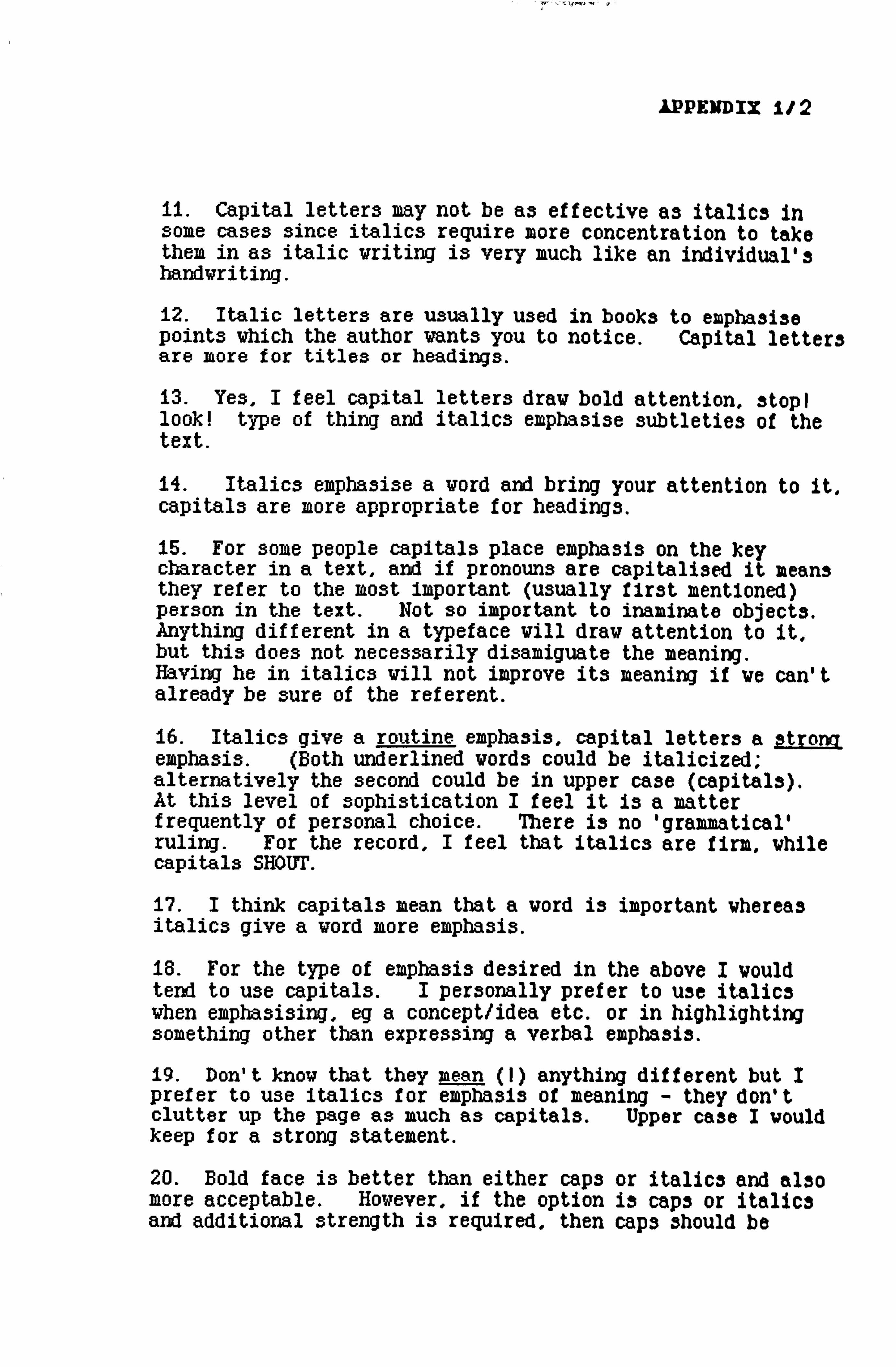
IPPEIWDIX 112
11. Capital letters may not be as effective as italics in some cases since italics require more concentration to take them in as italic writing is very much like an individual's handwriting.
12. Italic letters are usually used in books to emphasise points which the author wants you to notice. Capital letters are more for titles or headings.
D. Yes, I feel capital letters draw bold attention, stopi look! type of thing and italics emphasise subtleties of the text.
14. Italics emphasise a word and bring your attention to it, capitals are more appropriate for headings.
15. For some people capitals place emphasis on the key character in a text, and if pronouns are capitalised it means they refer to the most important (usually first mentioned) person in the text. Not so important to inaminate objects. Anything different in a typeface will draw attention to it, but this does not necessarily disamiguate the meaning. Having he in italics will not improve its meaning if we can't already be sure of the referent.
16. Italics give a routine emphasis, capital letters a strong emphasis. (Both underlined words could be italicized; alternatively the second could be in upper case (capitals). At this level of sophistication I feel it is a matter frequently of personal choice. There is no 'grammaticall ruling. For the record, I feel that italics are firm, while capitals SHOUT.
17.1 think capitals mean that a word is important whereas italics give a word more emphasis.
18. For the type of emphasis desired in the above I would tend to use capitals. I personally prefer to use italics when emphasising, eg a concept/idea etc. or in highlighting something other than expressing a verbal emphasis.
19. Don't know that they mean (1) anything different but I prefer to use italics for emphasis of meaning - they don't clutter up the page as much as capitals. Upper case I would keep for a strong statement.
20. Bold face is better than either caps or italics and also more acceptable. However, if the option is caps or italics and additional strength is required, then caps should be

APPE]ffDIX 1/3
preferred, italics just "highlight" not empha3i3e.
21. Capital letter3 tend for me to denote 3ize. or emphasJ3 on volume, %Therea3 italic3 tend to emphasi3e mood, feeling or emotions.
22. Italic print seems better for cases vhere amusement, disbelief or some other such emotion is being registered. Capital letters are better for cases vhere a fact is being related and the important factors need to be made to stand out. I knov there aren't really any formal rules about vhen to use what typeface, but they do mean different things to me personally.
23. For me, capital letters draw attention to the word in isolation, whereas italics emphasis the word within it3 context of the surrounding words.
24. Capitals are better for headlines and the headings put above some paragraphs in the text, vhereas italics are better for inside the paragraph because they look better since they are quite similar to normal typeface. Capitals in the middle of a text are irritating in a typed text. They seem to clumsy as if the typist thinks the reader is too studpid to know what italics are there for. I prefer bold print.
25. Capitals - for an element of surprise. emphasis of something important but possibly predictable. But I think its just a matter choice really.
Italics - for previously of personal
26. Italics often seem to show incredulity: capitals are followed by a comparison. Capitals also draw more attention to the word than do italics.
27. To me italics emphasise the actual object as happens when something is emphasi3ed in conversation. Capital letters in reading material usually eaphasise the importance of things vhereas italics often shov the degree to vhich things happenor are done (I hope this makes sense to you).
28. Capital letters may be beter for exclamation3, italic3 for stress and/or differentiation. They'll begin to mean something different if people like you start trying to make them different.
29. Capital letters are better In every case. Italic print is hardly noticeable as being different. It usually looks as if there's something wrong with the typewriter or It3 ribbon.
30. No, the capital letters for me don't mean anything
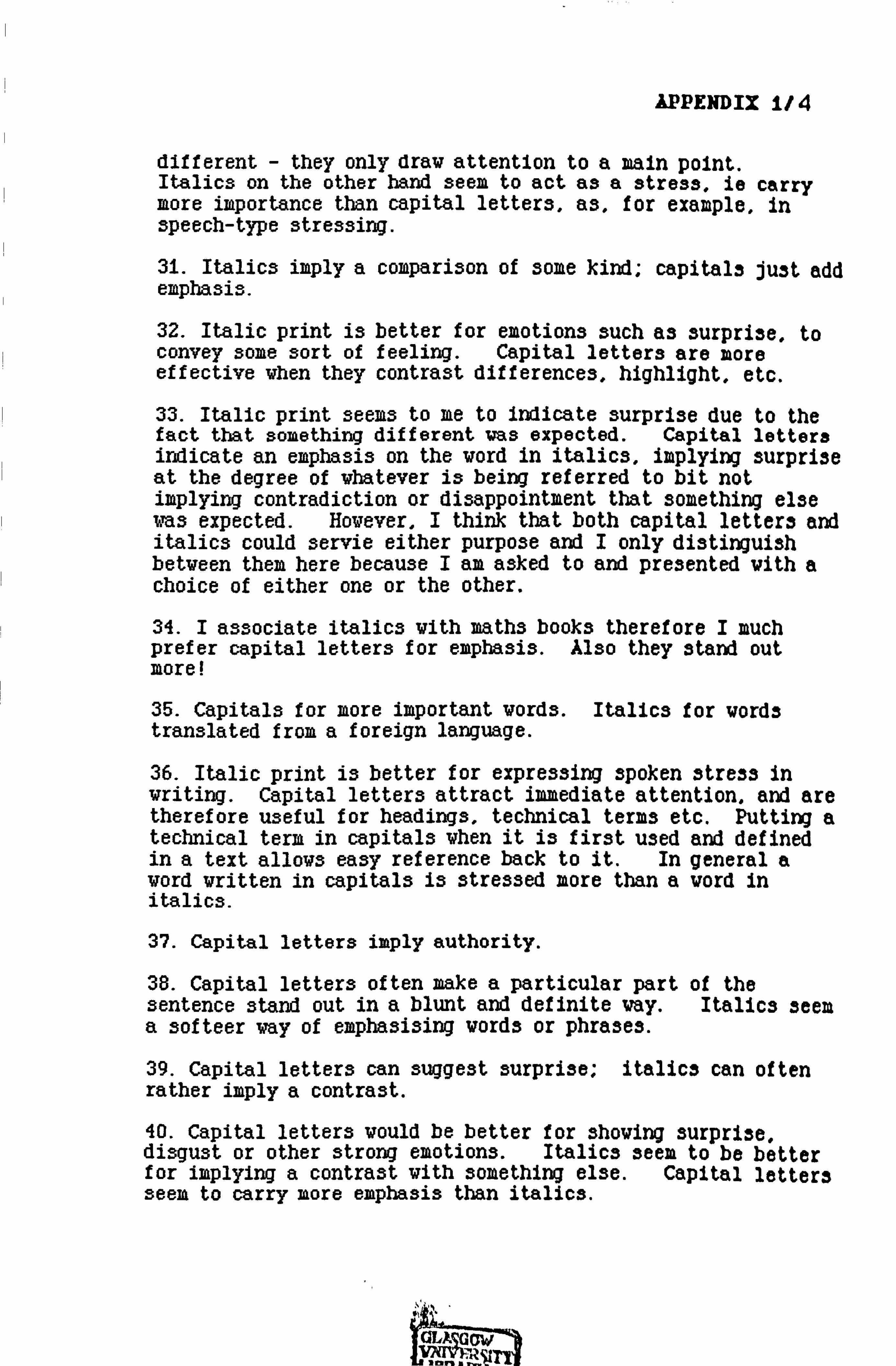
APPENDIX 114
different - they only draw attention to a main point. Italics on the other band seem to act as a stress, ie carry more importance than capital letters, as, for example, in speech-type stressing.
31. Italics imply a comparison of some kind; capitals just add emphasis.
32. Italic print is better for emotions such as surprise, to convey some sort of feeling. Capital letters are more effective when they contrast differences, highlight, etc.
33. Italic print seems to me to indicate surprise due to the fact that something different was expected. Capital letters indicate an emphasis on the word in italics, implying surprise at the degree of whatever is being referred to bit not implying contradiction or disappointment that something else was expected. However, I think that both capital letters and italics could servie either purpose and I only distinguish between them here because I am asked to and presented with a choice of either one or the other.
34.1 associate italics vith math3 books therefore I much prefer capital letters for emphasis. Also they stand out more!
35. Capitals for more important words. Italics for words translated from a foreign language.
36. Italic print is better for expressing spoken 3tre3s in writing. Capital letters attract immediate attention. and are therefore useful for headings, technical terms etc. Putting a technical term in capitals when it is first used and defined in a text allows easy reference back to it. In general a word written in capitals is stressed more than a word in italics.
37. Capital letters imply authority.
38. Capital letters often make a particular part of the sentence stand out in a blunt and definite way. Italics seem a 3ofteer way of emphasi3ing vords or phrases.
39. Capital letters can suggest surprise; italic3 can often rather imply a contrast.
40. Capital letters would be better for showing surpri3e, disgust or other strong emotions. Italics seem to be better for implying a contrast with something else. Capital letter3 seem to carry more emphasis than italics.
aw


