
The Labor Market
“the unemployment rate is only the beginning of the problem”

The labor marketThe labor market
The labor market is an enormously important market, and many of you in the beginning had concerns about some of the measures of performance in that market. High on that list was the unemployment rate, and we’ll certainly look at that as well as employment and earnings data. We’ll start with some information on demographics – a real driver of the labor market and the overall economy. Demographics used to be as exciting as watching grass grow, but now we use terms like tectonic plates, tsunami, and seismic when describing it. This is also a topic some of you mentioned in the opening postings. We’ll start with some headlines that contain some of the stats we will be looking at here.

In the news: The labor marketIn the news: The labor market
1. “Did we drop the ball on unemployment?”2. “More jobs predicted for machines, not people”3. “The collapse of manufacturing”4. “Out of a job and no longer looking”5. “The number of those working past 65 is at a record high”6. “Teenage jobless rate reaches record high”7. “In Spain, jobless find a refuge off the books”8. “The recession was sexist (so is the recovery)”9. “Skills shortages are getting worse as youth unemployment
reaches record highs”10. “In wreckage of lost jobs, lost power”11. “median earnings for prime-age (25-64) working men have
declined slightly from 1970 to 2010, falling by 4 percent after adjusting for inflation.”

Demographics
Back in the 18th century Thomas Malthus warned us about demographic growth, but concern over it largely disappeared until the 1960s and 1970s during rising concern over the environment and the carrying capacity of the world. China’s one-child policy is an extreme example of population “management,” but so is US immigration policy. Here we will look at the drivers of demographic change that are set to dramatically change the world in which we live.

Demographic Drivers of change
1. Births / deaths (fertility / mortality / life expectancy)
2. Immigration
3. Labor force participation

Population Reference Bureau
Fertility rate
Do you know what that is?What happened over here?
And here?

Population Reference Bureau
Fertility rate
Those boomersThe pill arrives
Abortion legalized

What does the next 6 graphs tell us about changes in families between those boomers and your generation – and what does it tell us about the future population?


Life Expectancy: by Race & Gender


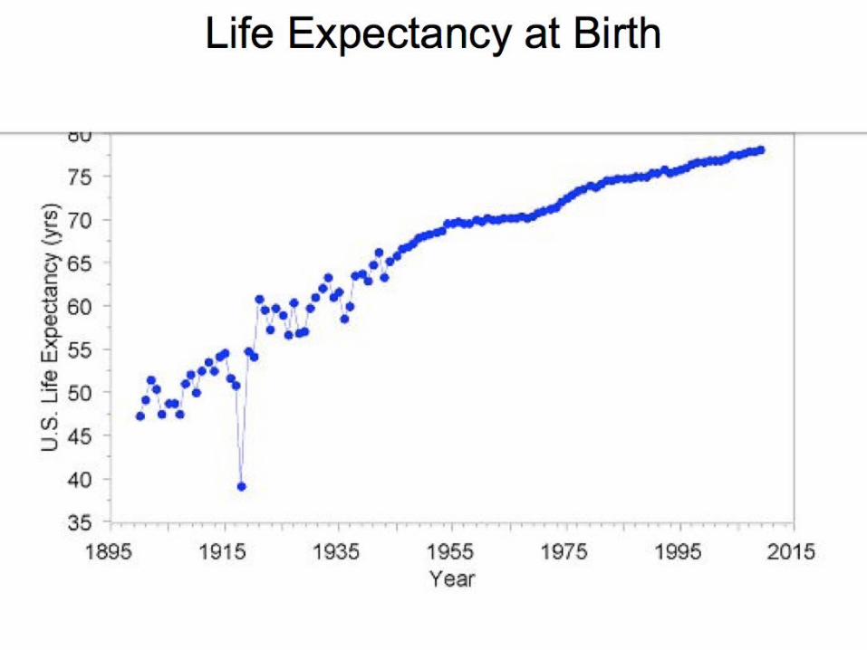
We can see a sharp drop in birth and fertility rates that will slow down the population growth in upcoming years, although differential growth rates will reduce the share of the population that is white. This is the problem facing the Republican Party after the last election: they appeal to an increasingly small part of the population. So watch out to see what happens with the immigration bill, and you can see in the two graphs why we are seeing so much debate on he topic. We are approaching immigration levels not seen since the turn of the last century during the industrial revolution, and then we shut off migration and imposed Prohibition to limit the bad behaviors those immigrants brought with them. And check out those boomers who keep getting older plus the increasing life expectancy. Some of the impact can be seen in the following graphs – and do not forget to look at RI.

Implications of Demographic Drivers
1. Population growth
2. Population composition1. Age
2. Race & ethnicity

US Population ProjectionIn thousands

US Census: Constant Net Immigration
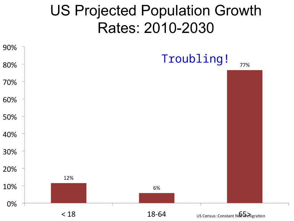
Troubling!

Scary!

US Census: Constant Net Immigration
2010-2030
2010

International Comparisons
Is the US “different?”

Why is the US so different from the other rich countries – and what are some of the implications?

Population pyramids are good ways to look at the age composition of the population. What do these tell us about the US, China, Japan, Afghanistan, and South Korea?


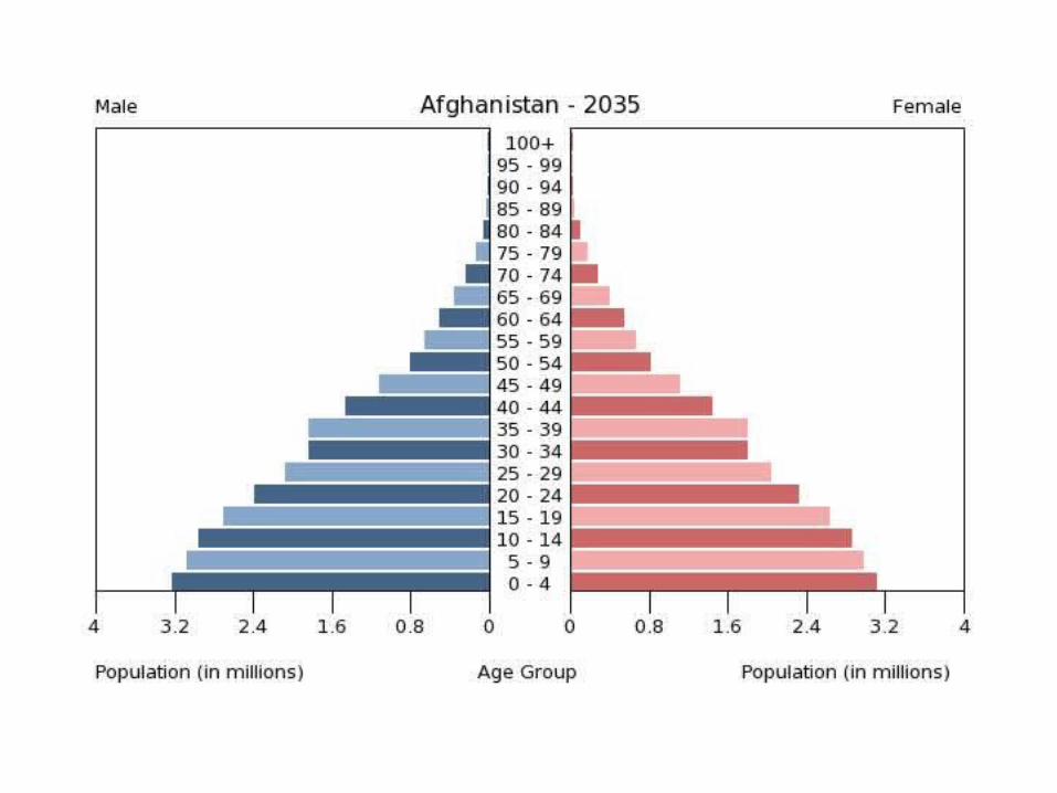

Here are a couple of observations.1.Afghanistan is different. This is a typical profile of a poor country with high birth rates, and it gives us countries that are essentially countries of children. About 46% of Afghanistan’s population is age 0-14. 2.China is different too. It is aging rapidly, but it will be doing it before it is rich. China looks like other rich countries, except it is poor (per capita GDP). Part of this is China’s one-child policy. 3.All of the rich countries are aging rapidly, although the US is aging slower. The aging problem is most severe in East Asia – look at Japan and South Korea.

Labor MarketLabor Market
1. Labor market measures– Measures of Quantity (Q = labor force, employment)– Measures of Price (P = earnings / wages)– Measure of disequilibrium (unemployment)
2. Limitations of measures– What’s missing in
the numbers
3. Track record– Trends– Cycles
P
Q
P*
Q*
=W
= E
Headlines
U*
Now let’s look at the important measures of performance in the labor market.

Important labor market concepts: Based on monthly BLS survey
1. Civilian population (16+) = Labor Force + Not in Labor Force
2. Labor Force = Employed + Unemployed
3. Labor Force Participation Rate = Labor Force/Civilian Population 16+
4. Unemployment Rate = Unemployed/Labor Force
5. Employment population ratio = Employed / Population

What do you see?
You will now see a collection of graphs that “capture” some of the major features of the labor market. I suggest getting out that pad again and working through each graph and take note of any trends, cyclical properties, and what is different or distinctive about the Great Recession.

Labor force participation rates: What percentage of the population decides to
join the labor market?
• Trends – the gender differences and the long term
• Cycles – the “mancession” and behavior over the business cycle
• Differences: race & ethnicity, age, gender
Take out that pad and jot down what you see in these labor market graphs

What has been the long term trend, and what is behind the decline in the 2000s?

What about the gender differences? What is behind these and what is the implication?

The end of men?
1. “It’s a first order mystery for social scientists, why women have more clearly heard the message that the economy has changed and men have such a hard time hearing it or responding. …
2. census data showing that in most of the United States, young, single, childless women in their 20s working full time have a higher median income than equivalent young men.” “Who wears the pants in this economy?,” NYT, 2012

Employment: Where the jobs are
1. Trends
2. Cycles
3. Structural change
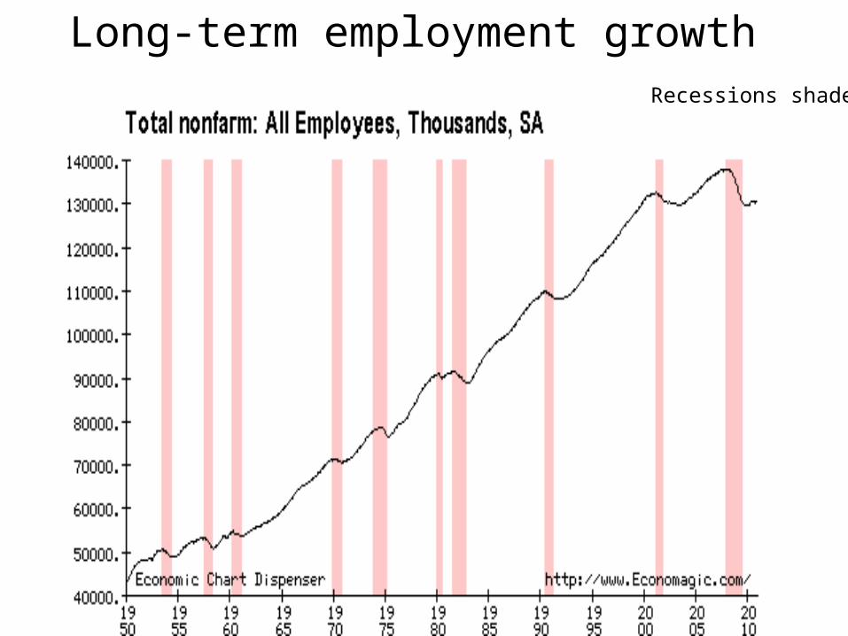
Long-term employment growthRecessions shaded

The 2000s do not look so good here

Where are the jobs?

Where are the jobswithin services?


Employment
2010Change 2010-
2020Percent Change
2010-2020Median annual
earnings
Office and Administrative Support Occupations
22,602.50 2,335.70 10.3 30,710
Healthcare Practitioners and Technical Occupations
7,799.30 2,019.70 25.9 58,490
Sales and Related Occupations 14,915.60 1,869.10 12.5 24,370
Healthcare Support Occupations 4,190.00 1,443.70 34.5 24,760
Construction and Extraction Occupations 6,328.00 1,407.20 22.2 39,080
Education, Training, and Library Occupations 9,193.60 1,403.70 15.3 45,690
Personal Care and Service Occupations 4,994.70 1,336.60 26.8 20,640
Transportation and Material Moving Occupations
9,004.80 1,328.70 14.8 28,400
Business and Financial Operations Occupations
6,789.20 1,172.50 17.3 60,670
Food Preparation and Serving Related Occupations
11,150.30 1,092.50 9.8 18,770

Typical education needed for entry 2010 Employment 2010 ShareChange 2010-
2020 % Change 2010-2021
Total, all occupations 143,068.20 100 20,468.90 14.3
Doctoral or professional degree 4,409.70 3.1 876.6 19.9
Master's degree 1,986.00 1.4 431.2 21.7
Bachelor's degree 22,171.10 15.5 3,656.10 16.5
Associate's degree 7,994.60 5.6 1,440.00 18
Postsecondary non-degree award 6,524.00 4.6 1,100.90 16.9
Some college, no degree 811.6 0.6 142.2 17.5
High school diploma or equivalent 62,089.60 43.4 7,576.10 12.2
Less than high school 37,081.70 25.9 5,245.70 14.1

What does this tell you about the future of the labor market and those ECN tests?

Unemployment: Who wants to work and can’t
•“Politics” of unemployment rate•Trends•Cycles•Limitations of measure and alternative unemployment rate measures•Composition of unemployment (gender, age, education, race & ethnicity, location, industry, occupation, duration)
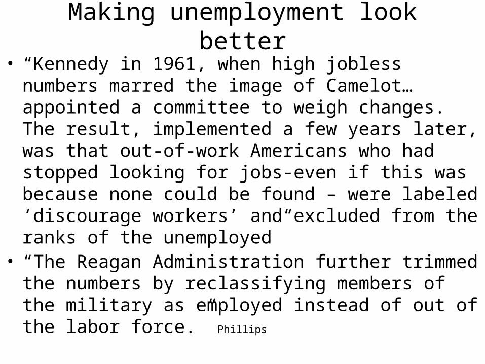
Making unemployment look better
• “Kennedy in 1961, when high jobless numbers marred the image of Camelot…appointed a committee to weigh changes. The result, implemented a few years later, was that out-of-work Americans who had stopped looking for jobs-even if this was because none could be found – were labeled ‘discourage workers’ and excluded from the ranks of the unemployed”
• “The Reagan Administration further trimmed the numbers by reclassifying members of the military as employed instead of out of the labor force.” Phillips

How does that Great Recession look here and in the following graphs?

Alternative BLS unemployment rates


Unemployment Rate: by Race & Ethnicity
How does the early 80s recession compare with the Great Recession?

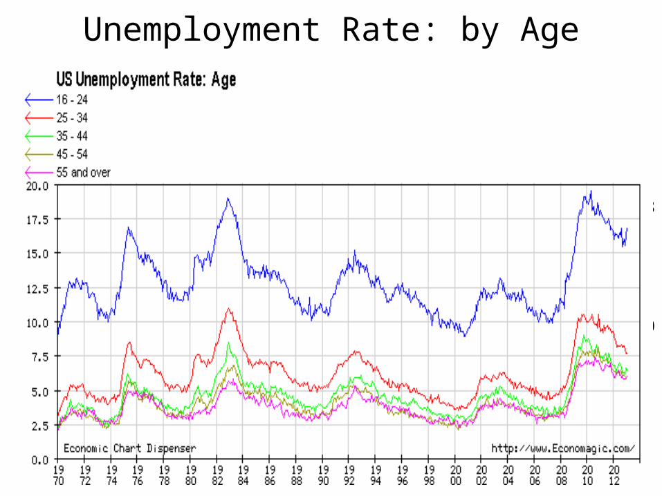
Unemployment Rate: by Age
18
10
7
16-24
34-

Unemployment Rate: by Education
16
10
5
Coll
<HS

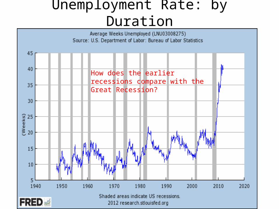
Unemployment Rate: by Duration
How does the earlier recessions compare with the Great Recession?

Case Study: The Great Recession
Macroeconomics is based on the assumption we have measures that capture how the economy is performing. Here we will look at the Great Recession and see what it looks like in the labor market.
Since recession started
1.Number employed down 7.4m
2.Number unemployed up 7.5M
3.Number unemployed > 27 weeks up +4.9M
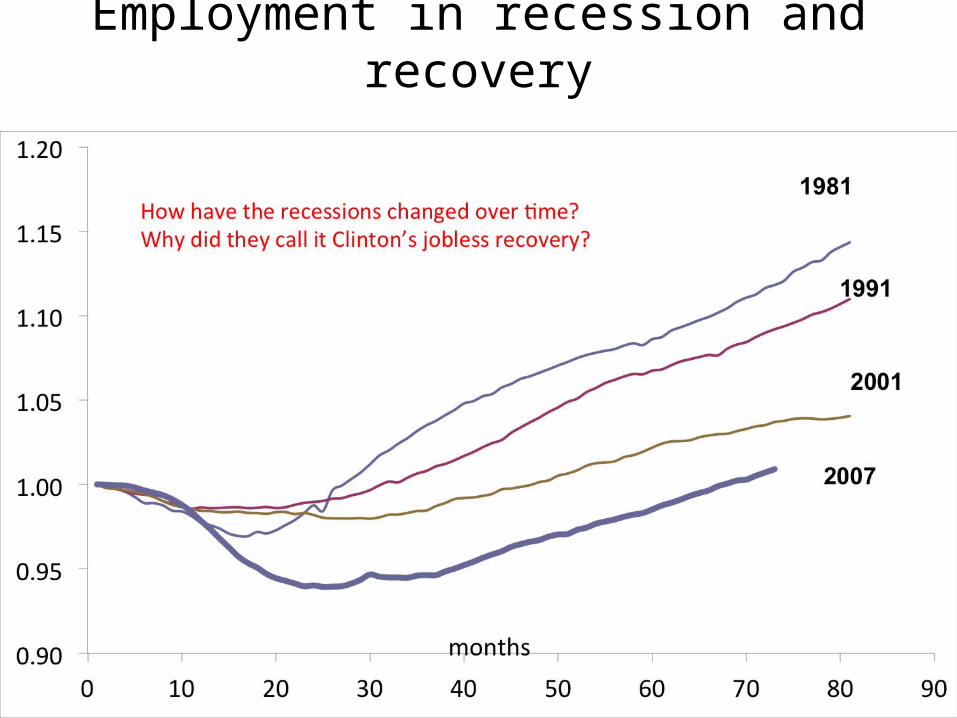
Employment in recession and recovery

Mancession

Mancession


How does the early 80s recession compare with the Great Recession – and why? What does this have to do with structural and cyclical unemployment?
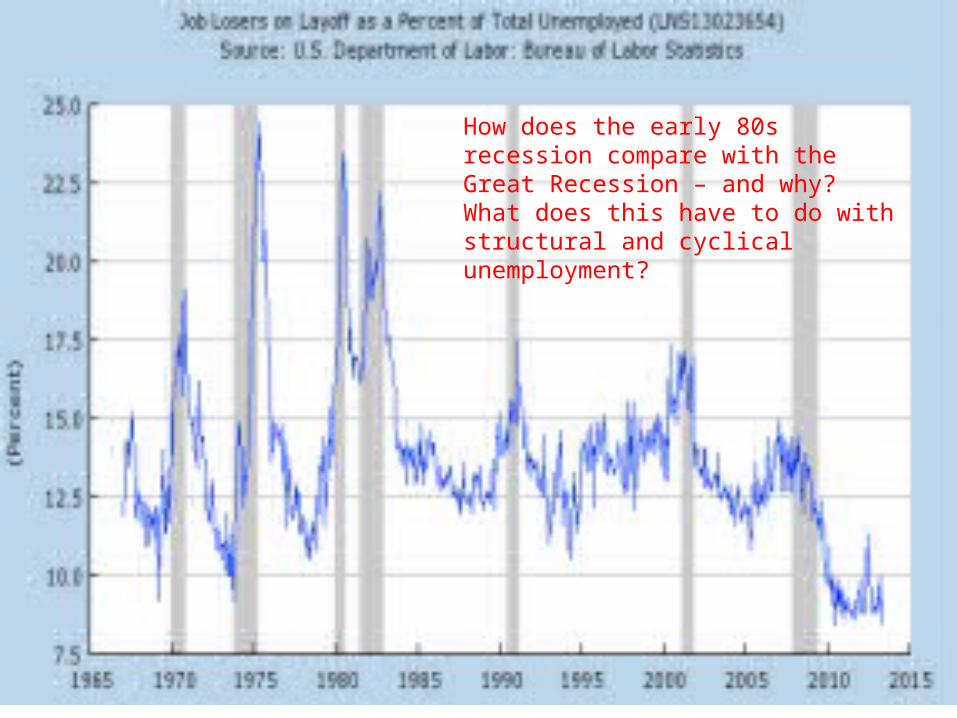
How does the early 80s recession compare with the Great Recession – and why? What does this have to do with structural and cyclical unemployment?
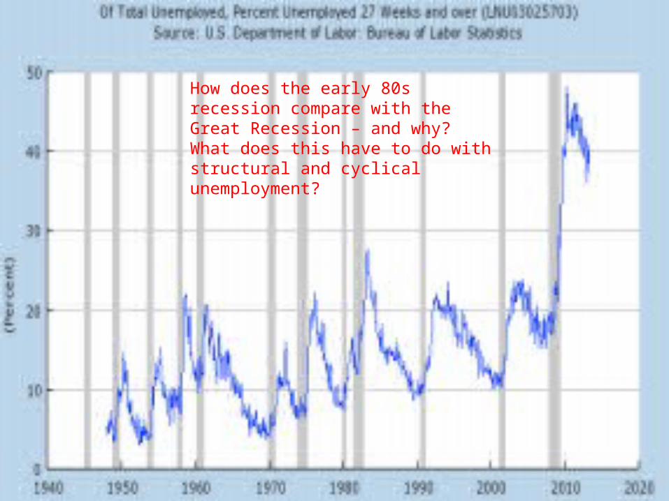
How does the early 80s recession compare with the Great Recession – and why? What does this have to do with structural and cyclical unemployment?

SSA http://www.ssa.gov/open/ODD/nation.html
What do you see here?


International comparisons

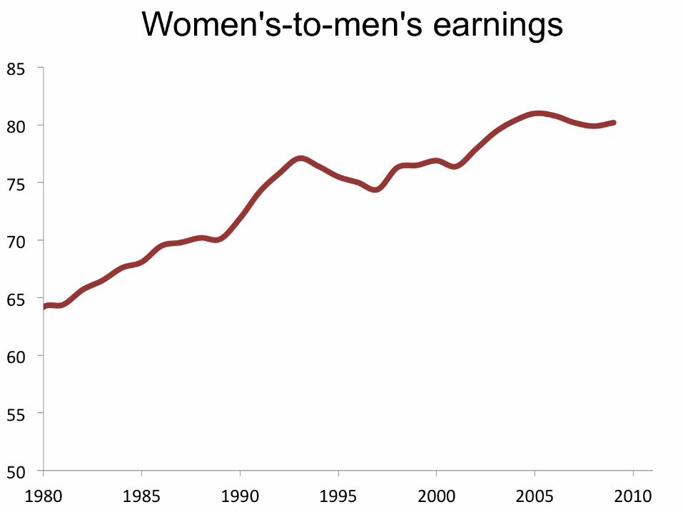
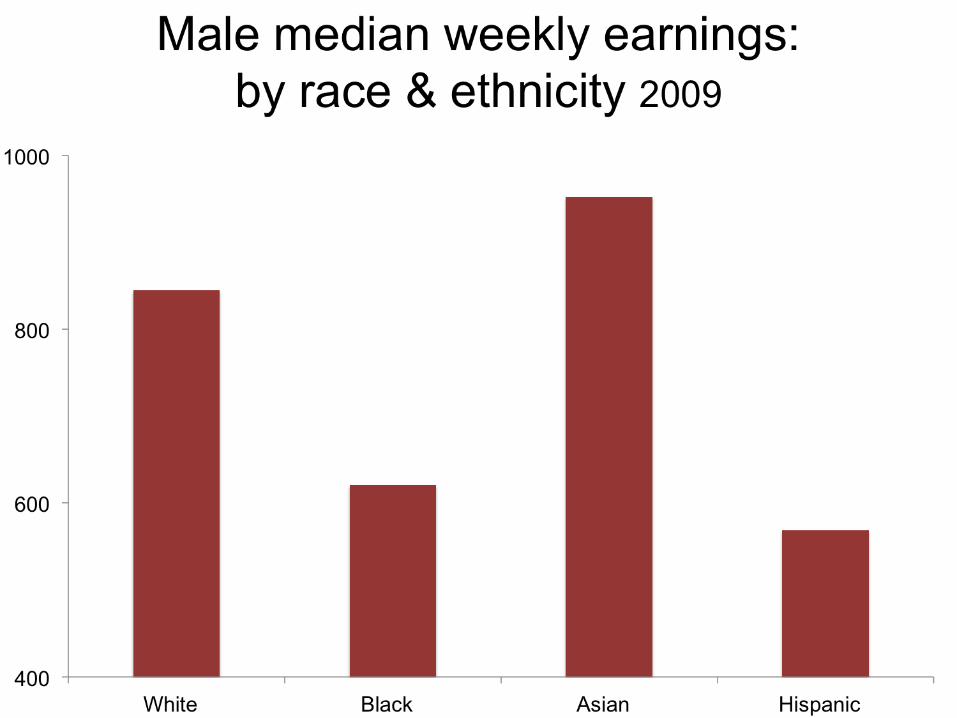
Earnings / Income: What is the reward for all that work?
•Real vs nominal
•By family structure
•By age
•By race & ethnicity
•By gender
•By region
“Using conventional methods of analysis, the data show that the median earnings for prime-age (25-64) working men have declined slightly from 1970 to 2010, falling by 4 percent after adjusting for inflation.
This finding … is unsettling, but also quite misleading. For one thing, this statistic includes only men who have jobs. In 1970, 94 percent of prime-age men worked, but by 2010, that number was only 81 percent. The decline in employment has been accompanied by increases in incarceration rates, higher rates of enrollment in the Social Security Disability Insurance program and more Americans struggling to find work.” The Uncomfortable Truth About American Wages
Worse than it looks?Worse than it looks?


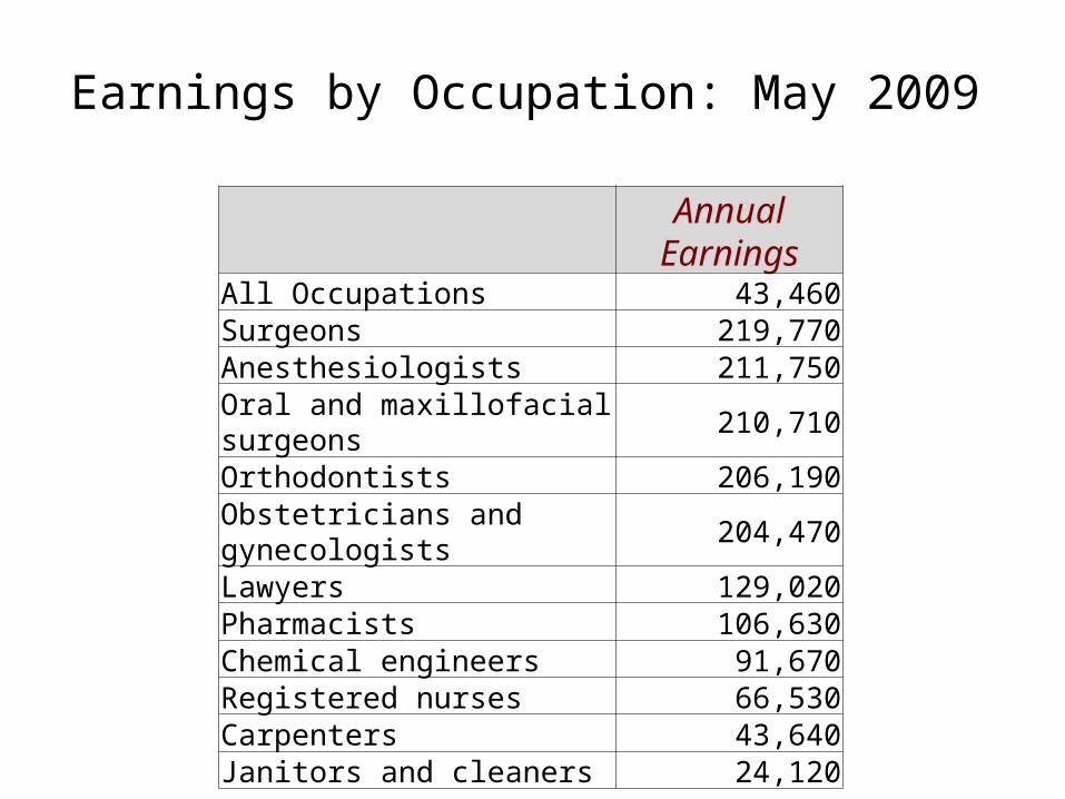
Annual
EarningsAll Occupations 43,460Surgeons 219,770Anesthesiologists 211,750Oral and maxillofacial surgeons 210,710Orthodontists 206,190Obstetricians and gynecologists 204,470Lawyers 129,020Pharmacists 106,630Chemical engineers 91,670Registered nurses 66,530Carpenters 43,640Janitors and cleaners 24,120
Earnings by Occupation: May 2009

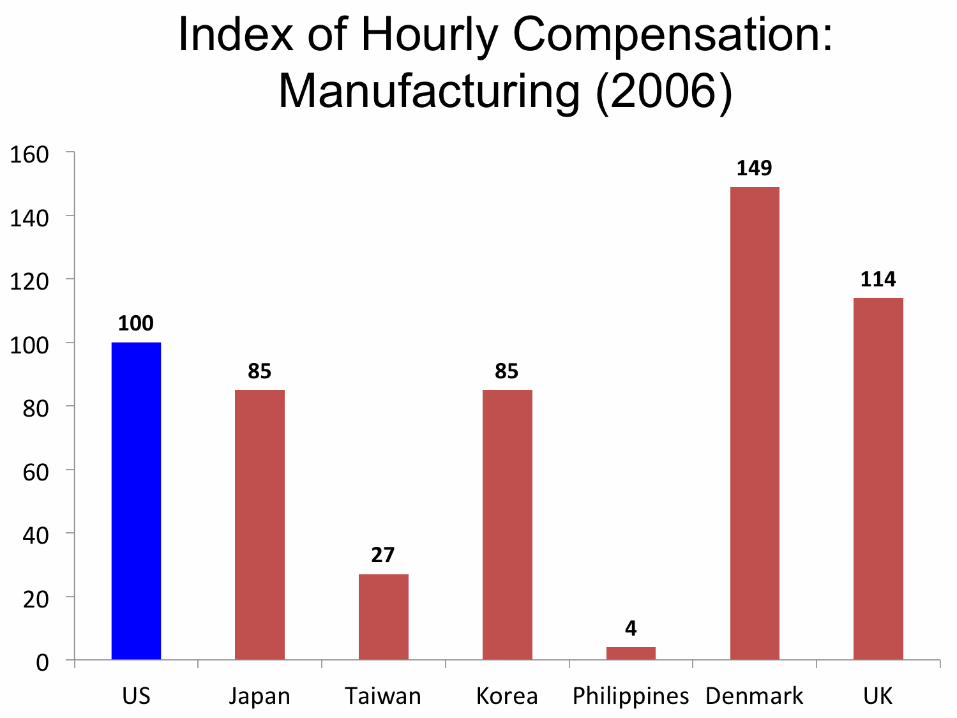
International Comparisons
Is the US “different?”

Percentage Change in Employment: 1970-2009

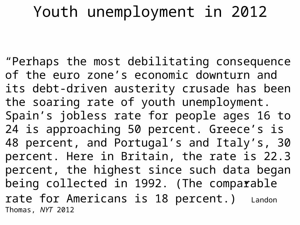
Youth unemployment in 2012
“Perhaps the most debilitating consequence of the euro zone’s economic downturn and its debt-driven austerity crusade has been the soaring rate of youth unemployment. Spain’s jobless rate for people ages 16 to 24 is approaching 50 percent. Greece’s is 48 percent, and Portugal’s and Italy’s, 30 percent. Here in Britain, the rate is 22.3 percent, the highest since such data began being collected in 1992. (The comparable rate for Americans is 18 percent.)” Landon Thomas, NYT 2012


Bannister, MLR, April 2009
China’s manufacturing employment & compensation costs: 2006-2009


