Download - The Complexity of Simplicity

This slide left intentionally blank

Everything should be made as simple as possible, but no simpler.Albert Einstein
Simplicity is the ultimate sophistication.Leonardo da Vinci
Simplicity is the glory of expression.Walt Whitman
Nothing is true, but that which is simple.Goethe
Less is more.Mies van der Rohe
Simplicity, simplicity, simplicity! Henry David Thoreau implored us.

But how?
The Complexityof SimplicityDan Saffer@odannyboy


SIMPLICITY COMPLEXITY
We tend to think of simplicity like this: as opposite complexity. A simple object is more usable, pleasing, and less complex. But this is really a false dichotomy. We don’t really mind complexity.

SIMPLICITY COMPLICATED
We mind UNNECESSARY complexity, and its byproduct: confusion.

Complicated products are characterized by
★ unclear starting place★ muddled mental model of how
the product works★ interaction design that makes
tasks overly difficult★ visual or industrial design without
recognizable patterns

SIMPLICITY COMPLICATEDSIMPLISTIC
But equally, we can also dislike products that are TOO SIMPLE, as to become simplistic. If people feel your product is simplistic, they won’t buy it because they’ll think it can’t do the job (even if it can).

Simplistic products are characterized by
★ lack of control caused by too much automation
★ underpowered or too powerful

SIMPLICITY COMPLICATEDSIMPLISTIC

Truly simple products are characterized by
★ being understandable★ having an underlying structure★ optimized for the most common
being users and use cases★ an understanding of the
complexity of the activity, but not reflective of it
We’re going to talk about how we achieve this and get to there throughout this talk.

Simplicity is in the mind
One thing to be aware of is one person’s simplicity is another person’s complex mess. Often what designers and engineers think of as simple is not.

COMPLEX?

SIMPLE?

How do we find the right
balance?
One thing that sets truly simple products apart is their ability to work under extreme conditions. To be simple, you have to aim for higher than just usable.
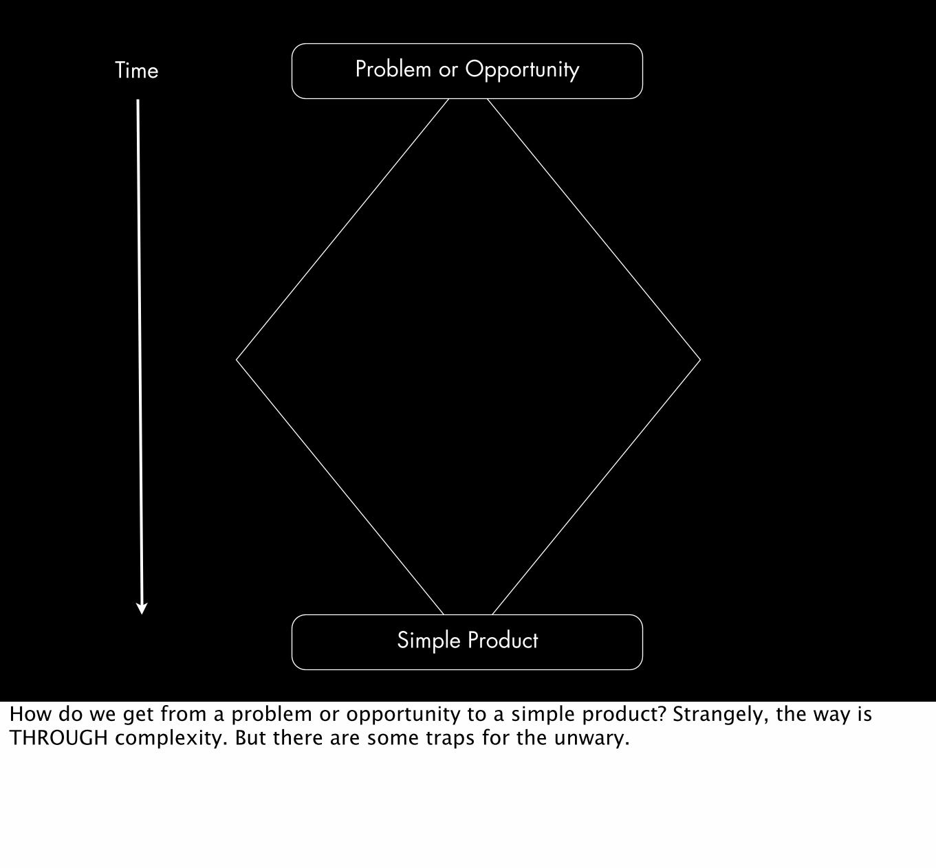
Problem or Opportunity
Simple Product
Time
How do we get from a problem or opportunity to a simple product? Strangely, the way is THROUGH complexity. But there are some traps for the unwary.

PROCRUSTES
Trust me when I say you can thank me for the placement of the title here. Procrustes was a son of Poseidon who had an iron bed in which he invited every passer-by to spend the night, and where he set to work on them with his smith's hammer, to stretch them to fit. Or if the guest proved too tall, Procrustes would amputate the excess length. Procrustes continued his reign of terror until he was captured by Theseus, traveling to Athens along the sacred way, who "fitted" Procrustes to his own bed.

Problem or Opportunity
Simple Product
Brute Force Product
Time

Lotus Notes
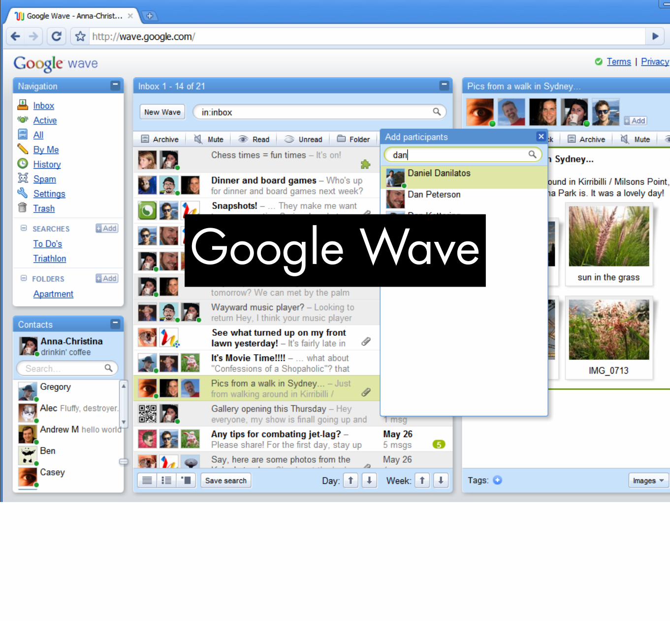
Google Wave

Segway

There is always an easy solution to every problem—neat, plausible, and wrong.H.L. Mencken

Brute force products are characterized by
★ lack of nuance★ incorrect problem framing★ conformity of the user to its way of
doing the activity, not the other way around
★ socially tone-deaf

Seek simplicity, but distrust it. Alfred North Whitehead

WHAT MAKES PRODUCTS
COMPLICATED?
No one wants to make a difficult product. No one starts out saying, you know what? Let’s make this son of bitch as confusing as possible.

Problem or Opportunity
Simple Product
Complicated Product
Brute Force Product
Time
FeaturesVersionsContext
Multiple User GroupsStakeholders
Activity ComplexityConstraintsEdge Cases

FEATURES
More features means more controls, need for a menu or a fuller menu, more complexity simply because there’s more stuff.

People love features. Companies also love features.
Without ever having used a product, people want to know what it does. They look at the feature list. Everything being equal, they will choose the product that does more, even if there are features they will likely never use.

The Sport Utility Principle
David Pogue 2006. People like to surround themselves with unnecessary power. Research has shown that feature lists matter UNTIL users use the product, after which they matter much less than the usability of the product. The idea of a feature can be more appealing than its

How to fight “featuritis”
★ tell a story★ be beautiful★ seem luxurious★ focus on differentiators other
than features★ targeted users★ transitions★ unique interactions

VERSIONS
New versions = more features. If you have to put out a new version (and I know you do) focus on improving the core functionality, not on “value-add” extras.
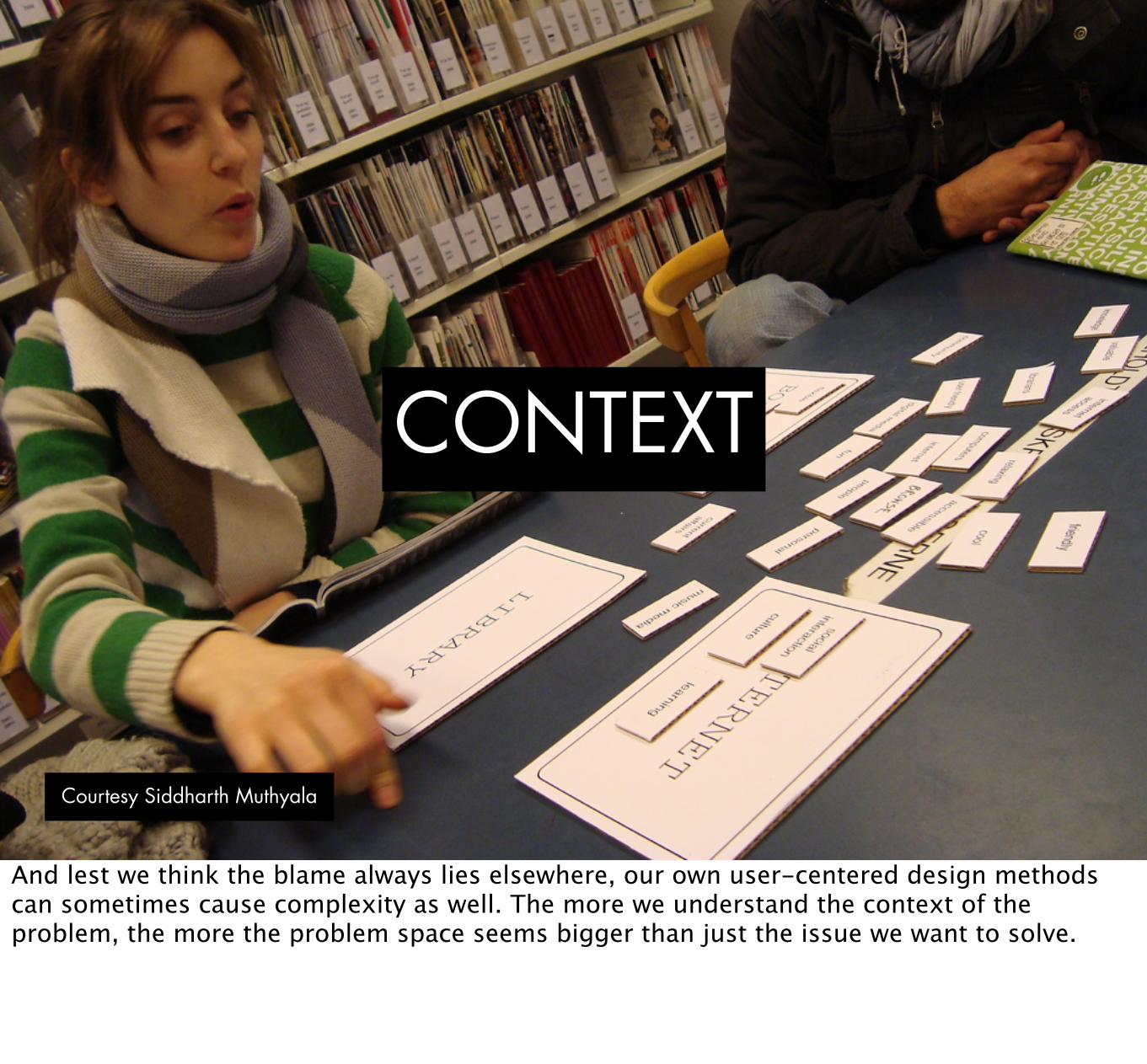
CONTEXT
Courtesy Siddharth Muthyala
And lest we think the blame always lies elsewhere, our own user-centered design methods can sometimes cause complexity as well. The more we understand the context of the problem, the more the problem space seems bigger than just the issue we want to solve.

How many designers does it take to change
a lightbulb?
Does it have to be a lightbulb? Can we rethink
the electrical grid?
How many designers does it take to change a lightbulb?
Does it have to be a lightbulb?

Users
Courtesy galaciaCAD.com
Namely, multiple user groups. When you have a diverse group of people, with their own general needs, wants, and feature requests, the product is bound to get more complicated because you have to design more areas, new ways into the site, etc.

One of the simplest homepages online ever, and even so, it had to break the site into need and have hay.
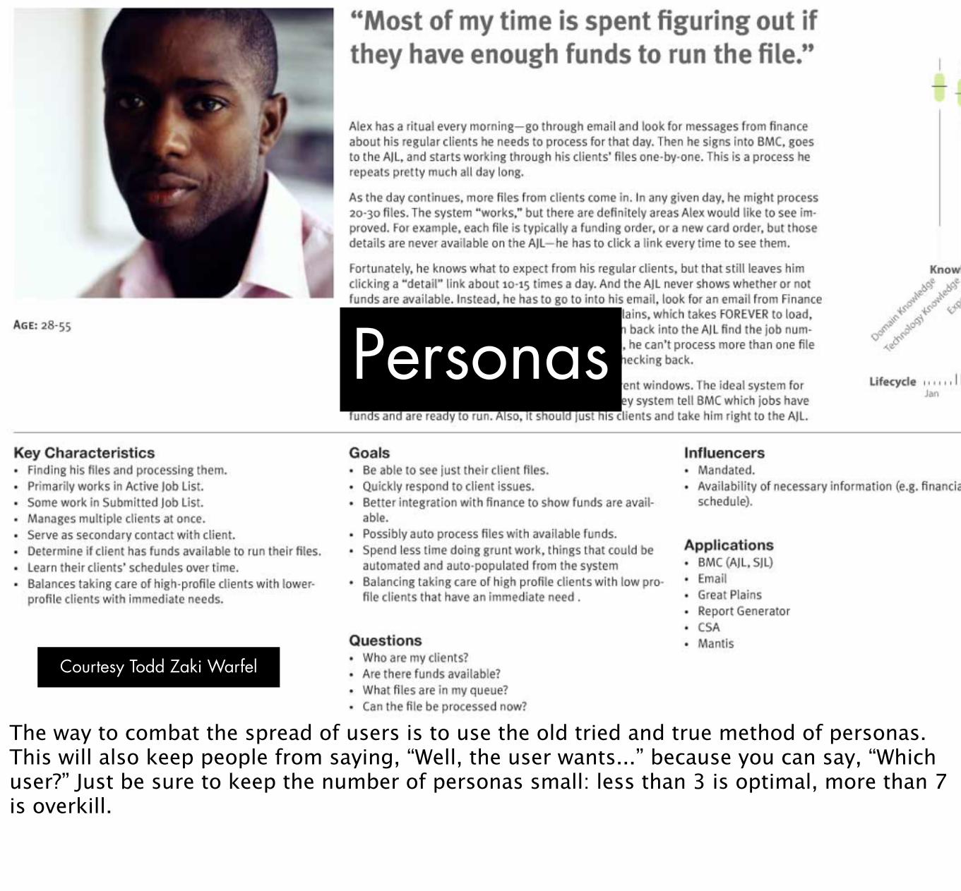
Personas
Courtesy Todd Zaki Warfel
The way to combat the spread of users is to use the old tried and true method of personas. This will also keep people from saying, “Well, the user wants...” because you can say, “Which user?” Just be sure to keep the number of personas small: less than 3 is optimal, more than 7 is overkill.

STAKEHOLDERS
Likewise, the number of stakeholders who want their pet feature or idea featured in the product, often simply so they can say they affected the product. Beware the “value add.”

Principles
Courtesy Adaptive Path
One way to avoid or at least argue effectively against stakeholders jamming in new features is by establishing design principles near the beginning of the product. Design principles state the design objectives in clear, memorable language. If you can get people to agree to those at the beginning of the project, you’ll have ammunition to use later in the project to prevent the product from being pulled in various directions.

ACTIVITY
Courtesy Sunlight Labs
All activities have some complexity. Some activities are very complex. Some things can never be made simple. We need to keep Tesler’s Law in mind.

Tesler’s Law
This is Larry Tesler, the guy who created cut and paste, among other UI conventions.

ACTIVITY
COMPLEXITY
Person
System
All processes have a core of complexity. It’s just who or what handles that complexity. [Email example]

This is what a complicated (to most people) email client would be like. It’s pushed a lot of the complexity onto the user, including remember the email addresses of where to send email.

This is what the Simplistic email client would be like. You never have to fill out anything, not even the message or to whom it’s addressed.

Autofill is a great example of the system taking on some of the complexity itself.

Of course, auto-correct can go too far...

CONSTRAINTS
Schedule
Budget
Cost
Technology
Business Processes
Team
Risk

Had I but more time, I would have written less. Thomas Jefferson
Jefferson’s quip here rings true for design as well. If you have enough time, you can come up with simpler, tighter solutions.

EDGE CASES
“But what if the user does...”
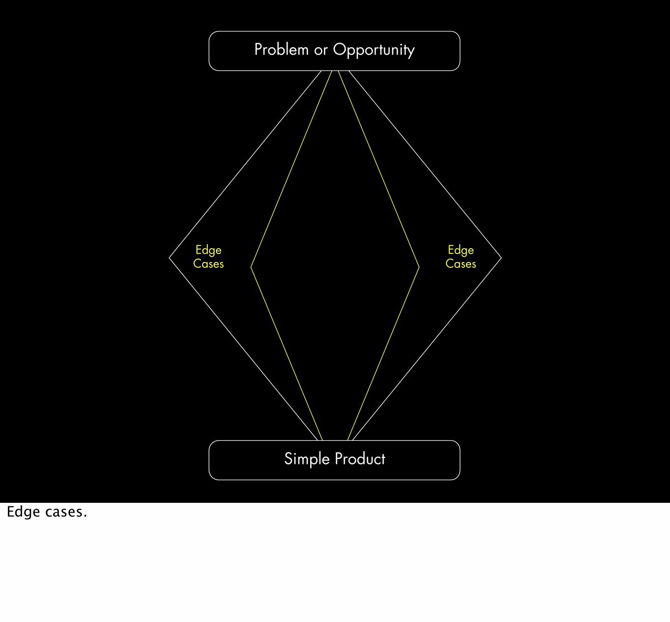
Simple Product
Problem or Opportunity
Edge Cases
Edge Cases
Edge cases.

How not to get bogged down with edge cases
★ focus on core experience first. Sell it.★ set priorities and establish frequencies
★ low chance=less priority, prominence★ almost no chance=a bug
★ prevention, not support when possible

Problem or Opportunity
Simple Product
Complicated Product
Time
FeaturesVersionsContext
Multiple User GroupsStakeholders
Activity ComplexityConstraintsEdge Cases

I would not give a fig for the simplicity this side of complexity, but I would give my life for the simplicity on the other side of complexity.Oliver Wendell Holmes
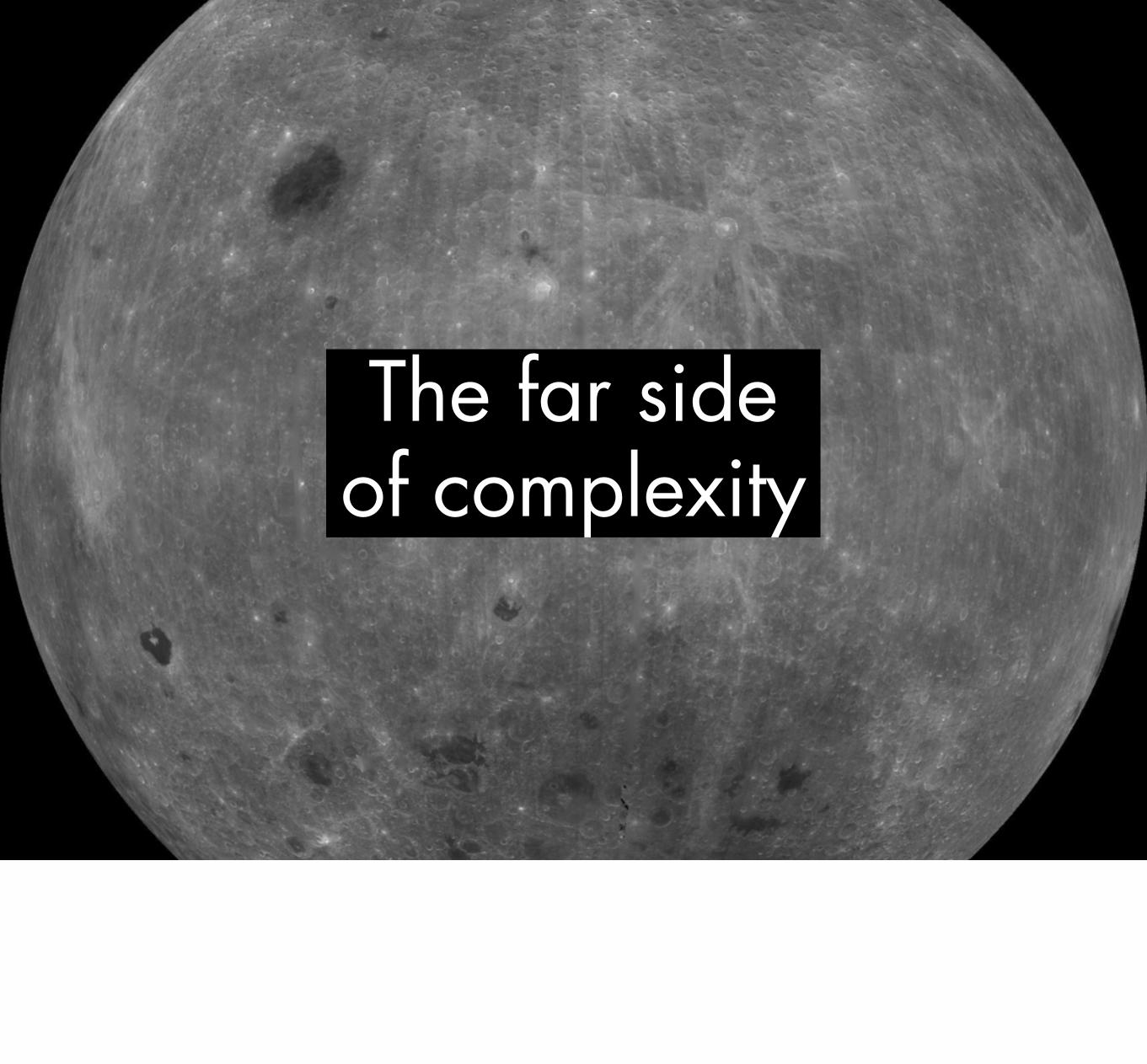
The far side of complexity

When you start looking at a problem, and it seems really simple with all these simple solutions, you don’t really understand the complexity of the problem. And your solutions are way too simplified and they don’t work. Then you get into the problem and you see it’s really complicated. And you come up with all these convoluted solutions. That’s sort of the middle, and it’s where most people stop, and the solutions tend to work for a while. But the really great person will keep on going and find, sort of, the key underlying principle of the problem. And come up with a beautiful elegant solution that works.
Steve Jobs

Problem or Opportunity
Simple Product
Complicated Product
FeaturesVersionsContext
Multiple User GroupsStakeholders
Activity ComplexityConstraintsEdge Cases
RemovingMental Model Alignment
HidingOrganizing
Expansion/CollapsingReduce Choice/Smart Defaults
Logical InconsistencyShortcuts
Distribution
So how do we make things simpler?

REMOVE
Most obvious way to simplify a product is to remove features, especially unnecessary features. When in doubt whether something should be there, consider getting rid of it.

How to choose what features to remove
★ prioritize based on user goals★ doesn’t fit the design principles★ difficult to implement and low usage★ poorly-implemented features★ “nice to haves” (that no one will miss)★ multiple ways of performing the
same task★ unnecessary options and preferences
The question you should always ask isn’t Why should we get rid of this? Instead it should be Why should we keep this?

MENTAL MODEL
ALIGNMENT
Courtesy Chris Marmo
A mental model represents a person’s thought process for how something works, based on incomplete facts, past experiences, and even intuitive perceptions. They help shape actions and behavior, influence what people pay attention to in complicated situations, and define how people approach and solve problems.
How to align mental models with the product’s conceptual model
★ match expected task activities with what is shown on screen
★ map decisions to specific controls or to a multi-purpose control
★ figure out what the system can handle★ break up complex tasks into
understandable pieces...★ ...but don’t break the task flow

HIDING
A way to reduce the choices of your product is by hiding them. Users don’t get distracted or overwhelmed by choices.

How to hide features
★ staged disclosure: functionality on a “need to use” basis
★ limit the “rocks,” but hide well★ progressive disclosure: hide precision
tools for expert users★ things that are rarely updated like
account details, one-time settings★ beware of automatic hiding of things
like menu items

ORGANIZING
Courtesy Bart Piotrowski
Organization helps many seem like few...as long as the group are less than the number of items to organize.

How to organize a product
★ make it modular: cluster similar things★ make each module easy to learn★ label in understandable ways
★ look for framing metaphors from existing products users might know
★ remove visual clutter★ keep emphasis on one or two items★ remove introductions and
unnecessary instructions

EXPAND/COLLAPSE
Courtesy FindTarget.com

Operational Simplicity vs.
Perceived Simplicity
Perceived simplicity = fewer controls, less visible optionsOperational simplicity = one control per action, everything expanded

Audience Participation: Mute, Volume Down, Volume Up
★ three controls★ two controls★ one control★ more than three controls?
(seriously?)

UI tools for collapsing
★ menus/drop-down menus★ panels★ tabs★ scrolling★ list boxes★ icons★ popups/overlays/right-click menus

UI tools for expanding
★ buttons★ sliders★ checkboxes★ radio buttons★ dials

REDUCE CHOICE/SMART DEFAULTS
Courtesy Gary Isaac
Giving choices gives people a sense of control. But as Barry Schwartz points out in Paradox of Choice, too many choices becomes a cognitive burden. Users are happier with limited choices. It’s the responsibility of the designers to help with that. This is why preferences can be so bad: they abdicate responsibility.

How to reduce choice and make smart defaults
★ best defaults are those that suit the most users most of the time
★ visual signals★ emphasis of the next likely step★ desire lines: show shortcuts
★ how alternatives are visually presented affects the choice
★ strive for no error messages★ don’t forget the almighty return key
“The natural world functions quite well without error messages.” Don Norman

Sometimes people need help getting started. Good design in some ways relies on the ability to instill instant familiarity. Make the suggested choice the default choice or the ONLY choice.

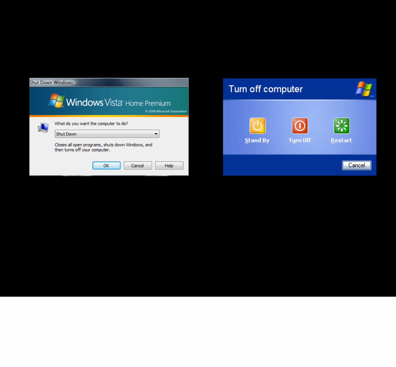
LOGICAL INCONSISTENCY
When you have a choice between being consistent or being logical, it sometimes makes sense to be inconsistent.

When to be logically inconsistent
★ optimize for common use, not an arbitrary scheme
★ make it easy to get to the last thing(s) the user was working on, even if it means putting them in a special place or pulling out of a heirarchy

A foolish consistency is the hobgoblin of little minds. Ralph Waldo Emerson

SHORTCUTS
Make it easy to access/get to
★ the last thing engaged with★ document, media, file, etc.★ step in a process
★ the last changed setting★ the next actions users often perform
immediately following★ hidden functionality for expert users★ invitations to explore (e.g. tool tips)
DISTRIBUTION
The last method is distribution of features. If you can’t rid of features, one way is to distribute them across platforms.

How to distribute functionality
★ pick the right platform for the task★ perform a “functional cartography”
Desktop Web Mobile
Feature X
Feature X
Feature X
What’s hard on one platform can be easy on another.

Problem or Opportunity
Simple Product
Time
Brute Force Product
Complicated Product
FeaturesVersionsContext
Multiple User GroupsStakeholders
Activity ComplexityConstraintsEdge Cases
RemovingMental Model Alignment
HidingOrganizing
Expansion/CollapsingReduce Choice/Smart Defaults
Logical InconsistencyShortcuts
Distribution

Most companies are looking to “wow” with their products, when in reality what they should be looking for is an “of course” reaction.Christian Lindholm
I think this gets at the heart of simplicity. Of course it works like that. Of course that feature would be here, not there. It’s this comfort of understanding combined with a feeling of mastery that is at the heart of simplicity.

Thanks.
[email protected]@odannyboy on Twitter
Go now, to the far side of complexity, and simplify your products. Thank you very much.


