
Technology Guide for Excel
Business Analytics and Modeling
Anne Keller Geraci & Kris Green
Fall 2020 Edition

(this page left blank intentionally)

Contents
Chapter 1. Format of computer information in this guide 5
Chapter 2. Basic Computer Information 6
2.1 Advice on computers and doing work electronically 6
2.2 A Note About Naming Files and File extensions 6
2.3 Folders and Organization 7
2.4 Using the help system in Microsoft Office 2016 9
2.5 Copying and pasting between programs 10
2.6 Saving your Excel data as .CSV (Comma-separated values) 10
2.7 Activating the Data Analysis Toolpak 11
Chapter 3. Using Excel 13
3.1 Excel desktop 14
3.2 Excel cursor shapes 16
3.3 Excel Errors 17
3.4 Good Data Entry Practice 18
3.5 Comments in Excel 19
3.6 Managing Worksheets in Excel 20
3.7 Sizing columns to make data fit 20
3.8 Good spreadsheet organization 21
3.9 Cell References in Excel 22
3.10 Copying Formulas in Excel 25
Chapter 4 Computing Summary Statistics in Excel 27
4.1 Computing mean & standard deviation in Excel 27
4.3 Adding up a list of values 27
4.4 Computing deviations in Excel 27
4.6 Computing Medians & Modes in Excel 28
4.8 Computing z-scores 28
4.9 Computing Percentiles in Excel 28
4.10 Using Descriptive Statistics – Data Analysis Toolpak 28
Chapter 5. Making and Using Pivot Tables 31
5.1 What is a pivot table? 31
5.2 Creating a pivot table 31
5.3 Pivot Table – Show values as 35

5.4 The Pivot Table Ribbon 36
5.5 Grouping items in the table 36
Chapter 6 Sorting data 39
Chapter 7 Data Visualization 41
7.1 Bar Graph 43
7.2 Histograms 49
7.3 Simple Boxplots (Box-and-Whisker Plots) 53
7.4 Side-by-side Boxplots (Box-and-Whisker Plots) 57
7.5 Scatter Plots 63
7.6 Adding Trend Lines to a Scatter Plot 64
7.7 Logarithmic and Log-Log plots 66
Chapter 8. Correlation & Regreession in Excel 69
8.1 Correlation 69
8.2 Simple Linear Regression 70
8.3 Dummy variables with IF functions in Excel 72
8.4 Multiple Regression 73
Chapter 9. Advanced Excel Functions 76
9.1 Using an Excel VLOOKUP table 76
9.2 Computing Values of Exponentials and Logarithms 78
9.3 Setting up functions in Excel for shifting and Scaling 79
Chapter 10 Using SOLVER 80
10.1 Introduction to using SOLVER to minimize and maximize a function. 80
10.2 Setting up constraints in Excel 81
10.3 Adding constraints in Solver 83
10.4 Options in solver 85
10.5 Errors in Solver 86
Chapter 1. Format of computer information in this guide
This technology guide is provided as a supplement to Business Analytics and Modeling, by Kris
Green – Fall 2020 Edition.
This textbook contains two kinds of computer information to help you. Each will be formatted a
little differently, so here is a brief overview of each to help you.
1. Basic information on using computers. One of the most important things you will need to
learn is how to use computers efficiently. Where will you store your data files? How
will you retreive your half-completed assignment? How will you organize your files so
that you can find them again?
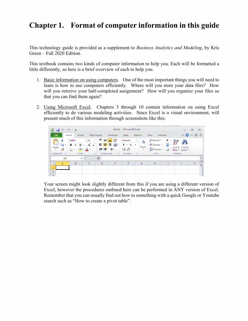
2. Using Microsoft Excel. Chapters 3 through 10 contain information on using Excel
efficiently to do various modeling activities. Since Excel is a visual environment, will
present much of this information through screenshots like this:
Your screen might look slightly different from this if you are using a different version of
Excel, however the procedures outlined here can be performed in ANY version of Excel.
Remember that you can usually find out how to something with a quick Google or Youtube
search such as “How to create a pivot table”.
Chapter 2. Basic Computer Information
2.1 Advice on computers and doing work electronically
There is nothing so tragic as bad things happening to good students.
Unknown Instructor
If you want to avoid being one of those good students to whom bad things happen, take heed of
the following advice. It should become a mantra, repeated to yourself over and over until it is a
part of your psyche:
SAVE EARLY, SAVE OFTEN.
Anytime you make a substantial change to your work like pasting a graphic in, typing a whole
sentence or paragraph, adding a table, or reformatting, you should save your file. Save as soon as
possible after starting a file. There is also a keyboard shortcut for saving files: CTRL+S. Use this
frequently to avoid losing a substantial part of your work.
2.2 A Note About Naming Files and File extensions
When you save your files (”Early and often”, remember) be sure to save them with a meaningful
name. If the file includes your solution to homework 2, then include ”homework 2” in the title.
You may also want to save all the files for each course you are taking into a separate folder, named
for the course. Finally, if the file is going to be sent electronically to your instructor (through email
or some course management system) it’s a good idea to make sure that your name appears on the
file in some way. After all, unless you are the only student in the class, the file name ”homework
2” could belong to anyone. Your instructor may even establish guidelines for naming files in order
to make file management for the entire course easier on him/herself and the teaching assistants (if
any). Be sure to check whether your instructor has a preferred file-naming system
It is also helpful when saving files to name them meaningfully. If you name the first Excel
workbook for every course you take ”File1” you will have a lot of files with the same name. Come
up with a naming convention that clearly helps you locate the files you want.
Files with this extension …. are typically used with this softare
.DOC or .DOCX Microsoft Word
.XLS or .XLSX Microsoft Excel
.R or .Rmd R Studio. (.Rmd is for R Markdown)
.CSV Comma-Separated File (data)
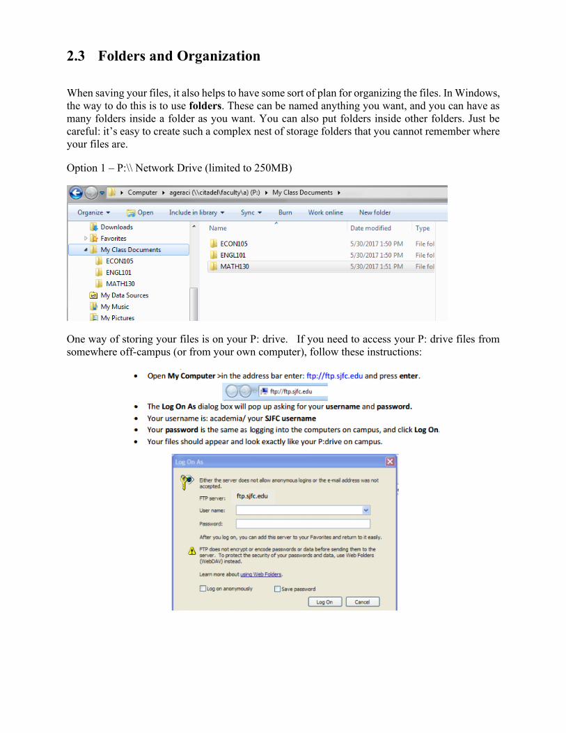
2.3 Folders and Organization
When saving your files, it also helps to have some sort of plan for organizing the files. In Windows,
the way to do this is to use folders. These can be named anything you want, and you can have as
many folders inside a folder as you want. You can also put folders inside other folders. Just be
careful: it’s easy to create such a complex nest of storage folders that you cannot remember where
your files are.
Option 1 – P:\\ Network Drive (limited to 250MB)
One way of storing your files is on your P: drive. If you need to access your P: drive files from
somewhere off-campus (or from your own computer), follow these instructions:

Option 2 – Google Drive (unlimited storage space)
The other way of storing your files is on Google Drive. These files can be accessed using this
icon on the SJFC launchpad:
For example, here’s how you might organize your Google Drive:
The benefit of this method is that you can download and install a program called Drive (from
https://tools.google.com/dlpage/drive), which will automatically synchronize your Google Drive
files to your personal computer.
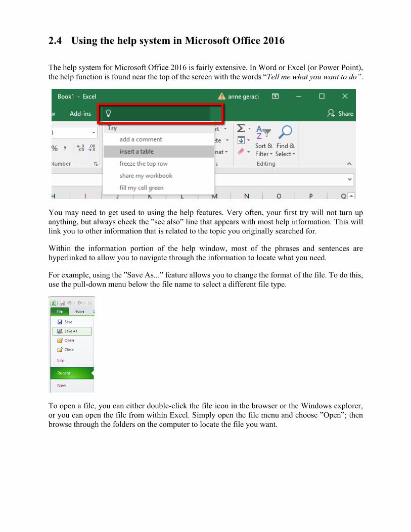
2.4 Using the help system in Microsoft Office 2016
The help system for Microsoft Office 2016 is fairly extensive. In Word or Excel (or Power Point),
the help function is found near the top of the screen with the words “Tell me what you want to do”.
You may need to get used to using the help features. Very often, your first try will not turn up
anything, but always check the ”see also” line that appears with most help information. This will
link you to other information that is related to the topic you originally searched for.
Within the information portion of the help window, most of the phrases and sentences are
hyperlinked to allow you to navigate through the information to locate what you need.
For example, using the ”Save As...” feature allows you to change the format of the file. To do this,
use the pull-down menu below the file name to select a different file type.
To open a file, you can either double-click the file icon in the browser or the Windows explorer,
or you can open the file from within Excel. Simply open the file menu and choose ”Open”; then
browse through the folders on the computer to locate the file you want.
2.5 Copying and pasting between programs
Microsoft Office 2016 is designed so that you can select information in one program, copy it
(using either the keyboard shortcut CTRL + C or the menu command ”Edit/ Copy”) and then paste
it into another program. When you copy selections, they are placed in an area called the ”clip
board”. To take these selections from the clipboard and place them into a document (either another
location in the same document, or in another document altogether) simply place the cursor where
you want the information to go and either use the keyboard shortcut ”CTRL + V” or the menu
”Edit/ Paste” to paste the object in the location you have selected.
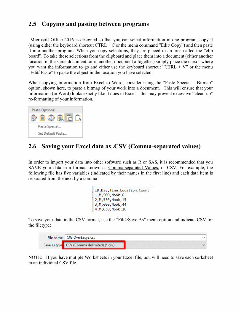
When copying information from Excel to Word, consider using the “Paste Special – Bitmap”
option, shown here, to paste a bitmap of your work into a document. This will ensure that your
information (in Word) looks exactly like it does in Excel – this may prevent excessive “clean-up”
re-formatting of your information.
2.6 Saving your Excel data as .CSV (Comma-separated values)
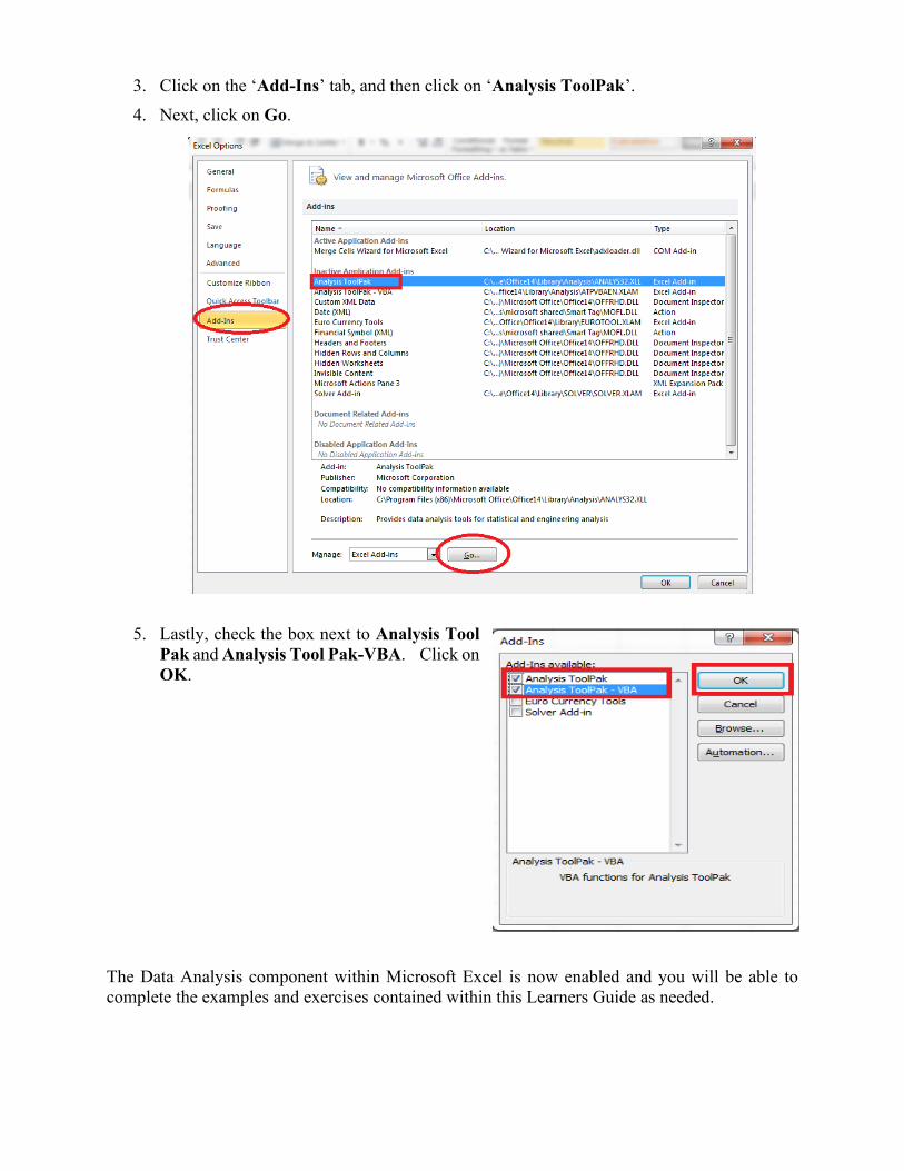
In order to import your data into other software such as R or SAS, it is recommended that you
SAVE your data in a format known as Comma-separated Values, or CSV. For example, the
following file has five variables (indicated by their names in the first line) and each data item is
separated from the next by a comma
To save your data in the CSV format, use the “File>Save As” menu option and indicate CSV for
the filetype:
NOTE: If you have mutiple Worksheets in your Excel file, uou will need to save each sorksheet
to an individual CSV file.

2.7 Activating the Data Analysis Toolpak
To enable the Data Analysis component within Excel:
1. Click File
2. Next, click on Options (your screen may
look like one of these images:
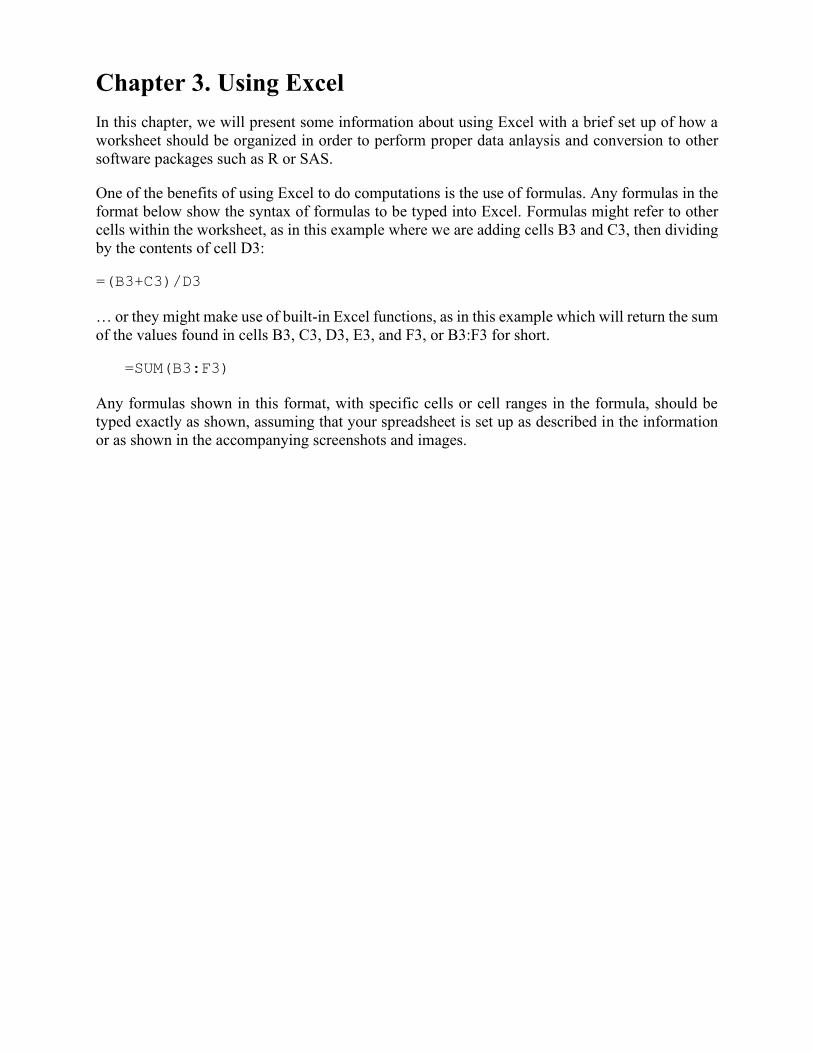
3. Click on the ‘Add-Ins’ tab, and then click on ‘Analysis ToolPak’.
4. Next, click on Go.
5. Lastly, check the box next to Analysis Tool
Pak and Analysis Tool Pak-VBA. Click on
OK.
The Data Analysis component within Microsoft Excel is now enabled and you will be able to
complete the examples and exercises contained within this Learners Guide as needed.
Chapter 3. Using Excel
In this chapter, we will present some information about using Excel with a brief set up of how a
worksheet should be organized in order to perform proper data anlaysis and conversion to other
software packages such as R or SAS.
One of the benefits of using Excel to do computations is the use of formulas. Any formulas in the
format below show the syntax of formulas to be typed into Excel. Formulas might refer to other
cells within the worksheet, as in this example where we are adding cells B3 and C3, then dividing
by the contents of cell D3:
=(B3+C3)/D3
… or they might make use of built-in Excel functions, as in this example which will return the sum
of the values found in cells B3, C3, D3, E3, and F3, or B3:F3 for short.
=SUM(B3:F3)
Any formulas shown in this format, with specific cells or cell ranges in the formula, should be
typed exactly as shown, assuming that your spreadsheet is set up as described in the information
or as shown in the accompanying screenshots and images.
3.1 Excel desktop
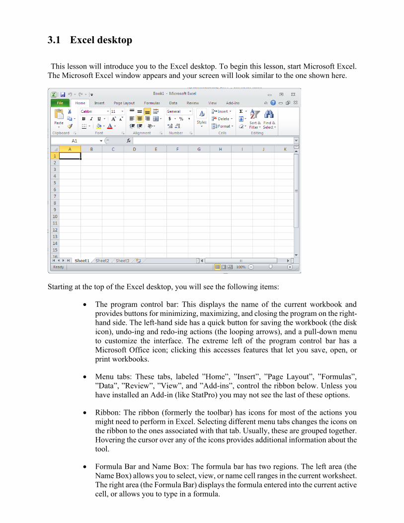
This lesson will introduce you to the Excel desktop. To begin this lesson, start Microsoft Excel.
The Microsoft Excel window appears and your screen will look similar to the one shown here.
Starting at the top of the Excel desktop, you will see the following items:
• The program control bar: This displays the name of the current workbook and
provides buttons for minimizing, maximizing, and closing the program on the right-
hand side. The left-hand side has a quick button for saving the workbook (the disk
icon), undo-ing and redo-ing actions (the looping arrows), and a pull-down menu
to customize the interface. The extreme left of the program control bar has a
Microsoft Office icon; clicking this accesses features that let you save, open, or
print workbooks.
• Menu tabs: These tabs, labeled ”Home”, ”Insert”, ”Page Layout”, ”Formulas”,
”Data”, ”Review”, ”View”, and ”Add-ins”, control the ribbon below. Unless you
have installed an Add-in (like StatPro) you may not see the last of these options.
• Ribbon: The ribbon (formerly the toolbar) has icons for most of the actions you
might need to perform in Excel. Selecting different menu tabs changes the icons on
the ribbon to the ones associated with that tab. Usually, these are grouped together.
Hovering the cursor over any of the icons provides additional information about the
tool.
• Formula Bar and Name Box: The formula bar has two regions. The left area (the
Name Box) allows you to select, view, or name cell ranges in the current worksheet.
The right area (the Formula Bar) displays the formula entered into the current active
cell, or allows you to type in a formula.

• Workspace: The main area of the screen is a grid of cells into which you enter
information, data, and formulas. Each of these cells has a name, identified by first
the column (A, B, C, etc.) and then the row (1, 2, 3, etc.) So cell D6 is in the fourth
column (labeled D) and the sixth row.
• Worksheet Control: This area, just below the workspace, has tabs to select different
worksheets in the workbook.
• Status Bar: The status bar provides quick statistics for the region of data that is
currently selected in the worksheet along the right side. Along the left side is where
you will see error messages and notifications.
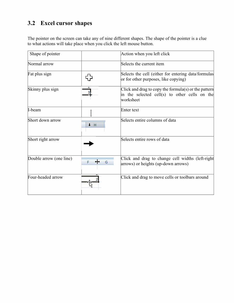
3.2 Excel cursor shapes
The pointer on the screen can take any of nine different shapes. The shape of the pointer is a clue
to what actions will take place when you click the left mouse button.
Shape of pointer Action when you left click
Normal arrow Selects the current item
Fat plus sign Selects the cell (either for entering data/formulas
or for other purposes, like copying)
Skinny plus sign
Click and drag to copy the formula(s) or the pattern
in the selected cell(s) to other cells on the
worksheet
I-beam Enter text
Short down arrow
Selects entire columns of data
Short right arrow
Selects entire rows of data
Double arrow (one line)
Click and drag to change cell widths (left-right
arrows) or heights (up-down arrows)
Four-headed arrow
Click and drag to move cells or toolbars around
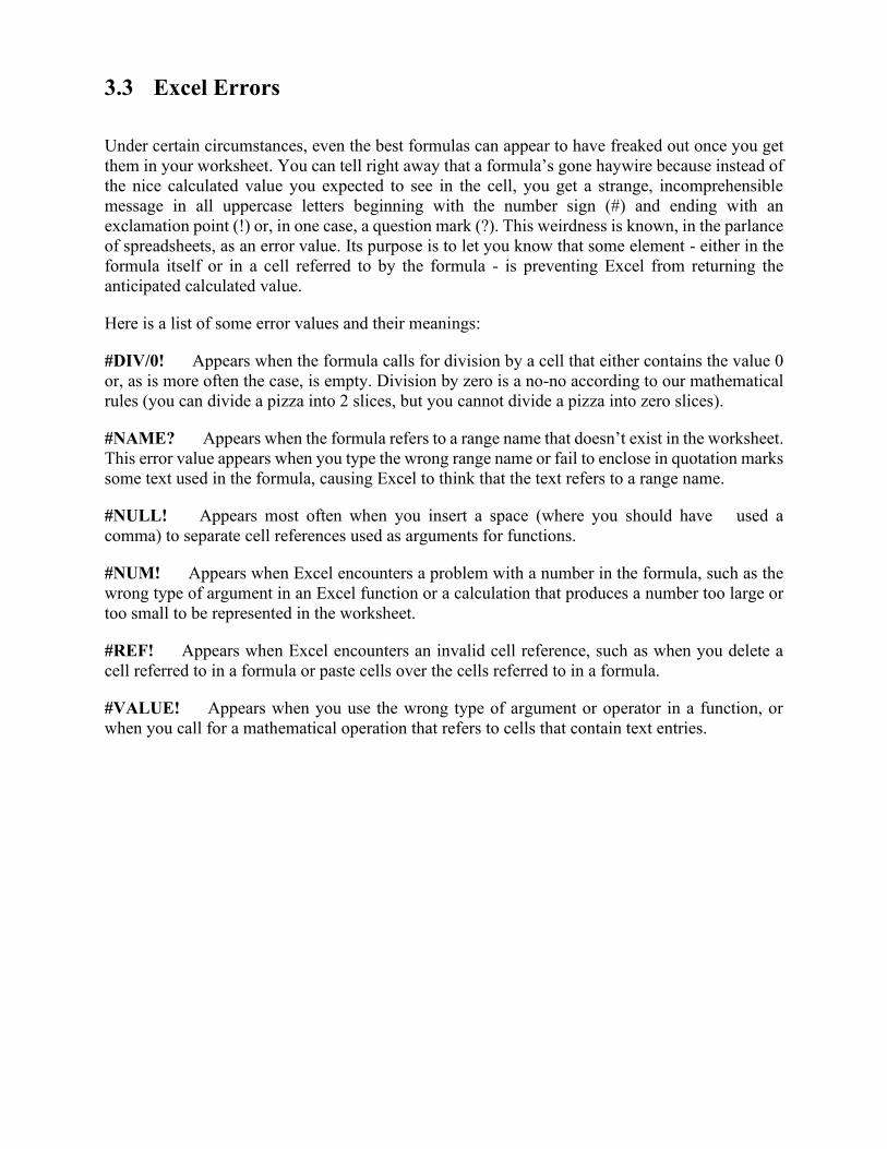
3.3 Excel Errors
Under certain circumstances, even the best formulas can appear to have freaked out once you get
them in your worksheet. You can tell right away that a formula’s gone haywire because instead of
the nice calculated value you expected to see in the cell, you get a strange, incomprehensible
message in all uppercase letters beginning with the number sign (#) and ending with an
exclamation point (!) or, in one case, a question mark (?). This weirdness is known, in the parlance
of spreadsheets, as an error value. Its purpose is to let you know that some element - either in the
formula itself or in a cell referred to by the formula - is preventing Excel from returning the
anticipated calculated value.
Here is a list of some error values and their meanings:
#DIV/0! Appears when the formula calls for division by a cell that either contains the value 0
or, as is more often the case, is empty. Division by zero is a no-no according to our mathematical
rules (you can divide a pizza into 2 slices, but you cannot divide a pizza into zero slices).
#NAME? Appears when the formula refers to a range name that doesn’t exist in the worksheet.
This error value appears when you type the wrong range name or fail to enclose in quotation marks
some text used in the formula, causing Excel to think that the text refers to a range name.
#NULL! Appears most often when you insert a space (where you should have used a
comma) to separate cell references used as arguments for functions.
#NUM! Appears when Excel encounters a problem with a number in the formula, such as the
wrong type of argument in an Excel function or a calculation that produces a number too large or
too small to be represented in the worksheet.
#REF! Appears when Excel encounters an invalid cell reference, such as when you delete a
cell referred to in a formula or paste cells over the cells referred to in a formula.
#VALUE! Appears when you use the wrong type of argument or operator in a function, or
when you call for a mathematical operation that refers to cells that contain text entries.
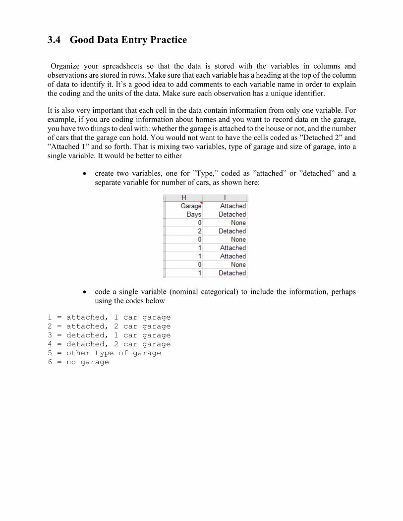
3.4 Good Data Entry Practice
Organize your spreadsheets so that the data is stored with the variables in columns and
observations are stored in rows. Make sure that each variable has a heading at the top of the column
of data to identify it. It’s a good idea to add comments to each variable name in order to explain
the coding and the units of the data. Make sure each observation has a unique identifier.
It is also very important that each cell in the data contain information from only one variable. For
example, if you are coding information about homes and you want to record data on the garage,
you have two things to deal with: whether the garage is attached to the house or not, and the number
of cars that the garage can hold. You would not want to have the cells coded as ”Detached 2” and
”Attached 1” and so forth. That is mixing two variables, type of garage and size of garage, into a
single variable. It would be better to either
• create two variables, one for ”Type,” coded as ”attached” or ”detached” and a
separate variable for number of cars, as shown here:
• code a single variable (nominal categorical) to include the information, perhaps
using the codes below
1 = attached, 1 car garage
2 = attached, 2 car garage
3 = detached, 1 car garage
4 = detached, 2 car garage
5 = other type of garage
6 = no garage
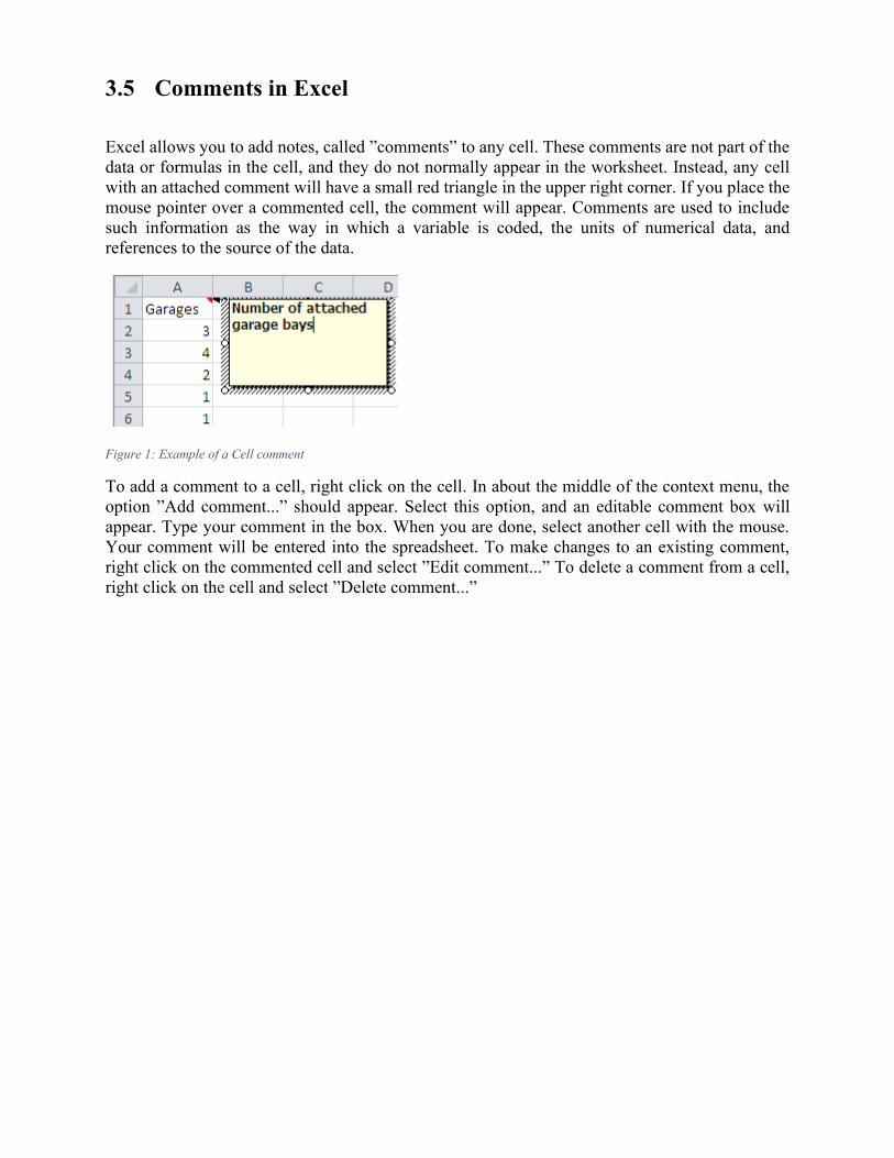
3.5 Comments in Excel
Excel allows you to add notes, called ”comments” to any cell. These comments are not part of the
data or formulas in the cell, and they do not normally appear in the worksheet. Instead, any cell
with an attached comment will have a small red triangle in the upper right corner. If you place the
mouse pointer over a commented cell, the comment will appear. Comments are used to include
such information as the way in which a variable is coded, the units of numerical data, and
references to the source of the data.
Figure 1: Example of a Cell comment
To add a comment to a cell, right click on the cell. In about the middle of the context menu, the
option ”Add comment...” should appear. Select this option, and an editable comment box will
appear. Type your comment in the box. When you are done, select another cell with the mouse.
Your comment will be entered into the spreadsheet. To make changes to an existing comment,
right click on the commented cell and select ”Edit comment...” To delete a comment from a cell,
right click on the cell and select ”Delete comment...”
3.6 Managing Worksheets in Excel
An Excel workbook (e.g. MYDATA.XLSX) can contain many different worksheets. By default,
these are named ”Sheet1”, ”Sheet2”, etc. Worksheets are accessed by the tabs at the bottom of
the screen, as shown here:
To re-name a sheet: double-click on the name of the sheet and it the sheet name will be
highlighted. Type in the new name for the sheet and hit ENTER. (You can also right click on the
sheet name and select ”Rename” from the menu.)
To add another worksheet to your workbook you may either use the ”Insert” menu, or right-click
on the worksheet tabs and select ”Add worksheet”. You can also click on the worksheet tab to the
right of the last worksheet in the workbook. To change the order of the worksheets, click and drag
one of the tabs to a new place in the list; you will see a small sheet icon and a down arrow showing
you where the sheet will be placed. It is also helpful to rename the worksheets with more
meaningful names than ”Sheet1” and ”Sheet2”. To do this, either
3.7 Sizing columns to make data fit
You may also run into the problem that information you enter into cells in a spreadsheet might not
fit. You have two options to get information to fit: You can either resize the columns or you can
enter the text on multiple lines. To resize the columns, you can go to the column header and either
clip-and-drag the width of the column to the desired size or you can double-click on it so that it
automatically resizes to be wide enough for the widest entry in that column.
To enter information in multiple lines within a single cell in Excel, first type the information on
the first line and then hit ALT+ENTER to move to the second line. You can use as many lines as
you want.
3.8 Good spreadsheet organization
When doing summary calculations in Excel, it is recommended that you leave a space between the
raw data and the calculations. For example, in this worksheet we are computing the mean of the
Salary data (in column A). Note that we left column A blank and make our calculations in
Column C and D.
It is also acceptable to use a new worksheet for such calculations.
3.9 Cell References in Excel
Excel organizes information into sheets. Each worksheet is then organized by columns (labeled
by letters) and rows (labeled by numbers). Thus, every cell (rectangle on the worksheet that
contains information) has a name, called a cell reference. This cell reference is usually given the
way you called out locations on the game Battleship: as a column and a row. For example, in the
worksheet shown at the right, the word ”SALARY” is in cell A1. The mean of the salary data is in
cell D1. Such a reference is called a relative cell reference.
There are other types of cell references (called absolute cell references) that you will learn about
below. The other important thing to know about cell references is that you can easily refer to a
block of cells, as long as the block of cells forms some sort of rectangle. For example, to refer to
the salaries themselves on the worksheet above, you would refer to all the cells in the rectangle
starting in cell A2 and continuing through cell A11. In Excel notation, this entire range of cells is
identified by A2:A11.
Absolute Cell References in Excel
Above, you learned how to refer to any cell or range of cells using the grid system in Excel. If
there is data in the cell in column D in row 2, this cell is referred to as D2. However, this type of
cell reference (a relative reference) will change if the formula is copied to another cell. Many times
(as in the example below of computing deviations) a particular cell reference will need to be
absolute. This means that it will not change if the formula is copied. To make a cell reference
absolute, place a dollar sign ($) in front of both the column and row. Thus, an absolute reference
to cell D2 would look like $D$2.
As you may have guessed, you can have mixed references also, where either the column or row is
absolute. In general, if you don’t want part of the reference (either the row or column) to change
as you copy the formula, be sure to place a dollar sign in front of it.
When you are typing a cell reference into a formula, you do not have to type the dollar signs to
convert them to absolute references. After you type a cell reference in a formula (say you type
A2), hit the F4 button along the top row of the keyboard. This converts the current cell reference
into an absolute reference (so now you would have $A$2). If you hit the F4 button again, it is
converted to a mixed reference with the row fixed (A$2), hitting it again will convert it to a mixed
reference with the column fixed ($A2). Finally, hitting F4 a fourth time will cycle back to a relative
reference (A2).
Three dimensional cell references in Excel
In addition to referring to cells by the column and row, Excel allows you to build formulas that
include references to cells on other worksheets in the current workbook. Suppose you are entering
a formula in ’Sheet 1’ of a workbook and there is a number in cell D4 of ’Sheet 2’ that you want
the formula to look up. Simply typing D4 in the current formula will not work; Excel will simply
look up the value in cell D4 of the workbook containing the formula. To get around this, you must
use a 3D cell reference. All this involves is including the name of the worksheet in single quotes,
followed by the ”bang” or exclamation mark symbol (!) and then the normal cell reference. So, in
our example, to get a formula in ’Sheet 1’ to use the value in cell D4 from ’Sheet 2’, you need to
type the cell reference exactly in the form
’Sheet 2’!D4
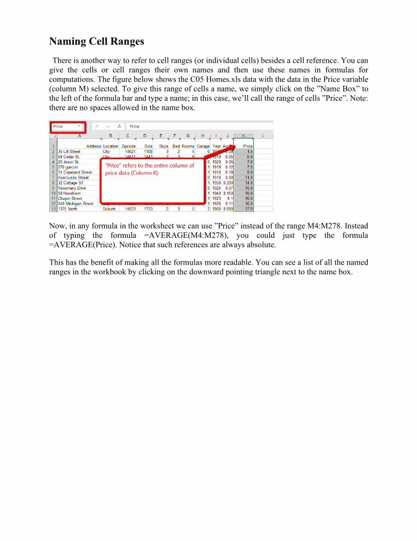
Naming Cell Ranges
There is another way to refer to cell ranges (or individual cells) besides a cell reference. You can
give the cells or cell ranges their own names and then use these names in formulas for
computations. The figure below shows the C05 Homes.xls data with the data in the Price variable
(column M) selected. To give this range of cells a name, we simply click on the ”Name Box” to
the left of the formula bar and type a name; in this case, we’ll call the range of cells ”Price”. Note:
there are no spaces allowed in the name box.
Now, in any formula in the worksheet we can use ”Price” instead of the range M4:M278. Instead
of typing the formula =AVERAGE(M4:M278), you could just type the formula
=AVERAGE(Price). Notice that such references are always absolute.
This has the benefit of making all the formulas more readable. You can see a list of all the named
ranges in the workbook by clicking on the downward pointing triangle next to the name box.
3.10 Copying Formulas in Excel
There are three different ways to copy formulas in Excel from one cell to another cell or to a
group of cells (like a whole column): standard copy and paste commands, dragging the fill handle,
or double-clicking the fill handle.
Using Copy and Paste Commands
This method is the most obvious. First select the cell with the formula you want to copy. Copy
this using either CTRL+C, the copy button on the toolbar, or the ”Edit/Copy” menu command.
Now highlight the cell or cells where you want the formula to be placed and paste it in using either
CTRL+V, the paste button on the toolbar, or the ”Edit/Paste” menu command.
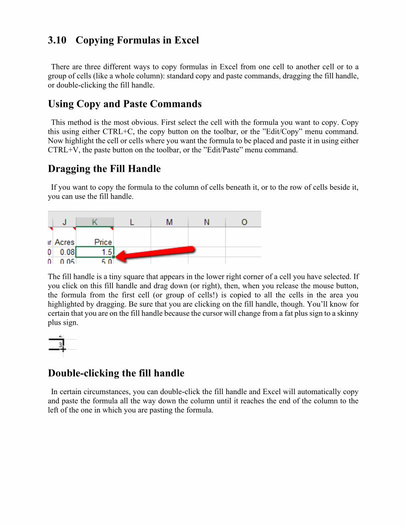
Dragging the Fill Handle
If you want to copy the formula to the column of cells beneath it, or to the row of cells beside it,
you can use the fill handle.
The fill handle is a tiny square that appears in the lower right corner of a cell you have selected. If
you click on this fill handle and drag down (or right), then, when you release the mouse button,
the formula from the first cell (or group of cells!) is copied to all the cells in the area you
highlighted by dragging. Be sure that you are clicking on the fill handle, though. You’ll know for
certain that you are on the fill handle because the cursor will change from a fat plus sign to a skinny
plus sign.
Double-clicking the fill handle
In certain circumstances, you can double-click the fill handle and Excel will automatically copy
and paste the formula all the way down the column until it reaches the end of the column to the
left of the one in which you are pasting the formula.
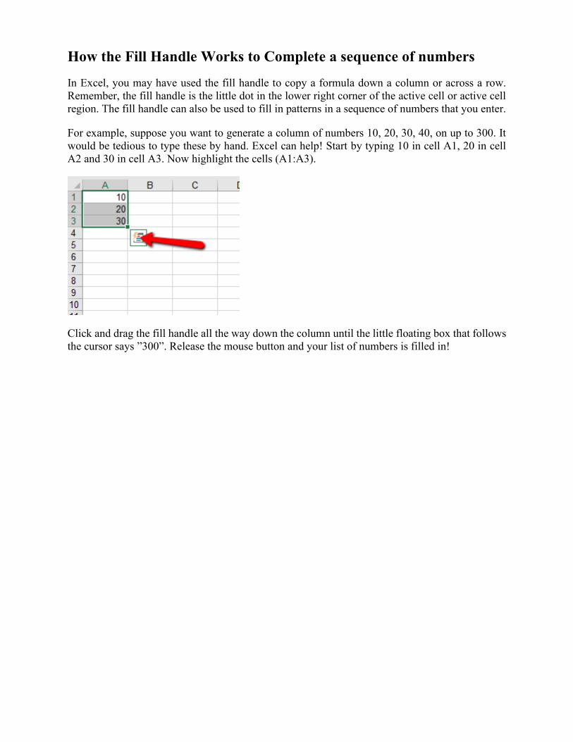
How the Fill Handle Works to Complete a sequence of numbers
In Excel, you may have used the fill handle to copy a formula down a column or across a row.
Remember, the fill handle is the little dot in the lower right corner of the active cell or active cell
region. The fill handle can also be used to fill in patterns in a sequence of numbers that you enter.
For example, suppose you want to generate a column of numbers 10, 20, 30, 40, on up to 300. It
would be tedious to type these by hand. Excel can help! Start by typing 10 in cell A1, 20 in cell
A2 and 30 in cell A3. Now highlight the cells (A1:A3).
Click and drag the fill handle all the way down the column until the little floating box that follows
the cursor says ”300”. Release the mouse button and your list of numbers is filled in!
Chapter 4 Computing Summary Statistics in Excel
4.1 Computing mean & standard deviation in Excel
Excel uses the function AVERAGE for the mean. To compute the mean of the data in cells
A2:A11, we enter the formula
=average(A2:A11)
into any cell on the spreadsheet. If you later move or copy the cell containing this formula, the
cell references will be changed since we used relative cell references. This means that the formula
will probably not point to the right cells anymore. Also remember that if you change any of the
data in cells A2:A11 the mean will be re-calculated instantly. If, however, you add data outside
this range, you will need to change the formula.
There are two different standard deviation functions to use in Excel, depending on whether the
data is from a sample or a population.
To compute the standard deviation of a sample (this is the most commonly used version), use the
formula
=stdev(range of cells)
For the standard deviation of a population, use the formula
=stdevp(range of cells)
4.3 Adding up a list of values
If you have a list of values, you can quickly add them together using the SUM command in Excel.
For example, if your values to be added are in cells A2:A26, entering the command
=SUM(A2:A26)
into cell B2 (or any other cell) will add the values together.
4.4 Computing deviations in Excel
In order to compute the deviations in Excel, we first need the mean of all the data. Let’s calculate
this with Excel by typing =average(A2:A20) into cell F1.
Now, we will create a new column for the deviations. In cell B1, type ”Deviation” so that the
column has a label. Now, in cell B2, we want to enter a formula to compute difference between
the first data point (in cell A2) and the average (an absolute reference to cell F1). Thus, we enter
the formula
=A2 - $F$1
Now we simply copy this formula (see below) down to the other cells, using the “Fill Handle”
procedure described above.
4.6 Computing Medians & Modes in Excel
To compute the median of the data in cells A2:A11, we enter the formula
= MEDIAN(A2:A11)
into any cell on the spreadsheet. Remember, though, that if you later move or copy the cell, the
cell references will be changed since we used relative cell references. Also remember that if you
change any of the data in cells A2:A11 the median will be re-calculated instantly. If, however, you
add data outside this range, you will need to change the formula.
The mode is computed with the formula
=MODE(A2:A11)
You may get the result #N/A if there is no mode. If there is more than one mode, Excel just guesses
and gives one of them. The fact that there may be more than one mode, or no mode at all, is why
this statistic is rarely used except for categorical data.
4.8 Computing z-scores
To compute z-scores for the variable Price (cells M3:M278), we first need to compute the mean
and standard deviation. In cell P1 enter =AVERAGE(M3:M278) to compute the average and in
cell P2 enter =STDEV(M3:M278) to get the standard deviation. Now, in column N, enter ”Z
Score” in N3 and enter the formula below into N4
=(M4 - $P$1)/$P$2
All that is left is to copy the formula to the rest of column N (N5:N278).
4.9 Computing Percentiles in Excel
To calculate percentiles in Excel, use the formula
=PERCENTILE(array of cells, percentile)
Note that percentile should be entered as a decimal number. Thus, for the 80% percentile, you
should enter 0.80. For the 35th percentile, enter 0.35.
4.10 Using Descriptive Statistics – Data Analysis Toolpak
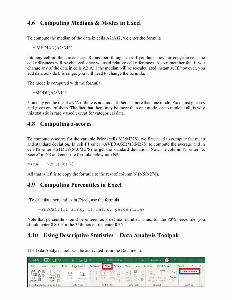
The Data Analysis tools can be actrivated from the Data menu:
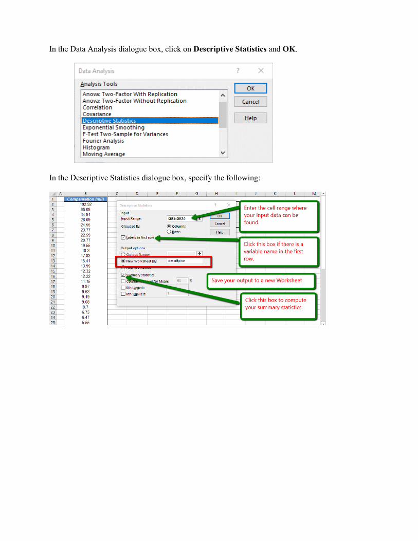
In the Data Analysis dialogue box, click on Descriptive Statistics and OK.
In the Descriptive Statistics dialogue box, specify the following:
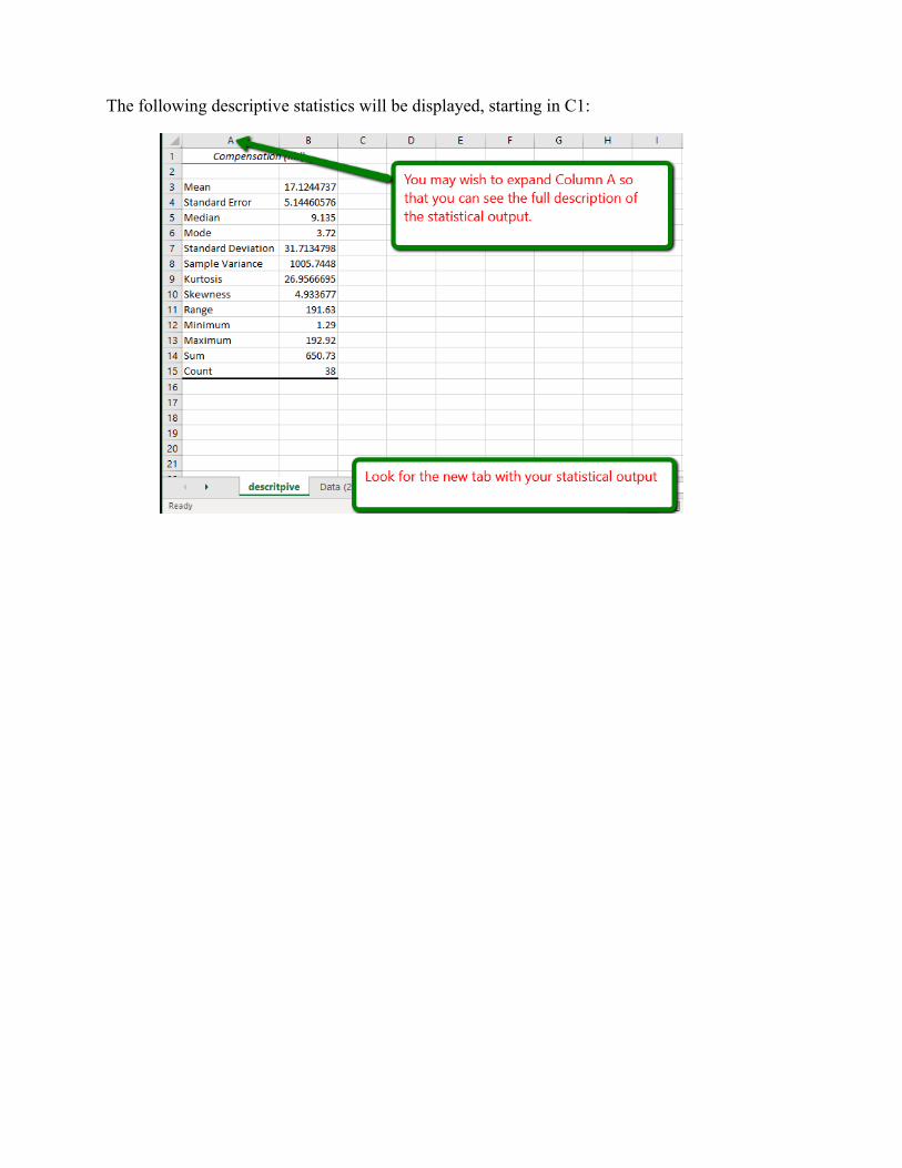
The following descriptive statistics will be displayed, starting in C1:
Chapter 5. Making and Using Pivot Tables
5.1 What is a pivot table?
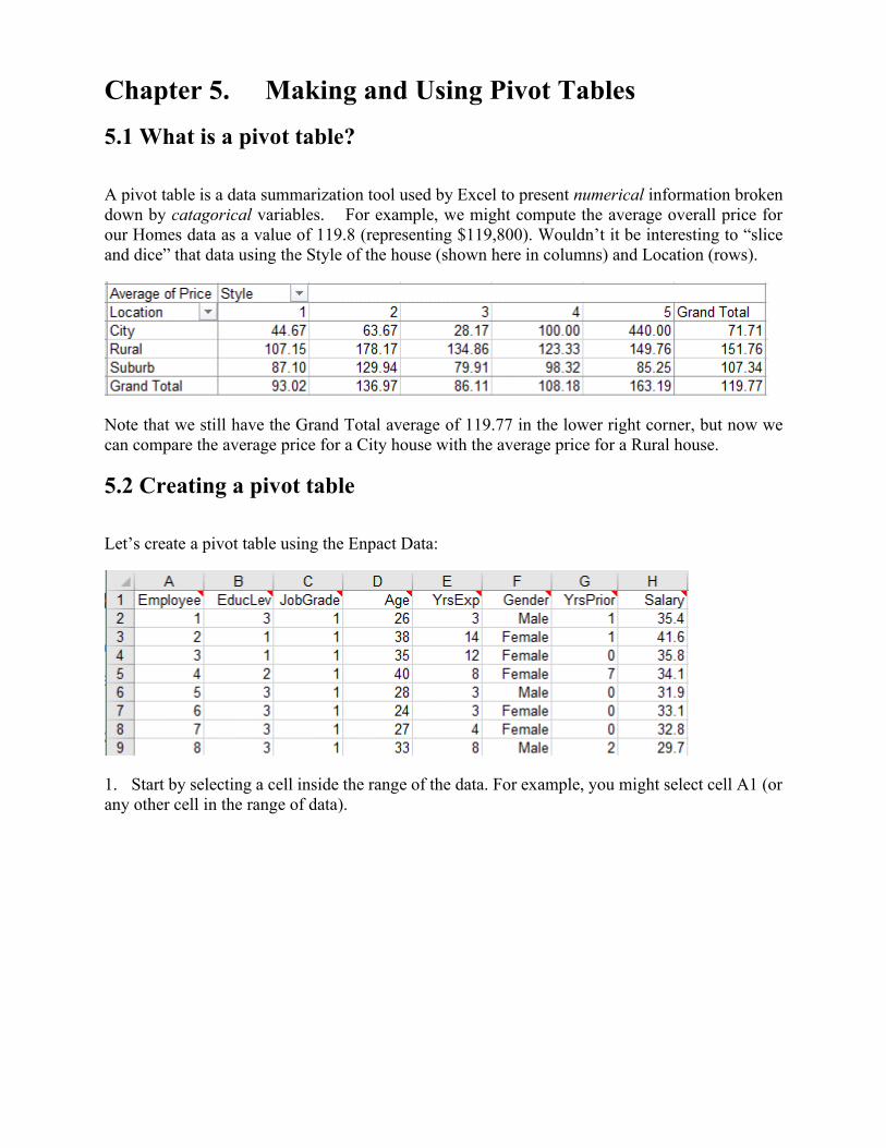
A pivot table is a data summarization tool used by Excel to present numerical information broken
down by catagorical variables. For example, we might compute the average overall price for
our Homes data as a value of 119.8 (representing $119,800). Wouldn’t it be interesting to “slice
and dice” that data using the Style of the house (shown here in columns) and Location (rows).
Note that we still have the Grand Total average of 119.77 in the lower right corner, but now we
can compare the average price for a City house with the average price for a Rural house.
5.2 Creating a pivot table
Let’s create a pivot table using the Enpact Data:
1. Start by selecting a cell inside the range of the data. For example, you might select cell A1 (or
any other cell in the range of data).
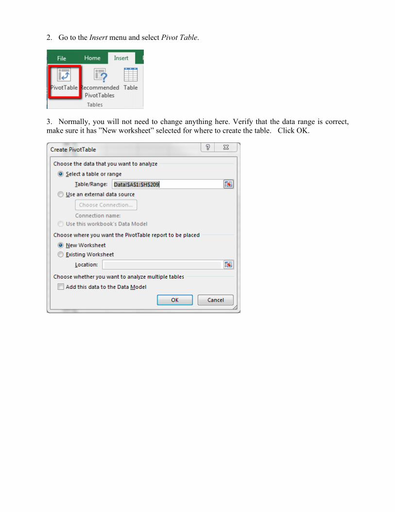
2. Go to the Insert menu and select Pivot Table.
3. Normally, you will not need to change anything here. Verify that the data range is correct,
make sure it has ”New worksheet” selected for where to create the table. Click OK.
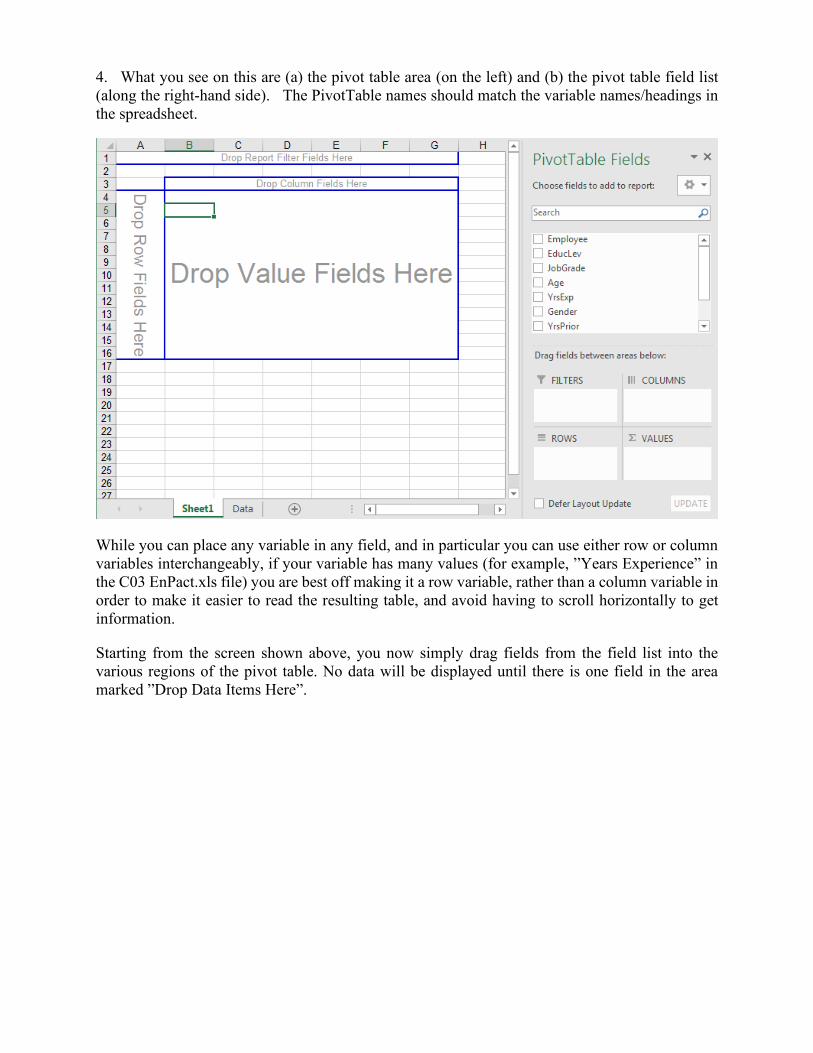
4. What you see on this are (a) the pivot table area (on the left) and (b) the pivot table field list
(along the right-hand side). The PivotTable names should match the variable names/headings in
the spreadsheet.
While you can place any variable in any field, and in particular you can use either row or column
variables interchangeably, if your variable has many values (for example, ”Years Experience” in
the C03 EnPact.xls file) you are best off making it a row variable, rather than a column variable in
order to make it easier to read the resulting table, and avoid having to scroll horizontally to get
information.
Starting from the screen shown above, you now simply drag fields from the field list into the
various regions of the pivot table. No data will be displayed until there is one field in the area
marked ”Drop Data Items Here”.
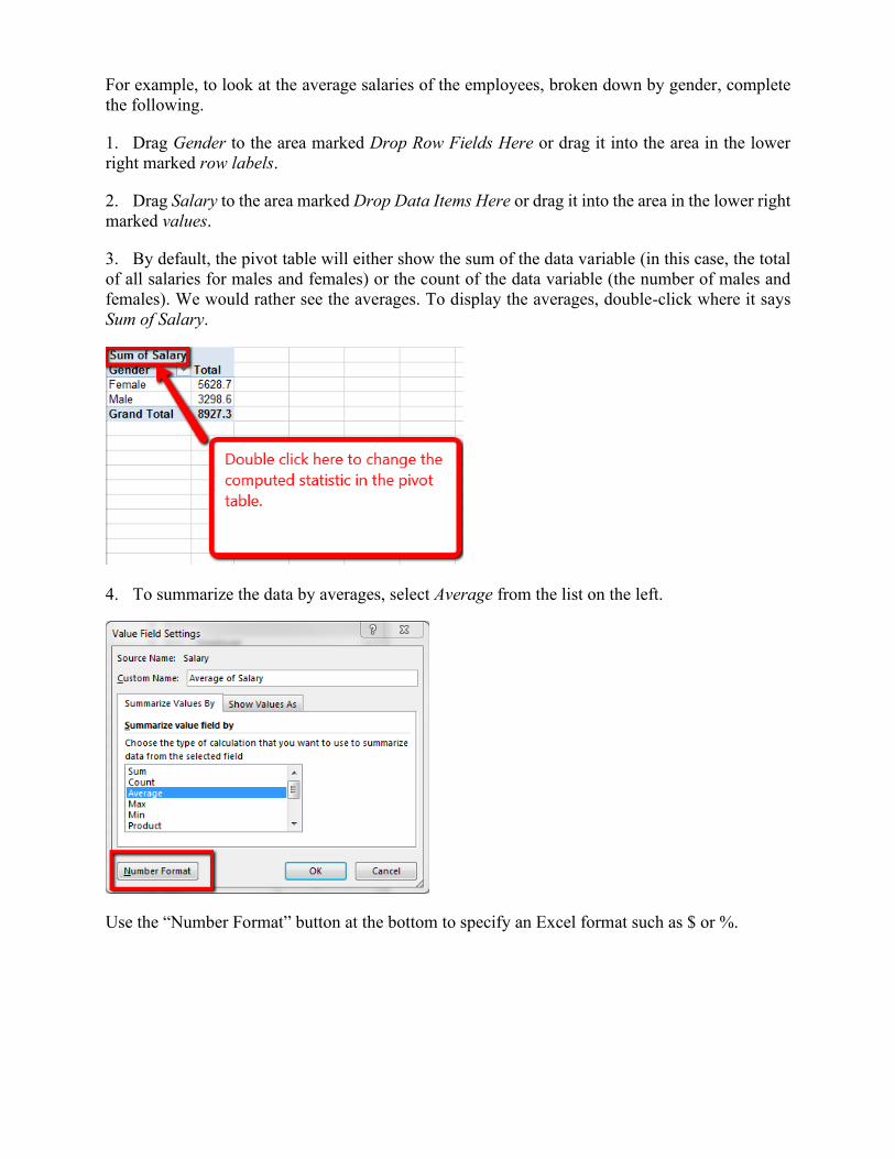
For example, to look at the average salaries of the employees, broken down by gender, complete
the following.
1. Drag Gender to the area marked Drop Row Fields Here or drag it into the area in the lower
right marked row labels.
2. Drag Salary to the area marked Drop Data Items Here or drag it into the area in the lower right
marked values.
3. By default, the pivot table will either show the sum of the data variable (in this case, the total
of all salaries for males and females) or the count of the data variable (the number of males and
females). We would rather see the averages. To display the averages, double-click where it says
Sum of Salary.
4. To summarize the data by averages, select Average from the list on the left.
Use the “Number Format” button at the bottom to specify an Excel format such as $ or %.
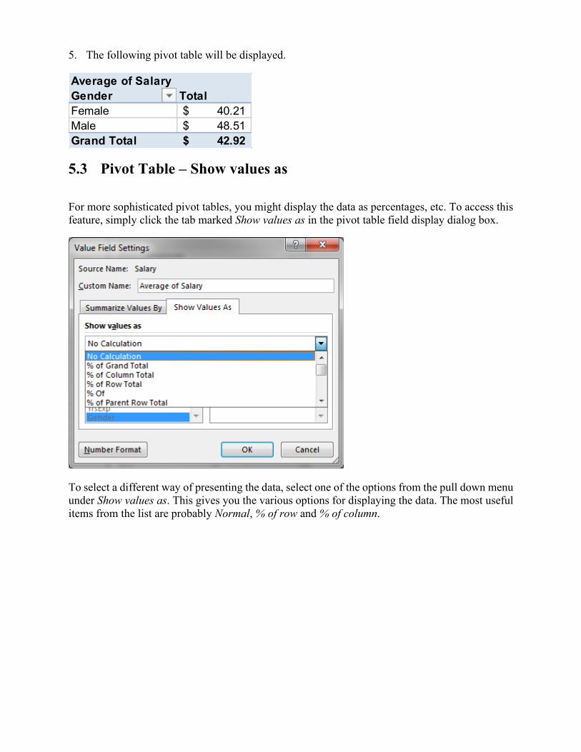
5. The following pivot table will be displayed.
5.3 Pivot Table – Show values as
For more sophisticated pivot tables, you might display the data as percentages, etc. To access this
feature, simply click the tab marked Show values as in the pivot table field display dialog box.
To select a different way of presenting the data, select one of the options from the pull down menu
under Show values as. This gives you the various options for displaying the data. The most useful
items from the list are probably Normal, % of row and % of column.
Average of Salary
Gender Total
Female 40.21$
Male 48.51$
Grand Total 42.92$
5.4 The Pivot Table Ribbon
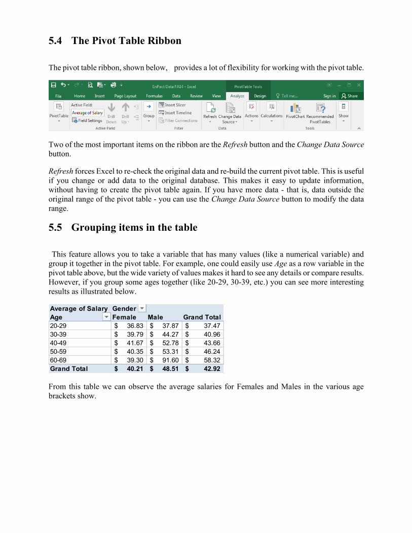
The pivot table ribbon, shown below, provides a lot of flexibility for working with the pivot table.
Two of the most important items on the ribbon are the Refresh button and the Change Data Source
button.
Refresh forces Excel to re-check the original data and re-build the current pivot table. This is useful
if you change or add data to the original database. This makes it easy to update information,
without having to create the pivot table again. If you have more data - that is, data outside the
original range of the pivot table - you can use the Change Data Source button to modify the data
range.
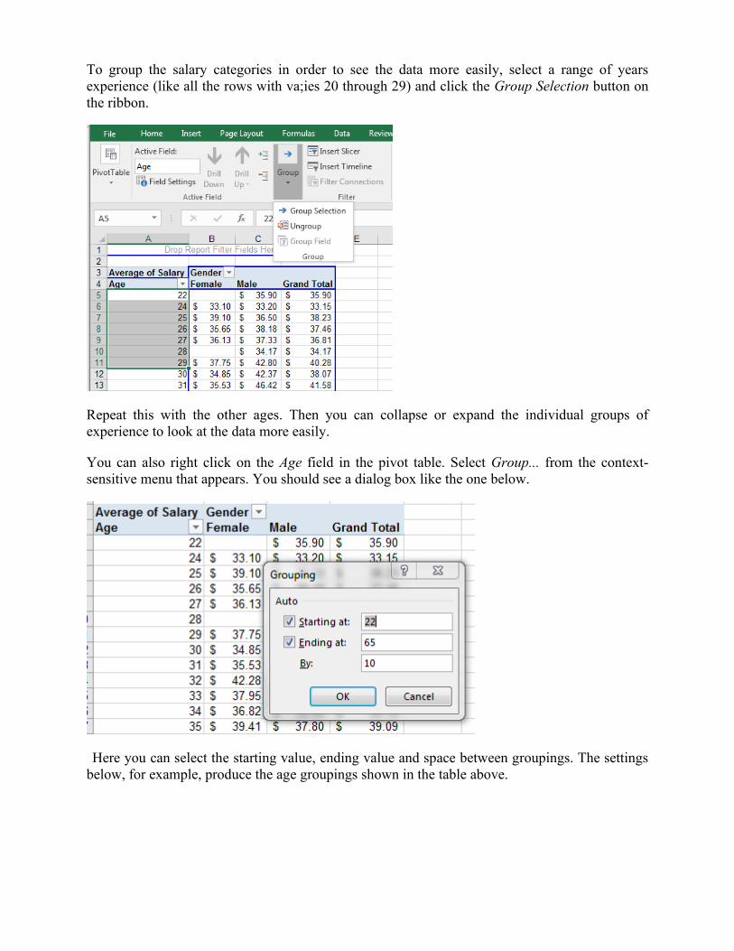
5.5 Grouping items in the table
This feature allows you to take a variable that has many values (like a numerical variable) and
group it together in the pivot table. For example, one could easily use Age as a row variable in the
pivot table above, but the wide variety of values makes it hard to see any details or compare results.
However, if you group some ages together (like 20-29, 30-39, etc.) you can see more interesting
results as illustrated below.
From this table we can observe the average salaries for Females and Males in the various age
brackets show.
Average of Salary Gender
Age Female Male Grand Total
20-29 36.83$ 37.87$ 37.47$
30-39 39.79$ 44.27$ 40.96$
40-49 41.67$ 52.78$ 43.66$
50-59 40.35$ 53.31$ 46.24$
60-69 39.30$ 91.60$ 58.32$
Grand Total 40.21$ 48.51$ 42.92$
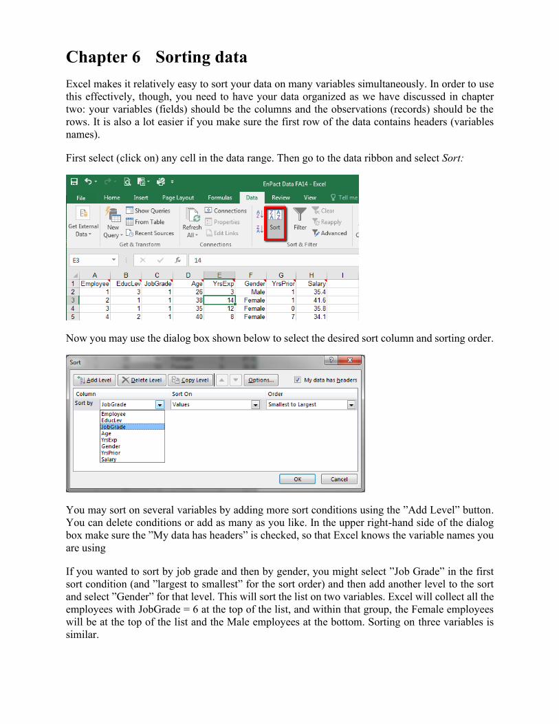
To group the salary categories in order to see the data more easily, select a range of years
experience (like all the rows with va;ies 20 through 29) and click the Group Selection button on
the ribbon.
Repeat this with the other ages. Then you can collapse or expand the individual groups of
experience to look at the data more easily.
You can also right click on the Age field in the pivot table. Select Group... from the context-
sensitive menu that appears. You should see a dialog box like the one below.
Here you can select the starting value, ending value and space between groupings. The settings
below, for example, produce the age groupings shown in the table above.

Chapter 6 Sorting data
Excel makes it relatively easy to sort your data on many variables simultaneously. In order to use
this effectively, though, you need to have your data organized as we have discussed in chapter
two: your variables (fields) should be the columns and the observations (records) should be the
rows. It is also a lot easier if you make sure the first row of the data contains headers (variables
names).
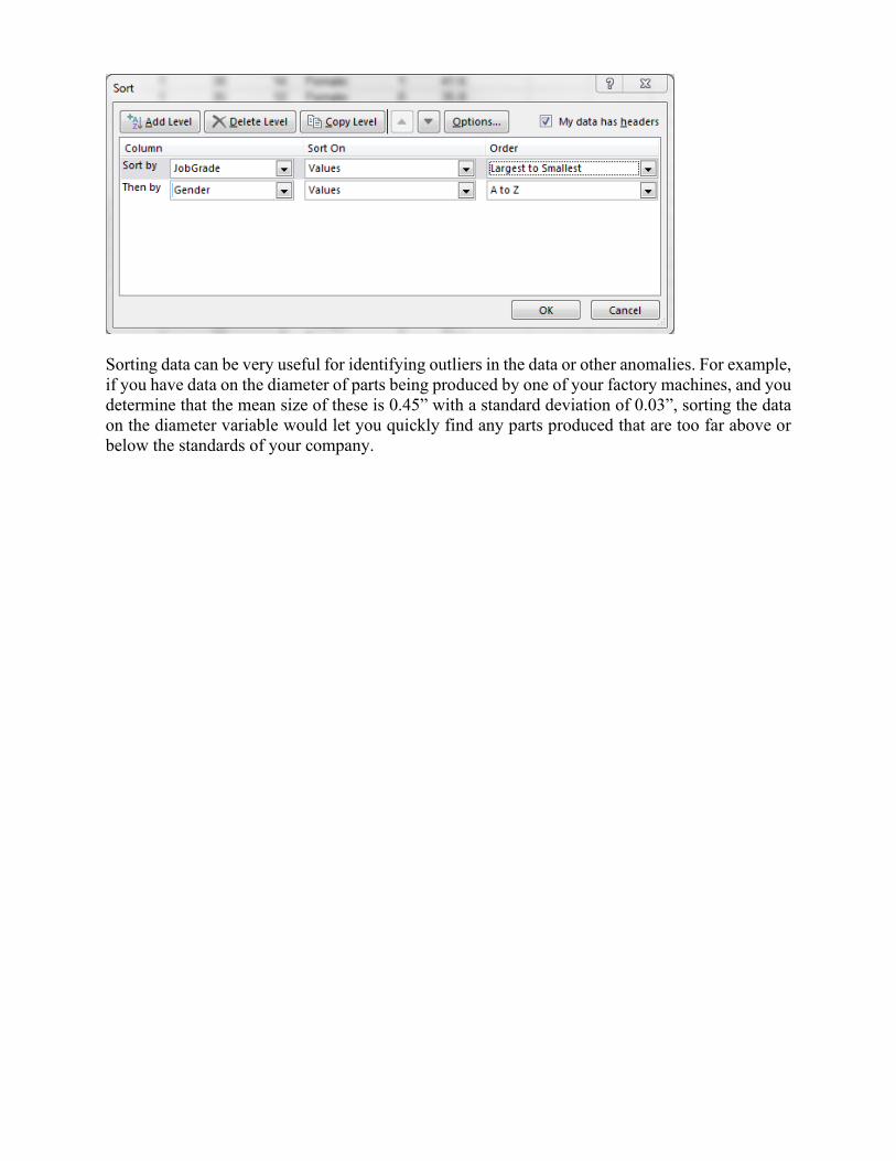
First select (click on) any cell in the data range. Then go to the data ribbon and select Sort:
Now you may use the dialog box shown below to select the desired sort column and sorting order.
You may sort on several variables by adding more sort conditions using the ”Add Level” button.
You can delete conditions or add as many as you like. In the upper right-hand side of the dialog
box make sure the ”My data has headers” is checked, so that Excel knows the variable names you
are using
If you wanted to sort by job grade and then by gender, you might select ”Job Grade” in the first
sort condition (and ”largest to smallest” for the sort order) and then add another level to the sort
and select ”Gender” for that level. This will sort the list on two variables. Excel will collect all the
employees with JobGrade = 6 at the top of the list, and within that group, the Female employees
will be at the top of the list and the Male employees at the bottom. Sorting on three variables is
similar.
Sorting data can be very useful for identifying outliers in the data or other anomalies. For example,
if you have data on the diameter of parts being produced by one of your factory machines, and you
determine that the mean size of these is 0.45” with a standard deviation of 0.03”, sorting the data
on the diameter variable would let you quickly find any parts produced that are too far above or
below the standards of your company.
Chapter 7 Data Visualization
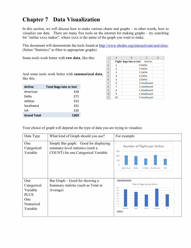
In this section, we will discuss how to make various charts and graphs – in other words, how to
visualize our data. There are many free tools on the internet for making graphs – try searching
for “online xxxx maker”, where xxxx is the name of the graph you want to make.
This document will demonstrate the tools found at http://www.shodor.org/interactivate/activities/
(Selest “Statistics” to filter to appropriate graphs)
Some tools work better with raw data, like this:
And some tools work better with summarized data,
like this
Airline Total Bags late or lost
American 318
Delta 271
Jetblue 223
Southwest 331
UA 226
Grand Total 1369
Your choice of graph will depend on the type of data you are trying to visualize
Data Type What kind of Graph should you use? For example
One
Categorical
Variable
Simple Bar graph: Good for displaying
summary-level statistics (such a
COUNT) for one Categorical Variable
One
Categorical
Variable
PLUS
One
Numerical
Variable
Bar Graph – Good for showing a
Summary statistic (such as Total or
Average)
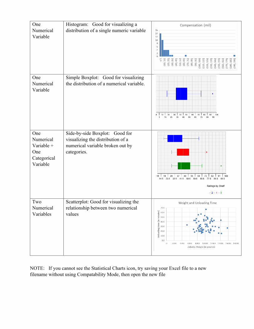
One
Numerical
Variable
Histogram: Good for visualizing a
distribution of a single numeric variable
One
Numerical
Variable
Simple Boxplot: Good for visualizing
the distribution of a numerical variable.
One
Numerical
Variable +
One
Categorical
Variable
Side-by-side Boxplot: Good for
visualizing the distribution of a
numerical variable broken out by
categories.
Two
Numerical
Variables
Scatterplot: Good for visualizing the
relationship between two numerical
values
NOTE: If you cannot see the Statistical Charts icon, try saving your Excel file to a new
filename without using Compatability Mode, then open the new file
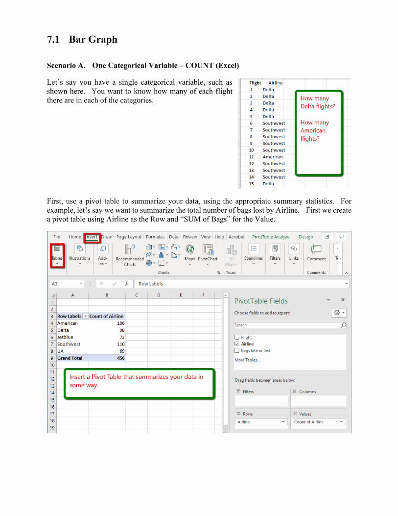
7.1 Bar Graph
Scenario A. One Categorical Variable – COUNT (Excel)
Let’s say you have a single categorical variable, such as
shown here. You want to know how many of each flight
there are in each of the categories.
First, use a pivot table to summarize your data, using the appropriate summary statistics. For
example, let’s say we want to summarize the total number of bags lost by Airline. First we create
a pivot table using Airline as the Row and “SUM of Bags” for the Value.
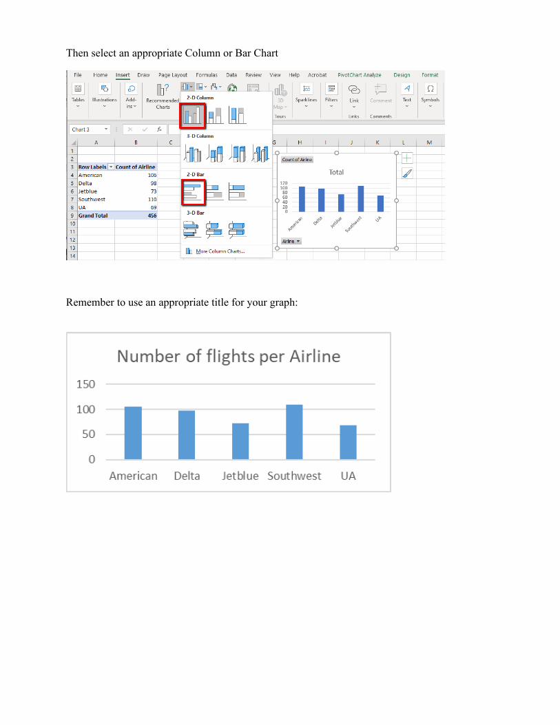
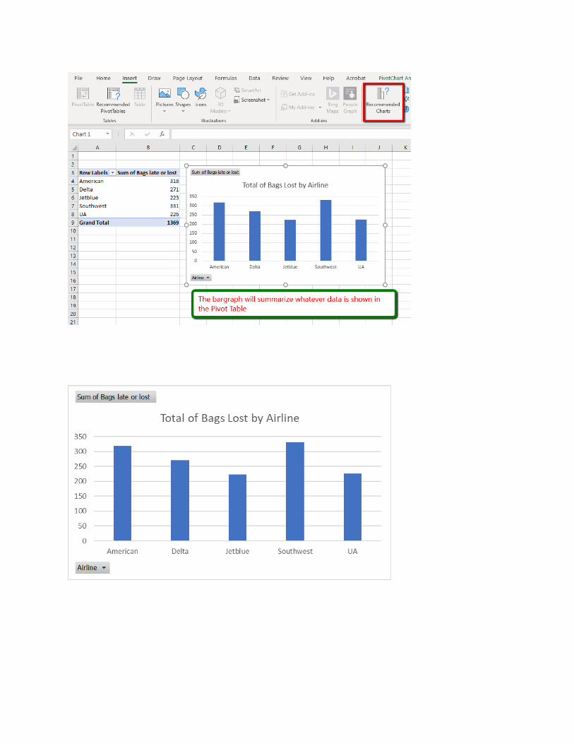
Then select an appropriate Column or Bar Chart
Remember to use an appropriate title for your graph:
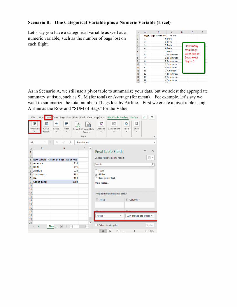
Scenario B. One Categorical Variable plus a Numeric Variable (Excel)
Let’s say you have a categorical variable as well as a
numeric variable, such as the number of bags lost on
each flight.
As in Scenario A, we still use a pivot table to summarize your data, but we selest the appropriate
summary statistic, such as SUM (for total) or Average (for mean). For example, let’s say we
want to summarize the total number of bags lost by Airline. First we create a pivot table using
Airline as the Row and “SUM of Bags” for the Value.
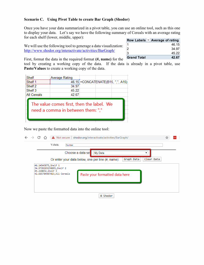
Scenario C. Using Pivot Table to create Bar Graph (Shodor)
Once you have your data summarized in a pivot table, you can use an online tool, such as this one
to display your data. Let’s say we have the following summary of Cereals with an average rating
for each shelf (lower, middle, upper):
We will use the following tool to generage a data visualization:
http://www.shodor.org/interactivate/activities/BarGraph/
First, format the data in the required format (#, name) for the
tool by creating a working copy of the data. If the data is already in a pivot table, use
Paste/Values to create a working copy of the data.
Now we paste the formatted data into the online tool:
Row Labels Average of rating
1 46.15
2 34.97
3 45.22
Grand Total 42.67
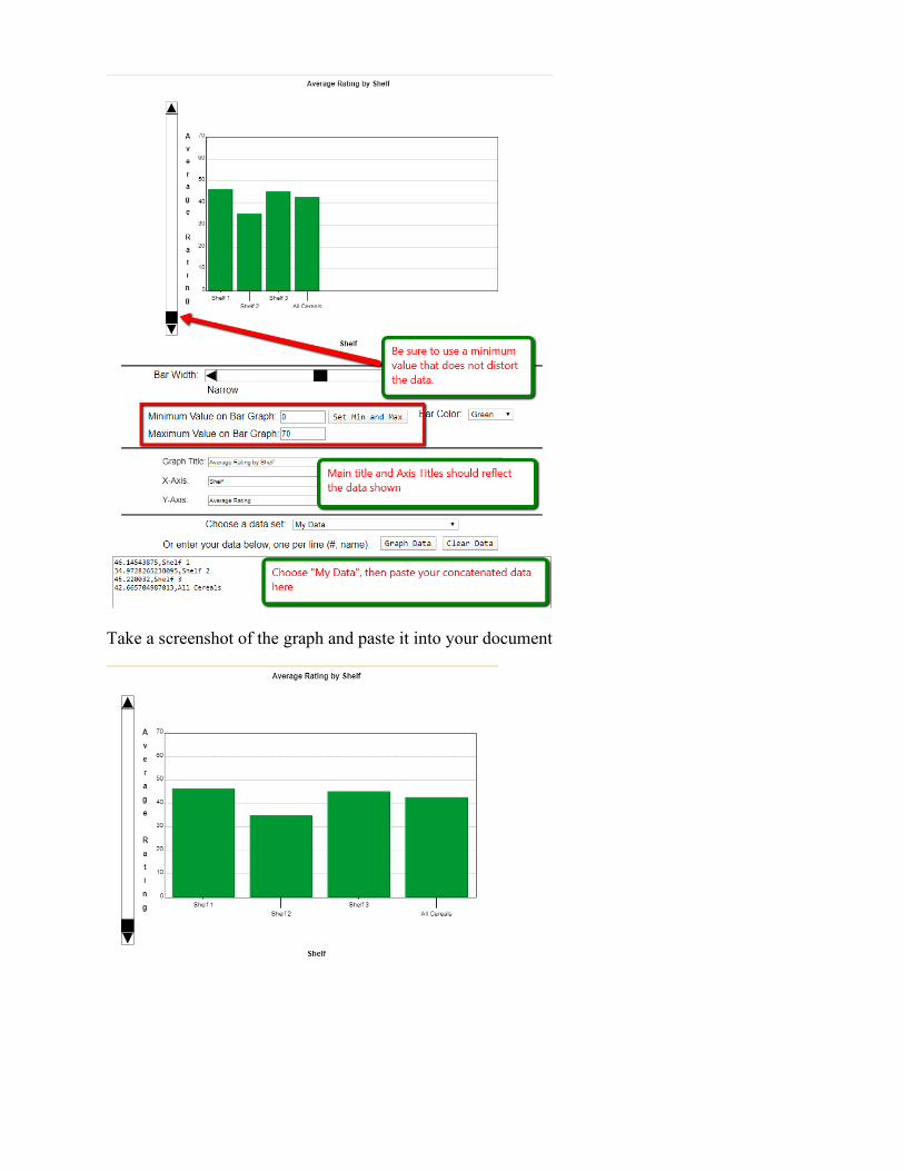
Take a screenshot of the graph and paste it into your document
7.2 Histograms
Scenario A. One Numeric Variable (Excel)
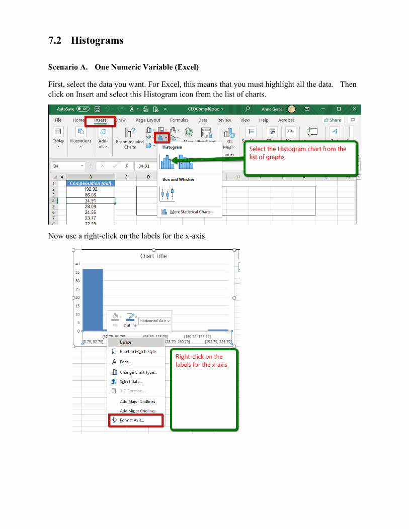
First, select the data you want. For Excel, this means that you must highlight all the data. Then
click on Insert and select this Histogram icon from the list of charts.
Now use a right-click on the labels for the x-axis.
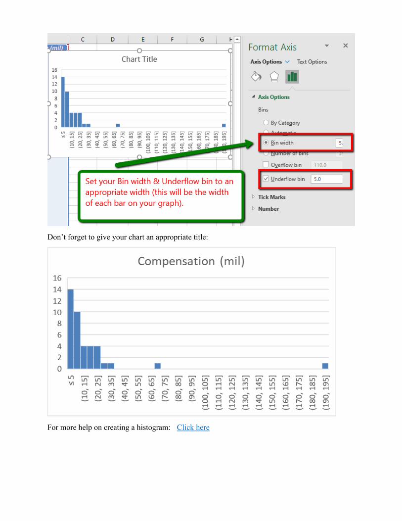
Don’t forget to give your chart an appropriate title:
For more help on creating a histogram: Click here
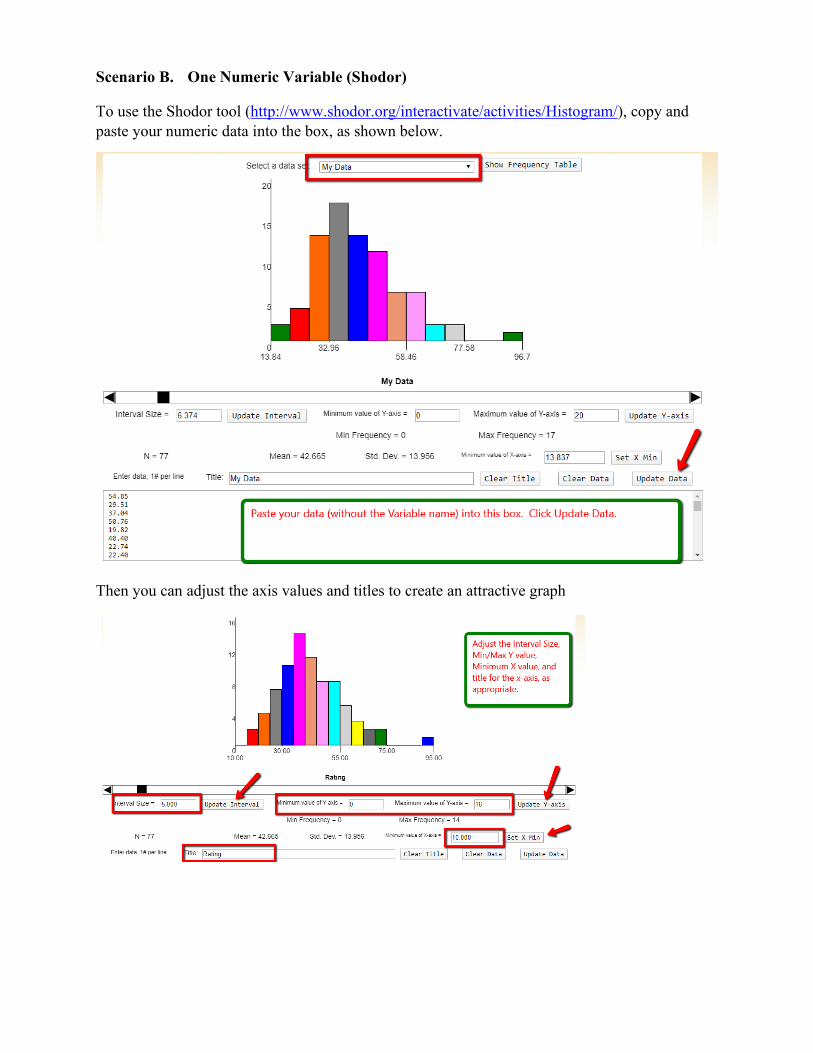
Scenario B. One Numeric Variable (Shodor)
To use the Shodor tool (http://www.shodor.org/interactivate/activities/Histogram/), copy and
paste your numeric data into the box, as shown below.
Then you can adjust the axis values and titles to create an attractive graph
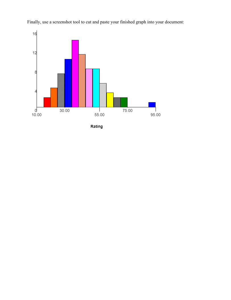
Finally, use a screenshot tool to cut and paste your finished graph into your document:
7.3 Simple Boxplots (Box-and-Whisker Plots)
Scenario A. One Numeric Variable (Excel)
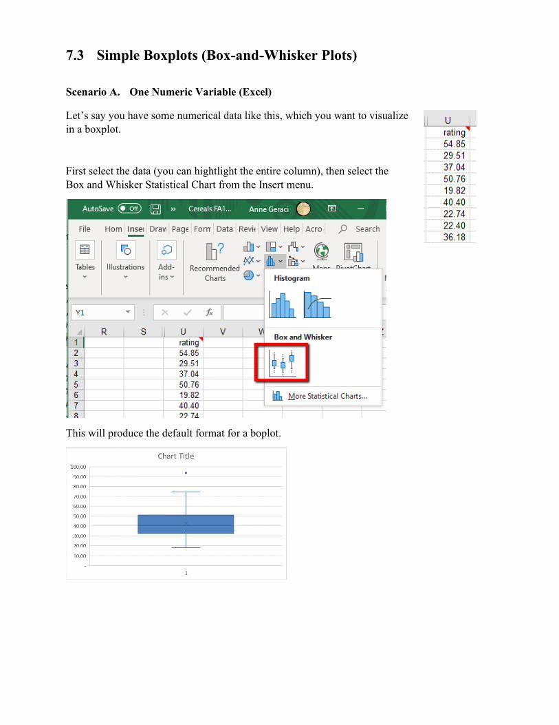
Let’s say you have some numerical data like this, which you want to visualize
in a boxplot.
First select the data (you can hightlight the entire column), then select the
Box and Whisker Statistical Chart from the Insert menu.
This will produce the default format for a boplot.
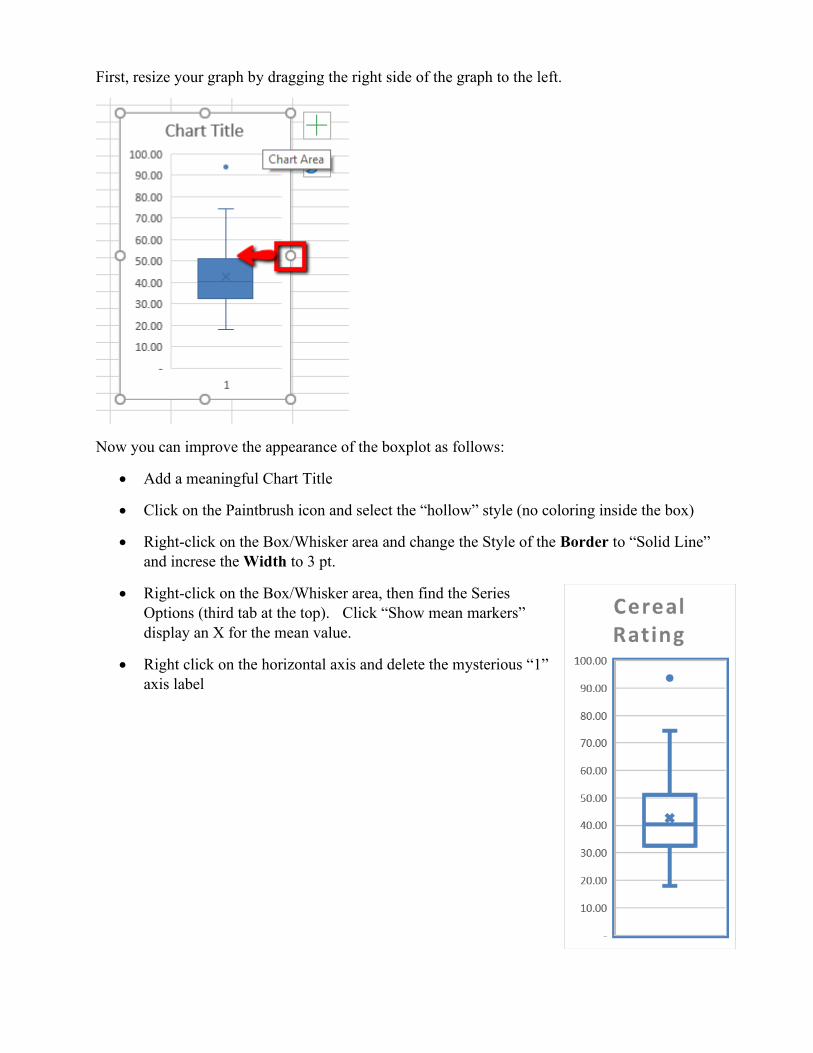
First, resize your graph by dragging the right side of the graph to the left.
Now you can improve the appearance of the boxplot as follows:
• Add a meaningful Chart Title
• Click on the Paintbrush icon and select the “hollow” style (no coloring inside the box)
• Right-click on the Box/Whisker area and change the Style of the Border to “Solid Line”
and increse the Width to 3 pt.
• Right-click on the Box/Whisker area, then find the Series
Options (third tab at the top). Click “Show mean markers”
display an X for the mean value.
• Right click on the horizontal axis and delete the mysterious “1”
axis label
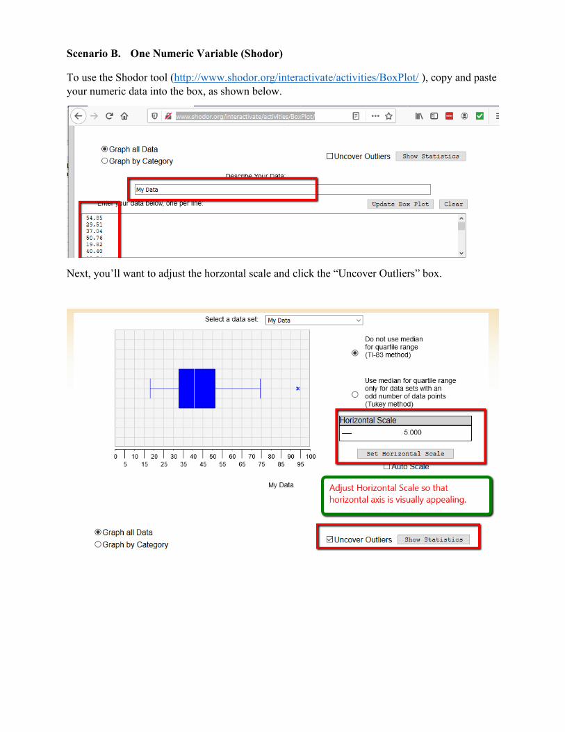
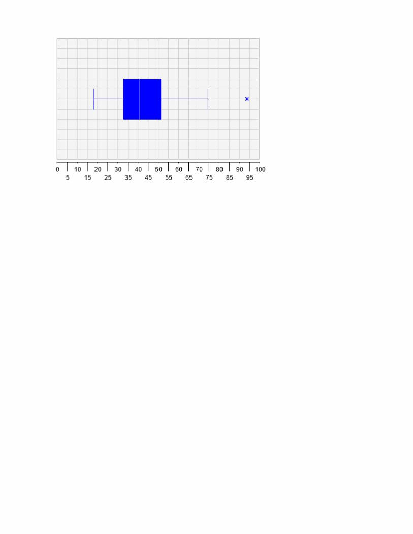
Scenario B. One Numeric Variable (Shodor)
To use the Shodor tool (http://www.shodor.org/interactivate/activities/BoxPlot/ ), copy and paste
your numeric data into the box, as shown below.
Next, you’ll want to adjust the horzontal scale and click the “Uncover Outliers” box.
7.4 Side-by-side Boxplots (Box-and-Whisker Plots)
Scenario A. One Numeric Variable + One Categorical (Excel)
To make a boxplot using Excel arrange your data so that the categorical data is to the LEFT of
the numerical data.
First, select both columns of data, then click on Insert and select the Box-and-Whisker icon from
the list of charts. Be sure to modify the Chart Title as necessary.
For more information on creating a box-and-whisker chart with multiple variables: Click here

Scenario B. One Numeric Variable + One Numeric/Categorical (Excel)
Remember that you must have one categorical column of data (on the left) and one numerical
variable (on the right). In the following example, we see that numbers are used to represent a
category (1 = Top shelf, 2 = Middle shelf; 3 = bottom shelf), which LOOKS to Excel like
numbers. If we try and produce a boxplot, we don’t get the desired result:
To fix this, highlight the column, then select Text to Columns from the Data menu:
Hit Next twice, then select Text for the Column data format. Generate the bargraph as shown
above:
Scenario C. One Numeric Variable + One Numeric/Categorical (Shodor)
To produce a side-by-side boxplot in Shodor, use a similar method as above to create the data you
wish to plot:
Now cut and paste the concatenated rating and category into the Shodor website:
Adjust the horizontal axis, and “Uncover Outliers”.
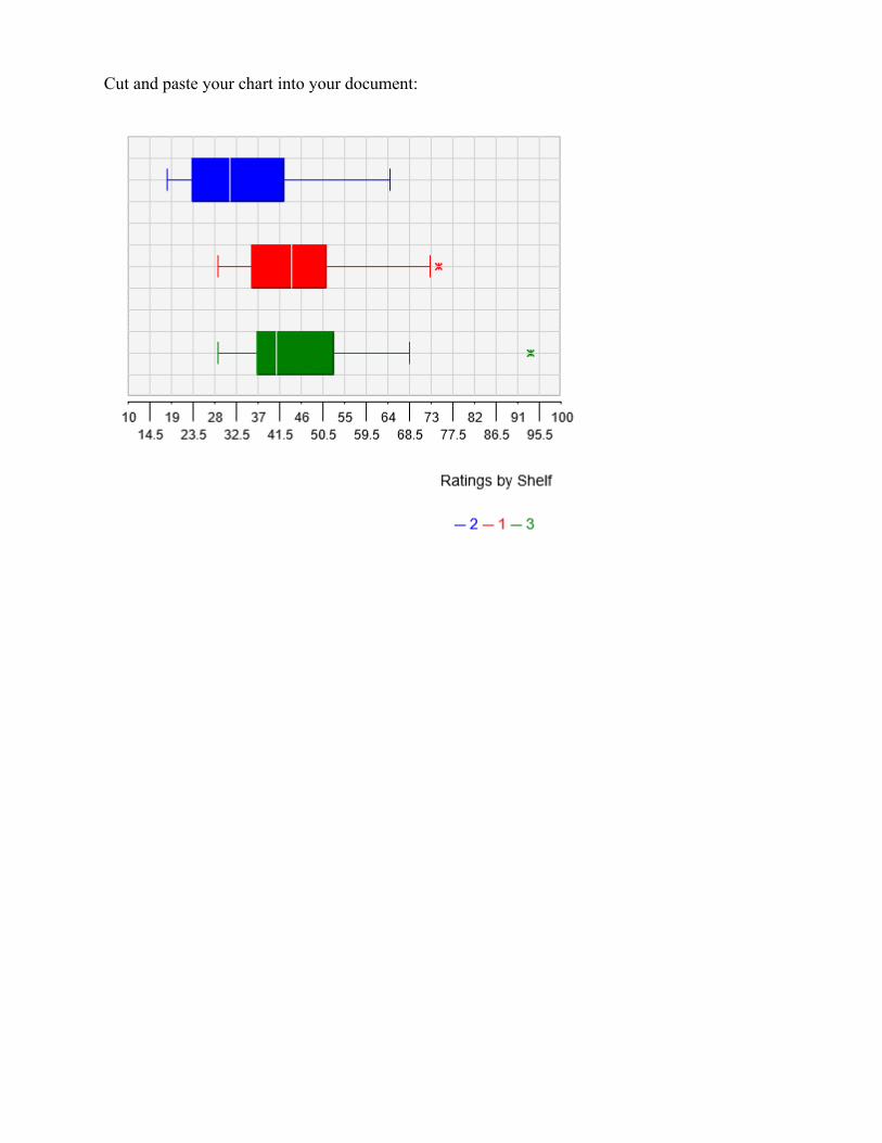
Cut and paste your chart into your document:
7.5 Scatter Plots
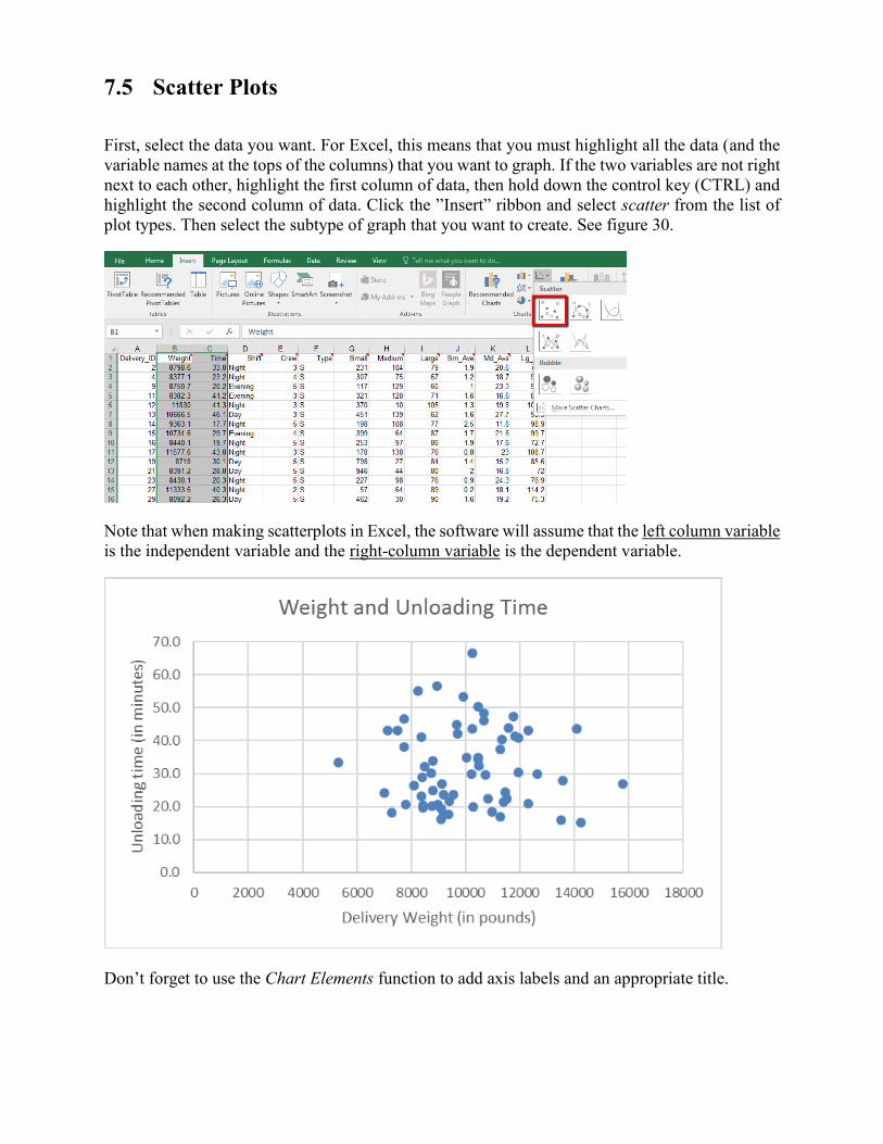
First, select the data you want. For Excel, this means that you must highlight all the data (and the
variable names at the tops of the columns) that you want to graph. If the two variables are not right
next to each other, highlight the first column of data, then hold down the control key (CTRL) and
highlight the second column of data. Click the ”Insert” ribbon and select scatter from the list of
plot types. Then select the subtype of graph that you want to create. See figure 30.
Note that when making scatterplots in Excel, the software will assume that the left column variable
is the independent variable and the right-column variable is the dependent variable.
Don’t forget to use the Chart Elements function to add axis labels and an appropriate title.
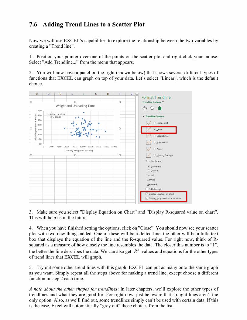
7.6 Adding Trend Lines to a Scatter Plot
Now we will use EXCEL’s capabilities to explore the relationship between the two variables by
creating a ”Trend line”.
1. Position your pointer over one of the points on the scatter plot and right-click your mouse.
Select ”Add Trendline...” from the menu that appears.
2. You will now have a panel on the right (shown below) that shows several different types of
functions that EXCEL can graph on top of your data. Let’s select ”Linear”, which is the default
choice.
3. Make sure you select ”Display Equation on Chart” and ”Display R-squared value on chart”.
This will help us in the future.
4. When you have finished setting the options, click on ”Close”. You should now see your scatter
plot with two new things added. One of these will be a dotted line, the other will be a little text
box that displays the equation of the line and the R-squared value. For right now, think of R-
squared as a measure of how closely the line resembles the data. The closer this number is to ”1”,
the better the line describes the data. We can also get 2R values and equations for the other types
of trend lines that EXCEL will graph.
5. Try out some other trend lines with this graph. EXCEL can put as many onto the same graph
as you want. Simply repeat all the steps above for making a trend line, except choose a different
function in step 2 each time.
A note about the other shapes for trendlines: In later chapters, we’ll explore the other types of
trendlines and what they are good for. For right now, just be aware that straight lines aren’t the
only option. Also, as we’ll find out, some trendlines simply can’t be used with certain data. If this
is the case, Excel will automatically ”grey out” those choices from the list.

A note about the Polynomial choice for trend lines: Polynomials come in different degrees. You
can control the degree of the polynomial that Excel uses by adjusting the number in the box next
to the polynomial trendline. Excel allows degree 2 through 6 polynomials.
Adding Trendlines for Non-proportional Models
Excel can add trendlines for some non-proportional models to graphs. The process is virtually
identical to the process used above to add linear trendlines in Excel. The only difference is that in
step 2 you should select the following options:
• To get an exponential fit, choose ”exponential”
• To get a logarithmic fit, choose a ”logarithmic”
• To get the square fit, use ”Polynomial” and select ”Order 2”
• It is not possible to force Excel to generate trendlines for reciprocals or square roots
directly. As it turns out, these are specific cases of the more general ”Power”
models. However, if you add a ”power” trendline to a graph, the power is one of
the parameters in the model (like slope or y -intercept) so you probably will not
get a power of 0.5 (2
1= which is a square root model) or a power of 1− (for a
reciprocal model).
7.7 Logarithmic and Log-Log plots
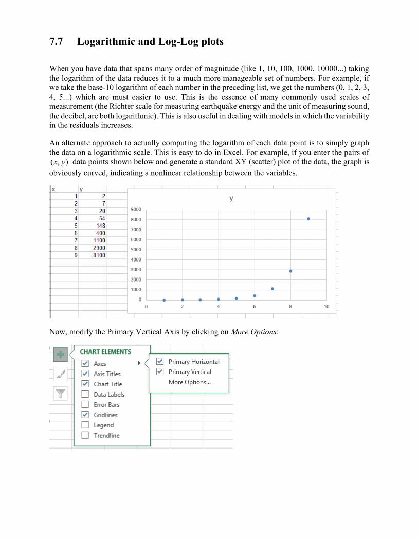
When you have data that spans many order of magnitude (like 1, 10, 100, 1000, 10000...) taking
the logarithm of the data reduces it to a much more manageable set of numbers. For example, if
we take the base-10 logarithm of each number in the preceding list, we get the numbers (0, 1, 2, 3,
4, 5...) which are must easier to use. This is the essence of many commonly used scales of
measurement (the Richter scale for measuring earthquake energy and the unit of measuring sound,
the decibel, are both logarithmic). This is also useful in dealing with models in which the variability
in the residuals increases.
An alternate approach to actually computing the logarithm of each data point is to simply graph
the data on a logarithmic scale. This is easy to do in Excel. For example, if you enter the pairs of
),( yx data points shown below and generate a standard XY (scatter) plot of the data, the graph is
obviously curved, indicating a nonlinear relationship between the variables.
Now, modify the Primary Vertical Axis by clicking on More Options:
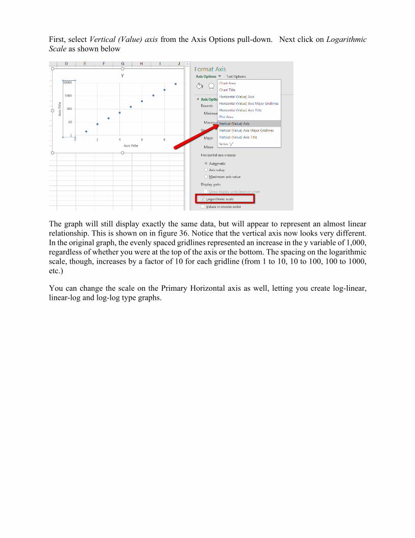
First, select Vertical (Value) axis from the Axis Options pull-down. Next click on Logarithmic
Scale as shown below
The graph will still display exactly the same data, but will appear to represent an almost linear
relationship. This is shown on in figure 36. Notice that the vertical axis now looks very different.
In the original graph, the evenly spaced gridlines represented an increase in the y variable of 1,000,
regardless of whether you were at the top of the axis or the bottom. The spacing on the logarithmic
scale, though, increases by a factor of 10 for each gridline (from 1 to 10, 10 to 100, 100 to 1000,
etc.)
You can change the scale on the Primary Horizontal axis as well, letting you create log-linear,
linear-log and log-log type graphs.

Chapter 8. Correlation & Regression in Excel
8.1 Correlation
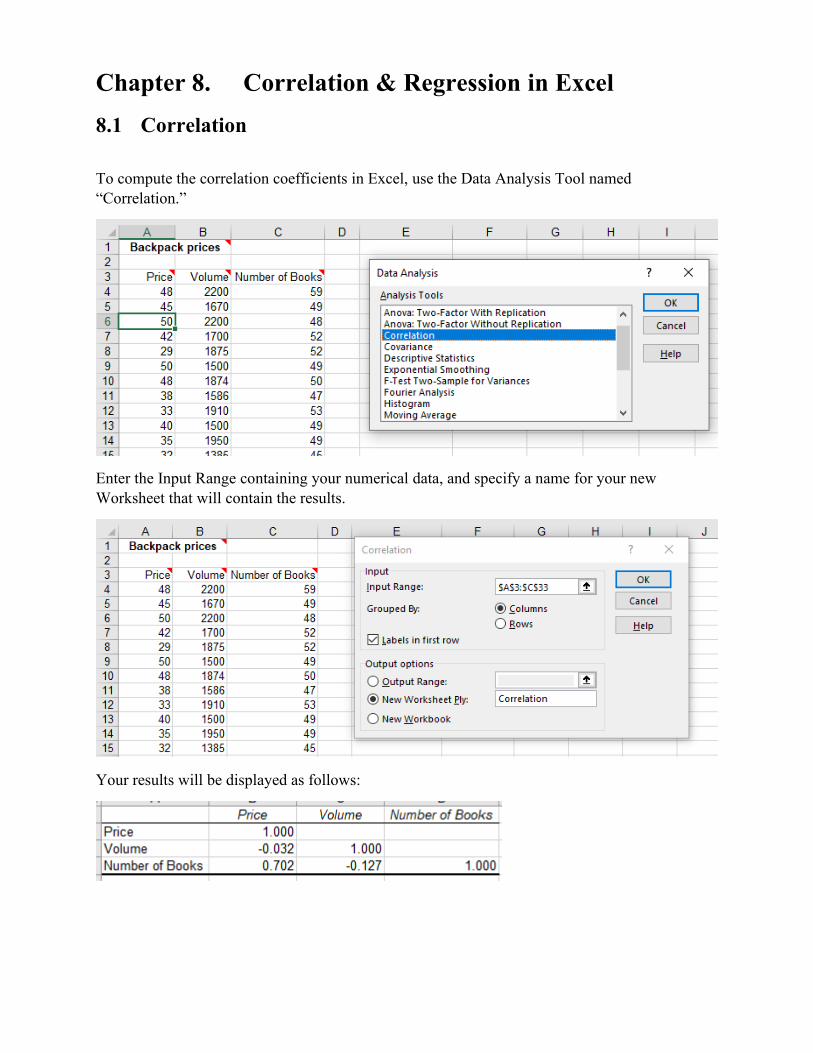
To compute the correlation coefficients in Excel, use the Data Analysis Tool named
“Correlation.”
Enter the Input Range containing your numerical data, and specify a name for your new
Worksheet that will contain the results.
Your results will be displayed as follows:
8.2 Simple Linear Regression
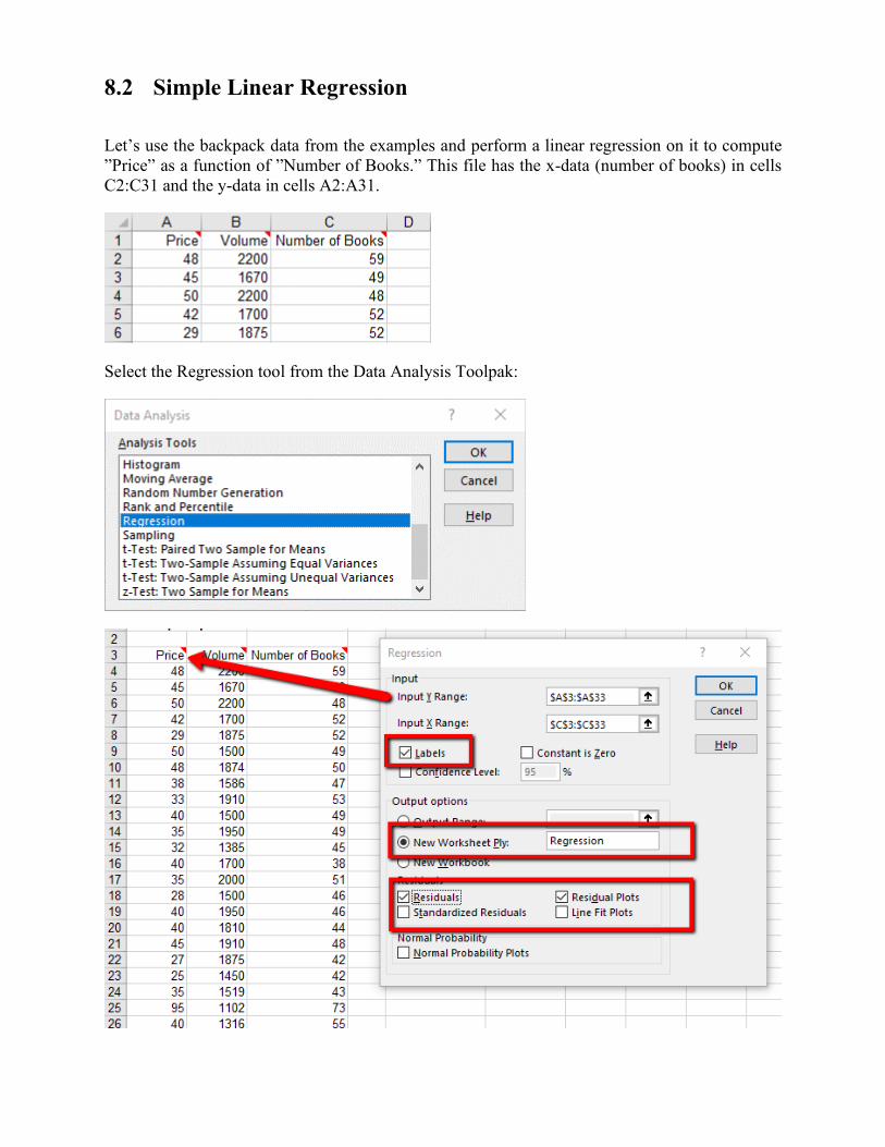
Let’s use the backpack data from the examples and perform a linear regression on it to compute
”Price” as a function of ”Number of Books.” This file has the x-data (number of books) in cells
C2:C31 and the y-data in cells A2:A31.
Select the Regression tool from the Data Analysis Toolpak:
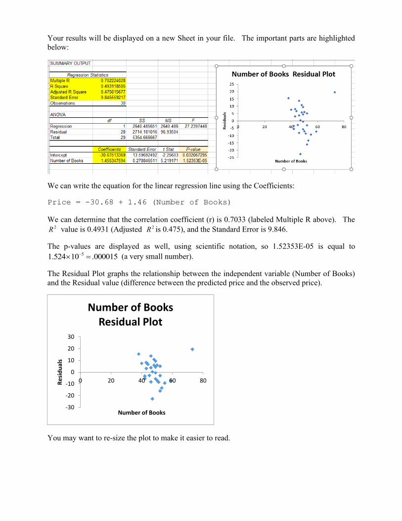
Your results will be displayed on a new Sheet in your file. The important parts are highlighted
below:
We can write the equation for the linear regression line using the Coefficients:
Price = -30.68 + 1.46 (Number of Books)
We can determine that the correlation coefficient (r) is 0.7033 (labeled Multiple R above). The 2R value is 0.4931 (Adjusted 2R is 0.475), and the Standard Error is 9.846.
The p-values are displayed as well, using scientific notation, so 1.52353E-05 is equal to 51.524 10 .000015− = (a very small number).
The Residual Plot graphs the relationship between the independent variable (Number of Books)
and the Residual value (difference between the predicted price and the observed price).
You may want to re-size the plot to make it easier to read.
-30
-20
-10
0
10
20
30
0 20 40 60 80Re
sid
ual
s
Number of Books
Number of Books Residual Plot
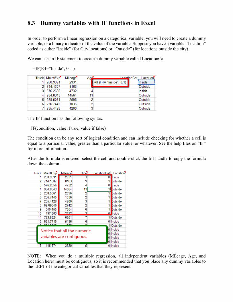
8.3 Dummy variables with IF functions in Excel
In order to perform a linear regression on a categorical variable, you will need to create a dummy
variable, or a binary indicator of the value of the variable. Suppose you have a variable ”Location”
coded as either “Inside” (for City locations) or “Outside” (for locations outside the city).
We can use an IF statement to create a dummy variable called LocationCat
=IF(E4=”Inside”, 0, 1)
The IF function has the following syntax.
IF(condition, value if true, value if false)
The condition can be any sort of logical condition and can include checking for whether a cell is
equal to a particular value, greater than a particular value, or whatever. See the help files on ”IF”
for more information.
After the formula is entered, select the cell and double-click the fill handle to copy the formula
down the column.
NOTE: When you do a multiple regression, all independent variables (Mileage, Age, and
Location here) must be contiguous, so it is recommended that you place any dummy variables to
the LEFT of the categorical variables that they represent.
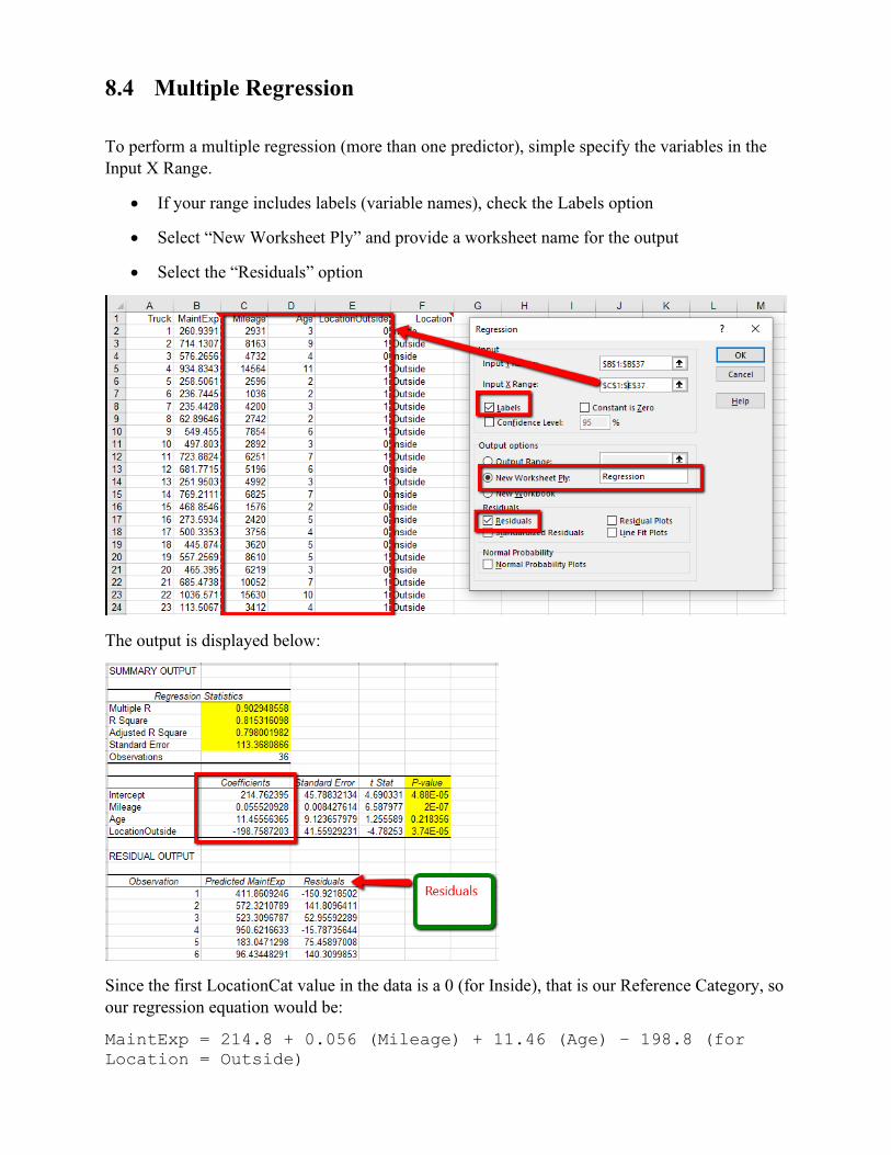
8.4 Multiple Regression
To perform a multiple regression (more than one predictor), simple specify the variables in the
Input X Range.
• If your range includes labels (variable names), check the Labels option
• Select “New Worksheet Ply” and provide a worksheet name for the output
• Select the “Residuals” option
The output is displayed below:
Since the first LocationCat value in the data is a 0 (for Inside), that is our Reference Category, so
our regression equation would be:
MaintExp = 214.8 + 0.056 (Mileage) + 11.46 (Age) – 198.8 (for
Location = Outside)
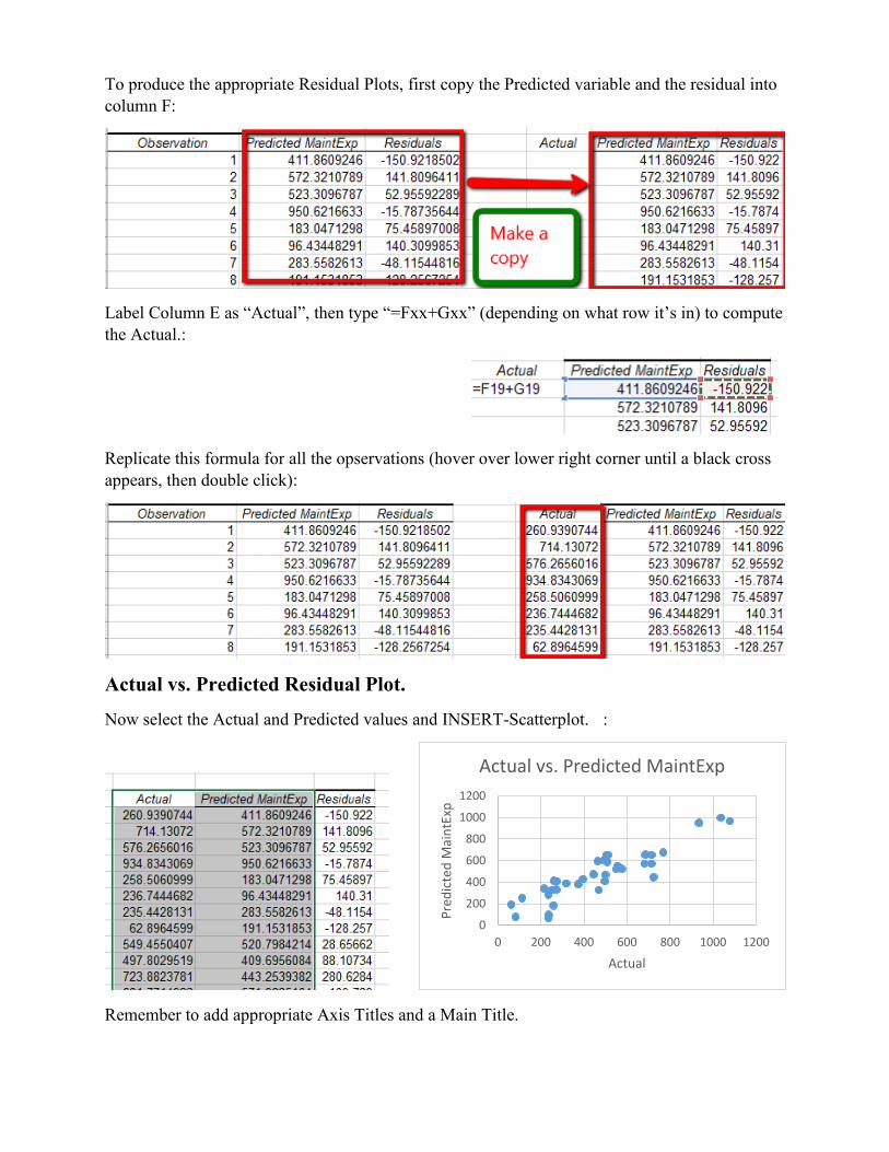
To produce the appropriate Residual Plots, first copy the Predicted variable and the residual into
column F:
Label Column E as “Actual”, then type “=Fxx+Gxx” (depending on what row it’s in) to compute
the Actual.:
Replicate this formula for all the opservations (hover over lower right corner until a black cross
appears, then double click):
Actual vs. Predicted Residual Plot.
Now select the Actual and Predicted values and INSERT-Scatterplot. :
Remember to add appropriate Axis Titles and a Main Title.
0
200
400
600
800
1000
1200
0 200 400 600 800 1000 1200
Pre
dic
ted
Mai
ntE
xp
Actual
Actual vs. Predicted MaintExp
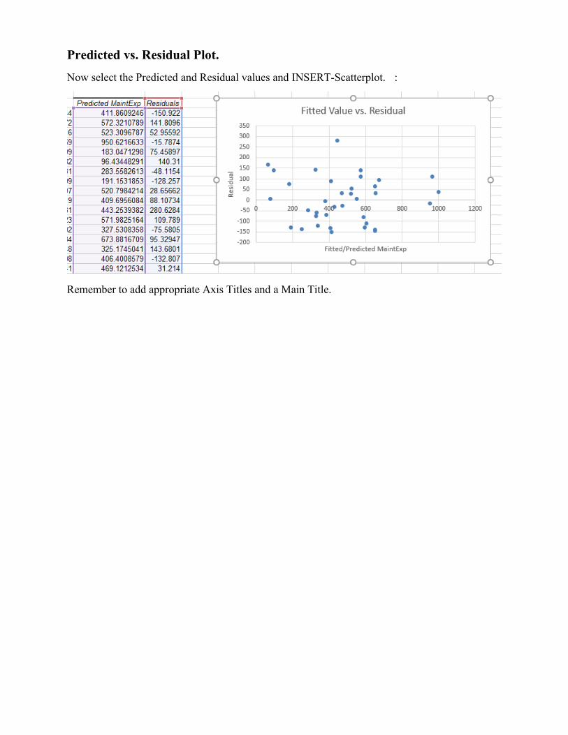
Predicted vs. Residual Plot.
Now select the Predicted and Residual values and INSERT-Scatterplot. :
Remember to add appropriate Axis Titles and a Main Title.
Chapter 9. Advanced Excel Functions
9.1 Using an Excel VLOOKUP table
In doing some tasks, we find that we need some way to use different information depending on the
result of some number. For example, in calculating employee pay, different job types might have
different, standardized pay rates at our company. Wouldn’t it be nice if Excel could figure it out
from the information given and calculate the pay rate correctly? Using a lookup table, in this case
a VLOOKUP table, Excel can.
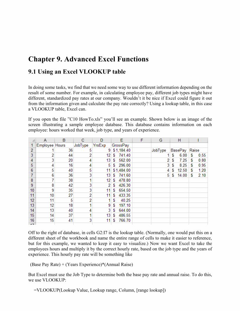
If you open the file ”C10 HowTo.xls” you’ll see an example. Shown below is an image of the
screen illustrating a sample employee database. This database contains information on each
employee: hours worked that week, job type, and years of experience.
Off to the right of database, in cells G2:I7 is the lookup table. (Normally, one would put this on a
different sheet of the workbook and name the entire range of cells to make it easier to reference,
but for this example, we wanted to keep it easy to visualize.) Now we want Excel to take the
employees hours and multiply it by the correct hourly rate, based on the job type and the years of
experience. This hourly pay rate will be something like
(Base Pay Rate) + (Years Experience)*(Annual Raise)
But Excel must use the Job Type to determine both the base pay rate and annual raise. To do this,
we use VLOOKUP:
=VLOOKUP(Lookup Value, Lookup range, Column, [range lookup])
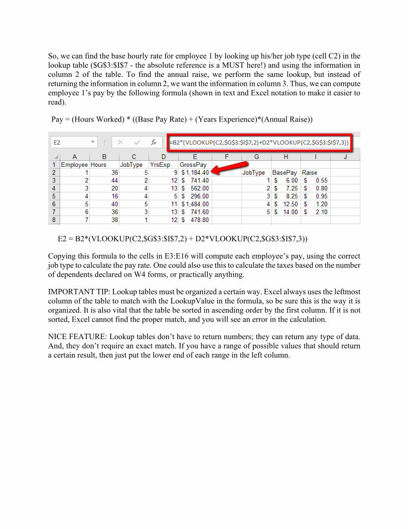
So, we can find the base hourly rate for employee 1 by looking up his/her job type (cell C2) in the
lookup table ($G$3:$I$7 - the absolute reference is a MUST here!) and using the information in
column 2 of the table. To find the annual raise, we perform the same lookup, but instead of
returning the information in column 2, we want the information in column 3. Thus, we can compute
employee 1’s pay by the following formula (shown in text and Excel notation to make it easier to
read).
Pay = (Hours Worked) * ((Base Pay Rate) + (Years Experience)*(Annual Raise))
E2 = B2*(VLOOKUP(C2,$G$3:$I$7,2) + D2*VLOOKUP(C2,$G$3:$I$7,3))
Copying this formula to the cells in E3:E16 will compute each employee’s pay, using the correct
job type to calculate the pay rate. One could also use this to calculate the taxes based on the number
of dependents declared on W4 forms, or practically anything.
IMPORTANT TIP: Lookup tables must be organized a certain way. Excel always uses the leftmost
column of the table to match with the LookupValue in the formula, so be sure this is the way it is
organized. It is also vital that the table be sorted in ascending order by the first column. If it is not
sorted, Excel cannot find the proper match, and you will see an error in the calculation.
NICE FEATURE: Lookup tables don’t have to return numbers; they can return any type of data.
And, they don’t require an exact match. If you have a range of possible values that should return
a certain result, then just put the lower end of each range in the left column.
9.2 Computing Values of Exponentials and Logarithms
Excel uses a standard notation to compute the exponential or logarithm of a number. The notation
looks a lot like the notation we have been using above:
• To compute the value of 3e , type ”=EXP(3)” in a cell and hit enter.
• To get the value of e raised to whatever is in cell B2, type ”=EXP(B2)”
• To compute the natural logarithm of 3, type ”=LN(3)”
• To compute the natural log of the number in cell B2, type ”=LN(B2)”
Note that Excel (and most calculating tools) have another logarithm function. This is the LOG(x)
function. There is a slight difference between LOG(x) and LN(x). For our purposes, we will always
use LN(x) when we talk about the logarithm of x .
Technical details: LOG( x ) stands for the base-10 logarithm of x . LN( x ) stands for the base- e
logarithm of x . Essentially, when we compute a base- b logarithm of the number x we are
finding the value of a so that the following equation is true: xba = . For example, since
100=102 , we know that the base-10 logarithm of 100 is 2 (i.e., 2=(100)log10 .) Since 32=25
we know that 5=(32)log2 . Excel really only has options for base- e logarithms (LN) and base-
10 logarithms (LOG). There are many other useful logarithm bases, but these are the most
common, and there is a mathematical technique that relates logarithms of any two bases:
)(ln
)(ln=log
b
xx
b .
9.3 Setting up functions in Excel for shifting and Scaling
Previously, we introduced the idea of setting up an Excel spreadsheet to calculate a table of
function values. We can use this same idea for calculating the values of a function with arbitrary
shifts (horizontal and vertical) and scalings. For example, suppose we want to fit a shifted curve
to a set of data that has x -values in cells A6:A25 and y -values in cells B6:B25. Let’s add in some
parameter values. Enter labels for each shift in A1:A3 and sample values for these shifts in B1:B3.
You now have a worksheet that looks something like the one at the right.
Now we need to add in a column of values for the predicted y data, according to our formula, using
the shifts and scales. Suppose that we want to use a logarithmic function to try and fit the data. So,
we want to try to use the formula
y = (Vertical shift) + (Vertical Scale)*ln(X + Horizontal shift)
To do this, we enter the following formula into cell C6 and copy it down the column (Note: This
is a formula for the logarithmic model we are currently working with; for other models, you will
have to develop a different formula):
= $B$1 + $B$3*ln(A6 + $B$2)
Notice that we are using absolute cell references to look up the values of the parameters and
compute the predicted y -values. This way, the constants will remain correct as we copy the
formula down, but the x-values will change, based on which row we are in. This format will easily
allow us to change the shifts and scales to try and match the actual data (in column B). A visual
representation (a scatterplot) would also help, since the graph would help you see the shifts and
try to move the graph of the predicted y -values closer to the actual data.
Chapter 10 Using SOLVER
10.1 Introduction to using SOLVER to minimize and maximize a
function.
Excel has a very powerful equation solving tool built into it. This routine has limitations, and it
certainly won’t work for solving equations that don’t have numerical values for the parameters,
but it is a powerful tool for solving specific problems.
To use the solver, you need to have two things set up on your spreadsheet:
1. A cell that calculates something (the target cell)
2. Other cells (virtually any number of them) whose values are used in the calculation
of the target cell (the parameter cells)
Using the solver1 is easy, once it’s set up. Select the target cell. Then activate the solver routine
with ”Tools/ Solver”. In the dialog box, make sure the ”Set Target Cell” refers to the correct target
cell. Then, click on the option for what solution you want: either maximum, minimum, or exact
value - like goal seek. Finally, click in the space next to ”By changing cells” and then highlight
the parameter cells on the worksheet (use the control key to select multiple, non-adjacent parameter
cells). Finally, hit the SOLVE button and let Excel compute.
Since the process is numerical, there are some errors that may occur. First, Excel may not find a
solution. This can happen for a variety of reasons, but most often it’s related to having the stating
values of the parameter cells too far from the solution, so try changing the values of the parameter
cells and starting over. You might also get problems if your target cell involves calculations with
logarithms, since the process may need to try a variety of values for each parameter and this may
lead to computing the log of a negative number, which is impossible.
1 The solver add-in is not always installed when you load Excel. To make it available, click on the ”Tools” menu and
select ”Add-ins”. Regardless of what other add-ins you have installed, you should see ”Solver add-in” in the list of
available add-ins. Check the box next to it, and then hit ”OK” and from now on, solver should load in Excel and be
available for solving optimization problems
10.2 Setting up constraints in Excel
In order to use Excel’s routines for solving constrained optimization problems, you must first set
up the spreadsheet so that (a) all the information is present and easily understood by a person
reading it and (b) it contains all the formulas needed to connect the optimization variables and
constraints to the objective function.
Let’s return to an example, where we have translated an optimization problem into mathematical
language as a preparation for solution – we were trying to determine the optimum mix of three
products (chairs, tables and juice carts) to manufacture in order to maximize our profits.
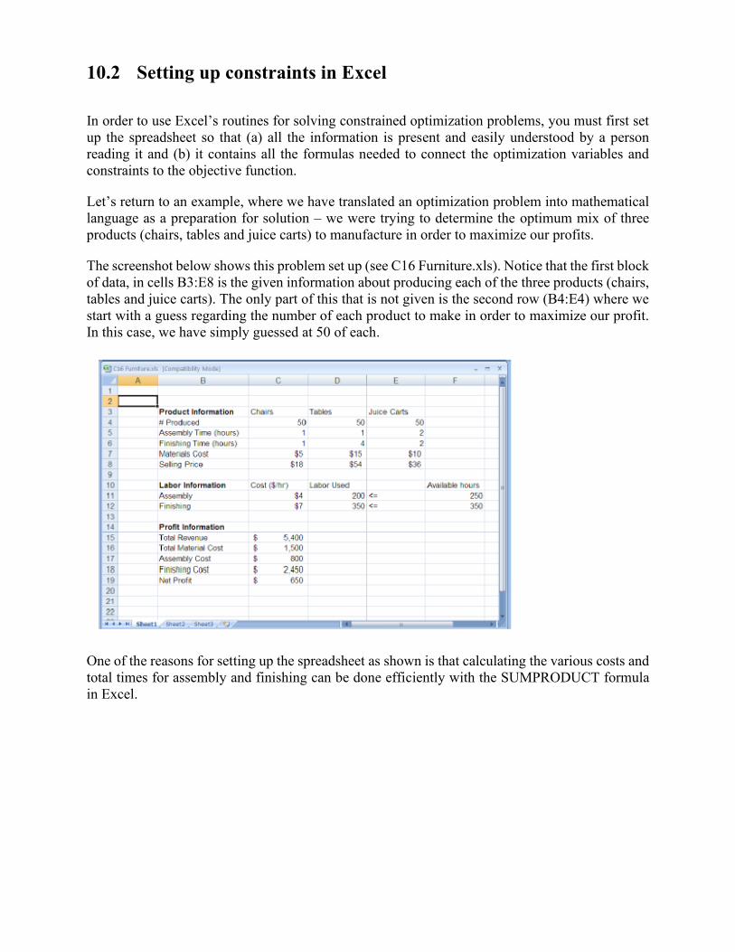
The screenshot below shows this problem set up (see C16 Furniture.xls). Notice that the first block
of data, in cells B3:E8 is the given information about producing each of the three products (chairs,
tables and juice carts). The only part of this that is not given is the second row (B4:E4) where we
start with a guess regarding the number of each product to make in order to maximize our profit.
In this case, we have simply guessed at 50 of each.
One of the reasons for setting up the spreadsheet as shown is that calculating the various costs and
total times for assembly and finishing can be done efficiently with the SUMPRODUCT formula
in Excel.
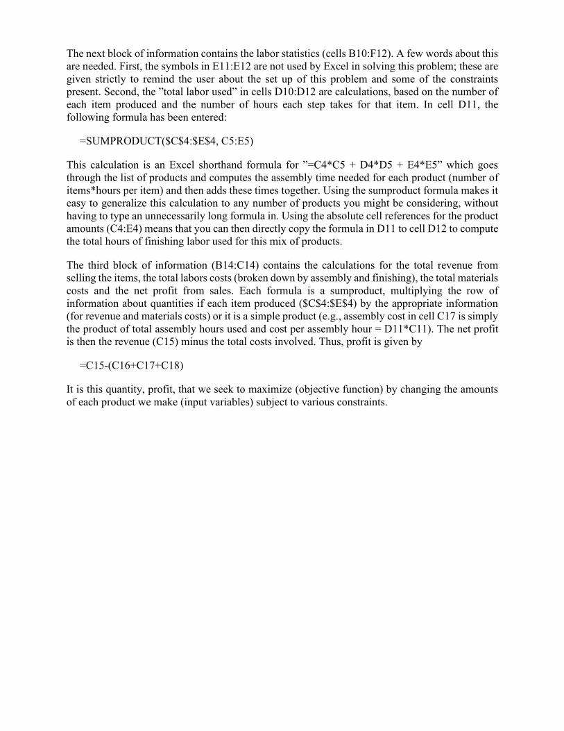
The next block of information contains the labor statistics (cells B10:F12). A few words about this
are needed. First, the symbols in E11:E12 are not used by Excel in solving this problem; these are
given strictly to remind the user about the set up of this problem and some of the constraints
present. Second, the ”total labor used” in cells D10:D12 are calculations, based on the number of
each item produced and the number of hours each step takes for that item. In cell D11, the
following formula has been entered:
=SUMPRODUCT($C$4:$E$4, C5:E5)
This calculation is an Excel shorthand formula for ”=C4*C5 + D4*D5 + E4*E5” which goes
through the list of products and computes the assembly time needed for each product (number of
items*hours per item) and then adds these times together. Using the sumproduct formula makes it
easy to generalize this calculation to any number of products you might be considering, without
having to type an unnecessarily long formula in. Using the absolute cell references for the product
amounts (C4:E4) means that you can then directly copy the formula in D11 to cell D12 to compute
the total hours of finishing labor used for this mix of products.
The third block of information (B14:C14) contains the calculations for the total revenue from
selling the items, the total labors costs (broken down by assembly and finishing), the total materials
costs and the net profit from sales. Each formula is a sumproduct, multiplying the row of
information about quantities if each item produced ($C$4:$E$4) by the appropriate information
(for revenue and materials costs) or it is a simple product (e.g., assembly cost in cell C17 is simply
the product of total assembly hours used and cost per assembly hour = D11*C11). The net profit
is then the revenue (C15) minus the total costs involved. Thus, profit is given by
=C15-(C16+C17+C18)
It is this quantity, profit, that we seek to maximize (objective function) by changing the amounts
of each product we make (input variables) subject to various constraints.
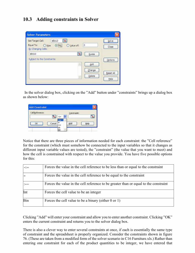
10.3 Adding constraints in Solver
In the solver dialog box, clicking on the ”Add” button under ”constraints” brings up a dialog box
as shown below:
Notice that there are three pieces of information needed for each constraint: the ”Cell reference”
for the constraint (which must somehow be connected to the input variables so that it changes as
different input variable values are tested), the ”constraint” (the value that you want to meet) and
how the cell is constrained with respect to the value you provide. You have five possible options
for this:
<= Forces the value in the cell reference to be less than or equal to the constraint
= Forces the value in the cell reference to be equal to the constraint
>= Forces the value in the cell reference to be greater than or equal to the constraint
Int Forces the cell value to be an integer
Bin Forces the cell value to be a binary (either 0 or 1)
Clicking ”Add” will enter your constraint and allow you to enter another constraint. Clicking ”OK”
enters the current constraint and returns you to the solver dialog box.
There is also a clever way to enter several constraints at once, if each is essentially the same type
of constraint and the spreadsheet is properly organized. Consider the constraints shown in figure
76. (These are taken from a modified form of the solver scenario in C16 Furniture.xls.) Rather than
entering one constraint for each of the product quantities to be integer, we have entered that
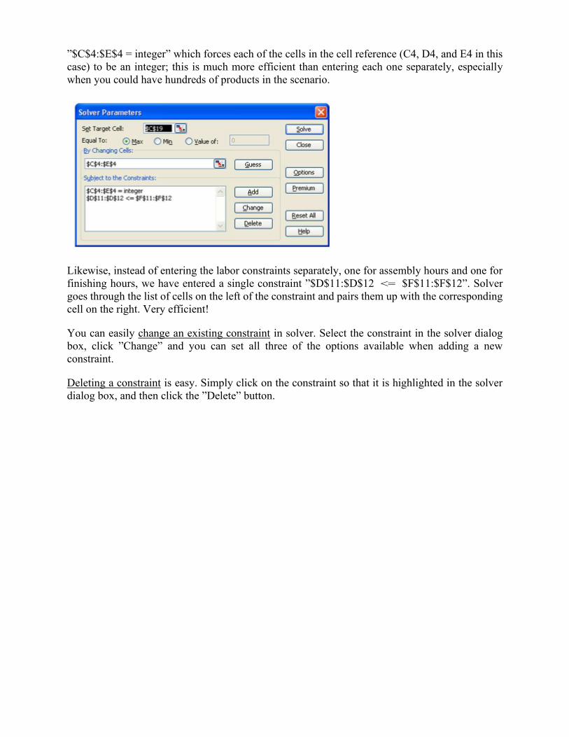
”$C$4:$E$4 = integer” which forces each of the cells in the cell reference (C4, D4, and E4 in this
case) to be an integer; this is much more efficient than entering each one separately, especially
when you could have hundreds of products in the scenario.
Likewise, instead of entering the labor constraints separately, one for assembly hours and one for
finishing hours, we have entered a single constraint ”$D$11:$D$12 <= $F$11:$F$12”. Solver
goes through the list of cells on the left of the constraint and pairs them up with the corresponding
cell on the right. Very efficient!
You can easily change an existing constraint in solver. Select the constraint in the solver dialog
box, click ”Change” and you can set all three of the options available when adding a new
constraint.
Deleting a constraint is easy. Simply click on the constraint so that it is highlighted in the solver
dialog box, and then click the ”Delete” button.
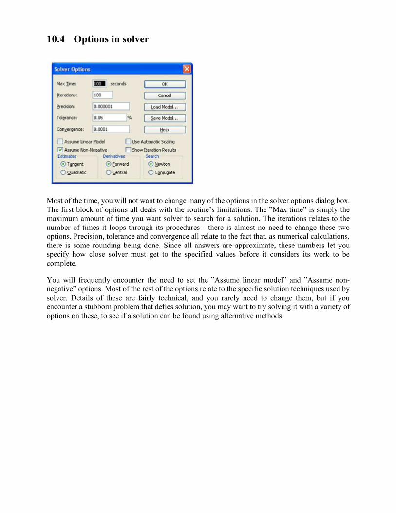
10.4 Options in solver
Most of the time, you will not want to change many of the options in the solver options dialog box.
The first block of options all deals with the routine’s limitations. The ”Max time” is simply the
maximum amount of time you want solver to search for a solution. The iterations relates to the
number of times it loops through its procedures - there is almost no need to change these two
options. Precision, tolerance and convergence all relate to the fact that, as numerical calculations,
there is some rounding being done. Since all answers are approximate, these numbers let you
specify how close solver must get to the specified values before it considers its work to be
complete.
You will frequently encounter the need to set the ”Assume linear model” and ”Assume non-
negative” options. Most of the rest of the options relate to the specific solution techniques used by
solver. Details of these are fairly technical, and you rarely need to change them, but if you
encounter a stubborn problem that defies solution, you may want to try solving it with a variety of
options on these, to see if a solution can be found using alternative methods.
10.5 Errors in Solver
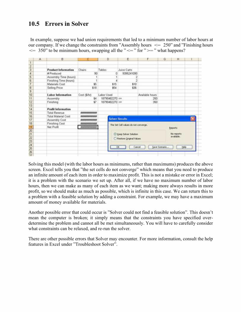
In example, suppose we had union requirements that led to a minimum number of labor hours at
our company. If we change the constraints from ”Assembly hours <= 250” and ”Finishing hours
<= 350” to be minimum hours, swapping all the ” <= ” for ” >= ” what happens?
Solving this model (with the labor hours as minimums, rather than maximums) produces the above
screen. Excel tells you that ”the set cells do not converge” which means that you need to produce
an infinite amount of each item in order to maximize profit. This is not a mistake or error in Excel;
it is a problem with the scenario we set up. After all, if we have no maximum number of labor
hours, then we can make as many of each item as we want; making more always results in more
profit, so we should make as much as possible, which is infinite in this case. We can return this to
a problem with a feasible solution by adding a constraint. For example, we may have a maximum
amount of money available for materials.
Another possible error that could occur is ”Solver could not find a feasible solution”. This doesn’t
mean the computer is broken; it simply means that the constraints you have specified over-
determine the problem and cannot all be met simultaneously. You will have to carefully consider
what constraints can be relaxed, and re-run the solver.
There are other possible errors that Solver may encounter. For more information, consult the help
features in Excel under ”Troubleshoot Solver”.
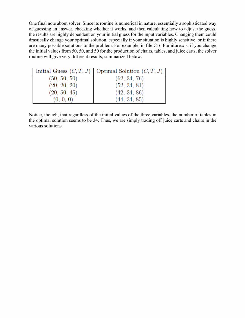
One final note about solver. Since its routine is numerical in nature, essentially a sophisticated way
of guessing an answer, checking whether it works, and then calculating how to adjust the guess,
the results are highly dependent on your initial guess for the input variables. Changing them could
drastically change your optimal solution, especially if your situation is highly sensitive, or if there
are many possible solutions to the problem. For example, in file C16 Furniture.xls, if you change
the initial values from 50, 50, and 50 for the production of chairs, tables, and juice carts, the solver
routine will give very different results, summarized below.
Notice, though, that regardless of the initial values of the three variables, the number of tables in
the optimal solution seems to be 34. Thus, we are simply trading off juice carts and chairs in the
various solutions.


