
Step by Step Trading
By Dr Alexander Elder
Copyright 2015 by Dr Alexander Elder
All charts by StockChartscom ndash used with permission
ISBN 978-0-9744942-5-8
Published by eldercom
LEGAL No part of this publication may be reproduced stored in a retrieval system or
transmitted in any form or by any means without the prior written permission of the copyright
owner
DISCLAIMER OF WARRANTY while the author has used his best efforts in preparing this
book he makes no representations or warranties with respect to the accuracy or completeness of
the contents The advice and strategies contained herein may not be appropriate for your
situation You should consult with a professional where appropriate The author shall not be
responsible for any loss
Books by Dr Alexander Elder
In chronological order
Trading for a Living
Study Guide for Trading for a Living
Rubles to Dollars
Come into My Trading Room
Study Guide for Come into My Trading Room
Straying from the Flock Travels in New Zealand
Entries amp Exits Visits to 16 Trading Rooms
Study Guide for Entries amp Exits
The New Sell amp Sell Short (with Study Guide)
To Trade or Not to Trade A Beginnerrsquos Guide (e-book)
Two Roads Diverged Trading Divergences (e-book)
The New High ndash New Low Index (e-book) with Kerry Lovvorn
Additive Manufacturing (e-book)
The Trading Puzzle ndash Book One (e-book) with Kerry Lovvorn
The New Trading for a Living
Study Guide for The New Trading for a Living
Table of Contents
Free updates and the honor code
Starting Out on Your Journey
Markets are tough
Two steps that will put you ahead of the crowd
How to control risk
Good records make good traders
Technical Analysis
StockCharts Basics
Letrsquos create a chart (actually two charts)
Dressing a naked chart a pair of moving averages
Profits from manic-depression (using envelopes)
The power of bulls and bears (MACD indicator)
May the force be with you (Force index)
Less is more (other indicators)
Trading Systems
The trades to avoid (the Impulse system)
Every trade deserves a name (the system you trade)
Buying pullbacks in an uptrend
Catching reversals (false breakout with a divergence)
An end-of-day trend-following system (by Kerry Lovvorn)
Trading with fundamentals and technicals (by Philip Wu)
Trade Management
The sweet spot (what timeframe will you trade)
Stops targets and risk control
Your visual diary
The road ahead
Sources
Acknowledgments
About the author
Free updates and the honor code
After we accumulate feedback for this e-book we plan to issue an updated edition and send it at
no charge to all purchasers If you bought this book from Eldercom yoursquoll automatically
receive an update If you bought it elsewhere please let us know and wersquoll add your email to
our list for future updates We have a strict privacy policy and will never release your
information to anyone
Please do not forward this book to your friends (ie commit piracy) Instead email your friends
this link to make sure they receive the latest update
Please do not copy this book
I put several hundred hours of work into writing Please reciprocate my trust in you by sending
your friends the above link rather than pirating the book
And now letrsquos embark on our journey
Dr Alexander Elder
Vermont March 2015
Return to the top
Starting Out on Your Journey
Congratulations on becoming a StockChartscom member You have taken an important step
towards becoming a successful trader This book will guide you through the next several steps
My goal in writing it was to help you avoid common pitfalls and master the key principles that
will serve you for the rest of your trading life
Most beginners jump into trading unprepared They remind me of new skiers who hop into a
gondola and ride to the top of a mountain without a clue how to ski down its slopes This book
will teach you the essentials of modern computerized trading Even if you already have some
experience yoursquoll find much that is useful and perhaps even surprising in this book
To help you focus on the process of becoming a successful stock trader Irsquove included the key
lessons from my years of experience This book Step by Step Trading will walk you through
the essentials of this fantastically interesting but demanding craft and teach you its main dorsquos and
donrsquots I believe that ldquoless is morerdquo in trading Most traders needlessly complicate their work
and hurt their results instead of improving them
I suggest reading this brief book at least twice Begin by loading it onto your favorite tablet or
printing it out and read it once the old-fashioned way relaxing in your favorite chair Then go
back and re-read it while sitting in front of your StockCharts screen and implement its lessons
This will ensure that you absorb all of the essential information in this book
Wersquoll begin by looking at the risks of trading and then set the essential money management
rules Wersquoll continue our journey of discovery by going step-by-step through the exact chart
settings that I use ndash and of course explain how and why I use them There is no need to waste
time re-inventing the wheel if you can benefit directly from my years of experience
After that Irsquoll show you several examples of trading systems and trade management techniques
Irsquoll even give you a copy of the spreadsheet that I use to track my own trades Take your time
working with this book to become a more knowledgeable and more disciplined trader
Return to the top
Markets are tough
Trading attracts us with its promise of money and freedom challenge and excitement Beginners
quickly discover how hard it is to take profits out of the market Remember the only easy thing
about trading is losing money
The rewards of trading as well as its dangers are both are very real and you need to weigh them
before you jump in with both feet If you decide to trade you have a fascinating road ahead of
you If you decide that trading is not for you there is no shame in ldquoLet me stand aside from the
markets for nowrdquo
Before we analyze charts and look for stocks to buy or sell letrsquos explore several basic questions
what markets to trade how to manage risk and why keep a trading journal
Where will your trading profits come from The money you hope to take out of the markets
currently resides in other peoplersquos accounts And all those men women and corporations have
absolutely no desire to give money to you As a matter of fact right now while yoursquore reading
this book theyrsquore crafting their trading plans designed to take your money
While yoursquore planning to pick their pockets theyrsquore working hard on trying to pick yours
Theyrsquore probably more experienced in this game than a beginning trader But your forthcoming
Throughout this book yoursquoll find boxes like this one - they contain precise instructions on how to duplicate my settings on your computer If you are on the first reading of this book you can skip these and focus on the actual text Later when you are in front of your computer follow these instructions ndash step-by-step ndash to get your StockCharts account configured just like mine
battle with them isnrsquot even your biggest problem
Your greatest enemy ndash a bigger obstacle than any competitor a grasping broker or unstable
internet ndash is the person you see every morning in the mirror
All beginners ndash and quite a few experienced traders who should know better ndash sabotage
themselves in ways that are sometimes sad at other times hilarious but almost always avoidable
And they do it not once or twice but over and over again until their account is depleted or they
lose confidence and slink away from the markets
The lack of knowledge or to put it bluntly ignorance isnrsquot the biggest cause of trader mortality
The two major causes of losing are the inability to control risk and to manage yourself If you
learn to manage yourself in the markets and to control risks yoursquoll ensure that you have enough
time to survive clear up any lack of knowledge and start taking profits from the markets
Most people hate to face their own role in losing This is why if you want to become a
successful trader you need to learn to manage yourself write trading plans calculate risks vs
rewards and complete your trading journal after each trade Then yoursquoll rise above the masses
and start taking money from the markets
The rules for managing risk that Irsquoll show you may feel annoying for beginners with tiny
accounts because proper risk control limits trade size Our greed pushes against risk
management All traders have this powerful emotion ndash some of us have a lot and others an even
bigger lot
Another hugely powerful emotion is fear and it follows on the heels of greed You get greedy
put on an oversize trade the market slaps you ndash and now fear kicks in You become afraid to put
on a perfectly reasonable trade ndash and afterwards kick yourself for having missed an opportunity
Poor risk management makes people lose courage as well as money
This is why I want to begin this book on trading tools and systems with brief chapters on risk
control and self-management
Return to the top
Two steps that will put you ahead of the crowd
The two key skills that separate winners from losers are risk control and self-control
Managing risk in your account is pretty straightforward once you know the formulae which
yoursquore about to see A professional trader may allocate up to a third of his research time to
calculating money management angles as he compares risks and rewards for different stocks
He discards many stocks that look attractive but whose risk parameters donrsquot suit him
How much time does an average beginner spend calculating and managing risk Most likely
zero zip nada Right before placing a trade he may briefly scratch his head or some other part
of his anatomy and decide to double his usual size because he made money in the previous trade
or skip this trade because he lost money in his previous trade Both choices are equally wrong
If you let your latest trade determine what size to trade next time it means giving up control of
trade management If you follow the formulae in this book for controlling risks yoursquoll
accomplish a goal in which most beginners fail
The second essential skill ndash self-control ndash is harder to quantify Fortunately there is a clear and
concrete tool for implementing and measuring self-control keeping good quality trading records
After Entries amp Exits my book of interviews with traders was published people kept asking
what those traders had in common The 16 traders in the book ndash men and women long-term and
short-term traders stocks futures and options traders American and foreign traders ndash what did
they have in common
They all kept excellent records
I say to my students ldquoShow me a trader with good records and Irsquoll show you a good trader
Show me a trader with poor or nonexistent records and Irsquoll show you an average trader And
thatrsquos a very poor sight because an average trader loses money The majority must lose in order
for a small informed and disciplined minority to make profits Wersquoll pay attention to record-
keeping as well as risk management in this book
Return to the top
How to control risk
An intelligent scuba diver always keeps an eye on his air tankrsquos pressure gauge to make sure he
has enough to return to the surface with a safety margin The money in your trading account is
your air supply Watch it be economical in its use and have a reserve
All beginners no matter how bright make mistakes and take losses Be sure to keep your losses
small donrsquot let them threaten your survival
The most important rule of risk control is THE TWO PERCENT RULE never risk more than
2 of your account equity on any given trade
Begin by writing down three numbers for every trade your entry target and stop Without them
a trade turns into a gamble ndash and yoursquore not here to gamble are you
Later in the chapters on technical analysis wersquoll discuss how to set these three numbers At this
point simply recognize that every trade requires a stop and that the distance from your entry to
that stop determines how many dollars yoursquoll risk per share
Letrsquos say you plan to buy a stock at $30 and expect it to rally to $35 ndash that is your target As a
cautious person and not a gambler you decide to place a protective stop at $28 ndash the level you
set through technical analysis to be discussed later Buying at $30 and protecting at $28 means
yoursquoll be risking $2 per share in this trade
Next question how much money do you have in your trading account Letrsquos say you have
$20000 What is 2 of $20000 It is $400 ndash and thatrsquos the maximum amount yoursquore allowed
risk on any trade
Next question how many shares of that stock may you buy Well if your maximum permitted
risk is $400 and your risk per share is $2 you may buy up to 200 shares You may buy fewer
shares but you may not go above the number given to you by the 2 Rule
The maximum number of shares you may buy is determined by your risk per share and your total
permitted risk
Figure 01 The Iron Triangle of Risk Control
The Iron Triangle of Risk Control ldquoArdquo is the maximum risk for your account (2 of its current
value) ldquoBrdquo is your risk per share (the distance from your entry to your stop) ldquoCrdquo = A divided by
B
You donrsquot have to risk 2 of your account on every trade ndash yoursquore perfectly welcome to risk
less but you may never risk more The bigger your account the lower percentage you want to
risk
THE SIX PERCENT RULE states that you must stop trading for the rest of the month
whenever your losses reach 6 of your account equity at the beginning of that month
If and when losses start piling up take that as a sign that your method isnrsquot working in the
current market environment Itrsquos time to pause and step aside for a while Once your drawdown
hits 6 thatrsquos the end of trading for the current month ndash no new trades
This is similar to placing a stop on a trade ndash the 6 Rule places a stop on your account limiting
the maximum damage that can be caused by a series of losing trades The 6 Rule breaks losing
streaks giving you time to think and regroup
Most traders get killed by fish ndash either a shark bite (a single disastrous loss) or piranha bites (a
series of losses none of them lethal but together they shred an account to the bone) The 2
Rule will protect you from the sharks The 6 Rule will save you from the piranhas
You may never increase those limits but feel free to lower them especially the 2 maximum
loss per trade
If you use the 2 and 6 rules a series of only three losing trades can knock you out of the
game early in the month If you reduce your maximum risk per trade to 1 yoursquoll double the
number of trades you may take before being forced to step aside Lowering your risk per trade to
1 or less will give you more latitude to practice your tactics
Before we close this chapter a quick comment on account size A tiny account makes it very
hard to diversify while large accounts tend to lull beginners into a false sense of security At the
time of this writing Irsquod say that the sweet spot for beginners is somewhere in the $20000 to
$50000 range It is big enough to diversify but small enough not to get carried away
Remember that an intelligent beginner trades to learn Imagine going to a dental or an
engineering school you wouldnrsquot expect to make a living out of it in your first year of schooling
Focus on learning and acquiring skills become a survival expert Trade small and keep good
records If you do it right from the start yoursquoll be making good money later ndash instead of
overtrading getting hurt near the starting line and becoming demoralized
Risk management will make you a safer trader In the next chapter wersquoll discuss good record-
keeping a key tool for your growth as a trader
Return to the top
Good records make good traders
Remember this rule ldquoit is OK to make mistakes but not OK to repeat themrdquo It reminds me of a
Russian saying ldquoDonrsquot step on the same rake twicerdquo Many traders keep losing money
repeating the same mistakes
A habitual loser doesnrsquot remember what he did right and made money or what he did wrong and
lost Had he remembered he would have done more of the right stuff and stopped repeating the
wrong moves
Letrsquos be realistic itrsquos beyond human capacity to remember all the nitty-gritty details of trading
tools systems entries exits news reports and a myriad of other details Thatrsquos why we need to
write those things down Successful traders keep good records review them and learn from
them
You need to keep both numerical and visual records a spreadsheet and marked-up charts of your
trades StockCharts gives you a great way to mark up your charts and Irsquom going to give you a
spreadsheet you can use for numerical records Letrsquos review the spreadsheet first
Shown below are two lines from my spreadsheet reflecting a trade I made while working on this
book Notice that in addition to the usual numbers such as entry and exit dates and prices gross
and net profit or loss this spreadsheet includes columns for rating the quality of each trade as
well as of every entry and exit I call them buy sell and trade grades You have to grade your
performance in order to improve it
Figure 02 Traderrsquos Spreadsheet
1 Source ndash where I got the idea for this trade It could be myself an article or a friendrsquos tip
2Method ndash If Source is lsquoselfrsquo then this is the method I used to find this trade
3Symbol ndash Symbol or ticker
4Quant ndash How many shares
5ls ndash Long or short
6Bought ndash Purchase price
7Date ndash Date bought
8Comm ndash Commission (since I first sold one half and then the other I split this line in two)
9Sold ndash Sell price
10Date ndash Sold date
11Comm ndash Sales commission
12Fee ndash Exchange fees
13PL ndash Gross profit or loss
14Net ndash Net profit or loss
15Buy gr ndash Buy Grade (How far from the dayrsquos high did I buy See below for more)
16Sell gr ndash Sell Grade (How far from the dayrsquos low did I sell See below for more)
You can download the spreadsheet in Excel format by clicking this link httpstockchartscomstep-by-step-tradingtraders-spreadsheetxlsx If you donrsquot have MS Excel you can download this simplified version httpstockchartscomstep-by-step-tradingtraders-spreadsheetcsv
17Trade gr ndash Trade Grade (What percentage of the channel did I capture See below for more)
18amp19Upchan amp Downch ndash Upper and lower daily channel lines on the day I bought
2021amp22 High low and close on the day I bought
2324amp25 High low and close on the day I sold
The all-important Trade Grade reflects the percentage of the price channel that the trade earned
or lost Prices flow in channels like rivers in their valleys Your trade grade is the percentage of
the width of the valley that you captured in your trade You will see how to construct channels
in one of the following chapters
The TRADE GRADE (Sell ndash Buy) (Upper channel line ndash Lower channel line)
This formula compares your profit (or loss) in a trade to the spread between channel lines on the
day you entered that trade Since the distance from the top to the bottom of a channel reflects a
realistic maximum available for a swing trade the Trade Grade reflects the percentage of the
maximum you were able to catch A grade above 30 makes an A-quality trade Donrsquot swing
for the fences set reasonable goals anything above 30 is excellent
Buy and Sell grades reflect the quality of every purchase or sale Each of these grades is based
on a single bar measuring how your entry or exit relates to the high and the low points of the
day
The BUY GRADE (High ndash Buy) (High ndash Low)
You want to buy as far away from the high and as near the low of the daily bar as possible If
you buy in the lower half of the daily bar your rating for that buy is over 50 which is
excellent
The SELL GRADE (Sell ndash Low) (High ndash Low)
You want to sell as far away from the low and as near the high of the daily bar as possible If
you sell in the upper half of the daily bar your rating for that sell is over 50 which is
excellent
Your Buy and Sell Grades show where you stand in the never-ending battle against the pros who
make a living buying near the lows and selling near the highs If you buy in the upper half of the
bar and sell in the lower half yoursquore feeding the wolves Of course no one can definitely tell
what will be the high and the low of the day but getting consistently low ratings is a sign that
yoursquore chasing runaway prices and need to tighten your discipline
The spreadsheet above shows two lines documenting one trade because I purchased that stock in
a single trade but sold it in two installments This is marked by the entry commissions on both
lines being boxed together My Buy Grade was 74 meaning I bought near the bottom quarter
of that day Notice also that the closing price for that day (Col 2) is colored green because my
purchase price of $9285 was below the closing price of $9317 This meant that the trade was
profitable at closing time ndash another measure of its quality
I exited the first half of the trade because I thought the market was becoming toppy and wanted
to take partial profits My Sell Grade was 76 based on the high and low of the sale day but I
sold too early in the day The stock closed for the day above my sale price which is why I
colored the closing box in Col 25 in red
The next day the stock reversed and headed lower I cut and ran getting a poor sale grade of
only 21 meaning I sold in the bottom quarter of the day ndash chasing the trend Still the stock
continued to decline after I sold and closed below my selling price earning me a green box in
Column 25
Both Trade Grades were good ndash 41 of the daily channel for the first sale and 40 for the
second Both were above the 30 level that marks A-quality trades
I hope you appreciate how much useful information about the quality of trades you can get from
analyzing a single line in a spreadsheet Imagine how much more you can learn from analyzing
dozens of such lines
In addition to numerical records and ratings of all your trades itrsquos very educational to keep a
visual diary of your trades Save a picture of your stock and its indicators on the day you buy it
and another picture on the day you sell By reviewing them at a later date yoursquoll be able to see
what works well and what doesnrsquot work in your approach to trading Those snapshots will turn
you into your own teacher
StockCharts makes it easy to maintain a visual diary combining price charts indicators and
comments Near the end of this book after wersquove reviewed the analytic and decision-making
process I will share with you my visual diary of this AMT trade and show you how to maintain
it in StockCharts
Keeping a visual diary of your trades along with numerical records will set you apart from the
pack of competitors Yoursquoll rise above them by having what they donrsquot have risk management
and record-keeping These tasks arenrsquot nearly as exciting as looking for trades and entering them
ndash but they make all the difference between long-term winning and losing
Note For more thoughts on record-keeping please see my book The New Trading for a Living
Return to the top
Technical Analysis
StockCharts Basics
Experienced members may well skip this chapter but please read it carefully if you are a new
member of StockCharts Itrsquoll help you to get more out of this book and apply its lessons to your
work
Clicking on any chart in this book will take you to the same chart at wwwStockChartscom
(obviously you need to be online to use this function) There yoursquoll be able to see that chart in a
larger format and explore all of its settings
Figure 03 Your options in StockCharts
A trader can use StockCharts without paying a dime (A) He or she can even access the sitersquos
remarkable ChartSchool (B) Still membership (C) has its privileges and the most important of
them is that the program can memorize any selections or changes a member makes on his charts
If you add an indicator or change its parameters the program will remember it and you wonrsquot
have to retype everything the next time you log in You also get more indicators and tools
To learn to use StockCharts click on httpstockchartscomvideos to view a gallery of sharp
and practical lessons They are divided into the following chapters
The Basics
Using SharpCharts
Additional Analysis Tools
Using ChartLists
Using ChartNotes
Scanning and Alerts
Those videos will help you understand your choices for plotting charts changing their styles and
creating lists Be absolutely sure to watch the very first video in ldquoThe Basicsrdquo chapter ndash Getting
Started with StockChartscom Watching that 17-minute video will save you multiple hours
down the road
Let me briefly point out just three of the basic features of StockCharts Overlays Indicators and
ChartStyles
Figure 04 Overlays
Overlays are studies that are superimposed on price plots such as moving averages and
envelopes (more on those below) StockCharts allows you to have a huge number of overlays
but wersquoll stick to the essentials and not clutter our charts
Figure 05 Indicators
Indicators help us find when bulls or bears dominate a stock You will see what indicators I use
to discover the shifts of power in the endless battles between those two groups I like plotting
my indicators below prices but that is simply a personal preference Same as overlays letrsquos not
clutter our charts but select a small number of clear and well understood indicators
Figure 06 Advanced Options
Notice that some of the overlays and indicators allow us to use advanced options Those are
marked by green triangles as shown above You will see my selections in this book ndash but feel
free to change them make them your own with your own unique settings
Figure 07 ChartStyles
Arrow A in Figure 07 points to one of the most useful features of StockCharts ndash a menu of
ChartStyles It gives you the ability to set up a chart exactly how you like and save that format
as a ChartStyle so that in the future you can apply this template to any ticker with just a single
click
The program also gives you some predefined ChartStyles including my favorite ldquoElderrsquos
Weekly Stocksrdquo Arrow B points to where you can change the ticker andor timeframe of a chart
with a single click
Return to the top
Letrsquos create a chart (actually two charts)
Every bar or candle you see on your chart represents market action during the period of time
covered by that bar or candle A bar on a daily chart represents the range of prices during one
day Its vertical line connects the high and the low points of that day while the tick on the left
shows the opening price and the tick on the right the closing price On a candlestick chart the
area between the opening and closing prices is thick Candles are hollow if prices close above
the opening price or filled if they close below the opening price
I use bar charts because thatrsquos how I learned to trade before candlesticks appeared in the US
Keeping an eye on the opening and closing ticks gives me the same information as candles and I
can fit more bars than candles on a computer screen Even though this book uses bar charts all
of its techniques can be used with candles
A bar on a weekly chart reflects price action for one week on a monthly chart for one month on
an hourly chart for one hour and so on Markets move at the same time in different timeframes
but sometimes they trend in opposite directions For example the trend may be rising on the
To create a daily bar chart using StockChartscom follow these steps 1) Log into your account 2) Type a ticker symbol into the ldquoCreate a Chartrdquo box at the top of the page Wersquore going to use
AMZN for this example Press the ldquoGordquo button when you are done 3) You should now be looking at a chart of AMZN with your ldquoDefaultrdquo chart settings To see a
plain bar chart click on the ldquoChartStylesrdquo dropdown located below the chart and select ldquoPlain OHLC Barsrdquo from the choices
weekly chart but falling on the daily challenging us to decide which one to follow Wersquoll deal
with that in a moment but please keep in mind that for a truly stereo vision of any stock you
must monitor it in more than one timeframe Those who track a single timeframe miss important
information
The key principle of using multiple timeframes is to make your strategic decision ndash to be a bull
or a bear ndash on a longer-term chart then switch to a shorter-term chart for making tactical
decisions where to buy and sell If the longer-term chart isnrsquot clear donrsquot even bother going to
the shorter-term chart but move on to the next stock We should look for trades only when the
strategic direction is clear
Select two timeframes that relate to one another by approximately a factor of five A weekly and
a daily chart make a good pair Other good pairs are monthly and weekly for very long-term
trading or daily and hourly for shorter-term trading The same approximate ratio applies to
intraday charts such as 30- and 5-minute Watching at least two timeframes is like looking at
the road ahead with both eyes You wouldnrsquot want to drive with one eye closed Let your
competitors do that using only one timeframe
Having selected a weekly and a daily pair wersquoll make our strategic decisions to buy sell short
or stand aside on the weekly chart Wersquoll fine-tune and implement those decisions on the daily
chart
What trading vehicles shall we chart Letrsquos begin with the key indexes ndash the Dow the Nasdaq
and the SampP If you live and trade outside the US track the key stock index or indexes for your
country ndash for example the Toronto Stock Exchange index in Canada or All-Ordinaries in
Australia Select a handful of popular high-volume stocks to which you can give your
undivided attention Itrsquos better to update and review five charts every day than 20 charts once in
a while Be extremely cautious using ETFs most of which poorly track their underlying
To change your chart to a different bar period click on the ldquoPeriodrdquo dropdown located above the left corner of the chart then select the new period that you want to see (eg weekly 1 hour 5 min etc) Then click the ldquoUpdaterdquo button
vehicles Avoid leveraged ETFs and volatility ETFs which a respected colleague called ldquoas
great a wealth-destroying machine as Ive ever seenrdquo There is an in-depth review of six groups
of trading vehicles including stocks and ETFs in The New Trading for a Living
Figure 08 AMZN weekly
Clicking on any chart in this book will take you to the same chart at wwwStockChartscom (you
need to be online to use this function) Yoursquoll be able to see that chart in a larger format as well
as view and modify its settings
Letrsquos take a look at two charts of Amazoncom ndash a weekly chart (above) and a daily chart
(below) Both are naked without any technical indicators Plain charting the original approach
to technical analysis has several pluses but even more minuses On the one hand charts reflect
everybodyrsquos actions in any given market On the other hand trying to analyze a naked chart
tends to be very subjective
Old market books are filled with descriptions of heads-and-shoulders rectangles triangles etc
The longer you squint at a chart the more of them will seem to appear If you feel bullish yoursquoll
keep lsquofindingrsquo patterns that point up and if yoursquore bearish yoursquoll be lsquoseeingrsquo the ones pointing
down
Just think of trendlines You can draw them across the extreme price points or across the edges
of congestion zones which will change their angles and trading messages Their angles will also
change if you change your price scale
Horizontal price levels make sense because traders have memories They remember at what
price levels trends reversed in the past Masses of people buy and sell at those levels Keep in
mind that support and resistance arenrsquot rigid like a wall of plate glass they are flexible like a
wire fence on a farm This is why false breakouts ndash quick excursion beyond the lines of support
and resistance that fail to continue ndash provide valuable trading signals called false breakouts
I believe that the market doesnrsquot know diagonals Among the very few chart patterns that make
logical sense are horizontal lines (support and resistance) and their breakouts especially false
breakouts
Take a look at the weekly chart of AMZN in Figure 8 At the bar marked ldquoArdquo the stock reached
a high of $40563 and stalled A few weeks later AMZN rose to $40669 ndash a negligible upside
breakout ndash choked up and retreated Two weeks later it opened at $403 ran up to $40806
reversed and closed at $38727 ndash below the breakout line as well as the psychologically
important $400 level This false upside breakout led to a vicious decline
A few months later we see a mirror image of this pattern At bar C the stock dropped to a low of
$28438 and then rallied In area D it dipped to $284 slightly below the level of the previous
bottom Recoiling from that low left behind a false downside breakout setting up the stage for a
frisky rally
All traders watch support and resistance but professionals and amateurs react to them
differently Amateurs love following breakouts while the pros who expect most breakouts to
fail like to fade them ndash trade against them
Figure 09 AMZN daily
Turning to the daily chart of AMZN we immediately notice two severe breaks marked E-1 and
E-2 Imagine buying a few days earlier and then waking up to discover that your wonderful
$360 stock has become a $315 stock overnight Ouch
Both breaks were caused by earnings reports that missed Wall Streetrsquos expectations A cautious
trader doesnrsquot get caught in such breaks The dates of earnings reports are announced far in
advance allowing you to exit those trades Holding a trade through earnings turns it into a
crapshoot Depending on the report you may win lose or stay unchanged ndash but that is no longer
a trade but a gamble
On the weekly chart of AMZN we see an upside reversal near the right edge suggesting the
strategy of going long (buying) The daily chart shows a pattern of alternating rallies and
declines Rather than buying into the rally at the right edge we may want to wait for the next
minor decline on the daily chart ndash a wave that goes against the tide ndash and buy at a discount We
can sharpen this approach by using technical indicators which wersquoll review in the following
chapters
Return to the top
Dressing a naked chart a pair of moving averages
Computerized technical analysis is more objective than classical charting When an indicator is
up itrsquos up and when itrsquos down itrsquos down Therersquos no fiddling with the angle of a ruler
Technical analysis software contains a wealth of indicators but you arenrsquot going to use all of
them Compare this to sitting down in a restaurant and picking up a menu Yoursquore not going to
order every item on the list only select an appetizer a main course and a dessert In trading we
need to select just a handful of indicators and learn to use them
A perfect indicator doesnrsquot exist Markets are complex you cannot win using a single tool
Some indicators work best during trends others in trading ranges Trends and ranges are easy to
recognize in the middle of a chart but the closer we get to the right edge the foggier they
become Thatrsquos why we need to combine trend-following indicators which are good for trends
with oscillators which work better in trading ranges Letrsquos begin by selecting several indicators
and in later chapters wersquoll combine them into trading systems
In selecting indicators you may begin using what I show you here but please feel perfectly free
to choose others Just remember to keep their number down to five or at a maximum six Thatrsquos
more than enough using more will only create confusion I call this approach lsquoFive bullets to a
cliprsquo
The first tool I like to add to every chart is a pair of moving averages
Before using any indicator we must understand how it is constructed and what it measures
Each tick on your computer screen reflects a transaction between a buyer and a seller ndash a
momentary consensus of value Buyers bid low sellers ask for more but they feel pressure to
act before some undecided trader steps in and snatches away that deal When a buyer and a
seller step forward from the crowd and trade with each other a price tick appears on your screen
The consensus of value it represents keeps changing with every new tick and those ticks
coalesce into bars or candles
Moving averages add up prices during a selected time window and average them out If each
tick is a snapshot of value then a moving average is a composite photograph of value a trend-
following indicator
Figure 10 AMZN daily 26- and 13-bar EMAs
I highly recommend using exponential moving averages (EMAs) rather than simple ones EMAs
are more sensitive to changes but they donrsquot react to the dropping off of old prices like simple
averages
The main message of any EMA is the direction of its slope It rises when the crowd trading a
stock grows more optimistic ndash bullish It declines when that crowd grows more pessimistic ndash
bearish
A fast EMA (which I like coloring red on my chart) reflects a shorter-term consensus of value
A slow EMA (colored gold) reflects a longer-term consensus of value I always use a pair of
EMAs with the time window of the slow EMA twice as long as the fast EMA My pairs may be
13 and 26 or 11 and 22 bars etc The bars can be weekly daily or intraday
Figure 11 DDD daily 26- and 13-bar EMAs
The zone between the two EMAs is extremely important ndash I call it THE VALUE ZONE A
swing trader aims to buy below value and sell above it ndash or sell short above and cover below
value
Stocks go down twice as fast as they rise Professional traders love shorting ndash betting on price
declines Here you see a bearish trend in 3D Systems Inc (DDD) identified by the
downsloping EMAs
To add these two EMAs to your chart follow these steps 1) Find the ldquoOverlaysrdquo area located below the chart 2) Select ldquoExp Moving Avgrdquo from one of the overlay dropdowns in that section Wersquoll create
the gold 26-period EMA line first 3) Change the corresponding ldquoParameterrdquo setting from the default (20) to ldquo26rdquo 4) Change the corresponding ldquoStylerdquo setting from ldquoAutordquo to ldquoSolid (Thick)rdquo 5) Change the corresponding ldquoColorrdquo setting from ldquoAutordquo to ldquoGoldrdquo 6) Now on the next line select ldquoExp Moving Avgrdquo again from the overlay dropdown 7) Change the ldquoParameterrdquo from 20 to ldquo13rdquo 8) Set the ldquoStylerdquo to ldquoSolid (Thin)rdquo and then set the color to ldquoRedrdquo 9) Press the ldquoUpdaterdquo button
The bar marked ldquoKrdquo shows a pattern called a ldquoKANGAROO TAILrdquo ndash an extremely tall bar
protruding from a tight weave of prices which typically augurs in trend reversals The slow
(gold-colored) EMA turns down indicating a downtrend While the value of this stock is being
destroyed DDD keeps rallying into its value zone in areas marked ldquoPbrdquo for pullbacks They
provide excellent shorting opportunities for savvy traders
Bullish traders do the opposite When a rising slow moving average identifies an uptrend they
buy pullbacks into the value zone
Return to the top
Profits from manic-depression (using envelopes)
Warren Buffett perhaps the greatest living investor says that whenever you buy a stock you
become a partner with a manic-depressive fellow he calls Mr Market That fellow runs up to
you every day offering to sell you his shares or to buy you out Most of the time you should
ignore him because he is crazy but there are two exceptions
First when Mr Market becomes depressed he may offer to sell you his shares for a song and
thatrsquos when you should buy Second when Mr Market becomes manic he may offer you a
crazy price for your shares ndash and thatrsquos when you should sell These prescriptions are logical but
hard to follow because Mr Marketrsquos mood is very infectious Most people want to buy when he
is manic (near the top) and sell when he is depressed (near the bottom)
We need to diagnose Mr Marketrsquos condition and instead of becoming infected by it do the exact
opposite ndash buy when he is depressed and sell when he is manic
The tool that will help us do that is an envelope or a channel It consists of two lines parallel to a
moving average ndash one line above and the other below A well-drawn channel contains
approximately 95 of prices for the past 100 bars Whatrsquos inside a channel is normal whatrsquos
above is mania and whatrsquos below is depression Channels help us recognize Mr Marketrsquos
extremes ndash and trade against them
Remember that a channel is a tool not a complete trading system Prices dipping below their
channel shouldnrsquot be taken as an automatic buy signal and prices rising above it shouldnrsquot be
taken as an automatic sell signal Wersquoll use several technical indicators including EMAs and
channels as building blocks from which wersquoll construct trading systems in later chapters
There are several methods of building channels The most basic and straightforward is to draw
two lines parallel to a slow EMA For example if you use a pair that consists of a 13-day and a
26-day EMA build the channel around the 26-day EMA If at the right edge of the screen your
EMA stands at $100 and you decide to use a 5 channel the upper channel line will be at $105
and the lower at $95
Such channels are fine if you track a very small number of stocks because you can easily find the
proper percentage for every stock Some stocks require wider channels than others Channels on
the weekly chart have to be twice as wide as the daily channels Because of these complexities
traders look for channels that automatically adjust their width to the volatility of any stock or
index
Figure 12 AMZN daily 26- and 13-bar EMAs Keltner channel (26 27 26)
Keltner channels fit the bill They are based on the concept of Average True Range (ATR) a
sensitive measure of any stockrsquos volatility When a stock approaches its upper Keltner channel
itrsquos overbought Mr Market is manic and we should avoid buying no matter how tempting it
feels On the contrary consider taking profits on long positions and look for shorting
opportunities When a stock sinks towards its lower Keltner channel it is oversold Mr Market
is depressed and we should avoid shorting On the contrary consider taking profits on short
positions and look for buying opportunities
Figure 13 AMZN daily 26- and 13-bar EMAs triple Keltner channels at +- 1 2 and 3 ATR
My partner in SpikeTradecom Kerry Lovvorn likes to plot not one but three ATR channels on
his charts It is normal for prices to oscillate within +- one ATR They go to +- two ATRs
during healthy rallies and declines but any move outside of +- three ATRs tends to be
unsustainable There is an article on using Keltner channels including Kerryrsquos method in the
To add Keltner Channels to your chart follow these steps 1) Find the ldquoOverlaysrdquo area below the chart 2) Click on the empty overlay dropdown box in that area and select ldquoKeltner Channelsrdquo from the
dropdown 3) Type ldquo262726rdquo into the ldquoParametersrdquo box replacing the default settings
(Note That is ldquotwenty-six comma two point seven comma twenty-sixrdquo) 4) Select ldquoDashedrdquo from the ldquoStylerdquo dropdown 5) Click the ldquoUpdaterdquo button
free ChartSchool at StockChartscom Just enter ldquoKeltner Channelsrdquo into the ldquoSearchrdquo box on
the right-side of the StockCharts homepage to find it
A popular volatility-based channel is called Bollinger Bands ndash but popular doesnrsquot always mean
the best Bollinger Bandsrsquo volatility makes them useful for options traders because prices of
options are driven by volatility Stock index and futures traders are better off using more sedate
Keltner channels
Return to the top
The power of bulls and bears (MACD indicator)
Our indicators should be simple and robust Simple because they track only a few basic
numbers opening high low and closing prices plus volume It doesnrsquot pay to overcomplicate
your analysis Brian Monieson a professional trader in Chicago once said ldquoI have a PhD in
mathematics I specialized in cybernetics but I was able to overcome those disadvantages and
make moneyrdquo Good indicators are not only simple but also robust meaning that small changes
of their parameters donrsquot change their bullish or bearish messages
MACD stands for Moving Average Convergence-Divergence We can plot it as two lines or a
histogram You can study MACD in the StockChartsrsquo free ChartSchool as well as in all of my
books
Figure 14 AMZN daily 26- and 13-bar EMAs MACD Lines and MACD-Histogram (12 26 9)
The original indicator invented by Gerald Appel was MACD Lines The Fast line of MACD
tracks a short-term consensus of value while the Slow line tracks long-term consensus of value
In pre-computer days Appel calculated them by hand and used their crossovers as buy and sell
signals Waiting for MACD Lines to cross leads to missing the most dynamic early part of a
trend by the time those lines intersect half of the price move is history
When personal computers became available a team of programmers working under Tim Slater
in New Orleans developed MACD-Histogram for tracing the spread between the two MACD
Lines It is a much more sensitive indicator of the power of bulls or bears
To add the MACD Indicator to your chart 1) Find the ldquoIndicatorsrdquo area below the chart (Itrsquos below the ldquoOverlaysrdquo area wersquove been
working with) 2) Click on one of the Indicator dropdowns and select ldquoMACDrdquo from the list that appears 3) Make sure that the ldquoPositionrdquo dropdown is set to ldquoBelowrdquo ensuring that the MACD panel
appears below the price bars 4) Click the ldquoUpdaterdquo button
MACD-Histogram shows whether bulls or bears dominate the latest price bar If that bar is
higher or less deep than the previous bar bulls are in charge If the latest bar is deeper or less
high than the previous bar bears are in charge Take a look at the right edge of Figure 14 and
the last two bars of MACD-Histogram clearly show which group is in charge These are
ordinary signals the best signals of MACD-Histogram however are divergences
Figure 15 DJIA weekly 26- and 13-bar EMAs MACD Lines and MACD-Histogram(12 26 9)
Herersquos the definition of a bullish divergence ldquoIt occurs when prices trace a bottom rally and
then sink to a new low At the same time MACD-Histogram traces a different pattern When it
rallies from its first bottom that rally lifts it above the zero line lsquobreaking the back of the bearrsquo
When prices sink to a new low MACD-Histogram declines to a shallower bottom At that point
prices are lower but the bottom of MACD-Histogram is higher showing that bears are weaker
and the downtrend is ready for a reversal MACD-Histogram gives a buy signal when it ticks up
from its second bottomrdquo (from my Two Roads Diverged Trading Divergences)
The weekly chart of the Dow in Figure 15 helped me catch the bottom of the 2007-2009 bear
market Bears slammed the market down in area A but had their back broken when MACD-H
rallied above zero in area B Prices fell to a new low in area C but the shallowness of MACD-H
showed that bears were exhausted When MACD-Histogram ticked up in area C it completed a
bullish divergence That buy signal occurred during the first week of a new bull market
Notice that breaking of the centerline between two indicator bottoms is a must for a true
divergence MACD-Histogram has to cross above the zero line before sinking to its second
bottom If there is no crossover there is no divergence
Another key point MACD-Histogram gives a buy signal when it ticks up from the second
bottom There is no need to wait until it crosses above the centerline for the second time The
buy signal occurs when MACD-Histogram still below zero stops declining and traces out a bar
that is less negative than its preceding bar
Figure 16 TRIP daily 26- and 13-bar EMAs MACD Lines and MACD-Histogram (12 26 9)
To quote again from Two Roads Diverged ldquoBearish divergences occur near market tops where
they identify dangerous cracks in seemingly happy uptrends A bearish divergence occurs when
prices rise to a new high decline then rise to a higher peak MACD-Histogram gives the first
sign of trouble when it breaks below its zero line during the decline from its first peak When
prices reach a higher high MACD-Histogram rises to a much lower high It shows that bulls are
weaker prices are rising simply out of inertia and are ready to reverserdquo
Tripadvisor (TRIP) is a prominent company of lsquothe new economyrsquo I like its website use it
when I travel and monitor its stock In 2014 it capped its wild rally with a bearish divergence
which warned of a coming downturn MACD-Histogram rallied to a new high in area ldquoArdquo
broke the back of the bull in area ldquoBrdquo and delivered a feeble rally smaller than ldquoArdquo in area ldquoCrdquo
even as prices rallied here The downtick of MACD-Histogram in area ldquoCrdquo completed a bearish
divergence and sent a signal to sell and sell short It gave a very timely signal to sell and sell
short before a vicious decline
Remember MACD-Histogram has to re-cross its zero line between the two tops and then tick
down from its second lower peak No matter how tempted you may feel to sell short sit on your
hands until MACD-Histogram has given you its signal Patience is essential for successful
trading Donrsquot let the excitement of the game cloud your mind and jump in prematurely
Later in this book wersquoll return to MACD when we discuss the Impulse system I will also show
you one of my favorite trading methods which I call FB+BD ndash a combination of a false breakout
(discussed in a previous chapter) with a bullish or bearish divergence
Return to the top
May the force be with you (Force Index)
Yoursquove seen earlier in this book that each tick on a chart reflects a transaction between two
persons a buyer and a seller (in case of automatic trading one or both of them may have been a
computer program) The buyer believes that the stock is undervalued and will go up Had he
thought otherwise he wouldrsquove waited to buy it lower The seller believes the stock is
overvalued and about to drop ndash otherwise he wouldrsquove waited to sell it higher Each of them
thinks he is right but only one will make money while the other will lose
Rising volume reflects a greater degree of conviction among both winners and losers As long as
losers believe theyrsquore right the trend thatrsquos impaling them can continue Joe Granville the late
great market analyst who did some of the pioneering work on volume used to say ldquoVolume is
the steam that makes the choo-choo gordquo
Most people plot volume as vertical bars underneath price bars or candles I prefer to track
volume using an indicator that I developed Force Index Here is its formula for the daily charts
FORCE INDEX = (Close of today minus close of yesterday) times volume of today
Force Index multiplies todayrsquos price change by the volume it took to accomplish that change It
can be positive or negative depending on whether todayrsquos close was higher or lower than
yesterdayrsquos The greater price change and the greater the volume the greater the Force Index
We need to smooth Force Index with a moving average A 2-day EMA of Force Index helps
catch short-term swings while a 13-day EMA of Force Index helps identify intermediate-term
tops and bottoms
Figure 17 TRIP daily 26- and 13-bar EMAs 2-day Force Index
A 2-day EMA of Force Index helps identify trade entry points Once yoursquove made a decision to
buy during an uptrend a decline of the 2-day EMA of Force Index below zero identifies a
bargain area Once you decide to sell short during a downtrend a rise of the 2-day EMA of
Force Index above zero marks a short-term overvalued condition a shorting opportunity On the
chart above we use the slope of the slow moving average to identify the trend Green horizontal
bars mark the areas where 26-bar EMA rises and pink horizontal bars where it declines
It pays to look for divergences between the Force Index peaks and bottoms and prices A bullish
divergence is marked on the chart above with a diagonal green arrow Divergences between the
To add the 2-day Force Index to your chart 1) Find the ldquoIndicatorsrdquo area below the chart 2) Click on one of the Indicator dropdowns and select ldquoForce Indexrdquo 3) Change the ldquoParameterrdquo setting from ldquo13rdquo to ldquo2rdquo 4) Click the ldquoUpdaterdquo button
rising bottoms of the Force Index and price bottoms show us when bears are losing power They
alert us to buying opportunities
Watch out for downspikes of Force index such as the one on the left side of the green arrow
Whenever the 2-day EMA of Force Index spikes down five times or more its usual depth and
then recoils from that low expect prices to rally in the coming days Keep in mind that while
downspikes often lead to upside reversals upspikes donrsquot provide shorting signals
Figure 18 KO daily 26- and 13-bar EMAs 13-day Force Index
A 13-day EMA of Force Index helps track longer-term balance of power between bulls and
bears When it crosses above its centerline it shows that bulls are in control and suggests trading
from the long side When it turns negative it shows that bears are in control and suggests
trading from the short side
Divergences between a 13-day EMA of Force Index and prices identify important turning points
and we see two of them in Figure 18 The top B is higher than the top A but Force Index is
lower showing that bulls have become weaker ndash it is a bearish divergence Notice ldquobreaking the
back of the bullrdquo between the two tops of Force Index a necessary condition of a true
divergence
There is a bullish divergence between the bottoms X and Y Prices are slightly lower at the
second bottom but the bottom of the Force Index is shallower a rally between those bottoms
ldquobroke the back of the bearrdquo
Notice also a false upside breakout in area B and a false downside breakout in area Y When
independent technical signals such as divergences and false breakouts occur together they
reinforce each otherrsquos messages
Experienced traders wait until a clear pattern reaches out to them from the screen and ldquograbs
them by the facerdquo Donrsquot settle for questionable or foggy patterns You get paid for trading well
not for trading often Keep scanning your stocks and trade only when the picture you see at the
right edge is near perfect
Force Index spikes work quite differently on the charts of the 13-bar Force Index Here they
provide tremendously useful signals ndash but only on the weekly charts where they help catch trend
reversals This idea came from Kerry Lovvorn my partner in SpikeTradecom who added a 3-
ATR channel to the Force Index The signals wersquore about to discuss donrsquot mark every reversal ndash
but the ones they catch are worth trading
To add the 13-day Force Index to your chart 1) Find the ldquoIndicatorsrdquo area below the chart 2) Click on one of the Indicator dropdowns and select ldquoForce Indexrdquo 3) Click the ldquoUpdaterdquo button
Figure 19 X weekly 26- and 13-bar EMAs 13-day Force Index with a 3-ATR Keltner channel
When the 13-week Force Index escapes either above or below its 3-ATR Keltner channel it
marks a stampede by either bulls or bears It takes an uncommonly strong burst of optimism to
raise the 13-week Force Index above its 3-ATR channel It takes an unusually powerful wave of
fear to push this indicator below its 3-ATR channel The crowd canrsquot sustain those moves for
long When they start choking up and the 13-week Force Index returns into its channel it shows
that prices are ready to reverse and retrace at least a part of their previous move
Arrows 1 4 and 6 on the weekly chart above show where bears ran out of steam and gave buy
signals each was good for several weeks Arrows 2 3 and 5 show where bulls began to choke
up and gave signals to sell and sell short Only one signal out of six (arrow 2) didnrsquot work out
There are no perfect signals in market analysis which is why we must use protective stops How
to set them is described later in this book
Figure 20 Adding a Keltner channel to Force Index
Return to the top
Less is more (other indicators)
The number of technical indicators available to us is huge but all of them are based on the same
few pieces of data open high low and closing prices plus volume This is why piling on more
and more indicators doesnrsquot improve market analysis
To add Keltner Channels to your Force Index follow these steps 1) Scroll down to the ldquoIndicatorsrdquo area below the chart and find the line with your Force Index
settings 2) Find the ldquoOverlayrdquo dropdown located on the far right of that same line (See the screenshot
below for help) 3) Select ldquoKeltner Channelsrdquo from that dropdown 4) Change the corresponding ldquoParametersrdquo box to ldquo26326rdquo 5) Click the ldquoUpdaterdquo button
Figure 21 Indicators in StockChartscom
This screenshot from StockChartscom shows its wealth of technical tools You arenrsquot going to
use them all ndash just as you arenrsquot going to eat every dish and drink every bottle of wine on the
menu of a good restaurant
The tools we reviewed in this book are marked with green arrows You can study them in
ChartSchool a very useful section of StockChartscom They are described in detail in my books
as well as in John Murphyrsquos magisterial Technical Analysis of Financial Markets Murphy it
must be noted is a frequent contributor to StockCharts his comments on intermarket analysis
are original and deep
By now wersquove reviewed a sufficient number to begin building trading systems Of course you
arenrsquot limited to the arrowed indicators Feel free to select others if you wish but remember not
to overcomplicate your analysis Adding more and more indicators will only clutter your charts
and confuse your decision-making
I noticed long ago that as tradersrsquo performance improves their charts become more sparse Less
is more in trading We need to select a few indicators understand them well and then focus on
the structure of trading systems and risk control
ldquoEnoughrdquo is the power word in trading as well as in life ldquoMorerdquo is a recipe for an endless
chase thinking yoursquore missing something feeling dissatisfied ldquoEnoughrdquo puts you in a position
of power and control
Return to the top
Trading Systems
The trades to avoid (the Impulse system)
Before we build a trading system letrsquos set up a censorship system The Impulse system will keep
us out of trouble by showing when not to trade As Jesse Livermore one of the great speculators
of the 20th
century said to an interviewer ldquoTherersquos a time to be long a time to be short and a
time to go fishingrdquo
The Impulse System applies a pair of indicators to any trading vehicle or an index a fast
exponential moving average and MACD-Histogram The slope of the EMA reflects the direction
of the marketrsquos inertia The slope of the last two bars of MACD-Histogram shows the direction
of market power Their combination colors every bar green if both are rising red if both are
falling and blue if they move in the opposite directions When both the inertia and the power are
pointing against your planned trade you shouldnrsquot be getting into it Wait until the Impulse
system removes its prohibition
Figure 22 Colors and messages of the Impulse system [from The New Trading for a Living]
EMA rising amp MACD-Histogram rising (especially below zero) = Impulse is green bullish
Shorting is prohibited buying or standing aside is permitted
EMA falling amp MACD-Histogram falling (especially above zero) = Impulse is red bearish
Buying is prohibited shorting or standing aside is permitted
EMA rising amp MACD-Histogram falling = Impulse is blue neutral Nothing is prohibited
EMA falling amp MACD-Histogram rising = Impulse is blue neutral Nothing is prohibited
When both indicators decline showing that bears are in charge they prohibit buying When both
rise showing that bulls are in charge they prohibit shorting We need to check the colors of the
Impulse system in two timeframes ndash our favorite (tactical usually daily chart) and the chart one
order of magnitude longer (strategic usually weekly chart) If even one of them says lsquonorsquo to our
trade we should stand aside and wait for the Impulse system to release us to trade
As for the indicator parameters we can use a 13-bar EMA and a 12-26-9 MACD-Histogram
You may change these parameters just be sure to use the same numbers consistently
The Impulse system doesnrsquot mean ldquobuy green sell redrdquo as some copy-cats cheerfully declare
By the time the Impulse system turns green the uptrend is well under way If you wait to buy
until the Impulse turns green yoursquoll miss the best opportunities Our goal is to identify a
potential buy early while the Impulse system is still red and then closely monitor that stock As
soon as the Impulse changes from red to blue it removes its prohibition of buying and releases
us to buy Its best signals are given not by color (green or red) but by the disappearance of color
(the Impulse stops being red or green and turns blue)
Figure 23 The Impulse system
Silica Holdings Inc (SLCA) serves oil producers in the Canadian tar sands as well as frackers It
was one of the ldquohotrdquo stocks of 2014 and rallied from $24 to $73 more than tripling in 7 months
As it began to decline bargain-hunters started coming in Notice how the red bars of the
Impulse system kept telling buyers to leave it alone Red bars prohibited buying In area 1 the
Impulse system went blue then green permitting buying but quickly withdrew that permission
To change your chart into an Impulse System chart 1) Find the ldquoTyperdquo dropdown located in the ldquoChart Attributesrdquo area underneath the chart 2) Click on the dropdown and select ldquoElder Impulse Systemrdquo from the very bottom of the list
that appears 3) Press the ldquoUpdaterdquo button
when it turned red again in area 2 Another short-lived permission to buy in area 3 was cancelled
in area 4 Those messages of the Impulse system helped shorts make money (that was the side I
was on) but week after week told buyers to stay away stay out of trouble
The Impulse System isnrsquot a trading system ndash itrsquos a censorship system It doesnrsquot tell you what to
do ndash it shows what yoursquore not allowed to do Find your trade using whatever system you like
(we will review several systems below) but take a look at the Impulse system in your favorite
(intermediate) timeframe as well as in the timeframe one order of magnitude longer before
placing your order The Impulse system will tell you whether you are allowed or not allowed to
make that trade Hold off entering a trade until the Impulse System releases you to act
Return to the top
Every trade deserves a name (the system you trade)
As you scroll through the charts of various stocks it is essential to have a very clear image in
your mind of the pattern yoursquore looking for Every trading system is designed to handle a
specific price pattern When you find a chart that matches that pattern work up a possible trade
Be sure to write a description of the system yoursquoll trade What kind of pattern will it look for
What kind of stock What rules will you use for entries and exits Write down your answers to
these questions This discipline will put you miles ahead of most competitors
ldquoI heard good things about itrdquo or ldquoit looks kinda goodrdquo arenrsquot legitimate reasons to put on a trade
Each trade must be based on a specific system You may have more than one system but each
trade must follow only one
Let me list several questions that apply to every trade and suggest some answers before we turn
to specific systems in the following chapters
What class of trading vehicles will you trade The best area for beginners is stocks Avoid the
delusion of buying options as a substitute for stocks be super-cautious about ETFs and avoid
leveraged ETFs like the plague Leave those for day-traders only
Which stocks will you trade Set your minimum daily volume in order to avoid bad slippage in
thinly traded stocks I look for those that trade over a million shares per day Avoid penny
stocks with their huge percentage swings ndash set your minimum price around $5
Where will you look for trading ideas Perhaps there are stock industry groups yoursquore interested
in ndash select the most liquid high-volume stocks in those groups and follow them on a daily basis
Donrsquot spread yourself too thin The internet is brimming with stock tips but trying to follow
them is like drinking from a fire hose Select one or two sources you trust ndash pay attention to
them and go easy on the rest StockChartscom has several contributors who publish daily
reports I like piggy-backing ideas of the elite-level members of SpikeTradecom
SeekingAlphacom is worthwhile if you track fundamentals
These and many other decisions are ahead of you Donrsquot let things happen by default Be
mindful and alert And now let me show you a few systems two of which are my own and two
from the traders I respect
Return to the top
Buying pullbacks in an uptrend
It feels tempting to buy a stock thatrsquos hitting new highs but many buyers get shaken out by
pullbacks that tend to follow rallies Thatrsquos how people end up buying high and selling low
If you identify an uptrend and then wait for a pullback you can get your stock at a discount (and
if you donrsquot get it ndash forget it There are many more fish in the sea) We can protect a pullback
trade with a stop not too far away and take profits when that stock rallies again
If you compare a trend to a tide a pullback is like a wave splashing against that tide
The same approach works with selling short Once we identify a downtrend like a tide going
out wait for a counter-trend rally in order to sell short Shorting is a very worthwhile activity
popular among professionals but not suitable for beginners because stocks drop twice as fast as
they rise Shorting demands quick reactions and good risk management skills Learn buying
first and expand into shorting later
To implement the pullback system wersquoll use two charts Wersquoll make our strategic decision ndash to
be a bull a bear or stand aside ndash on the weekly chart If that chart is bullish wersquoll turn to the
daily chart for tactical decisions on where to enter and place our stop and target If the weekly
chart is bearish or doubtful letrsquos skip the daily and move on to the weekly chart of another stock
There is a lot of chaos in the markets and when a stock looks doubtful skip it and move on to the
next candidate Traders with a scientific background often have a fantasy that they can identify a
trend by adding more tools but no fancy indicators will clear up a chaotic market A promising
trade has to grab you by the face When a stockrsquos trend is unclear no amount of analysis will
find a good trade Donrsquot waste your time on doubtful stocks ndash trade only those whose signals
leap at you from the screen
Herersquos what wersquoll be looking for
The weekly slow EMA is rising
The weekly Impulse system is green or blue (cannot be red)
On the daily chart prices are in the value zone or below it (cannot buy above it)
The daily Impulse system is blue (wait until it stops being red)
The two-day Force Index is below zero
Trade rules
Buy in the value zone on the daily chart
Place a stop near the low of the second lowest recent bar or 15 ATRs below your entry
whichever is lower Wersquoll discuss ATRs in a chapter on stops
Set a target at least as high above value as the purchase is below Attractive trades have
reward-to-risk ratios better than 21
Figure 24 SLCA the Impulse system weekly 26- and 13-week EMAs 12-26-9 MACD Lines
and MACD-Histogram
In 2014 Silica Holdings Inc (SLCA) was in the news for most of the year The stock was in the
news as a major supplier for the Canadian tar sands industry Looking at the weekly chart we
see a steady rise with the stock consistently above its fast and slow moving averages The
Impulse system stopped being red in February permitting buying
To create a weekly chart similar to Figure 24 from scratch follow these steps 1) Type ldquoSLCArdquo into the ldquoCreate a Chartrdquo box at the top of any of our webpages and then click
the ldquoGordquo button 2) Find the ldquoChartStylesrdquo dropdown box located just below the bottom of the chart 3) Click on that dropdown to open it up then select ldquoElderrsquos Weekly Stocksrdquo from the
dropdown list
Figure 25 SLCA Pullback to value daily 26- and 13-day EMAs 3-ATR Keltner channel 12-
26-9 MACD Lines and MACD-Histogram 2-day Force Index
With the weekly chart clearly rising and permitting us to buy letrsquos turn to the daily chart for
tactical decisions where to enter set targets and place stops Here you can see that once every
five or six weeks a brief panic hits the stock It gets pushed down into its value zone Force
Index turns negative and the Impulse system goes red prohibiting buying
As soon as the red disappears the Impulse releases us to buy that pullback to value ndash those bars
are marked with vertical green arrows Stops should be placed in the vicinity of the pullback
lows and profit targets near the upper channel line Once prices rally above the upper channel
To convert your weekly chart into a daily chart simply select ldquoDailyrdquo from the ldquoPeriodrdquo dropdown above the chart and press the ldquoUpdaterdquo button
line and drop back below it thatrsquos the last call to take profits in the areas marked with vertical
red arrows
Some may ask once I buy using this system why not keep the stock for as long as the weekly
trend continues to rise Why exit at a nearby profit target
You certainly may attempt that but it will no longer be a swing trade Long-term trend-
following lures us with its promise of great profits but it has its disadvantages It is a hugely
stressful challenge to hold a trade through a deep drawdown not knowing whether the trend will
continue or reverse Deep drawdowns are likely to occur during long-term trends Swing
trading is more reliable and less stressful Wersquoll return to this question in a later chapter
You learn to trade by making trades and managing them The more often you trade and keep
good records the more you learn Swing trading ndash holding trades from a few days to a few
weeks ndash provides the sweet spot for learning to trade Once you become a competent and
confident trader you may expand in both directions long-term investing or day-trading
Returning to the daily chart above notice a very severe bearish divergence of MACD near the
right edge Additional warnings to the bulls come from a bearish divergence of Force Index as
well as the fact that prices couldnrsquot rise above their channel during the latest rally No tree grows
to the sky and an accumulation of bearish signals sends a message to look for another stock to
apply the pullback system to Sure enough by the time of this writing the oil crisis has hit and
SLCA is back in the low 20rsquos
Return to the top
Catching reversals (false breakout with a divergence)
The Reversal system aims to do the opposite of the Pullback system instead of catching trends
itrsquos designed to trade their reversals It looks for a different pattern than a Pullback system and
takes different actions This is why each trade needs to have the name of a specific system
attached to it ndash to make you focus on the pattern yoursquore aiming to catch
In this book wersquoll focus on going long catching the ends of downtrends and buying upside
reversals Letrsquos leave catching downside reversals and selling short for a later more advanced
stage of your development
The reversal system uses the charts of two timeframes We begin by scanning the weeklies
looking for stocks whose declines appear to be slowing down and finding support Stay away
from sharply falling stocks ndash donrsquot try to ldquocatch a falling kniferdquo Look for slower declines that
appear to be bottoming out A pattern of a sharp bottom a reflex rally and then a slower retest
of the lows may offer an attractive buying opportunity when accompanied by a bullish
divergence A good place to look for this pattern is among industry groups that are currently out
of favor with the general public
Herersquos what wersquoll be looking for
The weekly chart shows a double bottom with the second lower than the first
The weekly Impulse system stopped being red
Either weekly or daily chart shows a bullish divergence of MACD-Histogram
On the daily chart prices are in or near the value zone
The daily Impulse system is not red
Trade rules
Buy near the value zone on the daily chart
Place a stop near the low of the second lowest recent bar or 15 ATRs below your entry
whichever is lower Wersquoll discuss ATRs in a chapter on stops
Set a target near the fast EMA on the weekly chart
In a nutshell wersquoll identify our candidates on the weekly chart then switch to the daily chart and
look for a combination of two patterns
A stock falls to a new low but then rallies to close above its recently broken line of support
An indicator such as MACD-Histogram traces a bullish divergence in either timeframe
Figure 26 AMZN the Impulse system weekly 26- and 13-week EMAs 12-26-9 MACD Lines
and MACD-Histogram
This weekly chart shows a decline of AMZN which slowed down after hitting support (marked
by an orange dashed line) Remember that support is not rigid ndash itrsquos more like a wire fence than
a sheet of glass Bears keep pushing weekly bars down but cannot sink an entire bar below that
line During the bar marked with a green arrow weekly MACD-Histogram ticked up turning the
Impulse blue and permitting buying
Figure 27 AMZN Reversal system daily 26- and 13-day EMAs 3-ATR Keltner channel 12-
26-9 MACD Lines and MACD-Histogram 2-day Force Index
Just as the decline on the weekly chart was finding support the daily charts showed multiple
bullish divergences There was a triple bullish divergence of MACD-Histogram and a bullish
divergence of Force Index in which the first bottom was a downspike ndash another bullish signal
There was also a false downside breakout at bottom 3 These signals kept coming one after
another reinforcing each other
After catching an upside reversal and profiting from it remain aware of continuing opportunities
to follow that stock in its new uptrend You can now switch to the Pullback system buying in
the value zone and taking profits at the upper channel line
Return to the top
An end-of-day trend-following system (by Kerry Lovvorn)
Most of us begin by reading about other peoplersquos systems finding one that appeals to us and
then using it After a while most of us start tweaking our borrowed systems ndash until they
gradually become as individual as we are We may remember where our system had originally
come from but by now it has become our own
Compare this to driving ndash whether you drive on the right or the left side of the road or even
down the middle of a dirt path in a remote area your driving style is as personal as your
signature You obey safety rules but the way you get from A to B reflects your style
I think that the best place to see other peoplersquos systems is SpikeTradecom ndash an online
community I co-lead with my friend Kerry Lovvorn Our members compete for the best stock
pick of the week and as they post their trades members get to see their systems and can ask
them questions
The following system comes from the section of SpikeTrade called ldquoQampA with AampKrdquo Thatrsquos
where Kerry and I take turns answering membersrsquo questions
A member from South Carolina wrote ldquoI dont have the time to actively manage trades and
would be interested in a simple swing trend-following system that I could check at end of each
day What are some suggestions for a system if one existsrdquo
Kerry replied ldquoMany of us tend to over-complicate our approaches to the market and lose sight
of its basic principles The difficulty with any trend-following system is the word follow A
trend follower must put aside his thoughts and opinions and follow the trend as long as it remains
in force
ldquoWhenever I build a trading system I start with a core concept such as lsquofor an uptrend to remain
in force prices must keep making higher lowsrsquo This calls for buying when a potential new
uptrend is forming and selling when that trend may be ending The idea is to catch short-term
upswings that last 10 to 20 bars and ride them as long as a stock continues making higher lows
ldquoNext letrsquos define our parameters for buying and selling Wersquoll use a variant of a moving
average trend-following system but with a twist use an EMA of the lows rather than the usual
EMA of closing prices
Figure 28 ALL A Trend-following System daily A line chart of closing prices and an 8-bar
EMA of the lows
ldquoThe black line in the figure above represents closing prices and the gold line an 8-period
To create the chart above follow these steps 1) Type ldquoALLrdquo into the ldquoCreate a Chartrdquo box at the top of any of our pages and then click the
ldquoGordquo button 2) Find the ldquoChartStylesrdquo dropdown just underneath the chart that appears 3) Click on that dropdown and then select ldquoPlain OHLC Barsrdquo from the list that appears 4) Find the ldquoTyperdquo dropdown located in the ldquoChart Attributesrdquo area underneath the chart 5) Click on that dropdown and select ldquoSolid Line (thick)rdquo from the list that appears 6) Find the empty dropdown in the ldquoOverlaysrdquo area located a little lower down the page 7) Click on that dropdown and select ldquoExp Moving Avgrdquo from the list that appears 8) Change the ldquoParametersrdquo box from the default (20) to ldquo8lowrdquo 9) Change the ldquoStylerdquo from ldquoAutordquo to ldquoSolid (thick)rdquo 10) Change the ldquoColorrdquo from ldquoAutordquo to ldquoGoldrdquo 11) Click the ldquoUpdaterdquo button to see your chart
average of the lows Remember this EMA is based on the lows of each bar instead of its closing
ticks For an uptrend to continue prices must keep making higher lows
ldquoNow lets set our conditions for buying and selling Lets buy when price has traded below its 8-
bar EMA of the lows for more than two bars and then closes above that line Lets sell when
prices close below the 8-bar EMA of the lows indicating the uptrend is in danger We may not
act until those conditions are met Buy and sell signals are marked with green and red arrows on
the chart above
ldquoThis is a very simple setup with only two rules We know we will make money as long as prices
trend up for more than 10 to 20 bars on average The next step is to identify suitable stocks to
trade using this system First test it on paper then with real money starting with a small size
ldquoNot all systems are kept to such bare minimums Many of us tend to complicate our systems
before we even validate their basic concept We may be surprised just how little we need to
follow a system to make money
Hope this helps
Kerry
PShellip each person is different which is why any single system will not fit all traders We must
find a system that suits our personality and risk tolerance If we dont match our system to the
way we are wired it would be impossible to maintain discipline I focus on this whenever
traders consult with merdquo
Return to the top
Trading with fundamentals and technicals (by Philip Wu)
At the time of this writing Philip is the top-performing Spiker (an elite-level member) of
SpikeTradecom Both trades shown below come from his ldquoHow I Won My Goldrdquo posts Each
weekend the Spiker who wins our trading competition during the previous week posts his ldquoGoldrdquo
report (you can read those reports even as a non-member ndash theyrsquore open to guests)
Philip selects his trades on the basis of fundamental news items that are getting a lot of play in
the media He zooms in on specific stocks using a few technical tools and backs all his trades
with ironclad risk management
Figure 29 TKMR daily with triple ATR channels 12-26-9 MACD Lines and MACD-Histogram
and 5-day Force Index
On October 18 2014 Philip posted a report titled ldquoManaging an Ebola trade with a protective
stop ndash Long TKMRrdquo He wrote ldquoTekmira Pharmaceuticals Corporation (TKMR) is a
biopharmaceutical company focused on advancing novel therapeutics It provides leading lipid
nanoparticle delivery technology to pharmaceutical partners Over the past weekend there was
significant news coverage of the Ebola crisis I decided to pick a drug stock in this area to
leverage on this news event which could send prices higher Canada-based Tekmira
Pharmaceuticals was said to be furthest along among the companies working on Ebola treatment
Technicals showed TKMR price as oversold near a support level and on a rising channel I
chose TKMR as my Spike pick
ldquoOn Monday TKMR gapped higher skipping over my buy limit at $2280 I decided to raise my
buy limit to $2320 and was filled late in the afternoon On Tuesday TKMR had a relatively
wide range but closed near the opening price On Wednesday it opened higher and I started
raising my protective stop to preserve profits Once TKMR went 5 above my purchase price I
decided to tighten my stop very closely and was eventually stopped out at $2449 for a 556
gain
ldquoIn summary the news on the Ebola crisis provided a catalyst to move Ebola drug stocks higher
Due to the relatively high level of volatility careful trade management through protective stops
was needed to preserve profits Without the protective stop I would have ended with a 6 loss
for the week as prices fell to close at $2176 on Fridayrdquo
Notice that Philip uses different Force Index parameters ndash he applies a 5-day moving average to
smooth out Force Index instead of the 2- or 13-day EMAs that I use Serious traders typically
like to personalize their indicators
Figure 30 HOV daily with triple ATR channels 12-26-9 MACD Lines and MACD-Histogram
and 5-day Force Index
On November 15 2014 Philip posted a report titled ldquoManaging with protective stops ndash Long
HOVrdquo He wrote ldquoHovnanian Enterprises (HOV) designs constructs markets and sells
residential homes in the United States Over the past weekend there were several positive news
articles on the recovery of the housing market due to lower energy costs and the potential
relaxation to the mortgage lending process I decided to pick a house builder stock to ride this
sentiment I chose HOV because it had been in a narrow trading range for the past 14 days
building a potential coil to spring higher
ldquoOn Monday HOV gapped higher and opened above my buy limit at $370 Since the price
action was still bullish I decided to raise my buy limit to $398 and was filled at 130 pm On
Tuesday HOV opened higher than the prior dayrsquos close and continued to move strongly higher
When it rallied 3 above my purchase price I decided to begin raising my protective stops to
protect profits During this trade which lasted 2 days I moved my protective stops five times
from $360 to $390 to $400 to $410 to $420 where I was eventually stopped out for a profit of
553
ldquoIn summary the positive housing outlook provided a catalyst to move HOV higher The price
action on HOV confirmed the bullish sentiment As HOV began to rise sharply on Monday and
Tuesday careful trade management through protective stops was needed to protect profitsrdquo
Return to the top
Trade Management
The sweet spot (what timeframe will you trade)
Once you become interested in buying a stock do you ask yourself how long you intend to hold
it Minutes Hours Days Weeks Years Forever This is an important question because
different timeframes call for different trading methods Yoursquoll have your finger on the trigger
when day-trading but may go for a week without looking at a stock in which you invest for the
long term
All trading timeframes can be divided into three broad groups day-trading swing trading and
long-term trading or investing Each has its own advantages and disadvantages but only one is
especially suitable for beginning traders
Day-trading can be profitable for the pros but is extremely demanding way above any
beginnersrsquo abilities Day-trading requires instant reactions if you stop to think yoursquore dead
Beginners need to stop and think at every step which puts them at a huge disadvantage in this
deadly serious game All they get out of it are losses bruised self-esteem and the memories of a
very expensive ride
Figure 31 Day-trade GMCR 5-minute chart with 13- and 26-bar EMAs 12-26-9 MACD Lines
and MACD-Histogram Note this chart cannot be clicked on because of restrictions on old intra-
day data
Take a look at this chart of Keurig Green Mountain Inc (GMCR) a popular vehicle among day-
traders It reflects two days of trading with each bar covering 5 minutes On day one the stock
stabbed down at the open followed by a powerful uptrend (area A) A pullback in area B was
followed by a new rally (area C) until the closing bell That rally was hard to trade due to its
very small ranges
The next day began with a quick stab up (D) creating a false upside breakout with a bearish
divergence GMCR immediately collapsed into the area E and then very suddenly reversed
After retracing its decline it spent the rest of the day going nowhere There was a lot of activity
but to profit from it and to avoid losing money yoursquod have to be a top-level pro operating at high
speed without any hesitation That was definitely not a beginnersrsquo game
I am shocked by the ads inviting beginners to day-trade Their brokers will profit because day-
trading generates lots of commissions but the outcome for a newbie trader will be the same as
for a non-athlete attempting a high-wire walk
Figure 32 Investment GMCR monthly chart
Position trading or investing is at the opposite extreme of time slow as molasses Take a look at
this monthly chart of the same stock where each bar represents one month of price action
GMCR rallied from under $3 in 2006 to over $150 per share Thatrsquos one delicious cup of coffee
Hey barista pour me another one with sugar and cream It looks sweet indeed ndash but the
question is will you be able to hold this cup in your hands without getting burned
First of all the rise in GMCR (and Google and Apple and many other leading stocks) so clear
in retrospect was anything but clear early on There were hundreds of other young promising
companies that died went bankrupt merged and disappeared Even if you had the amazing
foresight to buy a thousand shares of GMCR at $3 would you have been able to hold them
through area A where the stock dipped 33 How about area C where it dipped 28 And
what about area B ndash would you have held while the value of your shares sank 85
Long-term trading or investing demands a combination of brilliant foresight with an iron will
My hatrsquos off to you Mr Buffett Not too many mortals can do that
Letrsquos stay away from the extremes of day-trading and long-term investing The sweet spot is in
the middle Swing trading ndash catching price moves that last from a few days to a few weeks ndash
avoids the interminable wait and gut-wrenching drawdowns of investing It also avoids having
to make instant decisions in day-trading You have the time to think about what to do with your
trade ndash without waiting too long for the results
Figure 33 Trading GMCR daily chart
On the daily chart of GMCR we see an uptrend a reversal then a downtrend Green arrows
mark the days on which prices dip down into their value zone while the Impulse stops being red
permitting us to buy From there the stock rallies to an overbought level near the upper channel
line (circled in red) suggesting profit-taking
After the trend turns down a savvy trader can reverse the process ndash sell short in the value zone
and cover in the oversold area near the lower channel line Of course we can use a weekly chart
to better define the trend and pay close attention to daily indicators
One of the traders I interviewed for my book Entries amp Exits said ldquoSome traders hunt elephants
others rabbits Rabbit hunting is a much more reliable pursuitrdquo You may not become the hero
of the village but you will feed your family Thatrsquos swing trading for you and this is why this
book without claiming to be a complete guide to trading focuses on swing trading
Return to the top
Stops targets and risk control
Using protective stops is essential for your survival and long-term success One of the main
reasons so many traders lose and wash out of the markets is that they donrsquot use stops We like
thinking about profits but yoursquove got to know what is the maximum amount you can lose in a
trade Without that limit you can irreparably damage your account
People donrsquot use stops for three reasons ignorance wanting to hang on to hope and the trouble
with whipsaws
As you approach the end of this book ignorance should no longer be an issue You know better
than to waste money hoping that a sinking stock will miraculously reverse and rally Whipsaws
on the other hand are a real problem
A whipsaw means that you buy a stock set a stop underneath the stock declines and hits it you
exit with a loss only to see your stock reverse and rally just as you originally expected After
several whipsaws many folks give up using stops But trading without stops is a recipe for a
disaster because sooner or later one of your lsquostoplessrsquo stocks will get caught in a major
downdraft and deliver a lsquoshark bitersquo to your account
Even though we can never completely eliminate whipsaws we do have ways of reducing their
occurrences
Stops are a pain ndash but a disciplined trader accepts that pain just like a professional athlete accepts
the pain of never-ending workouts What we need to do is make our stops more logical and less
likely to be hit by random moves This will reduce the frequency of whipsaws Thatrsquos what
discipline is about you put your hand out where it can be slapped but you do it on your terms
An undisciplined trader spares himself the occasional slaps of whipsaws but loses his arm to a
shark bite of a disastrous loss
There are chapters on various ways of setting stops in my books The New Trading for a Living
and The New Sell and Sell Short Let me condense them into two essential principles
One donrsquot place your stops at obvious levels Crowds of lazy and unimaginative traders plop
their stops immediately underneath recent lows The market often sinks back to those obvious
lows triggers their stops then reverses and rallies again Thatrsquos why false breakouts which
wersquove discussed are so common in the markets
Place your stops at non-obvious levels ndash either closer to the market or deeper below the low A
closer stop will reduce your dollar risk per share but increase the risk of a whipsaw A deeper
stop will help you sidestep some false breakouts but if it gets hit yoursquoll lose more For short-
term swing trading it generally pays to place your stops tighter while for longer-term position
trades yoursquod be better off with wider stops Remember lsquothe iron triangle of risk controlrsquo ndash a
wider stop will force you to trade a smaller size
Two be sure to measure your stockrsquos volatility in deciding where to place your stop A very
practical tool is ATR (Average True Range) This indicator shows what distance your stock is
likely to cover from one day to the next There is an article on ATR in StockChartsrsquo
ChartSchool and a chapter in my book The New Trading for a Living
StockCharts makes it easy to look up the current ATR value Create a new SharpChart and then
find the ldquoIndicatorsrdquo area below the chart Click on one of the unused dropdowns (ldquo-None-ldquo)
and select ldquoAvg True Range (ATR)rdquo from the list that appears (I also like to change the
Parameter setting from ldquo14rdquo to ldquo26rdquo but that depends on your time frame) Finally click
ldquoUpdaterdquo Yoursquoll see a curve that rises and falls with your stockrsquos volatility The number at the
right edge is the current ATR value
You definitely want to put your stop more than one ATR below your entry point One ATR is
the normal range of market noise and if you jam your stop any closer yoursquoll be asking for a
whipsaw One and a half ATR is the minimum distance from the entry to stop two ATR even
better The farther away your stop the lower your risk of a whipsaw but the higher your dollar
risk per share Thatrsquos where the Iron Triangle of Risk Control comes in reducing the permitted
number of shares when your risk per share increases This way you can keep your total risk per
trade within a predetermined limit
As for the profit targets use value zone and channel lines as shown repeatedly in previous
chapters If you buy at a certain distance below the value zone and catch an uptrend expect the
pendulum of the market to swing a similar distance above value If your analysis is strongly
bullish make the upper channel line your profit target
Return to the top
Your visual diary
As we approach the end of this book Irsquod like to return to the theme with which we began our
journey Being mindful and keeping good records will help you become a successful trader
This is why it is essential to keep a diary of your trades documenting your entries and exits and
reviewing those charts to learn what you did right or wrong
There are many ways of keeping a visual diary and StockCharts allows you to draw and write
notes on your charts then save them for future review You can create a folder call it My
Trades and put those saved charts into it Name them using the ticker date and action for
example AAPL_20150126_Entry or FB_20150128_Exit
Letrsquos return to the very first stock we looked at in this book whose numerical record appeared in
Figure 02 Now herersquos the diary of my AMT swing trade I made my strategic decision to buy
on a weekly chart and tactical decisions to enter and exit on the daily charts I exited this trade in
two steps a day apart Here it is
Figure 34 AMT weekly ndash diary of an entry
The weekly chart shows a strong uptrend At the right edge there is a pullback into the value
zone
Figure 35 AMT daily ndash diary of an entry
Planned entry was $9252 target $97 stop-loss $9112 (reward-to-risk ration of 32) Note that I
entered before the weekly Impulse turned blue I did it because the daily signals looked perfect
and the stock was moving in the right direction protected by a stop
Figure 36 AMT daily ndash diary of an exit
I exited this trade in two steps first half on the third day and the rest on the fourth as prices
seemed to stall near their recent top I bought below value and sold above the value zone in a
swing trade that earned several thousand dollars (see Figure 02) without too much exposure to
the markets The next time I see this pattern Irsquoll do exactly the same thing
Irsquom writing this chapter several months after closing my AMT trade Do you think that without
these charts I could remember any details No of course not ndash but my records enable me to go
back in time and see everything as fresh as it was on the day I traded I can review my decisions
and learn from my actions A trader who keeps good records becomes his own teacher You
cannot buy that ndash but you can get it for free with your own labor
Return to the top
The road ahead
Trading is a never-ending journey It offers great rewards but demands focus attention and
discipline It is also a huge amount of fun ndash especially when you do it right I enjoyed creating
this book and hope that you enjoyed our journey together
You as a StockCharts user have a great tool at your fingertips with many more features than we
covered in this book Explore them use them but donrsquot get carried away There is less to
trading than meets the eye and you need a system that is relatively simple and robust
There are several excellent market analysts associated with StockCharts As a Member yoursquoll
be receiving their emails Select one or two you especially like and read their posts on a regular
basis
Be sure to continue your education You may wish to read the books mentioned below You
definitely want to review their instructional videos Be sure to keep and review your trade diary
Take part in StockCharts webinars and if at all possible take yourself to their ChartCon
conference in Seattle ndash it is an amazing experience
Continue to work and I look forward to hearing from you about your success one of these days
Best wishes
Dr Alexander Elder
Vermont March 2015
Return to the top
Sources
Elder Alexander Entries amp Exits (New York John Wiley amp Sons 2006)
mdashmdashmdash Force Index video (New York Eldercom Inc 2010)
mdashmdashmdash The New Sell amp Short How to Take Profits Cut Losses and Benefit from Price
Declines (New York John Wiley amp Sons 2011)
mdashmdashmdash The New Trading for a Living (New York John Wiley amp Sons 2014)
mdashmdashmdash Two Roads Diverged Trading Divergences (New York Eldercom 2012)
Lefevre Edwin Reminiscences of a Stock Operator (1923) (Greenville SC Traders Press
1985)
Schroeder Alice The Snowball Warren Buffett and the Business of Life (Bantam 2009)
Murphy John J Technical Analysis of the Financial Markets (New York New York Institute of
Finance 1999)
Return to the top
Acknowledgments
I am grateful to colleagues and friends without whose help this book might not have seen the
light of day I wish I could also blame them for any mistakes but ndash kidding aside ndash I know itrsquos
me who is responsible please let me know if you find any
Chip Anderson at StockChartscom encouraged me to take on this project and provided valuable
technical assistance
Kerry Lovvorn and Philip Wu generously shared their systems using StockCharts
Konrad Krupinski my former webmaster and now a physician helped with cover design
As always at the end of any project there was Carol Keegan Kayne ndash reviewing the text
catching errors and helping make this file ready for readers At the final step before releasing
this file Betsey Park did a much appreciated edit
Thank you all
Alexander Elder
Vermont 2015
Return to the top
About the author
Dr Alexander Elder is a professional trader and a teacher of traders He is the author of 14
books including Trading for a Living (1993) and Come into My Trading Room (Barronrsquos 2002
Book of the Year) considered modern classics among traders
Dr Elder was born in Leningrad and grew up in Estonia where he entered medical school at the
age of 16 At 23 while working as a shiprsquos doctor he jumped a Soviet ship in Africa and
received political asylum in the United States He worked as a psychiatrist in New York City and
taught at Columbia University His experience as a psychiatrist provides him with unique insight
into the psychology of trading Dr Elderrsquos books articles and software reviews have established
him as one of todayrsquos leading experts on trading
Dr Elder is the founder of SpikeTrade whose members compete for best stock picks each week
He is an active trader and a sought-after speaker at conferences in the US and abroad
Return to the top

Buying pullbacks in an uptrend
Catching reversals (false breakout with a divergence)
An end-of-day trend-following system (by Kerry Lovvorn)
Trading with fundamentals and technicals (by Philip Wu)
Trade Management
The sweet spot (what timeframe will you trade)
Stops targets and risk control
Your visual diary
The road ahead
Sources
Acknowledgments
About the author
Free updates and the honor code
After we accumulate feedback for this e-book we plan to issue an updated edition and send it at
no charge to all purchasers If you bought this book from Eldercom yoursquoll automatically
receive an update If you bought it elsewhere please let us know and wersquoll add your email to
our list for future updates We have a strict privacy policy and will never release your
information to anyone
Please do not forward this book to your friends (ie commit piracy) Instead email your friends
this link to make sure they receive the latest update
Please do not copy this book
I put several hundred hours of work into writing Please reciprocate my trust in you by sending
your friends the above link rather than pirating the book
And now letrsquos embark on our journey
Dr Alexander Elder
Vermont March 2015
Return to the top
Starting Out on Your Journey
Congratulations on becoming a StockChartscom member You have taken an important step
towards becoming a successful trader This book will guide you through the next several steps
My goal in writing it was to help you avoid common pitfalls and master the key principles that
will serve you for the rest of your trading life
Most beginners jump into trading unprepared They remind me of new skiers who hop into a
gondola and ride to the top of a mountain without a clue how to ski down its slopes This book
will teach you the essentials of modern computerized trading Even if you already have some
experience yoursquoll find much that is useful and perhaps even surprising in this book
To help you focus on the process of becoming a successful stock trader Irsquove included the key
lessons from my years of experience This book Step by Step Trading will walk you through
the essentials of this fantastically interesting but demanding craft and teach you its main dorsquos and
donrsquots I believe that ldquoless is morerdquo in trading Most traders needlessly complicate their work
and hurt their results instead of improving them
I suggest reading this brief book at least twice Begin by loading it onto your favorite tablet or
printing it out and read it once the old-fashioned way relaxing in your favorite chair Then go
back and re-read it while sitting in front of your StockCharts screen and implement its lessons
This will ensure that you absorb all of the essential information in this book
Wersquoll begin by looking at the risks of trading and then set the essential money management
rules Wersquoll continue our journey of discovery by going step-by-step through the exact chart
settings that I use ndash and of course explain how and why I use them There is no need to waste
time re-inventing the wheel if you can benefit directly from my years of experience
After that Irsquoll show you several examples of trading systems and trade management techniques
Irsquoll even give you a copy of the spreadsheet that I use to track my own trades Take your time
working with this book to become a more knowledgeable and more disciplined trader
Return to the top
Markets are tough
Trading attracts us with its promise of money and freedom challenge and excitement Beginners
quickly discover how hard it is to take profits out of the market Remember the only easy thing
about trading is losing money
The rewards of trading as well as its dangers are both are very real and you need to weigh them
before you jump in with both feet If you decide to trade you have a fascinating road ahead of
you If you decide that trading is not for you there is no shame in ldquoLet me stand aside from the
markets for nowrdquo
Before we analyze charts and look for stocks to buy or sell letrsquos explore several basic questions
what markets to trade how to manage risk and why keep a trading journal
Where will your trading profits come from The money you hope to take out of the markets
currently resides in other peoplersquos accounts And all those men women and corporations have
absolutely no desire to give money to you As a matter of fact right now while yoursquore reading
this book theyrsquore crafting their trading plans designed to take your money
While yoursquore planning to pick their pockets theyrsquore working hard on trying to pick yours
Theyrsquore probably more experienced in this game than a beginning trader But your forthcoming
Throughout this book yoursquoll find boxes like this one - they contain precise instructions on how to duplicate my settings on your computer If you are on the first reading of this book you can skip these and focus on the actual text Later when you are in front of your computer follow these instructions ndash step-by-step ndash to get your StockCharts account configured just like mine
battle with them isnrsquot even your biggest problem
Your greatest enemy ndash a bigger obstacle than any competitor a grasping broker or unstable
internet ndash is the person you see every morning in the mirror
All beginners ndash and quite a few experienced traders who should know better ndash sabotage
themselves in ways that are sometimes sad at other times hilarious but almost always avoidable
And they do it not once or twice but over and over again until their account is depleted or they
lose confidence and slink away from the markets
The lack of knowledge or to put it bluntly ignorance isnrsquot the biggest cause of trader mortality
The two major causes of losing are the inability to control risk and to manage yourself If you
learn to manage yourself in the markets and to control risks yoursquoll ensure that you have enough
time to survive clear up any lack of knowledge and start taking profits from the markets
Most people hate to face their own role in losing This is why if you want to become a
successful trader you need to learn to manage yourself write trading plans calculate risks vs
rewards and complete your trading journal after each trade Then yoursquoll rise above the masses
and start taking money from the markets
The rules for managing risk that Irsquoll show you may feel annoying for beginners with tiny
accounts because proper risk control limits trade size Our greed pushes against risk
management All traders have this powerful emotion ndash some of us have a lot and others an even
bigger lot
Another hugely powerful emotion is fear and it follows on the heels of greed You get greedy
put on an oversize trade the market slaps you ndash and now fear kicks in You become afraid to put
on a perfectly reasonable trade ndash and afterwards kick yourself for having missed an opportunity
Poor risk management makes people lose courage as well as money
This is why I want to begin this book on trading tools and systems with brief chapters on risk
control and self-management
Return to the top
Two steps that will put you ahead of the crowd
The two key skills that separate winners from losers are risk control and self-control
Managing risk in your account is pretty straightforward once you know the formulae which
yoursquore about to see A professional trader may allocate up to a third of his research time to
calculating money management angles as he compares risks and rewards for different stocks
He discards many stocks that look attractive but whose risk parameters donrsquot suit him
How much time does an average beginner spend calculating and managing risk Most likely
zero zip nada Right before placing a trade he may briefly scratch his head or some other part
of his anatomy and decide to double his usual size because he made money in the previous trade
or skip this trade because he lost money in his previous trade Both choices are equally wrong
If you let your latest trade determine what size to trade next time it means giving up control of
trade management If you follow the formulae in this book for controlling risks yoursquoll
accomplish a goal in which most beginners fail
The second essential skill ndash self-control ndash is harder to quantify Fortunately there is a clear and
concrete tool for implementing and measuring self-control keeping good quality trading records
After Entries amp Exits my book of interviews with traders was published people kept asking
what those traders had in common The 16 traders in the book ndash men and women long-term and
short-term traders stocks futures and options traders American and foreign traders ndash what did
they have in common
They all kept excellent records
I say to my students ldquoShow me a trader with good records and Irsquoll show you a good trader
Show me a trader with poor or nonexistent records and Irsquoll show you an average trader And
thatrsquos a very poor sight because an average trader loses money The majority must lose in order
for a small informed and disciplined minority to make profits Wersquoll pay attention to record-
keeping as well as risk management in this book
Return to the top
How to control risk
An intelligent scuba diver always keeps an eye on his air tankrsquos pressure gauge to make sure he
has enough to return to the surface with a safety margin The money in your trading account is
your air supply Watch it be economical in its use and have a reserve
All beginners no matter how bright make mistakes and take losses Be sure to keep your losses
small donrsquot let them threaten your survival
The most important rule of risk control is THE TWO PERCENT RULE never risk more than
2 of your account equity on any given trade
Begin by writing down three numbers for every trade your entry target and stop Without them
a trade turns into a gamble ndash and yoursquore not here to gamble are you
Later in the chapters on technical analysis wersquoll discuss how to set these three numbers At this
point simply recognize that every trade requires a stop and that the distance from your entry to
that stop determines how many dollars yoursquoll risk per share
Letrsquos say you plan to buy a stock at $30 and expect it to rally to $35 ndash that is your target As a
cautious person and not a gambler you decide to place a protective stop at $28 ndash the level you
set through technical analysis to be discussed later Buying at $30 and protecting at $28 means
yoursquoll be risking $2 per share in this trade
Next question how much money do you have in your trading account Letrsquos say you have
$20000 What is 2 of $20000 It is $400 ndash and thatrsquos the maximum amount yoursquore allowed
risk on any trade
Next question how many shares of that stock may you buy Well if your maximum permitted
risk is $400 and your risk per share is $2 you may buy up to 200 shares You may buy fewer
shares but you may not go above the number given to you by the 2 Rule
The maximum number of shares you may buy is determined by your risk per share and your total
permitted risk
Figure 01 The Iron Triangle of Risk Control
The Iron Triangle of Risk Control ldquoArdquo is the maximum risk for your account (2 of its current
value) ldquoBrdquo is your risk per share (the distance from your entry to your stop) ldquoCrdquo = A divided by
B
You donrsquot have to risk 2 of your account on every trade ndash yoursquore perfectly welcome to risk
less but you may never risk more The bigger your account the lower percentage you want to
risk
THE SIX PERCENT RULE states that you must stop trading for the rest of the month
whenever your losses reach 6 of your account equity at the beginning of that month
If and when losses start piling up take that as a sign that your method isnrsquot working in the
current market environment Itrsquos time to pause and step aside for a while Once your drawdown
hits 6 thatrsquos the end of trading for the current month ndash no new trades
This is similar to placing a stop on a trade ndash the 6 Rule places a stop on your account limiting
the maximum damage that can be caused by a series of losing trades The 6 Rule breaks losing
streaks giving you time to think and regroup
Most traders get killed by fish ndash either a shark bite (a single disastrous loss) or piranha bites (a
series of losses none of them lethal but together they shred an account to the bone) The 2
Rule will protect you from the sharks The 6 Rule will save you from the piranhas
You may never increase those limits but feel free to lower them especially the 2 maximum
loss per trade
If you use the 2 and 6 rules a series of only three losing trades can knock you out of the
game early in the month If you reduce your maximum risk per trade to 1 yoursquoll double the
number of trades you may take before being forced to step aside Lowering your risk per trade to
1 or less will give you more latitude to practice your tactics
Before we close this chapter a quick comment on account size A tiny account makes it very
hard to diversify while large accounts tend to lull beginners into a false sense of security At the
time of this writing Irsquod say that the sweet spot for beginners is somewhere in the $20000 to
$50000 range It is big enough to diversify but small enough not to get carried away
Remember that an intelligent beginner trades to learn Imagine going to a dental or an
engineering school you wouldnrsquot expect to make a living out of it in your first year of schooling
Focus on learning and acquiring skills become a survival expert Trade small and keep good
records If you do it right from the start yoursquoll be making good money later ndash instead of
overtrading getting hurt near the starting line and becoming demoralized
Risk management will make you a safer trader In the next chapter wersquoll discuss good record-
keeping a key tool for your growth as a trader
Return to the top
Good records make good traders
Remember this rule ldquoit is OK to make mistakes but not OK to repeat themrdquo It reminds me of a
Russian saying ldquoDonrsquot step on the same rake twicerdquo Many traders keep losing money
repeating the same mistakes
A habitual loser doesnrsquot remember what he did right and made money or what he did wrong and
lost Had he remembered he would have done more of the right stuff and stopped repeating the
wrong moves
Letrsquos be realistic itrsquos beyond human capacity to remember all the nitty-gritty details of trading
tools systems entries exits news reports and a myriad of other details Thatrsquos why we need to
write those things down Successful traders keep good records review them and learn from
them
You need to keep both numerical and visual records a spreadsheet and marked-up charts of your
trades StockCharts gives you a great way to mark up your charts and Irsquom going to give you a
spreadsheet you can use for numerical records Letrsquos review the spreadsheet first
Shown below are two lines from my spreadsheet reflecting a trade I made while working on this
book Notice that in addition to the usual numbers such as entry and exit dates and prices gross
and net profit or loss this spreadsheet includes columns for rating the quality of each trade as
well as of every entry and exit I call them buy sell and trade grades You have to grade your
performance in order to improve it
Figure 02 Traderrsquos Spreadsheet
1 Source ndash where I got the idea for this trade It could be myself an article or a friendrsquos tip
2Method ndash If Source is lsquoselfrsquo then this is the method I used to find this trade
3Symbol ndash Symbol or ticker
4Quant ndash How many shares
5ls ndash Long or short
6Bought ndash Purchase price
7Date ndash Date bought
8Comm ndash Commission (since I first sold one half and then the other I split this line in two)
9Sold ndash Sell price
10Date ndash Sold date
11Comm ndash Sales commission
12Fee ndash Exchange fees
13PL ndash Gross profit or loss
14Net ndash Net profit or loss
15Buy gr ndash Buy Grade (How far from the dayrsquos high did I buy See below for more)
16Sell gr ndash Sell Grade (How far from the dayrsquos low did I sell See below for more)
You can download the spreadsheet in Excel format by clicking this link httpstockchartscomstep-by-step-tradingtraders-spreadsheetxlsx If you donrsquot have MS Excel you can download this simplified version httpstockchartscomstep-by-step-tradingtraders-spreadsheetcsv
17Trade gr ndash Trade Grade (What percentage of the channel did I capture See below for more)
18amp19Upchan amp Downch ndash Upper and lower daily channel lines on the day I bought
2021amp22 High low and close on the day I bought
2324amp25 High low and close on the day I sold
The all-important Trade Grade reflects the percentage of the price channel that the trade earned
or lost Prices flow in channels like rivers in their valleys Your trade grade is the percentage of
the width of the valley that you captured in your trade You will see how to construct channels
in one of the following chapters
The TRADE GRADE (Sell ndash Buy) (Upper channel line ndash Lower channel line)
This formula compares your profit (or loss) in a trade to the spread between channel lines on the
day you entered that trade Since the distance from the top to the bottom of a channel reflects a
realistic maximum available for a swing trade the Trade Grade reflects the percentage of the
maximum you were able to catch A grade above 30 makes an A-quality trade Donrsquot swing
for the fences set reasonable goals anything above 30 is excellent
Buy and Sell grades reflect the quality of every purchase or sale Each of these grades is based
on a single bar measuring how your entry or exit relates to the high and the low points of the
day
The BUY GRADE (High ndash Buy) (High ndash Low)
You want to buy as far away from the high and as near the low of the daily bar as possible If
you buy in the lower half of the daily bar your rating for that buy is over 50 which is
excellent
The SELL GRADE (Sell ndash Low) (High ndash Low)
You want to sell as far away from the low and as near the high of the daily bar as possible If
you sell in the upper half of the daily bar your rating for that sell is over 50 which is
excellent
Your Buy and Sell Grades show where you stand in the never-ending battle against the pros who
make a living buying near the lows and selling near the highs If you buy in the upper half of the
bar and sell in the lower half yoursquore feeding the wolves Of course no one can definitely tell
what will be the high and the low of the day but getting consistently low ratings is a sign that
yoursquore chasing runaway prices and need to tighten your discipline
The spreadsheet above shows two lines documenting one trade because I purchased that stock in
a single trade but sold it in two installments This is marked by the entry commissions on both
lines being boxed together My Buy Grade was 74 meaning I bought near the bottom quarter
of that day Notice also that the closing price for that day (Col 2) is colored green because my
purchase price of $9285 was below the closing price of $9317 This meant that the trade was
profitable at closing time ndash another measure of its quality
I exited the first half of the trade because I thought the market was becoming toppy and wanted
to take partial profits My Sell Grade was 76 based on the high and low of the sale day but I
sold too early in the day The stock closed for the day above my sale price which is why I
colored the closing box in Col 25 in red
The next day the stock reversed and headed lower I cut and ran getting a poor sale grade of
only 21 meaning I sold in the bottom quarter of the day ndash chasing the trend Still the stock
continued to decline after I sold and closed below my selling price earning me a green box in
Column 25
Both Trade Grades were good ndash 41 of the daily channel for the first sale and 40 for the
second Both were above the 30 level that marks A-quality trades
I hope you appreciate how much useful information about the quality of trades you can get from
analyzing a single line in a spreadsheet Imagine how much more you can learn from analyzing
dozens of such lines
In addition to numerical records and ratings of all your trades itrsquos very educational to keep a
visual diary of your trades Save a picture of your stock and its indicators on the day you buy it
and another picture on the day you sell By reviewing them at a later date yoursquoll be able to see
what works well and what doesnrsquot work in your approach to trading Those snapshots will turn
you into your own teacher
StockCharts makes it easy to maintain a visual diary combining price charts indicators and
comments Near the end of this book after wersquove reviewed the analytic and decision-making
process I will share with you my visual diary of this AMT trade and show you how to maintain
it in StockCharts
Keeping a visual diary of your trades along with numerical records will set you apart from the
pack of competitors Yoursquoll rise above them by having what they donrsquot have risk management
and record-keeping These tasks arenrsquot nearly as exciting as looking for trades and entering them
ndash but they make all the difference between long-term winning and losing
Note For more thoughts on record-keeping please see my book The New Trading for a Living
Return to the top
Technical Analysis
StockCharts Basics
Experienced members may well skip this chapter but please read it carefully if you are a new
member of StockCharts Itrsquoll help you to get more out of this book and apply its lessons to your
work
Clicking on any chart in this book will take you to the same chart at wwwStockChartscom
(obviously you need to be online to use this function) There yoursquoll be able to see that chart in a
larger format and explore all of its settings
Figure 03 Your options in StockCharts
A trader can use StockCharts without paying a dime (A) He or she can even access the sitersquos
remarkable ChartSchool (B) Still membership (C) has its privileges and the most important of
them is that the program can memorize any selections or changes a member makes on his charts
If you add an indicator or change its parameters the program will remember it and you wonrsquot
have to retype everything the next time you log in You also get more indicators and tools
To learn to use StockCharts click on httpstockchartscomvideos to view a gallery of sharp
and practical lessons They are divided into the following chapters
The Basics
Using SharpCharts
Additional Analysis Tools
Using ChartLists
Using ChartNotes
Scanning and Alerts
Those videos will help you understand your choices for plotting charts changing their styles and
creating lists Be absolutely sure to watch the very first video in ldquoThe Basicsrdquo chapter ndash Getting
Started with StockChartscom Watching that 17-minute video will save you multiple hours
down the road
Let me briefly point out just three of the basic features of StockCharts Overlays Indicators and
ChartStyles
Figure 04 Overlays
Overlays are studies that are superimposed on price plots such as moving averages and
envelopes (more on those below) StockCharts allows you to have a huge number of overlays
but wersquoll stick to the essentials and not clutter our charts
Figure 05 Indicators
Indicators help us find when bulls or bears dominate a stock You will see what indicators I use
to discover the shifts of power in the endless battles between those two groups I like plotting
my indicators below prices but that is simply a personal preference Same as overlays letrsquos not
clutter our charts but select a small number of clear and well understood indicators
Figure 06 Advanced Options
Notice that some of the overlays and indicators allow us to use advanced options Those are
marked by green triangles as shown above You will see my selections in this book ndash but feel
free to change them make them your own with your own unique settings
Figure 07 ChartStyles
Arrow A in Figure 07 points to one of the most useful features of StockCharts ndash a menu of
ChartStyles It gives you the ability to set up a chart exactly how you like and save that format
as a ChartStyle so that in the future you can apply this template to any ticker with just a single
click
The program also gives you some predefined ChartStyles including my favorite ldquoElderrsquos
Weekly Stocksrdquo Arrow B points to where you can change the ticker andor timeframe of a chart
with a single click
Return to the top
Letrsquos create a chart (actually two charts)
Every bar or candle you see on your chart represents market action during the period of time
covered by that bar or candle A bar on a daily chart represents the range of prices during one
day Its vertical line connects the high and the low points of that day while the tick on the left
shows the opening price and the tick on the right the closing price On a candlestick chart the
area between the opening and closing prices is thick Candles are hollow if prices close above
the opening price or filled if they close below the opening price
I use bar charts because thatrsquos how I learned to trade before candlesticks appeared in the US
Keeping an eye on the opening and closing ticks gives me the same information as candles and I
can fit more bars than candles on a computer screen Even though this book uses bar charts all
of its techniques can be used with candles
A bar on a weekly chart reflects price action for one week on a monthly chart for one month on
an hourly chart for one hour and so on Markets move at the same time in different timeframes
but sometimes they trend in opposite directions For example the trend may be rising on the
To create a daily bar chart using StockChartscom follow these steps 1) Log into your account 2) Type a ticker symbol into the ldquoCreate a Chartrdquo box at the top of the page Wersquore going to use
AMZN for this example Press the ldquoGordquo button when you are done 3) You should now be looking at a chart of AMZN with your ldquoDefaultrdquo chart settings To see a
plain bar chart click on the ldquoChartStylesrdquo dropdown located below the chart and select ldquoPlain OHLC Barsrdquo from the choices
weekly chart but falling on the daily challenging us to decide which one to follow Wersquoll deal
with that in a moment but please keep in mind that for a truly stereo vision of any stock you
must monitor it in more than one timeframe Those who track a single timeframe miss important
information
The key principle of using multiple timeframes is to make your strategic decision ndash to be a bull
or a bear ndash on a longer-term chart then switch to a shorter-term chart for making tactical
decisions where to buy and sell If the longer-term chart isnrsquot clear donrsquot even bother going to
the shorter-term chart but move on to the next stock We should look for trades only when the
strategic direction is clear
Select two timeframes that relate to one another by approximately a factor of five A weekly and
a daily chart make a good pair Other good pairs are monthly and weekly for very long-term
trading or daily and hourly for shorter-term trading The same approximate ratio applies to
intraday charts such as 30- and 5-minute Watching at least two timeframes is like looking at
the road ahead with both eyes You wouldnrsquot want to drive with one eye closed Let your
competitors do that using only one timeframe
Having selected a weekly and a daily pair wersquoll make our strategic decisions to buy sell short
or stand aside on the weekly chart Wersquoll fine-tune and implement those decisions on the daily
chart
What trading vehicles shall we chart Letrsquos begin with the key indexes ndash the Dow the Nasdaq
and the SampP If you live and trade outside the US track the key stock index or indexes for your
country ndash for example the Toronto Stock Exchange index in Canada or All-Ordinaries in
Australia Select a handful of popular high-volume stocks to which you can give your
undivided attention Itrsquos better to update and review five charts every day than 20 charts once in
a while Be extremely cautious using ETFs most of which poorly track their underlying
To change your chart to a different bar period click on the ldquoPeriodrdquo dropdown located above the left corner of the chart then select the new period that you want to see (eg weekly 1 hour 5 min etc) Then click the ldquoUpdaterdquo button
vehicles Avoid leveraged ETFs and volatility ETFs which a respected colleague called ldquoas
great a wealth-destroying machine as Ive ever seenrdquo There is an in-depth review of six groups
of trading vehicles including stocks and ETFs in The New Trading for a Living
Figure 08 AMZN weekly
Clicking on any chart in this book will take you to the same chart at wwwStockChartscom (you
need to be online to use this function) Yoursquoll be able to see that chart in a larger format as well
as view and modify its settings
Letrsquos take a look at two charts of Amazoncom ndash a weekly chart (above) and a daily chart
(below) Both are naked without any technical indicators Plain charting the original approach
to technical analysis has several pluses but even more minuses On the one hand charts reflect
everybodyrsquos actions in any given market On the other hand trying to analyze a naked chart
tends to be very subjective
Old market books are filled with descriptions of heads-and-shoulders rectangles triangles etc
The longer you squint at a chart the more of them will seem to appear If you feel bullish yoursquoll
keep lsquofindingrsquo patterns that point up and if yoursquore bearish yoursquoll be lsquoseeingrsquo the ones pointing
down
Just think of trendlines You can draw them across the extreme price points or across the edges
of congestion zones which will change their angles and trading messages Their angles will also
change if you change your price scale
Horizontal price levels make sense because traders have memories They remember at what
price levels trends reversed in the past Masses of people buy and sell at those levels Keep in
mind that support and resistance arenrsquot rigid like a wall of plate glass they are flexible like a
wire fence on a farm This is why false breakouts ndash quick excursion beyond the lines of support
and resistance that fail to continue ndash provide valuable trading signals called false breakouts
I believe that the market doesnrsquot know diagonals Among the very few chart patterns that make
logical sense are horizontal lines (support and resistance) and their breakouts especially false
breakouts
Take a look at the weekly chart of AMZN in Figure 8 At the bar marked ldquoArdquo the stock reached
a high of $40563 and stalled A few weeks later AMZN rose to $40669 ndash a negligible upside
breakout ndash choked up and retreated Two weeks later it opened at $403 ran up to $40806
reversed and closed at $38727 ndash below the breakout line as well as the psychologically
important $400 level This false upside breakout led to a vicious decline
A few months later we see a mirror image of this pattern At bar C the stock dropped to a low of
$28438 and then rallied In area D it dipped to $284 slightly below the level of the previous
bottom Recoiling from that low left behind a false downside breakout setting up the stage for a
frisky rally
All traders watch support and resistance but professionals and amateurs react to them
differently Amateurs love following breakouts while the pros who expect most breakouts to
fail like to fade them ndash trade against them
Figure 09 AMZN daily
Turning to the daily chart of AMZN we immediately notice two severe breaks marked E-1 and
E-2 Imagine buying a few days earlier and then waking up to discover that your wonderful
$360 stock has become a $315 stock overnight Ouch
Both breaks were caused by earnings reports that missed Wall Streetrsquos expectations A cautious
trader doesnrsquot get caught in such breaks The dates of earnings reports are announced far in
advance allowing you to exit those trades Holding a trade through earnings turns it into a
crapshoot Depending on the report you may win lose or stay unchanged ndash but that is no longer
a trade but a gamble
On the weekly chart of AMZN we see an upside reversal near the right edge suggesting the
strategy of going long (buying) The daily chart shows a pattern of alternating rallies and
declines Rather than buying into the rally at the right edge we may want to wait for the next
minor decline on the daily chart ndash a wave that goes against the tide ndash and buy at a discount We
can sharpen this approach by using technical indicators which wersquoll review in the following
chapters
Return to the top
Dressing a naked chart a pair of moving averages
Computerized technical analysis is more objective than classical charting When an indicator is
up itrsquos up and when itrsquos down itrsquos down Therersquos no fiddling with the angle of a ruler
Technical analysis software contains a wealth of indicators but you arenrsquot going to use all of
them Compare this to sitting down in a restaurant and picking up a menu Yoursquore not going to
order every item on the list only select an appetizer a main course and a dessert In trading we
need to select just a handful of indicators and learn to use them
A perfect indicator doesnrsquot exist Markets are complex you cannot win using a single tool
Some indicators work best during trends others in trading ranges Trends and ranges are easy to
recognize in the middle of a chart but the closer we get to the right edge the foggier they
become Thatrsquos why we need to combine trend-following indicators which are good for trends
with oscillators which work better in trading ranges Letrsquos begin by selecting several indicators
and in later chapters wersquoll combine them into trading systems
In selecting indicators you may begin using what I show you here but please feel perfectly free
to choose others Just remember to keep their number down to five or at a maximum six Thatrsquos
more than enough using more will only create confusion I call this approach lsquoFive bullets to a
cliprsquo
The first tool I like to add to every chart is a pair of moving averages
Before using any indicator we must understand how it is constructed and what it measures
Each tick on your computer screen reflects a transaction between a buyer and a seller ndash a
momentary consensus of value Buyers bid low sellers ask for more but they feel pressure to
act before some undecided trader steps in and snatches away that deal When a buyer and a
seller step forward from the crowd and trade with each other a price tick appears on your screen
The consensus of value it represents keeps changing with every new tick and those ticks
coalesce into bars or candles
Moving averages add up prices during a selected time window and average them out If each
tick is a snapshot of value then a moving average is a composite photograph of value a trend-
following indicator
Figure 10 AMZN daily 26- and 13-bar EMAs
I highly recommend using exponential moving averages (EMAs) rather than simple ones EMAs
are more sensitive to changes but they donrsquot react to the dropping off of old prices like simple
averages
The main message of any EMA is the direction of its slope It rises when the crowd trading a
stock grows more optimistic ndash bullish It declines when that crowd grows more pessimistic ndash
bearish
A fast EMA (which I like coloring red on my chart) reflects a shorter-term consensus of value
A slow EMA (colored gold) reflects a longer-term consensus of value I always use a pair of
EMAs with the time window of the slow EMA twice as long as the fast EMA My pairs may be
13 and 26 or 11 and 22 bars etc The bars can be weekly daily or intraday
Figure 11 DDD daily 26- and 13-bar EMAs
The zone between the two EMAs is extremely important ndash I call it THE VALUE ZONE A
swing trader aims to buy below value and sell above it ndash or sell short above and cover below
value
Stocks go down twice as fast as they rise Professional traders love shorting ndash betting on price
declines Here you see a bearish trend in 3D Systems Inc (DDD) identified by the
downsloping EMAs
To add these two EMAs to your chart follow these steps 1) Find the ldquoOverlaysrdquo area located below the chart 2) Select ldquoExp Moving Avgrdquo from one of the overlay dropdowns in that section Wersquoll create
the gold 26-period EMA line first 3) Change the corresponding ldquoParameterrdquo setting from the default (20) to ldquo26rdquo 4) Change the corresponding ldquoStylerdquo setting from ldquoAutordquo to ldquoSolid (Thick)rdquo 5) Change the corresponding ldquoColorrdquo setting from ldquoAutordquo to ldquoGoldrdquo 6) Now on the next line select ldquoExp Moving Avgrdquo again from the overlay dropdown 7) Change the ldquoParameterrdquo from 20 to ldquo13rdquo 8) Set the ldquoStylerdquo to ldquoSolid (Thin)rdquo and then set the color to ldquoRedrdquo 9) Press the ldquoUpdaterdquo button
The bar marked ldquoKrdquo shows a pattern called a ldquoKANGAROO TAILrdquo ndash an extremely tall bar
protruding from a tight weave of prices which typically augurs in trend reversals The slow
(gold-colored) EMA turns down indicating a downtrend While the value of this stock is being
destroyed DDD keeps rallying into its value zone in areas marked ldquoPbrdquo for pullbacks They
provide excellent shorting opportunities for savvy traders
Bullish traders do the opposite When a rising slow moving average identifies an uptrend they
buy pullbacks into the value zone
Return to the top
Profits from manic-depression (using envelopes)
Warren Buffett perhaps the greatest living investor says that whenever you buy a stock you
become a partner with a manic-depressive fellow he calls Mr Market That fellow runs up to
you every day offering to sell you his shares or to buy you out Most of the time you should
ignore him because he is crazy but there are two exceptions
First when Mr Market becomes depressed he may offer to sell you his shares for a song and
thatrsquos when you should buy Second when Mr Market becomes manic he may offer you a
crazy price for your shares ndash and thatrsquos when you should sell These prescriptions are logical but
hard to follow because Mr Marketrsquos mood is very infectious Most people want to buy when he
is manic (near the top) and sell when he is depressed (near the bottom)
We need to diagnose Mr Marketrsquos condition and instead of becoming infected by it do the exact
opposite ndash buy when he is depressed and sell when he is manic
The tool that will help us do that is an envelope or a channel It consists of two lines parallel to a
moving average ndash one line above and the other below A well-drawn channel contains
approximately 95 of prices for the past 100 bars Whatrsquos inside a channel is normal whatrsquos
above is mania and whatrsquos below is depression Channels help us recognize Mr Marketrsquos
extremes ndash and trade against them
Remember that a channel is a tool not a complete trading system Prices dipping below their
channel shouldnrsquot be taken as an automatic buy signal and prices rising above it shouldnrsquot be
taken as an automatic sell signal Wersquoll use several technical indicators including EMAs and
channels as building blocks from which wersquoll construct trading systems in later chapters
There are several methods of building channels The most basic and straightforward is to draw
two lines parallel to a slow EMA For example if you use a pair that consists of a 13-day and a
26-day EMA build the channel around the 26-day EMA If at the right edge of the screen your
EMA stands at $100 and you decide to use a 5 channel the upper channel line will be at $105
and the lower at $95
Such channels are fine if you track a very small number of stocks because you can easily find the
proper percentage for every stock Some stocks require wider channels than others Channels on
the weekly chart have to be twice as wide as the daily channels Because of these complexities
traders look for channels that automatically adjust their width to the volatility of any stock or
index
Figure 12 AMZN daily 26- and 13-bar EMAs Keltner channel (26 27 26)
Keltner channels fit the bill They are based on the concept of Average True Range (ATR) a
sensitive measure of any stockrsquos volatility When a stock approaches its upper Keltner channel
itrsquos overbought Mr Market is manic and we should avoid buying no matter how tempting it
feels On the contrary consider taking profits on long positions and look for shorting
opportunities When a stock sinks towards its lower Keltner channel it is oversold Mr Market
is depressed and we should avoid shorting On the contrary consider taking profits on short
positions and look for buying opportunities
Figure 13 AMZN daily 26- and 13-bar EMAs triple Keltner channels at +- 1 2 and 3 ATR
My partner in SpikeTradecom Kerry Lovvorn likes to plot not one but three ATR channels on
his charts It is normal for prices to oscillate within +- one ATR They go to +- two ATRs
during healthy rallies and declines but any move outside of +- three ATRs tends to be
unsustainable There is an article on using Keltner channels including Kerryrsquos method in the
To add Keltner Channels to your chart follow these steps 1) Find the ldquoOverlaysrdquo area below the chart 2) Click on the empty overlay dropdown box in that area and select ldquoKeltner Channelsrdquo from the
dropdown 3) Type ldquo262726rdquo into the ldquoParametersrdquo box replacing the default settings
(Note That is ldquotwenty-six comma two point seven comma twenty-sixrdquo) 4) Select ldquoDashedrdquo from the ldquoStylerdquo dropdown 5) Click the ldquoUpdaterdquo button
free ChartSchool at StockChartscom Just enter ldquoKeltner Channelsrdquo into the ldquoSearchrdquo box on
the right-side of the StockCharts homepage to find it
A popular volatility-based channel is called Bollinger Bands ndash but popular doesnrsquot always mean
the best Bollinger Bandsrsquo volatility makes them useful for options traders because prices of
options are driven by volatility Stock index and futures traders are better off using more sedate
Keltner channels
Return to the top
The power of bulls and bears (MACD indicator)
Our indicators should be simple and robust Simple because they track only a few basic
numbers opening high low and closing prices plus volume It doesnrsquot pay to overcomplicate
your analysis Brian Monieson a professional trader in Chicago once said ldquoI have a PhD in
mathematics I specialized in cybernetics but I was able to overcome those disadvantages and
make moneyrdquo Good indicators are not only simple but also robust meaning that small changes
of their parameters donrsquot change their bullish or bearish messages
MACD stands for Moving Average Convergence-Divergence We can plot it as two lines or a
histogram You can study MACD in the StockChartsrsquo free ChartSchool as well as in all of my
books
Figure 14 AMZN daily 26- and 13-bar EMAs MACD Lines and MACD-Histogram (12 26 9)
The original indicator invented by Gerald Appel was MACD Lines The Fast line of MACD
tracks a short-term consensus of value while the Slow line tracks long-term consensus of value
In pre-computer days Appel calculated them by hand and used their crossovers as buy and sell
signals Waiting for MACD Lines to cross leads to missing the most dynamic early part of a
trend by the time those lines intersect half of the price move is history
When personal computers became available a team of programmers working under Tim Slater
in New Orleans developed MACD-Histogram for tracing the spread between the two MACD
Lines It is a much more sensitive indicator of the power of bulls or bears
To add the MACD Indicator to your chart 1) Find the ldquoIndicatorsrdquo area below the chart (Itrsquos below the ldquoOverlaysrdquo area wersquove been
working with) 2) Click on one of the Indicator dropdowns and select ldquoMACDrdquo from the list that appears 3) Make sure that the ldquoPositionrdquo dropdown is set to ldquoBelowrdquo ensuring that the MACD panel
appears below the price bars 4) Click the ldquoUpdaterdquo button
MACD-Histogram shows whether bulls or bears dominate the latest price bar If that bar is
higher or less deep than the previous bar bulls are in charge If the latest bar is deeper or less
high than the previous bar bears are in charge Take a look at the right edge of Figure 14 and
the last two bars of MACD-Histogram clearly show which group is in charge These are
ordinary signals the best signals of MACD-Histogram however are divergences
Figure 15 DJIA weekly 26- and 13-bar EMAs MACD Lines and MACD-Histogram(12 26 9)
Herersquos the definition of a bullish divergence ldquoIt occurs when prices trace a bottom rally and
then sink to a new low At the same time MACD-Histogram traces a different pattern When it
rallies from its first bottom that rally lifts it above the zero line lsquobreaking the back of the bearrsquo
When prices sink to a new low MACD-Histogram declines to a shallower bottom At that point
prices are lower but the bottom of MACD-Histogram is higher showing that bears are weaker
and the downtrend is ready for a reversal MACD-Histogram gives a buy signal when it ticks up
from its second bottomrdquo (from my Two Roads Diverged Trading Divergences)
The weekly chart of the Dow in Figure 15 helped me catch the bottom of the 2007-2009 bear
market Bears slammed the market down in area A but had their back broken when MACD-H
rallied above zero in area B Prices fell to a new low in area C but the shallowness of MACD-H
showed that bears were exhausted When MACD-Histogram ticked up in area C it completed a
bullish divergence That buy signal occurred during the first week of a new bull market
Notice that breaking of the centerline between two indicator bottoms is a must for a true
divergence MACD-Histogram has to cross above the zero line before sinking to its second
bottom If there is no crossover there is no divergence
Another key point MACD-Histogram gives a buy signal when it ticks up from the second
bottom There is no need to wait until it crosses above the centerline for the second time The
buy signal occurs when MACD-Histogram still below zero stops declining and traces out a bar
that is less negative than its preceding bar
Figure 16 TRIP daily 26- and 13-bar EMAs MACD Lines and MACD-Histogram (12 26 9)
To quote again from Two Roads Diverged ldquoBearish divergences occur near market tops where
they identify dangerous cracks in seemingly happy uptrends A bearish divergence occurs when
prices rise to a new high decline then rise to a higher peak MACD-Histogram gives the first
sign of trouble when it breaks below its zero line during the decline from its first peak When
prices reach a higher high MACD-Histogram rises to a much lower high It shows that bulls are
weaker prices are rising simply out of inertia and are ready to reverserdquo
Tripadvisor (TRIP) is a prominent company of lsquothe new economyrsquo I like its website use it
when I travel and monitor its stock In 2014 it capped its wild rally with a bearish divergence
which warned of a coming downturn MACD-Histogram rallied to a new high in area ldquoArdquo
broke the back of the bull in area ldquoBrdquo and delivered a feeble rally smaller than ldquoArdquo in area ldquoCrdquo
even as prices rallied here The downtick of MACD-Histogram in area ldquoCrdquo completed a bearish
divergence and sent a signal to sell and sell short It gave a very timely signal to sell and sell
short before a vicious decline
Remember MACD-Histogram has to re-cross its zero line between the two tops and then tick
down from its second lower peak No matter how tempted you may feel to sell short sit on your
hands until MACD-Histogram has given you its signal Patience is essential for successful
trading Donrsquot let the excitement of the game cloud your mind and jump in prematurely
Later in this book wersquoll return to MACD when we discuss the Impulse system I will also show
you one of my favorite trading methods which I call FB+BD ndash a combination of a false breakout
(discussed in a previous chapter) with a bullish or bearish divergence
Return to the top
May the force be with you (Force Index)
Yoursquove seen earlier in this book that each tick on a chart reflects a transaction between two
persons a buyer and a seller (in case of automatic trading one or both of them may have been a
computer program) The buyer believes that the stock is undervalued and will go up Had he
thought otherwise he wouldrsquove waited to buy it lower The seller believes the stock is
overvalued and about to drop ndash otherwise he wouldrsquove waited to sell it higher Each of them
thinks he is right but only one will make money while the other will lose
Rising volume reflects a greater degree of conviction among both winners and losers As long as
losers believe theyrsquore right the trend thatrsquos impaling them can continue Joe Granville the late
great market analyst who did some of the pioneering work on volume used to say ldquoVolume is
the steam that makes the choo-choo gordquo
Most people plot volume as vertical bars underneath price bars or candles I prefer to track
volume using an indicator that I developed Force Index Here is its formula for the daily charts
FORCE INDEX = (Close of today minus close of yesterday) times volume of today
Force Index multiplies todayrsquos price change by the volume it took to accomplish that change It
can be positive or negative depending on whether todayrsquos close was higher or lower than
yesterdayrsquos The greater price change and the greater the volume the greater the Force Index
We need to smooth Force Index with a moving average A 2-day EMA of Force Index helps
catch short-term swings while a 13-day EMA of Force Index helps identify intermediate-term
tops and bottoms
Figure 17 TRIP daily 26- and 13-bar EMAs 2-day Force Index
A 2-day EMA of Force Index helps identify trade entry points Once yoursquove made a decision to
buy during an uptrend a decline of the 2-day EMA of Force Index below zero identifies a
bargain area Once you decide to sell short during a downtrend a rise of the 2-day EMA of
Force Index above zero marks a short-term overvalued condition a shorting opportunity On the
chart above we use the slope of the slow moving average to identify the trend Green horizontal
bars mark the areas where 26-bar EMA rises and pink horizontal bars where it declines
It pays to look for divergences between the Force Index peaks and bottoms and prices A bullish
divergence is marked on the chart above with a diagonal green arrow Divergences between the
To add the 2-day Force Index to your chart 1) Find the ldquoIndicatorsrdquo area below the chart 2) Click on one of the Indicator dropdowns and select ldquoForce Indexrdquo 3) Change the ldquoParameterrdquo setting from ldquo13rdquo to ldquo2rdquo 4) Click the ldquoUpdaterdquo button
rising bottoms of the Force Index and price bottoms show us when bears are losing power They
alert us to buying opportunities
Watch out for downspikes of Force index such as the one on the left side of the green arrow
Whenever the 2-day EMA of Force Index spikes down five times or more its usual depth and
then recoils from that low expect prices to rally in the coming days Keep in mind that while
downspikes often lead to upside reversals upspikes donrsquot provide shorting signals
Figure 18 KO daily 26- and 13-bar EMAs 13-day Force Index
A 13-day EMA of Force Index helps track longer-term balance of power between bulls and
bears When it crosses above its centerline it shows that bulls are in control and suggests trading
from the long side When it turns negative it shows that bears are in control and suggests
trading from the short side
Divergences between a 13-day EMA of Force Index and prices identify important turning points
and we see two of them in Figure 18 The top B is higher than the top A but Force Index is
lower showing that bulls have become weaker ndash it is a bearish divergence Notice ldquobreaking the
back of the bullrdquo between the two tops of Force Index a necessary condition of a true
divergence
There is a bullish divergence between the bottoms X and Y Prices are slightly lower at the
second bottom but the bottom of the Force Index is shallower a rally between those bottoms
ldquobroke the back of the bearrdquo
Notice also a false upside breakout in area B and a false downside breakout in area Y When
independent technical signals such as divergences and false breakouts occur together they
reinforce each otherrsquos messages
Experienced traders wait until a clear pattern reaches out to them from the screen and ldquograbs
them by the facerdquo Donrsquot settle for questionable or foggy patterns You get paid for trading well
not for trading often Keep scanning your stocks and trade only when the picture you see at the
right edge is near perfect
Force Index spikes work quite differently on the charts of the 13-bar Force Index Here they
provide tremendously useful signals ndash but only on the weekly charts where they help catch trend
reversals This idea came from Kerry Lovvorn my partner in SpikeTradecom who added a 3-
ATR channel to the Force Index The signals wersquore about to discuss donrsquot mark every reversal ndash
but the ones they catch are worth trading
To add the 13-day Force Index to your chart 1) Find the ldquoIndicatorsrdquo area below the chart 2) Click on one of the Indicator dropdowns and select ldquoForce Indexrdquo 3) Click the ldquoUpdaterdquo button
Figure 19 X weekly 26- and 13-bar EMAs 13-day Force Index with a 3-ATR Keltner channel
When the 13-week Force Index escapes either above or below its 3-ATR Keltner channel it
marks a stampede by either bulls or bears It takes an uncommonly strong burst of optimism to
raise the 13-week Force Index above its 3-ATR channel It takes an unusually powerful wave of
fear to push this indicator below its 3-ATR channel The crowd canrsquot sustain those moves for
long When they start choking up and the 13-week Force Index returns into its channel it shows
that prices are ready to reverse and retrace at least a part of their previous move
Arrows 1 4 and 6 on the weekly chart above show where bears ran out of steam and gave buy
signals each was good for several weeks Arrows 2 3 and 5 show where bulls began to choke
up and gave signals to sell and sell short Only one signal out of six (arrow 2) didnrsquot work out
There are no perfect signals in market analysis which is why we must use protective stops How
to set them is described later in this book
Figure 20 Adding a Keltner channel to Force Index
Return to the top
Less is more (other indicators)
The number of technical indicators available to us is huge but all of them are based on the same
few pieces of data open high low and closing prices plus volume This is why piling on more
and more indicators doesnrsquot improve market analysis
To add Keltner Channels to your Force Index follow these steps 1) Scroll down to the ldquoIndicatorsrdquo area below the chart and find the line with your Force Index
settings 2) Find the ldquoOverlayrdquo dropdown located on the far right of that same line (See the screenshot
below for help) 3) Select ldquoKeltner Channelsrdquo from that dropdown 4) Change the corresponding ldquoParametersrdquo box to ldquo26326rdquo 5) Click the ldquoUpdaterdquo button
Figure 21 Indicators in StockChartscom
This screenshot from StockChartscom shows its wealth of technical tools You arenrsquot going to
use them all ndash just as you arenrsquot going to eat every dish and drink every bottle of wine on the
menu of a good restaurant
The tools we reviewed in this book are marked with green arrows You can study them in
ChartSchool a very useful section of StockChartscom They are described in detail in my books
as well as in John Murphyrsquos magisterial Technical Analysis of Financial Markets Murphy it
must be noted is a frequent contributor to StockCharts his comments on intermarket analysis
are original and deep
By now wersquove reviewed a sufficient number to begin building trading systems Of course you
arenrsquot limited to the arrowed indicators Feel free to select others if you wish but remember not
to overcomplicate your analysis Adding more and more indicators will only clutter your charts
and confuse your decision-making
I noticed long ago that as tradersrsquo performance improves their charts become more sparse Less
is more in trading We need to select a few indicators understand them well and then focus on
the structure of trading systems and risk control
ldquoEnoughrdquo is the power word in trading as well as in life ldquoMorerdquo is a recipe for an endless
chase thinking yoursquore missing something feeling dissatisfied ldquoEnoughrdquo puts you in a position
of power and control
Return to the top
Trading Systems
The trades to avoid (the Impulse system)
Before we build a trading system letrsquos set up a censorship system The Impulse system will keep
us out of trouble by showing when not to trade As Jesse Livermore one of the great speculators
of the 20th
century said to an interviewer ldquoTherersquos a time to be long a time to be short and a
time to go fishingrdquo
The Impulse System applies a pair of indicators to any trading vehicle or an index a fast
exponential moving average and MACD-Histogram The slope of the EMA reflects the direction
of the marketrsquos inertia The slope of the last two bars of MACD-Histogram shows the direction
of market power Their combination colors every bar green if both are rising red if both are
falling and blue if they move in the opposite directions When both the inertia and the power are
pointing against your planned trade you shouldnrsquot be getting into it Wait until the Impulse
system removes its prohibition
Figure 22 Colors and messages of the Impulse system [from The New Trading for a Living]
EMA rising amp MACD-Histogram rising (especially below zero) = Impulse is green bullish
Shorting is prohibited buying or standing aside is permitted
EMA falling amp MACD-Histogram falling (especially above zero) = Impulse is red bearish
Buying is prohibited shorting or standing aside is permitted
EMA rising amp MACD-Histogram falling = Impulse is blue neutral Nothing is prohibited
EMA falling amp MACD-Histogram rising = Impulse is blue neutral Nothing is prohibited
When both indicators decline showing that bears are in charge they prohibit buying When both
rise showing that bulls are in charge they prohibit shorting We need to check the colors of the
Impulse system in two timeframes ndash our favorite (tactical usually daily chart) and the chart one
order of magnitude longer (strategic usually weekly chart) If even one of them says lsquonorsquo to our
trade we should stand aside and wait for the Impulse system to release us to trade
As for the indicator parameters we can use a 13-bar EMA and a 12-26-9 MACD-Histogram
You may change these parameters just be sure to use the same numbers consistently
The Impulse system doesnrsquot mean ldquobuy green sell redrdquo as some copy-cats cheerfully declare
By the time the Impulse system turns green the uptrend is well under way If you wait to buy
until the Impulse turns green yoursquoll miss the best opportunities Our goal is to identify a
potential buy early while the Impulse system is still red and then closely monitor that stock As
soon as the Impulse changes from red to blue it removes its prohibition of buying and releases
us to buy Its best signals are given not by color (green or red) but by the disappearance of color
(the Impulse stops being red or green and turns blue)
Figure 23 The Impulse system
Silica Holdings Inc (SLCA) serves oil producers in the Canadian tar sands as well as frackers It
was one of the ldquohotrdquo stocks of 2014 and rallied from $24 to $73 more than tripling in 7 months
As it began to decline bargain-hunters started coming in Notice how the red bars of the
Impulse system kept telling buyers to leave it alone Red bars prohibited buying In area 1 the
Impulse system went blue then green permitting buying but quickly withdrew that permission
To change your chart into an Impulse System chart 1) Find the ldquoTyperdquo dropdown located in the ldquoChart Attributesrdquo area underneath the chart 2) Click on the dropdown and select ldquoElder Impulse Systemrdquo from the very bottom of the list
that appears 3) Press the ldquoUpdaterdquo button
when it turned red again in area 2 Another short-lived permission to buy in area 3 was cancelled
in area 4 Those messages of the Impulse system helped shorts make money (that was the side I
was on) but week after week told buyers to stay away stay out of trouble
The Impulse System isnrsquot a trading system ndash itrsquos a censorship system It doesnrsquot tell you what to
do ndash it shows what yoursquore not allowed to do Find your trade using whatever system you like
(we will review several systems below) but take a look at the Impulse system in your favorite
(intermediate) timeframe as well as in the timeframe one order of magnitude longer before
placing your order The Impulse system will tell you whether you are allowed or not allowed to
make that trade Hold off entering a trade until the Impulse System releases you to act
Return to the top
Every trade deserves a name (the system you trade)
As you scroll through the charts of various stocks it is essential to have a very clear image in
your mind of the pattern yoursquore looking for Every trading system is designed to handle a
specific price pattern When you find a chart that matches that pattern work up a possible trade
Be sure to write a description of the system yoursquoll trade What kind of pattern will it look for
What kind of stock What rules will you use for entries and exits Write down your answers to
these questions This discipline will put you miles ahead of most competitors
ldquoI heard good things about itrdquo or ldquoit looks kinda goodrdquo arenrsquot legitimate reasons to put on a trade
Each trade must be based on a specific system You may have more than one system but each
trade must follow only one
Let me list several questions that apply to every trade and suggest some answers before we turn
to specific systems in the following chapters
What class of trading vehicles will you trade The best area for beginners is stocks Avoid the
delusion of buying options as a substitute for stocks be super-cautious about ETFs and avoid
leveraged ETFs like the plague Leave those for day-traders only
Which stocks will you trade Set your minimum daily volume in order to avoid bad slippage in
thinly traded stocks I look for those that trade over a million shares per day Avoid penny
stocks with their huge percentage swings ndash set your minimum price around $5
Where will you look for trading ideas Perhaps there are stock industry groups yoursquore interested
in ndash select the most liquid high-volume stocks in those groups and follow them on a daily basis
Donrsquot spread yourself too thin The internet is brimming with stock tips but trying to follow
them is like drinking from a fire hose Select one or two sources you trust ndash pay attention to
them and go easy on the rest StockChartscom has several contributors who publish daily
reports I like piggy-backing ideas of the elite-level members of SpikeTradecom
SeekingAlphacom is worthwhile if you track fundamentals
These and many other decisions are ahead of you Donrsquot let things happen by default Be
mindful and alert And now let me show you a few systems two of which are my own and two
from the traders I respect
Return to the top
Buying pullbacks in an uptrend
It feels tempting to buy a stock thatrsquos hitting new highs but many buyers get shaken out by
pullbacks that tend to follow rallies Thatrsquos how people end up buying high and selling low
If you identify an uptrend and then wait for a pullback you can get your stock at a discount (and
if you donrsquot get it ndash forget it There are many more fish in the sea) We can protect a pullback
trade with a stop not too far away and take profits when that stock rallies again
If you compare a trend to a tide a pullback is like a wave splashing against that tide
The same approach works with selling short Once we identify a downtrend like a tide going
out wait for a counter-trend rally in order to sell short Shorting is a very worthwhile activity
popular among professionals but not suitable for beginners because stocks drop twice as fast as
they rise Shorting demands quick reactions and good risk management skills Learn buying
first and expand into shorting later
To implement the pullback system wersquoll use two charts Wersquoll make our strategic decision ndash to
be a bull a bear or stand aside ndash on the weekly chart If that chart is bullish wersquoll turn to the
daily chart for tactical decisions on where to enter and place our stop and target If the weekly
chart is bearish or doubtful letrsquos skip the daily and move on to the weekly chart of another stock
There is a lot of chaos in the markets and when a stock looks doubtful skip it and move on to the
next candidate Traders with a scientific background often have a fantasy that they can identify a
trend by adding more tools but no fancy indicators will clear up a chaotic market A promising
trade has to grab you by the face When a stockrsquos trend is unclear no amount of analysis will
find a good trade Donrsquot waste your time on doubtful stocks ndash trade only those whose signals
leap at you from the screen
Herersquos what wersquoll be looking for
The weekly slow EMA is rising
The weekly Impulse system is green or blue (cannot be red)
On the daily chart prices are in the value zone or below it (cannot buy above it)
The daily Impulse system is blue (wait until it stops being red)
The two-day Force Index is below zero
Trade rules
Buy in the value zone on the daily chart
Place a stop near the low of the second lowest recent bar or 15 ATRs below your entry
whichever is lower Wersquoll discuss ATRs in a chapter on stops
Set a target at least as high above value as the purchase is below Attractive trades have
reward-to-risk ratios better than 21
Figure 24 SLCA the Impulse system weekly 26- and 13-week EMAs 12-26-9 MACD Lines
and MACD-Histogram
In 2014 Silica Holdings Inc (SLCA) was in the news for most of the year The stock was in the
news as a major supplier for the Canadian tar sands industry Looking at the weekly chart we
see a steady rise with the stock consistently above its fast and slow moving averages The
Impulse system stopped being red in February permitting buying
To create a weekly chart similar to Figure 24 from scratch follow these steps 1) Type ldquoSLCArdquo into the ldquoCreate a Chartrdquo box at the top of any of our webpages and then click
the ldquoGordquo button 2) Find the ldquoChartStylesrdquo dropdown box located just below the bottom of the chart 3) Click on that dropdown to open it up then select ldquoElderrsquos Weekly Stocksrdquo from the
dropdown list
Figure 25 SLCA Pullback to value daily 26- and 13-day EMAs 3-ATR Keltner channel 12-
26-9 MACD Lines and MACD-Histogram 2-day Force Index
With the weekly chart clearly rising and permitting us to buy letrsquos turn to the daily chart for
tactical decisions where to enter set targets and place stops Here you can see that once every
five or six weeks a brief panic hits the stock It gets pushed down into its value zone Force
Index turns negative and the Impulse system goes red prohibiting buying
As soon as the red disappears the Impulse releases us to buy that pullback to value ndash those bars
are marked with vertical green arrows Stops should be placed in the vicinity of the pullback
lows and profit targets near the upper channel line Once prices rally above the upper channel
To convert your weekly chart into a daily chart simply select ldquoDailyrdquo from the ldquoPeriodrdquo dropdown above the chart and press the ldquoUpdaterdquo button
line and drop back below it thatrsquos the last call to take profits in the areas marked with vertical
red arrows
Some may ask once I buy using this system why not keep the stock for as long as the weekly
trend continues to rise Why exit at a nearby profit target
You certainly may attempt that but it will no longer be a swing trade Long-term trend-
following lures us with its promise of great profits but it has its disadvantages It is a hugely
stressful challenge to hold a trade through a deep drawdown not knowing whether the trend will
continue or reverse Deep drawdowns are likely to occur during long-term trends Swing
trading is more reliable and less stressful Wersquoll return to this question in a later chapter
You learn to trade by making trades and managing them The more often you trade and keep
good records the more you learn Swing trading ndash holding trades from a few days to a few
weeks ndash provides the sweet spot for learning to trade Once you become a competent and
confident trader you may expand in both directions long-term investing or day-trading
Returning to the daily chart above notice a very severe bearish divergence of MACD near the
right edge Additional warnings to the bulls come from a bearish divergence of Force Index as
well as the fact that prices couldnrsquot rise above their channel during the latest rally No tree grows
to the sky and an accumulation of bearish signals sends a message to look for another stock to
apply the pullback system to Sure enough by the time of this writing the oil crisis has hit and
SLCA is back in the low 20rsquos
Return to the top
Catching reversals (false breakout with a divergence)
The Reversal system aims to do the opposite of the Pullback system instead of catching trends
itrsquos designed to trade their reversals It looks for a different pattern than a Pullback system and
takes different actions This is why each trade needs to have the name of a specific system
attached to it ndash to make you focus on the pattern yoursquore aiming to catch
In this book wersquoll focus on going long catching the ends of downtrends and buying upside
reversals Letrsquos leave catching downside reversals and selling short for a later more advanced
stage of your development
The reversal system uses the charts of two timeframes We begin by scanning the weeklies
looking for stocks whose declines appear to be slowing down and finding support Stay away
from sharply falling stocks ndash donrsquot try to ldquocatch a falling kniferdquo Look for slower declines that
appear to be bottoming out A pattern of a sharp bottom a reflex rally and then a slower retest
of the lows may offer an attractive buying opportunity when accompanied by a bullish
divergence A good place to look for this pattern is among industry groups that are currently out
of favor with the general public
Herersquos what wersquoll be looking for
The weekly chart shows a double bottom with the second lower than the first
The weekly Impulse system stopped being red
Either weekly or daily chart shows a bullish divergence of MACD-Histogram
On the daily chart prices are in or near the value zone
The daily Impulse system is not red
Trade rules
Buy near the value zone on the daily chart
Place a stop near the low of the second lowest recent bar or 15 ATRs below your entry
whichever is lower Wersquoll discuss ATRs in a chapter on stops
Set a target near the fast EMA on the weekly chart
In a nutshell wersquoll identify our candidates on the weekly chart then switch to the daily chart and
look for a combination of two patterns
A stock falls to a new low but then rallies to close above its recently broken line of support
An indicator such as MACD-Histogram traces a bullish divergence in either timeframe
Figure 26 AMZN the Impulse system weekly 26- and 13-week EMAs 12-26-9 MACD Lines
and MACD-Histogram
This weekly chart shows a decline of AMZN which slowed down after hitting support (marked
by an orange dashed line) Remember that support is not rigid ndash itrsquos more like a wire fence than
a sheet of glass Bears keep pushing weekly bars down but cannot sink an entire bar below that
line During the bar marked with a green arrow weekly MACD-Histogram ticked up turning the
Impulse blue and permitting buying
Figure 27 AMZN Reversal system daily 26- and 13-day EMAs 3-ATR Keltner channel 12-
26-9 MACD Lines and MACD-Histogram 2-day Force Index
Just as the decline on the weekly chart was finding support the daily charts showed multiple
bullish divergences There was a triple bullish divergence of MACD-Histogram and a bullish
divergence of Force Index in which the first bottom was a downspike ndash another bullish signal
There was also a false downside breakout at bottom 3 These signals kept coming one after
another reinforcing each other
After catching an upside reversal and profiting from it remain aware of continuing opportunities
to follow that stock in its new uptrend You can now switch to the Pullback system buying in
the value zone and taking profits at the upper channel line
Return to the top
An end-of-day trend-following system (by Kerry Lovvorn)
Most of us begin by reading about other peoplersquos systems finding one that appeals to us and
then using it After a while most of us start tweaking our borrowed systems ndash until they
gradually become as individual as we are We may remember where our system had originally
come from but by now it has become our own
Compare this to driving ndash whether you drive on the right or the left side of the road or even
down the middle of a dirt path in a remote area your driving style is as personal as your
signature You obey safety rules but the way you get from A to B reflects your style
I think that the best place to see other peoplersquos systems is SpikeTradecom ndash an online
community I co-lead with my friend Kerry Lovvorn Our members compete for the best stock
pick of the week and as they post their trades members get to see their systems and can ask
them questions
The following system comes from the section of SpikeTrade called ldquoQampA with AampKrdquo Thatrsquos
where Kerry and I take turns answering membersrsquo questions
A member from South Carolina wrote ldquoI dont have the time to actively manage trades and
would be interested in a simple swing trend-following system that I could check at end of each
day What are some suggestions for a system if one existsrdquo
Kerry replied ldquoMany of us tend to over-complicate our approaches to the market and lose sight
of its basic principles The difficulty with any trend-following system is the word follow A
trend follower must put aside his thoughts and opinions and follow the trend as long as it remains
in force
ldquoWhenever I build a trading system I start with a core concept such as lsquofor an uptrend to remain
in force prices must keep making higher lowsrsquo This calls for buying when a potential new
uptrend is forming and selling when that trend may be ending The idea is to catch short-term
upswings that last 10 to 20 bars and ride them as long as a stock continues making higher lows
ldquoNext letrsquos define our parameters for buying and selling Wersquoll use a variant of a moving
average trend-following system but with a twist use an EMA of the lows rather than the usual
EMA of closing prices
Figure 28 ALL A Trend-following System daily A line chart of closing prices and an 8-bar
EMA of the lows
ldquoThe black line in the figure above represents closing prices and the gold line an 8-period
To create the chart above follow these steps 1) Type ldquoALLrdquo into the ldquoCreate a Chartrdquo box at the top of any of our pages and then click the
ldquoGordquo button 2) Find the ldquoChartStylesrdquo dropdown just underneath the chart that appears 3) Click on that dropdown and then select ldquoPlain OHLC Barsrdquo from the list that appears 4) Find the ldquoTyperdquo dropdown located in the ldquoChart Attributesrdquo area underneath the chart 5) Click on that dropdown and select ldquoSolid Line (thick)rdquo from the list that appears 6) Find the empty dropdown in the ldquoOverlaysrdquo area located a little lower down the page 7) Click on that dropdown and select ldquoExp Moving Avgrdquo from the list that appears 8) Change the ldquoParametersrdquo box from the default (20) to ldquo8lowrdquo 9) Change the ldquoStylerdquo from ldquoAutordquo to ldquoSolid (thick)rdquo 10) Change the ldquoColorrdquo from ldquoAutordquo to ldquoGoldrdquo 11) Click the ldquoUpdaterdquo button to see your chart
average of the lows Remember this EMA is based on the lows of each bar instead of its closing
ticks For an uptrend to continue prices must keep making higher lows
ldquoNow lets set our conditions for buying and selling Lets buy when price has traded below its 8-
bar EMA of the lows for more than two bars and then closes above that line Lets sell when
prices close below the 8-bar EMA of the lows indicating the uptrend is in danger We may not
act until those conditions are met Buy and sell signals are marked with green and red arrows on
the chart above
ldquoThis is a very simple setup with only two rules We know we will make money as long as prices
trend up for more than 10 to 20 bars on average The next step is to identify suitable stocks to
trade using this system First test it on paper then with real money starting with a small size
ldquoNot all systems are kept to such bare minimums Many of us tend to complicate our systems
before we even validate their basic concept We may be surprised just how little we need to
follow a system to make money
Hope this helps
Kerry
PShellip each person is different which is why any single system will not fit all traders We must
find a system that suits our personality and risk tolerance If we dont match our system to the
way we are wired it would be impossible to maintain discipline I focus on this whenever
traders consult with merdquo
Return to the top
Trading with fundamentals and technicals (by Philip Wu)
At the time of this writing Philip is the top-performing Spiker (an elite-level member) of
SpikeTradecom Both trades shown below come from his ldquoHow I Won My Goldrdquo posts Each
weekend the Spiker who wins our trading competition during the previous week posts his ldquoGoldrdquo
report (you can read those reports even as a non-member ndash theyrsquore open to guests)
Philip selects his trades on the basis of fundamental news items that are getting a lot of play in
the media He zooms in on specific stocks using a few technical tools and backs all his trades
with ironclad risk management
Figure 29 TKMR daily with triple ATR channels 12-26-9 MACD Lines and MACD-Histogram
and 5-day Force Index
On October 18 2014 Philip posted a report titled ldquoManaging an Ebola trade with a protective
stop ndash Long TKMRrdquo He wrote ldquoTekmira Pharmaceuticals Corporation (TKMR) is a
biopharmaceutical company focused on advancing novel therapeutics It provides leading lipid
nanoparticle delivery technology to pharmaceutical partners Over the past weekend there was
significant news coverage of the Ebola crisis I decided to pick a drug stock in this area to
leverage on this news event which could send prices higher Canada-based Tekmira
Pharmaceuticals was said to be furthest along among the companies working on Ebola treatment
Technicals showed TKMR price as oversold near a support level and on a rising channel I
chose TKMR as my Spike pick
ldquoOn Monday TKMR gapped higher skipping over my buy limit at $2280 I decided to raise my
buy limit to $2320 and was filled late in the afternoon On Tuesday TKMR had a relatively
wide range but closed near the opening price On Wednesday it opened higher and I started
raising my protective stop to preserve profits Once TKMR went 5 above my purchase price I
decided to tighten my stop very closely and was eventually stopped out at $2449 for a 556
gain
ldquoIn summary the news on the Ebola crisis provided a catalyst to move Ebola drug stocks higher
Due to the relatively high level of volatility careful trade management through protective stops
was needed to preserve profits Without the protective stop I would have ended with a 6 loss
for the week as prices fell to close at $2176 on Fridayrdquo
Notice that Philip uses different Force Index parameters ndash he applies a 5-day moving average to
smooth out Force Index instead of the 2- or 13-day EMAs that I use Serious traders typically
like to personalize their indicators
Figure 30 HOV daily with triple ATR channels 12-26-9 MACD Lines and MACD-Histogram
and 5-day Force Index
On November 15 2014 Philip posted a report titled ldquoManaging with protective stops ndash Long
HOVrdquo He wrote ldquoHovnanian Enterprises (HOV) designs constructs markets and sells
residential homes in the United States Over the past weekend there were several positive news
articles on the recovery of the housing market due to lower energy costs and the potential
relaxation to the mortgage lending process I decided to pick a house builder stock to ride this
sentiment I chose HOV because it had been in a narrow trading range for the past 14 days
building a potential coil to spring higher
ldquoOn Monday HOV gapped higher and opened above my buy limit at $370 Since the price
action was still bullish I decided to raise my buy limit to $398 and was filled at 130 pm On
Tuesday HOV opened higher than the prior dayrsquos close and continued to move strongly higher
When it rallied 3 above my purchase price I decided to begin raising my protective stops to
protect profits During this trade which lasted 2 days I moved my protective stops five times
from $360 to $390 to $400 to $410 to $420 where I was eventually stopped out for a profit of
553
ldquoIn summary the positive housing outlook provided a catalyst to move HOV higher The price
action on HOV confirmed the bullish sentiment As HOV began to rise sharply on Monday and
Tuesday careful trade management through protective stops was needed to protect profitsrdquo
Return to the top
Trade Management
The sweet spot (what timeframe will you trade)
Once you become interested in buying a stock do you ask yourself how long you intend to hold
it Minutes Hours Days Weeks Years Forever This is an important question because
different timeframes call for different trading methods Yoursquoll have your finger on the trigger
when day-trading but may go for a week without looking at a stock in which you invest for the
long term
All trading timeframes can be divided into three broad groups day-trading swing trading and
long-term trading or investing Each has its own advantages and disadvantages but only one is
especially suitable for beginning traders
Day-trading can be profitable for the pros but is extremely demanding way above any
beginnersrsquo abilities Day-trading requires instant reactions if you stop to think yoursquore dead
Beginners need to stop and think at every step which puts them at a huge disadvantage in this
deadly serious game All they get out of it are losses bruised self-esteem and the memories of a
very expensive ride
Figure 31 Day-trade GMCR 5-minute chart with 13- and 26-bar EMAs 12-26-9 MACD Lines
and MACD-Histogram Note this chart cannot be clicked on because of restrictions on old intra-
day data
Take a look at this chart of Keurig Green Mountain Inc (GMCR) a popular vehicle among day-
traders It reflects two days of trading with each bar covering 5 minutes On day one the stock
stabbed down at the open followed by a powerful uptrend (area A) A pullback in area B was
followed by a new rally (area C) until the closing bell That rally was hard to trade due to its
very small ranges
The next day began with a quick stab up (D) creating a false upside breakout with a bearish
divergence GMCR immediately collapsed into the area E and then very suddenly reversed
After retracing its decline it spent the rest of the day going nowhere There was a lot of activity
but to profit from it and to avoid losing money yoursquod have to be a top-level pro operating at high
speed without any hesitation That was definitely not a beginnersrsquo game
I am shocked by the ads inviting beginners to day-trade Their brokers will profit because day-
trading generates lots of commissions but the outcome for a newbie trader will be the same as
for a non-athlete attempting a high-wire walk
Figure 32 Investment GMCR monthly chart
Position trading or investing is at the opposite extreme of time slow as molasses Take a look at
this monthly chart of the same stock where each bar represents one month of price action
GMCR rallied from under $3 in 2006 to over $150 per share Thatrsquos one delicious cup of coffee
Hey barista pour me another one with sugar and cream It looks sweet indeed ndash but the
question is will you be able to hold this cup in your hands without getting burned
First of all the rise in GMCR (and Google and Apple and many other leading stocks) so clear
in retrospect was anything but clear early on There were hundreds of other young promising
companies that died went bankrupt merged and disappeared Even if you had the amazing
foresight to buy a thousand shares of GMCR at $3 would you have been able to hold them
through area A where the stock dipped 33 How about area C where it dipped 28 And
what about area B ndash would you have held while the value of your shares sank 85
Long-term trading or investing demands a combination of brilliant foresight with an iron will
My hatrsquos off to you Mr Buffett Not too many mortals can do that
Letrsquos stay away from the extremes of day-trading and long-term investing The sweet spot is in
the middle Swing trading ndash catching price moves that last from a few days to a few weeks ndash
avoids the interminable wait and gut-wrenching drawdowns of investing It also avoids having
to make instant decisions in day-trading You have the time to think about what to do with your
trade ndash without waiting too long for the results
Figure 33 Trading GMCR daily chart
On the daily chart of GMCR we see an uptrend a reversal then a downtrend Green arrows
mark the days on which prices dip down into their value zone while the Impulse stops being red
permitting us to buy From there the stock rallies to an overbought level near the upper channel
line (circled in red) suggesting profit-taking
After the trend turns down a savvy trader can reverse the process ndash sell short in the value zone
and cover in the oversold area near the lower channel line Of course we can use a weekly chart
to better define the trend and pay close attention to daily indicators
One of the traders I interviewed for my book Entries amp Exits said ldquoSome traders hunt elephants
others rabbits Rabbit hunting is a much more reliable pursuitrdquo You may not become the hero
of the village but you will feed your family Thatrsquos swing trading for you and this is why this
book without claiming to be a complete guide to trading focuses on swing trading
Return to the top
Stops targets and risk control
Using protective stops is essential for your survival and long-term success One of the main
reasons so many traders lose and wash out of the markets is that they donrsquot use stops We like
thinking about profits but yoursquove got to know what is the maximum amount you can lose in a
trade Without that limit you can irreparably damage your account
People donrsquot use stops for three reasons ignorance wanting to hang on to hope and the trouble
with whipsaws
As you approach the end of this book ignorance should no longer be an issue You know better
than to waste money hoping that a sinking stock will miraculously reverse and rally Whipsaws
on the other hand are a real problem
A whipsaw means that you buy a stock set a stop underneath the stock declines and hits it you
exit with a loss only to see your stock reverse and rally just as you originally expected After
several whipsaws many folks give up using stops But trading without stops is a recipe for a
disaster because sooner or later one of your lsquostoplessrsquo stocks will get caught in a major
downdraft and deliver a lsquoshark bitersquo to your account
Even though we can never completely eliminate whipsaws we do have ways of reducing their
occurrences
Stops are a pain ndash but a disciplined trader accepts that pain just like a professional athlete accepts
the pain of never-ending workouts What we need to do is make our stops more logical and less
likely to be hit by random moves This will reduce the frequency of whipsaws Thatrsquos what
discipline is about you put your hand out where it can be slapped but you do it on your terms
An undisciplined trader spares himself the occasional slaps of whipsaws but loses his arm to a
shark bite of a disastrous loss
There are chapters on various ways of setting stops in my books The New Trading for a Living
and The New Sell and Sell Short Let me condense them into two essential principles
One donrsquot place your stops at obvious levels Crowds of lazy and unimaginative traders plop
their stops immediately underneath recent lows The market often sinks back to those obvious
lows triggers their stops then reverses and rallies again Thatrsquos why false breakouts which
wersquove discussed are so common in the markets
Place your stops at non-obvious levels ndash either closer to the market or deeper below the low A
closer stop will reduce your dollar risk per share but increase the risk of a whipsaw A deeper
stop will help you sidestep some false breakouts but if it gets hit yoursquoll lose more For short-
term swing trading it generally pays to place your stops tighter while for longer-term position
trades yoursquod be better off with wider stops Remember lsquothe iron triangle of risk controlrsquo ndash a
wider stop will force you to trade a smaller size
Two be sure to measure your stockrsquos volatility in deciding where to place your stop A very
practical tool is ATR (Average True Range) This indicator shows what distance your stock is
likely to cover from one day to the next There is an article on ATR in StockChartsrsquo
ChartSchool and a chapter in my book The New Trading for a Living
StockCharts makes it easy to look up the current ATR value Create a new SharpChart and then
find the ldquoIndicatorsrdquo area below the chart Click on one of the unused dropdowns (ldquo-None-ldquo)
and select ldquoAvg True Range (ATR)rdquo from the list that appears (I also like to change the
Parameter setting from ldquo14rdquo to ldquo26rdquo but that depends on your time frame) Finally click
ldquoUpdaterdquo Yoursquoll see a curve that rises and falls with your stockrsquos volatility The number at the
right edge is the current ATR value
You definitely want to put your stop more than one ATR below your entry point One ATR is
the normal range of market noise and if you jam your stop any closer yoursquoll be asking for a
whipsaw One and a half ATR is the minimum distance from the entry to stop two ATR even
better The farther away your stop the lower your risk of a whipsaw but the higher your dollar
risk per share Thatrsquos where the Iron Triangle of Risk Control comes in reducing the permitted
number of shares when your risk per share increases This way you can keep your total risk per
trade within a predetermined limit
As for the profit targets use value zone and channel lines as shown repeatedly in previous
chapters If you buy at a certain distance below the value zone and catch an uptrend expect the
pendulum of the market to swing a similar distance above value If your analysis is strongly
bullish make the upper channel line your profit target
Return to the top
Your visual diary
As we approach the end of this book Irsquod like to return to the theme with which we began our
journey Being mindful and keeping good records will help you become a successful trader
This is why it is essential to keep a diary of your trades documenting your entries and exits and
reviewing those charts to learn what you did right or wrong
There are many ways of keeping a visual diary and StockCharts allows you to draw and write
notes on your charts then save them for future review You can create a folder call it My
Trades and put those saved charts into it Name them using the ticker date and action for
example AAPL_20150126_Entry or FB_20150128_Exit
Letrsquos return to the very first stock we looked at in this book whose numerical record appeared in
Figure 02 Now herersquos the diary of my AMT swing trade I made my strategic decision to buy
on a weekly chart and tactical decisions to enter and exit on the daily charts I exited this trade in
two steps a day apart Here it is
Figure 34 AMT weekly ndash diary of an entry
The weekly chart shows a strong uptrend At the right edge there is a pullback into the value
zone
Figure 35 AMT daily ndash diary of an entry
Planned entry was $9252 target $97 stop-loss $9112 (reward-to-risk ration of 32) Note that I
entered before the weekly Impulse turned blue I did it because the daily signals looked perfect
and the stock was moving in the right direction protected by a stop
Figure 36 AMT daily ndash diary of an exit
I exited this trade in two steps first half on the third day and the rest on the fourth as prices
seemed to stall near their recent top I bought below value and sold above the value zone in a
swing trade that earned several thousand dollars (see Figure 02) without too much exposure to
the markets The next time I see this pattern Irsquoll do exactly the same thing
Irsquom writing this chapter several months after closing my AMT trade Do you think that without
these charts I could remember any details No of course not ndash but my records enable me to go
back in time and see everything as fresh as it was on the day I traded I can review my decisions
and learn from my actions A trader who keeps good records becomes his own teacher You
cannot buy that ndash but you can get it for free with your own labor
Return to the top
The road ahead
Trading is a never-ending journey It offers great rewards but demands focus attention and
discipline It is also a huge amount of fun ndash especially when you do it right I enjoyed creating
this book and hope that you enjoyed our journey together
You as a StockCharts user have a great tool at your fingertips with many more features than we
covered in this book Explore them use them but donrsquot get carried away There is less to
trading than meets the eye and you need a system that is relatively simple and robust
There are several excellent market analysts associated with StockCharts As a Member yoursquoll
be receiving their emails Select one or two you especially like and read their posts on a regular
basis
Be sure to continue your education You may wish to read the books mentioned below You
definitely want to review their instructional videos Be sure to keep and review your trade diary
Take part in StockCharts webinars and if at all possible take yourself to their ChartCon
conference in Seattle ndash it is an amazing experience
Continue to work and I look forward to hearing from you about your success one of these days
Best wishes
Dr Alexander Elder
Vermont March 2015
Return to the top
Sources
Elder Alexander Entries amp Exits (New York John Wiley amp Sons 2006)
mdashmdashmdash Force Index video (New York Eldercom Inc 2010)
mdashmdashmdash The New Sell amp Short How to Take Profits Cut Losses and Benefit from Price
Declines (New York John Wiley amp Sons 2011)
mdashmdashmdash The New Trading for a Living (New York John Wiley amp Sons 2014)
mdashmdashmdash Two Roads Diverged Trading Divergences (New York Eldercom 2012)
Lefevre Edwin Reminiscences of a Stock Operator (1923) (Greenville SC Traders Press
1985)
Schroeder Alice The Snowball Warren Buffett and the Business of Life (Bantam 2009)
Murphy John J Technical Analysis of the Financial Markets (New York New York Institute of
Finance 1999)
Return to the top
Acknowledgments
I am grateful to colleagues and friends without whose help this book might not have seen the
light of day I wish I could also blame them for any mistakes but ndash kidding aside ndash I know itrsquos
me who is responsible please let me know if you find any
Chip Anderson at StockChartscom encouraged me to take on this project and provided valuable
technical assistance
Kerry Lovvorn and Philip Wu generously shared their systems using StockCharts
Konrad Krupinski my former webmaster and now a physician helped with cover design
As always at the end of any project there was Carol Keegan Kayne ndash reviewing the text
catching errors and helping make this file ready for readers At the final step before releasing
this file Betsey Park did a much appreciated edit
Thank you all
Alexander Elder
Vermont 2015
Return to the top
About the author
Dr Alexander Elder is a professional trader and a teacher of traders He is the author of 14
books including Trading for a Living (1993) and Come into My Trading Room (Barronrsquos 2002
Book of the Year) considered modern classics among traders
Dr Elder was born in Leningrad and grew up in Estonia where he entered medical school at the
age of 16 At 23 while working as a shiprsquos doctor he jumped a Soviet ship in Africa and
received political asylum in the United States He worked as a psychiatrist in New York City and
taught at Columbia University His experience as a psychiatrist provides him with unique insight
into the psychology of trading Dr Elderrsquos books articles and software reviews have established
him as one of todayrsquos leading experts on trading
Dr Elder is the founder of SpikeTrade whose members compete for best stock picks each week
He is an active trader and a sought-after speaker at conferences in the US and abroad
Return to the top
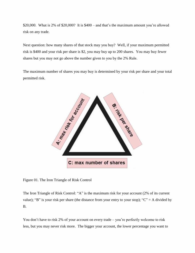
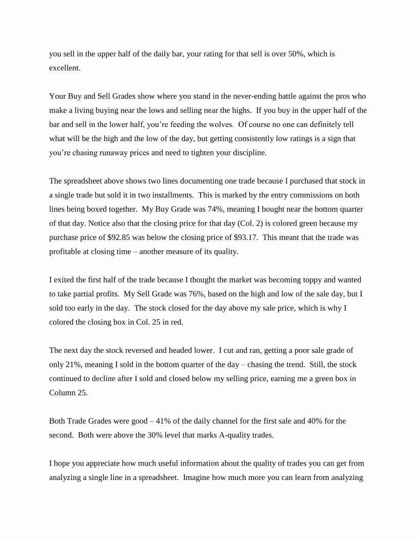
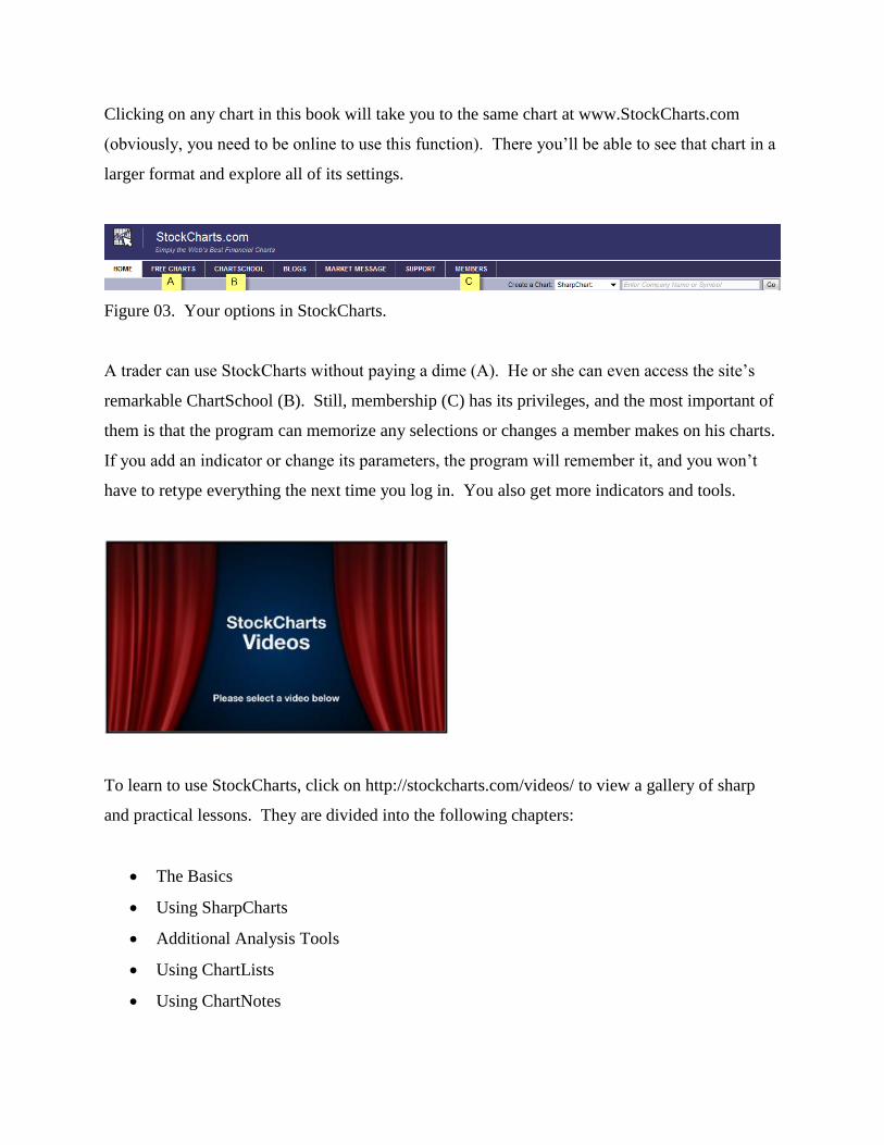
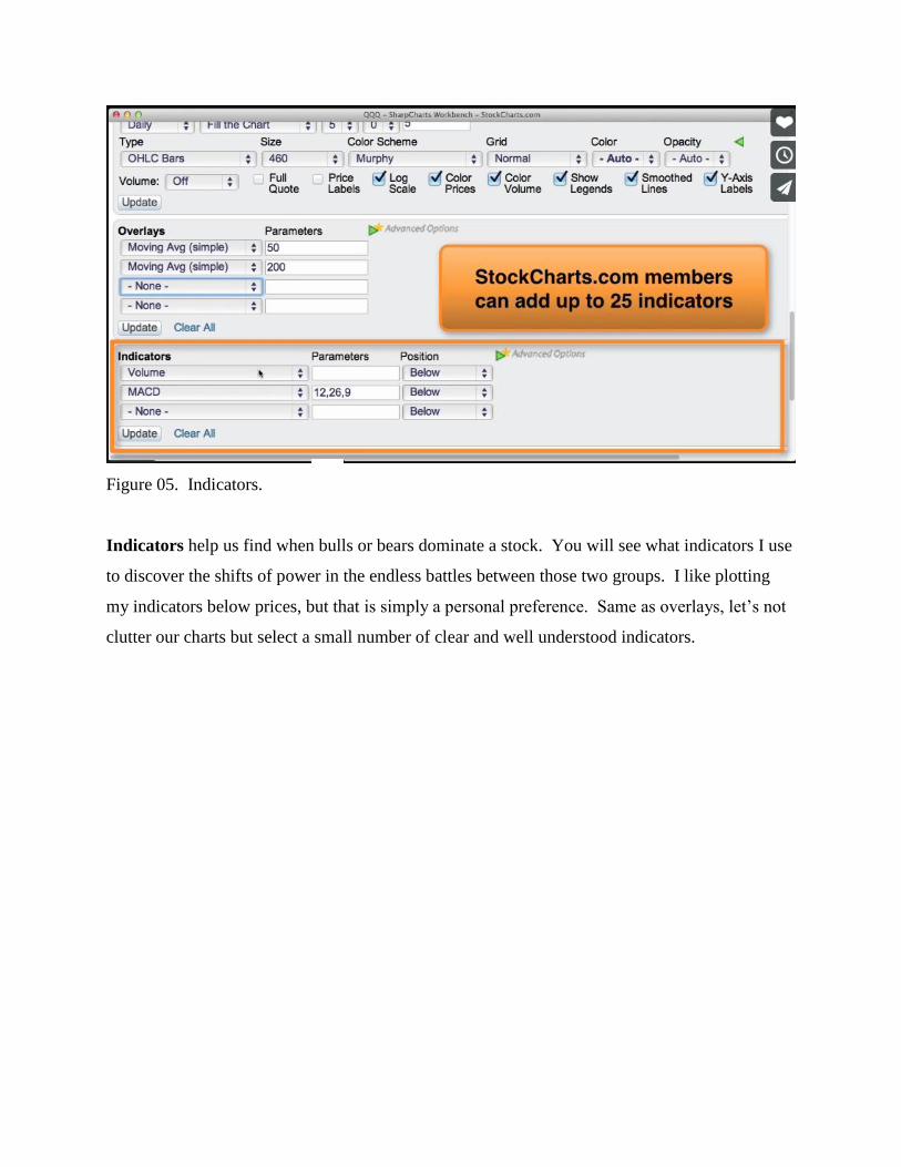
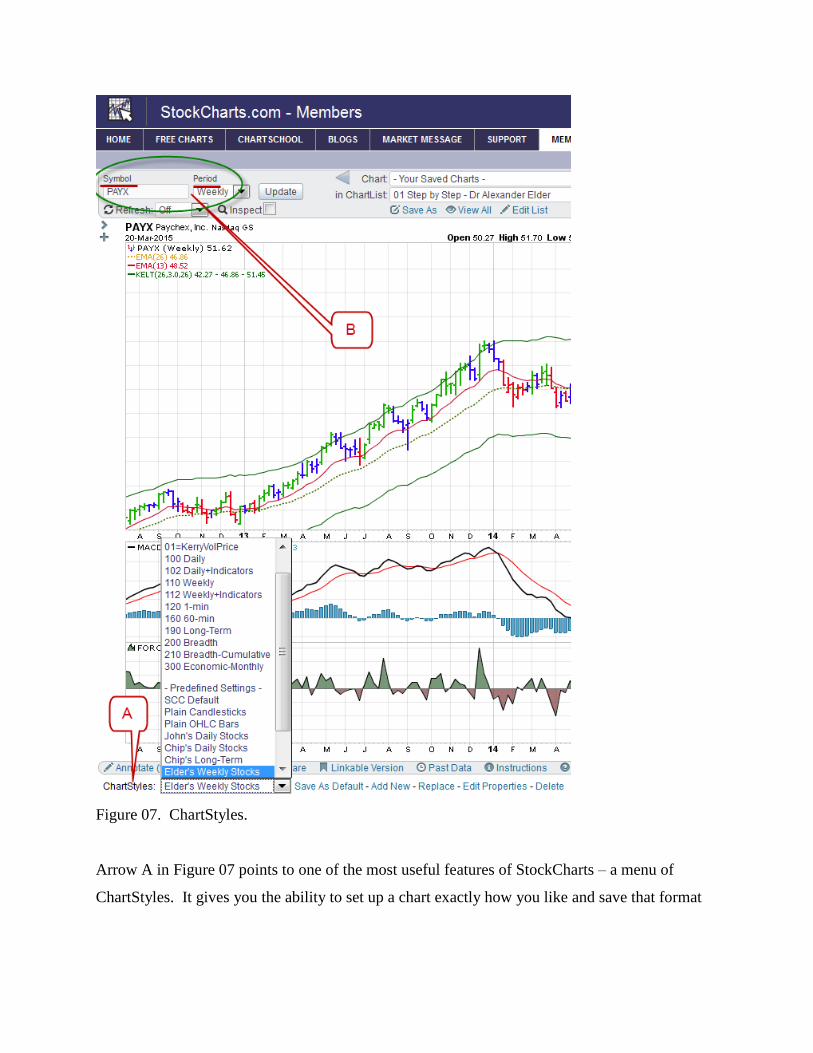
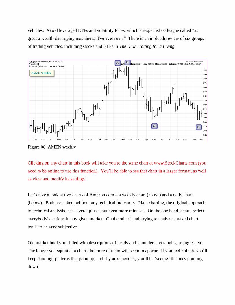
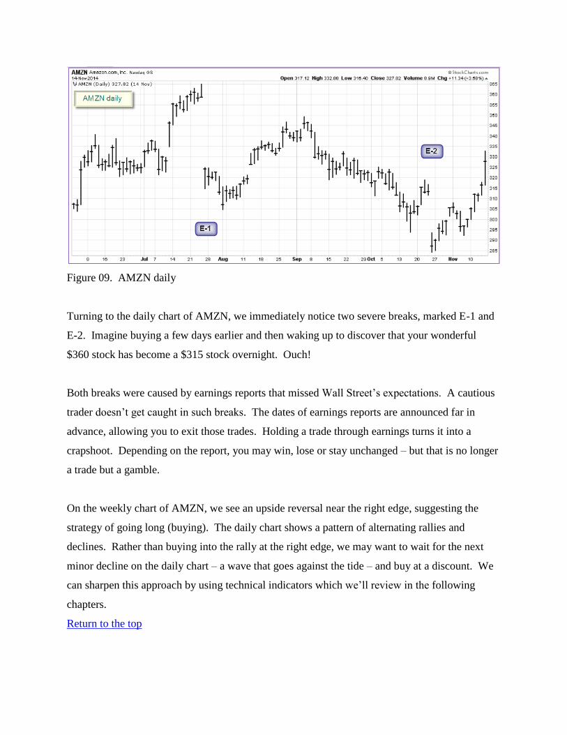
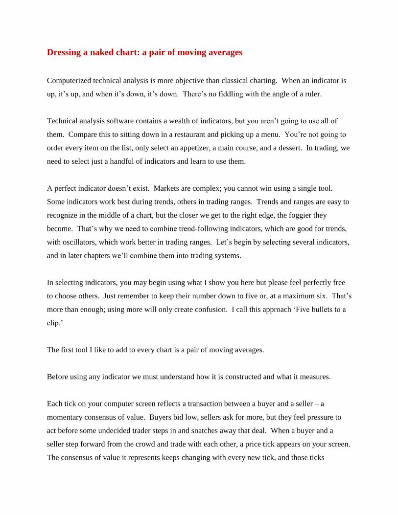
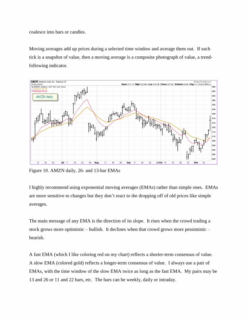
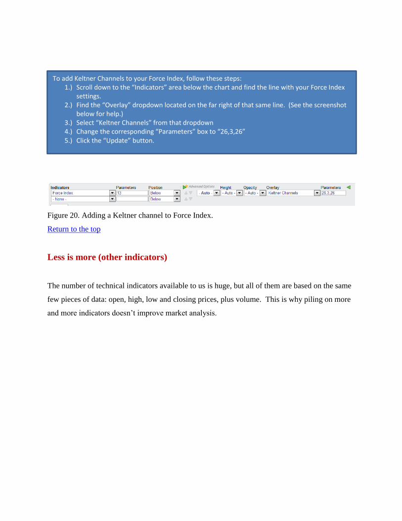
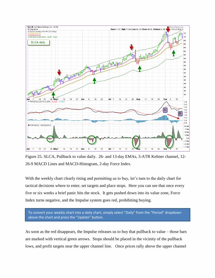
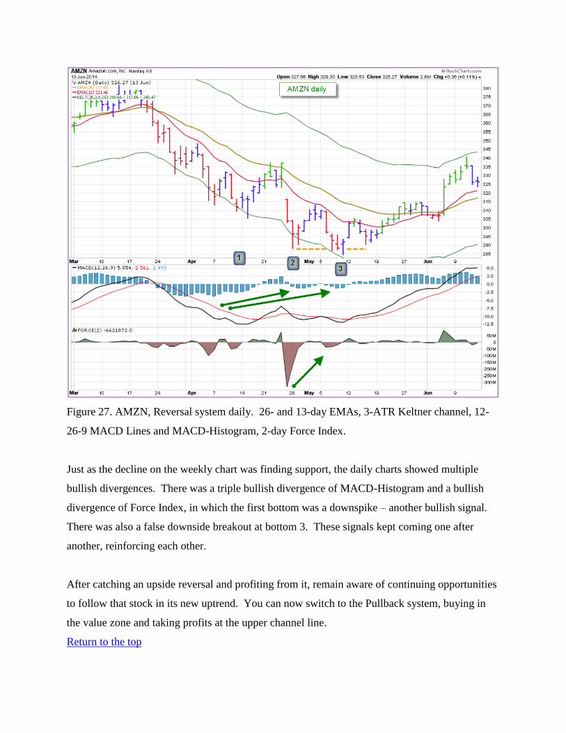
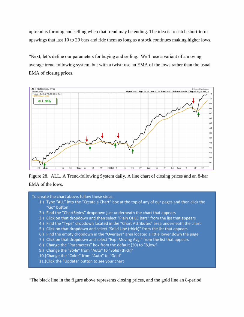
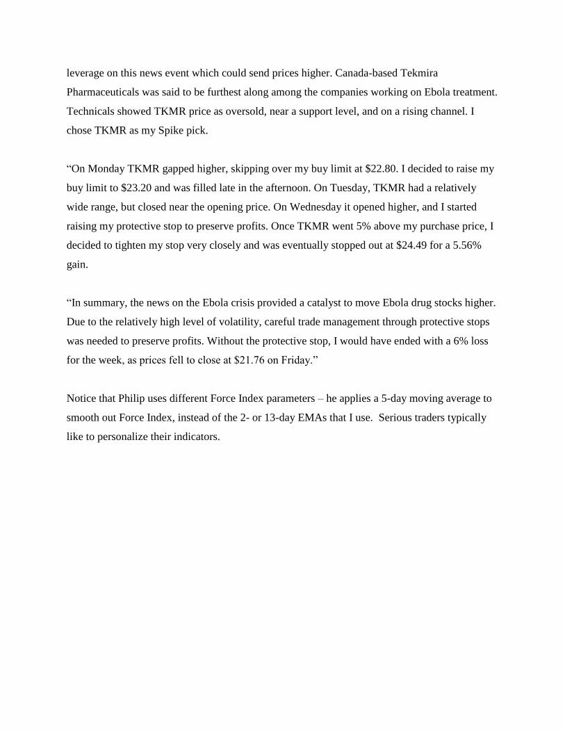
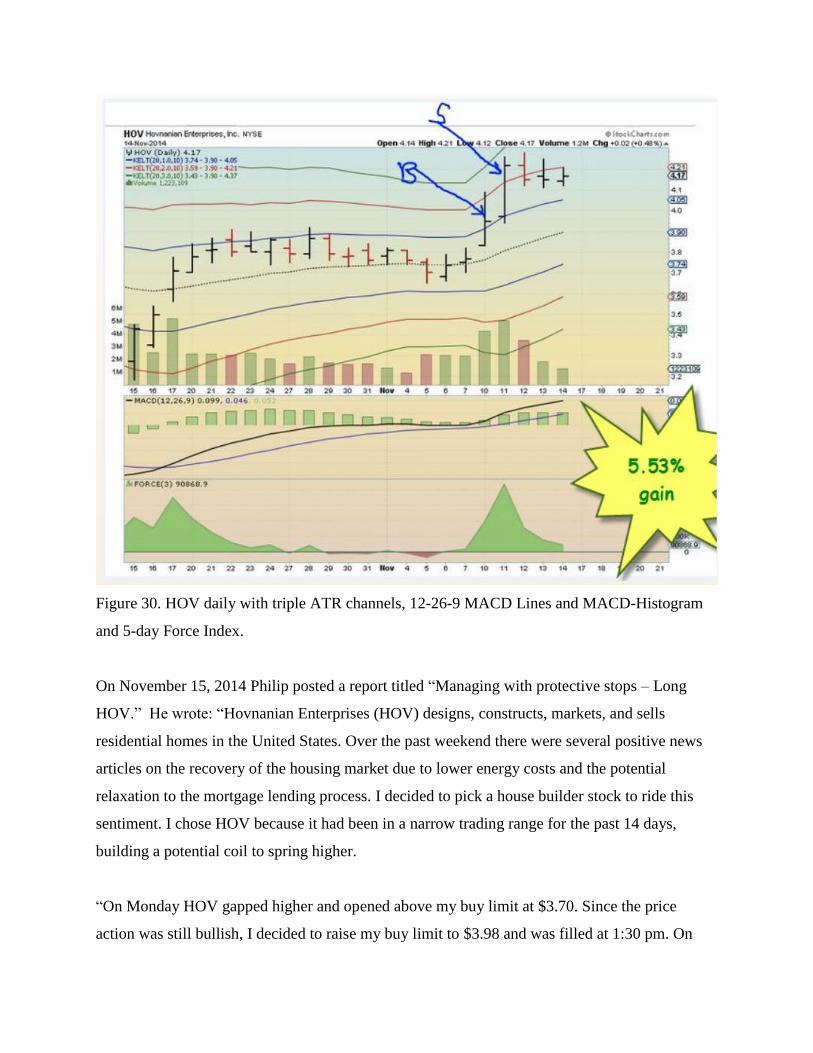
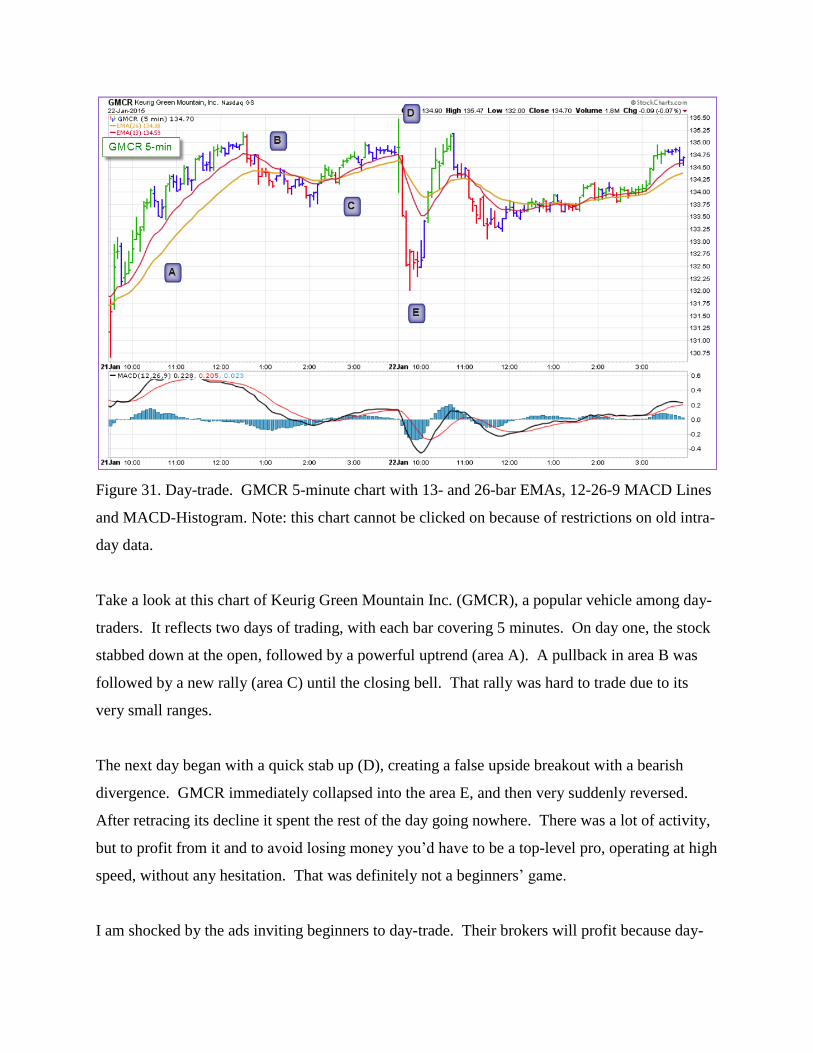
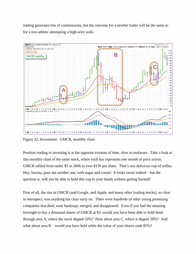
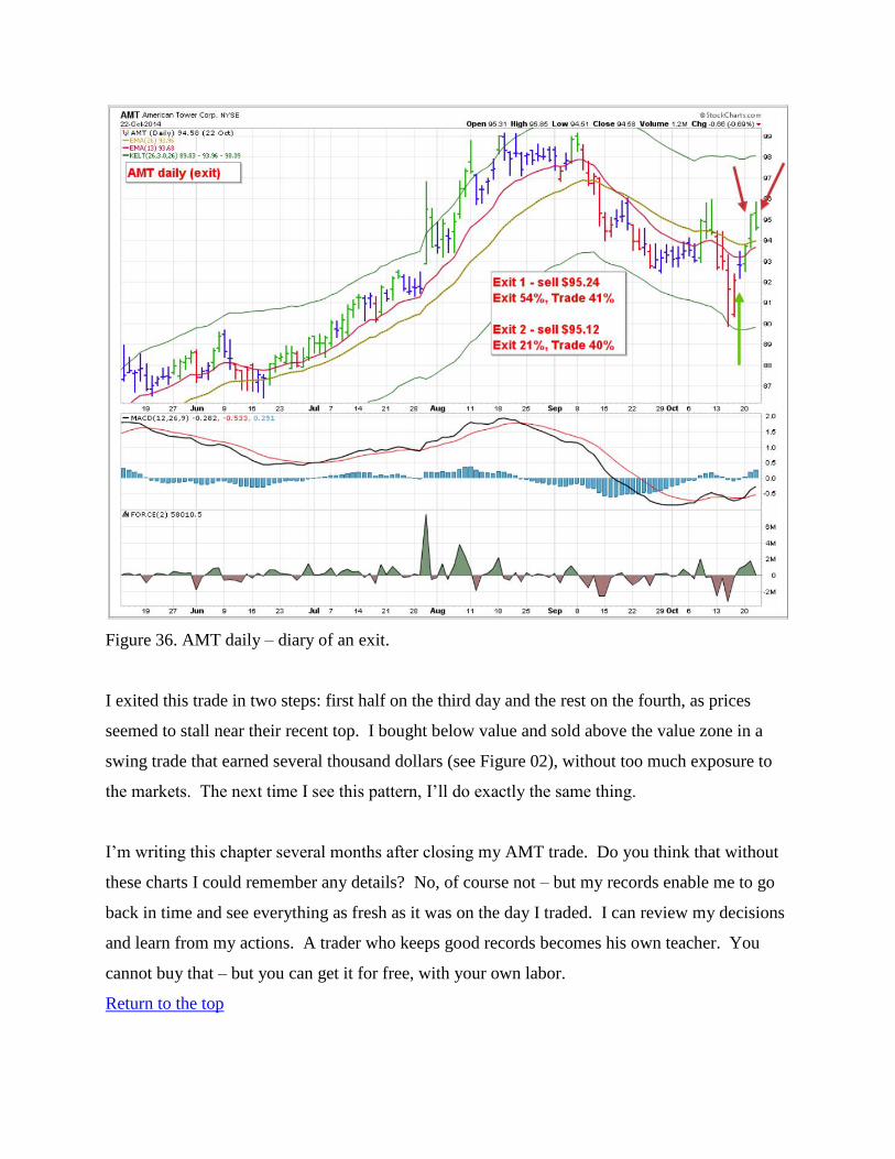


