Stage 2 Visual Arts
Assessment Type 3: Visual Study
Student Response

1t11Y tUJt:m t,gM~ rlrr!~ 1m ~ m WI M DJ?!m1mO Jl)t~f! I!IJI~!;!rm' m!']T;r( !If)t glmel~~ glrrD~!Q
Stage 2 Visua I Arts Design 2013
Assessment Type 3: Visua I Study
SACE No.
School Code:
Word Count: 1802

'How Luke Lucas' fonts share an intrinsic
relationship with the design's context.' Custom typography shares an intrinsic relationship with the context of the logo or design that it is
employed for. Luke Lucas exploits this and creates unique connections between both type and
contextual design through the profuse application of vastly technically varied and complex digital
means.
Typography has evolved through the utilisation of elements and principals of design to become a
means of creating original and distinctive text. Designers encapsulate this to create type that is
engaging and visually informative, all the while remaining coherent and visually relevant to the
context of the work.
Custom typography in particular requires the through and thought out development of structure in
relevance to the context itself, a type must indiscernibly encompass the elements of readable,
visually satisfying and clear layouts in order to be successful in capturing the attention of the viewer
and be an effective piece.
My visual study is to be focused on the custom typographic works of Luke Lucas in relevance to his
context related designs. Lucas has pushed the boundaries of design through his prolific utilisation of
digital design means, in order to embody a vast range of technical facets in design, including form,
texture, line and colour. Lucas' work reflects the context of his topic whether it be through
references to nature, incorporation of fluid images or the utilisation of multi-toned colours and
effects. He succeeds in doing this all the while sharing discernible stylistic commonalities with other
custom type designs.
: Luke Lucas Design
: Similar Artist/Designer Work
II II : My Interpretation of Lucas' Work
: Personal Exploration

, weet SavQury design Luca Lucas S nd fluidity of
. the form a replicates ntext of wine. . ·d ithin the co IlqUi w . I" ht shadows and Manipulating Ig, I f
. h varying leve s 0 colour, Wit ted use of
Exaggera translucency. . the free-. d form replicates . line an . f the subject. flowing propert~eseoof poured wine
The text and 1m gh this motion is . d toget er,
are ma me h the edges of exemplified throug
the font. (60)
I Trochut achieves a .
·th·ln his Sony PlayStation effect WI .
romotional poster, capturing the rlinlerlSiCIn and depth within the paint splatters. (21)

From Luke Lucas' Sweet Savaury design, I took
inspiration from the liquidity in creating both the Tasty, and Burgertype. The medium used to
ueate the type was bottled tomato sauce. The VISCOSity and light reflecting properties of the
Product, allowed for a discernable level of depth
and form, whilst maintaining legibility. Type and
medium used share an intrinsic relationship as both relate to food the condiment would be f d In. (76) oun

Luke Lucas' Crush design is heavily reflective of its
purpose through form and lighting. The text of
Crush itself reflects Custard (the product itself)
through the selective use of lighting and shadows
in order to portray the liquidity of subject matter.
The techniques employed to reflect liquid within
Luke's design are also evident with Alex Trochut's
work illustrating the same effect. (62)

t~~tJmD IMl m~~p!t)JJ\ !!tIM
/
)
J }l )
~
J~ I
Jk2J( )
)
L5~ .... ~ .• ~,
ft~
Ij lj
(
r •
r , /
)\ )..~
From Luke Lucas' Crush design, I created a type by
using maple syrup on a pane of glass. The text of
Sweet and the medium used in its creation inertly
share an intrinsic relationship. The lettering itself
appears flat and washed out, while reflecting the
external light. I captured the liquidity further
throu~h allowing the syrup to drip down the pane
of glass, capturing the depth and form within the type. (75)
l

!b!I1V!!J g !II~J~lJ~;' 1r!~m1
, ~
.t(~. --.J0).: ~ ... ~;" fr~\I-4l=, ~\. ---- ~ .,~:: ~' DJ ~ :~,/ .,:j,,- '. ') '\. l~) ·:V)
• ~
~
Furthering the utilisation of liquid and inspiration behind
Luke Lucas' Sweet Savoury design, I manipulated my own
Sweet text to create variations of the type. Maintaining
the use of liquid as the theme and context of the design, I
created a logo application of the design to promote a
brand of paddle-pop. I incorporated several liquid
elements in order to further accentuate the designs
theme. (65)
• ".

Tastes like acid wash
Luke Lucas' Tastes like acid wash type incorporates the
texture and form of acid wash denim in formulat ing and
influencing the type for this design. Through the use of
shading and manipulation of texture, the font accurately
reflects the surface of acid wash denim. The ribbon-esque
flow of the type highlights the dimension and form of the
text, whilst demonstrating the relationship between the
subject matter and the text.
Alex Trochut's Puma type creates text through the use of
shoelaces, seamlessly connecting the subject matter to the
text utilizing the same methods as Lucas. (98)

lJ1!VJJlIJJ 1M) !I(~!,J~U1M\ ~!~!I
Luke Lucas' If it tastes like acid wash design, I
captured my own flow and format to the design
through using a ribbon to create text. I took into
consideration the manoeuvrability of the medium in
creating the text Yes and Smile, as the font type was
manually created. Depth and a satin texture was
created through the lighting reflection and shadows
in the bends and folds of the text, similar to that of
the Acid wash lettering. (80)

Luke Lucas' POP! type employs a multi-model method in
order to formulate the text and accompanying images. A
strong use ofform to create depth, this in conjunction with
dramatic pop-art style line and colour accents emphasise the
text. I recreated this through my Bam type through similar
methods, and married the text and with the image of a fist
to bring relevance and a relationship to the subject matter.
Both the Pop type and Pop-art styling's reflect and
Roy Lichtenstein incorporates a similar emphasis on line and
colour to create drama within his artwork. (96)
.. • ,. · , · • • ..
.. • •
• · • • " . "1 · .. , • · • · • • ,
• • • • .. • • • . · , · • • •
• •
•
•
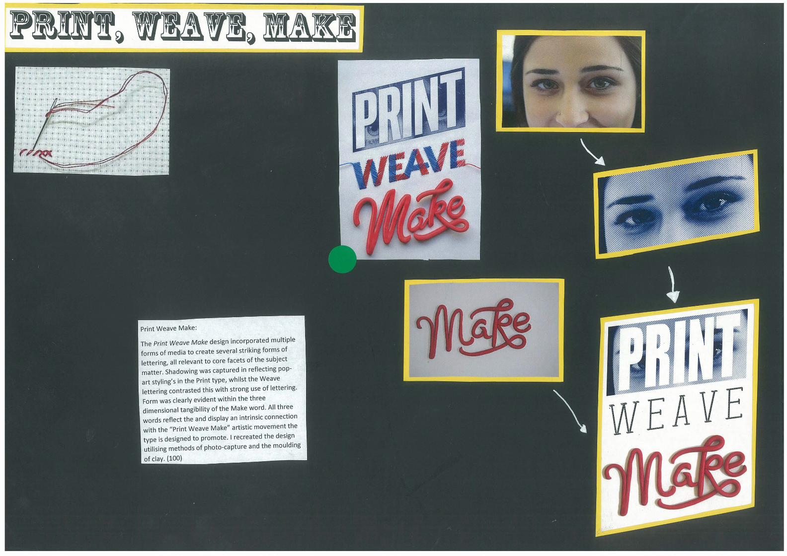
Print Weave Make:
The Print Weave Make design incorporated multiple
forms of media to create several striking forms of
lettering, all relevant to core facets of the subject
matter. Shadowing was captured in reflecting pop
art styling's in the Print type, whilst the Weave . lettering contrasted this with strong use of lettering.
Form was clearly evident within the three
dimensional tangibility of the Make word. All thr~e words reflect the and display an intrinsic connection
·th the "Print Weave Make" artistic movement the WI d . type is designed to promote. I recreated the eSlgn
utilising methods of photo-capture and the moulding
of clay. (100)

Luke Lucas' Distro type design incorporates a prolific
use of repetition and colour in developing the
perspective of the 100 lettering. Lighting and
shadowing further create from and body of the
design whilst reflecting the neon/disco stylings of
the font, which successfully representing and reflect
the progressional technology focus of the design. I
created a similar perspective based effect within my
interpretation through the successive repetition of
coloured circles. (69)
Luke's design is not dissimilar to the work of Jen
Stark, whom utilises repetition of colour in a physical
format to create elaborate and detailed artwork.

Taking inspiration from both Luke Lucas' Distro design, and the physical attributes of Jen Stark's
work' I created several interpretations of the letter
'M'. Through incorporating a tri-tone colour, whilst
experimenting with the dimension and layout of the
design. The three designs demonstrate perspective
and a strong evidence of shape and line, whilst
maintaining the legibility of the subject matter, the letter M. (67)

O@)!.@)D u!D!Ie M DJ~!IJ\ !!@)m
Taking inspirat' f lucas' Distro d Ion rom the repetition of colour in luke . . eSlgn, I utilised the same techni .
digital format. The lette M que In a with different c I r was repeated in different fonts
o ours to demonstrat th ff has on perspective and d. . e e e ect repetition
I Imenslon. Contrasting and
comp ementary t . dis I . ones were Incorporated to further
pay the visual effectiveness of the d · ( eSlgn. 57)

Luke Lucas' We head it thraugh the grapevine design
heavily utilises line and shape to replicate form and
shape of a grapevine, taking a litera l meaning on the
context of an old idiom. I recreated this through a
daisy chain taking reference from the idiom Another link in the chain. The text captures the same
techniques of the grapevine font through the

From Luke Lucas' We heard it thraugh the grapevine type
design, I attempted to incorporate a similar use of line and
form in creating my own text. I initially played around with several different textas to demonstrate how line can
create form through movement. From this created the
text Vine through a piece of string. The completed type
reflects the same form and physical connection to that of Luce Lucas' designs. (71)

From Luke Lucas' Grapevine type, I furthered my own
personal interpretation through multiple applications. I
incorporated the line-based text, Daisy, and Flower into
the applications of my designs in order to display the
connection between that of the type and create context
within the design. I furthered this notion through the
separate images of grass, and a flowerbed. The inclusion of context related images, further the coherence and unity
between the custom type and design's context. (76)

Custom typography presents a way in which text design can stand out from ordinary print, through
the use of multitudes of visual techniques and media, in order to share a cohesive relationship with the context of the design and its purpose whilst maintaining the font as the primary focus in the
luke lucas draws upon an expansive array of media in creating custom fonts that draw attention to and shares an intrinsic relationship with the subject matter. Multi-disciplined methods of creating
custom type allows for a design to accurately share a relationship the topic Or subject it represents, connecting it to the literal texture of the inspiration.
luke lucas fonts share an intrinsic relationship with the context of the design, in order to capture
the theme and subject matter of the design in relation to its purpose. lucas' Sweet Savoury design
took advantage of the properties of Wine as liquid in creating the highly effective type for the design. Not dissimilar to this, lucas' POP design marries together the context of popcorn Within the design, whilst paying homage to the pop art styling of Roy lichtenstein in creating an attention grabbing and visually appealing book cover.
Through investigating the relationships luke lucas' design share with their purpose I was able to discover the intricacies and challenges of custom type, theme and visual points of difference (i.e. liquid, multi-modal methods etc.). From underlining and to a point emulating the words of luke
lucas I learned that theme and concept used to create custom typography is a way to communicate
a message Within the design . In this particular time of visually saturated environment, it is impossible to have an effective design without a context of theme. I found that custom type is a dynamic and
visually effective way of creating text and styles With layered meanings that can be interpreted by all vieWers. Through luke lucas' diverse utilisation of dimension, aesthetic and concepts; his designs become more than just words.

Website:
1. PrintTogether. 2012. Interview with Luke Lucos. [ONLINE] Available at:
http://www.printtogether.com.au/blog/luke-Iucas. [Accessed 19 March 13].
2. Luke Lucas. 2012. About. [ONLINE] Available at: http://www.lukelucas.com/About.
[Accessed 19 March 13]. 3. Upscale Typography. 2012 . LifeLounge - Provocotive type treatment. [ONLINE] Available at:
http://upscaletypography.com!?p-486. [Accessed 19 March 13]. 4. Luke Lucas. 2012. Nail Frenzy MGPO. [ONLINE] Available at: http://www.lukelucas.com/Nail-
Frenzy-MGPO. [Accessed 26 March 13].
Books:
1. Bergstrom, B. 2008. Essentials of visual communication. London: Laurence King Pub ..
2. Lupton, E. 2011. Graphic Design Thinking: Beyond Brainstroming. New York: Prinston
Archetectual Press.
3. Lupton, E. 2004. Thinking with type. New York: Princeton Architectural Press.
4. Lupton, E. and Phillips, J. 2008. Graphic design. New York: Princeton Architectural Press.
5. Walsh Macario, J. 2009. Graphic design essentials. London: Laurence King.
6. Zeegen, L. 2007. Secrets of digital illustration. Mies, Switzerland: RotoVision.
Images:
1. Unknown. (2012). Alex Trochut- Puma. Available: http://www.alextrochut.com/#/works/puma . Last accessed 25th July 2013.
2. Unknown. (2013) . Denim Jeans Texture. Available: http://depositphotos.com/3727784/stock-photo-Denim-jeans-texture . htm I. Last
accessed 25th July 2013. 3. Unknown. (2013). Denim Pocket with Tag. Available:
http://depositphotos.coml7 27280 1/stock- i lIustration-Denim-pocket-with-tag.-
.html. Last accessed 25th July 2013. 4. Unknown. (2008). Neon. JPG. Available:
http://commons.wikimedia.org/wiki/File :Neon.JPG. Last accessed 17th June 2013.
5. Stein Harry. (2010). Does the Budget Matter. Available: http://notaboutq ual ity .com/20 13/05/081 does-the-budget-matter/. Last accessed
13th June 2013. 6. Unknown. (2011) . Cosmic Complex- Jen Stark. Available:
http://www.jenstark.com/ . Last accessed 13th June 2013. 7. Unknown. (2013). Dimension- Jen Stark. Available: http://www.jenstark.com/# 1.
Last accessed 13th June 2013 .
Unknown. (2013). Vortextural. Available: http://www .jenstark.com/# 2. Last
accessed 13th June 2013. 9. Unknown. (2010). Distro-100 Cover. Available : http : //www.lukelucas.com/Distro-
100-Cover. Last accessed 13th June 2013. 10. Unknown. (2008) . Revival of a Teacup. Available:
http://traCingsilverlines.bl09spot.com.au/2012/07/revival-of-teacu p. html . Last
accessed 15th May 2013. 11. Unknown. (2013). Grape vines vector art - Download Grape vectors.Available :
http://www.vectorstock.com/royalty-free-vector/g rape-vi nes-vector-613808 . Last
accessed 17th June 2013. 12. Unknown. (2010) . All in the Name. Ava ilable:
ht tp://www.allinthe.name/2011/03/sean-freeman/ . Last accessed 12th June
2013. 13. Unknown. (2013). Grapevine - Qantas epiQure. Available:
http://www.lukelucas.com/GrapeVine-Oantas-epiOure. Last accessed 25th June
2013. 14. Unknown. (2011). Top 10 Pop Art By Lichtenstein. Available :
http://wallart101 .blogspot.com.au/20 13/02/top-1 0- pop-art- byIichtenstein.html#.UjbJ2cagn3M . Last accessed 15th March 2013.
15. Unknown. (2006). Whaam! Roy Lichtenstein at Tate Modern in Crisis On Infinite
Comics! Forum. Avai lable: http://marvelmasterworksfansite.yuku .com/topic/22539# . Uj bKOcag n3M . Last
accessed 17th April 2013. 16. Unknown. (2002). Pin Pop Art Kapow on Pinterest. Available:
http://www.picstopin.com/244/pop-artkapow/httP:%7C%7cwww* barnitts* co* uk%7Cimages%7CShOp%7CmOre%7C37
Ox302 1340883208KaPow* jpg/. Last accessed 24th April 2013 . 17. Unknown. (2009). Making your own microwave popcorn couldn't be
easier. Ava i la ble: http://cleanerplateclub. wordpress.com/2008/11/201 makingyour_own_microwave-popcorn-couldnt-be -easier/ . Last accessed 25th April 2013.
18. Unknown. (2011). Pop Book Cover. Available: http://www.lukelucas.com/Pop
Book-Cover. Last accessed 4th April 2013.

Assessment Comments
This visual study is an A grade. Practical Application
PA1 An insightful and challenging exploration of concepts and resolutions prompted by works from Luke Lucas, Alex Trochut, Roy Lichtenstein and Jen Stark. All practitioners are relevant to the explorations. Concepts and visual ideas have been explored, to produce authentic, personal and imaginative resolved responses, such as, the use of ribbons and sauce. Different media has been explored throughout as a response to the various works explored. The designing processes involved in developing fonts for a purpose in advertising are referred to throughout.
PA3 Consistent documenting and recording of personal and creative visual thinking and problem solving processes are clearly evidenced on each page. Deconstruction of fonts and how they can be used in a poster or advertising campaign is highlighted. For example, "Sweet Savory" or "Tastes Like Acid Wash", document relevant design compositional devices.
Analysis and Synthesis
AS1 Highly perceptive critical analysis is evident. For example, "Luke Lucas' Sweet Savory design replicates the form and fluidity of liquid within the context of wine. Manipulating light, shadows and colour, with varying levels of translucency". Critical analysis is also evident with reference to other designers’ works mentioned in the study. There is clear reference to a range of historical and contemporary contexts, for example, in references to Roy Lichtenstein and Alex Trochut. In all instances, responses were made to the visual evidence presented.
AS2 Interpretations and responses to works of design are evident through the use of appropriate visual arts language in responding to the works selected, in order to explore ideas and to respond to visually. Both issues and questions on design are explored through a synthesis of thoughts on style and compositional structures as in "Print, Weave, Make". The use of the elements and principles of design are evident, for example, "manipulation of texture, text, shading, reflection and shadows".
AS4 Insightful evaluations and conclusions are evident throughout and at the conclusion. Personal comments about visual arts learning are insightful. Examples include, "Through investigating the relationships Luke Lucas' design share with their purpose I was able to discover the intricacies and challenges of custom type, theme, and visual points of difference". As well, "I learned that the theme and concept used to create custom typography is a way to communicate a message with design".
Inquiry and Exploration
IE1 An extensive range of works is explored in this study, which support and connect to the study focus of custom fonts. Clear insights into how a designer uses custom fonts to respond to design problems are evident. Personal exploration culminating in an understanding of how visual elements combine to help create a successful response to a problem are clearly outlined and developed. The Bibliography clearly documents and acknowledges the range of sources used.
IE2 Astute self-analysis and exploration of designers’ works are clearly evident in the creation of new custom fonts. This is demonstrated where line can create form through movement. A personal aesthetic in response to the designers’ works is developed. This is evident in the interpretation of the use of custom fonts in a design context to create an individual response to a problem.

Performance Standards for Stage 2 Visual Arts
Practical Application Knowledge and Understanding
Analysis and Synthesis Inquiry and Exploration
A Initiation of complex or challenging and well-planned conceptualisation, development, and resolution of innovative, imaginative, or personally relevant visual ideas.
Comprehensive exploration to refine technical skills and use different media, materials, and technologies.
Insightful and thorough documentation of creative visual thinking and problem-solving processes.
Highly effective application of refined technical skills and sensitive use of media, materials, technologies, and processes to communicate visual ideas in a work or works of art or design.
In-depth knowledge of selected visual arts concepts, forms, styles, and conventions, and a clear understanding of their practical application.
In-depth knowledge and understanding of visual arts in different cultural, social, and/or historical contexts.
Insightful and discerning understanding of aesthetic and/or functional qualities in a variety of works of art or design.
Highly perceptive critical analysis and interpretation of a variety of works of art or design from different contexts.
Extensive and sophisticated use of visual arts language to interpret, respond to, and synthesise thoughts on visual arts, including issues and/or questions.
Discerning evaluation of own work and connections or comparisons with other practitioners’ work.
Insightful evaluation of, and conclusions about, visual arts learning.
Productive and thorough use of research skills and a clear understanding of inquiry methods to locate and appropriately acknowledge sources, explore, experiment, and develop perceptive and clear insights into a range of aspects of the visual arts.
Astute exploration and self-analysis in development of a personal aesthetic through the visual arts.
B Thoughtful and well-planned conceptualisation, development, and resolution of imaginative or personally relevant visual ideas.
Thorough exploration to refine technical skills and use media, materials, and technologies.
Thoughtful and organised documentation of creative visual thinking and/or problem-solving processes.
Effective application of some refined technical skills and some sensitive use of media, materials, technologies, and processes to communicate visual ideas in a work or works of art or design.
Some depth of knowledge of selected visual arts concepts, forms, styles, and conventions, and a sound understanding of their practical application.
Some depth of knowledge and understanding of visual arts in different cultural, social, and/or historical contexts.
Clear understanding of aesthetic and/or functional qualities in several different works of art or design.
Well-informed and well-considered critical analysis and interpretation of several works of art or design from different contexts.
Proficient use of visual arts language to interpret, respond to, and synthesise thoughts on visual arts, including issues and questions.
Thoughtful evaluation of own work and connections or comparisons with other practitioners’ work.
Thoughtful and well-explained evaluation of, and conclusions about, visual arts learning.
Systematic use of research skills and a sound understanding of inquiry methods to locate and appropriately acknowledge sources, explore, experiment, and develop mostly clear insights into different aspects of the visual arts.
Thoughtful exploration and self-analysis in development of a personal aesthetic through the visual arts.
C Considered conceptualisation, development, and resolution of imaginative or personally relevant visual ideas.
Competent exploration to refine technical skills and use media, materials, and technologies.
Organised documentation of creative visual thinking and/or problem-solving processes.
Competent application of technical skills and elements of sensitivity in the use of media, materials, technologies, and processes to communicate visual ideas in a work or works of art or design.
Appropriate knowledge of selected visual arts concepts, forms, styles, and conventions, and some understanding of their practical application.
Considered knowledge and understanding of visual arts in different cultural, social, and/or historical contexts.
Appropriate understanding of aesthetic and/or functional qualities in different works of art or design.
Informed and considered critical analysis and interpretation of two or more works of art or design from different contexts.
Competent use of visual arts language to interpret, respond to, and synthesise thoughts on visual arts, including issues and questions.
Considered evaluation of own work and connections or comparisons with other practitioners’ work.
Competent and appropriate evaluation of, and conclusions about, visual arts learning.
Competent use of research skills and considered understanding of inquiry methods to locate and appropriately acknowledge sources, explore, experiment, and develop some insights into different aspects of the visual arts.
Some considered exploration and self-analysis in development of a personal aesthetic through the visual arts.
D Elements of conceptualisation and some development and resolution of visual ideas.
Some exploration of technical skills, using media, materials, and technologies.
Disjointed or partial documentation of creative visual thinking and/or problem-solving processes.
Partial application of technical skills and some use of media, materials, technologies, or processes in developing a work of art or design.
Some basic knowledge of selected visual arts concepts, forms, conventions, and styles, and an emerging understanding of their practical application.
Some reference to knowledge or understanding of visual arts in a cultural, social, or historical context.
A superficial understanding of aesthetic or functional qualities in works of art or design.
Some basic consideration and interpretation of at least one work of art or design with superficial reference to the context.
Restricted use of visual arts language to interpret, respond to, and describe thoughts on visual arts, including issues or questions.
Some description of own and others’ works, with some tenuous connections or comparisons.
Some basic summary and description of visual arts learning, with elements of evaluation.
Some use of basic research skills and awareness of inquiry methods to locate one or more sources (with attempted acknowledgment), explore, and experiment.
Superficial recognition of the role of visual arts in personal development.
E Emerging skills in the conceptualisation, development, and resolution of visual ideas.
Attempted exploration of technical skills, using media, materials, or technologies.
Limited documentation of creative visual thinking or problem-solving processes.
Attempted application of technical skills to develop a work of art or design.
Limited knowledge or understanding of concepts, forms, or styles in visual arts.
Emerging awareness of different visual arts contexts.
Some awareness of the need to understand aesthetic or functional qualities in works of art or design.
Emerging awareness of connections between at least one work of art or design and the context.
Limited use of visual arts language for interpretation or response in the visual arts.
Attempted description of own and others’ work.
Attempted description of aspects of visual arts learning.
Attempted engagement in a directed research process.
Emerging awareness of the role of visual arts in personal development.


