IJMT Volume 2, Issue 4 ISSN: 2249-1058 __________________________________________________________
A Monthly Double-Blind Peer Reviewed Refereed Open Access International e-Journal - Included in the International Serial Directories Indexed & Listed at: Ulrich's Periodicals Directory ©, U.S.A., Open J-Gage, India as well as in Cabell’s Directories of Publishing Opportunities, U.S.A.
International Journal of Marketing and Technology http://www.ijmra.us
167
April
2012
Role of Colours in Consumer Preferences
Dr. Sumesh Raizada* B.E.(Electrical), MBA, Ph.D
__________________________________________________________
Abstract:
Colours play a vital role in almost our everyday lives and contribute significantly in influencing
our buying decisions. Considering their extreme relevance, present study has been taken up to
understand the influence of colours in moulding our buying preferences. The paper shall briefly
discuss the scientific, cultural and psychological aspects of colours. It shall also examine the
association of colours with the gender, income group and zodiac sign of an individual and his
buying preferences. Paper shall finally conclude with the recommendations on utilization of
colours in the Branding and promotional strategies of the marketers. Study is based on both
primary and secondary collection of information.
Key Words: Colours, Product, Branding, Promotion, Zodiac
* Professor, Jagan Institute of Management Studies, Rohini, Delhi.
IJMT Volume 2, Issue 4 ISSN: 2249-1058 __________________________________________________________
A Monthly Double-Blind Peer Reviewed Refereed Open Access International e-Journal - Included in the International Serial Directories Indexed & Listed at: Ulrich's Periodicals Directory ©, U.S.A., Open J-Gage, India as well as in Cabell’s Directories of Publishing Opportunities, U.S.A.
International Journal of Marketing and Technology http://www.ijmra.us
168
April
2012
Introduction:
As per Oscar Wilde, “Mere colours, unspoiled by meanings and unallied with definite form, can
speak to the soul in a thousand different ways.” Colours have their existence in this universe
even before the humans or any other form of life would have evolved. The science of colours
was also well studied and recognized by the ancient civilizations. Our ancestors used colours for
natural healing and curing various ailments. In astrology, colours are associated with the birth
signs and corresponding favourable stone or fabric of an individual. Colour exists in nature in
different forms of flora, fauna and light rays emitted by the sun. Though may not be a part of
formal studies in most of the academic learning except for in fashion & interior designing,
advertising or packaging, yet they contribute significantly in almost our everyday lives. Colours
have a key role in moulding our liking; for the food we eat, clothes we wear, place where we sit
or sleep, vehicles we drive and so on. Colours in fact are allied with our society, culture, religion,
politics and economy since ages and shall remain so in future also.
No one can imagine this world, nature and things around us in simple grey, white or black hue.
Had it been so, the life would have been dull, boring and without any vigour for all of us.
Festivals, Entertainment, Sports and even Business would have become totally unexciting and
meaningless without colours. Marketing activities such as advertising, branding and packaging
would have been rendered totally irrelevant. The colours are therefore extremely important to us
as they bring enthusiasm, festivities and energies in our lives. They influence our personalities,
opinion, culture and buying preferences. As a result, colours are widely used in industries such as
packaging, fashion, apparel, advertising, automobiles and off late ICT.
Considering its immense significance, present study has been undertaken to understand colour
preferences for certain products and services. The paper shall briefly comment on the scientific,
socio-cultural and psychological aspects of colours. It shall make an effort to find out the
association of colours with the gender, income groups and zodiac sign of the consumers and their
buying preferences. Paper shall conclude with the recommendations on utilization of colours in
the sales and promotional strategies of the marketers. Literature review is primarily from the
print and electronic sources while primary data has been collected through a randomly conducted
questionnaire survey.

IJMT Volume 2, Issue 4 ISSN: 2249-1058 __________________________________________________________
A Monthly Double-Blind Peer Reviewed Refereed Open Access International e-Journal - Included in the International Serial Directories Indexed & Listed at: Ulrich's Periodicals Directory ©, U.S.A., Open J-Gage, India as well as in Cabell’s Directories of Publishing Opportunities, U.S.A.
International Journal of Marketing and Technology http://www.ijmra.us
169
April
2012
In the subsequent paragraphs, significance of colours from various aspects has been discussed.
Socio-cultural aspects of Colours:
Different societies or cultures over a period of time have developed preferences or aversion to
certain colours. These may be due to their religious influences, experiences or environmental
conditions. In Christianity, white is the colour worn by the brides and is considered auspicious,
on the other hand same colour is associated with mourning and widowhood in Hinduism. Red is
the colour of festivities in Asian nations while green is associated with the Islamic ideology.
Among Jews, blue is considered to be a sacred while Irish have strong emotional bonding with
green. Black which basically absorbs the light and thus all the colours, is inauspicious in several
western nations. Violet is also related with mourning in some European nations.
Though no proper explanation can be given for the variation in colour ideologies among different
nationalities, still it can largely be attributed to the topographical or climatic conditions
prevailing in those countries or regions. Our ancestors use to worship natural forces of sun, air,
water, fire and earth, which they considered as indispensable for the sustenance of life. Similarly
in middle-east or Arabic countries which are largely the deserts and deficient of grass and
vegetation, green must have been the most sought after colour and therefore would have become
sacred for them. In Islamic ideology, green is also associated with the Paradise. Those living
closer to the polar region, experience cool climate and normally use warm colours such as red or
yellow. The cooler colour such as white is used less in their routine life and hence is therefore
sought after during festivities. Similarly, Asian or tropical countries facing warm climates
normally use cooler shades such as blue or white. Warmer shades of red and yellow are hence
more prominent during festivities, especially among females. However, use of these two colours
along with green and dark blue is very common in warm desert regions of Gujarat and Rajasthan,
where they symbolize traditions, social status and rituals. The implications of colours are very
important since they elicit a variety of consumer emotions and responses.
IJMT Volume 2, Issue 4 ISSN: 2249-1058 __________________________________________________________
A Monthly Double-Blind Peer Reviewed Refereed Open Access International e-Journal - Included in the International Serial Directories Indexed & Listed at: Ulrich's Periodicals Directory ©, U.S.A., Open J-Gage, India as well as in Cabell’s Directories of Publishing Opportunities, U.S.A.
International Journal of Marketing and Technology http://www.ijmra.us
170
April
2012
Commercial aspects of Colours:
Designers in any commercial establishment have a tough task while deciding a firm’s logo,
catalogue, business card, letter pad, etc. as all these reflect the ideology and image of the
organization. Their task is to identify the colours, which align with the business, its mission,
vision as well as the target customers. Several organizations are nowadays redesigning the
corporate logos in order to align their brand image and identity according to global operations
and customers.
Designing the packaging or promotional schemes for a product again is extremely difficult for
the brand managers. The same brand cannot be packaged differently to suit the varying colour
preferences among the consumers, obviously due to enormous costs involved in development,
production, shipment and storage. The marketers thus have to rely on their judgment of the most
suitable and preferred colour scheme and thereafter design the whole product or promotional
campaign around it.
Organizations understand the importance of colours in effective brand recall and visibility.
Traditional rivals Coke and Pepsi make themselves distinguished on the basis of red and blue
colours respectively. India’s largest bank SBI can be identified by its dominantly blue coloured
logo while ICICI and Bank of Baroda have incorporated orange. Among telecom firms,
Vodafone and Airtel again rely on tested red colour while Idea logo is prominently in yellow.
Among IT firms, TCS, HCL and Infosys use stable blue colour while Wipro make use of all
seven colours in the rainbow. In automobile industry, logos of Tata motors and Ashok Leyland
have blue colour signifying stability and reliability. Maruti Suzuki use red and blue, while
Mahindra’a logo is in red. Retailers, such as Shoppers’ Stop use black in order to associate itself
with the niche, exclusive or upper income segment customers, Big Bazaar has orange and blue
combination to depict vibrancy and trust while Birla’s More again has orange to indicate energy
and enthusiasm. In FMCG and consumer durables, red is dominant in the logo of LG, on the
other hand blue is found in Samsung and whirlpool. HUL has blue, Dabur is in green and orange,
Cadbury has purple and Nestle has red coloured logo. In industrial product firms, ABB and
Areva have red colour as dominant while GE has blue and BHEL has blue and white. Crompton
Greaves has recently redesigned its logo as blue and green in accordance with its multinational
status and commitment towards environmental protection.

IJMT Volume 2, Issue 4 ISSN: 2249-1058 __________________________________________________________
A Monthly Double-Blind Peer Reviewed Refereed Open Access International e-Journal - Included in the International Serial Directories Indexed & Listed at: Ulrich's Periodicals Directory ©, U.S.A., Open J-Gage, India as well as in Cabell’s Directories of Publishing Opportunities, U.S.A.
International Journal of Marketing and Technology http://www.ijmra.us
171
April
2012
In a commercial organization, colours have applications in the followings areas;
Communication: Web sites, visiting cards, letter pads, uniform of the staff, etc
Publicity and promotion: Hoardings, banners, print and electronic advertisements, etc.
Product packaging, labelling, etc.
Branding: Logo, trademarks, interior or exterior furnishing of the manufacturing or sales
outlets, etc.
Product Positioning: Display at the retail outlets, atmospherics, visual merchandising
Colours off late have become more important in view of the e-commerce and internet where
customers can be attracted through a neatly designed and attractive web site. Promotions through
hoardings, posters, print and television also make use of colours to effectively convey the
message of a brand or the organization. With the advanced generation telecom products and
services, colours shall play a vital role in m-commerce also, in the near future.
Psychological aspects of Colours:
Commercials such as “Give me Red” (Eveready Battery) or “Men in Blue” (Indian cricket team),
not only aimed at building the brand identity but also indicated the psychological association.
Red colour with its highest wavelengths, are considered to be warm and arouse excitement &
energy while blue are considered to be cool and helps in soothing the emotions. It is well known
that colours influences mood and feeling. However, since human emotions are not very stable
and varies from person to person, it is difficult to generalize the preferences. Psychologists have
observed that colour impression can account for nearly 60% of the acceptance or rejection of any
product or service. The field of colour psychology is still not very well studied and researched
except for in the fashion, interior designing, packaging or advertising.
Personality of an individual also plays a very crucial role in colour selection. An extrovert
generally prefers bright colours such as red or orange. He might feel uncomfortable in the blue,
monochromatic or monotonous environment. The climatic and environmental conditions of a
particular region also affect the preferences. Hot colours are not preferred in the warm climatic
conditions while cool colours are generally avoided in the colder regions. Similarly, men usually

IJMT Volume 2, Issue 4 ISSN: 2249-1058 __________________________________________________________
A Monthly Double-Blind Peer Reviewed Refereed Open Access International e-Journal - Included in the International Serial Directories Indexed & Listed at: Ulrich's Periodicals Directory ©, U.S.A., Open J-Gage, India as well as in Cabell’s Directories of Publishing Opportunities, U.S.A.
International Journal of Marketing and Technology http://www.ijmra.us
172
April
2012
prefer cool colours compared to women who prefer hot and bright colours. Since colour
communicates so effectively among the people, it is extremely challenging for the marketers to
convey the right message to the right people.
Scientific aspects of Colours:
We perceive colours on the basis of light reflected by an object. Newton observed that colours
are not inherent in any substance. Rather the surface of the object reflects some colours and
absorbs the rest. The white colour of an object is because it reflects all the wavelengths while
black appear when the surface absorbs all the visible light. That makes the colour of sky appear
sometime blue, white or even orange in the day and almost black in the night. The colourful
flowers or birds are all due to phenomenon of reflection of light from them. The most naturally
occurring colour spectrum is rainbow with seven basic colours. Newton invented the concept of
colour wheel by bending the colour spectrum into a circle and segregating colours as cool and
warm or complementary and contrast, between the two extremes of violet and red. The visible
light corresponds to small wavelengths of 400 – 700 nm of radiations. Other electromagnetic
radiations that are beyond or below these wavelengths fall under infrared or ultraviolet categories
and cannot be seen through a human eye. Colours, in the case of paints and furnishings are used
to protect the surface from varying atmospheric and temperature changes. In Naturopathy,
coloured drinks, lights or bath are recommended for the healing of body and mind. Personality
and physical health of a person can also be judged by the colour of his aura, which envelops
around a person closely.
Political aspects of Colours:
Congress has tricolour of national flag, so BSP has capitalized on blue as a symbol of progress
for the backwards castes, SP has green coloured flags while Communists are traditionally red.
Several companies, organization and even countries have distinguished themselves on the basis
of colours. White, red or blue colours are most prominent in flags of European or communist
countries, on the other hand, green coloured flags are popular in Islamic countries. The flag of
Red Cross organization has a famous red coloured symbol which makes it distinct from others.

IJMT Volume 2, Issue 4 ISSN: 2249-1058 __________________________________________________________
A Monthly Double-Blind Peer Reviewed Refereed Open Access International e-Journal - Included in the International Serial Directories Indexed & Listed at: Ulrich's Periodicals Directory ©, U.S.A., Open J-Gage, India as well as in Cabell’s Directories of Publishing Opportunities, U.S.A.
International Journal of Marketing and Technology http://www.ijmra.us
173
April
2012
Similarly the Olympic flag, which contains five rings of red, green, blue, yellow and black
colours, symbolize the five continents. The three stripes in Indian flag indicate courage, sacrifice
and selflessness for the saffron, purity and peace for white and growth & prosperity for the
green. The blue coloured chakra denotes progress and vast extremes such as in sky and ocean.
Colours in Astrology:
Each zodiac sign is associated with a certain colour according to our ruling planet or stars of
birth. Most of the astrologers recommend favourable colours of stones or clothing corresponding
to each astrological sign. Though may not be generalized, yet people born under a certain sun
sign exhibits similar characteristics and preferences. However their colour choices at times may
be different from the colours of their zodiac sign. Colour association with various zodiac signs
are as mentioned in the Table 1.
Zodiac sign Associated Colour Characteristics
Capricorn Indigo Emphatic, intuitive, spiritual
Aquarius Violet Team builder, visionary, creative
Pisces Magenta Helping, socially active, confident
Aries Red Dynamic, ambitious, creative
Taurus Orange Stubborn, sacrificing, determined
Gemini Orange Persistent, enthusiastic, demanding
Cancer Yellow Creative, emotional, entertaining
Leo Yellow Curious, independent, compassionate
Virgo Green Adaptable, team player, passionate
Libra Green Harmonious, compassionate, helping
Scorpio Turquoise Energetic, expressive, emotional
Sagittarius Blue Expressive, balanced,
Table 1 (Compiled by author)
IJMT Volume 2, Issue 4 ISSN: 2249-1058 __________________________________________________________
A Monthly Double-Blind Peer Reviewed Refereed Open Access International e-Journal - Included in the International Serial Directories Indexed & Listed at: Ulrich's Periodicals Directory ©, U.S.A., Open J-Gage, India as well as in Cabell’s Directories of Publishing Opportunities, U.S.A.
International Journal of Marketing and Technology http://www.ijmra.us
174
April
2012
Colours in Marketing Strategies:
Colours can be categorized into two basic categories: warm and cold. In general, warm colours,
like red and yellow, send an outgoing, energetic message, while cool colours, like blue, are calm
and more reserved. Though different studies have come up with varying significance of colours
depending upon the context in which those researches were conducted, yet by and large
following are the characteristics of major colours
Red: It is the hottest colour and symbolizes blood and fire. It is often used in packaging
of FMCG products to attract the consumers at the retail outlets. It is also used in logo of
large number of brands and also conveys passion, excitement, aggression, energy and
danger.
Brown: It relates to earth or wood and conveys warmth, comfort, stability, reliability, and
approachability. It also associates with the feeling of wholesomeness and simplicity. It is
used in transportation and industrial product firms
Yellow: It conveys happiness, creativity and energy and is associated with the sun. It
relates to optimism and motivation and is often used for displays in the point of purchase
counters. Generally used to boost morale, stimulate nervous system and to support
communication.
Green: A neutral colour that relates to nature and vegetation is in the middle of colour
spectrum. It symbolizes health, freshness and tranquillity. It is also used in packaging of
food products and helps in reducing anxiety and nervousness. At times it conveys
different associations depending upon the shades like dark green relates to prestige while
light green is used to provide soothing effect. Colour of uniform of Indian armed forces is
green. Many companies are now associating their brands with this colour to convey
concern for environment.

IJMT Volume 2, Issue 4 ISSN: 2249-1058 __________________________________________________________
A Monthly Double-Blind Peer Reviewed Refereed Open Access International e-Journal - Included in the International Serial Directories Indexed & Listed at: Ulrich's Periodicals Directory ©, U.S.A., Open J-Gage, India as well as in Cabell’s Directories of Publishing Opportunities, U.S.A.
International Journal of Marketing and Technology http://www.ijmra.us
175
April
2012
Blue: It is the most popular colour and is considered as trustworthy, loyal and
dependable. Companies use it to convey a sense of commitment among its customers and
other stakeholders. It relates to sky as well as water and is often used to provide a cooling
impact.
Black: It is associated with authority, power, elegance and sophistication. It is used for
niche or expensive products and used to target upper income group customers. It
sometimes creates strong emotions or emptiness.
Orange: It is considered to be vibrant, playful and full of energy. It induces fun and
excitement and is used for representing edible and health products. It is mostly used in
restaurants or in dining halls to raise appetite.
White: It is associated with purity, cleanliness, peace, simplicity and freshness. It
communicates clarity of thoughts & actions and often related to baby or clinical products.
In western culture it is associated with marriage or festivities and indicates snow or cold.
Purple: It conveys royalty, mystery, sophistication, creativity and spirituality. It is used
for upper end customers or in the premium priced products. It provides soothing impact
on the mind and is at times used for targeting females or teenagers.
Research Methodology:
While secondary sources are both electronic and print publications, primary data has been
collected through a structured questionnaire. Random sampling survey was conducted among the
youths in the age group of 18-24 years, considering them to be most responsive to the new
brands, technologies or advertisements that are launched in the market. Sample size of 120 was

IJMT Volume 2, Issue 4 ISSN: 2249-1058 __________________________________________________________
A Monthly Double-Blind Peer Reviewed Refereed Open Access International e-Journal - Included in the International Serial Directories Indexed & Listed at: Ulrich's Periodicals Directory ©, U.S.A., Open J-Gage, India as well as in Cabell’s Directories of Publishing Opportunities, U.S.A.
International Journal of Marketing and Technology http://www.ijmra.us
176
April
2012
taken and the survey was conducted in Delhi-NCR, where consumers are sensitive and highly
responsive to new fashion trends. Analysis has been done with the help of statistical tools such as
cross tabulation and frequency distribution. Association of key variables like zodiac sign, gender
and income categories with the colour preferences in different situations were studied.
Research was primarily to understand the colour preferences in the present young generation.
Among the limitations, the sample size was relatively small to come to any generalized
conclusions. Besides, the colour preferences in rural area and children below 18 years of age or
adult above 24 years were not studied. It is however indicative of the prevailing fashion trends
and preferences among the urban youths who take independent decisions while buying several
products and who shall be financially independent within a year or two.
Respondents were asked to give their preference and opinion on the following aspects;
Why do they think that colours are important in our lives?
What is their most favourite colour?
What is more important for a beverage or eatable? Colour or taste
Which colour is generally preferred for formal or informal wear?
Which colour attracts the maximum attention on the roadside or at the marketplace?
What colour relax or irritate the moods?
How is the product remembered after it is seen in the market? Though its colour or brand
name
Analysis and Interpretation:
I. Demographic details of the Respondents
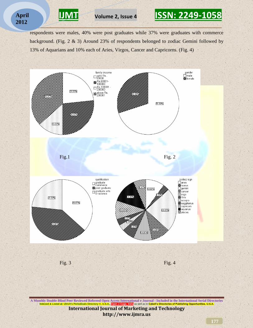
All the respondents were students in the age group of 18-24 years. The income profile was more
or less evenly distributed with 37% of respondents coming from families with income over Rs.
two lac per month and 27% had family income of between Rs. fifty thousand - one lac. Those
having income level below Rs. fifty thousand per month were around 23% (Fig.1). 70% of total
IJMT Volume 2, Issue 4 ISSN: 2249-1058 __________________________________________________________
A Monthly Double-Blind Peer Reviewed Refereed Open Access International e-Journal - Included in the International Serial Directories Indexed & Listed at: Ulrich's Periodicals Directory ©, U.S.A., Open J-Gage, India as well as in Cabell’s Directories of Publishing Opportunities, U.S.A.
International Journal of Marketing and Technology http://www.ijmra.us
177
April
2012
respondents were males, 40% were post graduates while 37% were graduates with commerce
background. (Fig. 2 & 3) Around 23% of respondents belonged to zodiac Gemini followed by
13% of Aquarians and 10% each of Aries, Virgos, Cancer and Capricorns. (Fig. 4)
Fig.1 Fig. 2
Fig. 3 Fig. 4
IJMT Volume 2, Issue 4 ISSN: 2249-1058 __________________________________________________________
A Monthly Double-Blind Peer Reviewed Refereed Open Access International e-Journal - Included in the International Serial Directories Indexed & Listed at: Ulrich's Periodicals Directory ©, U.S.A., Open J-Gage, India as well as in Cabell’s Directories of Publishing Opportunities, U.S.A.
International Journal of Marketing and Technology http://www.ijmra.us
178
April
2012
II. Overall Analysis
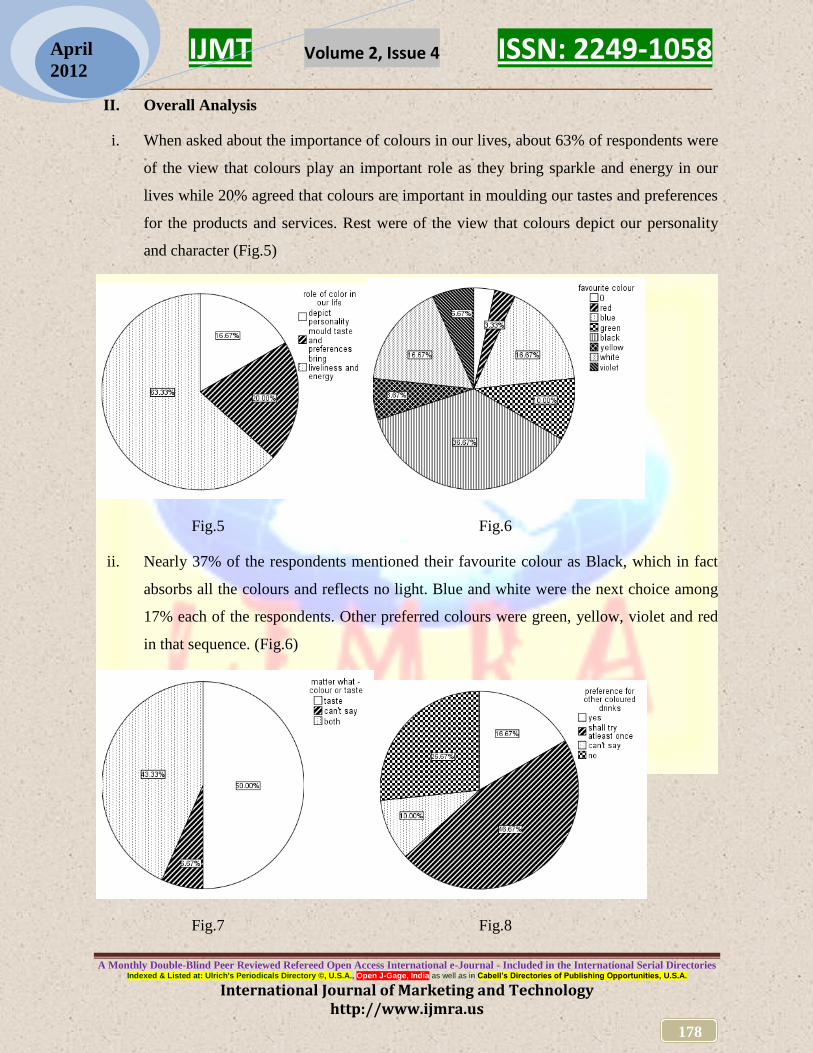
i. When asked about the importance of colours in our lives, about 63% of respondents were
of the view that colours play an important role as they bring sparkle and energy in our
lives while 20% agreed that colours are important in moulding our tastes and preferences
for the products and services. Rest were of the view that colours depict our personality
and character (Fig.5)
Fig.5 Fig.6
ii. Nearly 37% of the respondents mentioned their favourite colour as Black, which in fact
absorbs all the colours and reflects no light. Blue and white were the next choice among
17% each of the respondents. Other preferred colours were green, yellow, violet and red
in that sequence. (Fig.6)
Fig.7 Fig.8

IJMT Volume 2, Issue 4 ISSN: 2249-1058 __________________________________________________________
A Monthly Double-Blind Peer Reviewed Refereed Open Access International e-Journal - Included in the International Serial Directories Indexed & Listed at: Ulrich's Periodicals Directory ©, U.S.A., Open J-Gage, India as well as in Cabell’s Directories of Publishing Opportunities, U.S.A.
International Journal of Marketing and Technology http://www.ijmra.us
179
April
2012
iii. Half of the respondents consider taste as more important for any beverage or eatable
while 43% consider both taste and colour as important. (Fig.7) Majority 47% respondents
opined that they would try at least once, a beverage or food product that tastes same but is
differently coloured such as orange coloured coke or green coloured pasta (Fig.8). It
indicates that youths are open to new products or ideas.
iv. Nearly 30% of respondents preferred blue as their favourite colour for informal dressing
followed by 27% preference for black. Green and Red were other prominent colours
mentioned by around 17% and 10% respondents respectively (Fig.9). In case of formal
wear, black was the choice of more than half (53%) of the respondents. White (27%) and
blue (17%) were the other major favourite colours for formal wear among respondents.
(Fig.10). It was noticed that respondents used more choices of colours (around seven)
while dressing up for the informal wear as compared to when they dress up for the formal
wear (only four). Another noticeable factor was the choice of black colour for both
formal as well as informal wearing among today’s youth. Considering that black is
associated with authority and power, indicates that present youth irrespective of their
gender are more confident and determined. They also aspire to look different and above
the rest.
Fig.9 Fig.10

IJMT Volume 2, Issue 4 ISSN: 2249-1058 __________________________________________________________
A Monthly Double-Blind Peer Reviewed Refereed Open Access International e-Journal - Included in the International Serial Directories Indexed & Listed at: Ulrich's Periodicals Directory ©, U.S.A., Open J-Gage, India as well as in Cabell’s Directories of Publishing Opportunities, U.S.A.
International Journal of Marketing and Technology http://www.ijmra.us
180
April
2012
v. Red colour most obviously attracts maximum number of respondents (approx.27%), as
proved scientifically also because of its highest wavelength. Green colour was considered
most attention seeking by 23% respondents followed by black (17%), yellow and white
(10% each) (Fig.11). Question was asked specifically to the road side hoardings, banners,
posters or billboards. The response indicates that the advertisement on highways, malls or
roadside should prominently utilize red, green or even black colour in its theme to attract
maximum attention. However, black may not be the choice of many advertisers because
of their low visibility at night.
Fig.11 Fig. 12
vi. Nearly one-third of the respondents (33%) held that yellow is the most irritating colour
while 27% were of the view that black is the most irritating. Among remaining
respondents (13% each), red, white and green were believed to be irritating colours. (Fig.
12). More than two-fifth (43%) respondents felt that white colour brings calmness and
tranquillity. Blue was voted by nearly 27% while green was considered to most serene by
about 13% respondents. Other colours supposed to bring the cooling effects were red,
yellow and violet. (Fig.13) Response was in reference to the preference for indoor
furnishing or painting of walls and furniture. The above responses indicate that youth
nowadays prefer to have blue and green as colours for indoor furnishing and dislike
yellow or black.

IJMT Volume 2, Issue 4 ISSN: 2249-1058 __________________________________________________________
A Monthly Double-Blind Peer Reviewed Refereed Open Access International e-Journal - Included in the International Serial Directories Indexed & Listed at: Ulrich's Periodicals Directory ©, U.S.A., Open J-Gage, India as well as in Cabell’s Directories of Publishing Opportunities, U.S.A.
International Journal of Marketing and Technology http://www.ijmra.us
181
April
2012
Fig.13 Fig.14
vii. When asked how they remember a product later on, half (50%) of the respondents
considered colour as a reminiscent factor while approximately 37% felt that they
remember a product through its brand name (Fig.14). Question asked was in reference to
product packaging and point of sale display. Companies especially the FMCG, apparel or
consumer durables should give due considerations to the colours in their packaging or
branding.
III. Analysis - Gender wise
a) Gender wise cross tabulation indicates that males get irritated by black and yellow
furnishing in rooms. Surprisingly they prefer to wear black but at the same time they
don’t want to see black colour around them. Among female youths most irritating colour
is yellow. (Fig.15)
IJMT Volume 2, Issue 4 ISSN: 2249-1058 __________________________________________________________
A Monthly Double-Blind Peer Reviewed Refereed Open Access International e-Journal - Included in the International Serial Directories Indexed & Listed at: Ulrich's Periodicals Directory ©, U.S.A., Open J-Gage, India as well as in Cabell’s Directories of Publishing Opportunities, U.S.A.
International Journal of Marketing and Technology http://www.ijmra.us
182
April
2012
Fig.15 Fig.16
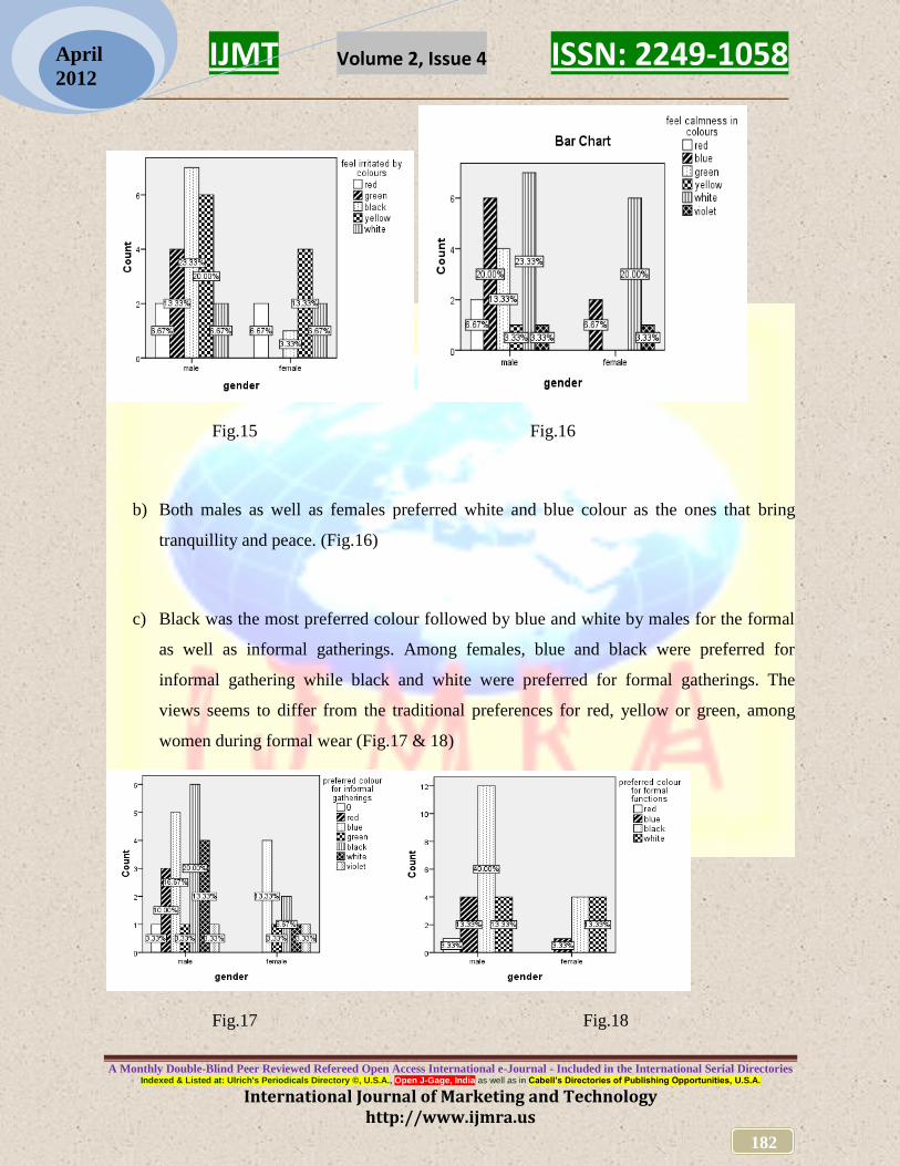
b) Both males as well as females preferred white and blue colour as the ones that bring
tranquillity and peace. (Fig.16)
c) Black was the most preferred colour followed by blue and white by males for the formal
as well as informal gatherings. Among females, blue and black were preferred for
informal gathering while black and white were preferred for formal gatherings. The
views seems to differ from the traditional preferences for red, yellow or green, among
women during formal wear (Fig.17 & 18)
Fig.17 Fig.18

IJMT Volume 2, Issue 4 ISSN: 2249-1058 __________________________________________________________
A Monthly Double-Blind Peer Reviewed Refereed Open Access International e-Journal - Included in the International Serial Directories Indexed & Listed at: Ulrich's Periodicals Directory ©, U.S.A., Open J-Gage, India as well as in Cabell’s Directories of Publishing Opportunities, U.S.A.
International Journal of Marketing and Technology http://www.ijmra.us
183
April
2012
d) Red and green are the colours that attract most number of male as well as female
respondents alike. (Fig.19)
Fig.19 Fig.20
e) Most respondents among males as well as females, view taste as more important
compared to colour of the beverage or a food product. (Fig.20)
f) Most number of males as well as females respondents remembers a product through its
colour while substantial numbers remember it through the brand name. (Fig.21)
Fig.21 Fig.22

IJMT Volume 2, Issue 4 ISSN: 2249-1058 __________________________________________________________
A Monthly Double-Blind Peer Reviewed Refereed Open Access International e-Journal - Included in the International Serial Directories Indexed & Listed at: Ulrich's Periodicals Directory ©, U.S.A., Open J-Gage, India as well as in Cabell’s Directories of Publishing Opportunities, U.S.A.
International Journal of Marketing and Technology http://www.ijmra.us
184
April
2012
g) Black, blue and white are the favourite colours among most of the males while it is
generally yellow and violet among the females. (Fig.22)
Conclusions and Recommendations:
Following are the key conclusions and recommendations, drawn from the above study;
Majority of the respondents are of the opinion that colours play an important role in our
lives as they bring sparkle and energy in us. Products such as mobiles, laptops,
automobiles, fashion accessories, footwear, health food & drinks, cosmetics, etc. should
therefore have more colour options to target the younger segment
Black is the most popular colour among the respondents indicating that today’s youth
aspire for niche and premium products and want to look different. Blue and White are
the other two most prominent colours signifying the simplicity and security respectively.
Firms dealing in apparels, accessories or consumer durable should come out with designs
having above colours in prominence.
Youth nowadays are open to new products, technologies or brands. They are ready to
taste beverages or food which may be artificially coloured. Packaged drinks and ready to
eat or cook products such as juices, wafers, cookies, noodles, pasta can be introduced
with more colour variants to attract the younger generation.
In case of informal wear, blue colour is the most popular among youngsters while black
emerged as clear favourite in formal wear. However, youths prefer to select from among
far more colour choices when it comes for informal wearing as compare to the formal
dressing in which limited colours are preferred. Firms manufacturing jeans, casual shirts,
dress material, half pants, night-suits, etc. must look for more colour options such as

IJMT Volume 2, Issue 4 ISSN: 2249-1058 __________________________________________________________
A Monthly Double-Blind Peer Reviewed Refereed Open Access International e-Journal - Included in the International Serial Directories Indexed & Listed at: Ulrich's Periodicals Directory ©, U.S.A., Open J-Gage, India as well as in Cabell’s Directories of Publishing Opportunities, U.S.A.
International Journal of Marketing and Technology http://www.ijmra.us
185
April
2012
green, red, violet and black, apart from blue. Those in the marketing of formal shirts,
trousers, suits and dress material should focus on black, white and blue.
Red colour quite obviously attracts the attention of maximum number of people on the
roadside or at the marketplace as indicated by the survey also. This is followed by green,
black, yellow and white. Advertising firms, architects for the malls or retail stores must
utilize the above colours dominantly for hoardings, billboards, banners or retail
atmospherics. The above must also be used in the packaging of products especially those
sold across the shelf in the hypermarkets. Gifts, cards, bags, toys, footwear and
accessories, apparel, jewellery and FMCG fall under this category.
Despite black being preferred as clothing by the youth, they don’t want black or yellow
interiors considering them to be too bold and warm. White and blue are the colours,
which are generally favoured for the interiors. Firms dealing in paints, furniture or
furnishing should therefore avoid yellow, black or red colours and focus more on white,
blue and certain shades of green. Similarly, some other products such as personal care,
eyewear or home appliances may also be designed accordingly.
Since products are also remembered by their colours, firms must place special emphasis
on the colour of packaging so as to increase the product recall and repeat sales. This is
also important for impulse buying as well as for the apparels, automobiles, mobiles,
consumer appliances, furnishing or fashion accessories.
Most of the retail firms, hotels, restaurants, consumer durables firms, etc. in their CRM
efforts collect date of birth of their customers to convey wishes on appropriate dates.
They can accordingly collect data related to the customer’s favourite colours and can
also work it out according to their respective zodiac signs. The customers can be
informed whenever their preferred colour shades arrive in the stores. Hotels, restaurants,
airlines can also work out their interior furnishings for the regular and preferred clients.

IJMT Volume 2, Issue 4 ISSN: 2249-1058 __________________________________________________________
A Monthly Double-Blind Peer Reviewed Refereed Open Access International e-Journal - Included in the International Serial Directories Indexed & Listed at: Ulrich's Periodicals Directory ©, U.S.A., Open J-Gage, India as well as in Cabell’s Directories of Publishing Opportunities, U.S.A.
International Journal of Marketing and Technology http://www.ijmra.us
186
April
2012
Scope for future research:
Colour play a vital role in our behavioural responses and have an impact on how we behave, feel
and respond. Our personality is sometimes judged by the colours we choose or wear. It is
important to study various aspects and factors, hidden or explicit, that influences our response to
varying coloured stimuli. Detailed study is also required to understand the general colour
preferences among the adults, for some commonly purchased products and the role of colour as
an important product attribute. The above study can be extended to other age groups and also to
the rural areas.
References:
• Williams, John (March 7, 2007), Your Brand's True Colors in
http://www.entrepreneur.com/marketing/branding/imageandbrandingcolumnistjohnwilliams/
article175428.html
• Campbell, June, The Psychology of Color in Marketing in
http://www.colourtherapyhealing.com/colour/colour_history.php
• Raizada, Sumesh (15.3.2006), Colorful world of colors, in The Hindustan Times, Lucknow
• http://hubpages.com/hub/The-Importance-of-Colours-in-our-Lives
• http://www.care2.com/c2c/groups/disc.html?gpp=738&pst=107207
• http://eosweb.larc.nasa.gov/EDDOCS/Wavelengths_for_Colors.html
• http://www.viewzone.com/luscher.html
• http://www.stanford.edu/class/linguist34/Unit_13/colors.htm
• http://www.indianetzone.com/42/colour_symbolism_rajasthani_costumes.htm
• http://sbinformation.about.com/cs/advertising/a/colors.htm


