Download - NEW YORK ECONOMIC REVIEW

NEW YORK ECONOMIC REVIEW
FALL 2019
JOURNAL OF thE NEW YORK StAtE
ECONOMICS ASSOCIAtION
VOLUME L
NYSEA

NEW YORK ECONOMIC REVIEW Volume 50, Fall 2019
1
NEW YORK STATE ECONOMICS ASSOCIATION
FOUNDED 1948
2018-2019 OFFICERS President: CLAIR SMITH • SAINT JOHN FISHER UNIVERSITY Vice-President:
SEAN MacDONALD • NEW YORK CITY COLLEGE OF TECHNOLOGY, CUNY Secretary: MICHAEL McAVOY • SUNY ONEONTA Treasurer:
PHILIP SIRIANNI • SUNY ONEONTA Editorial Board: DAVID VITT • EDITOR • FARMINGDALE STATE COLLEGE BRID G. HANNA • ASSOCIATE EDITOR • ROCHESTER INSTITUTE OF TEHCHNOLGOY CRISTIAN SEPULVEDA • ASSOCIATE EDITOR • FARMINGDALE STATE COLLEGE
RICK WEBER • ASSOCIATE EDITOR • FARMINGDALE STATE COLLEGE Web Coordinator: KPOTI KITISSOU • SUNY ONEONTA Board of Directors: LAUREN CALIMERIS • ST. JOHN FISHER COLLEGE
CHUKWUDI IKWUEZE • QUEENSBOROUGH COMMUNITY COLLEGE, CUNY KENNETH LIAO • FARMINGDALE STATE COLLEGE ARIDAM MANDAL • SIENA COLLEGE MICHAEL O’HARA • ST. LAWRENCE UNIVERSITY MANIMOY PAUL • SIENA COLLEGE
KASIA PLATT • SUNY OLD WESTBURY DELLA SUE • MARIST COLLEGE
WADE THOMAS • SUNY ONEONTA RICK WEBER • FARMINGDALE STATE COLLEGE
Conference Proceedings Editor MANIMOY PAUL • SIENA COLLEGE
The views and opinions expressed in the Journal are those of the individual authors and do not necessarily represent those of individual staff members or the New York State Economics
Association.

NEW YORK ECONOMIC REVIEW Volume 50, Fall 2019
2
Vol. 50, Fall 2019
CONTENTS
ARTICLES Predicting Altruistic Behavior after Cheap Talk: Evidence from an Experiment Michael J. Vernarelli, Yosef Boutakov, Matthew Kehoe…………………………..…………………….5 Credit Union Net-Worth Change Following the Financial Crisis: The Sand versus Low Foreclosure States Teri S. Peterson, Robert J. Tokle………………………………………………..………………………17 Local Government Credit Ratings: New York vs. the US Julie Anna Golebiewski, George Palumbo, Mark Zaporowski………………………………………..29 Examining the Relationship Between Capacity Utilization and Inflation
Christine L. Storrie, Melissa R. Voyer..…………………………………………..…………..…………46 Referees……..………………………………………………….……………………………………………..……67

NEW YORK ECONOMIC REVIEW Volume 50, Fall 2019
3
EDITORIAL
The New York Economic Review (NYER) is an annual publication of the New York State Economics Association (NYSEA). The NYER publishes theoretical and empirical articles, and also interpretive reviews of the literature in the fields of economics and finance. All well-written, original manuscripts are welcome for consideration at the NYER. We also encourage the submission of short articles and replication studies. Special Issue proposals are welcome and require a minimum of 4 papers to be included in the proposal, as well as a list of suggested referees.
MANUSCRIPT GUIDELINES
1. All manuscripts are to be submitted via e-mail to the editor in a Microsoft Word file format, with content
formatted according to the guidelines at: https://www.nyseconomicsassociation.org/NYER/Guidelines
Manuscript submissions should be emailed to editor David Vitt at [email protected] The NYER is cited in:
• EconLit by the American Economic Association • Ulrich’s International Periodicals Directory • Cabell’s Directory of Publishing Opportunities
in Business and Economics
ISSN NO: 1090-5693

NEW YORK ECONOMIC REVIEW Volume 50, Fall 2019
4
Copyright Notice
As a condition of publication in the New York Economic Review, all authors agree to the following terms of
licensing/copyright ownership:
First publication rights to original work accepted for publication is granted to the New York Economic
Review but copyright for all work published in the journal is retained by the author(s).
Works published in the New York Economic Review will be distributed under a Creative Commons
Attribution License (CC-BY-NC-ND). By granting a CC-BY-NC-ND license in their work, authors retain
copyright ownership of the work, but they give explicit permission for others to download, reuse, reprint,
distribute, and/or copy the work, as long as the original source and author(s) are properly cited (i.e. a complete
bibliographic citation and link to the New York State Economics Association website). No permission is
required from the author(s) or the publishers for such use. According to the terms of the CC-BY-NC-ND
license, any reuse or redistribution must indicate the original CC-BY-NC-ND license terms of the work. The
No-Derivatives attribute of the license allows changing the format, but not modifying the text or tables as to
content. The Non-Commercial attribute of the license disallows users to reproduce the work or create
derivatives for the purpose of commercial gain.
Exceptions to the application of the CC-BY-NC-ND license may be granted at the editors’ discretion if
reasonable extenuating circumstances exist. Such exceptions must be granted in writing by the editors of
the Journal; in the absence of a written exception, the CC-BY-NC-ND license will be applied to all published
works. We provisionally exclude indexing services like EconLit or Ebsco from the Non-Commercial attribute,
contact the editor for a letter reflecting this.
Authors may enter into separate, additional contractual agreements for the non-exclusive distribution of the
published version of the work, with an acknowledgement of its initial publication in the New York Economic
Review
Authors are permitted to post their work online in institutional/disciplinary repositories or on their own
websites. Pre-print versions posted online should include a citation and link to the final published version
in the New York Economic Review as soon as the issue is available; post-print versions (including the final
publisher's PDF) should include a citation and link to the website of the New York State Economics
Association.

NEW YORK ECONOMIC REVIEW Volume 50, Fall 2019
5
Predicting Altruistic Behavior after Cheap Talk in the Dictator Game
Michael J. Vernarelli*, Yosef Boutakov*, Matthew Kehoe*
* Department of Economics, Rochester Institute of Technology, Rochester, New York.
ABSTRACT An important aspect of strategic games is the ability of a player to predict the behavior of another, including
altruistic behavior. Cheap talk represents a form of communication where one or more parties make costless, nonverifiable claims. This study examines the ability of individuals to predict altruistic behavior in the Dictator Game (DG) after hearing cheap talk. We conduct an experiment where participants play the DG, then make predictions of the dictator contributions of their fellow participants before and after cheap talk. We find that while predictive accuracy is not better than chance before cheap talk, that cheap talk significantly improves predictive accuracy.
INTRODUCTION An important aspect of strategic games is the ability of a player to predict the behavior of another.
A variety of studies have shown that dispositional altruism is manifested in behavioral outcomes (see, for
example, Rushton et al., 1981; Carlo et al., 1991). Thus, a player’s ability to predict the dispositional altruism
of other players can be a valued characteristic in a strategic setting. Cheap talk represents a form of
communication where one or more of the parties in a game make costless, nonverifiable claims. Since
Crawford and Sobel (1982) introduced models of this behavior some 35 years ago, we have seen a robust
literature develop. Much research has focused on cheap talk in strategic games examining issues
surrounding the veracity of cheap talk and its impact on outcomes. There are a number of papers examining
the topic of communication in the Ultimatum Game (see, for example, Rankin, 2003; Croson et al., 2003;
and Lusk and Hudson, 2004). It is conceivable that cheap talk provides information regarding the
dispositional altruism of players in strategic games, as well.
To investigate this question we examined the ability of individuals to predict the behavior of those in
the role of dictator in the Dictator Game (DG) after hearing cheap talk. Dictator contributions in the DG have
been widely acknowledged as a measurement of altruistic behavior (see, for example, Hoffman et al., 1996;
Camerer, 2003). If individuals are able to accurately predict dictator behavior, this would suggest that players
in games involving strategic concerns could also manifest this ability to detect underlying dispositional
altruism.
Social scientists have pursued the question of the ability to predict dispositional altruism in the DG.
Pradel et al. (2009) investigated whether individuals were able to predict the level of altruism in others with
whom they had some familiarity. Their study was conducted using German schoolchildren who were 10 to
19 years old in six school classes. The students were asked to play a hypothetical DG where they were
required to allocate an age appropriate amount of money (€6 to €10 depending on the class) between

NEW YORK ECONOMIC REVIEW Volume 50, Fall 2019
6
themselves and an anonymous classmate. The participants then assumed the role of judges and were asked
to predict their fellow students’ (targets’) dictator contributions. One week later half the student participants
were randomly assigned the role of dictator and were paired with a student from the other half who served
as the recipient of the dictator's contribution. The researchers found that the students (judges) in the
experiment were able to predict altruistic behavior as measured by dictator contributions greater than
chance.
Vernarelli (2016) conducted a similar experiment using students in a college social sorority. The
participants played a version of the DG where each was given $10 to allocate between herself and an
anonymous student who was not a member of the sorority. After playing the game each participant assumed
the role of judge and was asked to predict the contributions of her fellow participants. He found that the
judges were able to predict behavior better than chance and that predictive ability was a function of the
degree of social closeness between judge and target.
Fetchenhauer et al. (2010) tested the ability of individuals to detect permanent cues to altruism
based on an event-unrelated stimulus. They first created silent videotapes of 56 target participants speaking
into the camera. Afterwards, the participants (targets) played a version of the DG where they made
hypothetical decisions on how to divide €60 between themselves and an anonymous person who was also
participating in the study. One out of six participant pairings were randomly selected to play the game with
real money. Next, the videotapes were shown to a different group of 34 participants who as judges were
asked to predict contributions of the 56 dictators. Fetchenhauer et al. found that average predictions
correlated with actual decisions better than chance. In particular they found statistically significant
differences between the average predictions for those who contributed nothing and those who contributed
some positive amount.
Our study will extend this research by explicitly considering the effect of cheap talk on predictive
accuracy. We have the participants in our experiment first play the role of the dictator in a version of the DG.
Then the participants assume the role of judges and make two sets of predictions regarding their fellow
participants’ dictator contributions: one before cheap talk and a second after cheap talk. In this way we are
able to isolate the effect of cheap talk upon predictive accuracy.
The organization of the paper is as follows. We discuss the experiment design in the next section,
followed by our results, and the paper concludes with the discussion.
EXPERIMENT DESIGN
The experiment was conducted with students at a large private university. The students were invited
to participate in the experiment via email. They were told that the experiment would take about an hour and
a half and would be conducted in classrooms on campus when classes were not in session. Each participant
was told he would be paid a $10 participation fee upon successful completion of the experiment.

NEW YORK ECONOMIC REVIEW Volume 50, Fall 2019
7
A research team (the co-authors and one research assistant) conducted the experiment. The
experiment was designed for exactly 18 students to facilitate the appropriate level of personal interaction
among the participants. At the beginning of the experiment the research team distributed lanyards with a
number attached and instructed the participants to wear the lanyard throughout the experiment. Participants
were referred to only by number to maintain their anonymity to the research team and protect the
confidentiality of their decisions and the information they provided during the experiment. Each participant
was handed a clipboard containing an envelope with 10 one-dollar bills, a description of each of three
categories of familiarity, a sheet with three questions, and a rating sheet.
The 18 participants (13 males and 5 females) were told the following. They would be playing a
version of the dictator game, although it was not identified as such, and predicting the decisions of the other
participants. As a condition of their participation they could not discuss their decisions, ratings or predictions
during or after the experiment. After hearing this overview they were required to sign an informed consent
statement and the formal experiment began.
The research team read aloud three familiarity descriptions while the participants followed along on
their handouts. A participant was directed to rate his fellow participants 1) if he did not recognize that
individual at all 2) if the participant recognized that individual but did not consider her a friend or someone
he knew well 3) if the participant considered that individual a friend or someone he knew quite well. Each
participant was asked to stand one at a time and face the group so his number was clearly visible. Each was
told not to speak or make any gesture. When a participant stood, the others rated the degree of familiarity
they had with him. After all participants had rated the degree of familiarity with the other participants, the
research team explained how the dictator game would work. The participants would decide how many one-
dollar bills they took for themselves to keep and how many to leave in the envelope. The envelope would be
given to an anonymous RIT student who was not a participant in the experiment. The anonymous student
would not know from whom or where the money was coming. The student would also be anonymous to the
research team. The research team did not disclose the actual method of distribution to the participants. This
method is described in Appendix A.
Next, a research team member escorted each participant with their envelope of ten one-dollar bills
one-by-one to a designated empty classroom. The participant entered the empty classroom while the
research team member did not. The door was closed so the participant was able to remove the money she
wished to keep in complete privacy out of the view of other participants. Once all the participants had
completed this task and had returned the envelopes to the research team, they were asked to stand one-
by-one, as before, while the other participants wrote down their initial predictions of how much had been
retained and how much was left in the envelope. Again, the participants were instructed not to speak or
otherwise gesture during this part of the experiment.

NEW YORK ECONOMIC REVIEW Volume 50, Fall 2019
8
After this initial rating had been completed the research team directed the participants to read along
while the research team read the three questions aloud. The three questions were developed in consultation
with Department of Psychology faculty at Rochester Institute of Technology and were as follows:
1. What are things that make you happy?
2. How much of a problem is unconstrained greed, like on Wall Street, for society?
3. How much does it bother you to see animals hurt or in pain?
The questions were designed to elicit an individual’s attitudes towards altruism and empathy, which
has been shown to correlate with dispositional altruism. (see, for example, Hoffman, 1976; Krebs, 1975).
After hearing the three questions the participants wrote down their answers to each of the questions on the
sheets provided.
Next, the participants were divided into three groups of six participants and led to three separate
classrooms by members of the research team. The seven individuals (six participants and a research team
member) were seated in a small circle facing one another. Each participant was asked to read her answers
to the three questions. After the other five participants had heard one participant’s answers, they were asked
to make a second prediction regarding how much money that participant had retained and how much she
had contributed to the anonymous student and write the predictions on their rating sheets. Then the next
participant read his answers and the five others made their predictions. The participants were told that they
could make the same predictions they had made previously or they could change them. After all six
participants in the group had completed this task, the 18 participants reassembled in a central meeting room.
There they were reassigned to different six person groups and the rating process was repeated. After four
iterations all the participants had rated every one of the other 17 participants. The research team collected
the lanyards and rating sheets and the participants were paid their $10 participation fee.
RESULTS
The decisions and ratings of 18 participants were analyzed. The average contribution was $2.89
(28.9%), comparable to what has been observed in previous studies. Engle (2011) conducted a meta study
of dictator game results and found that the mean contribution was 28.35% of the pie. Table I showing the
frequency of each amount contributed is given below.
Table I: Dictator Contributions Amount Contributed $0 $1 $2 $3 $4 $5 $6 $7 $8 $9 $10
Frequency 7 1 0 5 0 2 0 1 0 1 1
The distribution seems consistent with past results from the dictator game with the exception of the
fact that three participants (16.7%) contributed more than half of the $10 to the anonymous student. The

NEW YORK ECONOMIC REVIEW Volume 50, Fall 2019
9
average amount predicted to be contributed to the anonymous student was $2.85 before hearing the
answers to the three questions (cheap talk) and $3.27 after hearing the answers. The difference between
the two predicted amounts was statistically significant [t(18) = -2.937, p-value = .009, two-tailed].
The hypothesis we tested is that participants were able to predict the altruistic behavior of their fellow
participants as measured by dictator contributions more accurately after cheap talk. However, the fact that
the experiment requires every participant to predict the behavior of every other participant renders the
predictions nonindependent. The data analysis adjusted for this phenomenon by using the “round robin”
method devised by Warner et al. (1979) which has been widely cited across a variety of disciplines (see, for
example, Dass and Fox, 2011; Gill and Swartz, 2001; and Pradel et al., 2009). The specific application of
the “round robin” method in our study is discussed in Appendix B.
The predictive ability regarding identification of altruistic behavior before and after cheap talk was
first tested by analyzing the correlation between the amount contributed by a participant (target) and the
adjusted average prediction by the other 17 participants (judges). Before cheap talk the correlation between
the judges’ adjusted average prediction and the target’s contribution was positive, but not statistically
significant (r=.204, p=.209, one-tailed). After cheap talk the correlation was strongly positive and statistically
significant (r=.541, p=.010, one-tailed). These results support the hypothesis that predictive accuracy
increased after cheap talk.
The second test of predictive ability examined the correlation between the target’s contribution and
the judge’s adjusted prediction using a dataset where the unit of observation was the individual judge-target
dyad. This dataset potentially contained 306 dyads (18 X 17) in which each judge predicted the amount
contributed by each of the other 17 participants (targets). Since the experiment was designed to isolate the
effect of cheap talk on predictive accuracy, we eliminated all dyads where the judge or the target indicated
that they knew the other well or considered her a friend. There were 14 such dyads leaving 292 in the dataset
for analysis. Again, the correction for the nonindependence of observations indicated in Appendix B was
applied. Before cheap talk the correlation between the judge’s adjusted prediction and the target’s
contribution was positive, but not statistically significant (r=.038, p=.260, one-tailed). After cheap talk the
correlation was positive and statistically significant (r=.203, p<.001, one-tailed). These results similarly
support the hypothesis that predictive accuracy increased after cheap talk.
A caveat to the interpretation that a comparison of the correlation coefficients for the dyad dataset
indicates the effect of cheap talk on enhanced predictive ability is that the analysis did not control for a false
consensus effect (Ross et al., 1977). Studies have shown that individuals judging others’ behavior rely
heavily upon self-related knowledge (Krueger and Clement, 1994). If a judge believes that the target’s
behavior is similar to her own, makes a prediction on that basis, and the target’s behavior is in fact similar,
this would lead to an accurate prediction without the judge possessing any true independent predictive ability
(Dawes and Mulford, 1996).
We found evidence of a false consensus effect. For the dataset containing the 292 dyads the
correlation coefficients between the judge’s prediction and the judge’s own dictator contribution before cheap

NEW YORK ECONOMIC REVIEW Volume 50, Fall 2019
10
talk (r=.407, p <.001) and after cheap talk (r=.261, p<.001) were positive and statistically significant. To
control for the false consensus effect, we adopted an approach developed by Kenny and Acitelli (2001) that
regresses the judge’s own dictator contribution and the target’s dictator contribution on the judge’s prediction
of the target’s dictator contribution. The results are given in Table II.
Table II: Regression Results Controlling for False Consensus Effect in Dyad Dataset
Before Cheap Talk After Cheap Talk
VARIABLE β S.E. p-value β S.E. p-value Intercept 1.904 .229 <.001 2.347 .244 <.001
Judge’s dictator
Contribution .325 .043 <.001 .220 .046 <.001
Target’s dictator .011 .043 .801 .118 .046 .010
contribution R2 = .166 F= 28.735 (p<.001) R2 = .089 F=14.109 (p<.001)
In the regression equations for both before cheap talk and after cheap talk, the coefficient for the
judge’s own dictator contribution is positive and significant indicating a false consensus effect. However, the
coefficient of the target’s dictator contribution is positive, but insignificant, in the before cheap talk regression
equation. In the after cheap talk regression equation it is positive and statistically significant. This result is
consistent with our hypothesis that cheap talk enhances the judge’s independent predictive ability.
Correlation coefficients for individual judges were also calculated. The results are given in Table III.
Before cheap talk 8 of the 18 judges’ predictions were negatively correlated and 3 of the positive
correlations were statistically significant at the 𝛼𝛼 = .10 level. After cheap talk only 2 of the 18 individual
predictions were negatively correlated and 6 of the positive correlations were significant at the 𝛼𝛼 = .10 level.
Of the 16 judges for whom correlations coefficients could be calculated for both before and after cheap talk
predictions, 12 increased the accuracy of their predictions, while 4 decreased their accuracy.
The results strongly suggest a cheap talk effect on predictive accuracy. However, we noticed that in
a significant number of dyads (128 of 292, 44%) the judge did not change his prediction after cheap talk. We
computed the correlation coefficient for this subset of the dyad dataset and found it positive and statistically
significant. (r=.205, p=.010). We regressed the judge’s own dictator contribution and the target’s dictator
contribution on the judge’s prediction of the target’s contribution to control for the false consensus effect and
the results are given in Table IV.

NEW YORK ECONOMIC REVIEW Volume 50, Fall 2019
11
Table III: Predictive Accuracy for Individual Judges Before and After Cheap Talk
Judge (#) Number of Pearson’s r Pearson’s r p-value after Predictions before cheap talk after cheap talk cheap talk if p<.10
11 15 -.156 .006
12 14 .052 .505 .033
13 17 -.107 .025
14 16 .167 .532 .017
15 17 .067 .070
16 14 ----* .054
17 16 .338 .192
18 17 .400 .207
19 17 -.307 .053
21 17 .122 .424 .045
22 17 .084 -.032
23 17 -.057 .331 .098
24 14 ----* -.291
25 17 .354 .243
26 17 -.233 .389 .061
27 17 -.031 .019
28 16 .256 .449 .041
29 17 -.209 .075 * correlation coefficients could not be calculated because judges’ predictions were constant
Table IV: Regression Results Controlling for a False Consensus Effect for “No Change” Dyads
VARIABLE β S.E. p-value Intercept 1.273 .343 <.001
Judge’s dictator .395 .069 <.001
contribution
Target’s dictator .139 .071 .053
contribution R2 = .232 F= 18.931 (p<.001)

NEW YORK ECONOMIC REVIEW Volume 50, Fall 2019
12
The results indicate evidence of a false consensus effect and marginally significant independent predictive
ability.
Correlation analysis for the remaining 164 dyads where the judge changed her prediction after cheap
talk showed an increase in predictive accuracy (from r=-.062, p=.214 to r=.187, p=.008). After controlling for
a false consensus effect there was evidence of improved predictive ability, but it was not statistically
significant. It should be noted that the false consensus effect itself appeared to weaken after cheap talk as
evidenced by the reduction in both the regression coefficient and the p-value of the judge’s dictator
contribution. The results are given in Table V.
Table V: Regression Results Controlling for a False Consensus Effect for “Change” Dyads
Before Cheap Talk After Cheap Talk
VARIABLE β S.E. p-value β S.E. p-value Intercept 2.449 .302 <.001 3.321 .324 <.001
Judge’s dictator .258 .054 <.001 .081 .058 .167
contribution
Target’s dictator -.081 .053 .127 .072 .057 .209
contribution R2 = .147 F= 13.848 (p<.001) R2 = .019 F=1.540 (p=.218)
DISCUSSION
We wanted to see if judges who were not familiar with a target could predict altruistic behavior as
measured by dictator game contributions if given a small amount of information about the target, i.e., cheap
talk. The average dictator contribution was $2.89 (28.9%), comparable to what was observed in previous
studies Before cheap talk the judges’ average prediction was $2.85, virtually identical to the average
contribution. After cheap talk the judges’ average prediction increased to $3.27. The difference in these two
average predicted amounts was statistically significant.
The main finding was that judges could not predict altruistic behavior better than chance before
cheap talk, but were able to afterwards. We tested for correlations between a target’s contribution and the
judges’ average adjusted predictions as well as between the target’s contribution and judge’s adjusted
predictions for individual judge-target dyads. The correlation coefficient after cheap talk in the experiment
was larger for the average predictions dataset than for the dyads dataset (.541 vs. .212), but both were
statistically significant. Correlation coefficients for individual judges painted the same general picture. Of the
16 judges for whom before and after cheap talk correlations could be calculated, 12 improved their accuracy
after cheap talk. Three judges had correlation coefficients that were significant at p<.10 before cheap talk,
but there were six such judges after cheap talk.

NEW YORK ECONOMIC REVIEW Volume 50, Fall 2019
13
There are a number of possible explanations why predictive accuracy improved after hearing cheap
talk (the dictators’ answers to the questions). The cheap talk might have provided direct clues regarding
dispositional altruism, signals for personality traits that are correlated with dispositional altruism, or
information regarding one’s sensitivity towards social acceptance and being motivated to meet expected
social norms. Our study’s design did not allow for the isolation of any particular underlying causal factor.
More simply, the cheap talk was essentially a “black box” in which any individual factor or combination thereof
could have led to the observed behavior.
We found weak evidence that judges in the dyad dataset who did not change their predictions after
cheap talk exhibited some independent predictive accuracy, suggesting that one’s ability may be related to
the interpretation of subtle, non-verbal cues, i.e., body language, prior to any cheap talk. This result is similar
to what Fetchenhauer et al. found in their study, although there were notable differences in the experiment
design. In our study judges viewed live targets who did not speak after they had played the DG, while in
Fetchenhauer et al. the targets spoke on videotape with their speech muted before playing the DG.
Nevertheless, there are similarities in the results of the two studies. The predictive ability of individual judges
in Fetchenhauer at al. after viewing the videotapes seemed consistent with the predictive ability of the
individual judges in our experiment after cheap talk. For example, Fetchenhauer et al. reports that 3 of the
34 judges exhibited negative correlations and the correlation coefficients ranged between -.09 and .33. After
cheap talk in our experiment there were 2 of the 16 judges (for whom correlation coefficients could be
calculated both before and after cheap talk) with negative correlation coefficients with the range for the group
between -.29 and .53.
Our results reflect the fact that there may be three broad types of individuals when it comes to
predictive accuracy: those who can make accurate predictions based on subtle non-verbal cues before
cheap talk, those who may be less intuitive but benefit from hearing cheap talk, and those who do not exhibit
an ability to make accurate predictions. In fact individuals’ predictive ability may be even more nuanced. A
given individual’s predictive ability may vary depending upon the target, where some targets give the
requisite non-verbal cues that allow for accurate predictions, some allow for accurate predictions of their
behavior only after cheap talk, and yet others remain inscrutable. Our results regarding predictive ability in
the DG raise hopes that similar behavioral ability is manifested in other games. Future research is needed
to determine whether individuals have the ability to make accurate predictions in more complex games where
there truly is strategic interaction.
ENDNOTES ◊ We would like to thank Jeffrey Wagner and an anonymous reviewer for the comments and suggestions made on earlier
drafts of this paper. Of course, any errors that remain are our responsibility.

NEW YORK ECONOMIC REVIEW Volume 50, Fall 2019
14
REFERENCES
Camerer, Colin. 2003. Behavioral Game Theory: Experiments on Strategic Interaction. Princeton, NJ:
Princeton University Press.
Carlo, Gustavo, Nancy Eisenberg, Debra Troyer, Galen Switzer and Anna L. Speer. 1991. “The Altruistic
Personality: In What Contexts is it Apparent?” Journal of Personality and Social Psychology, 61(3): 450-
458.
Crawford, Vincent. P. and Joel Sobel. 1982. “Strategic Information Transmission.”
Econometrica, 50: 1431-1451.
Croson, Rachel., Terry Boles, and Keith Murnighan. 2003. “Cheap Talk in Bargaining Experiments: Lying and
Threats in Ultimatum Games.” Journal of Economic Behavior and Organization, 51: 143-159.
Dass, Mayukh and Gavin L. Fox. 2011. “A Holistic Network Model for Supply Chain Analysis.” International Journal
of Production Economics, 131(2): 587-594.
Dawes, Robyn M. and Matthew Mulford.1996. “The False Consensus Effect and Overconfidence: Flaws in Judgment
or Flaws in How We Study Judgment.” Organizational Behavior and Human Decision Processes, 65: 201-
211.
Engel, Christoph. 2011. “Dictator Games: A Meta Study.” Experimental Economics, 4: 583-610.
Fetchenhauer, Detlef, Ton Groothuis and Julia Pradel. 2010. “Not Only States but Traits: Humans Can Identify
Permanent Altruistic Dispositions in 20 Seconds.” Evolution and Human Behavior, 31: 80-86.
Gill, Paramjit and Tim B. Swartz. 2001. “Statistical Analyses for Round Robin Interaction Data.” Canadian
Journal of Statistics, 29(2): 321-331.
Hoffman, Elizabeth, Kevin McCabe and Vernon Smith. 1996. “Social Distance and Other Regarding Behavior in
Dictator Games.” The American Economic Review, 86: 653-680.
Hoffman, Martin L. 1976. “Empathy, Role-taking, Guilt, and Development.” In Thomas Lickona (Ed.) Moral
Development and Behavior: Social, Personality, and Developmental Perspectives, pp.41-63. Hillsdale, NJ:
Erlbaum.
Kenny, David A. and Linda Acitelli. 2001. “Accuracy and Bias in the Perception of the Partner in a Close
Relationship.” Journal of Personality and Social Psychology, 80: 439-448.
Krebs, Dennis L. 1975. “Empathy and Altruism.” Journal of Personality and Social Psychology, 32: 1134-46.
Krueger, Joachim and Russell W. Clement. 1994. “The Truly False Consensus Effect: An Ineradicable and
Egocentric Bias in Social Perception.” Journal of Personality and Social Psychology, 67: 596-610.
Lusk, Jason L., and Darren Hudson. 2004. “Effect of Monitor-Subject Cheap Talk on Ultimatum Game Offers.”
Journal of Economic Behavior and Organization, 54: 439-443.
Pradel, Julia, Harald A. Euler, and Detlef Fetchenhauer. 2009. “Spotting Altruistic Dictator Game Players and
Mingling with Them: The Elective Assortation of Classmates.” Evolution and Human Behavior, 30: 103-113.
Rankin, Frederick W. 2003. “Communication in Ultimatum Games.” Economic Letters, 81: 267-271.

NEW YORK ECONOMIC REVIEW Volume 50, Fall 2019
15
Ross, Lee, David Greene, and Pamela House. 1977. “The ‘False Consensus’ Effect: An Egocentric Bias in Social
Perception and Attribution Processes.” Journal of Experimental Social Psychology, 13: 279-301.
Rushton, J. Philippe, Roland D. Chrisjohn and G. Cynthia Fekken. 1981. “The Altruistic Personality and the Self-
report Scale.” Personality and Individual Differences, 2(4): 293-302.
Vernarelli, Michael J. 2016. “Predicting Altruistic Behavior and Assessing Homophily: Evidence from the Sisterhood.”
Sociological Science, 3: 889-909.
Warner, Rebecca M., David A. Kenny, and Michael Stoto. 1979. “A New Round Robin Analysis of Variance for Social
Interaction Data.” Journal of Personality and Social Psychology, 37: 1742- 1757.
APPENDIX A
The research team distributed the money contributed in the envelopes to the anonymous students by setting
up a table outside on the university grounds and inviting student passersby to receive “free money.” After
some initial skepticism students who were not part of the experiment and completely anonymous to the
research team stopped at the table, randomly selected an envelope, and were given the money inside. All
18 envelopes were distributed in 10-15 minutes.
APPENDIX B
Warner et al. (1979) indicated that in small group samples where every group member interacts with every
other group member a consistent pattern of behavior manifested by individuals in dyadic interactions results
in nonindependence of observations. They defined two roles in the dyad, actor and partner. In the current
study an actor (judge) predicted the behavior of the partner (target) in the dyad. An individual judge is
assumed to have consistent behavior across her predictions. Likewise, a target is assumed to receive a
consistent set of predictions concerning her behavior across all predictions. Warner et al. proposed an
equation to disentangle these two effects, so that the underlying dyadic interaction between actor and partner
could be identified. Its application to the analysis of predictive ability is given below.
𝑃𝑃𝑖𝑖𝑖𝑖 = 𝑚𝑚 + 𝑎𝑎𝑖𝑖 + 𝑏𝑏𝑖𝑖 + 𝑐𝑐𝑖𝑖𝑖𝑖
where:
𝑃𝑃𝑖𝑖𝑖𝑖 is prediction by judge i of dictator contributions made by target j
𝑚𝑚 is the mean of all predictions made
𝑎𝑎𝑖𝑖 is the actor effect of judge i in her predictions
𝑏𝑏𝑖𝑖 is the partner effect of target j in predictions received by her
𝑐𝑐𝑖𝑖𝑖𝑖 is the interaction effect between judge i and target j in dyad ij

NEW YORK ECONOMIC REVIEW Volume 50, Fall 2019
16
The actor effect is calculated as:
𝑎𝑎𝑖𝑖 = �(𝑛𝑛 − 1)2
𝑛𝑛(𝑛𝑛 − 2)�𝑚𝑚𝑖𝑖∗ + �𝑛𝑛 − 1
𝑛𝑛(𝑛𝑛 − 2)�𝑚𝑚∗𝑖𝑖 − �𝑛𝑛 − 1𝑛𝑛 − 2
�𝑚𝑚
where:
𝑛𝑛 is number of participants in the study
𝑚𝑚𝑖𝑖∗ is mean of predictions made by participant i as judge
𝑚𝑚∗𝑖𝑖 is mean of predictions received by participant i as target
The partner effect is calculated as:
𝑏𝑏𝑖𝑖 = �(𝑛𝑛 − 1)2
𝑛𝑛(𝑛𝑛 − 2)�𝑚𝑚∗𝑖𝑖 + �𝑛𝑛 − 1
𝑛𝑛(𝑛𝑛 − 2)�𝑚𝑚𝑖𝑖∗ − �𝑛𝑛 − 1𝑛𝑛 − 2
�𝑚𝑚
For analysis of the average prediction of the judges and the contribution of a target, the correlation between
the partner effect and contribution of the participant was calculated. For analysis of predictive ability of
individual judges at the dyad level, the correlation between the interaction effect and the contribution of
individual participants was calculated. The interaction effect was calculated as:
𝑐𝑐𝑖𝑖𝑖𝑖 = 𝑃𝑃𝑖𝑖𝑖𝑖 − 𝑚𝑚 − 𝑎𝑎𝑖𝑖 − 𝑏𝑏𝑖𝑖

NEW YORK ECONOMIC REVIEW Volume 50, Fall 2019
17
Credit Union Net-Worth Change Following the Financial Crisis: The Sand versus Low Foreclosure States
Teri S. Peterson* & Robert J. Tokle**
* Department of Marketing and Management, Campus Stop 8020, Idaho State University, Pocatello, ID
83209
**Department of Economics, Campus Stop 8020, Idaho State University, Pocatello, ID 83209
ABSTRACT
Financial institutions, including credit unions, struggled to maintain healthy capital ratios during the 2008-2009 Financial Crisis. However, credit unions in different regions experienced different levels of financial stress. We created a state group variable that distinguished states as either the highest or lowest mortgage foreclosure rates. To test if credit unions’ capital ratios responded differently to the continuous variables, this state group variable was interacted with each of the continuous variables. We found that the Sand States (high foreclosures) had statistical differences in the coefficients for five out of ten variables previously shown to be predictors of capital ratio change.
INTRODUCTION During the early-to-mid 2000s, high leverage helped to fuel the rapid housing price increases in the U.S.
Many consumers and investors bought homes with little to nothing down. Many of these purchases included
the use of subprime mortgages. Likewise, many lenders and investment banks that packaged mortgages
into mortgage-backed securities (MBS) operated with capital-to-asset ratios that were too low relative to
their asset risk. During this time period, credit default swaps, acting similar to insurance policies against MBS
default, could not always cover losses, even as the rating agencies readily assigned AAA ratings to new
MBS issues. When the housing bubble finally burst, it led to the first nationwide drop in housing prices since
the Great Depression (Blinder, 2013, p. 89). The Great Recession soon followed, with real GDP declining
for four consecutive quarters, the longest decrease in real GDP since the 1930s.
However, the housing downturn varied considerably among states. It was most severe in the four “Sand
States” of Arizona, California, Florida and Nevada. Labeled due to their abundance of either beaches or
deserts, the Sand States experienced the largest increase in foreclosure rates during 2005-2008, increasing
as a group by an average of 1.76 percent, compared to a national average increase of 0.43 percent. This
foreclosure rate increase ranged from 1.43 percent to 2.14 percent for the individual Sand States, compared
to foreclosure rates of less than 1.0 percent for the other 46 states during the same time period (U.S.
Department of Housing and Urban Development, 2010). In addition, these four Sand States accounted for
more than 40 percent of all U.S. mortgage foreclosures initiated during 2008 (Olesiuk and Kalser, 2009).
On the other hand, the 16 states with the lowest mortgage foreclosure increase (the “Low-Foreclosure
States”) experienced less than a 0.2 percent increase during the same time period (U.S. Department of
NEW YORK ECONOMIC REVIEW Volume 50, Fall 2019
18
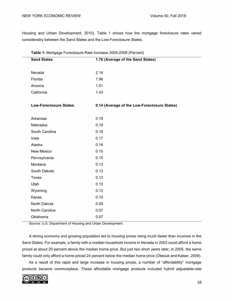
Housing and Urban Development, 2010). Table 1 shows how the mortgage foreclosure rates varied
considerably between the Sand States and the Low-Foreclosure States.
Table 1: Mortgage Foreclosure Rate Increase 2005-2008 (Percent)
Sand States 1.76 (Average of the Sand States)
Nevada 2.14
Florida 1.96
Arizona 1.51
California 1.43
Low-Foreclosure States 0.14 (Average of the Low-Foreclosure States)
Arkansas 0.19
Nebraska 0.19
South Carolina 0.18
Iowa 0.17
Alaska 0.16
New Mexico 0.15
Pennsylvania 0.15
Montana 0.13
South Dakota 0.13
Texas 0.13
Utah 0.13
Wyoming 0.13
Kanas 0.10
North Dakota 0.09
North Carolina 0.07
Oklahoma 0.07 Source: U.S. Department of Housing and Urban Development.
A strong economy and growing population led to housing prices rising much faster than incomes in the
Sand States. For example, a family with a median household income in Nevada in 2003 could afford a home
priced at about 20 percent above the median home price. But just two short years later, in 2005, the same
family could only afford a home priced 24 percent below the median home price (Olesiuk and Kalser, 2009).
As a result of this rapid and large increase in housing prices, a number of “affordability” mortgage
products became commonplace. These affordable mortgage products included hybrid adjustable-rate

NEW YORK ECONOMIC REVIEW Volume 50, Fall 2019
19
mortgages (initially with very low interest rates), interest-only mortgages (initially no mortgage amortization),
negative-amortization mortgages (initial mortgage payments so low that the principle increases), and
balloon-payments mortgages (short-term mortgages that require a large payment at the end). This rapid
increase in housing prices and resulting increase in the use of affordability mortgages was so pronounced
in the Sand States that “by 2006, nearly half of total U.S. originations of privately securitized affordability
mortgages were made in the four Sand States alone” (Olesiuk and Kalser, 2009, p. 31). In addition, subprime
mortgage lending in the Sand States became prevalent by 2006 (U.S. Department of Housing and Urban
Development, 2010).
In sum, during the years leading up to the financial crisis, Sand State housing price increases led to a
higher use of affordability mortgage products as well as increased incentives for investor mortgages. This in
turn led to cycles of even higher housing prices. When the housing bubble burst, high mortgage foreclosure
rates devastated local economies and left negative impacts in the financial services sector, resulting in a
sharp increase in unemployment rates during the 2007-2009 Recession. As a result, unemployment rates
in the Sand States increased from below the national average to among the highest in the nation (U.S.
Department of Housing and Urban Development, 2010).
Credit unions, as well as banks and other financial institutions, needed to concentrate on maintaining
capital adequacy during the 2008-2009 Financial Crisis. This paper examines how the effect of the
explanatory variables associated with maintaining credit union capital adequacy may have differed between
the Sand Sates and Low-Foreclosure States.
The structure this of paper is as follows. The Background section examines the two studies we found in
the literature on credit union capital adequacy determinants, and explains how this paper adds to the
literature. The Model section presents the explanatory variables used to examine determinants of credit
union capital, as well as a test of how these explanatory variables interacted with the Sand States versus
the Low-Foreclosure State groups. The statistical methodology to test for these explanatory variable
interactions is presented in the Statistical Methods section, which is followed by the Sample section. Lastly,
the Results section presents the regression results of the ten explanatory variables, and how five of these
variable coefficients differed when interacted with the Sand States versus the Low-Foreclosure States
groups.
BACKGROUND According to Ahmad et al. (2009), relatively little has been written on the determinants of bank capital
ratios. They noted that although their “study focuses only on one developing country, these findings may
help to identify the correlates of bank capital ratios in both developed and developing economies since this
topic received scant attention of researchers” (page 255). See Tokle and Peterson (2017) for a brief review
of five studies found on bank capital determinants.

NEW YORK ECONOMIC REVIEW Volume 50, Fall 2019
20
Even less has been written on credit union capital ratio determinants. We found just two articles in the
literature that examined the determinants of credit union capital ratios. In the first, Frame et al. (2002)
explored how credit union risk differs by type of credit union membership. In one section of their paper, the
capital ratio was a dependent variable, used as a proxy measure of credit union risk. Their results found
federal chartered credit unions (subject to more regulatory scrutiny), along with real estate and unsecured
lending, to be positively related to capital ratios while credit union size, auto lending, and both associational
and residential credit union field-of-membership were negatively related to capital ratios.
In the second article, Tokle and Peterson (2017) examined explanatory variables associated with credit
union net-worth/asset change nationwide during the depth of the 2008-2009 Financial Crisis for all U.S.
credit unions. The credit union industry measures capital adequacy by net-worth ratios, which are essentially
the same, and used interchangeably with capital-to-asset ratios. The National Credit Union Administration
(NCUA) classified a credit union as “well capitalized” in 2009 if its net-worth ratio was 7 percent or greater
(Tokle and Tokle, 2012). During the financial crisis, many credit unions struggled to maintain this 7 percent
net-worth ratio and remain solvent. For these credit unions, rather than focusing on strategic items such as
offering new products or building new branches, they instead focused on trying to maintain, or even prevent
significant decreases in their net-worth ratios. Tokle and Peterson chose to examine net-worth ratio change
as the dependent variable since “trying to maintain net-worth ratios and prevent their falling became
increasingly an important focus in the credit union industry as many credit unions worried about survival
(Tokle and Peterson, 2017, page 41).”
For an example of a credit union during the financial crisis strategizing to remain “well-capitalized,” see
“ISU Credit Union Faces the Great Contraction of 2008-09” (Tokle and Tokle, 2012). This case study
examines how ISU Credit Union tried to increase its net-worth ratio after it fell just below 7 percent in
February 2009. Their main strategies were to reduce various costs, restrict asset growth (which increases a
capital/asset ratio), and make more loans, since available investments fell to near zero returns.
All nine continuous independent variables in Tokle and Peterson (2017) were significant with their
expected signs at the one percent level, while three indicator variables were nonsignificant. On one hand,
net-worth change was positively related to the percentage of assets in loans, loan yield, fees-to-assets and
credit union size. On the other hand, net-worth change was negatively related to cost-of-funds, operating
expenses-to-assets, change in credit union size, loan charge-offs and the percentage of loans in real estate.
This paper adds to the literature by examining how the effect of the explanatory variables associated
with credit union net-worth change may have differed between the Sand Sates and Low-Foreclosure States.
In our model, we included a categorical variable indicating group membership (Sand State or Low-
Foreclosure State) as well as the interaction of this group variable with the other explanatory variables. This
enabled us to assess differences in slope coefficients between states that were most affected by the financial
crisis (Sand States) compared to the states that had the lowest rates of mortgage foreclosures (Low-
Foreclosure States).

NEW YORK ECONOMIC REVIEW Volume 50, Fall 2019
21
MODEL
The model used in the analysis is similar to the model used in the Tokle and Peterson (2017), which
examined which explanatory variables had an impact on credit union net-worth ratio change in the aftermath
of the 2008-2009 Financial Crisis. This paper removes the three nominal level variables found to be
nonsignificant: dummy variables = 1 if a credit union had risk-based lending, indirect lending, or had a federal
charter, and 0 otherwise.
In comparison to the model used in Tokle and Peterson (2017), this model adds the percentage of loans
in credit card loans, and adds an indicator variable defining the Sand States (states with increases in
foreclosure rates greater than 1.42 percent) and the Low-Foreclosure States (states with increases in
foreclosure rates of less than 0.2 percent). In addition, to test if the credit unions’ net-worth ratios responded
differently to the ten continuous variables, the group variable was interacted with each of the continuous
variables. Model selection was based on minimum AICc (Akaike’s Information Criterion corrected), an
information theoretic approach (Burnham and Anderson, 1998). The choice of an information theoretic
approach, and specifically the AICc approach, over traditional p-value variable selection was due to recent
literature enumerating issues with the null hypothesis testing approach (Wasserstein and Lazar, 2016) and
the goal of complex model selection versus a goal of confirmation/falsification for which the BIC and related
tools would have been more appropriate (Aho, Derryberry, & Peterson, 2014).
DEPENDENT VARIABLE
Net-worth ratio change (Net-Worth Change) during 2009 was calculated as net-worth ratio year-end
2009 minus net-worth ratio year-end 2008, measured in percent. Hence, a net-worth ratio higher in 2009
than in 2008 indicates a positive net-worth ratio change while a falling net-worth ratio indicates a negative
net-worth ratio change. Maintaining and/or preventing declines in net-worth ratios became an important issue
for many credit unions as they worked to remain financially stable during the depth of the 2008-2009
Financial Crisis.
INDEPENDENT VARIABLES Note that the explanatory variables 1-9 are based on the model used in Tokle and Peterson (2017).
1. Total Loans/Assets (Loans/Assets), measured in percent. Keeley (1990) found the loan-to-assets
coefficient to be positive, but insignificant when regressed on large bank-holding company capital
ratios. Also, during 2009, returns available to credit unions in investments, such as U.S.
Treasuries, fell to near zero levels. While credit union loan interest rates also fell, the decrease
was not as large, leaving credit unions with higher loans-to-assets, ceteris paribus, earning
relatively higher asset yields. We expect that credit unions with a higher Loans/Assets ratio will
have a higher net income, and consequently a positive effect on net-worth ratio change.

NEW YORK ECONOMIC REVIEW Volume 50, Fall 2019
22
2. Yield on Average Loans (Loan Yield), measured in percent. Loan interest rates can vary among
credit unions within a local market as well as between markets due to factors such as variation in
depository institution competition. We expect that credit unions with higher loan yields will have
higher net income and hence a positive effect on net-worth ratio change.
3. Cost-of-Funds/Average Assets (Cost-of-Funds), measured in percent. Cost-of-Funds can also vary
between credit unions within a local market as well as between local markets. We hypothesize that
credit unions with a higher Cost-of-Funds will have lower net income, resulting in a negative effect
on net-worth ratio change.
4. Operating Expenses/Average Assets (Expenses/Assets), measured in percent. In a similar
reasoning to Cost-of-Funds, credit unions with higher operating expenses should have lower net
income. Hence, we expect Expenses/Assets to have a negative effect on net-worth ratio change.
5. Fee Revenue/Total Assets (Fees/Assets), measured in percent. Fee revenue has become
increasingly an important source of credit union revenue in recent years. For example, for credit
unions as a whole, fee revenue-to-assets increased from 0.42 in 1991 to 0.82 by 2009 (Credit
Union National Association, 2012). We theorize those credit unions with a higher fee revenue to
have higher net incomes, and consequently have a positive effect on net-worth ratio change.
6. Credit Union Size (Size). Depository institution size has been commonly used as a proxy measure
for economies of scale, including Barret and Unger (1991), Hannan and Liang (1995), and
Wheellock and Wilson (2011). Hence, larger credit union size, indicating probable economies-of-
scale, could lead to higher net income and hence a positive effect on net-worth ratio change. Due
to skewness, Size is measured as the logarithm of a credit union’s total assets.
7. Credit Union Size Change (Size Change), measured in percent. One strategy for depository
institutions to strengthen their capital ratios during a financial crisis is to reduce asset size or at
least slow asset growth (Mishkin, 2013, p. 228). Some credit unions may have used this strategy
to shore up their net worth (Tokle and Tokle, 2012). We expect that Size Change will have a
negative effect on net-worth ratio change.
8. Net Loan Charge-Offs/Average Loans (Charge-Offs), measured in percent. Higher loan charge-
offs would increase “provision for loan loss,” decreasing net income. We theorize that higher
Charge-Offs would lead to a fall in net-worth ratio change.
9. Real Estate Loans/Total Loans (Real Estate/Loans), measured in percent. Due to higher than
typical default rates experienced during the 2008-2009 Financial Crisis, real estate assets
weakened the balance sheets of many financial institutions. We would expect that credit unions
with a larger percent of loans in mortgages may have experienced a larger “provision for loan
loss,” resulting in, ceteris paribus, a decrease in net income. Hence, we expect that Real
Estate/Loans to have a negative effect on net-worth ratio change during 2009.
10. Credit Card Loans/Total Loans (Credit Card/Loans), measured in percent. Credit card loans
represent another loan type offered by many credit unions. Although small as a portion for a

NEW YORK ECONOMIC REVIEW Volume 50, Fall 2019
23
typical credit union’s loan portfolio, credit cards typically carry relatively high interest rates, which
should help to increase a credit union’s net income. But credit cards also have a high default rate,
which would increase a credit union’s “provision for loan loss.” Hence, we hypothesize that the
portion of loans in credit card loans to be a 2-tailed test for net-worth ratio change. 11. State Group is a nominal level variable with a value of 1 if the credit union was located in one of
the Sand States and a value of 0 if the credit union was located in one of the Low-Foreclosure
State during 2005-2008. State Group was also used to examine the interaction of the explanatory
variables with the Sand States versus the Low-Foreclosure State groups.
STATISTICAL METHODS In order to assess the differential impact of the explanatory variables between the Sand States and the
Low-Foreclosure States, the State Group variable was interacted with all of the continuous variables.
According to Ramsey and Schafer (2002) “Two explanatory variables are said to interact if the effect that
one of them has on the mean response depends on the value of the other” (p. 247).
Interaction terms are included when there is reason to suspect the two nominal groups responded
differently with respect to the continuous variables. Thus, by including these interactions it allows for different
coefficients for Sand States versus the Low-Foreclosure States. To further improve the model, a model
selection process was employed, specifically, backwards selection using minimum AICc. Although the
sample size is not small enough to warrant the corrected version of AIC, this is what is available in the
software (JMP, v. 12.2). The correction will not substantively change the value of AIC when the sample size
is as large as in this data set. Further, the resulting model will be discussed using the Log Worth ordering as
a measure of relative importance. Variance Inflation Factors (VIF) were generated on the main effects model
to assess multicollinearity. All VIFs were less than 5.
SAMPLE
The individual credit union data came from the National Credit Union Administration (NCUA). The
sample consisted of all credit unions in the Sand States and the Low-Foreclosure States at the beginning of
2009, less two exclusions. First, all credit unions that either failed or were involved in a merger during 2009
were excluded since they either ceased to exist or their financial statistics changed due to a merger. Second,
all small credit unions were excluded since they typically offer fewer products and services and hence their
reaction to the 2008-2009 Financial Crisis could be different. A small credit union was defined by the NCUA
in 2009 to be less than $10 million in assets (Chilingerian, 2015).
Using information from the Report to Congress on the Root Causes of the Foreclosure Crisis (U.S.
Department of Housing and Urban Development, 2010), two subsets were drawn from this population: The
Sand States and the Low-Foreclosure states. These two extremes were chosen specifically to test the
NEW YORK ECONOMIC REVIEW Volume 50, Fall 2019
24
hypothesis that there would be a different response to the housing bubble and resulting financial crisis in
terms of the size of coefficients for the ten continuous variables in these two types of states.
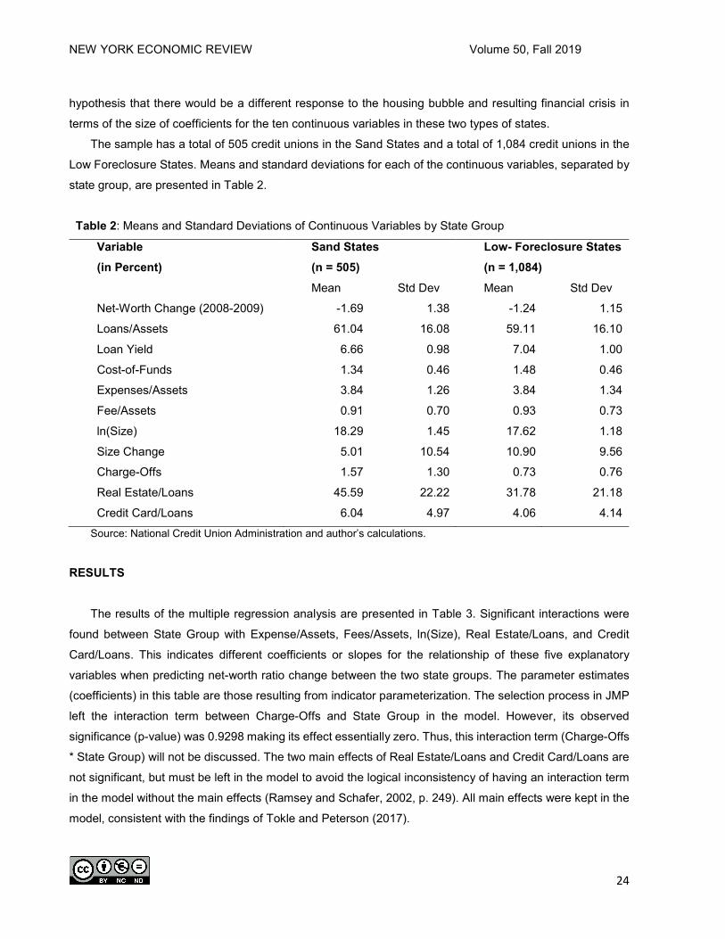
The sample has a total of 505 credit unions in the Sand States and a total of 1,084 credit unions in the
Low Foreclosure States. Means and standard deviations for each of the continuous variables, separated by
state group, are presented in Table 2.
Table 2: Means and Standard Deviations of Continuous Variables by State Group
Variable (in Percent)
Sand States (n = 505)
Low- Foreclosure States (n = 1,084)
Mean Std Dev Mean Std Dev
Net-Worth Change (2008-2009) -1.69 1.38 -1.24 1.15
Loans/Assets 61.04 16.08 59.11 16.10
Loan Yield 6.66 0.98 7.04 1.00
Cost-of-Funds 1.34 0.46 1.48 0.46
Expenses/Assets 3.84 1.26 3.84 1.34
Fee/Assets 0.91 0.70 0.93 0.73
ln(Size) 18.29 1.45 17.62 1.18
Size Change 5.01 10.54 10.90 9.56
Charge-Offs 1.57 1.30 0.73 0.76
Real Estate/Loans 45.59 22.22 31.78 21.18
Credit Card/Loans 6.04 4.97 4.06 4.14 Source: National Credit Union Administration and author’s calculations.
RESULTS
The results of the multiple regression analysis are presented in Table 3. Significant interactions were
found between State Group with Expense/Assets, Fees/Assets, ln(Size), Real Estate/Loans, and Credit
Card/Loans. This indicates different coefficients or slopes for the relationship of these five explanatory
variables when predicting net-worth ratio change between the two state groups. The parameter estimates
(coefficients) in this table are those resulting from indicator parameterization. The selection process in JMP
left the interaction term between Charge-Offs and State Group in the model. However, its observed
significance (p-value) was 0.9298 making its effect essentially zero. Thus, this interaction term (Charge-Offs
* State Group) will not be discussed. The two main effects of Real Estate/Loans and Credit Card/Loans are
not significant, but must be left in the model to avoid the logical inconsistency of having an interaction term
in the model without the main effects (Ramsey and Schafer, 2002, p. 249). All main effects were kept in the
model, consistent with the findings of Tokle and Peterson (2017).

NEW YORK ECONOMIC REVIEW Volume 50, Fall 2019
25
Table 3: Regression Results
Variable Coefficient t Ratio Prob>|t| Intercept -4.886 -9.28 <.0001
Loans/Assets 0.019 10.83 <.0001
Loan Yield 0.352 12.02 <.0001
Cost-Of-Funds -0.251 -4.22 <.0001
Expenses/Assets -0.396 -10.69 <.0001
Fee/Assets 0.340 5.81 <.0001
ln(Size) 0.174 6.48 <.0001
Size Change -0.082 -34.87 <.0001
Charge-Offs -0.729 -19.33 <.0001
Real Estate/Loans 0.000 0.01 0.9910
Credit Card/Loans -0.004 -0.66 0.5082
State Group -0.312 -5.72 <.0001
Expenses/Assets*State Group -0.232 -4.04 <.0001
Fee/Assets*State Group 0.394 3.92 <.0001
ln(Size)*State Group -0.156 -3.69 0.0002
Real Estate/Loans*State Group -0.006 -2.42 0.0154
Credit Card/Loans*State Group 0.037 3.63 0.0003
R2 = 0.55
For the 10 explanatory continuous variables, the parameter estimated coefficients had their
hypothesized signs and were significant at the 1 percent level, except as indicated above, for Real
Estate/Loans and Credit Card/Loans. As expected, Loans/Assets was positively related to net-worth ratio
change. Since monetary policy had driven short-term interest rates to near zero in 2009, the difference in
rates on credit union investments and credit union loans increased. Credit unions with a larger percent of
assets in loans on their balance sheets were able to earn, other factors constant, a higher net income and
hence achieve an increase in net-worth ratios. This coefficient, at just 0.019, meant that for every 1 percent
increase in Loans/Assets, the net-worth change is predicted to increase by 0.019 percent.
Loan Yield, as expected, was also positively associated with net-worth ratio change. For credit unions
that were able to charge higher loan rates, for a 1 percent increase in loan yield, the net-worth change is
predicted to increase by 0.352 percent. As expected, both Cost-Of-Funds and Expenses/Assets reduced
net income and are negatively associated with a change in net-worth ratios. Increasingly during recent years,
fee income has become an important component of credit union net income. As expected, the positive and
significant coefficient of Fees/Assets suggests that credit unions with higher a fee income ratio experienced
an increase in their net-worth ratios.

NEW YORK ECONOMIC REVIEW Volume 50, Fall 2019
26
Also as expected, Size was positively related to net-worth ratio change while Size Change was
negatively related to net-worth ratio change. It appears that credit union size, a proxy measure for
economies-of-scale had a positive effect on net worth ratios, while some credit unions did shore up their net
worth by restricting asset growth. Lastly, Charge-Offs had a coefficient of -0.729, the largest coefficient in
absolute terms. This meant that for every 1 percent increase in loan charge-offs, the net-worth ratio change
is predicted to decrease by 0.729 percent. Higher loan charge-offs decreased net income by increasing
“provision for loan loss” and reducing net income.
Interpreting the interactions with State Group is best explained by combining the coefficients to create
the coefficient (slope) for the Sand States and Low Foreclosure States separately. This is shown in Table 4.
The relationship between the Expense/Assets and the net-worth ratio change was negative as expected. By
comparing the coefficients for Sand States and Low-Foreclosure States it was shown that the negative
impact of Expense/Assets was greater for the Sand States than it was for the Low Foreclosure States. This
more pronounced negative effect of Expense/Assets on the net-worth change in Sand States could possibly
stem from some credit unions expanding branches and services in the Sand States during the previous
years in response to their booming local economies, aided by the run-up in real estate prices. A resulting
higher operating expense ratio would result, leading to a larger negative impact of expense on the net-worth
ratio change.
Fees/Assets was positively related to the net-worth ratio change for both Sand Sates and Low-
Foreclosure States. However, the coefficient is more than twice as large for the Sand States. Thus, every 1
percent increase in Fees/Assets, the net-worth ratio change was predicted to increase by 0.735 percent for
credit unions in the Sand States, but only 0.340 percent in the Low-Foreclosure Sates. Some credit unions
in the Sand States may have been trying to maintain net worth by increasing fee income, resulting in a larger
effect of Fees/Assets on net-worth ratio change. The logarithm of size had the expected positive association
for both Sand States and Low-Foreclosure States. However, the Size coefficient was much smaller for the
Sand States. Therefore, the buffer provided by larger size was almost negated in the Sand States.
The percentage of loans from real estate had a coefficient not significantly different from zero for the
Low-Foreclosure States, indicating that there was no relationship between the distribution of loans between
real estate loans and the net-worth ratio change for Low-Foreclosure States. However, there was a negative
association between percentage of loans in real estate and net-worth change in the Sand States. This would
be consistent with the knowledge that the Sand States suffered heavily during the financial crisis from large
decreases in real estate prices and foreclosures, while there was relatively little change in real estate
foreclosures in the Low-Foreclosure States. For the Sand States, more real estate foreclosures would lead
to a larger “provision for loan loss,” and hence a lower net-worth ratio.
On the other hand, Credit Card/Loans was negatively associated with net-worth change in the Low-
Foreclosure States, but was positively associated with net-worth change in the Sand States. This suggests
that the higher interest rates on credit card loans, especially in comparison to the near-zero rate of returns
on short-term investments available to credit unions at the time offered somewhat of a buffer in Sand States.

NEW YORK ECONOMIC REVIEW Volume 50, Fall 2019
27
Credit card loans could have helped to shore up to some extent the net worth for credit unions in the Sand
States.
Table 4: Coefficients Including Interaction with State Group
Variable Low-Foreclosure States Sand States Expenses/Assets -0.3970 -0.6290
Fee/Assets 0.3400 0.7350
Ln(size) 0.1740 0.0180
Real Estate/Loans 0.0000 -0.0060
Credit Card/Loans -0.0040 0.0320
CONCLUSION
Although the 2008-2009 Financial Crisis led to the most severe recession since the Great Depression
as well as the first nationwide decrease in housing prices since the 1930’s, the home foreclosure rate and
resulting effect on local economies varied considerably. The four Sand States of Arizona, California, Florida
and Nevada experienced very high real estate foreclose rates while 16 states that we refer to as the Low-
Foreclosure States had relatively very low foreclosure rates. In addition to exploring the explanatory
variables of credit union net-worth change during the recent financial crisis, we also used interaction
variables to assess how these variables differed for the credit unions analyzed in the Sand States versus
the Low-Foreclosure States. As expected, we found significant interactions with the explanatory variables of
operating expenses/assets, fee income/assets, credit union size, and the portion of credit union loans in real
estate and credit cards, accounting for half of the continuous explanatory variables in the model.
ENDNOTE The data and regression results are available from Teri Peterson at [email protected] upon request.
REFERENCES
Ahmad, Rubi, M Ariff and Michael J. Skully. “The Determinants of Bank Capital Ratios in a Developing Economy.”
Asian-Pacific Financial Markets. 2009, Volume 15, pp. 255-272.
Aho, Ken, Derryberry, D. and Peterson, T. “Model selection for ecologists: the worldviews of AIC and BIC.” Ecology.
2014, Volume 95, pp 631-636.
Barret, Richard, and Kay Unger. “Capital Scarcity and Banking Industry Structure in Montana.” Growth and Change.
1991, Volume 22, pp. 48–57.
Blinder, Alan S. After the Music Stopped. 2013, Penguin Books.

NEW YORK ECONOMIC REVIEW Volume 50, Fall 2019
28
Burnham, K. P., & Anderson, D. R. Model Selection and Multimodel Inference: A Practical Information-theoretic
Approach. 2002, Springer.
Chilingerian, Natasha. “NCUA Board Ups Small CU Threshold to $100 Million.” Credit Union Times.
(www.cutimes.com/2015/09/17/ncua-ups-small-cu-threshold)
Credit Union National Association. Credit Union Report, Mid-Year 2012. 2012, Madison, Wisconsin.
Frame, Scott W., Gordon V. Karles and Christine McClatchey. “The Effect of the Common Bond and Membership
Expansion on Credit Union Risk.” The Financial Review. 2002, Volume 37, pp. 613-636.
Hannan, Timothy H., and J. Nellie Liang. “The Influence of Thrift Competition on Bank Business Loan Rates.” Journal
of Financial Services Research. 1995, Volume 9, pp. 107–122.
Keeley, M. “Deposit Insurance, Risk, and Market Power in Banking.” The American Economic Review. 1990, Volume
80, pp. 1183-1200.
Mishkin, Frederick S. Money, Banking and Financial Markets. 2013, Pearson.
Olesiuk, Shayna M. and Kathy R Kalser. “The Sand States: Anatomy of a Perfect Housing Storm.” FDIC Quarterly.
2009, Volume 3, pp. 30-32.
Ramsey, F. L., & Schafer, D. W. The Statistical Sleuth: A course in Methods of Data Analysis. 2002, Duxbury.
Tokle, Robert J. and Joanne G. Tokle. "ISU Credit Union Faces the Great Contraction of 2008-09." Journal of Case
Studies. 2012, Volume 30, Number 1, pp. 20-36.
Tokle, Robert J. and Teri S. Peterson. “Determinants of Credit Union Net Worth Change Following the Financial
Crisis.” The New York Economic Review. 2017, Volume 47, pp. 39-50.
U.S. Department of Housing and Urban Development. “Report to Congress on the Root Causes of the Foreclosure
Crisis.” January, 2010.
Wasserstein, R. L. & Nicole A. Lazar. “The ASA's Statement on p-Values: Context, Process, and Purpose.” The
American Statistician, 2016, Volume 70, pp. 129-133.
Wheelock, D.C., & Wilson, P.W. “Are Credit Unions too Small?” Review of Economics and Statistics. 2011, Volume
93, pp. 1343-1359.
NEW YORK ECONOMIC REVIEW Volume 50, Fall 2019
29
Local Government Credit Ratings: New York vs. the US
Julie Anna Golebiewski*, George Palumbo*, Mark Zaporowski*
*Department of Economics & Finance, Wehle School of Business, Canisius College, 2001 Main Street
Buffalo, NY 14208 ABSTRACT
After substantial criticism from the SEC and members of Congress (among them the senior senator from New York, Charles Schumer) that the Moody’s ratings for municipal bonds undervalued the creditworthiness of local governments in the United States, Moody’s changed its municipal rating system from a relative to a global scale. The resultant credit ratings for municipal governments, released in 2010, showed increases in ratings for most local governments in the United States of between one and three steps. In 2014, Moody’s released a methodological report outlining the quantitative scale employed to generate these new ratings. Using an ordered probit model to analyze publicly available data from the Decennial Census of Population and Housing, the American Community Survey, and the Census of Governments for individual governmental units, as well as BLS and BEA data for overlying counties, we estimate Moody’s quantitative underlying ratings for the general obligations of local governments in the United States. Our analysis reveals that after Moody’s rating recalibration, New York State (NYS) counties have a higher probability of receiving a lower rating than do their counterparts in the rest of the country, even after standardizing for the set of economic, fiscal, financial, governmental, and demographic factors that Moody’s identified as part of their ratings process. Additionally, NYS local governments did not benefit as much from the recalibration as local governments in the rest of the nation.
INTRODUCTION As a dominant force in the municipal credit rating market, Moody’s Investors Service had been criticized
for employing a process that lacked transparency, was not easily understood by professionals or the general
public and, generated lower ratings, and therefore higher borrowing costs1 for instruments with less risk of
default than corporate bond equivalents (Moody’s Special Comment, 2006). In response to these criticisms,
Moody’s recalibrated the ratings of the general obligations of state and local governments, shifting from a
relative to a global scale in 2010 (Moody’s, 2010). This recalibration moved the general obligation ratings
for most issuing governments up, between one and three steps.
After the recalibration, Moody’s published a guide describing a quantitative ratings methodology US
Local Government General Obligation Debt (Moody’s, 2014). This report described a data driven model for
generating a portion, though not all, of the underlying credit ratings of governments issuing general obligation
bonds. While this model is the most detailed description of the ratings process revealed to date, there is still
a place for subjective decisions made by analysts. This paper maps ratings determinants discussed in the
2014 methodology report and then adds variables representing factors that could affect ratings identified in
the existing literature. Specifically, economic concentration/ diversity, previous ratings, the assignment of
expenditure responsibility to local governments by the state government, government type, racial
composition, and other qualitative factors have been added to the ratings determinants presented in Moody’s
NEW YORK ECONOMIC REVIEW Volume 50, Fall 2019
30
quantitative model. The results suggest that Moody’s has treated local governments in New York State
(NYS) differently when assigning credit ratings – with lower ratings for local governments in New York than
in the rest of the nation. It is possible that this apparent differential treatment could be a result of our inability
to account for the subjective elements of the ratings process in our model, the absence of a consistent set
of tax base and pension obligation data for local governments across the country or a bias in the ratings
process.
The importance of a consistent and transparent process to the users of ratings can’t be overstated.
Ratings agencies, bond issuers, bond insurers and portfolio managers all benefit from a ratings process that
does not show differential treatment based on the type of government, political boundaries or the racial
composition of the residential population. While the significance of governmental organization, racial
composition and past credit ratings variables have been discussed in the recent literature, to our knowledge
this is the first time that the local government ratings of an entire state appear to be underrated when
compared to like governments in other states.
GENERAL OBLIGATION RATINGS OF LOCAL GOVERNMENTS
Issuers apply for a rating by sending the rating agency an official statement with financial projections
and audits. After analysts review and analyze the data, a rating committee reviews the tentative rating that
a lead analyst provides. The actual issuance of a rating requires that a contract be signed and that fees be
paid to the agency by the municipality. During the period leading up to the financial markets crisis and the
resultant recession that began in 2008, there was considerable criticism about the validity of a rating process
that was perceived by some to be little more than a fee for service relationship. In addition to initial ratings,
Moody’s reviews any changes in credit risk as they occur. The Moody’s Watchlist indicates those issues
whose underlying governments have experienced fundamental changes and are under review for possible
upgrades or downgrades.
Table 1a shows the underlying general obligation credit ratings issued by Moody’s for general purpose local
governments for the years 2006 and 2014. Since the ratings of general obligation bonds are parity ratings,
all outstanding general obligation bonds issued by a general purpose government will carry the same
underlying rating. These ratings do not reflect enhancements from third parties. The underlying credit ratings
may reveal the ratings at the time of issue, or a rating that reflects some change in the perceived
creditworthiness that occurred after issue and before the date the rating was collected. Indeed, there may
have been several positive or negative rating changes between the date of issue and latest public rating.
Since rating changes can occur after the initial rating, the date of the credit ratings in the paper will be
identified as the date at which the data was collected: 2006 for the earlier sample and 2014 for the later
sample.

NEW YORK ECONOMIC REVIEW Volume 50, Fall 2019
31
Table 1a: U.S. Local Governments Moody’s Underlying Credit Ratings: 2006 & 2014
In 2006, only 31.3% of the Moody’s general obligation ratings were Aa3 or above, but by 2014 that
proportion had increased to 71.0%. The recalibration of underlying ratings that occurred in 2010, along with
the relative increase in creditworthiness of local governments, were in large part responsible for the change
in ratings. Similarly, at the low end of the rating distribution, 13.9% of general purpose governments had GO
ratings below A3 in 2006, by 2014 that number had declined to 2.6%. Thus, over a period that included the
2014
Frequency
2014
Percent
2006
Frequency
2006
Percent
Percent
Change
2006-2014
Rating
Aaa 209 8.44% 100 4.06% 109%
Aa1 254 10.26% 87 3.54% 192%
Aa2 786 31.76% 223 9.06% 252%
Aa3 508 20.53% 361 14.67% 41%
% above A1 70.99% 31.33%
A1 482 19.47% 471 19.14% 2%
A2 134 5.41% 468 19.02% -71%
A3 38 1.54% 409 16.62% -91%
Baa1 30 1.21% 190 7.72% -84%
Baa2 17 0.69% 98 3.98% -83%
Baa3 9 0.36% 46 1.87% -80%
Ba1 3 0.12% 7 0.28% -57%
Ba2 1 0.04% 0 0% n.a.
Ba3 1 0.04% 1 0.04% 0%
B1 3 0.12% 0 0% n.a.
% below A3 2.58% 13.89%
Total
2475
2461
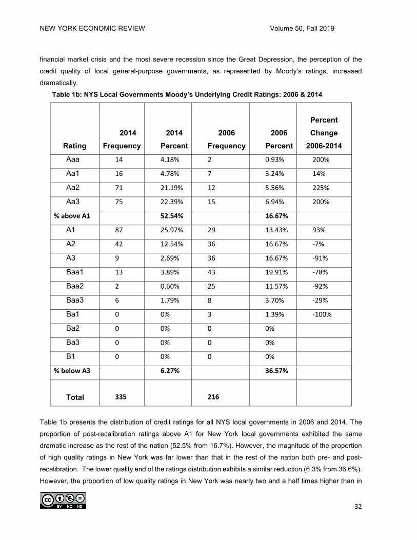
NEW YORK ECONOMIC REVIEW Volume 50, Fall 2019
32
financial market crisis and the most severe recession since the Great Depression, the perception of the
credit quality of local general-purpose governments, as represented by Moody’s ratings, increased
dramatically. Table 1b: NYS Local Governments Moody’s Underlying Credit Ratings: 2006 & 2014
Rating
2014 Frequency
2014 Percent
2006 Frequency
2006 Percent
Percent Change
2006-2014 Aaa 14 4.18% 2 0.93% 200%
Aa1 16 4.78% 7 3.24% 14%
Aa2 71 21.19% 12 5.56% 225%
Aa3 75 22.39% 15 6.94% 200%
% above A1 52.54% 16.67%
A1 87 25.97% 29 13.43% 93%
A2 42 12.54% 36 16.67% -7%
A3 9 2.69% 36 16.67% -91%
Baa1 13 3.89% 43 19.91% -78%
Baa2 2 0.60% 25 11.57% -92%
Baa3 6 1.79% 8 3.70% -29%
Ba1 0 0% 3 1.39% -100%
Ba2 0 0% 0 0%
Ba3 0 0% 0 0%
B1 0 0% 0 0%
% below A3 6.27% 36.57%
Total 335 216
Table 1b presents the distribution of credit ratings for all NYS local governments in 2006 and 2014. The
proportion of post-recalibration ratings above A1 for New York local governments exhibited the same
dramatic increase as the rest of the nation (52.5% from 16.7%). However, the magnitude of the proportion
of high quality ratings in New York was far lower than that in the rest of the nation both pre- and post-
recalibration. The lower quality end of the ratings distribution exhibits a similar reduction (6.3% from 36.6%).
However, the proportion of low quality ratings in New York was nearly two and a half times higher than in

NEW YORK ECONOMIC REVIEW Volume 50, Fall 2019
33
the rest of the nation in 2014. The fact that New York local governments have a higher proportion of low
quality ratings and a smaller proportion of high quality ratings leads one to ask what the cause of such a
dramatic difference could be.
Table 2a: U.S. Local Governments 2006 Moody’s Ratings 2014 Scale2
2006 Moody’s Ratings 2014 Scale
2014 Moody’s Ratings 2014 Scale
Rating Counties Municipalities Towns Counties Municipalities Towns
Aaa 38 55 7 60 109 40
Aa1 25 56 6 65 137 52
Aa2 76 124 23 193 393 200
Aa3 100 218 43 113 264 131
A1 134 275 62 111 301 70
A2 125 297 46 23 86 25
A3 121 248 40 2 29 7
Baa1 35 143 12 3 24 3
Baa2 24 66 8 2 13 2
Baa3 6 39 1 1 7 1
Ba1 0 7 0 1 2 0
Ba2 1 0 0 0 1 0
Ba3 0 0 0 0 1 0
B1 0 0 0 0 3 0
Total 685 1528 248 574 1370 531
Tables 2a and 2b below present GO ratings by type of government. While they reveal similar pre- and
post-recalibration increases in overall ratings, there is not a clear pattern of difference between NYS local
governments and the rest of the nation when viewed by type of government2. If there is an explanation for
the overall disparity between the ratings of local governments in NYS and those in the rest of the nation, it
might be identified by an analysis of the Moody’s rating model.

NEW YORK ECONOMIC REVIEW Volume 50, Fall 2019
34
Table 2b: NYS Local Governments4 2006 Moody’s Ratings 2014 Scale
2006 Moody’s Ratings 2014 Scale
2014 Moody’s Ratings 2014 Scale
Rating Counties Municipalities Towns Counties Municipalities Towns Aaa 1 1 0 0 8 6
Aa1 1 5 1 4 3 9
Aa2 7 1 4 8 28 35
Aa3 0 5 10 13 26 36
A1 7 10 12 11 51 25
A2 11 17 8 5 23 14
A3 11 15 10 0 9 0
Baa1 7 27 9 1 11 1
Baa2 2 18 5 0 2 0
Baa3 1 7 0 1 4 1
Ba1 0 3 0 0 0 0
Ba2 0 0 0 0 0 0
Ba3 0 0 0 0 0 0
B1 0 0 0 0 0 0
Total 48 109 59 43 165 127
The following section reviews the literature related to estimating municipal credit ratings, focusing on
Moody’s ratings. This focus on Moody’s is due to the dominant position Moody’s has in the municipal ratings
market, as well as Moody’s recent recalibration.
LITERATURE REVIEW
Since Roy Bahl employed multiple regression analysis to identify a set of economic, fiscal and financial
variables that influenced the credit ratings of government issues, there have been an evolving set of targeted
factors and econometric techniques employed to estimate the credit ratings of the general obligations of

NEW YORK ECONOMIC REVIEW Volume 50, Fall 2019
35
state and local governments. The process for evaluating the creditworthiness has significantly changed since
1971.
Cluff and Farnham (1985) identified a set of socioeconomic determinants of the Moody’s credit rating
for general obligation municipal bonds. The data for their national sample of 976 cities was extracted from
International City Management Association sources, as well as housing characteristics from the 1970
Census of Population and Housing. They suggested that probit was the appropriate estimation technique
given the discrete ordered nature of credit ratings.
Loviscek and Crowley (1990) examined general obligation issues of county governments in a sample of
60 metropolitan areas, concluding that income and economic base diversity measures dominate a
government’s set of financial and fiscal factors in attaining Aaa credit ratings. Capeci (1991) identified the
link between a set of economic, demographic, fiscal, governmental and financial factors that affect credit
ratings and the cost of borrowing for 136 municipalities. More recently, Hildreth and Miller (2002) reiterated
the importance of economic base diversity, suggesting that revenue variables are a reflection of the
economic factors that influence them.
Poterba and Rueben (2001) concluded that tax limits for state governments increase the perception of
risk and thus increase borrowing costs, while expenditure limits have the opposite effect. However, in an
analysis of 521 newly issued state government general obligation bonds, Johnson and Kriz (2005) found no
relationship between revenue limits and credit ratings, though they did conclude that revenue limits increase
borrowing costs. They also found that expenditure limits and associated fiscal constraints lead to higher
credit ratings and thus to lower borrowing costs. Mullins (2004) demonstrated that the impact of tax and
expenditure limitations on credit ratings may be obscured by the asymmetric affect that these limitations
have on high and low income areas.
Palumbo and Zaporowski (2012) translated ordered probit coefficients into marginal probabilities
substantiating the primacy of economic and demographic characteristics, such as diversity of the economic
base and the growth rates of earnings and population in the credit rating process employed by Moody’s.
They found that debt as a percent of the market value of residential property plays a significant role in the
perception of credit quality, while other fiscal and financial measures such as per capita revenues and
interest payments had no apparent impact on ratings. State aid, unemployment rates and per capita income
had predictable, though modest effects. Additionally, their findings support the proposition that the existence
of tax limits reduce the perception of credit quality, while expenditure limits raise credit ratings.
More recently, Kriz and Xiao (2017) examined the effects of the global rating recalibration conducted by
Moody’s in 2010. Following the hypothesis forwarded by the rating agencies that the recalibration was yield
neutral, they find that the rating recalibration brought a structural change to the municipal bond market and
increased the yield spread of municipal bonds in the Aaa, Aa, and A rating categories over their risk-free
comparison group by approximately 15 basis points. They also found no statistically significant impact of the
rating recalibration on the spread for Baa-rated bonds.

NEW YORK ECONOMIC REVIEW Volume 50, Fall 2019
36
In a review of the relationship between race and municipal bond ratings, Yinger (2010) reported that
higher proportions of Black and Hispanic populations led to lower credit ratings, while high proportions of
Asians led to higher credit quality. While this supports the previous findings of Cluff and Farnham (1984)
and Moon and Stotsky (1993), his analysis is limited to the impact of demographics on GO bond ratings.
Maher, Deller, Stallmann, and Park (2016), however, found that higher concentrations of white population
are associated with higher credit ratings while accounting for economic, demographic, fiscal and financial
characteristic. Johnson, Abbas and LaFontant (2018) reported that following recalibration, Moody’s ratings
for state governments reflected an increased importance of general revenue and a lessened impact of tax
burden. They concluded that Moody’s seems to have an increased appreciation for revenues that are
sufficiently high to meet debt burdens, accompanied by a lower concern for the impact of debt on tax payers.
Following the development of the literature from Bahl to Johnson et al., we implement a model to identify
the changes in the determinants of Moody’s credit ratings for local government GO debt following
recalibration and the financial markets crisis. The factors employed in this ratings model either appear as
significant variables in the previous literature, or are specifically identified in the Moody’s ratings
methodology report released in 2014. The model is used to identify the treatment of local governments in
NYS compared to local governments in the rest of the nation.
FACTORS AFFECTING RATINGS
The major factors that determine the underlying creditworthiness of a local government’s general
obligations are economic/demographic, fiscal/financial, governmental, and debt/pension (Moody’s, 2014).
While there are a wide variety of sub-categories that can be used to adjust the ratings generated by these
factors, the broad categories provide some communality and transparency to the process. The fiscal health of a municipality is related directly to the revenue it receives and the dollars it spends
to provide services. The fiscal capacity of a community is typically determined by the size of the bases that
can be taxed, generally, property, sales, income or wages. Local governments in the U.S. rely most heavily
on the ad valorem property tax, followed by excise-sales, and then wage or income taxes. Either directly or
indirectly, the level of income in a community affects the size of these bases and the tax revenues they can
generate. Fees and user charges are generally collected, but that revenue is often linked to the debt service
on non-guaranteed debt, rather than the general obligations of a local government. While some of these
revenue sources can be exported to consumers outside of the jurisdiction collecting the revenue, local
employment, earnings and total income are the drivers for most of the local government tax bases.
Another element of a community’s fiscal capacity is the aid it receives in the form of intergovernmental
transfers. These transfers can be categorical or general, formula driven or project specific, matching or lump
sum. Their purpose can be to share revenue or to stimulate governmental activity. Whatever the reason for
the grants, the recipient government’s ability to provide public services is affected and may result in
diminished local contributions to pay for those services. State governments that mandate expenditure

NEW YORK ECONOMIC REVIEW Volume 50, Fall 2019
37
programs that local governments must support often use intergovernmental transfers to share part of the
financing responsibility for these services. When recipient governments become overly dependent on
intergovernmental revenue, they can have their creditworthiness compromised in two ways. The first is
through the downgrading of the credit rating of the transferring government. It is difficult for a recipient
government to be perceived as sounder than the government that provides a substantial portion of the
recipient government’s revenues. Secondly, if the aid flows are ad hoc in nature or are appropriated on an
emergency basis, they might be perceived as more easily interrupted than aid that is built into a formula and
is viewed as ongoing. In addition, states can affect a local government’s revenue raising capacity through
tax and/or debt limits.
The credit rating process attempts to determine whether the revenue generating capacity of a local
government is adequate to meet its debt service requirements. The absence of full market, taxable and
assessed value from the Census of Governments since 1987 makes a standardized measure of revenue
capacity across jurisdictions within a state difficult and across states virtually impossible5.
A few of the important debt variables for consideration in creditworthiness include total direct debt, net
direct debt and debt per capita. Total direct debt is defined as the sum of any short-term notes and any
general obligation debt outstanding. Net direct debt is calculated by subtracting sinking funds, reserve funds
and all debt that the municipality isn’t actually responsible to pay from total direct debt. The debt data in this
analysis was obtained from the U.S. Bureau of the Census in 2012 Census of Governments.
In addition to the debt factors are the pension and health insurance liabilities that have accrued for past
and current employees, as well as those that will accrue for future employees over the life of the obligation.
There are significant variations among the states concerning the extent to which local governments are
responsible for the funding of future pension and health insurance liabilities. Additionally, state governments
can and have returned the revenue raising responsibility for pensions to local governments in periods when
state pension systems have failed to provide adequate revenues to meet responsibilities6.
The ratings assigned to bond issues by Moody’s in this analysis range from highest quality (Aaa) with
the lowest probability of default to junk bond status (Ba) with the highest probability of default. The ratings
that qualify a bond as investment grade are: Aaa, Aa, A, Baa, with gradations within each class of 1, 2 or 3.
This rating scheme yields a total of fourteen rating categories. Smaller values of the dependent variable
imply higher creditworthiness and a lower probability of default.
The economic, demographic, fiscal and financial data for 2006 is drawn from Bureau of Economic
Analysis (BEA), Bureau of Labor Statistics and Census of Governments (COG) data for 2002, and decennial
Census of Population and Housing (COP) data for 2000. These reflect the most recent information that was
available to Moody’s analysts in 2006. The data sources available to analysts in 2014 were BEA, BLS and
the COG for 2012. The economic and demographic information was changed somewhat from the previous
decade with the 2010 COP as the source of most demographic information and the American Community
Survey (ACS) providing socio-economic data.

NEW YORK ECONOMIC REVIEW Volume 50, Fall 2019
38
MODELING THE RATINGS PROCESS
Between 2002 and 2016, a series of methodological papers outlining the bond rating process were made
publicly available by Moody’s Investor Services (see references). These sources identify the factors that
guide the credit rating process at Moody’s for governments that issue long-term debt. To model this process
we assume there exists a latent index for each issuing government, 𝑅𝑅𝑖𝑖∗, that determines the probability of
default and consequently, the bond rating for government i’s general obligation debt. 𝑅𝑅𝑖𝑖∗ is linearly related to
a vector of economic, demographic, fiscal, intergovernmental and financial explanatory variables (X) via the
following:
(0) 𝑅𝑅𝑖𝑖∗ = 𝛽𝛽′𝑋𝑋 + 𝜀𝜀𝑖𝑖
where ε is assumed to be an independently and identically distributed normal random variable. Although 𝑅𝑅𝑖𝑖∗
is unobservable, we observe the underlying rating (𝑅𝑅𝑖𝑖) assigned to government i’s general obligation bonds.
The observed credit rating on issue i, 𝑅𝑅𝑖𝑖, is determined from 𝑅𝑅𝑖𝑖∗ as follows:
(2) 𝑅𝑅𝑖𝑖 =
⎩⎪⎪⎨
⎪⎪⎧
1if 𝑅𝑅𝑖𝑖∗ ≤ 𝜇𝜇1 2 if 𝜇𝜇1 < 𝑅𝑅𝑖𝑖∗ ≤ 𝜇𝜇2
3 if 𝜇𝜇2 < 𝑅𝑅𝑖𝑖∗ ≤ 𝜇𝜇3 ...
14 if 𝑅𝑅𝑖𝑖∗ > 𝜇𝜇13
The cutoff points for each rating are represented by the µ parameters. As µi increases, the
creditworthiness of the issuer decreases, the risk of default increases, and the credit rating agency assigns
a lower rating to the government. The conditional probability of observing each value of R is given by:
P(Ri = 1 | X, β, µ) = Φ(µ1-β′X)
P(Ri = 2 | X, β, µ) = Φ(µ2- β′X) – Φ(µ1- β′X)
(3) .
.
.
P(Ri = 14 | X, β, µ) = 1 – Φ(µ13- β′X),
where Φ is the cumulative normal distribution function. The β and µ parameters are estimated by maximizing
the following log likelihood function (Kaplan and Urwitz, 1979),
(4) L(β, µ) = ∑ ∑ log (P(Ri = j | X,14j=1
ni=1 β, µ)) λ(Ri = j),
where λ(Ri = j) is a logical function that takes on the value 1 if Ri = j and the value 0 if Ri ≠j.

NEW YORK ECONOMIC REVIEW Volume 50, Fall 2019
39
Table 3: Variable Definitions and Mean Values Variables Means
RECAL = 1 if all change in ratings occurred at the time of or before recalibration; 0 otherwise
0.89
BLACK = the ratio of black residents to the total population 0.09
COUNTY = 1 if government is county; 0 otherwise 0.24
AIDEXP = intergovernmental revenue as % of total expenditures (2012) 0.21
POPCHANGE = ratio of 2010 population to 2000 Census population 0.14
ST13 = Moody’s credit rating for state government in 2013 1.71
POP = 2010 Census population in thousands 110.24
RAT06 = quantitative Moody’s 2006 credit rating 2.73
GFBAL = general fund balance in thousands (2010) 19.23
INTTHS = interest payments in thousands $ (2012) 11.92
NONREVDEBT = Total long term debt minus public debt for private purposes thousands
$ (2012)
232.88
MEDHVAL = ACS median housing value thousands $ (2010) 227.38
MEDFI = ACS median family income thousands $ (2010) 71.59
DIREXP = direct expenditures thousands $ (2012) 277.81
TLIM = 1 if state tax limits exist for local governments; 0 otherwise 0.26
ELIM = 1 if state expenditures exist local governments; 0 otherwise 0.50
CDIV = industry employment concentration/ diversity ratio where higher values indicate more
concentration
0.11
UR13 = BLS unemployment rate for overlying county (2013) 7.00
PER250 = ratio of households with personal income > $250,000 (2010) 0.35
NYS = 1 if government located in New York State; 0 otherwise 0.12
While Aaa rated issues can be perceived to have lower levels of default risk than Aa1, and Baa3 issues
have lower risk than those rated Ba1, the rating categories should not be treated as equally spaced discrete
intervals, since credit ratings are measured on an ordinal rather than an interval scale. Unlike OLS, probit
analysis allows for the estimation of cutoff points associated with various levels of credit quality. The
explanatory variables included in the model appear in Table 3 and are similar to those employed in the
existing literature. The ability of debt issuing governments to meet their future obligations is directly related
to their expenditure commitments and their fiscal capacity. Own source revenues are predominantly
comprised of taxes, fees and charges. At the local level, the principal tax bases are consumption and
property values.

NEW YORK ECONOMIC REVIEW Volume 50, Fall 2019
40
Table 4: Ordered Probit Estimates
Limit Points: µ1=2.16; µ2=3.69; µ3=5.95; µ4=7.32; µ5=9.13; µ6=10.01; µ7=10.29;
µ8=10.67; µ9=10.82; µ10=11.05; µ11=11.22; µ12=11.31; µ13=11.44
The estimated coefficients of the model appear in Table 4. The limit points represent the estimates of
the ordered probit model used to classify each local government into rating categories. For example, forecast
values of the dependent variable up to 2.16 represent a Aaa rating. A positive estimated coefficient on an
explanatory variable indicates a reduction in the probability of falling into the highest ratings category (Aaa)
and an increase in the probability of falling into the lowest ratings category (Ba3). A negative estimated
coefficient on an explanatory variable indicates an increase in the probability of falling into the highest ratings
category (Aaa) and a decrease in the probability of falling into the lowest ratings category (Ba3). However,
the effect of a one unit change in an explanatory variable on the ratings categories is not readily apparent
without additional calculations estimating marginal impacts of each explanatory variable on inclusion in each
rating category. For a detailed discussion of these marginal estimates, see Palumbo and Zaporowski (2012).
VARIABLE COEFFICIENT Z-STATISTIC P-Value
RECAL -1.4181 -15.22 0.000
BLACK 0.2785 1.14 0.254
COUNTY -0.3232 -3.64 0.000
AIDEXP 0.3332 1.54 0.123
POPCHANGE -0.2297 -2.29 0.022
ST13 0.1705 2.85 0.004
POP 0.0009 5.91 0.000
RAT02 2.6136 33.23 0.000
GFBAL -0.0145 -10.94 0.000
INTTHS 0.0031 2.32 0.020
NONREVDEBT 0.0001 1.45 0.146
MEDHVAL 0.0001 0.23 0.817
MEDFI -0.0136 -5.96 0.000
DIREXP -0.0003 -3.77 0.000
TLIM 0.1142 1.16 0.248
ELIM 0.0379 0.53 0.594
CDIV 2.5546 3.32 0.001
UR13 0.0276 1.37 0.170
PER250 0.1799 0.77 0.439
NYS 0.2269 1.85 0.065
Log Likelihood -1597.10

NEW YORK ECONOMIC REVIEW Volume 50, Fall 2019
41
Table 5: Ordered Probit Estimates
Log Likelihood -1564.26
Limit Points: µ1=2.15; µ2=3.76; µ3=6.10; µ4=7.50; µ5=9.32; µ6=10.21; µ7=10.48;
µ8=10.84; µ9=10.99; µ10=11.23; µ11=11.40; µ12=11.49; µ13=11.63
VARIABLE COEFFICIENT Z-STATISTIC P-Value
RECAL -1.5828 -15.26 0.000
COUNTY -0.4335 -4.54 0.000
BLACK 0.1891 0.74 0.460
AIDEXP 0.5195 2.28 0.022
POPCHANGE -0.2367 -2.32 0.020
ST13 0.1689 2.75 0.006
POP 0.0008 4.37 0.000
RAT02 2.7614 32.13 0.000
GFBAL -0.0149 -9.42 0.000
INTTHS 0.0030 2.19 0.029
NONREVDEBT 0.0001 1.38 0.166
MEDHVAL -0.0003 -0.44 0.656
MEDFI -0.0135 -5.29 0.000
DIREXP -0.0002 -1.73 0.083
TLIM 0.1362 1.33 0.183
ELIM 0.0456 0.63 0.528
CDIV 2.0649 2.51 0.012
UR13 0.0267 1.27 0.203
PER250 0.1850 0.69 0.493
NYS 1.0522 0.82 0.412
NYSXRECAL 1.0177 4.19 0.000
NYSXCOUNTY 0.7004 2.20 0.028
NYSXBLACK 1.6164 1.19 0.234
NYSXAIDEXP -1.9153 -2.04 0.041
NYSXPOPCHANGE -1.1296 -0.83 0.407
NYSXPOP 0.0018 1.61 0.107
NYSXRAT02 -0.4318 -2.40 0.017
NYSXGFBAL 0.0003 0.07 0.945
NYSXINTTHS -0.0122 -0.98 0.326
NYSXNONREVDEBT 0.00002 0.04 0.969
NYSXMEDHVAL -0.000001 -0.00 0.999
NYSXMEDFI -0.0033 -0.49 0.625
NYSXDIREXP 0.0003 0.44 0.657 NYSXCDIV 1.8762 0.71 0.479
NYSXUR13 -0.0632 -0.54 0.590
NYSXPER250 0.4101 0.66 0.510

NEW YORK ECONOMIC REVIEW Volume 50, Fall 2019
42
The explanatory variables that have the greatest marginal impact include the municipality’s 2002 rating,
the percent black, the county dummy, the aid to expenditure ratio, the industry employment concentration,
the recalibration dummy, the population change between 2000 and 2010, and the NYS dummy. As
anticipated, the recalibration raised the probability of having a higher rating and decreased the probability of
a low rating. The coefficient on the aid to expenditure ratio suggests that the higher the aid a local
government receives to fund its expenditures, the higher the probability of receiving a lower rating. This is
consistent with expectations as aid is a less certain form of revenue than other sources. The coefficient on
the county dummy indicates that county governments in the United States have a higher probability of being
perceived as more creditworthy than cities and towns.
Lastly, and of particular interest, the coefficient on the NYS dummy indicates that local governments in
NYS are more likely to receive lower ratings and less likely to receive higher ratings than local governments
elsewhere in the U.S. This is true after having controlled for other economic, fiscal, financial, and
demographic factors that may be different in NYS than in other U.S. states.
To further understand the impact on local governments in NYS, a Chow test was performed to determine
whether the differential treatment of local governments in NYS extended to other independent variables in
the model. For example, when looking at county governments, does it appear that Moody’s treats NYS
counties differently than counties in the rest of the US? Furthermore, does Moody’s treat the economic,
demographic, fiscal, and financial factors identified in their model differently for NYS governments than it
does for governments in the rest of the nation? To test this proposition, we interact each of the explanatory
variables with the NYS dummy and re-estimate the model. We then employ the Chow test to test the
significance of the proposition. The ordered probit with NYS interactions appears in Table 5. The chi-square
test statistic of 68.29 indicates that the estimated regression coefficients are different for NYS than in the
rest of the U.S.7 .
Table 6 displays the extent of the difference between NYS governments and the rest of the nation.
Column 3 shows the impact of each of the explanatory variables on the dependent variable for NYS. Moody’s
recalibration had a larger effect on local governments in the rest of the country than it had in NYS. Counties
in NYS had a higher probability of a lower rating than do counties in the rest of the country. Counties in NYS
were also more likely to have a lower rating than were other local governments in NYS. This is in contrast
to what the results show for counties and other local governments throughout the remainder of the country.
The aid to expenditure ratio had a positive effect on ratings in NYS, as opposed to the negative effect it had
for the rest of the nation. Perhaps this is because the bulk of the aid in NYS is more certain as the aid is
primarily formula-driven for education and/or public welfare, much of which originates at the federal level.

NEW YORK ECONOMIC REVIEW Volume 50, Fall 2019
43
Table 6: Identifying the Impact of Moody’s Differential Treatment of NYS Local Governments
VARIABLE
ESTIMATED COEFFICIENTS WITHOUT INTERACTION TERMS
ESTIMATED COEFFICIENTS WITH INTERACTION TERMS
RECAL -1.4181 -0.5651
COUNTY -0.3232 0.2669
BLACK 0.2785 1.8055
AIDEXP 0.3332 -1.3958
POPCHANGE -0.2297 -1.3663
ST13 0.1705 NA
POP 0.0009 0.0026
RAT02 2.6136 2.3296
GFBAL -0.0145 -0.0146
INTTHS 0.0031 -0.0092
NONREVDEBT 0.0001 0.00012
MEDHVAL 0.0001 -0.000301
MEDFI -0.0136 -0.0168
DIREXP -0.0003 0.0001
TLIM 0.1142 NA
ELIM 0.0379 NA
CDIV 2.5546 1.9029
UR13 0.0276 -0.0365
PER250 0.1799 0.5951
NYS 0.2269 1.0522
While the impact of prior ratings was slightly less important in determining the ratings in NYS, there was
a dramatic difference in the impact of the percent of the population that is Black in NYS. The coefficient is
six times larger in NYS indicating higher Black populations increase the probability of lower credit ratings
substantially more than in the rest of the country. These results are especially important since they reveal a
relationship between race and ratings, or ratings history and current ratings that was explicitly stated by
Moody’s in their 2014 report.
CONCLUSION
Using Moody’s quantitative ratings model, we find that it appears that when determining credit quality,
Moody’s treats local governments in NYS in a manner different from local governments in the rest of the
nation. The results indicate that NYS counties have a higher probability of receiving a lower rating than do
their counterparts in the rest of the country, even after standardizing for the set of economic, fiscal, financial,
NEW YORK ECONOMIC REVIEW Volume 50, Fall 2019
44
governmental, and demographic factors that Moody’s identified as part of their ratings process. NYS local
governments did not benefit as much from the recalibration as local governments in the rest of the nation. It
also appears that a high aid to expenditure ratio has a positive impact on NYS local governments’ credit
ratings, contrary to the negative relationship elsewhere. Our findings suggest that previous credit ratings
have slightly less carryover for local governments in New York than is true in other states.
Importantly, county governments in NYS have a higher probability of lower credit ratings than town, city
and village governments elsewhere. This is in contrast to the relationship seen in the rest of the country,
where county governments have a higher probability of higher credit ratings than their local government
counterparts. Finally, while no place in the Moody’s methodology is race specifically identified as an indicator
of credit quality, higher Black proportions of the population are associated with higher probabilities of
receiving lower credit ratings throughout the nation, though the percent Black was an even stronger
determinant of credit rating in NYS than in the rest of the United States.
We conclude, therefore, that NYS governments are treated differentially in the ratings process, though
this treatment is not always detrimental to their ratings.
ENDNOTES
“Sen. Charles Schumer, D-N.Y. asked Moody's Investors Service this week ‘"to improve the clarity"’ of its municipal bond ratings… the process for rating municipal bonds must be examined, because it differs from that for corporate bonds and often results in states and municipalities paying higher interest rates even though their default rate is comparable those of companies. That forces states to take out more bond insurance…”The Associated Press, January 31, 2008.
2 Government type will follow the classification system established by the Governments Division of the Bureau of the Census where embedded in the GIDS code: states = 0, counties = 1; municipalities (cities and villages) = 2; towns = 3; special districts = 4 and school districts = 5. See https://www.census.gov/programs-surveys/gus/technical-documentation/methodology/population-of-interest.html and https://www.census.gov/data/datasets/2016/econ/local/public-use-datasets.html 3 The 2014 Moody’s methodological ratings report released a numeric ratings scale where Aaa = 1, Aa1 = 2, Aa2 = 3 ….. B1 = 14. 4 Even though NYS considers towns municipal governments the Census Bureau classifies cities and villages as municipalities and towns as separate types of governments as noted above. 5 For discussion of this see National Research Council of the National Academies State and Local Government Statistics at a Crossroads National Academy of Science: 2007. 6 For a discussion of this see New York's Exploding Pension Costs - Empire Center for Public Policy https://www.empirecenter.org/wp-content/uploads/.../PensionExplosion.12.2010.pdf 7 The p-value of the test statistic was less than 0.0001.
REFERENCES Bahl, Roy W., “Measuring the Creditworthiness of State and Local Governments: Municipal Bond Ratings.”
Proceedings of the National Tax Association, 24 (1971): 600-622.
Carleton, Willard T. and Eugene M. Lerner, “Statistical Credit Scoring of Municipal Bonds,” Journal of Money
Credit and Banking, (1969): 750-764.
Chow, Gregory C., “Tests of Equality between Sets of Coefficients in Two Linear Regressions,” Econometrica 28
(1960): 591-605.

NEW YORK ECONOMIC REVIEW Volume 50, Fall 2019
45
Cluff, George S. and Paul G. Farnham, “Standard and Poor’s vs. Moody’s: Which City Characteristics Influence
Municipal Bond Ratings?,” Quarterly Review of Economics and Business, Vol. 24, Autumn 1984, 72-94.
Cluff, George S. and Paul G. Farnham, “A Problem of Discrete Choice: Moody’s Municipal Bond Ratings,” Journal
of Economics and Business, (1985): 277-302.
Greene, William H., Econometric Analysis, Upper Saddle River, NJ: Prentice-Hall (2000)
Hildreth, W. Bartley and Gerald J. Miller, “Debt and the Local Economy: Problems in Benchmarking Local
Government Debt Affordability,” Public Budgeting and Finance 22 (2002): 99-113.
Hildreth, W. Bartley and C. Kurt Zorn, “The Evolution of the State and Local Government Municipal Debt Market
Over the Past Quarter Century,” Public Budgeting and Finance, Vol. 25, (2005): 127-153.
Johnson, Craig L. and Kenneth A. Kriz, “Fiscal Institutions, Credit Ratings, and Borrowing Costs,” Public Budgeting
and Finance 25 (2005): 84-103.
Kaplan, Robert S. and Gabriel Urwitz, “Statistical Models of Bond Ratings: A Methodological Inquiry,” Journal of
Business 52 (1979): 231-261.
Kriz, Kenneth A. and Yan Xiao, “The Impact of Rating Recalibration on Municipal Bond Yield Spreads,” Public
Budgeting and Finance 37 (2017): 1-19.
Loviscek, Anthony L. and Frederick D. Crowley, “What is in a Municipal Bond Rating?” The Financial Review 25
(1991): 25-53.
Maher, Craig S., Steven C. Deller, Judith I. Stallmann, and Sungho Park, “The Impact of Tax and Expenditure
Limits on Municipal Credit Ratings,” American Review of Public Administration 46 (2016): 592-613.
Moody’s Investors Service “Mapping of Moody’s U.S. Municipal Bond Rating Scale Corporate Equivalent Ratings to Municipal Obligations,” Special Comment, Moody's Public Finance Credit Committee, June 2006.
Moody’s Investors Service “Recalibration of Moody’s U.S. Municipal Ratings to its Global Rating Scale,” Ratings Methodology, Global Credit Research, March 2010.
Moody’s Investors Service “US Local Government General Obligation Debt,” Ratings Methodology, January 2014; modified December 2016.
Moon, Choon-Geol and Janet G. Stotsky, “Municipal Bond Rating Analysis,” Regional Science and Urban
Economics, Vol. 23, (1993) 29-50.
Mullins, Daniel R., “Tax and Expenditure Limitations and the Fiscal Response of Local Governments: Asymmetric
Intra-Local Fiscal Effects,” Public Budgeting and Finance 24 (2004): 111-147.
Palumbo, G. and M. Zaporowski (2012) “Determinants of Municipal Bond Ratings for General Purpose Governments:
an Empirical Analysis,” Public Budgeting & Finance, Vol. 32, No. 2, 86-102.
Yinger, J., “Municipal Bond Ratings and Citizens’ Rights, American Law and Economics Review, Vol. 12, No.1,
(2010): 1-38.

NEW YORK ECONOMIC REVIEW Volume 50, Fall 2019
46
Examining the Relationship Between Capacity Utilization and Inflation
Christine L. Storrie* and Melissa R. Voyer
* Department of Economics, Finance and Accounting, State University of New York, College at Oneonta, Oneonta, NY
13820 (Author for correspondence: Email. [email protected])
ABSTRACT This paper provides insight into the complex relationship between capacity utilization and inflation in the U.S. economy. We test various current and expected inflation rates in separate models to examine the strength of relationship between capacity utilization and inflation from 1984-2018. We find the relationship between current inflation and capacity utilization has continued to weaken over time. Long run expected inflation and capacity utilization, however, have the strongest relationship, with changes in expected inflation having larger impact on utilization rates since 2000. These results suggest more emphasis should be placed on the relationship between capacity utilization and expected future inflation. INTRODUCTION
Capacity utilization is often used as a metric to measure slack in the economy. It can be interpreted
as the proportion of capacity being used from the total available capacity to produce finished goods. Capacity
utilization tends to fluctuate with the business cycle. Firms adjust production up or down to respond to
changes in demand. Average rates of capacity utilization in the United States have been falling since the
1970’s. After historical highs of close to 90 percent capacity in the late 1960’s and early 1970’s, capacity
utilization has been experiencing a decades-long downward trend. Utilization rates tend to fall sharply during
a recession and are now rarely attaining pre-recession peaks (Pierce & Wisniewski, 2018).
Economic theory implies that high rates of capacity utilization put upward pressure on prices. With
low rates of utilization, however, rising production does not require significant capital investment so firms
can increase production with little to no impact on prices. Empirically, studies have shown that the correlation
between total capacity utilization (TCU) and inflation has weakened since the early 1980’s. Few studies have
analyzed this relationship since 2000. If a relationship does still exist, or exists only at certain times (when
capacity utilization is high or during technology shocks, for example), it is important for policy makers
understand this relationship and its implications for the economy.
This study analyzes the relationship between capacity utilization and inflation from the Great
Moderation through the financial crisis, the subsequent recession and the extended period of economic
recovery since then. We extend the literature by including recent economic data through the end of 2018 to
gather insight on how the relationship may have changed in recent years. Since TCU has not averaged
utilization rates anywhere near the all-time highs of the 1960’s and early 1970’s and has not even come
close to averages seen during the 1980’s and early 1990’s, we are not only concerned with upward pressure

NEW YORK ECONOMIC REVIEW Volume 50, Fall 2019
47
that higher rates of TCU can put on prices, we are also interested if low utilization rates can be attributed to
the stable prices that we have seen in recent years.
We test our models using three different measurements of current inflation and two measures of
expected inflation. Specifically, we estimate two models using OLS regressions from 1984-2018 to estimate
both inflation and total capacity utilization. We include four lags for the dependent and independent variables
in each model. We alternate the dependent and independent variables in our models so we not only can
determine the impact that TCU has on current and expected inflation rates, but also if the various inflation
measures impact TCU. We include lags of the variables because information about current rates are not
available in the current month due to the measurement of the data. Due to this, production decisions are
made using available information which would most likely is between 1-4 months prior. Additionally, if firms
increase production and subsequently capacity utilization rates rise, it is reasonable to assume that it could
take several months for prices to respond. Conversely, if firms adjust production based on not only the prices
they are experiencing in current month, but also on information regarding prices from previous months, then
we would see previous inflation rates affecting TCU in our model. Therefore, including lags to capture
previous months’ information in our models is important.
The Great Moderation is most often assumed to have begun in the first quarter of 1984. Since that
time, the U.S. as well as the global industrialized economies have seen decreased volatility in aggregate
variables, most notably GDP growth rates. This time of low volatility is often attributed to improved monetary
policies and better inventory management techniques (Summers, 2005). This study analyzes the
relationship between the two variables over this time period to determine if capacity utilization continues
have a weak relationship with inflation rates as theory would predict. We extend the sample period into the
new millennia and include the financial crisis, recession and recovery period to capture the relationship
between the variables in recent years. Additionally, we re-estimate both models using two subsets of the
sample period. The first subset is from 1984-1999 and the second is 2000-2018, reflecting the years since
the Federal Reserve switched its inflation target from the Consumer Price Index (CPI) to core Personal
Consumption Expenditures (Core PCE) in 2000.
As we focus on all aspects of inflation, we will be able to determine which price indexes have a
stronger with TCU. Additionally, we incorporate two expected inflation indexes, to compare the relationship
between TCU to both short-term and long-term expected inflation. There is little existing literature that test
the relationship between survey inflation expectations and industry capacity utilization. This study seeks to
fill that gap by comparing the relationship between capacity utilization to both short-term and long-term
expected inflation to determine the role of expectations in production decisions as well as any impact of
changes in TCU on inflation expectations. If the results show that the relationship varies between TCU and
the various price indices, this could have further implications on the conduct of monetary policy.
We find there is a weak relationship between TCU and inflation. The relationship also appears to
have changed in recent years. Of the current inflation indexes, core PCE has the weakest relationship with
capacity utilization. Core PCE does not respond to changes in TCU. The second lag of core PCE has a
NEW YORK ECONOMIC REVIEW Volume 50, Fall 2019
48
negative effect on TCU in the full model as well as from 1984-1999. This result changes after 2000, however.
In the second subperiod, core PCE is the only current inflation measure to have any effect on TCU. This
change in response since 2000 could be indicative of the Fed’s decision to use core PCE as its inflation
indicator. Firms may now use changes in this index as indicators of changes in inflation and adjust production
accordingly. The impact is fairly small however. When core PCE increases by one percent, TCU increases
by 0.03 percent two months afterwards.
When using CPI as the measure of current inflation, we see that the effect of changes in TCU on
CPI has gotten stronger since 2000, but TCU does not respond to changes in inflation measured by CPI.
The producer price index (PPI) is the only inflation measure that is impacted by changes in TCU in the full
sample period as well in as the two sub-periods. The second lag of TCU is statistically significant in all
periods and implies that a one percent increase in capacity utilization rates roughly increases PPI inflation
by 3-5 percent. Furthermore, this impact appears to have gotten stronger since 2000. This implies that it
takes two months for prices to respond to changes in capacity utilization rates.
Our results show that changes in long-term expected inflation rates have the largest impact on
capacity utilization. The effect has gotten stronger in recent years as capacity utilization rates have been on
a declining trend. Additionally, we find a bidirectional relationship between TCU and long-term expected
inflation but the impact of TCU on expected inflation has weakened in recent years. These results imply that
the Fed may want to put more emphasis on the relationship between long term expected inflation and
capacity utilization when making decisions about the future conduct of monetary policy.
CAPACITY UTILIZATION The Federal Reserve Board releases monthly measurements of capacity utilization rates. The
capacity indexes are constructed for 89 industries and consist of various groups including total
manufacturing as well as durable and nondurable manufacturing. Total capacity utilization (TCU) is the
(seasonally adjusted) output index divided by the capacity index for the total industry. This variable measures
the amount of capacity being utilized in comparison to total available capacity for goods produced in mining,
manufacturing, electric, and gas utilities. Capacity utilization rates attempt to measure maximum sustainable
output in the economy. This is the level of output that can be maintained given realistic work schedules,
down time and availability of inputs in production. The proportion of potential economic output actually
realized can give insight into overall slack in the economy. The total capacity utilization rate can also indicate
the amount firms are able to produce without an increase in costs and the amount of future demand a firm
will be able to satisfy.
The Census Bureau and Federal Reserve have their own methods for measuring capacity utilization.
The Census Bureau bases its estimates on a subsample of a survey sent to about 450 manufacturing plants
to calculate preferred and practical capacity utilization indexes. The Federal Reserve relies on surveys
conducted by McGraw-Hill and the Census Bureau to calculate monthly capacity utilization rates. The two
series tend to move together, but are constructed using vastly different methods.

NEW YORK ECONOMIC REVIEW Volume 50, Fall 2019
49
Capacity utilization is useful for evaluating industry price pressures, investment, and war
mobilization capabilities (Bauer & Deily, 1988). Bauer and Deily give detailed explanations of the Federal
Reserve’s and the Census Bureau’s measures of capacity utilization. Estimates from the Census Bureau
represent manufacturing, which account for just 20-22 percent of GDP and only covers the fourth quarter of
each year. There is a question of the quality of the data because it is unclear who responds to the surveys
and how the questions are interpreted. The Federal Reserve approach uses a relatively small sample and
consistency is hard to achieve. Both series tend to have limitations but Bauer and Deily conclude the Federal
Reserve’s approach may be the most reasonable way of measuring capacity utilization.
CAPACITY UTILIZATION AND INFLATION
The relationship between inflation and capacity utilization is complex. According to Keynesian
theory, when capacity utilization rates are high, there is a strong relationship between capacity utilization
and inflation but when capacity utilization rates are lower, the relationship weakens. According to the theory,
when capacity utilization is low, firms can increase their employment and capital usage without having to
simultaneously increase prices cover the increases in production costs. Firms, therefore, are able to increase
output with little to no impact on inflation. When utilization rates are high, however, firms incur higher
production costs in order to increase output. Firms raise prices to offset increases in production costs,
ultimately leading to higher inflation.
Inflation rates may also rise during a technology shock (Finn, 1996). When an economy is
experiencing a technology shock, productivity tends to increase. Dotsey and Stark (2005) find the link
between capacity utilization and inflation is not consistent over time, however. They plot core PCE Inflation,
and capacity utilization for the years 1959 to 2003. The raw data do not give a clear indication of the
relationship as the variables move together in some periods and at other times move oppositely implying
there may be times where the relationship is stronger than others.
Bauer (1990) and Corrado and Mattey (1997) discuss the impact marginal cost may have on the
relationship. Bauer provides an alternative view of defining capacity as the level of output at which average
cost is minimized. At points where output is below capacity, the marginal cost of increasing output is relatively
small. When output is above capacity, the marginal costs increase more rapidly with increases in output.
Nakibullah and Shebeb (2013) put emphasis on a cost-input analysis and a dual cost measure to
find capacity utilization. Their findings support the Keynesian theory that the relationship between the two
variables is strongest when capacity utilization is high.
Corrado and Mattey test the correlation between capacity utilization and future inflation over the
business cycle. They find capacity utilization is directly correlated with future inflation. Conversely, they find
the correlation between capacity utilization and the Consumer Price Index from 1967-1995 is virtually zero.
When they exclude food and energy prices, the correlation between capacity utilization and inflation is
relatively strong, however. They find capacity utilization is an important indicator of inflation which works as

NEW YORK ECONOMIC REVIEW Volume 50, Fall 2019
50
well or better than other possible inflation indicator variables at the one to two-year horizons and has the
advantage of being more stable over time.
Ahmed and Cassou (2017) also support the findings of Corrado and Mattey. They test the
relationship between TCU and inflation and find there are short run and long run connections. They question
whether TCU can predict future inflation, however. Specifically, results from regression analysis show a
change in the inflation rate leads to a change in capacity utilization. This conclusion differs from most findings
as inflation is typically viewed as the dependent variable.
As this is a complex relationship, Gittings (1989) conducts a sector-by-sector analysis by focusing
on the impact of cost and price changes in the economy. When focusing on separate industries, Gittings
finds only a few industries have sufficient price and capacity time series. This implies caution should be used
when assuming the relationship between capacity utilization and inflation is the same throughout the
economy.
Garner (1994) examines whether capacity utilization can be used as a reliable indicator of
inflationary pressures. He specifically focuses on capacity utilization in the manufacturing sector and focuses
on a thirty-year period from 1964-1993 and estimates inflation using CPI. Garner uses OLS regression to
estimate a stable-inflation rate of capacity utilization by using inflation as the dependent variable. He finds
similar results to previous studies and concludes that the stable-inflation rate of capacity utilization has
remained steady at around 82 percent and finds no evidence that the relationship has weakened amidst
rapid technology growth or strong business investment.
Finn (1996) observes that inflation and capacity utilization move together at times, but also at other
times move in opposite directions. Most often when the variables move in opposing directions the
movements are small. Two notable exceptions were during the energy price crises in 1973-1974 and again
in 1979. Finn develops a new neoclassical theory showing that because of the inflation tax, exogenous
changes in money growth cause decreases in utilization rates while causing increases in inflation. Other
aspects of money neutrality, like sticky prices may be the reason for the positive relationship between
inflation and utilization. When the money growth response is strong, inflation will increase along with capacity
utilization.
Emery and Chang (1997) test not only the impact of TCU on inflation but the relationship between
the two variables. They find that since 1983 the relationship has deteriorated when using CPI as the inflation
measure. The PPI has slightly more predictive power on TCU particularly when analyzing quarterly or
semiannually horizons. Ceccetti (1995) finds evidence that capacity utilization adds significant explanatory
power to out of sample forecasts of inflation prior to 1982 but not in years afterwards.
In 1997, The Board of Governors of the Federal Reserve System completed a revision of its
measures of output, capacity utilization for the industrial sector revising estimates back to 1977. The revision
primarily comprised of using weights that are updated annually as opposed to every five years (Corrado,
Gilber, Raddock, & Kudon, 1997). This resulted in a downward revision of estimates for total capacity
utilization. This could explain some of the conflicting results found in studies conducted prior to this time.

NEW YORK ECONOMIC REVIEW Volume 50, Fall 2019
51
IMPLICATIONS FOR MONETARY POLICY
The link between inflation and TCU has implications for monetary policy. Dotsey and Stark find the
Fed’s decision to pursue an accommodative policy will have different consequences for inflation depending
on the current level of capacity utilization. For instance, the economy may see less inflation when capacity
utilization is low with accommodative policy. As prices rise, output levels will normalize over the long run.
At normal rates of utilization, they find a negative relationship between the two variables.
The Fed seeks to maintain stable prices and achieve maximum employment as mandated by the by
Congress under the Federal Reserve Act of 1977. Therefore, the Fed’s ability to correctly model inflation
and make accurate predictions is important for the conduct of monetary policy as well as future expectations
of prices in the U.S. economy. The Federal Reserve recognizes TCU as an important economic indicator
and economists have acknowledged the predictive power of total capacity utilization on inflation since the
1970’s. Understanding the relationship between TCU and inflation is therefore important in making accurate
monetary policy decisions. Dotsey and Stark show the strength of the relationship has begun to deteriorate
since the 1980’s. This can be partly attributed to the changing nature of monetary policy. The accuracy of
the Fed’s predictions of the current and future state of the economy is important for investment decisions
and these decisions ultimately impact financial markets.
DATA
We use monthly data from 1984 through 2018 and test the relationship between total capacity
utilization and inflation over the entire sample period as well as two sub-periods. 1984 is roughly the
beginning of the period commonly known as the Great Moderation, where inflation began to stabilize after
the volatility of inflation rates seen in the 1970’s. This period of relative macroeconomic stability lasted until
the financial crisis in 2007-2008. Since the financial crisis, both capacity utilization and inflation rates have
remained relatively low, with the exception of PPI which has seen extreme volatility, particularly since the
Great Recession. We chose to split the period into the sub-periods of 1984-1999 and 2000-2018 because
the Fed changed its inflation target from CPI to core PCE in 2000. This will allow us to see if the relationship
between TCU and inflation has changed based on the inflation indicators used by the Fed during each time
period.
We estimate our models in repeated OLS regressions using alternative measures of inflation. Actual
inflation is unobservable and therefore cannot be directly measured. There are several variables to estimate
the level of inflation, however. Specifically, we use three prices indexes to estimate inflation rates: Consumer
Price Index (CPI), Producer Price Index (PPI), Personal Consumption Expenditures less food and energy
prices (Core PCE)1. CPI and PPI are obtained from the U.S. Bureau of Labor Statistics and the U.S. Bureau
of Economic Analysis is the source for Core PCE.
Analyzing the differences in the relationship between seasonally adjusted total industry capacity
utilization (TCU), obtained from the Federal Reserve Board of Governors, and the three measures of inflation

NEW YORK ECONOMIC REVIEW Volume 50, Fall 2019
52
is important because each price index encompass a different aspect of the economy. CPI measures the
weighted average of a market basket of goods and services purchased by a typical family of four, which
includes imported goods. Core PCE measures the amount consumers in the U.S. spend on goods and
services, minus food and energy prices which reduces the volatility in the index. PPI measures the average
selling price of goods and services produced in the U.S. It measures sales of goods at all stages of
production. Since PPI incorporates both the prices firms receive for finished goods and what they pay for
intermediate goods, total capacity utilization and inflation may be more closely related based on this
inflationary measure. Changes in PPI can reflect temporary supply and demand imbalances so using PPI
for long-term forecasting can be difficult.
Table 1: Descriptive Statistics
Panel A: 1984-2017
Months Mean Std. Dev. Min Max CPI 420 2.69 1.33 -1.96 6.38 PPI 420 2.10 4.56 -16.06 17.36 Core PCE 420 2.29 0.97 0.90 4.71 MICH 420 3.04 0.56 0.40 5.20 CLEVE30 420 2.87 0.63 1.91 4.77 TCU 420 79.29 3.57 66.69 85.15
Panel B: 1984-1999
Months Mean Std. Dev. Min Max
CPI 192 3.27 1.15 1.19 6.38
PPI 192 1.38 2.52 -3.76 7.09
Core PCE 192 2.96 1.05 0.98 4.71
MICH 192 3.14 0.50 2.30 4.80
CLEVE30 192 3.42 0.44 2.60 4.77
TCU 192 81.96 1.89 78.06 85.15
Panel C: 2000-2017
Months Mean Std. Dev. Min Max CPI 228 2.19 1.27 -1.96 5.50 PPI 228 2.70 5.68 -16.06 17.36 Core PCE 228 1.73 0.36 0.90 2.55 MICH 228 2.96 0.59 0.40 5.20 CLEVE30 228 2.40 0.30 1.91 3.22 TCU 228 77.05 3.08 66.69 82.34
Notes and Sources: Federal Reserve’s Board of Governors, Bureau of Labor
Statistics, Bureau of Economic Analysis, University of Michigan, Federal Reserve
Bank of Cleveland. Inflation variables are author calculations for annual percentage
change in the price level.

NEW YORK ECONOMIC REVIEW Volume 50, Fall 2019
53
Both Gittings (1989) and Bauer (1990) determine a “natural rate” of capacity utilization and find it to
be between 80 percent and 82 percent. Finn (1995) notes that capacity utilization rates above 85 percent
create bottlenecks where supply and labor are short and soon after, key price indexes begin to surge. This
helps determine how the relationship can change due to high or low levels of capacity utilization. Figure 1 is
a graph of TCU from 19984-2018. The short-dashed line represents the threshold for what Finn estimates
as “high” utilization rates. Historically, we have not seen rates consistently above 85 percent since the
1970’s. In fact, there has only been one month that TCU has been at or above 85 percent since 1979. That
was in January 1989, when TCU peaked at 85.15 percent. The long-dashed lines represent the natural rate
between 80-82 percent of capacity usage. From 1984-1999, capacity utilization was above the natural rate
approximately 38 percent of the time, however, having 73 months where TCU was above 82 percent.
Additionally, 43 percent of the time, TCU was at both Bauer and Gittings’ estimates for the natural rate.
We not only test the relationship between capacity utilization and various actual inflation rates, we are also
interested in learning how expectations impact capacity utilization. Therefore, we test whether changes in
capacity utilization affect both short-term and long-term expected inflation rates as well as whether expected
inflation affects capacity utilization rates. We use the Survey of Consumers conducted by the University of
Michigan (MICH) to measure short-term expected inflation. In addition, we use the Cleveland Federal
Reserve Bank’s model, which estimates the 30-year average annual expected inflation rate (CLEVE30).
These rates are what inflation is expected to average over the next 30 years.2 Figure 1. Total Capacity Utilization Rates, 1984-2018.
Source and Notes: Federal Reserve Board of Governors. Dashed lines indicate “natural rate”
of capacity utilization. Short dashed line indicates “high” utilization threshold zone.
Table 1 presents descriptive statistics for the data. Panel A represents the entire sample period,
while Panels B and C present statistics for the sub-periods of 1984-1999 and 2000-2018 respectively. As

NEW YORK ECONOMIC REVIEW Volume 50, Fall 2019
54
seen from Panel B, rates of capacity utilization from 1984-1999 are significantly higher than the rates in the
latter period of 2000-2018. Additionally, differences can be seen between inflation and expected inflation
measures. Both expected inflation rates for 1984-1999 are above 3 percent, but after 2000 are below 3
percent with 30-year expected inflation averaging 2.4 percent.
Conversely, at no point from 2000-2018 was TCU above the natural rate and only at the natural rate
roughly 15 percent of the time (34 out of 228 months). We can also see more volatility in TCU after 2000.
This can be attributed to the Great Recession that followed the financial crisis where capacity utilization
dipped below 70 percent in 2009 falling as to 66.7 percent in June 2009.
METHODOLOGY
We are primarily interested in determining whether the relationship between TCU and inflation has
changed over time. To test this, we specify two models by alternating the dependent and independent
variables. We estimate an OLS regression using four lagged variables of the dependent and independent
variables. Specifically, the model to determine the impact of TCU on inflation is:
𝜋𝜋𝑡𝑡 = 𝛼𝛼0 + 𝛼𝛼1𝜋𝜋𝑡𝑡−1 + 𝛼𝛼2𝜋𝜋𝑡𝑡−2 + 𝛼𝛼3𝜋𝜋𝑡𝑡−3 + 𝛼𝛼4𝜋𝜋𝑡𝑡−4 + 𝛼𝛼5TC𝑈𝑈𝑡𝑡 + 𝛼𝛼6TC𝑈𝑈𝑡𝑡−1 + 𝛼𝛼7TC𝑈𝑈𝑡𝑡−2 +
𝛼𝛼8TC𝑈𝑈𝑡𝑡−3 + 𝛼𝛼9TC𝑈𝑈𝑡𝑡−4 + 𝜀𝜀𝑡𝑡 (1)
where π is the inflation rate as measured by the annual percentage change in the price index for month t.
TCU is the total capacity utilization rate in month t. Equation (1) will determine if changes in current as well
as previous months’ capacity utilization rates influence changes in inflation in each period.
Next, we re-estimate the model alternating the dependent and independent variables to test to
impact of changes in inflation on capacity utilization. This method is similar to Ahmed and Cassou who use
capacity utilization as the dependent variable in their model. This will allow us not only to determine the
impact of capacity utilization on inflation, but will help determine the overall relationship between the two
variables. With TCU as the dependent variable, the model now becomes:
𝑇𝑇𝑇𝑇𝑈𝑈𝑡𝑡 = 𝛽𝛽0 + 𝛽𝛽1𝑇𝑇𝑇𝑇𝑈𝑈𝑡𝑡−1 + 𝛽𝛽2𝑇𝑇𝑇𝑇𝑈𝑈𝑡𝑡−2 + 𝛽𝛽3𝑇𝑇𝑇𝑇𝑈𝑈𝑡𝑡−3 + 𝛽𝛽4𝑇𝑇𝑇𝑇𝑈𝑈𝑡𝑡−4 + 𝛽𝛽5𝜋𝜋𝑡𝑡 + 𝛽𝛽6𝜋𝜋𝑡𝑡−1 + 𝛽𝛽7𝜋𝜋𝑡𝑡−2 +
𝛽𝛽8𝜋𝜋𝑡𝑡−3 + 𝛽𝛽9𝜋𝜋𝑡𝑡−4 + 𝜀𝜀𝑡𝑡 (2)
We estimate Equation (1) and (2) for the entire sample period. We then re-estimate both models for
the sub-periods,1984-1999 and 2000-2018. All inflation indexes are incorporated as inflation rates of percent
change from a year ago and all variables are in first differences to correct for unit roots. We estimate both
equations for each of the three price indexes and two measures of expected inflation.
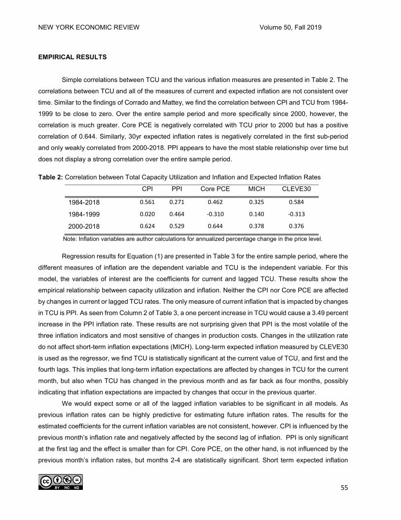
NEW YORK ECONOMIC REVIEW Volume 50, Fall 2019
55
EMPIRICAL RESULTS
Simple correlations between TCU and the various inflation measures are presented in Table 2. The
correlations between TCU and all of the measures of current and expected inflation are not consistent over
time. Similar to the findings of Corrado and Mattey, we find the correlation between CPI and TCU from 1984-
1999 to be close to zero. Over the entire sample period and more specifically since 2000, however, the
correlation is much greater. Core PCE is negatively correlated with TCU prior to 2000 but has a positive
correlation of 0.644. Similarly, 30yr expected inflation rates is negatively correlated in the first sub-period
and only weakly correlated from 2000-2018. PPI appears to have the most stable relationship over time but
does not display a strong correlation over the entire sample period.
Table 2: Correlation between Total Capacity Utilization and Inflation and Expected Inflation Rates
CPI PPI Core PCE MICH CLEVE30
1984-2018 0.561 0.271 0.462 0.325 0.584
1984-1999 0.020 0.464 -0.310 0.140 -0.313
2000-2018 0.624 0.529 0.644 0.378 0.376
Note: Inflation variables are author calculations for annualized percentage change in the price level.
Regression results for Equation (1) are presented in Table 3 for the entire sample period, where the
different measures of inflation are the dependent variable and TCU is the independent variable. For this
model, the variables of interest are the coefficients for current and lagged TCU. These results show the
empirical relationship between capacity utilization and inflation. Neither the CPI nor Core PCE are affected
by changes in current or lagged TCU rates. The only measure of current inflation that is impacted by changes
in TCU is PPI. As seen from Column 2 of Table 3, a one percent increase in TCU would cause a 3.49 percent
increase in the PPI inflation rate. These results are not surprising given that PPI is the most volatile of the
three inflation indicators and most sensitive of changes in production costs. Changes in the utilization rate
do not affect short-term inflation expectations (MICH). Long-term expected inflation measured by CLEVE30
is used as the regressor, we find TCU is statistically significant at the current value of TCU, and first and the
fourth lags. This implies that long-term inflation expectations are affected by changes in TCU for the current
month, but also when TCU has changed in the previous month and as far back as four months, possibly
indicating that inflation expectations are impacted by changes that occur in the previous quarter.
We would expect some or all of the lagged inflation variables to be significant in all models. As
previous inflation rates can be highly predictive for estimating future inflation rates. The results for the
estimated coefficients for the current inflation variables are not consistent, however. CPI is influenced by the
previous month’s inflation rate and negatively affected by the second lag of inflation. PPI is only significant
at the first lag and the effect is smaller than for CPI. Core PCE, on the other hand, is not influenced by the
previous month’s inflation rates, but months 2-4 are statistically significant. Short term expected inflation

NEW YORK ECONOMIC REVIEW Volume 50, Fall 2019
56
(MICH) has negative coefficients and are statistically significant for one and four-month lags. The effect on
long-term expected inflation is negative for the second lag and positive but relatively small (0.02) for the
fourth lag.
Table 3: Regression Results: Equation (1) 1984-2018
Coefficients CPI PPI Core PCE MICH CLEVE30
πt-1 0.513*** 0.327*** 0.128 -0.113* 0.042 (0.082) (0.081) (0.109) (0.068) (0.052) πt-2 -0.183*** 0.047 0.084** -0.109 -0.098* (0.070) (0.076) (0.042) (0.081) (0.055) πt-3 0.019 -0.017 0.239*** -0.060 0.034 (0.068) (0.087) (0.050) (0.053) (0.054) πt-4 0.027 -0.027 0.225*** -0.148*** 0.025*** (0.069) (0.069) (0.059) (0.049) (0.009) TCUt -0.435 0.173 0.165 0.013 0.029*** (0.428) (1.789) (0.122) (0.047) (0.008) TCUt-1 0.261 2.038 0.143 0.004 0.015* (0.565) (2.257) (0.165) (0.038) (0.008) TCUt-2 0.970 3.492** 0.008 0.081 -0.005 (0.634) (1.739) (0.133) (0.051) (0.009) TCUt-3 0.332 1.950 0.006 0.075 -0.002 (0.338) (1.293) (0.146) (0.053) (0.011) TCUt-4 -0.200 -0.946 -0.176 0.001 -0.025*** (0.290) (1.289) (0.128) (0.037) (0.009) Constant 1.610*** 1.279*** 0.702*** -0.003 -0.005 (0.240) (0.462) (0.166) (0.015) (0.004) Observations 416 416 416 416 416 R-squared 0.245 0.195 0.256 0.059 0.055
Notes: π represents the inflation variable for each column. Robust standard errors in parentheses.
*, **, *** denote statistical significance at 90%, 95 % and 99 % confidence levels respectively.
Table 3 represents the regressions for the entire period. To analyze how the relationship may have
changed over time, we split the sample into the two sub-periods. Breaking down the data into two time
periods gives further insight into how the relationship has changed since the 1980’s. Table 4 shows
estimates of Equation (1) for the years 1984-1999. Similar to the results for the full sample period, CPI and
Core PCE and MICH do not respond to changes in utilization rates. PPI, however, is still highly responsive
to changes in the previous month’s capacity utilization. The impact of changes in TCU, TCUt-1, and TCUt-4
on CLEV30 are slightly larger in the first sub-period as compared to the overall sample.

NEW YORK ECONOMIC REVIEW Volume 50, Fall 2019
57
Table 4: Regression Results: Equation (1) 1984-1999
Coefficients CPI PPI Core PCE MICH CLEVE30 πt-1 0.411*** 0.462*** 0.227*** -0.256*** 0.011 (0.097) (0.111) (0.078) (0.094) (0.076) πt-2 -0.044 -0.174* 0.047 -0.014 -0.065 (0.096) (0.091) (0.068) (0.080) (0.079) πt-3 0.157* 0.104 0.284*** -0.255*** 0.019 (0.091) (0.105) (0.074) (0.077) (0.075) πt-4 -0.061 -0.048 0.145** -0.156** 0.034*** (0.071) (0.116) (0.068) (0.073) (0.009) TCUt 0.232 -0.100 0.383 0.000 0.034** (0.415) (1.346) (0.248) (0.047) (0.015) TCUt-1 0.512 3.003*** 0.047 0.020 0.053*** (0.393) (1.139) (0.262) (0.046) (0.017) TCUt-2 -0.140 0.635 0.004 0.082* 0.016 (0.360) (1.139) (0.236) (0.047) (0.019) TCUt-3 -0.388 0.575 -0.074 0.042 -0.011 (0.377) (1.270) (0.262) (0.051) (0.019) TCUt-4 0.055 -0.631 -0.198 0.049 -0.052** (0.355) (1.036) (0.228) (0.043) (0.020) Constant 1.672*** 0.824** 0.796*** -0.009 -0.008 (0.383) (0.383) (0.253) (0.020) (0.006) Observations 188 188 188 188 188 R-squared 0.199 0.228 0.304 0.136 0.112
Notes: π represents the inflation variable for each column. Robust standard errors in parentheses. *, **, *** denote statistical significance at 90%, 95% and 99% confidence levels respectively.
The estimates for the regressions for the period beginning in 2000 are given in Table 5. The
estimated coefficients for TCU on the three inflation variables are quite different than in the prior period. In
the overall sample and from 1984-1999, CPI does not respond to changes in TCU. Since 2000, however, a
1 percent change in TCUt-2 indicates a 1.57 percent change in inflation as measured by CPI. It also has a
larger impact on PPI with an estimated coefficient of 4.872. When Core PCE is used as the dependent
variable for estimating inflation, almost all of the coefficients become insignificant. More importantly, the R2
falls to 0.05 due to the high variability of the inflation variable around the fitted values. The impact of utilization
on long term inflation expectations also weakens during this time period. Only current TCU remains
significant although the relative size of the coefficient remains consistent.

NEW YORK ECONOMIC REVIEW Volume 50, Fall 2019
58
Table 5. Regression Results: Equation (1) 2000-2018 Coefficients CPI PPI Core PCE MICH CLEVE30 πt-1 0.519*** 0.306*** -0.086 0.024 0.047 (0.097) (0.093) (0.181) (0.083) (0.073) πt-2 -0.207** 0.084 -0.052 -0.210* -0.172** (0.081) (0.085) (0.073) (0.108) (0.078) πt-3 -0.033 -0.039 0.051 0.084 0.081 (0.089) (0.099) (0.061) (0.065) (0.069) πt-4 0.016 -0.040 0.131** -0.219*** -0.037 (0.089) (0.081) (0.064) (0.066) (0.068) TCUt -0.608 0.423 0.045 0.012 0.030*** (0.660) (2.828) (0.141) (0.066) (0.010) TCUt-1 0.166 1.336 0.258 -0.012 -0.005 (0.827) (3.578) (0.199) (0.055) (0.010) TCUt-2 1.570* 4.872* 0.068 0.095 -0.011 (0.886) (2.495) (0.178) (0.073) (0.011) TCUt-3 0.531 2.715 0.074 0.091 0.001 (0.477) (1.881) (0.171) (0.074) (0.014) TCUt-4 -0.443 -1.424 -0.064 -0.023 -0.008 (0.417) (1.962) (0.163) (0.051) (0.009) Constant 1.498*** 1.675** 1.645*** -0.000 -0.004 (0.283) (0.771) (0.348) (0.022) (0.004) Observations 224 224 224 224 224 R-squared 0.286 0.205 0.050 0.116 0.077
Notes: π represents the inflation variable for each column. Robust standard errors in parentheses. *, **, *** denote statistical significance at 90%, 95% and 99% confidence levels respectively. Results for Equation (2) are presented in Tables 6 through 8, where the TCU is the dependent variable and
the inflation indexes are the independent variable in each column. The results in Table 6 encompass the
entire time period, while Table 7 includes the regression results from 1984-1999 and Table 8 displays results
from 2000-2017. With these sets of results, we are now interested in the inflation coefficients. As seen in the
results presented in Table 6, the current inflation measures do not affect the rates of capacity utilization. This
implies a weak relationship between the variables. When comparing TCU and expected inflation rates, the
relationship is stronger for 30-year expected inflation. The results for the entire sample period are similar to
those found in Table 7 for 1984-1999. The second lags of inflation measured by CPI and Core PCE are both
negative and significant at the 90% level of confidence but no other current inflation indicators are statistically
significant from zero in this model. The effects of long-term expected inflation on TCU are smaller than for
the full sample. Only coefficients for current and πt-1 are significant in this model.

NEW YORK ECONOMIC REVIEW Volume 50, Fall 2019
59
Table 6: Regression Results: Equation (2) Years 1984-2018 Coefficients CPI PPI Core PCE MICH CLEVE30 TCUt-1 0.064 0.051 0.050 0.048 0.020 (0.081) (0.082) (0.082) (0.083) (0.081) TCUt-2 0.159*** 0.131** 0.150*** 0.149*** 0.138*** (0.053) (0.053) (0.050) (0.052) (0.050) TCUt-3 0.206*** 0.198*** 0.221*** 0.207*** 0.217*** (0.059) (0.059) (0.067) (0.062) (0.059) TCUt-4 0.143*** 0.141*** 0.159*** 0.142*** 0.185*** (0.050) (0.050) (0.056) (0.051) (0.056) π -0.012 0.000 0.020 0.025 0.889*** (0.011) (0.003) (0.015) (0.092) (0.268) πt-1 0.026* 0.007 0.019 0.170** 0.523* (0.014) (0.004) (0.016) (0.076) (0.268) πt-2 -0.009 -0.001 -0.009 0.070 0.450* (0.013) (0.004) (0.016) (0.065) (0.247) πt-3 0.004 0.001 -0.007 0.029 0.044 (0.011) (0.003) (0.015) (0.080) (0.254) πt-4 -0.004 -0.002 -0.019 -0.012 -0.103* (0.007) (0.003) (0.016) (0.071) (0.054) Constant -0.017 -0.013 -0.010 -0.002 0.007 (0.045) (0.020) (0.049) (0.021) (0.021) Observations 416 416 416 416 416 R-squared 0.167 0.176 0.156 0.163 0.185
Notes: π represents the inflation variable for each column. Robust standard errors in parentheses. *, **, *** denote statistical significance at 90%, 95% and 99% confidence levels respectively.

NEW YORK ECONOMIC REVIEW Volume 50, Fall 2019
60
Table 7: Regression Results: Equation (2) 1984-1999
Coefficients CPI PPI Core PCE MICH CLEVE30 TCUt-1 -0.048 -0.048 -0.036 -0.048 -0.095 (0.084) (0.084) (0.088) (0.090) (0.097) TCUt-2 0.130 0.120 0.161** 0.148* 0.085 (0.083) (0.083) (0.077) (0.084) (0.087) TCUt-3 0.214*** 0.209** 0.190** 0.204** 0.182** (0.076) (0.081) (0.078) (0.081) (0.079) TCUt-4 0.045 0.058 0.021 0.031 0.059 (0.062) (0.064) (0.067) (0.062) (0.074) π 0.009 -0.000 0.036 0.001 0.682** (0.017) (0.007) (0.024) (0.101) (0.299) πt-1 0.027 0.009 0.030 0.163 0.716** (0.016) (0.008) (0.026) (0.106) (0.304) πt-2 -0.038** -0.007 -0.056** -0.030 0.099 (0.016) (0.006) (0.024) (0.121) (0.332) πt-3 -0.013 -0.006 -0.015 -0.221 0.045 (0.017) (0.006) (0.021) (0.148) (0.303) πt-4 -0.004 -0.004 0.002 -0.141 -0.021 (0.015) (0.005) (0.023) (0.117) (0.039) Constant 0.064 0.019 0.017 0.006 0.018 (0.078) (0.030) (0.080) (0.029) (0.030) Observations 188 188 188 188 188 R-squared 0.107 0.094 0.105 0.095 0.102
Notes: π represents the inflation variable for each column. Robust standard errors in parentheses. *, **, *** denote statistical significance at 90%, 95% and 99% confidence levels respectively.
Evidence of the weakening relationship between current inflation and TCU in recent years is
presented in Table 8. Core PCE is the only current inflation measure that is statistically significant when
used as a regressor. The second lag of inflation for Core PCE is 0.037, indicating a 1 percent increase in
inflation would result in a 0.037 percent increase in utilization. Although the coefficients for πt-2 are statistically
significant at the 95 percent confidence level for both sub-periods, the coefficient is negative in the first
period and positive in the latter time period. The relationship between CLEVE30 and TCU has gotten
stronger over time. The estimated coefficients for current and the second lag of CLEVE30 are large and
highly significant. This result implies that expectations of future inflation have a greater impact on production
decisions that actual inflation rates.

NEW YORK ECONOMIC REVIEW Volume 50, Fall 2019
61
Table 8. Regression Results: Equation (2) 2000-2018
Coefficients CPI PPI Core PCE MICH CLEVE30 TCUt-1 0.095 0.086 0.091 0.076 0.069 (0.127) (0.125) (0.126) (0.125) (0.125) TCUt-2 0.161** 0.114 0.145** 0.131** 0.133** (0.072) (0.069) (0.067) (0.066) (0.065) TCUt-3 0.207*** 0.192** 0.211** 0.205*** 0.217*** (0.077) (0.078) (0.086) (0.079) (0.070) TCUt-4 0.191*** 0.200*** 0.215*** 0.206*** 0.248*** (0.067) (0.064) (0.071) (0.065) (0.069) π -0.014 0.001 0.007 0.023 1.352*** (0.016) (0.004) (0.023) (0.129) (0.474) πt-1 0.024 0.006 0.020 0.162 0.459 (0.018) (0.005) (0.021) (0.102) (0.452) πt-2 -0.001 -0.001 0.037** 0.108 1.260*** (0.017) (0.004) (0.018) (0.074) (0.420) πt-3 0.006 0.003 -0.000 0.142 0.271 (0.014) (0.003) (0.026) (0.096) (0.465) πt-4 -0.003 -0.002 -0.028 0.025 -0.255 (0.009) (0.003) (0.024) (0.097) (0.655) Constant -0.030 -0.021 -0.065 -0.005 0.007 (0.050) (0.028) (0.101) (0.030) (0.032) Observations 224 224 224 224 224 R-squared 0.244 0.255 0.234 0.243 0.281
Notes: π represents the inflation variable for each column. Robust standard errors in parentheses. *, **, *** denote statistical significance at 90%, 95% and 99% confidence levels respectively.
It should be noted that the R2 for the regression are low, especially for time-series analyses. But as
we primarily interested in the relationship between the two variables and not trying to predict the dependent
variables in the regressions, the size and significance of the estimated coefficients provide information about
the response of the dependent variables even though the low R2 implies high variability around the data.
As alternative specifications, we use manufactured goods, as well as durable and non-durable
goods in place of TCU in both models. This would allow us to test the if the relationships were dependent
upon industry sector. All series are monthly observations obtained from the Federal Reserve’s Board of
Governors and are transformed into first differences. Results for all three alternative models produced
similar results as the models using TCU and therefore are not reported.

NEW YORK ECONOMIC REVIEW Volume 50, Fall 2019
62
Figure 2. Impulse Response Functions: Accumulated Response of Inflation to a Technology Shock
Note: Dashed lines represent 95% confidence interval bands.
To further analyze the relationship between TCU and inflation, we consider multiple vector
autoregression (VAR) to analyze impulse response functions for TCU and each of the current and expected
inflation measures. Optimal lag lengths are chosen by the lag length selection criteria. Finn (1996) estimates
VAR models and constructs impulse responses to test whether the relationship between capacity utilization
and inflation is dynamic over time. Focusing on technology shocks, she finds a positive relationship between
endogenous capacity utilization and inflation during technology shocks. Bauer (1990) also finds an
endogenous relationship between the two variables during both demand and supply shocks from 1950-1988.
Building upon these results, we construct impulse responses to test the response of one of the variables to
shocks in the other variable.

NEW YORK ECONOMIC REVIEW Volume 50, Fall 2019
63
Figure 3. Impulse Response Functions: Accumulated Response of TCU to Shocks in Inflation
Note: Dashed lines represent 95% confidence interval bands.
Neither TCU nor any of the measures of inflation or expected inflation respond to a one-time shock
in the other variable. When the responses are accumulated, however, CPI, core PCE and PPI all respond
to repeated shocks in TCU. Figure 2 displays impulse responses for each of the inflation and expected
inflation variables. The graphs represent the accumulated responses of inflation to a one standard deviation
shock in TCU. This can be interpreted as a technology shock. Short-term expected inflation, as measured
by MICH, also has a positive permanent response to long-term technology shocks but the response is small.
The 30-year expected inflation rate does not show any response to a shock in TCU. This implies that
expectations of future inflation may be adjusted up slightly, but if the shock is interpreted as temporary, then
long-term expectations are unaffected. All of the current inflation variables show a permanent positive
impact on prices when there is a shock to capacity utilization.

NEW YORK ECONOMIC REVIEW Volume 50, Fall 2019
64
Figure 3 presents the results when the VAR measures the response of TCU to shocks in current
and expected inflation rates. Capacity utilization rates do not respond to shocks to any of the current inflation
measures. There is a positive response when the shock is to long-term inflation rates, however. This
indicates that firms will adjust capacity slightly when they anticipate higher future prices. This is consistent
with the theory of supply. Firms will increase their supply if they anticipate higher future prices.
CONCLUSION
This study analyzes the relationship between capacity utilization and inflation from 1984-2018
alternating price indexes in the models to estimate current inflation as well as short-term and long-term
expected inflation. Numerous studies have shown that the relationship between the variables has weakened
since the early 1980’s. This study attempts to add to the existing literature by analyzing the relationship post
1970’s to assess how the relationship may have changed in recent years. Since each inflation index is
measured differently, it is important to consider all variables when analyzing this dynamic relationship as
some inflation measures have a stronger relationship with TCU than others.
We estimate two forms of OLS regressions with four lags of the dependent and independent
variables to capture the lag in response time of each of the variables to one another. The various inflation
measures are the dependent variables in the first model and the second model estimates total capacity
utilization as the dependent variable. Both models are estimated for the full sample period of 1984-2018
and again on the sub-periods of 1984-1999 and 2000-2018.
Our results show that the relationship between inflation and capacity utilization is complex and has
continued to change in recent years. We find that the strongest relationship between TCU and 30 year
expected inflation. We find a bidirectional relationship between these variables but the effect of expected
inflation on TCU has gotten stronger in recent years while TCU’s impact on expected inflation rates has
gotten smaller. Additionally, we find TCU has the strongest impact on PPI but find no effect of PPI on TCU
rates in our models.
The weakest relationship between TCU and the various inflation measures is with core PCE
although core PCE is the only current inflation rate to have any effect on TCU since 2000. These results
confirm previous studies that find the relationship between capacity utilization and inflation has weakened
since the early 1980’s when estimating the relationship using CPI and core PCE for the overall sample. We
find the first and second lags of the independent variables in the models to best predictor of changes in the
dependent variables for all models of current inflation and short-term inflation.
Long-term expected inflation is the only inflation measure that is found to be statistically significant
for the independent variable measured in time t. Additionally, most models were statistically significant in
one or more of the lags of the dependent variables as well. This implies that more emphasis should be
placed on the relationship between capacity utilization and long term expectations of future inflation rates
than on actual inflation.

NEW YORK ECONOMIC REVIEW Volume 50, Fall 2019
65
The Federal Reserve recognizes TCU as an important economic indicator. The accuracy of the
Fed’s predictions of the current state of the economy is important for investment decisions and these
decisions ultimately impact the financial markets. The Fed should not heavily consider capacity utilization
rate as an indicator of price pressures especially since it uses Core PCE index as its inflation target objective
and this weakest relationship in our results. The Fed should still monitor movements in capacity utilization
rates because they are indicators of slack in the economy. Additionally, if rates were to climb to levels similar
to those in the late 1960’s and early 1970’s, then changes in utilization rates could begin to put upward
pressure on prices again.
ENDNOTES 1. Personal Consumption Expenditures was also used as an alternative measure of prices but the
results were not statistically significant and are therefore omitted from the analysis.
2. As a robustness check, we estimated both models using 10-year expected inflation as measured
by the Cleveland Federal Reserve Bank’s model and found similar results to the 30-year series.
These results are available upon request.
REFERENCES
Ahmed, M. I., & Cassou, S. P. (2017). Threshold Cointegration Between Inflation and US Capacity Utilization. Applied
Economics, 49(3), 289–302.
Bauer, P. W. (1990). A Reexamination of the Relationship Between Capacity Utilization and Inflation. Economic
Review - Federal Reserve Bank of Cleveland, 26(3), 2–12.
Bauer, P. W., & Deily, M. E. (1988). A User’s Guide to Capacity-Utilization Measures. Economic Commentary,
Federal Reserve Bank of Cleveland, (July).
Cecchetti, S. G. (1995). Inflation indicators and inflation policy. NBER Macroeconomics Annual 10, 189–219.
Corrado, C., Gilber, C., Raddock, R., & Kudon, C. (1997). Industrial production and capacity utilization: historical
revision and recent developments. Federal Reserve Bulletin, 83, 67.
Corrado, C., & Mattey, J. (1997). Capacity Utilization. Journal of Economic Perspectives—Volume, 11(1), 151–167.
Dotsey, M., & Stark, T. (2005). The Relationship Between Capacity Utilization and Inflation. Federal Reserve Bank
of Philadelphia Business Review, Second Qua, 8–17.
Emery, K. M., & Chih-Ping Chang. (1997). Is there a stable relationship between capacity utilization and inflation?
Economic Review-Federal Reserve Bank of Dallas, 14.
Finn, M. G. (1995). Is “High” Capacity Utilization Inflationary? FRB Richmond Economic Quarterly, 81(1), 1–16.
Finn, M. G. (1996). A Theory of the Capacity Utilization/Inflation Relationship. FRB Richmond Economic Quarterly,

NEW YORK ECONOMIC REVIEW Volume 50, Fall 2019
66
82(3, Summer), 67–86.
Garner, C. A. (1994). Capacity Utilization and US Inflation. Economic Review - Federal Reserve Bank of Kansas
City, 79(5), 5.
Gittings, T. A. (1989). Capacity Utilization and Inflation. Federal Reserve Bank of Chicago Economic Perspectives,
13(3), 2–9.
Nakibullah, A., & Shebeb, B. (2013). The Relationship Between Capacity Utilization and Inflation: The Case of
Bahrain. The Global Journal of Finance and Economics, 10(2), 139–149.
Pierce, J. R., & Wisniewski, E. (2018). Some Characteristics of the Decline in Manufacturing Capacity Utilization.
Board of Governors of the Federal Reserve, 2018-01–01.
Summers, P. M. (2005). What caused the Great Moderation? : Some Cross-Country Evidence. Economic Review -
Federal Reserve Bank of Kansas City, 90(3), 5.

NEW YORK ECONOMIC REVIEW Volume 50, Fall 2019
67
REFEREE ACKNOWLEDGMENT
The New York State Economics Association is grateful for the time spent by the following referees in recent years. Without your efforts, we would not be able to produce this journal.
1. Alexander McQuoid 2. Pinar Uysal 3. Kasia Plat 4. Richard Deitz 5. Julie Anna Golebiewski 6. Renzo Alvarez 7. Sean MacDonald 8. Michael Toma 9. Brent Evans 10. Shahdad Nagshpour
11. Eddery Lam 12. Garrison Song 13. Paul Bauer 14. James Booker 15. Fan Chen 16. Kai Chen 17. Robert Jones 18. James Murtagh 19. Philip Sirianni 20. Jeffrey Wagner 21. Mark Zaparowski 22. Xu Zhang


