Download - Music Magazine - Photo Options
Photo OptionsBy Eliza Chapman-Smith
Photo Options
I took quite a few photos with my model, and I had to make some choice about which ones to use for the front cover, contents page and double page spread of my magazine. I discarded the ones that were out of focus, badly light or inappropriate for my needs. I then narrowed my choices down to three for each, and chose one from this selection.
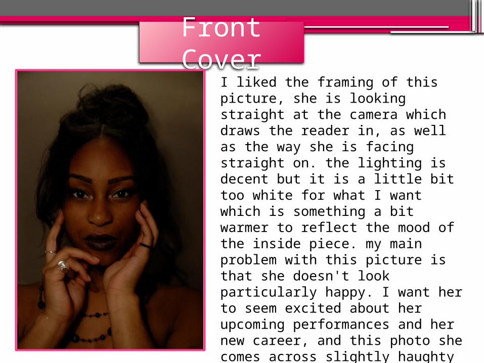
Front Cover
I liked the framing of this picture, she is looking straight at the camera which draws the reader in, as well as the way she is facing straight on. the lighting is decent but it is a little bit too white for what I want which is something a bit warmer to reflect the mood of the inside piece. my main problem with this picture is that she doesn't look particularly happy. I want her to seem excited about her upcoming performances and her new career, and this photo she comes across slightly haughty and indifferent. In addition I think the hairstyle (i.e. parted straight down the middle) looks too severe.
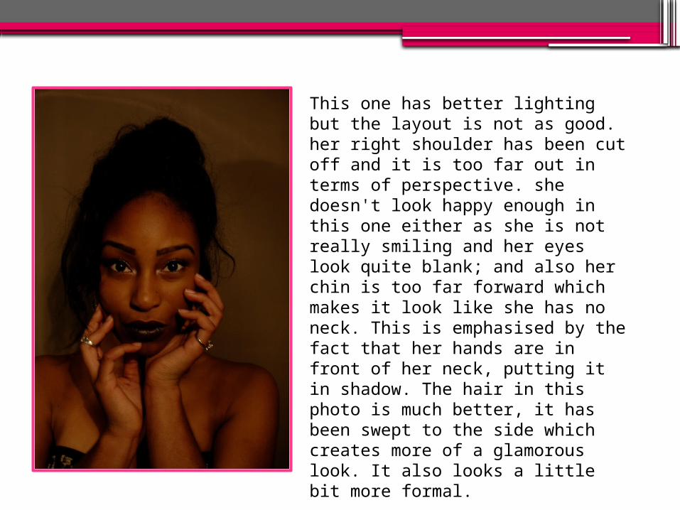
This one has better lighting but the layout is not as good. her right shoulder has been cut off and it is too far out in terms of perspective. she doesn't look happy enough in this one either as she is not really smiling and her eyes look quite blank; and also her chin is too far forward which makes it look like she has no neck. This is emphasised by the fact that her hands are in front of her neck, putting it in shadow. The hair in this photo is much better, it has been swept to the side which creates more of a glamorous look. It also looks a little bit more formal.
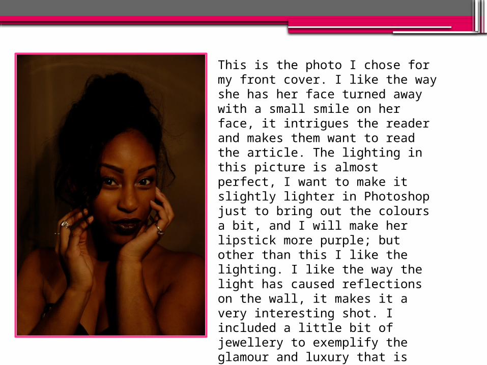
This is the photo I chose for my front cover. I like the way she has her face turned away with a small smile on her face, it intrigues the reader and makes them want to read the article. The lighting in this picture is almost perfect, I want to make it slightly lighter in Photoshop just to bring out the colours a bit, and I will make her lipstick more purple; but other than this I like the lighting. I like the way the light has caused reflections on the wall, it makes it a very interesting shot. I included a little bit of jewellery to exemplify the glamour and luxury that is associated with this music genre, but not too much to make her seem vain. The hair is good because it is similar to the previous one.
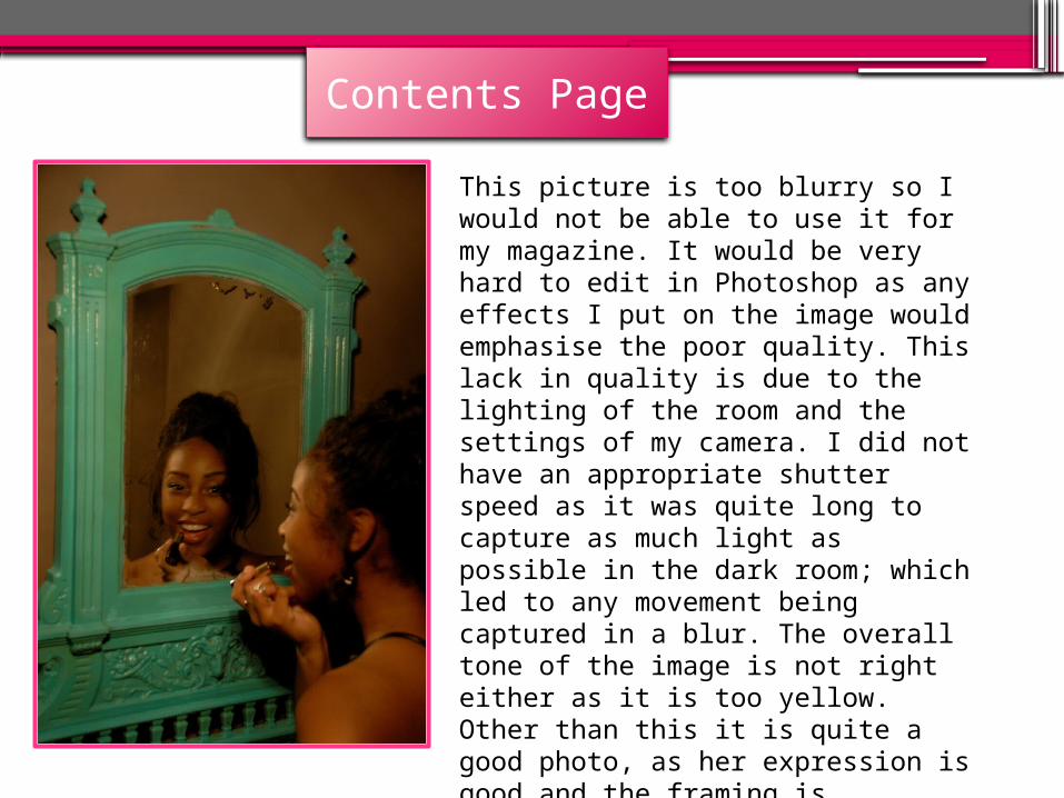
This picture is too blurry so I would not be able to use it for my magazine. It would be very hard to edit in Photoshop as any effects I put on the image would emphasise the poor quality. This lack in quality is due to the lighting of the room and the settings of my camera. I did not have an appropriate shutter speed as it was quite long to capture as much light as possible in the dark room; which led to any movement being captured in a blur. The overall tone of the image is not right either as it is too yellow. Other than this it is quite a good photo, as her expression is good and the framing is effective.
Contents Page
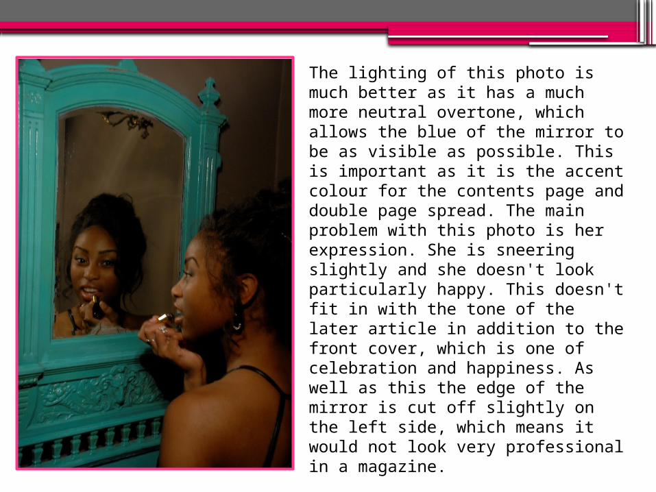
The lighting of this photo is much better as it has a much more neutral overtone, which allows the blue of the mirror to be as visible as possible. This is important as it is the accent colour for the contents page and double page spread. The main problem with this photo is her expression. She is sneering slightly and she doesn't look particularly happy. This doesn't fit in with the tone of the later article in addition to the front cover, which is one of celebration and happiness. As well as this the edge of the mirror is cut off slightly on the left side, which means it would not look very professional in a magazine.
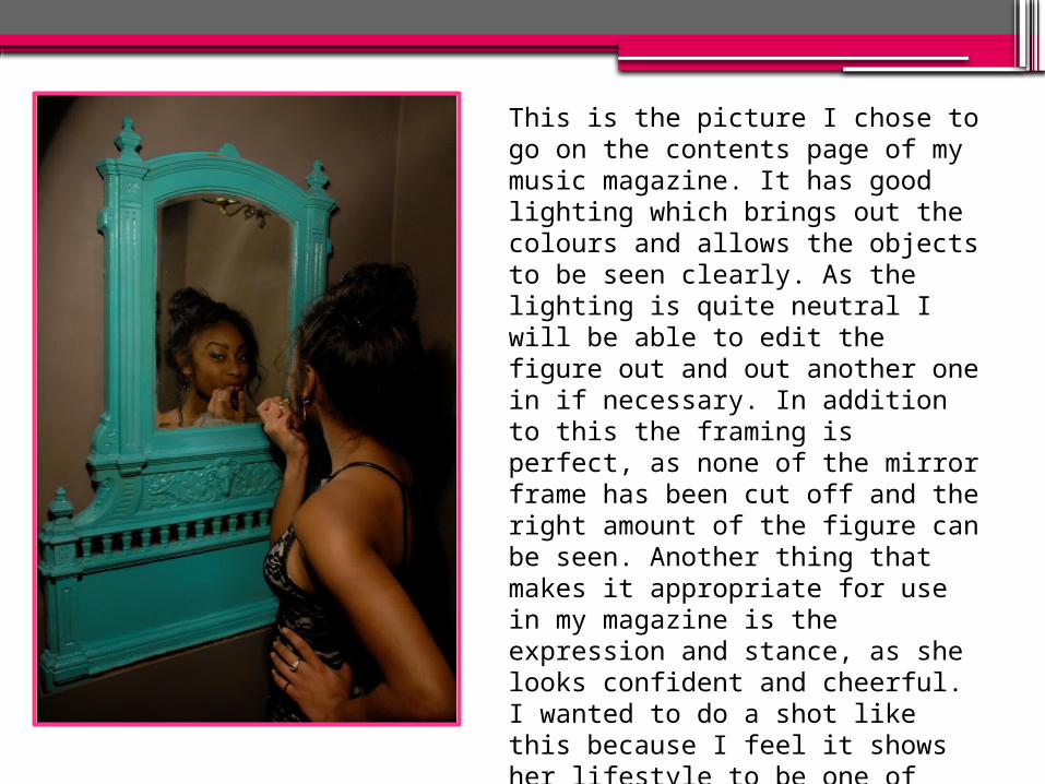
This is the picture I chose to go on the contents page of my music magazine. It has good lighting which brings out the colours and allows the objects to be seen clearly. As the lighting is quite neutral I will be able to edit the figure out and out another one in if necessary. In addition to this the framing is perfect, as none of the mirror frame has been cut off and the right amount of the figure can be seen. Another thing that makes it appropriate for use in my magazine is the expression and stance, as she looks confident and cheerful. I wanted to do a shot like this because I feel it shows her lifestyle to be one of glamour and sophistication.


