
Copyright is owned by the Author of the thesis. Permission is given for a copy to be downloaded by an individual for the purpose of research and private study only. The thesis may not be reproduced elsewhere without the permission of the Author.
Mapping the Environmental Footprint of the Central Plains Water Irrigation Scheme
A thesis submitted in partial fulfilment of the Masters of Design
Mapping the Environmental Footprint of the Central Plains Water Irrigation Scheme
at the Institute of Communication Design
Massey University, Wellington, NZ.
Dean Ivamy
2009
Acknowledgements
This thesis is greatly indebted to the following people who individually have assisted throughout this
year of study. Firstly, my partner Katie Wood for all her time, love and attention. My parents David and
Jill, for always providing an interested listening ear, the drive, motivation, and financial support to get
me through. Academic support and advice from Donald Preston, Jacquie Naismith, Patricia Thomas,
Tulia Moss, Annette O’Sullivan, and Kate Gilliam. For the assistance of data collection and statistical
information, Anna Thorburn (MAF), Christine Dean (Statistics New Zealand), Kevin Hackwell (Forest &
Bird), all the Councils, Government agencies, and the environmental and dairy industry groups who
so openly provided information and knowledge. Steffen Kreft, Tania Marriott, and Rachael Linton (my
fellow masters students) for sharing in this year of discovery. Technical support and problem solving
from John Clemens, Stuart Foster, Julian Allom, and Nicola and Simon George.
Thank you all.

A final decision on the proposed Central Plains Water (CPW) scheme needs to be left to the consent-granting
authorities, according to Christchurch City Mayor Bob Parker. The basis for this position is that the issues
raised by the proposed irrigation scheme are simply too complex for members of the public to grasp.
(The Press, September 10, 2007).
In the statement Mayor Parker is referring to a complexity of issues that involves a plethora of hard-
scientific and statistical information. The diversity of opinions regarding the scheme’s benefits and
potential negative implications also create misunderstanding for the general public. This prompts the
hypothesis of this design thesis, which suggests that statistical data when visually mapped and in the
context of its physical environment can provide significant cognitive and ecological awareness for the
viewer to understand the economic and environmental implications of the proposed irrigation scheme.
Both the areas of cartographic mapping and the dairy industry contain controlled vocabularies, which
present opportunity for graphic modeling and explanation through visible phenomena. The Canterbury
Plains has a well-established historical and agricultural narrative. However, due to the recent dramatic
and substantial transition of the region’s dairy industry between the periods 1995 – 2008, subsequent
demand for freshwater now represents the real prospect of uncharted future environmental instability.
The development of a visual language system capable of the interpretation and construction of the
irrigation scheme’s benefits and potential negative implications, provide this thesis through graphic
modeling the possibility to compare the proposed CPW scheme’s issues. While some industry groups
consider public participation as arbitrary and unnecessary, recent surveys indicate water quality and
fertiliser management as the most significant areas for environmental concern. The debate should not
exclude the public, but rather include communication systems capable of reaching all communities.
Abstract
1.1 Introduction
2.1 Environment
2.2 Cartography
2.3 Information Design
Statistical Data
3.1 Collection, Selection,
and Presentation
Cartographic Visual
3.2 Presentation and
Landscape Design
3.3 Information Display
and Visual Argument
4.0 Conclusion
Page
1.1.1 Introduction 6
1.1.2 Discussion of Context 7
1.1.3 Central Proposition 8
2.1.1 The Impact of Irrigation on the Canterbury Plains 10
2.1.2 New Zealand’s Dairy Farming Landscape 12
2.1.3 Self-Regulation and Clean Streams 13
2.1.4 The Battle of Rural-Urban 14
2.2.1 Political Power Structure 17
2.2.2 In Search of Scientific Truth 18
2.2.3 Deconstructing Rhetorical Mapping Devices 19
2.2.4 Mapmaker as Creator rather than Reflector for Counter-culture Agendas 21
2.2.5 Dynamic Mapping of Information, Environmental Causation and Place 22
2.3.1 The role of Context in Cognition 25
2.3.2 No Symbol Explains itself more than … 27
2.3.3 Environmental Causation and Data Presentation. 28
3.1.1 Historical Analysis and the Chronological Display of Keywords 31
3.1.2 Settlement and Destruction of the Native Forests 31
3.1.3 Industry Transition through Statistical Data Collection 32
3.1.4 The Diagrammatic Display of the Cow 32
3.2.1 Contextual Background and Isometric Perspective 32
3.2.2 Navigational Interaction and the Framing of the Canterbury Plains 34
3.2.3 Scientific Evidence and The Valuative Judgment 34
3.3.1 Icon Design and the Canterbury Dairy Farm Model 36
3.3.2 Icon Modifiers and Extensions to the Visual Narrative 38
3.3.3 Map Comparisons and the Visible Transition of the Dairy Industry Over Time 39
4.1.1 Conclusion 40
4.1.2 Appendix 42
5.1.1 Bibliography 43
Contents
3.0 Methods and Processes.
2.0 Research and Theory.

1: Canterbury plains, Allen J Kynaston.
2: Central Plains Water irrigation scheme, http://www.selwyn.govt.nz/cpw/cpw-map.jpg.
3: Livestock fertiliser diagram (2008).
4: Canterbury plains from space, Phillips, R. (2003). New Zealand from space. 2. Auckland, NZ: Penguin Books.
5: Ruth Watson, Another Map of the World, 1989.
6: The Historical Development of the British Empire, Imperial acquisitions, 1915, Catalogue reference: CO 1047/1098.
7: Van Sant GeoSphere, A Clear Day, 1990.
8: Pictographic narrative of Aztecs leaving their homeland in year Flint 1. Codex Boturini Drucker, J., & McGann, J. (2001). Images as the text: Pictograms and pictographic rhetoric. 9: Dr Snow Snow, The Cholera Epidemic, London, 1854.
10: Charles Joseph Minard, Figurative Map of the successive losses in men of the French Army in the Russian Campaign 1812–13.
11: Mike Zender, Interactive information design – Alzheimer’s display, 2007.
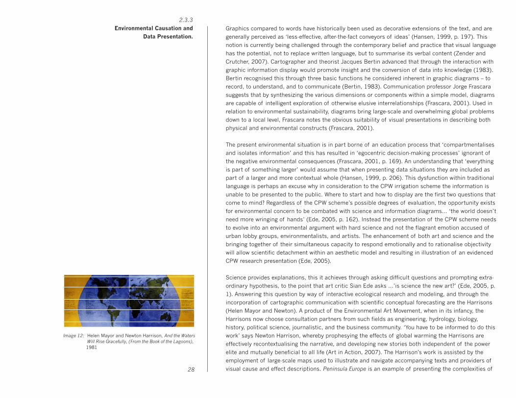
12: Helen Mayor and Newton Harrison, And the Waters Will Rise Gracefully, (From the Book of the Lagoons), 1981, oil, graphic, photography, 51 x 122cm. 13: Canterbury’s agricultural history (2008)
14: Dairy cow cyclic graph (concept) (2008)
15: Albrecht Altdorfer, The Battle of Issus, 1528-29
16: Canterbury plains from space, Phillips, R. (2003). New Zealand from space. 2. Auckland, NZ: Penguin Books.
17: Reed New Zealand World Atlas (2004), Auckland, NZ: Reed: Terralink International, [3rd] ed
18: Orthophotos, L37 - Ashburton (1998/99). New Zealand Map Grid (NZMG) Crown Copyright Reserved
19: Canterbury plains aerial photo, Bradley, B. (2000). New Zealand from space. Auckland, NZ: Penguin Books.
20: Rakaia River (section) (2008)
21: Lake Ellesmere with dairy pasture (section) (2008)
22: Christchurch (Western Suburbs) (2008)
23: Richard Misrach, Atomic Bomb Loading Pit #2, 1989
24: Icon map of Canterbury agricultural history (section) (2008)
25: Icon map of Canterbury native forest fires (2008)
26: Dairy cow cyclic graph #1 (2008)
27: Dairy cow cyclic graph #2 (2008)
28: Native forest fire (Alford Forest) (2008)
Images

29: Fertiliser and runoff (Rakaia River) (2008)
30: Dairy cow icons (2008)
31: Lake Ellesmere and Selwyn District (2008)
32: Selwyn District with dairy pasture and cows (2008)
Images

5
1.0 Introduction.
6
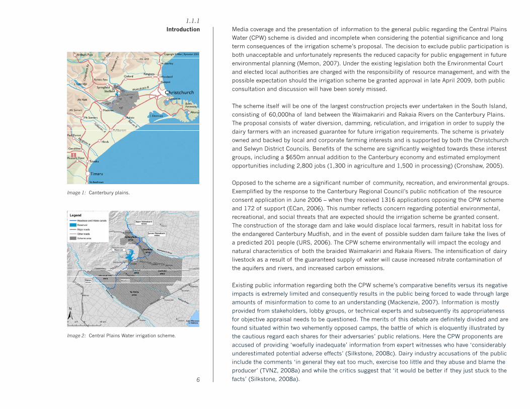
Media coverage and the presentation of information to the general public regarding the Central Plains
Water (CPW) scheme is divided and incomplete when considering the potential significance and long
term consequences of the irrigation scheme’s proposal. The decision to exclude public participation is
both unacceptable and unfortunately represents the reduced capacity for public engagement in future
environmental planning (Memon, 2007). Under the existing legislation both the Environmental Court
and elected local authorities are charged with the responsibility of resource management, and with the
possible expectation should the irrigation scheme be granted approval in late April 2009, both public
consultation and discussion will have been sorely missed.
The scheme itself will be one of the largest construction projects ever undertaken in the South Island,
consisting of 60,000ha of land between the Waimakariri and Rakaia Rivers on the Canterbury Plains.
The proposal consists of water diversion, damming, reticulation, and irrigation in order to supply the
dairy farmers with an increased guarantee for future irrigation requirements. The scheme is privately
owned and backed by local and corporate farming interests and is supported by both the Christchurch
and Selwyn District Councils. Benefits of the scheme are significantly weighted towards these interest
groups, including a $650m annual addition to the Canterbury economy and estimated employment
opportunities including 2,800 jobs (1,300 in agriculture and 1,500 in processing) (Cronshaw, 2005).
Opposed to the scheme are a significant number of community, recreation, and environmental groups.
Exemplified by the response to the Canterbury Regional Council’s public notification of the resource
consent application in June 2006 – when they received 1316 applications opposing the CPW scheme
and 172 of support (ECan, 2006). This number reflects concern regarding potential environmental,
recreational, and social threats that are expected should the irrigation scheme be granted consent.
The construction of the storage dam and lake would displace local farmers, result in habitat loss for
the endangered Canterbury Mudfish, and in the event of possible sudden dam failure take the lives of
a predicted 201 people (URS, 2006). The CPW scheme environmentally will impact the ecology and
natural characteristics of both the braided Waimakariri and Rakaia Rivers. The intensification of dairy
livestock as a result of the guaranteed supply of water will cause increased nitrate contamination of
the aquifers and rivers, and increased carbon emissions.
Existing public information regarding both the CPW scheme’s comparative benefits versus its negative
impacts is extremely limited and consequently results in the public being forced to wade through large
amounts of misinformation to come to an understanding (Mackenzie, 2007). Information is mostly
provided from stakeholders, lobby groups, or technical experts and subsequently its appropriateness
for objective appraisal needs to be questioned. The merits of this debate are definitely divided and are
found situated within two vehemently opposed camps, the battle of which is eloquently illustrated by
the cautious regard each shares for their adversaries’ public relations. Here the CPW proponents are
accused of providing ‘woefully inadequate’ information from expert witnesses who have ‘considerably
underestimated potential adverse effects’ (Silkstone, 2008c). Dairy industry accusations of the public
include the comments ‘in general they eat too much, exercise too little and they abuse and blame the
producer’ (TVNZ, 2008a) and while the critics suggest that ‘it would be better if they just stuck to the
facts’ (Silkstone, 2008a).
1.1.1
Introduction
Image 1: Canterbury plains.
Image 2: Central Plains Water irrigation scheme.
7
This research through design thesis explores the environmental and economic potential impact of the
CPW scheme. Focusing on the history, narrative, and transition of the Canterbury Plains, it begins with
a comprehensive discussion of the complexities and instabilities of New Zealand’s dairy industry. In
particular relationships between irrigation, the environment, and the economic reliance increasingly
afforded upon the dairy industry are considered with regard to the broadening attitudes of both the
urban and rural communities. The CPW scheme and the ensuing Environmental Court hearing does in
the context of this thesis represent a significant precedent with respect to future intensification and
expansion of the dairy industry throughout the Canterbury Plains and beyond.
Through the formation of ideas originating from scientific complexity and statistical evidence, this
thesis suggests that the translation of information into a visual language system will enable readers
a greater understanding of the CPW scheme. This visual language system will attempt to connect the
scheme’s comparative benefits identified as financial gain and employment throughout the Canterbury
community with the negative environmental impacts associated with intensive dairy farming. This is
an opportunity for quantifiable and objective statistical research to be displayed graphically and within
context so as to assist explanation and cognition for an informed and discursive impression of the
irrigation scheme’s related issues, and for an audience that is presently starved of reliable information.
An examination of the larger contextual surroundings that frame the scheme suggest the connection
between both historical attitudes of the original pioneering settlers of the Canterbury Plains and the
contemporary environmental and sustainable disregard of present dairy industry farmers. The wanton
and accidental destruction of the region’s native forests during 1850 – 1880 act as both a metaphor
and a precursor for the potential environmental consequences that surround the irrigation scheme.
While representative of different ecological precedents, the destruction of native forests is employed
by this thesis as a micro-narrative and introduction to further examination of the relationship between
economic and environmental cause and effect as is related to present agricultural industry practice.
The emergence of patterns from the visual display of statistical information are capable of expanding
context, while the visualisation of concepts are increasingly used in the communication of icons, visual
signage systems and data presentation. Limitations however exist in the cognitive display of icons for
complex actions and states of being (Zender, 2006). In order to extend the possible visual transfer of
icons and their potential illustration of the combined effects of the CPW irrigation scheme, this thesis
attempts to engage icons within the cartographic map. Through the combination and modification of
icons the CPW map seeks to expand the visual language capabilities and cognitive functionality of the
icon through layering, abstraction, and sequence, using the existing environmental context of the map.
The discussion and application of cartography within this design thesis includes its engagement as
both rhetorical and scientific tools for effective communication and persuasion. By acknowledging the
map as provider of valuative connotations (MacEachren, 1995), and through map construction – the
environmental evidence researched within this design thesis is assigned political power and influence
with regard to the CPW irrigation scheme’s argument. The appropriation of cartography and its quasi–
employment as community propaganda mapping shifts the traditional role of map-making from that of
privileged political, economic, and state authorities, to anyone with an audience prepared to listen.
1.1.2
Discussion of Context
8
Diagrams are powerful information resources through the use of graphic metaphor, though these can
cause problems in respect to interpretation. This research through design thesis proposes information
presented as visual icons and within context of the cartographic map will provide cognitive community
understanding of the Central Plains Water irrigation scheme. Through the modification of icons so as
to enable and expand the expression of complex concepts this thesis advances that a visual language
system capable of model building will aid the CPW interpretation through diagrammatic presentation.
1.1.3
Central Proposition

9
2.1 Environment.

10
The drought that affected New Zealand agriculture in early 2008 was a brutal reminder to farmers of
how much the agricultural industry is at the mercy of the weather, and is estimated to have cost the
dairying sector between $500 million to $1 billion (Hembry, 2008a). It further strengthens the popular
notion of putting too many eggs in one basket when considering New Zealand is now more dependant
on agriculture and pastoral production than ever within the last 25 years (Scherer, 2008). The Reserve
Bank of New Zealand is prepared for just two economic disaster models: the first being a cataclysmic
earthquake centered in Wellington, the second is the outbreak of Foot and Mouth disease amongst the
nation’s burgeoning dairy herds (Federated Farmers, 2008a). Irrigation development, whilst initially
intended as drought proofing insurance, today is used more as a factor for farmers and therefore the
economy to diversify (MAF, 2004). The Ministry of Agricultural and Fisheries (MAF) identify irrigation as
bringing a greater diversity of business activities and therefore improved security to local economies,
particularly the Canterbury Region where farm-based production is anticipated to be the community’s
basis and likely to remain so for the foreseeable future (MAF, 2004). Until the 1980s, Governmental
policy considered irrigation as part of national interest with Canterbury’s farmers being allocated
approximately 100 million cubic metres (cumecs) of groundwater per year, current permits for this
region now exceed 350 million cumecs (Crombie, 2007). Accordingly, the levels of community based
ecological pressure between both economic development and environmental conservation are also
rising (MAF, 2004).
The demand for irrigation on the Canterbury Plains is such that Derek Crombie, Project Manager
of CPW Limited considers the environment will be worse off should the proposed CPW scheme not
proceed, because of the individual and corporate farmers lined up behind the CPW scheme (Crombie,
2007). Opinions throughout the region are polarised, where the scheme is seen as a ‘white knight’
delivering increased economic prosperity and a ‘bogeyman’ with the potential threat of water aquifer
pollution and an over-reliance on dairy farming (Norris, 2007). The CPW irrigation scheme however
was considered the second most important issue concerning the recent 2007 Canterbury Regional
Council Election (Opinions, 2007), responses provided by mayoral candidates were in most occasions
reduced to those requiring single-word answers and with the resounding answer being in the negative
(Norris, 2007). The elected councilor Mayor Parker being the exception, his response throughout the
campaign was consistently ‘maybe, maybe not’ and he is accused of being non-descript, ill-informed,
and uncommitted regarding this significant community and environmental issue (Norris, 2007).
Parallel to the Canterbury Region’s unanswered election questions are the concerns of Environment
Canterbury (ECan) who describe information supplied by CPW proponents as ‘woefully inadequate’,
and accuse the irrigators’ expert witnesses of having ‘considerably underestimated [the] potential
adverse effects’ of the scheme (Silkstone, 2008c). Peer review of a CPW-funded archaeological report
concerning the suitability of irrigation on the Canterbury Plains concluded it also as inadequate and
containing considerable ambiguity. This was highlighted by the fact that this CPW archaeological
report did not inspect any of the nine potentially threatened sites and yet it suggests consent should
be granted for the scheme to proceed (Silkstone, 2008b). The Canterbury Region is the largest user
of freshwater resources in New Zealand, however none of its four councils have as yet developed an
approved water allocation plan. The Food and Agriculture Organisation of the United Nations (FAO)
2.1.1
The Impact of Irrigation on the
Canterbury Plains
Image 3: Livestock fertiliser diagram.
11
identifies a direct link between this lack of appropriate water resource management and the ongoing
depletion of the world’s water supply (Steinfeld, Gerber, et al., 2006). ECan suggest that the CPW
scheme will increase the period in which the Waimakariri River is at minimum flow to double from its
current duration of just under three weeks a year to eight weeks once implemented (Silkstone, 2008a).
A generic farmer on the Canterbury Plains who farms sheep (dryland farmer) will typically generate a
gross farm income of $1200/ha (Mackenzie, 2007). The same farmer with a limited irrigation system
(arable farmer) will comparatively make about $3000/ha, while the farmer with full irrigation and a
reliable supply of water will generate $7500/ha. ECan (2005) identify the amount of land used in the
Canterbury region for dairying as having increased from 63,000 ha (1995) to over 146,000 ha (2004)
and the region’s dairy cow population increased 287 percent to 592,745 (2007) over the same period
(Statistics N.Z., 2007). Gaining an economic increase on the irrigation investment requires associated
increases from other inputs, this results in the on-going intensification of the dairy industry placing
increased pressures on soil and water resources (Monaghan, de Klein, et al., 2006). Environmental
and health related costs are ‘borne by society at large’ and the dairy industry is accused of failing to
factor them into consideration when considering profit maximising decisions (Tail and Cullen, 2007,
p.1). The FAO suggests both Government and Council programmes are implemented after significant
environmental damage has already occurred due to the swiftly developing and transforming livestock
sector (Steinfeld, Gerber, et al., 2006). Successful environmental resource management requires more
than the undertaking of one-off projects on farms and should include the coordinated responses of
many stakeholder groups, communities and agencies (Valentine, I., E. Hurley, et al 2007, p. 316).
ECan believe the limits of the Canterbury Plains’ irrigation potential have already been reached, and
are suggesting now is the time to pause and look at the impacts already occurring (Cronshaw, 2007).
However, with associated dairy farm expenses in the order of 60% of gross, and the before mentioned
dairy farmer with full irrigation committed to spending $4500/ha in the local community (Mackenzie,
2007). This potential $650 million per annum addition from the CPW irrigation scheme may simply be
too much for Mayor Parker and his constituents to refuse.
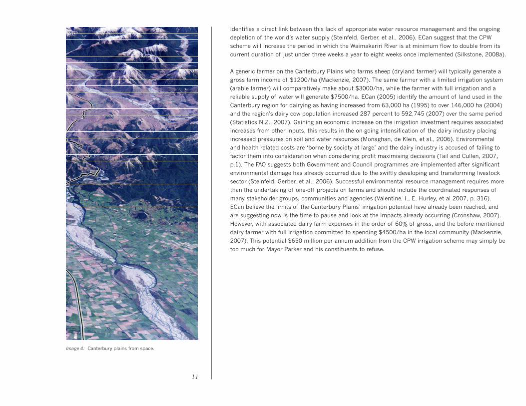
Image 4: Canterbury plains from space.
12
New Zealand’s economy is ‘utterly dependent on its primary industries’ according to the Federated
Farmers President Don Nicolson and the lobby group’s 2008 General Election Manifesto which is aptly
subtitled New Zealand’s Economic Backbone (Federated Farmers, 2008a, p. 3). Frank Brenmuhl, the
Federated Farmer’s Dairy Section Chairman while addressing the New Zealand and Australian Dairy
Farmers Council in February 2008 assured his audience they in fact were the true backbone of the
industry (Federated Farmers, 2008b). These metaphorical backbones combined statistically, identify
agriculture as contributing 65% of New Zealand exports, generating $18,926 million gross revenue,
and when including downstream processing 15% of total GDP (Federated Farmers, 2008a). With 34.2
million sheep and 5.6 million dairy cows occupying 14.7 million hectares or 55% of New Zealand’s
total land area, the last decade has seen agricultural productivity grow annually by 1.8% double the
economy as a whole. This growth can be seen particularly in the Canterbury Plains’ transition to dairy
farming during the last decade, where Ashburton, Christchurch, Selwyn, Timaru, and Waimakariri
(note these regions for the purposes of this thesis constitute the Canterbury Plains) in 1995 totaled in
number of dairy cows 170,253; by 2007 this number had increased by 287% to 592,745 (Statistics
NZ). Compared to the 69% increase nationally in the dairy cow population since 1995, the Canterbury
Region represents a significant transition and intensification of livestock numbers.
‘Food is the new oil’ enthuses Fonterra’s General Manager of Strategy and Economics, Alex Duncan,
citing the world’s demand for food is expected to double over the next 25 to 50 years (Scherer, 2008),
this country produces so much milk that only 4 percent is sold domestically, while the dairy industry
is targeting 4% growth per annum, and doubling of production within 17 years (Deans and Hackwell,
2008). These trends however are expected to produce ‘proportionately higher levels of pollutants and
contaminants from our primary production’ according to the Ministry for the Environment (MFE) 2007
Draft Chapter (p. 1). The agricultural sector contributes 48.5% of total New Zealand greenhouse gas
emissions (average 2002-04), an increase of 15% over 1990 levels (MFE, 2007a). This increase is
primarily attributable to emissions from enteric fermentation, which account for 31.0 percent of New
Zealand’s total emissions. Methane emissions from dairy livestock have increased 70.3% since 1990
(Tail and Cullen, 2006) creating significant environmental problems as methane has 23 times more
global warming potential than carbon dioxide (Steinfeld, Gerber, et al., 2006). The second significant
contribution is the increased use of inorganic nitrogen and phosphate fertilisers, having risen by 420
and 100 percent respectfully since 1990 (0ECD, 2008). Due to the natural deficiencies in four major
nutrients required for plant growth, it is estimated New Zealand’s soil would be capable of supporting
between 25 and 50 percent of current livestock numbers without the additional of fertiliser (Statistics,
2006, p. 1).
The Government’s decision to bypass the scrutiny of the Commerce Commission was designed to give
New Zealand ‘more clout in the global dairy market’ resulting in the creation of Fonterra New Zealand
(Adcock, 2003, p. 112). The booming dairy industry is now almost completely controlled by the giant
dairy co-operative, where Fonterra’s contribution to total export revenue is 25% driven by record high
commodity prices, and the company now processes 95% of the milk solids produced in this country
(Ninness, 2008). While these figures might indicate expansion of rural New Zealand, the consolidation
of farm ownership in fact means farmers are instead deciding to sell their family farms to syndicates
2.1.2
New Zealand’s Dairy Farming
Landscape

13
of investors, illustrated by the declining number of Fonterra suppliers, from 12,600 in 2003, to now
10,500 in 2008 (Ninness, 2008). Further decline is expected as Fonterra chairman Henry van der
Heyden suggests within the next 10 to 15 years dairy farmer numbers in New Zealand are likely to
drop to 4,000 or 5,000 (Ninness, 2008). 30 years ago the national average dairy herd was 125 cows,
today the average herd numbers 347 cows and even at this size you’re just scraping along (Ninness,
2008). A BERL report (2008) identified Ashburton as New Zealand’s leading dairy farming region with
the largest average herd numbering 779 cows (TVNZ, 2008b). Brenmuhl in his Dairy Farmers Council
speech recognised New Zealand’s international dairy reputation as consisting of individual and family
farmers while claiming that private interest and environmental groups are ‘distorting the image of the
dairy industry … claiming that it is a group of giant corporations’ (Federated Farmers, 2008b).
The Clean Streams Accord demonstrates that on-farm environmental management is firmly on the dairy
farmers’ agendas according to Barry Harris, Fonterra’s Sustainability Leadership Team Chairman
(Fonterra, 2008). While long-term sustainability is seemingly assured with Brenmuhl adding that the
dairy industry is constantly looking for new ways to improve environmental performance (Federated
Farmers, 2008b). The Clean Streams Accord is touted by farmers as an agreement that has solved or
will solve the negative impacts of farming on freshwater (Joy, 2008). The Federated Farmer’s 2008
General Election Manifesto asks for ‘scientifically verified metrics for sustainability’ (2008, p. 34) yet the
voluntary Clean Streams Accord holds farmers unaccountable with soft targets and has failed to include
any conditions that changes in water quality be measured (Deans and Hackwell, 2008). A MFE report
suggests it will take at least five years, and more likely 10 to 15 years, before definitive trends can be
identified with respect to water pollution (Cowie and van Voorthuysen, et al., 2006). Dr Erik Jeppesen,
from Denmark’s National Environmental Research Institute, substantiates this further by warning of a
‘time bomb’ of polluting nitrate’s existing in the ground and these will continue leaching into rivers and
aquifers for several decades still (Rowan, 2008).
So while it may take many years before the impact of past nutrient applications becomes apparent,
MAF warns of a link between irrigation and the intensification of land use resulting in ‘a concomitant
increase in nutrient application’ today (2004a, p. 26). This is exhibited in Canterbury, when in 2004 the
region become the heaviest fertilised in the country, on the back of substantial dairying and irrigation
expansion (Statistics, 2006). The Clean Streams Accord provides figures implying that the Canterbury
region has only 3% significant non-compliance with their dairy effluent discharge resource consents
(2006-07). However, ECan reports serious non-compliance of 17.7% (over 110 incidents), and minor
non-compliance of 42.7% while noting that sound dairy shed effluent management plans have failed to
be adopted by many farmers (Deans and Hackwell, 2008). Nationally serious non-compliance is more
than 14% of dairy farms, twice the 7% reported by the Accord partners that includes Fonterra, MFE,
MAF, and Local Government New Zealand. Considering most regional council figures are calculated
after well-publicised annual inspections that include prior notification (Deans and Hackwell, 2008),
and since most pollution is believed to go unrecorded (Steinfeld, Gerber, et al., 2006) such high levels
2.1.3
Self-Regulation and
Clean Streams

14
of non-compliance is concerning. The voluntary scheme is failing to deal with serious poor operating
practice on dairy farms (Deans and Hackwell, 2008), with Fonterra acknowledging disappointment with
respect to farmers who are failing to comply with regional council requirements (Fonterra, 2008).
The Accord partners assumed that voluntary ‘best’ practice measures would deliver improved water
quality, but this has not been the case. The adoption of Good Environmental Practices (GEPs) on dairy
farms is not generally driven by environmental considerations – environmental sustainability has at
best a limited role with regard to on-farm decision-making (Tait and Cullen, 2006). Instead logistics
and economics are important – adoption of GEPs is seen to occur only when ‘there is a congruence
of farmers’ economic and environmental goals’ (Monaghan, 2008, p. 3). The Accord was intended to
send a strong message to both domestic and international customers, acknowledging environmental
management as an integral and important component of the dairy industry, and that industry self-
management as the most effective means of achieving this. The Accord’s commonly used phrase ‘best
practice’ is problematic due to the inference among both farmers and public of the impression that
this adopted practice is sufficient in achieving the required water quality goals (Deans and Hackwell,
2008). Added alarm is the implication that the Accord’s voluntary approach is being used strategically
against alternative and further imposed regulations that would arguably necessitate more invasive
restrictions on dairy farming practice. Suggestion that voluntary agreements can succeed when farmer
concerns of environmental quality reflect those of society is unlikely considering the obvious disparity
in the current practices and attitudes of the dairy industry (Kara, Ribaudo, et al, 2008, p. 1530).
New Zealand is heavily urbanised, to the extent that 86% of the population are categorised as urban,
while farmers represent fewer than 4% of the population. For the Federated Farmers this urban-rural
divide is a major concern when considering their position as ‘the engine room of the economy’ they
‘must be at the forefront of public policy’ and not an afterthought (Federated Farmers, 2008a, p. 3).
With regard to environmental practice the public should give farmers a break, according to Charlie
Peterson ‘be grateful for the food on their table, not constantly criticising the people who produce it’
(TVNZ, 2008a). Professor Jacqueline Rowarth, director of Massey Agriculture insists the public should
‘stop blaming farmers for our environmental woes’ warning that doing so may ‘impact adversely on
the consumer further down the track’ (Coddington, 2008). Considered from within the dairy industry
as being the minority cause within a complex environmental issue, the rural sector view themselves as
publicly scapegoated by ignorant environmental politics, and ‘feel good eco-friendly’ urban majorities
(Friedman, 2007). Federated Farmers identify these lobby groups as having driven a wedge between
both communities, and encourage Governmental financial support for Federated Farmer’s initiatives
to improve relations between urban and rural (Federated Farmers, 2008a). The Government is already
assisting farmers, to the tune of $72.1 million – the cost of cleaning up the worst of Rotorua’s polluted
lakes which are suffering from toxic algal blooms resultant of high farm nutrient levels (Rowan, 2008).
Lake Taupo, presents a different kind of Government involvement, where intervention of fertiliser caps
is presented by Federated Farmers as abusing producers who feel under siege, and while admittedly
2.1.4
The Battle of Urban-Rural
cleaning up Lake Taupo will help the rest of the country it is seen by farmers as ‘totally unfair how its
ended up the farmers having to pay for the lakes protection’ (TVNZ, 2008a).
Bruce McNab, Federated Farmer’s spokesman, sees the reliance on information received from lobby
groups as counter-productive. He believes both opposing groups should ‘get together and focus on
what they have in common, instead of creating conflict’ (TVNZ, 2008c). The Resource Management
Act (RMA), he suggests, is being taken advantage of by urban environmental groups in order to stifle
farmers’ developments. Farmer opinion of the RMA laws is likened to where ‘draconian provisions are
enforced’ and consequently enables ‘an idiot with no idea of the industry’ to complain through the
RMA process (Adcock, 2003, p. 115). These opinions are echoed by Federated Farmers who accuse
the RMA of ‘eroding the productive capacity’ and ‘compromising the long-term viability of farming’,
resulting in the failure to achieve promotion of sustainable resource management (Federated Farmers,
2008a, p. 30). The RMA process is considered frustrating with respect to public participation, Lincoln
University Environmental Management Professor Ali Memon describes the RMA as uneven ‘from the
perspective of those who do not stand to gain financially from favourable outcomes’ (Memon, 2007).
The privilege of expert knowledge from lawyers, scientists and technical experts is identified over the
practical knowledge of local residents, thus further illustrating the expanding differences, economic
resources, and challenges that confront a balanced view of the CPW irrigation scheme.
The most likely urban grievance identified by this thesis is related to the Emissions Trading Scheme
where households, road users and small to medium businesses, that generate one third of the nation’s
emissions, will meet 90 percent of the payment (Terry, 2008). Federated Farmers want renegotiations
of New Zealand’s Kyoto agreement to exclude all livestock emissions claiming the potential impact for
future farm viability (Federated Farmers, 2008a). Simon Terry, Director for the Sustainability Council
refutes these suggestions, insisting that urban communities will pay the largely disproportionate share
in order to insulate farmers’ incomes through capital gains protection money (Terry, 2008). Seen from
an environmental perspective, the urban community’s relationship with the CPW scheme is expressed
by a recent Lincoln University survey, indicating increasing concern for the quality of rivers, streams
and lakes, with water quality overtaking air pollution as the respondents number one concern (Lincoln,
2004). Management of farm effluent and runoff was identified as the least well managed of all the
environmental problems. Federated Farmers however share little time for these sociological studies,
as they ‘detract from pure research and development investment’ (Federated Farmers, 2008a, p. 29).
This separation typically illustrates the urban/rural divide, where large groups and sections of New
Zealand’s society insist the dairy industry must include ecological and ethical considerations beyond
just profit and include social and environmental costs in future developments (Williams, 2007).
15

16
2.2 Cartography.

From the outset of cartography, connections between map-making and pretensions to political power,
rule and conquest have been apparent. By the sixteenth century, maps that had previously symbolised
sovereignty over the world, and were used in religious and portrait painting as regalia accompanying
those of authority and nobility, were beginning to develop new connotations. Brian Harley cartographic
theorist, expresses in Maps, knowledge, and power the sixteenth century map as ‘primarily intended to
convey the extent of the territorial powers, ambitions, and enterprises’ and when used to accompany
emperors, monarchs, and statesmen, the map functioned as ’graphic shorthand for the social and
territorial power they were expected to wield’ (1988, p. 295). A theme often accompanying European
Renaissance attitudes, namely ‘celebration of the individual’ would see the symbolic attributes of the
sixteenth century map transferred from the church to the individual. By the seventeenth century, it
would be the state that would adopt the political currency implicitly present in the cartographic map.
Seventeenth century maps were typically emblematic of the social, architectural, and technological
progress celebrated by most major European cities of the time (Dubbini, 2002). Here engraved city
views featured pristinely appointed buildings housing governmental, public institutions, commercial
agencies, and infrastructure. Seen as visual proclamations of ‘the triumph of good government and
public and private laboriousness’ this attention to civic achievement developed into a ‘conception of
the whole city as one harmonious body and perfectly functional organism’ which ‘the atlas seemed the
ideal instrument for creating a compendium of the architectural form of a given civilisation’ (Dubbini,
2002, p. 26).
The exertion of power through cartography is identified in Deconstructing the Map (1989) where Harley
proposes the existence of a patron behind most maps, where ‘monarchs, ministers, state institutions,
and the church, have all initiated programs of mapping for their own ends’ (p. 12). Harley accuses the
map of reinforcing ‘distinctions of class and power’ through the use of cartographic tricks, identifying
those most prominent, that is, the patron as a most likely recipient of the map’s power and influence.
It is the cartographer or patron whose assumptions are most represented by the map, Jeremy Black
cartographic author describes the map as ‘not simply a means of displaying historical evidence’ but
rather ‘interpretations of that evidence’ (1997b, p. 20). This argument concerning the map’s valuative
connotations is discussed further by geography professor Alan MacEachren in How Maps Work (1995)
acknowledging the presence of a social hierarchical structure, as is suggested also by Harley (1995).
MacEachren however proposes that the single most important rule responsible for this structure is
that ‘presence on the map, therefore, connotes importance,’ and describes a related rule concerning
locational proximately on the map, whereby ‘centrality, then, also connotes importance’ (p. 343).
Valuative connotations were particularly apparent in the maps of the eighteenth century, specifically
during the period of New Imperial European Colonisation. Where the previous century used the map to
advance social unity and celebrate civic achievement, the eighteenth century map unashamedly spoke
of victorious empires and nationalist propaganda. This is especially illustrated through the European
Imperial powers claims of occupation and entitlement within the newly discovered lands, and through
the employment of cartography decreeing non-map-making nations as without either right or claim
(Remarkable Maps, 2005). Cartography was the most ‘convenient and accepted legal means to claim
the land masses of the New World’ (Remarkable Maps, 2005, p. 87). Relationships between European 17
2.2.1
Political Power Structure
Image 5: Ruth Watson, Another Map of the World, 1989.

colonisation and cartography continued into the nineteenth and twentieth centuries, and was present
within the historical atlases that closed their map section with a colour coded world view featuring the
might of the imperial powers. Most famous of these was the vast expanse of the British Empire, which
was indicated by the colour pink and covered a quarter of the globe, serving as impressive reminders
of Britain’s supremacy (Remarkable Maps, 2005). These atlases provided several important roles in
the process of representing and educating existing, as well as new members to the imperialist potency
of the British Empire.
The potential of maps as a means to extend imperial control over places not already claimed by other
cartography presents opportunity for the CPW irrigation project to engage with and benefit from the
possible inferences of the map. So where the political agendas of European colonisation are matched
with the worldviews presented through the cartographic map, so too the Canterbury Plains and the
presence of dairy cows, irrigation, and environmental causation may also be afforded political power
on this map. Where the exertion of power through cartography is traditionally reserved for those in
government or with entitlement, and environmental conservation not usually a part of this category,
maps that present the CPW scheme may serve to create importance and prominence for it and be
assigned political power by it simply with through this engagement with cartography.
Parallels between cartography and science have been intrinsically connected from since Ptolemy’s
Geographia (2nd century AD) and its discussion of the geographic knowledge of Greco-Roman worlds.
Within a contemporary context it is the cartographer and author Arthur H. Robinson (1915–2004) and
The Look of Maps, published in 1952 which is widely regarded as seminal within the development of
modern scientific and cognitive cartography. With parallels to the emergent scientific disciplines of
psychology and psychophysics, Robinson’s approach was similarly influenced by thematic, military
mapping, photography, and the Impressionist Movement (Montello, 2002). Cognitive cartography can
be expressed as ‘systematically applying the theories and methods of science, particularly psychology’
to assist ‘perception, learning, memory, thinking, reasoning and problem-solving, and communication’
for the map reader (Montello, 2002, p. 284). MacEachren identifies cognitive cartography as analysis
of the ‘characteristics of perception as they apply to maps’ and resulted in future decisions based on
objective rules (1995, p. 2). This scientific approach shifted the emphasis in modern cartography from
production and graphic design, and instead toward map functionality and systematic analysis.
The disappearance of art from cartography can be paralleled similarly with the disappearance of the
author. Wood and Fels identify the author’s disappearance from the map as necessary to enable the
notion or pretense of maps as representative of reality, and enable the viewer to ‘take for granted – as
natural – what is never more than the social construction of a map’ (Wood and Fels, 1993, p. 71). For
‘were it not reality, why then it would just be … opinion’ and suddenly the things represented by the
map would be open to discussion and debate (Wood and Fels, 1993, p. 18). The word ‘transparent’ is
discussed by many in the context of cartography, where it is afforded the implication as an objective 18
2.2.2
In Search of Scientific Truth
Image 6: The Historical Development of the British Empire, 1926.
medium. Defined as the obvious and evident result in the process of functioning with the user being
unaware of its presence, the word also serves to further imply of the disappearance of art and the
author from modern cartography (Oxford, 1999). Maps connote accuracy, impartiality, and authority
that inspire confidence because of the seemingly obvious lack of a particular viewpoint (MacEachren,
1995). This is further enhanced by the ‘connotation of integrity’ where governmental and/or scientific
involvement is believed to connote freedom from bias. MacEachren identifies this as having resulted
from the eighteenth century development of systematic governmental surveys that served to connote
modern cartography with the ‘single and apparently impersonal view of the world’ (1995, p. 341).
Importantly this established contemporary cartography’s most cherished myth, that of apparent
‘dispassionate neutrality’ (Wood and Fels, 1993, p. 22).
The belief in the objectivity of maps is somewhat thanks to the implication that behind the map stands
scientific honesty and precision. Expressed as the ‘impartial scientific realisation of reality’ and where
map–users equate cartography as having been made increasingly accurate through modern advances
in technology (Black, 1997b, p. 17). Cartography benefits from scientific, production, communication,
and technological advances, which can be argued increase accuracy and map representation. However
the implication is that these scientific components have become now so dominant as to completely
overshadow any subjective implications (Wood and Fels, 1993). Wood and Fels argue the ‘pretense’ of
this reality represented by the map now negates any questions of authenticity or objectivity that the
map may contain. Further stating ‘that no sooner are maps acknowledged as social constructions that
their contingent, their conditional, their … arbitrary character is unveiled’ and then suddenly open to
debate (1993, p. 20). With regard to the CPW irrigation debate the scientific objectivity provided from
the map is central to the communication process where the implied factual and objective evidence and
therefore truth provided by the presentation of information through cartography connote accuracy and
distance from propaganda. The CPW map while a representative instrument of a persuasive argument
should be far removed from the emotional or overtly sensitive manner in order to be an effective voice.
The depiction of power and politics within the conventions of cartography is dominated by symbols
according to Black, where problems inherent in mapping cartographic places and communities are
that ‘these worlds have to be created for readers who know nothing of them’ (1997b, p. 101). The use
of novel and unfamiliar imagery whilst enlarging the cartographic repertoire, also introduces questions
regarding the graphic rhetoric of maps and the required unpicking of texts (Black, 1997). Postmodern
condemnation of scientific rationality, and its futility in the communication of accurate knowledge is
exhibited amply in Harley’s Deconstructing the Map (1989). Harley invites the reader to consider the
honesty of the image, its silences and contradictions, by reading between the lines of the map and in
the ‘margins of the text’ (p. 3). While the scientific approach identified by Robinson had its insistence
on a standardised set of rules and language (Montello, 2002, MacEachren, 1995), Harley argues for
the deconstruction of cartography, insisting that ‘text is certainly a better metaphor for maps than the
mirror of nature’ (1989, p. 7).19
2.2.3
Deconstructing Rhetorical
Mapping Devices

Acknowledging that all maps can be interpreted as both cultural and constructed texts, and through
deconstruction identified as systems containing individual layers, associations, and contexts. Harley
suggests ‘rhetoric is part of the way all texts work and that all maps are rhetorical texts’ (1989, p. 11).
Consider maps as containers of the persuasive devices synonymous of rhetorical language, including
invocations of authority, colour, decoration, and method justifications. Harley identifies the process of
map making as inherently rhetorical, because of its tendency for ‘selection, omission, simplification,
classification, the creation of hierarchies, and symbolisation’ (1989, p. 11). Use of Colour within maps
serve to increase the density/complexity of information, although as argued by Black, colour conveys
no more information than could be obtained by black and white with graduations (1997a, p. 216). In
fact large variations can create colour puzzles as suggested by information designer Edward R. Tufte,
while also limited as visual ordering systems because of their inability to give a visual order to colours
(2001, p. 153). However colour is often a favourite propaganda tool employed by cartography because
of the unconscious associations it evokes (Muehrcke, 2001).
The use of solid colour can imply the existence of harmony and agreement between states or nations
upon the cartographic map (Black, 1997a). Though this impression may be untrue, for conflict and
turmoil may well reign within this land, although the solid and stable colour suggest otherwise. Where
occurrences in which the map casts metaphorical judgment, such as proclaiming pristine Caribbean
blue water, devoid of the eroded silt, or the industrial waste, is where this colouration falsely dresses
the map with ‘the most reassuring tones’ (Wood and Fels, 1993, p. 121). Application of colour in the
description of the Canterbury Plains’ landscape has the potential to present direct associations of the
dairy industries negative environmental impacts. For example the tone of green used to identify the
irrigated pastures might juxtapose sharply with the dry and unfertile surrounding land. This colour
while used to imply the locational presence of the industry may also represent emotive privilege when
seen in the landscape and within context of the map’s subject matter.
Maps simplify our surroundings by offering a selective and incomplete view of reality, which is the
cartographic paradox, to present both a useful and truthful picture ‘an accurate map must tell white
lies’ (Monmonier, 1991, p 1). Therefore presenting the CPW scheme has the liability of removing the
viewer from confronting reality, providing instead a view that is schematic and lacks complexity. These
omissions not only impact what is omitted from the irrigation debate, but also the variety and quantity
of information that is shown, and thus by reducing, the CPW maps must also generalise. Through both
selection and spatial depiction, maps ‘abstract, exaggerate, simplify and classify’ each of which is
misleading (Black, 1997b, p. 104). This is evident when considering the proximity of objects visually
expressed on a map, where simply because features are presented close together doesn’t in fact mean
they’re related (Muehrcke, 2001). Distortions are inevitable when considering that decisions are made
concerning colour, size, style, quantity, and arrangement of symbols, to the extent that thematic maps
of numerical distributions the only rule suggested by Muehrcke is make it ‘look right’ (2001, p. 527).
20

When compared with literature, art, or music, Harley identifies the map as having very ‘few genuinely
popular, alternative, or subversive modes of expression’ and supposes mapping as ‘preeminently a
language of power, not of protest’ (1988, p. 301). Pointing to the retention of cartographic power by
dominant groups, such as government, military, news media, and the multi-nationals as reason for
this. The recent emergence of personal computing, incorporating powerful mapping tools amongst
more organised vocal community and lobby groups should have to some extent balanced these issues.
However, geographer Chris Perkins in Community Mapping (2007) points to the practice of community
mapping as ‘much less frequent or emancipatory than might be expected’ (p. 127). For which Perkins
in Cultures of Map Use (2008) identifies participation barriers that include: the perceived specialist or
technical demands, and the prohibitive expense of survey and official mapping, as possible reason for
this. Black considers the ‘lack of uniformity in data collection’ due to the politicalisation in collection,
presentation and analysis as further evidence of this deficit (1997b, p. 23). While Parker suggests that
the collaborative engagement with external entities may create interpretative and/or cultural barriers
or difficulties, and also argues that the notion of community itself may be problematic with respect to
the acknowledged cartographic sense of privilege and authority (2006).
Alternatives to traditional mapping practices have of recent included more participation from within
the arts community. According to MacEachren they offer an ‘intuitive and holistic’ approach, and that
whilst drawing on scientific research and developments, the art community’s achievements can enable
‘critical examination’ (1995, p. 9). This model is no more clearly expressed than the Tom Van Sant /
GeoSphere Project, which included the assistance of a NASA Jet Propulsion Laboratory, multi-spectral
scanners and thirty-five million pixels – producing the amply titled A Clear Day (Image 7). This global
image map was created after a serious medical condition threatened to blind Van Sant, and it is the
result of a year-long obsession and intention to highlight environmental themes (Wood, 1993). The
map serves to illustrate these personal concerns, and those of National Geographic whose 1990 World
Atlas cover it adorned. The map is employed to publicise their committed ‘vision of the earth as
scared, as having an existence… apart… from that of man’, and where the map represents an earth
so still it is seemingly ‘holding its breath’ while both paper thin and fragile (Wood, 1993, p. 66). The
Van Sant map intended to generate environmental activism, connotes a request for help before it is too
late, before this ‘beautiful “picture” can no longer be taken’ (MacEachren, 1995, p. 349).
21
2.2.4
Mapmaker as Creator rather than
Reflector for Counter-culture
Agendas
Image 7: Van Sant GeoSphere, A Clear Day, 1990.
Decisions including the particular wave length to stress – infra-red being characteristically generous
for vegetative surveys and water resources, or the amount of cloud cover included or in the Van Sant
example excluded, are a part of any artistic, and hence, cartographic process. Artistic maps illustrate
the evocative power of cartography engaged with both art and science (Perkins, 2008). This is further
emphasised by Harley who sought to reject the previously dominant binary opposites of ‘art/science,
true/false, objective/subjective’ (1989, p. 11), and ‘scientific integrity’ as opposed to the ‘ideological
distortion’ (1988, p. 278). MacEachren accepts that while no exact rules exist for the combination of
art and science required for any given cartographic problem, their collaborative function provides both
valuable tools and resources for cognitive map communication (1995). This is exemplified in both the
‘intuitive and holistic’ approach of art, whilst science offers a more ‘inductive and often reductionist’
method of breaking and examining a complete picture into individual parts (MacEachren, 1995, p. 9).
As suggested by Crampton and Krygier critical cartography assumes that maps ‘construct reality as
much as they represent it’ (2006, p. 15). They define critical cartography as challenging that of the
more traditional scientific and academic ethos and as ‘linking geographic knowledge with power, and
thus [mapmaking] is political’ (2006, p. 11). By implication the contents of the CPW irrigation scheme
maps are then political and these decisions expressed through mapping are representative of political
expressions. No longer restricted to limitations of observation, the CPW maps assume their natural
and logical position as instruments for statistical data processing, and reasoning about quantitative
information and persuasive argument (Wood and Fels, 1993). Functioning as inciteful and emotive
communicators, Canterbury is presented through the author’s intention to convince, persuade and
suggest particular relationships. This persuasive function occurs ‘explicitly or implicitly’ traditionally
through the overtly deceitful nature of propaganda maps, or the subtler forms of persuasion that are
inherent in the majority of government and scientific maps produced (MacEachren, 1995, p. 348).
Dynamic mapping is the expression of change over time, which as opposed to the static territorial or
distribution maps, can be identified as the expression of processes and actions such as centralisation,
decentralisation, and can result in the formation of national identity (Black, 1997a). Information when
expressed through dynamic maps creates dual modes of connectivity for the viewer, enabling both the
recognition of patterns between ‘disparate entities, events, locations and phenomena’ whilst occurring
concurrently with presentations of relationships within a social and/or cultural context (Black, 1997b,
p.20). This is explained as where an active construction takes place between both the knowledge and
experience – connectivity – of the map and with the map’s viewer (Turnbull, 1993). This interaction
differs significantly from that of written text, which delivers information sequentially and is ultimately
removed from the contextual surrounds when considering relationships of spatial and/or physical
representation (Black, 1997a). The naturally abstract quality of the map provides for the location and
visualisation of ‘concrete description[s] and explanations that would be otherwise overly abstract’ in
written text form (Black, 1997a, p 213). This allows the map to visually describe the entire context of
a situation, thus permitting the viewer a wider appreciation and the opportunity to form connections 22
2.2.5
Dynamic Mapping of Information,
Environmental Causation
and Place
within the larger surrounding picture of an issue, event or concept.
Maps establish context through the engagement of three linked systems: ‘space, time, and object’
(MacEachren, 1995, p. 325). These provide the framework of the dynamic map, and the ability to
present a discourse or argument through an agreed relationship of complex iconic or linguistic codes.
However, Wood and Fels argue that the map is more than just a single solitary image presented to the
viewer, and instead this image is accompanied by a crowd of additional rhetorical signs: ‘titles, dates,
legends, keys, scale, images, emblems, texts, references, footnotes, potentially any device of visual
expression’ that combined creates a cognitive and coherent proposition and/or ‘legitimate discourse’
(1993, p. 131). Opportunity exists for the map to use the arrangement and interaction of and between
any graphic/visual codes of representation, provided they can be conventionalised. So while mapping
surpasses the possible practical exchange of most other communication systems, Wood and Fels
acknowledge that the limitations are clearly prescribed by the limitations of our own visual culture and
also the conventions of how effectively we determine and equate graphical marks and their defined
meanings (1993).
The representation of reality through mapping permits a clearer understanding and appreciation of
the world’s natural and physical environments. Black acknowledges that when presented visually and
through diagrammatic means, instead of as ‘locational specificity’, we start viewing place as an aspect
of ‘model building’ (1997b, p. 26). This simplification of maps subsequently allows for the diversity
and complexity of the CPW irrigation scheme to be presented on the map and within its cartographic
context. Muehrcke notes that without maps, the world seems a chaotic place of unrelated phenomena
and through model building we are able to separate ourselves from confronting this reality and also its
overwhelming and confusing state (Muehrck, 2001). The possibility of presenting the CPW scheme as
a diagrammatic model draws directly from the maps convenience as a useful picture that people are
prepared to let stand for reality. While environmental features such as rivers, soil, and mountains do
traditionally feature on atlases with an illustrative function, the CPW map will encourage the viewers to
consider these within a wider ecological, economic and social regard. The potential for environmental
transition and causation in the CPW map is similar to suggestions by Black where cartographers maps
become both necessary as descriptive and as explanatory tools. Furthermore, the interpretable nature
of cartographic summary will therefore enable the CPW map to draw upon visual description as both a
source of information to aid decision-making and behavioral practices in space.
23

24
2.3 Information Design.

Perceptual psychologist Rudolf Arnheim (1969) affirmed that everything in this world is affected by
context, identifying an object’s context as the initial and primary influence upon its general cognition.
Therefore, in order to understand an object’s perceptive qualities, Arnheim suggests two possibilities:
either remove the object from its context (abstraction), or analyse both the object and its contextual
content. Mike Zender, an information design researcher/practitioner considers that most traditional
communication design has followed the first of Arnheim’s two suggestions (2006). As exhibited in
airport and highway visual language systems, Zender describes the abstracted object as being ‘peeled
from its context’ and presented as limited iconic signs ‘on a plain, unadorned, blank background’
(2006, p. 182). There are various other contextual influences acting upon these (airport and highway)
signage examples and all visual language systems in general. These include, Environmental Context,
where in the example of the airport the distinctive physical and locational features themselves identify
and promote the icon’s meaning and/or interpretation. Zender describes the Proximate Context as the
interactive field contained in and employed by a visual language system, such as its ‘framing devices’
and with respect to roadside signs, a distinctive triangle shape (2006). Third, and most significant
for Arnheim and Zender is the Immediate Context where the elements within an image interact with
each other to enable an integrated message (2006). Instead of the solitary communication limits
inherent of individual signs, Arnheim and Zender suggest that advancing Immediate Context will create
the possibility for a more complex and descriptive visual language system by expanding rather than
limiting cognition through context (2006).
Visual language’s limited capacity in conveying information is described by communication Professor
Jorge Frascara as resultant of the modern perseverance in the reduction, simplicity and isolation from
context (2001). This scientific insistence upon clarity of information, Frascara describes as having
been fostered from verbal languages’ linear process and bias toward sequential explanation (2001).
The reliance of current icon-based systems on both Environmental Context and verbal language has
translated into the isolated development of communicating physical objects. Zender acknowledges
that whilst effectively describing nouns, visual languages are rarely able to communicate processes
and actions (2007). So while Frascara is among many who suggest the employment of visual language
for the integration of information into meaningful wholes, Zender warns existing examples are like a
‘spoken language with no verbs’ (2007 & Crutcher, p.29).
What all graphic language share is an organisational structure that allows for the elements within any
system to interact with each other, therefore communication depends on the stability or convention of
these to an audience. This analysis of pictographic systems, by textual scholars Johanna Drucker and
Jerome McGann also identifies two fundamental principles critical to all graphic languages; ‘a set of
entities and a system of relations among [these] entities’ (2001, p. 96). With this in mind it is evident
how airport and highway signage systems whilst utilising both external Environmental and Proximate
Contexts, are potentially missing the before mentioned significant influence of Immediate Context when
containing single elements. The addition of multiple icons within shared spaces suggests relationships
between individual icons and the potential to develop new meanings (Zender, 2006). This process is
described as ‘expanding context’ and allows for the combination of separate icons through layering,
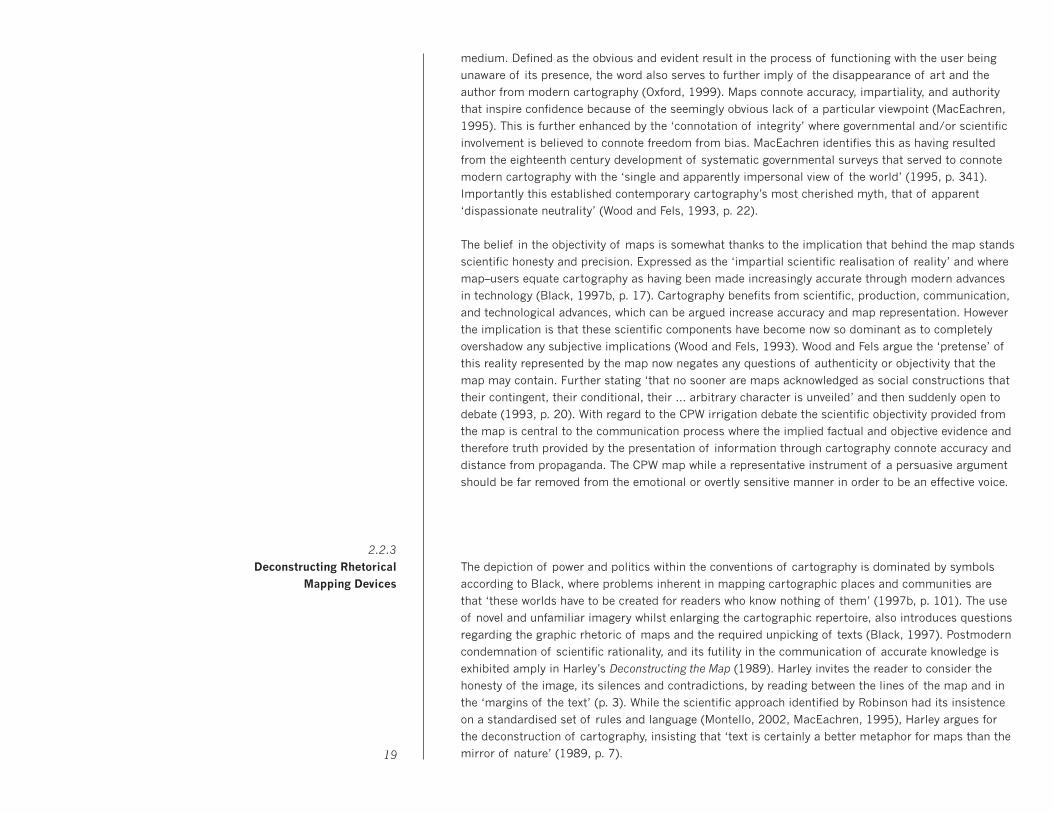
abstraction, and sequence (Zender, 2006). The Aztec Codex pictographic narrative (Image 8) uses a 25
2.3.1
The role of Context in Cognition
spatialised arrangement of separate icons in order to describe its scene. In this example the layering
of icons represents a journey of leaving home (left) and traveling to a destination (right). The inclusion
of multiple signs within the Immediate Context allows the pictograph to present a vivid and detailed
communication condensed into one single diagrammatic picture. The narrative’s ‘expanding context’ is
now ‘choreographed into meaningful relations by the use of several rhetorical principles’ that include
proximity, scale, direction, and the orientation of various sign relationships (Drucker, McGann, 2001,
p.99). Through the presence of spatial delineation, a dynamic instruction is issued to the viewer
inviting one to experience this ancient traveled journey by connecting the two separate locations.
Representational pictures tell a story through their illustration of spatial and accompanying relational
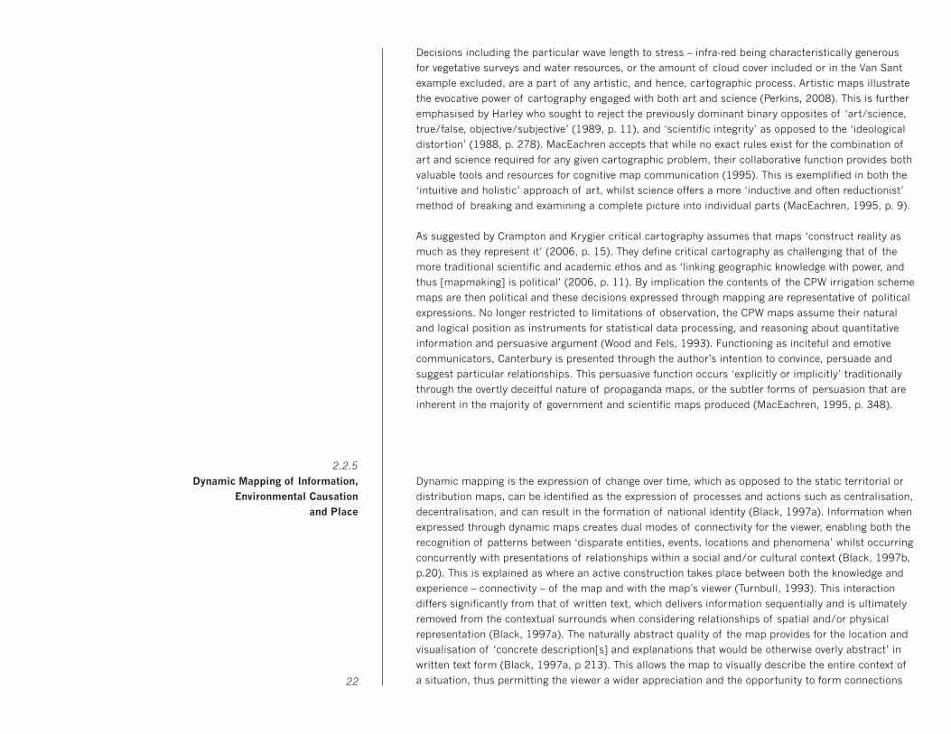
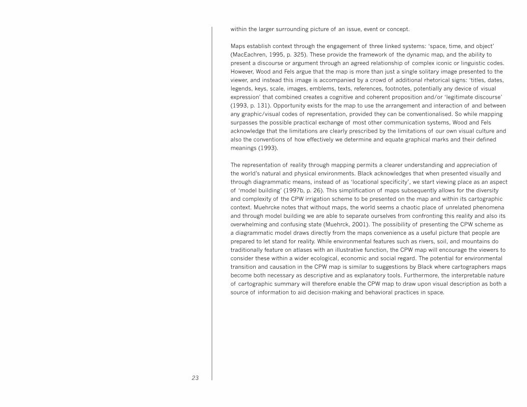
information, such as the mysteries of a Cholera Epidemic, or the protagonists within a hotly debated
local community irrigation scheme. The opportunity to visually describe the quantitative comparisons
of the CPW scheme using the cartographic map is based on the principles of two specific historical
data maps. The Cholera Epidemic in London, 1854, (Image 9) provides the example of Dr John Snow
revealing cause and effect relationships between the cholera epidemic outbreak and the proximity
of the Broad Street pump (Tufte, 1997). Achieved through the locational display of the 83 cholera
related deaths on a topographic map of London, this illustrates the persuasive argument made from
the representational display of statistical data. Charles Joseph Minard’s data-map expressing the
failed Russian campaign by Napoleon 1812 – 1813 (Image 10), however, uses the direct comparison of
visual quantities and the narrative journey through time to explain the devastating losses of 412,000
men. This expression of causality is illustrated through multivariate analysis where the duration,
temperature, and natural obstacles of the environment are presented as cause and effect (Tufte, 2006).
26
Image 9: John Snow, The Cholera Epidemic, London, 1854. Image 10: Charles Joseph Minard, Figurative Map of the successive losses in men of the French Army in the Russian Campaign 1812–13.
Image 8: Pictographic narrative of Aztecs leaving their homeland in year Flint 1. Codex Boturini
The communication of complex and abstract messages through a visual language system is expected
to remain unachievable whilst visual language is limited only to the expression of nouns, and unable
to communicate verbs and adjectives/adverbs (Zender, 2006). These concepts are analogous to the
description of things, actions and modifiers, and are essential for the operation of any explanatory
language system. While icons are used increasingly throughout the world to identify airport terminals,
Olympic events, and computer desktop functions, etc., as a universal visual language system existing
icon design is restricted to a limited application. Originating from the Greek word for image, the icon
shares characteristics and a resemblance to the thing it signifies, hence the provision for describing
nouns (things and objects) with an economy of means. This feature of iconic display, however, is also
the icon’s downfall with regard to specific modifiers, actions, and states of being which are generally
not communicated in existing icon systems (Zender, 2006). The interaction of separate icons through
layering, abstraction, and sequence previously described as Expanding Context presents the possibility
of employing the Immediate Context as a significant influence in the communication of data. In areas
with ‘controlled vocabularies and clear ontologies’ physical and/or spatial relationships between icons
have the visual potential to effectively communicate expansive themes and content within constituents
(Zender & Crutcher, 2007, p.47).
Efficacy in communicating information is ‘proportional to the extent to which it is comprehensible’ to
a target population (Young & Wogalter, 2001, p. 124). Otto Neurath and the ISOTYPE visual language
system established this utility through two rules: the reduction of graphical style and the consistency
in appearance of a coherent system (Lupton, 1989). The combined effect of this resulted graphically
in the silhouette, and was used by Neurath for the perceived dispassionate, scientific, and impartial
authority it implied (Holmes, 2001). The silhouette’s stylistic consistency indicates unity as a statistical
set, establishing agreed formulaic conventions that allow for consistent user comprehension (Lupton,
1989). An indexical image made without human intervention, the silhouette implies truth originating
from a pre-chemical photography technique that emulates the shadow (Lupton, 1989). This flatness
and stylistic consistency reinforce that the ISOTYPE silhouettes are read as signs, which design critic
Ellen Lupton associates to letters with a ‘language quality’, and by implication, groups of letters within
a ’self-sufficient language’ (Lupton, 1989, p. 151).
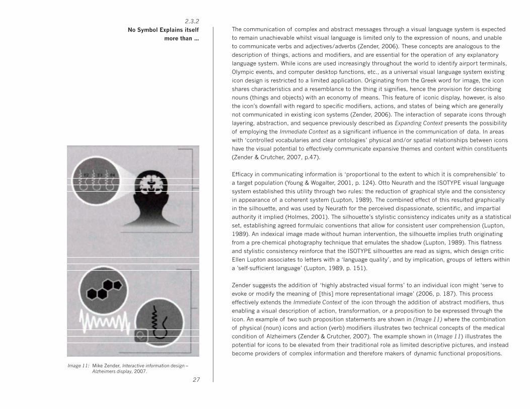
Zender suggests the addition of ‘highly abstracted visual forms’ to an individual icon might ‘serve to
evoke or modify the meaning of [this] more representational image’ (2006, p. 187). This process
effectively extends the Immediate Context of the icon through the addition of abstract modifiers, thus
enabling a visual description of action, transformation, or a proposition to be expressed through the
icon. An example of two such proposition statements are shown in (Image 11) where the combination
of physical (noun) icons and action (verb) modifiers illustrates two technical concepts of the medical
condition of Alzheimers (Zender & Crutcher, 2007). The example shown in (Image 11) illustrates the
potential for icons to be elevated from their traditional role as limited descriptive pictures, and instead
become providers of complex information and therefore makers of dynamic functional propositions.
Image 11: Mike Zender, Interactive information design – Alzheimers display, 2007.
27
2.3.2
No Symbol Explains itself
more than …
Graphics compared to words have historically been used as decorative extensions of the text, and are
generally perceived as ‘less-effective, after-the-fact conveyors of ideas’ (Hansen, 1999, p. 197). This
notion is currently being challenged through the contemporary belief and practice that visual language
has the potential, not to replace written language, but to summarise its verbal content (Zender and
Crutcher, 2007). Cartographer and theorist Jacques Bertin advanced that through the interaction with
graphic information display would promote insight and the conversion of data into knowledge (1983).
Bertin recognised this through three basic functions he considered inherent in graphic diagrams – to
record, to understand, and to communicate (Bertin, 1983). Communication professor Jorge Frascara
suggests that by synthesizing the various dimensions or components within a simple model, diagrams
are capable of intelligent exploration of otherwise elusive interrelationships (Frascara, 2001). Used in
relation to environmental sustainability, diagrams bring large-scale and overwhelming global problems
down to a local level, Frascara notes the obvious suitability of visual presentations in describing both
physical and environmental constructs (Frascara, 2001).
The present environmental situation is in part borne of an education process that ‘compartmentalises
and isolates information’ and this has resulted in ‘egocentric decision-making processes’ ignorant of
the negative environmental consequences (Frascara, 2001, p. 169). An understanding that ‘everything
is part of something larger’ would assume that when presenting data situations they are included as
part of a larger and more contextual whole (Hansen, 1999, p. 206). This dysfunction within traditional
language is perhaps an excuse why in consideration to the CPW irrigation scheme the information is
unable to be presented to the public. Where to start and how to display are the first two questions that
come to mind? Regardless of the CPW scheme’s possible degrees of evaluation, the opportunity exists
for environmental concern to be combated with science and information diagrams… ‘the world doesn’t
need more wringing of hands’ (Ede, 2005, p. 162). Instead the presentation of the CPW scheme needs
to evolve into an environmental argument with hard science and not the flagrant emotion accused of
urban lobby groups, environmentalists, and artists. The enhancement of both art and science and the
bringing together of their simultaneous capacity to respond emotionally and to rationalise objectivity
will allow scientific detachment within an aesthetic model and resulting in illustration of an evidenced
CPW research presentation (Ede, 2005).
Science provides explanations, this it achieves through asking difficult questions and prompting extra-
ordinary hypothesis, to the point that art critic Sian Ede asks …’is science the new art?’ (Ede, 2005, p.
1). Answering this question by way of interactive ecological research and modeling, and through the
incorporation of cartographic communication with scientific conceptual forecasting are the Harrisons
(Helen Mayor and Newton). A product of the Environmental Art Movement, when in its infancy, the
Harrisons now choose consultation partners from such fields as engineering, hydrology, biology,
history, political science, journalistic, and the business community. ‘You have to be informed to do this
work’ says Newton Harrison, whereby prophesying the effects of global warming the Harrisons are
effectively recontextualising the narrative, and developing new stories both independent of the power
elite and mutually beneficial to all life (Art in Action, 2007). The Harrison’s work is assisted by the
employment of large-scale maps used to illustrate and navigate accompanying texts and providers of
visual cause and effect descriptions. Peninsula Europe is an example of presenting the complexities of 28
Image 12: Helen Mayor and Newton Harrison, And the Waters Will Rise Gracefully, (From the Book of the Lagoons), 1981
2.3.3
Environmental Causation and
Data Presentation.
climate change as subject matter to an audience through art making, and via a dialogue between the
Harrison’s and the public consisting of icons and other text/image strategies. The Harrison’s belief
is that the marketplace will not solve the environmental problems, which are currently piecemeal, or
fragmented in consideration and instead require a whole systems approach to a whole new narrative.
29

30
3.0 Methods and Processes.

In order to communicate the environmental significance of the CPW scheme, this contemporary issue
needs to be placed within an historical context. Consideration of the history, narrative, and transition
specific to the Canterbury Plains provides a detailed chronological timeline and is able to establish a
contextual placement of the irrigation scheme. Accounts by authors including Knox (1969), Acland
(1975), Speight (1927), and Eldred–Grigg (1982) converge to generate an abbreviated whilst still
representative flow of the themes and subject matter central to the Canterbury Plains social, cultural
and physical identity. This research presents a number of symbolic subjects including the pioneering
spirit as exemplified by the Dean’s family, and the constant battle between settler and environment,
especially represented by the struggle to control the various raging rivers of the Canterbury Plains.
The selection and refinement of these popular themes from their initial subject matter of historical
accounts to single-sentenced summations and finally keywords, subsequently allow for their display
and arrangement into categories and ultimately into their visualisation upon graphed timelines. This
material from an historic perspective permits a more factual and less subjective account as might be
otherwise accused of more contemporary and directly associated literature i.e., protagonists websites,
newspaper, and public discussions. The previous condemnation of community mapping as overtly
political and hence its reduced transparency (Parker, 2006) also supports quantifiable and historic
data sources and non-association with data from perceivably biased lobby and/or stakeholder groups.
The mapping of keywords upon a chronological timeline (Image 13) allows this collection of statistical
information to be presented and evaluated together and in respect of surrounding events. Although
reliant on traditional written language to communicate, this graphical display is beginning to employ
the visible and spatial relationships usually restricted from this more conventional word format. The
emergence of observable connections, parallels, and correlation between the various keywords and the
statistical summations allow for the identification of prominent cause and effect issues from within
Canterbury’s agricultural history. Stretching approximately 150 years, the timeline illustrates the initial
reluctance and difficulty experienced by the early settler. This however dramatically changed upon the
realisation of farming potential by the early pioneers, and resulted in the settlement and turning of
soils during the years 1850 – 1880 of 1.3 million acres of the Canterbury Plains. The environmental
consequences of this subsequent swell in human habitation are glimpsed in the wanton and accidental
destruction of the regions very limited resource of native trees, and ultimately reduced the area of
millable timber to about 12% of the original forests during the same 1850-1880 period. Combined
these two statistical statements provide a metaphorical frame encapsulating the attitudes and
relationships between the new settler and the environment amidst the early years of settlement.
3.1.2
Settlement and Destruction of the
Native Forests
3.1.1
Historical Analysis
and the Chronological Display
of Keywords
3.1 Statistical Data Collection, Selection, and Presentation
Image 13: Canterbury’s agricultural history
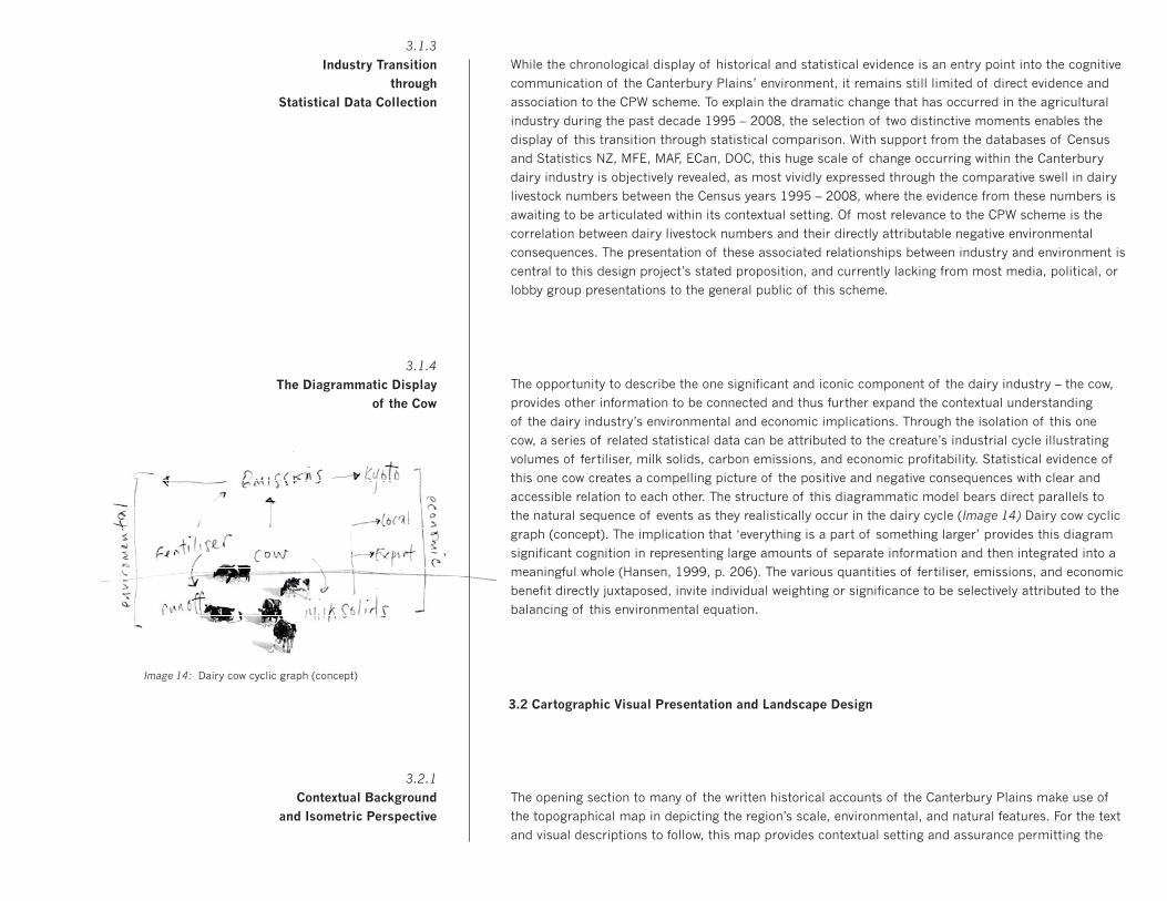
While the chronological display of historical and statistical evidence is an entry point into the cognitive
communication of the Canterbury Plains’ environment, it remains still limited of direct evidence and
association to the CPW scheme. To explain the dramatic change that has occurred in the agricultural
industry during the past decade 1995 – 2008, the selection of two distinctive moments enables the
display of this transition through statistical comparison. With support from the databases of Census
and Statistics NZ, MFE, MAF, ECan, DOC, this huge scale of change occurring within the Canterbury
dairy industry is objectively revealed, as most vividly expressed through the comparative swell in dairy
livestock numbers between the Census years 1995 – 2008, where the evidence from these numbers is
awaiting to be articulated within its contextual setting. Of most relevance to the CPW scheme is the
correlation between dairy livestock numbers and their directly attributable negative environmental
consequences. The presentation of these associated relationships between industry and environment is
central to this design project’s stated proposition, and currently lacking from most media, political, or
lobby group presentations to the general public of this scheme.
The opportunity to describe the one significant and iconic component of the dairy industry – the cow,
provides other information to be connected and thus further expand the contextual understanding
of the dairy industry’s environmental and economic implications. Through the isolation of this one
cow, a series of related statistical data can be attributed to the creature’s industrial cycle illustrating
volumes of fertiliser, milk solids, carbon emissions, and economic profitability. Statistical evidence of
this one cow creates a compelling picture of the positive and negative consequences with clear and
accessible relation to each other. The structure of this diagrammatic model bears direct parallels to
the natural sequence of events as they realistically occur in the dairy cycle (Image 14) Dairy cow cyclic
graph (concept). The implication that ‘everything is a part of something larger’ provides this diagram
significant cognition in representing large amounts of separate information and then integrated into a
meaningful whole (Hansen, 1999, p. 206). The various quantities of fertiliser, emissions, and economic
benefit directly juxtaposed, invite individual weighting or significance to be selectively attributed to the
balancing of this environmental equation.
The opening section to many of the written historical accounts of the Canterbury Plains make use of
the topographical map in depicting the region’s scale, environmental, and natural features. For the text
and visual descriptions to follow, this map provides contextual setting and assurance permitting the
3.2.1
Contextual Background
and Isometric Perspective
3.2 Cartographic Visual Presentation and Landscape Design
3.1.4
The Diagrammatic Display
of the Cow
3.1.3
Industry Transition
through
Statistical Data Collection
Image 14: Dairy cow cyclic graph (concept)

reader to comfortably and with confidence enter the literal and reflective world of the author. Similar
use is made of the Canterbury Plains’ map for the purposes of establishing location and environment
in which this project concerning the CPW scheme is based. The functionality of maps in demarcating
the boundaries and spatial dimensions of physical objects and concepts is already well acknowledged
regarding thematic mapping. Statistical information is seen to be presented as both convincing and
with scientific and objective accuracy when accompanying the map. An invitation is extended to the
viewer for immediate exploration and investigation of the map and visual content, while secondary to
this are questions concerning the information’s origin or possible degree of objectivity (Tufte, 2001).
The decision to present the CPW map from an isometric perspective allows a topographical overview
of the distribution of resources and provides connection with the traditional navigation of road maps.
The isometric angle while allowing x and y axis movement both horizontally and vertically throughout
the map also allows for z depth, thus the Canterbury Plains is to some extent represented as a three
dimensional space. The cartographic background subsequently provides for a description of dramatic
and compressed action in a single frame, similar to Renaissance ‘battle maps’ where epic storytelling
expanded the ‘centrality of a single narrative’ (Kraus, 1999, p. 7). The transferring of topographical
reality into artistic composition was originally achieved by Albrecht Altdorfer (1480-1538), and is most
evident in The Battle of Issus (1528-29), (Image 15), where an assemblage of natural and constructed
features are subjected to the conventions of two-dimensional organisation (Wood, 1999).
A similar visual pretension to the expressive natural qualities of the Canterbury Plains’ landscape is
illustrated on the CPW map. The foreboding Southern Alps with its iconic and rugged mountain peaks
serve to contrast the genteel slope of the Canterbury Plains as it gradually lowers to meet the ocean.
The centralisation of the Canterbury Plains on the map allows a descriptive diagrammatic explanation
of the landscape’s natural ecology, where pure glacial rainfall upon the Alps, feeds braided rivers that
stretch to cross the once baron and dry land. The dairy industry’s interference in this natural cycle is
visually exacerbated on the map through bold and easily seen irrigation races that divide and section
across the plains surface. Likewise the rivers while functioning to identify the various regional council
borders similarly define and evoke the environmental concern within this narrative. The mapping and
rhetorical construction is subjectively evident in selection and interpretation of environmental features,
and where as expressed by the Harrisons ‘we reduce the roads, privilege the rivers, and intensify the
mountains’ (Harrison and Harrison, 2007, p. 4).
33
Image 15: Albrecht Altdorfer, The Battle of Issus, 1528-29
Image 16: Canterbury plains from space

Cartography provides immediate connection and a sense of physical relationship with an audience
through identifying the places of residence, and areas of spiritual and historical regard. The dramatic
scale and diversity of the Canterbury region is equal to any other New Zealand scene with respect to
the strong visual recognition inherent in its physical and cartographic depiction. This sense of local
identity and pride when viewed on the map is similar to the nationalism and Eurocentrism expressed
where the vast expanse of the British Empire is instead replaced by the chequered fields of the dairy
farm (Remarkable Maps, 2005). The industrial juxtaposition of the dairy industry is intentionally
illustrated upon the Canterbury map, or combination of maps – as is the case in the construction of
the CPW map. The combined merits of the atlas, aerial topographical survey, and the satellite scan,
each with their own separate and distinct graphical style and scientific function, produce the finished
map article pertaining to reveal truth. Through the accuracy and attention to objective observation, the
CPW map provides a value judgment of the pastoral production and economic prosperity of the plains.
The employment of rhetorical language upon the CPW map will appear obvious to some viewers, while
oblivious to others. This depends upon prior experience with the visual propaganda of cartography,
appreciation of the Canterbury Plains’ ecosystem, or personal attitudes toward the dairy industry. As
exemplified by the decisions of the Tom Van Sant / Geosphere Project to present the earth on a clear
day and with environmental activism also a central message, the CPW map also relies on the emotive
selection of colours and content, with the arrangement of these acting to sensationalise the otherwise
overtly scientific portrayal of the Canterbury Plains. The irrigated and lush green pastures of the dairy
farms chequer the landscape with increased frequency between the two maps 1995 and 2009, their
reliance upon the supply of water drawn from the rivers it made obvious with the visual description of
reduced flow and deterioration evident in the rivers of the 2009 map. The presence of water races is
exacerbated and parallel to the increased dairy cow population in the later map, identifying the fertile
and economic attraction of the industry with brighter colours and a more pronounced visual presence.34
Image 17: Ashburton District, Reed New Zealand World Atlas, 2004.
Image 18: Orthophotos, L37 - Ashburton (NZMG), 1998/99.
Image 19: Canterbury plains from space.
Image 20: Rakaia River (section)
3.2.2
Navigational Interaction
and the Framing of the
Canterbury Plains
Image 21: Lake Ellesmere with Dairy Pasture (section)
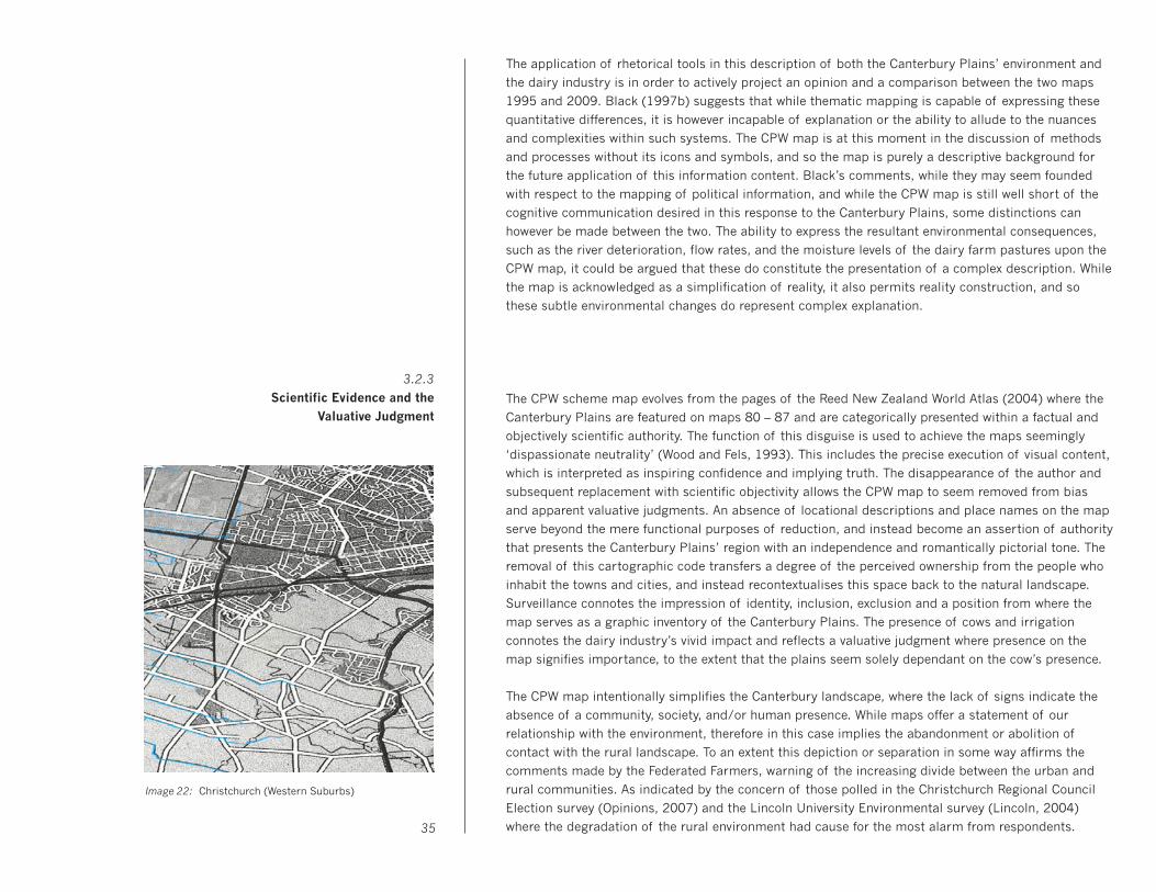
The application of rhetorical tools in this description of both the Canterbury Plains’ environment and
the dairy industry is in order to actively project an opinion and a comparison between the two maps
1995 and 2009. Black (1997b) suggests that while thematic mapping is capable of expressing these
quantitative differences, it is however incapable of explanation or the ability to allude to the nuances
and complexities within such systems. The CPW map is at this moment in the discussion of methods
and processes without its icons and symbols, and so the map is purely a descriptive background for
the future application of this information content. Black’s comments, while they may seem founded
with respect to the mapping of political information, and while the CPW map is still well short of the
cognitive communication desired in this response to the Canterbury Plains, some distinctions can
however be made between the two. The ability to express the resultant environmental consequences,
such as the river deterioration, flow rates, and the moisture levels of the dairy farm pastures upon the
CPW map, it could be argued that these do constitute the presentation of a complex description. While
the map is acknowledged as a simplification of reality, it also permits reality construction, and so
these subtle environmental changes do represent complex explanation.
The CPW scheme map evolves from the pages of the Reed New Zealand World Atlas (2004) where the
Canterbury Plains are featured on maps 80 – 87 and are categorically presented within a factual and
objectively scientific authority. The function of this disguise is used to achieve the maps seemingly
‘dispassionate neutrality’ (Wood and Fels, 1993). This includes the precise execution of visual content,
which is interpreted as inspiring confidence and implying truth. The disappearance of the author and
subsequent replacement with scientific objectivity allows the CPW map to seem removed from bias
and apparent valuative judgments. An absence of locational descriptions and place names on the map
serve beyond the mere functional purposes of reduction, and instead become an assertion of authority
that presents the Canterbury Plains’ region with an independence and romantically pictorial tone. The
removal of this cartographic code transfers a degree of the perceived ownership from the people who
inhabit the towns and cities, and instead recontextualises this space back to the natural landscape.
Surveillance connotes the impression of identity, inclusion, exclusion and a position from where the
map serves as a graphic inventory of the Canterbury Plains. The presence of cows and irrigation
connotes the dairy industry’s vivid impact and reflects a valuative judgment where presence on the
map signifies importance, to the extent that the plains seem solely dependant on the cow’s presence.
The CPW map intentionally simplifies the Canterbury landscape, where the lack of signs indicate the
absence of a community, society, and/or human presence. While maps offer a statement of our
relationship with the environment, therefore in this case implies the abandonment or abolition of
contact with the rural landscape. To an extent this depiction or separation in some way affirms the
comments made by the Federated Farmers, warning of the increasing divide between the urban and
rural communities. As indicated by the concern of those polled in the Christchurch Regional Council
Election survey (Opinions, 2007) and the Lincoln University Environmental survey (Lincoln, 2004)
where the degradation of the rural environment had cause for the most alarm from respondents.
3.2.3
Scientific Evidence and the
Valuative Judgment
Image 22: Christchurch (Western Suburbs)
35

The CPW map instead of presenting a landscape ruined to an extent glorifies and embellishes the
plains. Similar to comments made from the photographer Richard Misrach (Image 23) who suggests
if the environment is captured as ugly, people will be encouraged to consider the place as a waste-
land and content should it remain left that way (Selz, 2006). Conversely, the romantic notion of the
Canterbury landscape hasn’t departed; merely now engaged in battle with its most aggressive and
compelling adversary.
Initial expectations of the icon’s design and functionality were established early in the design process,
the collection of statistics and keywords generated from the historical research and once presented in
visual icon form enabled an indication of the future requirements that would be expected of the icons.
This engagement between the visual icons and the raw statistical information of the Canterbury Plains
indicated the capabilities of the icons as data mapping vehicles. This is especially so with regard to the
controlled vocabulary and immediate context of the agricultural and dairy industries which both have
strong and vivid visual identities, affording the icon’s potential to communicate expansive themes and
content with an apparent efficiency.
The Canterbury agricultural history icon map (Image 24) attempts to translate the visual equivalent of
the Canterbury Region’s agricultural history into a series of pictorial relationships between icons upon
a chronological timeline. Through the resemblance of the icon and its referent, this map establishes
spatial connections with both proximate context between the icons and within the agreed conventions
of the graph. Employment of scale and quantity also allows the icon to represent change over time
through sequential position relative to the horizontal axis and timeline. While a degree of cause and
effect relationships are visible between the various individual icons, such as the decrease in forestry
due to fire and milling (Image 25). These visual explanations are primarily based on the expression of
nouns, and are devoid of the verbs and adjectives/adverbs identified as essential in the success of
explanatory visual language systems (Zender, 2006).
3.3 Information Display and Visual Argument
3.3.1
Icon Design and the
Canterbury Dairy Farm Model
Image 23: Richard Misrach, Atomic Bomb Loading Pit #2, 1989
Image 24: Canterbury agricultural history icon map (section)
Image 25: Canterbury native forest fires icon map

The necessity for information design to identify connections and present cause and effect explanations
is central to the Dairy cow cyclic graph #1 (Image 26), where the icons now have become engaged
in a cyclic explanation of the dairy industry. The linking of arrows on this map connects the various
significant dairy industry themes into a series of casual relationships that includes statistical data
of proportional volumes and quantities. The icons collectively share immediate context with each
other and are therefore assisting to inform and provide cognition with respect to their own individual
referents and those surrounding icons. The importance of this map is the establishment of synthesis
and correspondence between the individual icon elements. The reduction of this complex and diverse
issue into clearly defined stages is reliant on the suitability and connection of the icons within this
information mapping to present easily conceived impressions and summations of the CPW scheme.
The Dairy cow cyclic graph #2 (Image 27) extends the cyclic organisation of the icon through their
separation and arrangement into distinctly different categories of information. The cow is affirmed
central to the visual equation with economic and milk solid production expressed on the cow’s left and
the applied fertiliser and nitrogen leaching on the cow’s right. Above the cow is the quantity of carbon
emissions released per annum, as are the other volumes of information expressed per annum. The
map’s display of icons and content is more clearly defined and further reduced, allowing the potential
sub-categories to illustrate secondary cause and effect scenarios through the visual hierarchy and z
depth now present within this isometric perspective map. The three-dimensional configuration of the
CPW map permits the icons to interact with the cow and the picture plane in a natural and expressive
way, further representative of the icon’s true referents. 37
Image 26: Dairy cow cyclic graph #1 Image 27: Dairy cow cyclic graph #2

Limitations in the communicative function of icons have significantly restricted their useful purpose in
the expression of complex messages and highly abstract concepts, and in particular those involving
actions and/or states of being. Icon modifiers have to some extent proven capable in the expansion
of context through layering, abstraction, and sequence (Zender, 2006). However these attempts have
been limited to the focused domain of scientific concepts, and are therefore aided by the specialist
knowledge and language comprehension already existent in the reader. The CPW scheme has been
excluded from the general public for the exact opposite reason, where the complexity of the data and
the perceived lack of knowledge has determined the public as incapable of grasping the intensive and
hard-scientific information regarding the irrigation scheme. The success achieved by Zender is very
much reliant upon the interaction of the icon’s immediate context, where the combination of icons or
the addition of separate modifiers are able to assist in generating a third and thus new modified icon
and referential meaning (Zender and Crutcher, 2007).
The opportunity to combine or group icons for statistical presentation has long been proven suitable
in the expression of social and economic information, as exemplified by the Isotype pictorial language
system. The presentation of icons within the CPW map is a combination of the models used by both
Zender and Neurath, with the addition of the Canterbury Plains’ map providing environmental context.
Illustrated in the example Native forest fire (Alford Forest) (Image 28) is the combination of individual
native New Zealand tree icons, each is representative of a particular species and they are combined
to identify the size and type of forest with reference to a specific location on the Canterbury Plains.
The addition of the burnt tree stumps and the obvious change in colouration of the map’s surface is
indicative of the subsequent burning or forest fires that devastated over 40% of the region’s native
timber resources during 1850-1880. The spatial location and size of the native forest has been visibly
altered through the addition and/or combination of icons, as explained in the equation, native tree +
burnt stump = native forest fire.
Fertiliser is applied to the Canterbury Plains to advance and maintain the nutrient levels required for
pasture growth in the intensive grazing systems and high stocking rates current in the dairy industry.
It is acknowledged that 30% of the applied nitrogen is leached into the aquifers and rivers (DairyNZ,
2008). The fertiliser icons are displayed as a transparent cube and include their scientific abbreviated
terms. Hovering above the map’s surface allows the fertiliser icons to be distributed to a number of
different locations including as shown in Fertiliser and runoff (Rakaia River) (Image 29). As expressed
through the change in colour of the river water once contact is made with the nitrogen, the relationship
between fertiliser and the environment is now presented through the modification and extension of
the icon within the map. The visual presence of the river is able to convert scientific causation into the
comparison between prior and post nitrogen runoff as a result of the dairy industry. The map’s spatial
and isometric display further explains the natural process through the journey of nitrogen down the
river and into the ocean.
38
3.3.2
Icon Modifiers and
Extensions to the Visual Narrative
Image 28: Native forest fire (Alford Forest)
Image 29: Fertiliser and runoff (Rakaia River)
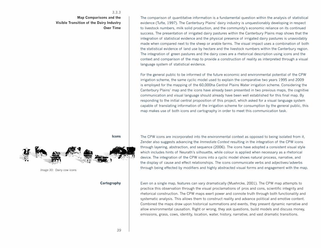
The comparison of quantitative information is a fundamental question within the analysis of statistical
evidence (Tufte, 1997). The Canterbury Plains’ dairy industry is unquestionably developing in respect
to livestock numbers, milk solid production, and the community’s economic reliance on its continued
success. The presentation of irrigated dairy pastures within the Canterbury Plains map shows that the
integration of statistical evidence and the physical presence of irrigated dairy pastures is unavoidably
made when compared next to the sheep or arable farms. The visual impact uses a combination of both
the statistical evidence of land use by hectare and the livestock numbers within the Canterbury region.
The integration of green pastures and the dairy cows are a rhetorical description using icons and the
context and comparison of the map to provide a construction of reality as interpreted through a visual
language system of statistical evidence.
For the general public to be informed of the future economic and environmental potential of the CPW
irrigation scheme, the same cyclic model used to explain the comparative two years 1995 and 2009
is employed for the mapping of the 60,000ha Central Plains Water irrigation scheme. Considering the
Canterbury Plains’ map and the icons have already been presented in two previous maps, the cognitive
communication and visual language should already have been well established for this final map. By
responding to the initial central proposition of this project, which asked for a visual language system
capable of translating information of the irrigation scheme for consumption by the general public, this
map makes use of both icons and cartography in order to meet this communication task.
The CPW icons are incorporated into the environmental context as opposed to being isolated from it,
Zender also suggests advancing the Immediate Context resulting in the integration of the CPW icons
through layering, abstraction, and sequence (2006). The icons have adopted a consistent visual style
which includes hints of Neurath’s silhouette, while colour is applied when necessary as a rhetorical
device. The integration of the CPW icons into a cyclic model shows natural process, narrative, and
the display of cause and effect relationships. The icons communicate verbs and adjectives/adverbs
through being effected by modifiers and highly abstracted visual forms and engagement with the map.
Even on a single map, features can vary dramatically (Muehrcke, 2001). The CPW map attempts to
practice this observation through the visual proclamations of pros and cons, scientific integrity and
rhetorical construction. The CPW maps exert power and connote truth through both functionality and
systematic analysis. This allows them to construct reality and advance political and emotive content.
Combined the maps draw upon historical summations and events, they present dynamic narrative and
allow environmental causation. Right or wrong, they ask questions, build models and discuss money,
emissions, grass, cows, identity, location, water, history, narrative, and vast dramatic transitions.
39
Cartography
3.3.3
Map Comparisons and the
Visible Transition of the Dairy Industry
Over Time
Icons
Image 30: Dairy cow icons

This thesis explores the Canterbury Region’s dairy industry, from the economic benefits and financial
security bestowed within the wider community to the environmental and aesthetic transition forced
upon the landscape. Global demand for primary production through burgeoning middle classes now
result in expanding and intensive dairying practices where previously nonexistent. Dairy giant Fonterra
who contribute a quarter toward New Zealand’s total exports and processes 95% of milk production
illustrate this dependency upon agriculture. Making the analogy between food and oil, Fonterra warn
of ecological sacrifice and degradation in order to meet supply and maximise environmental resources
as they define them. Contributing half of total greenhouse gas emissions, the agricultural industry are
seeking to further strengthen their ‘environmental management’ with a 420% increase in the use of
nitrogen fertiliser and 70% in livestock enteric fermentation since 1990 (MFE, 2007). This increased
pollution parallels environmental degradation that Federated Farmers insist must be publicly accepted
if we want to feed the world and maintain a healthy economy (Joy, 2008). The MFE warns tourism, our
single largest foreign exchange earner relies on a ‘100% PURE’ image for international promotion, yet
also noting that the primary production sectors ‘trade heavily’ on this perceived environmental claim,
while the dairy industry advances that ‘leveraging New Zealand’s positive environmental image adds
value’ to dairy products (Environment Waikato, 2006).
The gathering of statistical data and scientific evidence from the agricultural industries, governmental
agencies, and research institutions provide this thesis the opportunity for an objective and quantifiable
expression of the dairy industry’s interrelationships. Resulting in the diagrammatic model of the cow
and its associated pros and cons as they have increased with the intensification of both industry and
global market commodity prices. The combination of science and art enhances both perspectives with
rationalised objectivity amidst emotional representation. This possible readjusting of the way we view
the Canterbury Plains’ dairy industry results from the contextual perspective of the cartographic map
and visual display of livestock in terms of habitat and ecological narratives. Where previously accused
of compartmentalising and isolating information (Frascara, 2001) the CPW map intentionally engages
in a whole systems approach through the cyclic modeling of the cow within an environmental context.
The ability for diagrams to express ecologies of information is illustrated in the CPW map’s synthesis
of economic benefit versus environmental consequence through its main protagonist – the dairy cow.
The acquisition and display of quantitative comparisons allows the emergence of pattern phenomena
and a clearer understanding of the future implications as they relate to the proposed CPW irrigation
scheme. Though neither the ‘white knight’ nor ‘bogeyman’ actually appear on the maps, their presence
is seen everywhere throughout them, and ultimately the CPW maps provide an introduction and brief
narrative journey into their world, and the Canterbury Plains’ dairy industry.
Investigation into the history and application of icons as a visual language system presents this public
community map with significant cognitive information transfer that demonstrates the agility of icons
for efficient and economic communication. Through the expansion of both immediate and environmental
context, the icon is able to display transition with cause and effect evidence, also expressing verbs and
adjectives/adverbs. Assisted by the controlled vocabularies of cartography and the dairy industry, the
icon communicates the physicality of cows, milk solids, and fertiliser, while also permitting processes
and actions such as native forest fire and nitrogen leaching to convey the environmental and economic 40
4.1.1
Conclusion
Image 31: Lake Ellesmere and Selwyn District
Image 32: Selwyn District with dairy pasture and cows
implication of the dairy industry on the Canterbury Plains. In arguing for environmental consideration
this thesis also acknowledges the economic importance of the dairy industry with an emphasis on the
impartiality, logical argument, and rational expression. The visual connections imposed by the maps
are intended to evoke consideration, discussion, and investigation, therefore providing the construction
and transfer of power to a general public who have been intentionally negated of this civic right. Where
previously the cartographic map was reserved primarily for those in power, this CPW mapping project
reflecting the sense of mapmaker as creator rather than reflector, represents the aggressively powerful
spatial potential of the map. Though this map is not territory, it demonstrates through representation
as metaphor for the culture that inhabits this space, and so by implication the importance of not just
the dairy industry but also the environmental when considering the Canterbury Plains’ landscape.
41
Considering the intention for serious and non-bias communication, the Central Plains Water (CPW)
mapping project represents and embellishes both arguments of the scheme insofar as providing an
opportunity for the general public to develop conclusions based on their own appraisal and reaction
to the various icons/themes depicted. Exemplified by the mountainous gold bullion, while opposed
through the toxic teal as the fertiliser runoff enters the waterways – the viewer is prompted to make
their own calculations of the economic benefits and environmental trade-off. The obvious comparison
between the 1995 and 2009 maps is expressed through the dramatic increase in cow population and
consequently transferred into the size of both the economic and productive gains of the scheme.
Beyond the accumulative comparison in volume, presence and symbolism of the dairy industry, is the
rhetorical construction of the Canterbury Plain’s cartographic landscape. Cartographic mapping used
as contextual backdrop within the maps provide disparate data sets of information (seen in the cyclic
modeling) to present narrated cause and effect explanation for the viewer. The ease in which navigation
is achieved through both the traditions and geography of mapping comprehension and the principles
and graphical techniques of landscape paintings allow these maps to communicate on multiple levels.
Firstly, the environmental representation seen through the selection of topographical features (rivers,
trees, soil, etc) and their transition over time, simulate the dairy industry’s ecological byproducts.
Consequently, these visible effects are then directly juxtaposed with the volumes of cows, milk-solid’s
production, and economic gain. The viewer is invited to consider the industrialisation of the Canterbury
Plains in direct contrast to a changing environmental landscape and the potential ecological footprints.
The map’s scale (2.5 x 1m) provides space for the staging and development of sub-narratives, and the
relationships and proximity between cows and the individual rivers, the contrasting gold with the teal
run-off, and the encroachment of farmland into the native forests. A sense of provocative rhetoric is
unashamedly employed to establish the significance of this subject matter while also allowing for the
opposing arguments to battle with pride and vigor. The layering of this visually based language system
consisting of icons, and with the topographical elements as backdrop eliminates the need for complex
keys and descriptions. The maps present a mix of objectivity and rhetoric… where the inclusion of
statistical information and measurable datasets are offset by an expressive and emotive colour palette.
At this stage the viewer now more confident and comfortable with the symbolic language and narrative
can investigate more closely the subtle or quantitative information displayed within the separate maps.
The exclusion of public consultation and discussion from the CPW irrigation scheme and regardless of
the possible reasons and degrees or levels of communication required is unacceptable! The fact that
these cartographic maps illustrate the possibilities for when accurate statistical information is used in
a manner-befitting objective and cognitive communication – represents this. This combined transfer of
information through both the visual and the traditional written language systems permit the viewer to
experience both impressionistic and lineal transfer of the statistical information. So while the initial
design project concept sought to remove alphanumeric language, this is unavoidable when using such
large volumes of data and when also requiring the degrees of accuracy and accountability for public
consideration. And beyond this, Mapping the Environmental Footprint of the Central Plains Water Irrigation
Scheme challenges the role of cartography and information design within a new contemporary context.42
4.1.2
Appendix
43
Acland, L. G. D. (1975). The early Canterbury runs. Christchurch, NZ: Whitcoulls.
Adcock, S. (2003). What New Zealand dairy farmers desire from the Government. British Food Journal, 105 (1/2), 111-118.
Arnheim, R. (1969). Visual Thinking. Los Angeles, US: Berkley: University of California Press.
Bertin, J. (1983). Semiology of graphics: diagrams, networks, maps. Madison, US: University of Wisconsin Press.
Black, J. (1997a). Maps and History. New Haven: Yale University Press.
Black, J. (1997b). Maps and Politics. London: Reaktion.
Campbell, H. (2007). In search of ancient New Zealand. North Shore, NZ: Penguin Books.
Chizlett, C. (1992). Damned Lies. And Statistics. Otto Neurath and Soviet Propaganda in the 1930s. Visible Language, 26 (3/4) (Diagrams as Tools for Worldmaking), 298-321.
Coddington, D. (2008, June 8). Perilous ploy to put the gumboot into farmers. The New Zealand Herald, Retrieved September 29, 2008, from http://www.nzherald.co.nz/agriculture/news/article.cfm?cid=16&objectid=10 514994
Cowie, B., Voorthuysen, R. v., & Ridley, G. (2006). A Monitoring and Reporting Strategy for the Dairying and Clean Streams Accord: Measuring the Outcomes of Implementing the Accord. Retrieved July 3, 2008, from http://www.mfe.govt.nz/publications/land/dairying-clean-streams-monitoring-reporting strategy-apr06/ html/page5.html.
Crampton, J. W., & Krygier, J. (2006). An Introduction to Critical Cartography. ACME: An International E-Journal for Critical Geographies, 4(1), 11–33.
Crombie, D. (2007, September 7). CPW scheme will boost groundwater supplies. The Press. Retrieved October 14, 2008, from http://www.stuff.co.nz/4193027a12935.html
Cronshaw, T. (2005, December 02). Lifeblood of Canterbury. The Press, Retrieved June 10, 2008, from http://www. stuff.co.nz/thepress/3498907a6531.html
Cronshaw, T. (2007, September 01). The science of saving water. The Press, Retrieved June 12, 2008, from http:// www.stuff.co.nz/4184778a6531.html
DairyNZ. (2008). DairyNZ farmfact. Retrieved December 8, 2008, from http://www.dairynz.co.nz/file/fileid/5031
Dann, C. (2008, August 1). The price of milk. TVNZ. Retrieved August 2, 2008, from http://tvnz.co.nz/view/ page/536641/1972200
Deans, N., & Hackwell, K. (2008). Dairying and Declining Water Quality: Fish and Game New Zealand. Forest and Bird. Retrieved November 22, 2008, from http://www.forestandbird.org.nz/files/file/Dairying_and_
Declining_Water_Quality(3).pdf
Drucker, J., & McGann, J. (2001). Images as the text: Pictograms and pictographic rhetoric. Information Design Journal, 10 (2), 95-106.
Dubbini, R. (2002). Geography of the gaze: urban and rural vision in early modern Europe. Chicago: University of Chicago Press.
ECan. (2004). Regional economic implications of water allocation and reliability: a report prepared for Environment Canterbury and MAF Policy Christchurch [N.Z.] Environment Canterbury.
ECan. (2005). Rural land use change in Canterbury: 1995-2004. Report no. U05/19.
ECan. (2006). Resource Consent Application Responses. Retrieved 2008, December 02, from http://www.ecan.govt. nz/Resource+Consents/Central+Plains+Water/Background.htm
Ede, S. (2005). Art and Science. London: I.B. Tauris.
5.1.1
Bibliography
Eldred–Grigg, S. (1982). A New History of Canterbury. Dunedin, NZ: John McIndoe Limited.
Federated Farmers. (2008a). 2008 General Election Manifesto – New Zealand’s Economic Backbone.
Federated Farmers. (2008b). Frank Brenmuhl Address To Dairy Farmers. Retrieved November 22, 2008, from http:// www.scoop.co.nz/stories/PO0802/S00176.htm
Fonterra. (2008, February 26). Press Release. Clean Streams Accord halfway - positive change. Retrieved November 19, 2008, from http://www.scoop.co.nz/stories/BU0802/S00404.htm
Frascara, J. (2001). Diagramming as a Way of Thinking Ecologically Visible Language, 35(2), 164-177.
Friedman, A. (2007, August 9). Time to face the truth. The Press, Retrieved November 11, 2008, from http://www. stuff.co.nz/thepress/4157947a12935.html
Hansen, Y. M. (1999). Visualization for Thinking, Planning, and Problem Solving. In R. Jacobson (Ed.), Information Design. Cambridge, Mass: MIT Press.
Harley, J. B. (1988). Maps, knowledge, and power. In D. Cosgrove & S. Daniels (Ed.), The Iconography of landscape: essays on the symbolic representation, design, and use of past environments. Cambridge: Cambridge University Press.
Harley, J. B. (1989). Deconstructing the Map. Cartographica, 26(2), 1 - 20.
Harley, J. B. (1990). Text and Contexts in the Interpretation of Early Maps. In D. Buisseret (Ed.), From Sea Charts to Satellite Images: Interpreting North American History through Maps (pp. 3 - 15). Chicago: University of Chicago Press.
Harrison, H. M., & Harrison, N. (2007). Public Culture and Sustainable Practices: Peninsula Europe from an ecodiversity perspective, posing questions to Complexity Scientists. Structure and Dynamics: eJournal of Anthropological and Related Sciences, 2(3), 38.
Hembry, O. (2008a, May 28). Effects of hot summer to be felt for years. The New Zealand Herald, Retrieved June 2, 2008, from http://www.nzherald.co.nz/droughts/news/article.cfm?c_id=180&objectid=10512903
Hembry, O. (2008b, July 5). A freedom fighter for food producers. Retrieved September 10, 2008, from http://www. nzherald.co.nz/our-working-lives/news/article.cfm?c_id=1501794&objectid=10520006
Herald. (2008a, February 13). Keep it quiet: We’re less than 100 per cent pure. The New Zealand Herald, August 21, 2008, from http://www.nzherald.co.nz/forestry/news/article.cfm?c_id=47&objectid=10492079&pnum=0
Herald. (2008b, February 11). Pollution study cut because not factual - Mallard. The New Zealand Herald, Retrieved June 27, 2008, from http://www.nzherald.co.nz/dairyindustry/news/article.cfm?c_ id=168&objectid=10491734&pnum=0
Holmes, N. (2001). Pictograms: A view from the drawing board or, what I have learned from Otto Neurath and Gerd Arntz (and jazz). Information Design Journal, 10 (2), 133-143.
Joy, M. (2008, July 7). Pollution cannot be watered down. The New Zealand Herald, Retrieved July 10, 2008, from http://www.nzherald.co.nz/agriculture/news/article.cfm?c_id=16&objectid=10520232
Kara, E., Ribaudo, M., & Johansson, R. C. (2008). On how environmental stringency influences adoption of best management practices in agriculture. Journal of Environmental Management, 88(2008), 1530–1537.
Karabeg, D. (2002). Designing Information Design. Information Design Journal, 11(1), 82-90.
Knox, G. A. (1969). The Natural history of Canterbury. Wellington, NZ: Reed.
Kraus, C. (1999). Big Picture. In Bill Hammond: 23 Big Pictures. Dunedin, NZ: Dunedin Public Art Gallery.
Lincoln. (2004). Public Perceptions of the New Zealand Environmental Report. Christchurch, NZ: Lincoln University.
Lupton, E. (1989). Reading Isotype. In Design Discourse: History, Theory, Criticism. Chicago: University of Chicago Press, Chicago.44
5.1.1
Bibliography
MacEachren, A. M. (1995). How maps work: representation, visualization, and design. New York: Guilford Press.
Mackenzie, I. (2007, August 17). Dairying debate clouded by misinformation. The Press, Retrieved August 1, 2008, from http://www.stuff.co.nz/4167579a12935.html
MAF. (2004). The Economic Value of Irrigation in New Zealand, MAF Technical Paper No: 04/01. Retrieved August 3, 2008, from http://www.maf.govt.nz/mafnet/rural-nz/sustainable-resource-use/irrigation/the-economic- value-of-irrigation/.
Memon, A. (2007). The CPW Irrigation Scheme: What do we do from here? Retrieved July 2, 2008, from http://www. lincoln.ac.nz/story24639.html?
MFE. (2007a). Ministry for the Environment 2007 Draft Chapter. Retrieved July 28, 2008, from http://www.mfe.govt. nz/state/reporting/enz-07-draft-conclusion-chapter.pdf.
MFE. (2007b). New Zealand’s Greenhouse Gas Inventory 1990-2005 (ref. ME806). Retrieved July 3, 2008, from http://www.mfe.govt.nz/publications/climate/greenhouse-gas-inventory-overview-jul07/html/index.html.
Monaghan, R. (2008). Hunter Down Irrigation Scheme – Section 42A report. Christchurch, NZ: Environment Canterbury.
Monaghan, R. M., Klein, C. A. M. d., & Muirhead, R. W. (2008). Prioritisation of farm scale remediation efforts for reducing losses of nutrients and faecal indicator organisms to waterways: A case study of New Zealand dairy farming. Journal of Environmental Management 87, 609–622.
Monmonier, M. (1991). How to Lie with Maps. Chicago: University of Chicago Press.
Montello, D. R. (2002). Cognitive Map-Design Research in the Twentieth Century: Theoretical and Empirical Approaches. Cartography and Geographic Information Science, 29(3), 283-304.
Muehrcke, P. C., Muehrcke, J. O., & Kimerling, A. J. (2001). Map use: reading, analysis, and interpretation. Madison, Wis: JP Publications.
Ninness, G. (2008, May 25). Businesses replacing people down on the farm. Sunday Star Times, Retrieved June 24, 2008, from http://www.stuff.co.nz/4560058a13.html
Norris, J. (2007, September 25). Water, water everywhere but now let’s stop to think. The Press.
OECD. (2008). Environmental Performance of Agriculture in OECD countries since 1990. Paris, France.
Opinions (2007). Have you decided on who to vote for mayor? September 22 and 23, 2007. Christchurch, N.Z. Opinions, Market Research Ltd.
Oxford. (1999). Oxford Concise Dictionary. Oxford, UK: Oxford University Press.
Park, G. (1995). The groves of life = Nga uruora : ecology and history in a New Zealand landscape. Wellington, NZ: Victoria University Press.
Park, G. (2006). Theatre country: essays on landscape and whenua. Wellington, NZ: Victoria University Press.
Parker, B. (2006). Constructing Community Through Maps? Power and Praxis in Community Mapping. The Professional Geographer, 58(4), 470-484.
Perkins, C. (2007). Community Mapping. The Cartographic Journal, 44(2), 127-137.
Perkins, C. (2008). Cultures of Map Use. The Cartographic Journal, 45(2), 150-158.
Rowan, J. (2008, August 13). ‘Time bomb’ threatens lakes. The New Zealand Herald, Retrieved August 14, from http://www.nzherald.co.nz/pollution/news/article.cfm?c_id=281&objectid=10526756
Scherer, K. (2008, February 29). Science goes back to the future. The New Zealand Herald, Retrieved October 6, 2008, from http://www.nzherald.co.nz/business/news/article.cfm?c_id=3&objectid=10506660
Silkstone, D. (2008a, February 6). Coast to coast ‘under threat.’ The Press, Retrieved June 22, 2008, from http:// www.stuff.co.nz/AAMB4/aamsz=300x44_MULTILINK/4388827a6009.html45
5.1.1
Bibliography
Silkstone, D. (2008b, March 3). Archaeological report slammed. The Press, Retrieved October 2, 2008, from http:// www.stuff.co.nz/4422996a24035.html
Silkstone, D. (2008c, May 5). Report reveals threat to rivers. The Press, Retrieved August 21, 2008, from http://www. stuff.co.nz/thepress/4509748a6009.html
Speight, R. (1927). Natural history of Canterbury: a series of articles on the early history of the province and on the history of scientific investigation, up till 1926, as well as on some results of this investigation. Christchurch, NZ: Philosophical Institute of Canterbury.
Statistics, N. Z. (2006). Fertiliser Use and the Environment. Retrieved August 9, 2008 from http://www3.stats.govt. nz/environment/Fertiliser_use_and_the_environment_Aug06.pdf
Statistics, N. Z. (2007). Livestock Numbers by Type and Territorial Authority [Table] Agriculture Statistics 2007, Retrieved June 29, 2008, from http://www.stats.govt.nz/tables/2007-ag-prod/Livestock+numbers.htm
Steinfeld, H., Gerber, P., Wassenaar, T., Castel, V., Rosales, M., & Haan, C. d. (2006). Livestock’s long shadow – Environmental issues and options: Food and Agriculture Organization of the United Nations.
Swaffield, S., & Swanwick, C. (2006). Recognising and managing landscape values. Retrieved July 2, 2008, from http://www.lincoln.ac.nz/story13628.html
Tait, P., & Cullen, R. (2007). Some External Costs of Dairy Farming in Canterbury. Lincoln University.Terry, S. (2008, July 23). Plan to put price on carbon emissions needs to change. The New Zealand Herald. Retrieved June 9, 2008, from http://www.nzherald.co.nz/kyotoprotocol/news/article.cfm?c_ id=244&objectid=10522906
Tufte, E. R. (1997). Visual explanations: images and quantities, evidence and narrative. Cheshire, Conn: Graphics Press.
Tufte, E. R. (2001). The Visual Display of Quantitative Evidence. Cheshire, Conn: Graphics Press.
Tufte, E. R. (2006). Beautiful evidence. Cheshire, Conn: Graphics Press.
Turnbull, D. (1993). Maps are Territories. Science is an Atlas. Chicago: University Of Chicago Press.
TVNZ. (2008a, June 25). Kiwi’s should be grateful for food. Retrieved October 19, 2008, from http://tvnz.co.nz/ view/page/536641/1871793
TVNZ. (2008b, August 25). Ashburton is top dairy farming region. Retrieved August 25, 2008, from http://tvnz. co.nz/view/page/411365/2032381
TVNZ. (2008c, June 13). Talk first says Fed Farmers. Retrieved September 29, 2008, from http://tvnz.co.nz/view/ page/425823/1844240
URS. (2006). Central Plains Water Enhancement Scheme, Dam Safety Assurance Report. March 2006: Report for Central Plains Water Limited.
Valentine, I., Hurley, E., Reida, J., & Allenc, W. (2007). Principles and processes for effecting change in environmental management in New Zealand. Journal of Environmental Management, 82 311–331.
Williams, L. (2007, August 17). The downside of dairying. The Press, Retrieved September 9, 2008, from http:// www.stuff.co.nz/stuff/4167578a12935.html
Wood, C. S. (1999). Albrecht Altdorfer and the origins of landscape. London, U.K.: Reaktion.
Wood, D., & Fels, J. (1993). The Power of Maps. London: Routledge.
Young, S. L., & Wogalter, M. S. (2001). Predictors of pictorial symbol comprehension. Information Design Journal, 10(2), 124-132.
Zender, M. (2006). Advancing Icon Design for Global Non Verbal Communication. Visible Language, 40.2, 177-206.
Zender, M., Crutcher, Keith A. (2007). Visible language for the expression of scientific concepts. Visible Language, 41.1, 23-49.
46
5.1.1
Bibliography


