
Atlanta Regional Commission
For more information, contact:
All Things Big and Small: Employment Trends & Business Establishment Growth in Metro
Atlanta
About the Data
• Bureau of Labor Statistics (BLS): We used BLS data to explore up to date industry sector change in Atlanta and the U.S. as a whole.
• Quarterly Workforce Indicators (QWI): A set of economic indicators including employment, job creating, earnings, and other measures of employment flows. We have used the QWI to study and compare business and employment patterns in metro Atlanta to other peer metro areas.
• Zip Code Business Patterns: We used Census business establishment/ firm numbers to look at total establishments and change in establishments on the Zip Code level.
Note: We mention both firms and establishments numerous times throughout the report. There are subtle differences, but, in general, when using these terms, we simply mean “businesses.” To learn more about the difference between firms and establishments, please visit: https://ask.census.gov/faq.php?id=5000&faqId=487
What the data tell us…
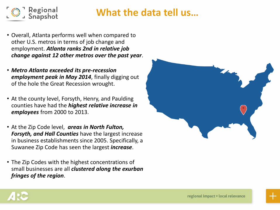
• Overall, Atlanta performs well when compared to other U.S. metros in terms of job change and employment. Atlanta ranks 2nd in relative job change against 12 other metros over the past year.
• Metro Atlanta exceeded its pre-recession employment peak in May 2014, finally digging out of the hole the Great Recession wrought.
• At the county level, Forsyth, Henry, and Paulding counties have had the highest relative increase in employees from 2000 to 2013.
• At the Zip Code level, areas in North Fulton, Forsyth, and Hall Counties have the largest increase in business establishments since 2005. Specifically, a Suwanee Zip Code has seen the largest increase.
• The Zip Codes with the highest concentrations of small businesses are all clustered along the exurban fringes of the region.

0
20
40
60
80
100
120
140
160
Total Change
3.2
2
1.2
3.4
2.1
2.6
3.1
1.5
1
3 3
1.8
0
0.5
1
1.5
2
2.5
3
3.5
4
% Change(000s)
Job Change, May 2014- May 2015
Metro Atlanta is adding jobs at a nice clip recently, especially compared with the 11 other large metros in the nation. The chart on the left shows total numbers and the chart on the right shows percentages. For total jobs added, between May 2014 and May 2015, metro Atlanta has added the fourth-most jobs. Metro Atlanta ranks second in percent change of jobs over the past year.
Source: Bureau of Labor Statistics
0.6
0.7
0.8
0.9
1
1.1
1.2
1.3
1.4
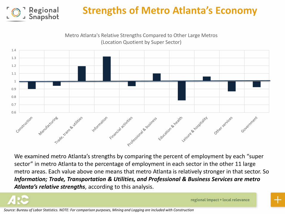
Metro Atlanta's Relative Strengths Compared to Other Large Metros (Location Quotient by Super Sector)
Strengths of Metro Atlanta’s Economy
We examined metro Atlanta’s strengths by comparing the percent of employment by each “super sector” in metro Atlanta to the percentage of employment in each sector in the other 11 large metro areas. Each value above one means that metro Atlanta is relatively stronger in that sector. So Information; Trade, Transportation & Utilities, and Professional & Business Services are metro Atlanta’s relative strengths, according to this analysis.
Source: Bureau of Labor Statistics. NOTE: For comparison purposes, Mining and Logging are included with Construction
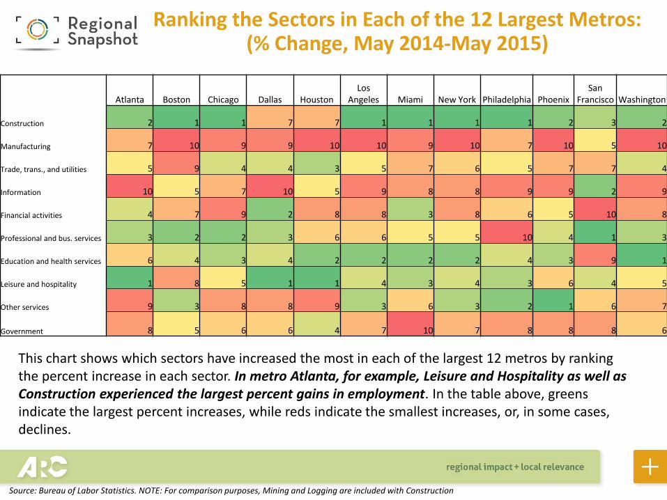
Atlanta Boston Chicago Dallas HoustonLos
Angeles Miami New York Philadelphia PhoenixSan
Francisco Washington
Construction 2 1 1 7 7 1 1 1 1 2 3 2
Manufacturing 7 10 9 9 10 10 9 10 7 10 5 10
Trade, trans., and utilities 5 9 4 4 3 5 7 6 5 7 7 4
Information 10 5 7 10 5 9 8 8 9 9 2 9
Financial activities 4 7 9 2 8 8 3 8 6 5 10 8
Professional and bus. services 3 2 2 3 6 6 5 5 10 4 1 3
Education and health services 6 4 3 4 2 2 2 2 4 3 9 1
Leisure and hospitality 1 8 5 1 1 4 3 4 3 6 4 5
Other services 9 3 8 8 9 3 6 3 2 1 6 7
Government 8 5 6 6 4 7 10 7 8 8 8 6
Ranking the Sectors in Each of the 12 Largest Metros: (% Change, May 2014-May 2015)
This chart shows which sectors have increased the most in each of the largest 12 metros by ranking the percent increase in each sector. In metro Atlanta, for example, Leisure and Hospitality as well as Construction experienced the largest percent gains in employment. In the table above, greens indicate the largest percent increases, while reds indicate the smallest increases, or, in some cases, declines.
Source: Bureau of Labor Statistics. NOTE: For comparison purposes, Mining and Logging are included with Construction
-8
-6
-4
-2
0
2
4
6
Jan
-08
Ap
r-0
8
Jul-
08
Oct
-08
Jan
-09
Ap
r-0
9
Jul-
09
Oct
-09
Jan
-10
Ap
r-1
0
Jul-
10
Oct
-10
Jan
-11
Ap
r-1
1
Jul-
11
Oct
-11
Jan
-12
Ap
r-1
2
Jul-
12
Oct
-12
Jan
-13
Ap
r-1
3
Jul-
13
Oct
-13
Jan
-14
Ap
r-1
4
Jul-
14
Oct
-14
Jan
-15
Ap
r-1
5
Year-Over-Year % Change: Total Employment2008-Present
ATL U.S.
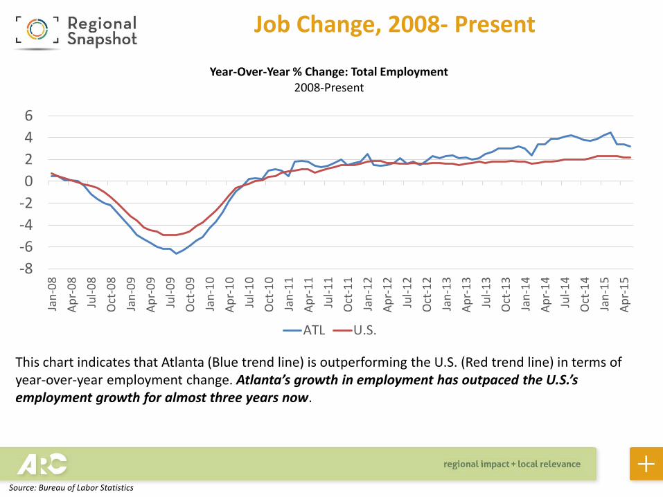
This chart indicates that Atlanta (Blue trend line) is outperforming the U.S. (Red trend line) in terms of year-over-year employment change. Atlanta’s growth in employment has outpaced the U.S.’s employment growth for almost three years now.
Job Change, 2008- Present
Source: Bureau of Labor Statistics
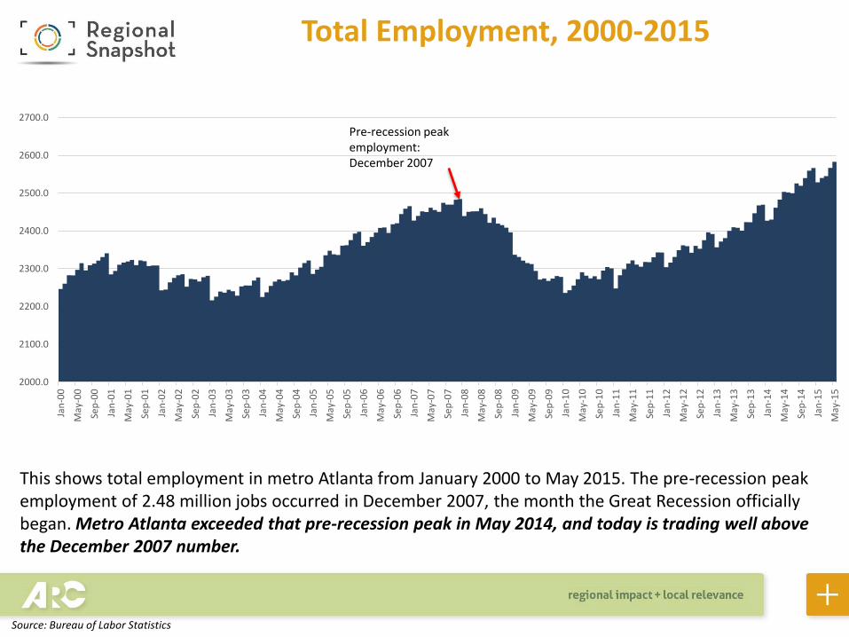
This shows total employment in metro Atlanta from January 2000 to May 2015. The pre-recession peak employment of 2.48 million jobs occurred in December 2007, the month the Great Recession officially began. Metro Atlanta exceeded that pre-recession peak in May 2014, and today is trading well above the December 2007 number.
Total Employment, 2000-2015
Source: Bureau of Labor Statistics
2000.0
2100.0
2200.0
2300.0
2400.0
2500.0
2600.0
2700.0
Jan
-00
May
-00
Sep
-00
Jan
-01
May
-01
Sep
-01
Jan
-02
May
-02
Sep
-02
Jan
-03
May
-03
Sep
-03
Jan
-04
May
-04
Sep
-04
Jan
-05
May
-05
Sep
-05
Jan
-06
May
-06
Sep
-06
Jan
-07
May
-07
Sep
-07
Jan
-08
May
-08
Sep
-08
Jan
-09
May
-09
Sep
-09
Jan
-10
May
-10
Sep
-10
Jan
-11
May
-11
Sep
-11
Jan
-12
May
-12
Sep
-12
Jan
-13
May
-13
Sep
-13
Jan
-14
May
-14
Sep
-14
Jan
-15
May
-15
Pre-recession peak employment: December 2007
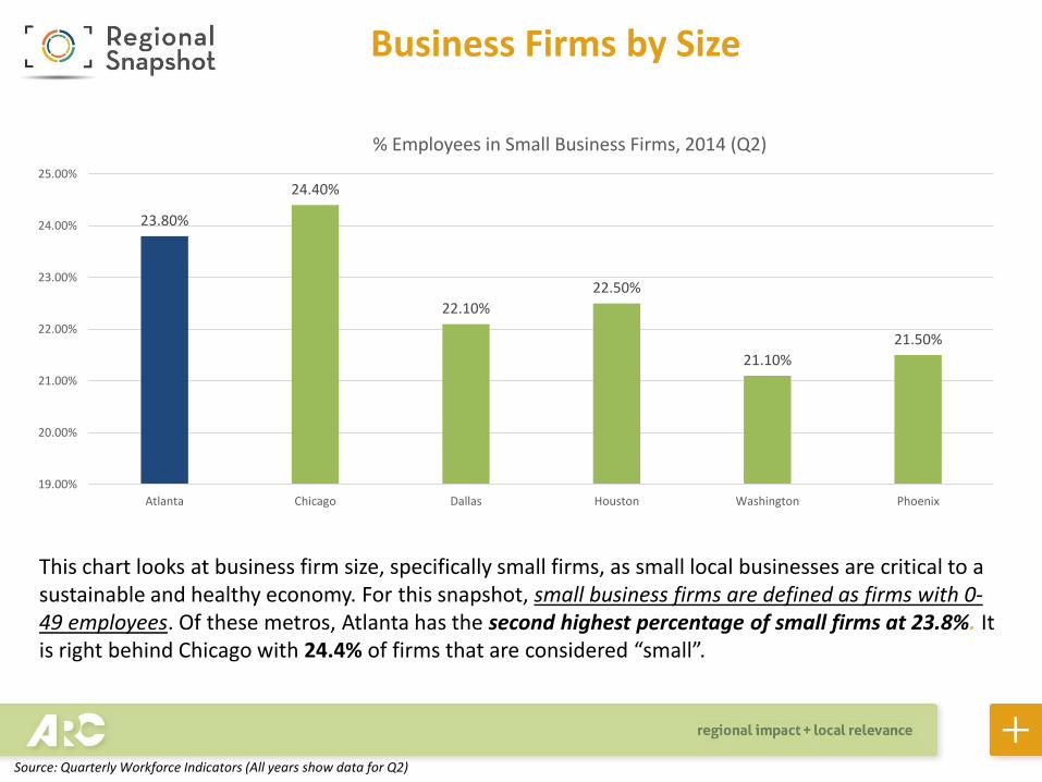
This chart looks at business firm size, specifically small firms, as small local businesses are critical to a sustainable and healthy economy. For this snapshot, small business firms are defined as firms with 0-49 employees. Of these metros, Atlanta has the second highest percentage of small firms at 23.8%. It is right behind Chicago with 24.4% of firms that are considered “small”.
Business Firms by Size
23.80%
24.40%
22.10%
22.50%
21.10%
21.50%
19.00%
20.00%
21.00%
22.00%
23.00%
24.00%
25.00%
Atlanta Chicago Dallas Houston Washington Phoenix
% Employees in Small Business Firms, 2014 (Q2)
Source: Quarterly Workforce Indicators (All years show data for Q2)
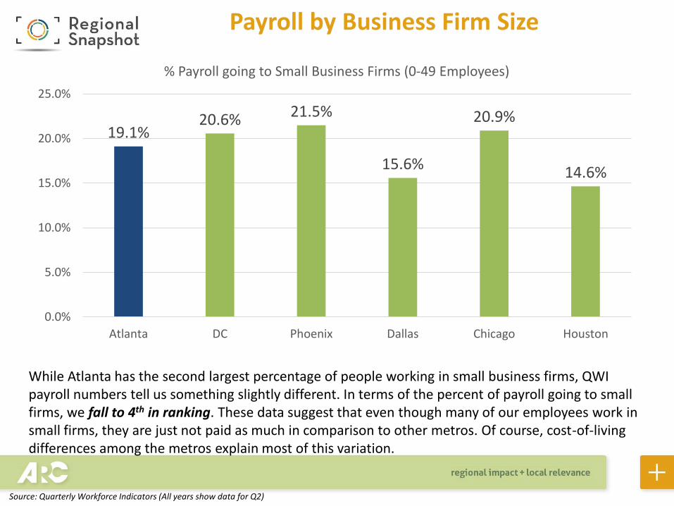
Payroll by Business Firm Size
19.1%20.6% 21.5%
15.6%
20.9%
14.6%
0.0%
5.0%
10.0%
15.0%
20.0%
25.0%
Atlanta DC Phoenix Dallas Chicago Houston
% Payroll going to Small Business Firms (0-49 Employees)
While Atlanta has the second largest percentage of people working in small business firms, QWI payroll numbers tell us something slightly different. In terms of the percent of payroll going to small firms, we fall to 4th in ranking. These data suggest that even though many of our employees work in small firms, they are just not paid as much in comparison to other metros. Of course, cost-of-living differences among the metros explain most of this variation.
Source: Quarterly Workforce Indicators (All years show data for Q2)
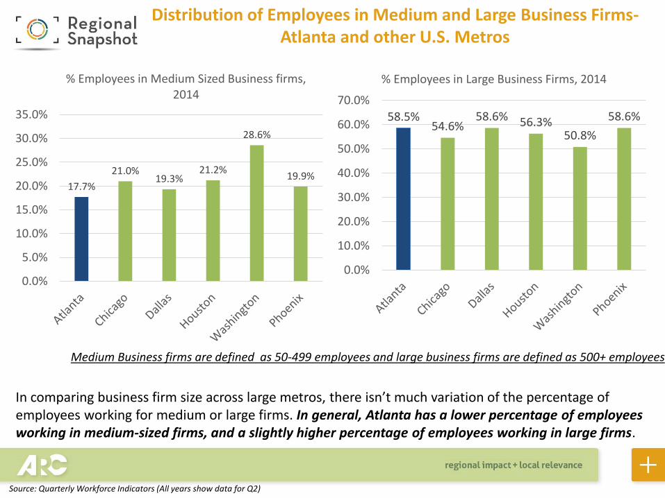
17.7%
21.0%19.3%
21.2%
28.6%
19.9%
0.0%
5.0%
10.0%
15.0%
20.0%
25.0%
30.0%
35.0%
% Employees in Medium Sized Business firms, 2014
58.5%54.6%
58.6% 56.3%50.8%
58.6%
0.0%
10.0%
20.0%
30.0%
40.0%
50.0%
60.0%
70.0%
% Employees in Large Business Firms, 2014
Distribution of Employees in Medium and Large Business Firms-Atlanta and other U.S. Metros
Medium Business firms are defined as 50-499 employees and large business firms are defined as 500+ employees
In comparing business firm size across large metros, there isn’t much variation of the percentage of employees working for medium or large firms. In general, Atlanta has a lower percentage of employees working in medium-sized firms, and a slightly higher percentage of employees working in large firms.
Source: Quarterly Workforce Indicators (All years show data for Q2)
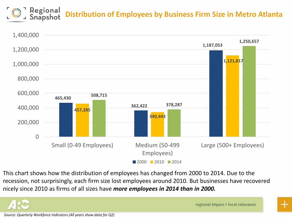
Distribution of Employees by Business Firm Size in Metro Atlanta
This chart shows how the distribution of employees has changed from 2000 to 2014. Due to the recession, not surprisingly, each firm size lost employees around 2010. But businesses have recovered nicely since 2010 as firms of all sizes have more employees in 2014 than in 2000.
465,430
362,422
1,187,053
457,285
340,443
1,121,817
508,715
378,287
1,250,657
0
200,000
400,000
600,000
800,000
1,000,000
1,200,000
1,400,000
Small (0-49 Employees) Medium (50-499Employees)
Large (500+ Employees)
2000 2010 2014
Source: Quarterly Workforce Indicators (All years show data for Q2)
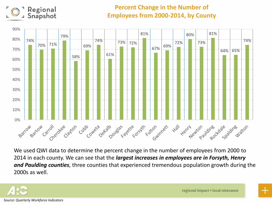
Percent Change in the Number of Employees from 2000-2014, by County
74%70% 71%
79%
58%
69%74%
61%
73% 72%
81%
67%69%
72%
80%
73%
81%
64% 65%
74%
0%
10%
20%
30%
40%
50%
60%
70%
80%
90%
We used QWI data to determine the percent change in the number of employees from 2000 to 2014 in each county. We can see that the largest increases in employees are in Forsyth, Henry and Paulding counties, three counties that experienced tremendous population growth during the 2000s as well.
Source: Quarterly Workforce Indicators
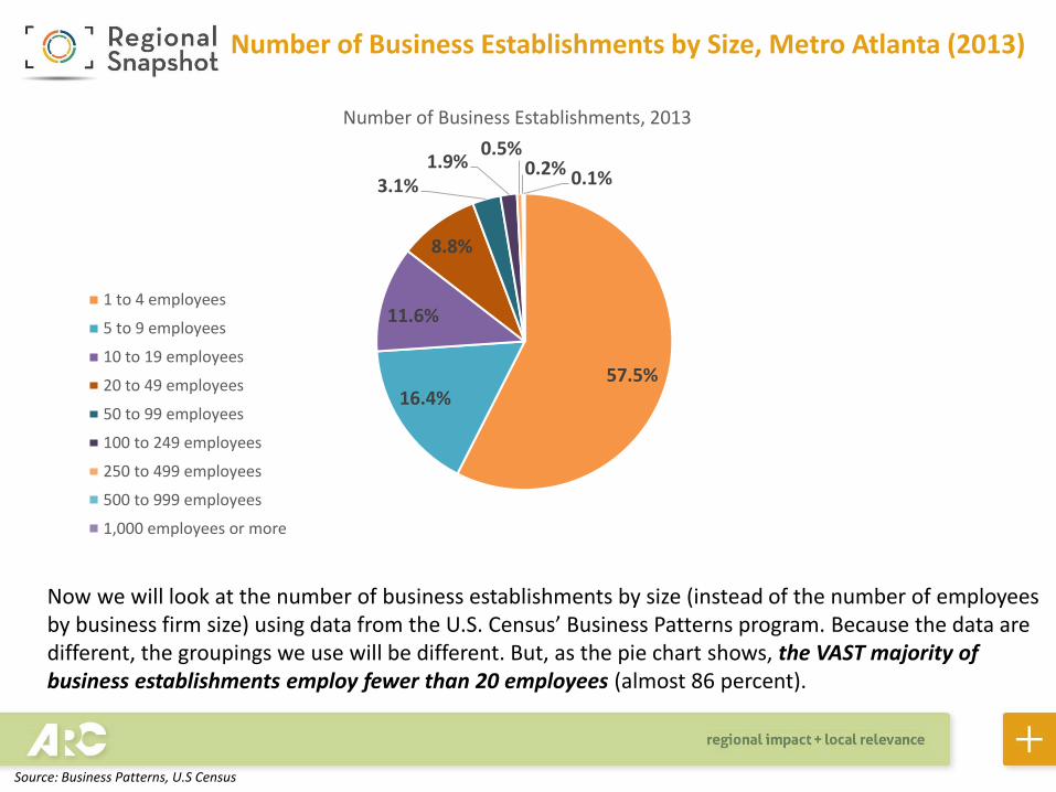
Now we will look at the number of business establishments by size (instead of the number of employees by business firm size) using data from the U.S. Census’ Business Patterns program. Because the data are different, the groupings we use will be different. But, as the pie chart shows, the VAST majority of business establishments employ fewer than 20 employees (almost 86 percent).
57.5%16.4%
11.6%
8.8%
3.1%1.9%
0.5%0.2% 0.1%
Number of Business Establishments, 2013
1 to 4 employees
5 to 9 employees
10 to 19 employees
20 to 49 employees
50 to 99 employees
100 to 249 employees
250 to 499 employees
500 to 999 employees
1,000 employees or more
Number of Business Establishments by Size, Metro Atlanta (2013)
Source: Business Patterns, U.S Census
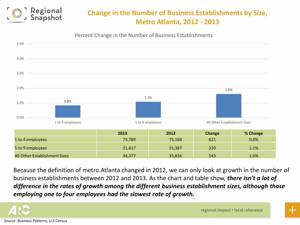
Because the definition of metro Atlanta changed in 2012, we can only look at growth in the number of business establishments between 2012 and 2013. As the chart and table show, there isn’t a lot of difference in the rates of growth among the different business establishment sizes, although those employing one to four employees had the slowest rate of growth.
Change in the Number of Business Establishments by Size, Metro Atlanta, 2012 - 2013
0.8%1.1%
1.6%
0.0%
1.0%
2.0%
3.0%
4.0%
5.0%
1 to 4 employees 5 to 9 employees All Other Establishment Sizes
Percent Change in the Number of Business Establishments
2013 2012 Change % Change
1 to 4 employees 75,789 75,168 621 0.8%
5 to 9 employees 21,617 21,387 230 1.1%
All Other Establishment Sizes 34,377 33,834 543 1.6%
Source: Business Patterns, U.S Census
129,130
133,087
136,724
134,338
129,429128,177
127,305
129,287
130,704
122,000
124,000
126,000
128,000
130,000
132,000
134,000
136,000
138,000
2005 2006 2007 2008 2009 2010 2011 2012 2013
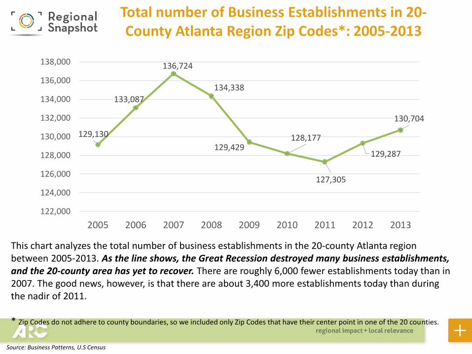
This chart analyzes the total number of business establishments in the 20-county Atlanta region between 2005-2013. As the line shows, the Great Recession destroyed many business establishments, and the 20-county area has yet to recover. There are roughly 6,000 fewer establishments today than in 2007. The good news, however, is that there are about 3,400 more establishments today than during the nadir of 2011.
* Zip Codes do not adhere to county boundaries, so we included only Zip Codes that have their center point in one of the 20 counties.
Total number of Business Establishments in 20-County Atlanta Region Zip Codes*: 2005-2013
Source: Business Patterns, U.S Census
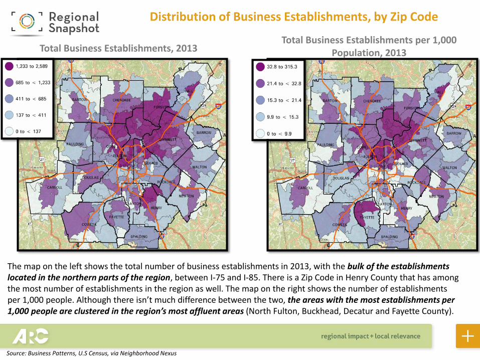
Distribution of Business Establishments, by Zip Code
The map on the left shows the total number of business establishments in 2013, with the bulk of the establishments located in the northern parts of the region, between I-75 and I-85. There is a Zip Code in Henry County that has among the most number of establishments in the region as well. The map on the right shows the number of establishments per 1,000 people. Although there isn’t much difference between the two, the areas with the most establishments per 1,000 people are clustered in the region’s most affluent areas (North Fulton, Buckhead, Decatur and Fayette County).
Total Business Establishments, 2013Total Business Establishments per 1,000
Population, 2013
Source: Business Patterns, U.S Census, via Neighborhood Nexus
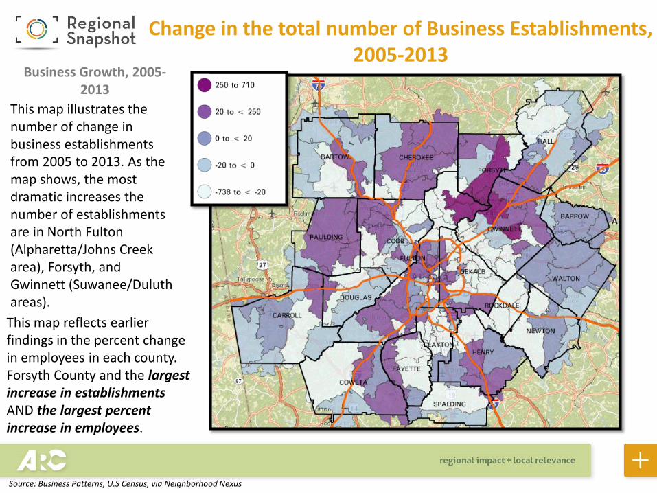
Change in the total number of Business Establishments, 2005-2013
This map illustrates the number of change in business establishments from 2005 to 2013. As the map shows, the most dramatic increases the number of establishments are in North Fulton (Alpharetta/Johns Creek area), Forsyth, and Gwinnett (Suwanee/Duluth areas).
This map reflects earlier findings in the percent change in employees in each county. Forsyth County and the largest increase in establishmentsAND the largest percent increase in employees.
Business Growth, 2005-2013
Source: Business Patterns, U.S Census, via Neighborhood Nexus

Focus on small Business Establishments (1-9 Employees), 2013
This map highlights those Zip Codes where at least 90 percent of all business establishments have fewer than 10 employees – so where the heaviest concentrations of small businesses are located. As the map shows, all of these Zip Codes are located on the exurban fringes of the region, which makes some sense given that many small businesses may not require “foot traffic”, thus they don’t necessarily need to be in heavily populated areas.
Highest Concentrations of Small Businesses, 2013
Source: Business Patterns, U.S Census, via Neighborhood Nexus


