Inferring Phenotypic Properties from Single-CellCharacteristicsPeng Qiu*
Department of Bioinformatics and Computational Biology, The University of Texas M. D. Anderson Cancer Center, Houston, Texas, United States of America
Abstract
Flow cytometry provides multi-dimensional data at the single-cell level. Such data contain information about the cellularheterogeneity of bulk samples, making it possible to correlate single-cell features with phenotypic properties of bulk tissues.Predicting phenotypes from single-cell measurements is a difficult challenge that has not been extensively studied. The 6thDialogue for Reverse Engineering Assessments and Methods (DREAM6) invited the research community to developsolutions to a computational challenge: classifying acute myeloid leukemia (AML) positive patients and healthy donorsusing flow cytometry data. DREAM6 provided flow cytometry data for 359 normal and AML samples, and the class labels forhalf of the samples. Researchers were asked to predict the class labels of the remaining half. This paper describes onesolution that was constructed by combining three algorithms: spanning-tree progression analysis of density-normalizedevents (SPADE), earth mover’s distance, and a nearest-neighbor classifier called Relief. This solution was among the top-performing methods that achieved 100% prediction accuracy.
Citation: Qiu P (2012) Inferring Phenotypic Properties from Single-Cell Characteristics. PLoS ONE 7(5): e37038. doi:10.1371/journal.pone.0037038
Editor: Avi Ma’ayan, Mount Sinai School of Medicine, United States of America
Received January 20, 2012; Accepted April 11, 2012; Published May 25, 2012
Copyright: � 2012 Peng Qiu. This is an open-access article distributed under the terms of the Creative Commons Attribution License, which permits unrestricteduse, distribution, and reproduction in any medium, provided the original author and source are credited.
Funding: This work is partially supported by: (1) TCGA Genome Data Analysis Center grant U24 CA143883 02 S1; (2) the Cancer Center Support Grant at theUniversity of Texas M. D. Anderson Cancer Center P30 CA016672. The funders had no role in study design, data collection and analysis, decision to publish, orpreparation of the manuscript.
Competing Interests: One of the three main computational components in this paper is the SPADE algorithm. PQ is on a patent for the SPADE algorithm, whichhas been applied for on behalf of Stanford University. This does not alter the author’s adherence to all the PLoS ONE policies on sharing data and materials.
* E-mail: [email protected]
Introduction
Flow cytometry technology provides multi-parametric single-cell
measurements of a heterogeneous population of cells [1]. The flow
cytometry data for one biological sample is usually in the form of
a tall thin matrix, where each row corresponds to an individual cell
and each column corresponds to one protein marker. Each
element in the data matrix is the expression of a protein marker
on/inside an individual cell. Such single-cell data contain in-
formation about the cellular heterogeneity underlying the mea-
sured population (i.e., how many cell types there are, and the
percentages of cells belonging to each cell type). If such data for
multiple samples are available, the relationship between the
cellular heterogeneity and the phenotypic properties of the
samples can be evaluated.
The relationship between single-cell characteristics and pheno-
typic properties has been discussed in the literature. For example,
flow cytometry was used to derive the percentages of smudge cells
and lymphocytes in blood samples, which were shown to be
predictive of prognosis for patients with chronic lymphocytic
leukemia [2]. CD33 expression derived from flow cytometry
predicted clinical outcome in patients with acute myeloid leukemia
(AML) who were treated with gemtuzumab ozogamicin mono-
therapy [3]. Flow cytometry was used to profile follicular
lymphoma tumors and identify a subpopulation of lymphoma
cells with impaired B-cell antigen receptor signaling, whose
abundance was negatively correlated with survival [4]. These
studies demonstrate possible correlations between cellular compo-
sitions and clinical outcomes, such as survival and drug response.
To correlate single-cell data and phenotypic properties, in
general, two computational components are needed: (1) identify
cell types or subpopulations of cells, and (2) infer phenotypic
properties from summary statistics of the subpopulations. For
subpopulation identification, the most widely used approach for
analyzing flow cytometry data is gating, which is a subjective and
labor-intensive method that relies on user-defined sequences of
nested biaxial plots [5,6]. To reduce the subjectivity, a number of
automated clustering algorithms have been proposed, such as K-
means [7,8], mixture models, [9–12], density-based clustering
[13,14], spectral analysis [15], and tree-based analysis [16,17].
Once the subpopulations are defined, summary statistics can be
easily computed (i.e., percentages and median marker expres-
sions). For the purpose of inferring phenotypic properties, many
classification algorithms in the machine learning literature can be
applied. Examples include support vector machine [18], neural
network [19], random forest [20], model-based classifiers [21], and
nearest neighbor approaches [22,23]. The combination of sub-
population identification and classification algorithms can produce
many analysis pipelines, each of which may have its own strengths
and weaknesses.
The challenges put forth by DREAM, the acronym for
Dialogue for Reverse Engineering Assessments and Methods,
provide objective and unbiased platforms for evaluating compu-
tational methods in systems biology [24–27]. Started in 2007, the
DREAM project designs a set of computational challenges each
year, invites scientists to solve them, and evaluates the solutions
that are submitted. The challenges have included: transcription
factor binding prediction, network inference, missing data
PLoS ONE | www.plosone.org 1 May 2012 | Volume 7 | Issue 5 | e37038

prediction, sequence motif recognition, parameter estimation,
and gene expression prediction. The DREAM6 in 2011 included
one challenge on AML prediction using single-cell flow
cytometry data. Operating in parallel to DREAM, another
initiative FlowCAP (Flow Cytometry: Critical Assessment of
Population Identification Methods) focuses on computational
methods for flow cytometry analysis. The AML prediction
challenge was shared by DREAM6 and FlowCAP2.
This manuscript discusses my participation in the AML
prediction challenge. The challenge provided flow cytometry data
for 359 subjects and the normal/AML status of 179 subjects.
Researchers were asked to predict the normal/AML status of the
remaining 180 subjects. In response to this challenge, I submitted
one solution and it achieved 100% prediction accuracy. The main
components of the solution were: spanning-tree progression
analysis of density-normalized events (SPADE) [16], earth mover’s
distance (EMD) [28] and a nearest-neighbor classification
approach called Relief [22]. Detailed descriptions of the challenge
and my solution are provided hereafter.
Results
Description of the AML Prediction Challenge and DataThe AML prediction challenge included a total of 359 samples
from 316 healthy donors and 43 AML positive patients. Each
sample was subdivided into 8 aliquots/tubes, stained for different
marker combinations, and assayed by flow cytometry. Tube 1 was
an isotype control and tube 8 was unstained. Table 1 shows the
marker combinations, five protein markers per tube. In addition to
the protein markers, the data contained measurements for forward
scatter (FSC) and side scatter (SSC) for each cell, which reflected
cell size and granularity. Therefore, the data of each tube was
a matrix containing 7 columns. The total number of cells (rows)
varied across the different tubes and samples, ranging from 8000
to 50000.
The information for 179 samples regarding whether they were
healthy or AML positive was provided as the training set. The
challenge was to predict the normal/AML status of the remaining
180 testing samples. It is worth noting that since the total numbers
of normal and AML samples were provided, participants were
able to easily figure out the numbers of normal and AML samples
in the testing samples, which were 160 and 20, respectively.
As shown in Table 1, only one protein marker was shared by
different tubes. Since the number of overlapping markers in the
different tubes was small (CD45, FSC and SSC), I decided to
analyze the 8 tubes separately, as if there were 8 different
prediction problems. In the following subsections, tube 2 will be
used to illustrate the analysis and results, because it is the first tube
that is not a control tube.
Data Quality Check and PreprocessingThe flow cytometry data of each tube for each sample were
provided in a comma-separated values (CSV) file. The total
number of files was 359*8= 2872. Data in the CSV files were
compensated and transformed [29] before being released to the
participants. FSC was transformed in linear scale, while SSC and
the five protein markers were transformed in logarithmic scale.
As a quality check, histograms were visualized for each marker
in each file. For example, Figure 1 shows the histograms derived
from tube 2. Each plot contains 359 curves, which are the
distributions of the transformed intensities for one marker in the
2nd tube of the 359 samples. The curves in each plot formed
clusters of peaks, meaning that the distributions of the intensities of
the markers in tube 2 were relatively well aligned across different
samples. Similar patterns were observed in the data from the other
tubes (see information S1). Such observations indicated that there
was no significant mean shift or variance change among the
samples, and thus, data from different samples were directly
comparable without the need for normalizing any baseline
differences among samples.
From Figure 1, it can be observed that all markers in the
logarithmic scale shared a similar standard deviation (*0:1);whereas the standard deviation of FSC was large, because of its
linear scale. To ensure that the subsequent analysis was not
dominated by the FSC channel, linear transformation was used to
shift the mean of the FSC data to 0 and scale the standard
deviation to 0.1. This was performed separately for each data file.
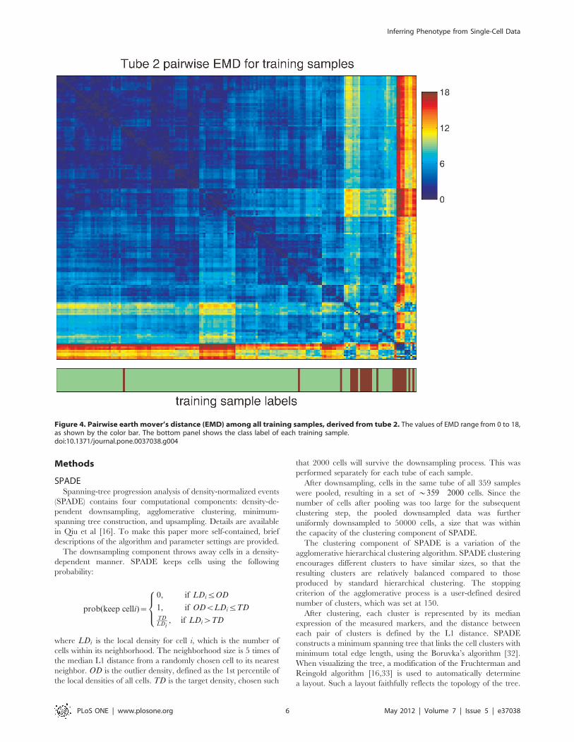
SPADESPADE is the acronym for spanning-tree progression analysis of
density-normalized events [16]. It is a computational approach for
flow cytometry analysis. SPADE views a flow cytometry dataset as
a point cloud of cells and derives a tree structure to represent the
geometry of the cloud, which reflects the cellular heterogeneity
underlying the data. To achieve this, SPADE contains four
computational components: density-dependent downsampling,
agglomerative clustering, minimum-spanning tree construction,
and upsampling. As mentioned above, data for different tubes
were analyzed separately. In this subsection, tube 2 is used to
illustrate how SPADE was applied for the AML prediction
challenge.
To jointly analyze the tube 2 data for all the samples with
SPADE, my strategy was to first perform density-dependent
downsampling on the tube 2 data for the individual samples
separately, then pool the downsampled data for clustering and
minimum-spanning tree construction, and finally apply upsam-
pling to calculate the distribution of cells with respect to the tree
for each sample.
Density-dependent downsampling is a process that removes cells.
This process removes cells in the abundant cell types with high
probability while keeping most cells in the rare cell types. Down-
sampling was performed on individual samples because the total
numbers of cells in different samples were different. To ensure that
individual samples contributed equally to the collective when the
downsampled data for all samples were pooled, the downsampling
parameters of SPADE were varied such that the same number of
cells (i.e., 2000 in this analysis) survived the downsampling process
for each sample.
The downsampled data for all samples were pooled, forming
a meta-cloud that represented the union of all phenotypes present
Table 1. The fluorophore-conjugated antibodies contained ineach of the 8 tubes.
FL1 FL2 FL3 FL4 FL5
Tube 1 IgG1-FITC IgG1-PE CD45-ECD IgG1-PC5 IgG1-PC7
Tube 2 Kappa-FITC Lambda-PE CD45-ECD CD19-PC5 CD20-PC7
Tube 3 CD7-FITC CD4-PE CD45-ECD CD8-PC5 CD2-PC7
Tube 4 CD15-FITC CD13-PE CD45-ECD CD16-PC5 CD56-PC7
Tube 5 CD14-FITC CD11c-PE CD45-ECD CD64-PC5 CD33-PC7
Tube 6 HLA-DR-FITC CD117-PE CD45-ECD CD34-PC5 CD38-PC7
Tube 7 CD5-FITC CD19-PE CD45-ECD CD3-PC5 CD10-PC7
Tube 8 NonSpecific NonSpecific NonSpecific NonSpecific NonSpecific
doi:10.1371/journal.pone.0037038.t001
Inferring Phenotype from Single-Cell Data
PLoS ONE | www.plosone.org 2 May 2012 | Volume 7 | Issue 5 | e37038

in at least one sample. Agglomerative clustering was applied to
divide the meta-cloud into small pieces (i.e. 150 clusters).
Minimum-spanning tree construction was used to derive a tree
structure that connected the clusters with minimum total edge
length. Each tree node represented one cluster of cells that were
similar to each other, which occupied one small region of the
meta-cloud. The topology of the tree approximated the skeleton of
the meta-cloud. Figure 2 shows multiple versions of the SPADE
tree. The only difference among those versions is the coloring. The
nodes of each tree were colored by the median intensity of one
marker measured in tube 2.
The topology, layout and coloring of the tree were automat-
ically generated by SPADE. Annotation boundaries in Figure 2
were manually drawn to partition the tree into subgraphs, such
that the color pattern within one boundary was relatively
homogeneous in all the colored trees. For example, nodes in the
boundary that covered the upper-right branch were negative for
all five protein markers; nodes within the adjacent annotation
boundary was positive for CD45 and negative for the other four
protein markers. Each annotation boundary outlined one branch/
subgraph of the tree, which might correspond to a subpopulation
of cells with a distinct phenotype. Since tube 2 measured B-cell
markers, a few branches of the SPADE tree can be interpreted as
B-cell subtypes. The two branches in the upper-left corner were
mature B cells because they were positive for both CD19 and
CD20. This was further confirmed by the mutually exclusive
expression of kappa and lambda in those two branches, which has
been observed in mature B cells [30]. The bottom branch was
CD19+ CD20- Kappa- Lambda-, which was likely to be immature
B cells. The five subgraphs near the center of the tree were CD45+CD19- CD20-, with different expressions of kappa and lambda.
The cell types of nodes in those subgraphs were not clear
according to the markers in tube 2. The manually derived
annotaion boundaries were useful for understanding the corre-
spondence between the tree and the underlying cell types.
However, for the purpose of predicting the normal/AML
classification, such annotations were not necessary.
After the SPADE tree was derived from the pooled down-
sampled data, upsampling was performed to map each cell in the
original dataset to the node to which it was most similar. Through
Figure 1. Distributions of marker intensities in data of tube 2. Each panel contains 359 curves, and each curve shows the distributions of theintensities of one marker in tube 2 for one of the 359 samples.doi:10.1371/journal.pone.0037038.g001
Inferring Phenotype from Single-Cell Data
PLoS ONE | www.plosone.org 3 May 2012 | Volume 7 | Issue 5 | e37038

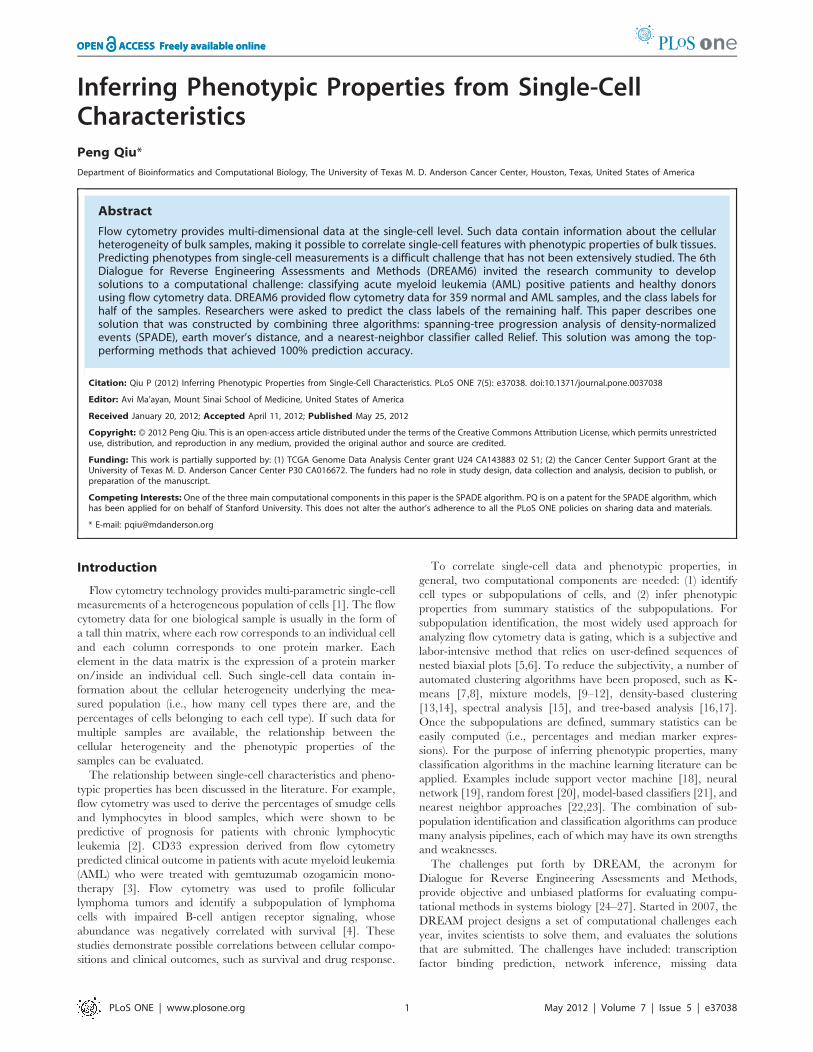
this process, for each sample, every cell in the original dataset was
assigned to one tree node, which enabled the calculation of the
percentage of cells that belonged to each tree node. The
percentage values could also be used to color the SPADE tree.
Figure 3 shows two examples. Each plot highlighted the parts of
the meta-cloud that were occupied by cells in one sample. The
following subsection discusses how the distribution of cells with
respect to the tree can be used for classification.
Classification Based on One TubeThe above SPADE analysis derived 359 distributions: how cells
in tube 2 of each sample were distributed across the tree. Such
a distribution is a characteristic of each sample that can be used for
classification. One possible way to address the classification
challenge is to ask: whether the cell percentage of any subtree
correlates with the normal/AML phenotype. Since each subtree
can be considered as one cell type or a collection of a few similar
cell types, this analysis identifies cell types whose abundance
predicts the normal/AML phenotype. For the tree shown in
Figure 2, the total number of possible subtrees is greater than
24000. Therefore, this analysis is subject to multiple hypothesis
testing.
Instead of searching for subtrees that predict the phenotype, an
alternative is to ask whether the entire distribution is predictive.
Following this idea, my solution for the AML prediction challenge
was to combine two algorithms: the earth mover’s distance (EMD)
[28] and a nearest-neighbor classifier named Relief [22].
EMD is a distance metric that measures the dissimilarity
between two probability distributions with respect to a structured
domain [28], which is the SPADE tree in this analysis. If one unit
of effort is needed to move one cell from a tree node to its adjacent
neighbor, the EMD between two distributions in Figure 3 is the
minimum effort needed to make one distribution the same as the
other by moving cells. It can be calculated by solving a constraint
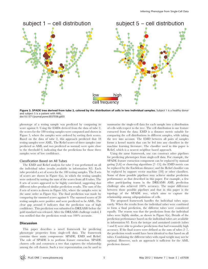
linear programming problem. Based on the data and the tree
derived from tube 2, the pairwise EMDs of all training samples
were calculated and shown in the heatmap in Figure 4. The order
of the samples in the heatmap was organized by hierarchical
clustering, so that similarity patterns among the samples was
visible along the diagonal line [31]. The normal and AML samples
were not perfectly separated according to the EMD values.
However, the AML samples formed more than two clusters in the
bottom-right corner of Figure 4, indicating that the AML samples
can be further divided into a few subtypes according to the
markers measured in tube 2.
Relief is a nearest neighbor based classifier. The Relief score for
one testing sample is defined by the distance from the testing
sample to the nearest normal sample minus the distance from the
test sample to the nearest AML sample. If a testing sample is
normal, the distance between it and the nearest normal sample is
likely to be small, and the distance between it and the nearest
AML sample is likely to be large. Thus, the score for a normal
testing sample is likely to be negative. Following similar logic, the
score for an AML sample is likely to be positive. Therefore, the
Figure 2. SPADE tree derived from tube 2 data of all 359 samples. Each tree is colored by the expression of one protein marker in tube 2:kappa, lambda, CD45, CD19 and CD20. Manually derived annotation boundaries are shown by the gray curves that partition the tree. Theseboundaries facilitate the interpretation of which phenotype is represented by different parts of the tree.doi:10.1371/journal.pone.0037038.g002
Inferring Phenotype from Single-Cell Data
PLoS ONE | www.plosone.org 4 May 2012 | Volume 7 | Issue 5 | e37038
phenotype of a testing sample was predicted by comparing its
score against 0. Using the EMDs derived from the data of tube 2,
the scores for the 180 testing samples were computed and shown in
Figure 5, where the samples were ordered by sorting their scores.
Based on the data of tube 2, this approach predicted that 18
testing samples were AML. The Relief scores of three samples (one
predicted as AML and two predicted as normal) were quite close
to the threshold 0, indicating that the predictions for those three
samples were of low confidence.
Classification Based on All TubesThe EMD and Relief analysis for tube 2 was performed on all
the individual tubes (results available in information S2). Each
tube provided a set of scores for the 180 testing samples. The 8 sets
of scores are shown in Figure 6(a), in which the testing samples
were ordered by sorting the sum of the scores from all 8 tubes. The
8 sets of scores appeared to be highly correlated, suggesting that
different tubes produced similar prediction results. The sum of the
8 sets of scores is shown in Figure 6(b), where the samples were in
the same order as Figure 6(a). The final prediction was made by
comparing the summed scores against 0. The summed scores of 20
testing samples were positive and were predicted to be AML. The
clear gap around 0 indicates that the prediction was of high
confidence. This prediction was submitted to DREAM6 before the
gold standard was released. After the DREAM6 challenge ended, I
was notified that the prediction result was 100% accurate.
Discussion
This paper describes a novel framework for predicting
phenotypic properties from single-cell data. The framework
contains three main components: SPADE, EMD and Relief.
The role of SPADE is to perform feature extraction. SPADE
clusters cells and constructs a tree that captures the relationship
among the cell clusters. Such a tree representation can be used to
summarize the single-cell data for each sample into a distribution
of cells with respect to the tree. The cell distribution is one feature
extracted from the data. EMD is a distance metric suitable for
comparing the cell distributions in different samples, while taking
the tree into account. The EMD between all pairs of samples
forms a kernel matrix that can be fed into any classifiers in the
machine learning literature. The classifier used in this paper is
Relief, which is a nearest neighbor based approach.
Using the same framework, one can construct other pipelines
for predicting phenotypes from single-cell data. For example, the
SPADE feature extraction component can be replaced by manual
gating [5,6] or clustering algorithms [7–15]; the EMD metric can
be replaced by the Euclidean distance; and the Relief classifier can
be replaced by support vector machine [18] or other classifiers.
Some of those possible pipelines may achieve similar prediction
performance as that described in this paper. For example, a few
other participating teams in the DREAM6 AML prediction
challenge also achieved 100% accuracy. The major difference
between those possible pipelines and that in this paper is the
topology of the SPADE tree, which aims to capture the
relationship among subpopulations of cells.
The proposed framework handles the individual tubes sepa-
rately. When the results from the individual tubes were combined
to form a final prediction, the different tubes were considered
equally. The reason was that the predictions from the individual
tubes were highly similar, as shown in Figure 6(a). Details of the
prediction performance based on the individual tubes are available
in information S3. Even the isotype and unstained controls (tubes
1 and 8) were able to produce predictions that had reasonably high
accuracy. If the final scores were defined as the sum of tubes 2–7,
the prediction result would have been identical to that based on all
tubes. Combining the different tubes with equal weight may not be
optimal. However, such an approach is sufficient for the AML
prediction dataset.
Figure 3. SPADE tree derived from tube 2, colored by the distribution of cells in two individual samples. Subject 1 is a healthy donorand subject 5 is a patient with AML.doi:10.1371/journal.pone.0037038.g003
Inferring Phenotype from Single-Cell Data
PLoS ONE | www.plosone.org 5 May 2012 | Volume 7 | Issue 5 | e37038
Methods
SPADESpanning-tree progression analysis of density-normalized events
(SPADE) contains four computational components: density-de-
pendent downsampling, agglomerative clustering, minimum-
spanning tree construction, and upsampling. Details are available
in Qiu et al [16]. To make this paper more self-contained, brief
descriptions of the algorithm and parameter settings are provided.
The downsampling component throws away cells in a density-
dependent manner. SPADE keeps cells using the following
probability:
prob(keep celli)~
0, if LDiƒOD
1, if ODvLDiƒTDTDLDi
, if LDiwTD
8><>:
where LDi is the local density for cell i, which is the number of
cells within its neighborhood. The neighborhood size is 5 times of
the median L1 distance from a randomly chosen cell to its nearest
neighbor. OD is the outlier density, defined as the 1st percentile of
the local densities of all cells. TD is the target density, chosen such
that 2000 cells will survive the downsampling process. This was
performed separately for each tube of each sample.
After downsampling, cells in the same tube of all 359 samples
were pooled, resulting in a set of *359 � 2000 cells. Since the
number of cells after pooling was too large for the subsequent
clustering step, the pooled downsampled data was further
uniformly downsampled to 50000 cells, a size that was within
the capacity of the clustering component of SPADE.
The clustering component of SPADE is a variation of the
agglomerative hierarchical clustering algorithm. SPADE clustering
encourages different clusters to have similar sizes, so that the
resulting clusters are relatively balanced compared to those
produced by standard hierarchical clustering. The stopping
criterion of the agglomerative process is a user-defined desired
number of clusters, which was set at 150.
After clustering, each cluster is represented by its median
expression of the measured markers, and the distance between
each pair of clusters is defined by the L1 distance. SPADE
constructs a minimum spanning tree that links the cell clusters with
minimum total edge length, using the Boruvka’s algorithm [32].
When visualizing the tree, a modification of the Fruchterman and
Reingold algorithm [16,33] is used to automatically determine
a layout. Such a layout faithfully reflects the topology of the tree.
Figure 4. Pairwise earth mover’s distance (EMD) among all training samples, derived from tube 2. The values of EMD range from 0 to 18,as shown by the color bar. The bottom panel shows the class label of each training sample.doi:10.1371/journal.pone.0037038.g004
Inferring Phenotype from Single-Cell Data
PLoS ONE | www.plosone.org 6 May 2012 | Volume 7 | Issue 5 | e37038

However, the edge length information of the tree is not encoded in
the visualization.
Finally, upsampling is performed to recover the information lost
during the downsampling process. For each cell in one tube of
each sample, SPADE identifies its nearest neighbor in the subset of
50000 cells used in clustering, and assigns it to the cluster that its
nearest neighbor belongs to. After upsampling, each cell in the
original dataset is assigned to one cluster/node. The median
marker expression and the cell count of each node can be
calculated based on the entire original dataset.
The SPADE analysis in this paper was performed using
SPADE2.0, an efficient Matlab implementation of the algorithm.
SPADE2.0 is about 15 times faster than the original prototype
released when SPADE was first published [16], and includes an
easy-to-use graphical user interface. SPADE2.0 is available at
http://odin.mdacc.tmc.edu/pqiu/software/SPADE2/index.html.
Earth Mover’s DistanceThe earth mover’s distance (EMD) measures the distance
between two probability distributions [28]. In this work, EMD is
used to evaluate the distance between two cell distributions with
respect to a tree structure (see examples in Figure 3). Imagine the
cells in one node as the mass in one city, the tree edges as the
highways that connect different cities, and efforts are needed to
move mass from city to city along the highways. The EMD between
two distributions is the minimum amount of effort needed to make
one distribution the same as the other. Here, the cost formoving one
cell from a tree node to its adjacent neighbor is defined as one unit of
effort. The EMD between two cell distributions (P and Q) can be
obtained by a linear programming formulation:
C~minfij
Pi,j
fijcij
s:t:
fij§0Pj
fij~P(i)
Pi
fij~Q(j)
8>>><>>>:
To make P the same as Q, fij is the number of cells moved from
node i to node j, and cij is the number of hops in the shortest path
between the two nodes. The equality constraints ensure that the
total number of cells moved out of node i equals P(i), and the total
number of cells moved into node j equals Q(j). The solution to this
minimization problem is the EMD between the two distributions,
and can be obtained by the ‘‘linprog’’ function in Matlab or other
linear programming solvers. One possible extension of this
formulation is to include the edge length information in the cost
Figure 5. Relief score for each testing sample, derived from tube 2. To make predictions, scores should be compared with a threshold of 0. Apositive score means the testing sample is likely to be AML; whereas a negative score means normal.doi:10.1371/journal.pone.0037038.g005
Inferring Phenotype from Single-Cell Data
PLoS ONE | www.plosone.org 7 May 2012 | Volume 7 | Issue 5 | e37038

matrix, defining cij as the total edge length of the shortest path
connecting the two nodes.
Supporting Information
Information S1 Data quality check figures.(PDF)
Information S2 EMD and RELIEF figures based onindividual tubes.(PDF)
Information S3 Classification based on individual orsubsets of tubes.
(PDF)
Acknowledgments
The author gratefully acknowledges the organizers of DREAM6 and
FlowCAP2 for providing the data and gold standards for the AML
prediction challenge.
Author Contributions
Conceived and designed the experiments: PQ. Performed the experiments:
PQ. Analyzed the data: PQ. Contributed reagents/materials/analysis
tools: PQ. Wrote the paper: PQ. Designed the software used in analysis:
PQ.
References
1. Chattopadhyay P, Price D, Harper T, Betts M, Yu J, et al. (2006) Quantum dot
semiconductor nanocrystals for immunophenotyping by polychromatic flow
cytometry. Nature Medicine 12: 972–977.
2. Nowakowski G, Hoyer J, Shanafelt T, Geyer S, LaPlant B, et al. (2007) Usingsmudge cells on routine blood smears to predict clinical outcome in chronic
lymphocytic leukemia: A universally available prognostic test. Mayo Clinic
Proceedings 82: 449–453.
3. Walter R, Gooley T, van der Velden V, Loken M, van Dongen J, et al. (2007)
Cd33 expression and p-glycoprotein mediated drug efflux inversely correlate
and predict clinical outcome in patients with acute myeloid leukemia treated
with gemtuzumab ozogamicin monotherapy. Blood 109: 4168–4170.
4. Irish J, Myklebust J, Alizadeh A, Houot R, Sharman J, et al. (2010) B-cell
signaling networks reveal a negative prognostic human lymphoma cell subset
Figure 6. Final prediction scores. (a) The Relief prediction scores for testing samples, derived from individual tubes. Each row corresponds to onetube. Along the horizontal axis, the 180 testing samples are ordered by sorting the sum of the scores from all 8 tubes. (b) Sum of scores from all 8tubes. Samples are in the same order as above. The final prediction is made by comparing the scores against the threshold 0. A clear gap can beobserved around 0, indicating high confidence of the prediction.doi:10.1371/journal.pone.0037038.g006
Inferring Phenotype from Single-Cell Data
PLoS ONE | www.plosone.org 8 May 2012 | Volume 7 | Issue 5 | e37038

that emerges during tumor progression. Proceedings of the National Academy of
Sciences 107: 12747–12754.5. Herzenberg L, Tung J, Moore W, Herzenberg L, Parks D (2006) Interpreting
flow cytometry data: a guide for the perplexed. Nature Immunology 7: 681–685.
6. Hahne F, LeMeur N, Brinkman R, Ellis B, Haaland P, et al. (2009) Flowcore:a bioconductor package for high throughput flow cytometry. BMC Bioinfor-
matics 10.7. Murphy RF (1985) Automated identification of subpopulations in flow
cytometric list mode data using cluster analysis. Cytometry 6: 302–309.
8. Finak G, Bashashati A, Brinkman R, Gottardo R (2009) Merging mixturecomponents for cell population identification in flow cytometry. Advances in
Bioinformatics 2009: 12 pages.9. Lo K, Brinkman R, Gottardo R (2008) Automated gating of flow cytometry data
via robust modelbased clustering. Cytometry A 73: 321–332.10. Boedigheimer M, Ferbas J (2008) Mixture modeling approach to flow cytometry
data. Cytometry A 73: 421–429.
11. Chan C, Feng F, Ottinger J, Foster D, West M, et al. (2008) Statistical mixturemodeling for cell subtype identification in flow cytometry. Cytometry A 73:
693–701.12. Pyne S, Hu X, Kang K, Rossin E, Lin T, et al. (2009) Automated high-
dimensional flow cytometric data anlysis. Proceedings of the National Academy
of Science 106: 8519–8524.13. Walther G, Zimmerman N, Moore W, Parks D, Meehan S, et al. (2009)
Automatic clustering of flow cytometry data with density-based merging.Advances in Bioinformatics.
14. Qian Y, Wei C, Lee F, Campbell J, Halliley J, et al. (2010) Elucidation ofseventeen human peripheral blood B-cell subsets and quantification of the
tetanus response using a density-based method for the automated identification
of cell populations in multidimensional flow cytometry data. Cytometry Part B:Clinical Cytometry 78B: S69–S82.
15. Zare H, Shooshtari P, Gupta A, Brinkman R (2010) Data reduction for spectralclustering to analyze high throughput flow cytometry data. BMC Bioinformatics
11: 403.
16. Qiu P, Simonds E, Bendall S, Gibbs Jr. K, Bruggner R, et al. (2011) Extractinga cellular hierarchy from high-dimensional cytometry data with SPADE. Nature
Biotechnology 29: 886–891.17. Bendall S, Simonds E, Qiu P, Amir E, Krutzik P, et al. (2011) Single cell mass
cytometry of differential immune and drug responses across the humanhematopoietic continuum. Science 332: 687–696.
18. Furey TS, Christianini N, Duffy N, Bednarski DW, Schummer M, et al. (2000)
Support vector machine classification and validation of cancer tissue samplesusing microarray expression data. Bioinformatics 16: 906–914.
19. O’Neill MC, Song L (2003) Neural network analysis of lymphoma microarray
data: prognosis and diagnosis near-perfect. BMC Bioinformatics 4.
20. Statnikov A, Wang L, Aliferis C (2008) A comprehensive comparison of random
forests and support vector machines for microarray-based cancer classification.
BMC Bioinformatics 9: 319.
21. Qiu P, Wang Z, Liu R (2005) Ensemble dependence model for classification and
prediction of cancer and normal gene expression data. Bioinformatics 21:
3114–3121.
22. Kira K, Rendell L (1992) A practical approach to feature selection. In: ML92:
Proceedings of the Ninth International Workshop on Machine Learning.
Morgan Kaufmann Publishers Inc., pp 249–256.
23. Sun Y, Goodison S, Li J, Liu L, Farmerie W (2007) Improved breast cancer
prognosis through the combination of clinical and genetic markers. Bioinfor-
matics 23: 30–37.
24. Stolovitzky G, Monroe D, Califano A (2007) Dialogue on reverse-engineering
assessment and methods. Annals of the New York Academy of Sciences 1115:
1–22.
25. Stolovitzky G, Prill R, Califano A (2009) Lessons from the DREAM2
Challenges. Annals of the New York Academy of Sciences 1158: 159–195.
26. Prill R, Marbach D, Saez-Rodriguez J, Sorger P, Alexopoulos L, et al. (2010)
Towards a rigorous assessment of systems biology models: the DREAM3
challenges. PLoS ONE 5: e9202.
27. Prill R, Saez-Rodriguez J, Alexopoulos L, Sorger P, Stolovitzky G (2011)
Crowdsourcing network inference: the DREAM predictive signaling network
challenge. Science Signaling 4: mr7.
28. Rubner Y, Tomasi C, Guibas L (2000) The earth mover’s distance as a metric
for image retrieval. International Journal of Computer Vision 40: 99–121.
29. Parks D, Roederer M, Moore W (2006) A new logicle display method avoids
deceptive effects of logarithmic scaling for low signals and compensated data.
Cytometry Part A 69A: 541–551.
30. Palazzo A, Evensen E, Huang Y, Cesano A, Nolan G, et al. (2011) Association of
reactive oxygen species-mediated signal transduction with in vitro apoptosis
sensitivity in chronic lymphocytic leukemia B cells. PLoS ONE 6: e24592.
31. Qiu P, Gentles AJ, Plevritis SK (2011) Discovering biological progression
underlying microarray samples. PLoS Computational Biology 7: e1001123.
32. Pettie S, Ramach V (1999) An optimal minimum spanning tree algorithm.
Journal of the ACM 49: 49–60.
33. Fruchterman T, Reingold E (1991) Graph drawing by force-directed placement.
Software Practice and Experience 21: 1129–1164.
Inferring Phenotype from Single-Cell Data
PLoS ONE | www.plosone.org 9 May 2012 | Volume 7 | Issue 5 | e37038


