
1
Lecture 1
STATISTICS
Statistics has been defined differently by different authors from time to time. One
can find more than hundred definitions in the literature of statistics.
Statistics can be used either as plural or singular. When it is used as plural, it is a
systematic presentation of facts and figures. It is in this context that majority of people use
the word statistics. They only meant mere facts and figures. These figures may be with
regard to production of food grains in different years, area under cereal crops in different
years, per capita income in a particular state at different times etc., and these are generally
published in trade journals, economics and statistics bulletins, newspapers, etc.,
When statistics is used as singular, it is a science which deals with collection,
classification, tabulation, analysis and interpretation of data.
Important definition of statistics
Statistics is the branch of science which deals with the collection, classification and
tabulation of numerical facts as the basis for explanations, description and comparison of
phenomenon - Lovitt
The science which deals with the collection, analysis and interpretation of numerical data -
Corxton & Cowden
The science of statistics is the method of judging collective, natural or social phenomenon
from the results obtained from the analysis or enumeration or collection of estimates -
King
Statistics may be called the science of counting or science of averages or statistics is the
science of the measurement of social organism, regarded as whole in all its manifestations
- Bowley
Statistics is a science of estimates and probabilities -Boddington
Statistics is a branch of science, which provides tools (techniques) for decision making in
the face of uncertainty (probability) - Wallis and Roberts
This is the modern definition of statistics which covers the entire body of statistics
All definitions clearly point out the four aspects of statistics collection of data,
analysis of data, presentation of data and interpretation of data.
Importance: Statistics plays an important role in our daily life, it is useful in almost all
sciences – social as well as physical – such as biology, psychology, education, economics,
business management, agricultural sciences etc., . The statistical methods can be and are
being followed by both educated and uneducated people. In many instances we use sample
data to make inferences about the entire population.
1. Planning is indispensable for better use of nation‟s resources. Statistics are
indispensable in planning and in taking decisions regarding export, import, and
production etc., Statistics serves as foundation of the super structure of
planning.

2
2. Statistics helps the business man in the formulation of polices with regard to
business. Statistical methods are applied in market and production research,
quality control of manufactured products
3. Statistics is indispensable in economics. Any branch of economics that require
comparison, correlation requires statistical data for salvation of problems
4. State. Statistics is helpful in administration in fact statistics are regarded as
eyes of administration. In collecting the information about population, military
strength etc., Administration is largely depends on facts and figures thud it
needs statistics
5. Bankers, stock exchange brokers, insurance companies all make extensive use
of statistical data. Insurance companies make use of statistics of mortality and
life premium rates etc., for bankers, statistics help in deciding the amount
required to meet day to day demands.
6. Problems relating to poverty, unemployment, food storage, deaths due to
diseases, due to shortage of food etc., cannot be fully weighted without the
statistical balance. Thus statistics is helpful in promoting human welfare
7. Statistics are a very important part of political campaigns as they lead up to
elections. Every time a scientific poll is taken, statistics are used to calculate
and illustrate the results in percentages and to calculate the margin for error.
In agricultural research, Statistical tools have played a significant role in
the analysis and interpretation of data.
1. In making data about dry and wet lands, lands under tanks, lands under
irrigation projects, rainfed areas etc.,
2. In determining and estimating the irrigation required by a crop per day, per
base period.
3. In determining the required doses of fertilizer for a particular crop and crop
land
In soil chemistry also statistics helps classifying the soils basing on their analysis results,
which are analyzed with statistical methods.
4. In estimating the losses incurred by particular pest and the yield losses due to
insect, bird, or rodent pests statistics is used in entomology.
5. Agricultural economists use forecasting procedures to determine the future
demand and supply of food and also use regression analysis in the empirical
estimation of function relationship between quantitative variables.
6. Animal scientists use statistical procedures to aid in analyzing data for decision
purposes.
7. Agricultural engineers use statistical procedures in several areas, such as for
irrigation research, modes of cultivation and design of harvesting and
cultivating machinery and equipment.

3
Limitations of Statistics:
1. Statistics does not study qualitative phenomenon
2. Statistics does not study individuals
3. Statistics laws are not exact laws
4. Statistics does not reveal the entire information
5. Statistics is liable to be misused
6. Statistical conclusions are valid only on average base
Functions of statistics
Statistics simplifies complexity, presents facts in a definite form, helps in
formulation of suitable policies, facilitates comparison and helps in forecasting.
Uses of statistics
Statistics has pervaded almost all spheres of human activities. Statistics is useful
in the administration of various states, Industry, business, economics, research workers,
banking, insurance companies etc.
Collection of data
Data can be collected by using sampling methods or experiments.
Data
The information collected through censuses and surveys or in a routine manner or
other sources is called a raw data. When the raw data are grouped into groups or classes,
they are known as grouped data.
There are two types of data
1. Primary data
2. Secondary data.
Primary data
The data which is collected by actual observation or measurement or count is
called primary data.
Methods of collection of primary data
Primary data is collected in any one of the following methods

4
1. Direct personal interviews.
2. Indirect oral interviews
3. Information from correspondents.
4. Mailed questionnaire method.
5. Schedules sent through enumerators.
Secondary data
The data which are compiled from the records of others is called secondary data.
The data collected by an individual or his agents is primary data for him and
secondary data for all others. The secondary data are less expensive but it may not
give all the necessary information. Secondary data can be compiled either from
published sources or from unpublished sources
Sources of published data
1. Official publications of the central, state and local governments.
2. Reports of committees and commissions.
3. Publications brought about by research workers and educational associations.
4. Trade and technical journals.
5. Report and publications of trade associations, chambers of commerce, bank etc.
6. Official publications of foreign governments or international bodies like U.N.O,
UNESCO etc.
Sources of unpublished data
All statistical data are not published. For example, village level officials maintain
records regarding area under crop, crop production etc. They collect details for
Variables
Variability is a common characteristic in biological Sciences. A quantitative or
qualitative characteristic that varies from observation to observation in the same group is
called a variable.
Quantitative data
The basis of classification is according to differences in quantity. In case of
quantitative variables the observations are made in terms of kgs, Lt, cm etc. Example:
weight of seeds, height of plants.
Qualitative data
When the observations are made with respect to quality is called qualitative data.

5
Eg: Crop varieties, Shape of seeds, soil type.
The qualitative variables are termed as attributes.
Classification of data
Classification is the process of arranging data into groups or classes according to
the common characteristics possessed by the individual items.
Data can be classified on the basis of one or more of the following kinds namely
1. Geography 2.Chronology 3. Quality 4. Quantity
1. Geographical classification (or) Spatial Classification
Some data can be classified area-wise, such as states, towns etc.
Data on area under crop in India can be classified as shown below
Region Area ( in hectares)
Central India -
West -
North -
East -
South -
2. Chronological or Temporal or Historical Classification
Some data can be classified on the basis of time and arranged chronologically or
historically.
Data on Production of food grains in India can be classified as shown below
Year Tonnes
1990-91 -
1991-92 -
1992-93 -
1993-94 -
1994-95 -
3. Qualitative Classification
Some data can be classified on the basis of attributes or characteristics. The number of
farmers based on their land holdings can be given as follows
Type of farmers Number of farmers
Marginal 907
Medium 1041
Large 1948
Total 3896
6
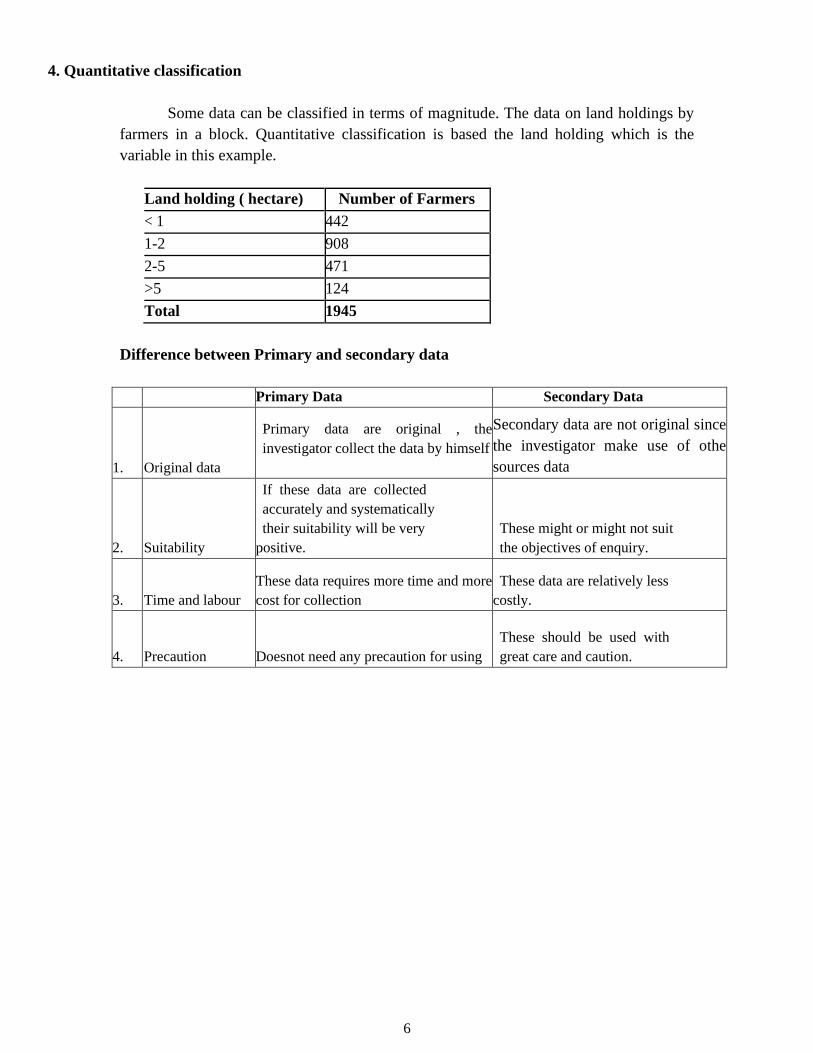
4. Quantitative classification
Some data can be classified in terms of magnitude. The data on land holdings by
farmers in a block. Quantitative classification is based the land holding which is the
variable in this example.
Land holding ( hectare) Number of Farmers
< 1 442
1-2 908
2-5 471
>5 124
Total 1945
Difference between Primary and secondary data
Primary Data Secondary Data
1. Original data
Primary data are original , the
investigator collect the data by himself
Secondary data are not original since
the investigator make use of othe
sources data
2. Suitability
If these data are collected
accurately and systematically
their suitability will be very
positive.
These might or might not suit
the objectives of enquiry.
3. Time and labour
These data requires more time and more
cost for collection
These data are relatively less
costly.
4. Precaution Doesnot need any precaution for using
These should be used with
great care and caution.

7
Frequency distribution: Construction of Frequency Distribution table,
Diagrammatic representation of data
Construction of Frequency Distribution Table:
In statistics, a frequency distribution is a tabulation of the values that one or more
variables take in a sample. Each entry in the table contains the frequency or count of the
occurrences of values within a particular group or interval, and in this way the table
summarizes the distribution of values in the sample.
The following steps are used for construction of frequency
table Step-1: The number of classes are to be decided
The appropriate number of classes may be decided by Yule’s formula, which is as follows:
Number of classes = 2.5 x n1/4. Where ‟ n” is the total number of observations
Step-2: The class interval is to be determined. It is obtain by using the relationship
Maximum value in the given data – Minimum value in the given
data
C.I = -------------------------------------------------------------------------------------
Number of classes
Step-3: The frequencies are counted by using Tally marks
Step-4: The frequency table can be made by two methods
a) Exclusive method
b) Inclusive method
a) Exclusive method: In this method, the upper limit of any class interval is kept the same as
the lower limit of the just higher class or there is no gap between upper limit of one class and
lower limit of another class. It is continuous distribution.
Ex:
C.I. Tally marks Frequency (f)
0-10
10-20
20-30
b) Inclusive method: There will be a gap between the upper limit of any class and the
lower limit of the just higher class. It is discontinuous distribution
Ex:
C.I. Tally marks Frequency (f)

8
0-9
10-19
20-29
To convert discontinuous distribution to continuous distribution by subtracting 0.5 from
lower limit and by adding 0.5 to upper limit
Note: The arrangement of data into groups such that each group will have some numbers.
These groups are called class and number of observations against these groups are called
frequencies.
Each class interval has two limits 1. Lower limit and 2. Upper limit
The difference between upper limit and lower limit is called length of class interval.
Length of class interval should be same for all the classes. The average of these two limits
is called mid value of the class.
Example: Construct a frequency distribution table for the following data
25, 32, 45, 8, 24, 42, 22, 12, 9, 15, 26, 35, 23, 41, 47, 18, 44, 37, 27, 46, 38, 24, 43,
46, 10, 21, 36, 45, 22, 18.
Solution: Number of observations (n) = 30
Number of classes = 2.5 x n1/4
= 2.5 x 301/4
= 2.5 x 2.3
= 5.8 - 6.0
Class interval =
Max.value - Min.value
No.of .classes
=
47 - 8
6
=
39
= 6.5 ̴ 6
6
Inclusive method:
C.I. Tally marks Frequency (f)
8-14 | | | | 4

9
15-21 | | | | 4
22-28 | | | | | | | 8
29-35 | | 2
36-42 | | | | 5
42-49 | | | | | | 7
Total 30
Exclusive
method:
C.I. Tally marks Frequency (f)
7.5-14.5 | | | | 4
14.5-21.5 | | | | 4
21.5-28.5 | | | | | | | 8
28.5-35.5 | | 2
35.5-42.5 | | | | 5
42.5-49.5 | | | | | | 7
Total 30
Diagrams
Diagrams are various geometrical shape such as bars, circles
etc. Diagrams are based on scale but are not confined to points or lines.
They are more attractive and easier to understand than graphs.
Merits
1. Most of the people are attracted by diagrams.
2. Technical Knowledge or education is not necessary.
3. Time and effort required are less.
4. Diagrams show the data in proper perspective.
5. Diagrams leave a lasting impression.
6. Language is not a barrier.

10
7. Widely used tool.
Demerits (or) limitations
1. Diagrams are approximations.
2. Minute differences in values cannot be represented properly in diagrams.
3. Large differences in values spoil the look of the diagram.
4. Some of the diagrams can be drawn by experts only. eg. Pie chart.
5. Different scales portray different pictures to laymen.
Types of Diagrams
The important diagrams are
1. Simple Bar diagram.
2. Multiple Bar diagram.
3. Component Bar diagram.
4. Percentage Bar diagram.
5. Pie chart
6. Pictogram
7. Statistical maps or cartograms.
In all the diagrams and graphs, the groups or classes are
represented on the x-axis and the volumes or frequencies are
represented in the y-axis.
Simple Bar diagram
If the classification is based on attributes and if the attributes
are to be compared with respect to a single character we use simple bar
diagram.
Example
1. The area under different crops in a state.
2. The food grain production of different years.
3. The yield performance of different varieties of a crop.
4. The effect of different treatments etc.

11
Simple bar diagrams Consists of vertical bars of equal width.
The heights of these bars are proportional to the volume or magnitude
of the attribute. All bars stand on the same baseline. The bars are
separated from each others by equal intervals. The bars may be
coloured or marked.
Example
The cropping pattern in Tamil Nadu in the year 1974-75 was as follows.
Crops Area In 1,000 hectares
Cereals 3940
Oilseeds 1165
Pulses 464
Cotton 249
Others 822
The simple bar diagram for this data is given below.
Multiple bar diagram
If the data is classified by attributes and if two or more
characters or groups are to be compared within each attribute we use
multiple bar diagrams. If only two characters are to be compared
within each attribute, then the resultant bar diagram used is known as
double bar diagram.
The multiple bar diagram is simply the extension of simple bar
diagram. For each attribute two or more bars representing separate
characters or groups are to be placed side by side. Each bar within an
attribute will be marked or coloured differently in order to distinguish
them. Same type of marking or colouring should be done under each

12
attribute. A footnote has to be given explaining the markings or
colourings.
Example
Draw a multiple bar diagram for the following data which represented
agricultural production for the priod from 2000-2004
Year Food grains (tones) Vegetables (tones) Others (tones)
2000 100 30 10
2001 120 40 15
2002 130 45 25
2003 150 50 25
2004

13
Component bar diagram
This is also called sub – divided bar diagram. Instead of placing the bars for each
component side by side we may place these one on top of the other. This will result in a
component bar diagram.
Example:
Draw a component bar diagram for the following data
Year Sales (Rs.) Gross Profit (Rs.) Net Profit (Rs.)
1974 100 30 10
1975 120 40 15
1976 130 45 25
1977 150 50 25
14
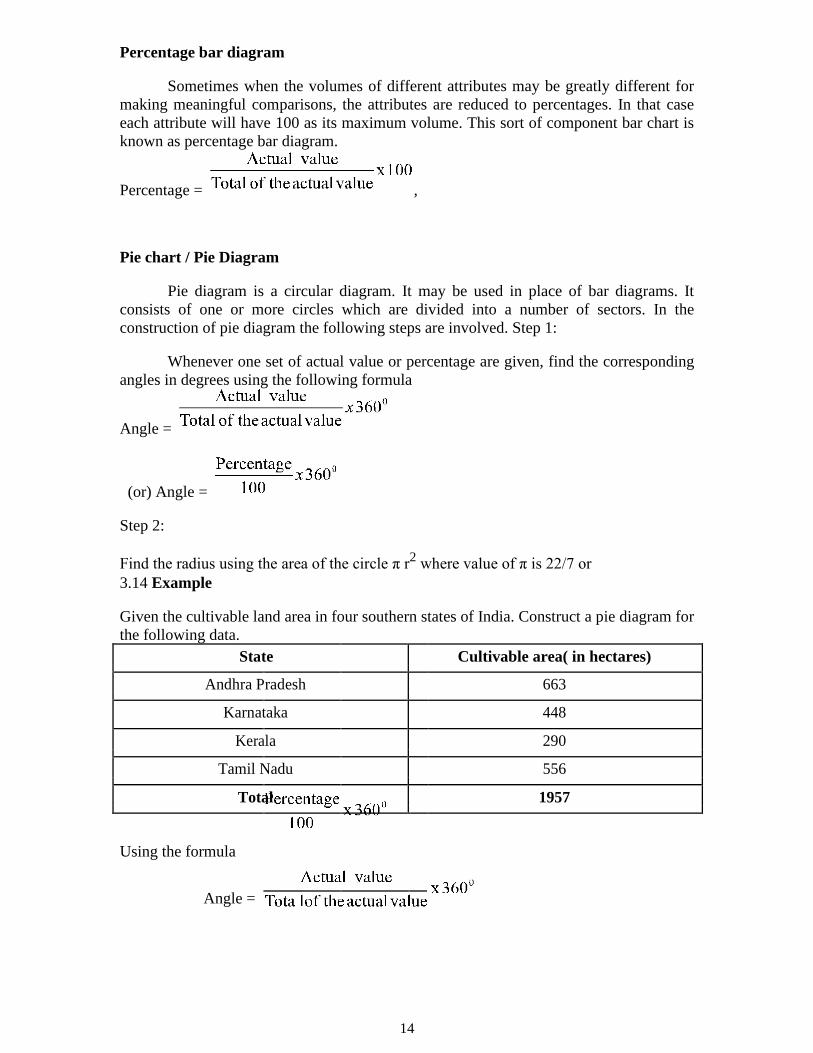
Percentage bar diagram
Sometimes when the volumes of different attributes may be greatly different for
making meaningful comparisons, the attributes are reduced to percentages. In that case
each attribute will have 100 as its maximum volume. This sort of component bar chart is
known as percentage bar diagram.
Percentage = ,
Pie chart / Pie Diagram
Pie diagram is a circular diagram. It may be used in place of bar diagrams. It
consists of one or more circles which are divided into a number of sectors. In the
construction of pie diagram the following steps are involved. Step 1:
Whenever one set of actual value or percentage are given, find the corresponding
angles in degrees using the following formula
Angle =
(or) Angle =
Step 2:
Find the radius using the area of the circle π r2 where value of π is 22/7 or
3.14 Example
Given the cultivable land area in four southern states of India. Construct a pie diagram for
the following data.
State Cultivable area( in hectares)
Andhra Pradesh 663
Karnataka 448
Kerala 290
Tamil Nadu 556
Total 1957
Using the formula
Angle =

15
The table value becomes
State Cultivable area
Andhra Pradesh 121.96
Karnataka 82.41
Kerala 53.35
Tamil Nadu 102.28
Radius = πr2
Here πr2 =1957
r2=
r = 24.96
r= 25 (approx)
Cultivable
Andhra
Karnatak
Keral
Tamil
Histogram
When the data are classified based on the class intervals it can be represented by a
histogram. Histogram is just like a simple bar diagram with minor differences. There is
no gap between the bars, since the classes are continuous. The bars are drawn only in
outline without colouring or marking as in the case of simple bar diagrams. It is the
suitable form to represent a frequency distribution.
Class intervals are to be presented in x axis and the bases of the bars are the
respective class intervals. Frequencies are to be represented in y axis. The heights of the
bars are equal to the corresponding frequencies.

16
Example
Draw a histogram for the following data
Seed Yield (gms) No. of Plants
2.5-3.5 4
3.5-4.5 6
4.5-5.5 10
5.5-6.5 26
6.5-7.5 24
7.5-8.5 15
8.5-9.5 10
9.5-10.5 5

17
Histogram
3
2.5-
2 3.5-
No. of
4.5-
2
1
5.5-
6.5-
1
7.5-
5
8.5-
0
9.5-
Seed
Frequency Polygon
The frequencies of the classes are plotted by dots against the mid-points of each
class. The adjacent dots are then joined by straight lines. The resulting graph is known as
frequency polygon.
Example
Draw frequency polygon for the following data
Seed Yield (gms) No. of Plants
2.5-3.5 4
3.5-4.5 6
4.5-5.5 10
5.5-6.5 26
6.5-7.5 24
7.5-8.5 15
8.5-9.5 10
9.5-10.5 5

18
Frequency curve
The procedure for drawing a frequency curve is same as for frequency polygon.
But the points are joined by smooth or free hand curve.
Example
Draw frequency curve for the following data
Seed Yield (gms) No. of Plants
2.5-3.5 4
3.5-4.5 6
4.5-5.5 10
5.5-6.5 26
6.5-7.5 24
7.5-8.5 15
8.5-9.5 10
9.5-10.5 5

19
Ogives
Ogives are known also as cumulative frequency curves and
there are two kinds of ogives. One is less than ogive and the other is
more than ogive.
Less than ogive: Here the cumulative frequencies are plotted against
the upper boundary of respective class interval.
Greater than ogive: Here the cumulative frequencies are plotted
against the lower boundaries of respective class intervals.
Example
Continuous Mid Point Frequency < cumulative > cumulative
Interval Frequency frequency
0-10 5 4 4 29
10-20 15 7 11 25
20-30 25 6 17 18
30-40 35 10 27 12
40-50 45 2 29 2
Cu
mu
lative
Fre
qu
en
cy
Boundary values


