Download - From Zero to Hero
Andy Marshall, Head of User Experience
Getting beyond the boxes and arrows
From zero to hero
Getting beyond the boxes and arrows
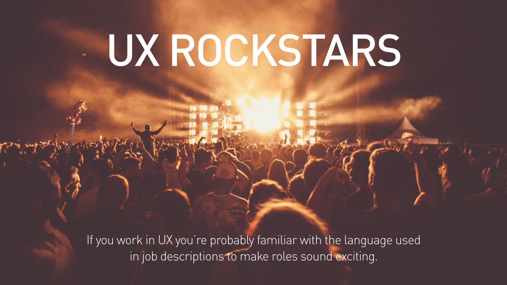
UX ROCKSTARS
If you work in UX you’re probably familiar with the language used in job descriptions to make roles sound exciting.

UX NINJASource: © Bianca Williams flickr.com
I’ve also seen this in a job description. Frankly it’s verging on ridiculous.
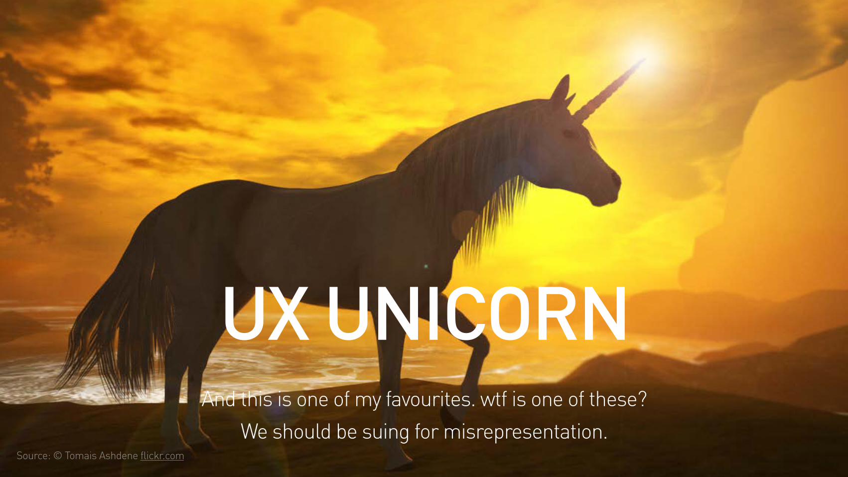
UX UNICORNSource: © Tomais Ashdene flickr.com
And this is one of my favourites. wtf is one of these? We should be suing for misrepresentation.
Getting beyond the boxes and arrows
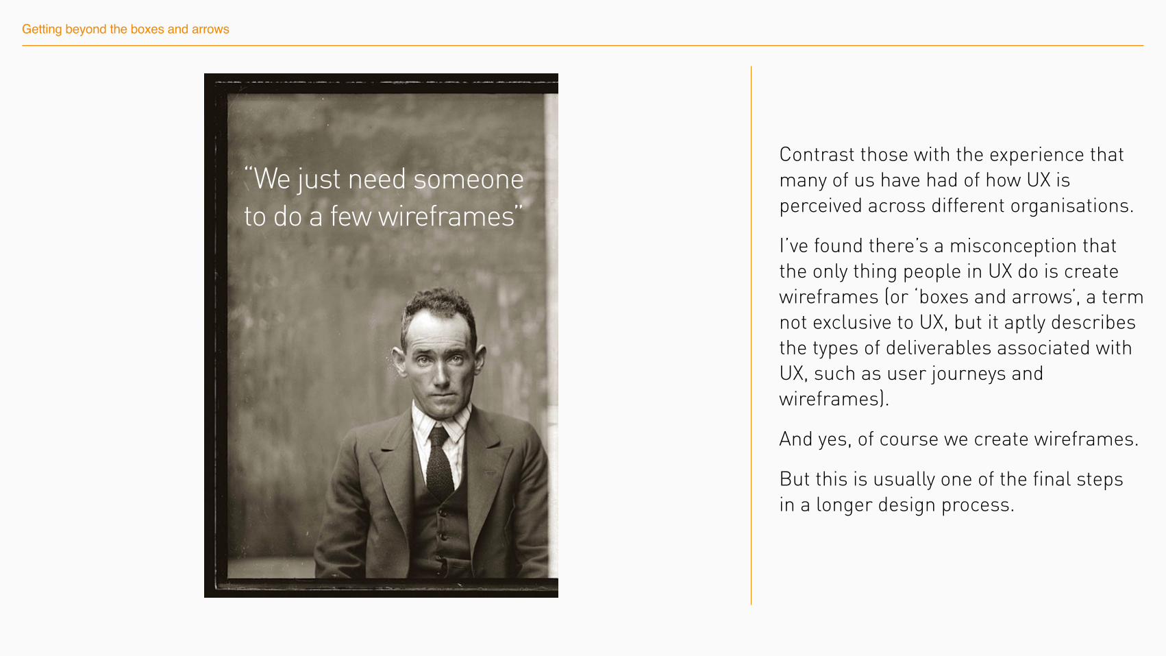
“We just need someone to do a few wireframes”
Contrast those with the experience that many of us have had of how UX is perceived across different organisations.
I’ve found there’s a misconception that the only thing people in UX do is create wireframes (or ‘boxes and arrows’, a term not exclusive to UX, but it aptly describes the types of deliverables associated with UX, such as user journeys and wireframes).
And yes, of course we create wireframes.
But this is usually one of the final steps in a longer design process.
Getting beyond the boxes and arrows
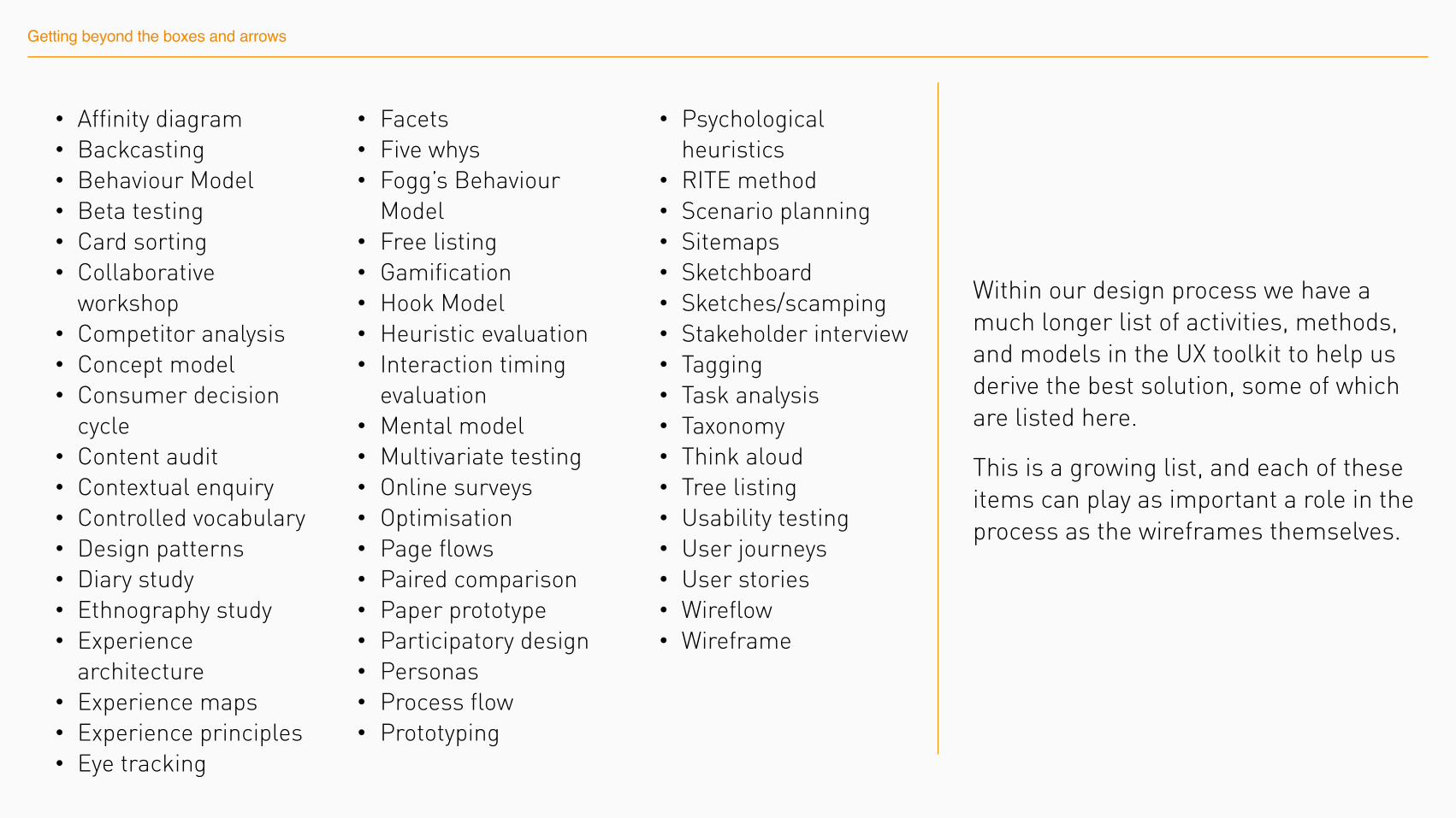
• Affinity diagram • Backcasting • Behaviour Model • Beta testing • Card sorting • Collaborative
workshop • Competitor analysis • Concept model • Consumer decision
cycle • Content audit • Contextual enquiry • Controlled vocabulary • Design patterns • Diary study • Ethnography study • Experience
architecture • Experience maps • Experience principles • Eye tracking
• Facets • Five whys • Fogg’s Behaviour
Model • Free listing • Gamification • Hook Model • Heuristic evaluation • Interaction timing
evaluation • Mental model • Multivariate testing • Online surveys • Optimisation • Page flows • Paired comparison • Paper prototype • Participatory design • Personas • Process flow • Prototyping
• Psychological heuristics
• RITE method • Scenario planning • Sitemaps • Sketchboard • Sketches/scamping • Stakeholder interview • Tagging • Task analysis • Taxonomy • Think aloud • Tree listing • Usability testing • User journeys • User stories • Wireflow • Wireframe
Within our design process we have a much longer list of activities, methods, and models in the UX toolkit to help us derive the best solution, some of which are listed here.
This is a growing list, and each of these items can play as important a role in the process as the wireframes themselves.
Getting beyond the boxes and arrows
Beyond the boxes and arrows
The fact is anyone can create a wireframe.
Getting beyond the boxes and arrows requires opening your mind to new ideas and ways of thinking about the problems you’re solving - and continuously improving the execution of your solutions.
Like anyone looking after a UX team I actively encourage my team to be constantly learning and developing and we even set aside time away from the day-to-day work to ensure this happens.
This presentation shares just a few of the areas that I encourage my team to explore.
Take time to learneach UI element
1
Take time to learn each UI element
Learning each UI element may sound like obvious advice.
But there is a big difference from understanding the basic functionality that a UI element performs compared to really knowing it should be used, and where it’s appropriate to be used.
1 Take time to learn each UI element
1 Take time to learn each UI element
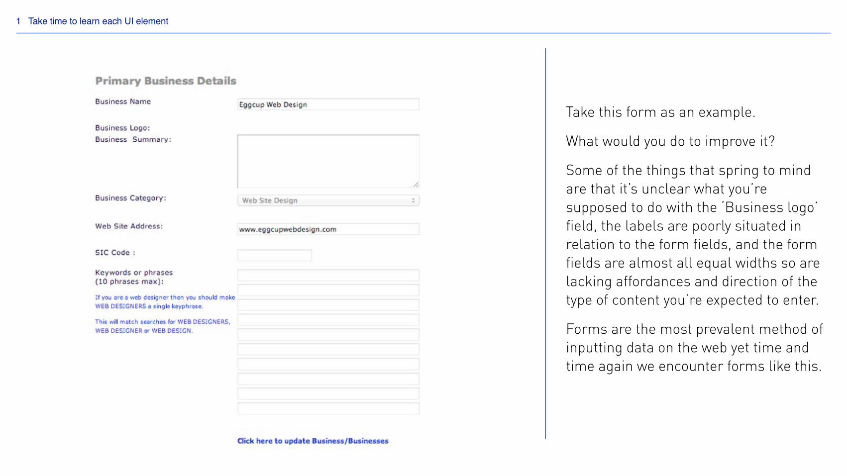
Take this form as an example.
What would you do to improve it?
Some of the things that spring to mind are that it’s unclear what you’re supposed to do with the ‘Business logo’ field, the labels are poorly situated in relation to the form fields, and the form fields are almost all equal widths so are lacking affordances and direction of the type of content you’re expected to enter.
Forms are the most prevalent method of inputting data on the web yet time and time again we encounter forms like this.
1 Take time to learn each UI element
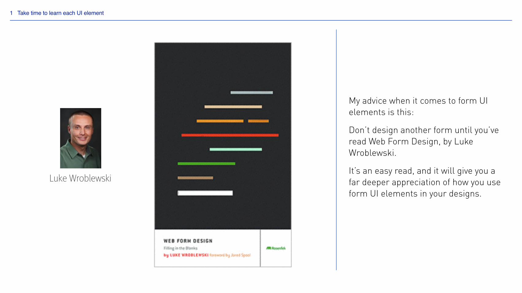
Luke Wroblewski
My advice when it comes to form UI elements is this:
Don’t design another form until you’ve read Web Form Design, by Luke Wroblewski.
It’s an easy read, and it will give you a far deeper appreciation of how you use form UI elements in your designs.
1 Take time to learn each UI element
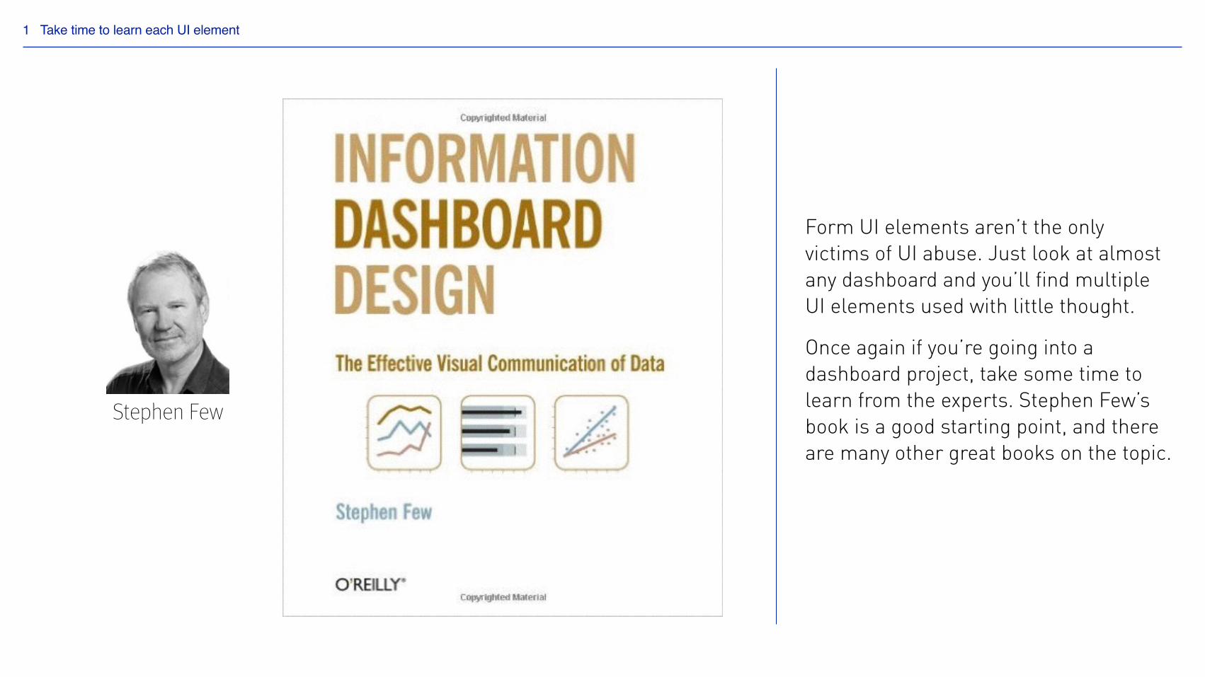
Stephen Few
Form UI elements aren’t the only victims of UI abuse. Just look at almost any dashboard and you’ll find multiple UI elements used with little thought.
Once again if you’re going into a dashboard project, take some time to learn from the experts. Stephen Few’s book is a good starting point, and there are many other great books on the topic.
with cautionFollow best practice…2
Follow best practice… with caution
Best practice is of course important. Once you’ve had time to consider a problem and consider your own solutions, looking to best practice is often a good next step.
But sometimes what we think is best practice isn’t best practice at all.
If a solution becomes pervasive enough, it’s easy to mistake it as being ‘best practice’ but in reality it might not be a good solution at all.
2 Follow best practice… with caution
2 Follow best practice… with caution
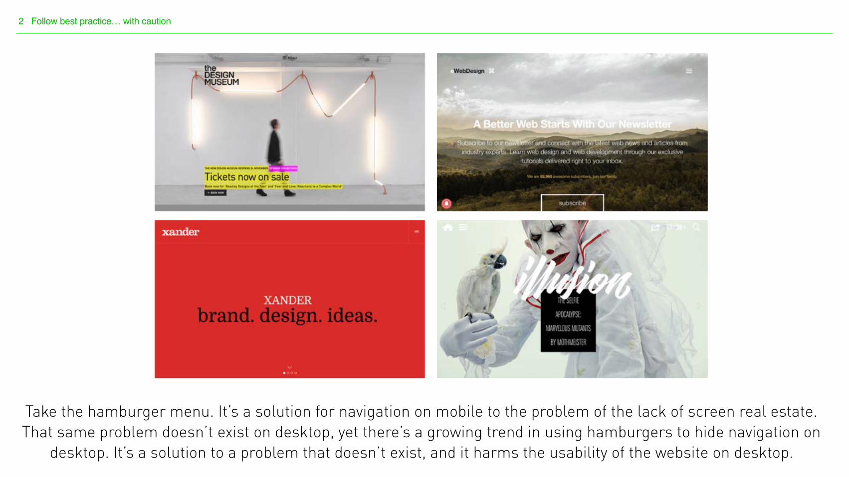
Take the hamburger menu. It’s a solution for navigation on mobile to the problem of the lack of screen real estate. That same problem doesn’t exist on desktop, yet there’s a growing trend in using hamburgers to hide navigation on
desktop. It’s a solution to a problem that doesn’t exist, and it harms the usability of the website on desktop.
2 Follow best practice… with caution
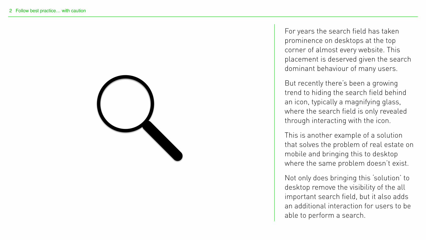
For years the search field has taken prominence on desktops at the top corner of almost every website. This placement is deserved given the search dominant behaviour of many users.
But recently there’s been a growing trend to hiding the search field behind an icon, typically a magnifying glass, where the search field is only revealed through interacting with the icon.
This is another example of a solution that solves the problem of real estate on mobile and bringing this to desktop where the same problem doesn’t exist.
Not only does bringing this ‘solution’ to desktop remove the visibility of the all important search field, but it also adds an additional interaction for users to be able to perform a search.
2 Follow best practice… with caution
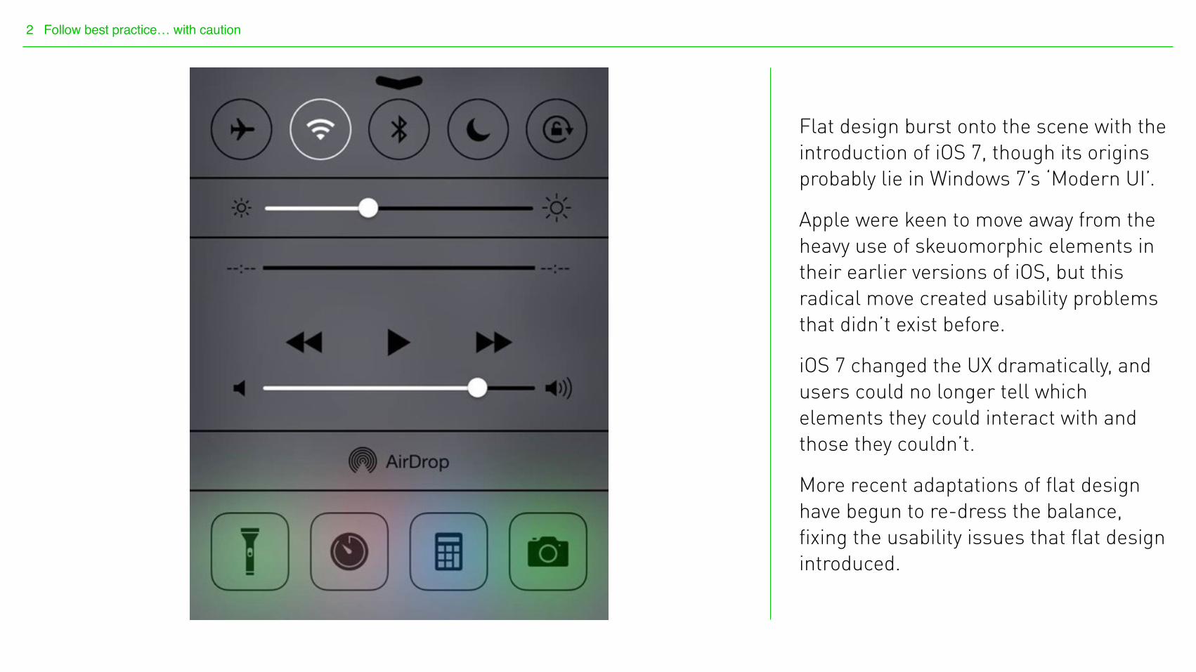
Flat design burst onto the scene with the introduction of iOS 7, though its origins probably lie in Windows 7’s ‘Modern UI’.
Apple were keen to move away from the heavy use of skeuomorphic elements in their earlier versions of iOS, but this radical move created usability problems that didn’t exist before.
iOS 7 changed the UX dramatically, and users could no longer tell which elements they could interact with and those they couldn’t.
More recent adaptations of flat design have begun to re-dress the balance, fixing the usability issues that flat design introduced.

Follow best practice. But question everything.
2 Follow best practice… with caution
Watch out for instincts3
Watch out for instincts
We follow our instincts on a daily basis - we’d barely be able to function without making instinctive decisions.
But in UX design the best solution can sometimes be counter intuitive. And these can be hard to spot.
3 Watch out for instincts
3 Watch out for instincts
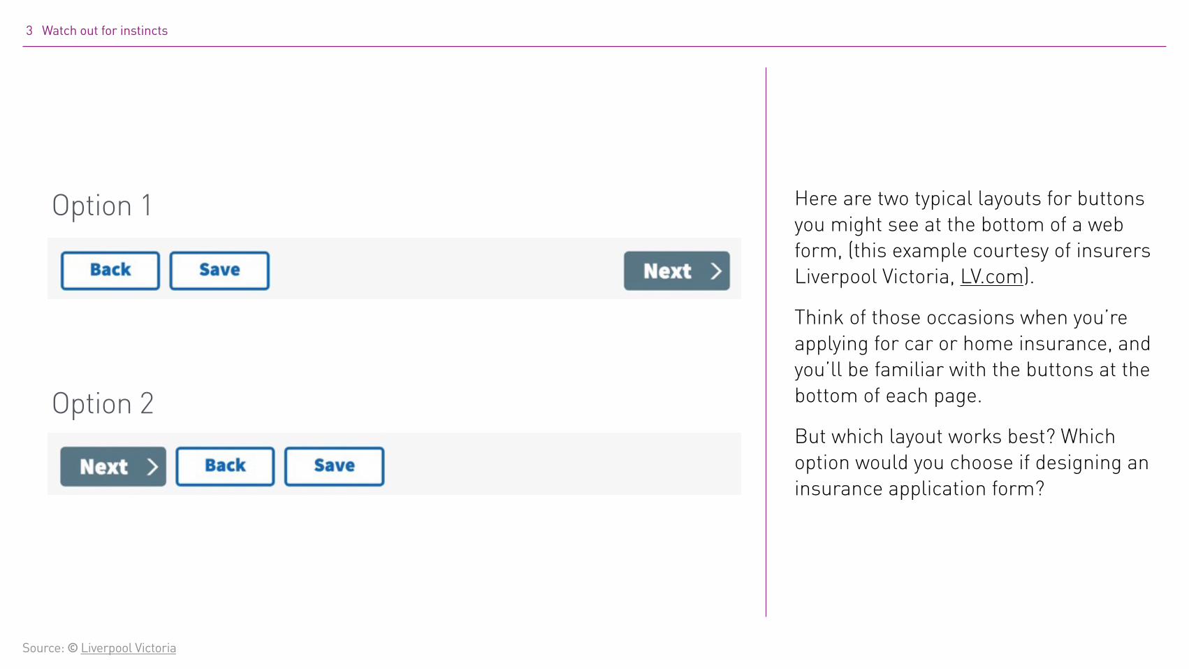
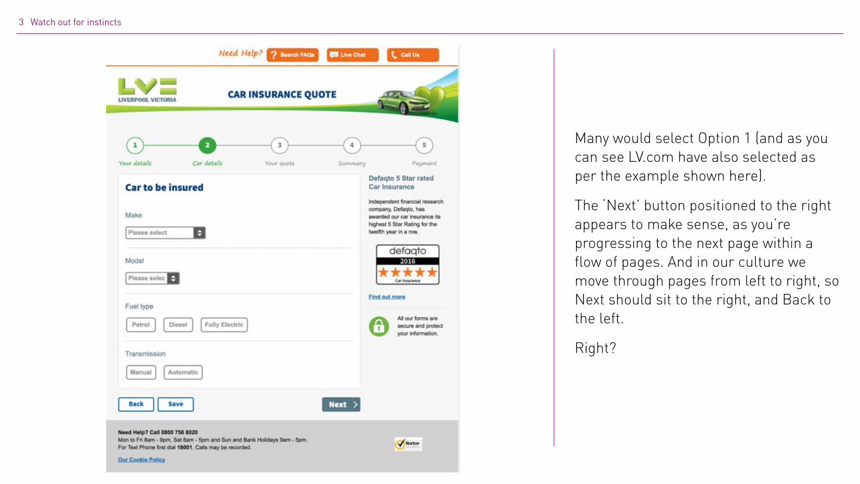
Option 1
Option 2
Here are two typical layouts for buttons you might see at the bottom of a web form, (this example courtesy of insurers Liverpool Victoria, LV.com).
Think of those occasions when you’re applying for car or home insurance, and you’ll be familiar with the buttons at the bottom of each page.
But which layout works best? Which option would you choose if designing an insurance application form?
Source: © Liverpool Victoria
3 Watch out for instincts
Many would select Option 1 (and as you can see LV.com have also selected as per the example shown here).
The ‘Next’ button positioned to the right appears to make sense, as you’re progressing to the next page within a flow of pages. And in our culture we move through pages from left to right, so Next should sit to the right, and Back to the left.
Right?
3 Watch out for instincts
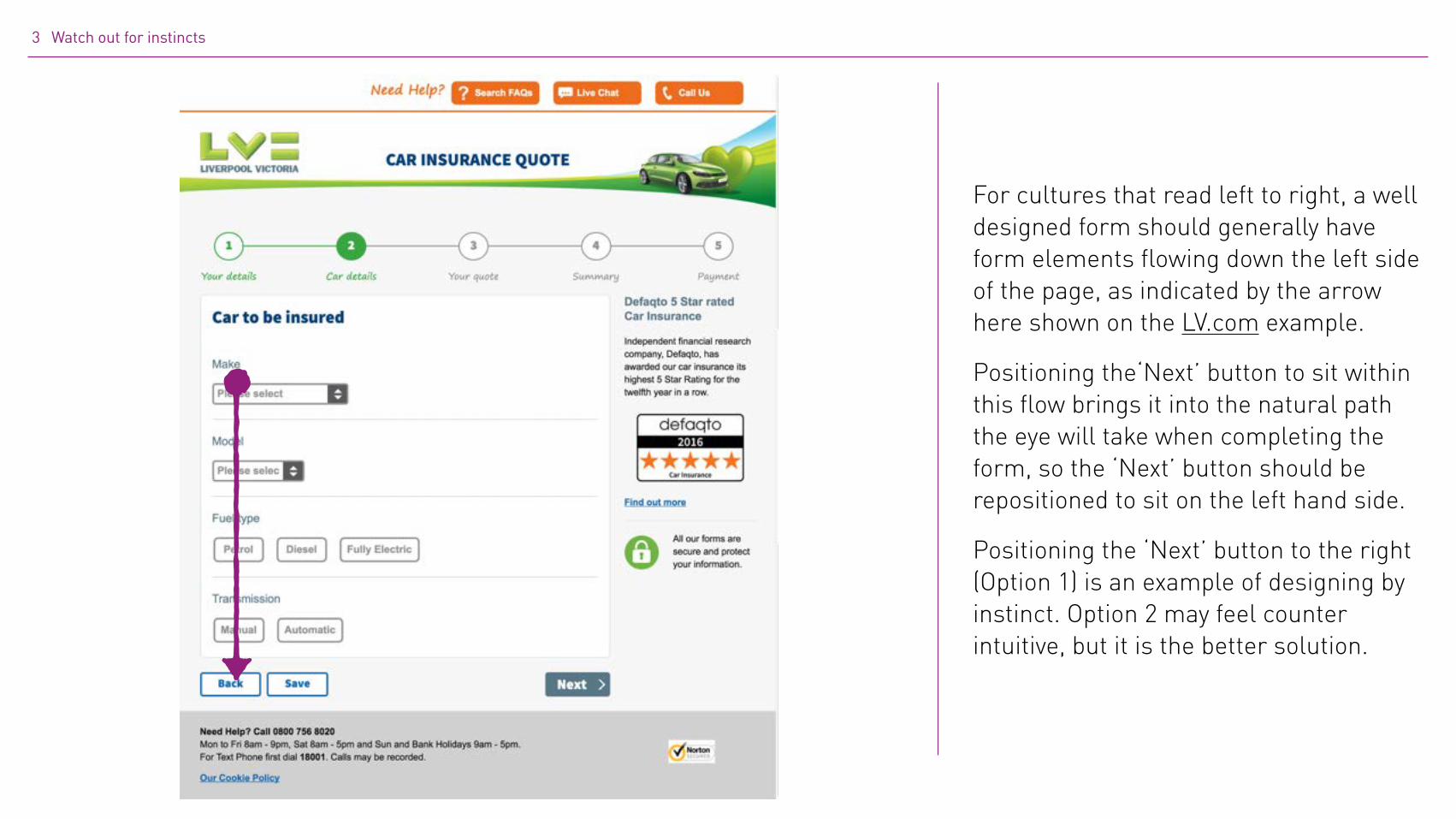
For cultures that read left to right, a well designed form should generally have form elements flowing down the left side of the page, as indicated by the arrow here shown on the LV.com example.
Positioning the‘Next’ button to sit within this flow brings it into the natural path the eye will take when completing the form, so the ‘Next’ button should be repositioned to sit on the left hand side.
Positioning the ‘Next’ button to the right (Option 1) is an example of designing by instinct. Option 2 may feel counter intuitive, but it is the better solution.
3 Watch out for instincts
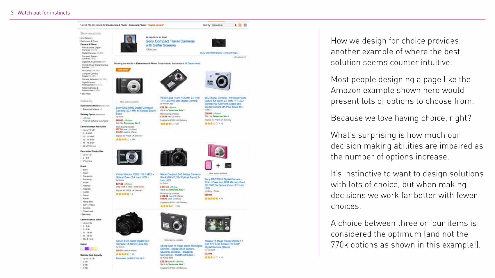
How we design for choice provides another example of where the best solution seems counter intuitive.
Most people designing a page like the Amazon example shown here would present lots of options to choose from.
Because we love having choice, right?
What’s surprising is how much our decision making abilities are impaired as the number of options increase.
It’s instinctive to want to design solutions with lots of choice, but when making decisions we work far better with fewer choices.
A choice between three or four items is considered the optimum (and not the 770k options as shown in this example!).

3 Keep your instincts in check
“We love the idea of choice, but hate making decisions.” Sheena Iyengar
Learn how people tick4

Learn how people tick
Understanding your target audience is one of the fundamental elements in any design process, for example personas do a fantastic job of describing user needs and goals.
But the secret sauce to creating deeply engaging user experiences lies in understanding people more deeply. And by this I mean how people process information, make decisions, are motivated, how they remember, recall information, and so on.
This of course is a enormous area to explore. But the more your UX team is immersed in this world the better their design solutions become as they design around how people tick.
Here are just some of the areas that I explore with my team.
4 Learn how people tick

4 Learn how people tick
Source: © Steven Merriewells flickr.com
Our brains are pattern recognition machines. Take one look at this picture and the fusiform facial area, a part of your brain dedicated to recognising faces and body parts, kicks in.
3 Learn how people tick
System 1 System 2
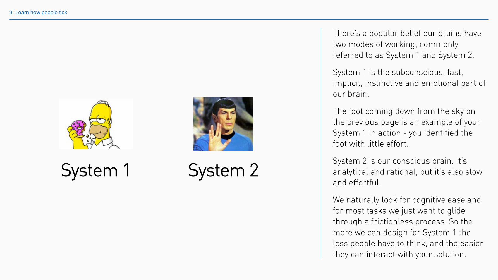
There’s a popular belief our brains have two modes of working, commonly referred to as System 1 and System 2.
System 1 is the subconscious, fast, implicit, instinctive and emotional part of our brain.
The foot coming down from the sky on the previous page is an example of your System 1 in action - you identified the foot with little effort.
System 2 is our conscious brain. It’s analytical and rational, but it’s also slow and effortful.
We naturally look for cognitive ease and for most tasks we just want to glide through a frictionless process. So the more we can design for System 1 the less people have to think, and the easier they can interact with your solution.
Colour Orientation Shape
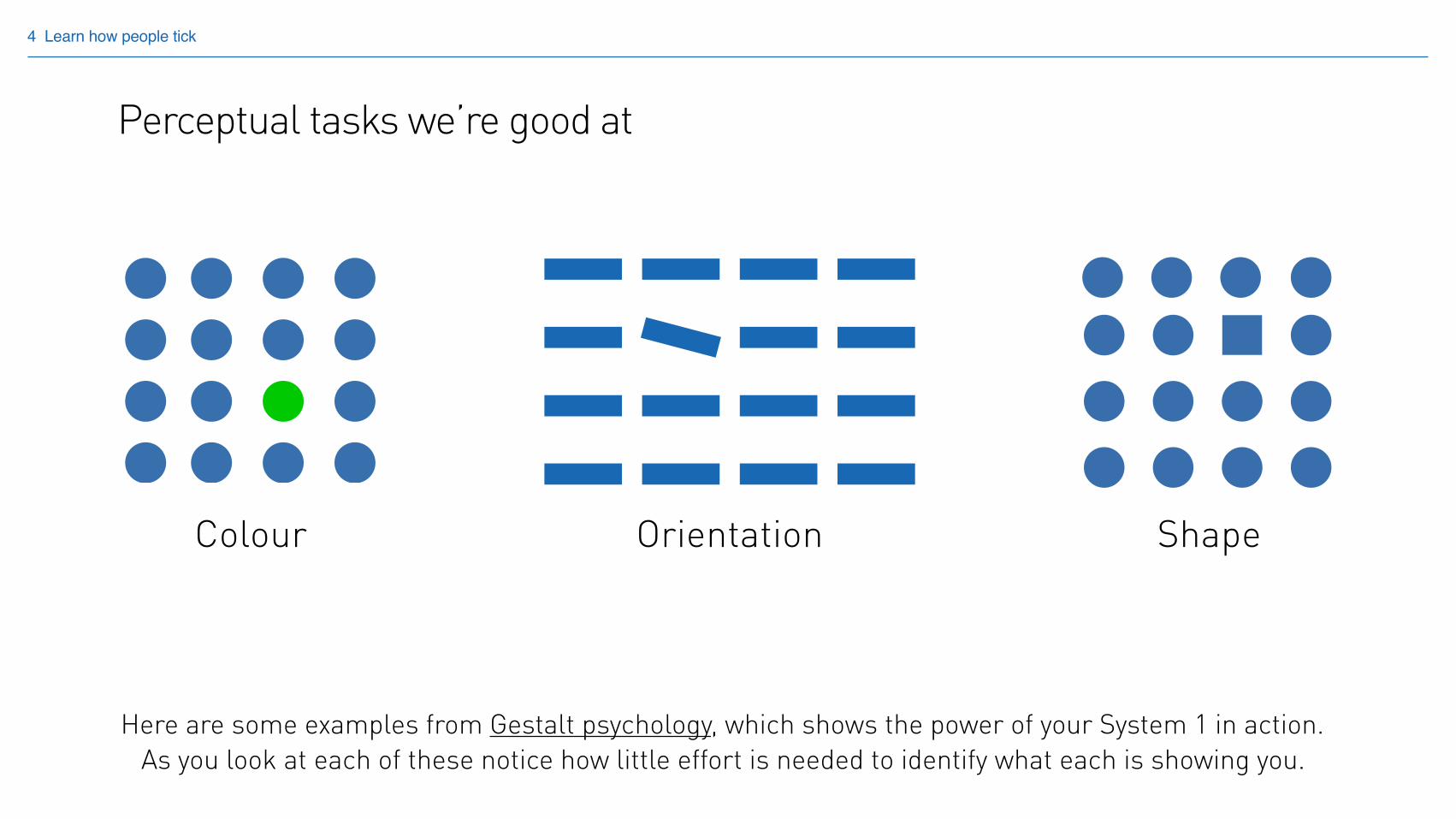
Perceptual tasks we’re good at
4 Learn how people tick
Here are some examples from Gestalt psychology, which shows the power of your System 1 in action. As you look at each of these notice how little effort is needed to identify what each is showing you.
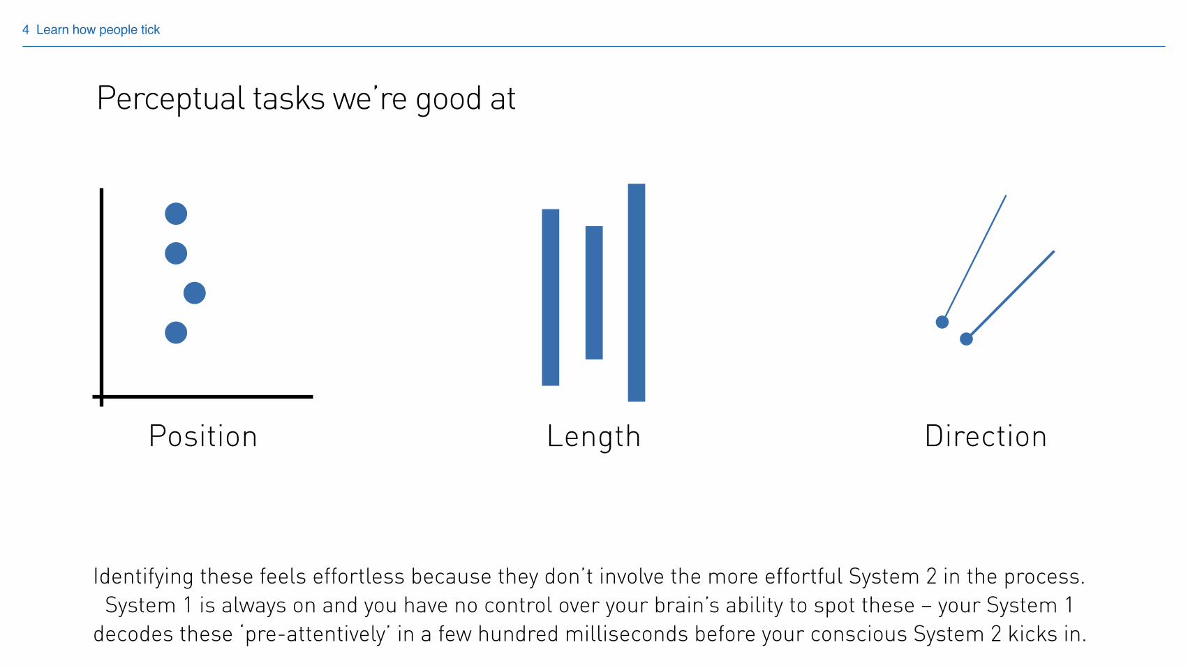
Position Length Direction
4 Learn how people tick
Identifying these feels effortless because they don’t involve the more effortful System 2 in the process. System 1 is always on and you have no control over your brain’s ability to spot these – your System 1
decodes these ‘pre-attentively’ in a few hundred milliseconds before your conscious System 2 kicks in.
Perceptual tasks we’re good at
Angle and area Volume Saturation
4 Learn how people tick
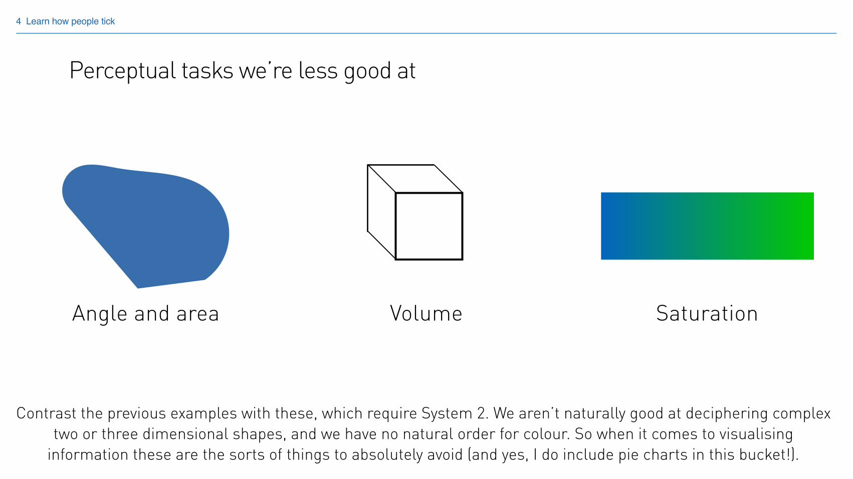
Perceptual tasks we’re less good at
Contrast the previous examples with these, which require System 2. We aren’t naturally good at deciphering complex two or three dimensional shapes, and we have no natural order for colour. So when it comes to visualising
information these are the sorts of things to absolutely avoid (and yes, I do include pie charts in this bucket!).
4 Learn how people tick
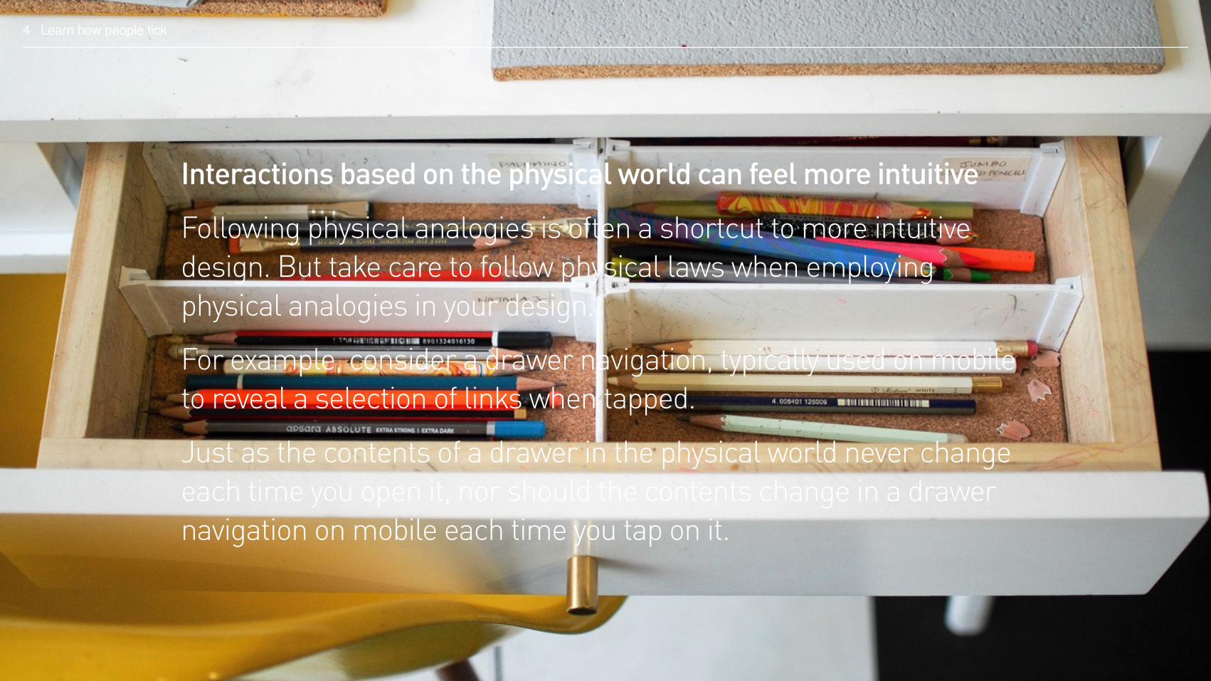
Interactions based on the physical world can feel more intuitive
Following physical analogies is often a shortcut to more intuitive design. But take care to follow physical laws when employing physical analogies in your design.
For example, consider a drawer navigation, typically used on mobile to reveal a selection of links when tapped.
Just as the contents of a drawer in the physical world never change each time you open it, nor should the contents change in a drawer navigation on mobile each time you tap on it.
4 Learn how people tick
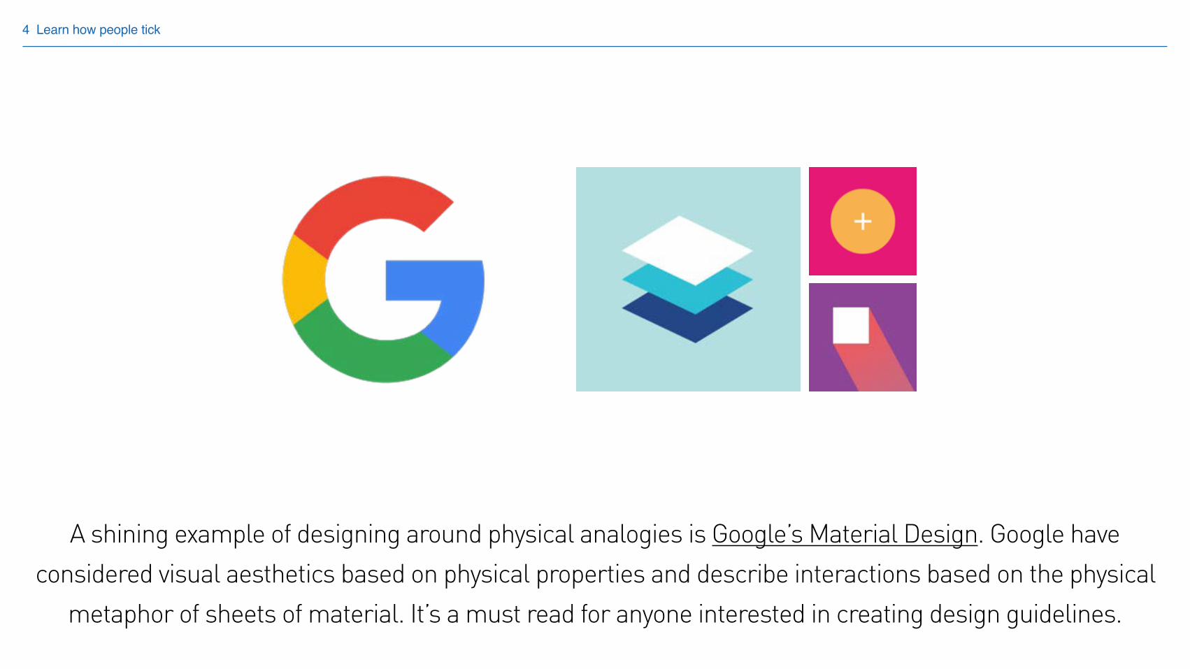
A shining example of designing around physical analogies is Google’s Material Design. Google have considered visual aesthetics based on physical properties and describe interactions based on the physical
metaphor of sheets of material. It’s a must read for anyone interested in creating design guidelines.
4 Learn how people tick
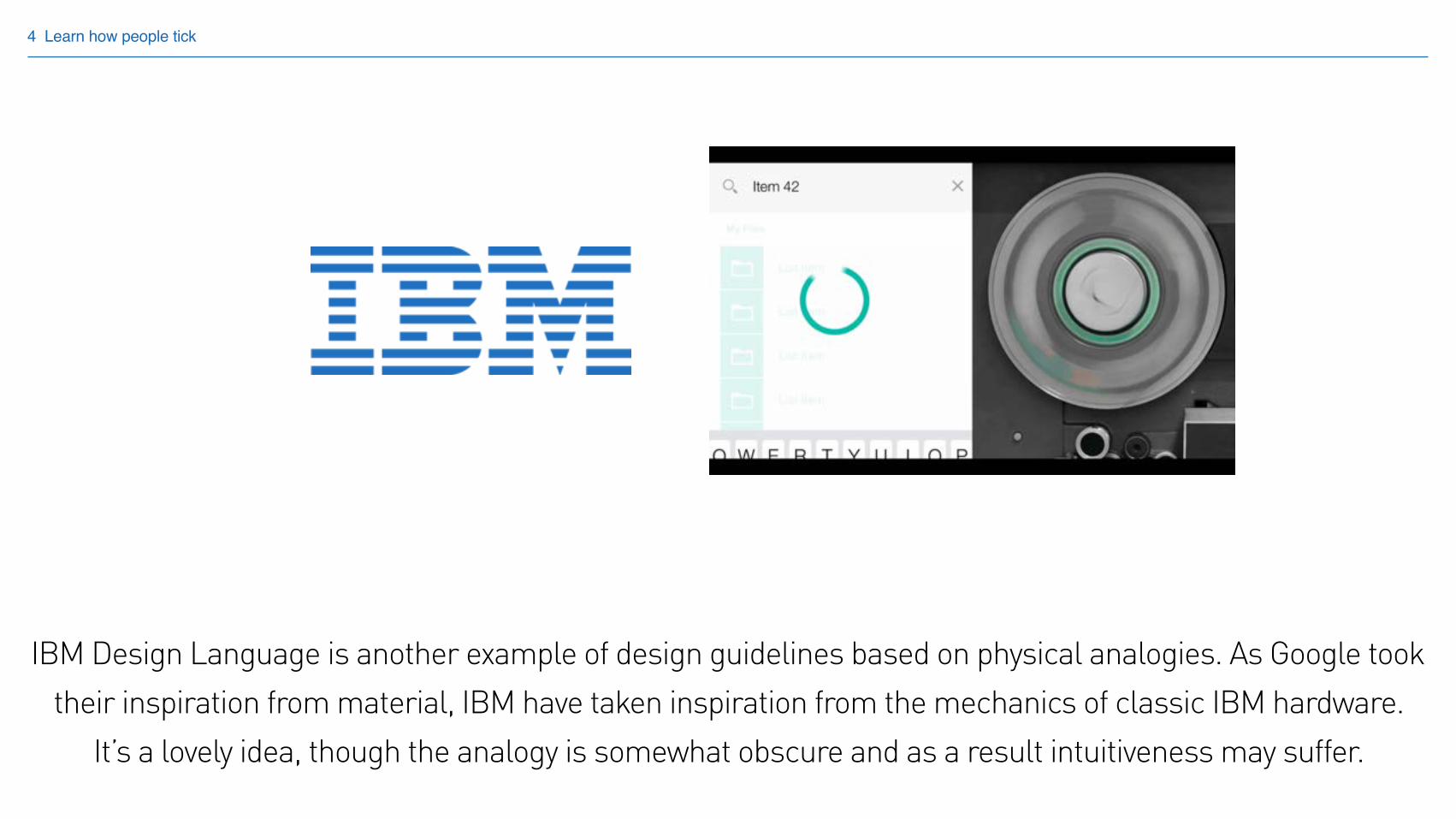
IBM Design Language is another example of design guidelines based on physical analogies. As Google took their inspiration from material, IBM have taken inspiration from the mechanics of classic IBM hardware.
It’s a lovely idea, though the analogy is somewhat obscure and as a result intuitiveness may suffer.
4 Learn how people tick
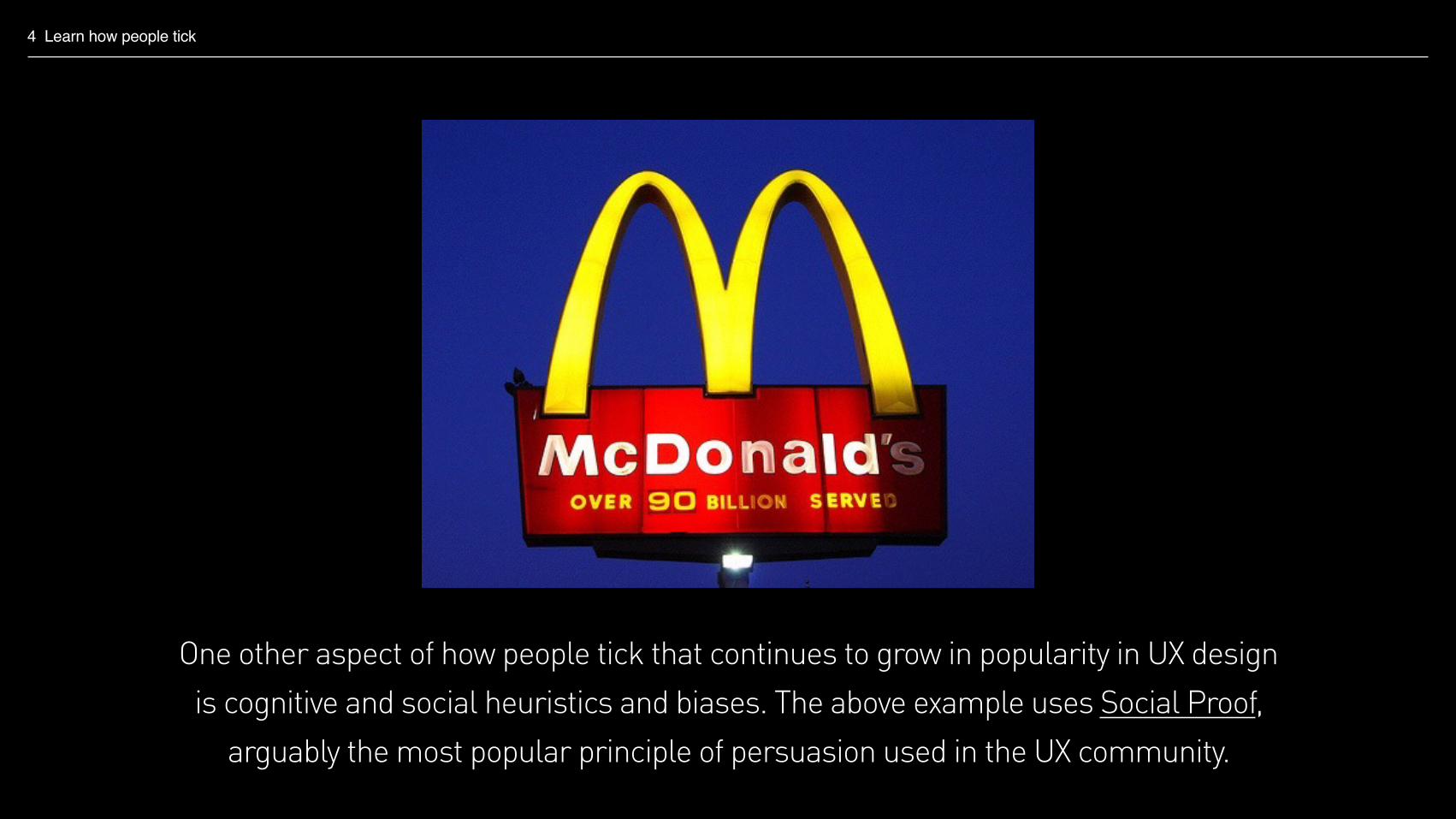
One other aspect of how people tick that continues to grow in popularity in UX design is cognitive and social heuristics and biases. The above example uses Social Proof,
arguably the most popular principle of persuasion used in the UX community.

4 Learn how people tick
Robert Cialdini, 1984
Social proof Reciprocity Commitment and consistency Authority Liking Scarcity
If they’re not already familiar with these persuasive principles I introduce members of my team to the six principles made famous in Cialdini’s 1984 book, Influence. These principles
are easy to understand and can bring immediate improvements to their work.
4 Learn how people tick
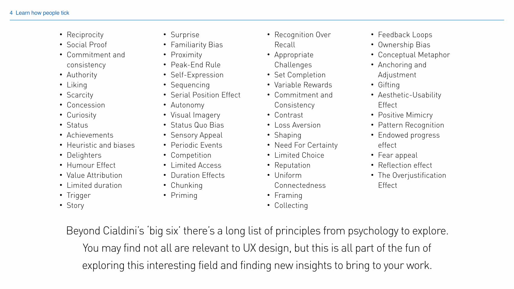
• Reciprocity • Social Proof • Commitment and
consistency • Authority • Liking • Scarcity • Concession • Curiosity • Status • Achievements • Heuristic and biases • Delighters • Humour Effect • Value Attribution • Limited duration • Trigger • Story
• Surprise • Familiarity Bias • Proximity • Peak-End Rule • Self-Expression • Sequencing • Serial Position Effect • Autonomy • Visual Imagery • Status Quo Bias • Sensory Appeal • Periodic Events • Competition • Limited Access • Duration Effects • Chunking • Priming
• Recognition Over Recall
• Appropriate Challenges
• Set Completion • Variable Rewards • Commitment and
Consistency • Contrast • Loss Aversion • Shaping • Need For Certainty • Limited Choice • Reputation • Uniform
Connectedness • Framing • Collecting
• Feedback Loops • Ownership Bias • Conceptual Metaphor • Anchoring and
Adjustment • Gifting • Aesthetic-Usability
Effect • Positive Mimicry • Pattern Recognition • Endowed progress
effect • Fear appeal • Reflection effect • The Overjustification
Effect
Beyond Cialdini’s ‘big six’ there’s a long list of principles from psychology to explore. You may find not all are relevant to UX design, but this is all part of the fun of exploring this interesting field and finding new insights to bring to your work.
4 Learn how people tick
Learn how people tick
As you can seen there’s a lot to learn about how people tick. Being armed with this knowledge can reshape the way you think about UX, and can radically raise the quality of your design solutions.
But learning in this area tends not to be part of our day to day work, and you need to be able to take time to step away from your work to develop your knowledge in this area.
It’s because of this I bring my team together every few weeks, getting them away from their desks and projects to spend some time exploring topics and learning how people tick.
Final thoughts…
Final thoughts…
To wrap up, here are a couple of questions that I encourage my team to ask when approaching any new piece of work.
Final thoughts…
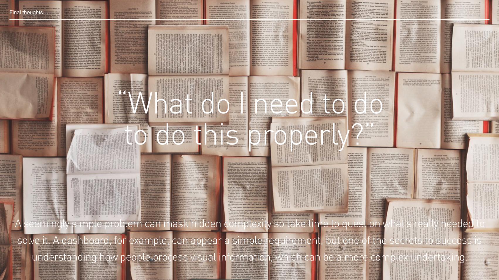
“What do I need to do to do this properly?”
Final thoughts…
A seemingly simple problem can mask hidden complexity so take time to question what’s really needed to solve it. A dashboard, for example, can appear a simple requirement, but one of the secrets to success is
understanding how people process visual information, which can be a more complex undertaking.
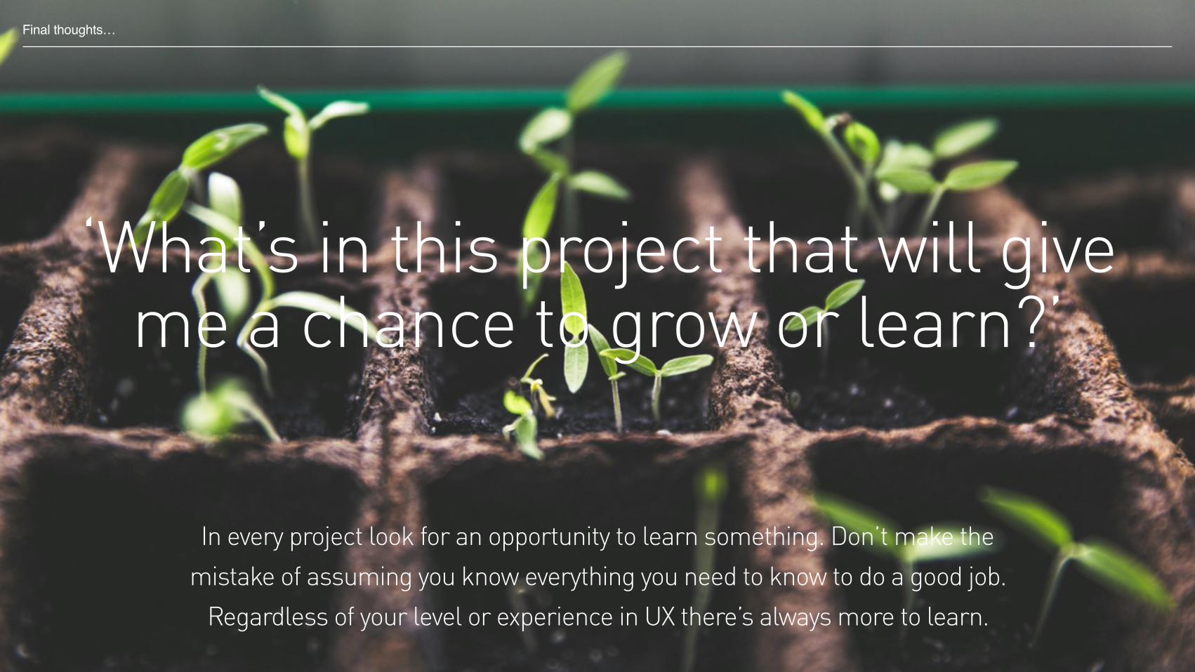
‘What’s in this project that will give me a chance to grow or learn?’
Final thoughts…
In every project look for an opportunity to learn something. Don’t make the mistake of assuming you know everything you need to know to do a good job.
Regardless of your level or experience in UX there’s always more to learn.
Andy Marshall, Head of User Experience
Thank you
slideshare.net/andy_marshall
@andy__marshall


