Download - Eric Luther Studios Portfolio 2015

Eric Luther McClendonA r t i s t P o r t f o l i o
1

2

Hello, welcome to Eric Luther McClendon’s artist viewbook and portfolio. Under the titleEric Luther Studios, he operates to achieve a high standard of visual proficiency ranging from fine art photography, video, design, and craft work.
Eric McClendon earned his BFA in photography and graphic design at Jacksonville State University in Alabama. While utilizing a fine arts perspective of photography, he is exploring the facets of graphic design and the correlation between the two worlds of art. Exhibiting works at the Gadsden Museum of Art and member exhibitions at the SPESC 2014 regional conference.
Also in 2014, his series photo seriesFlux Inertia was featured on theweb-based Nakid Magazine.
“My style consists of encompassing the idea in its own world where tones and emotion create an atmosphere where the subject can breathe and become real. This derives from a transition I have examined in people - attempting to identify the niches within our personalities; the changes that occur when we aren’t particularly aware of them, the feeling of those times when we aren’t aware.”
series 6-14
15-18 drawings
design 19-21
22-25 photography
contact 26
TABLE OF CONTENTS
STATEMENT
3

4

5

S E R I E S F L U X INERTIA
5-14
ChariotPigmented Ink Print, 2014, 20”x11”
6

Flux Inertia is a cross-examinationbetween us and the cause and effect of
movement. The movement in thisscenario is the “unseen” force of nature -
S O U N D
We are perpetually receiving sound, all around us - made by cars, the fan in the bathroom, even the high pitch buzz of the LED lights on your flatscreen - sounds you hear but don’t even realize.
The essence of this series is how sound can influence movement or change
upon us emotionally and physically.
In many ways these images are meant to represent a balance between the interaction of humans and sound as an entity - how we are ultimately affected and how sound can be ignored, uti l ized
or subdued.
FuturaPigmented Ink Print, 2014, 20”x11”
SensitivePigmented Ink Print, 2014, 20”x11”
MajestyPigmented Ink Print, 2014, 20”x11”
7

MothPigmented Ink Print, 2014, 20”x11”
8

AffairsPigmented Ink Print, 2014, 20”x11”
9

C O M P S U R EOOO
I D E N T I T Y I N T H E M O D E R N W O R L D
10

I D E N T I T Y M O R A T O R I U M
P i g m e n t e d I n k P r i n t , 2 0 1 3 , 1 1 ” x 1 7 ” P i g m e n t e d I n k P r i n t , 2 0 1 3 , 1 1 ” x 1 7 ”
I D E N T I T Y D I F F U S I O N
11

I D E N T I T Y F O R E C L O S U R E
C O M P O S U R E“Composure” deals with three very distinctive forms of identity crises within our present sociocultural situation.
Identity, being a theme almost relentlessly explored through photography, has been a vital part of understanding human behavior and the ever-changing social issues in our modern world. With that said, a part of this exploration has been left unexamined.
This specific thread of issues lie within the present sociocultural situation: exposure to different lifestyles, at a young age, through the wide spectrum of social culture and “raw freedom” of the internet. The responsive became apparent to me as an individual first through personal experiences, but also looking at the differences in how adolescents would formerly acquire their sense of whothey are before this vast realm of information was at our fingertips.
P i g m e n t e d I n k P r i n t , 2 0 1 3 , 1 1 ” x 1 7 ”
12

I D E N T I T Y F O R E C L O S U R E
13

Untitled color studies
This group of images,resulting in a variety of color schemes, exemplifies the foundation of a basic understanding of how color can be used - without having to be concerned with imagery. Different mediums such as ink pens, water-color, and pastels also contribute to the aesthetic and style of each study.
14
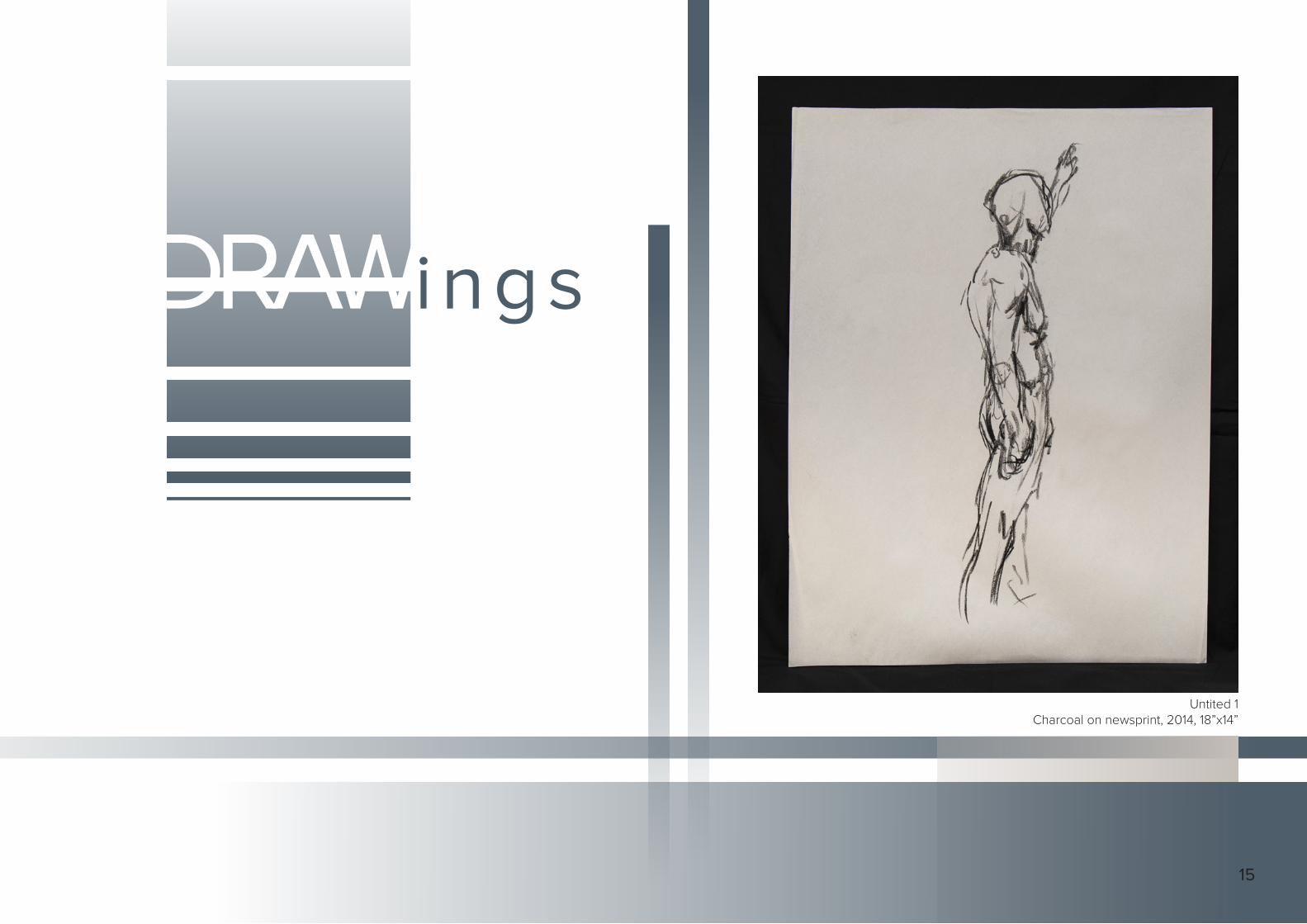
DRAWings
Untited 1Charcoal on newsprint, 2014, 18”x14”
15

Untitled 12Graphite and Conte on paper, 2014, 18”x24”
16

Tutenkhamen IPas te ls and Conte on paper, 2014 , 10.5”x 10.5”
17

“Pickett’s Charge” band logoInk on paper, 2015, 8.5”x11”
raphic
DESIGN
DESIGN18

raphic
DESIGN
Visual Arts Society RSVP Invitation
Using different mediums - like watercolor in thisexample - creates a more unique visual aspect to overall
design. As you can see, the process allows for infinitepossibilies once the “handmade” art has been digitized.
Below are examples of the paper inserts and envelope cover.
19

The design also incorporates texture inside the shapes, giving another layer of depth that can sometimes go unnoticed.
Another important feature to this piece is the implied white space. This not only adds to the dynamic lines of the other shapes, but gives further interest in the subject forcing the eye to actively observe the page.
Using a rich pastel color scheme was also a conscious decision - cool tones with gradation keep the viewer from being overwhelmed with the various directional lines and shapes.
Jacksonville State University JazzPromotional Poster
To highlight the jazz studies at JSU, the client came to me and wanted
something to bring excitement to this musical language and course of study.
Thinking about interesting ways to display information, I thought about
how jazz can encapsulate “raw” thoughts and flow from one idea to
the next seemlessly. Althoughgeometric, this poster attemps to keep the looseness yet also give
reference to the tight structure of jazz
20

w
T-PAIN CONCERT PROMOTIONAL POSTER & VIP BADGES
While working as a student designer at Jackson-ville State University, I was able to work with all of the promotional material for the “welcome back” concert featuring T-PAIN.
Although observing certain specifications from his PR, I was able to vamp up and sylize the feel of this major event for the entire student body. In an attempt to keep a sleek and modern look, I used dynamic lines - once again - inherently con-tributing to the nature of his logo and musical genre. This also narrowed my target audience and made it easier to design postcards, posters, and concert badges that all correlated aesthetically with an edgy composition.
This event was open to the public as well - so with that in mind, I used a very legible typeface for the show information and spaced everything in a way to also help with legibility.
Below are the concert badges, shown without the rectagular crop (so to give an example of how layers can be utilized to give depth).
21

NashvillePigmented Ink Print 2015, 8.5”x11”
PHOTOGRAPHYFINE ART
Throughout our lives we are constantlydigesting imagery from a digital source. And in this technology driven world, photography has been increasingly more accesible to everyone. Not to say that this fact contaminates the output of imagery, it only desenstizes us as viewers - scanning over photographs without a thought. The phenomena of Photoshop has created an untrusting attitude towards the consumption of images, assuming that “there are no true photographs in our modern world,” and “everything is tampered with.”
From the early days of photography, image making was another playground for illusion and surrealism. Many of the great photographers tampered with their images - if not only subtly by “dodging” or “burning” in the darkroom.
Since our concept of photography and its controversial history are skewed, we are skeptical - throwing on our criticism hats and approaching the art form more intensely than say drawing or painting.
These are a few of the images that do not belong in a series (yet) that embrace the spectacular abilities of technology and the processes that were used long ago in the early days of photography.
22

ChoicesSilver Print, 2013, 11”x17”
Those Were The DaysSilver Print, 2013, 11”x17”
23

24

Twelve AngelsPigmented Ink Print, 2015, 13”x26”
25
CONTACT INFORMATION
Eric Luther McClendon
ericlutherstudios.com
Social Media Information:Instagram - @ericlutherstudiosFacebook - /ericlutherstudios
LinkedIn - Eric McClendon
26

27


