Download - Colour in Visualization

1
Colour in Visualization

2
Colour Physics and Models

Tri-stimulus Theory of Colour Vision
© RNIB
Light falling on the retina is
detected by rods and cones.
The three types of cones are
sensitive to different
wavelengths of light.
The tri-stimulus theory: different colours are perceived
when different cones are stimulated by different amounts.

CIE Chromaticity Diagram.
All visible colours are
represented on the
CIE chromaticity
diagram.
Pure spectral colours
(single wavelength)
are around the edge of
the diagram.
The colours inside the
diagram are perceived
from more than one
wavelength.©, and reproduced with the permission of, Ernie Wright

CIE Chromaticity Diagram.
It is often used to
compare digital
imaging devices
against the capabilities
of human vision.
The central triangle is
all colours that can be
represented by a CRT
monitor its gamut.
The colour gamut is
not identical for CRT &
LCD. It is very different
for printers.©, and reproduced with the permission of, Ernie Wright

RGB Colour Model
Additive colour model
where colours are
made up by combining
proportions of three
primary colours:
Red, Green and Blue
Used by emissive
display, eg CRT, LCD.
© The Colour Group of Great Britain
Secondary colours are yellow, cyan and magenta.

RGB Colour Examples
All colours you see on current CRT & LCD displays are made of different proportions of red, green and blue eg:
(255, 204, 0)(255, 255, 0) (137,137,255)
The RGB components are often entered as integers in the range [0,255] as used by the graphics hardware.(Brown additive colour applet, colour mixing applet)Also represented in range [0.0, 1.0] or [0%, 100%].
Often known as true colour or full colour mode this can represent ~ 16 million different proportions of R, G and B.Not all visually unique however, there are metamers.

RGB Colour: Disadvantages
RGB is a device level colour model in that it relates to the graphics hardware and display system.
It can be (very) difficult to guess which combination of RGB values creates a specific colour.
There are several alternatives:
The colour naming system is good as each colour is given a name but not so good for adjusting colours.
There are several three variable alternatives that are easier to use than RGB, for example HLS and HSL.

HLS Colour Model
The hue, lightness and saturation colour model allows selection of colours with a more intuitive control.
Hue is colour or shade.
Lightness is closeness to white or black.
Saturation is vividness or depth of colour.
© Adobe systems
Note, for Paint Shop Pro users HSL is slightly different.
Both HLS and HSL are also related to the HSV model.

CMYK Colour Model
CMYK is a subtractive colour model used in printing, light is absorbed by printed ink to create the perceived colours.
Cyan
absorbs
red light.
Magenta
absorbs
green light
Yellow
absorbs
blue light.
K is for black
which in printing
is a separate ink.
© The Colour Group of Great Britain

CMYK comparison with RGB
CMYK and RGB overlaid on the CIE colour space.
RGB Gamut
CMYK Gamut
Both colour models are unable to reproduce all visible colours.
In addition they do not fully cover each other’s gamut.
Most electronic and printed images will not look the same, don’t assume screen graphics will print out well – always test.
© Adobe Systems

Get it right in black and white
Someone, one day, will print out your visualizations in black and white.
Check that, at least, the vital information still works.
13
What colours are there?

xkcd: a large survey of colour names

xkcd: a large survey of colour names
Names from an online survey of 222,500 people.
There is relatively little difference, women tend to add more qualifiers, and know the difference between aqua and teal.
https://blog.xkcd.com/2010/05/03/color-survey-results/
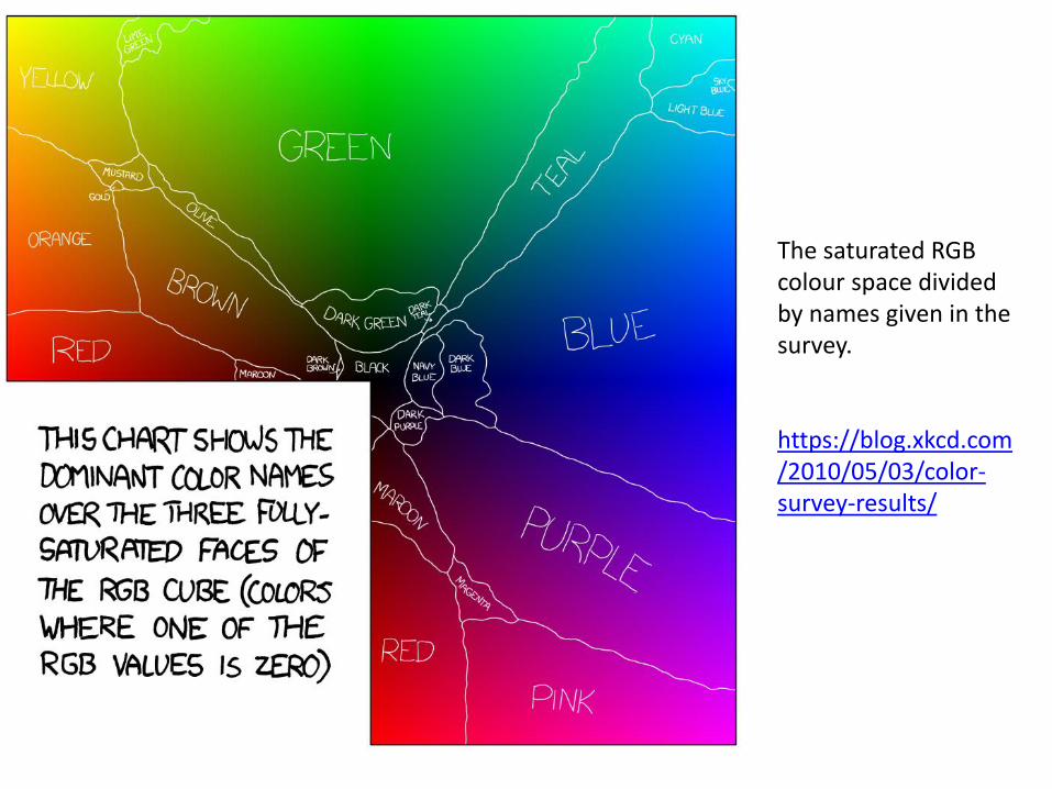
The saturated RGB colour space divided by names given in the survey.
https://blog.xkcd.com/2010/05/03/color-survey-results/

Most distinct 48 colours in the survey
There is a case these could be the most reliably identifiable colours.
There is a full table of the top 954 colours on the survey page:
https://blog.xkcd.com/2010/05/03/color-survey-results/

Fuchsia
No one can spell it – though many can see it
https://blog.xkcd.com/2010/05/03/color-survey-results/

19
Choosing a colour palette

How many colours can we use?
Studies show there are only about 6-12 very distinct colours.
Red, green, yellow, blue, pink, brown, orange, grey, purple, plus black and white.
Good for nominal data but .. are these aesthetically or technically good choices?
Ware, Information Visualization for Design

Sequential colour palettes
You can vary one or more of the HLS components to get a sequential palette, good for quantitative data.
L varies
L and S vary
H, L and S vary
Zellis et al, 2009

PowerBI sequential palettes
PowerBI lets you set a colour palette of you add a value field to Color saturation.
You can set the colours on the format tab, as well as give specific values for max & min.

Diverging colour palettes
These have a neutral value in the middle of the palette and diverge in each direction, good for quantitative data.
Zellis et al, 2009

PowerBI diverging palettes
By default PowerBI creates a rainbow colour pallete.
It is widely understood this is not a good palette for representing continuous values.
Equal perceptual steps in this palette are not equal numerical steps on a linear scale.

PowerBI Report Themes
Report themes allow you to customize almost every aspect of a report that can be set in the Format tab. The theme is stored as a text editable JSON file.
Predefined themes are available and there is a community gallery of themes you can download: https://community.powerbi.com/t5/Themes-Gallery/bd-p/ThemesGallery
In addition conditional formatting allows you to customize to your data when displayed in tables and matrices.

The Which Blair ProjectRogowitz & Kalvin, IBM
“Color scales that did not include a monotonically-increasing luminance component produced no positive rating scores.”

Perceptually Uniform Colour MapsPeter Kovesi, CET, UWA
https://arxiv.org/abs/1509.03700
https://peterkovesi.com/projects/colourmaps/

Color brewer
http://colorbrewer2.org/#type=sequential&scheme=BuGn&n=3

Colour blindness
There are a range of colour deficiencies in the population.
It is rare to be completely colour blind, but do check colours.
Try and be sure colour is not your only method for conveying information, e.g. use shape too, as below.

Summary of Colour
It is often easier to use the HLS model than physical RGB.
Remember different devices cannot show the same colours.
There are a limited number of distinct nameable colours.
Quantitative data – use sequential or diverging schemes.
Nominal/Categorical data – use qualitative schemes.
Design for colour-blindness and printability in black and white.


