Download - Building Brand Value - nahbclassic.org

BuildingBrand Value
The NAHB Brand Identity Guidelines
02.25.21
National Association of Home Builders Brand Identity Guidelines 2
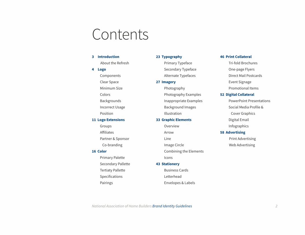
Contents3 Introduction
About the Refresh
4 LogoComponents
Clear Space
Minimum Size
Colors
Backgrounds
Incorrect Usage
Position
11 Logo ExtensionsGroups
Affiliates
Partner & Sponsor
Co-branding
16 ColorPrimary Palette
Secondary Pallette
Tertiaty Pallette
Specifications
Pairings
23 TypographyPrimary Typeface
Secondary Typeface
Alternate Typefaces
27 ImageryPhotography
Photography Examples
Inappropriate Examples
Background Images
Illustration
33 Graphic ElementsOverview
Arrow
Line
Image Circle
Combining the Elements
Icons
43 StationeryBusiness Cards
Letterhead
Envelopes & Labels
46 Print CollateralTri-fold Brochures
One-page Flyers
Direct Mail Postcards
Event Signage
Promotional Items
52 Digital CollateralPowerPoint Presentations
Social Media Profile &
Cover Graphics
Digital Email
Infographics
58 AdvertisingPrint Advertising
Web Advertising
National Association of Home Builders Brand Identity Guidelines 3
Our brand is a reflection of who we are and the benefits we deliver to our stakeholders. By consistently applying the
NAHB brand across all applications, we create and maintain a powerful brand that reinforces who we are, how we
define the personality of our brand and the value we provide to our key audiences.
Visual identity guidelines for the NAHB brand are included within this document. These standards are to be
consistently applied to all of our branded communications including stationery, business cards, advertising, print
collateral, trade show exhibits, signage and digital media.
Brand discipline is imperative to developing a strong brand identity. Strict adherence to the NAHB Brand Identity
Guidelines is critical and shall be enforced in order to maximize the impact of our brand.
The previous iteration of the NAHB brand was strong, recognizable, and contained considerable brand equity thanks
to the hard work of our organization, members, partners, and stakeholders. By evolving our brand as outlined in this
document, we are enhancing that equity and building upon existing best practices in our communication materials.
The vested interest in our refreshed brand by all involved parties signals this refresh as a key opportunity to
restructure how we communicate about the organization, while still respecting the work and value inherent in who
we are.
Several elements identified throughout this guide have undergone slight modification – either to adapt to new,
modern communication specifications and mediums – or to rework aspects noted in valuable feedback by
members, partners, and stakeholders. Our evolved brand represents higher versatility, agile responsiveness, a
strong foundation, and a deep commitment to our core principles as we move into an exciting new era.
Introduction
About the Refresh

National Association of Home Builders Brand Identity Guidelines 4
The NAHB logo consists of a bold typographic rendition of the acronym “NAHB” with a roof above it. The dual red
and blue color and star contained within the “A” reinforce our national pride. The full organization name “National
Association of Home Builders” sits centered below the mark.
The logo with the organization name is the preferred version. The version without the organization name may
be used when communicating with audiences familiar with the organization (members, partners, etc.).
LogoComponents
full version
roofline
acronym
registrationorganization name
star
mark only
National Association of Home Builders Brand Identity Guidelines 5
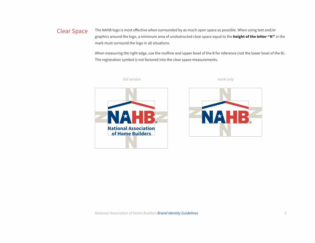
The NAHB logo is most effective when surrounded by as much open space as possible. When using text and/or
graphics around the logo, a minimum area of unobstructed clear space equal to the height of the letter “N” in the
mark must surround the logo in all situations.
When measuring the right edge, use the roofline and upper bowl of the B for reference (not the lower bowl of the B).
The registration symbol is not factored into the clear space measurements.
Clear Space
full version mark only

National Association of Home Builders Brand Identity Guidelines 6
To ensure visibility and legibility, the full NAHB logo should never be presented in a size smaller than 0.75 inches (19mm) wide. When using the mark only logo version, do not reproduce below 0.375 inches (9.5mm) wide.
To maintain visual integrity, applications using alternative reproduction techniques such as silk screening or
embroidery may require presenting the logo at a larger size than the recommendation.
The logos should never be reproduced below 90px and 46px respectively for digital applications.
Minimum Size
0.75 inches19mm90px
0.375 inches9.5mm
46px
Shown here at actual minimum size
National Association of Home Builders Brand Identity Guidelines 7
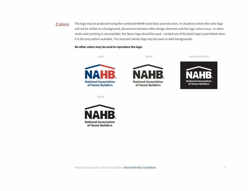
The logo may be produced using the combined NAHB brand blue and red colors. In situations where the color logo
will not be visible on a background, dissonance between other design elements and the logo colors occur, or when
multi-color printing is not available, the Stone logo should be used. Limited use of the black logo is permitted when
it is the only option available. The reversed (white) logo may be used on dark backgrounds.
No other colors may be used to reproduce the logo.
Colors
color Stone
black
reversed (white)

National Association of Home Builders Brand Identity Guidelines 8
The logo may be produced using the NAHB brand blue and red colors. In situations where the color logo will not be
visible on a background or when multi-color printing is not available the stone logo may be used.
The reversed (white) logo may be used on dark backgrounds.
Backgrounds
Color logo
Stone logo
Reversed (white) logo

National Association of Home Builders Brand Identity Guidelines 9
Correct and consistent usage of the NAHB logo is an essential part of building brand equity. Each element has been
carefully designed and positioned using specific proportions. Do not alter or redraw the logo in any way. Do not add
elements to the logo such as words, slogans, events or descriptions.
Incorrect Usage
1. Do not invert or change the color
2. Do not alter or reset the lettering
3. Do not replace NAHB with other names or acronyms
4. Do not add text
5. Do not use the star as a decorative graphic
6. Do not create an outlined version of the mark
7. Do not add a drop shadow or other special
effects
8. Do not alter the size or position of the elements
9. Do not skew or rotate
1 2 3
4 5 6
7 8 9
National Association of Home Builders Brand Identity Guidelines 10
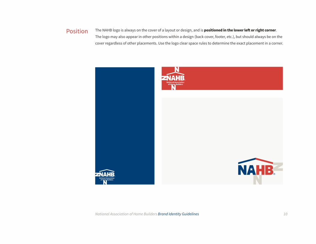
The NAHB logo is always on the cover of a layout or design, and is positioned in the lower left or right corner.
The logo may also appear in other positions within a design (back cover, footer, etc.), but should always be on the
cover regardless of other placements. Use the logo clear space rules to determine the exact placement in a corner.
Position

National Association of Home Builders Brand Identity Guidelines 11
The NAHB logo may be augmented with group names in order to specify the brand in communications from specific
groups. The augmentation includes a solid line and the name of the group sitting to the right of the core logo. Group
logos may use the full NAHB logo with name or just the NAHB mark.
When using a group logo, the clear space rule for the core logo (height of the “N” in NAHB) should also apply here.
When the black or reversed (white) logo is used, the line and text should also be black or white respectively.
The text “NAHB” should not be included in the name of the group. The exception being with specific groups since they
are mandated to put NAHB in front of their name. Examples of correct font, Source Sans Pro Regular and color, 90%
black are shown below.
Logo ExtensionsGroups
National Associationof Home Builders
55+ HousingIndustry Council
Professional Women In Building
National Associationof Home Builders
Source Sans Pro RegularTitle Case, #333333
BuilderBooks
National Associationof Home Builders
Sub-brand TextCan Up to ThreeLines In Length
Source Sans Pro RegularTitle Case, #333333

National Association of Home Builders Brand Identity Guidelines 12
When using the logo as a sign of affiliation, the text “Affiliated of” must appear above the NAHB logo. No other text
may appear above the logo. This affiliate text and logo set may also be used in the partner & sponsor co-branding
configurations.
The text is set in Source Sans Pro Italic font, in the primary palette stone color.
Affiliates & Modifiers
Affiliate Affiliate
Member Subsidiary AffiliateModifiers

National Association of Home Builders Brand Identity Guidelines 13
When the NAHB logo is used with other partner or sponsor logos they are separated by a solid line. The relationship
between the logos should be carefully considered. The logos should occupy the same amount of space, being
roughly the same size despite horizontal or vertical configurations.
The full color versions of both logos are preferred. If a partner logo only exists in black, the NAHB logo should still
appear in full color if color reproduction is available.
Partner co-branding occurs on communication materials where the NAHB brand is prevalent throughout the
piece(s), incorporating NAHB colors, typography and graphic elements.
Partner & Sponsor Co-branding
National Associationof Home Builders
PartnerLogo
National Associationof Home Builders
PartnerLogo
National Associationof Home Builders
Partner Logo
Single large logo
Single horizontal logo

National Association of Home Builders Brand Identity Guidelines 14
Examples of co-branding with partner/sponsor logos
National Associationof Home Builders
National Association of Home Builders Brand Identity Guidelines 15
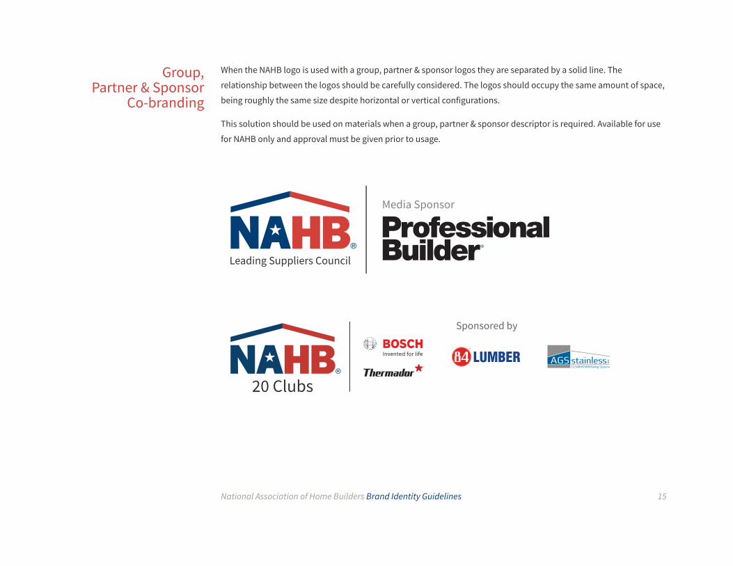
When the NAHB logo is used with a group, partner & sponsor logos they are separated by a solid line. The
relationship between the logos should be carefully considered. The logos should occupy the same amount of space,
being roughly the same size despite horizontal or vertical configurations.
This solution should be used on materials when a group, partner & sponsor descriptor is required. Available for use
for NAHB only and approval must be given prior to usage.
Group, Partner & Sponsor
Co-branding

National Association of Home Builders Brand Identity Guidelines 16
The NAHB palette is organized by familiar materials related to home building: brick, metal, glass, concrete and stone. The colors can be further divided into tints and shades. Tints are lighter versions of the core colors, and
shades are darker versions. These divisions allow for multiple color combinations using 5 primary and secondary
colors, allowing for a mix of light and dark tones. Colors should be referred to by their material name. For instance,
one may call the lower left block “the brick shade” or “shade of brick.”
The primary palette, Brick and Metal, are the identifying colors for NAHB. These signature colors may be used
extensively both for large areas of color and as accent colors.
Color
Primary Colors
The Color Palette
Brick Metal

National Association of Home Builders Brand Identity Guidelines 17
The NAHB secondary color palette was chosen to complement the primary pallette of Brick and Metal, providing
additional range to the brand experience. These colors respect and complement the traditional red and blue while
adding an additional level of range to the pallette. The elements that are used on the exterior of a house served as
the inspiration for the secondary color pallette -- Glass, Stone and Concrete.
The Neutrals (These colors should never be used together)
Secondary Colors
Glass
Stone Concrete

National Association of Home Builders Brand Identity Guidelines 18
In addition to the primary palette and its divisions, these accent colors may be used in special circumstances to
brighten a layout, highlight a call to action, or to extend the palette when other colors have been exhausted (e.g.
17 tabs each require their own color for easy identification). The tertiary colors work well with the NAHB primary
colors, but are not recognizable identifiers for NAHB. Accent colors should never appear without primary palette
colors and should never take up more than 10% of a page’s area in a layout. The shades and tints of these colors may not be used.
Tertiary Colors the accents
Grass Sunlight Copper Water

National Association of Home Builders Brand Identity Guidelines 19
Primary Colors
Tertiary Colors
Secondary Colors
The Core Colors
Pantone: 180 C CMYK: 0/87/77/13 RGB: 195/58/52 Hex: #BE3A34
Pantone: 299 C CMYK: 79/7/0/0 RGB: 0/163/224 Hex: #00A3E0
Pantone: 60% Black CMYK: 0/0/0/60 RGB: 123/121/121 Hex: #7B7979
Pantone: 2299 C CMYK: 38/0/94/0 RGB: 164/210/51 Hex: #A4D233
Pantone: 144 C CMYK: 0/49/100/0 RGB: 237/139/0 Hex: #ED8B00
Pantone: 541 C CMYK: 100/61/0/43 RGB: 0/60/113 Hex: #003C71
Pantone: 402 C CMYK: 34/30/33/8 RGB: 157/150/141 Hex: #9D968D
Pantone: 7405 C CMYK: 0/8/100/0 RGB: 242/205/0 Hex: #F2CD00
Pantone: 2398 C CMYK: 75/0/34/0 RGB: 0/186/179 Hex: #00BAB3
The primary, secondary and tertiary colors combine to create the NAHB core colors. Specifications are provided for
printing with Pantone inks (spot-colors), for 4-color process printing (CMYK) and for digital/web (RGB/Hex).

National Association of Home Builders Brand Identity Guidelines 20
Primary
Extended Palette
Secondary
Extended Palette
The Extended Palette In situations where a wider range of colors are needed, or a more monochromatic palette is called for, the shades
and tones of each of the core primary or secondary colors may be used. For full bleed backgrounds, core colors and
shades may be used. Tints may be used in small callouts, but not full bleed backgrounds.
CMYK:16/74/73/7 RGB: 196/94/74 Hex: #c45e4a
CMYK: 61/48/20/13 RGB: 103/114/146 Hex: #667292
CMYK: 48/9/0/0 RGB: 123/193/235 Hex: #7BC1EB
CMYK: 14/12/17/0 RGB: 209/204/189 Hex: #D1CCBD
CMYK: 0/0/0/25 RGB: 185/229/251 Hex: #B9E5FB
CMYK: 27/93/97/26 RGB: 148/44/33 Hex: #942C21
CMYK: 100/85/43/44 RGB: 13/40/72 Hex: #0D2748
CMYK: 84/40/14/0 RGB: 21/130/178 Hex: #1582B2
CMYK: 63/60/64/65 RGB: 63/60/35 Hex: #3D3935
CMYK: 0/0/0/85 RGB: 0/182/241 Hex: #00B6F1
Glass
Stone
Concrete
Brick
Metal
Core Color

National Association of Home Builders Brand Identity Guidelines 21
Colors, alone and together, evoke certain emotions. It’s important to select colors that are appropriate for the
message you are tryng to convey. Warm colors (orange, yellows, and reds) create active responses in the brain
and elicit feelings of excitement, passion, and sometimes agression. Cool colors (blues, greens, and purples) are
considered calming colors that elicit a sense of trust and comfort. Using the shade (increasing the darkness) of a
color increases the formality of the message, while increasing the brightness of a color can increase the playfulness
of the message. Refrain from using three or more distinct colors in layouts.
Pairings
FORMAL
RELAXED
SUBT
LE
BOLD

National Association of Home Builders Brand Identity Guidelines 22
The primary colors are the identifying colors of NAHB. However, the secondry and tertiary colors can be paired with
the primary colors to create a diverse range of monotone, duotone, and analogous color pairings that are approriate
for different messages. Below are a few examples of some of the color pairing possibilities.
Pairings

National Association of Home Builders Brand Identity Guidelines 23
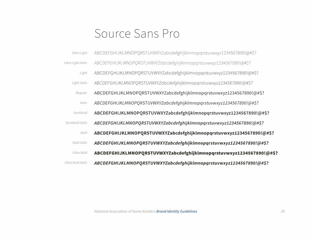
The official NAHB brand typeface is Source Sans Pro. This typeface was selected for its legibility, versatility and
availability. Source Sans Pro may be used for headlines, subheads, body text, folios and footnotes, as well as for
sub-brand logo versions and all other text associated with NAHB.
The typefaces work well in print and digital formats. Source Sans Pro may be downloaded as a Google Web Font,
compatible with Macs and PCs.
Headlines should use sentence case, whereas subheads may use all-caps with extra letter spacing. Italics may be
used for emphasis as well as for specialized paragraph/character styles. In rare cases, all can be used to create
section headers or for visual impact. Please limit the use of all-caps in these situations to 3 or less words.
Headline StyleS U B H E A D S T Y L EAnother Subhead StyleBody Text Style
TypographyPrimary Typeface
Example styles pairings using only Source Sans Pro
National Association of Home Builders Brand Identity Guidelines 24
Source Sans ProABCDEFGHIJKLMNOPQRSTUVWXYZabcdefghijklmnopqrstuvwxyz1234567890!@#$?
ABCDEFGHIJKLMNOPQRSTUVWXYZabcdefghijklmnopqrstuvwxyz1234567890!@#$?
ABCDEFGHIJKLMNOPQRSTUVWXYZabcdefghijklmnopqrstuvwxyz1234567890!@#$?
ABCDEFGHIJKLMNOPQRSTUVWXYZabcdefghijklmnopqrstuvwxyz1234567890!@#$?
ABCDEFGHIJKLMNOPQRSTUVWXYZabcdefghijklmnopqrstuvwxyz1234567890!@#$?
ABCDEFGHIJKLMNOPQRSTUVWXYZabcdefghijklmnopqrstuvwxyz1234567890!@#$?
ABCDEFGHIJKLMNOPQRSTUVWXYZabcdefghijklmnopqrstuvwxyz1234567890!@#$?
ABCDEFGHIJKLMNOPQRSTUVWXYZabcdefghijklmnopqrstuvwxyz1234567890!@#$?
ABCDEFGHIJKLMNOPQRSTUVWXYZabcdefghijklmnopqrstuvwxyz1234567890!@#$?
ABCDEFGHIJKLMNOPQRSTUVWXYZabcdefghijklmnopqrstuvwxyz1234567890!@#$?
ABCDEFGHIJKLMNOPQRSTUVWXYZabcdefghijklmnopqrstuvwxyz1234567890!@#$?
ABCDEFGHIJKLMNOPQRSTUVWXYZabcdefghijklmnopqrstuvwxyz1234567890!@#$?
Ultra Light
Ultra Light Italic
Light
Light Italic
Regular
Italic
Semibold
Semibold Italic
Bold
Bold Italic
Ultra Bold
Ultra Bold Italic

National Association of Home Builders Brand Identity Guidelines 25
Secondary Typeface In cases where layouts will include a heavy amount of text or when text may be produced below 8pt, Source Serif Pro may be used. This secondary typeface should always accompany the primary typeface and never appear on its
own. Use Source Serif Pro for books or long documents over 10 pages. Source Serif Pro may also be used for folios and
footnotes, captions, callout quotes, or other peripheral text. Do not use Source Serif Pro for headlines or subheads.
This secondary typeface works well in print and digital formats. Source Serif Pro may be downloaded as a Google Web
Font, compatible with Macs and PCs.
Source Serif ProABCDEFGHIJKLMNOPQRSTUVWXYZabcdefghijklmnopqrstuvwxyz1234567890!@#$?
ABCDEFGHIJKLMNOPQRSTUVWXYZabcdefghijklmnopqrstuvwxyz1234567890!@#$?
ABCDEFGHIJKLMNOPQRSTUVWXYZabcdefghijklmnopqrstuvwxyz1234567890!@#$?
Regular
Semibold
Bold

National Association of Home Builders Brand Identity Guidelines 26
Calibri and Cambria may be used as replacements for the brand typefaces in rare cases when the Source Sans
Pro is not available. The Calibri and Cambria families are available for both PC and Mac platforms and is readily
present on all operating systems. Do not use these alternate typefaces if the brand typefaces are available.
CalibriABCDEFGHIJKLMNOPQRSTUVWXYZabcdefghijklmnopqrstuvwxyz1234567890!@#$?
ABCDEFGHIJKLMNOPQRSTUVWXYZabcdefghijklmnopqrstuvwxyz1234567890!@#$?
ABCDEFGHIJKLMNOPQRSTUVWXYZabcdefghijklmnopqrstuvwxyz1234567890!@#$?
ABCDEFGHIJKLMNOPQRSTUVWXYZabcdefghijklmnopqrstuvwxyz1234567890!@#$?
CambriaABCDEFGHIJKLMNOPQRSTUVWXYZabcdefghijklmnopqrstuvwxyz1234567890!@#$?
ABCDEFGHIJKLMNOPQRSTUVWXYZabcdefghijklmnopqrstuvwxyz1234567890!@#$?
ABCDEFGHIJKLMNOPQRSTUVWXYZabcdefghijklmnopqrstuvwxyz1234567890!@#$?
ABCDEFGHIJKLMNOPQRSTUVWXYZabcdefghijklmnopqrstuvwxyz1234567890!@#$?
Alternate Typefaces
Regular
Italic
Bold
Bold Italic
Regular
Italic
Bold
Bold Italic
National Association of Home Builders Brand Identity Guidelines 27
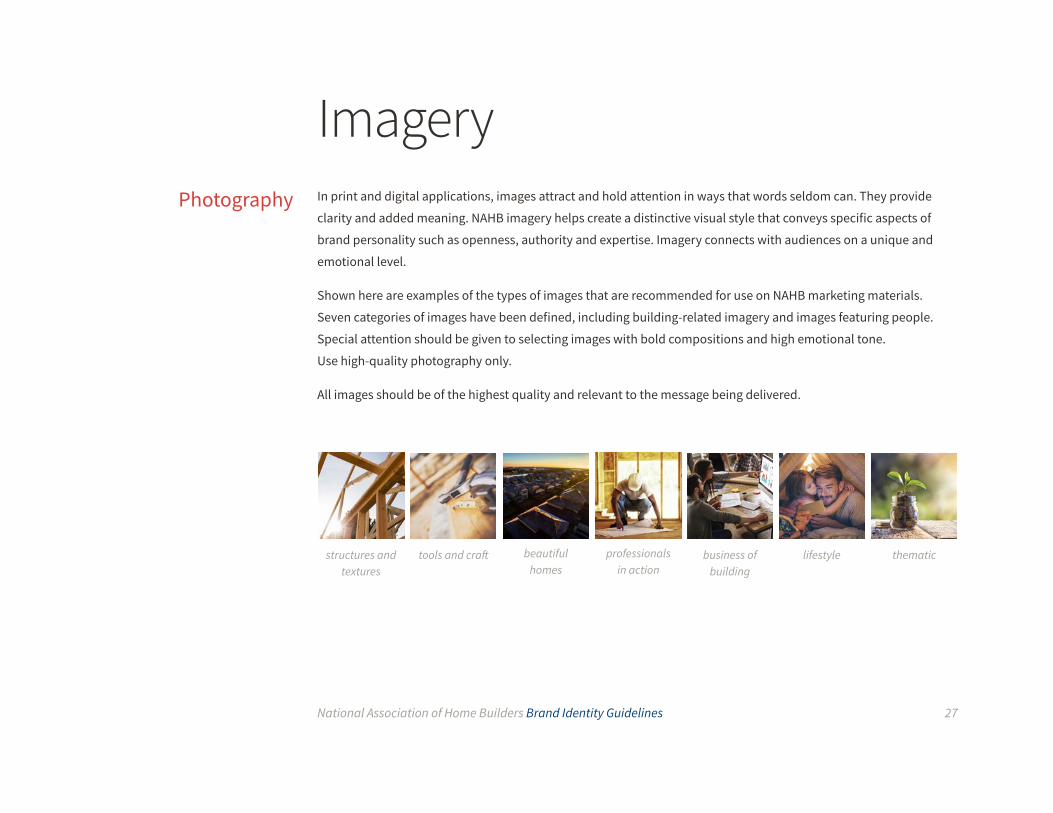
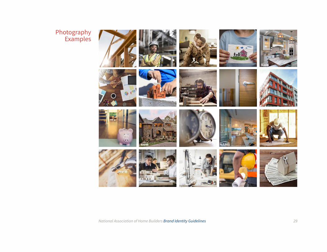
In print and digital applications, images attract and hold attention in ways that words seldom can. They provide
clarity and added meaning. NAHB imagery helps create a distinctive visual style that conveys specific aspects of
brand personality such as openness, authority and expertise. Imagery connects with audiences on a unique and
emotional level.
Shown here are examples of the types of images that are recommended for use on NAHB marketing materials.
Seven categories of images have been defined, including building-related imagery and images featuring people.
Special attention should be given to selecting images with bold compositions and high emotional tone.
Use high-quality photography only.
All images should be of the highest quality and relevant to the message being delivered.
ImageryPhotography
structures and textures
tools and craft beautiful homes
professionals in action
lifestyle thematicbusiness of building

National Association of Home Builders Brand Identity Guidelines 28
When using images from NAHB entries across the Beautiful Homes category, all images should have an NAHB
watermark. These photos should be of actual entrants’ work vs. stock photography.
The watermark will always live on the bottom left corner of a photo and a minimum area of unobstructed clear
space equal to the height of the letter “N” in the mark must surround the logo in all situations. The watermark
will contain an NAHB logo, as well as, the award title set in Source Sans Pro. The opacity of the watermark should be
85% of white.
Additional watermark content is optional and may include: winner, category name, credit (year, photographer
name) entrant name or project name.
Watermarking Awards Photos
winner, category name (optional)Credit: <year> <photographer nameEntrant name, project name - if necessary
[insert year, photographer name]Best in American Living TM
example of watermark spacing
example of photo with watermark
National Association of Home Builders Brand Identity Guidelines 29
Photography Examples
National Association of Home Builders Brand Identity Guidelines 30
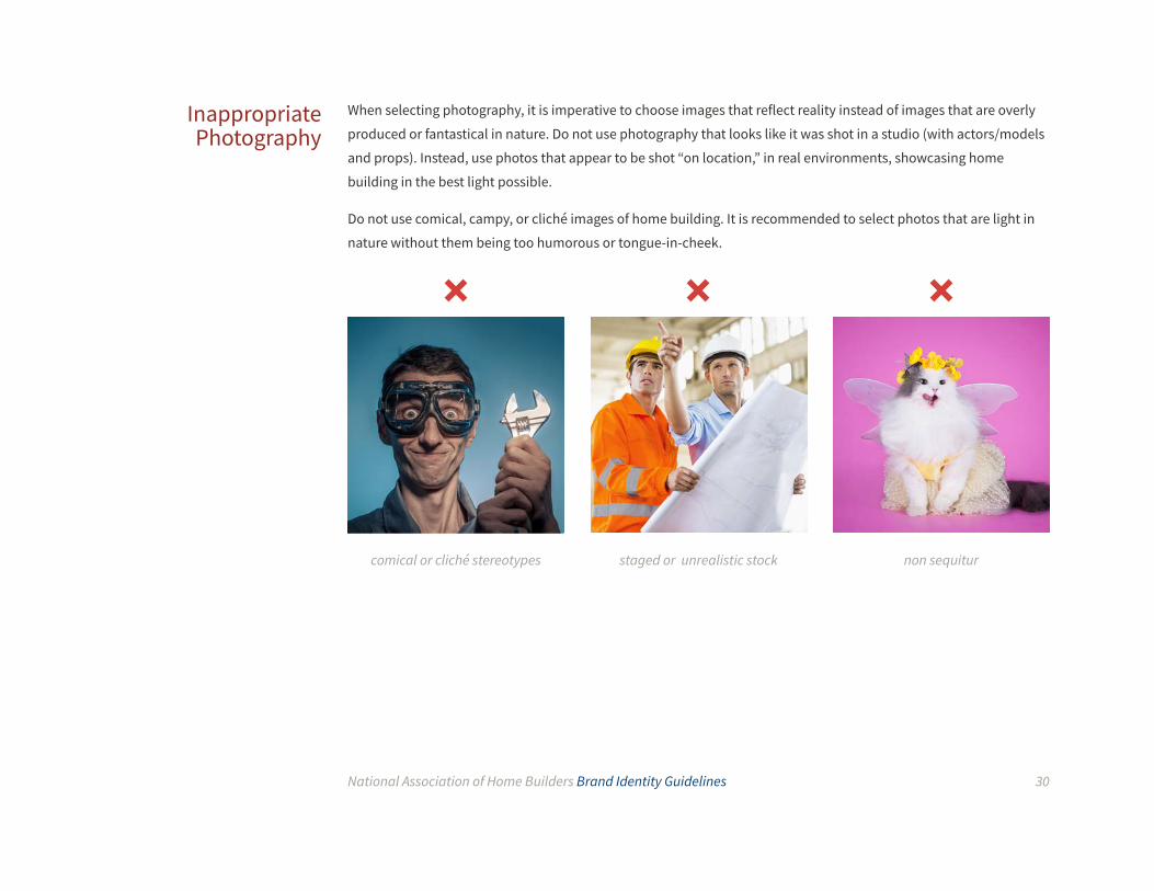
When selecting photography, it is imperative to choose images that reflect reality instead of images that are overly
produced or fantastical in nature. Do not use photography that looks like it was shot in a studio (with actors/models
and props). Instead, use photos that appear to be shot “on location,” in real environments, showcasing home
building in the best light possible.
Do not use comical, campy, or cliché images of home building. It is recommended to select photos that are light in
nature without them being too humorous or tongue-in-cheek.
Inappropriate Photography
comical or cliché stereotypes staged or unrealistic stock non sequitur
National Association of Home Builders Brand Identity Guidelines 31
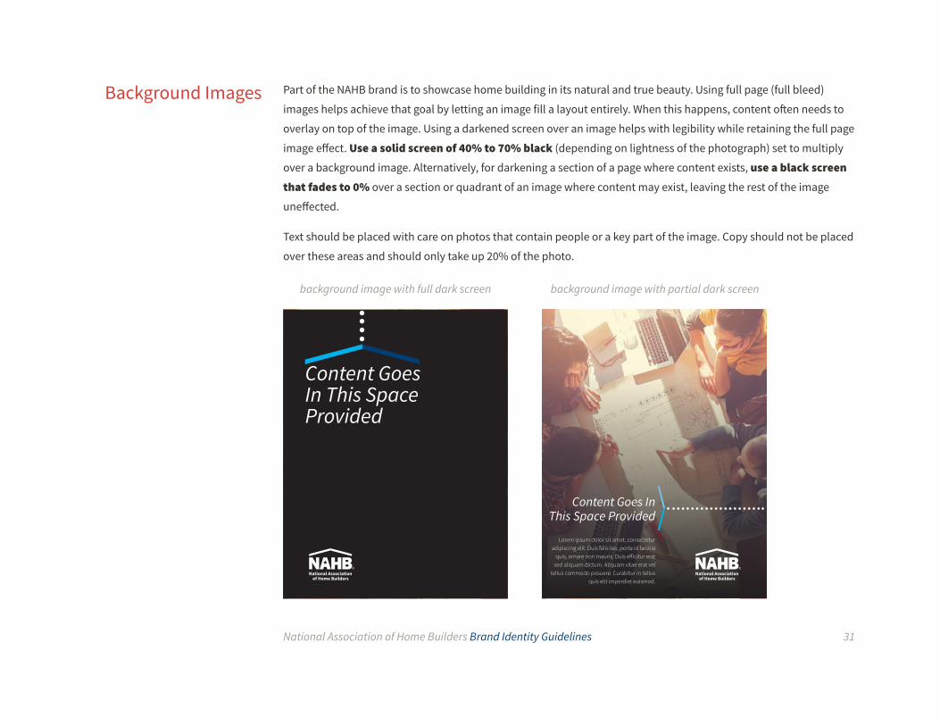
Part of the NAHB brand is to showcase home building in its natural and true beauty. Using full page (full bleed)
images helps achieve that goal by letting an image fill a layout entirely. When this happens, content often needs to
overlay on top of the image. Using a darkened screen over an image helps with legibility while retaining the full page
image effect. Use a solid screen of 40% to 70% black (depending on lightness of the photograph) set to multiply
over a background image. Alternatively, for darkening a section of a page where content exists, use a black screen that fades to 0% over a section or quadrant of an image where content may exist, leaving the rest of the image
uneffected.
Text should be placed with care on photos that contain people or a key part of the image. Copy should not be placed
over these areas and should only take up 20% of the photo.
Background Images
background image with full dark screen background image with partial dark screen
Content Goes In This Space Provided
Lorem ipsum dolor sit amet, consectetur adipiscing elit. Duis felis leo, porta id lacinia
quis, ornare non mauris. Duis efficitur erat sed aliquam dictum. Aliquam vitae erat vel
tellus commodo posuere. Curabitur in tellus quis elit imperdiet euismod.
Content Goes In This Space Provided

National Association of Home Builders Brand Identity Guidelines 32
Sometimes it can be difficult to find the perfect photo. Sometimes there are concepts which photography can’t
express perfectly. When a different visual approach is required, or in order to expand the NAHB image library,
illustrations may be used. Illustrations may be most helpful when producing infographic one-pagers that rely on
simplifing complex information through visuals.
The NAHB illustration style is minimalist, flat and colorful. These kinds of illustrations are easy to find pre-made,
and can be easily edited to suit specific needs. This style of illustration works especially well with infographics.
To find these kinds of illustrations, search for keywords including flat, minimal and vector, in addition to the
contextual content to be displayed (building, ideas, technology, etc.). The illustrations should be topical, easy to
understand, and be converted to the NAHB primary palette colors.
Clip art are simple pictures and symbols made available over the internet or in applications such as Microsoft Office
and are not appropriate.
Illustration

National Association of Home Builders Brand Identity Guidelines 33
The NAHB brand is dependant on more than the logo, colors, typography and photography. The glue that binds
these elements together is the set of graphic elements used to create layouts. The graphic elements include arrows, lines, circles and icons. When used together with other elements, these graphics produce a cohesive look and feel
across all visual communication platforms.
When applied correctly, the secondary graphics developed for NAHB marketing materials add variety and visual
interest, allow for differentiation between materials with different marketing needs, provide a “staging area” for the
NAHB logo, and provide a structural framework for content organization.
Graphic ElementsOverview
image circle
arrow
typography
dotted line
logo
Evolution of the NAHB Visual Brand

National Association of Home Builders Brand Identity Guidelines 34
The arrow graphic element is derived from the roof line in the NAHB logo. The proportions, angle and dual color
property of the arrow should remain the same as it appears in the logo.
The arrow may point to the left, right, or up – but never down. The arrows can be used as brackets, aside from
that it’s best to use one arrow per page/section. The arrow color should be monotone or analogous color pairs,
containing at least one primary or secondary color, from the NAHB brand color palette (they may also use the logo
colors of brick and metal).
Arrow
150.56°
104.72°

National Association of Home Builders Brand Identity Guidelines 35
Text May Go In This Space Provided
The arrow is primarily used next to headlines and subheads in order to direct the reader’s attention to the next
element in the design’s visual hierarchy – usually an image or piece of content. The arrow is always at a 90 degree
angle to the layout/page. However, the arrow may be used without text for instances where the text may be larger
than the space of the arrow.
When accompanying headlines, the arrow is slightly wider (or taller) than the text, and sits close to the top or sides
of the text. When the arrow sits to the right of a headline, the text is usually right-justified. Never place the arrow in
other positions or touching the text it accompanies.
Text May Go In This Space Provided
Text May Go In This Space
Provided
The bad example here breaks four rules: the arrow
points down, it is smaller than the text, it touches the
text, and it is not at a 90° angle to the page
This example shows .01" of space allowance or 6 points down from the lowest angle
(second vertical rule)

National Association of Home Builders Brand Identity Guidelines 36
As a general rule, the arrow should be accompanied by a dotted line to "connect" the text to an image when
possible. However, the arrows can also contain (or "protect") text by creating brackets or simply "direct" text
without using the dotted line to allow greater diversity in layouts.
Arrow Movement
CONNECTS
DIRECTS
PROTECTS

National Association of Home Builders Brand Identity Guidelines 37
Multifamily Housing
Arrows can be used in groups or alone. When used alone, the arrow may bleed off the page. When a portion of the
arrow bleeds off a page, the point of the arrow must be present. The arrow can be used as a solid color or a screen. Oversized Arrow
The point of the arrow is not visible
The point of the arrow is visible
National Association of Home Builders Brand Identity Guidelines 38
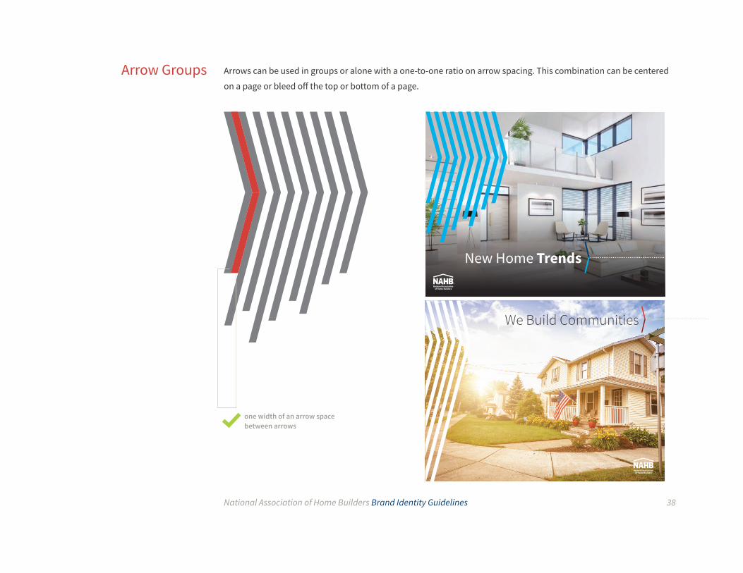
Arrows can be used in groups or alone with a one-to-one ratio on arrow spacing. This combination can be centered
on a page or bleed off the top or bottom of a page. Arrow Groups
one width of an arrow space between arrows
New Home Trends
We Build Communities
National Association of Home Builders Brand Identity Guidelines 39
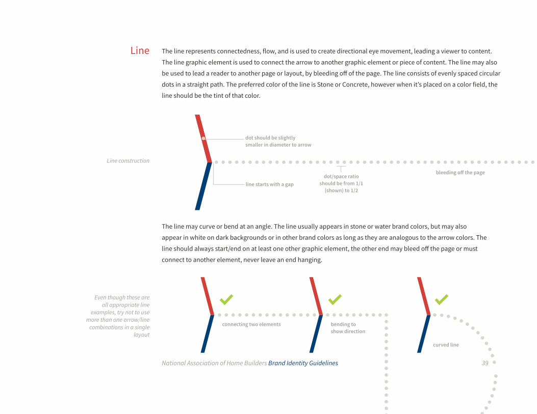
The line represents connectedness, flow, and is used to create directional eye movement, leading a viewer to content.
The line graphic element is used to connect the arrow to another graphic element or piece of content. The line may also
be used to lead a reader to another page or layout, by bleeding off of the page. The line consists of evenly spaced circular
dots in a straight path. The preferred color of the line is Stone or Concrete, however when it’s placed on a color field, the
line should be the tint of that color.
The line may curve or bend at an angle. The line usually appears in stone or water brand colors, but may also
appear in white on dark backgrounds or in other brand colors as long as they are analogous to the arrow colors. The
line should always start/end on at least one other graphic element, the other end may bleed off the page or must
connect to another element, never leave an end hanging.
Line
dot/space ratio should be from 1/1
(shown) to 1/2
dot should be slightly smaller in diameter to arrow
line starts with a gap
Even though these are all appropriate line
examples, try not to use more than one arrow/line
combinations in a single layout
Line construction
connecting two elements bending to show direction
curved line
bleeding off the page

National Association of Home Builders Brand Identity Guidelines 40
There are two ways to display images in NAHB layouts. One way is to make the image full-bleed, spanning the entire
page or area. This highlights the beauty of the image and increases visibility and impact, but can be difficult if more
content is required in the layout. When showing images smaller than full page, the image circle may be used.
Image circles should bleed off at least one side of a page or layout. They should contain any type of brand-
appropriate photography and more than one image circle may appear on a page or layout. Limit use of text within
the image circle to headlines only, taking up no more than 25% of the circle. Body copy cannot be placed within the image circle.
Image circles may be used on white or colors from the primary, primary extended or secondary palette. For covers,
the combined area of the circles should be more than 30% of a page or layout. To create visual interest, a portion of
an image can extend beyond the circle.
Image Circle
Examples of image circles in layouts

National Association of Home Builders Brand Identity Guidelines 41
When the arrow, line, and circle come together, they create the complete visual graphic set for NAHB that can be
used in any kind of layout or design. The set of elements is designed to be as versatile as possible, accommodating
any layout, size or amount of content. At least one element must be present on all print and digital collateral. If a full
page image is used, the arrow must be used.
By using the graphics correctly and consistently, our advertising, print materials, and other communication
applications will have a visually distinctive and compelling appearance that continually reinforces the NAHB brand.
Combining the Elements
Examples of all elements together in layouts
You and your business become stronger withthe resources and tools available to members:
NetworkingLorem ipsum dolor sit amet, consectetur adipiscing elit. Fusce viverra ex vel feugiat sagittis. Morbi porttitor faucibus purus, eu elementum sem pellentesque et. Integer auctor, ante id luctus dapibus, nisi lectus ornare odio, at interdum metus sapien nec velit. Mauris ullamcorper a dolor eu rutrum. Nulla massa leo, fringilla ac finibus at, pellentesque ac est. Maecenas ullamcorper orci ac sem ornare, non maximus ligula consectetur. Mauris feugiat tellus ac varius pulvinar. Aenean in sagittis lorem, sed volutpat diam.Nunc porttitor nisi nec fringilla tempus. Aenean urna turpis, lacinia pellentesque maximus id, mollis ut leo. Quisque tincidunt aliquam turpis quis viverra.
ExpertiseLorem ipsum dolor sit amet, consectetur adipiscing elit. Fusce viverra ex vel feugiat sagittis. Morbi porttitor faucibus purus, eu elementum sem pellentesque et. Integer auctor, ante id luctus dapibus, nisi lectus ornare odio, at interdum metus sapien nec velit.
SavingsMauris ullamcorper a dolor eu rutrum. Nulla massa leo, fringilla ac finibus at, pellentesque ac est. Maecenas ullamcorper orci ac sem ornare, non maximus ligula consectetur. Mauris feugiat tellus ac varius pulvinar. Aenean in sagittis lorem, sed volutpat diam.
Ready to Join?Contact the Home Builder Association of Greater Lansing at 517.323.3254 and find out more about how membership can work for you. Visit hbalansing.com for more information.
Headline Text Goes In
This SpaceMore text can go in
this space provided. Text can go in this space
here. More text here
Subhead Goes Here
Stay on top of industry trends, gain invaluableknowledge, and make the connections you’ll need to stay competitive in today’s marketplace. When you join your local home builders association (HBA), you also automatically become a member of the state association and the National Association of Home Builders (NAHB). That is a 3-in-1 membership! All three levels of this federation are here to help your business grow, move our industry forward andkeep both strong.
ExpertiseLorem ipsum dolor sit amet, consectetur adipiscing elit. Fusce viverra ex vel feugiat sagittis. Morbi porttitor faucibus purus, eu elementum sem pellentesque et. Integer auctor, ante id luctus dapibus, nisi lectus ornare odio, at interdum metus sapien nec velit.
SavingsMauris ullamcorper a dolor eu rutrum. Nulla massa leo, fringilla ac finibus at, pellentesque ac est. Maecenas ullamcorper orci ac sem ornare, non maximus ligula consectetur. Mauris feugiat tellus ac varius pulvinar. Aenean in sagittis lorem, sed volutpat diam.Nunc porttitor nisi nec fringilla tempus. Aenean urna turpis, lacinia pellentesque maximus id, mollis ut leo. Quisque tincidunt aliquam turpis quis viverra.
Headline Can Go In This Space
ProvidedSubhead goes in the space provided here

National Association of Home Builders Brand Identity Guidelines 42
The NAHB brand rests on 5 value pillars. These pillars represent our values and our offerings to members, partners
and the nation at large. Icons may be used on the interior or back panel of print pieces, and on digital pieces where
they are not the main focus of attention. They are meant to signify the type of benefit or offering being discussed
in a piece, layout, or section by visually identifying with a simple symbol, but not by overpowering the design or
confusing the viewer (who may not be familiar with them upon first encounter).
The icons may be set in any NAHB primary or secondary palette color, or white, but do not permanently assign one
color with an icon, vary the colors used so as to not associate colors to values. The text should not be separated from
their corresponding icons. Icons and their corresponding text should be placed in a corner, preferably across from
the NAHB logo.
Icons
NAHB 5 pillar icons
An icon used in a layout on the back of a piece or
within a circle

National Association of Home Builders Brand Identity Guidelines 43
Our business cards incorporate the elements of the NAHB visual identity system, including the NAHB logo and
descriptor, color palette, typography and secondary graphics. Shown here are the front and back layouts. Do not
create unauthorized versions incorporating sub-brands, additional logos or alternate colors.
StationeryBusiness Cards
Layout with example information
front back
National Associationof Home Builders
JOHNATHAN M. LONGNAMETitle Goes in This Space ProvidedSecond Line of Title Goes Here
1201 15th Street NWWashington, DC 20005
D 202 266 1234 M 202 266 1230T 800 368 5242 [email protected]
We Build Communities
nahb.org

National Association of Home Builders Brand Identity Guidelines 44
The NAHB letterhead uses the logo and primary palette colors to create a clean, adaptable template. Use only
approved stationery ordered; do not create unauthorized versions for sub-brands or other groups. Do not alter the
logo, placement of the logo, descriptor, contact information, spacing or formatting in any way. The body copy font
size should be a minimum of 9 points and a maximum of 10 points.
The letterhead comes in two color varieties: full color and black. If color printing is available the full color version is
preferred over the black. The letterhead is designed to be used on any size paper (e.g. 8.5x11 or A4), using a logo set
at 1.25” wide as the main guide. Information in the personal header may vary.
Letterhead
Example letterhead and construction guidelines (not
shown at actual size)
200
Dear John:
Proin
justo.
National Associationof Home Builders

National Association of Home Builders Brand Identity Guidelines 45
Envelopes & Labels
Example envelope and label (not shown actual size)
mailing label
Construction guidelines (not shown actual size)
The NAHB mailing system designs use the logo and primary typeface to create a simple, clean return address area
for any type of mailing materials including: envelopes, postcards and other mailed items. The return address design
comes in two color varieties: full color and black. If color printing is available the full color version is preferred over
the black. The return address is designed to be used on any sized envelope or label, using a logo set at 0.857" wide
as the main guide for other measurements.
Source Sans Pro Regular10pt/15pt, Title Case

National Association of Home Builders Brand Identity Guidelines 46
Connecting Women. Sharing Ideas.Strengthening Our Industry.
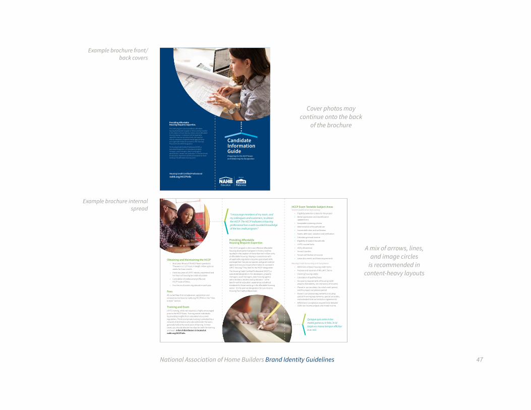
Brochures are an excellent medium to collect and communicate information in an easily digestible, physical
manner. Brochures incorporate all the elements of the NAHB visual identity system, including the logo, color palette,
typography, graphic elements, and photography. Creative flexibility has been built into the system, allowing for a
variety of design options to meet specific needs. Coated paper should be used when possible.
Print CollateralTri-fold Brochures
Example brochure covers
Resources for Promoting Your
DesignationCertified Graduate
Remodeler
Join the Remodeling
Industry’s Elite75 Years of Craftsmanship
National Association of Home Builders Brand Identity Guidelines 47
“I encourage members of my team, and my colleagues and customers, to obtain the HCCP. The HCCP indicates a housing professional has a well-rounded knowledge of the tax credit program.”
Obtaining and Maintaining the HCCP• Must pass 48 out of 75 HCCP Exam questions.
The exam is 2 1/2 hours in length. Allow up to six weeks for Exam results.
• Have two years of LIHTC industry experience and ten hours of housing tax credit education.
• Completion of professional profile and HCCP Code of Ethics.
• Four hours of continuing education each year.
FeesAll current fees that include exam; application and renewal can be found at nahb.org/HCCPinfo in the "How to Earn" section.
Training and ExamLIHTC training, while not required, is highly encouraged prior to the HCCP Exam. Training assists individuals by providing insights from calculations to current regulations. Public and private training is provided by a network of distributors who also administer the exam, generally held at the conclusion of training. In most cases, you should allocate two days for both the training and exam. A list of distributors is located at nahb.org/HCCPinfo.
Providing Affordable Housing Requires Expertise.
The LIHTC program is the most effective affordable housing development program in history and has resulted in the creation of more than two million units of affordable housing. Staying in compliance with all applicable regulations requires specialized skills and expertise. How do companies and governmental agencies know you’ve got what it takes to succeed in LIHTC housing? They look for the HCCP designation.
The Housing Credit Certified Professional (HCCP), a specialized designation—for developers, property managers, asset managers, state housing agency administrators, lenders and syndicators—is the benchmark for education, experience and ethical standards for those working in the affordable housing sector. It's the premier designation for Low Income Housing Tax Credit professionals.
Quisque quis ante in leo mattis porta eu in felis. In id turpis eu massa tempor efficitur a ac nisl.
HCCP Exam Testable Subject AreasTenant Qualification and Leasing
• Eligibility/selection criteria for the project
• Rental application and recertification update forms
• Acceptable screening criteria
• Determination of household size
• Income definition and verification
• Assets: definition, valuation and verification
• Calculating annual income
• Eligibility of student households
• LIHTC income limits
• Utility allowances
• Tenant transfers
• Tenant certification of income
• Lease documents and lease requirements
Housing Credit Accounting and Compliance
• Definitions of basic housing credit terms
• Purpose and issuance of IRS LIHTC forms
• Claiming housing credits
• Calculation of qualified basis
• Occupancy requirements of housing credit projects (habitability, non-transiency of tenants)
• Placed-in-service dates, the initial credit period, and the project compliance period
• Owner's compliance requirements (including special financing requirements, special set-asides, and extended land use restriction agreements)
• Difference in compliance requirements between 100% low income projects and mixed income.
Candidate Information GuidePreparing for the HCCP Exam and Obtaining the Designation
Housing Credit Certified Professionalnahb.org/HCCPinfo
Providing Affordable Housing Requires Expertise.
The LIHTC program is the most effective affordable housing development program in history and has resulted in the creation of more than two million units of affordable housing. Staying in compliance with all applicable regulations requires specialized skills and expertise. How do companies and governmental agencies know you’ve got what it takes to succeed in LIHTC housing? They look for the HCCP designation.
The Housing Credit Certified Professional (HCCP), a specialized designation—for developers, property managers, asset managers, state housing agency administrators, lenders and syndicators—is the benchmark for education, experience and ethical standards for those working in the affordable housing sector.
Example brochure front/back covers
Cover photos may continue onto the back
of the brochure
A mix of arrows, lines, and image circles
is recommended in content-heavy layouts
Example brochure internal spread

National Association of Home Builders Brand Identity Guidelines 48
Flyers can be used to communicate timely information in an efficient manner due to their ability to be printed
quickly and in large quantities. Flyers may be organized into sets to be distributed easily. They are handy devices for
meetings, events or for general information.
NAHB flyer designs should follow all brand guidelines and should include as many brand elements as possible.
Coated paper should be used when possible.
One-page Flyers
front back
Although only one flyer design idea is shown here,
there are a myriad of design possibilities using
the NAHB brand elements
You and your business become stronger withthe resources and tools available to members:
For more information visit us online at nahb.org.
Or follow us at nahb.org/facebook and nahb.org/twitter.
NetworkingMembership provides you access to industryprofessionals with your home market and beyond.Our members support their fellow members and value the opportunity to “do business with a member.”This leads to more referrals and a more robust bottom line for your business.
Nobody understands your business like yourfellow members. Your local association gives you theopportunity to make connections with peers who know what it takes to succeed in this industry. Build lasting relationships with the people who can help you and your business thrive.
Nobody understands your business like yourfellow members. Your local association gives you theopportunity to make connections with peers who know what it takes to succeed in this industry. Build lasting relationships with the people who can help you and your business thrive.
Take the opportunity to join an NAHB Council or other
within the home building industry.
AdvocacyYou can count on NAHB’s keen advocacy focus,aiming to provide our industry the stability to moveforward and giving our members durable andcompetitive advantage. NAHB works with lawmakers
2017 NSMC Super Sales Rally:
Heart of a Winner, Soul of a Champion.

National Association of Home Builders Brand Identity Guidelines 49
Direct mail is an efficient and powerful way to communicate with members, affiliates and the general public. When
designing direct mail communication pieces, use as many of the NAHB brand elements as possible — including
the logo, colors, typography and image circles. Keep headline text large and legible, messages should be short and
to the point. Only use visual metaphors when cliché graphics are avoidable. Coated paper shoud be used when
possible.
Direct Mail Postcards
Example direct mail postcard using a color
background with white text/logo, an arrow/line/
circle combination, and a well-chosen stock image Put your
membership to work now.
Money-saving discounts that benefit you, your business
and your family
Visit nahb.org/ma

National Association of Home Builders Brand Identity Guidelines 50
Events are an excellent opportunity to use minimized, distilled sets of NAHB brand elements. Be bold and
straightforward when designing signage intended for large display. Use the power of emotional images and bright
colors to draw viewers into a physical area. Note that the NAHB logo may be placed in the upper section of a layout
(not recommended in other applications) to avoid being covered by people or other event signage. In these special
cases be sure to follow all clear space and background color rules.
Event Signage
Example vertical and horizontal event signage
The arrow and line brand elements are missing in these examples to show examples of layouts which may rely on some (not all) brand elements. They may be reincorporated in other signage designs where appropriate.
Welcome Home.
National Associationof Home Builders
National Associationof Home Builders

National Association of Home Builders Brand Identity Guidelines 51
When creating merchandise, apparel and other premium items for NAHB, always follow the brand guidelines,
making sure to always use quality materials. Try to use the full version of the logo (with text) wherever possible
or where printing small type is allowed.
Do not create logos for events or “mock up” event names or taglines with the NAHB logo. Event graphics should appear
separately from the logo (such as on the back of a shirt) and always outside the minimum required clear space.
Due to the technical limitations of silkscreen, embroidery, and other reproduction methods used to create
promotional items, pay special attention to ensure high-quality, accurate representation of the NAHB logo.
Do not use the star motif within the logo as a secondary graphic.
Before ordering any promotional items, talk to Patricia Potts (xt. 8224) or Joe Rudden (xt. 8696) in the Print Marketing Department to ensure you are getting the best price and using an appropriate vendor for the piece.
Promotional Items

National Association of Home Builders Brand Identity Guidelines 52
When designing PowerPoint slide decks, it is important to keep these things in mind:
• Do not overstuff a slide with content, consider breaking up dense slides into a few lighter slides
• Use large text to prompt discussion, instead of risking your audience reading ahead while you speak
• Keep visual metaphors and clichés to a minimum, use powerful and real images
Try to incorporate a healthy mix of colors, typography and brand elements. It’s okay if slides look different from one
another as long as they all follow the NAHB brand guidelines. Alternate between dark and light backgrounds, and
use photos and illustrations when they help communicate a message. Try to avoid using more than one message
per slide. NAHB slide decks are usually designed to a 16:9 ratio, and rarely, if ever, use a 4:3 ratio. More PowerPoint
templates will be available in PowerPoint, under the “shared” tab.
Digital CollateralPowerPoint
Presentations
Example cover slide

National Association of Home Builders Brand Identity Guidelines 53
Example interior slides
Example divider and end slides
This is a page title.Lorem ipsum dolor sit amet, consectetur adipiscing elit, sed do eiusmod tempor incididunt ut labore et dolore magna aliqua. Ut enim ad.
• This is a bullet style • Another bullet here
National Associationof Home Builders
This is a divider slide.Headline here.
This is a page title.This is a subhead here
14
Item Item
20 14
Item Item
20
14
Item Item
20
National Associationof Home Builders
This is an End Page
National Associationof Home Builders

National Association of Home Builders Brand Identity Guidelines 54
The NAHB Facebook, Twitter and other branded properties allow us to communicate directly with members,
partners and the public in an intimate and effective way. The graphics used on these platforms must match NAHB
brand standards and carry through elements used in other mediums.
A profile picture should always contain the NAHB logo as large as can be comfortable, so that it shows up in
feeds and thumbnails well. In this specific instance it is okay to break the clear space rule on page 5 and drop the
descriptor text.
Cover graphics may change designs over time, but should always carry through design elements from the brand.
Consider keeping text in the cover graphics to a minimum, as responsive sizing (mobile devices) hinders placed text
and content in these graphics.
Check the social media platforms’ websites to determine the exact dimensions for each cover photo.
Social Media Profile & Cover Graphics
Example profile pictures

National Association of Home Builders Brand Identity Guidelines 55
It is important to note that space for the profile picture must be accounted for when designing most cover photos.
Leave room for borders, cropping, inset photos or responsive considerations when laying out an image. The best
option is usually a simple, single theme/image design.
Example Facebook cover (851px x 315px)
Example Twitter cover (1500px x 500px)
Welcome Home.
We Are NAHB

National Association of Home Builders Brand Identity Guidelines 56
We Build Communities Subhead text will look like this
This is just mock headline content for discussion XXLorem ipsum dolor sit amet, consectetur adipiscing elit. Aenean elemen-tum
nulla vitae nulla maximus placerat.
Speaker 1: ante nec semper posuere. Lorem ipsum
do-lor sit amet, consectetur adipiscing elit. Proin porta
ante nec semper posuere. Lorem ipsum do-lor sit
amet, consectetur adipiscing elit.
Speaker 2: ante nec semper posuere. Lorem ipsum
do-lor sit amet, consectetur adipiscing elit. Proin porta
ante nec semper posuere. Lorem ipsum do-lor sit
amet, consectetur adipiscing elit.
CLICK HERE
em04ali
Lorem ipsum dolor sit amet, consectetur adipiscing elit. Aenean elemen-tum
nulla vitae nulla maximus placerat. Proin porta ante nec semper pos-uere. Lo-
rem ipsum dolor sit amet, consectetur adipiscing elit. Suspendisse accumsan
erat id ex hendrerit, ac mollis odio aliquet. In ac lacus magna.
Lorem ipsum dolor sit amet, consectetur adipiscing elit.
CLICK HERE
Digital emails should use the brand elements to embody the NAHB brand while still allowing for optimal white space
and visual aesthetic. Imagery style should be used for a hero image in the header that is strong and resonates with
the message, and arrows and lines can be used throughout the body. New email templates will be available soon.
Digital Email
Example of Digital Emails
Wednesday, Feb. 8Yoga class will be held from 12-1 p.m. Please contact Pamela Smith if you
would like to participate and receive weekly email updates.
Thursday, Feb. 9Fitness class will be held from 12-1 p.m. If you would like to participate,
please meet in the lobby.
Fridays through MarchJeans for Charity Days will be held each Friday. Donations can be made
through payroll as an after-tax deduction and withheld from the first
paycheck of the month. If you would like to participate for the month of
March, please email Kiersten Fox by Feb. 15. Donations will benefit the
following charities:
• Bright Beginnings – A child and family development center that
offers a bright start for homeless infants, toddlers and preschoolers
and their families
• Friends of Homeless Animals – A no-kill shelter that focuses on the
rescue and placement of homeless dogs and cats in the Northern
Virginia and Washington, D.C.
• N Street Village – A community of empowerment and recovery for
homeless and low-income women in Washington, D.C.
Looking Ahead:Monday, Feb. 20The National Housing Center will be closed in observance of Presidents’ Day.
Friday, Feb. 24A cooking seminar, Fundamentals of Flavor, will be held at 12 p.m. in
CR-9000. Learn simple cooking tricks on how to quickly get delicious food
on the table.
Staff Reminder:NAHB staff should use the nahb.org “Find” function or Outlook’s Address
Book to find the most up-to-date email addresses of association leaders.
Our members often change their email addresses, so the address you saved
previously may no longer be current.
em04ali
NAHB Monday Minute Weekly Staff Update

National Association of Home Builders Brand Identity Guidelines 57
When creating infographics, consider the size and orientation of the information. When possible, use a simple
graphic to replace words and no more than three colors within one layout. Information can be displayed within
circles and information flow can be illustrated through the dotted line. Headlines and sections can be broken up
with a combination of the arrow and dotted line. Contact Brand Marketing for the latest templates.
Infographics
National Association of Home Builders Brand Identity Guidelines 58
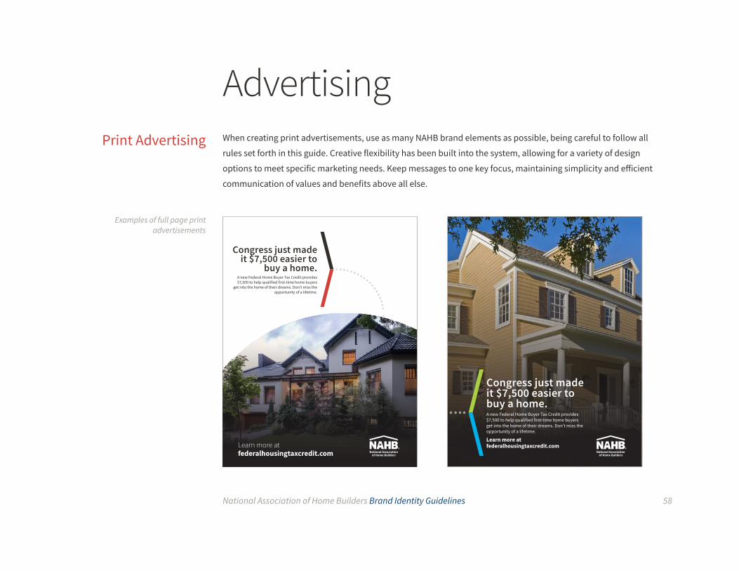
When creating print advertisements, use as many NAHB brand elements as possible, being careful to follow all
rules set forth in this guide. Creative flexibility has been built into the system, allowing for a variety of design
options to meet specific marketing needs. Keep messages to one key focus, maintaining simplicity and efficient
communication of values and benefits above all else.
Advertising
Examples of full page print advertisements
Print Advertising
Congress just made it $7,500 easier to buy a home.A new Federal Home Buyer Tax Credit provides $7,500 to help qualified first-time home buyers get into the home of their dreams. Don’t miss the opportunity of a lifetime.
Learn more atfederalhousingtaxcredit.com
Congress just made it $7,500 easier to
buy a home.A new Federal Home Buyer Tax Credit provides $7,500 to help qualified first-time home buyers
get into the home of their dreams. Don’t miss the opportunity of a lifetime.
Learn more atfederalhousingtaxcredit.com

National Association of Home Builders Brand Identity Guidelines 59
Examples of half and quarter page print
advertisements
Congress just made it $7,500 easier to
buy a home.A new Federal Home Buyer Tax Credit provides $7,500 to help qualified first-time home buyers
get into the home of their dreams. Don’t miss the opportunity of a lifetime.
Learn more atfederalhousingtaxcredit.com
Congress just made it $7,500
easier to buy a home.
A new Federal Home Buyer Tax Credit provides $7,500 to help qualified
first-time home buyersget into the home of their dreams. Don’t miss the
opportunity of a lifetime.
Learn more atfederalhousingtaxcredit.com
Congress just made it easier to buy a home.A new Federal Home Buyer Tax Credit provides $7,500 to help qual-ified first-time home buyersget into the home of their dreams. Don’t miss the opportunity of a lifetime.
Learn more atfederalhousingtaxcredit.com
National Association of Home Builders Brand Identity Guidelines 60
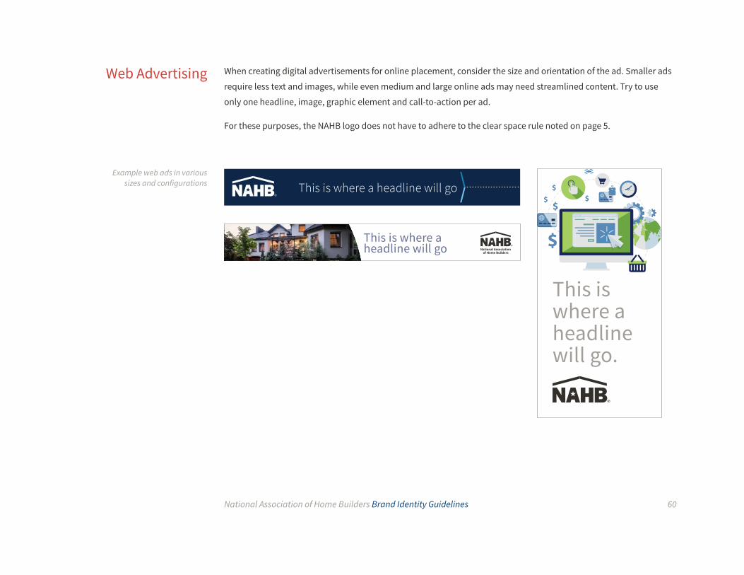
When creating digital advertisements for online placement, consider the size and orientation of the ad. Smaller ads
require less text and images, while even medium and large online ads may need streamlined content. Try to use
only one headline, image, graphic element and call-to-action per ad.
For these purposes, the NAHB logo does not have to adhere to the clear space rule noted on page 5.
Web Advertising
Example web ads in various sizes and configurations This is where a headline will go
This is where a headline will go
This is where a headline will go.

Please contact Brand Marketing if you have any questions or need assistance on branding guidelines.


