Download - All pie graphs are wrong

All Pie Graphs are Wrong
James ThorburnInformation Architect

3 inescapable facts about Pie and your slice of it

1. There is no more pie coming
The amount of pie is determined in advance - more pie cannot be added to the pie. The amount of pie has been set. It will not change. If someone gets more pie, the total amount of pie does not increase.
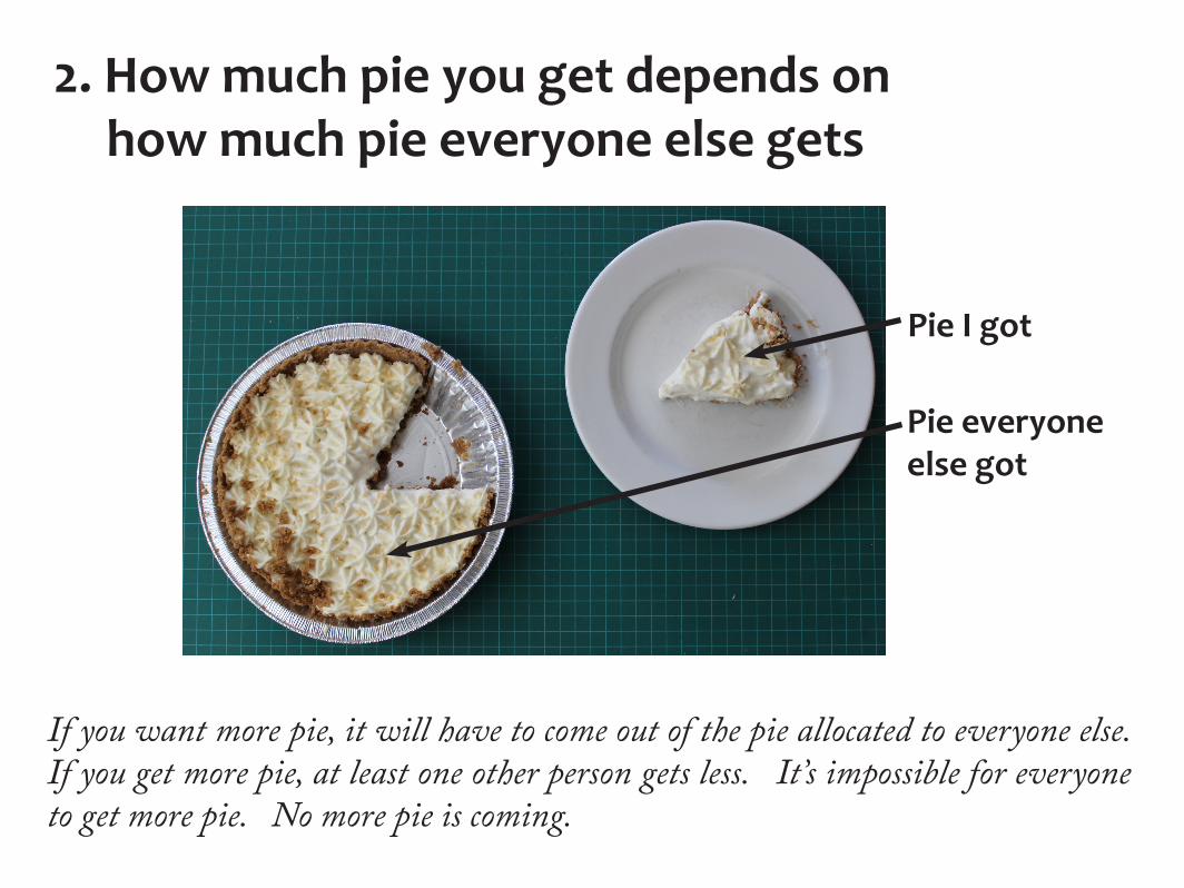
2. How much pie you get depends on how much pie everyone else gets
Pie I got
Pie everyone else got
If you want more pie, it will have to come out of the pie allocated to everyone else. If you get more pie, at least one other person gets less. It’s impossible for everyone to get more pie. No more pie is coming.
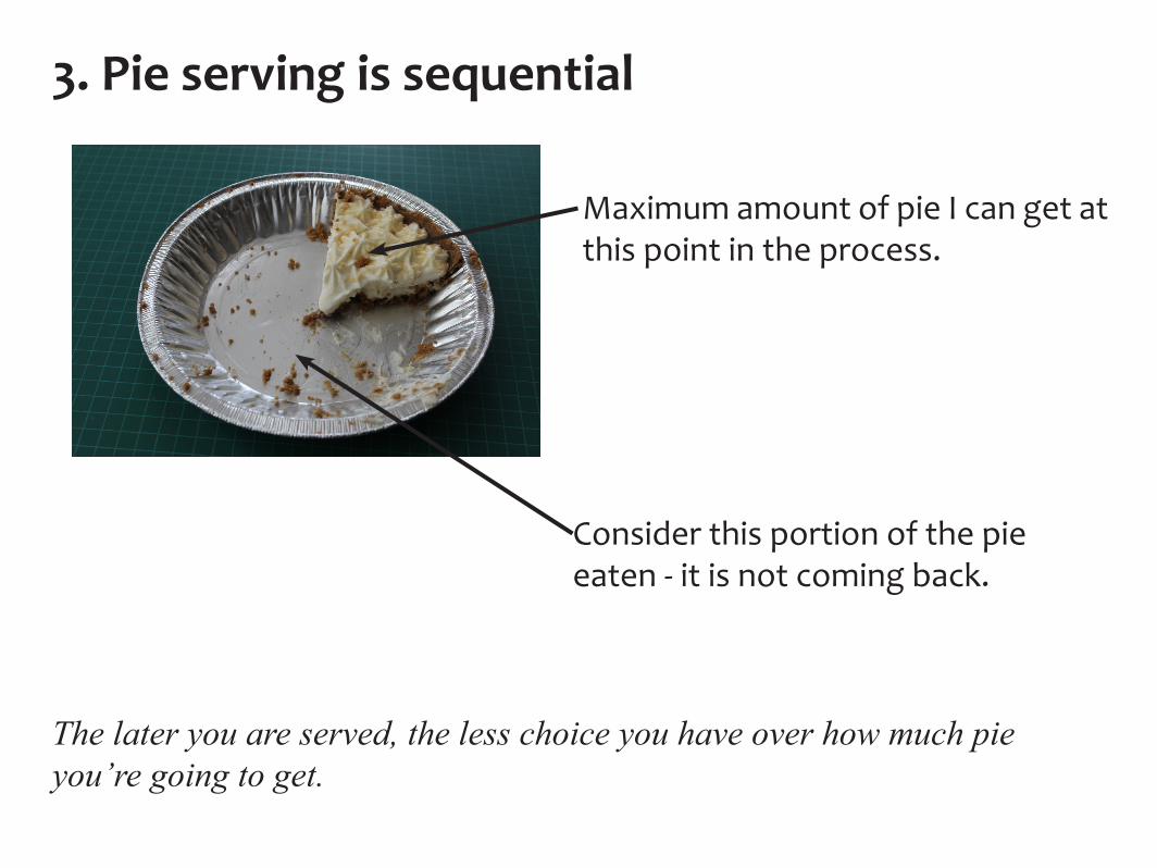
3. Pie serving is sequential
Maximum amount of pie I can get at this point in the process.
The later you are served, the less choice you have over how much pie you’re going to get.
Consider this portion of the pie eaten - it is not coming back.
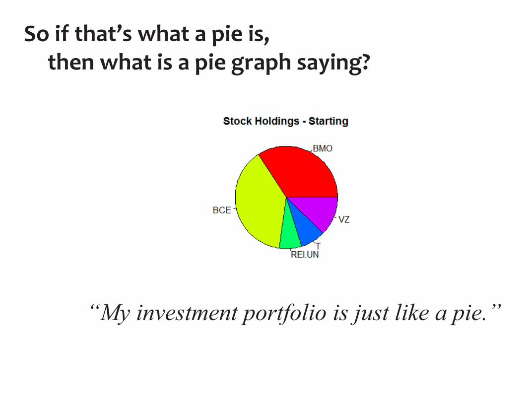
So if that’s what a pie is, then what is a pie graph saying?
“My investment portfolio is just like a pie.”
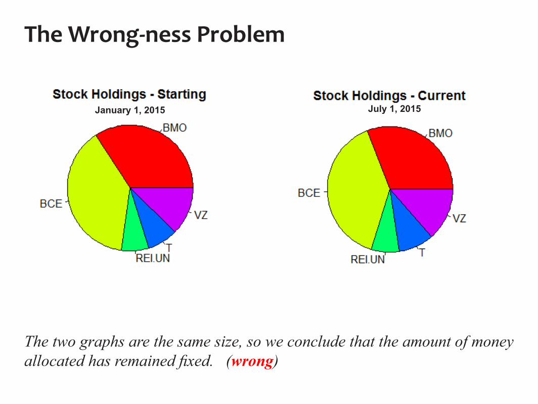
The two graphs are the same size, so we conclude that the amount of money allocated has remained fixed. (wrong)
The Wrong-ness Problem
January 1, 2015 July 1, 2015
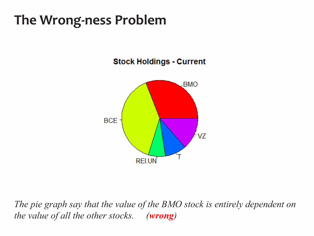
The pie graph say that the value of the BMO stock is entirely dependent on the value of all the other stocks. (wrong)
The Wrong-ness Problem

The subsequent graph shows that BMO has shrunk and Verizon has grown. We naturally conclude that this means that an allocation was transferred from BMO to Verizon. (wrong)
The Wrong-ness Problem
January 1, 2015 July 1, 2015
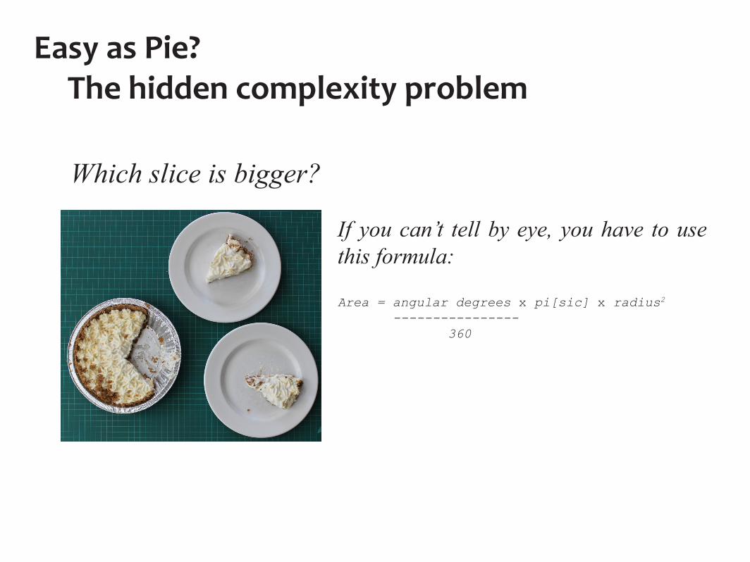
Which slice is bigger?
If you can’t tell by eye, you have to use this formula:
Area = angular degrees x pi[sic] x radius2
---------------- 360
Easy as Pie? The hidden complexity problem
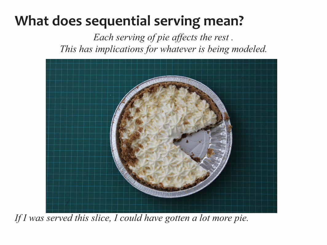
If I was served this slice, I could have gotten a lot more pie.
What does sequential serving mean?Each serving of pie affects the rest .
This has implications for whatever is being modeled.

If I was served this slice but wanted more, no one is going to give me back any of their slice.
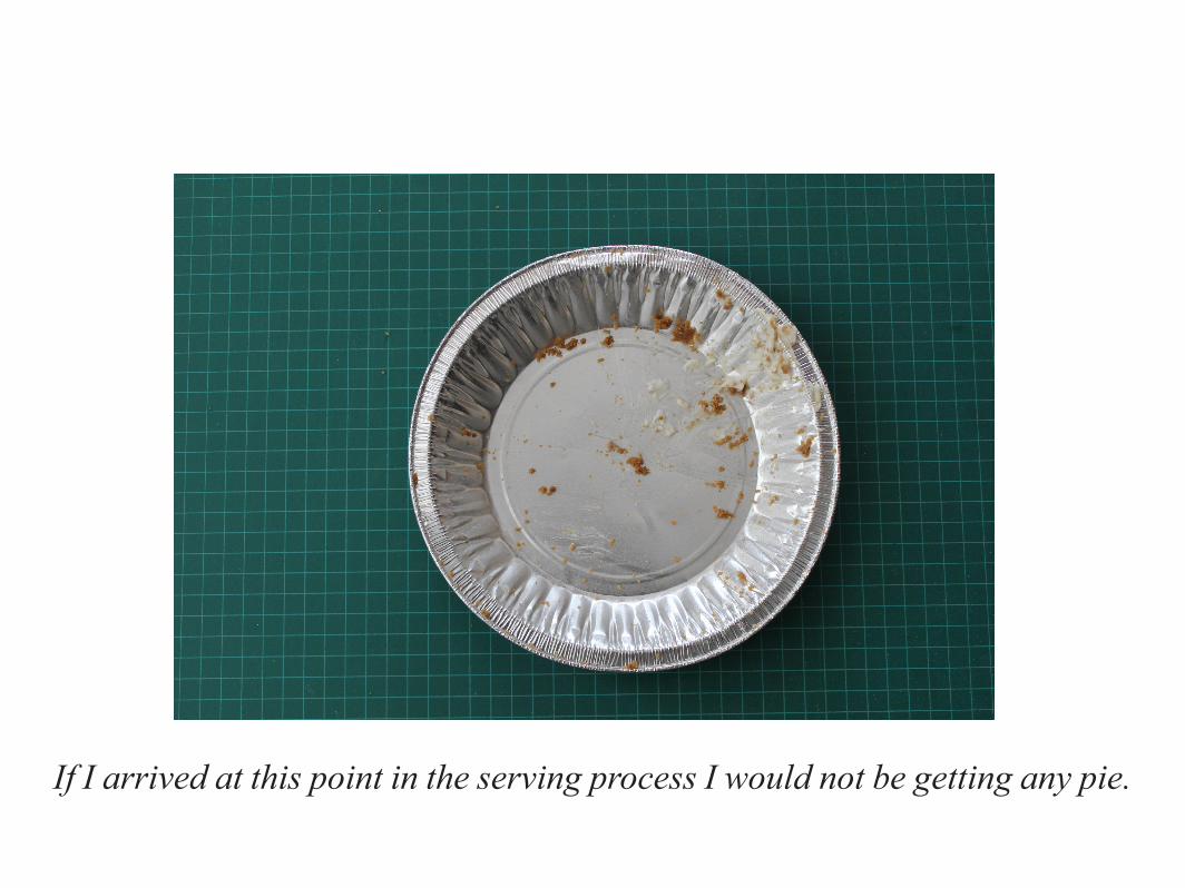
If I arrived at this point in the serving process I would not be getting any pie.
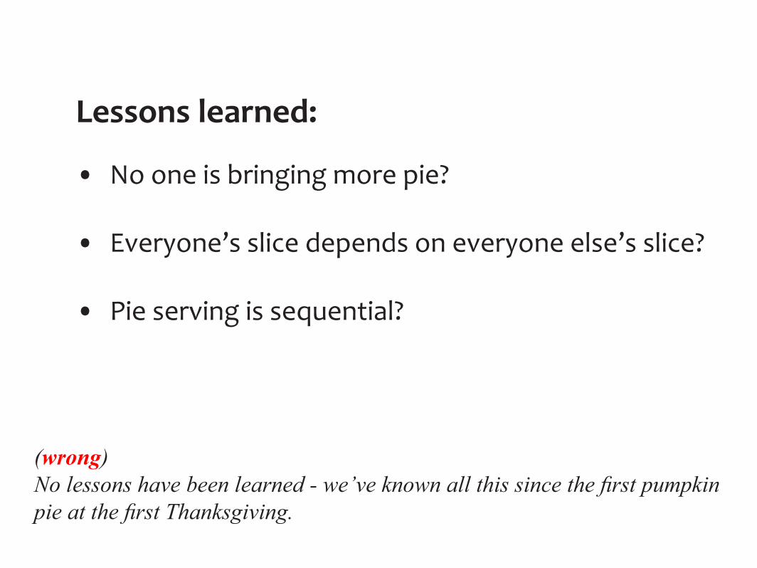
Lessons learned: • No one is bringing more pie?
• Everyone’s slice depends on everyone else’s slice?
• Pie serving is sequential?
(wrong)No lessons have been learned - we’ve known all this since the first pumpkin pie at the first Thanksgiving.
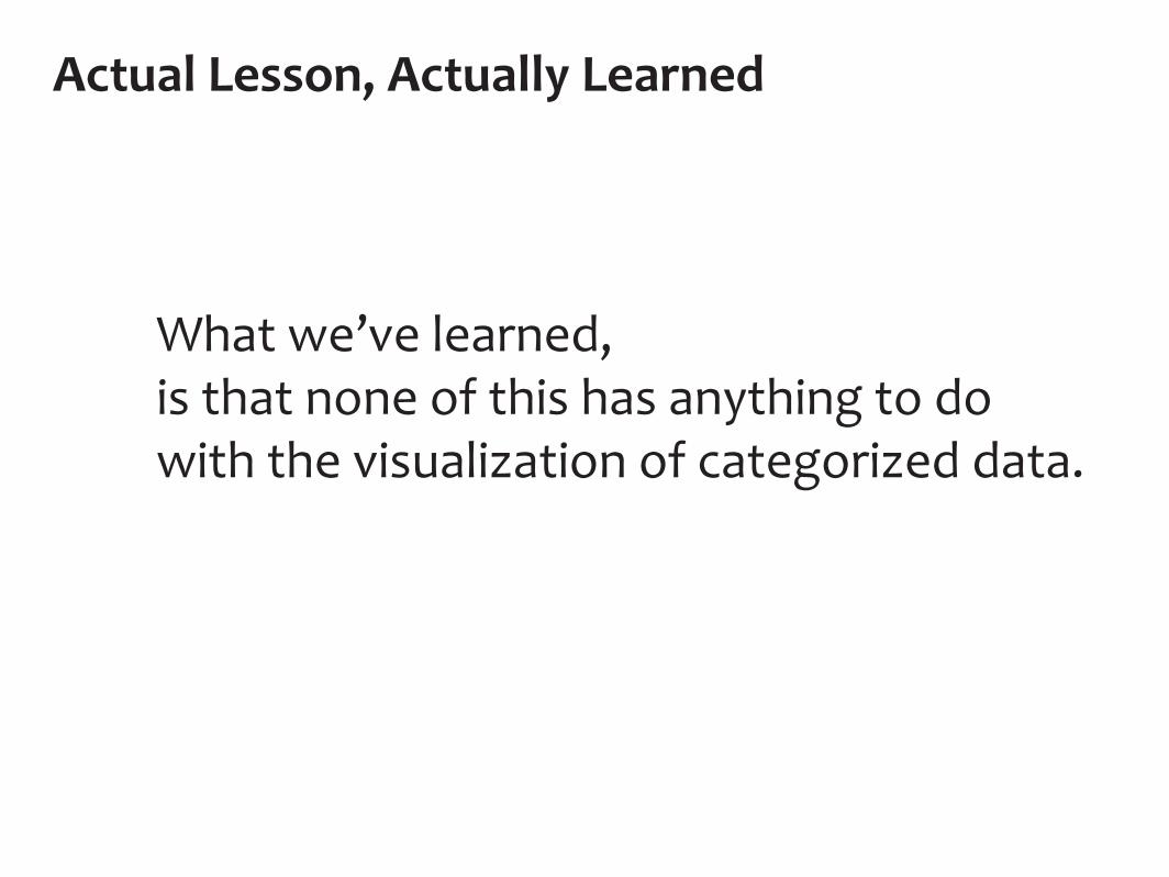
What we’ve learned, is that none of this has anything to do with the visualization of categorized data.
Actual Lesson, Actually Learned

So what’s a better alternative?
Let’s look at the humble bar graph, and its real-world analogue, the stack...
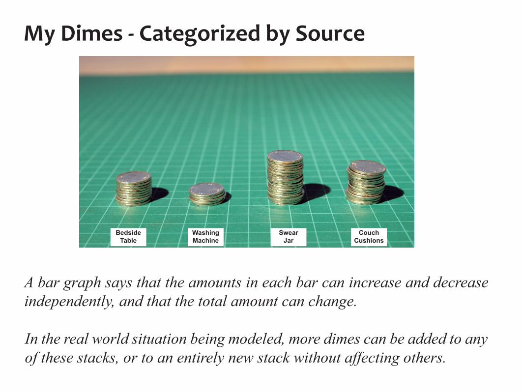
My Dimes - Categorized by Source
A bar graph says that the amounts in each bar can increase and decrease independently, and that the total amount can change.
In the real world situation being modeled, more dimes can be added to any of these stacks, or to an entirely new stack without affecting others.
BedsideTable
WashingMachine
SwearJar
CouchCushions
BedsideTable
WashingMachine
SwearJar
CouchCushions
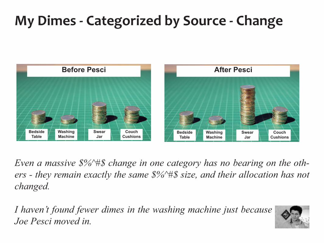
Even a massive $%^#$ change in one category has no bearing on the oth-ers - they remain exactly the same $%^#$ size, and their allocation has not changed.
I haven’t found fewer dimes in the washing machine just because Joe Pesci moved in.
My Dimes - Categorized by Source - Change
BedsideTable
WashingMachine
SwearJar
CouchCushions
Before Pesci After Pesci
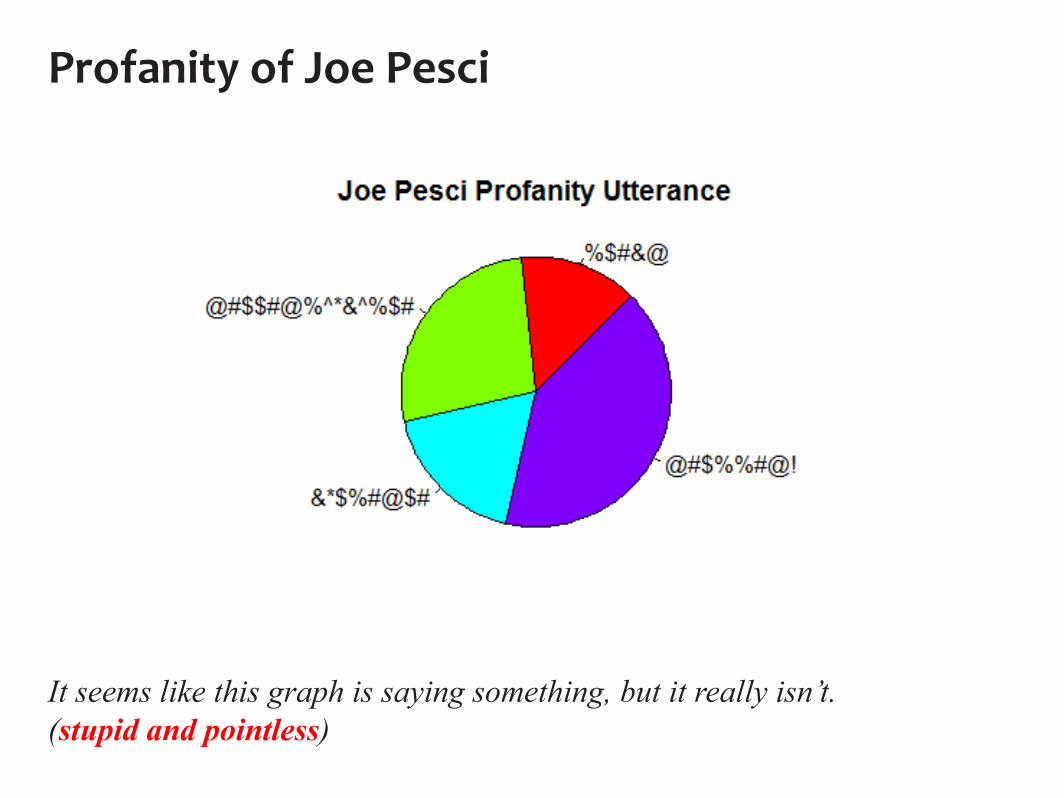
Profanity of Joe Pesci
It seems like this graph is saying something, but it really isn’t.(stupid and pointless)

It’s impossible to look at the second graph and not draw the conclusion that fewer dimes have been found in the Couch Cushions. (wrong)
My Dimes - Categorized by Source - Change
Before Pesci After Pesci

BedsideTable
WashingMachine
SwearJar
CouchCushions
BedsideTable
WashingMachine
SwearJar
CouchCushions
5 dimes added to each stackOriginal
When the dataset grows, the graph should grow
The pie graphs say that the swear jar and couch cushions produced fewer dimes (wrong) and the total number of dimes did not change. (wrong)
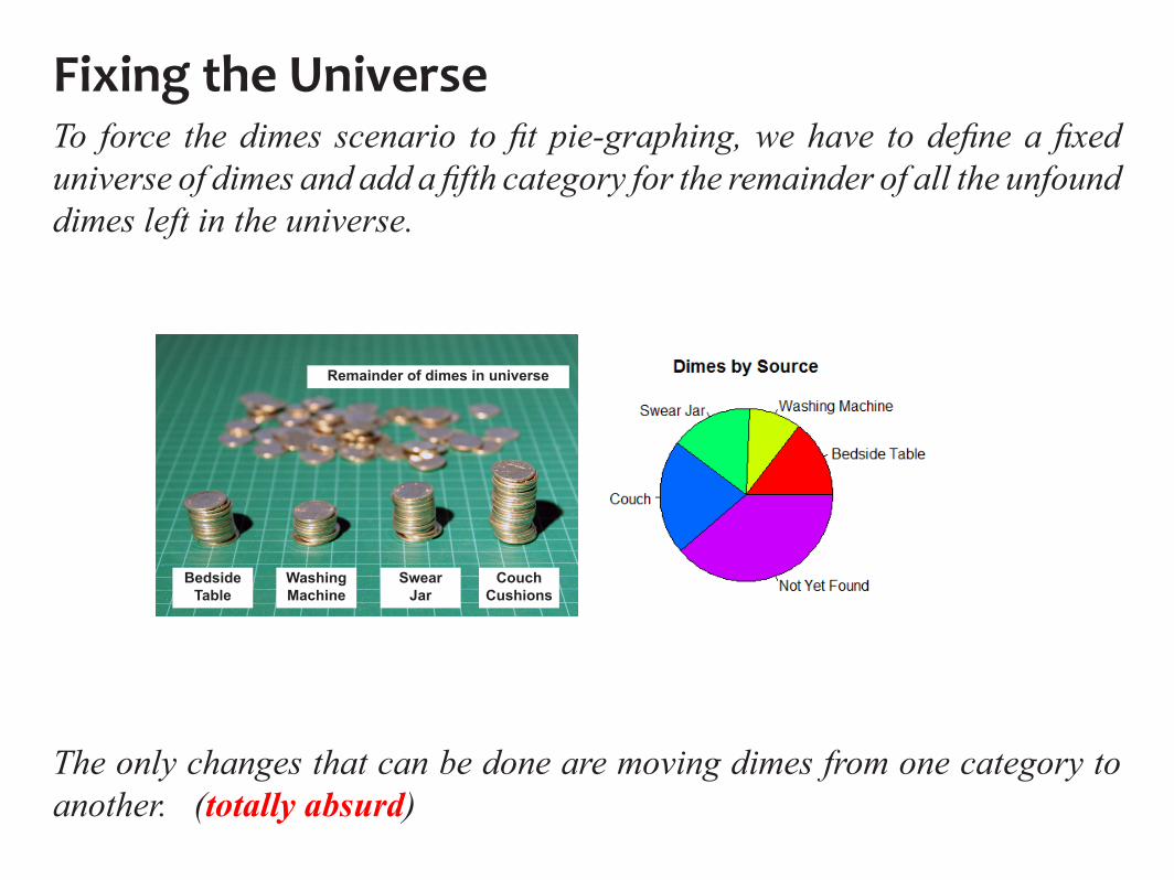
To force the dimes scenario to fit pie-graphing, we have to define a fixed universe of dimes and add a fifth category for the remainder of all the unfound dimes left in the universe.
BedsideTable
WashingMachine
SwearJar
CouchCushions
Remainder of dimes in universe
Fixing the Universe
The only changes that can be done are moving dimes from one category to another. (totally absurd)
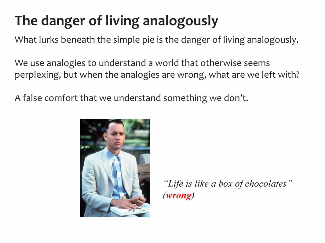
The danger of living analogouslyWhat lurks beneath the simple pie is the danger of living analogously.
We use analogies to understand a world that otherwise seems perplexing, but when the analogies are wrong, what are we left with?
A false comfort that we understand something we don’t.
“Life is like a box of chocolates”(wrong)


