Download - Agile mobile first

NLHTML5Mobile and TV development @ Netvlies

Agile mobile firstResponsibly responsive in an agile environment


Netvlies — Est. 1997

44 communicative professionals with 18 years of experience in complex online projects

What is our goal?
Being responsibly responsive in an agile environment

Topics
Leveling the playing fieldWhat do “responsive” and “mobile first” really mean? Theories and concepts.
An agile workflowThe consequences for your team: observations and advices.
An agile front-endHow to build for a changing environment: tips and techniques.
Conclusions and Q&A

Leveling the playing field

But what’s next? An iPad website? An N90 website? Can we really continue to commit to supporting each new user agent with its own
bespoke experience? At some point, this starts to feel like a zero sum game. But how can we —
and our designs — adapt?
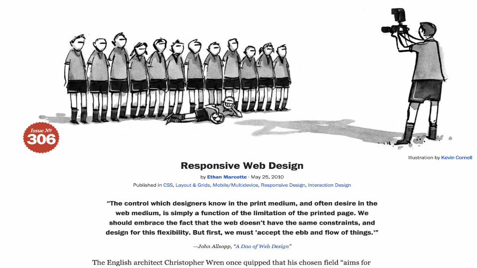
Ethan Marcotte — Responsive Web Design
“


Creating a website in a device-agnostic way, thus making its
content accessible and its interface usable to a diverse range of users.
— Me

Responsive
Fluid
Large phone
...
Adaptive
Liquid
Small tablet
...

All web pages are by default responsive
motherfuckingwebsite.com
Breaking that is your choice.

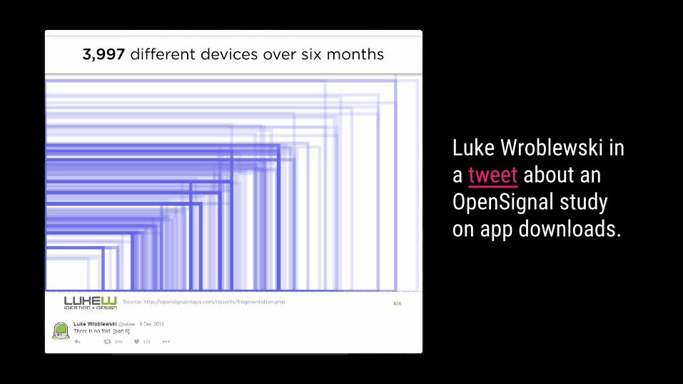
Luke Wroblewski in a tweet about an OpenSignal study on app downloads.

We need to expand beyond the viewport and consider how we support myriad device capabilities, how we retain accessibility in complex interfaces, and how
we deliver assets over the wire.
Scott Jehl — Responsible Responsive Web Design
“

Think of it like you're moving. If you're living in a mansion and you have to move into a small
apartment, it's really hard to find a place for all of your stuff. If you live in a small apartment first, you learn how to get by with less stuff, and you can then
add more stuff when you move into a mansion.
Clarissa Peterson, UX strategist
“


Your desktop website
Your user’s mobile browser


Content first
Performance first
Future proof
Progressive enhanced
Mobile first

“Constructing a website mobile first costs more time” ...not understanding what responsive/mobile first means?
...not willing to think about abstract systems?
...not enough proficient with the tools that are required to build it?
..scared of trying new things that may affect available hours?
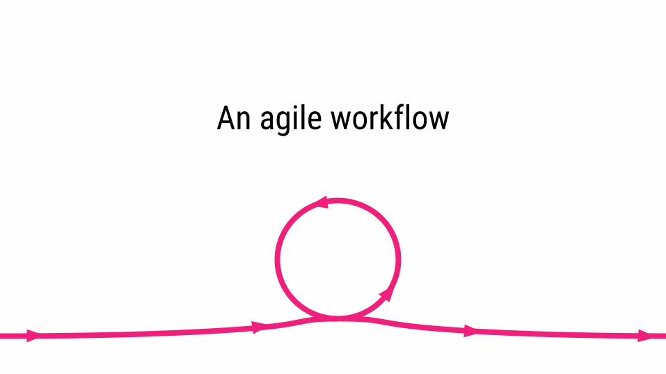
An agile workflow
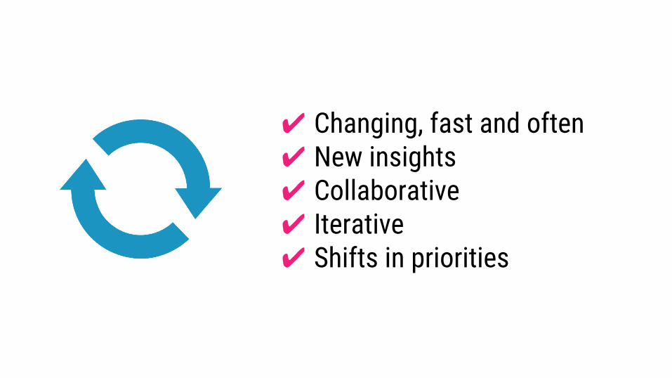
✔ Changing, fast and often✔ New insights✔ Collaborative✔ Iterative✔ Shifts in priorities

consequences for
Client communication

Things Clients Ask Who Don’t Understand Responsive
?
?
??
©

Things clients ask who don’t understand responsive
Can you put my products inside the screen at all times? Users
have to scroll now.
“

Things clients ask who don’t understand responsive
This text we have should always run
over two lines.
“

Things clients ask who don’t understand responsive
Why don’t these two columns have the
same height?
“

Things clients ask who don’t understand responsive
This image should align with the height of the text next to it.
“
Things clients ask who don’t understand responsive
It all has to fit on my screen; make
everything smaller.
“

Things clients ask who don’t understand responsive
At which resolution should we deliver the
designs?
“

consequences for
Design and concept
We already have component X! Let’s use it again on this new page.
Be prepared for this request
“

Component based
✔ Your client is already convinced ✔ Discuss what deliverables are ✔ Define the constraints with the team✔ Delivering a design system (styleguide)✔ Sell it!


/*---title: Buttonssection: Base CSS---
Button styles can be applied to any element. Typically you'll want to useeither a `<button>` or an `<a>` element:
```example:html<button class="btn">Click</button><a class="btn" href="/some-page">Some Page</a>```*/
.btn { background-color: black; color: white;}


Hello WorkspaceDefining the constraints

So...
✔ your entire team knows what responsive means✔ your entire team knows what mobile first means
✔ your entire team knows what the design implications are✔ you communicated what the design implications are
✔ your workflow is agile✔ you have set up a design system
Now, how to build the thing?

An agile front-end

We need a system that is
Brad Frost - Maintaining Design Systems
✔ official✔ maintainable✔ cross-disciplinary✔ approachable
✔ visible✔ agnostic✔ contextual(and more)

We need this

Even when the final deliverable is a pattern library, clients often still expect to
sign off on page designs.
Charlotte Jackson — From Pages to Patterns: An Exercise for Everyone, ALA
“


There are two hard things in computer science: cache
invalidation and naming things.
Phil Karlton
“

There are two hard things in computer science: cache
invalidation, naming things and off-by-one errors.
— Internet joke
“

Charlotte Jackson — A List Apart
Part one: paper and scissors
Part two: naming components
Part three: code
From Pages to Patterns: An Exercise for Everyone
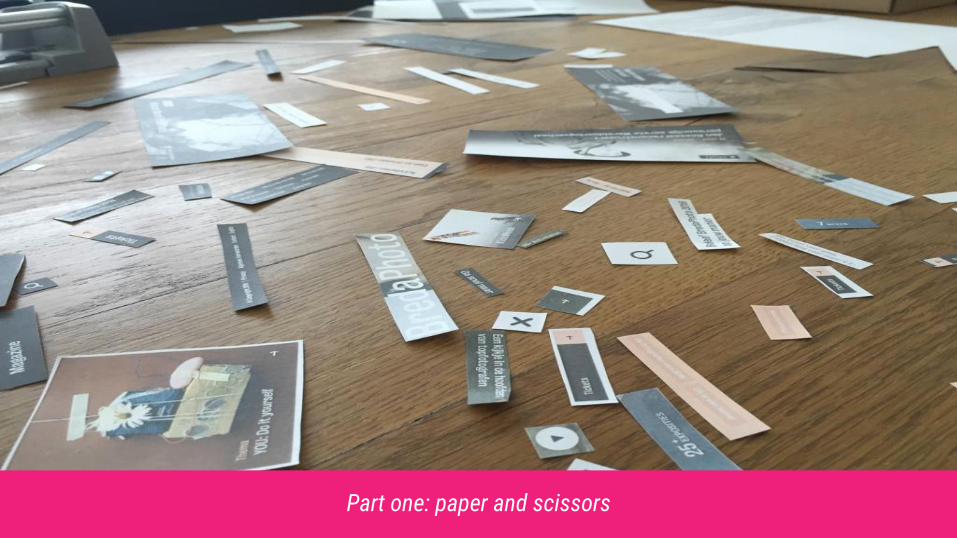
Part one: paper and scissors

Part one: paper and scissors

Part two: naming components

Part two: naming components
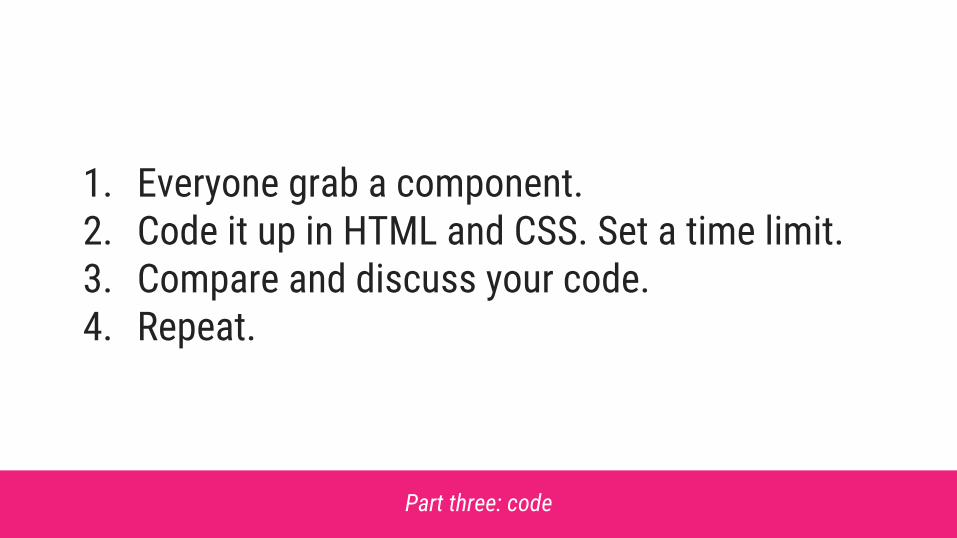
Part three: code
1. Everyone grab a component.2. Code it up in HTML and CSS. Set a time limit.3. Compare and discuss your code.4. Repeat.

Dare to challenge coding conventions&
test your assumptions
{ ? }

html { font-size: 1em;}
/** * Headings are always ‘just a bit bigger’ than body copy. */
h1, h2, h3, h4, h5, h6 { font-size: 1.25rem;}

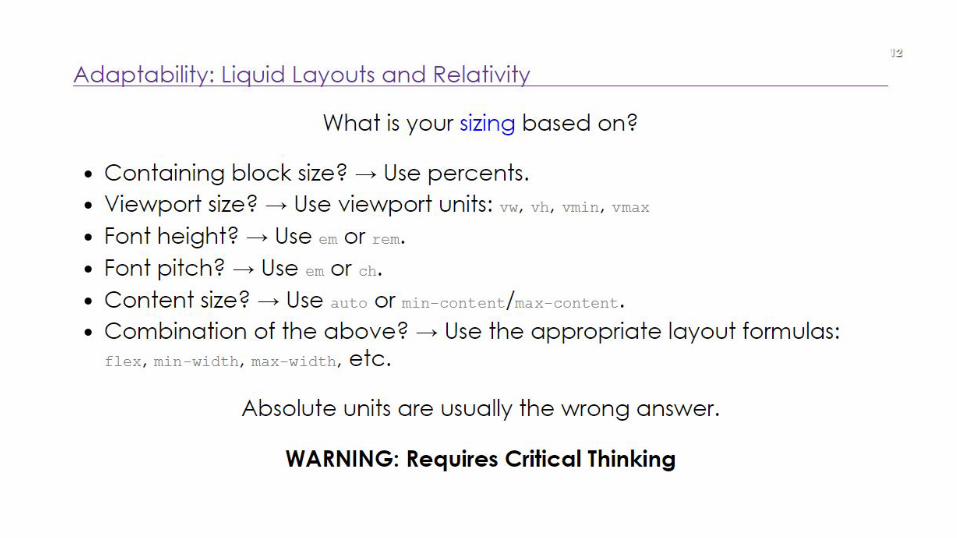
Absolute units are usually the wrong answer.
Elika J. Etemad (fantasai) — CSS Best Practices
“

And other tips
✔ Go for modular CSS as much as possible✔ Avoid using ID's✔ Avoid nesting selectors✔ Keep the specificity graph in mind✔ Make use of progressive enhancement✔ Embrace new technologies where possible

Harry Roberts — The Specificity Graph

We have a codebase that is likely to prove problematic because we have erratic and
poorly managed specificity-and-source-order: we are more likely to spend time undoing or
negating the effects of high specificity CSS that was defined too early in the project.
Elika J. Etemad (fantasai) — CSS Best Practices
“

Harry Roberts — The Specificity Graph

Functional CSSComponent-driven design vs. component-driven CSS
Cole Peters — Building and shipping functional CSS
<div class='u-relative u-mt1 u-p2 v-bg-white v-bs2'> <!-- The contents of the card --></div>

Functional CSSComponent-driven design vs. component-driven CSS
Cole Peters — Building and shipping functional CSS
<div class='u-relative u-mt1 u-md-mb0 u-p2 v-bg-white v-bs2'> <!-- The contents of the card --></div>
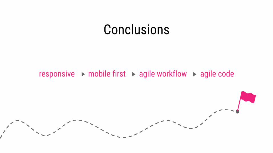
Conclusions
responsive mobile first agile workflow agile code

ConclusionsWhat’s the necessary basis for doing this right?
✔ Determine if everybody on your team understands "responsive"
✔ Determine if everybody on your team understands "mobile-first"
✔ Research, setup and evaluate your agile, componentized workflow
✔ Dare to challenge coding conventions and test your assumptions
Thanks!Questions?
?Jelmer de Maat
Front-end developer @ Netvliesnetvlies.nl
[email protected]@jelmerdemaat


