document title - swbh.nhs.uk€¦ · web view... layout design , performance and ... world class...
TRANSCRIPT

digital presence review
1

Sandwell and West Birmingham Hospitals NHS Trust
v1
2

ContentsIntroduction...............................................................................................3Performance...............................................................................................5Initial impressions......................................................................................6
The header..............................................................................................7Page title.................................................................................................8Proposition..............................................................................................9Navigational hierarchy...........................................................................0
www.swbh.nhs.uk................................................................................0bmec.swbh.nhs.uk...............................................................................0swbhengage.com.................................................................................1
Headings and page titles............................................................................2Content priority and layout........................................................................3
Accessibility............................................................................................4Social media...............................................................................................5
Sandwell and West Birmingham Hospitals NHS Trust...........................5Twitter.................................................................................................5Facebook..............................................................................................5YouTube...............................................................................................5
Engage....................................................................................................6Birmingham and Midland Eye Centre.....................................................6
3

Introduction
The following document critiques the web presence of the Sandwell and Birmingham NHS Trust. It takes into account accessibility, usability, architecture, layout design, performance and social media.
Copy and content reviews will be carried out elsewhere. Please note that as this is an overview, all the opinions expressed are made without recourse to structured user analysis or data (e.g. via Google Analytics).
If further analysis is required, we would suggest that the first step be a detailed analysis of user needs via focus group, user questionnaires and your analytics.
The three sites critiqued in this document are:
Sandwell and West Birmingham Hospitals NHS Trust main website (https://www.swbh.nhs.uk/)
This is the main website for the Trust with a top line navigation of Home, About Us, Patients & Visitors, Services, GP Information, News, Work For Us, Our Charity and Contact Us
The homepage features a carousel with articles and services: Chief Executive’s Blog, Patients’ Feedback, Laser Hair Removal, FINCH Service, Laser Tattoo removal, Nail Surgery and Birmingham Carrots
There are also links to visiting times, our services, changing your appointment, news, get involved and Visit BMEC (Birmingham and Midland Eye Centre)
The SWBH NHS Trust Twitter profile (@SWBHnhs) has 1,672 followers, 3,277 tweets and is following 587 people
There is also a Facebook page for Sandwell and West Birmingham Hospitals (https://www.facebook.com/SWBHnhs?fref=ts) which has 310 likes and 27 talking about this
Engage (https://swbhengage.com/)
Brings health promotion and social networking together – advice about healthy living and users can sign up to become a member (which includes a newsletter 3 times a year, automatic membership of the Engage online community, invitations to attend health talks, consultations and surveys, opportunity to join focus groups and opportunity to become a Governor
Site for sharing experiences, giving opinions and making contact on anything and everything that is health related
Has around 7,500 members
Birmingham and Midland Eye Centre (https://bmec.swbh.nhs.uk/)
4

Part of the Trust and one of the largest facilities of its kind in Europe – receives referrals from hospitals and GPs across the region – range of services include ophthalmology A&E, diagnostics, day surgery, out patients, and administrative/educational facilities
Top line navigation of Home, About Us, Services, Consultants, Patients, Media, Research, Contact Us and Healthcare Professionals
Carousel on homepage features follow us on Twitter, History of BMEC, World Class Services, Supporting our Patients, Be Part of the Solution and Birmingham Carrots
There are also links to find us, services, research, latest news, change your appointment, eye conditions & treatment, healthcare professions, news
The BMEC Twitter profile (@SWBH_BMEC) has 52 followers, 156 tweets and is following 40 people
Birmingham Midland Eye Centre Facebook page has been merged with Birmingham Eye Hospital which has 37 likes and 3,708 people who have been here
5

6

Performance
The table below shows the relative time it takes for each site to load. We have used a free speed test from gtmetrix.com, and results may vary from other speed testers based on location and network conditions.
Website First view Result
https://www.swbh.nhs.uk/
6.88s Slow
https://bmec.swbh.nhs.uk/
7.04s Slow
https://swbhengage.com
8.53s Slow
Across the board the sites are not performing particularly well in terms of load speeds. Within your CMS (Wordpress) there are various strategies you can use to improve page load speeds including employing minification, a technique to reduce the number of CSS and JavaScript files in the site.
7

Initial impressions From a design perspective the Trust, BMEC and Engage homepages all received positive feedback from our team.
They are very clean, and define clear user journeys into important content areas through the presentation of large promotional panels. However there are some areas in which their homepages in particular could benefit from some improvement.
Upon arriving at a site a user will automatically look to establishing a context for their visit, asking questions like:
Where am I? How did I get here? What action do I want to achieve by my visit?
It is therefore very important that a site’s homepage clearly establishes the answers to these questions in order to allow the user to orient themselves correctly. Conventionally, objects that allow them to do so include:
Logos and branding A clear value proposition Representative page titles A clear URL
The first section in this report looks at these elements to decipher the first impression your site gives.
8

The headerThe header is the area of the page that users rely on to provide locative and contextual information. Typically readers will read from the top left of the page, in an ‘F’ shaped pattern across the core content area beginning in the extreme top left.
This area of top priority should house the logo or identifier for the site you are currently on. On the NHS Trust site there is an image with the tagline ‘Where everyone matters’ with no indication that this is the Trust’s main site. From a user perspective, the question ‘Where am I?’ is answered insufficiently, they will be aware that the site is related to the trust via recourse to the logo on the right hand side, however there is no clear signpost as to what part the site plays in the organisation.
The BMEC header is much better as it employs the use of the service logo, which indicates what the site actually is. Equally the Engage site displays the logo of the service prominently in this location and therefore does a much better job of matching the users expectations in this sense.
9

Page titleHome page titles are a great location to spell out the proposition for a particular site and provide a frame for on page content beneath it.
The title on the home page for both the Trust site and the BMEC cycles through a number of brand values ‘professional and knowledgeable, open and accountable’ etc but it doesn’t actually provide any more context for the visitor as to where they are, or signpost how they can complete the goals associated with their visit.
From a user perspective including terms which reflect your brand, that you want to emphasise is a good thing, and these terms should be included in a central proposition but the main heading on a web page is conventionally a locative or instructive element and it is best not to confuse a user’s by going against their expectations in this way.
Conversely the Engage website does a good job of setting out its stall by removing this confusing heading and promoting the highlights carousel to the first piece of content a user comes to. The content of this carousel
10

accurately describes the scope of the service and the reasons to sign up.
PropositionOn both the Trust and the BMEC sites the core proposition is explicitly spelt out through a few lines of text underneath the main homepage banner, and illustrated through the main banner itself.
The large promotional banner contains feature content for the hospital, and through its composition aids the user in their understanding of the breadth of the work undertaken by the hospital.
Rather than being primary information however a user might expect for this content to appear below an explicit proposition, in support of it, it is certainly from a layout (and text size) perspective easy to miss.
The Engage site also has a central banner, however it performs a slightly different job to the other carousels on
11

the other sites. Rather than be a space for ‘featured content’ it presents the proposition for the community making it clear for the user across 4 panels.
12

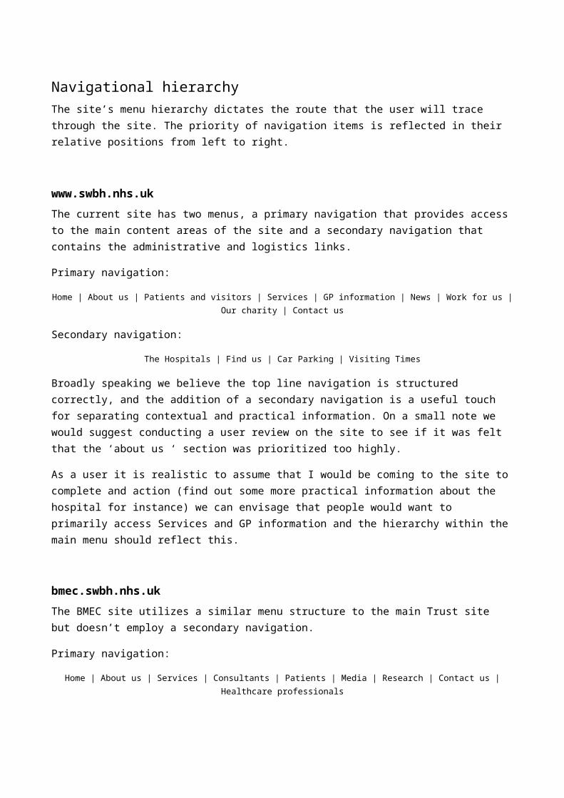
Navigational hierarchyThe site’s menu hierarchy dictates the route that the user will trace through the site. The priority of navigation items is reflected in their relative positions from left to right.
www.swbh.nhs.ukThe current site has two menus, a primary navigation that provides access to the main content areas of the site and a secondary navigation that contains the administrative and logistics links.
Primary navigation:
Home | About us | Patients and visitors | Services | GP information | News | Work for us | Our charity | Contact us
Secondary navigation:
The Hospitals | Find us | Car Parking | Visiting Times
Broadly speaking we believe the top line navigation is structured correctly, and the addition of a secondary navigation is a useful touch for separating contextual and practical information. On a small note we would suggest conducting a user review on the site to see if it was felt that the ‘about us ‘ section was prioritized too highly.
As a user it is realistic to assume that I would be coming to the site to complete and action (find out some more practical information about the hospital for instance) we can envisage that people would want to primarily access Services and GP information and the hierarchy within the main menu should reflect this.
bmec.swbh.nhs.ukThe BMEC site utilizes a similar menu structure to the main Trust site but doesn’t employ a secondary navigation.
Primary navigation:
Home | About us | Services | Consultants | Patients | Media | Research | Contact us | Healthcare professionals
Concerns over top line menu hierarchy are still present, our feeling would be that about us is still not as important as service pages to the majority of users.
Secondly we would advise the implementation of the secondary navigation, users will utilize this menu to find out how to access this service (car parking and directions).

swbhengage.comThe primary site navigation has a different purpose than it does on the other two sites. The reason for this is that most users coming to the Engage site will login straight away to their dashboard, which enables them to complete and review site activities.
This should be utilized to encourage more individuals to sign up to the service, and this is why the ‘Members’ section is correctly positioned after the home page.
Primary navigation
Home | Members | Events | Discussions | Health Advice | Blog | Kids Zone | Featured | Get Involved |
About engage
Having said this we feel that ‘Members’ could actually be labelled more effectively to encourage people to join the scheme (which appears to be its purpose as a section) perhaps along the lines of ‘Join the community’ or ‘sign up’.
page 1 of 22
page 2 of 22

Headings and page titlesHeadings and page titles should be positioned prominently at the top of every page. They should reflect the on page or sectional content and, if the site is using valid html markup should be positioned within the <h1> tag.
As an example heading structure for a given page
<h1> Patients & Visitors</h1>
<h2> Patients & Visitors</h2> (menu sub-heading)
<h3>Wards</h3>
This is a good heading structure from an SEO and accessibility point of view, however from a usability perspective one would expect the largest heading on the page ‘Professional and knowledgeable’ to be the page title.
Again this brand value doesn’t accurately describe the purpose of the page and is confusing. This heading structure is replicated on the BMEC site with a similar problem.
The Engage site has a better structure, using this primary piece of on-page space to position an accurate page heading.
page 3 of 22

Content priority and layoutThe way a reader consumes the main content area of a site depends to a large extent on who the reader is and what they are reading, however, numerous eye-tracking case studies have proven that people tend to consume online content in an F shape pattern (indicative of the content which then receives most attention and ignorant of vertical menus).
In the below examples we have applied this general rule across a selection of pages from each of the three sites you manage.
page 4 of 22

On the Trust and BMEC sites on page content seems to be prioritised correctly. Most important promotional panels (from a user perspective) are accommodated within the top arm of the F and those of secondary importance are positioned underneath. However on the Engage site it might be worth considering moving the large sign up button box so that it achieves greater prominence.
AccessibilityWe have run your sites through the web aim accessibility tool to perform a cursory audit of site features to ensure that the site allows for the broadest possible access. The tool we used can be found here http://wave.webaim.org/
The sites score very well on the majority of accessibility points and even includes the ability to increase the size of fonts for those with impaired vision, there are however a few elements to be addressed with regards to colour contrast.
Active top level navigation and sub category links on the homepage both have very poor colour contrast and this should be addressed.
The Engage site also has some issues with colour contrast.
Chiefly with the use of the electric blue #00baff, which both as a foreground and background colour fails accessibility tests.
This colour should be altered to ensure the website is compliant to web standards and accessible for those with impaired vision.
None of your sites make allowances for access from mobile devices. Responsively designed websites are becoming increasingly important as users now expect to be able to access content on smartphones and tablets.
page 5 of 22

Social media
Sandwell and West Birmingham Hospitals NHS TrustTwitter
1,672 followers, 3,277 tweets and is following 587 people
The Trust’s Twitter feed is used to push a number of different pieces of content, it is a contact point for patients asking questions, as well as a promotional tool for health services, relevant events and job openings. The feed contains a mix of multimedia including photography, the frequency of posts with media content in them could however be increased.
More generally there needs to be a greater regularity of tweets being posted to avoid maintenance of the feed looking intermittent, this is especially important in healthcare as people may use the twitter feed to ask about illness or hospital services. Equally when someone tweets at the hospital, these posts are simply retweeted, to try and engender more engagement with their audience social media managers should look at acknowledging a tweet with a direct response where possible.
Facebook 310 likes and 27 talking about this
In general it is clear that the Facebook page receives less attention than the twitter profile does as the majority of content on the page is automatically generated posts from tweets, rather than unique content.
While it is good to have cross referencing to the tweets, it may perhaps be better to personalise the Facebook page and add in a much wider variety of content (such as encouraging users to send in photos or videos) It is, for instance, the perfect place to promote feature content such the Chief executive’s blog.
YouTube 9 subscribers and 7,942 views in total – average of 499.81 views per video
Having a YouTube channel is a very helpful thing to have as both a place to store video content which can be used elsewhere, but also as another channel for engaging with your audience. Your channel is well populated and has a good mix of content.
page 6 of 22

Having said this the standard of videos is very mixed with some professionally filmed and others clearly filmed on a mobile phone or poor quality video camera.
It would also improve things to help users find relevant content it would be good to categorise the videos into playlists so users can easily find what they are looking for.
page 7 of 22

EngageFor a website that ‘brings health promotion and social networking together under one roof’ it seems odd that Engage does not have either a Facebook page or a Twitter profile – it does have a twitter feed of SWBH NHS Trust but is not generating its own content which means it cannot engage with its target audience (of over 500,000 people).
If profiles are set up then an initial way of getting more interaction would be to both tweet out to relevant organisations (gyms in the area, health food shops etc.) and follow them to try and get follower numbers up.
Birmingham and Midland Eye Centre52 followers, 156 tweets and is following 40 people
Most content is retweets of relevant job positions from the main SWBH NHS Trust twitter profile or tweets from campaigns such as the Glaucoma campaign. A greater level of engagement could be reached through BMEC tweeting out to relevant organisations and groups (such as RNIB or the Macular Degeneration Society).
These organisations should also be followed and connected with to increase follower numbers.
page 8 of 22