do federally assisted households have access to high...
TRANSCRIPT

Prepared by Ingrid Gould Ellen and
Keren Mertens Horn
Civil Rights ResearchNovember 2012
Do Federally Assisted Households
Have Access to High Performing Public Schools?

ACKNOWLEDGMENTS
The authors would like to thank Stephanie Rosoff and Abigail Rudow for excellent research assis-tance, colleagues at the Furman Center for Real Estate and Urban Policy for helpful comments,and the Poverty & Race Research Action Council for its generous support.

Prepared by Ingrid Gould Ellen and
Keren Mertens Horn
Civil Rights ResearchNovember 2012
Do Federally Assisted Households Have Access to High Performing
Public Schools?

__________________________
ii
ABOUT THE AUTHORS
Ingrid Gould Ellen is Professor of Public
Policy and Urban Planning at NYU’s
Wagner Graduate School of Public Service
and Co-Director of the Furman Center for
Real Estate and Urban Policy;
Keren Mertens Horn is Assistant Professor
in the Economics Department at the
University of Massachusetts Boston.

IntroductionA family’s housing unit provides more than simplyshelter. It also provides a set of neighborhood ameni-ties and a package of local public services, including,most critically, a local school. Yet housing and edu-cation policymakers rarely coordinate their efforts,and there has been little examination of the schoolsthat voucher holders or other assisted householdsactually reach. In this project we describe the ele-mentary schools nearest to households receivingfour different forms of housing assistance in thecountry as a whole, in each of the 50 states, and inthe 100 largest metropolitan areas. We compare thecharacteristics of these schools to those accessibleto other comparable households. We pay particular attention to whether voucher holders are able toreach neighborhoods with higher performing schoolsthan other low-income households in the same geographic area.
In brief, we find that assisted households as a wholeare more likely to live near low-performing schoolsthan other households. Surprisingly, Housing ChoiceVoucher holders do not generally live near higherperforming schools than households receiving otherforms of housing assistance, even though the voucherprogram was created, in part, to help low-incomehouseholds reach a broader range of neighborhoodsand schools. While voucher holders typically livenear schools that are higher performing than thosenearest to public housing tenants, they also typicallylive near schools that are slightly lower performingthan those nearest to households living in Low Income Housing Tax Credit (LIHTC) and Project-based Section 8 developments and lower performingthan those nearest to other poor households.
Our analysis is based on the most recent available datafrom 2008-09, which means that the data do not take
into account the efforts of HUD and state housingagencies to improve the operation of their housingprograms over the past four years. The data will alsonot reflect the full impacts of the recession and housingcrisis on subsidized housing location patterns. We arelooking forward to comparing this baseline data with2012 data when they become available.
BACKGROUND
Roughly one in four eligible households in theUnited States receives a housing subsidy from thefederal government.1 These subsidies come in manydifferent forms, but in this report we focus on thefour programs that constitute the overwhelming majority of federal assistance: Public Housing; Project-based Section 8; Low Income Housing TaxCredits; and Housing Choice Vouchers. The pro-grams collectively serve millions of householdsaround the country.
� Roughly 1.2 million households (including morethan 360,000 households with children underthe age of 18) live in traditional public housing,which is owned and operated by local governmentauthorities around the country.
� Another 1.5 million households live in privatelyowned housing that is subsidized by the U.S. Department of Housing and Urban De-velopment. The largest of these programs is the Project-based Section 8 program, which provideshomes for about 1.2 million households andapproximately 400,000 households with children.
� The largest current low-income housing pro-duction program is the Low Income HousingTax Credit program, which now houses roughly2.5 million households.2 The LIHTC providesa dollar-for-dollar federal tax reduction to investors who provide equity contributions to
__________________________
1 See Ingrid Gould Ellen, “Rental Housing Policy in the United States: Key Facts and Critical Trade-Offs,” Presentation at a White House convening,The Next Generation Housing Policy: Convening on Rental Housing, October 13th, 2010. http://furmancenter.org/inthenews/testimonies/
2 There is no nationally available information on the tenants living in LIHTC developments, but we assume that housing units with at least two bed-rooms house families with children. Using this proxy, we estimate that the LIHTC program houses about 900,000 households with children nationally.
1
develop affordable rental housing through theprogram.
� Finally, the federal government provides tenant-based subsidies through the Housing ChoiceVoucher program, which currently serves over2 million households, including over 1.2 millionhouseholds with children and over 2.5 millionchildren under the age of eighteen.3
In our analysis we describe the schools near householdswith children living in these four types of assistedhousing, and compare them to those near otherlow-income households with children, for the nationas whole, the 50 states separately, and the 100 largestmetropolitan areas. We pay particular attention towhether Housing Choice Voucher holders are ableto use their more flexible form of assistance to reachneighborhoods with higher performing schools. Wealso examine whether outcomes vary for householdsof different races – focusing specifically on thevoucher program.
MethodologyOur research involves two basic tasks: (1) identifyingthe schools accessible to assisted households andother comparable households in the relevant geo-graphic area; and (2) comparing the characteristicsand performance of those schools.
LINKING ASSISTED HOUSEHOLDS TO SCHOOLS
Although we do not have access to school zoneboundaries for every area in the country, we are
able to identify the district elementary school nearestto each assisted household with school-age children.While the nearest school within a district will notalways be the household’s zoned school, our analysissuggests that it is in most cases and certainly providesa good proxy for the educational opportunities avail-able to that household.4 For unassisted households,we are able to match them to the elementary schoolnearest to the central point (“centroid”) of the censustract in which they live.
We use this method to identify the schools accessibleto four types of assisted households with children:5
voucher holders with children, households withchildren living in public housing, households withchildren living in Project-based Section 8 develop-ments, and households living in LIHTC units withat least two bedrooms. We compare the characteristicsof schools nearest to these groups to the characteristicsof schools nearest to the larger population of house-holds with children, to renter households with chil-dren, and to households with children living belowthe poverty line.
To approximate the characteristics of the schoolsnearest to these larger groups, we use census tractdata from the American Community Survey (ACS).From the ACS, we draw counts of all householdswith children, renter households with children,households with children living below the povertyline, and households with children by race living ineach census tract. We then link every householdgroup within a census tract to the elementary schoolnearest to the centroid of that tract.
__________________________
3 The assistance provided by vouchers is substantial. Based on income, the median voucher household with children earns approximately $13,000annually, has a family size of 4, and lives in a unit that rents at $1,000 per month. For this family, the voucher is equivalent to an increase in post-tax income of approximately $8,000 annually, increasing their income by 60 percent. We seek to evaluate whether households are able to use thisform of assistance to reach neighborhoods with higher performing schools.
4 In another analysis, we found that for 74 percent of all HUD assisted households in New York City, the nearest school within the community schooldistrict is in fact their zoned school (Ellen and Horn, 2012). In smaller school districts (many of which have only one or a few elementary schools),the nearest school within the school district is even more likely to be the zoned school. In some districts, students may choose from a number ofdifferent schools outside their local zone, although this is more common for students attending middle schools and high schools.
5 We define households with children as households with persons under the age of 18.
2

CREATING MEASURES OFSCHOOL PERFORMANCE
Experts in the field of education continue to debatethe best way to evaluate the performance of publicschools. Ideally, we would like to evaluate schoolson their ability to improve students’ future employ-ment outcomes, their earnings potential, or maybeeven their future happiness or life satisfaction. We would like to identify which schools, if any, playa role in decreasing the likelihood that a child willturn to a life of crime or rely on public assistance. It is extremely rare, however, to have access to such long-term measures; moreover, it is not practi-cal to wait many years to learn how a school is performing.
For the most part, researchers and policymakershave instead assessed schools by the test scores oftheir students, as these scores are easy to measureand give real-time feedback.6 Additionally, thereexists some evidence that mean performance onstandardized tests captures an important dimensionof school quality. For example, Chetty et al.7 findevidence that attending a kindergarten class withhigher achieving peers can improve test scoresthroughout elementary school and boost earningslater in life. Although test scores are clearly imperfect,they are often the most salient pieces of informationthat households have on their local school as well asthe most widely available measure of performance.
Therefore, we rely on test scores as our key measureof school performance throughout the analysis.
For these measures to be comparable across statesand metropolitan areas, we have to grapple with thegreat variation in standardized tests used acrossstates. To address this variation, we create a measureof school performance using the percentile rank foreach school within every state based on studentproficiency rates in math and English language arts.To provide a broader picture of the schools, we sup-plement these test score data with the share ofstudents eligible for free or reduced price lunch.We also report on the share black and Hispanic onthe individual metropolitan area tables provided inAppendix B.8
We describe the medians of these measures forschools nearest to all our categories of households.We also report on the share of households in eachgroup whose nearest elementary school is above thestate median with respect to test scores and theshare whose nearest school is ranked in the bottom10th percentile of the state distribution in terms oftest scores. Additionally, we report the share ofhouseholds in each group whose nearest school hasfewer than 20 percent of students eligible for freeand reduced price lunch and the share whose nearestschool has more than 80 percent eligible for freeand reduced price lunch. Finally, for voucher holders,we look at outcomes separately by household race.
3
__________________________
6 For some examples see Koretz, Daniel, Sheila Barron, Karen J. Mitchell, and Brian M. Stecher. 1996. “The Perceived Effects of the Kentucky Instruc-tional Results Information System.” Rand Monograph Report MR-792-PCT/FF, Rand Corporation, Santa Monica, CA; Jacob, Brian A. 2005. “Account-ability, Incentives and Behavior: The Impact of High Stakes Testing in the Chicago Public Schools.” Journal of Public Economics 89(5–6): 761–96;Cullen, Julie B. and Randall Reback. 2006. “Tinkering Toward Accolades: School Gaming under a Performance Accountability System.” In ed.Michael Baye and John Maxwell, Improving School Accountability, Advances in Applied Microeconomics, 14: 1-34; Sanbonmatsu L, Kling, J.R.,Duncan, G.J., and Brooks-Gunn, J. 2006. “Neighborhoods and Academic Achievement: Results from the Moving to Opportunity Experiment.” Jour-nal of Human Resources, 41(4): 649-691; DeLuca, Stephanie and Peter Rosenblatt. 2010. “Does Moving To Better Neighborhoods Lead to BetterSchooling Opportunities? Parental School Choice in an Experimental Housing Voucher Program.” Teachers College Record, 112(5): 1443-91; Har-ris, S. 2011. Value-added Measures in Education. Boston: Harvard University Press.
7 Chetty R., Friedman, J.N., Hilger N., Saez E., Schanzenback, D.W. and Yagan D. 2010. “How Does Your Kindergarten Classroom Affect Your Earnings:Evidence from Project STAR.” NBER Working Paper, 16381.
8 Comparisons between the racial composition of schools nearest to assisted households and schools nearest to other households is not meaning-ful at the national level because they may simply capture differences between the racial composition of population in the regions of the countrywhere assisted households are more concentrated and that of other regions. This is true for percent of students eligible for free and reduced pricelunch as well, but the variation in poverty across states and metropolitan areas is not as great as the variation in racial composition.

In Appendix A, we present tables for each of the 50states. In Appendix B, we show tables for each ofthe largest 100 metropolitan areas. For the metro-politan area tables, we rely on rankings of schoolswithin the metropolitan area.
DataThis analysis relies on a variety of different largedata sources, which have been brought together forthe first time, making it possible to explore the char-acteristics of schools available to assisted householdswith children. We have access to a national file ofsubsidized housing tenants in 2008 from the De-partment of Housing and Urban Development(HUD), which provides the residential address of allassisted households, other than LIHTC tenants, aswell as the income, race, and composition of eachhousehold. We then supplement these datasets withHUD’s publicly available Low Income Housing TaxCredits dataset, which includes the address of everyLIHTC development placed in service by 2009.
To measure the performance of each school, wehave data from the Department of Education thatprovide the proficiency rates in math and Englishfor students in all public schools in the country for
the 2008-2009 school year. We also take advantageof the Common Core of Data (a product of the USDepartment of Education’s National Center for Ed-ucation Statistics) for additional school characteristics,including measures of school-level poverty rates(specifically the share of students who are eligiblefor free or reduced price lunch) and racial composition,as well as the location of each elementary school.
AnalysisNATIONWIDE RESULTS
Tables 1, 2, and 3 present our comparisons of assistedhouseholds with children to other households withchildren in the general population for the UnitedStates. (We replicate these tables in the appendicesfor each of the 50 states and each of the 100 largestmetropolitan areas in the country.) Table 1 showsthe median characteristics of schools nearest toassisted households and other households with chil-dren. We see that recipients of all four major typesof federal housing assistance generally have accessto an elementary school that ranks quite low withintheir state. The median state test score ranking forelementary schools nearest to public housing tenantsis the 19th percentile. In other words, the schoolnearest to half of public housing tenants ranks at or
4
Table 1. Median Characteristics of Schools Nearest to Assisted Households and Other Households with Children
Proficiency Percentile % Free/ReducedUSA Rank Math/ELA Price Lunch
Housing Choice Voucher Households 26 74.1%
Public Housing 19 82.1%
Project Based Section 8 28 68.6%
LIHTC** 31 67.1%
All Households 53 45.9%
All Renters 37 66.8%
Poor Households 30 73.1%
** To proxy for units with children, all units with fewer than 2 bedrooms are removed

below the 19th percentile of public schools in theirstate. For voucher holders with children, the medianstate ranking of their nearest school is the 26th per-centile. While this ranking is somewhat higher, it isstill well below their state’s median. The medianranking of the schools nearest to tenants in Project-based Section 8 developments is the 28th percentile;while the median ranking of the schools nearest toLIHTC tenants is the 31st percentile.
The bottom rows of the table show how assistedhouseholds with children fare in comparison to awider range of households, most of whom are notliving in subsidized housing. (Note that as thesecomparison groups are constructed from censusdata, they include voucher holders as well as otherhouseholds with housing assistance; differences be-tween these groups are thus biased downwards tosome degree). The median school nearest to publichousing residents is significantly lower performingthan the median schools nearest to all households,to renters, and even to households living below thepoverty line. Public housing residents also live nearschools that have significantly higher poverty rates,again, even in comparison to those near to householdswith incomes below the poverty line.
The schools nearest to voucher households andtenants of Project-based Section 8 developmentshave median performance levels higher than thosenearest to public housing tenants, but their nearestschools are still ranked below the median schoolnearest to households living below the poverty line.These unfavorable comparisons are troubling, asone would assume, at least in the case of vouchers,that the additional income should provide low-income households with sufficient resources to im-prove on (or at least match) the residential outcomesof other households living in poverty. The oneassisted group that is able to reach schools thatappear more advantaged than those accessible topoor households is tenants living in tax credit devel-opments. The median school near tenants living inLIHTC developments is ranked slightly higher andhas a lower poverty rate than the median school
nearest to poor households. Still, the median schoolnearest to LIHTC tenants is ranked below themedian school nearest to renters as a whole.
Table 2 reveals more about the distribution of house-holds with children across schools, by reporting onthe share of households who live near schools thatare ranked in the top 50th percentile and the bottom10th percentile with respect to test scores as well asthe share of households who live near schools thathave shares of students eligible for free and reducedprice lunch of below 20 percent and above 80percent. We again find very similar patterns. Abouta third of Public Housing and Project-based Section8 tenants live near schools that are ranked in thebottom 10th percentile based on performance. Abouta quarter of Housing Choice Voucher holders and23 percent of LIHTC tenants live near schools per-forming at this low level. Looking at the householdswho live near schools ranked at or above the median,we find that many more LIHTC tenants are able toreach high performing schools. One third of LIHTCtenants live near high performing schools, in comparison to just 25 percent of tenants living inProject-based Section 8 developments, 26 percentof voucher holders, and 19 percent of public housingtenants. The contrasts are perhaps even more strikingwhen we consider the share of tenants who livenearest to a school in which more than 80 percentof students are eligible for free and reduced pricelunch. Just over a third of LIHTC tenants livenearest to such a high-poverty school, as comparedto 41 percent of Housing Choice Voucher holdersand 53 percent of public housing tenants.
FURTHER EXPLORATION OFSCHOOL LOCATION OUTCOMESFOR THE VOUCHER PROGRAM
Our analysis shows that Housing Choice Vouchertenants live, on average, near lower performing andlower-income schools than tenants in Project BasedSection 8 or LIHTC developments. This is somethingof a puzzle, as voucher holders are able to choosewhere they use their subsidy. Thus, one would
5

expect that, among all four groups, voucher holderswould be more likely to reach better schools thanother poor households. It may be that voucherholders simply find very few affordable housing op-tions in neighborhoods with high performing schools,or that information gaps are preventing them fromfinding those that exist, or that administrative con-straints in the voucher program make it difficult tocross into higher performing school districts. Anotherpotential reason why voucher holders may end upnear more disadvantaged schools than the broaderset of poor households is that voucher holders aremore likely to be non-white; and in general non-white students tend to have access to lower performingschools, given patterns of residential discriminationand segregation. Although residents of other assistedhousing developments are also more likely to beminorities, they are not tasked with finding theirown rental units. Therefore in Table 3, we look sep-arately at outcomes for voucher holders who arewhite, black, and Hispanic.
We find wide disparities in the performance ofschools near voucher households with children ofdifferent races and ethnicities.9 The median schoolnearest to white voucher holders is ranked 20 per-centile points higher than that of the median schoolnearest to black voucher holders and 15 percentilepoints higher than that of the median school nearestto Hispanic voucher holders. The differences interms of poverty rates are striking, with the medianpercentage of students eligible for free or reducedprice lunch varying from 57 percent for schoolsnearest to white voucher holders to 81 and 80percent for schools nearest to black and Hispanicvoucher households, respectively.
When comparing outcomes between racial groupsfor the population at large, we find that even greaterdifferences emerge. The median school nearest towhite households with children is ranked 41 percentilepoints higher than that of the median school nearestto black households with children and 31 percentile
6
Table 2. Distribution of Households with Children Across Schools, by School Characteristics
Share with Nearest School
Ranked in Ranked in Bottom 10th Top 50th Over 80% Below 20%
USA Percentile Percentile FRPL* FRPL*
Housing Choice Voucher Households 24.9% 25.9% 41.1% 7.0%
Public Housing 32.5% 19.4% 53.3% 5.7%
Project Based Section 8 30.3% 24.5% 41.6% 8.3%
LIHTC** 23.2% 33.0% 34.1% 10.3%
All Households 10.4% 52.8% 20.1% 25.1%
All Renters 17.2% 37.8% 34.0% 12.8%
Poor Households 21.6% 31.6% 40.6% 10.2%
* FRPL (Free/Reduced Price Lunch)
** To proxy for units with children, all units with fewer than 2 bedrooms are removed
__________________________
9 For ease of exposition, we refer to racial groups, rather than both racial and ethnic groups.

points higher than the median school nearest toHispanic households with children. When focusingon the differences in school performance betweenvoucher holders with children of a given race andall households with children of that same race, thedifferences are narrower for all minority groups.For the full population we saw a gap of 27 percentilepoints between voucher holders and all householdswith children. When focusing on differences withinracial groups, we see a gap of 4 percentile points forblack households and 9 percentile points for Hispanichouseholds. When comparing voucher holder out-comes to only poor households of the same race,the gaps are even narrower. For black households,the gap actually reverses, with the median schoolnearest to black voucher holders ranked three per-centile points higher than the median school nearestto poor black households. For Hispanic households,the gap narrows from 9 percentile points to 2 per-centile points, though poor Hispanic householdsstill live near higher performing schools than Hispanicvoucher households. We see similar patterns for theother school indicators.
Thus, our analysis confirms that one reason whyvoucher holders experience much worse outcomesthan the population at large is that they are more
likely to be non-white, though this does not accountfor the entire gap in school performance betweenvoucher holders and the general population.
DIFFERENCES ACROSS METROPOLITAN AREAS
When analyzing outcomes for each of the metro-politan areas, we find tremendous variation acrossareas and regions in the access that assisted householdshave to high performing schools. We include thetables for each state and for each of the 100 largestmetropolitan area in the Appendix of this report.
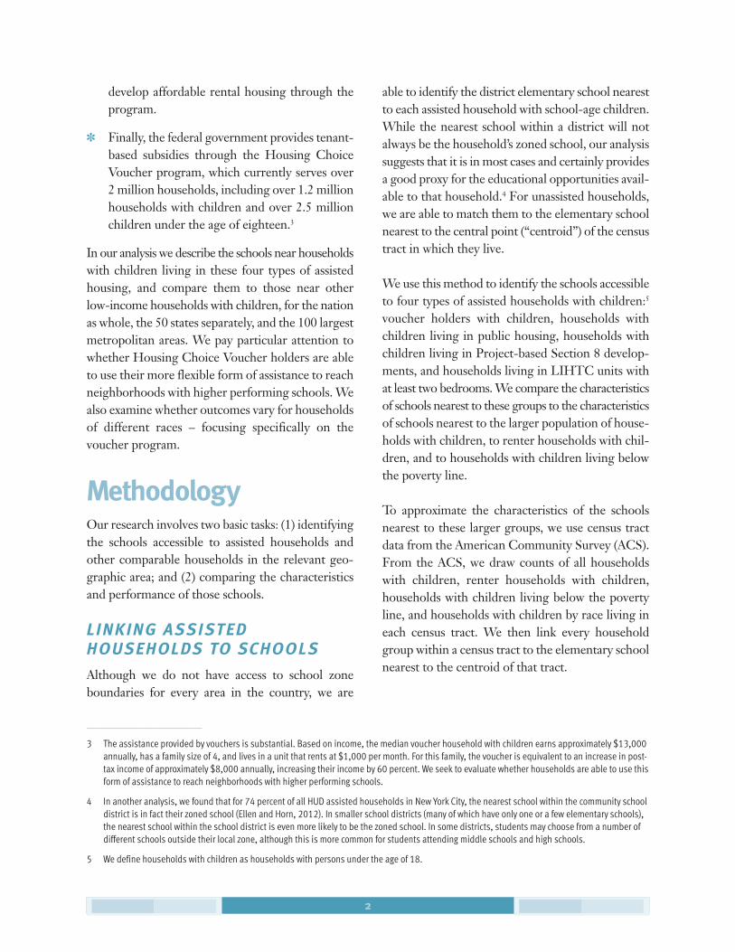
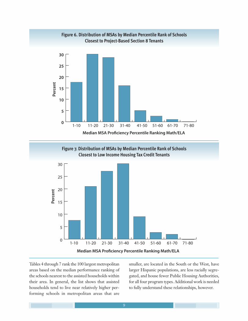
Rather than describing the differences between eachstate and metropolitan area, we summarize the vari-ation with the histograms in Figures 1 through 4,which show the distribution of the median per-formance of schools nearest assisted households ineach program in each metropolitan area. We seesignificant variation across metropolitan areas forrecipients of all four types of housing assistance.For Housing Choice Vouchers we see that, for themajority of metropolitan areas, the median schoolnearest to voucher holders is ranked between the12th and the 36th percentile, but with an overallrange that extends up to the 56th percentile. For
7
Table 3. Median Characteristics of Schools Nearest to Housing Choice Voucher Households and Other Households with Children, by Race
Proficiency Percentile % Free/ReducedUSA Rank Math/ELA Price Lunch
White Housing Choice Voucher Households 40 56.6%
Black Housing Choice Voucher Households 20 80.7%
Hispanic Housing Choice Voucher Households 25 79.8%
All White Households 65 31.9%
All Black Households 24 76.5%
All Hispanic Households 34 74.0%
Poor White Households 47 51.6%
Poor Black Households 17 83.3%
Poor Hispanic Households 27 81.5%

8
1-10 11-20 21-30 31-40 41-50 51-60 61-70 71-80
Perc
ent
Median MSA Pro�ciency Percentile Ranking Math/ELA
0
5
10
15
20
25
30
35
40
Figure 4. Distribution of MSAs by Median Percentile Rank of Schools Closest to Housing Choice Voucher Holders
public housing tenants we see an even wider distri-bution, with a significant clustering between the6th and 18th percentiles. For Project-based Section8 developments we see that, in the majority of met-ropolitan areas, the median schools ranked betweenthe 10th and 30th percentiles, slightly lower than
voucher households and higher than public housing.Finally, for LIHTC developments we see clusteringat higher percentiles of performance, between the20th and 40th percentiles, and a range that extendsfrom the very lowest performing schools up to thoseranked at the 65th percentile.
1-10 11-20 21-30 31-40 41-50 51-60 61-70 71-80
Median MSA Pro�ciency Percentile Ranking Math/ELA
Perc
ent
0
5
10
15
20
25
30
35
Figure 5. Distribution of MSAs by Median Percentile Rank of Schools Closest to Public Housing Tenants
9
Perc
ent
1-10 11-20 21-30 31-40 41-50 51-60 61-70 71-80
Median MSA Pro!ciency Percentile Ranking Math/ELA
0
5
10
15
20
25
30
Figure 6. Distribution of MSAs by Median Percentile Rank of Schools Closest to Project-Based Section 8 Tenants
0
5
10
15
20
25
30
Figure 7. Distribution of MSAs by Median Percentile Rank of Schools Closest to Low Income Housing Tax Credit Tenants
Tables 4 through 7 rank the 100 largest metropolitanareas based on the median performance ranking ofthe schools nearest to the assisted households withintheir area. In general, the list shows that assistedhouseholds tend to live near relatively higher per-forming schools in metropolitan areas that are
smaller, are located in the South or the West, havelarger Hispanic populations, are less racially segre-gated, and house fewer Public Housing Authorities,for all four program types. Additional work is neededto fully understand these relationships, however.

10
TABLE 4: 100 Largest MSAs – Median Proficiency Percentile Rank of Schools Closest to Housing Choice Voucher Holders
ProficiencyMSA PercentileRanking MSA Name Ranking
1 El Paso, TX 54
2 McAllen-Edinburg-Mission, TX 53
3 Omaha, NE-IA 52
4 Bakersfield, CA 51
5 Colorado Springs, CO 46
6 Stockton-Lodi, CA 42
7 Riverside-San Bernardino, CA 40
8 Columbia, SC 39
9 Albuquerque, NM 38
9 Memphis, TN-AR-MS 38
9 Oklahoma City, OK 38
12 San Antonio, TX 37
12 San Francisco, CA 37
14 Vallejo-Fairfield-Napa, CA 35
15 Mobile, AL 34
15 Portland-Vancouver, OR-WA 34
17 San Jose, CA 33
18 Las Vegas, NV-AZ 32
18 New Orleans, LA 32
20 Greenville-Spartanburg-Anderson, SC 31
20 Oakland, CA 31
20 Phoenix-Mesa, AZ 31
20 Scranton--Wilkes-Barre--Hazleton, PA 31
20 Seattle-Bellevue-Everett, WA 31
20 Tucson, AZ 31
26 Houston, TX 30
26 Norfolk-Va Beach-Newport News, VA-NC 30
26 Tacoma, WA 30
26 Ventura, CA 30
ProficiencyMSA PercentileRanking MSA Name Ranking
26 West Palm Beach-Boca Raton, FL 30
26 Wilmington-Newark, DE-MD 30
32 Allentown-Bethlehem-Easton, PA 29
32 Dayton-Springfield, OH 29
32 Fort Worth-Arlington, TX 29
32 Miami, FL 29
32 Richmond-Petersburg, VA 29
37 Dallas, TX 28
37 Tampa-St. Petersburg-Clearwater, FL 28
39 Jersey City, NJ 27
39 Raleigh-Durham-Chapel Hill, NC 27
39 Salt Lake City-Ogden, UT 27
42 Austin-San Marcos, TX 26
42 Denver, CO 26
42 San Diego, CA 26
45 Gary, IN 25
45 Jacksonville, FL 25
47 Baton Rouge, LA 24
47 Charlotte-Gastonia-Rock Hill, NC-SC 24
47 Fresno, CA 24
47 Los Angeles-Long Beach, CA 24
47 Sacramento, CA 24
47 Tulsa, OK 24
53 Little Rock-North Little Rock, AR 23.5
54 Akron, OH 23
54 Atlanta, GA 23
54 Baltimore, MD 23
54 Orange County, CA 23
58 Birmingham, AL 22

11
TABLE 4: 100 Largest MSAs – Median Proficiency Percentile Rank of Schools Closest to Housing Choice Voucher Holders
ProficiencyMSA PercentileRanking MSA Name Ranking
58 Detroit, MI 22
58 Harrisburg-Lebanon-Carlisle, PA 22
58 Knoxville, TN 22
62 Columbus, OH 21
62 Minneapolis-St. Paul, MN-WI 21
62 Orlando, FL 21
65 Greensboro--Winston-Salem--Hi Pt, NC 20
65 Washington, DC-MD-VA-WV 20
67 Cleveland-Lorain-Elyria, OH 19
67 Fort Lauderdale, FL 19
67 Kansas City, MO-KS 19
67 Nashville, TN 19
67 Nassau-Suffolk, NY 19
72 Charleston-North Charleston, SC 18
72 Louisville, KY-IN 18
74 New York, NY 17
74 Philadelphia, PA-NJ 17
74 Pittsburgh, PA 17
74 Sarasota-Bradenton, FL 17
78 Boston, MA-NH 16
78 Grand Rapids-Muskegon-Holland, MI 16
ProficiencyMSA PercentileRanking MSA Name Ranking
78 Indianapolis, IN 16
78 Rochester, NY 16
78 Springfield, MA 16
78 Wichita, KS 16
84 Bergen-Passaic, NJ 15
85 Cincinnati, OH-KY-IN 14
86 Buffalo-Niagara Falls, NY 13
86 Chicago, IL 13
86 Middlesex-Somerset-Hunterdon, NJ 13
86 Providence-Fall River-Warwick, RI-MA 13
86 St. Louis, MO-IL 13
91 Ann Arbor, MI 12
91 Milwaukee-Waukesha, WI 12
91 Newark, NJ 12
91 Syracuse, NY 12
91 Toledo, OH 12
91 Youngstown-Warren, OH 12
97 Albany-Schenectady-Troy, NY 11
97 New Haven-Meriden, CT 11
99 Hartford, CT 10
100 Monmouth-Ocean, NJ 6

12
TABLE 5: 100 Largest MSAs – Median Proficiency Percentile Rank of Schools Closest to Public Housing Tenants
ProficiencyMSA PercentileRanking MSA Name Ranking
1 Vallejo-Fairfield-Napa, CA 75
2 St. Louis, MO-IL 50
3 Mobile, AL 41
3 Albuquerque, NM 41
5 McAllen-Edinburg-Mission, TX 40
6 Columbia, SC 36
7 San Diego, CA 34
8 Tulsa, OK 33
8 Raleigh-Durham-Chapel Hill, NC 33
8 Portland-Vancouver, OR-WA 33
8 Omaha, NE-IA 33
12 Scranton–Wilkes-Barre–Hazleton, PA 31
12 Louisville, KY-IN 31
12 Fort Worth-Arlington, TX 31
12 El Paso, TX 31
12 Atlanta, GA 31
17 Tucson, AZ 30
18 Charlotte-Gastonia-Rock Hill, NC-SC 29
19 Jacksonville, FL 28
20 Kansas City, MO-KS 27
20 Jersey City, NJ 27
22 Tampa-St. Petersburg-Clearwater, FL 26
22 Riverside-San Bernardino, CA 26
22 Nassau-Suffolk, NY 26
25 Tacoma, WA 25
26 Richmond-Petersburg, VA 24
26 Memphis, TN-AR-MS 24
28 Miami, FL 22
28 Detroit, MI 22
ProficiencyMSA PercentileRanking MSA Name Ranking
30 West Palm Beach-Boca Raton, FL 21
30 Colorado Springs, CO 21
30 Birmingham, AL 21
30 Bakersfield, CA 21
34 Pittsburgh, PA 20
34 Phoenix-Mesa, AZ 20
34 Oakland, CA 20
34 New Orleans, LA 20
38 Knoxville, TN 19
38 Gary, IN 19
38 Baton Rouge, LA 19
41 Toledo, OH 18
41 Seattle-Bellevue-Everett, WA 18
41 Orlando, FL 18
41 Los Angeles-Long Beach, CA 18
41 Greenville-Spartanburg-Anderson, SC 18
41 Fresno, CA 18
47 Akron, OH 17
48 Salt Lake City-Ogden, UT 16
49 San Francisco, CA 15
49 Norfolk-Va Beach-Newport News, VA-NC 15
49 Milwaukee-Waukesha, WI 15
52 Youngstown-Warren, OH 14
52 New York, NY 14
52 Dayton-Springfield, OH 14
52 Baltimore, MD 14
56 Wichita, KS 13
56 Fort Lauderdale, FL 13
56 Dallas, TX 13

13
TABLE 5: 100 Largest MSAs – Median Proficiency Percentile Rank of Schools Closest to Public Housing Tenants
ProficiencyMSA PercentileRanking MSA Name Ranking
56 Cleveland-Lorain-Elyria, OH 13
56 Cincinnati, OH-KY-IN 13
61 Stockton-Lodi, CA 12
61 Sarasota-Bradenton, FL 12
61 San Jose, CA 12
61 San Antonio, TX 12
65 New Haven-Meriden, CT 11
65 Denver, CO 11
65 Allentown-Bethlehem-Easton, PA 11
65 Albany-Schenectady-Troy, NY 11
69 Wilmington-Newark, DE-MD 10
69 Sacramento, CA 10
69 Nashville, TN 10
69 Minneapolis-St. Paul, MN-WI 10
69 Houston, TX 10
69 Hartford, CT 10
69 Greensboro–Winston-Salem–Hi Pt, NC 10
69 Buffalo-Niagara Falls, NY 10
77 Little Rock-North Little Rock, AR 9
77 Columbus, OH 9
77 Chicago, IL 9
ProficiencyMSA PercentileRanking MSA Name Ranking
77 Austin-San Marcos, TX 9
81 Ventura, CA 8
81 Springfield, MA 8
81 Providence-Fall River-Warwick, RI-MA 8
84 Rochester, NY 7
84 Philadelphia, PA-NJ 7
84 Oklahoma City, OK 7
84 Las Vegas, NV-AZ 7
84 Boston, MA-NH 7
89 Monmouth-Ocean, NJ 6
89 Bergen-Passaic, NJ 6
91 Newark, NJ 5
91 Indianapolis, IN 5
93 Middlesex-Somerset-Hunterdon, NJ 4
93 Harrisburg-Lebanon-Carlisle, PA 4
93 Charleston-North Charleston, SC 4
96 Washington, DC-MD-VA-WV 3
96 Syracuse, NY 3
96 Ann Arbor, MI 3
99 Grand Rapids-Muskegon-Holland, MI 2

14
TABLE 6: 100 Largest MSAs – Median Proficiency Percentile Rank of Schools Closest to Project-Based Section 8 Tenants
ProficiencyMSA PercentileRanking MSA Name Ranking
1 Orange County, CA 66
2 El Paso, TX 58
3 Stockton-Lodi, CA 53
4 Omaha, NE-IA 52
5 Charleston-North Charleston, SC 48
6 Wilmington-Newark, DE-MD 44
6 New Orleans, LA 44
8 Wichita, KS 42
9 Greensboro–Winston-Salem–Hi Pt, NC 41
10 Columbia, SC 40
10 Albuquerque, NM 40
12 McAllen-Edinburg-Mission, TX 36
13 Kansas City, MO-KS 35
14 Mobile, AL 34
15 Seattle-Bellevue-Everett, WA 33
15 St. Louis, MO-IL 33
15 Riverside-San Bernardino, CA 33
15 Oklahoma City, OK 33
15 Norfolk-Va Beach-Newport News, VA-NC 33
15 Memphis, TN-AR-MS 33
21 Harrisburg-Lebanon-Carlisle, PA 32
21 Fresno, CA 32
21 Baton Rouge, LA 32
24 Louisville, KY-IN 31
24 Greenville-Spartanburg-Anderson, SC 31
26 West Palm Beach-Boca Raton, FL 30
26 San Antonio, TX 30
28 Tucson, AZ 29
28 San Diego, CA 29
ProficiencyMSA PercentileRanking MSA Name Ranking
28 Akron, OH 29
31 Raleigh-Durham-Chapel Hill, NC 28
31 Las Vegas, NV-AZ 28
31 Detroit, MI 28
34 Vallejo-Fairfield-Napa, CA 27
34 Tulsa, OK 27
34 Providence-Fall River-Warwick, RI-MA 27
34 Gary, IN 27
34 Dayton-Springfield, OH 27
39 Ventura, CA 26
39 Salt Lake City-Ogden, UT 26
39 Pittsburgh, PA 26
42 Tacoma, WA 25
42 Richmond-Petersburg, VA 25
42 Portland-Vancouver, OR-WA 25
45 Jersey City, NJ 24
46 San Jose, CA 23
46 Minneapolis-St. Paul, MN-WI 23
46 Little Rock-North Little Rock, AR 23
46 Grand Rapids-Muskegon-Holland, MI 23
46 Baltimore, MD 23
46 Bakersfield, CA 23
52 Indianapolis, IN 22
52 Houston, TX 22
54 Miami, FL 19
54 Atlanta, GA 19
56 Denver, CO 18
56 Birmingham, AL 18
56 Austin-San Marcos, TX 18
59 Springfield, MA 17
59 Phoenix-Mesa, AZ 17
59 Philadelphia, PA-NJ 17

15
TABLE 6: 100 Largest MSAs – Median Proficiency Percentile Rank of Schools Closest to Project-Based Section 8 Tenants
ProficiencyMSA PercentileRanking MSA Name Ranking
59 Milwaukee-Waukesha, WI 17
59 Jacksonville, FL 17
64 Tampa-St. Petersburg-Clearwater, FL 16
64 Los Angeles-Long Beach, CA 16
66 Fort Worth-Arlington, TX 15
67 Youngstown-Warren, OH 14
67 Sacramento, CA 14
67 New York, NY 14
67 Cleveland-Lorain-Elyria, OH 14
67 Allentown-Bethlehem-Easton, PA 14
72 Nashville, TN 13
72 Knoxville, TN 13
72 Colorado Springs, CO 13
72 Cincinnati, OH-KY-IN 13
72 Buffalo-Niagara Falls, NY 13
77 Toledo, OH 12
77 Rochester, NY 12
77 Oakland, CA 12
77 Charlotte-Gastonia-Rock Hill, NC-SC 12
81 Scranton–Wilkes-Barre–Hazleton, PA 11
ProficiencyMSA PercentileRanking MSA Name Ranking
81 Columbus, OH 11
81 Chicago, IL 11
84 Washington, DC-MD-VA-WV 9
84 San Francisco, CA 9
84 Hartford, CT 9
84 Dallas, TX 9
88 Orlando, FL 6
88 Boston, MA-NH 6
90 Newark, NJ 5
90 Ann Arbor, MI 5
90 Albany-Schenectady-Troy, NY 5
93 Syracuse, NY 4
93 Middlesex-Somerset-Hunterdon, NJ 4
93 Fort Lauderdale, FL 4
96 Sarasota-Bradenton, FL 3
97 New Haven-Meriden, CT 2
97 Nassau-Suffolk, NY 2
97 Monmouth-Ocean, NJ 2
100 Bergen-Passaic, NJ 1

__________________________
16
TABLE 7: 100 Largest MSAs – Median Proficiency Percentile Rank of Schools Closest to Low Income Housing Tax Credit Tenants
ProficiencyMSA PercentileRanking MSA Name Ranking
1 Monmouth-Ocean, NJ 66
2 Mobile, AL 64
3 Ventura, CA 58
4 Tulsa, OK 55
5 Tampa-St. Petersburg-Clearwater, FL 52
6 El Paso, TX 51
7 Oklahoma City, OK 48
7 Charleston-North Charleston, SC 48
9 Tacoma, WA 47
9 Riverside-San Bernardino, CA 47
9 Baton Rouge, LA 47
12 Colorado Springs, CO 46
13 Jacksonville, FL 43
14 Stockton-Lodi, CA 42
14 Nashville, TN 42
16 Albuquerque, NM 40
17 Rochester, NY 39
18 Sacramento, CA 38
18 McAllen-Edinburg-Mission, TX 38
20 San Antonio, TX 37
21 Norfolk-Va Beach-Newport News, VA-NC 36
21 Dayton-Springfield, OH 36
21 Columbia, SC 36
24 Vallejo-Fairfield-Napa, CA 35
24 San Diego, CA 35
24 Kansas City, MO-KS 35
27 Wilmington-Newark, DE-MD 34
27 Washington, DC-MD-VA-WV 34
27 Portland-Vancouver, OR-WA 34
ProficiencyMSA PercentileRanking MSA Name Ranking
27 Birmingham, AL 34
27 Austin-San Marcos, TX 34
32 Seattle-Bellevue-Everett, WA 33
32 Omaha, NE-IA 33
32 Minneapolis-St. Paul, MN-WI 33
32 Middlesex-Somerset-Hunterdon, NJ 33
32 Memphis, TN-AR-MS 33
32 Denver, CO 33
38 Richmond-Petersburg, VA 32
38 Miami, FL 32
38 Ann Arbor, MI 32
41 Raleigh-Durham-Chapel Hill, NC 31
41 Orange County, CA 31
41 Harrisburg-Lebanon-Carlisle, PA 31
41 Greenville-Spartanburg-Anderson, SC 31
41 Charlotte-Gastonia-Rock Hill, NC-SC 31
46 Tucson, AZ 30
46 New Orleans, LA 30
46 Fort Worth-Arlington, TX 30
49 Milwaukee-Waukesha, WI 29
49 Baltimore, MD 29
51 Los Angeles-Long Beach, CA 28
51 Houston, TX 28
51 Dallas, TX 28
51 Columbus, OH 28
55 San Jose, CA 27
55 Salt Lake City-Ogden, UT 27
55 Little Rock-North Little Rock, AR 27
55 Gary, IN 27

17
TABLE 7: 100 Largest MSAs – Median Proficiency Percentile Rank of Schools Closest to Low Income Housing Tax Credit Tenants
ProficiencyMSA PercentileRanking MSA Name Ranking
55 Bakersfield, CA 27
60 Wichita, KS 26
61 Louisville, KY-IN 25
62 Buffalo-Niagara Falls, NY 24
63 West Palm Beach-Boca Raton, FL 23
63 Indianapolis, IN 23
63 Greensboro–Winston-Salem–Hi Pt, NC 23
66 San Francisco, CA 22
66 Oakland, CA 22
68 Nassau-Suffolk, NY 21.5
69 Phoenix-Mesa, AZ 21
69 Orlando, FL 21
69 Grand Rapids-Muskegon-Holland, MI 21
69 Detroit, MI 21
73 Pittsburgh, PA 20
73 Hartford, CT 20
75 Fresno, CA 19
75 Atlanta, GA 19
77 St. Louis, MO-IL 18
77 Fort Lauderdale, FL 18
77 Akron, OH 18
ProficiencyMSA PercentileRanking MSA Name Ranking
80 Cincinnati, OH-KY-IN 17
80 Allentown-Bethlehem-Easton, PA 17
82 Philadelphia, PA-NJ 15
82 New York, NY 15
82 New Haven-Meriden, CT 15
85 Springfield, MA 13
85 Providence-Fall River-Warwick, RI-MA 13
87 Toledo, OH 12
87 Sarasota-Bradenton, FL 12
87 Las Vegas, NV-AZ 12
87 Chicago, IL 12
91 Knoxville, TN 11
91 Cleveland-Lorain-Elyria, OH 11
91 Albany-Schenectady-Troy, NY 11
94 Youngstown-Warren, OH 10
95 Jersey City, NJ 9
96 Syracuse, NY 7
97 Newark, NJ 6
97 Boston, MA-NH 6
99 Bergen-Passaic, NJ 3
100 Scranton--Wilkes-Barre--Hazleton, PA 1

18
ConclusionExisting research on the residential outcomes of as-sisted households finds that on average assistedhouseholds live in disadvantaged neighborhoods(Newman and Schnare, 1997; Pendall, 2000; Freeman,2003; Galvez, 2011). This analysis pushes the questiona step further and probes whether housing assistancehas the potential to break the cycle of povertythrough breaking the link between poor householdsand low performing schools. Unfortunately we findthat this does not generally appear to be the case;though we find some metropolitan areas where assisted households are living near relatively highperforming schools relative to other households inthe same metropolitan area. These metropolitanareas tend to be located in the South and West, andto have both smaller populations and lower levels ofracial segregation.
We find that voucher holders and public housingresidents tend to live in neighborhoods with lowerperforming schools than renters and other poorhouseholds. This is surprising, at least for thevoucher program, given that Housing ChoiceVouchers have the potential to allow low-incomefamilies to reach neighborhoods and schools thatare of higher quality than those accessed by otherpoor households. Looking at subgroups within thevoucher population, we find some variations inthese outcomes, with non-white voucher holdersattending lower performing schools than whitevoucher holders.
Unlike place-based subsidized housing, vouchershave great potential to enable households to moveto neighborhoods with better schools. Yet our researchsuggests that most voucher holders are not doing so.More work is necessary to uncover how housing as-sistance can better help low income householdsreach neighborhoods with higher performing schools.
Appendix A: State-by-state tables
Appendix B: Metropolitan area tables
Appendix C: National distributions of family units by school performance
Appendix D: Top 100 MSAs – percentile rankings for each housing program
Available at www.prrac.org/housing-schools.php

RELATED PUBLICATIONS FROM PRRAC
Finding Common Ground: Coordinating Housing and Education Policy to Promote Integration PRRAC and the National Coalition on School DiversityOctober 2011
New Homes, New Neighborhoods, New Schools: A ProgressReport on the Baltimore Housing Mobility Program
by Lora Engdahl PRRAC and the Baltimore Regional Housing Campaign
October 2009
Bringing Children Together: Magnet Schools and Public Housing RedevelopmentPRRAC and the Charles Hamilton Houston InstituteJanuary 2009
Reports available at www.prrac.org
Report Photos by Amanda Boggs, Design by ampersand graphic design

1200 18th St. NW, Suite 200
Washington, DC 20036
202/906-8023 • Fax 202/842-2885
www.prrac.org