diy manuals made mobile - ntnu
TRANSCRIPT

DIY manuals made mobile 1
DIY manuals made mobile EXPLORING VALUE CREATION OF MOBILE INTERFACES
Randi Finnvik Solli Department of Product Design
Norwegian University of Science and Technology
ABSTRACT
This article aims to explore value creation in the migration of the do-it-yourself (DIY) workshop manuals into interactive and digital products with mobile accessibility. Further, the opportunities and challenges emergent from the migration to digital shall be pointed out and discussed. Such exploration shall be performed through a theoretical review comprising the DIY phenomenon and motivations, the mobile tendencies and other trends. This section is closed with the relevant approaches towards the execution of the migration. After, a case study to inquire on the behaviours and preferences of the end users is presented. The discussion is focused on the different modes of value creation through a digital interface over conventional books. The conclusion is that opportunities gained on digital easily overcome the challenges of the migration. Additionally, user behaviour proved to be inclined towards the use of different sources, in which case the digital interface would benefit from serving as an information hub. Ultimately, the best results are obtained with mobile first philosophy and responsive or adaptive web design. Opportunities for future research are shown in the final section of this study.
KEYWORDS: TPD4505, Workshop Repair Manuals, DIY, Motivations, Mobile Information, Mobile Design, User Experience.
1. INTRODUCTION
This article aims to explore value creation for the end user in the migration of the physical do-it-yourself (DIY) workshop repair manuals into interactive digital products that can be accessed with smartphones and tablets. Opportunities, advantages and pitfalls of such process shall be pointed out. As a supporting research question, the feasibility of the end user moving from physical books to interactive digital versions shall also be addressed. The motivation behind this article is to apply the findings in an existing project where an
interactive digital prototype of a DIY manual being performed by the author of this study. Workshop repair manuals are a useful tool for those who want or need to do maintenance, repairs or modifications on vehicles like cars, motorcycles, tractors, ATVs, snowmobiles etc. These manuals give the user detailed information about the vehicle in matter, and how-to descriptions for maintenance and repairs. Everything from how to change the wheels to how to change the engine is described. The number of steps explained varies with who the manual is intended for.

DIY manuals made mobile 2
But why migrate from the physical workshop repair manual into an interactive and mobile product in the first place? Does it not already exist? The workshop repair manual exists today mainly as books and as online manuals. Two well-known brands are Clymer and Haynes. Clymer’s online manual is viewable and printable with a magazine reader (Clymer, 2013), which lacks of a user friendly interface on mobile devices. The online manuals are digital copies of the books, and feature the same content as the printed manual. They come in the form of a PDF file, but with keyword search capabilities. Haynes online manuals are better because they do not use a magazine reader, but rather a website with clickable links and content (Haynes, 2013). Sadly these are not optimized for any screens smaller than the computer screen, and you will get the same static information as the book provides. You will however be able to browse the manual quickly, and also get access to instructive videos, which is a big plus. But all in all, none of today’s online manuals are any good on mobile devices.
This article is an exploratory, narrative review following the need of a theoretical background about the subject in order to improve work on the interactive digital prototype. The theoretical part of this study includes a presentation of the do-it-yourself concept, the mobile information approach and other trends related to answering the main research question of this study. The systems thinking approach helped on defining the study’s research question. On a holistic view, all systems can be better understood, and therefore managed, if all the subcomponents that compose the whole are considered (Jackson, 2003). A case study through a survey was performed to gather data regarding behaviours and preferences of the manual’s end user. Finally, the discussion and the conclusions are presented. Future opportunities for research are shown in the last section.
2. DIY At this point, a working definition of do-it-yourself (DIY) activity is required. DIY in this article means the method of building, modifying or repairing something without the aid of experts or professionals (Wikipedia, 2013). The human kind has been doing this for thousands of years, so it is not a new phenomenon. The modern term ‘do it yourself’ was used as early as 1912 in a US advertisement, but it became commonly employed from the 1950s onwards after the magazine ‘Business Week’ proclaimed the 1950s as ‘the age of do-it-yourself’ in 1952 (Gelber, 1997). Recent surveys from diverse countries around the world show that consumers spend significant amounts of time and money to create and modify consumer products for their own use. They demonstrate that DIY is not just a marginal phenomenon, but is of increasing economic and societal value (Avram et al., 2013). 2.1 Motivations behind DIY But why do people do DIY? The reasons and motivations behind DIY are many, and the consumers’ motives for engaging in DIY activity have been examined by several researchers. Williams (2008) evaluates the two broad approaches that has often been used in earlier research to answer why people participate in DIY activity. There have either been attempts to apply the wider theorisations of consumption and the consumer to the DIY sector, or those who have theorised either that participation is economically determined and/or distinguished between those conducting DIY out of economic necessity or choice. Those applying broader theorisations have adopted three contrasting theoretical approaches:
1. The DIY consumer is depicted as somebody engaging in DIY improvements in order to maximise the market value of their property by measuring the costs of their DIY activities against their investment return.
DIY manuals made mobile 3
2. The consumer is depicted as a dupe or passive subject whose aspirations are formed and manipulated by the mass media, and served and fuelled by retail businesses.
3. Consumers are viewed as manipulating commodities to produce symbolic meanings and constitute identities.
Williams (2008) found that no one of these previous theorisation of DIY consumers’ motives is universally relevant, but that all theories are sometimes valid. Based on his study, he therefore divided the DIYers into being either ‘reluctant’ or ‘willing’. Reluctant DIYers engage in DIY either because they cannot afford to outsource the task, or due to problems with regard to finding and using trades-people. Willing DIYers on the other hand conducts DIY because of an economic desire to maximise the value, the pleasure they get from the process of DIY or the satisfaction received from creating an end-product, completing a job, mastering a skill or simply doing something for oneself.
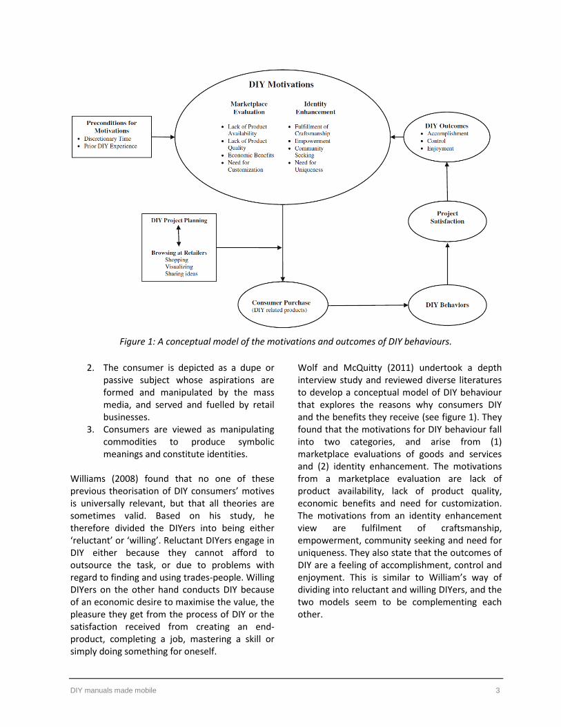
Wolf and McQuitty (2011) undertook a depth interview study and reviewed diverse literatures to develop a conceptual model of DIY behaviour that explores the reasons why consumers DIY and the benefits they receive (see figure 1). They found that the motivations for DIY behaviour fall into two categories, and arise from (1) marketplace evaluations of goods and services and (2) identity enhancement. The motivations from a marketplace evaluation are lack of product availability, lack of product quality, economic benefits and need for customization. The motivations from an identity enhancement view are fulfilment of craftsmanship, empowerment, community seeking and need for uniqueness. They also state that the outcomes of DIY are a feeling of accomplishment, control and enjoyment. This is similar to William’s way of dividing into reluctant and willing DIYers, and the two models seem to be complementing each other.
Figure 1: A conceptual model of the motivations and outcomes of DIY behaviours.

DIY manuals made mobile 4
2.2 DIY communities and sharing Today DIY is a big trend in many themes like home improvement, crafts and mechanics to mention a few. These themes are widespread and not very much alike, but Kuznetsov and Paulos (2010) found that they all have something in common; online sharing and communities. When searching online using the phrase ‘DIY’, you find numerous blogs, how-tos and online communities. Existing technology makes sharing easy, and anyone can quickly document and showcase their DIY projects to a large audience. They collaboratively critique, brainstorm and troubleshoot their work, often in real-time. The motivations for contributing to DIY communities that Kuznetsov and Paulos found in their study are listed in figure 2.
Figure 2: Motivations for contributing to DIY communities.
The reasons ‘get inspiration and new ideas for future projects’ and to ‘learn new concepts’ are listed as the most important ones, but the participants also highlighted motivations concerning information exchange: receiving feedback on personal projects and educating others. The authors found that answering questions in itself functioned as an instrument of learning, and that the participants saw a value in teaching others. They also discovered that DIY communities invite individuals across all backgrounds and skill levels to contribute.
3. MOBILE INFORMATION Understanding mobile information needs and associated interaction challenges is fundamental to improving designs for mobile phones and related devices. Simply converting what we use for computers will not do the job. Mobile users need applications and services that are designed to the particular requirements of mobile context and use. 3.1 How needs are addressed Sohn et al. (2008) conducted a 2-week diary study to better understand mobile information needs and how they were addressed. When asking users how they addressed their information needs at the time they arose, the most popular mechanisms were internet based (40%). When the diary entries from the mobile internet users were isolated, 73% of their needs were addressed either through web access or an online maps application. Heimonen (2009) carried out a 4-week diary study focusing on experienced mobile internet users. Mobile search and mobile browsing were the dominant form of addressing mobile information needs by this user group. The author found that search is used to satisfy broad information needs, while known web services and mobile applications were used more often for specific needs which are time constrained. In their 4-week diary and interview study of active mobile web users, Church and Oliver (2011) also found that mobile users are more likely to use a specific application for a specific purpose instead of searching for specific items in Google. From conversations they had with their users, it appears that one of the reasons for accessing general web content or executing a search is because the user in question has not yet found an application to fulfil his/her particular need. They use search for broad information needs, while web services and applications are used for specific needs which are time constrained.

DIY manuals made mobile 5
3.2 Contextual factors Sohn et al. (2008) found that 72% of entries were prompted by explicit contextual factors including activity, location, time and conversation. Heimonen (2009) found that the contexts where the participant was moving represent 33% of the information needs while 67% of the information needs took place when participants were in a situation that was relatively static in terms of movement. Of this, 35% of the users were at home, and 25% were in a social situation. Church and Oliver (2011) results showed that the vast majority of diary entries (over 70%) were recorded when users were in familiar and fairly stationary contexts, like at home or at work. The volume of mobile specific contexts like traveling abroad, outdoors and commuting, represents just 17% of mobile web usage. These results not only re-enforce the previous research, but also highlight an increase in accessing the mobile web in stationary situations. Mobile devices have become powerful and usable enough to supplant the desktop computer in some situations, even when the computer is available. The research is pointing to that in most cases this was due to proximity and convenience. The mobile phone is instantly available for fulfilling the information need. 3.3 Always on, always connected Sohn et al. (2008) stated that mobile devices are becoming always connected. Taylor et al. (2008) examined a group of active mobile internet users and found that this always-on feature had a significant impact on mobile web behaviours. The users in the study of Church and Oliver (2011) pointed to the fact that their mobile phones are always on and always with them, thus allowing instant access to online content in an easy manner without having to wait 5 minutes to boot up a computer. Today the always on and connected is a reality, and there are many reasons behind this phenomena, like decreasing
costs of mobile data plans, increased access to WiFi and the personal, always on, always connected nature of mobile technology. 3.4 Key motivators But what motivates people to use the mobile web? Taylor et al. (2008) explored the motivations surrounding mobile web access, and devised a list of 6 key motivators:
1. Awareness: The desire to stay current, to keep oneself informed in general.
2. Time management: The desire to be efficient, to manage projects, or get things done.
3. Curiosity: The interest in an unfamiliar topic, often based on a tip or chance encounter.
4. Diversion: The desire to kill time or alleviate boredom.
5. Social connection: The desire to engage with other people.
6. Social avoidance: The desire to separate oneself from others, to appear occupied so as not to be bothered.
Similar to this, Church and Oliver (2011) found that awareness is the key motivating factor for mobile web use, accounting for almost half of the diary entries. Time management was also popular among the users, with almost 25% of diary entries. The motivations that would be most important to automotive DIY are time management, social connection, awareness and curiosity. The users would use a workshop repair manual to get things done, and save time compared to having to find the information themselves from other sources. A social connection would allow them to collaboratively critique, brainstorm and troubleshoot their work, something which is important to DIYers as found in the study of Kuznetsov and Paulos (2010). The desire to stay current and informed would justify the need for a social connection with sharing abilities. The natural curiosity in people would make them

DIY manuals made mobile 6
browse through a manual in search for new knowledge, but preferably to a subject that would need DIY sooner rather than later. 4. RELATED TRENDS In this chapter I will present related trends that
are connected to making the physical DIY workshop repair manuals into interactive digital products that can be accessed with smartphones and tablets. 4.1 Growth in mobile devices and network usage During the recent years there has been a major growth when it comes to sales in mobile devices. In 2011, smartphone sales pass PC sales for the first time in history. The number of smartphones shipped was a staggering 487,7 million units, a growth compared to 2010 of 62,7%. For tablets the number was 63,2 million units, an increase of 274,2% (Alto, 2012). We can trace this growth to one device in particular: the iPhone. When it was launched back in 2007, the iPhone gave us the first taste of what the modern smartphone would become. How amazed people were also shows on Apple’s stock prices, which was respectively $122.04 a share on the day of the launch, and $335.26 a share only 4 days after (Kim, 2011). But what will tomorrow bring? The forecast is that this growth will continue. By the end of 2013, it is estimated that there will be more mobile devices on earth than people (Kelly, 2013). Today, mobile devices are taking over some of the tasks previously performed by the desktop or laptop. Browsing is one of those tasks. It is a global trend that people are accessing the web via their smartphones and tablets more often than ever. So far in 2013, 17.4% of web traffic has come through mobile devices, representing more than a 6% increase since 2012 (Fox, 2013). The mobile internet is actually growing faster than the desktop internet ever did (Stanley, 2009). Total mobile data traffic is expected to exceed 10 exabytes per month by 2017, compared to the
less than 1 exabyte per month in 2012 (Cisco, 2013). 4.2 The evolution of the book The book itself has undergone a big development. Previously the book has only been static information, placed in between a book cover and existed only in a physical form. Then came the eBook. The eBook is similar to the physical book regarding static information, but we also gained new value since they are highly mobile compared to physical books, they can never be lost, damaged or stolen and you get instant access as soon as the books are published (Langdown, 2012). Today books become not only eBooks, but also software applications. By using the built in functionality in smartphones like web services, location detection, sound and motion graphics, it takes us beyond the copy-paste based static information. Currently we are in a transition face where a wide variety of digital products are being offered. Websites, eBooks, applications and many combinations of these things. The reader experience is now also the user experience (McGuire and O'Leary, 2011). 4.3 Multimedia Like the book has evolved into eBooks and applications, media has evolved into multimedia. Multimedia includes a combination of text, audio, still images, animation, video, or interactivity content forms. Multimedia has become the norm of information delivery, and with today’s smartphones and tablets we expect a certain level of interactivity. We are no longer satisfied with only text based information, but want and expect more to get a better user experience. For the user of a workshop repair manual, a digital version could easily incorporate all these types of multimedia to enhance the experience and optimise the learning process. There exists a lot of research on multimedia learning, but the fundamental hypothesis underlying research on multimedia learning is that multimedia instructional messages that are designed in light of how the human mind works,

DIY manuals made mobile 7
are more likely to lead to meaningful learning than those that are not (Mayer and Mayer, 2005). One form of multimedia that is simple in idea but difficult in execution, is augmented reality. Inglobe Technologies have released a video that shows their augmented reality 3D tracker, which is still under development (Inglobe, 2013). Their application helps car owners to navigate through the car’s engine by displaying icons on engine parts. In addition, a virtual hand demonstrates how users can perform maintenance tasks such as adding oil. But they are not the first ones to exploit augmented reality in this manner. BMW released in 2007 a video where they show how they imagine it would be like using augmented reality in their workshops (BMW, 2007). Here they use a pair of glasses to show the mechanic all the information. Today this technology exists through Google Glass (Google, 2013). 4.4 Fragmentation and constraints Mobile phones, eBook readers, tablets, laptops, desktops and smart TVs are just some of the digital devices we use to access the web through applications and websites. Today there is a lot of fragmentation within this digital world, both concerning hardware and software, turning it into a standards nightmare. For instance the number of screen sizes, which again have different resolutions and aspect ratios. There exists a plethora of different screen sizes, ranging from the smallest of phones up to the biggest computer and TV screens. When it comes to the software, there are numerous platforms. Android, iOS, Windows, Blackberry, Bada, Palm OS, Linux and Symbian just to mention a few. Because of this fragmentation, developers need to consider not just who is accessing the application, but also what device they are using to do it since there are more constraints inherent in mobile design. Not only do you have to have in mind all the different screen sizes, resolutions and aspect ratios as well as which platform you are designing for, but you also have to think
about the performance of these mobile devices. They have slower processing power, smaller caches and a smaller number of simultaneous connections than their computer siblings. In addition, the mobile networks are slower than the regular networks.
5. SOLUTIONS But exactly how can the physical workshop repair
manuals be migrated into interactive digital products with added value for the user? This will be the focus in this chapter, by looking more closely on approaches that are popular today.
5.1 Mobile First ‘Mobile first’ is a web design philosophy that was first introduced by Luke Wroblewski in 2009. Before this the common practice was a ‘desktop first’ approach. Wroblewski saw that more often than not, the mobile experience for a web application or site was designed and built after the computer version was complete (Wroblewski, 2009). He stated three reasons why web applications should be designed for mobile first instead:
1. The growth in mobile devices and network.
2. Mobile constraints force you to focus on only the most important data and actions.
3. Mobile capabilities are far beyond what a normal desktop browser can do.
This was further explained and developed in his book called ‘Mobile First’ (Wroblewski, 2011). Mobile first is supposed to prepare you for the explosive growth and new opportunities emerging on mobile today, and also give you an opportunity to provide an improved overall experience for your customers. The mobile comes with a natural set of constraints that may at first seem limiting, but it forces you to focus on only the most important data and actions. Small screen sizes force you to prioritize what really matters, there simply is not room for anything

DIY manuals made mobile 8
else. The slower mobile network and limited data plans require you to have performance in mind, resulting in faster loading websites everywhere. Also, mobile first allows you to deliver innovative experiences by building on new capabilities native to mobile devices and modes of use. You can use exciting capabilities like location detection, device orientation, and touch to create innovative ways of meeting people’s needs.
5.2 Responsive web design Responsive web design is another approach to web design. A website will look and behave differently when viewed on a smartphone, a tablet or a computer. Responsive web design is aimed at crafting sites that embrace these differences between devices, by providing an optimal viewing experience for each one, giving you a holistic experience of the website. The term ‘responsive web design’ was made by Ethan Marcotte (Marcotte, 2010). He saw what kind of problems the fragmentation and the constant renewing nature of the web were making for the designers, developers and customers alike. Inspired by ‘responsive architecture’ where physical spaces can respond to the presence of people passing through them, he combined existing technology into a different way of thinking and described what we today has come to recognize as responsive web design. In 2011 Marcotte released his book called ‘Responsive Web Design’ (Marcotte, 2011). Here he explained in details what responsive web design is all about. A responsive web site is built by using 3 core ingredients:
1. Flexible grids 2. Flexible images 3. Media queries
To make flexible grids, instead of using pixel values you need to express the grid widths in relative, proportional terms; percentage in other words. By doing so, you get a grid that can resize itself as the browser’s viewport does without
compromising the proportions of the original design. While the text reflows effortlessly within a flexible container, the images on the other hand are still not aware of this new flexible environment. If the image is too big, it will simply overflow the container. To prevent this there needs to be a similar constraint to images. The last and maybe most important part to responsive web design is media queries. It is a mechanism for identifying not only types of media, but for actually inspecting the physical characteristics of the devices and browsers that render the website. You can get information like the width and height of the browser window, width and height of the device, if a phone is in landscape or portrait mode, the screens resolution and more. By knowing this information, we can optimize the display of our content to best meet the needs of the device, creating alternate layouts tailored to different resolution ranges. 5.3 Adaptive web design Another approach often confused with responsive web design is adaptive web design. This term was coined by Aaron Gustafson, who also wrote the book called ‘Adaptive Web Design’ (Gustafson, 2011). It uses the server to detect the device the website is being viewed on. Each device (desktop, tablet or smartphone) has their own distinct template optimized for that specific device, and the server only sends the files that are specific for that device making the page load faster. In short, by using a predefined set of layout sizes based on device screen, the adaptive web design approach adapts to the detected device. It is not surprising the terms get mistaken for one another, considering the fact that they are quite similar in both name and action. The biggest similarity between the two methods is that they both allow websites to be viewed on various screen sizes, and providing visitors with a better mobile user experience. Where the two methods differ is in their delivery of the structures. While responsive web design relies on flexible and fluid

DIY manuals made mobile 9
grids, adaptive web design is relying on predefined screen sizes. 5.4 Native, web and hybrid applications Applications are today synonymous with mobile devices like smartphones and tablets. But an application is not just an application, there are different types and different approaches.
Native application: Software runs on the device’s internal software and hardware. Native applications are typically fast and reliable, and can access all the device’s hardware. The application is tied to the platform it is built for, and cannot be easily transferred to another platform.
Web application: Software runs through a web browser and relies on internet connectivity to accomplish its task. This approach to mobile development creates cross-platform mobile applications that work on multiple devices; though not all of the device’s hardware features can be accessed.
Hybrid application: Software runs on a device’s internal software, but utilizes web connectivity to accomplish certain tasks. It combines the best (and worst) elements of native and web applications. (Budiu, 2013) So which one should you choose? Native applications, web applications or hybrid applications are all different ways to cater to the needs of the mobile user. There is no unique best solution: each of these has their strengths and weaknesses. The choice of one versus the other depends on the unique needs in each project. 6. METHODOLOGY A supportive case study was implemented to support the main research question. The
objective of the case study is to determine the feasibility of the end user moving from physical books to interactive digital versions and to
better understand the usage of workshop repair manuals. An online survey was selected as data collection method, since it allows control over the population to fill the sample, and it holds a great reach. The survey had 2 variants, one for the respondents with experience using DIY manuals and one for the non-experienced ones with 14 and 10 questions respectively. These surveys were posted in 4 motorcycle forums and 5 Facebook pages for a week. Such conditions make it hard to determine the total number of exposures. Still, the survey had 100 respondents, 87 experienced and 13 non-experienced. The results are used when necessary in the next section of the study. (Yin, 2009) 7. DISCUSSION Now that theoretical and empirical information has been gathered, it is possible to discuss on
whether or not it is possible for a mobile interface to add value for the end user over the conventional physical book. 87 out of the 100 participants have used one or more of these manuals before. The survey revealed that most of them use the workshop repair manuals for the knowledge and safety they provide, as well as the multimedia like illustrations and images. The manuals equip them with knowledge they might not have themselves, and safety through the fact that the procedures in the book have been tested by professionals. This also ensures that the users dare to try things they have never done before. The main reasons they gave for wanting to use a mobile/tablet as a workshop repair manual was accessibility and portability, the more advanced multimedia possibilities, easier navigation and better search functionality. The main reasons for not wanting to use a mobile/tablet were small screen sizes, dirt and scratches, and simply the fact that some of them prefer the book or paper. The research from Kuznetsov and Paulos (2010) tells us that online communities and sharing is an

DIY manuals made mobile 10
important aspect of DIY, and it seems to be even more important when it comes to automotive DIY. People need to discuss projects and problems with others, learn how to do something for the first time, learn another approach to a problem if the first one does not succeed, or share the experience they have had. In my survey, 87% of the experienced participants also use forums as an additional source of information, which seems to be confirming the importance of this aspect. Furthermore, 58% use family or acquaintances as an additional information source. An online community would give everyone someone to communicate with, consequently minimizing the need for personal contact. This is a big plus since not everyone personally knows someone with knowledge regarding to automotive DIY. The online sharing and communities would be made possible through a digital workshop repair manual. But to be able to share, input is needed. Previously, the rule of thumb was to limit the amount of mobile input (Fling, 2009), due to the fact that this type of input is more cumbersome than typing on a computer. But modern mobile devices have capabilities beyond computers, and they continue to make it easier to provide input through larger touch screens, microphones, video cameras and more. The growth in mobile devices means that many people have one or more mobile devices that can access and use digital workshop repair manuals. Of the participants in my survey, 88% owns a smartphone, 53% owns both a smartphone and a tablet, and only 7% owns neither. Whether or not people have access to WiFi is not as important as it used to be, since they can also access the mobile network. This will make a digital workshop repair manual truly mobile. The always on, always connected nature of mobile technology makes it convenient and accessible, an aspect many of the participants in my survey highlighted as a great strength. Slow mobile networks on the other hand can give a bad user experience, which means the digital manual should be as lightweight as possible to work on these networks as well. But if we also consider
the mobile network expansion and development, this is more likely to be a nonissue in the future. Many books may not have the need to exploit all the additional functions that the eBooks and applications offer to get a good reader and user experience. They are simply static text that functions just as well on paper. The workshop repair manual on the other hand will gain much needed added value and user experience, by making it digital and adding enhancements like interactive multimedia and dynamic content. The content would be easily accessible through a good search function and navigation system, while the interactive multimedia would make it easier to understand the procedures than just reading text with added images. The fact that 81% of the experienced participants in my survey also use YouTube as an additional source of information, seems to confirm the need for these types of multimedia and what they offer the user of usability over traditional text and images. Although a mobile version of the workshop repair manual would gain added value compared to a physical book, small screens will still be an issue to many. While with a book you will get a general overview and be able to see more than just what the screen is able to show you, mobile phones acts like a peephole, focusing on the information you look for. This can be viewed as both positive and negative. If negative, the drawback can be remedied by the bigger screen on a tablet or a computer. However, this also means that it is no longer as convenient and truly mobile.
What exists today of digital versions of the workshop repair manual was made with a desktop first approach, and it is clearly not working for mobile devices. Using the mobile first philosophy when making a digital and mobile version would be crucial to make it more functional, and further help reduce the drawbacks of small screen sizes. Not only would this philosophy improve the end result of the manual itself, but combined with responsive web design or adaptive web design it could also improve the website. Using responsive web design or adaptive web design will solve some of

DIY manuals made mobile 11
the problems connected to the fragmentation we experience today. We can therefore say that to a certain degree it is sort of future proofing the website, and it will give the users a holistic experience when visiting the website with different devices. They will recognize that it is the same page, but optimized for the type of device they are using and consequently making them facets of the same experience. Responsive web sites are however not that much smaller ‘weight’ wise on a phone than on a computer (Podjarny, 2013), so the method still needs to be developed further to meet the problems connected to performance on mobile devices and mobile networks. Responsive or adaptive web design would make the website more accessible through mobile phones and tablets. If done properly, responsive or adaptive web design can be used instead of an application. However, this requires a lot of work, especially if the website’s complexity level is high. In these cases you might still be better off making an application as well as a website. When it comes to native applications, there is still the problem of the multiple platforms. But it seems like the trend is finally going towards fewer platforms. Android is the major winner of this race so far, with Apple and Windows sharing the podium. In the third quarter of 2013, these three platforms stands for 96,2% of the market share (IDC, 2013). This means that by choosing to develop for these 3 platforms, almost the totality of the user base would be covered.
8. CONCLUSIONS The primary research question aimed to explore value creation in the migration of the DIY workshop repair manuals to digital products. There are certainly some drawbacks in a digital version over a physical book, but these drawbacks are much smaller than the added value. The greatest advantage with the digital version is that it gathers everything in one place. From my survey I found that people are using a lot of additional information sources to the book. Forums, YouTube, family and acquaintances are
used by most of them, and all of these can be easily combined within a digital version.
Consequently, a digital version would serve as an information hub. The supporting research question is about feasibility, and whether or not people would use a digital workshop repair manual in the first place. In my survey I asked if they would like to use mobile/tablet as a workshop repair manual. 70% of the participants said yes, 17% said they did not know, while only 13% said no. This indicates that making a digital workshop repair manual is wanted by most of today’s users. When it comes to the final solutions and what needs to be made to gain the most added value, the answer is both a website and an application. There needs to be a website so that everyone that uses a search on the internet will find the manual. The website would act like a link for the application, as well as give information about the company and everything that should not be put in an application. It should be made with the mobile first philosophy in mind, and also by the use of responsive or adaptive web design approach. This is important to make the site show only what is actually needed, as well as give the visitor a holistic experience through all digital surfaces. I conclude with an application because previous research tells us that people would rather use an application to fulfil their particular need, especially when they have specific needs which are time constrained. The content and usage of a workshop repair manual is both specific and time constrained. Besides, the more important reason to choose to make an application is that it needs access to certain phone/tablet capabilities to make it usable on a smartphone or tablet. The application should therefore be either a native or hybrid application to get access to these capabilities, and because offline functionality will make it completely mobile, not having to rely on WiFi or mobile networks at all times. An interesting result in my survey is that only 0,5% of the participants said they use applications as an additional source of

DIY manuals made mobile 12
information. This is probably because what is available today of this kind of application is more or less non-existent. They most certainly do not replace the book, and they do not add much value. The digital manual should not be a copy-paste version of the book, but made into a stand-alone product with its own value, and based on mobile design principles to make it functional. Of course it can be used as an addition to the book, but by allowing users to print out sections from the digital version, the book can be fully replaced. This feature would be especially valuable for the participants in the survey that either fear scratches and dirt on their mobile devices, or the ones that in general prefer paper. There are several concerns about the informal distribution of the material in matter through printed copies or PDF sharing. However, it would not be of a greater concern than what it is with today’s online manuals and their usage on PDF format. Besides, the added value for the user lies in the usage of the digital interactive version, not just the content itself.
The conclusion of this article is that the migration of the physical DIY workshop repair manuals into interactive digital products would add value to the workshop repair manual itself, and consequently to the end user. But this will never see the light of day unless there is value creation in form of profit for the producing companies.
9. FUTURE RESEARCH
This article explores value creation for the end user in the migration of the physical DIY workshop repair manuals into interactive digital products that can be accessed with smartphones and tablets. Based on the final conclusion in the previous chapter, future research should explore the same value creation, but in the perspective of the companies that produce and sell such a product. There are many factors that require attention. For instance: could a migration result in new user groups or more end users in general? How much would the
production of digital products cost? What are the demands in secondary services like maintenance and updating? And how would the totality of the service affect the work in the organizations and their staff? Ultimately, the main question that needs to be answered is whether or not such a migration will be profitable for said companies.
REFERENCES ALTO, P. 2012. Smart phones overtake client PCs in
2011 [Online]. Available: http://www.canalys.com/newsroom/smart-phones-overtake-client-pcs-2011 [Accessed 22.10 2013].
AVRAM, G., BODEN, A., POSCH, I. & STEVENS, G. 2013. Do-it-Yourself Sustainable Living: Opportunities and challenges for DIY communities. CHI 2013 Sustainability Community Workshop.
BMW. 2007. BMW Augmented Reality [Online]. Available: http://www.bmw.com/com/en/owners/service/augmented_reality_introduction_1.html [Accessed 28.11 2013].
BUDIU, R. 2013. Mobile: Native Apps, Web Apps, and Hybrid Apps [Online]. Available: http://www.nngroup.com/articles/mobile-native-apps/ [Accessed 11.11. 2013].
CHURCH, K. & OLIVER, N. 2011. Understanding mobile web and mobile search use in today's dynamic mobile landscape. Proceedings of the 13th International Conference on Human Computer Interaction with Mobile Devices and Services. Stockholm, Sweden: ACM.
CISCO 2013. Cisco Visual Networking Index: Global Mobile Data Traffic Forecast Update, 2012–2017.
CLYMER. 2013. Clymer manuals [Online]. Available: http://www.clymer.com/ [Accessed 06.09 2013].
FLING, B. 2009. Mobile design and development: Practical concepts and techniques for creating mobile sites and Web apps, O'Reilly Media, Inc.
FOX, Z. 2013. 17.4% of Global Web Traffic Comes Through Mobile [Online]. Available: http://mashable.com/2013/08/20/mobile-web-traffic/ [Accessed 25.10 2013].

DIY manuals made mobile 13
GELBER, S. M. 1997. Do-it-yourself: Constructing, repairing and maintaining domestic masculinity. American Quarterly, 49, 66-112.
GOOGLE. 2013. Google Glass [Online]. Available: http://www.google.com/glass/start/what-it-does/ [Accessed 28.11 2013].
GUSTAFSON, A. 2011. Adaptive web design. Crafting Rich Experiences with Progressive Enhancement.
HAYNES. 2013. The information resource for the DIY enthusiast [Online]. Available: http://www.haynes.com/ [Accessed 6.9 2013].
HEIMONEN, T. 2009. Information needs and practices of active mobile Internet users. Proceedings of the 6th International Conference on Mobile Technology, Application \&\#38; Systems. Nice, France: ACM.
IDC 2013. Apple Cedes Market Share in Smartphone Operating System Market as Android Surges and Windows Phone Gains, According to IDC.
INGLOBE. 2013. Inglobe Technologies to present the new ARmedia 3D Tracker at AWE 2013 [Online]. Available: http://arblog.inglobetechnologies.com/?p=1155 [Accessed 28.11 2013].
JACKSON, M. C. 2003. Systems Thinking: Creative Holism for Managers.
KELLY, S. M. 2013. Mobile Devices Will Outnumber People by the End of the Year [Online]. Available: http://mashable.com/2013/02/06/mobile-growth/ [Accessed 15.10 2013].
KIM, R. 2011. The iPhone Effect: How Apple’s phone changed everything [Online]. Available: http://gigaom.com/2011/06/29/the-iphone-effect-how-apples-phone-changed-everything/ [Accessed 15.10 2013].
KUZNETSOV, S. & PAULOS, E. Rise of the expert amateur: DIY projects, communities, and cultures. Proceedings of the 6th Nordic Conference on Human-Computer Interaction: Extending Boundaries, 2010. ACM, 295-304.
LANGDOWN, N. 2012. Advantages and Disadvantages of E-books [Online]. Available: http://blookict.blogspot.no/2012/10/advantages-and-disadvantages-of-e-books.html [Accessed 15.10 2013].
MARCOTTE, E. 2010. Responsive web design. A list apart, 306.
MARCOTTE, E. 2011. Responsive web design, Editions Eyrolles.
MAYER, R. E. & MAYER, R. E. 2005. Cognitive Theory of Multimedia Learning
The Cambridge Handbook of Multimedia Learning. MCGUIRE, H. & O'LEARY, B. 2011. Book: A
Futurist's Manifesto: A Collection of Essays from the Bleeding Edge of Publishing, O'Reilly.
PODJARNY, G. 2013. Real World RWD Performance – Take 2 [Online]. Available: http://www.guypo.com/uncategorized/real-world-rwd-performance-take-2/ [Accessed 01.11 2013].
SOHN, T., LI, K. A., GRISWOLD, W. G. & HOLLAN, J. D. A diary study of mobile information needs. Proceedings of the SIGCHI Conference on Human Factors in Computing Systems, 2008. ACM, 433-442.
STANLEY, M. 2009. Morgan Stanley Releases The Mobile Internet Report [Online]. Available: http://www.morganstanley.com/about/press/articles/4659e2f5-ea51-11de-aec2-33992aa82cc2.html [Accessed 25.10 2013].
TAYLOR, C. A., ANICELLO, O., SOMOHANO, S., SAMUELS, N., WHITAKER, L. & RAMEY, J. A. 2008. A framework for understanding mobile internet motivations and behaviors. CHI '08 Extended Abstracts on Human Factors in Computing Systems. Florence, Italy: ACM.
WIKIPEDIA. 2013. Do it yourself [Online]. Available: http://en.wikipedia.org/wiki/Do_it_yourself [Accessed 24.09 2013].
WILLIAMS, C. C. 2008. Re-thinking the motives of do-it-yourself (DIY) consumers. The International Review of Retail, Distribution and Consumer Research, 18, 311-323.
WOLF, M. & MCQUITTY, S. 2011. Understanding the do-it-yourself consumer: DIY motivations and outcomes. AMS Review, 1, 154-170.
WROBLEWSKI, L. 2009. Mobile First [Online]. Available: http://www.lukew.com/ff/entry.asp?933 [Accessed 29.10 2013].
WROBLEWSKI, L. 2011. Mobile first, Eyrolles. YIN, R. K. 2009. Case study research: Design and
methods, Sage.